

Briefly: gold and the rest of the precious metals market are likely to decline in the next several weeks/months and then start another powerful rally. Gold’s strong bullish reversal/rally despite the USD Index’s continuous strength will likely be the signal confirming that the bottom is in.
Welcome to this week's Gold Investment Update. Our most recently featured medium-term outlook remains the same as the price moves align with our expectations (or at least are not really against them). On that account, there are parts of the previous analysis that didn’t change at all in the earlier days and are written in italics.
The key thing that happened this week is the weakness in gold stocks relative to gold as well as gold’s brief move back below its key resistance levels. Gold moved higher again in yesterday’s trading, but it seems doubtful that it will be able to hold onto those gains.
Let’s start today’s analysis with an overview of the events took place so far this week.
The Weekly Fundamental Roundup
With heightened volatility reverberating across the stock, bond, FX and commodity markets, material swings in asset prices have occurred in recent days. Moreover, with up-and-down performances confronting the USD Index, the U.S. 10-Year real yield and the PMs, recession fears and uncertainty about the path of future interest rates have increased investors’ anxiety.
Yet, while conflicting narratives seemingly shift sentiment by the hour, the fundamentals continue to support a more hawkish Fed, and the developments should be bearish for risk assets in the months ahead.
Will the U.S. Dollar’s Struggles Keep Gold Uplifted?
With the USD Index struggling to gain traction in recent months, rally attempts have sputtered, even though the dollar basket looks to be forming a bottom. However, while we have noted that Bridgewater Associates – the world’s largest hedge fund – supports our U.S. federal funds rate (FFR) conclusion and its implications for risk assets, the firm is bearish on the LONG-TERM outlook for the U.S. dollar.
For example, former Chief Investment Strategist Rebecca Patterson (who left the firm at the end of 2022) wrote on Jan. 18:
“The dollar is likely to decline further if we continue to see a combination of improving economic conditions in the rest of the world, and a scenario of ‘immaculate U.S. disinflation’ that would allow the Federal Reserve to slow its pace of rate rises without unduly undermining growth (…).
But a word of caution (…). A rapidly, notably falling dollar would provide an unwelcome measure of support for U.S. inflation – making the Fed more inclined to keep policy tight, even if it means a deeper recession. We are in a world with an ample number of catalysts that could reignite global growth and stability fears or lead the U.S. to outperform again. For now, the dollar is down but not necessarily out.”
To that point, we’ve warned repeatedly that investors’ optimism loosens financial conditions and helps spur more inflation. So, when interest rates decline, the U.S. dollar weakens, stocks rise and credit spreads narrow, the re-pricings stimulate the U.S. economy and enhance the pricing pressures.
As such, Patterson correctly noted that a weaker USD Index provides “an unwelcome measure of support for U.S. inflation,” which makes the Fed’s job more difficult, and should have hawkish ramifications in the months ahead.
Likewise, the link in the opening paragraph outlines co-CIO Bob Prince’s thesis for why wage inflation should keep output inflation uplifted until a material decline in nominal spending and corporate revenues elicits a sharp rise in the U.S. unemployment rate. Although, he also commented on the overvaluation of the U.S. dollar. He wrote:
“Because the dollar acts as the world’s primary funding currency, tightening by the Fed has a large impact on other countries’ balance of payments. As that tightening drives up the dollar relative to other currencies, foreign dollar borrowers are compelled to trade ever more of their weakening currencies for dollars to service their debts, thereby driving the dollar up even further (…).
“The aggressive tightening by the Fed, which has supported the dollar squeeze, has also pushed the dollar to the high end of its long-term ranges and the current account into deep deficit (…). As a result, the dollar is vulnerable to a weakening of the U.S. economy and a reversal of the tightening cycle in the U.S. relative to abroad.”
Please see below:
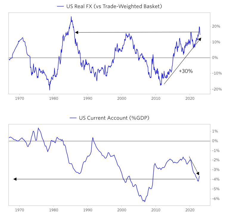 Source: Bridgewater Associates
To explain, the first chart at the top highlights how the Trade-Weighted USD Index has gone from near-record lows to near-record highs in ~13 years; and with mean reversion undefeated, a period of substantial weakness should confront the dollar in the years ahead.
Likewise, the second chart at the bottom showcases the U.S.’ current account deficit as a percentage of GDP. In a nutshell: when the U.S. imports more goods and services than it exports, it becomes a debtor country, which means more Treasury issuance, and potential weakness in the currency.
Again, though, these are long-term issues that the U.S. will have to deal with in the years ahead. Furthermore, the analysis aligns with our long-term thesis, as we believe the PMs will soar after they bottom later in 2023.
In contrast, the outlook for the U.S. dollar over the next several months is constructive, in our opinion, and even Bridgewater Associates acknowledges that a risk-off environment is bullish for the greenback. As such, with the S&P 500 likely far from its medium-term nadir, the next bout of fear should help re-ignite the USD Index’s bull market.
Please see below:
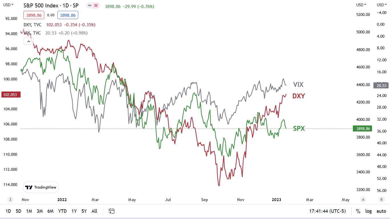
To explain, the green line above tracks the S&P 500, while the red and gray lines above track the inverted (down means up) USD Index and Cboe Volatility Index (VIX). If you analyze the relationships, you can see that when the VIX spikes, the USD Index often records substantial rallies (the red and gray lines falling).
In addition, sharp spikes in the VIX often occur when the S&P 500 sells off. Yet, with little fear confronting the financial markets right now, the VIX is near 20, and it rose slightly on Jan. 19.
Thus, if you focus your attention on the right side of the chart, you can see that the S&P 500 has pulled back (the green line falling), the VIX has risen slightly (the gray line falling), and the USD Index has declined (the red line rising).
As it stands, the absence of fear helps keep the USD Index down, but we expect that to change as the FFR continues its ascent. So, while the USD Index’s long-term outlook is not that clear, its medium-term outlook is bullish i.a. because a VIX spike should occur before this bear market in stocks ends.
Please see below:
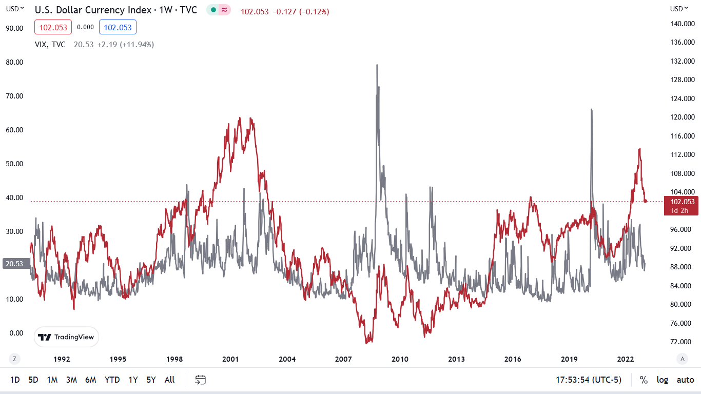
To explain, the red line above tracks the weekly movement of the USD Index, while the gray line above tracks the weekly movement of the VIX. As you can see, when the VIX rises, the USD Index is often a major beneficiary. Moreover, whether the USD Index is at high or low levels and panic strikes, the dollar basket often rallies hard, regardless of the starting position. So, while valuation matters over the long term, sentiment overpowers valuation when fear erupts.
Conversely, the right side of the chart shows how the USD Index and the VIX have both declined, with the latter at highly depressed levels relative to the fundamental risks that remain. Consequently, the VIX should have plenty of room to run, and its likely ascent should support the greenback over the medium term.
Overall, gold remains uplifted as the bearish medium-term catalysts have been ignored in the short term. But, with the Fed still materially hawkish and the fundamentals supporting higher interest rates, the pivot optimism priced in should reverse in the months ahead.
Sideways Silver Speaks Volumes
While the economic data pulls risk assets in competing directions, silver’s inability to hold $24 highlights the waning momentum confronting the PMs; and while gold and mining stocks both rallied on Jan. 19, they’re also stuck in consolidations, as the narrative bulls struggle to find new catalysts.
As a result, since Fed officials continue to rain down hawkish warnings, it’s likely only a matter of time before the momentum investors flee.
For example, Boston Fed President Susan Collins said on Jan 19 that there is “a long way to go” to balance labor demand with supply. She added:
“While the latest average hourly earnings data suggest some softening of wage pressures, labor costs continue to grow more rapidly than is consistent with 2% inflation.”
Thus, while we’ve warned about wage pressures for months, she also supports a more hawkish FFR path than what’s priced in.
Please see below:
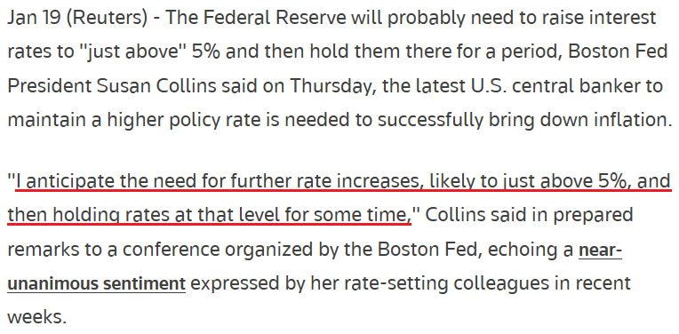 Source: Reuters
Likewise, Fed Governor Lael Brainard said on Jan. 19:
“Even with the recent moderation, inflation remains high, and policy will need to be sufficiently restrictive for some time to make sure inflation returns to 2% on a sustained basis.”
Therefore, while the overwhelming consensus assumes the Fed will pivot in the months ahead, we see things from the opposite perspective. However, it’s this consensus narrative that helps uplift gold, silver and mining stocks in the short term. For example, please see this Bloomberg headline from Jan. 19:
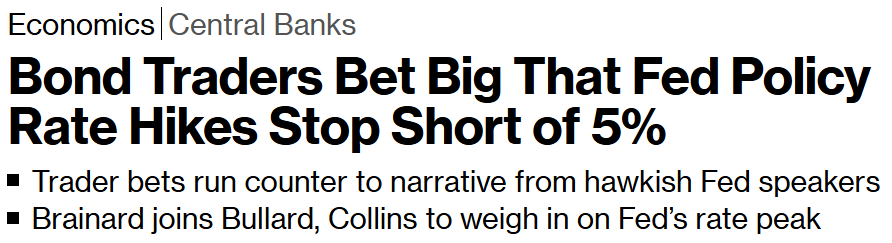 Source: Bloomberg
In contrast, as the epic battle unfolds, we side with the Fed because the fundamentals support higher interest rates.
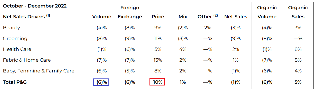
To that point, Procter & Gamble (P&G) – one of the largest U.S. consumer goods companies – released its second-quarter earnings on Jan. 19; and after the company raised its full-year sales guidance, CFO Andre Schulten said:
“We have seen in late December, very strong consumption in the U.S (…). When we look at the U.S., our biggest and most important markets, we actually see an acceleration of volume share by 50 basis points over the past three months and even 80 basis points over the past one month. Again, all of that gives us confidence to raise the top line guidance.”
He added:
“In terms of peak pricing, you're right, many of the large price increases get left this fiscal year. But that doesn't mean that we're not putting more pricing in the market. We have a number of price increases that go into effect in February. There's two components here. One where lapping price increases were executed last year, but we're also still passing through some of the cost pressures via incremental pricing around the world.”
So, while the crowd sees things from the post-GFC perspective, we believe the Fed’s inflation fight is far from over.
Please see below:
 Source: P&G
To explain, the red box above shows that P&G raised its prices by an average of 10%, while the blue box above shows that volume declined by 6%. As a result, the earnings outperformance on Jan. 19 was driven entirely by price increases.
Please see below:
 Source: Investing.com
Again, please remember that P&G has a nearly $340 billion market cap and posted nearly $21 billion in Q2 revenue, so its actions are material; and when the CFO says, “we have a number of price increases that go into effect in February” on top of the 10% recorded in Q2, the crowd doesn’t realize that the Fed’s inflation fight will be one of attrition.
Overall, silver remains uplifted because the crowd has placed ‘big bets’ that the Fed will pivot in the months ahead. Yet, their optimism contrasts inflationary history, and the current economic conditions also signal a much different outcome. Consequently, we expect risk assets to re-price substantially over the medium term.
Do you believe in the pivot narrative, or is the Fed actually right this time? How can inflation hit 2% if P&G is still raising its prices by 10%? And how wise is it for bond traders to follow the post-GFC playbook?
The Bottom Line
Gold, silver, and mining stocks continue to ride the pivot narrative, and the momentum investors are along for the ride. However, the fundamentals are far from ominous, and economic calamities often drive pivots. Furthermore, the FFR rose during three of the four recessions from 1969 to 1981, which highlights how rates can still rise when inflation is high and economic growth is weak. As such, investors have become too sentimental about the post-GFC monetary environment, and don’t realize that things have changed.
In conclusion, the PMs rallied on Jan. 19, as the USD Index and the U.S. 10-Year real yield declined. But, the fundamentals remain the same, and a profound wake-up call should emerge in the weeks (and perhaps days) ahead.
What to Watch for Next Week
With more U.S. economic data releases next week, the most important are as follows:
- Jan. 24: S&P Global Composite PMI, Richmond Fed manufacturing index
S&P Global’s nationwide survey is a great leading indicator of inflation, employment and growth; and while the Richmond Fed’s survey only covers the developments in Virginia, it still provides useful clues.
- Jan. 26: Q4 GDP, KC Fed manufacturing index
The crowd has been calling for a recession since Q2 2022, but Q4 should remain resilient. Therefore, even though the data is lagged, it’s still worth monitoring. Likewise, the KC Fed’s results augment the findings from the Richmond Fed.
- Jan. 27: Personal Consumption Expenditures (PCE) Index
The PCE Index is the Fed’s preferred inflation gauge. So, even though December’s results should follow the Consumer Price Index (CPI) and weaken due to lower oil prices, the data is still relevant.
All in all, economic data releases impact the PMs because they impact monetary policy. Moreover, if we continue to see higher employment and inflation, the Fed should keep its foot on the hawkish accelerator. If that occurs, the outcome is profoundly bearish for the PMs.
Technically Speaking
Let’s start today’s technical discussion with a quick check of copper prices.
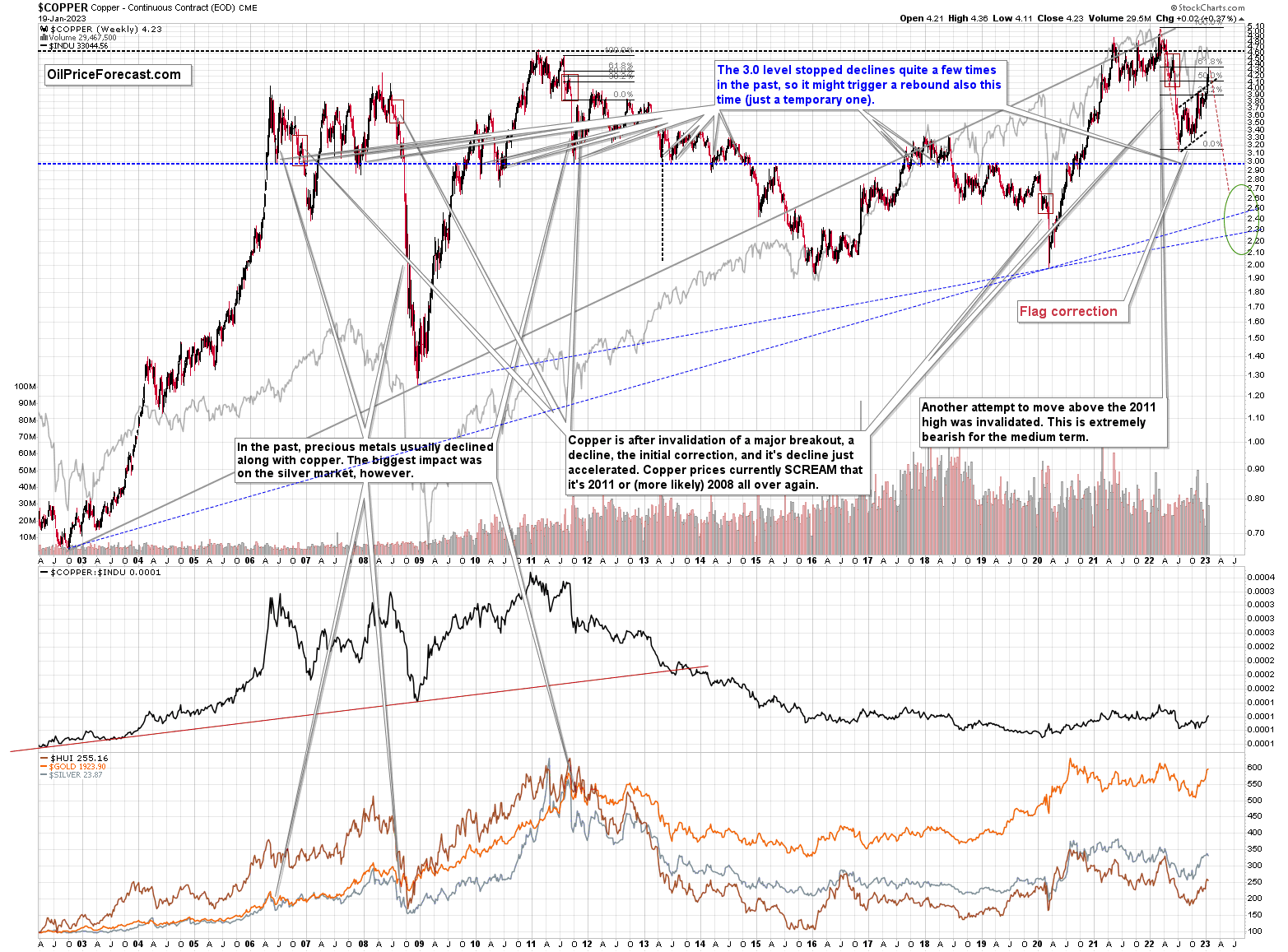
Copper rallied recently, but it stopped at its 61.8% Fibonacci retracement level and then moved back down. As a result, the recent move, while impressive on a day-to-day basis, is only a short-term correction. Consequently, what I wrote about it last week remains up-to-date:
Copper recently CLEARLY invalidated another attempt to move above its 2011 high. This is a very strong technical sign that copper (one of the most popular commodities) is heading lower in the medium term.
No market moves up or down in a straight line (well, the 2008 slide appears to have been an exception), and a short-term correction doesn’t necessarily invalidate the bigger trend. For the last couple of months, copper has been trading sideways, but it didn’t change much regarding the outlook.
In fact, it made my previous target area even more likely. You see, the consolidation patterns are often followed by a move that’s similar to the move that preceded them. In this case, the previous 2022 decline was quite significant, and if it is repeated, one can expect copper to decline well below 3.
Actually, copper could decline profoundly and bottom in the $2.0-2.7 area. That’s where we have rising, long-term support lines and also the previous – 2016 and 2020 – lows.
Flag patterns (which we just saw in copper) tend to be followed by price moves that are similar to ones that preceded them. I marked this on the above chart with red, dashed lines. This method supports a copper price’s move to around $2.7.
Given the size of the previous decline (and its pace), it seems quite likely that it could take another 2-8 months for copper to move to about $2.4. Given the current data, May appears to be the most likely time target.
Interest rates are going up, just like they did before the 2008 slide. What did copper do before the 2008 slide? It failed to break above the previous (2006) high, and it was the failure of the second attempt to break higher that triggered the powerful decline. What happened then? Gold declined, but silver and mining stocks truly plunged.
Again, copper is after invalidation of a major breakout, a decline, and a correction. Copper prices currently SCREAM that it’s a variation of 2008 all over again. This is extremely bearish for mining stocks (especially juniors) and silver.
Having said that, let’s check junior miners’ really big picture.
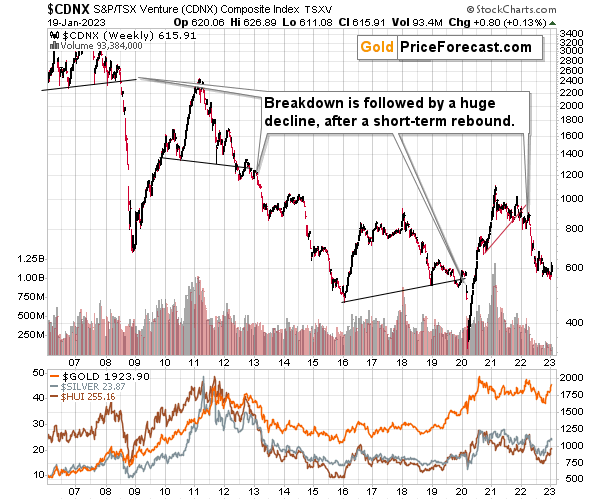
In short, we saw a tiny correction in the TSX Venture index and this should be a major red flag for anyone thinking that the recent rally was a game- or trend-changer. This is a blip on the radar screen, similar to what we saw in the second half of 2021, before another big move lower.
Consequently, my previous comments on the above chart remain up-to-date:
The Toronto Stock Exchange Venture Index includes multiple junior mining stocks. It also includes other companies, but juniors are a large part of it, and they truly plunged in 2008.
In fact, they plunged in a major way after breaking below their medium-term support lines and after an initial corrective upswing. Guess what – this index is after a major medium-term breakdown and a short-term corrective upswing. It’s likely ready to fall – and to fall hard.
So, what’s likely to happen? We’re about to see a huge slide, even if we don’t see it within the next few days.
Just like it was the case in 2008, the move higher that we saw before the final (biggest) slide in gold, silver, and gold stocks (lower part of the chart), we didn’t see a visible rally in the TSX Venture Index. Just as the index paused back then, it paused right now.
Currently, it’s trading at about 600, and back then, it consolidated at about 2500. The price levels are different, but the overall shape of the price moves (lack thereof) is similar. This serves as a signal, that the recent upswing in the PMs was not to be trusted.
The above is one of the weakest (from the technical point of view) charts that is see across the board right now. There is a strong long-term downtrend visible in the TSX Venture Index, and if stocks slide similarly as they did in 2008, the TSXV could truly plunge – perhaps even to the 300 level or lower.
The important short-term detail is that the TSXV just broke to new yearly lows. This is a major (yet barely noticed by most) indication that the next big move lower is about to start.
Having said that, let’s turn to gold.
Let’s start with context:
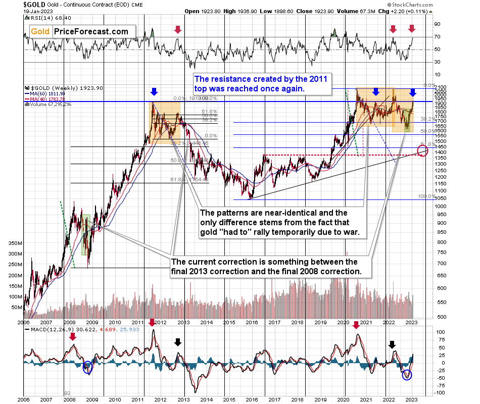
Between 2020 and now, quite a lot happened, quite a lot of money was printed, and we saw a war breaking out in Europe. Yet gold failed to rally to new highs.
In fact, it’s trading very close to its 2011 high, which tells you something about the strength of this market. It’s almost absent.
Truth be told, what we see in gold is quite in tune with what we saw after the 2011 top, and in particular, shortly after the 2012 top. We can also spot similarities between now and 2008. The long-term gold price chart below provides details.
Actually, since gold is now practically just where it was a week ago, my Monday’s description of the below gold chart remains up-to-date:
Do you know what levels gold has recently reached? Hint: those are very, very, very important price levels…
Gold just once again reached its 2011 high.
The one that triggered reversals either immediately or after an additional rally (but it took a war outbreak in Europe to push gold temporarily (!) above this level). Therefore, the importance of this long-term resistance can’t be overstated.
That’s one thing. Another thing is that, given the major fundamental event that I already mentioned above (the war outbreak), it’s possible for the technical patterns to be prolonged and perhaps even repeated before the key consequence materialized. Similarly to the head-and-shoulders pattern that can have more than one right head before the breakdown and slide happen.
In gold’s case, this could mean that due to the post-invasion top, the entire 2011-2013-like pattern got two major highs instead of one. And thus, the initial decline and the subsequent correction are pretty much a repeat of what we saw in 2020 and I early 2021, as well as what we saw 2011 and 2012.
The particularly interesting fact (!) about the correction that we saw after the 2011-2012 decline (the one that was followed by the huge 2012-2013 decline) is that during it, gold corrected slightly more than 61.8% of the preceding medium-term decline. Consequently, the current situation is just like what happened back then.
And if all the above wasn’t bearish enough, please take a look at the reading of the RSI indicator based on the weekly price changes. It’s now just below 70, and guess where it was at the final top before the 2012-2013 slide? Yes, it was exactly there, too.
That’s also approximately, where the RSI was at last year’s top.
The orange rectangles on the above chart represent the corrective upswings from approximately the previous local lows. There are two of them, and back in 2013, there was just one corrective upswing, before gold truly plunged.
However, please remember that history doesn’t repeat itself to the letter – it rhymes. This means that two corrections instead of one are still within the scope of the similarity, especially since the first correction wasn’t as big as the 2008 one.
The current situation is truly special, as the rate hikes are something that we haven’t seen in a long time. The same goes for the level of concern about the inflation that’s “out there.” The latter implies that when faced with a decision about whether to fight inflation or help the economy, the Fed is likely to lean toward the former. That’s bearish for assets like gold.
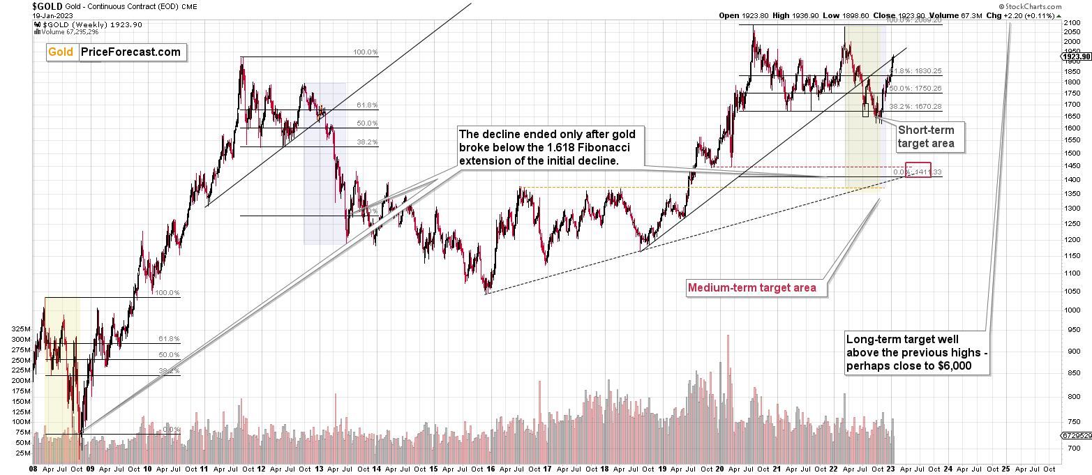
Looking at gold from the short-term point of view, reveals that gold is trying to verify the breakout above its 61.8% Fibonacci retracement.
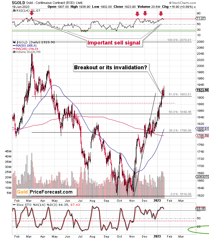
Trying, but not necessarily succeeding at it. Even though the rallies above the $1,900 level and the 61.8% Fibonacci retracement level were more visible than moves back below those levels, the latter still happened.
This, combined with an RSI above 70 – which is a classic sell signal that confirmed, e.a., the 2022 top – makes it very likely that “the battle for $1,900” will be lost.
Let’s zoom even further.
On the chart below (courtesy of https://GoldPriceForecast.com), you can see that while gold made another intraday attempt to move above the recent short-term highs and silver attempted to once again move above $24, both moves failed.
This indicates that the rally’s days are likely numbered.
Having said that, let’s take a closer look at the silver market.
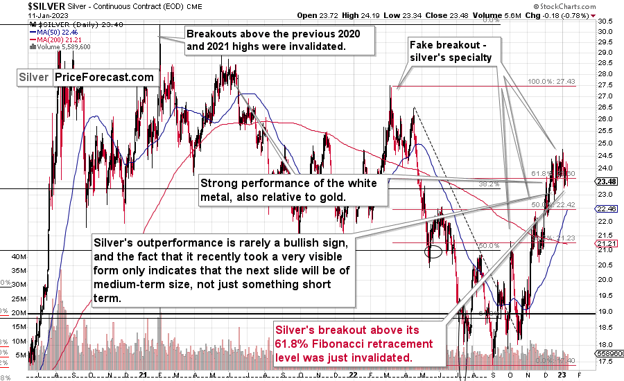
In short, silver tries to move above its 61.8% Fibonacci retracement and the $24 level, and it fails again and again. This means that what I previously wrote about the silver market remains up-to-date:
While silver had outperformed gold in recent weeks, it finally declined in a bigger way recently.
Why would this be the case? I spoke about it in last week’s video analysis, but to clarify once again, silver’s outperformance of gold is something based on who enters the market at specific times (the investment public tends to go in at the end of the rally and it tends to favor silver over gold), while gold is owned and bought primarily by the “big players.”
Tax loss harvesting in late December and early-January buy-backs is a reason why the entire market might have rallied initially this year, and it might have distorted the fact that silver did continue to outperform gold for weeks.
Now, it finally declined significantly recently, and it’s clear that it doesn’t want to stay neither above the $24 level, nor its 61.8% Fibonacci retracement, suggesting that the rally is now completely over.
The implications are bearish for the short term.
Also, my previous comments about the relative performance of silver and miners in December remain up-to-date:
What a boring month!
At least for those who monitor the performance of junior mining stocks. It’s after the Dec. 31 close, and the monthly price change for the GDXJ ETF is $0.12 (0.34%). That’s very little – next to nothing.
During the same time, gold futures rose by $66.30 (3.77%) and silver prices rose by $2.26 (10.38%) in December.
I know that I’ve been writing about this over and over again, but please note how extreme this signal is! It’s crystal-clear even on a monthly basis. The signal, of course, comes from markets’ relative performance.
Miners tend to underperform the gold price close to market tops, and silver tends to outperform close to market tops. The above monthly numbers are practically screaming: “it’s a top!” As always, very few are listening, as it’s easy to get carried away by the primary emotion that’s out there in the market, and when prices are rallying, people become bullish. They tend to ignore the signs and focus on the feelings.
Even the wording in the messages that we receive changes. The phrases “I feel the market is about to move higher” or “it seems to me that this rally won’t end” are common, but messages with indications and evidence supporting that bullish case are very rare or (usually) absent.
Please note that while I’ve been analyzing the precious metals sector’s outlook recently, my trading focus has been on the junior mining stocks – and indeed, miners have barely moved higher this month, even despite a sizable move lower in the USD Index.
But you said that miners are driven by stocks, and the S&P 500 is down by over 5% this month. Aren’t miners weak just because of the stocks? As a result, there is no underperformance of gold—no bearish indication? No.
While it’s true that stocks’ performance tends to impact juniors’ prices, it’s also true – to a considerable extent – in the case of the silver market.
Silver’s price hasn’t been weak this month. Quite the opposite – silver soared by over 10%.
If silver soared so much, then apparently the impact the stock market had on the precious metals sector was not as significant. Consequently, it’s very likely that the indications coming from the relative performance of miners and silver are truly bearish for the precious metals sector.
Looking at silver from a long-term point of view helps to see the forest, not just individual trees.
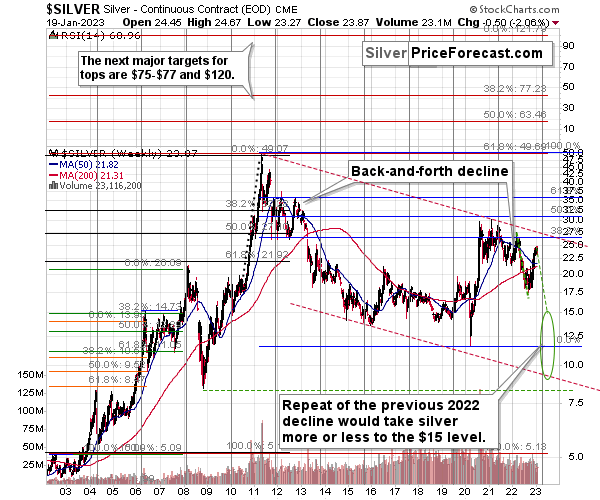
When looking at silver from a long-term point of view, it’s still obvious that the recent move higher was most likely just a corrective upswing.
What happens after corrections are over (as indicated by, i.e., silver’s outperformance)? The previous trend resumes. The previous trend was down, so that’s where silver is likely headed next.
Besides, the long-term turning point for silver is due in several months, and if silver repeats its previous 2022 decline, then it will bottom close to the turning point and also close to the $15 level– in the first half of 2023.
It’s likely to repeat its previous 2022, because that’s what tends to happen after flag patterns, and what you see on silver’s short-term chart between September and yesterday appears to be a flag pattern.
However, will silver only repeat its previous 2022 performance and not decline more than it already has?
Based on the analogies to 2008 and 2013, the latter is more likely. The 2013 slide was bigger than the initial decline that we saw in 2012. And the final 2008 slide was WAY bigger than what we saw before it.
Due to its industrial uses, silver is known to move more than gold, in particular when the stock market is moving in the same way as gold does. Since I think that gold and stocks are both likely to slide, silver is indeed likely to decline in a truly profound manner. Quite likely lower than just $15.
Consequently, my prediction for silver prices remains bearish, as does the outlook for the rest of the precious metals sector.
Let’s not forget that rising interest rates are likely to negatively impact not just commodities, but practically all industries. This will likely cause silver’s price to decline profoundly, as silver’s industrial demand could be negatively impacted by lower economic growth (or a decline in economic activity).
Consequently, it seems that silver will need to decline profoundly before it rallies (to new all-time highs) once again.
Having said that, let’s take a look at what happened in mining stocks.
History tends to repeat itself. Not to the letter, but in general. The reason is that while economic circumstances change and technology advances, the decisions to buy and sell are still mostly based on two key emotions: fear and greed. They don’t change, and once similar things happen, people’s emotions emerge in similar ways, thus making specific historical events repeat themselves to a certain extent.
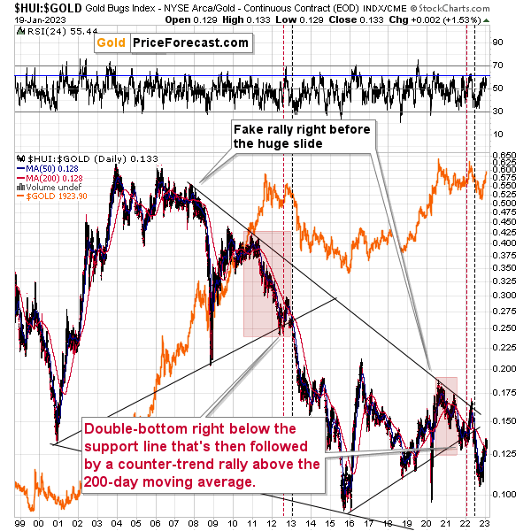
For example, right now, gold stocks are declining similarly to how they did in 2008 and in 2012-2013.
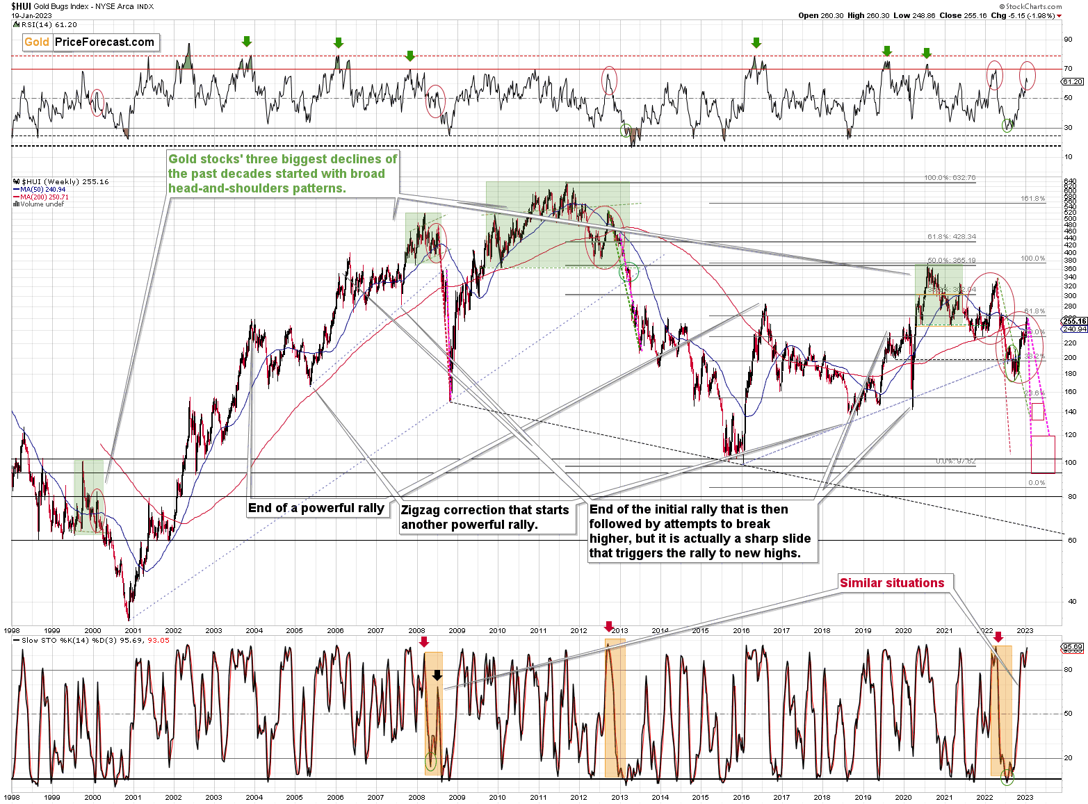
For now, gold stocks are down this week, despite the $2 move higher in gold. Gold stocks are underperforming gold once again, and it’s visible from many angles.
However, what I would like you to focus on here is that the “double correction” theory that I described below gold’s long-term chart is clearly visible here as well. We already saw the 2012 rally being repeated, and now we see it all over again. I marked them with red ellipses.
What are the implications? Well, obviously, they are bearish, as it was this correction in 2012 that started one of the most powerful declines of the previous decades. The RSI indicator based on the weekly prices is in a similar position to where it was at the late-2012 and 2022 tops. The consequences are clearly bearish for the following months.
My previous comments on the above chart, therefore, remain up-to-date:
The situation being what it is on the gold market (as discussed above) and the stock market (as I’ll discuss below), it seems to be only a matter of time before gold stocks slide.
For many months, I’ve been writing that the situation in the HUI Index is analogous to what we saw in 2008 and in 2013. Those declines were somewhat similar, yet different, and what we see now is indeed somewhere in between of those declines – in terms of the shape of the decline.
At first, the HUI Index declined just like it did in 2013, and the early-2022 rally appears to be similar to the late-2012 rally. However, the correction that we saw recently is also similar to the late-2012 rally.
Since the history doesn’t repeat itself to the letter, but it rhymes, is it that odd that we now saw two corrective upswings instead of one? Not necessarily.
This is especially the case that the 2008 decline had one sizable correction during the big decline. It’s not clearly visible on the above chart due to the pace of the 2008 slide, but it’s definitely there. You can see it more clearly in one of the below charts.
So, no, the recent rally is not an invalidation of the analogies to the previous patterns, it continues to rhyme with them in its own way. And the extremely bearish implications for the following months remain intact.
How low can the HUI Index fall during the next big downswing?
As it’s the case with gold and silver, a move back to the 2020 lows is definitely in the cards. Please note that this level is also strengthened (as support) by other major lows: the 2019, 2014, and 2008 ones.
However, I wouldn’t rule out a move even lower on a temporary basis. If gold were to decline to about $1,450-1,500, it would mean that it would double its current 2022 decline. If the HUI Index does that, it will move below 150.
So, all in all, 100-150 is my current target area for the upcoming slide in the HUI Index.
All right, let’s zoom in and see how mining stocks declined in 2008.
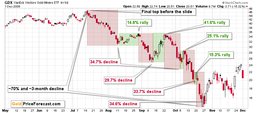
Back then, the GDXJ ETF was not yet trading, so I’m using the GDX ETF as a short-term proxy here.
The decline took about 3 months, and it erased about 70% of the miners’ value. The biggest part of the decline happened in the final month, though.
However, the really interesting thing about that decline – that might also be very useful this time – is that there were five very short-term declines that took the GDX about 30% lower.
I marked those declines with red rectangles. After that, a corrective upswing started. During those corrective upswings, the GDX rallied by 14.8-41.6%.
Do you know how much the GDX ETF has rallied from its September 2022 bottom? It moved up by 46.7%. This means that the move higher now is very similar to the corrective (!) upswing that we saw in September 2008. The analogy was not broken – it remains intact, and it points to much lower prices in the future.
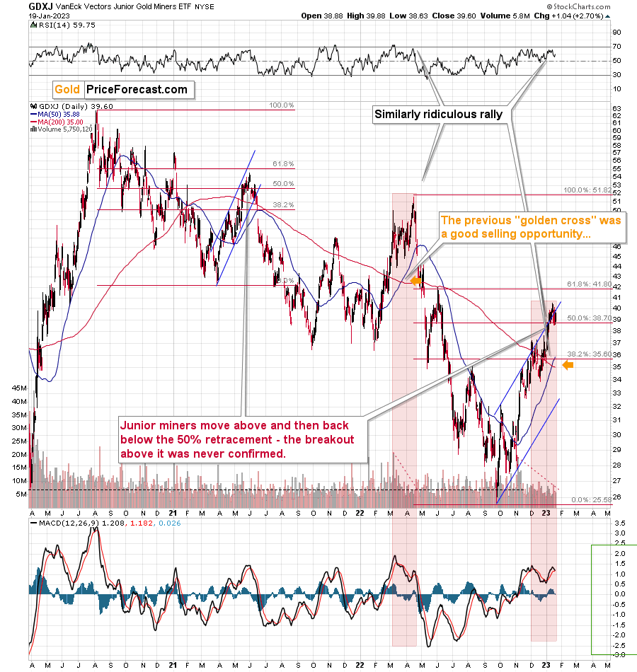
Junior miners are trying to move above their 50% Fibonacci retracement based on the 2022 decline.
They tried and failed not only in intraday terms but also in terms of the daily closing prices. Yes, the GDXJ moved higher yesterday, but it’s just another attempt to break above the 50% retracement. So, it’s not particularly believable – especially given that the previous attempt was invalidated.
Moreover, the current situation is very similar to what we saw in April 2022, and I marked that with red rectangles.
The rather flat top at first, and then a false breakout. That’s how the 2022 decline started. And it’s quite possible that it’s the way in which the 2023 decline started as well.
Speaking of analogies, the recent rally is similar to the previous short-term rally, and the similarity is also present in the silver market, which was strong (before the top) in both cases.
Back then (in mid-2021), junior miners had corrected a bit more than half of the preceding decline before sliding again, and this time we saw the same thing. Moreover, the similarity is also present in terms of the RSI indicator – it’s been trading at the same levels bacc then.
Interestingly, after the mid-2021 correction, the pace of the decline picked up, akd miners declined almost twice as fast. And yes, this could happen in the following months as well.
And yes, this means that another decline could take the GDXJ all the way down to its 2020 low, or very close to it.
Please note that the 50-day moving average just moved above the 200-day moving average, which means that a “golden cross” formed. This is a supposedly bullish indication, but history doesn’t confirm this description. In fact, the last time we saw it was in early 2022, close to the yearly top. Consequently, it’s not a bullish indication right now.
On the below chart, I marked just how perfectly the recent price moves played out according to the Elliott Wave Theory.
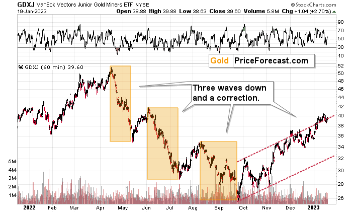
Of course, EWT is not the only tool that one could use, and I find other technical tools more useful, but still, this kind of pattern-following is uncanny.
The classic EWT pattern is three waves down (I marked those with orange rectangles) and then a correction consisting of two smaller waves.
That’s exactly what we have seen in recent months. The September–now pattern appears to be the above-mentioned correction.
I previously wrote that the Dec. 1 small breakout above the upper red line didn’t have meaningful bullish implications as it hadn’t been confirmed. And indeed, it was invalidated. The same happened very recently.
Now, since this pattern is complete, another huge 3-stage move lower can – and is likely – to unfold. This is very bearish for junior mining stocks (as well as for gold, silver, and probably other commodities and stocks), and the fact that juniors are already showing weakness relative to gold (the latter was almost flat yesterday, while miners declined) serves as a bearish confirmation. As always, I can’t guarantee anything, but in my view, the profits that can be reaped on this upcoming slide can be enormous.
Meanwhile, the relative performance of junior miners compared to senior miners continues to deteriorate in a medium-term trend.
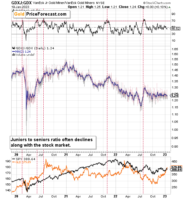
During this quick upswing, juniors rallied relative to seniors, but this is just a very short-term move that’s within a short-, and medium-term downtrends.
This implies bigger declines in the GDXJ in the future.
Also, let’s not forget about the forest while looking at individual trees. By that, I mean looking at how gold stocks perform relative to gold. That’s one of the major indications that the current situation is just like what we saw at the 2012 top.
The situation in the gold stock to gold ratio is similar to what we saw in late 2012 and early 2013. The HUI to gold ratio invalidated its first attempt to break lower (marked with red, dashed lines), but after a corrective upswing, it then broke lower more decisively. That’s what I marked using black, dashed lines.
Recently, we saw a quick upswing in the ratio, but that’s not a game-changer – even the biggest declines had corrections in the past.
If history is to rhyme, we’re about to see a profound decline. In fact, we’re likely already past its beginning.
Also, please note that the pattern that we currently see, which started in early 2016, is somewhat similar to what happened between 2003 and 2008.
Back in 2008, the breakdown from the consolidation resulted in sharply lower ratio values and much lower prices of gold stocks.
So, if the situation is analogous to 2012-2013, we’re likely to see a big decline in the following weeks/months, and if it’s analogous to 2008, we’re likely to see an enormous decline in the following weeks/months.
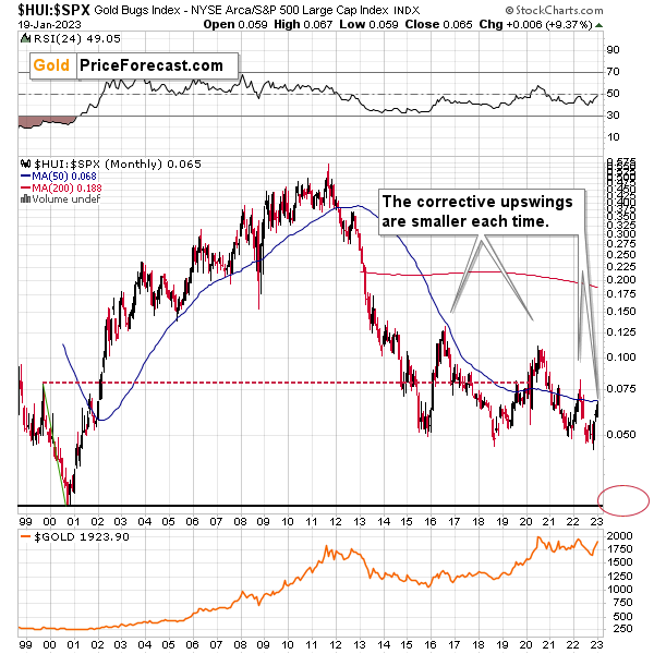
Interestingly, the situation in the gold stocks to other stocks ratio (HUI Index vs. S&P 500 Index) provides the same implications but from a different angle.
The corrective upswings that we’ve been seeing since 2015 are getting smaller and smaller. The current one is visibly smaller than what we saw last year.
Consequently, it seems that the ratio is ripe for a breakdown below the 0.05 level. The next support is provided by the all-time low at 0.026. And yes, with the ratio at 0.065 right now, this implies a decline by about 60%. If the HUI Index were to decline by 60% right now, it would have to move to about 100. If the stock market declined as well, it would imply the HUI was even lower.
Declining stock prices would only add fuel to the bearish fire (after all, gold stocks are… just stocks) and that’s exactly what’s likely to happen.
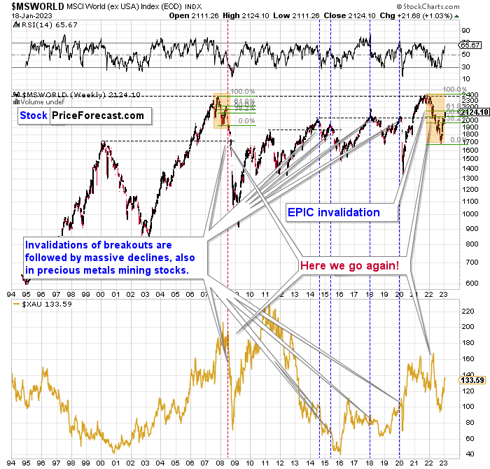
Just like what we saw in the case of copper and gold, world stocks corrected about 61.8% of their preceding decline. And that’s extremely bearish given the self-similarity to 2008.
Please note that the initial decline was now bigger than what we saw in 2008. Back then, stocks corrected about 61.8% of their initial decline before tumbling. If stocks are not able to do the same thing now – and they might not be – then the following slide could be even bigger than what we saw in 2008. Naturally, this would be profoundly bearish for junior mining stocks.
This means that nothing really changed, and the situation remains extremely bearish based, i.e., on the analogy to what we saw after previous invalidations of long-term breakouts.
As a reminder, in early 2022, I wrote that the situation was very bearish as invalidations of previous breakouts were usually followed by massive declines – not just in stocks but also in precious metals.
When stocks invalidated their 2006 breakout in 2008, their prices truly crumbled.
We also saw that on a smaller scale in 2014, 2015, and early 2018.
We’re seeing it right now.
To clarify, we’re actually seeing the aftermath of the invalidation. The huge decline is already taking place.
The difference between now and 2008 is that back then the slide was more volatile, and we didn’t really see a visible correction during the plunge. This time, the decline is more measured, and we saw a correction to one of the most classic retracements imaginable – the 38.2% one. This correction doesn’t change the trend, which remains down.
Based on what happened in 2008, it seems that stocks are about to move much lower in the following months.
Let’s take a look at the markets from a more short-term point of view and from the U.S. perspective.
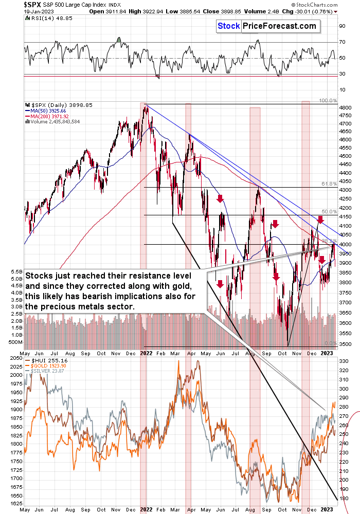
The S&P 500, unlike global stocks, corrected only a bit more than the 38.2% of the previous decline. And now they turned south, invalidating this small breakout. At the same time, they broke below the rising support line, which makes the outlook even more bearish. Consequently, my previous comments on the above chart remain up-to-date:
The broad market moved lower this week, and there are two good reasons to think that this time, the small move lower is just the beginning of a much bigger move to the downside.
One of the reasons is that this move lower came right after the triangle-vertex-based turning point. The declining black and red lines (both dashed) intersect at more or less the very recent top. As their name says, those turning points mark… Well, turning points. And since the most recent short-term move was to the upside, it currently has bearish implications.
The second reason is that stocks now broke below their rising support line (marked with a solid black line), and that’s not what happened during the two previous small moves lower.
The analogy in the price-volume link (marked with red rectangles) also points to much lower prices in the stock market.
Additionally, please note that stocks tried to move above their previous highs and the declining blue resistance line – and they failed. The invalidation served as yet another sell signal. It’s absolutely no wonder that we’re seeing a significant short-term decline right now.
Stocks corrected recently, and they turned south after touching their 38.2% Fibonacci retracement and the lower of the declining resistance lines. This likely means that the next big move lower is already here.
Why is this important for gold and silver investors and traders? Because the last two big moves took place more or less in line with each other – in stocks and in precious metals (and miners). The slide in stocks could also trigger something similar in the case of commodities like crude oil. The same thing is likely to happen again this time, especially given what’s happening in the USD Index.
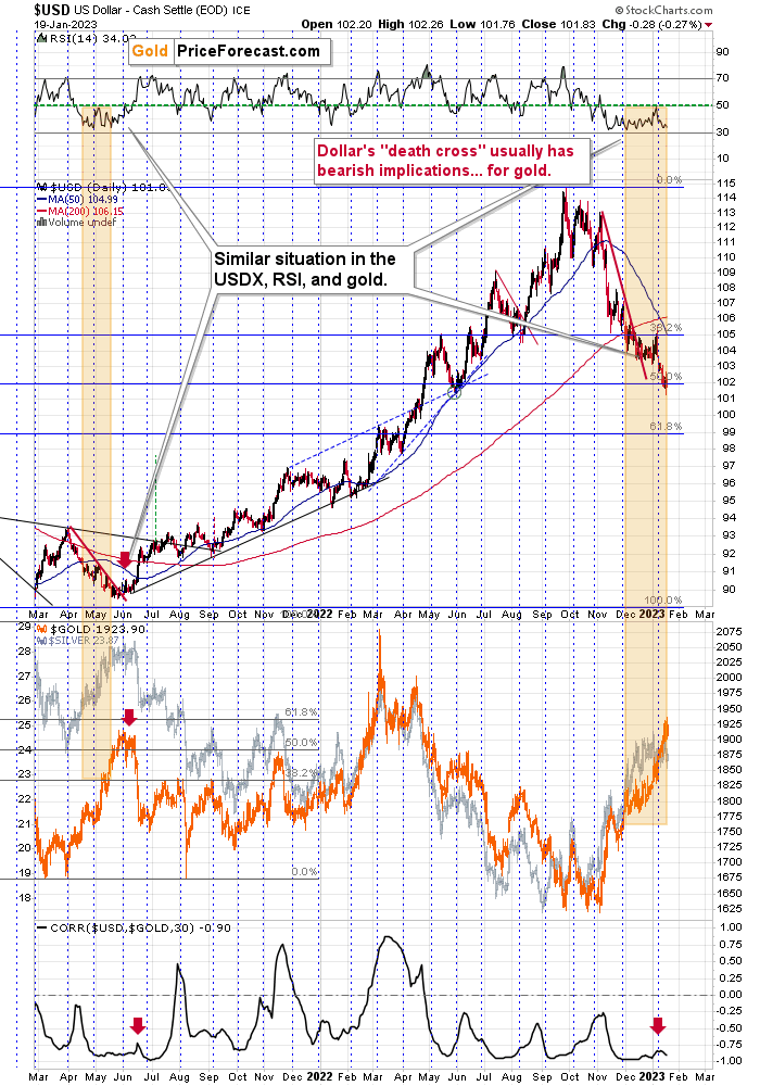
Namely, the USD Index appears to be bottoming at its 50% Fibonacci retracement.
The USDX moved below and then rallied back above its 50% Fibonacci retracement level (reversing from more or less its mid-2022 low). It might not be clearly visible on the above chart, so let’s zoom in.
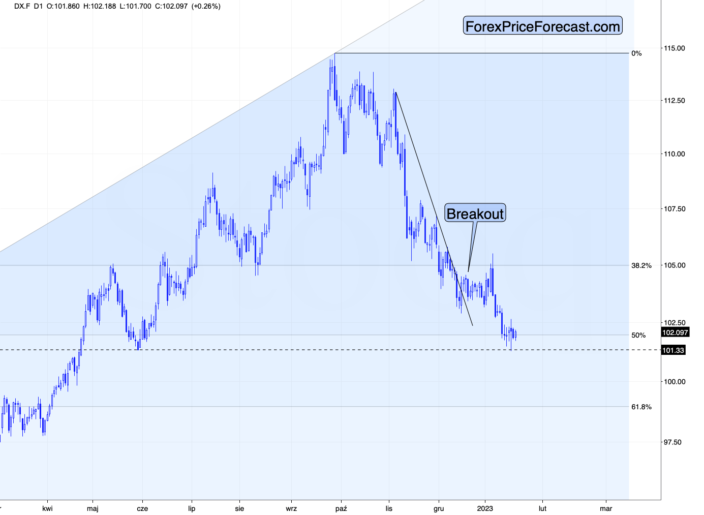
Now it’s clear that the move below 102 (and even 101.5!) was invalidated, and we saw a major reversal. At the moment of writing these words, the USDX futures are trading at about 102.1 – above the above-mentioned 50% retracement.
This means that the USD Index is likely to rally, and this – given the strongly negative correlation between the two – is likely to trigger declines in gold.
Of course, correlation doesn’t imply causation, but this actually is the case, as gold price is, well, priced in terms of the U.S. dollar.
All in all, the outlook for the precious metals market looks bearish, especially for junior mining stocks.
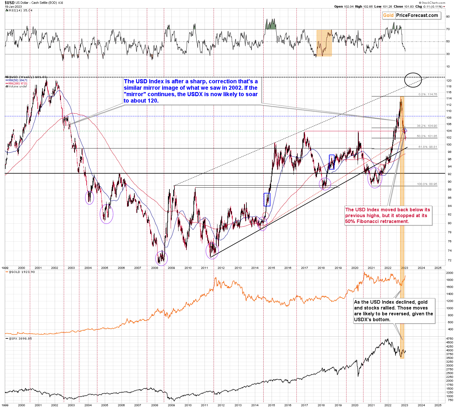
While it’s true that the USD Index moved a bit below its 2016 and 2020 levels, it’s also true that the 50% Fibonacci retracement is a very strong support level. And given the analogy to what happened during USDX’s previous rally above 110, it seems that the USD Index just did what it was “supposed to do” during this big upswing.
After a similar correction in 2000, the USD Index bottomed a bit below its 50-week (blue line on the above chart) moving average.
It also bottomed below the previous important (early 2020) high, which means that the current move back below the 2016 and 2020 highs is not as bearish as it might seem at first sight.
All in all, the USD Index appears to be bottoming here, and the precious metals sector appears to be topping.
Overview of the Upcoming Part of the Decline
- It seems to me that the corrective upswing is over (or about to be over) and that the next big move lower is already underway (or that it’s about to start).
- If we see a situation where miners slide in a meaningful and volatile way while silver doesn’t (it just declines moderately), I plan to – once again – switch from short positions in miners to short positions in silver. At this time, it’s too early to say at what price levels this could take place and if we get this kind of opportunity at all – perhaps with gold prices close to $1,500 - $1,550.
- I plan to switch from the short positions in junior mining stocks or silver (whichever I’ll have at that moment) to long positions in junior mining stocks when gold / mining stocks move to their 2020 lows (approximately). While I’m probably not going to write about it at this stage yet, this is when some investors might consider getting back in with their long-term investing capital (or perhaps 1/3 or 1/2 thereof).
- I plan to return to short positions in junior mining stocks after a rebound – and the rebound could take gold from about $1,450 to about $1,550, and it could take the GDXJ from about $20 to about $24. In other words, I’m currently planning to go long when GDXJ is close to $20 (which might take place when gold is close to $1,450), and I’m planning to exit this long position and re-enter the short position once we see a corrective rally to $24 in the GDXJ (which might take place when gold is close to $1,550).
- I plan to exit all remaining short positions once gold shows substantial strength relative to the USD Index while the latter is still rallying. This may be the case with gold prices close to $1,400 and GDXJ close to $15 . This moment (when gold performs very strongly against the rallying USD and miners are strong relative to gold after its substantial decline) is likely to be the best entry point for long-term investments, in my view. This can also happen with gold close to $1,400, but at the moment it’s too early to say with certainty.
- The above is based on the information available today, and it might change in the following days/weeks.
You will find my general overview of the outlook for gold on the chart below:
Please note that the above timing details are relatively broad and “for general overview only” – so that you know more or less what I think and how volatile I think the moves are likely to be – on an approximate basis. These time targets are not binding nor clear enough for me to think that they should be used for purchasing options, warrants, or similar instruments.
Letters to the Editor
We received a few messages over e-mail, but as we are moving to our new platform, we will be transferring them below the articles as comments – and that’s where we’ll be replying to them.
Asking your questions below the articles or in the spaces called “Ask the Community” or “Position Sizes” directly will help us deliver a reply sooner. In some cases, someone from the community might reply and help even before we do.
Please remember about the Pillars of our Community, especially about the Kindness of Speech Pillar.
Also, if there’s anything that you’re unhappy with, it’s best to send us a message at [email protected].
Please note that this section is going to go away within the next 1-8 weeks, as you can add comments/questions below the article on Golden Meadow – the platform that we’re using to provide our analyses. Your notification e-mails include an invitation link that allows you to access the “Gold Trading Alerts” space.
Also, if you haven’t had the chance to see the video, in which I’m talking about the new platform and why we essentially moved from Sunshine Profits to Golden Meadow, I strongly encourage you to do so:
Summary
Summing up, it seems that the major bottom in the USD Index is in (or at hand), while the correction in stocks, gold, silver, and mining stocks is over – or very close to being over.
Gold and silver correct about 61.8% of their 2022 decline, while junior miners corrected a bit more than 50% of the decline. The breakouts above those levels were invalidated recently and we see another attempt to move higher. Given miners’ weakness relative to gold, gold’s very long-term resistance (the 2011 high!) and the situation in the USD Index, it seems that the next big move lower in the precious metals sector is about to start.
Now, as more investors realize that interest rates will have to rise sooner than expected, the prices of precious metals and mining stocks (as well as other stocks) are likely to fall. In my opinion, the current trading position is going to become profitable in the following weeks, and quite possibly in the following days. And while I can’t promise any kind of performance, I fully expect it to become very profitable before it’s over and to prolong our 2022 winning streak.
After the final sell-off (that takes gold to about $1,350-$1,500), I expect the precious metals to rally significantly. The final part of the decline might take as little as 1-5 weeks, so it's important to stay alert to any changes.
As always, we'll keep you – our subscribers – informed.
To summarize:
Short-term outlook for the precious metals sector (our opinion on the next 1-6 weeks): Bearish
Medium-term outlook for the precious metals sector (our opinion for the period between 1.5 and 6 months): Bearish initially, then possibly Bullish
Long-term outlook for the precious metals sector (our opinion for the period between 6 and 24 months from now): Bullish
Very long-term outlook for the precious metals sector (our opinion for the period starting 2 years from now): Bullish
As a reminder, Gold Investment Updates are posted approximately once per week. We are usually posting them on Friday, but we can’t promise that it will be the case each week.
Our preferred ways to invest in and to trade gold along with the reasoning can be found in the how to buy gold section. Additionally, our preferred ETFs and ETNs can be found in our Gold & Silver ETF Ranking.
Moreover, Gold & Silver Trading Alerts are posted before or on each trading day (we usually post them before the opening bell, but we don’t promise doing that each day). If there’s anything urgent, we will send you an additional small alert before posting the main one.
Thank you.
Przemyslaw K. Radomski, CFA
Founder, Editor-in-chief

