

Briefly: gold and the rest of the precious metals market are likely to decline in the next several weeks/months and then start another powerful rally. Gold’s strong bullish reversal/rally despite the USD Index’s continuous strength will likely be the signal confirming that the bottom is in.
Welcome to this week's Gold Investment Update. Our most recently featured medium-term outlook remains the same as the price moves align with our expectations (or at least are not really against them). On that account, there are parts of the previous analysis that didn’t change at all in the earlier days and are written in italics.
The key thing that is still happening this week is that gold is trading close to its 2011 high while the USD Index is trading close to its 50% Fibonacci retracement. Consequently, very little has changed so far this week. The back-and-forth movement with only slight changes in terms of daily closing prices doesn’t provide much new information but adds quite a lot of anxiety to those who don’t look at the situation from a broad perspective and get wind up in day-to-day price moves.
Let’s start today’s analysis with an overview of the events took place so far this week.
The Weekly Fundamental Roundup
While volatility remains amplified, hopes for a soft landing and a dovish pivot have helped propel risk assets higher in recent days. Moreover, with the momentum investors (CTAs) crowding into the PMs, they believe that gold, silver and mining stocks are safe places to hide.
However, we believe this faith is shortsighted, as the fundamentals remain highly bearish; and with the crowd underestimating the resiliency of inflation, interest rates are still materially below where they should peak, and volatility should rise in the months ahead.
The Dip Buyers Run To Gold’s Rescue
With the S&P 500 selling off at the open and then rallying into the close on Jan. 25, the dip buyers have returned as fear dissipates from the financial markets; and with the Bank of Canada (BoC) aiding their cause with its wait-and-see approach to future interest rate hikes, the crowd sees downside catalysts as few and far between.
For example, the BoC raised its overnight lending rate by 25 basis points on Jan. 25. Its official statement read:
“Inflation is projected to come down significantly this year (…). The Bank’s ongoing program of quantitative tightening (QT) is complementing the restrictive stance of the policy rate. If economic developments evolve broadly in line with the MPR outlook, [the] Governing Council expects to hold the policy rate at its current level while it assesses the impact of the cumulative interest rate increases.”
It added:
“[The] Governing Council is prepared to increase the policy rate further if needed to return inflation to the 2% target, and remains resolute in its commitment to restoring price stability for Canadians.”
Also noteworthy, BoC Governor Tiff Macklem was adamant that higher-for-longer interest rates would remain.
Please see below:
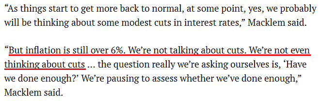 So, while the crowd prices in rate cuts later in 2023, please remember that a rise-and-hold outcome is still more hawkish than what’s expected. Therefore, the PMs remain uplifted by a narrative that we view as highly unrealistic.
More importantly, we quoted above how the BoC statement said, “Inflation is projected to come down significantly this year.” Well, do you remember what the BoC said in its Dec. 8, 2021, monetary policy statement?
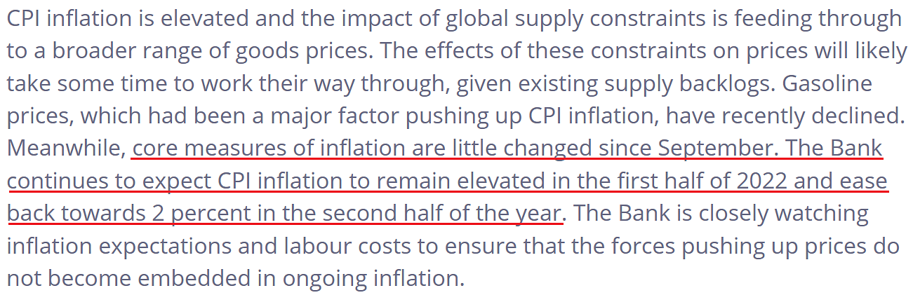
In contrast, headline inflation did not “ease back towards 2 percent,” and core inflation was not “little changed” throughout 2022.
Please see below:
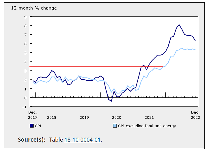 To explain, the dark and light blue lines above track the year-over-year (YoY) percentage changes in the Canadian headline and core CPIs. If you analyze where the horizontal red line intersects with the light blue line, you can see that the core CPI was at 3.4% YoY when the BoC made those comments in December 2021.
Yet, if you focus your attention on the performance thereafter, you can see that the core CPI ran away from the central bank, which highlights its forecasting fallibility. More importantly, notice how the light blue line has barely budged? The core CPI peaked at 5.5% YoY in July and stood at 5.3% YoY in December.
As a result, while the BoC may believe its inflation fight is over, the central bank is living in fantasy land.
Likewise, if you want to know why the dark blue line has declined, the December inflation report stated:
“The headline CPI grew at a slower pace largely due to slower growth in prices for gasoline (…). Consumers paid 13.1% less at the pump in December compared with November, the largest monthly decline since April 2020 (…). Lower crude oil prices were also reflected in a 14.8% month-over-month (MoM) decline in prices for fuel oil and other fuels.”
So, while we have warned repeatedly that North American central banks’ inflation fights will be arduous, the MoM decline in energy prices drove the headline CPI’s deceleration. Conversely, the core CPI remains well above the BoC’s target, and a 4.5% overnight lending rate is too low to win this inflation battle.
Remember, we follow the fundamentals, not the rhetoric from the Fed or the BoC; and while their statements move markets and impact the gold price, these are short-term phenomena. Furthermore, investors who blindly followed their “transitory” narrative in 2021 suffered mightily. Therefore, we view this as “Transitory Part 2.”
As evidence, China’s reopening has renewed investors’ optimism for economically-sensitive commodities; and surprise, surprise, it's bullish for the headline CPI.
Please see below:
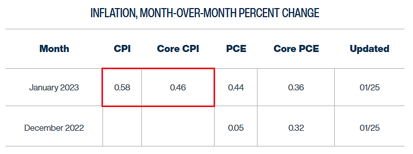 To explain, the Cleveland Fed projected that the January U.S. headline CPI would come in at 0.53% MoM on Jan. 20. Although, on Jan. 25, the estimate was increased to 0.58% MoM. Moreover, while the core CPI has held steady at 0.46% MoM, both annualize to 7.2% and 5.7% YoY, respectively.
Similarly, let’s not forget that the Atlanta Fed’s Sticky CPIs have hit new YoY highs for 17 straight months. As such, just because the Fed or the BoC says something doesn’t mean you should believe it.
Overall, an epic battle is unfolding across the financial markets. The crowd is back to blindly following the Fed and the BoC, leading to lower interest rates and a weaker USD Index. However, like in 2021, we believe they’re all wrong, and history is on our side. Consequently, while the Fed could follow the BoC and lean dovish next week, we expect a much different outcome before it’s all said and done.
Where will the BoC’s overnight lending rate peak? Is 4.5% the end? What tone will Powell strike next week: hawkish or dovish?
Silver Rallies Despite Its Fundamental Frailty
After earnings pessimism threatened to capsize the S&P 500 on Jan. 25, the intraday reversal coincided with similar volatility for silver. But, with the medium-term fundamentals still highly bullish for the FFR, real yields and the USD Index, there should be plenty of downside for the white metal in the months ahead.
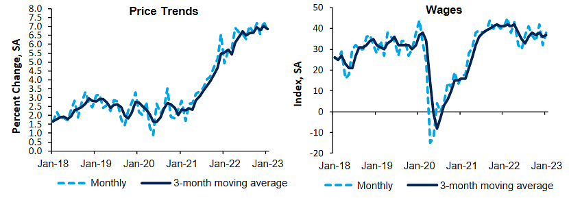
For example, S&P Global released its U.S. Composite PMI on Jan. 24. The headline index increased from 45 in December to 46.6 in January. An excerpt read:
“Greater wage costs and further increases in supplier prices drove up cost burdens during January. The rate of input price inflation gathered pace and was sharper than that seen in the previous survey period. A steeper rise in costs was not reflected in output prices, however, as the pace of charge inflation matched that seen in December 2022.”
So, with MoM input inflation on the rise and wages still highly problematic (like we warned), the up-and-down nature of inflation continues to follow the historical script; and while output inflation didn’t rise at the same pace in January, it’s likely only a matter of time before businesses raise their prices to protect their profit margins. In essence, they should repeat the same tactics they employed in 2021 and 2022.
The report added:
“U.S. firms recorded a marginal rise in employment at the start of 2023. The rate
of job creation was one of the softest in the current sequence of employment growth that began in July 2020. The upturn in workforce numbers was driven by service providers, as manufacturers registered a fractional contraction in staffing levels. Firms continued to mention efforts to build employee numbers, especially in roles with long-held vacancies.”
Thus, while “a marginal rise in employment” may seem immaterial, please remember that the Fed needs the unemployment rate to rise to cool wage and output inflation. Instead, wage growth persists, and U.S. companies are still adding workers.
As a result, the fundamentals continue to unfold as expected. Chris Williamson, Chief Business Economist at S&P Global Market Intelligence, said:
 In addition, the Philadelphia Fed released its Manufacturing Business Outlook Survey on Jan. 19. The headline index increased from -13.7 in December to -8.9 in January. An excerpt read:
“The firms reported increases in employment, and the employment index improved from -0.9 in December to 10.9 this month. The majority of responding firms (65 percent) reported steady employment levels, and the share reporting increases (22 percent) exceeded the share reporting decreases (11 percent). The average workweek index also turned positive, rising from -6.6 to 4.0.”
Likewise, the Richmond Fed released its Fifth District Survey of Service Sector Activity on Jan. 24. The headline index increased from -12 in December to -6 in January, and an excerpt read:
“A larger share of firms reported increased hiring in January, with the employment index rising from -2 to 9. Nonetheless, firms’ ability to find workers with the necessary skills saw little improvement as the index remained unchanged at -10 in January. Firms continued to increase wages and expect further wage increases in the near term.”
Consequently, wage and output inflation remain highly elevated across the Richmond service sector.
Please see below:
 On top of that, while the quote from the Philadelphia Fed above covers the manufacturing sector, its service sector companies are also increasing their headcount.
Please see below:
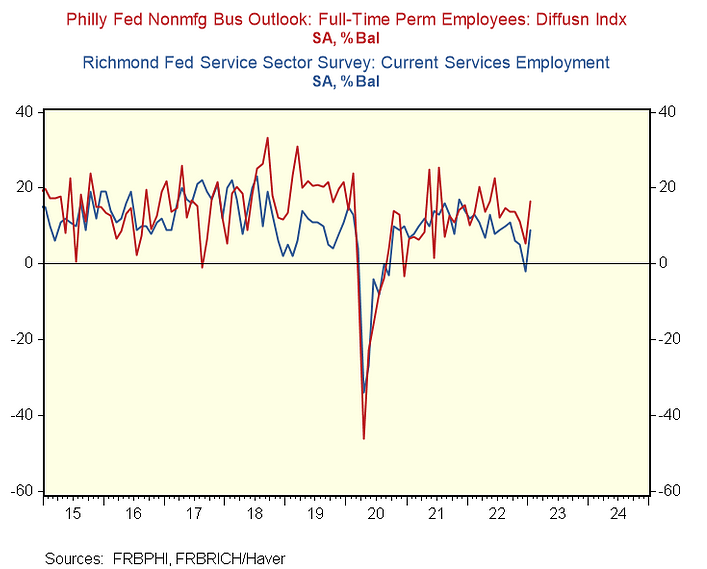
To explain, the red and blue lines above show that service sector employment levels in Philadelphia and Richmond hit eight and four-month highs in January. As a result, while it may sound like a broken record, the fundamentals support higher, not lower, interest rates.
Overall, silver continues to consolidate, as $24 remains resistance, but the absence of fear keeps the price from moving materially lower. However, the economic data remains profoundly hawkish, and new lows should confront silver before this bear market ends. As such, while we remain bullish on the PMs’ long-term prospects, caution is warranted in the months ahead.
What is your interpretation of the U.S. economy? Despite repeated recession calls, why won’t growth and the labor market collapse? Will the strength keep the Fed from cutting interest rates?
The Bottom Line
Little has changed across the financial markets, as the pivot and soft landing narratives still dominate the consensus outlook. Therefore, risk-off assets like the USD Index and real yields have suffered, while risk-on assets like the PMs have benefited. But, these narratives will ultimately collide with the fundamentals, and we believe the crowd has materially misjudged the medium-term outlook.
In conclusion, the PMs rallied on Jan. 25, as the S&P 500’s intraday reversal helped fuel more optimism. Yet, the fundamentals continue to diverge, and the positioning and narrative imbalances are near 2021 levels. Thus, we expect significant drawdowns when the optimism unwinds.
What to Watch for Next Week
With more U.S. economic data releases next week, the most important are as follows:
- Jan. 30: Dallas Fed manufacturing index
The regional survey highlights the inflation, employment and growth developments in Texas, and it’s an important piece of the overall puzzle.
- Jan. 31: Dallas Fed services index, Chicago PMI.
The services survey will augment the findings from the Dallas Fed’s manufacturing index, while the Chicago PMI will depict the state of play in Illinois.
- Feb. 1: ISM manufacturing PMI, JOLTS job openings, FOMC meeting, Jerome Powell press conference
The ISM conducts a nationwide survey, so its findings paint an overall portrait of the U.S. manufacturing sector. In addition, the JOLTS report will provide a lagged look at U.S. employment demand.
More importantly, the FOMC will take center stage, and Powell’s press conference will provide more monetary policy clues.
- Feb. 2: Challenger job cuts
While layoffs are abundant in the U.S. technology sector, monitoring other industries is paramount to predicting when the Fed may pivot.
- Feb. 3: U.S. nonfarm payrolls, unemployment rate, labor force participation rate, average hourly earnings, ISM services PMI.
While the four employment metrics are lagged, they move markets and shift rate-hike expectations. Also, the ISM services report will add more color to the manufacturing survey from Feb. 1.
All in all, economic data releases impact the PMs because they impact monetary policy. Moreover, if we continue to see higher employment and inflation, the Fed should keep its foot on the hawkish accelerator. If that occurs, the outcome is profoundly bearish for the PMs.
Technically Speaking
Let’s start today’s technical discussion with a quick check of copper prices.
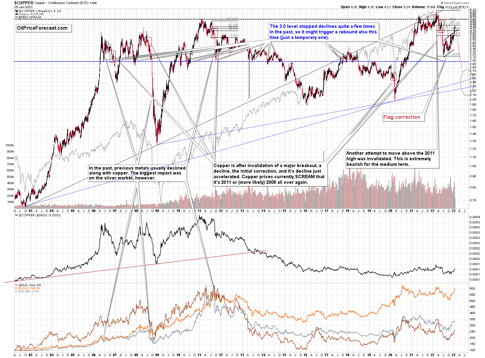
Copper rallied recently, but it stopped at its 61.8% Fibonacci retracement level and then moved back down. Consequently, the recent move – while impressive from the day-to-day point of view – remains to be a short-term correction only.
Consequently, what I wrote about it previously remains up-to-date:
Copper recently CLEARLY invalidated another attempt to move above its 2011 high. This is a very strong technical sign that copper (one of the most popular commodities) is heading lower in the medium term.
No market moves up or down in a straight line (well, the 2008 slide appears to have been an exception), and a short-term correction doesn’t necessarily invalidate the bigger trend. For the last couple of months, copper has been trading sideways, but it didn’t change much regarding the outlook.
In fact, it made my previous target area even more likely. You see, the consolidation patterns are often followed by a move that’s similar to the move that preceded them. In this case, the previous 2022 decline was quite significant, and if it is repeated, one can expect copper to decline well below 3.
Actually, copper could decline profoundly and bottom in the $2.0-2.7 area. That’s where we have rising, long-term support lines and also the previous – 2016 and 2020 – lows.
Flag patterns (which we just saw in copper) tend to be followed by price moves that are similar to those that preceded them. I marked this on the above chart with red, dashed lines. This method supports a copper price’s move to around $2.7.
Given the size of the previous decline (and its pace), it seems quite likely that it could take another 2-8 months for copper to move to about $2.4. Given the current data, May appears to be the most likely time target.
Interest rates are going up, just like they did before the 2008 slide. What did copper do before the 2008 slide? It failed to break above the previous (2006) high, and it was the failure of the second attempt to break higher that triggered the powerful decline. What happened then? Gold declined, but silver and mining stocks truly plunged.
Again, copper is after the invalidation of a major breakout, a decline, and a correction. Copper prices currently SCREAM that it’s a variation of 2008 all over again. This is extremely bearish for mining stocks (especially juniors) and silver.
Having said that, let’s check the junior miners’ really big picture.
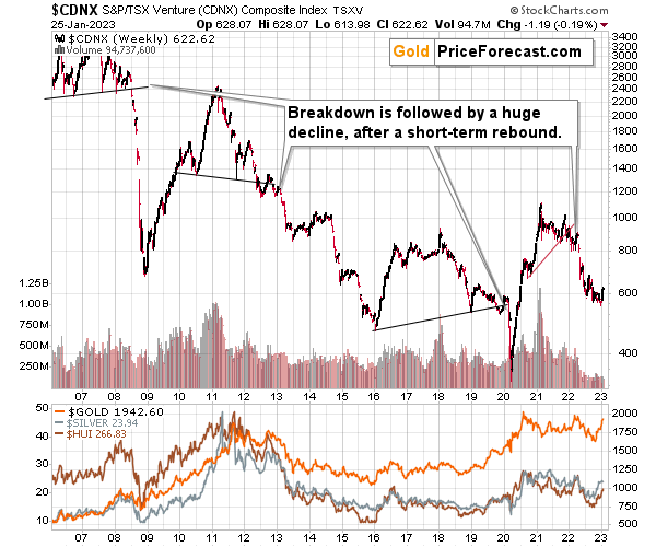
In short, we saw a tiny correction in the TSX Venture index, and this should be a major red flag for anyone thinking that the recent rally was a game- or trend-changer. This is a blip on the radar screen, similar to what we saw in the second half of 2021, before another big move lower.
Consequently, my previous comments on the above chart remain up-to-date:
The Toronto Stock Exchange Venture Index includes multiple junior mining stocks. It also includes other companies, but juniors are a large part of it, and they truly plunged in 2008.
In fact, they plunged in a major way after breaking below their medium-term support lines and after an initial corrective upswing. Guess what – this index is after a major medium-term breakdown and a short-term corrective upswing. It’s likely ready to fall – and to fall hard.
So, what’s likely to happen? We’re about to see a huge slide, even if we don’t see it within the next few days.
Just like it was the case in 2008, the move higher that we saw before the final (biggest) slide in gold, silver, and gold stocks (lower part of the chart) didn’t translate into a visible rally in the TSX Venture Index. Just as the index paused back then, it pauses right now.
Currently, it’s trading at about 600, and back then, it consolidated at about 2500. The price levels are different, but the overall shape of the price moves (or lack thereof) is similar. This serves as a signal that the recent upswing in the PMs is not to be trusted.
The above chart is one of the weakest (from a technical point of view) that is seen across the board right now. There is a strong long-term downtrend visible in the TSX Venture Index, and if stocks slide similarly as they did in 2008, the TSXV could truly plunge – perhaps even to the 300 level or lower.
The important short-term detail is that the TSXV just broke to new yearly lows. This is a major (yet barely noticed by most) indication that the next big move lower is about to start.
Having said that, let’s turn to gold.
Let’s start with context:
Between 2020 and now, quite a lot happened, quite a lot of money was printed, and we saw a war breaking out in Europe. Yet gold failed to rally to new highs.
In fact, it’s trading very close to its 2011 high, which tells you something about the strength of this market. It’s almost absent.
Truth be told, what we see in gold is quite in tune with what we saw after the 2011 top, and in particular, shortly after the 2012 top. We can also spot similarities between now and 2008. The long-term gold price chart below provides details.
Actually, since the gold price is still trading close to its 2011 high, my previous description of the below gold chart remains up-to-date:
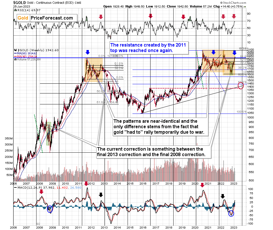
Do you know what levels gold has recently reached? Hint: those are very, very, very important price levels…
Gold just once again reached its 2011 high.
The one that triggered reversals either immediately or after an additional rally (but it took a war outbreak in Europe to push gold temporarily (!) above this level). Therefore, the importance of this long-term resistance can’t be overstated.
That’s one thing. Another thing is that, given the major fundamental event that I already mentioned above (the war outbreak), it’s possible for the technical patterns to be prolonged and perhaps even repeated before the key consequence materialized. Similarly to the head-and-shoulders pattern that can have more than one right head before the breakdown and slide happen.
In gold’s case, this could mean that due to the post-invasion top, the entire 2011-2013-like pattern got two major highs instead of one. And thus, the initial decline and the subsequent correction are pretty much a repeat of what we saw in 2020 and early 2021, as well as what we saw in 2011 and 2012.
The particularly interesting fact (!) about the correction that we saw after the 2011-2012 decline (the one that was followed by the huge 2012-2013 decline) is that during it, gold corrected slightly more than 61.8% of the preceding medium-term decline. Consequently, the current situation is just like what happened back then.
If all the above wasn’t bearish enough, please take a look at the reading of the RSI indicator based on the weekly price changes. It’s now just below 70, and guess where it was at the final top before the 2012-2013 slide? Yes, it was exactly there, too.
That’s also approximately where the RSI was at last year’s top.
The orange rectangles on the above chart represent the corrective upswings from approximately the previous local lows. There are two of them, and back in 2013, there was just one corrective upswing before gold truly plunged.
However, please remember that history doesn’t repeat itself to the letter – it rhymes. This means that two corrections instead of one are still within the scope of the similarity, especially since the first correction wasn’t as big as the 2008 one.
The current situation is truly special, as the rate hikes are something that we haven’t seen in a long time. The same goes for the level of concern about the inflation that’s “out there.” The latter implies that when faced with a decision about whether to fight inflation or help the economy, the Fed is likely to lean toward the former, and that’s bearish for assets like gold.
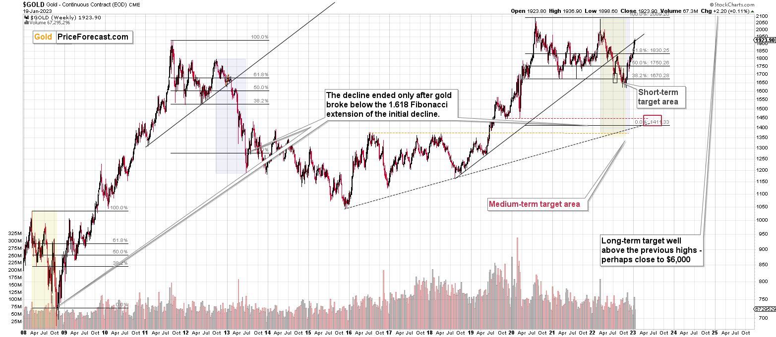
Looking at gold from a short-term point of view, we see that it has indeed moved above the 61.8% Fibonacci retracement.
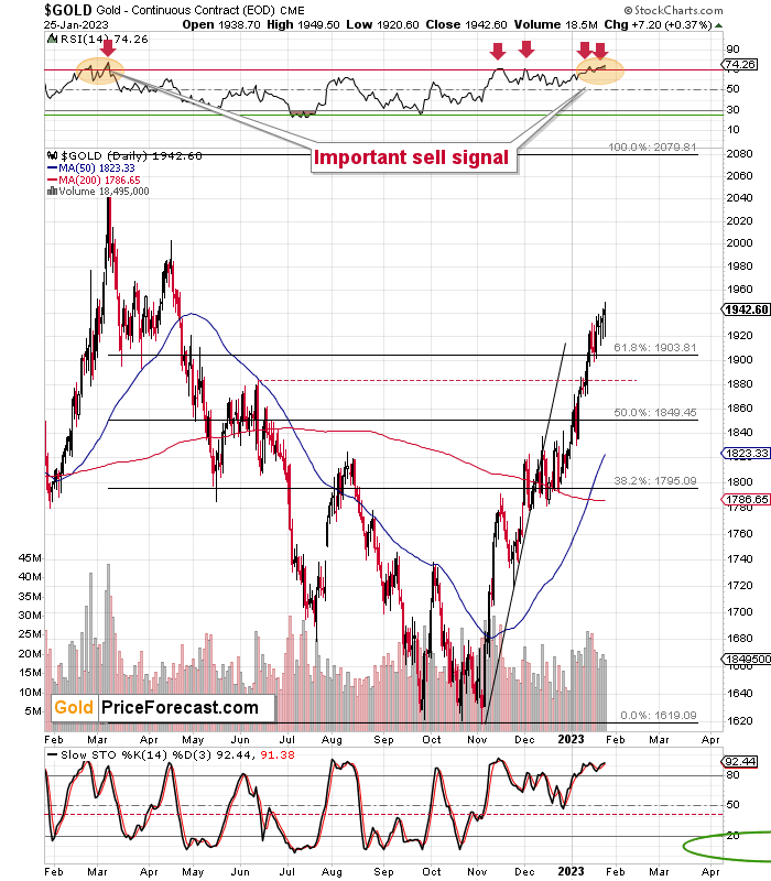
This would have been a bullish indication if it weren’t for the very bearish analogy to late 2012.
Particularly given that gold's RSI based on weekly closing prices is just below 70 and the RSI based on daily prices is well above 70. In fact, gold’s daily RSI is above 70 for the second time in a relatively short period, and that’s exactly what we also saw at the 2022 top.
Remember the feeling that was prevalent among gold investors and traders at the 2022 top, when it was trading above $2,000? The overwhelming bullishness? The feeling of invincibility? All the theories due to which gold just has to rally? It’s quite similar right now.
These are emotions that accompany tops, whereas fear, disappointment, and despair accompany bottoms. It’s much easier to describe ignoring emotions in trading than to actually do it, but it’s my responsibility to remind you how it is, how it was, and what happened to the price of gold during similar times.
And it fell. Hard.
Let’s zoom even further.
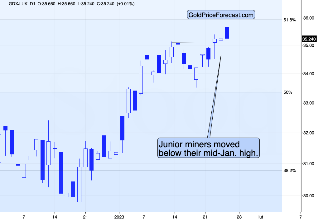
On the chart below (courtesy of https://www.goldpriceforecast.com/), you can see that while gold made another intraday attempt to move above the recent short-term highs and the silver price tried to once again move above $24, both moves failed.
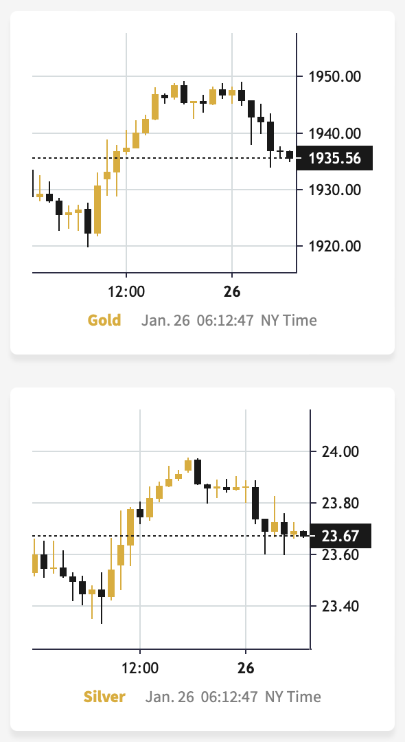
This indicates that the rally’s days are likely numbered.
Of course, we might get another intraday or intraweek attempt to move higher – just like we saw those attempts in the previous days. However, given the long-term resistance that I described earlier today, it’s likely that the next big, meaningful move will be to the downside.
Having said that, let’s take a closer look at the silver market.
In short, the short-term silver price chart is one of the most boring ones throughout the entire precious metal sector. Silver did practically nothing for several weeks in a row.
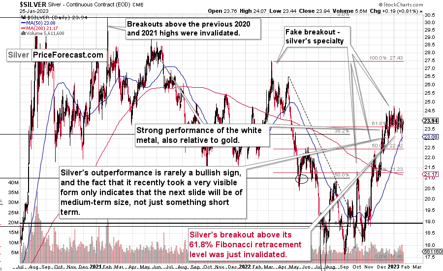
The white metal tried to move above its 61.8% Fibonacci retracement and the $24 level many times, but it failed – over and over again.
Silver clearly doesn’t want to stay above the $24 level or its 61.8% Fibonacci retracement, suggesting that the rally is now completely over. We’re simply waiting for the slide to start.
Interestingly, the above-described flat top in the silver price is being formed right after it outperformed gold and mining stocks on a massive scale – throughout December 2022. As you may recall, silver’s short-term outperformance of gold is a bearish indication, as we have already seen.
This further strengthens the scenario, in which the rally in the PMs is pretty much over or about to be over and the markets are just waiting for a good “excuse” to start another powerful decline.
Looking at silver from a long-term point of view helps to see the forest, not just individual trees.
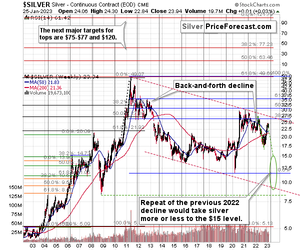
When looking at silver from a long-term point of view, it’s still obvious that the recent move higher was most likely just a corrective upswing.
What happens after corrections are over (as indicated by, i.e., silver’s outperformance)? The previous trend resumes. The previous trend was down, so that’s where silver is likely headed next.
Besides, the long-term turning point for silver is due in several months, and if silver repeats its previous 2022 decline, then it will bottom close to the turning point and also close to the $15 level– in the first half of 2023.
It’s likely to repeat its previous 2022, because that’s what tends to happen after flag patterns, and what you see on silver’s short-term chart between September and yesterday appears to be a flag pattern.
However, will silver only repeat its previous 2022 performance and not decline more than it already has?
Based on the analogies to 2008 and 2013, the latter is more likely. The 2013 slide was bigger than the initial decline that we saw in 2012. And the final 2008 slide was WAY bigger than what we saw before it.
Due to its industrial uses, silver is known to move more than gold, in particular when the stock market is moving in the same way as gold does. Since I think that gold and stocks are both likely to slide, silver is indeed likely to decline in a truly profound manner. Quite likely lower than just $15.
Consequently, my prediction for silver prices remains bearish, as does the outlook for the rest of the precious metals sector.
Let’s not forget that rising interest rates are likely to negatively impact not just commodities, but practically all industries. This will likely cause silver’s price to decline profoundly, as silver’s industrial demand could be negatively impacted by lower economic growth (or a decline in economic activity).
Consequently, it seems that silver will need to decline profoundly before it rallies (to new all-time highs) once again.
Having said that, let’s take a look at what happened in mining stocks.
History tends to repeat itself. Not to the letter, but in general. The reason is that while economic circumstances change and technology advances, the decisions to buy and sell are still mostly based on two key emotions: fear and greed. They don’t change, and once similar things happen, people’s emotions emerge in similar ways, thus making specific historical events repeat themselves to a certain extent.
For example, right now, gold stocks are declining similarly to how they did in 2008 and in 2012-2013.
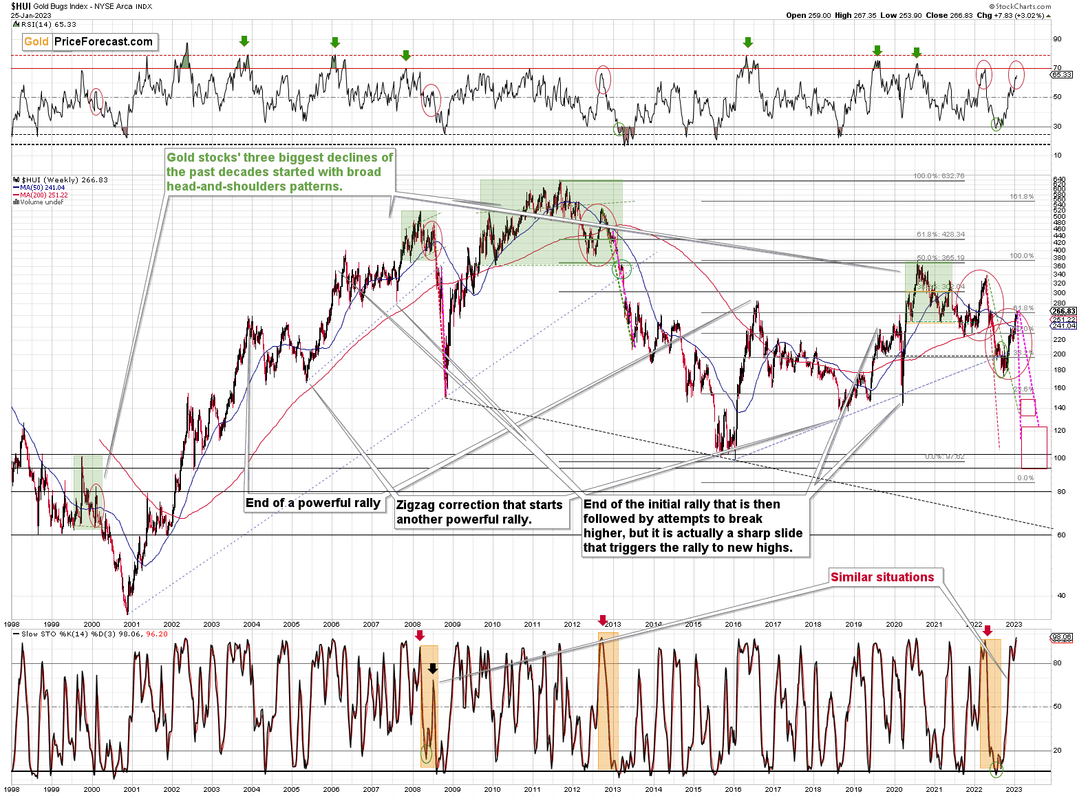
Moreover, the stochastic indicator (lower part of the above chart) is currently performing just like it did at the 2022 top – so the bearish similarity between those periods is not just in gold.
However, what I would like you to focus on here is that the “double correction” theory that I described below gold’s long-term chart is clearly visible also here. We already saw the 2012 rally being repeated and now we see it all over again. I marked them with red ellipses.
What are the implications? Well, obviously they are bearish, as it was this correction in 2012 that started one of the most powerful declines of the previous decades. The RSI indicator based on the weekly prices is in a similar position to where it was at the late-2012 and 2022 tops. The consequences are clearly bearish for the following months.
My previous comments on the above chart, therefore, remain up-to-date:
The situation being what it is on the gold market (as discussed above) and the stock market (as I’ll discuss below), it seems to be only a matter of time before gold stocks slide.
For many months, I’ve been writing that the situation in the HUI Index is analogous to what we saw in 2008 and in 2013. Those declines were somewhat similar, yet different, and what we see now is indeed somewhere in between of those declines – in terms of the shape of the decline.
At first, the HUI Index declined just like it did in 2013, and the early-2022 rally appears to be similar to the late-2012 rally. However, the correction that we saw recently is also similar to the late-2012 rally.
Since the history doesn’t repeat itself to the letter, but it rhymes, is it that odd that we now saw two corrective upswings instead of one? Not necessarily.
This is especially the case that the 2008 decline had one sizable correction during the big decline. It’s not clearly visible on the above chart due to the pace of the 2008 slide, but it’s definitely there. You can see it more clearly in one of the below charts.
So, no, the recent rally is not an invalidation of the analogies to the previous patterns, it continues to rhyme with them in its own way. And the extremely bearish implications for the following months remain intact.
How low can the HUI Index fall during the next big downswing?
As it’s the case with gold and silver, a move back to the 2020 lows is definitely in the cards. Please note that this level is also strengthened (as support) by other major lows: the 2019, 2014, and 2008 ones.
However, I wouldn’t rule out a move even lower on a temporary basis. If gold were to decline to about $1,450-1,500, it would mean that it would double its current 2022 decline. If the HUI Index does that, it will move below 150.
So, all in all, 100-150 is my current target area for the upcoming slide in the HUI Index.
All right, let’s zoom in and see how mining stocks declined in 2008.
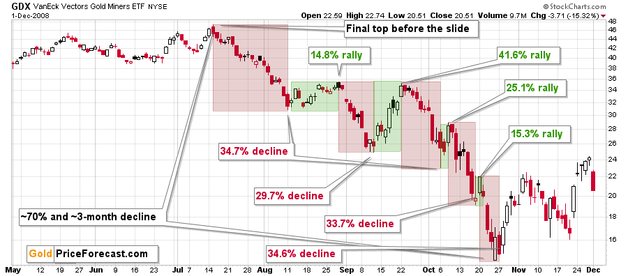
Back then, the GDXJ ETF was not yet trading, so I’m using the GDX ETF as a short-term proxy here.
The decline took about 3 months, and it erased about 70% of the miners’ value. The biggest part of the decline happened in the final month, though.
However, the really interesting thing about that decline – that might also be very useful this time – is that there were five very short-term declines that took the GDX about 30% lower.
I marked those declines with red rectangles. After that, a corrective upswing started. During those corrective upswings, the GDX rallied by 14.8-41.6%.
Do you know how much the GDX ETF has rallied from its September 2022 bottom? It moved up by 57.6%. This means that the move higher now is still somewhat similar to the corrective (!) upswing that we saw in September 2008. The analogy was not broken – it remains intact, and it points to much lower prices in the future.
Gold stocks tend to lead gold, both up and down. Are they really leading gold higher right now? Or are they… doing something else?
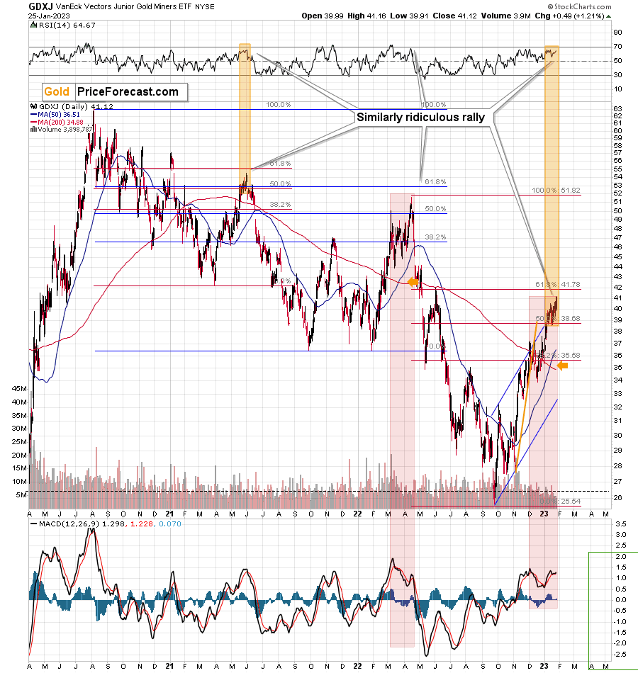
Junior miners moved above their 50% Fibonacci retracement based on the 2022 decline, but the GDXJ ETF did not move to its 61.8% Fibonacci retracement.
- Well, so? What’s so special about it?
Everything!
That's exactly how high this junior miners ETF corrected in mid-2021 and 2022 before the decline resumed, and the slide was bigger in the second case. That's intriguing because it's possible that because the correction is now based on a larger decline, the subsequent plunge will be — once again — larger.
Getting back to the original observation, the two declines that were corrected in the above-mentioned way started at the same top – the 2020 high.
The first correction that I marked with red Fibonacci retracement levels started from the early-2021 bottom.
Gold stocks corrected more than half of the decline (not more than 61.8% thereof), the RSI moved close to 70, and there was a final, irrational pop-up in prices. That was the top. I marked it with an orange rectangle.
The second correction that I marked with blue Fibonacci retracement levels started from the early-2022 bottom.
Gold stocks corrected more than half of the decline (but not more than 61.8% thereof), the RSI moved close to 70, and there was a final, irrational pop-up in prices, and that was the (2022) top. I marked it with a red rectangle.
What do we see now? The decline that is being corrected started in 2022, and the corrective upswing started in the final part of 2022.
Gold stocks corrected more than half of the decline (not more than 61.8% thereof), the RSI moved close to 70, and there was a final, irrational pop-up in prices. I copied both of the above-mentioned rectangles to the current situation, and it’s obvious that there’s also a similarity in terms of indicators.
In the first analogy, the similarity is in the RSI indicator (upper part of the chart), and in the second analogy, the similarity is in the MACD indicator (lower part of the chart).
Also, please note that the 50-day moving average just moved above the 200-day moving average, which means that a “golden cross” formed. This is a supposedly bullish indication, but history doesn’t confirm this description. In fact, the last time we saw it, was in early 2022, close to the yearly top. Consequently, it’s not a bullish indication right now.
Also on an immediate-term basis, we see that despite the very recent strength, gold juniors really don’t want to move to new highs. They erased almost their entire pre-market gain in today’s London trading.
On the below chart, I marked just how perfectly the recent price moves played out according to the Elliott Wave Theory.
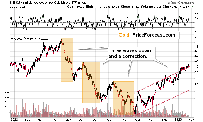
Of course, EWT is not the only tool that one could use, and I find other technical tools more useful, but still, this kind of pattern-following is uncanny.
The classic EWT pattern is three waves down (I marked those with orange rectangles) and then a correction consisting of two smaller waves.
That’s exactly what we have seen in recent months. The September–now pattern appears to be the above-mentioned correction.
I previously wrote that the Dec. 1 small breakout above the upper red line didn’t have meaningful bullish implications as it hadn’t been confirmed. And indeed, it was invalidated. The same happened very recently.
Now, since this pattern is complete, another huge 3-stage move lower can – and is likely – to unfold. This is very bearish for junior mining stocks (as well as for gold, silver, and probably other commodities and stocks), and the fact that juniors are already showing weakness relative to gold (the latter was almost flat yesterday, while miners declined) serves as a bearish confirmation. As always, I can’t guarantee anything, but in my view, the profits that can be reaped on this upcoming slide can be enormous.
Meanwhile, the relative performance of junior miners compared to senior miners continues to deteriorate in a medium-term trend.
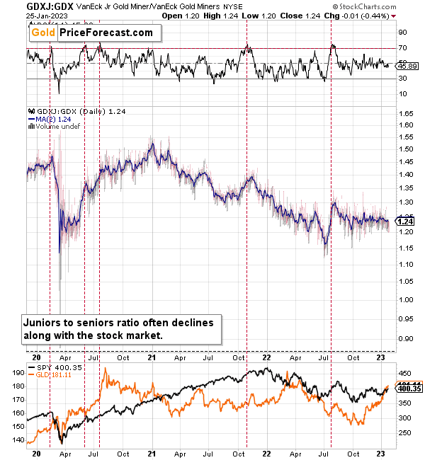
During this quick upswing, juniors rallied relative to seniors, but this is just a very short-term move that’s within a short-, and medium-term downtrends.
This implies bigger declines in the GDXJ in the future.
Also, let’s not forget about the forest while looking at individual trees. By that, I mean looking at how gold stocks perform relative to gold. That’s one of the major indications that the current situation is just like what we saw at the 2012 top.
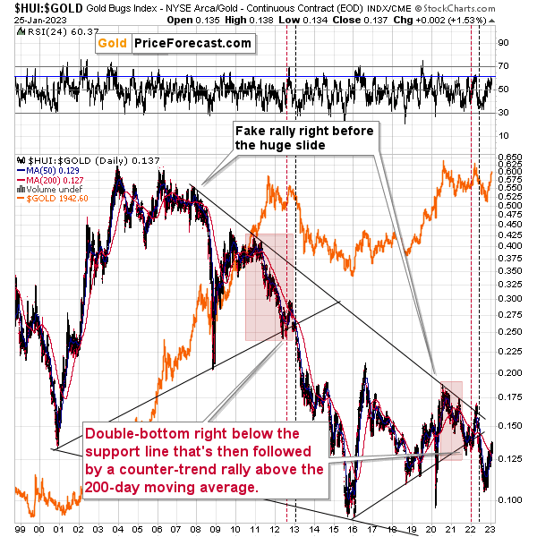
The situation in the gold stock to gold ratio is similar to what we saw in late 2012 and early 2013. The HUI to gold ratio invalidated its first attempt to break lower (marked with red, dashed lines), but after a corrective upswing, it then broke lower more decisively. That’s what I marked using black, dashed lines.
Recently, we saw a quick upswing in the ratio, but that’s not a game-changer – even the biggest declines had corrections in the past.
If history is to rhyme, we’re about to see a profound decline. In fact, we’re likely already past its beginning.
Also, please note that the pattern that we currently see, which started in early 2016, is somewhat similar to what happened between 2003 and 2008.
Back in 2008, the breakdown from the consolidation resulted in sharply lower ratio values and much lower prices of gold stocks.
So, if the situation is analogous to 2012-2013, we’re likely to see a big decline in the following weeks/months, and if it’s analogous to 2008, we’re likely to see an enormous decline in the following weeks/months.
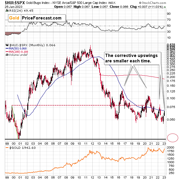
Interestingly, the situation in the gold stocks to other stocks ratio (HUI Index vs. S&P 500 Index) provides the same implications but from a different angle.
The corrective upswings that we’ve been seeing since 2015 are getting smaller and smaller. The current one is visibly smaller than what we saw last year.
Consequently, it seems that the ratio is ripe for a breakdown below the 0.05 level. The next support is provided by the all-time low at 0.026. And yes, with the ratio at 0.065 right now, this implies a decline by about 60%. If the HUI Index were to decline by 60% right now, it would have to move to about 100. If the stock market declined as well, it would imply the HUI was even lower.
Declining stock prices would only add fuel to the bearish fire (after all, gold stocks are… just stocks) and that’s exactly what’s likely to happen.
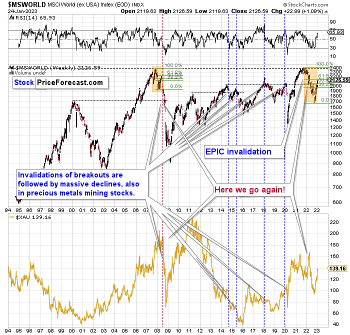
Just like what we saw in the case of copper and gold, world stocks corrected about 61.8% of their preceding decline. And that’s extremely bearish given the self-similarity to 2008.
Please note that the initial decline was now bigger than what we saw in 2008. Back then, stocks corrected about 61.8% of their initial decline before tumbling. If stocks are not able to do the same thing now – and they might not be – then the following slide could be even bigger than what we saw in 2008. Naturally, this would be profoundly bearish for junior mining stocks.
This means that nothing really changed, and the situation remains extremely bearish based, i.e., on the analogy to what we saw after previous invalidations of long-term breakouts.
As a reminder, in early 2022, I wrote that the situation was very bearish as invalidations of previous breakouts were usually followed by massive declines – not just in stocks but also in precious metals.
When stocks invalidated their 2006 breakout in 2008, their prices truly crumbled.
We also saw that on a smaller scale in 2014, 2015, and early 2018.
We’re seeing it right now.
To clarify, we’re actually seeing the aftermath of the invalidation. The huge decline is already taking place.
The difference between now and 2008 is that back then the slide was more volatile, and we didn’t really see a visible correction during the plunge. This time, the decline is more measured, and we saw a correction to one of the most classic retracements imaginable – the 38.2% one. This correction doesn’t change the trend, which remains down.
Based on what happened in 2008, it seems that stocks are about to move much lower in the following months.
Let’s take a look at the markets from a more short-term point of view and from the U.S. perspective.
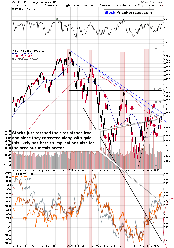
In short, stocks are once again trying to move above the lower of their declining resistance lines and the 4,000 level (in the S&P 500).
The previous attempts failed, so the odds are that the current one will fail too.
Consequently, my previous comments on the above chart remain up-to-date:
The broad market moved lower this week, and there are two good reasons to think that this time, the small move lower is just the beginning of a much bigger move to the downside.
One of the reasons is that this move lower came right after the triangle-vertex-based turning point. The declining black and red lines (both dashed) intersect at more or less the very recent top. As their name says, those turning points mark… Well, turning points. And since the most recent short-term move was to the upside, it currently has bearish implications.
The second reason is that stocks now broke below their rising support line (marked with a solid black line), and that’s not what happened during the two previous small moves lower.
The analogy in the price-volume link (marked with red rectangles) also points to much lower prices in the stock market.
Additionally, please note that stocks tried to move above their previous highs and the declining blue resistance line – and they failed. The invalidation served as yet another sell signal. It’s absolutely no wonder that we’re seeing a significant short-term decline right now.
Stocks corrected recently and they turned south after touching their 38.2% Fibonacci retracement and the lower of the declining resistance lines. This likely means that the next big move lower is already here.
Why is this important for gold and silver investors and traders? Because the last two big moves took place more or less in line with each other – in stocks and in precious metals (and miners). The slide in stocks could also trigger something similar in the case of commodities like crude oil. The same thing is likely to happen again this time, especially given what’s happening in the USD Index.
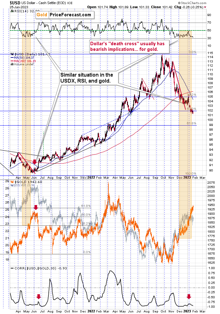
Namely, the USD Index appears to be bottoming at its 50% Fibonacci retracement.
Well, to be precise, the USDX is trading slightly below its 50% retracement at the moment of writing these words, but not significantly so. Given that the USDX reversed at its mid-2022 bottom, it’s likely that we’ll see a comeback above the 50% retracement any day or hour now.
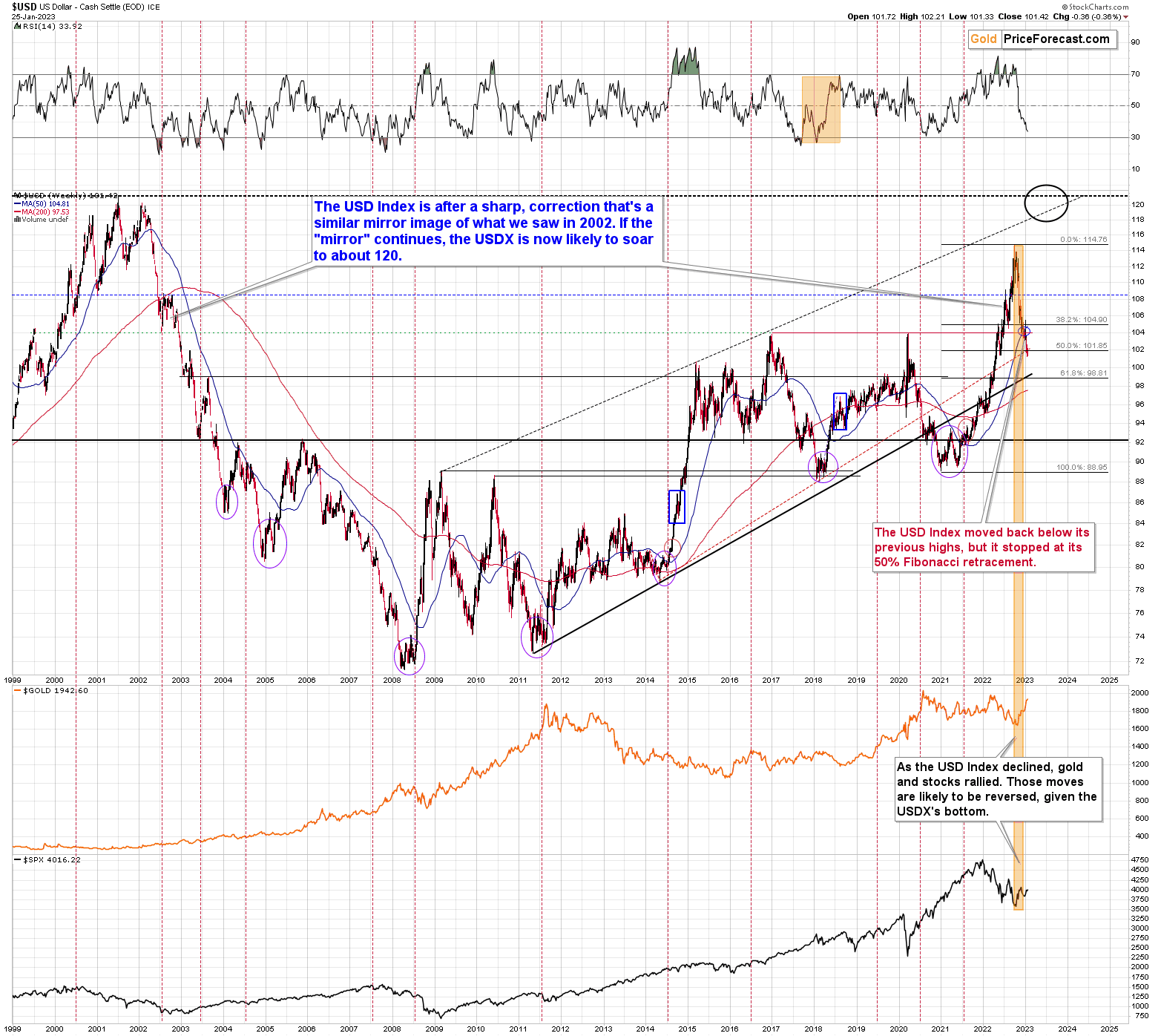
While it’s true that the USD Index moved a bit below its 2016 and 2020, it’s also true that the 50% Fibonacci retracement is a very strong support level. And given the analogy to what happened during USDX’s previous rally above 110, it seems that the USD Index just did what it was “supposed to do” during this big upswing.
And – as I mentioned above – the move below the 50% retracement is tiny so far and quite likely to be reversed given another medium-term support that was just reached.
After a similar correction in 2000, the USD Index bottomed a bit below its 50-week (blue line on the above chart) moving average.
It also bottomed below the previous important (early 2020) high, which means that the current move back below the 2016 and 2020 highs is not as bearish as it might seem at the first sight.
All in all, the USD Index appears to be bottoming here and the precious metals sector appears to be topping.
Overview of the Upcoming Part of the Decline
- It seems to me that the corrective upswing is over (or about to be over) and that the next big move lower is already underway (or that it’s about to start).
- If we see a situation where miners slide in a meaningful and volatile way while silver doesn’t (it just declines moderately), I plan to – once again – switch from short positions in miners to short positions in silver. At this time, it’s too early to say at what price levels this could take place and if we get this kind of opportunity at all – perhaps with gold prices close to $1,500 - $1,550.
- I plan to switch from the short positions in junior mining stocks or silver (whichever I’ll have at that moment) to long positions in junior mining stocks when gold / mining stocks move to their 2020 lows (approximately). While I’m probably not going to write about it at this stage yet, this is when some investors might consider getting back in with their long-term investing capital (or perhaps 1/3 or 1/2 thereof).
- I plan to return to short positions in junior mining stocks after a rebound – and the rebound could take gold from about $1,450 to about $1,550, and it could take the GDXJ from about $20 to about $24. In other words, I’m currently planning to go long when GDXJ is close to $20 (which might take place when gold is close to $1,450), and I’m planning to exit this long position and re-enter the short position once we see a corrective rally to $24 in the GDXJ (which might take place when gold is close to $1,550).
- I plan to exit all remaining short positions once gold shows substantial strength relative to the USD Index while the latter is still rallying. This may be the case with gold prices close to $1,400 and GDXJ close to $15 . This moment (when gold performs very strongly against the rallying USD and miners are strong relative to gold after its substantial decline) is likely to be the best entry point for long-term investments, in my view. This can also happen with gold close to $1,400, but at the moment it’s too early to say with certainty.
- The above is based on the information available today, and it might change in the following days/weeks.
You will find my general overview of the outlook for gold on the chart below:
Please note that the above timing details are relatively broad and “for general overview only” – so that you know more or less what I think and how volatile I think the moves are likely to be – on an approximate basis. These time targets are not binding nor clear enough for me to think that they should be used for purchasing options, warrants, or similar instruments.
Letters to the Editor
We received a few messages over e-mail, but as we are moving to our new platform, we will be transferring them below the articles as comments – and that’s where we’ll be replying to them.
Asking your questions below the articles or in the spaces called “Ask the Community” or “Position Sizes” directly will help us deliver a reply sooner. In some cases, someone from the community might reply and help even before we do.
Please remember about the Pillars of our Community, especially about the Kindness of Speech Pillar.
Also, if there’s anything that you’re unhappy with, it’s best to send us a message at [email protected].
Please note that this section is going to go away within the next 1-8 weeks, as you can add comments/questions below the article on Golden Meadow – the platform that we’re using to provide our analyses. Your notification e-mails include an invitation link that allows you to access the “Gold Trading Alerts” space.
Also, if you haven’t had the chance to see the video, in which I’m talking about the new platform and why we essentially moved from Sunshine Profits to Golden Meadow, I strongly encourage you to do so:
Summary
Summing up, it seems that the major bottom in the USD Index is in (or at hand), while the correction in stocks, gold, silver, and mining stocks is over – or very close to being over.
Gold and silver correct about 61.8% of their 2022 decline, while junior miners corrected a bit more than 50% of the decline. The breakouts above those levels were invalidated recently and we see another attempt to move higher. Given miners’ weakness relative to gold, gold’s very long-term resistance (the 2011 high!) and the situation in the USD Index, it seems that the next big move lower in the precious metals sector is about to start.
Now, as more investors realize that interest rates will have to rise sooner than expected, the prices of precious metals and mining stocks (as well as other stocks) are likely to fall. In my opinion, the current trading position is going to become profitable in the following weeks, and quite possibly in the following days. And while I can’t promise any kind of performance, I fully expect it to become very profitable before it’s over and to prolong our 2022 winning streak.
After the final sell-off (that takes gold to about $1,350-$1,500), I expect the precious metals to rally significantly. The final part of the decline might take as little as 1-5 weeks, so it's important to stay alert to any changes.
As always, we'll keep you – our subscribers – informed.
To summarize:
Short-term outlook for the precious metals sector (our opinion on the next 1-6 weeks): Bearish
Medium-term outlook for the precious metals sector (our opinion for the period between 1.5 and 6 months): Bearish initially, then possibly Bullish
Long-term outlook for the precious metals sector (our opinion for the period between 6 and 24 months from now): Bullish
Very long-term outlook for the precious metals sector (our opinion for the period starting 2 years from now): Bullish
As a reminder, Gold Investment Updates are posted approximately once per week. We are usually posting them on Friday, but we can’t promise that it will be the case each week.
Our preferred ways to invest in and to trade gold along with the reasoning can be found in the how to buy gold section. Additionally, our preferred ETFs and ETNs can be found in our Gold & Silver ETF Ranking.
Moreover, Gold & Silver Trading Alerts are posted before or on each trading day (we usually post them before the opening bell, but we don’t promise doing that each day). If there’s anything urgent, we will send you an additional small alert before posting the main one.
Thank you.
Przemyslaw K. Radomski, CFA
Founder, Editor-in-chief

