
- Euro & USD Indices
- General Stock Market
- Crude Oil
- Correlation Matrix
- Gold
- Silver
- Mining Stocks
- Is crude oil also a good candidate to short?
- Summary
There are several indications that the currency war is heating up, the gloves are coming off and new players are piling into the barroom brawl. First, Australia unexpectedly cut interest rates, then; both the Swedish and New Zealand central bank governors were making their moves. Way down under, New Zealand’s central bank last week acknowledging that it had intervened in foreign exchange markets to try to fight any further appreciation of the country’s currency, known as the kiwi. The New Zealanders are worried about a runaway property market driven by global money rushing into the country.
Wait a minute... that’s exactly the same scenario in Israel.
This week the Bank of Israel stepped up its efforts to curb the appreciation of the shekel surprising the markets by unexpectedly cutting its interest rate and announcing a program to purchase foreign currency. A weaker currency boosts exports, driven by cheaper prices. The smaller economies are reacting to all the quantitative easing by the world’s large economies.
Israel’s central bank, headed by Stanley Fischer, one of the most accomplished central bankers in the world, cut the key interest rate by a quarter of a percentage point to 1.5% to a three-year low.
Fischer told Bloomberg that the move came “in light of the continued appreciation of the shekel, taking into account the start of natural gas production from the Tamar gas field, interest rate reductions by many central banks – notably the European Central Bank, the quantitative easing in major economies worldwide and the downward revision in global growth forecasts.”
Despite the global financial threats, the Israeli economy is still in the black and healthier than the economies of many European countries. The shekel has risen by nearly 9% over the past six months, making it one of the best-performing currencies in the world, after the Mexican peso. Israel’s central bank also plans to buy around $2.1 billion in foreign currencies.
Israel's economy is heavily dependent on exports, and a strong shekel weakens the competitiveness of Israel's products abroad.
It was Japan this year that shot off the latest round in the currency war after announcing monetary stimulus of historic proportions. Recent steps by the world’s third-largest economy have become a central concern. The impact of the country’s aggressive new monetary policy has been making central bankers around the world lose sleep. Is the Bank of Japan trying to influence exchange rates to give its exporters an advantage? Other countries might react in kind, which is exactly what happens in currency wars.
Actually, this is not surprising to us. The global increase in the money supply and lowering of interest rates is not surprising because countries will have to keep doing that in order to keep their exports competitive. It is a currency war and those who inflate first, get the most benefits. They are short-lived because other countries will follow and the ultimate result will eventually be huge inflation on a global scale, but, again, on a short-term basis, the monetary authorities are pressed not to stay behind others. The comments about the lack of currency war are not surprising either. Speaking publicly about it would simply encourage other countries to join it sooner, and those that are already printing more money don’t want that to happen as it means that the above-mentioned advantage that they gained would disappear.
Implications for gold? Bullish in the long run, nonexistent in the short run.
On another topic, the latest World Gold Council Gold Demand Trends report shows that the gold market is driven by diverse global demand, and the appetite for owning gold jewelry, bars and coins continues to grow.
“The price drop in April, fueled by non-physical moves in the market, proved to be the catalyst for a surge of buying that has left many retailers short of stock and refineries introducing waiting lists for deliveries,” said Marcus Grubb, Managing Director of Investment at the World Gold Council. “What these figures show is that even before the events of April, the fundamentals of the gold market remain robust with; growing demand in India and China, central banks consistently adding gold to their reserves and strong buying of investment products such as gold bars and coins.”
The report, for the period between January-March 2013, shows that total jewelry demand was up 12% year-on-year in Q1 2013, driven mainly by Asian markets. For example, jewelry demand in China was up 19% on the same period last year and stood at a record 185 tons. Demand in both India and the Middle East was up 15% respectively and in the US, demand showed a significant increase, 6%, for the first time since 2005.
Demand for gold in China and India was also fueled by an increase in bar and coin sales - up 22% year-on-year in China and a whopping 52% in India. The US also saw a growing hunger for bars and coins-- up 43% compared with the same quarter in 2012.
There’s significant investment demand for physical gold bullion at the current prices – what does it mean for the market? That it’s going higher in the long run and that the current move down is just a correction. It doesn’t imply, however, that the bottom is already in or that it will form without additional temporary downswing.
Let's begin this week's technical part with the analysis of the Euro Index. We will start with the long-term chart (charts courtesy by http://stockcharts.com.)
Euro and USD Indices
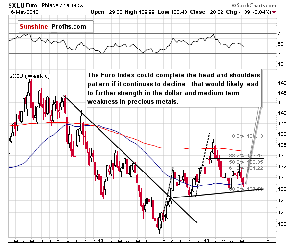
We begin this week with the long-term Euro Index chart. The index has declined for the past two weeks and it seems now that we should consider the possibility that the head-and-shoulders pattern will be completed here. Such a completion would take the Euro Index much lower.
The size of the projected decline after the breakdown and completion of the pattern is roughly the same size as the height of the head in the pattern. If this decline is attached to where the breakdown occurred, the projected downside target level will be about equal to the 2012 low (in the 121 – 122 area). Such a move would likely contribute to a USD Index rally as we’ll see in the next chart. All of this could also be bearish for gold in the medium term if it all does indeed materialize.
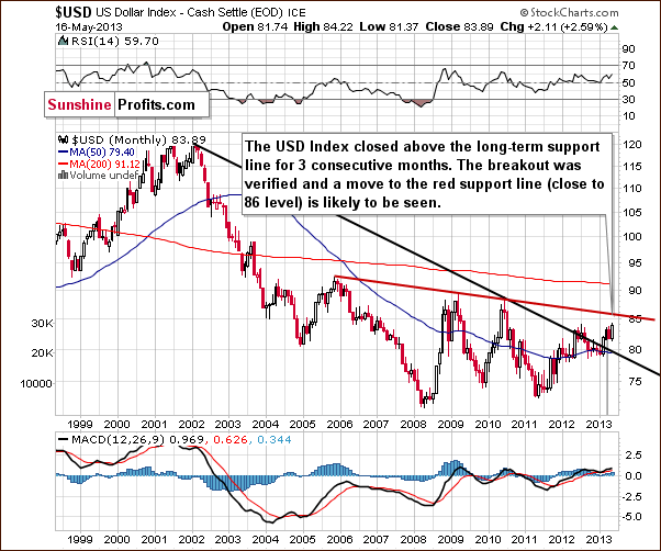
In this week’s very long-term USD Index chart, we see that more moves to the upside took place this week. As we stated in last week’s Premium Update:
The index has actually confirmed a breakout above the very long-term resistance line. It has closed above it now for three consecutive months (yes, months). While a correction to the 80 level is still possible in the short term, aneventual move to the upside is now more likely than not.
This week’s price action was in tune with what we expected after the recent breakout and the situation remains bullish. The next significant target is close to the 86 level.
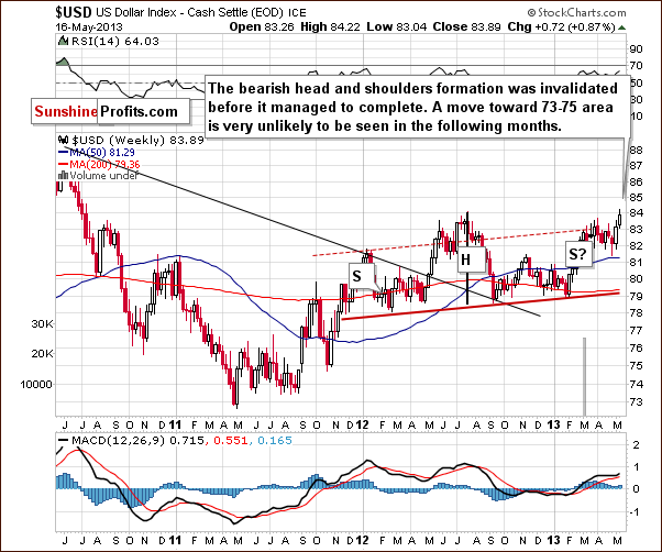
In the medium-term USD Index chart, this week a move was seen to the 2012 high. This invalided the head-and-shoulders pattern here before it was completed. The right arm in the pattern is no longer visible and the needed move to the 73 to 75 level (to complete the pattern) is not likely to be seen in the coming weeks. Last week, we mentioned that this pattern would probably be invalided because of the very long-term breakout, and this is precisely what happened. The situation is also more bullish here this week.
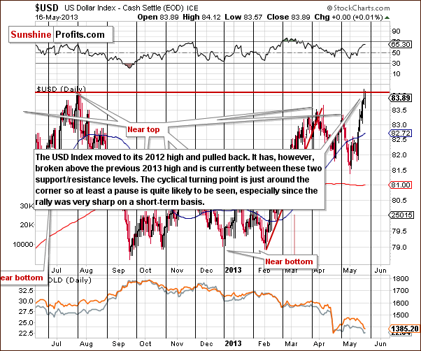
In the short-term USD Index chart, a pause was seen after the index reached a resistance level. The index is now between two support and resistance lines: the 2013 high provides support and the 2012 high is the resistance. We could see some sideways trading for a while before the next move to the upside, or higher index levels could be seen right away.
A reversal is likely once the cyclical turning point is reached, but the situation is a bit unclear since a resistance line has been reached already. Normally, a pause would be likely, but it could be the case that the pause has already been seen. All in all, what we wrote in Wednesday’s Market Alert seems up-to-date:
Speaking of the USD Index, it just closed above the March high and is quickly approaching its 2012 high (84.10) - at the moment of writing these words it's trading at 83.97. Another thing that's approaching is the next cyclical turning point - it's about a week away. At this time it's unclear, however, whether USD will really decline, or will the turning point simply trigger a consolidation that we would expect to see anyway after a breakout above an important resistance level (and the 2012 high - 84.10 - is definitely one). Please note that USD Index consolidated in a zig-zag pattern in April, so from a medium-term point of view, the current rally is not excessive and a bigger correction doesn't appear imminent. Consequently, even if the USD Index seems overbought on a short-term basis, the analysis of the medium-term picture suggests that an eventual correction may not provide a major bullish impact for precious metals, as it might not be significant enough.
Summing up, the situation remains bullish for the USD Index. The recent declines in the Euro Index along with the breakout in the USD Index will likely keep the current bullish outlook in place for the coming weeks. The implications of the bullish situation here, especially for the medium term, are bearish for the precious metals sector as the correlation between the dollar and the metals is negative as we’ll see in our gold and silver correlations section.
General Stock Market
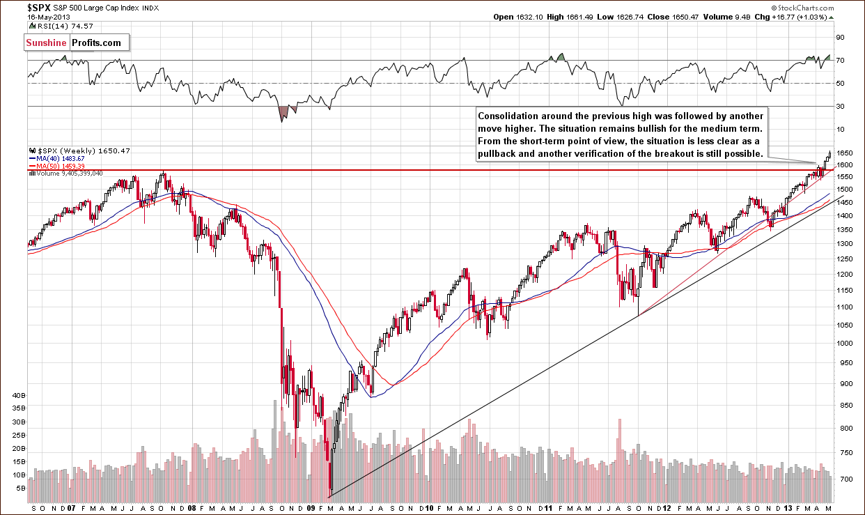
We turn now to the long-term S&P 500 Index chart. The stocks continue to move higher this week as expected. The situation is overbought on a short-term basis, but we do not expect to see an invalidation of the breakout above the 2007 high. If anything, we could see stocks move back to this level, which could further verify the breakout and allow them to gather strength in advance of the next rally. To help determine whether the correction will be seen immediately, we turn now to the financial sector that used to lead other stocks.
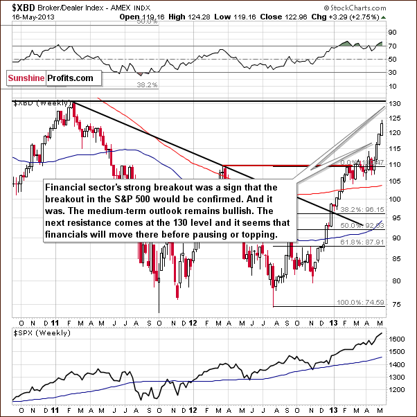
In this week’s Broker-Dealer index chart (proxy for the financial sector), we do not see any indications that stocks will be correcting any time soon (except for the RSI indicator that has been – with small pauses – overbought for months). The financials did not move to the next important resistance level. This eventual move will likely trigger a correction, but it will probably not be significant for either the general stock market. The above index could move to the previous support level (110) and verify it as resistance.
Summing up, the situation remains bullish for the medium term, and although a short-term correction is likely not too far off, we don’t expect to see it immediately.
Crude Oil
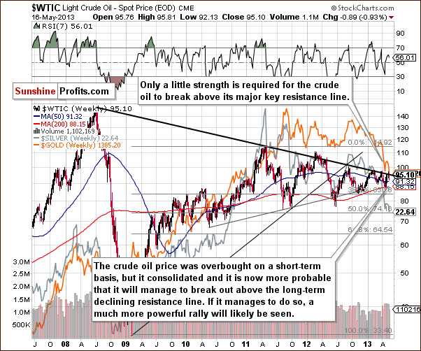
In this week’s Crude Oil price chart, we see that oil is in a position to possibly move higher once again (for the third time this year). We could finally see a breakout here, but since it does not seem imminent, we prefer to wait for the breakout and its confirmation before saying that higher prices are likely. The short-term picture is unclear at this time.
We replied to most questions that we received recently in this week’s Market Alerts and the remaining one is about crude oil, so it seems best to include it here instead of creating the “Letter” section this week:
Q: Thanks for the excellent recommendation to short commodities. I am shorting only silver at present and doing great. Can you advise if crude oil is also a good candidate to short? Thanks.
A: We're not certain enough about crude oil to suggest any position at this point. It invalidated its breakout once again, but the last few times we saw that, the following declines were relatively small, not worth betting on, in our opinion (in hindsight). Actually, we are closer to suggesting long positions rather than short positions in oil. But only after crude oil breaks above the declining resistance line and (!) verifies this breakout.
Gold and Silver Correlations
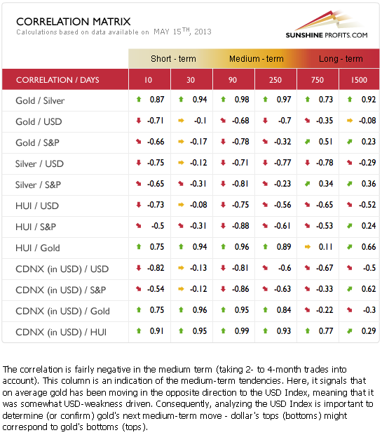
The Correlation Matrix is a tool which we have developed to analyze the impact of the currency markets and the general stock market upon the precious metals sector, (namely: gold correlations and silver correlations). Little has changed this week and last week’s Premium Update analysis is worth repeating here:
The short-term situation here is mixed and no real implications can be drawn at this time. The medium-term correlations are negative for the precious metals with both the USD Index and the general stock market. The precious metals are still pretty much anti-asset at this time. The medium-term odds, which favor a USD Index rally, have now painted a bearish picture for gold, silver and the precious metals mining stocks.
Gold
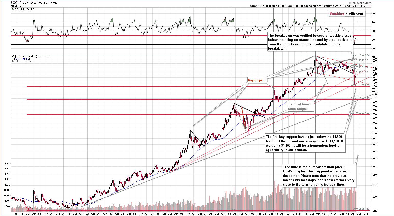
In this week’s very long-term gold chart, we see a situation quite similar to the declines to 2008, where a sharp pullback was followed by a continuation of the severe decline. The most bearish factor here is the shape of the decline, which is a reverse parabola. This formation results in accelerated declines and makes it difficult to tell how low prices will go. Although the declines will likely end shortly, the increased volatility could result in prices moving very low quickly while still being in tune with the trading pattern. This reverse parabola has been in place since last October.
The very long-term cyclical turning point suggests that a local bottom will be seen soon – within the next month, probably about 2 weeks from now. Keeping both of these factors in mind, we should prepare for even bigger declines. The $1,100 level is still pretty far away but we can’t rule this out as a possible low. Our most-probable target is still $1,285, based on the Fibonacci retracement level.
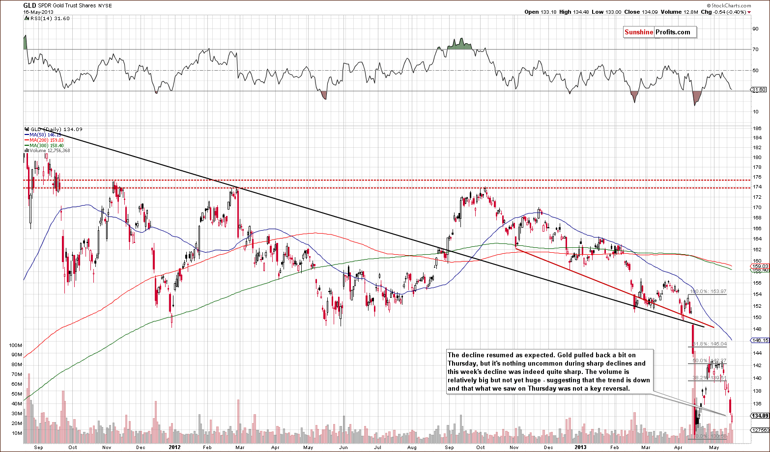
In this week’s medium-term GLD ETF chart, we see that prices pulled back on Thursday. Was this a sign of strength or perhaps it marked a bottom? We don’t think so as the volume level was not significant. It seems more likely that it was just a pause after the very sharp decline. It is not uncommon to see a pullback at this point in the decline (after all, this week’s decline was sharp), and the trend remains down.
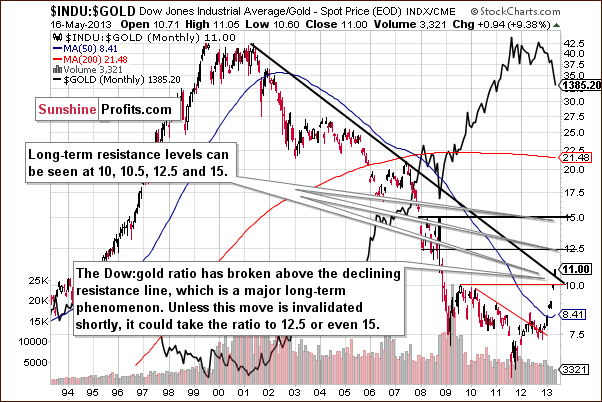
In this week’s Dow to gold ratio chart, we saw an important breakout above the declining long-term resistance line. This has bearish implications for gold. The next resistance level for this ratio is at 12.5 and with it currently at 11, declines in gold will surely be needed in addition to higher stock prices in order for the ratio to move this much higher (it seems that a move higher in the general stock market will not be enough for the ratio to move that high soon). The implications are, of course, bearish.
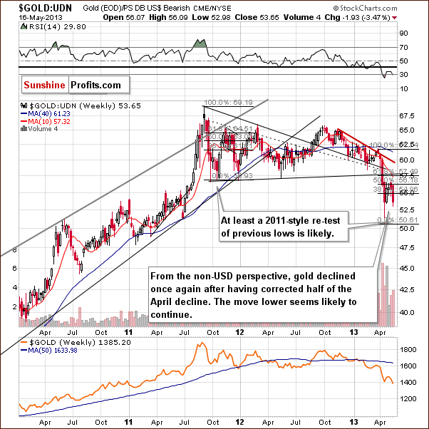
In this week’s chart of gold from the non-USD perspective, we see that declines have continued, the 50% Fibonacci retracement level was reached, and gold turned lower soon after. It seems that prices will decline to at least the 2013 low, similar to what we saw in 2011. Other factors say that gold will decline as well, but even without them, the implications of repeating past patterns here suggests lower prices based on the this chart alone.
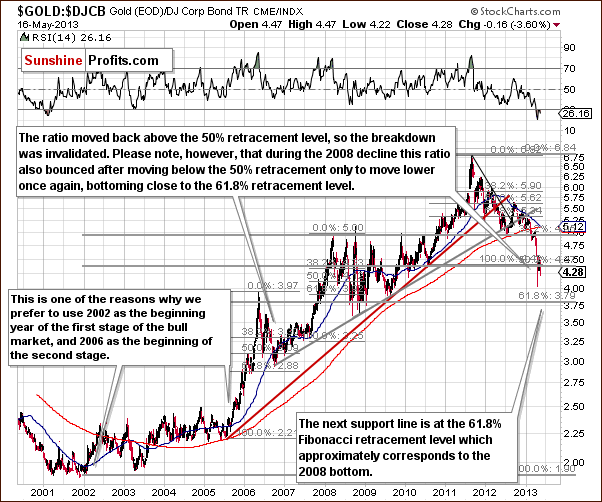
In this week’s gold to bonds ratio chart, another important ratio for gold, we have yet another chart where we see that declines have continued and will likely continue to be seen after the pullback. Remember that back in 2008, declines in gold continued until this ratio was below or close to the final (61.8%) Fibonacci retracement level. We have similar expectations at this time, and the final Fibonacci retracement level is at nearly the same price level which it was back then.
Summing up, gold prices declined this week and paused on Thursday but it still does not seem that this period of decline is completely over. We expect lower prices in the coming weeks with a bottom eventually being formed.
Silver
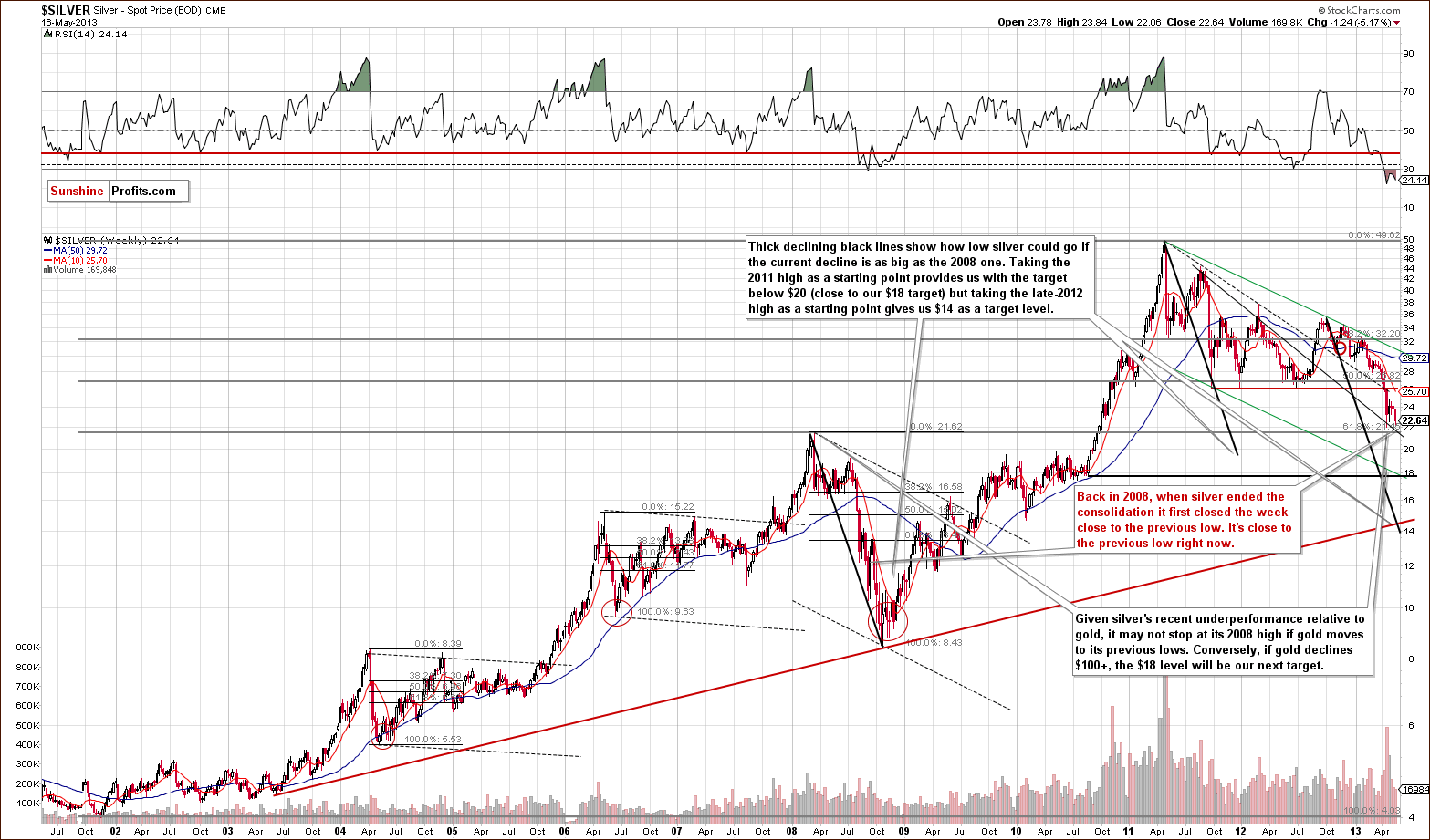
In this week’s very long-term silver chart, we have further similarities with the declines of 2008. We have seen a 3 week consolidation period after the initial plunge before prices moved lower once again. Note how silver moved lower back then after initially correcting and closed the week close to the previous local low that ended the previous sharp decline. This is about where we are right now. If silver closes the week close to the April low, at it’s there at the moment of writing these words, we will have another confirmation of the similarity between now and 2008.
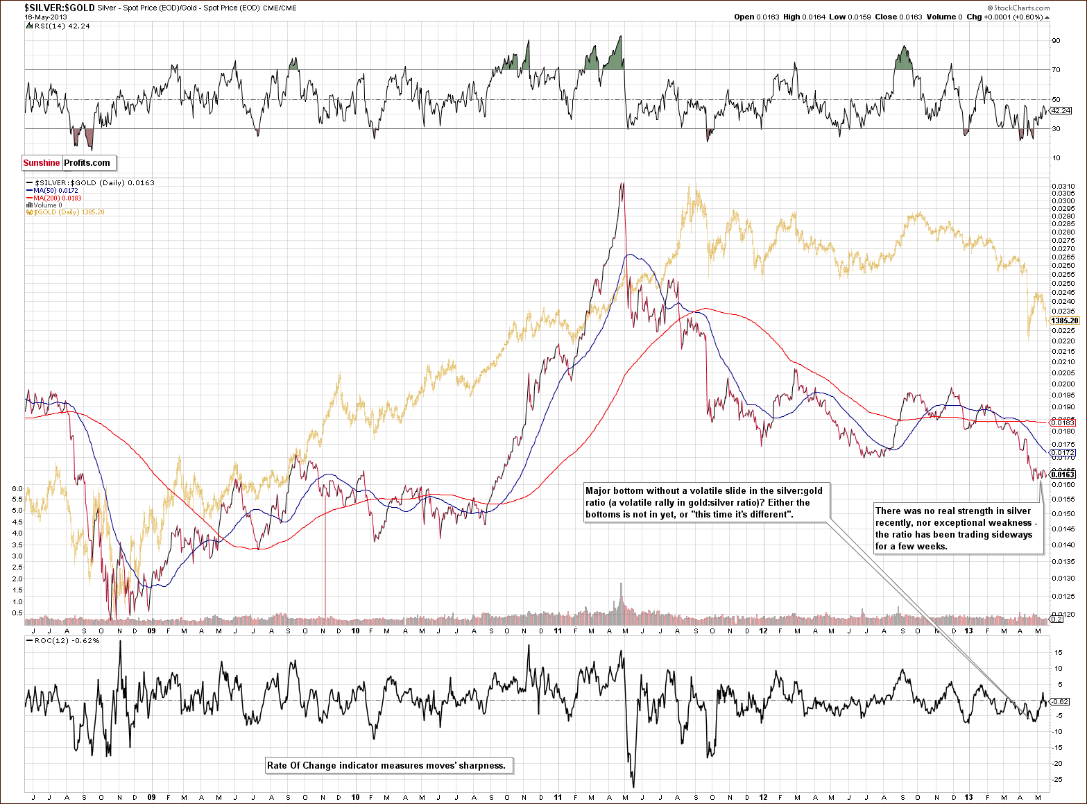
Turning now to our silver to gold ratio chart, very little has happened with this ratio for the past two weeks. The precious metals consolidated in a downtrend. Another move to the downside seems likely and this does not bode well for silver for the short term. We have previously discussed how the final bottom for the white metal is often preceded by a big underperformance of silver to gold. This is yet to be seen, so lower prices are likely still in the cards for the white metal, and the rest of the sector as well.
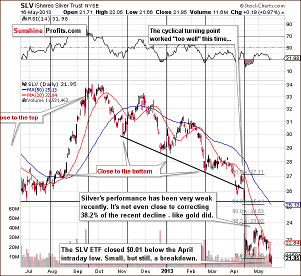
In the short-term SLV ETF chart, we saw a breakdown below the April low on Wednesday and on Thursday silver closed below this low as well (even if it was only $0.01 lower). One more daily close below this important low will confirm the breakdown, and we’ll also have a weekly close below an important support level and below the April low, so more declines are probable here. All in all, if silver closes below $21.96, then the breakdown will be confirmed.
Summing up, no true underperformance of silver to gold has been seen. Last week’s higher silver prices were just a one-time phenomenon and waiting for a confirmation of this strength turned out to be a good approach since silver subsequently declined. The short-term trend for the white metal remains down.
Gold and Silver Mining Stocks
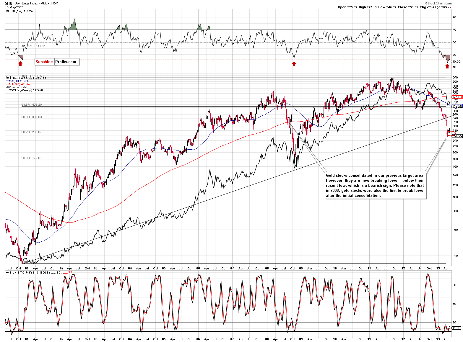
In this week’s very long-term HUI index chart, we have seen a move below the previous low as was also the case with the SLV ETF. This has bearish indications for the sector, much the same as was the case in 2008 when the gold stocks were the first to break below the level of their previous low. This then dragged the other parts of the sector lower as well. Declines also continue on a relative basis here.
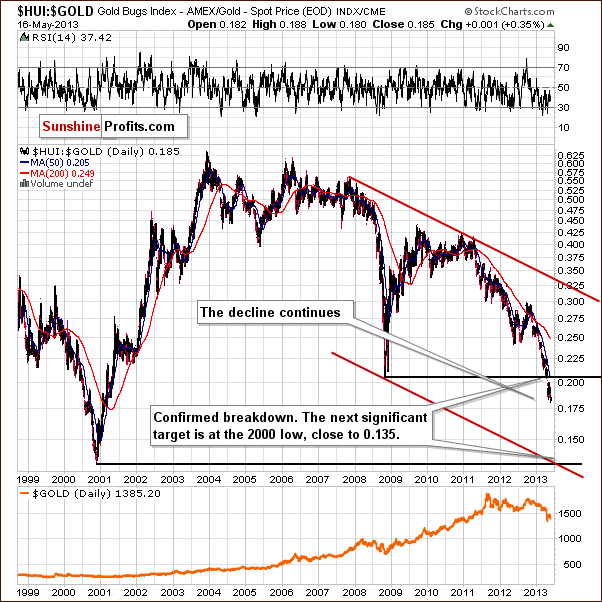
Once again we include our gold stocks to gold ratio chart. Comments made in last week’s Premium Update remain up-to-date at this time and the bearish outlook continues to be supported by this chart:
The trading channel and the next horizontal support intersect at a point much lower than where this ratio is today. Of course, the existence of a target level by itself is no indication that it will be reached; the trend has to be in place as well. The point here is that the ratio has already broken below the previous late 2008 major low and is now a bit more than 5% beneath it. This is a major breakdown and it was confirmed. The implication is that the trend is still down.
With the trend being down and accelerating and the recent breakdown being confirmed, there is a good possibility that the miners will decline significantly once again. This makes the previously mentioned target level a very important one. At this time it seems likely that the ratio will move to its 2000 low – close to the 0.135 level.
If gold stocks decline relative to gold as they did late in 2000, and gold declines to $1,300 or slightly higher, the target level for the HUI Index would be slightly above the low of 2008 – around the 180 level.
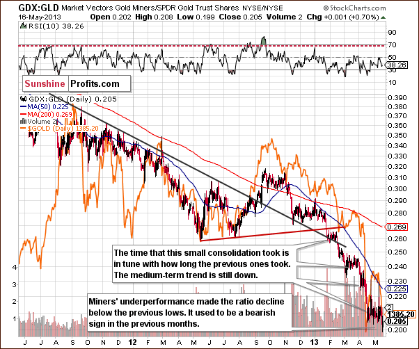
In this week’s GDX to GLD ratio chart, we see that the underperformance of the mining stocks continues on a short-term basis as well. In previous months, similar breakdowns in the ratio meant that lower prices in the sector were about to accelerate.
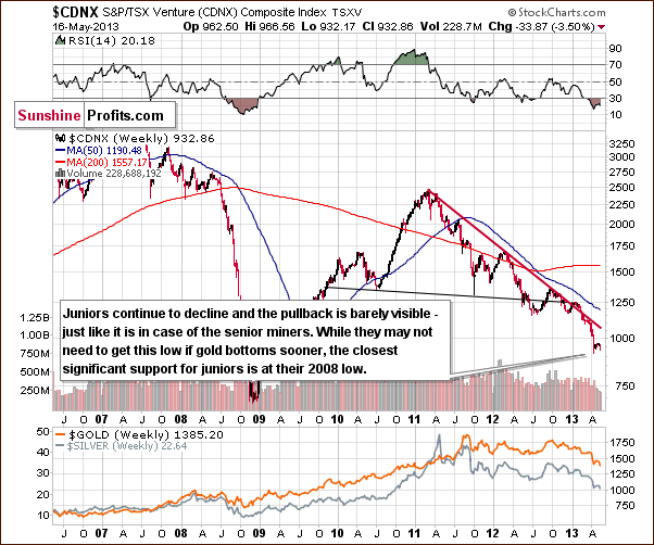
We now turn to the Toronto Stock Exchange Venture Index chart (which is a proxy for the junior miners as so many of them are included in it). The picture remains bearish here as the recent correction was quite small and almost immeasurable. Further weakness appears likely.
The bad news is that the next support level is at the 2008 lows. It is unclear at this time whether or not the juniors will go that low. What is clear is that there are no bullish implications to be seen here this week.
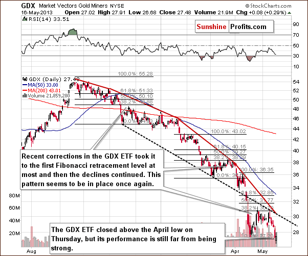
In this week’s short-term GDX ETF chart, we see similarities in a way to the SLV ETF chart. A breakdown was seen followed by a move to the upside. The GDX ETF, however, closed above the April low (still, fairly close to it). The underperformance of the miners relative to gold remains in place. The April breakout was initially invalidated and was followed by a significant decline, so we don’t put much weight in the invalidation of yesterday’s breakdown. It’s simply not a bullish sign at this time given previous breakdowns in the previous months.
Our final chart this week is the long-term XAU index chart. The target level for the current decline is slightly above 80 and this is something that likely needs to be reached before the declines in the mining stocks and the precious metals sector come to a close.
Summing up, the situation in the mining stocks remains bearish for the short and medium term.
Summary
The long-term and medium-term outlook is bullish for the USD Index at this time. There is a possibility that a bearish head-and-shoulders pattern will be completed in the Euro Index, and this supports the bullish outlook for the dollar.
The general stock market situation remains bullish for the medium term. While a pullback to the level of the 2007 high for the S&P 500 is possible in the weeks ahead, it does not appear to be likely immediately.
The precious metals seem to have resumed their declines after gold verified its breakdown below the rising support line. Based on the long-term cyclical turning point, it seems that gold will bottom in a few weeks but since recent declines have been in a parabolic fashion, it is difficult to tell how low gold will go. The mining stocks and silver continue to underperform but it’s not yet extreme enough to signal a market bottom on its own.
Our best bet at this time is to buy back one half of long-term investment holdings when gold moves to $1,305, then wait with the other half for confirmation of the bottom or a move towards $1,100.
Trading – PR: Short gold, silver and mining stocks.
Trading – SP Indicators: No positions: SP Indicators suggest long positions but the new self-similarity-based tool suggests short ones for a part of the precious metals sector (gold, silver) and there are mixed signals for another part (mining stocks) and we think that overall they cancel each other out.
Long-term investments: No positions.
| Portfolio's Part | Position | Stop-loss / Expiry Date |
|---|---|---|
| Trading: Mining stocks | Short (half) | 305 (HUI) / - |
| Trading: Gold | Short (half) | $1,505 / - |
| Trading: Silver | Short (half) | $25.30 / - |
| Long-term investments: Gold | No position | Buy half at $1,305 |
| Long-term investments: Silver | No position | Buy half at $18.20 |
| Long-term investments: Mining Stocks | No position | Buy half at XAU 84 |
This completes this week’s Premium Update. Our next Premium Update is scheduled for May 24, 2013.
Thank you for using the Premium Service. Have a profitable week, a great weekend!
Sincerely,
Przemyslaw Radomski, CFA
P.S. I'd like to ask you a favor - please help us expand our services in the best direction. We created a single-page survey with 10 questions, which shouldn't take more than a few minutes to complete. Here's the link: take the survey.

