
- Euro & USD Indices
- General Stock Market
- Crude Oil
- Correlation Matrix
- Gold
- Silver
- Mining Stocks
- Letters from Subscribers
- Spreads gold vs. silver
- Probability of a decline to $1,300 and $1,200
- Moving into S&P instead of cash
- Gold and Silver Indicators ROI
- Summary
T.S. Eliot called April “the cruelest month” in his famous poem, and without a doubt April was cruel to many gold investors. Sunshine Profits subscribers who followed our suggestions in April avoided a share of the pain. Probably no one suffered more than hedge fund manager John Paulson. He is joined byhedge fund manager David Einhorn whose Greenlight fund took a big hit on its gold miners ETF holdings. Einhorn said recently what we would consider an understatement: "We were somewhat surprised by the swift decline in the price of gold in April." If they were following fundamental valuations and analysis only, then that’s not surprising. Paying attention to the breakdown below the key support level at that time, provided a sell signal.
According to reports, Paulson's $700 million gold fund lost 27 percent in April due to leveraged bets on gold, when the price of the metal swooned by 17 percent over a two-week stretch. What must hurt is that the majority of the money invested in the Paulson gold fund is believed to be the billionaire's own. Regulatory filings show that at the end of last year Paulson's firm was the largest holder of the SPDR Gold ETF, with 21.8 million shares. Paulson made his fame and fortune after he made $15 billion for his firm in 2007 by betting against subprime mortgages before the housing collapse.
Paulson started his gold purchases in early 2009, betting that gold would rise due to the government money printing machines. Paulson took a $1.3 billion stake in AngloGold Ashanti Ltd. (AU) and $2.8 billion of GLD when the metal was trading around $950 an ounce. He was the biggest holder of both at the end of last year, the most recent figures available. Even with all the negative press gold is still trading more than 50 percent higher than when Paulson started investing in the metal.
Gold has bounced back from its 9 percent drop on April 15, to $1,361 an ounce in New York. It closed yesterday at $1,458, still down 13 percent for the year.
How are some of the other legendary investors doing?
Jim Rogers recently said in an interview to Morningstar, that he is not disturbed by the recent tumble in gold prices.
“Gold had gone up 12 years in a row, without a down year, which is extremely unusual in any asset. Equally important, gold has only had one 30% correction in 12 years. Again, that is extremely unusual. Most things correct 30-40% every year or two. So the action in gold has been very unique and gold needed a correction. The main thing that caused it, as far as I am concerned, was that the market was ready. It needed it and it is good for gold to have a proper correction,” said Rogers. We agree. At the same time we would like to point out that this has no implications on the short term.
How does he see the future for gold?
“Certainly, over the course of ten years gold will go much, much higher because I don’t see any possibility that governments are going to stop printing money in the next decade,” he said. “And as long as that’s going to happen then gold is certainly going to go higher and probably much higher.” We agree once again.
In a recent interview in the South China Morning Post, George Soros says, “Gold was destroyed as a safe haven, proved to be unsafe. Because of the disappointment, most people are reducing their holdings of gold.” However, he also notes that central banks are still buying gold, so he doesn’t “expect gold to go down.”
One humorous headline asked: “Who’s smartest on gold – Chinese housewives or George Soros?”
As weird as this may sound, if we’re talking about the long term, we tend to side with the Chinese housewives who have been buying physical gold in unprecedented amounts.
Hong Kong government data this week shows that imports by China from Hong Kong more than doubled to an all-time high in March. India’s purchases are set to exceed 100 metric tons for a second month in May as jewelers rush to beat central bank curbs on imports by banks.
Buyers in mainland China purchased 223.52 tons of gold in March, including scrap, compared with 97,106 kilograms in February, according to Hong Kong government data. There were also reports of similar huge surges in demand for physical gold in India, Dubai and many other countries. Just the China purchases would account for roughly 10% of the gold mined each year.
According to the China Gold Association there is a shortage of gold jewelry inventory in the country after consumers bought up supplies.
Sharp declines in precious metals can happen, as we all witnessed last month. We are reminded that it was around this time two years ago that silver plunged 12 per cent in just 11 minutes (on a side note, we did mention that silver was vulnerable for a washout before that happened).
As we enter the summer, we want to know who is right, George Soros or the Chinese housewives who have been stocking up on gold. Let’s turn to the technical portion with analysis of the US Dollar Index. We will start with the very long-term chart (charts courtesy by http://stockcharts.com.)
USD Index
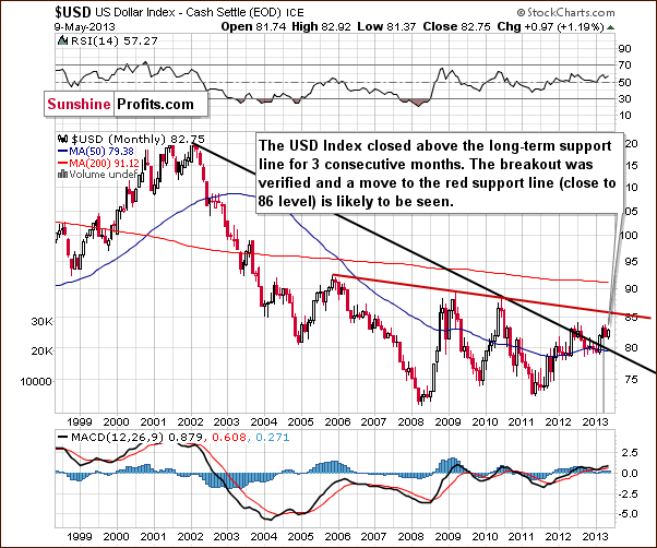
We begin this week with the very long-term USD Index chart. Very little has changed and the comments made in last week’s Premium Update remain up-to-date:
The index has actually confirmed a breakout above the very long-term resistance line. It has closed above it now for three consecutive months (yes, months). While a correction to the 80 level is still possible in the short term, an eventual move to the upside is now more likely than not. The closest target level seems to be slightly above 85 and although the 90 level could be in the cards as well, for now, we will focus on the first target level at this time.
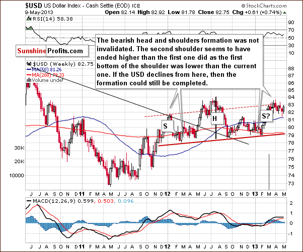
In the medium-term USD Index chart, there was basically no change as well this week. The head-and-shoulders pattern has not been invalidated (yet) as the index is still below the rising red resistance line and it’s definitely below its 2012 high. Although the pattern could still complete, it does not appear likely based on the long-term chart. The situation is bullish for the USD Index at this time and moves to the upside seem much more probable than the declines which are needed to complete the head-and-shoulders pattern here. In other words, it’s still possible for the USD Index to reverse its course and move lower (there are technical reasons for it on the above chart), but it doesn’t seem probable (based on the long-term chart).
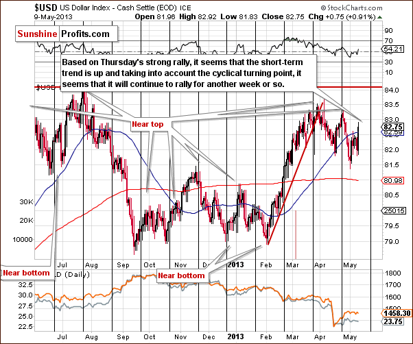
In the short-term USD Index chart, we saw a rally on Thursday and additional moves to the upside are likely since the cyclical turning point is still about a week away here. This room for additional rally could trigger declines in the precious metals. As for the likely impact on the precious metals, we will see that the short-term correlation between the dollar and the metals is unclear at this time when we get to our Gold and Silver Correlations section shortly.
Summing up, the main trend now is up for the USD Index, and this holds for the short term as well, because the cyclical turning point is still about a week away. Based on historical patterns, the index is likely to continue its current uptrend until reaching the cyclical turning point when a reversal to the downside will likely be seen. The move lower, however, will likely be a correction, not a major decline, as the long-term breakout was seen and medium-term trend is now up.
General Stock Market
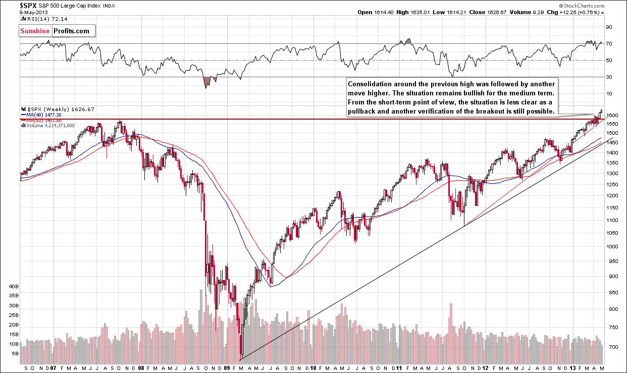
We turn now to the long-term S&P 500 Index chart, where we see that the bullish situation remains very much in place. The recent major breakout (above the 2007 high in the S&P 500 Index) has been followed by a period of steady rally leading to a situation where stocks are now once again quite overbought. Although some back and forth price movements are possible in following days, this breakout is the most important thing that should be kept in mind. By that we mean that even if stocks decline, such a decline would likely be only a temporary phenomenon, followed by weeks of rallies.
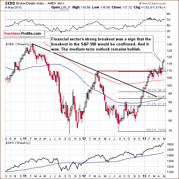
In this week’s Broker-Dealer index (proxy for the financial sector) chart, we see that a bullish cup-and-handle pattern was successfully completed and almost verified. The breakout is clear in this chart with respect to price and it will be clear in terms of time if financials close the week above 110. They are above 117 now, so that seems very likely. We expect the medium-term outlook to remain bullish.
Summing up, the overall situation in the general stock market remains positive for the medium term, even though it’s overbought on a short-term basis and a pullback is possible.
Crude Oil
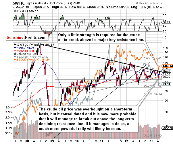
In this week’s Crude Oil price chart, we have some interesting developments. It seems that another attempt to breakout above the declining resistance line based on the 2008 and 2011 tops is underway. If prices move above this resistance line, it could very well trigger a rally in other commodities and in the precious metals prices.
At this time, since the breakout has not yet been completed and verified, and since several attempts have failed in the recent past, we prefer to wait for a confirmation of this breakout before discussing the bullish implications for the precious metals in any detail.
Gold and Silver Correlations
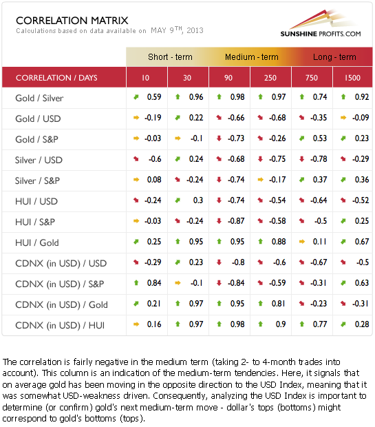
The Correlation Matrix is a tool, which we have developed to analyze the impact of the currency markets and the general stock market upon the precious metals sector, (namely: gold correlations and silver correlations). The short-term situation here is mixed and no real implications can be drawn at this time. The medium-term correlations are negative for the precious metals with both the USD Index and the general stock market. The precious metals are still pretty much anti-asset at this time. The medium-term odds, which favor a USD Index rally, have now painted a bearish picture for gold, silver and the precious metals mining stocks.
Gold
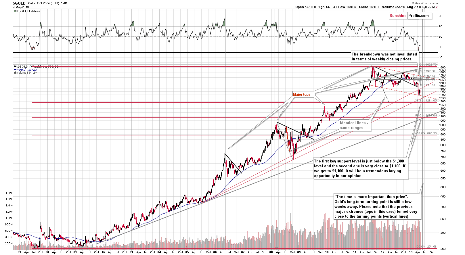
In this week’s very long-term gold chart, we see that the situation has changed very little as gold’s price has pretty much moved back and forth this week. The long-term cyclical turning point is now a few weeks away and could very well coincide with the end of gold’s current decline. Whether this holds true or not, it seems likely that gold’s current decline will continue for now at least as it appears to not yet be completed.
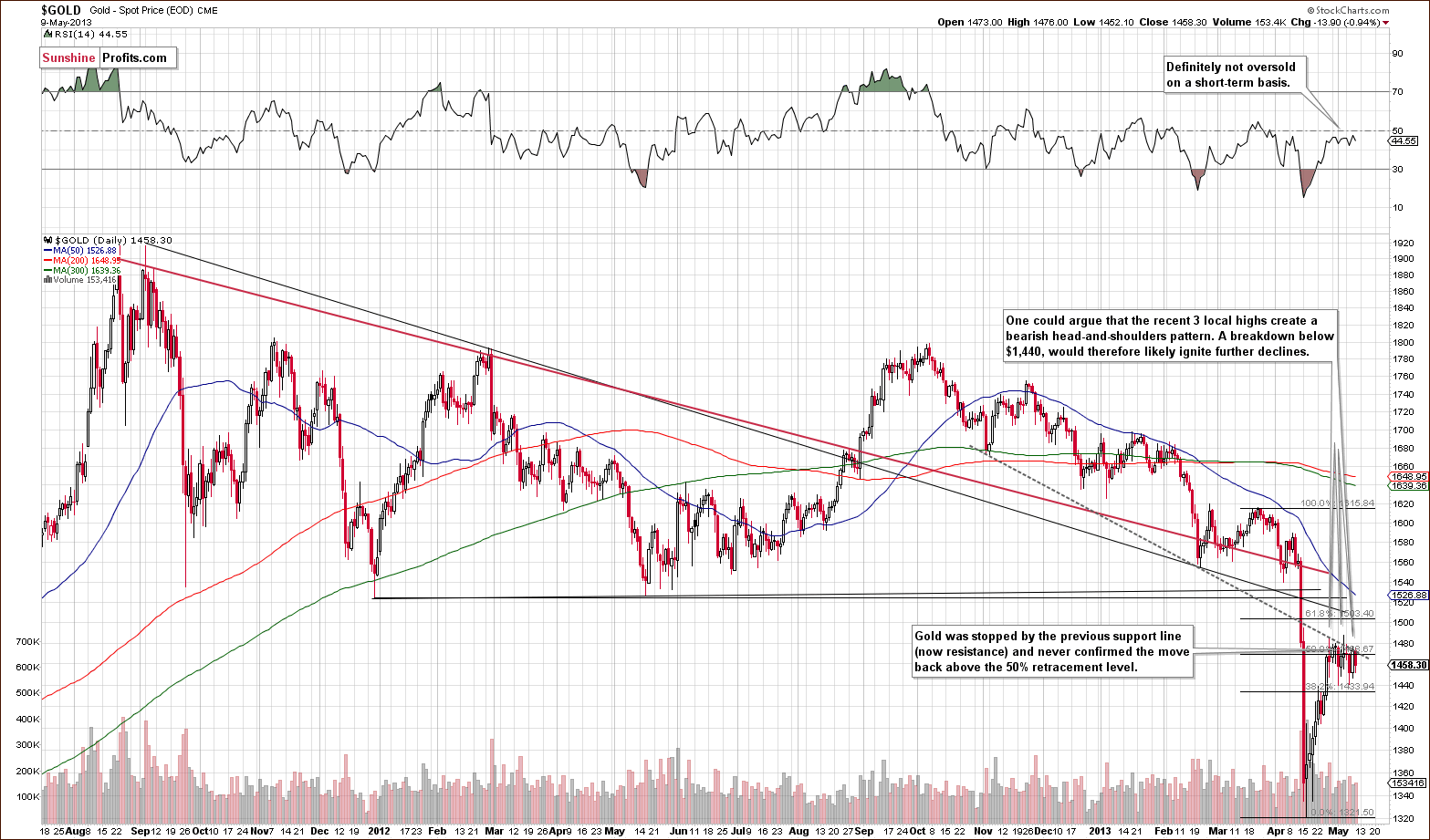
In the medium-term gold chart, we have seen prices rally and then move lower several times in the past few days. No rally back above the declining resistance line has been seen, however, for when this resistance line was touched, prices immediately moved lower once again. (We’ll see this same sort of price action in the GDX ETF, which has verified its breakdown below a support line.)
It could be argued that there is a bearish head-and-shoulders pattern forming on a very short-term basis here. If gold’s price breaks below the neck level around $1,440 and declines to $1,400, it will probably move even lower based on the long-term chart that we featured earlier in this update.
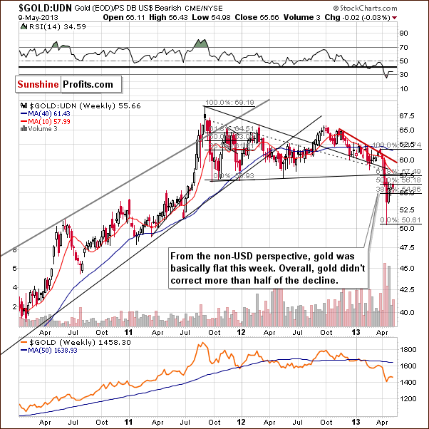
In this week’s chart of gold from the non-USD perspective, gold’s price didn’t do much this week (declining by 0.03%) and is still below the 50% Fibonacci retracement level. The trend for lower prices is still clearly in place and it seems that the past few weeks have just been a period of correction from a technical point-of-view.
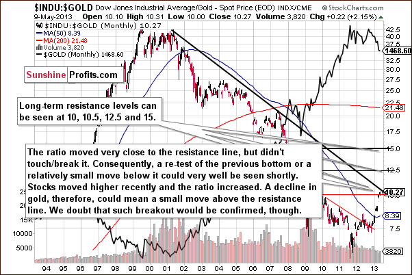
In this week’s Dow to gold ratio chart, we see the ratio getting close to a key resistance level. This is due almost entirely to the Dow’s rally this week. The “problem” here is that if gold prices decline and stocks continue to rally (a real possibility), this ratio could break out above the declining resistance line and move toward 12.5, thus leading to even bigger declines in gold (below $1,200). We do not feel that such a breakout will be confirmed, however.
Summing up, the situation in gold really didn’t change that much at all this week. It seems that the final bottom for the yellow metal is still ahead of us.
Silver
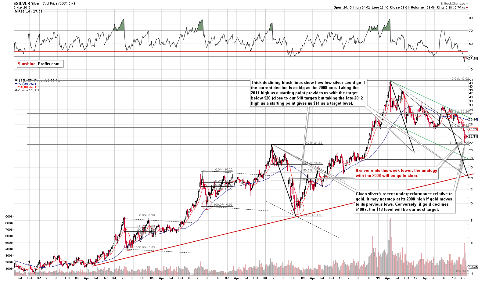
In this week’s very long-term silver chart, we see that silver didn’t do much this week either. While it did decline a bit more than gold did, it’s really nothing to write home about just yet. If the decline continues today, then the analogy between the 2008 decline and this time period would be even clearer. Back then, the pause in the decline lasted about two weeks, and prices have been consolidating for two weeks this time as well. It seems that silver is now ready to continue its decline once again.
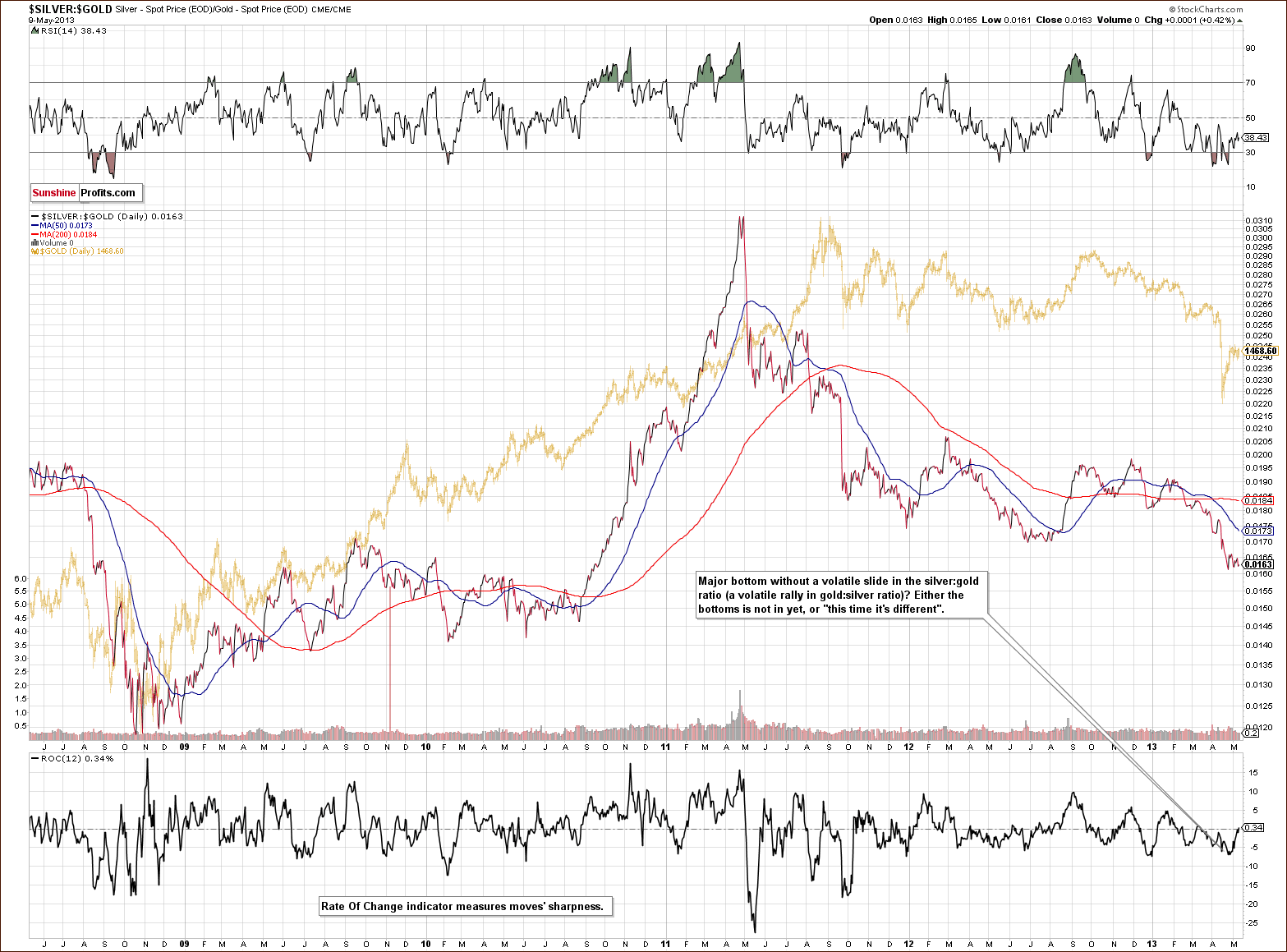
Turning now to our silver to gold ratio chart, we see there has still been no sharp drop in the ratio, which indicates that the silver bulls are not giving up just yet (or that lots of short positions are not being opened just yet). This is something, which is usually seen in the final part of a major decline, so it seems that this decline has some time to go yet.
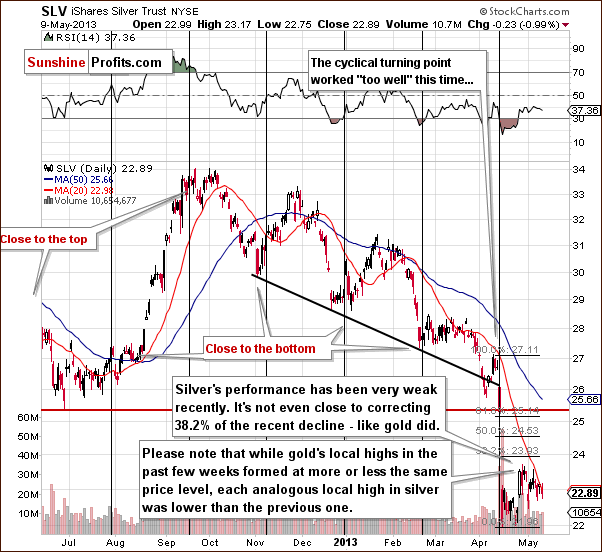
In the short-term SLV ETF chart, we see that silver continues to disappoint those invested in it. In our gold analysis, we discussed a possible bearish head-and-shoulders based on the local highs of the past few days. In the case of silver, these recent highs are getting lower and lower, a sign of underperformance.
Summing up, as with gold, the situation in silver is pretty much unchanged this week. There are several factors pointing to the likelihood that the declines here have not yet completed.
Gold and Silver Mining Stocks
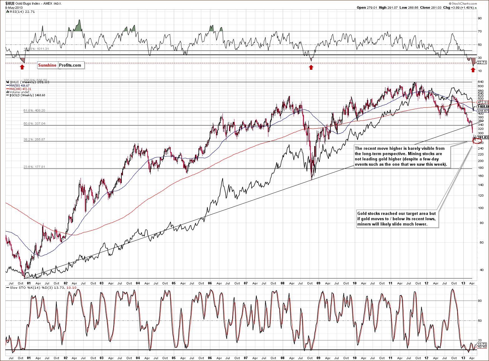
In this week’s very long-term HUI index chart, we actually see higher price levels, but this move is really quite small. It amounted to less than 4 index points for the week, slightly more than one percent and too little to really be meaningful. It cannot be used to support the idea that the gold stocks are leading gold higher.
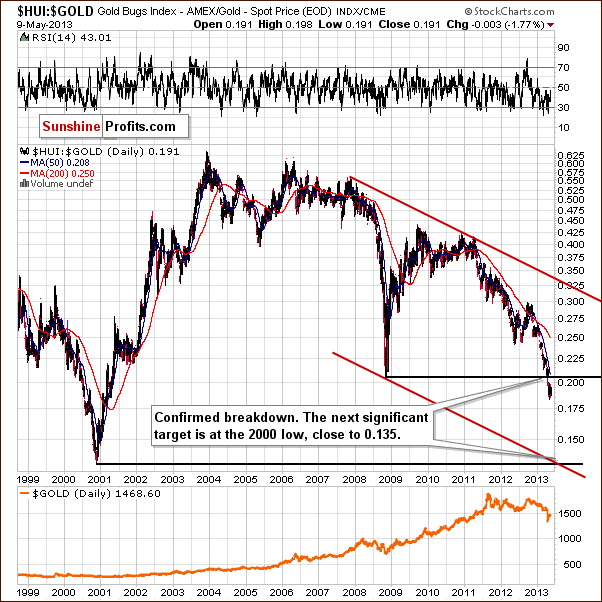
We introduce a new chart this week that presents a very bearish picture - the gold stocks to gold ratio chart. Just as it’s name suggests, it tells us how the gold stocks have performed versus gold from a long-term point of view. Please note that the trading channel and the next horizontal support intersect at a point much lower than where this ratio is today. Of course, the existence of a target level by itself is no indication that it will be reached; the trend has to be in place as well. The point here is that the ratio has already broken below the previous late 2008 major low and is now a bit more than 5% beneath it. This is a major breakdown and it was confirmed. The implication is that the trend is still down.
With the trend being down and accelerating and the recent breakdown being confirmed, there is a good possibility that the miners will decline significantly once again. This makes the previously mentioned target level a very important one. At this time it seems likely that the ratio will move to its 2000 low – close to the 0.135 level.
If gold stocks decline relative to gold as they did late in 2000, and gold declines to $1,300 or slightly higher, the target level for the HUI Index would be slightly above the low of 2008 – around the 180 level. This would coincide with a Fibonacci retracement level as you can see on the previous chart.
Does the target level for the XAU Index – another proxy for the mining stock sector – confirm this outlook?
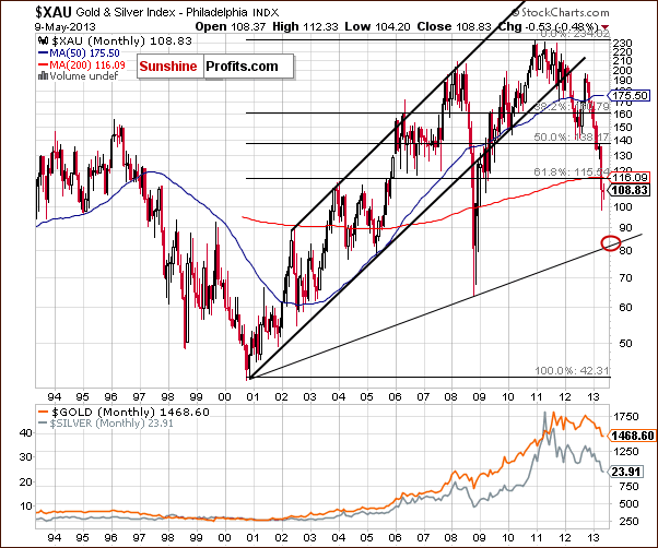
It does. In this week’s long-term XAU index chart, (where it’s easier to draw and create target levels), we once again show the downside target level here to be around 84 and in tune with our previous discussion about the HUI Index downside target level. This is more than 20% below the current index level here.
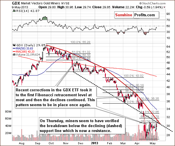
In this week’s short-term GDX ETF chart, we saw a rally on Wednesday, which may have encouraged some as significant volume was also seen. In Thursday’s Market Alert, however, we warned that it really wasn’t all that bullish:
Let’s take a look at what happened [Wednesday]: Mining stocks in general (GDX ETF), gold stocks in particular: strong rally on significant volume. Looks bullish by itself, but the same was the case on April 24 (size of the rally, volume, daily closing price) and the local top was formed on the next day. That's not all what makes us suspicious here. We just noticed that there's been a two-bigger-rallies-and-a-decline rule in place in case of the GDX ETF. Before each decline (or at least most of them) miners had a consolidation during which there were two significant daily rallies. One at the beginning of the consolidation and another one at or very close to its end. Take the March consolidation as an example. Miners rallied on March 6 and March 21 (and the latter was the final top for that consolidation). Another example - early April: Apr 5 and Apr 9. Also, January: Jan 10 and Jan 22.
On Thursday, the mining stocks declined in a way that was very similar to what we saw on April 24 (compare to the fragment that we put in bold above) and once again provided a bearish signal as they have verified the breakdown below the declining support line, which is now providing resistance. They failed to move above the first Fibonacci retracement level, and the trading action of the past few weeks seems to be nothing more than some consolidation within the downtrend.
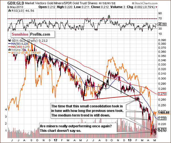
In this week’s GDX to GLD ratio chart, we again see that the mining stocks are clearly not leading gold higher also from the short-term point of view. Volatile back and forth daily moves have been the norm this week, and overall the situation is unchanged - still looks like a consolidation within a bigger decline and most likely is one.
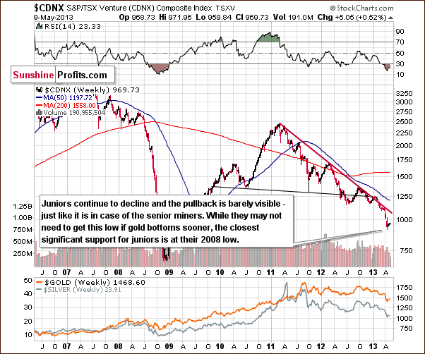
Finally, we turn to the Toronto Stock Exchange Venture Index chart (which is a proxy for the junior miners as so many of them are included in it). The picture remains bearish here in spite of the tiny pullback seen this week. No Fibonacci retracement levels are necessary here because it’s obvious that the pullback did not take the juniors much higher. No meaningful retracement was seen and the situation remains bearish.
Summing up, the situation for the precious metals mining stocks remains bearish. A bit of mid-week strength was followed by a disappointing Thursday. The analysis of the HUI Index and gold price ratio paints a bearish picture at this time.
Letters from Subscribers
Q: Do you ever do spreads, like gold vs. silver? Gold vs. oil? Gold vs. bonds? Gold vs. euro?
A: We sometimes do (gold vs. silver) but only rarely as we prefer more direct trades. We have research on this topic, however, with emphasis on the gold-silver ratio and pair trading.
Q: Are you less confident in a decline, or the extent of one, then you were one or two weeks ago? More importantly (and I know you dislike this kind of quantification) what kind of “odds” do you see for a decline to $1300, and to $1200 or below?
So I think we deserve a number - some probability - for, let's say, at least $1350 or below. And maybe we should be parked in the S&P instead of cash?
A: We are generally as “confident” as we were 2 weeks ago. At this point we'd give the move to $1,300 a 65% probability (which is very large, but the size of the move is). We'd give the $1,200 target a 40% chance.
Moving into S&P instead of cash? We think cash is better here because we expect the buying opportunity in the precious metals to present itself shortly - within the next few weeks. And in a matter of weeks we could very well see a move lower (a consolidation) in the stock market. It's not that the short-term is bearish - it's a bit unclear.
Q: Looking in greater detail at your webpage I saw the graphs of the ROI and noticed that when all trades are combined the corrections seem to cancel and the overall drawdown is diminished as some trades do not correct while others keep rising. Playing all of them together evens out the curve. At least assuming equal investments are played in all the schemes. Two questions: 1) have you added all the ROI curves to come up with a combined curve? 2) What is the investment you base the ROI on? Is it the value of the contract? The margin? Or the margin plus a certain amount of capital to cover drawdown on the entry price? Regards.
A: You are probably referring to the charts included here.
The answer to the first question is no, we haven't developed a combined curve. Each of the ROI charts is linked with a signal from one of our indicators. As such, each chart combines information on returns after a specific kind of signal (for instance after the Gold Bottom Indicator has flashed a signal). Since signals from different indicators do not necessarily occur on the same days (at least they don't have to, and our experience is that they don't) it is impossible to use a combined chart in a meaningful trading strategy.
At this point, to be clear, we would like to add that these outcomes are based on the time frame when gold was in a major uptrend – they don’t include the current decline. We expect that these indicators’ efficiency will be back once the uptrend resumes.
The idea you mention (diversification among indicators) is one we pursue in a slightly different way. Specifically, in each Premium Update we post information on positions suggested by our tools. If some our tools suggest opening a short position and others call for a long one, we see these indications as cancelling each other out.
Additionally, we think that quantitative tools aren’t the only thing that provides effective diversification; in our opinion it is best to diversify between tools and subjective analyses (such as those posted by our Editor). Tools offer you emotionless measurement but can rely on past data too much (no matter how hard you try to avoid that effect). A real person, on the other hand, can take into account a broad range of factors and may have a particularly keen sense of intuition but is not free from overly emotional behavior.
A short example: suppose one of your tools has been giving you extraordinary profits for a month because it is able to extract unique patterns from the data you have. It is still possible that these patterns will suddenly break down and the tool will be left generating signals based on patterns that are not there anymore. An analyst would be able to detect such a break quicker than a tool.
Conversely, imagine you have been right in your last 15 bets and you start feeling excessively confident in your ability to time the market. A mix of an excessive position and a large drawdown during your 16th bet can erase all the prior gains. A quantitative tool would be able to support your decisions without getting emotional.
To answer the second question: we based our calculations on the entry price of physical gold using the entry price as invested capital. To use these calculations for your purposes you should adjust them for transaction costs (which we haven't been able to do since every trader has a different fee schedule). If buying physical gold is too much of a hassle, then it would be possible to trade those signals using ETFs. In that case, you would need to take the tracking error into account (our ETF Ranking includes the tracking error, by the way).
Summary
The long-term picture for the USD Index is bullish and a move to the upside appears also to be in the cards for the next week or so when the cyclical turning point is reached.
The general stock market outlook is bullish on a medium-term basis, and this – along with the bullish outlook for the USD Index – provides a bearish picture for the precious metals. Crude oil prices appear to be on the verge of a breakout above an important resistance line although multiple attempts have failed recently. We will wait for the confirmation of this breakout before discussing implications for the precious metals sector.
The situation in gold changed very little in the past week, and this holds true for silver and for the mining stocks as well. Prices generally moved back and forth this week and overall are pretty much where they were a week ago. Seasonal tendencies indicate that lower prices are ahead for the sector, and this outlook holds true when analyzing the breakdown of the HUI Index to gold price ratio as well.
Trading – PR: Short silver and mining stocks.
Trading – SP Indicators: No positions: SP Indicators suggest long positions but the new self-similarity-based tool suggests short ones for a part of the precious metals sector (gold, silver) and there are mixed signals for another part (mining stocks) and we think that overall they cancel each other out.
Long-term investments: No positions.
| Portfolio's Part | Position | Stop-loss / Expiry Date |
|---|---|---|
| Trading: Mining stocks | Short (half) | 305 (HUI) / - |
| Trading: Gold | No position | - / - |
| Trading: Silver | Short (half) | $25.30 / - |
| Long-term investments: Gold | No position | Buy half at $1,305 |
| Long-term investments: Silver | No position | Buy half at $18.20 |
| Long-term investments: Mining Stocks | No position | Buy half at XAU 84 |
This completes this week’s Premium Update. Our next Premium Update is scheduled for May 17, 2013; however, you – as our subscribers – will continue to receive daily Market Alerts at least until the end of May on a daily basis.
Thank you for using the Premium Service. Have a profitable week, a great weekend!
Sincerely,
Przemyslaw Radomski, CFA

