

Briefly: in our opinion, full (300% of the regular position size) speculative short positions in mining stocks are justified from the risk/reward point of view at the moment of publishing this Alert.
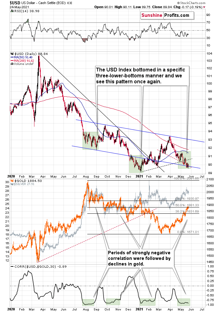
Let’s start today’s (May 25) analysis with something that’s happening right now, at the moment of writing these words. The USD Index is moving lower, below the recent lows. It’s currently trading at about 89.6, which means that after a few days of back-and-forth trading, it moved down once again – and (from the short-term point of view) quite visibly so.
What did gold do in response? It slid by 0.04%, which is a way of saying that it didn’t do anything. It should have rallied and broken above the recent highs. It didn’t, which indicates that the rally is likely over or about to be over. But let’s get back to the USD Index.
The Fight Between Gold and the USDX
Today’s move lower is a continuation, and most likely the final part, of a specific multi-bottom pattern that the USD Index exhibited recently.
I marked those situations with green. The thing is that the U.S. currency first declined practically without any corrections, but at some point it started to move back and forth while making new lows. The third distinctive bottom was the final one. Interestingly, the continuous decline took place for about a month, and the back-and-forth declines took another month (approximately). In July 2020, the USDX fell like a rock, and in August it moved back and forth while still declining. In November 2020, the USDX fell like a rock (there was one exception), and in December it moved back and forth while still declining.
Ever since the final days of March, we’ve seen the same thing all over again. The USD Index fell like a rock in April, and in May we’ve seen back-and-forth movement with lower lows and lower highs.
What we see right now is the third of the distinctive lows that previously marked the end of the declines.
And what did gold do when the USD Index rallied then?
In August, gold topped without waiting for USD’s final bottom – which is natural, given how extremely overbought it was in the short term.
In early January, gold topped (which was much more similar to the current situation given the preceding price action) when the USDX formed its third, final distinctive bottom.
The USD Index is after a two-month decline, half of which was the back-and-forth kind of decline. It’s forming the third – and likely the final – bottom, and gold just refused to react positively to this situation in today’s pre-market trading.
This might be “it” – the markets might be forming their final reversals here, starting to follow the most bearish (in the case of gold) part of the analogy to the price action in 2008 and 2012.
My yesterday’s comments on the above remain up-to-date:
Gold seems to be insisting on repeating – to some extent – its 2012 performance, and – to some extent – its 2008 performance. Either way, it seems that gold is about to slide.
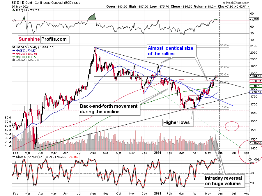
The reversal in gold took place after gold moved very close to its mid-January highs and the 50% Fibonacci retracement based on the August 2020 – March 2021 decline.
The sizes of the current rally (taking the second March bottom as the starting point) and the rally that ended at the beginning of this year are practically identical at the moment.
Just as the rallies from early 2012 and late 2012 (marked with blue) were almost identical, the same could happen now.
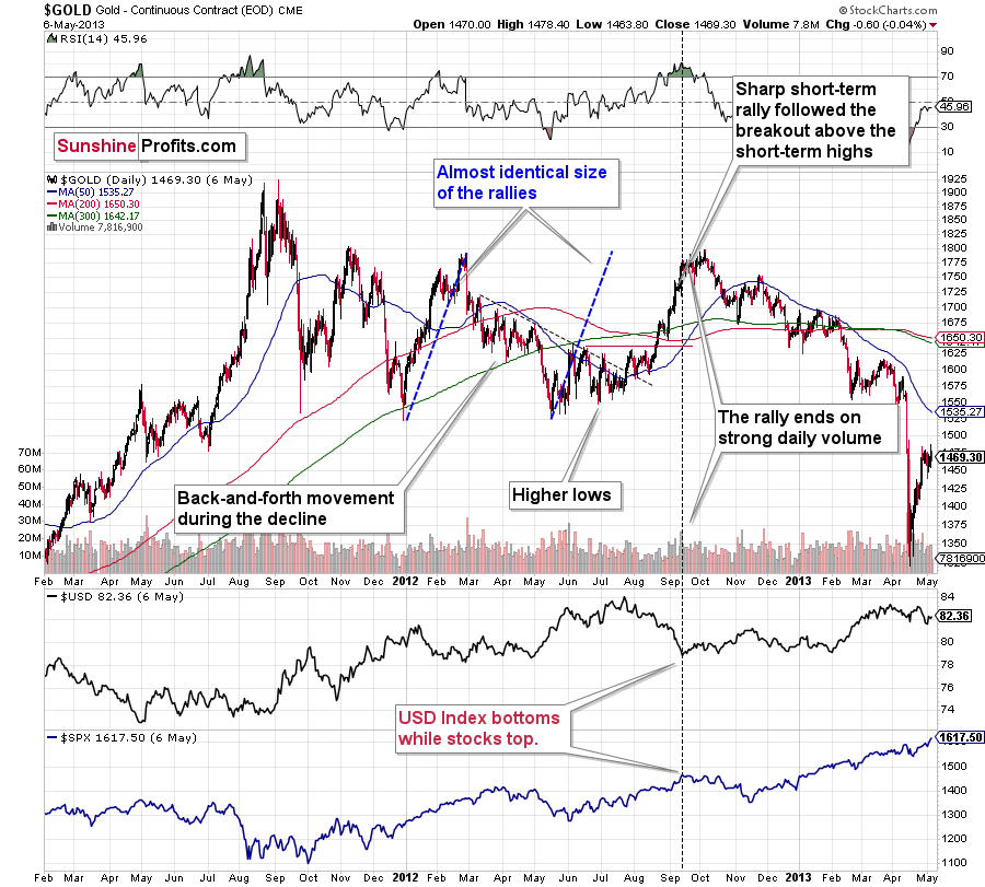
The March 2021 low formed well below the previous low, but as far as other things are concerned, the current situation is similar to what happened in 2012.
The relatively broad bottom with higher lows is what preceded both final short-term rallies – the current one, and the 2012 one. Their shape as well as the shape of the decline that preceded these broad bottoms is very similar. In both cases, the preceding decline had some back-and-forth trading in its middle, and the final rally picked up pace after breaking above the initial short-term high.
Interestingly, the 2012 rally ended on huge volume, which is exactly what we saw also on May 19 this year. Consequently, forecasting much higher gold prices here doesn’t seem to be justified based on the historical analogies.
The lower part of the above chart shows how the USD Index and the general stock market performed when gold ended its late-2012 rally and was starting its epic decline. In short, that was when the USD Index bottomed, and when the general stock market topped.
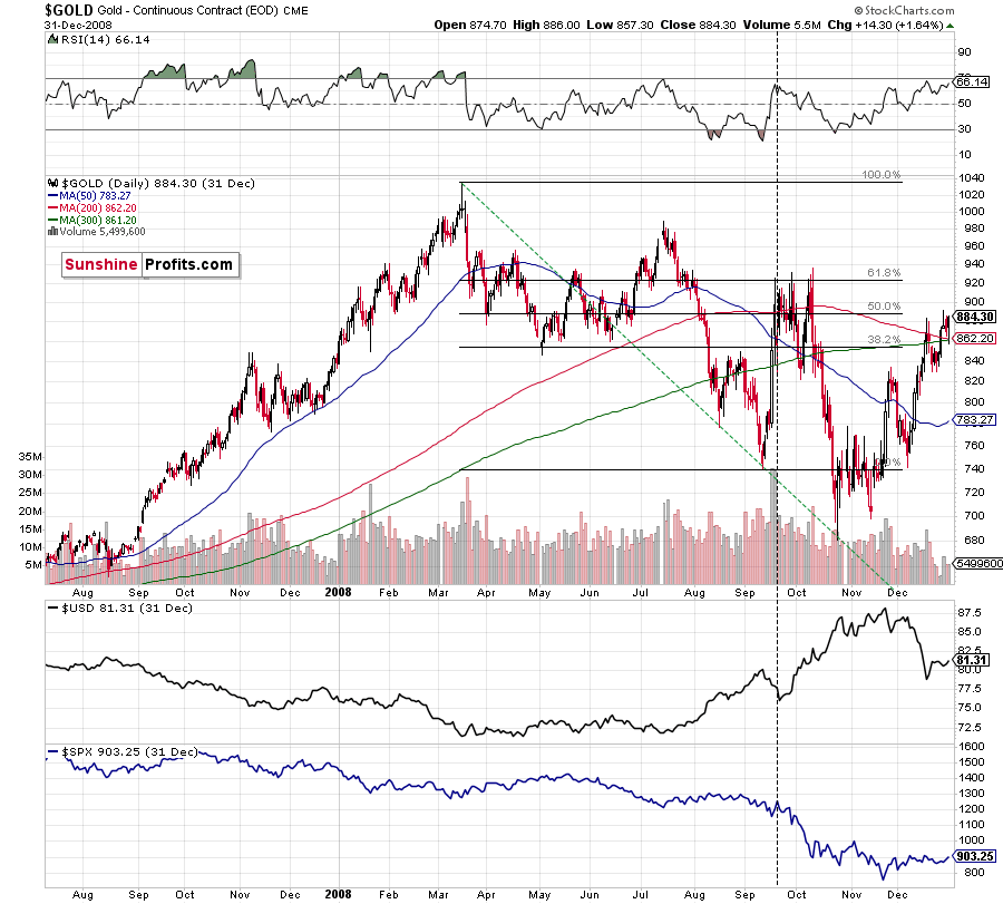
Back in 2008, gold corrected to 61.8% Fibonacci retracement, but it stopped rallying approximately when the USD Index started to rally, and the general stock market accelerated its decline. This time the rally was not as volatile, so the lower – 50% Fibonacci retracement level will hold the rally in check.
Taking into consideration that the general stock market has probably just topped, and the USD Index is about to rally, then gold is likely to slide for the final time in the following weeks/months. Both above-mentioned markets support this bearish scenario and so do the self-similar patterns in terms of gold price itself.
Having said that, let’s take a look at the markets from a more fundamental angle.
The Boiling Cauldron
With inflation surging and the PMs basking in the glory, the springtime serenity could eventually turn into a summertime slaughter. Case in point: with the Personal Consumption Expenditures (PCE) Index scheduled for release on May 28, another bout of bond-market volatility could rattle the financial markets in the coming days. For context, the headline PCE Index is similar to the headline Consumer Price Index (CPI). However, the former includes the prices that both consumers and nonprofits pay for goods and services.
Please see below:
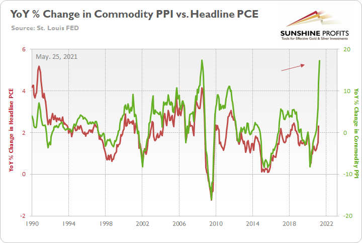
To explain, the green line above tracks the year-over-year (YoY) percentage change in the Commodity Producer Price Index (PPI), while the red line above tracks the YoY percentage change in the headline PCE Index (which includes the inflationary effects of food and energy). If you analyze the right side of the chart, you can see that a material gap is clearly visible. And while the headline PCE Index tends to undershoot the commodity PPI, reconnecting with the green line implies a headline PCE Index of roughly 5.50%. For context, the last time the PCE Index jumped above 5% was November 1990.
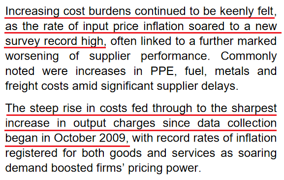
Highlighting the inflationary anxiety, the IHS Markit U.S. Composite PMI (released on May 21) hit a record of 68.1 in May, rising from 63.5 in April. More importantly, though, notice a recurring theme?
 Source: IHS Markit
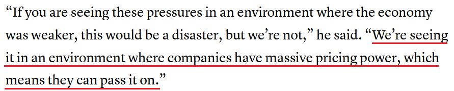
If that wasn’t enough, labor costs are rising at an alarming rate. With Chipotle, Bank of America, Under Armour and McDonald’s all hiking their minimum wages, Mark Zandi, chief economist at Moody’s Analytics, said that “It’s some of the strongest wage growth we’ve seen in a quarter-century.” More importantly, though, notice what Jonathan Golub, chief U.S. equity strategist at Credit Suisse, said an optimistic solution to the problem is?
 Source: CNBC
And “pass it on” they will. If I’ve written it once, I’ve written it a thousand times – when businesses are faced with rising cost pressures, are they likely to erode their profit margins to avoid an inflationary spike? Of course not. The burden is passed on to consumers in the form of rising prices.
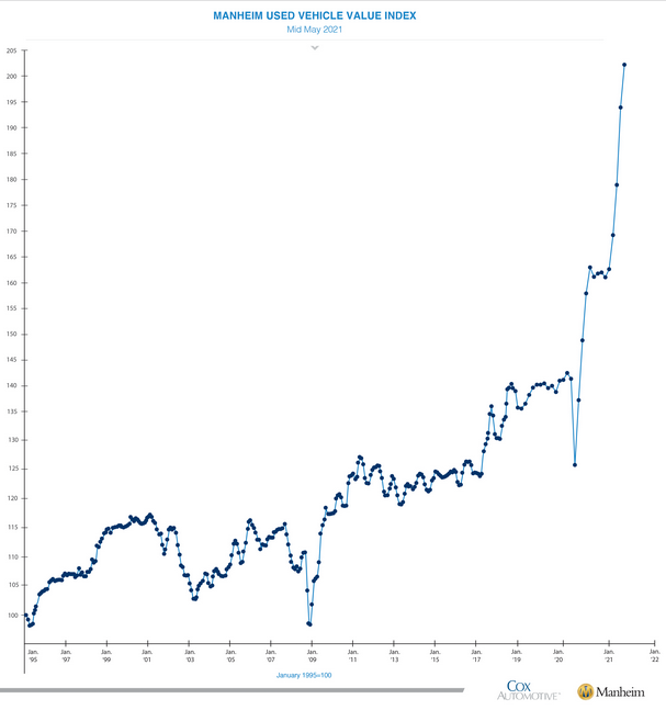
The Used Vehicle Value Index
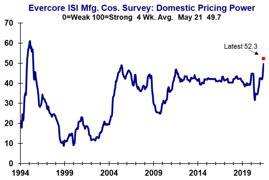
To that point, with Evercore ISI – a global independent investment banking advisory firm – releasing its latest manufacturers’ pricing power survey, the current reading is at its highest level since 1995.
Please see below:
On top of that, the Manheim Used Vehicle Index surged by another 4.55% during the first 15 days of May (relative to April), and like the Energizer Bunny, the parabolic spike keeps going, and going, and going…
Please see below:
More importantly, though, notice the effect that the Manheim Used Vehicle Index has on the Used Cars and Trucks CPI?
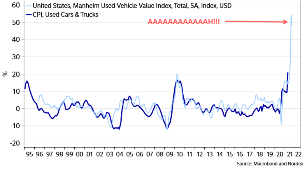
To explain, the light blue line above tracks the YoY percentage change in the Manheim Used Vehicle Index, while the dark blue line above tracks the YoY percentage change in the Used Cars and Trucks CPI. If you analyze the right side of the chart, you can see that a material gap is an understatement. And with the former surging and the latter severely lagging, can you guess where the Used Cars and Trucks CPI is likely headed next?
The FED and the U.S. banks
What’s more, with the U.S. Federal Reserve (FED) executing a massive amount of reverse repo transactions in recent days, the U.S. banking system is screaming at the FED to taper. For context, a reverse repurchase agreement (repo) occurs when an institution offloads cash to the FED in exchange for a Treasury security (on an overnight or short-term basis). And with U.S. financial institutions currently flooded with excess liquidity, they’re shipping cash to the FED at an alarming rate.
Please see below:
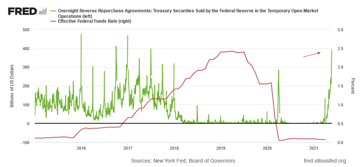
To explain, the green line above tracks the daily reverse repo transactions executed by the FED, while the red line above tracks the federal funds rate. If you analyze the right side of the chart, you can see that reverse repos surged to nearly $400 billion on May 24 (using the scale on the left side of the chart). More importantly, though, notice what happened the last time reverse repos moved above 400 billion? If you focus your attention on the red line, you can see that when a prior spike above $400 billion occurred in December 2015, the FED’s rate-hike cycle began. Thus, with current inflation dwarfing 2015 levels and U.S. banks practically throwing cash at the FED, is this time really different?
As further evidence, with investors’ spider-sense already tingling, demand for bank loans is also sending an ominous signal.
Please see below:
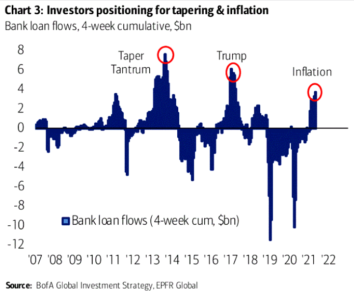
To explain, the blue bars above mark the four-week cumulative bank loan flows. If you analyze the red circles in the middle, you can see that investors scrambled to lock in financing prior to the 2013 taper tantrum and prior to the FED raising the federal funds rate by more than 1.50% in 2017-2018. Similarly, if you analyze the red circle on the right side of the chart, you can see that investors’ current behavior mirrors the prior bouts of panic. The bottom line? With inflation unlikely to slow down as long as the FED floods the system with money, it’s become increasingly evident that the gambit is on its last legs.
As further evidence, media narratives often act as the canary in the coal mine. From SPACs, to IPOs, to ARK Invest, to Bitcoin, when the national media proudly pumps an idea, it often has a material effect. However, when the narrative flips and those on the outside become critical of those on the inside, the veneer is removed and the scheme often unravels.
Please see below:
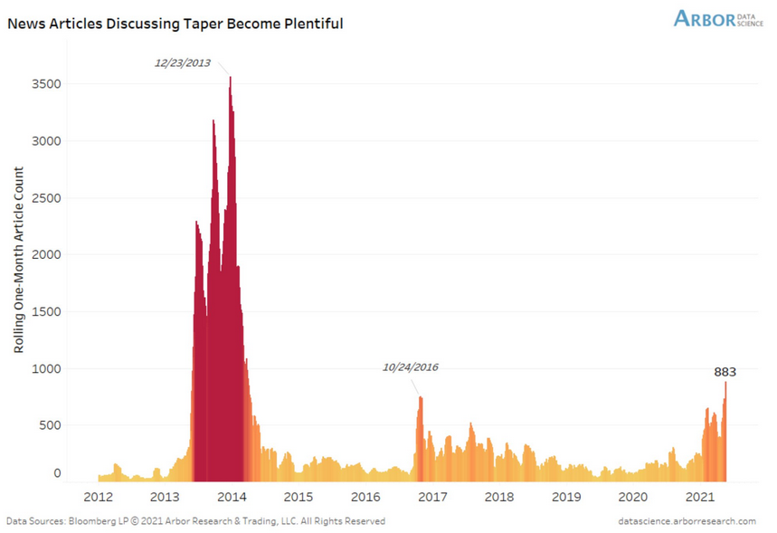
To explain, the red and orange bars above depict the number of news articles discussing “taper.” If you analyze the left side of the chart, you can see that the 2013 taper tantrum was a rather popular story. More importantly, though, if you analyze the orange bars near 2017, you can see that attention from the news media also coincided with the FED’s most recent rate-hike cycle. Likewise, if you analyze the right side of the chart, you can see that the spotlight on the FED already exceeds 2016-2017. Thus, with laser eyes (pun intended) focused squarely on the FED, the pressure continues to mount.
Remember what happened to the gold price in the first half of 2013 and in late 2016?
It declined by hundreds of dollars. And we are seeing the same indication once again.
Is the Fed Still Omniscient?
To that point, with Bank of America’s latest Global Fund Manager Survey revealing that inflation, taper tantrums and asset bubbles are keeping institutional investors up at night – is the FED’s omniscience already showing cracks in its foundation?
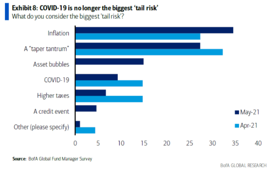
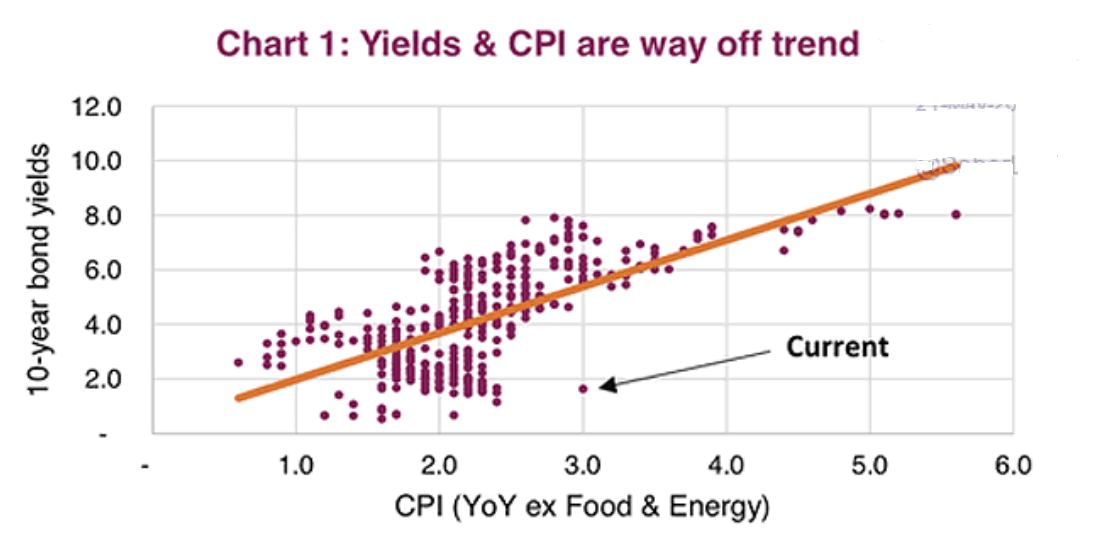
To explain, back in April, roughly 25% of respondents cited inflation as their most pressing concern. But now, the figure has increased to roughly 35%. Moreover, while fears of a taper tantrum have declined slightly, notice the new entrant on the list? If you analyze the third horizontal bar from the top (dark blue), you can see that roughly 15% of institutional investors cited asset bubbles as a growing risk. And with the bond market resembling the biggest bubble of the bunch – given that the real federal funds rate has fallen below -4% for the third time in history – the rubber band being the U.S. 10-Year Treasury yield is being stretched to its limit.
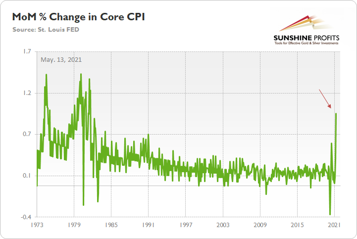
Case in point: with the core CPI (released on May 12) surging by 2.96% YoY and by 0.92% month-over-month (MoM) in April – the largest MoM percentage increase since September 1981 – the bond market continues to subsidize equities and commodities’ returns.
Please see below:
Moreover, with history implying that bond investors’ generosity is unlikely to last when the dam finally breaks, the PMs will likely drown in the flood.
 Source: The Daily Shot
To explain, the scatter plot above depicts the behavior of the U.S. 10-Year Treasury yield given various YoY percentage changes in the core CPI. If you analyze the middle of the chart, you can see that when the latter’s YoY percentage change hits 3% or more (rounded from the figure above), the U.S. 10-Year Treasury yield has always been north of 5%. Thus, with the current reading (follow the arrow) already a significant outlier, those that are expecting higher gold prices are betting on an even larger divergence from the 10Y-CPI historical norm.
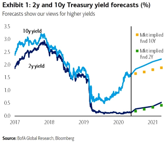
Finally, while the majority of investors expect the FED to maintain its dovish policy stance for the foreseeable future, Bank of America is singing a different tune. While market-implied price expectations base on a calm U.S. 10-Year Treasury yield over the second half of 2021, Bank of America expects the Treasury benchmark to hit 2.25% by the first quarter of 2022 (roughly seven months from now). The bottom line? If the projection proves prescient, the PMs’ current environment is likely as good as it gets.
In conclusion, the PMs recorded an immaterial bounce on May 24. And with the sedated U.S. 10-Year Treasury yield and the dormant USD Index doing much of the heavy lifting, the change of seasons has been increasingly kind to the metals. However, with inflation surging and investors underestimating the FED’s ability to control the situation without tapering its asset purchases, the opposite effect is likely to occur over the next few months. Thus, with the FED’s fear of doing something likely to morph into fear of doing nothing, whether the FED finally gives in or bond investors finally snap, the PMs’ precipice is likely near.
Overview of the Upcoming Part of the Decline
- It seems likely to me that the current corrective upswing is very close to being over, given gold’s similarity to what happened in 2012, USD’s similarity to 2016 and the situation in the general stock market.
- After miners slide once again in a meaningful and volatile way, but silver doesn’t (and it just declines moderately), I plan to switch from short positions in miners to short positions in silver (this could take another 1-2 weeks to materialize). I plan to exit those short positions when gold shows substantial strength relative to the USD Index, while the latter is still rallying. This might take place with gold close to $1,450 - $1,500 and the entire decline (from above $1,700 to about $1,475) would be likely to take place within 1-12 weeks, and I would expect silver to fall hardest in the final part of the move. This moment (when gold performs very strongly against the rallying USD and miners are strong relative to gold – after gold has already declined substantially) is likely to be the best entry point for long-term investments, in my view. This might happen with gold close to $1,475, but it’s too early to say with certainty at this time. In other words, the entire decline could take between 1 and 12 weeks, with silver declines occurring particularly fast in the final 1-2 weeks.
- If gold declines even below $1,500 (say, to ~$1350 or so), then it could take another 10 weeks or so for it to bottom, but this is not what I view as a very likely outcome.
- As a confirmation for the above, I will use the (upcoming or perhaps we have already seen it?) top in the general stock market as the starting point for the three-month countdown. The reason is that after the 1929 top, gold miners declined for about three months after the general stock market started to slide. We also saw some confirmations of this theory based on the analogy to 2008. All in all, the precious metals sector would be likely to bottom about three months after the general stock market tops. If the general stock market puts the final top in the first half of May (which seems quite likely given NASDAQ’s top in late April), then we might expect the precious metals sector to bottom sometime in August.
- The above is based on the information available today, and it might change in the following days/weeks.
Please note that the above timing details are relatively broad and “for general overview only” – so that you know more or less what I think and how volatile I think the moves are likely to be – on an approximate basis. These time targets are not binding or clear enough for me to think that they should be used for purchasing options, warrants or similar instruments.
Letters to the Editor
Q: Hello,
First off, I absolutely love the analyses provided on a daily basis. I learn so much from everything I read. The value you provide is truly amazing.
(…)
I do have one question concerning the position size. What do you think about increasing your position size if the trade initially goes against us? For example, let’s say I’m using the 20% rule for capital allocation and I enter a trade that initially goes against me (e.g., our current short on mining stocks). Can I double down and put another 20% on the trade at much lower levels? This would decrease my cost basis in the GDXD significantly.
Again, I appreciate all of what you do and the great work you put into helping all of us.
A: Thanks, I’m very happy that you’re enjoying reading my analyses so much, it means a lot to me.
I’m not a fan of doubling down on a position that’s already been entered based on sound position sizing techniques. However, if the position goes against one, and its value decreases, then it might be justified to add to this position, but not more than enough to make up for the lowered exposure.
For example, let’s assume that one wanted 20% of their portfolio in the JDST. Based on its decline, the above could be only 15% of one’s portfolio. Or perhaps 10%. Then, if the situation (outlook-based risk-to-reward ratio) continues to justify having 20% of the portfolio in this trade, then adding an extra ~5% or ~10% of the capital (to get back to the 20% total) might be a good idea.
The important thing to keep in mind is that one should take into account the “current” value of one’s portfolio, not the initial one while calculating the percentages.
Of course, the above shouldn’t be used if one’s position is still excessive after it has decreased its value.
Summary
To summarize, even though it doesn’t seem to be the case based on this month’s price change in gold, it seems that the yellow metal’s days are numbered. This is based not only on the excessively oversold USD Index and its 2016 self-similar pattern but also on what’s happening in the stock market, silver’s recent outperformance and price levels reached throughout the precious metals sector. From the long-term point of view, the current situation seems similar to what we saw in the second half of 2012, while from the short-term point of view it seems similar to what we saw at the beginning of 2021. While the very near term remains unclear, the outlook for the next several months remains very bearish.
After the sell-off (that takes gold to about $1,350 - $1,500), we expect the precious metals to rally significantly. The final part of the decline might take as little as 1-5 weeks, so it's important to stay alert to any changes.
Most importantly, please stay healthy and safe. We made a lot of money last March and this March, and it seems that we’re about to make much more on the upcoming decline, but you have to be healthy to enjoy the results.
As always, we'll keep you - our subscribers - informed.
To summarize:
Trading capital (supplementary part of the portfolio; our opinion): Full speculative short positions (300% of the full position) in mining stocks are justified from the risk to reward point of view with the following binding exit profit-take price levels:
Mining stocks (price levels for the GDXJ ETF): binding profit-take exit price: $24.12; stop-loss: none (the volatility is too big to justify a stop-loss order in case of this particular trade)
Alternatively, if one seeks leverage, we’re providing the binding profit-take levels for the JDST (2x leveraged) and GDXD (3x leveraged – which is not suggested for most traders/investors due to the significant leverage). The binding profit-take level for the JDST: $39.87; stop-loss for the JDST: none (the volatility is too big to justify a SL order in case of this particular trade); binding profit-take level for the GDXD: $94.87; stop-loss for the GDXD: none (the volatility is too big to justify a SL order in case of this particular trade).
For-your-information targets (our opinion; we continue to think that mining stocks are the preferred way of taking advantage of the upcoming price move, but if for whatever reason one wants / has to use silver or gold for this trade, we are providing the details anyway.):
Silver futures upside profit-take exit price: unclear at this time - initially, it might be a good idea to exit, when gold moves to $1,512.
Gold futures upside profit-take exit price: $1,512.
Long-term capital (core part of the portfolio; our opinion): No positions (in other words: cash
Insurance capital (core part of the portfolio; our opinion): Full position
Whether you already subscribed or not, we encourage you to find out how to make the most of our alerts and read our replies to the most common alert-and-gold-trading-related-questions.
Please note that we describe the situation for the day that the alert is posted in the trading section. In other words, if we are writing about a speculative position, it means that it is up-to-date on the day it was posted. We are also featuring the initial target prices to decide whether keeping a position on a given day is in tune with your approach (some moves are too small for medium-term traders, and some might appear too big for day-traders).
Additionally, you might want to read why our stop-loss orders are usually relatively far from the current price.
Please note that a full position doesn't mean using all of the capital for a given trade. You will find details on our thoughts on gold portfolio structuring in the Key Insights section on our website.
As a reminder - "initial target price" means exactly that - an "initial" one. It's not a price level at which we suggest closing positions. If this becomes the case (like it did in the previous trade), we will refer to these levels as levels of exit orders (exactly as we've done previously). Stop-loss levels, however, are naturally not "initial", but something that, in our opinion, might be entered as an order.
Since it is impossible to synchronize target prices and stop-loss levels for all the ETFs and ETNs with the main markets that we provide these levels for (gold, silver and mining stocks - the GDX ETF), the stop-loss levels and target prices for other ETNs and ETF (among other: UGL, GLL, AGQ, ZSL, NUGT, DUST, JNUG, JDST) are provided as supplementary, and not as "final". This means that if a stop-loss or a target level is reached for any of the "additional instruments" (GLL for instance), but not for the "main instrument" (gold in this case), we will view positions in both gold and GLL as still open and the stop-loss for GLL would have to be moved lower. On the other hand, if gold moves to a stop-loss level but GLL doesn't, then we will view both positions (in gold and GLL) as closed. In other words, since it's not possible to be 100% certain that each related instrument moves to a given level when the underlying instrument does, we can't provide levels that would be binding. The levels that we do provide are our best estimate of the levels that will correspond to the levels in the underlying assets, but it will be the underlying assets that one will need to focus on regarding the signs pointing to closing a given position or keeping it open. We might adjust the levels in the "additional instruments" without adjusting the levels in the "main instruments", which will simply mean that we have improved our estimation of these levels, not that we changed our outlook on the markets. We are already working on a tool that would update these levels daily for the most popular ETFs, ETNs and individual mining stocks.
Our preferred ways to invest in and to trade gold along with the reasoning can be found in the how to buy gold section. Furthermore, our preferred ETFs and ETNs can be found in our Gold & Silver ETF Ranking.
As a reminder, Gold & Silver Trading Alerts are posted before or on each trading day (we usually post them before the opening bell, but we don't promise doing that each day). If there's anything urgent, we will send you an additional small alert before posting the main one.
Thank you.
Przemyslaw Radomski, CFA
Founder, Editor-in-chief

