

Briefly: In our opinion, full (200% of the regular size of the position) speculative short positions in gold, silver and mining stocks are justified from the risk/reward perspective at the moment of publishing this alert. For the first time ever, we are increasing the size of a speculative position to 200% of the full position. Naturally, it doesn’t mean using everything that one has and then more for this specific trade. It means doubling the size that one regularly puts on the table while entering a speculative trade (which should be much less than half of one’s trading capital).
To say that gold’s weekly volume was big is like to say that snails are not the fastest animal. You can't say that it’s a lie, but it doesn't really convey the entire truth, either. Gold’s weekly volume was highest EVER. Yes, ever. There was not a single week – not ever during the 2011 top or when gold declined in 2008 – when gold moved on volume that was higher than what we saw last week.
Is this significant? You bet! The chart below provides the details (chart courtesy of http://stockcharts.com).
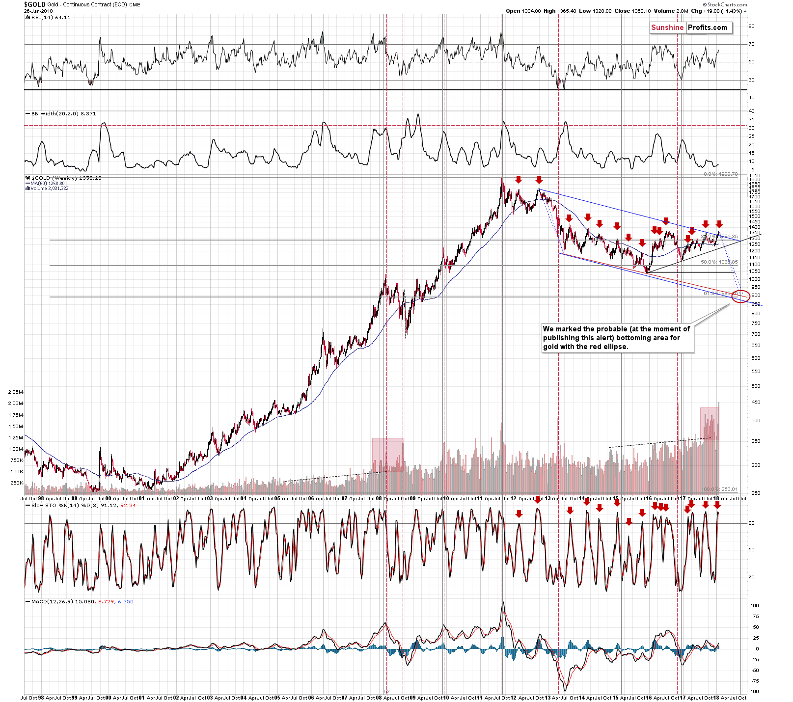
The breaking of the record is important, but it’s just an exclamation mark behind the implications that apply based on the analogy to other huge-volume weeks.
We marked situations with extreme weekly volume using vertical red dashed lines. There were 2 in 2008, one in 2009, one in 2011 (THE top), one in 2013, and one in 2016. All of them were followed by declines and 5 out of 6 confirmed a major top. The remaining case was during the 2013 decline.
Based on the above analogy, since we are definitely not in the middle of a short-term decline right now, it seems very likely that we are at a major top. The mentioned exclamation mark means that the top is indeed meaningful.
What could be meaningful about yet another $1,350-or-so top? There were quite a few of them in the past few years. It might be meaningful because that’s the top that starts the final slide in gold. That’s exactly what many other factors are pointing to, so such a scenario seems quite realistic.
While we’re analyzing the long-term charts, let’s take a look at the silver one.
There is a very good chance that this top is the final one, so let’s check what this implies.
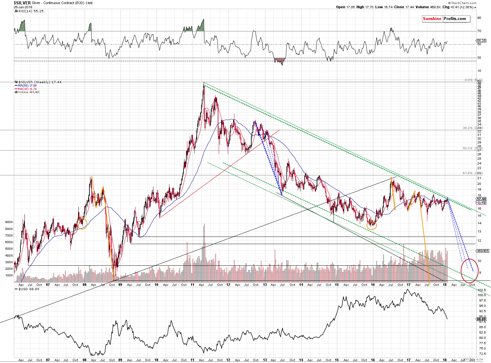
In order to do this, we’ll apply 2 techniques that we’re using in the case of other charts and we’ll remind you about something that we discovered a long time ago, but that remains to be very up-to-date also today. We get the feeling that you are most interested in the latter, so let’s start with it.
Please note the orange ellipses and lines on the above chart. You can see them in late 2007, in 2008 and 2015, 2016 and 2017. You see, starting from the bottoms marked with orange ellipses, the price moves that are marked with lines are practically identical – at least so far. The price moves are not identical only in the case of their range. The starting and ending points are extremely similar as well.
In both cases, silver bottomed a bit below $14 and quickly soared above $21. Then it declined to about $16 (in both cases). Then it rallied to about $19 (again, in both cases). Then it moved lower once again and declined very far dramatically before moving above the previous highs. Back in 2008, the decline was seen quickly. In this case, silver is taking its time. Does this invalidate the analogy or does it make it any less valid?
No. Back in 2008 silver’s decline got help from a strong rally in the USD and in this case, silver gets a boost from a huge decline in the USD. A decline that seems to be ending, but let’s stay with silver for a while. The important observation is that silver should have rallied given the decline in the USD from about 100 to below 90 over the last year. It didn’t. It’s actually even lower than it was during the 2017 top.
The analogy to 2008 wasn’t invalidated – it was just significantly delayed. When the circumstances are analogous, and the USD starts a rally, the silver market is likely to perform just as it did in 2008 or at least similarly. This means that we can expect silver to move to $10 or perhaps even temporarily below it before the final bottom is reached.
As we wrote above, that’s only one technique that points to these levels. The other two ones are the analogy to the 2013 decline and the lower border of the declining trend channel.
We marked the former with the declining dashed lines. The boldest of them marks the most likely analogy – if the top that we are – most likely – currently seeing is indeed the start of the final decline, then it is precisely this analogy that we should be focusing on.
The lower border of the trend channel is parallel to the line based on the key tops of the 2011 – today decline. That’s a classic way to create a support line, so it doesn’t seem to require a lot of commentary. Trend channels work in most markets and silver is one of them, so adding this kind of support is useful.
What does it all leave us with? Silver is likely to slide much lower before the decline is completely over. In fact, it could go to level that appear shocking or unbelievable at this time. Before dismissing the above, please note that a move from the current levels to single-digit prices already took place less than ten years ago. Why wouldn’t it be possible for history to repeat itself? After all, that’s the thing that it tends to do.
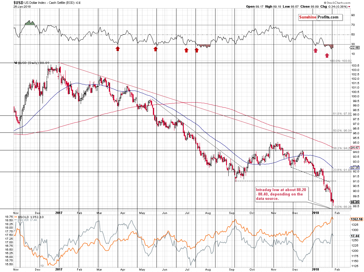
Having discussed the key charts for the key precious metals, let’s check what’s happening in the currency market. We explained the situation in detail and we provided updates during the previous week, so if you haven’t had the chance to read the last few alerts, it might be a good idea to do so today. Since we now have the weekly closing prices, it’s time for a weekly update.
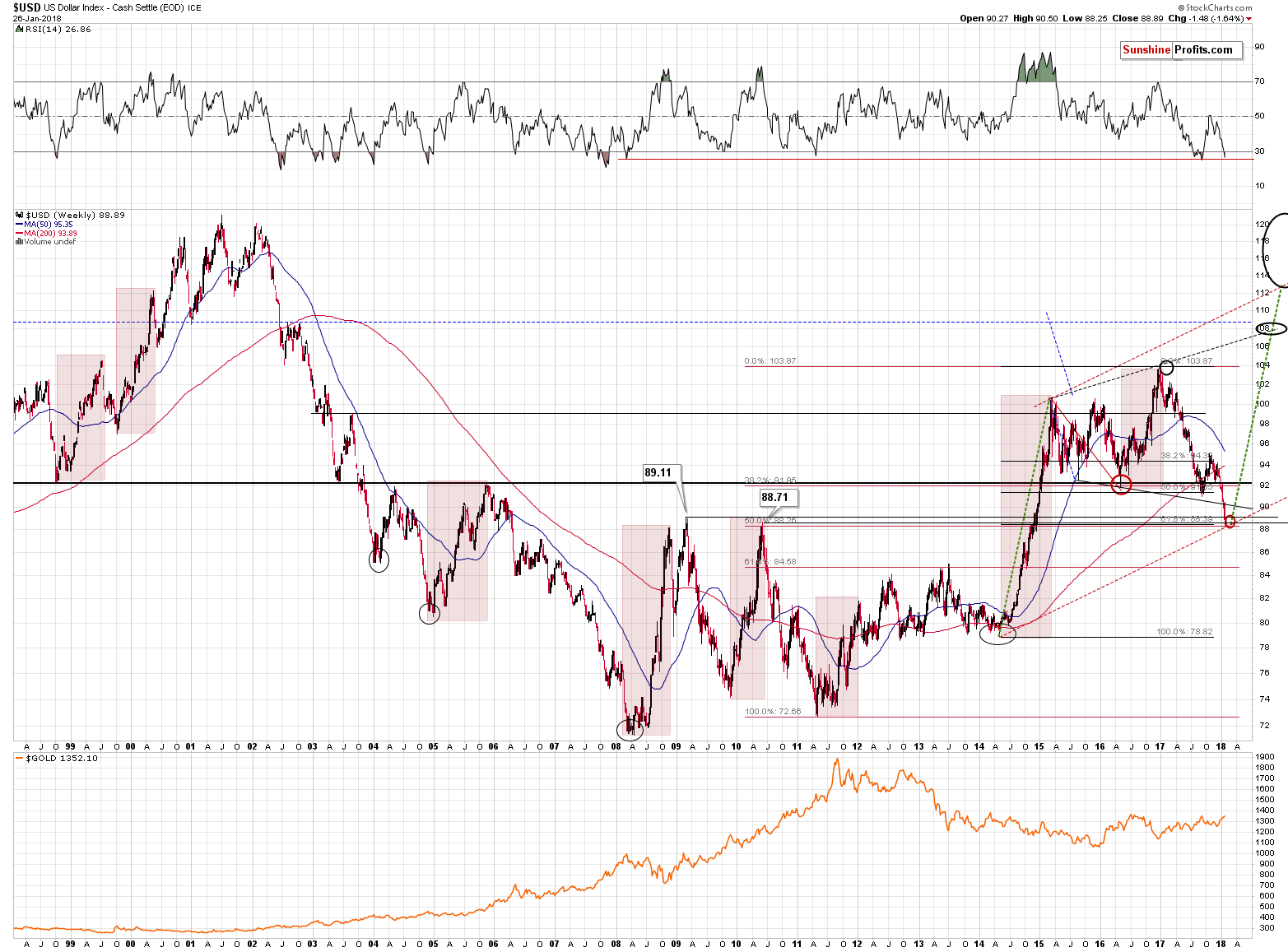
The USD Index closed slightly below the highest of the key support lines (2009 high of 89.11) and above 3 remaining support levels (the 2010 high of 88.71, 50% Fibonacci retracement based on the 2011 – 2017 rally and the 61.8% Fibonacci retracement based on the 2014 – 2017 rally).
The additional detail here is that in today’s pre-market trading, the USD Index has already moved to 89.27, which is more above the 2009 high than Friday’s close was below it. In other words, the tiny breakdown was already invalidated.
What does this tell us? It tells us that the USD Index is highly likely right after a critical bottom. Even if it was just one of the very important levels that would be reached, the situation would already be bullish in light of the very oversold situation in the RSI indicator. But it’s not just one extreme support that was reached, but 4 of them.
Based on the daily RSI indicator, the USD Index was most oversold in more than a year and it reversed exactly at the turning point. The oversold status is not yet a sign that the bottom is in, but it makes other signals – such as the ones described above – much more important.
The strength of the bullish factors and the amount of them is almost breathtaking.
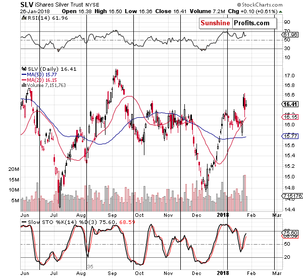
As we discussed earlier, it was the USD weakness that was most likely the factor behind silver’s lack of decline. If the USD Index has just formed a major bottom – and based on the technical reasons that’s more than likely – then we can expect significant weakness in the price of the white metal in the following weeks and months.
Yes, we realize that the fundamental picture for silver is favorable, we are aware of the arguments for silver shortage and the case for silver manipulation, but all of this doesn’t have to prevent silver from declining in the medium term. It certainly didn’t in 2008, so even if we combine the bullish fundamentals for silver, it’s technical picture and the situation in the USD Index, we still get a bearish outlook for the medium term.
While we’re in the long-term oriented part of the analysis, let’s take a look at a few more charts.
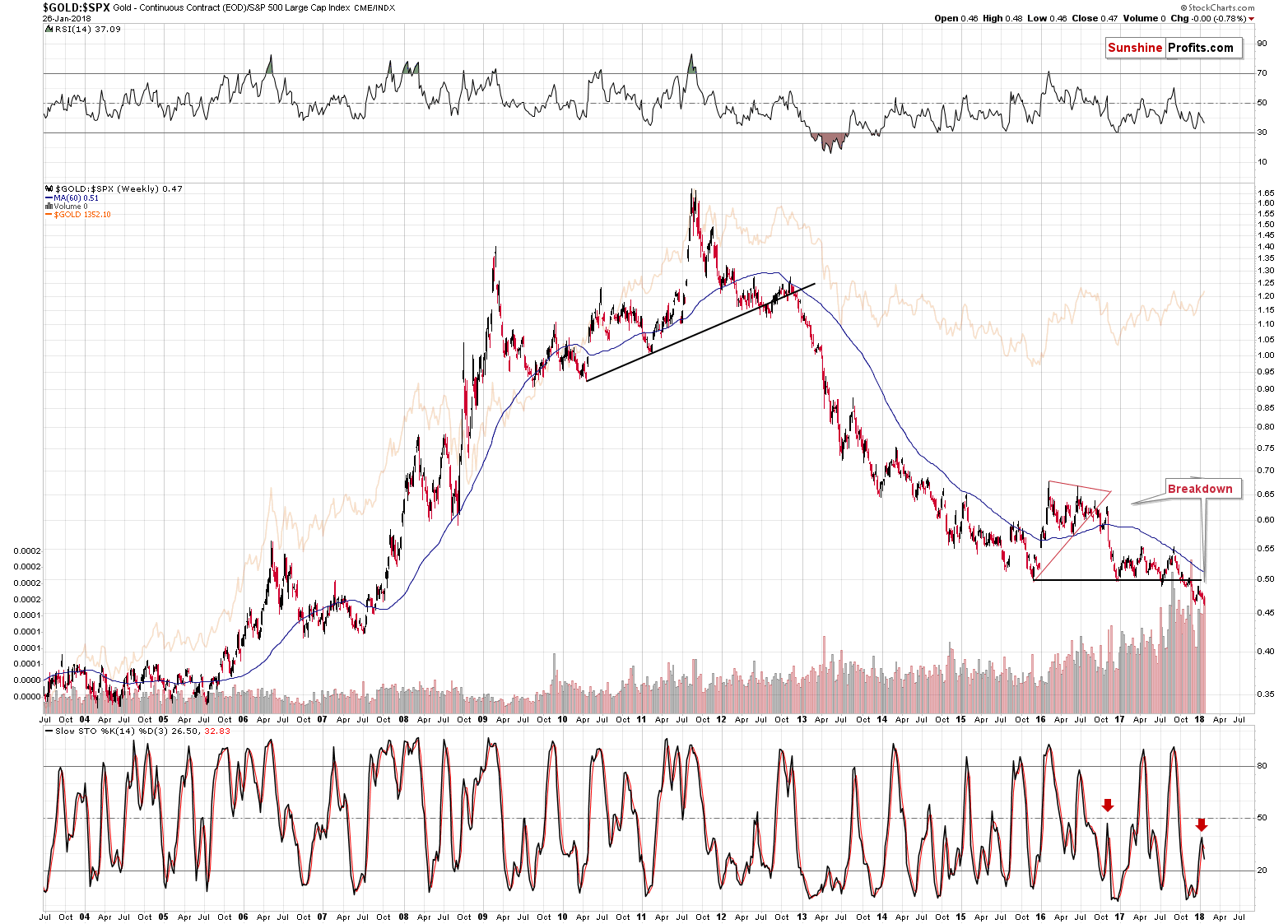
One of the most important long-term charts is the one featuring gold’s performance compared to the general stock market. We explained the situation in the ratio in detail in the January 23rd Alert and our comments on that matter remain up-to-date:
The special thing about the gold to S&P ratio is that it smoothens the price swings and makes it clear what’s really going on. In the case of the price of gold itself, the short-term price swings are more important and they look just like early parts of bigger moves. In the case of the ratio, however, the small moves are even smaller and the bigger ones are even bigger. It’s easier to differentiate between them in this way.
The flag example is the 2012 breakdown and the early 2013 decline. In the case of gold, it still looked like a consolidation after a rally, but the ratio showed that the rally was over. The latter turned out to be the reality.
The ratio is now after a major breakdown and after a corrective upswing that verified it. It now resumed its decline as confirmed by the sell signal from the Stochastic indicator.
The significance of the above is much greater than it may appear at the first sight. The reasons are the analogies to the similar cases. The breakdown below a major support line is very important because the only analogous case was the 2012 breakdown. The one that started the huge slide in the precious metals prices. Why is the confirmation so significant? Because we already had fake breakdowns previously that were shortly invalidated. Not this time. This time the implications are fully bearish and confirmed.
Speaking of the confirmation and sell signal from the Stochastic indicator – it’s significant, because of the similarity to the action in late 2016. Back then the ratio broke below the triangle pattern and rallied back up. It then topped and continued to slide – and this slide was confirmed by the sell signal from the Stochastic indicator. We’re seeing the same kind of confirmation this time. Just as the price of gold followed the ratio lower, the same appears likely this time.
By the way, the ratio topped right at the apex of the triangle, which further confirms the usefulness of the apex reversal technique that we discussed yesterday.
The gold to S&P 500 ratio is now breaking to new lows and this is taking place after the verification of the breakdown below the 2015, 2016 and 2017 lows. It’s tough to imagine a more bearish situation for the ratio – and thus for gold – than the above.
Staying with the ratios and with the general stock market, let’s see how mining stocks performed relative to other stocks.
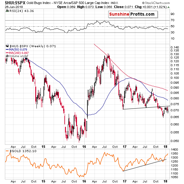
They moved higher, but the overall weekly change was just 1% and it was not enough for the previous breakdown to be invalidated. Consequently, the bearish implications of the latter remain in place.
Before moving to more short-term oriented analysis, we would like to provide you with the chart of the S&P so that you can see how small a reaction was triggered by the Friday’s rally.
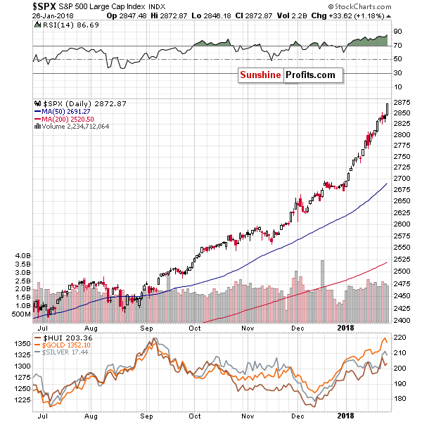
The S&P 500 rallied over 1% on Friday, and that’s something that should have caused silver and mining stocks to rally quite strongly. The former due to multiple industrial applications, and the latter due to being a part of the stock market. Nothing like that happened.
Metals and miners moved higher, but very insignificantly. Moreover, we haven’t seen any real strength in silver and the way mining stocks reacted is simply very bearish.
Miners (represented by the GDX ETF in the lower part of the above chart) moved a bit higher, but it didn’t even manage to close near to the Wednesday’s opening price or above the January 16th (the previous high) close. Gold and silver managed to do both, so mining stocks have just clearly underperformed, thus flashing a sell signal.
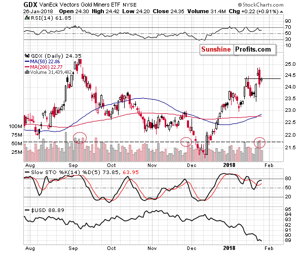
Moreover, Friday’s upswing was accompanied by relatively low volume (lowest since Tuesday), which suggests that the top is in and Friday’s upswing was just a pause before the decline really starts.
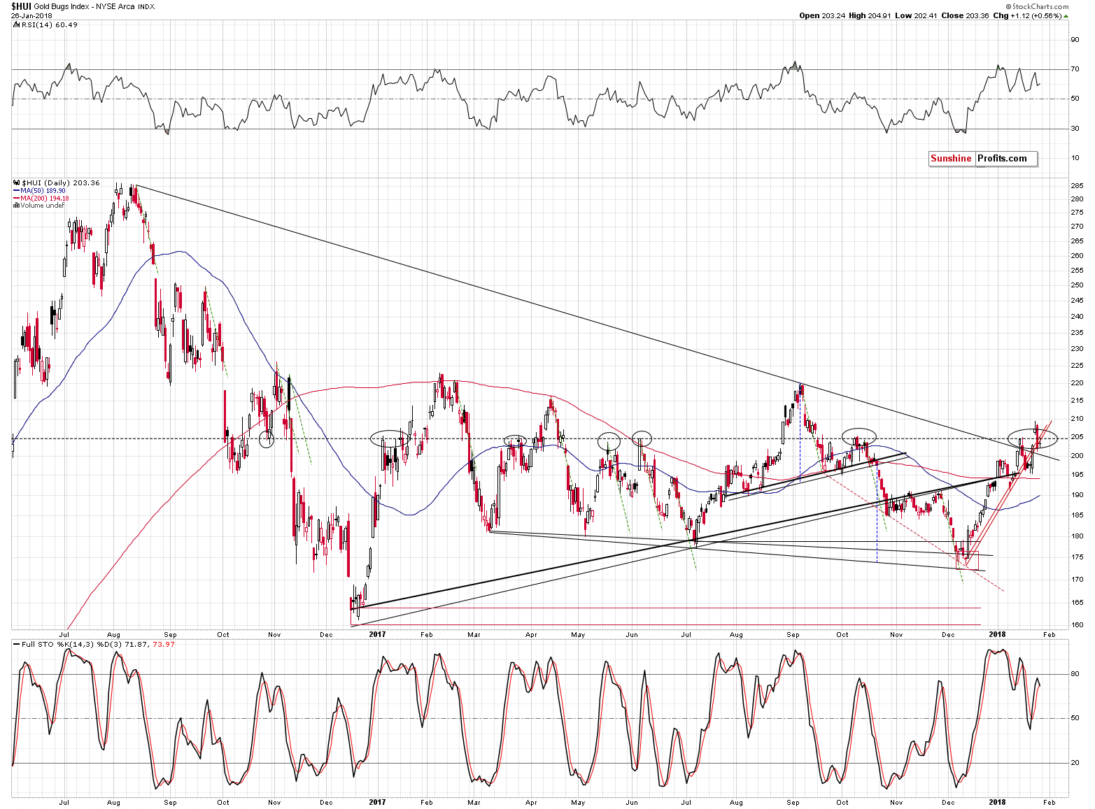
Looking at the HUI Index chart, we see that the 205 resistance has once again stopped the rally. The move above it was quickly invalidated, which is bearish. We can say the same about the move below the rising short-term support lines, because that’s where the HUI closed the week.
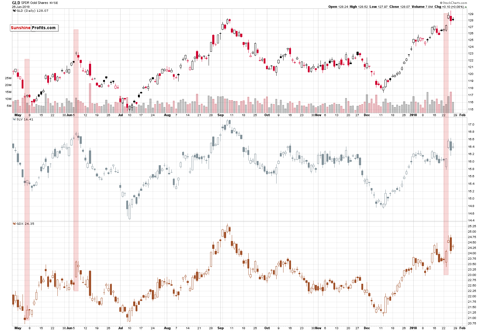
The relatively low volume is also something that we saw in the case of gold and silver, which serves as a confirmation of what we wrote earlier.
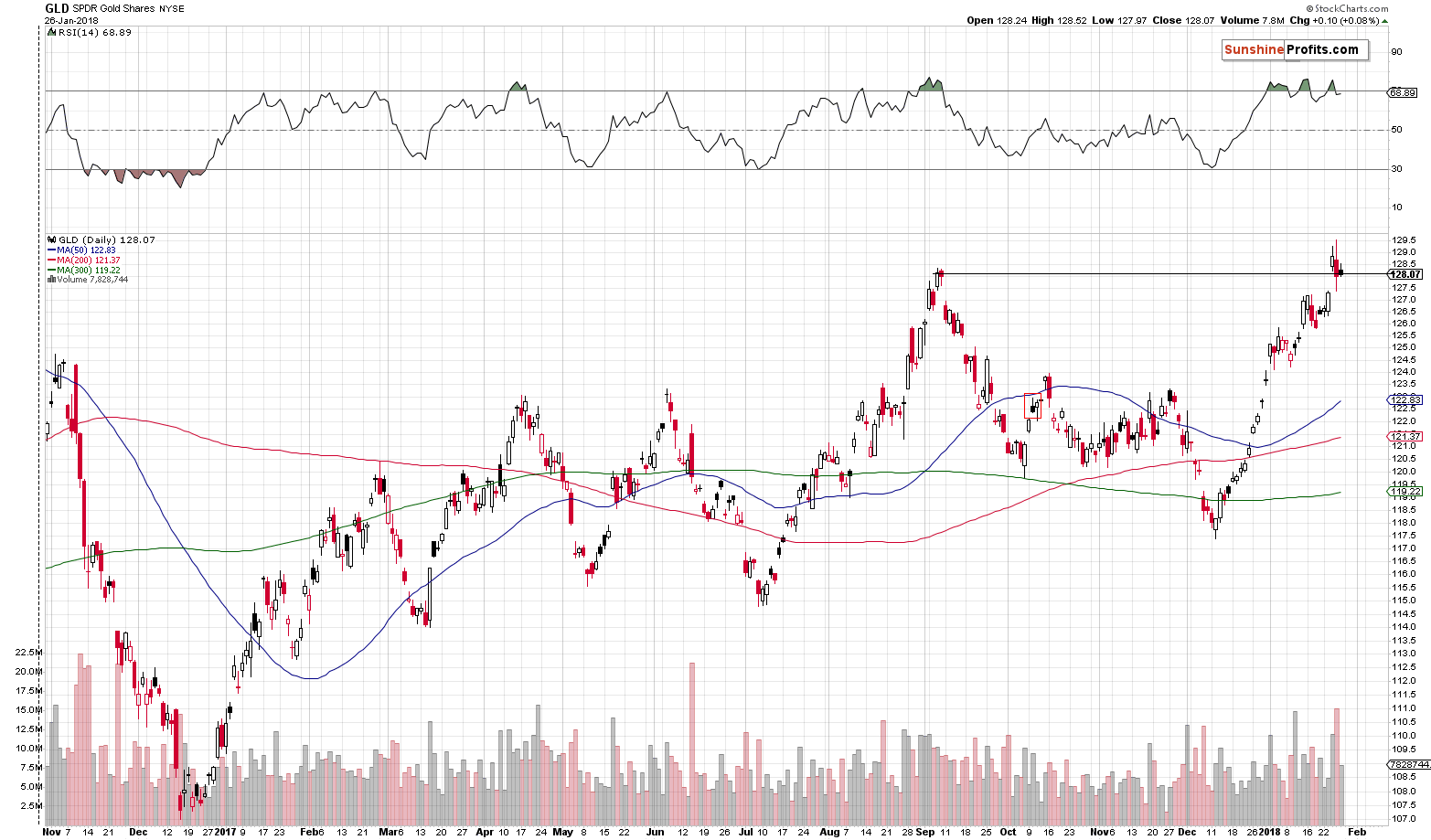
The additional fact that is visible on the above chart is that the GLD ETF didn’t manage to close the week above the September high. This is the final confirmation that the breakout above it was invalidated and that the implications are bearish.
Before summarizing, we would like to remind you about the critical signal that we got during the previous week:
The most important thing is that gold didn’t even manage to rally above $1,370 despite the USD’s volatile decline during yesterday’s session. In the previous alerts, we thoroughly described the likely strength of reaction in light of the possible decline in the USD and while gold moved in precise tune with it, yesterday, it didn’t even manage to do just that. Gold’s lack of strength was astonishing and that (along with the levels that the USD reached) was the factor that made us strongly increase the size of our short positions once again. The implications of the above remain bearish and today’s small pre-market upswing (to $1,353) doesn’t change it.
Summing up, the USD’s epic turnaround along with gold’s extraordinary weakness relative to the USD’s intraday decline along with multiple bearish confirmations paint a very bearish picture for the precious metals market for the following weeks. The situation was very bearish for PMs based on the above, but the record-breaking weekly volume in gold took the bearishness to a new – even more extreme – level. We are adjusting our positions accordingly and – for the first time ever – we are increasing the size of the trading position over 150% - to 200%.
Naturally, it doesn’t mean using everything that one has and then more for this specific trade. It means doubling the size that one regularly puts on the table while entering a speculative trade (which should be much less than half of one’s trading capital).
As always, we will keep you – our subscribers – informed.
To summarize:
Trading capital (supplementary part of the portfolio; our opinion): Full short positions (200% of the full position) in gold, silver and mining stocks are justified from the risk/reward perspective with the following stop-loss orders and initial target price levels:
- Gold: initial target price: $1,218; stop-loss: $1,382; initial target price for the DGLD ETN: $53.98; stop-loss for the DGLD ETN $37.68
- Silver: initial target price: $14.63; stop-loss: $17.82; initial target price for the DSLV ETN: $33.88; stop-loss for the DSLV ETN $20.88
- Mining stocks (price levels for the GDX ETF): initial target price: $19.22; stop-loss: $26.14; initial target price for the DUST ETF: $39.88; stop-loss for the DUST ETF $15.78
In case one wants to bet on junior mining stocks' prices (we do not suggest doing so – we think senior mining stocks are more predictable in the case of short-term trades – if one wants to do it anyway, we provide the details), here are the stop-loss details and initial target prices:
- GDXJ ETF: initial target price: $27.82; stop-loss: $38.22
- JDST ETF: initial target price: $94.88 stop-loss: $37.78
Long-term capital (core part of the portfolio; our opinion): No positions (in other words: cash)
Insurance capital (core part of the portfolio; our opinion): Full position
Important Details for New Subscribers
Whether you already subscribed or not, we encourage you to find out how to make the most of our alerts and read our replies to the most common alert-and-gold-trading-related-questions.
Please note that the in the trading section we describe the situation for the day that the alert is posted. In other words, it we are writing about a speculative position, it means that it is up-to-date on the day it was posted. We are also featuring the initial target prices, so that you can decide whether keeping a position on a given day is something that is in tune with your approach (some moves are too small for medium-term traders and some might appear too big for day-traders).
Plus, you might want to read why our stop-loss orders are usually relatively far from the current price.
Please note that a full position doesn’t mean using all of the capital for a given trade. You will find details on our thoughts on gold portfolio structuring in the Key Insights section on our website.
As a reminder – “initial target price” means exactly that – an “initial” one, it’s not a price level at which we suggest closing positions. If this becomes the case (like it did in the previous trade) we will refer to these levels as levels of exit orders (exactly as we’ve done previously). Stop-loss levels, however, are naturally not “initial”, but something that, in our opinion, might be entered as an order.
Since it is impossible to synchronize target prices and stop-loss levels for all the ETFs and ETNs with the main markets that we provide these levels for (gold, silver and mining stocks – the GDX ETF), the stop-loss levels and target prices for other ETNs and ETF (among other: UGLD, DGLD, USLV, DSLV, NUGT, DUST, JNUG, JDST) are provided as supplementary, and not as “final”. This means that if a stop-loss or a target level is reached for any of the “additional instruments” (DGLD for instance), but not for the “main instrument” (gold in this case), we will view positions in both gold and DGLD as still open and the stop-loss for DGLD would have to be moved lower. On the other hand, if gold moves to a stop-loss level but DGLD doesn’t, then we will view both positions (in gold and DGLD) as closed. In other words, since it’s not possible to be 100% certain that each related instrument moves to a given level when the underlying instrument does, we can’t provide levels that would be binding. The levels that we do provide are our best estimate of the levels that will correspond to the levels in the underlying assets, but it will be the underlying assets that one will need to focus on regarding the signs pointing to closing a given position or keeping it open. We might adjust the levels in the “additional instruments” without adjusting the levels in the “main instruments”, which will simply mean that we have improved our estimation of these levels, not that we changed our outlook on the markets. We are already working on a tool that would update these levels on a daily basis for the most popular ETFs, ETNs and individual mining stocks.
Our preferred ways to invest in and to trade gold along with the reasoning can be found in the how to buy gold section. Additionally, our preferred ETFs and ETNs can be found in our Gold & Silver ETF Ranking.
As a reminder, Gold & Silver Trading Alerts are posted before or on each trading day (we usually post them before the opening bell, but we don't promise doing that each day). If there's anything urgent, we will send you an additional small alert before posting the main one.
=====
Latest Free Trading Alerts:
S&P 500 index gained 1.2% on Friday, following breakout above short-term consolidation. It continued its almost month-long rally, as it extended the yearly advance to 7.5%. Is this an euphoria phase of the bull market? That's how it looks. However, despite some clear technical overbought conditions, there has been no confirmed reversal pattern so far.
More New Record Highs, But Bull Market May Die On That Euphoria
=====
Hand-picked precious-metals-related links:
PRECIOUS-Gold slips as U.S. dollar claws back some ground
Hefty price curbs India's love for gold
=====
In other news:
Dollar rises after six weeks of losses
The 6 Things to Watch in This Week's Fed Meeting
Oil dips as U.S. output rises, still set for strongest January in five years
IMF chief warns Trump's tax cuts could destabilise global economy
Japan raps Coincheck, orders broader checks after $530 million cryptocurrency theft
Crypto Investors Risk ‘Total Loss,’ Deutsche Warns
=====
Thank you.
Sincerely,
Przemyslaw Radomski, CFA
Founder, Editor-in-chief, Gold & Silver Fund Manager
Gold & Silver Trading Alerts
Forex Trading Alerts
Oil Investment Updates
Oil Trading Alerts

