

Briefly: in our opinion, full (300% of the regular position size) speculative short positions in mining stocks are justified from the risk/reward point of view at the moment of publishing this Alert.
The price moves we’ve seen so far this week are particularly interesting. And I don’t mean the boring action in the GDX (which serves its own purpose as a signal), but the reversals in gold and silver.
What Can History Teach Us?
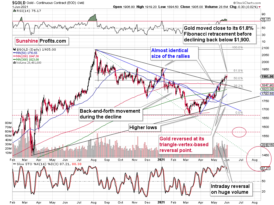
In the case of gold, the reversal took gold – temporarily – to new highs, but then gold declined once again. At the moment of writing these words (Jun. 2), gold is trading back below $1,900.
This price action took place on relatively significant volume (not as significant as the price action in silver, though), which suggests that the reversal is important. Moreover, that’s only a confirmation, as we knew that the reversal was important all along – based on the triangle-vertex-based reversal we recently saw. Combination of this with highly overbought RSI, a sell signal from the stochastic indicator, and, most importantly, the analogies to how the situation in gold developed in 2008 and 2012, provides us with an extremely bearish outlook for gold.
Many other factors are pointing to these similarities, and two of them are the size of the correction relative to the preceding decline and to the previous rally. In 2012 and 2008, gold corrected to approximately the 61.8% Fibonacci retracement level. Gold was very close to this level this year, and since the history tends to rhyme more than it tends to repeat itself to the letter, it seems that the top might already be in.
In both years, 2008 and 2012, there were three tops. Furthermore, the rallies that took gold to the second and third top were similar. In 2008, the rally preceding the third top was bigger than the rally preceding the second top. In 2012, they were more or less equal. I marked those rallies with blue lines in the above chart – the current situation is very much in between the above-mentioned situations. Also, the current rally is bigger than the one that ended in early January 2021 but not significantly so.
Since I realize that it’s most difficult to stay on track right at the top, let me remind you about two key facts:
- We have open-ended QEs – money is being pumped into the system at an unprecedented pace, even when stocks are well beyond their all-time highs. The world has been in a pandemic for over a year, and the economies were hit hard. And yet, gold – the king of safe hedges – did not manage to soar above its 2011 highs and then stay above them. Given how extremely positive the fundamental situation is, gold’s reaction is even more extremely bearish. This market is simply not ready to soar without declining significantly first. The bull market and bear markets move in stages, and the final slide was postponed multiple times, but it’s clear that gold is not ready to soar to new highs without completing this final stage – the downswing.
- Remember what happened when gold previously attempted to break above major long-term highs? It was in 2008 and gold was breaking above its 1980 high. Gold wasn’t ready to truly continue its bull market without plunging first. This downswing was truly epic, especially in the case of silver and mining stocks; and now even gold’s price patterns are like what we saw in 2008.
My previous comments on the analogies to 2008 and 2012 remain up-to-date:
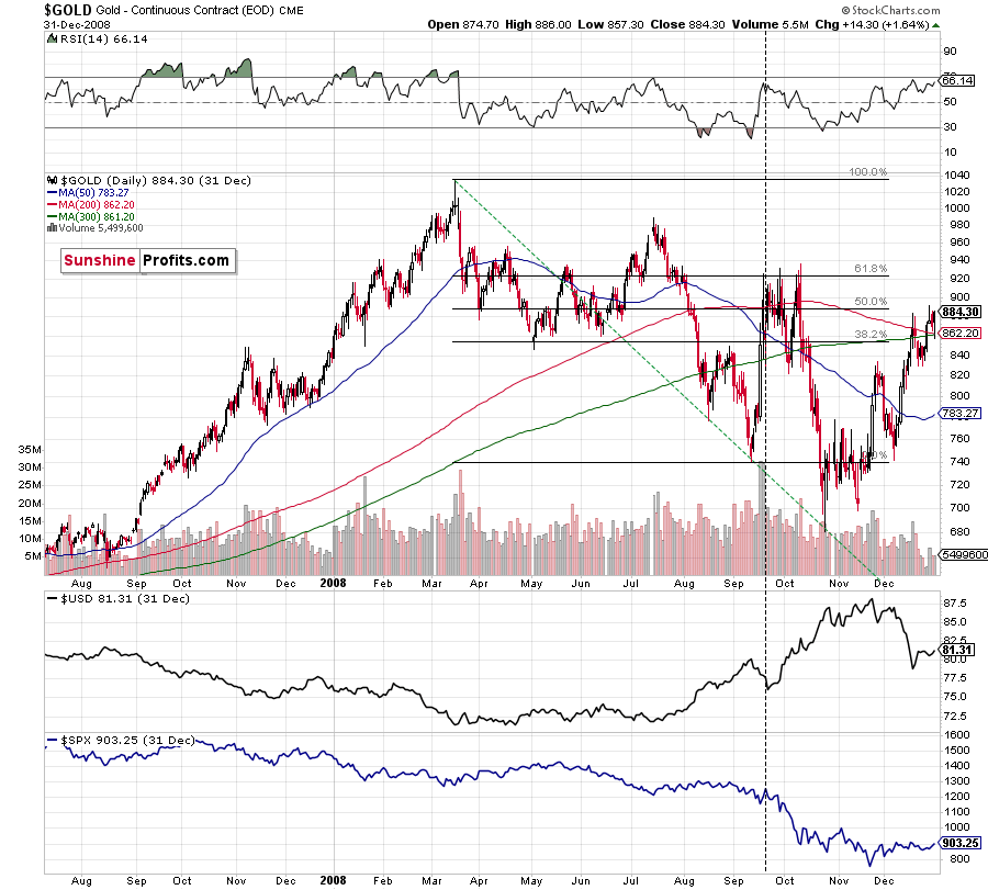
Back in 2008, gold corrected to 61.8% Fibonacci retracement, but it stopped rallying approximately when the USD Index started to rally, and the general stock market accelerated its decline.
Taking into consideration that the general stock market has probably just topped, and the USD Index is about to rally, then gold is likely to slide for the final time in the following weeks/months. Both above-mentioned markets support this bearish scenario and so do the self-similar patterns in terms of gold price itself.
What would change my mind with regard to gold itself? Perhaps if it broke above its January 2021 highs and confirmed this breakout. This would be an important technical indication on its own, but it would also be something very different from what happened in 2008 and 2012. If that happened along with strength in mining stocks, it would be very bullish. Still, if the above happened, and miners didn’t react at all or they declined, it would not be bullish despite the gains in the gold price itself.
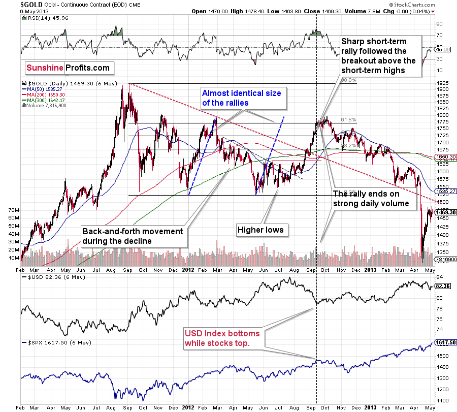
The March 2021 low formed well below the previous low, but as far as other things are concerned, the current situation is similar to what happened in 2012.
The relatively broad bottom with higher lows is what preceded both final short-term rallies – the current one, and the 2012 one. Their shape as well as the shape of the decline that preceded these broad bottoms is very similar. In both cases, the preceding decline had some back-and-forth trading in its middle, and the final rally picked up pace after breaking above the initial short-term high.
Interestingly, the 2012 rally ended on huge volume, which is exactly what we saw also on May 19 this year. Consequently, forecasting much higher gold prices here doesn’t seem to be justified based on the historical analogies.
The thing I would like to emphasize here is that gold didn’t form the final top at the huge-volume reversal on Sep. 13, 2012. It moved back and forth for a while and moved a bit above that high-volume top, and only then the final top took place (in early October 2012).
The same happened in September and in October 2008. Gold reversed on huge volume in mid-September, and it was approximately the end of the rally. The final top, however, formed after some back-and-forth trading and a move slightly above the previous high.
Consequently, the fact that gold moved a bit above its own high-volume reversal (May 19, 2021) is not an invalidation of the analogy, but rather its continuation.
There’s one more thing I would like to add, and it’s that back in 2012, gold corrected to approximately the 61.8% Fibonacci retracement level – furthermore, the same happened in 2008 as you can see in the below chart. Consequently, the fact that gold moved above its 50% Fibonacci retracement doesn’t break the analogy either. And even if gold moves to $1,940 or so, it will not break it. It’s not likely that it is going to move that high, as in both cases –in 2008 and 2012 – gold moved only somewhat above its high-volume reversal before forming the final top. So, as this year’s huge-volume reversal took place close to the 50% retracement and not the 61.8% retracement, it seems that we’ll likely see a temporary move above it, which will create the final top. And that’s exactly what we see happening so far this week.
The lower part of the above chart shows how the USD Index and the general stock market performed when gold ended its late-2012 rally and was starting its epic decline. In short, that was when the USD Index bottomed, and when the general stock market topped.
Also, please note that while it might seem bullish that gold managed to rally above its declining black resistance line recently (the one based on the 2020 top and the 2021 top), please note that the same happened in 2012 – I marked the analogous line with red. The breakout didn’t prevent gold from sliding. When the price reached the line, we saw a short-term bounce, but nothing more than that – the gold price fell through it in the following weeks.
Silver and Mining Stocks
Having said that, let’s check what silver and mining stocks did.
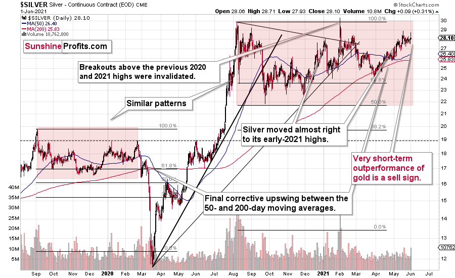
Silver has barely moved in terms of the closing prices. However, it has rallied significantly on an intraday basis – more than gold did; and the volume on which it happened was more notable than the one in gold.
In other words, silver did exactly what it tends to do at market tops. And we can say the same thing about the mining stocks.
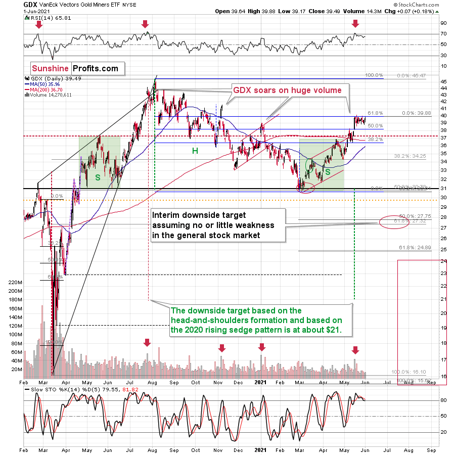
Gold miners moved higher, but the move took place on relatively low volume, so it was nothing to write home about. Miners refused to follow gold higher, but they seem likely to follow it lower as soon as they get a good trigger for it (a decline in gold). Actually, gold stocks can decline even without a decline in gold, at least initially – that’s how the 2012-2013 decline started, after all.
The clearest of the recent signs coming from mining stocks is the fact that gold rallied by almost $30 last week, and the HUI Index (flagship proxy for gold stocks) went down slightly. This is extremely bearish.
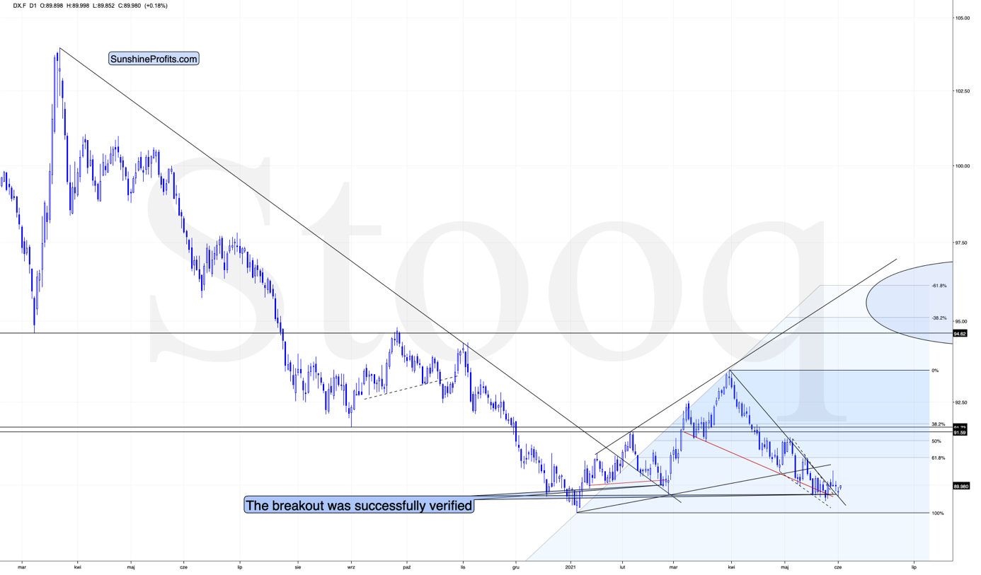
Meanwhile, the USD Index has just confirmed its short-term breakout, suggesting that the analogy to 2016 and the similarity to how it bottomed (triple bottom with lower lows) in mid-2020 remains intact. And so does the bullish outlook for the universally-hated-and-massively-shorted U.S. currency.
Having said that, let’s take a look at the markets from a more fundamental angle.
An Unproven Theory
With Basel 3 effectively eliminating unallocated gold accounts, there has been some trepidation regarding the potential effect on gold prices. For context, bullion banks and investment dealers offer clients the opportunity to choose between unallocated deposit accounts and allocated deposit accounts. In the case of the latter, physical gold is housed as collateral, cannot be lent out and banks’ creditors have no claim on the holdings during bankruptcy. Conversely, unallocated deposit accounts are not backed by physical gold and clients are left with an unsecured claim on their account holdings.
And why does all of this matter?
Well, with Jun. 28 (Basel 3 coming into effect) approaching fast, bullion banks will be required to maintain collateral against all of their clients’ holdings. In a nutshell: unallocated deposit accounts will be converted to allocated deposit accounts. And while the requirement should increase the demand for physical gold, will it affect the prices that we observe in the financial markets?
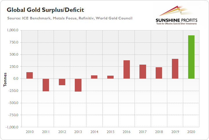
Well, for starters, it’s important to remember that the global gold market was oversupplied by nearly 900 tonnes in 2020.
Please see below:
Second, while capacity has been reduced and the supply/demand imbalance has declined to date, the market is still far from equilibrium.
Please see below:
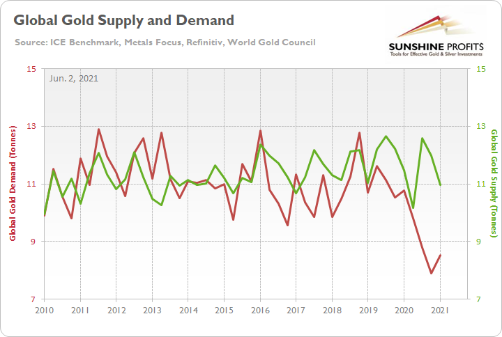
To explain, the green line above tracks global gold supply, while the red line above tracks global gold demand. If you analyze the right side of the chart, you can see that the supply/demand imbalance is still close to an 11-year high (which was set in Q4 2020).
To that point, if we net the two values, you can see that the current surplus allows plenty of room for physical demand to rise.
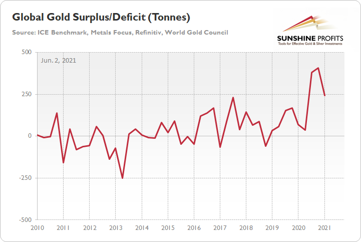
To explain, the red line above tracks gold’s global surplus/deficit. If you analyze the right side of the chart, you can see that as of Mar. 31 (end of Q1 2021), there are nearly 244 tonnes of gold that are still looking for a home.
What’s Publicly Known Is Already Included
Third, while Basel 3 theoretically implies that physical gold should see robust demand, gold miners aren’t as optimistic about the rumored Renaissance.
Please see below:
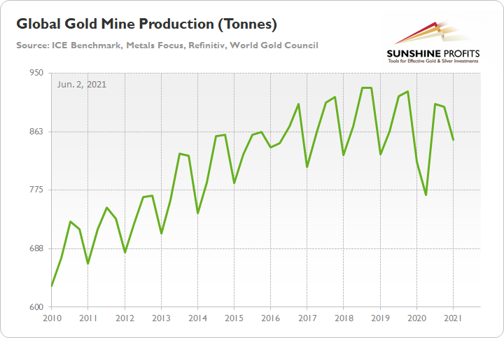
To explain, the green line above tracks global gold mine production. If you analyze the right side of the chart, you can see that mining production has been making lower highs since 2018. Moreover, while the implementation of Basel 3 is far from a secret, mining production actually declined from 900 tonnes in Q4 2020 to 851 tonnes in Q1 2021. As a result, if gold miners believed that a buying spree was near, would they have slashed production in the first quarter?
Finally – and most importantly – gold’s global surplus/deficit has almost no relationship with the futures price. In fact, periods of excess global demand often coincide with the yellow metal’s worst quarterly performances.
Please see below:
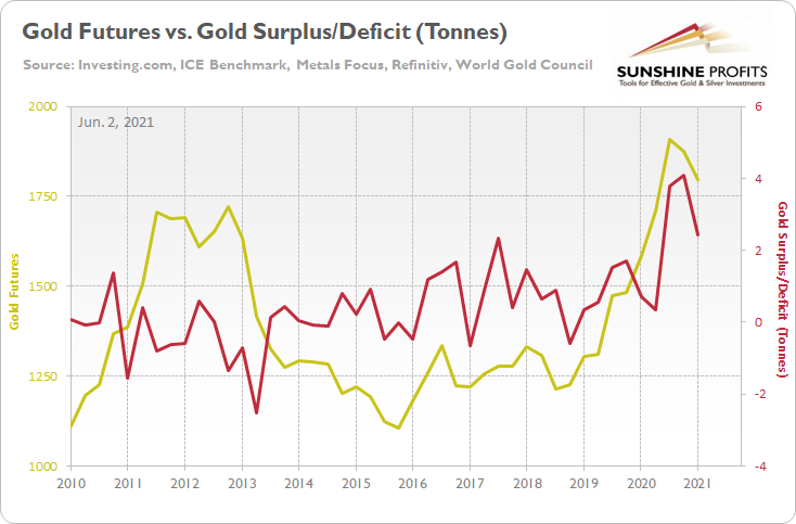
To explain, the gold line above tracks gold’s quarterly futures price, while the red line above tracks gold’s global surplus/deficit. If you analyze the relationship, you can see that when demand outweighed supply (deficit) in 2014, 2015, 2016 and 2018, gold’s quarterly futures price fell below $1,250. Conversely, when supply significantly outweighed demand (surplus) in 2020, gold’s quarterly futures price hit an all-time high.
Please note that I put the “Basel 3 is far from a secret” in bold. This is very important because the markets are forward-looking, so whatever is publicly known is likely already “in the price”. Consequently, whatever was likely to happen to the price of gold based on the Basel 3 announcement and implementation has quite likely already happened. If there is something that the market didn’t understand about the implications, then it might affect the price once it becomes known.
The bottom line?
While conventional wisdom suggests that the conversion from unallocated deposit accounts to allocated deposit accounts should put upward pressure on gold prices, history suggests otherwise. Moreover, with plenty of supply still available to absorb the potential shift, there are more important variables that will likely affect gold’s performance over the short and medium term.
Pricing Pressures
While the U.S. 10-Year Treasury yield jumped back above 1.60% on Jun. 1, bond investors remain skeptical of future inflation. Case in point: with the headline Personal Consumption Expenditures (PCE) Index (released on May 28) recording its highest year-over-year (YoY) percentage increase since 2008 and the core PCE Index (which excludes the inflationary effects of food and energy) recording its highest YoY percentage increase since 1992, the U.S. 10-Year Treasury yield barely flinched.
Please see below:
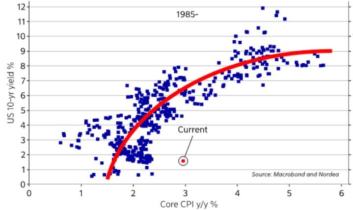
To explain, the blue dots above track the U.S. 10-Year Treasury yield during various YoY percentage changes in the core Consumer Price Index (CPI). For context, the core PCE Index is similar to the core CPI. However, the former measures the prices that consumers and nonprofits pay for goods and services. More importantly, though, if you focus your attention on the red dot labeled “current,” you can see that since 1985, when the YoY percentage change in the core CPI hits 3% or more, the U.S. 10-Year Treasury yield is always north of 4%.
To that point, the “transitory” narrative is built on the belief that YoY percentage changes are meaningless because the U.S. economy was in full or partial lockdown during April and May of 2020 (which leads to “base effects” that distort the comparability of the data). However, it’s important to remember that the month-over-month (MoM) percentage changes in the headline PCE Index and the core PCE Index – when we compare the April 2021 data to the March 2021 data (no base effects), we can see that both rose by the most since 2008 and 1983 respectively (if we exclude the one-time jump in the latter in 2001)
Please see below:
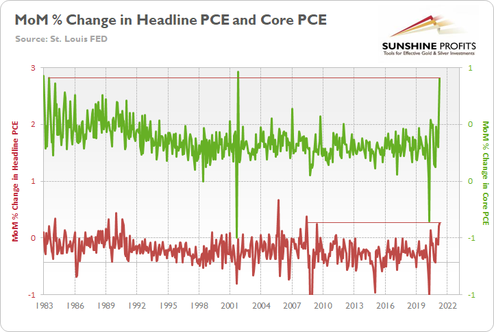
To explain, the green line above tracks the MoM percentage change in the core PCE Index, while the red line above tracks the MoM percentage change in the headline PCE Index. If you analyze the right side of the chart, you can see that base effects no longer apply. Thus, while the YoY critics insist that reopening spikes are expected, and therefore they are transitory, MoM comparisons signal a different outcome.
Furthermore, with a deluge of new data hitting the wire on the first day of June, the story hasn’t changed. Case in point: the Dallas Federal Reserve (FED) released its Texas Manufacturing Outlook Survey on Jun. 1; and whether it is raw materials or labor costs, the phrase ‘all-time high’ has become increasingly commonplace.
Please see below:
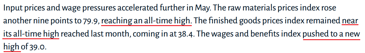 Source: Dallas FED
Similarly, the Institute for Supply Management (ISM) also released its Manufacturing PMI on Jun. 1. And while the overall reading jumped from 60.7% in April to 61.2% in May, the ISM Prices Index decreased from 89.6% to 88%.
However, an excerpt from the report read:
“Raw materials prices increased for the 12th consecutive month. In the last four months, the index has been at its highest levels since July 2008, the last of five straight months over 80 percent, when it registered 90.4 percent.”
For context, the ISM requires written permission before redistributing any of its content, and that’s why I quoted the findings rather than including a screenshot of the report. However, if you want to review the source material, you can find it here.
If that wasn’t enough, IHS Markit’s U.S. Manufacturing PMI hit another all-time high on Jun. 1, rising from 60.5 in April to 62.1 in May.
Please see below:
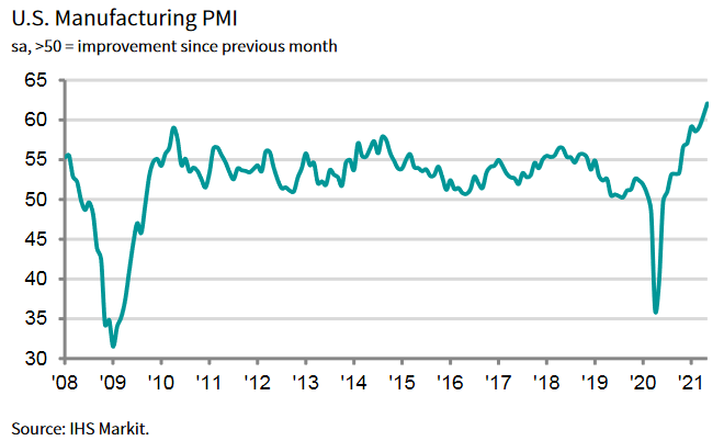
More importantly, though, “new orders increased at the fastest pace on record in May, as … the upturn was often linked to the loosening of COVID-19 restrictions and successful vaccine rollouts, which led to stronger demand conditions.”
And as you may have guessed, pricing pressures also followed suit:
 Source: IHS Markit
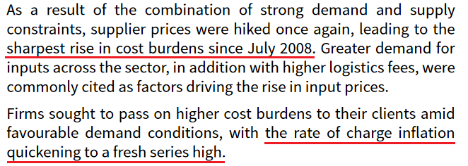
As another point of reference, the J.P. Morgan Global Manufacturing PMI also rose to an 11-year high on Jun. 1, with the report revealing that “Capacity pressures drive [a] surge in price inflation.”
Please see below:
 Source: J.P.Morgan, IHS Markit
But saving the best for last, Costco CFO Richard Galanti had this to say during the company’s third-quarter earnings call on May 27.
”There have been and are a variety of inflationary pressures that we and others are seeing. These include higher labor costs, higher freight costs, higher transportation demand, along with the container shortage and port delays that I mentioned, increased demand in various product categories some shortages, various shortages of everything from chips to oils and chemical supplies by facilities hit by the Gulf freeze and storms and, in some cases, higher commodity prices.”
Anything else?
 Source: Costco/The Motley Fool
The bottom line?
With the reality on the ground much different than the reality depicted in the financial markets, the divergence is occurring at a time when the U.S. 10-Year Treasury yield is at an all-time low relative to the YoY percentage change in the headline PCE Index. As a result, with a reversion to the mean likely to occur over the medium term, the PMs’ optimism may flip right along with it.
Is S&P 500 Heavily Wounded?
Finally, with U.S. equities looking increasingly vulnerable, macroeconomic data just stuck two more daggers into the S&P 500’s heart. Case in point: with U.S. sales of heavy trucks (released on May 28) rolling over again in April, the weak print is another ominous sign for the S&P 500.
Please see below:
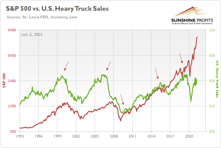
To explain, the red line above tracks the S&P 500, while the green line above tracks U.S. sales of heavy trucks. If you focus your attention on the arrows, you can see that heavy truck sales often peak in advance or alongside the S&P 500. Thus, with U.S. building permits also rolling over in January, the sun could be setting on the S&P 500.
As a second sign, with the FED’s reverse-repo nightmare draining liquidity from the system (another $448 billion was sold on Jun. 1), the central bank is already tightening (based on the net effect). And with the St. Louis FED’s Financial Stress Index (STLFSI) perking up, the S&P 500 often moves in the opposite direction. For context, the St. Louis FED uses “seven interest rates, six yield spreads, and five other indicators” to determine the level of stress in the financial system.
Please see below:
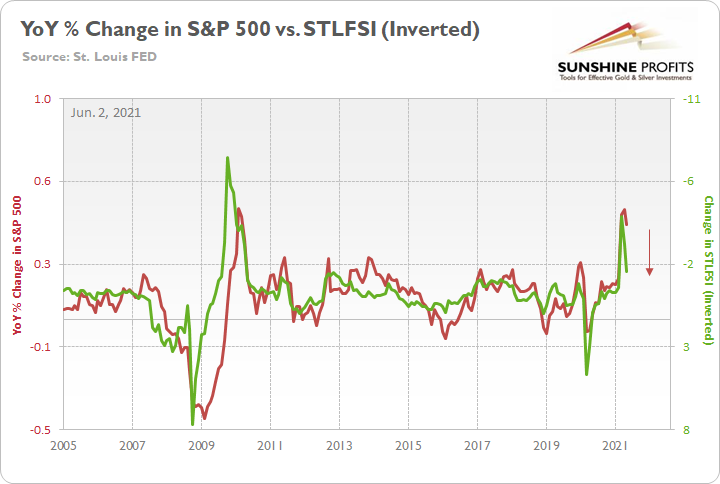
To explain, the red line above tracks the YoY percentage change in the S&P 500, while the green line above tracks the inverted YoY change in the STLFSI (the index value). For context, inverted means that the latter’s scale is flipped upside down and that a rising green line represents a falling STLFSI, while a falling green line represents a rising STLFSI. Also, a lower STLFSI means that there is less stress in the financial system, while a higher STLFSI means that there is more stress in the financial system.
If you analyze the relationship, you can see that as the YoY change in the STLFSI becomes less negative, the YoY percentage change in the S&P 500 becomes less positive. Moreover, if the red line reconnects with the green line on the right side of the chart, the S&P 500 would fall to roughly 3,730 by the end of June.
In conclusion, while the PMs view the current environment as a glass half full, liquidity is already drying up. With daily reverse repos siphoning cash from the financial system, the merry-go-round of buying bonds during the day and selling them at night signals that tapering is likely on the horizon. Moreover, with the U.S. 10-Year Treasury yield at an all-time low when evaluated on a relative basis, a reversion to the mean could hammer the PMs over the medium term. In addition, with the S&P 500 wobbling beneath the surface, if a stock-market swoon enters the equation, the PMs journey could be all the more painful.
Overview of the Upcoming Part of the Decline
- It seems likely to me that the current corrective upswing is very close to being over, given gold’s similarity to what happened in 2012, USD’s similarity to 2016 and the situation in the general stock market.
- After miners slide once again in a meaningful and volatile way, but silver doesn’t (and it just declines moderately), I plan to switch from short positions in miners to short positions in silver (this could take another 1-2 weeks to materialize). I plan to exit those short positions when gold shows substantial strength relative to the USD Index, while the latter is still rallying. This might take place with gold close to $1,450 - $1,500 and the entire decline (from above $1,700 to about $1,475) would be likely to take place within 1-12 weeks, and I would expect silver to fall hardest in the final part of the move. This moment (when gold performs very strongly against the rallying USD and miners are strong relative to gold – after gold has already declined substantially) is likely to be the best entry point for long-term investments, in my view. This might happen with gold close to $1,475, but it’s too early to say with certainty at this time. In other words, the entire decline could take between 1 and 12 weeks, with silver declines occurring particularly fast in the final 1-2 weeks.
- If gold declines even below $1,500 (say, to ~$1350 or so), then it could take another 10 weeks or so for it to bottom, but this is not what I view as a very likely outcome.
- As a confirmation for the above, I will use the (upcoming or perhaps we have already seen it?) top in the general stock market as the starting point for the three-month countdown. The reason is that after the 1929 top, gold miners declined for about three months after the general stock market started to slide. We also saw some confirmations of this theory based on the analogy to 2008. All in all, the precious metals sector would be likely to bottom about three months after the general stock market tops. If the general stock market puts the final top in the first half of May (which seems quite likely given NASDAQ’s top in late April), then we might expect the precious metals sector to bottom sometime in August.
- The above is based on the information available today, and it might change in the following days/weeks.
Please note that the above timing details are relatively broad and “for general overview only” – so that you know more or less what I think and how volatile I think the moves are likely to be – on an approximate basis. These time targets are not binding or clear enough for me to think that they should be used for purchasing options, warrants or similar instruments.
Summary
To summarize, even though it doesn’t seem to be the case based on this month’s price change in gold, it seems that the yellow metal’s days are numbered. This is based not only on the excessively oversold USD Index and its 2016 self-similar pattern but also on what’s happening in the stock market, silver’s recent outperformance and price levels reached throughout the precious metals sector. From the long-term point of view, the current situation seems similar to what we saw in the second half of 2012, and in 2008. While the very near term remains unclear, the outlook for the next several weeks and months remains very bearish.
After the sell-off (that takes gold to about $1,350 - $1,500), we expect the precious metals to rally significantly. The final part of the decline might take as little as 1-5 weeks, so it's important to stay alert to any changes.
Most importantly, please stay healthy and safe. We made a lot of money last March and this March, and it seems that we’re about to make much more on the upcoming decline, but you have to be healthy to enjoy the results.
As always, we'll keep you - our subscribers - informed.
To summarize:
Trading capital (supplementary part of the portfolio; our opinion): Full speculative short positions (300% of the full position) in mining stocks are justified from the risk to reward point of view with the following binding exit profit-take price levels:
Mining stocks (price levels for the GDXJ ETF): binding profit-take exit price: $24.12; stop-loss: none (the volatility is too big to justify a stop-loss order in case of this particular trade)
Alternatively, if one seeks leverage, we’re providing the binding profit-take levels for the JDST (2x leveraged) and GDXD (3x leveraged – which is not suggested for most traders/investors due to the significant leverage). The binding profit-take level for the JDST: $39.87; stop-loss for the JDST: none (the volatility is too big to justify a SL order in case of this particular trade); binding profit-take level for the GDXD: $94.87; stop-loss for the GDXD: none (the volatility is too big to justify a SL order in case of this particular trade).
For-your-information targets (our opinion; we continue to think that mining stocks are the preferred way of taking advantage of the upcoming price move, but if for whatever reason one wants / has to use silver or gold for this trade, we are providing the details anyway.):
Silver futures upside profit-take exit price: unclear at this time - initially, it might be a good idea to exit, when gold moves to $1,512.
Gold futures upside profit-take exit price: $1,512.
Long-term capital (core part of the portfolio; our opinion): No positions (in other words: cash
Insurance capital (core part of the portfolio; our opinion): Full position
Whether you already subscribed or not, we encourage you to find out how to make the most of our alerts and read our replies to the most common alert-and-gold-trading-related-questions.
Please note that we describe the situation for the day that the alert is posted in the trading section. In other words, if we are writing about a speculative position, it means that it is up-to-date on the day it was posted. We are also featuring the initial target prices to decide whether keeping a position on a given day is in tune with your approach (some moves are too small for medium-term traders, and some might appear too big for day-traders).
Additionally, you might want to read why our stop-loss orders are usually relatively far from the current price.
Please note that a full position doesn't mean using all of the capital for a given trade. You will find details on our thoughts on gold portfolio structuring in the Key Insights section on our website.
As a reminder - "initial target price" means exactly that - an "initial" one. It's not a price level at which we suggest closing positions. If this becomes the case (like it did in the previous trade), we will refer to these levels as levels of exit orders (exactly as we've done previously). Stop-loss levels, however, are naturally not "initial", but something that, in our opinion, might be entered as an order.
Since it is impossible to synchronize target prices and stop-loss levels for all the ETFs and ETNs with the main markets that we provide these levels for (gold, silver and mining stocks - the GDX ETF), the stop-loss levels and target prices for other ETNs and ETF (among other: UGL, GLL, AGQ, ZSL, NUGT, DUST, JNUG, JDST) are provided as supplementary, and not as "final". This means that if a stop-loss or a target level is reached for any of the "additional instruments" (GLL for instance), but not for the "main instrument" (gold in this case), we will view positions in both gold and GLL as still open and the stop-loss for GLL would have to be moved lower. On the other hand, if gold moves to a stop-loss level but GLL doesn't, then we will view both positions (in gold and GLL) as closed. In other words, since it's not possible to be 100% certain that each related instrument moves to a given level when the underlying instrument does, we can't provide levels that would be binding. The levels that we do provide are our best estimate of the levels that will correspond to the levels in the underlying assets, but it will be the underlying assets that one will need to focus on regarding the signs pointing to closing a given position or keeping it open. We might adjust the levels in the "additional instruments" without adjusting the levels in the "main instruments", which will simply mean that we have improved our estimation of these levels, not that we changed our outlook on the markets. We are already working on a tool that would update these levels daily for the most popular ETFs, ETNs and individual mining stocks.
Our preferred ways to invest in and to trade gold along with the reasoning can be found in the how to buy gold section. Furthermore, our preferred ETFs and ETNs can be found in our Gold & Silver ETF Ranking.
As a reminder, Gold & Silver Trading Alerts are posted before or on each trading day (we usually post them before the opening bell, but we don't promise doing that each day). If there's anything urgent, we will send you an additional small alert before posting the main one.
Thank you.
Przemyslaw Radomski, CFA
Founder, Editor-in-chief

