
- Tapering vs. Tightening issue continued
- USD and Euro Indices
- General Stock Market
- Correlation Matrix
- Gold
- Silver
- Mining Stocks
- Gold - truncated 5th wave?
- Summary
Tapering vs. Tightening issue continued
This week all (investors’) eyes were on the Fed, and the Fed delivered. A small (if you can call $10 billion “small”, but it is on a relative basis) form of tapering of the Quantitative Easing program was announced and markets reacted to it. It turned out that our assumptions about investors’ expectations were correct – they were expecting to see no tapering and they were surprised by it.
As mentioned previously, even though tapering and tightening are often viewed as synonyms, they are exactly the same thing. Let’s discuss this more thoroughly.
Tapering and tightening are rightly interpreted as backing out from two distinct expansionary tools. Even though those two tools have similar effects on the market interest rates, they are not viewed as equivalent. Moreover, as Bernanke willingly admitted, the Federal Open Market Committee does not know the exact consequences of long term asset purchases (therefore contrary to Dennis Lockhart’s – Federal Reserve Bank of Atlanta – claim it is not easy to understand when the economy is “ready” for backing out). As he softly stated apparently they are “somewhat less certain about the magnitudes of the effects on financial conditions and the economy of changes in the pace of purchases or in the accumulated stock of assets on the Fed's balance sheet”.
Let us look closer than on those two different tools that Fed used to bring down longer term interest rates. First the conventional tool, short-term interest rates, which started being reduced after the first symptoms of the coming recession:
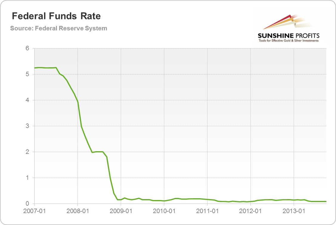
As fast as Bernanke took office and started rising the interest rates he had to start lowering them after the holiday season in 2007. The hit in 2008 and the Lehman fall only perpetuated the trend. In 2009 the Fed gladly and proudly started to walk in the world of near zero interest rates (negative real interest rates, the same diseases as the one that initially caused 2007-8 trouble). As you easily see, this “temporary” tool has become almost permanent as in the case of Japan. Interest rates are not moving anywhere soon. No “tightening” should be expected, since all the inflation hawks emigrated to parts unknown.
Now let us look at the second tool, asset purchases. As stated above it should be dehomogenized from the interest rate policy, since it is a different tool, and the Fed has a lot of uncertainty about what it does. But let us dehomogenize this tool even further. Let us divide asset purchases by the Fed into two distinct categories: longer term government securities purchases and mortgage backed securities purchases. Here is the government chart:
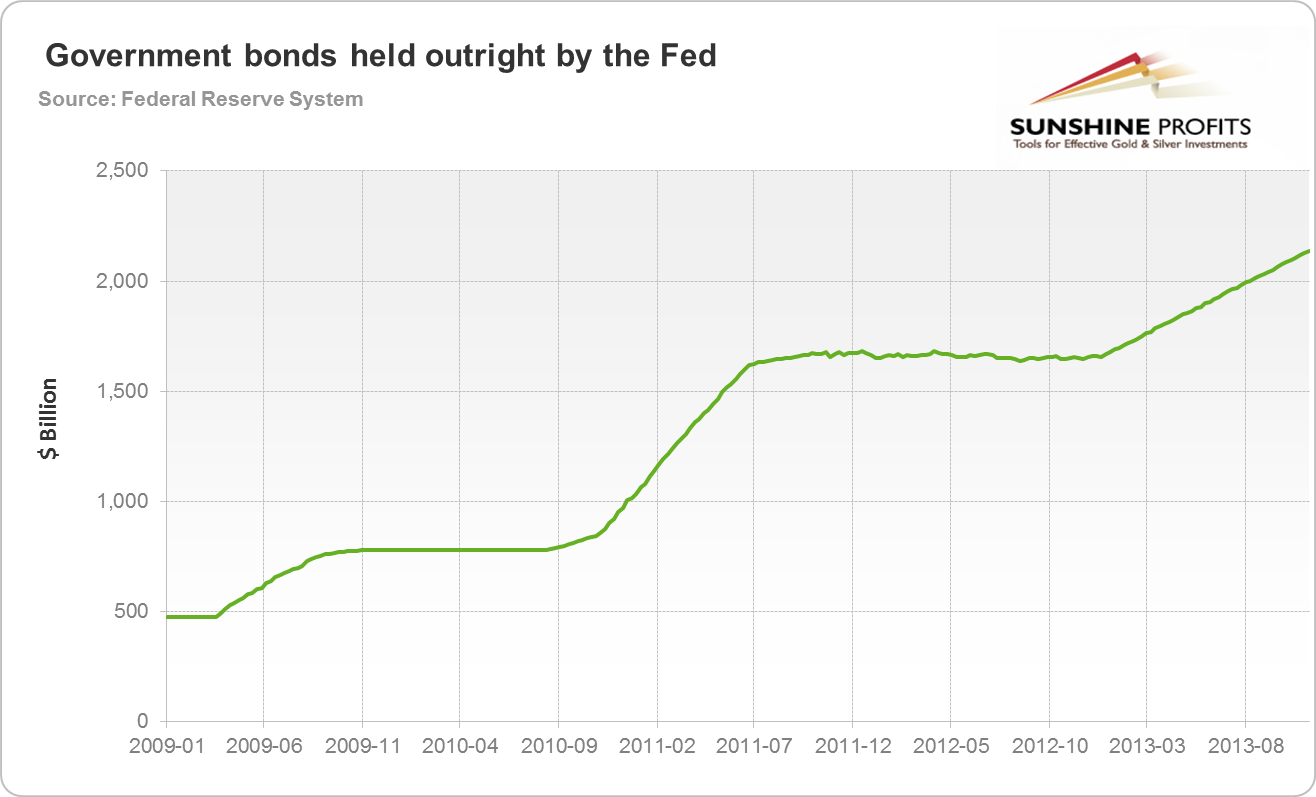
As soon as we walked into 2009 the Fed started to back up the Treasury by buying more bonds (interestingly in 2008 the Fed was reducing government bonds holding to put them into banks’ hands, since these were almost literally the only “safe” securities one could hold on to at the time). As you clearly see there was no reduction in government bond holding since 2009 – this will be important when we contemplate tapering issues in the next section.
The nature of this move was good old monetary printing program in favor of the government. Quite frankly let us forget about all this central bank independence talk. Here it is. Since 2009 the monetary printing press has been spinning in order to bid up government bonds, to bring down real returns on them, so the government can receive extra created money in order to spend it for political benefactors.
Of course an increase in asset holding is not smooth and steadily increasing. No doubts we will have some slowdowns, but no reverse movements. From 500 billion dollars in 2009 to over 2 trillion dollars at the end of 2013.
Things look slightly different in case of commercial assets held at the central bank. As we’ve discussed in the recent Market Overview (on which this part of the Update is based), a sort of “tapering” in the commercial assets held by the Fed already happened. Therefore in case it should happen again it needs not change much in the current economic circumstances.
If we consider that only half of this week’s tapering meant a decrease in bond purchases, then the final effect is indeed quite small as far as the overall approach is concerned, and the stability of the dollar system.
However, on a short-term basis, Fed’s comments were enough to trigger some moves that were likely to happen anyway based on the technical factors. Let’s see the details (charts courtesy of http://stockcharts.com).
USD and Euro Indices
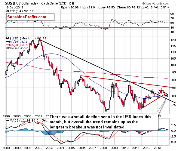
On the above chart, we see that the situation hasn’t changed much since our previous Premium Update was published and what we wrote at that time remains up to date.
Despite a small decline that we have seen since the beginning of the month, the uptrend remains in place as the breakout above the declining long-term support line was not invalidated.
Now, let’s examine the weekly chart.
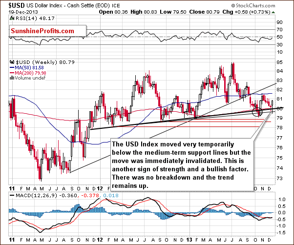
Looking at the above chart we see that earlier this week we had a similar situation to the one that we saw last week. Just like a week ago, the USD Index broke below the medium-term support line based on the February 2012, September 2012 and January 2013 lows (a bold black line) and the lower medium-term line based on the September 2012 and the January 2013 lows (a thin black line). However, once again this deterioration was only temporary. The dollar quickly rebounded and invalidated the breakdown below both medium-term support/resistance lines, which is a sign of strength and a bullish factor. From this perspective, there was no true breakdown and the trend remains up.
Let’s check the short-term outlook.
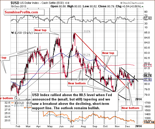
On the above chart, we see that earlier this week, the USD Index tried to break above its horizontal support line based on the June low without a positive result. These circumstances triggered a sharp decline on Wednesday - just before the Fed released its statement. However, the greenback quickly reversed course when the Federal Reserve announced that it will start winding down its stimulus program (small, but still) and rallied above the 80.5 level.
With this upswing, the U.S. dollar broke above the declining short-term resistance line. Although, the USD Index declined in the following hours and came back below both resistance lines, it turned out on the following day that this small deterioration was temporary. On Tuesday, the greenback extended its rally and moved higher breaking above both resistance lines once again. Taking this fact into account, we can conclude that the outlook remains bullish and that it could be the case that the decline is already over and that another rally in the US Dollar is just starting.
Let’s now take a look at the long-term Euro Index chart.
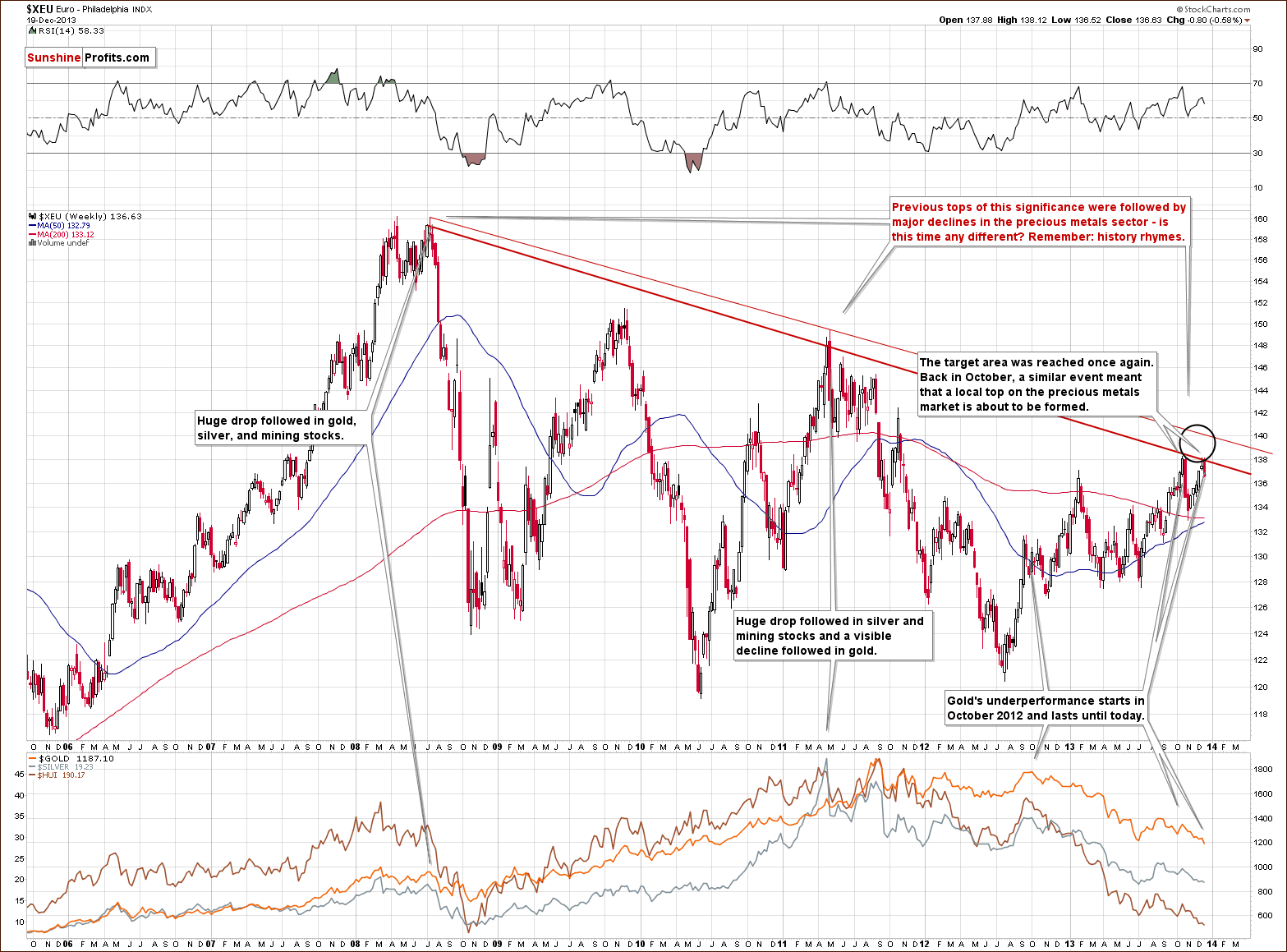
The first thing that catches the eye on the above chart is the target area, which was reached once again.
In our previous Premium Update we wrote the following:
(…) the European currency almost reached the October high. However, it seems that further growths are limited, not only because of this resistance level, but - even more importantly – because of the long-term declining resistance line based on the 2008 and the 2011 highs (in terms of weekly closing prices). As a reminder, this strong resistance line successfully stopped growth in October and triggered a sharp decline. Additionally, at that time, a similar situation preceded a local top in precious metals. On top of that, previous tops (in 2008 and then in 2011) were followed by major declines in the precious metals sector. If history repeats itself we may see similar price action in this situation.
Looking at the above chart we clearly see that the Euro Index reversed course after reaching this strong resistance zone and has declined below the level of 137. What’s most interesting, precious metals followed that decline, which suggests that we’ll likely see further deterioration in the PM’s sector – similarly to that seen in the past.
Please take a moment to compare euro’s performance in the past few weeks with the performance of the precious metals sector (lower part of the above chart).
Let’s now take a look at the medium-term Euro Index chart.
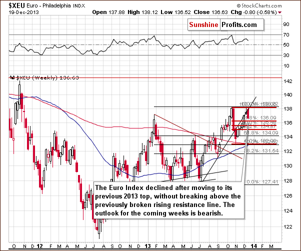
Looking at the above chart, we see that the Euro Index climbed once again this week and reached its very strong resistance zone created by the previous 2013 high and the short-term rising support line based on the July and September lows. As you see on the weekly chart, the European currency didn’t manage to break above these levels which triggered a sharp decline and pushed the euro slightly above the 38.2% Fibonacci retracement level based on a Nov-Dec rally. From this perspective the outlook for the coming weeks is bearish.
Summing up, looking at the current situation in both currencies, we are likely to see further deterioration in the Euro Index and improvement in the USD Index in the near future. As mentioned earlier in this section, the euro declined after reaching a strong resistance zone created by the October high and the long-term declining line, which successfully stopped the rally in October. Additionally, the USD Index reversed course after a drop below the medium-term support lines (to be precise: similarly to what we saw last week, there was no true breakdown overall) and it seems that the bottom for this decline might already be in. Taking these facts into account, the implications for the precious metal market are bearish.
General Stock Market
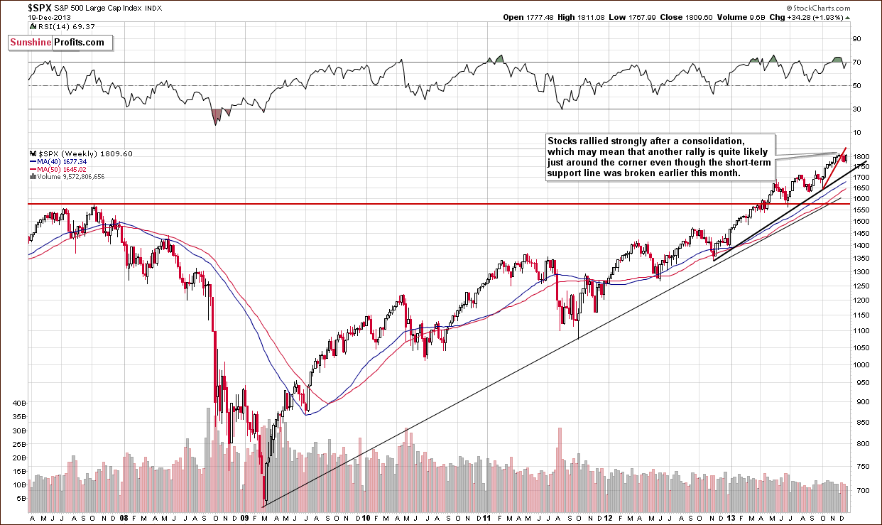
On the above chart we see that after a consolidation, the S&P500 Index rallied strongly after Fed’s announcement and came back above the psychological barrier of 1,800. These circumstances may mean that another rally in stocks is just around the corner even though the index remains below its short-term rising support line that was broken earlier this month.
Let’s move on to the short-term chart.
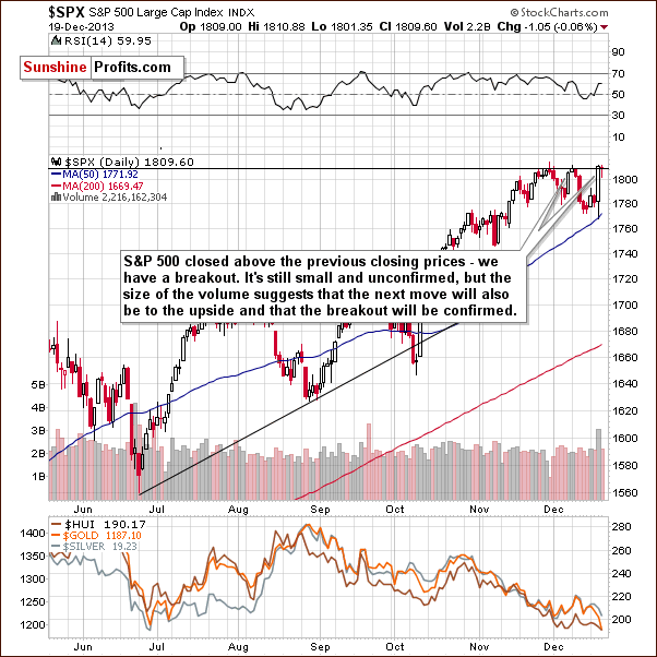
On the above chart we clearly see that stocks broke and closed above the previous closing prices. Although the breakout is small and not really meaningful without a confirmation (we prefer to wait for 3 consecutive closes above a given level for the breakout to be verified) we notice that it materialized on a large volume, which suggests that the next move will also be to the upside and the breakout that we saw on Wednesday will be confirmed.
Summing up, the outlook for the general stock market is more bullish than not.
Gold & Silver Correlations
Let’s take a look at our Correlation Matrix to find out how can the above translate into precious metals and mining stock prices.
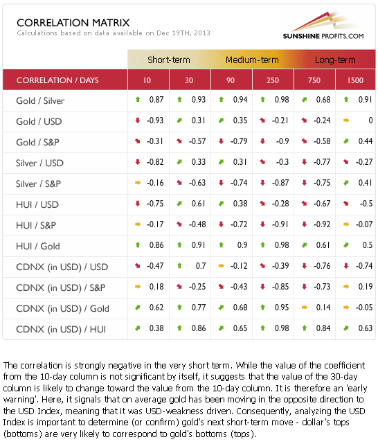
Basically, the short-term numbers don’t tell us much at this time when we look at them directly, but can tell us something if we look a bit beyond them.
The correlation between the USD Index and the precious metals sector is slightly positive in the 30-day column (and even moderately significant in the case of the mining stocks), which tells us that in the past 30 days PMs and the USD Index moved on average in a similar direction. However, this was the case when they both declined – and when USD moved higher (this week), metals and miners declined even more. This is a very bearish combination – whatever USD does, the precious metals sector seems to either decline modestly or strongly.
We can see a similar relationship in case of the general stock market. Precious metals and mining stocks rather ignore positive news, but react strongly to negative information.
Overall, the implications for the precious metals sector are bearish.
Gold
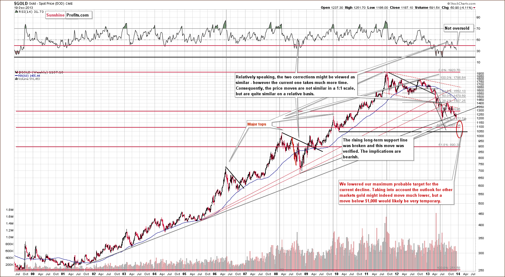
In our previous Premium Update we wrote the following:
(…) last week we saw a major change on the above chart as gold broke below the rising long-term support line. This week we saw a very temporary move above it, which was followed by another decline. If gold is not able to hold above this line despite a decline in the USD Index, then it is truly a weak market (at this moment that is) and quite likely to decline much more.
Looking at the above chart we see that we had such price action this week. Gold didn’t manage to successfully climb above the rising long-term support line (not to mention staying above this line), which triggered a sharp decline. With this downward move, the yellow metal not only declined below last week’s low, but also slipped below the level of $1,200. These circumstances clearly show the weakness of the buyers and it seems that the previous 2013 low will be reached quite soon.
2 weeks ago we wrote that the implications are bearish, especially that the RSI indicator is currently not oversold – it’s above 30 and well above its previous 2013 lows. Back in 2008, the RSI indicator moved close to its previous lows when the final bottom was in. In this case we would need to see much lower gold prices to have RSI close to the 20 level.
The next stop for gold is at its 2013 low, slightly above $1,170. It seems to us, however, that this will not be the final bottom for this decline, we expect the final one to form close to $1,100, possibly even at $1,050.
Please note that the exact target for gold is quite difficult to provide. In the cases of silver and mining stocks there are respectively: combinations of strong support levels, and a major support in the form of the 2008 low. In the case of gold, there are 4 support levels that could stop the decline and each of them is coincidentally located $50 below the previous one starting at $1,150: $1,150, $1,100, $1,050, and $1,000.
Let’s move on to the short-term chart to see the recent price moves more clearly and estimate the short-term outlook.
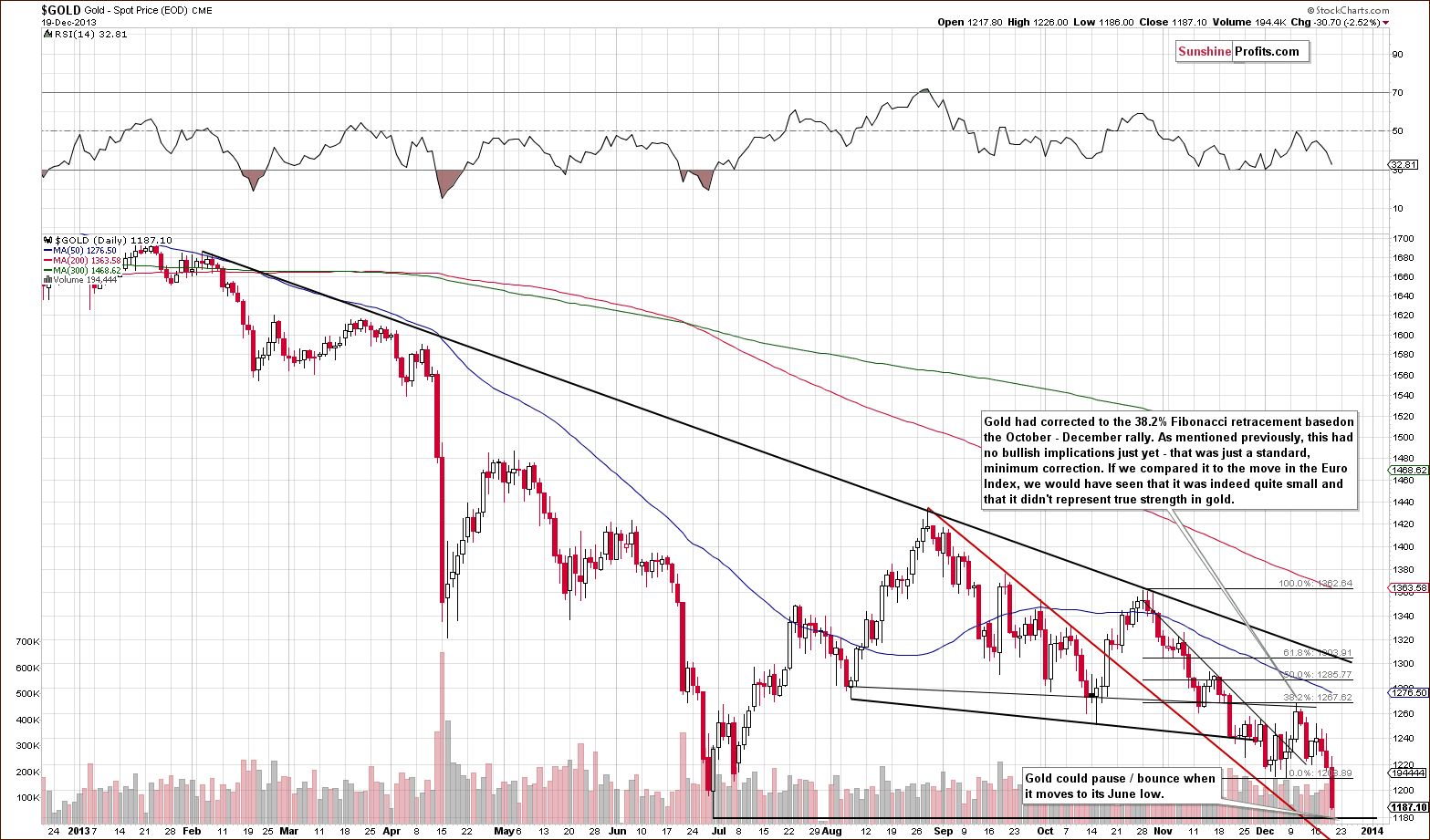
On the above chart we see that after an upward move to the 38.2% Fibonacci retracement level based on the October-November rally gold declined and reached the short-term support line based on the October and November high (in terms of daily opening prices). Although this line triggered an upswing, it was weak as it didn’t even erase last Thursday’s decline. These circumstances encouraged gold bears to act and gold reversed earlier this week.
As you can see on the above chart, the yellow metal declined significantly in recent days and dropped below the previous December low, which is a strong bearish signal. Additionally, this week’s decline materialized on the rising volume, which confirms the strength of the sellers. Taking this fact into account, we could see another significant move shortly.
Still, once we move to the previous 2013 low, we could see some kind of correction or a pause.
Let’s take a look at the chart featuring gold’s price from the non-USD perspective.
From the non-USD perspective, we saw another attempt to move back above the rising support line this week. However, similarly to what we saw last week, gold bulls failed and there was no invalidation of the breakdown below this rising medium-term support line. Therefore, the medium-term trend remains down and the pace of the decline might accelerate in the coming days/weeks based on the above-mentioned breakdown.
Let’s move on to the chart of gold priced in the British pound.
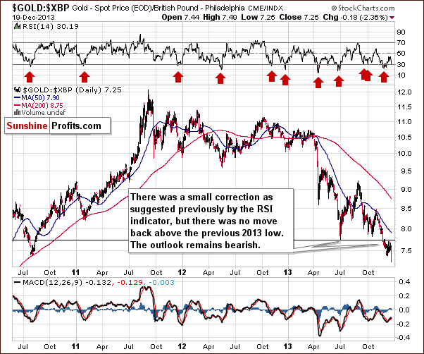
In our previous Premium Update we wrote the following:
(…) as far as gold priced in the British pound is concerned, we saw a verification of the breakdown below the previous 2013 low, nothing more.
As you can see on the above chart, gold priced in the British pound reversed earlier this week and declined below its previous lows, which is a bearish signal. From this perspective, the outlook is even more bearish than a week ago.
Let’s take a look at the chart of gold priced in the euro.
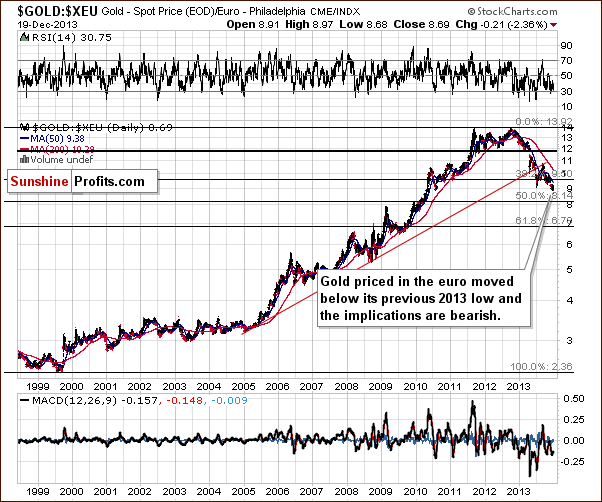
This week gold not only declined below the previous 2013 low once again (we saw 3 consecutive closes below this level and the breakdown is confirmed), but also below the December low, which clearly shows the weakness of the buyers. Please note that in the latter case, we saw 2 consecutive closes below this level, and if we see the third one, we will have a verification of the breakdown with more bearish implications.
From this perspective, the trend is not only down, but it seems that the decline might accelerate as we had the confirmed breakdown below the previous 2013 low.
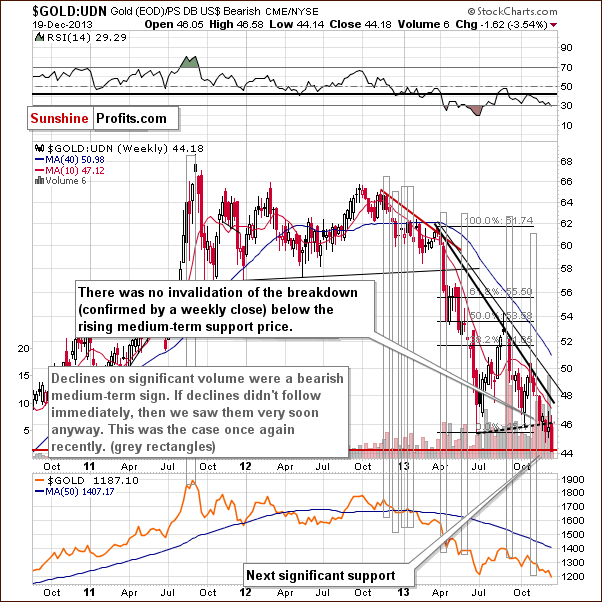
Finishing this section, let’s take a look at the Dow-to-gold ratio.
2 weeks ago we wrote the following:
That’s one of the most important and useful ratios there are as far as long- and medium-term trends are concerned. In particular, the big price moves can be detected before they happen (note the breakout in the first months of the year that heralded declines in gold).
We saw a breakout above the 12.5 level 2 weeks ago and shortly thereafter we wrote that with the ratio even higher today, we have a good possibility that the breakout will be confirmed and that we will see a big drop in the price of gold in the coming weeks or months.
The ratio moved even higher last week and this and it’s already at 13.03. However given the sharpness of the most recent move up, we wouldn’t be surprised to see a correction to the previously broken 12.50 level before the upswing continues.
The Dow to gold ratio moved slightly lower earlier this week, which didn’t change anything as it remained above the previously broken 12.50 level. The bearish implications remain in place.
This ratio is one of the most important things to keep in mind when estimating the big price moves. Please note that it did a great job at predicting where the first major bottom would form this year – it corresponded to the moment when the ratio reached its strong resistance at 12.50. Gold is falling once again and likely to form a major bottom in the coming weeks. Is there a level in the ratio that could give us some guidance here? There is – the 15 level – which is where the ratio topped in 2008.
Summing up, the outlook for gold remains bearish from the medium- and short-term perspective. It seems that gold will correct once it moves close to the $1,180 level (to the previous 2013 low), but that it will not be the final bottom. At this time is hard to give the exact target for gold itself, but it seems that gold will bottom when it’s 15 times less expensive than the value of the Dow Jones Industrial Index (Dow to gold ratio moves to 15) – probably with gold close to the $1,100 level.
Silver
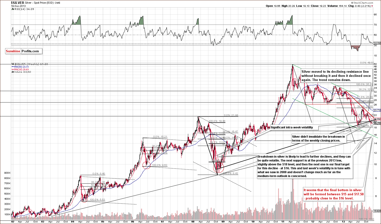
This week silver moved temporarily back above the rising support/resistance line, but didn’t manage to hold this level – similarly to what we saw in the case of gold. Just like the yellow metal, silver gave up the gains and dropped below both long-term support/resistance lines, which triggered further deterioration. With this downward move silver declined to slightly above the $19 level and approached the December low. If this support does not encourage buyers to act, the next downside target will be the previous 2013 low, slightly above the $18 level. Once we see silver below it, the next (and probably final) stop will likely be close to $16. Overall, the trend remains down.
Let’s move to the short-term chart to see the very recent price moves more clearly.
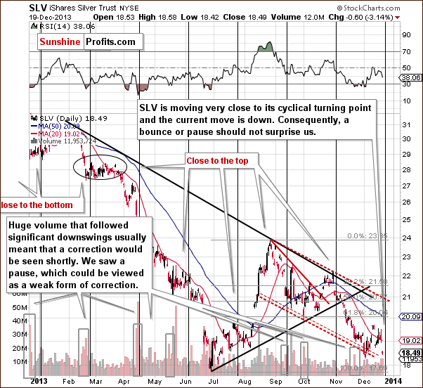
At the beginning of this week the SLV ETF moved higher and climbed above the 20-day moving average once again. However, it gave up the gains in the following days and declined heavily on Thursday. Similarly to what we saw a week ago - the breakout above the 20-day moving average was strongly invalidated and the invalidation is by itself a bearish signal. With this downswing silver approached the declining dashed support lines, which encouraged buyers to trigger an upward correction at the beginning of the month. Additionally, the SLV ETF is moving very close to its cyclical turning point.
Taking into account the fact that the current move is down and combining it with the proximity to the support lines and the cyclical turning point we can conclude that a bounce or pause should not surprise us.
Summing up, the outlook for silver remains bearish. Although the white metal showed temporary strength at the beginning of the week, it gave up the gains in the following days, reversed direction and followed the decline that we saw in the case of gold and mining stocks, along with its current medium-term trend. Silver could bounce on a temporary basis, but we don’t think it’s close to the final bottom at this time.
Gold & Silver Mining Stocks
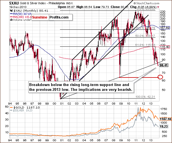
Just like a week ago, we will start the mining stocks section this time with the XAU Index chart (proxy for gold and silver mining stocks). After a major breakdown below two critical support levels: the long-term rising support line and the 2013 low and unsuccessful attempts to move back above these levels, mining stocks extended their declines and dropped to slightly above the level of 80. From this perspective, the trend remains down and the implications are clearly bearish for the coming weeks.
Let’s move on to the HUI Index chart.
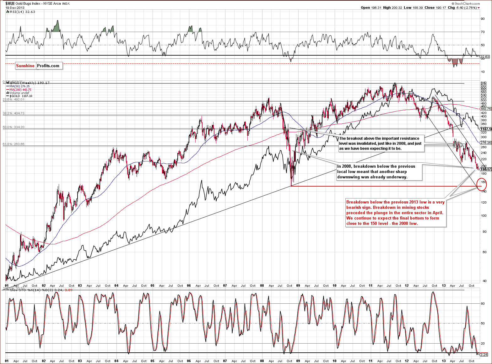
On the above chart we see that the HUI Index extended its declines and dropped below the December low earlier this week, which is a bearish sign. Taking into account this fact, further deterioration should not surprise us.
As mentioned previously, we expect the final bottom to be seen close to the 150 level. Please note that, approximately, it would only take a repeat of the October – December decline from the current levels for the above-mentioned target level to be reached.
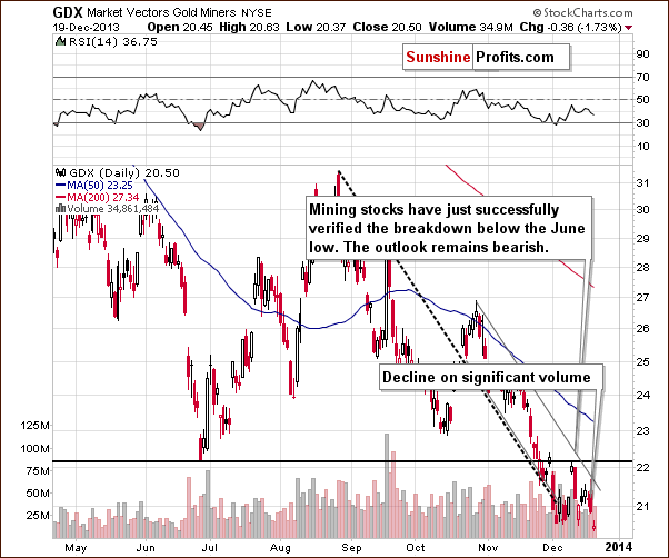
Let’s examine the short-term GDX ETF chart.
In our previous Premium Update we wrote:
(…) thanks to this week’s correction the RSI indicator is no longer oversold and consequently a move lower is even more probable than was the case last week.
Looking at the above chart we see that although the GDX ETF moved higher earlier this week, the short-term resistance line based on the November and December highs (which is also the upper line of the declining trend channel) successfully stopped further growth. As you see on the daily chart, this line triggered a decline, which pushed miners below the previous December low. Additionally, the recent downswing materialized on significant volume, which confirms the strength of the sellers.
Please note that despite this drop mining stocks remain within the declining trend channel. Nonetheless, the outlook remains bearish.
Let’s take a look at the chart featuring junior mining stocks.
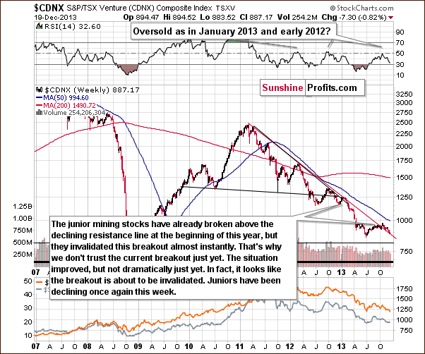
This week, the junior mining stocks extended their declines and reached the declining red support line. Although they haven’t invalidated the breakout above this line, it seems that such a price action is just around the corner. If the junior mining stock sector increases the pace of its decline, we will see a breakdown likely followed by an even quicker decline.
Let’s keep in mind that we saw an analogous breakout in the first months of this year and it was in fact the final pause before the decline accelerated.
Finally, we would like to discuss the current situation on the gold stocks to gold ratio.
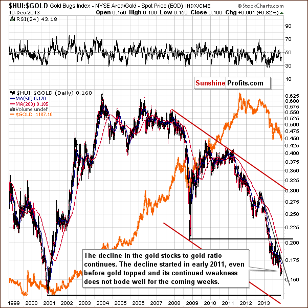
Similarly to what we saw last week - this week’s initial move up is not even visible from the long-term perspective. The medium- and short-term trends remain down and the implications are bearish going forward.
Summing up, the medium-term trend remains down, the decline is quite likely to accelerate shortly and the outlook for the mining stocks sector is very bearish. It seems that the final bottom in the precious metals sector will form when HUI and XAU Indices move to their 2008 lows and the HUI to gold ratio moves to its 2000 low.
Letters from Subscribers
We were asked to comment on the possibility gold will not move below its previous 2013 low based on it being a "truncated 5th wave" according to the Elliott Wave Theory.
Our take is that it could be the case, but it's not likely to be the case. Technical analysis in general, and the Elliott Wave Theory in particular are subjective and depend on an analyst or a tool that utilizes the general rules. The reason for the 5th wave to be truncated (meaning that it doesn't take gold to new lows and that we see a double bottom) could be a strong 3rd wave down. This could apply assuming that one sees the drop from over $1,800 to $1,181 in June 2013 as the wave number 3. Some might argue that the move to the April bottom was wave number 3 and the move in June was wave number 5. Others could say that we are still within a huge wave 3… Our point is that it's highly subjective what wave we are currently in, and if it is indeed wave 3, then it is still only a possibility, not a sure bet, that wave 5 will be truncated. This analysis is not strong enough in our view to support the double-bottom theory in gold on its own. Again, that's subjective judgment.
Summary
This week all (investors’) eyes were on the Fed, and the Fed delivered. A small (if you can call $10 billion “small”, but it is on a relative basis) form of tapering of the Quantitative Easing program was announced and markets reacted to it. It turned out that our assumptions about investors’ expectations were correct – they were expecting to see no tapering and they were surprised by it.
The market’s reaction is quite interesting. Stock market investors seem to have focused on the positive aspect – the outlook is positive enough for the QE to be less needed than it was previously. The precious metals market was hit – in this case, it meant that precious metals and mining stocks’ potential have diminished. Fundamentally, we don’t think that it has, as the dollar system is still at risk and gold should thrive – eventually. On a medium- and short-term basis, we are not surprised by the decline. The writing was on the wall – gold was very weak relative to key currencies and mining stocks were weak relative to gold. The trends remained to the downside and many other technical factors pointed to lower prices.
The medium-term outlook remains bearish, but on a short-term basis we might see a bounce as gold moved to its previous 2013 low. We provided an early heads-up about closing the speculative short positions and taking profits off the table when gold moves to $1,190 and this happened yesterday. Consequently, at this time we suggest no speculative and no long-term investment positions. We will probably re-enter the short positions after markets move a bit higher (silver’s cyclical turning point is just around the corner anyway).
The key question is how low the precious metals market can go before the final bottom is in.
Usually, the situation with price targets is quite clear in the case of gold and less clear for other markets, but right now, the opposite seems to be the case. There are several price levels at which gold could stop, but it seems that there are single most probable targets for silver ($16), HUI Index (150) and the Dow to gold ratio (15). Consequently, it seems best to monitor all the markets and key ratios and use them as a confirmation for timing the final bottom in gold. If we’re lucky, all the above-mentioned targets will be reached simultaneously and we will have a very good probability to enter the market very close to the bottom. Otherwise, we’ll let you know what our thoughts are and what to focus on. As always, we’ll keep you informed.
To summarize:
Trading – PR: No positions.
Trading – SP Indicators: No positions: SP Indicators suggest long positions, but the new self-similarity-based tool suggests short ones for the precious metals sector. We think that overall they cancel each other out.
Long-term investments: No positions.
| Portfolio's Part | Position | Stop-loss / Expiry Date |
|---|---|---|
| Trading: Mining stocks | None | - |
| Trading: Gold | None | - |
| Trading: Silver | None | - |
| Long-term investments: Gold | None | - |
| Long-term investments: Silver | None | - |
| Long-term investments: Platinum | None | - |
| Long-term investments: Mining Stocks | None | - |
This completes this week’s Premium Update. Our next Premium Update is scheduled for Monday, Dec 30, 2013 (we might post it over the weekend, though). We will continue to send out Market Alerts on a daily basis (except for when Premium Updates are posted) and we will send additional Market Alerts whenever appropriate.
Thank you for using the Premium Service.
Sincerely,
Przemyslaw Radomski, CFA

