
- What now for Janet Yellen?
- USD and Euro Indices
- General Stock Market
- Correlation Matrix
- Gold
- Silver
- Mining Stocks
- Summary
What now for Janet Yellen?
“It deserves emphasis that a 6-1/2 percent unemployment rate and inflation one to two years ahead that is 1/2 percentage point above the Committee's 2 percent objective are thresholds for possible action, not triggers that will necessarily prompt an immediate increase in the FOMC's target rate.”
Stepping aside by Bernanke remains a bit of a mystery, about which nobody cares. Why is he quitting his office? He was considered as the most competent man for the job – sophisticated money printing analyst, who is brilliant and capable of comprehending and directing Fed’s special operations. Now, he shall be succeeded by another brilliant person, who believes in those operations. Why then change? Two possible answers arise. The first one – Bernanke is tired and has had enough. Not only the experience was exhausting, but also the criticism was stressful. The second one – Bernanke stopped believing in continuation of special operations, and was interested in stepping back. Since this was rejected as unacceptable, so he had to step back. Let us not forget that in his texts before he was chosen as the Fed’s chairman he warned that the special operations may not work that well, because they could create a specific cocoon of various assets disconnected from the real pricing process (exactly what has happened!).
The certain fact is that Yellen is ready to continue with Fed’s expansionary operations. Therefore no tapering on the horizon so far. More money printing means greater chance for gold price to rise in the coming years.
In discussing unconventional tools in the realms of zero interest rates Yellen indicated that tapering is not on the horizon as long as two key variables remain at specific level. If the unemployment rate stays over 6,5 percent and inflation does not reach levels permanently higher than 2 percent goal, then the Fed is staying on the same course. This is basically what Bernanke was suggesting, but with higher emphasis on those specific levels. Bernanke left some uncertainty in his statements. Yellen is clear: we print until unemployment is over 6.5 and as long as the official inflation rate does not reach unacceptable levels.
Actually even more, because she highlighted that under those conditions Fed’s action is only “possible”, and not automatic. Seeing her concern about labor markets, it can mean that even if the official rate stays below 6.5 percent, then the Fed could still go on.
Yellen believes in the classical Keynesian framework: spending keeps the economy going. As long as the inflation rate is not running away, we should keep adding more money. If there is no direct inflationary pressure, and the economy is in recession, then spending is too low.
Well, this is all good news for gold bugs. If the central banker can do something for them, I guess the best way is to run the printing press.
The above is based on the November Market Overview report (Note from Matt: You will find much greater discussion of the tightening phenomenon in the upcoming Market Overview report.) Let’s move to the charts to see what’s likely to happen in the medium- and short term (charts courtesy of http://stockcharts.com.)
USD and Euro Indices
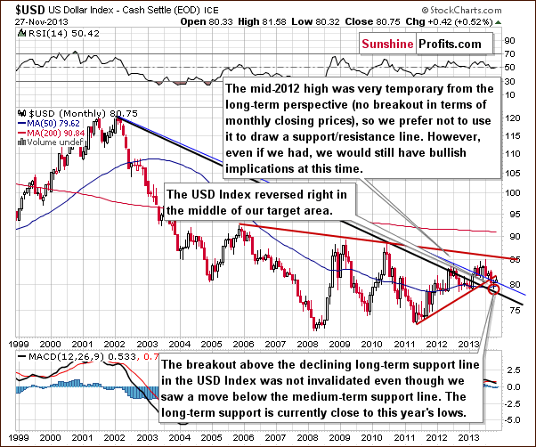
From the long-term perspective the situation hasn’t changed much recently and what we wrote in our previous Premium Update is still up-to-date today.
(...) the long-term breakout above the declining long-term support line was not invalidated. Additionally, the USD Index reversed right in the middle of our target area. Therefore, from this perspective, it seems that the downward move – if it’s not already over – will be quite limited because the long-term support line will likely stop any further declines.
Now, let’s examine the weekly chart.
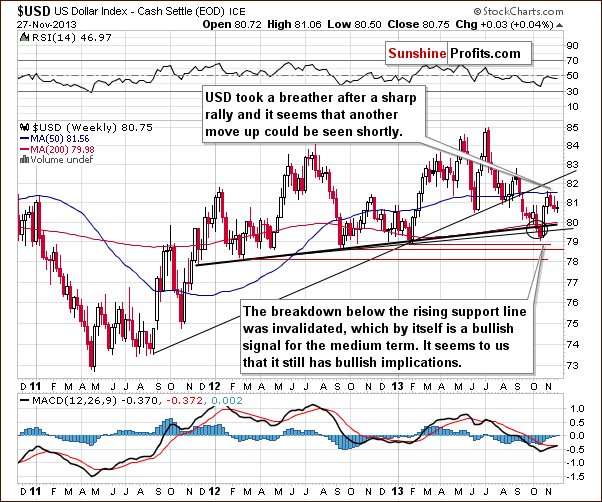
Looking at the above chart we see that at the beginning of the month the USD Index reached the 50-day moving average, which triggered a corrective move in the following weeks. With this downward move the U.S. dollar dropped to the low that we saw three weeks ago, therefore, we might see a post-double-bottom rally in the coming weeks.
Keep in mind that from this point of view the current correction is still shallow, which is a bullish signal for the short term. As you can see on the above chart, recent weeks have formed a consolidation, which is likely a pause before further increases.
Let’s check the short-term outlook.
In our previous Premium Update we wrote the following:
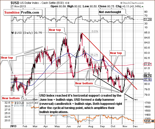
(...) since the next cyclical turning point is just a few days away, we wouldn’t rule out another downswing before the final bottom is reached.
As you can see on the above chart, the USD Index extended its decline and dropped to the previously-broken support/resistance line created by the June low. Last week, the proximity to this support level (or comments from the Fed about the possibility of tapering the QE program – which we don’t believe, by the way) triggered a sharp move up, which took the dollar above the level of 81 once again. Therefore, since this level was reached once again, it seems that we might see a similar rally once again. Additionally, the greenback formed a daily hammer (reversal) candlestick, which is another bullish sign.
On top of that, both happened right after the cyclical turning point, which amplifies their bullish implications. Connecting the dots, it seems that another move up could be seen shortly.
Let’s now take a look at the medium-term Euro Index chart.
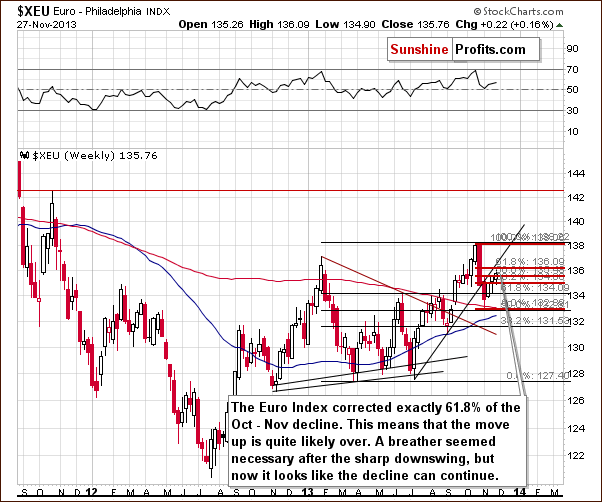
As you see on the above chart, since the beginning of the week, the euro continued its rally. The Euro Index moved above the level of 135 once again and corrected exactly 61.8% of its October-November decline (to 136.09).
At this point it’s worth mentioning the short-term rising support line based on the July and September lows, which is slightly above the 61.8% retracement. Looking at the above chart we clearly see that despite the recent corrective upward move, the breakdown below this line hasn’t been invalidated.
Combining these two facts, we can conclude that the move up is quite likely over and the decline can continue. If we see a move below 131.56, the bearish implications will be even stronger.
Summing up, looking at the current situation in both currencies, we are likely to see weakness in the Euro Index and improvement in the USD Index on a short-term basis. As mentioned earlier in this section, the USD Index reached its cyclical turning point and taking this fact into account, it seems that the bottom of the current correction is already in. Additionally, the euro corrected exactly 61.8% of its October-November decline and approached the short-term rising support line without breaking it, which means that the move up is quite likely over. Therefore, currently, the implications for the precious metal market are bearish.
General Stock Market
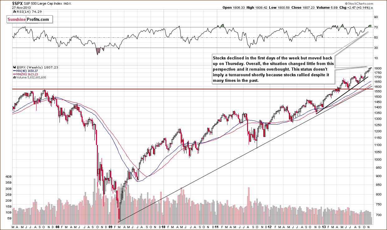
On the above chart we see that earlier this week the S&P500 Index moved lower; however, this deterioration was only temporary and stocks quickly erased losses. The final result is that the S&P500 Index hit a fresh all-time high at 1,808.42 and stocks remain above the psychological barrier of 1,800.
From this point of view, the long-term outlook remains bullish. However, the RSI reading (over 70) suggests that we might see some weakness in the short term. The strength of this indication is not very strong, though.
In our previous Premium Update we wrote that there was an interesting development on the short-term chart. Let’s move on to this chart and check what then transpired in the previous week.
Quoting our last Premium Update:
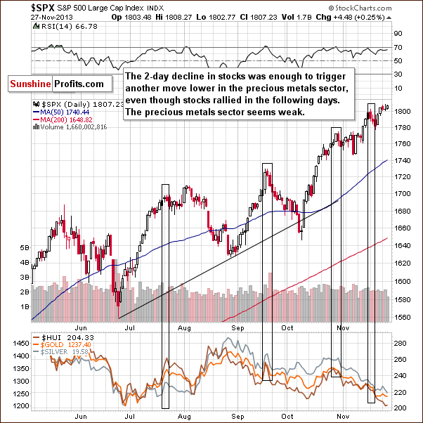
Stocks declined once again (…) and there are some non-obvious bearish implications for the precious metals sector. If we consider the past 6 months, there were only 3 cases when stocks declined for 2 consecutive trading days in a similar fashion to what we see right now - similar shapes of daily candlesticks and with sharp rallies preceding the 2-day decline. These were July 23-24, Sep 19-20, and Oct 29-30. It was not the final top for the stock market in all 3 cases, but in all 3 cases we saw a significant decline in the precious metals sector in the following days and weeks. Interestingly, all 3 cases took place in the second half of the month - which is where we are right now.
The above-mentioned declines on the precious metals market were not small – as you can see on the above chart – and thus, it seems that this bearish signal is still in play.
Looking at the above chart we clearly see that this two-day decline in stocks was enough to trigger a downward move in precious metals. On top of that, although the S&P 500 Index moved higher in recent days, we didn’t see a similar upswing in the case of PMs, which shows that the market is weak. Therefore, the implications are bearish going forward.
Gold & Silver Correlations
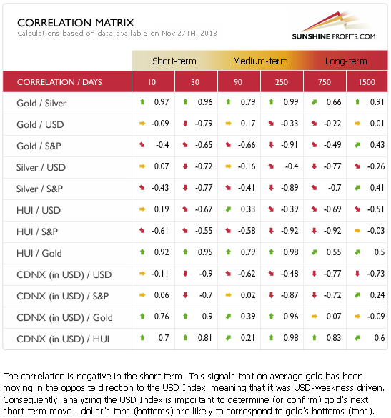
The correlation coefficients remain strongly negative as far as the short-term (30 trading days) link between precious metals and the USD Index is concerned. The 10-day column includes values close to 0, which simply means that gold didn’t respond to dollar’s move lower – which is a bearish sign.
As far as the general stock market is concerned, the correlation coefficients are more negative than they were last week, but still rather insignificant (except for the one between stocks and silver). It’s still hard to draw meaningful conclusions based on just them as far as entire sector is concerned, however, in case of silver, the implications are similar to those that we described based on the link with the USD Index. The white metal was weak recently as it failed to rally despite a move higher on the stock market. Both: a move higher in the S&P 500 and a move lower in the USD Index were not enough to trigger a move up in silver – which is a sign of weakness and a bearish indication.
Overall, the implications of the related markets on the precious metals sector are bearish based on the PMs-USD link.
Gold
Quoting our previous Premium Update:
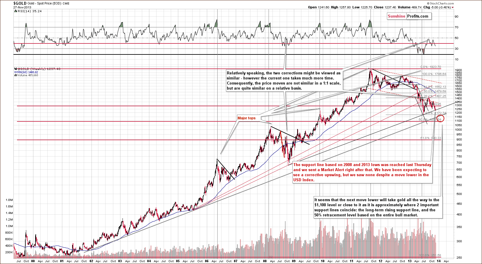
We saw more weakness and a bigger decline followed. Still, another significant support line stopped the decline (actually, a combination of support lines as you will see on the following charts) – the one based on the 2008 and 2013 lows. We marked it with black on the above chart. Both bottoms that it’s based on are significant, so the support is significant as well. Therefore, a corrective upswing should not be surprising here.
We saw a corrective upswing only on a very temporary basis and overall gold stayed at the above-mentioned support line. Consequently, based on the above chart alone, nothing changed, and we can still expect a corrective upswing of some sort – that is as long as we see no confirmed breakdown below the 2008-2013-low-based support line.
Let’s move on to the short-term chart to see the recent price moves more clearly and estimate the short-term outlook.
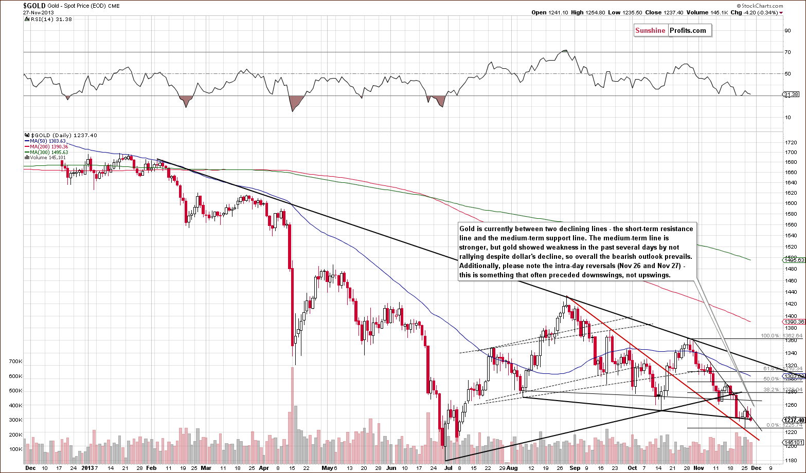
From this perspective, we also see that gold’s decline was stopped by a declining support line created by the August and October lows. We saw a huge intra-day reversal on Monday, but it didn’t trigger a powerful rally. Instead, we saw two days when gold moved higher in the first part of the session only to disappoint before closing. Such reversals are usually something that we see at local tops, not local bottoms.
Gold remains in a short-term downtrend and both early intra-day upswings were unsuccessful attempts to move above it. At first glance it doesn’t seem bearish. After all, the medium-term support line is stronger than the short-term resistance, and we are quite likely to see gold move higher based on just that, right? Wrong. While the above statement about the relative strength of both lines is true, the implication is incorrect, because it doesn’t take into account what happened on other markets, and this time one of them seems very important. The USD Index moved lower recently and it should be more than enough to trigger a breakout above a relatively weak, short-term declining resistance line, especially since medium-term and long-term support levels were reached. It wasn’t – gold displayed a clear sign of weakness.
The RSI is close to 30, which signals that gold is oversold on a short-term basis, but the above-mentioned weakness suggests that we shouldn’t be surprised to see gold even more oversold shortly – after a big drop.
Let’s take a look at the chart featuring gold’s price from the non-USD perspective.
From the non-USD perspective, we generally didn’t see any changes this week, so we will quote what we wrote last week, when gold was trading more or less at the same levels.
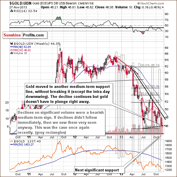
From the non-USD perspective gold has plunged even more visibly than from the USD perspective that we discussed above. However, the most important thing that we see on this chart is still what we discussed last week. It seems that non-USD gold’s decline on significant volume still has bearish implications.
In one of the previous Market Alerts we wrote the following:
Last week gold: UDN ratio declined on quite big volume, which used to precede significant declines in the past. Of course, a ratio does not have a volume by itself - the above is just a thought short-cut, and what we mean is actually the ratio of volumes - volume for gold divided by volume for the UDN ETF. Anyway, the resulting declines were not seen immediately in all cases, but they were seen shortly in almost all cases. Please take a look [above] - we marked these cases with grey rectangles.
As it was the case in the previous weeks, the medium-term trend remains down.
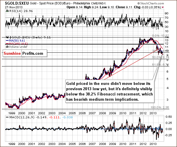
Gold priced in the euro also moved insignificantly lower this week and it remains below the important 38.2% Fibonacci retracement level. This happened after gold had already verified the breakdown below the rising red support line. The trend is not only down, but it seems that the decline might accelerate shortly – in terms of weeks, not necessarily days, as the above has only medium-term implications.
Still, please note that there was no breakdown below the previous 2013 low.
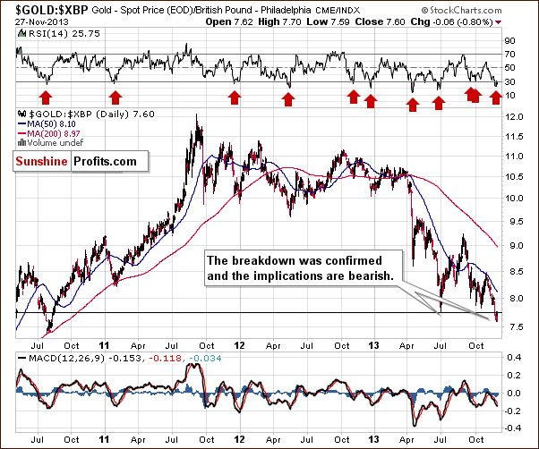
Gold priced in the British pound moved below its 2013 lows, which is a bearish factor, and the breakdown was verified by 3 consecutive closes below this level, which is even more bearish. The RSI indicator is currently below the 30 level, which means that a correction is quite likely to be seen soon, but based on the confirmation of the breakdown, it seems that it could start at much lower prices (meaning after a quick decline).
This week we saw a small breakout when we view gold from the Australian dollar perspective.
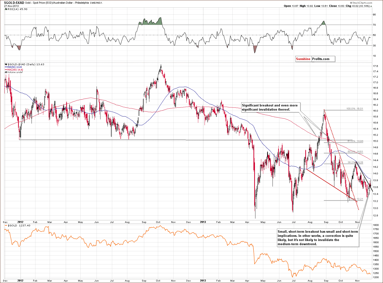
The breakout is not visible from other perspectives, so its bullish implications are limited. Other than that, there’s not much that we can say about the above chart.
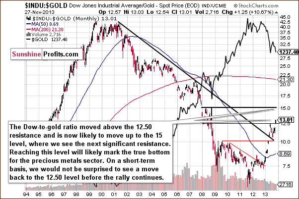
Last but definitely not least, we would like to discuss the Dow to gold ratio. That’s one of the most important and useful ratios there are as far as long- and medium-term trends are concerned. In particular, the big price moves can be detected before they happen (note the breakout in the first months of the year that heralded declines in gold).
We saw a breakout above the 12.5 level last week and last week we wrote that with the ratio even higher today, we have a good possibility that the breakout will be confirmed and that we will see a big drop in the price of gold in the coming weeks or months.
The ratio moved even higher this week and it’s already above 13.01. However given the sharpness of the most recent move up, we wouldn’t be surprised to see a correction to the previously broken 12.50 level before the upswing continues. It does not have to happen, though. Please note that at the beginning of the year, the breakout above the declining resistance line was not followed by a verification – the ratio soared without it.
There’s one more thing relative to which gold showed great weakness – the True Seasonal patterns.
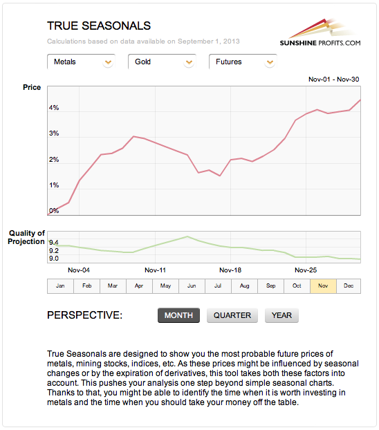
Gold was quite likely to move higher in the second half of the month. Not only was a move higher likely based on the significant support levels being reached and a move lower in the USD Index, but it was also the case based on the what usually happens at this time of the year (and taking derivatives’ expiration effect into account).
Again, all that gold managed to do was not to decline; it hasn’t rallied.
Summing up, the medium-term outlook for gold remains bearish and it seems that we might see another sizable downswing shortly as the situation deteriorated this week.
Gold was “supposed” to move higher based on the long- and medium-term support lines being reached, but all it managed to do was to pause the decline. Gold didn’t even manage to move above the short-term declining resistance line given a move lower in the USD Index and a move higher on the general stock market. That is a sign of weakness on the gold market, and something that we also saw before the metal plunged in April.
We saw an insignificant breakout in gold viewed from the Australian dollar perspective and a significant – and confirmed – breakdown from the British pound perspective. The net effect of the “outs” is bearish.
Silver
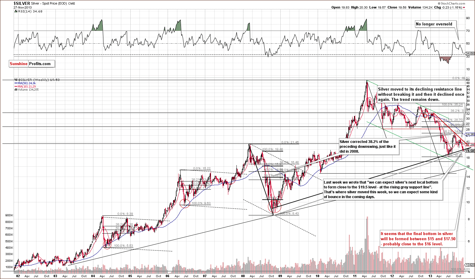
Quoting our last Premium Update:
(…) the white metal reached the support line based on the 2008 and 2013 lows in terms of weekly closing prices (marked with the black bold line). Taking this fact into account, the corrective upward move could start right away. On the other hand, we could see a bit more downside before it starts. In this case, the grey rising support line based on the 2008 and 2013 lows creates an initial downside target (close to $19.50).
On Monday, the intra-day move lower took the white metal to the rising long-term support line (marked with the grey bold line) without breaking it, which is a bullish signal for the short term. This positive event triggered a one-day rally, which pushed the white metal above $20. Despite this increase, silver gave up the gains and declined in the following days to the grey long-term support line once again. As long as silver remains above this line, there will be no great likelihood of further declines in the very short term.
Finally, it’s worth mentioning the position of the RSI. The indicator is still not oversold, so we might see significant declines in the coming weeks (it’s not that RSI is suggesting that at this time, but it doesn’t “say” that it’s unlikely).
Let’s move to the short-term chart to see the very recent price moves more clearly.
Quoting our previous Premium Update:
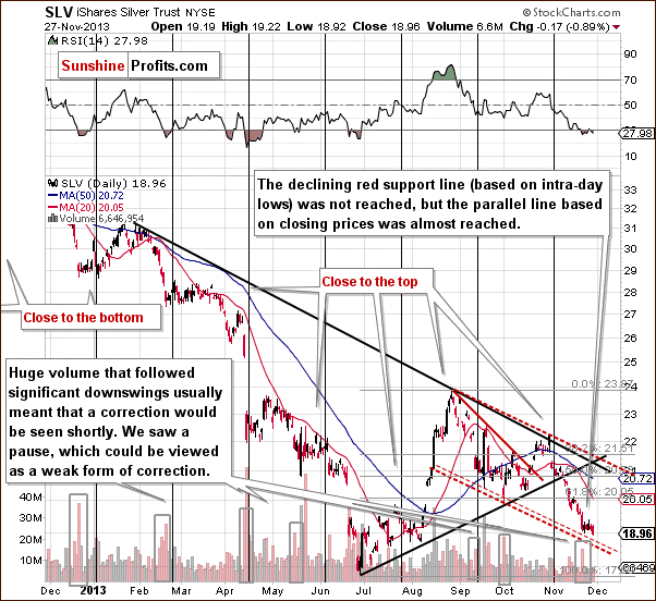
(…) the downside target for the SLV ETF very close to the $19 level. The target is created by the red dashed line, which is a parallel line to the declining resistance line based on the most recent local tops.
Last week we wrote that after the breakdown below the 61.8% retracement the SLV ETF accelerated declines and reached the above-mentioned downside target level. As you can see on the above chart, this red dashed support line triggered an upswing, but this improvement was temporary and the SLV ETF declined in recent days. Although it didn't break below the declining support line (marked with red dashed line), it moved - and closed – below the previous November low, which is a bearish sign. In case of spot silver, we saw a close slightly above Monday's intra-day low, however it is a breakdown in the case of daily closing prices. Again, the implications here are bearish, but not very bearish.
What we wrote in this section so far is not that bearish by itself. In fact, it suggests that a rebound is likely. However, it all becomes bearish once you take into account what happened in the USD Index and on the general stock market. USD declined while stocks moved higher – silver “should” have rallied and instead we saw a small decline. That’s a sign of weakness and indication that declines are just around the corner.
Summing up, the outlook for silver remains bearish. However, taking into account the facts that spot silver reached the support line based on the 2008 and 2013 lows in terms of intraday lows and the SLV ETF remains above the declining support line (marked with red dashed line), a short-term move to the upside could still be seen.
Gold & Silver Mining Stocks
Quoting our last Premium Update:
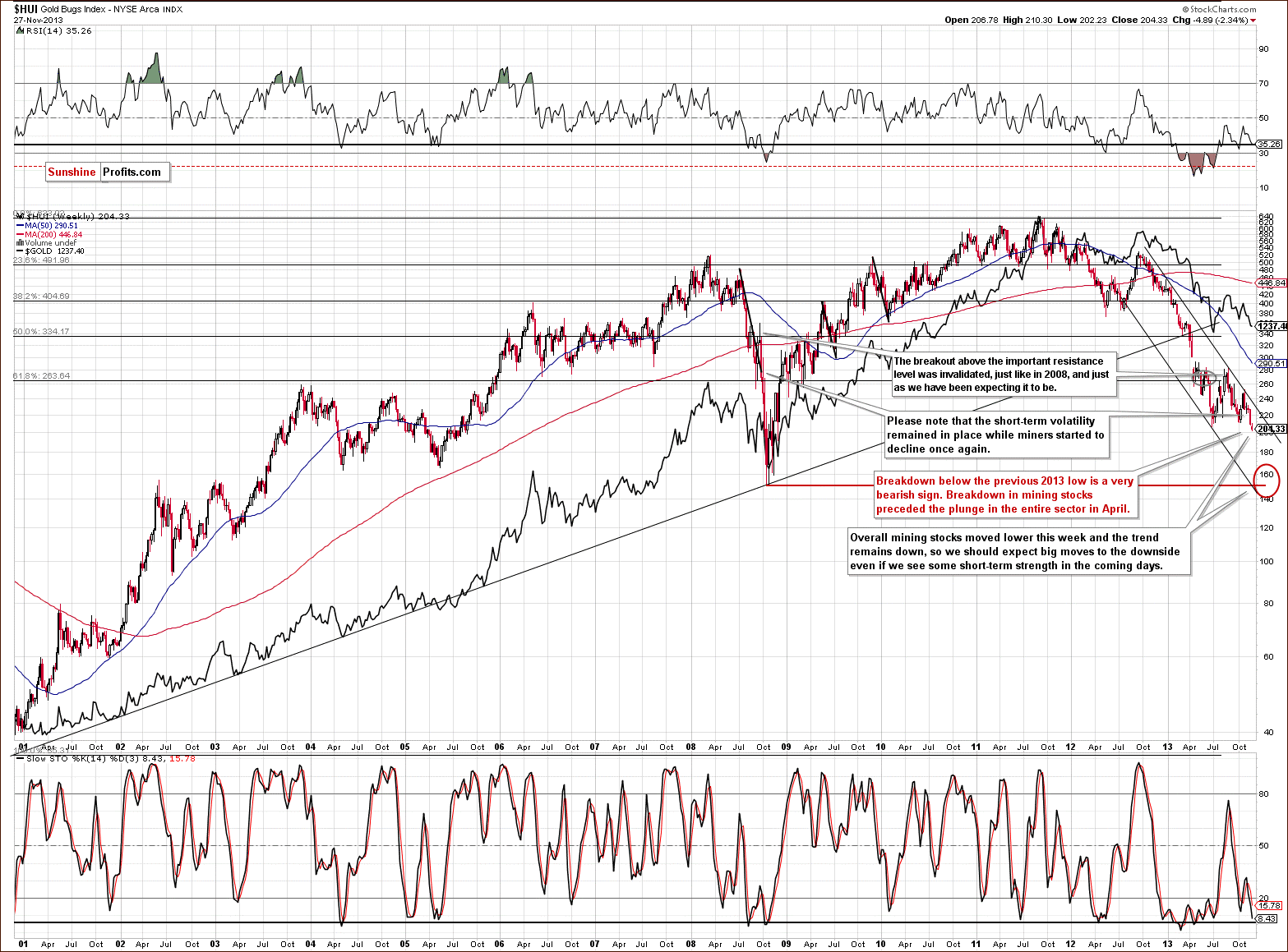
(…) the short-term volatility remained in place while miners started to decline once again. We saw a similar situation in 2008. Back then, it preceded further declines. If history repeats itself, we may see a similar situation in the coming days or weeks.
Looking at the above chart we see that the situation has deteriorated once again. This week, the HUI Index extended declines and dropped below the previous 2013 low, which is a very bearish sign. At this point it’s worth noting that similar breakdown in mining stocks preceded the plunge in the entire precious metals sector in April.
From this perspective the trend remains down and taking the above into account, we can expect big moves to the downside in the days or weeks ahead.
4 weeks ago we mentioned that there were some bullish indications on the chart featuring junior mining stocks.
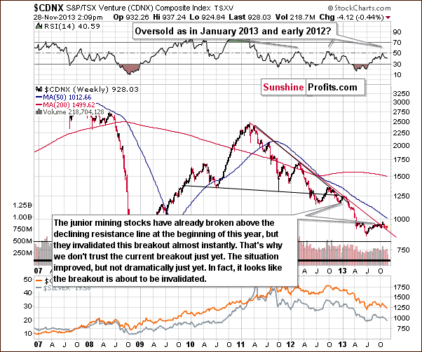
Although the juniors sector moved above the declining resistance line, we think that it’s still too early to say that the breakout has been truly confirmed – especially when we take into account the position of the RSI.
Please note that the last two times when the indicator reached these levels, major medium-term tops were formed. Therefore, we would need to see a verification of the breakout first to view it as an important medium-term signal. This would be the case in any other breakout as well, but in the case of the above chart, waiting for a verification seems particularly justified because we have already seen a false breakout at the beginning of this year – one which was followed by a significant decline in the entire precious metals sector.
Since we wrote the above, juniors have declined and almost reached the previously-broken declining resistance line in the previous week. Although juniors pulled back last week, this upswing didn’t change anything, because it was even visible in terms of weekly closing prices. Additionally, after that juniors reversed the course and declined once again. If they extend declines and invalidate the previous breakout, it will – naturally – have bearish medium-term consequences for the entire precious metals sector.
If the decline that we are likely to see in the precious metals sector takes juniors back below their declining red support/resistance line, we will have one more indication that the next major move will be to the downside.
Please note that in the case of the junior mining stocks the next significant support is much below the current value of the TSX Venture Index, so the coming decline will likely be very significant.
Let’s examine the short-term GDX ETF chart.
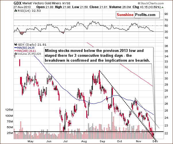
From the short-term point of view, we see that the situation has deteriorated recently. At the beginning of the week mining stocks declined below the previous 2013 low and stayed there for three consecutive trading days. This means that the breakdown is confirmed at the moment and the implications are bearish.
As you can see on the above chart, miners reached the medium-term declining support line created by the August and September high – similarly to what we saw at the beginning of the month. Back then, this line triggered a consolidation (just like now); however, as it turned out it was just a pause within a short-term decline.
Taking this fact into account and combining it with the confirmed breakdown below the previous 2013 low, the current decline could become a major, medium-term decline.
Finally, we would like to discuss the current situation on the gold stocks to gold ratio.
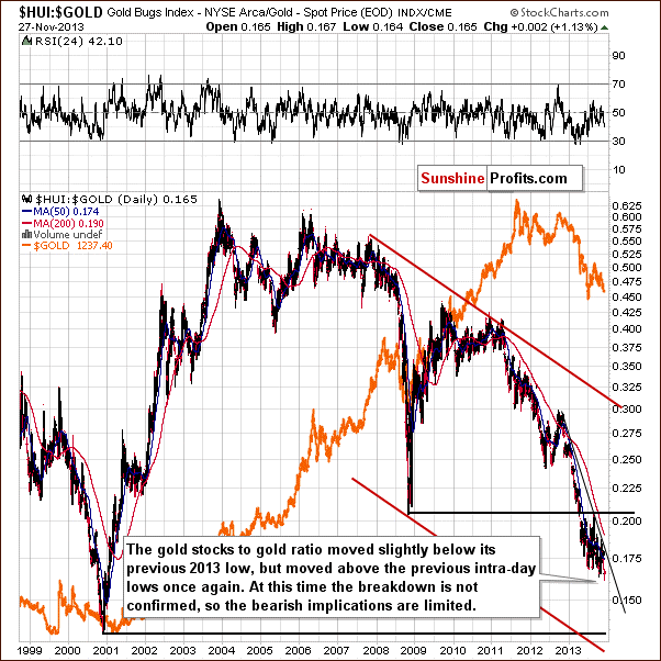
On the above chart we clearly see that the situation has deteriorated in the recent days. At the beginning of the week the HUI to gold ratio dropped slightly below its previous 2013 low. However, in the following days the ratio moved above the previous intraday lows once again. Therefore, the breakdown is not confirmed at the moment and the bearish implications are limited.
Please note that from this perspective, the downtrend remains in place, and it will remain in place as long as the HUI to gold ratio stays below the declining resistance line. We don’t expect to see a breakout above this line before another major plunge in the precious metals sector.
Summing up, the medium-term trend remains down. Taking into account the breakdown in the HUI Index and confirmed breakdown in the case of the GDX ETF, the outlook for the mining stocks is even more bearish than a week ago.
Summary
Gold was “supposed” to move higher based on the long- and medium-term support lines being reached, but all it managed to do was to pause the decline. Gold didn’t even manage to move above the short-term declining resistance line given a move lower in the USD Index and a move higher on the general stock market. That is a sign of weakness on the gold market, and something that we also saw before the metal plunged in April.
The mining stocks are once again visibly underperforming the underlying metals and the GDX ETF has already verified a breakdown below its previous 2013 low. We didn’t see a confirmed breakdown in the case of the XAU Index and HUI Index just yet, so the situation is not yet extremely bearish. Still, let’s keep in mind that miners’ underperformance is also something that we saw before precious metals plunged in April. The above is even more bearish if you take into account what recently happened in the USD Index (it declined) and on the general stock market (it moved higher). The situation is very bearish in the case of the mining stocks sector.
Silver’s performance is somewhere in between the above 2 sectors. It visibly under-performs gold despite general stock market’s move higher (similarly to mining stocks) and remains at a long-term support level (similarly to gold). The outlook is therefore not as bearish as it is the case with mining stocks, but it’s definitely bearish.
Consequently, we think that it’s time to start moving on the short side of the market, but we will wait for a confirmed breakdown in the case of the HUI Index before suggesting hedging / selling the long-term precious metals investments (the mining stocks part that is). As a reminder, we are currently only half-invested in the case of gold, silver, platinum, and mining stocks.
In particular, we think that it’s a good idea to open a speculative short position in the mining stock sector (half of the regular size thereof) and place stop-loss orders relatively close to where precious metals miners are right now.
Trading – PR: Short position in the mining stocks.
Trading – SP Indicators: No positions: SP Indicators suggest long positions, but the new self-similarity-based tool suggests short ones for the precious metals sector. We think that overall they cancel each other out.
Long-term investments: A half position in gold, silver, platinum and mining stocks. As far as long-term mining stock selection is concerned, we suggest using our tools before making purchases: the Golden StockPicker and the Silver StockPicker
| Portfolio's Part | Position | Stop-loss / Expiry Date |
|---|---|---|
| Trading: Mining stocks | Short - half | HUI: 214, GDX: $22.80 |
| Trading: Gold | None | - |
| Trading: Silver | None | - |
| Long-term investments: Gold | Long - half | - |
| Long-term investments: Silver | Long - half | - |
| Long-term investments: Platinum | Long - half | - |
| Long-term investments: Mining Stocks | Long - half | - |
This completes this week’s Premium Update. Our next Premium Update is scheduled for Wednesday Dec 4, 2013 (2 days ahead of the regular schedule). We will continue to send out Market Alerts on a daily basis (except for when Premium Updates are posted) and we will send additional Market Alerts whenever appropriate.
Thank you for using the Premium Service.
Sincerely,
Przemyslaw Radomski, CFA

