
- Yellen in February 2013
- USD and Euro Indices
- General Stock Market
- Correlation Matrix
- Gold
- Silver
- Palladium
- Mining Stocks
- Letters from Subscribers
- Long-term support for US Dollar
- Going "long" and "short"
- Syndicates working together to manipulate the price of Gold
- Summary
Yellen in February 2013
“I believe that the Federal Reserve's asset purchases and other unconventional policy actions have helped, and are continuing to help, fill this gap and thus shore up aggregate demand.”
As we mentioned previously (in case of Bernanke) it is always worthwhile to study previous careers of potential central bankers in order to understand their future role in case they get elected (Alan Greenspan being a proud exception to that rule!). It is therefore advisable to see past interpretations and opinion of Janet Yellen. They could signal the directions of future Fed’s decisions.
At the conference “A Trans-Atlantic Agenda for Shared Prosperity” Yellen expressed her concern about the labor markets (the transcript was published on Federal Reserve’s webpage). She emphasized the aggregate variables once again. She also spoke about the special conditions, in which the interest rate was reduced effectively to zero percent. Since further cutting is impossible, the Fed had to (she implies) go further and do something which may appear as additional interest rate cutting (assuming that was possible). The solutions were extensively discussed by Bernanke. As the above quote shows Yellen believes that it is a right way to go – forget the bubble, keep the printing machine ready in order to boost aggregate demand and increase output and employment.
Official employment levels have improved no doubt. But Yellen warns us not to be excited about this change, because some people are working part time (and they would prefer to work full time). Also there are thousands of people who gave up looking for a job during this recession. The methodology excludes those people from official unemployment statistics. The future Fed’s chairman, therefore, argues that concerns about unemployment should be higher than what official statistics show. What does this mean for possible monetary policy? Do not necessarily tighten the policy if the official rate goes down further, because labor market still have to be stimulated for some reason. More “dovish” than “hawkish”.
When analyzing the unemployment rate in the typical mainstream economics discussion one always tries to answer the question: is unemployment “structural” or “cyclical”? If it’s “structural”, it means that it has a lot to do with “real” economy, and that it cannot be easily healed by the government. Apparently the employees demanding work do not correspond with their skills to employers supplying jobs. If the unemployment is “cyclical”, it means that it is caused by the strange phenomenon of “business cycle”, therefore can be macroeconomically solved. As you probably imagine the “solution” is the government. Or more technically the “solution” lies in the low levels of overall “aggregate demand”, which can be boosted by government spending and the central bank’s active policy. Yellen stated that she interprets the current evidence as indicating that most of the unemployment is “cyclical”, hence it can be lowered by the intervention.
More “doves” thank “hawks” flying around. Again, another indication that she is willing to promote more inflationary policies at the Fed: employment levels are to be become even more important target for the Fed.
Under those circumstances gold appears to feel comfortable in the longer run.
The above is based on the November Market Overview report. Let’s move to the charts to see what’s likely to happen in the medium- and short term (charts courtesy of http://stockcharts.com.)
USD and Euro Indices
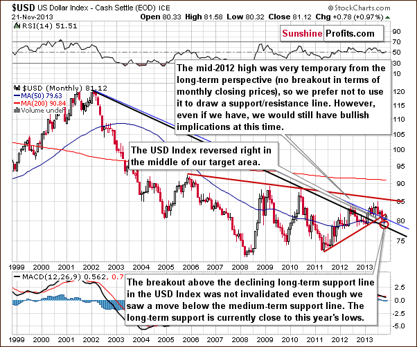
The situation in the long-term chart hasn’t changed much recently and what we wrote in our last Premium Update is still up-to-date today.
(...) the long-term breakout above the declining long-term support line was not invalidated. Additionally, the USD Index reversed right in the middle of our target area. Therefore, from this perspective, it seems that the downward move – if it’s not already over – will be quite limited because the long-term support line will likely stop any further declines.
Now, let’s examine the weekly chart.
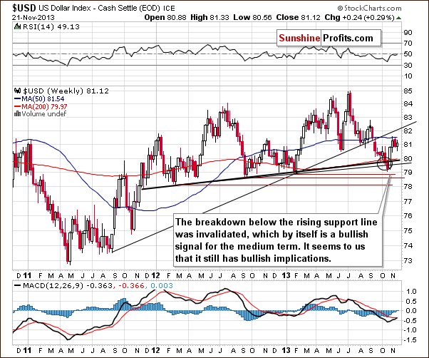
Quoting our previous Premium Update:
(…) after a sharp rally, which invalidated the move below the lower support line and the breakdown below the medium-term support line (a bold black line), the USD Index almost reached the previously-broken rising medium-term support line created by the August 2011 and January 2013 lows. The invalidation of the breakdown is itself a bullish signal and it seems that we will still see more of its impact in the coming weeks.
Looking at the above chart we see that this resistance (or the 50-day moving average that was reached) triggered a corrective move in the previous week, which pushed the U.S. dollar below the 81 level. Earlier this week the USD Index extended its decline and dropped to its weekly low at 80.56, which is slightly above the low that we saw two weeks ago. The proximity to this level encouraged buyers to act and resulted in a pullback. From this point of view the current correction is still shallow, which is a bullish signal for the short term. As you can see on the above chart, recent weeks have formed a consolidation, which is likely a pause before further increases.
Let’s check the short-term outlook.
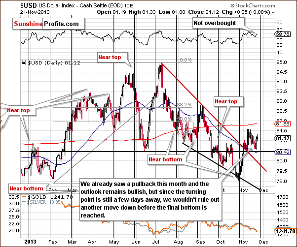
On the above chart we see that after the sharp late-October-November rally, the USD Index gave up some of the gains and corrected earlier growth in the previous week. As mentioned earlier in this section, in the first half of this week the U.S. dollar extended its decline. As you can see on the above chart, with this downward move, the greenback dropped slightly above the previously-broken support/resistance line created by the June low. On Wednesday, this support level (or comments from the Fed about the possibility of tapering the QE program – which we don’t believe, by the way) triggered a sharp move up, which took the dollar above the level of 81 once again.
Please note that as long as it stays above the short-term resistance line (marked with red), the situation will remain bullish. However, since the next cyclical turning point is just a few days away, we wouldn’t rule out another downswing before the final bottom is reached.
Let’s now take a look at the medium-term Euro Index chart.
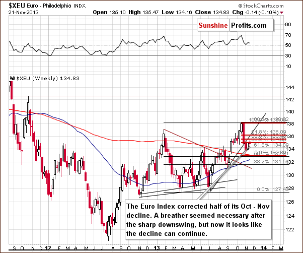
Quoting our previous Premium Update:
(…) after the Euro Index dropped below its rising support line and erased 50% of its entire July – October rally, we saw a relatively small move back up, which took the European currency to the 38.2% Fibonacci retracement level based on the October - November decline.
As you see on the above chart, at the beginning of the week, the euro continued its rally. The Euro Index broke above the level of 135 and corrected half of its October-November decline. However, this improvement was only temporary and the European currency declined heavily on Wednesday. In this way, the breakout above the 135 level was invalidated, which by itself is a bearish signal. At this point it’s worth mentioning that the breakdown below the rising support line based on the July and September lows hasn’t been invalidated. Combining these two facts, we can conclude that the situation is bearish and the decline can continue. If we see a move below 131.56 the bearish implications will be even stronger.
Summing up, we are likely to see further improvement in the USD Index and weakness in the Euro Index on a short-term basis. However, since the cyclical turning point was not reached just yet, we could see another move lower in the USD Index in the next few days, and a bottom close to the turning point. The bearish trend will remain in place as long as the euro remains below its short-term resistance line and the dollar stays above its short-term support line. Therefore, currently, the implications for the precious metal market are bearish, but at the same time there is a possibility that the USD Index will support a short-term upswing in PMs.
General Stock Market
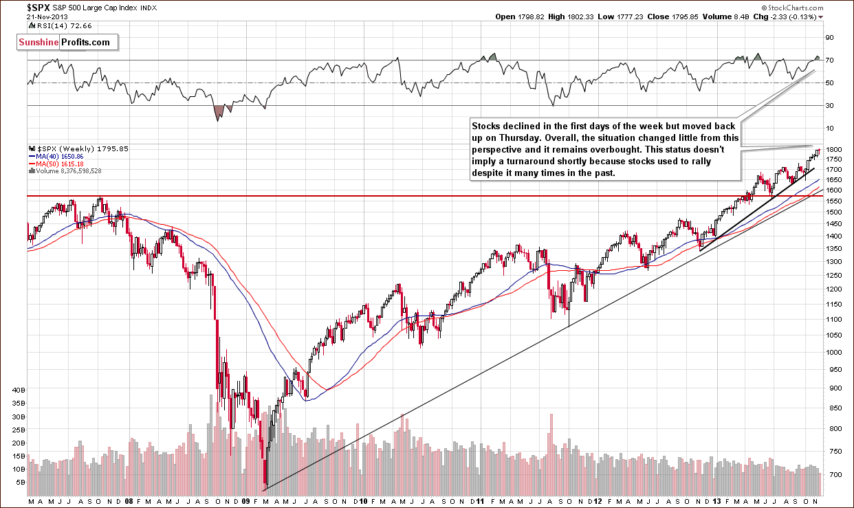
On the above chart we see that the S&P500 Index moved higher on Thursday, having declined earlier this week. The final result is that we have stocks more or less where we had them last week. From this point of view, the long-term outlook remains bullish. However, the RSI reading (over 70) suggests that we might see some weakness in the short term. The strength of this indication is not too strong, though.
Surprisingly, the lack of clarity on the long-term picture doesn’t mean that we have nothing to comment on as far as implications for the precious metals sector are concerned. There is an interesting development present on the short-term chart.
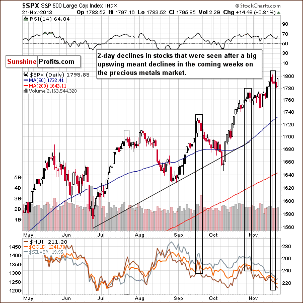
In Wednesday’s Market Alert we wrote the following:
Stocks declined once again yesterday (only slightly, but still) and there are some non-obvious bearish implications for the precious metals sector. If we consider the past 6 months, there were only 3 cases when stocks declined for 2 consecutive trading days in a similar fashion to what we see right now - similar shapes of daily candlesticks and with sharp rallies preceding the 2-day decline. These were July 23-24, Sep 19-20, and Oct 29-30. It was not the final top for the stock market in all 3 cases, but in all 3 cases we saw a significant decline in the precious metals sector in the following days and weeks. Interestingly, all 3 cases took place in the second half of the month - which is where we are right now.
The above-mentioned declines on the precious metals market were not small – as you can see on the above chart – and thus, it seems that this bearish signal is still in play.
Consequently, what we saw on the general stock market this week has bearish implications for the precious metals market, even though we don’t see it directly in our Correlation Matrix.
Gold & Silver Correlations
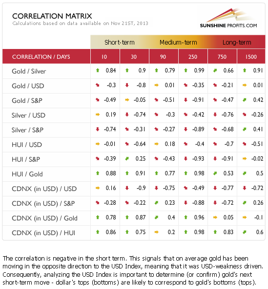
There are basically no changes in values on the Correlation Matrix since we discussed them last week, so we will quote our previous description thereof:
Correlations seem to have moved back to their default values in the case of the USD Index and the precious metals sector. This means that it's no wonder that metals have corrected – the reason was simply be the correction in the USD Index.
As the USD Index moved sharply up on Wednesday, metals and miners declined. The correlations were upheld. As mentioned earlier, it’s not that clear that the correction in the USD Index is over and that it will move higher from here. It’s more likely than not, but at this time we are not ruling out another downswing. The opposite goes for the precious metals sector - we could see another move up that will be followed by bigger declines.
Meanwhile, the correlation coefficients between PMs and the general stock market are rather insignificant on a short-term basis (with the exception of the mining stocks sector, which seems to be waiting for a decline in stocks in order to decline itself), so we can't tell much about the possible impact of the current outlook for stocks for the prices of gold and silver. Stocks have declined in the past few days and miners declined as well – the correlation remains in place and the implications are mildly bearish.
Gold
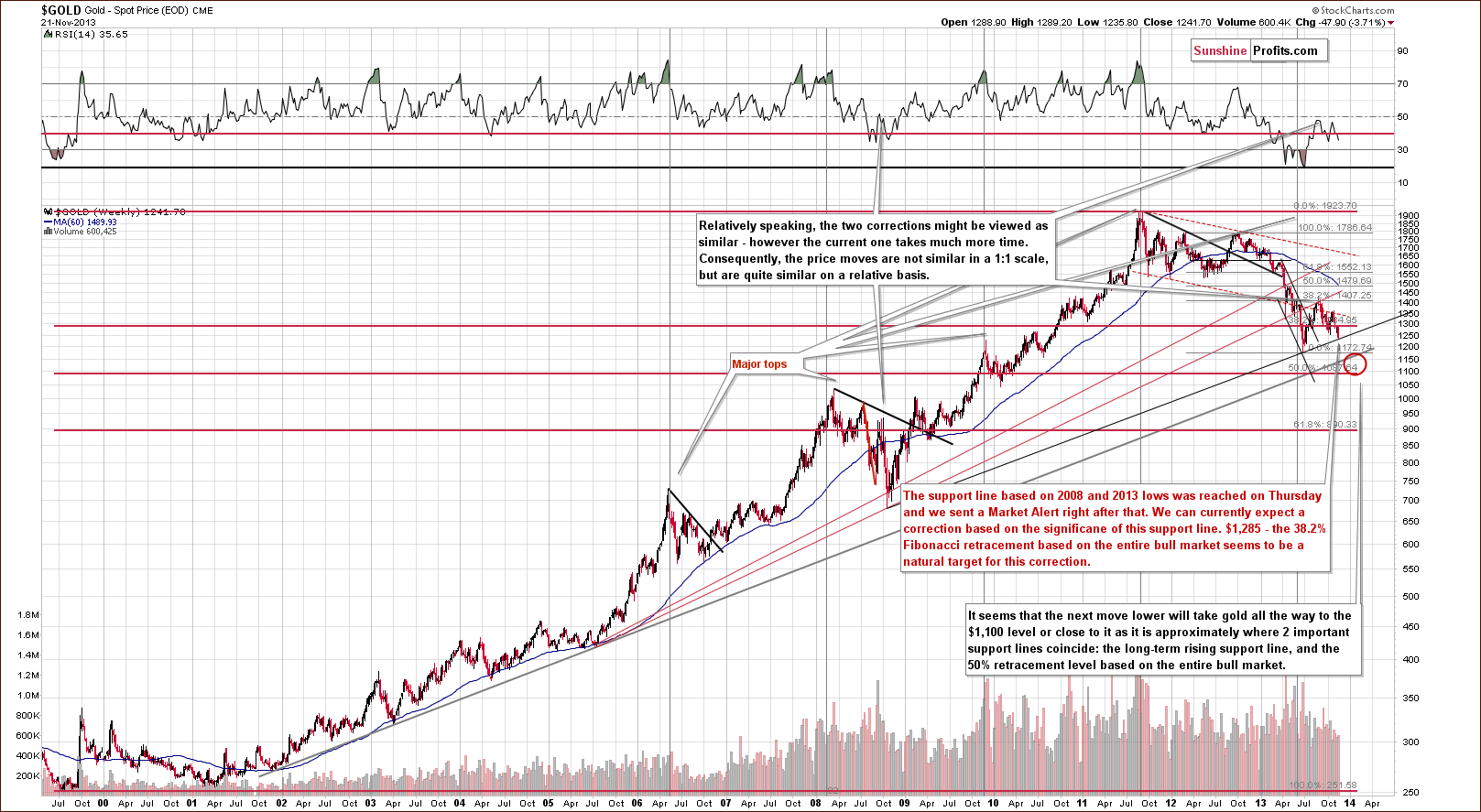
Quoting our previous Premium Update:
Gold is trading very close to the 38.2% Fibonacci retracement level ($1,285) based on the entire bull market, and just a bit more weakness might trigger a significant sell-off if the breakdown is confirmed.
We saw more weakness and a bigger decline followed. Still, another significant support line stopped the decline (actually, a combination of support lines as you will see on the following charts) – the one based on the 2008 and 2013 lows. We marked it with black on the above chart. Both bottoms that it’s based on are significant, so the support is significant as well. Therefore, a corrective upswing should not be surprising here.
Let’s move on to the short-term chart to see the recent price moves more clearly and estimate the short-term outlook. Today we will use two similar charts as we can see slightly different things on them – the fact that they confirm each other as far as outcome is concerned makes them even more useful.
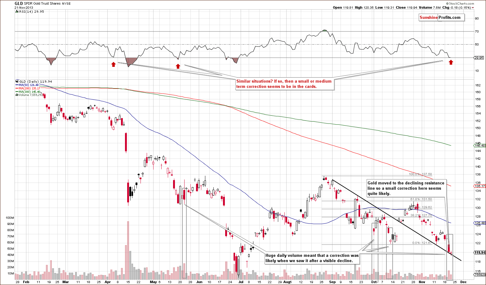
On the above chart we see several important clues regarding gold market’s next move:
- GLD moved to the declining support line, which means that at least a pause is likely.
- The RSI indicator moved below the 30 level, which is a traditional buy signal – and it triggered corrections a few times in the past.
- The volume on which Wednesday’s decline materialized was huge, and when we saw something similar after significant declines in the past; it meant that a local bottom is in or will be formed very soon (it didn’t mean that the final bottom is in – just that a pause or a correction was very likely).
On the spot gold chart we can see one more thing.
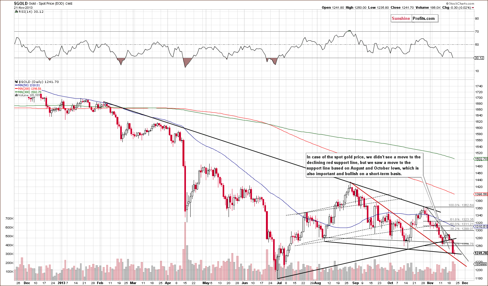
From this perspective, we saw that gold’s decline was stopped by a declining support line created by the August and October lows. We saw an intra-day move below it on Thursday, but gold reversed and moved back above it shortly – no meaningful breakdown was seen.
Overall, based on the USD gold price charts, it seems that we will see a corrective upswing (probably an insignificant one) before the decline continues.
Let’s take a look at the chart featuring gold’s price from the non-USD perspective.
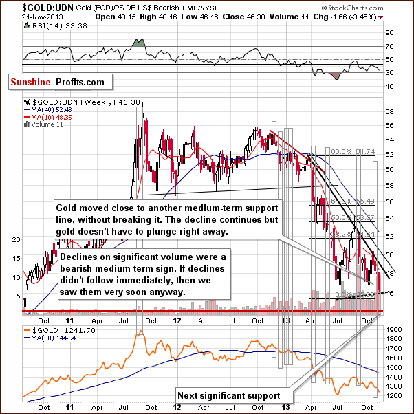
From the non-USD perspective gold has plunged even more visibly than from the USD perspective that we discussed above. However, the most important thing that we see on this chart is still what we discussed last week. It seems that non-USD gold’s decline on significant volume still has bearish implications.
In one of the precious Market Alerts we wrote the following:
Last week gold: UDN ratio declined on quite big volume, which used to precede significant declines in the past. Of course, a ratio does not have a volume by itself - the above is just a thought short-cut, and what we mean is actually the ratio of volumes - volume for gold divided by volume for the UDN ETF. Anyway, the resulting declines were not seen immediately in all cases, but they were seen shortly in almost all cases. Please take a look [above] - we marked these cases with grey rectangles.
As it was the case in the previous weeks, the medium-term trend remains down.
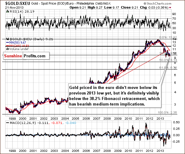
Gold priced in the euro also moved lower this week and it moved below the important 38.2% Fibonacci retracement level. This happened after gold had already verified the breakdown below the rising red support line. The trend is not only down, but it seems that the decline might accelerate shortly – in terms of weeks, not necessarily days, as the above has only medium-term implications.
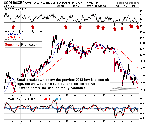
Gold priced in the British pound moved below its 2013 lows, which is a bearish factor, but only slightly bearish at this time, as the breakdown was not confirmed and other charts don’t confirm it either. Moreover, the RSI indicator is currently below the 30 level, which means that a pullback is quite likely to be seen.
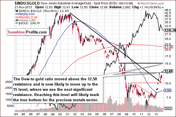
Last but definitely not least, we would like to discuss the Dow to gold ratio. That’s one of the most important and useful ratios there are as far as long- and medium-term trends are concerned. In particular, the big price moves can be detected before they happen (note the breakout in the first months of the year that heralded declines in gold).
In Tuesday’s Market Alert we wrote the following:
The Dow-to-gold ratio moved above the 12.5 level - to 12.56. The breakout is small and unconfirmed by the moment, but we are one step closer to the next (and probably final) plunge in the precious metals sector.
With the ratio even higher today, we have a good possibility that the breakout will be confirmed and that we will see a big drop in the price of gold in the coming weeks or months.
Summing up, the medium-term outlook for gold remains bearish, but based on the combination of support levels that was just reached and the size of the volume that we saw on Wednesday, we might see higher gold prices in the next several days. We don’t think that this rally will take gold much higher, though, and we will view this as another opportunity to re-enter short positions at better prices. How high can gold go? We could see a move to $1,285 level (the Fibonacci retracement), but even a move to $1,300 wouldn't surprise us. Move higher than $1,330 seems unlikely in our view. As always, we will keep monitoring the situation and report to you accordingly.
Silver
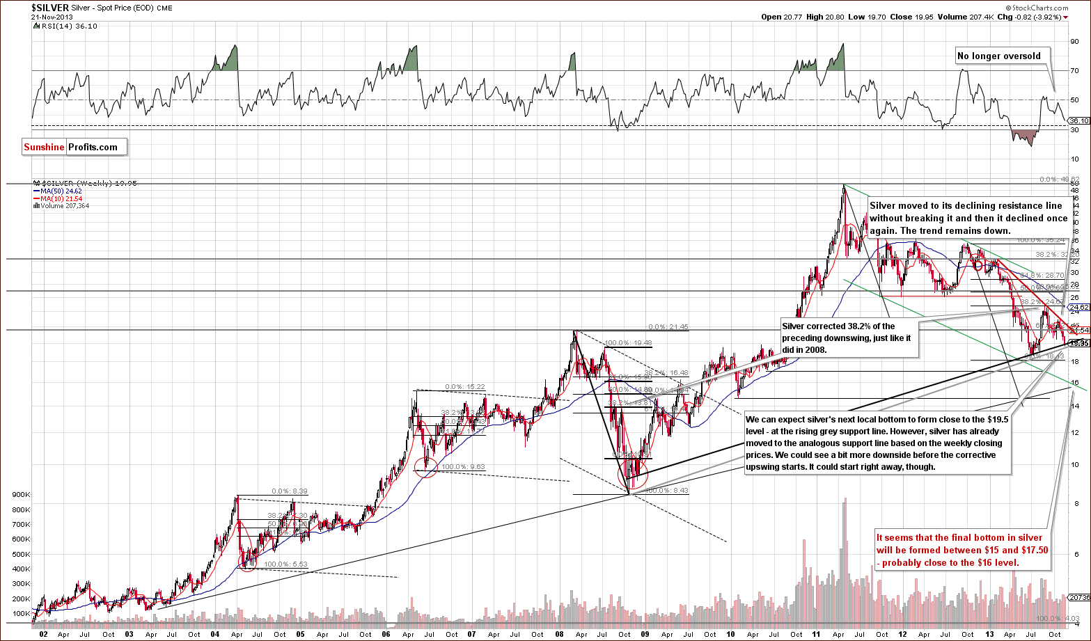
Quoting our last Premium Update:
(…) the white metal not only confirmed the breakdown below the rising support line, it also moved below the 61.8% Fibonacci retracement level based on the June-August rally ($20.80). This means that the upward correction might already be over.
Last Friday, the breakdown below the 61.8% Fibonacci retracement level was confirmed as silver closed below this level for the third consecutive trading day. This made the situation more bearish and triggered a heavy decline this week.
As you can see on the above chart this downswing pushed the price of silver below the previous week’s low and resulted in a new monthly low. With this decline, the white metal reached the support line based on the 2008 and 2013 lows in terms of weekly closing prices (marked with the black bold line). Taking this fact into account, the corrective upward move could start right away. On the other hand, we could see a bit more downside before it starts. In this case, the grey rising support line based on the 2008 and 2013 lows creates an initial downside target (close to $19.50).
At this point it’s worth mentioning the position of the RSI. The indicator is still not oversold, so we might see significant declines in the coming weeks (it’s not that RSI is suggesting that at this time, but it doesn’t “say” that it’s unlikely).
Let’s move to the short-term chart to see the very recent price moves more clearly.
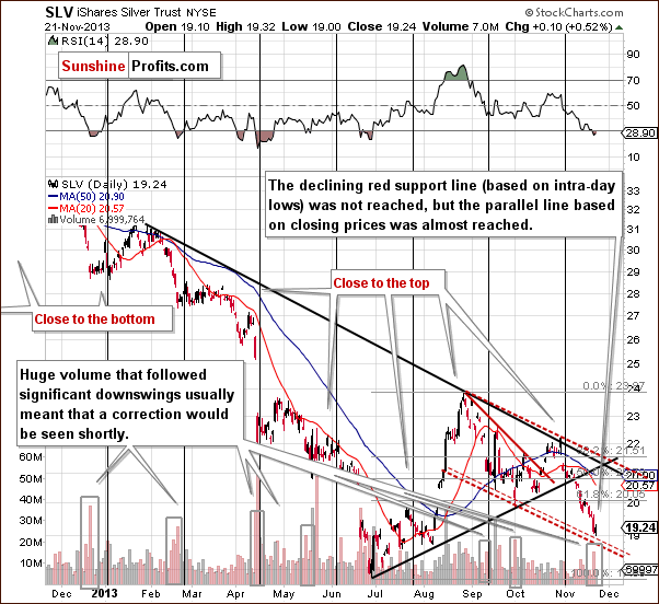
Quoting our previous Premium Update:
(…) the recent decline in SLV materialized on significant volume, which suggests that it was no accident. Interestingly, we saw something similar (a visible but not huge plunge) in early June, which preceded the real downswing and investors had several days to prepare. (…) the downside target for the SLV ETF very close to the $19 level. The target is created by the red dashed line, which is a parallel line to the declining resistance line based on the most recent local tops.
Looking at the above chart you can see that after the breakdown below the 61.8% retracement the SLV ETF accelerated declines and reached the above-mentioned downside target level.
At this point it’s worth noting that huge volume that followed significant downswings in the SLV ETF – similarly to what we discussed below the GLD ETF chart – usually meant that a correction would be seen shortly. Combining these two facts, we can conclude that an upswing in the coming days should not surprise us.
Summing up, the outlook for silver remains bearish. However, taking into account the facts that spot silver reached the support line based on the 2008 and 2013 lows in terms of weekly closing prices and the SLV ETF just declined on significant volume, we might expect to see the corrective upward move in the short term.
Palladium
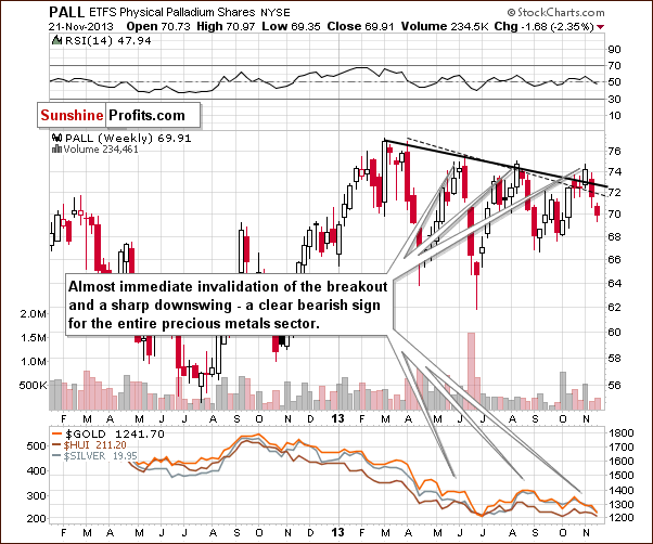
In our Tuesday Market Alert we wrote the following:
Palladium declined sharply yesterday and such moves used to herald big downswings also in the rest of the precious metals sector.
The above remains up-to-date. We saw continuation of the decline and the bearish implications remain in place, even if we see a short-term corrective upswing.
Gold & Silver Mining Stocks
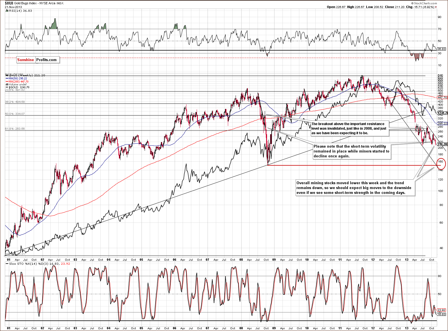
Quoting our last Premium Update:
(…) the trend was down last week and the same is the case right now. We haven’t seen any breakout above the declining resistance line and we can expect big moves to the downside in the days or weeks ahead.
Looking at the above chart we see that the HUI Index has declined heavily this week and dropped to its lowest level since June. Additionally, it almost reached the June low. Therefore, the situation is even more bearish than a week ago and the quote from the previous Premium Update is still up-to-date today.
Please note that the short-term volatility remained in place while miners started to decline once again. We saw a similar situation in 2008. Back then, it preceded further declines. If history repeats itself, we may see similar situation in the coming days or weeks. This means that we can’t rule out a corrective upswing here, despite the strong medium-term declining trend.
3 weeks ago we mentioned that there were some bullish indications on the chart featuring junior mining stocks.
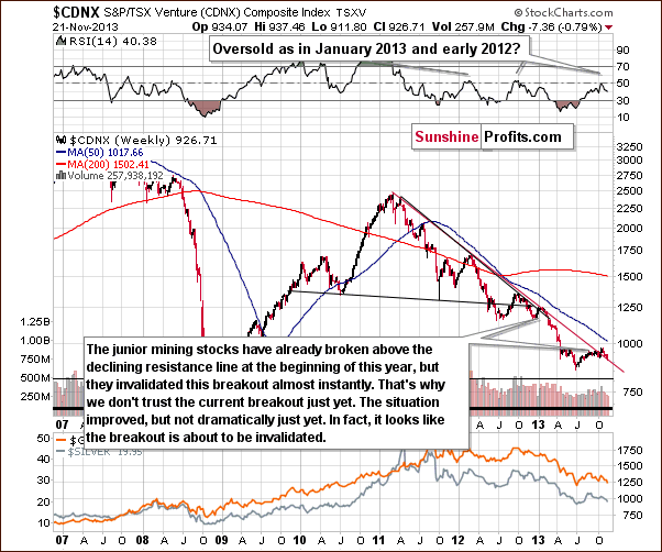
Although the juniors sector moved above the declining resistance line, we think that it’s still too early to say that the breakout has been truly confirmed – especially when we take into account the position of the RSI.
Please note that the last two times when the indicator reached these levels, major medium-term tops were formed. Therefore, we would need to see a verification of the breakout first to view it as an important medium-term signal. This would be the case in any other breakout as well, but in case of the above chart, waiting for a verification seems particularly justified because we have already seen a false breakout at the beginning of this year – one which was followed by a significant decline in the entire precious metals sector.
Since we wrote the above, juniors have declined (in the preceding two weeks and also this week) and they look like they are about to invalidate the previous breakout, which would – naturally – have bearish medium-term consequences for the entire precious metals sector.
If the decline that we are likely to see in the precious metals sector takes juniors back below their declining red support/resistance line, we will have one more indication that the next major move will be to the downside.
Please note that in case of the junior mining stocks the next significant support is much below the current value of the TSX Venture Index, so the coming decline will likely be very significant.
Let’s examine the short-term GDX ETF chart.
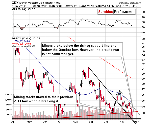
From the short-term point of view, we see that the situation has deteriorated recently. At the beginning of the week mining stocks declined to the previous November low and after a small pause we saw further decreases. On Wednesday, miners broke not only below the rising support line, but also below the October low. On the following day mining stocks dropped once again and reached their previous 2013 low without breaking it. In fact, we saw a turnaround and a move back up before the end of the session. The reversal hammer candlestick was just formed.
Taking this support into account, it seems that we might see a pause within a short-term decline. However, if miners drop below this level the current decline could become a major, medium-term decline. At this time, the former seems more likely.
Finally, we would like to discuss the current situation on the gold stocks to gold ratio.
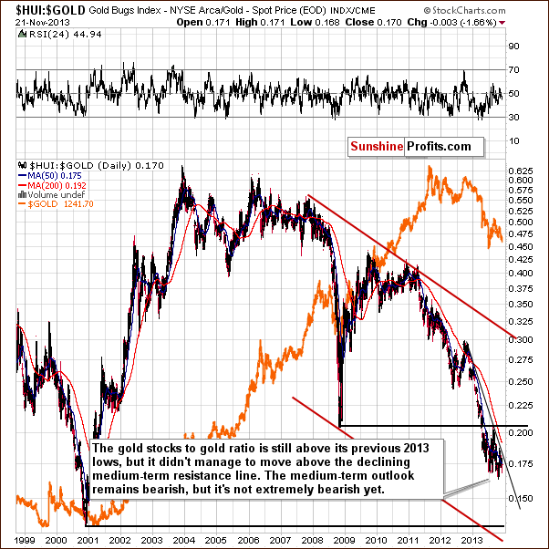
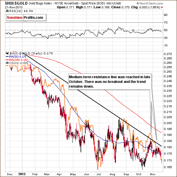
On the above chart we clearly see that the situation has deteriorated in the recent days. Since the beginning of the week the HUI to gold ratio has declined and hit a fresh monthly low on Thursday. From this perspective, the downtrend remains in place, and it will remain in place as long as the HUI to gold ratio stays below the declining resistance line. Since the ratio is not that close to it, it doesn’t seem that we will see a breakout soon. In fact, we don’t expect to see one before another major plunge in the precious metals sector.
Summing up, the medium-term trend remains down and the outlook for the mining stocks is bearish. However, a very short-term move up seems quite likely at this time.
Letters from Subscribers
Q: Like your analysis. I am not sure if I agree with the long-term support line you drew for the USD. Can you help me understand why you chose the brief spike in 2012 as part of the long-term support that the USD has supposedly breached to the upside? It seems arbitrary to me. Want to understand. Thanks.
A: Yes, this, like many of the techniques of technical analysis, is arbitrary and analyst-dependent to a considerable extent. The mid-2012 high was very temporary from the long-term perspective (no breakout in terms of monthly closing prices), so we (subjectively) prefer not to use it to draw a support/resistance line. However, even if we did, we would still have bullish implications at this time. We put an additional declining support line on today's long-term USD chart to illustrate the above.
Q: How can I learn how to do "short" and "long" purchasing. I am new to investing and your advice always talks about this. I am missing a lot of opportunities because I don't know how to do this. Where do I start? Which companies should I use? What do I need to get started with it? (…) You very rarely speak about buying gold and silver - only about buying long and short options so I need to know how to do this.
A: “Going long” means opening a position from which you will profit if the price of the asset goes up. For example, this could mean buying gold or investing in a gold ETF that moves in tune with the gold price. “Going short” means opening a position from which you will profit if the price of the asset goes down. This could mean buying shares of an ETF that is set to move higher when gold declines. So, you’re long gold if you have a position which is worth more as gold goes up. Being short gold means you have a position which is worth more as gold goes down.
Once we have established this, it is important to introduce our approach to gold and silver portfolio structuring. We strongly suggest you read it thoroughly. In short, we divide the precious metals portfolio into three parts: insurance, long-term investments and speculative (trading) capital.
Insurance is the part you keep in your portfolio at all (or almost all) times in the form of physical gold. Since physical gold appreciates when the price of gold goes up, the insurance part is a long position.
Long-term investments are also best kept in the form of physical gold. The difference here is that you might want to limit your investments when the prices are falling sharply. So, in the long-term investment part of your portfolio you also have a long position, which can be limited (sold or hedged) when the market conditions are unfavorable. In extreme cases, you can hedge or sell all of your long-term investments – you would have no position in this part of the portfolio (by our assumption, this would be a very rare situation).
For more information on how to buy physical gold for your insurance and long-term investment parts, please refer to our guide on . Buying physical gold means opening a long position. As you might have noticed, in our structure you don’t open short positions with your insurance or long-term investments (you only occasionally hedge long-term investments).
Finally, we have speculative (trading) capital (this part is also sometimes called “short-term capital”). This part is constituted by instruments such as gold and silver ETFs or ETNs. Going long gold with your speculative capital means buying shares of ETFs or ETNs which tend to move in the same direction gold does. Our ETF Ranking might prove useful here. ETFs/ETNs with “Long” in the “Short” column of the ranking allow you to go long gold (such a position doesn’t reflect gold moves perfectly, but usually is good enough; tracking error varies by ETF/ETN).
If you want to open a short position with your speculative capital, you might want to buy ETFs or ETNs inversely related to gold (or silver). You can find them in our ranking – they are marked with “Short” in the “Short” column of the ranking. Generally, you should be able to buy both long and short ETFs/ETNs using your brokerage account (ETFs/ETNs available will vary by brokerage).
Q: I read this article at the Telegraph newspaper which may be of interest regarding syndicates working together to manipulate the price of Gold. They explain that Gold price dropped rapidly after an investigation was opened today to determine if price fixing is going on in the precious metal market.
A: The general comment here is that markets are full of unexpected events, either big or small. People also tend to react emotionally rather than logically when faced with high-impact decisions under stress. Add to that algorithmic trading and stop-loss levels automatically closing large positions and you have an environment in which large jumps might not be all that uncommon.
The question if precious metals markets are manipulated is a different topic altogether. There seem to be a lot of theories as to who manipulates the market and why, but not much hard evidence. We have made numerous comments on the subject so far, but to sum it up: it’s not clear if the markets are manipulated, even though it seems likely to some extent. This extent is small enough not to really impact the techniques that we use (including technical analysis and statistical tools), as you have seen in the past days, weeks, and months.
We have also been looking quite closely into the price moves around the expiration dates of gold and silver derivatives. It seems that there are some peculiar movements at such times, which suggests that markets might be manipulated. Whether that is really the case or not remains unknown, but we see no reason not to include these effects in our analysis. The results of our research are included in True Seasonals – our tool describing seasonal tendencies in the precious metals market.
Finally, please be careful as far as sources of the above information are concerned – especially if the entity reporting the manipulation is in the business of selling gold or silver. While this doesn’t prove anything, please keep in mind that they might be biased toward suggesting purchasing precious metals right away instead of waiting for it (you might choose a different bullion dealer) or even describe techniques used to forecast corrections as useless (waiting for a purchase or even selling gold/silver temporarily means lower sales for them). As a reminder, we have suggested selling/hedging even the long-term investments in gold, silver and mining stocks on April 12, 2013 at 11:22 AM and higher prices have not been seen since that time. At that time, we suggested selling or hedging half of the investments in all 3 parts of the precious metals sector. Even before that date, we suggested selling/hedging half of the mining stock investments.
Summary
It was a quite volatile week for the precious metals investors. Gold and silver declined sharply and so have mining stocks. Even though we generally don’t engage in day-trading, we had suggested taking profits off the table in the case of the short position that we had suggested opening just a day before. At this time it still seems that it was a good idea, as the precious metals sector looks like it’s about to move higher once again before plunging below the previous 2013 lows.
Gold reached a combination of multiple support levels and this alone makes a correction in the entire sector quite likely. Additionally, silver moved to it’s own long-term rising support line and miners moved to their previous 2013 low – and moved back up before the end of yesterday’s session. It looks like we’re going to see another shorting opportunity soon, but we don’t have a favorable risk/reward situation for opening any trading positions at this time just yet.
Trading – PR: No positions.
Trading – SP Indicators: No positions: SP Indicators suggest long positions, but the new self-similarity-based tool suggests short ones for the precious metals sector. We think that overall they cancel each other out.
Long-term investments: A half position in gold, silver, platinum and mining stocks. As far as long-term mining stock selection is concerned, we suggest using our tools before making purchases: the Golden StockPicker and the Silver StockPicker
| Portfolio's Part | Position | Stop-loss / Expiry Date |
|---|---|---|
| Trading: Mining stocks | None | - |
| Trading: Gold | None | - |
| Trading: Silver | None | - |
| Long-term investments: Gold | Long - half | - |
| Long-term investments: Silver | Long - half | - |
| Long-term investments: Platinum | Long - half | - |
| Long-term investments: Mining Stocks | Long - half | - |
This completes this week’s Premium Update. Our next Premium Update is scheduled for Friday, Nov 29, 2013. We will continue to send out Market Alerts on a daily basis (except for when Premium Updates are posted) and we will send additional Market Alerts whenever appropriate.
Thank you for using the Premium Service.
Sincerely,
Przemyslaw Radomski, CFA

