
- Can VIX Substitute Gold?
- USD and Euro Indices
- General Stock Market
- True Seasonals
- Correlation Matrix
- Gold
- Silver
- Palladium
- Mining Stocks
- Other news
- Summary
Can VIX Substitute Gold?
No, it can’t. We’ve read a very interesting essay on gold, VIX (the volatility index) and the safe haven status entitled Forget gold, the VIX is the new safe haven and we would like to share our thoughts about it.
First of all, what would you expect from a safe haven asset? Should it trade without speculative parabolic upswings and subsequent corrections?
Such ups and downs will happen if a given asset is allowed to trade freely and independently from other ones. Bull markets and bear markets. Excessive optimism turns into excessive pessimism and vice-versa – at least when the markets are free, that’s how things work. That’s simply a realistic observation.
If the gold market is free (at least to a considerable degree), then we can expect it to move ahead of itself every now and then and to underperform at times. What does that tell us? That we should be careful not to view the cyclical downturn as anything more than it is. It is the way markets work and attributing such downturns to other – especially fundamental – factors, can be misleading.
Gold hasn’t really responded to the open-ended QE – it hasn’t skyrocketed. It didn’t even manage to hold a rally for long - the upswings that we saw when the key pieces of news were announced were temporary at best. Does that mean that gold is no longer a good way to protect oneself from the rapidly increasing money supply, which has to, eventually, trigger higher inflation? No, it means that multiple factors that determine the gold price ended up pushing it lower. We can’t tell what would have happened if we hadn’t had an open-ended QE in place for so long. Perhaps the price of gold would be a few hundred dollars lower. All we know is that given the cyclical, fundamental, and short-term emotional factors gold is where it is. Can we infer – based on gold’s decline in 2013 – that the fundamental situation has deteriorated? No. Gold has been rallying, with small pauses, for over a decade. We could have expected to see it correct eventually – it seems that this time is now. It doesn’t mean that it has stopped being a hedge against irresponsible monetary policy. That has not necessarily been the reason for gold not to rally in recent months.
Moving back to the topic – what does it mean for gold to be a safe haven? It means that it should appreciate – on average – when things go bad. Bad = high inflation or any other significant uncertainty. If it is allowed to trade freely (at least mostly), then we can expect it to form local bubbles and then to correct. Has gold more than quadrupled in the last decade? Yes, it has. This means that, on average, gold has been moving higher, most likely, on rising uncertainty and huge money creation. It has corrected in the recent years – OK, but it could be the case that it simply corrected just because it had to correct as this is just the way bull markets work.
Gold is still a hedge against turmoil (especially financial turmoil), but we just can’t expect it to respond to each and every piece of bullish news. If it is in a cyclical downtrend, it will not really respond to positive news. It will eventually, but not necessarily right away. It might need to correct first, and then it will likely come back with a vengeance.
Therefore, if something doesn’t happen right away, it doesn’t mean that it doesn’t work at all. In a loose analogy – you might not see an immediate benefit from education, yet you know that you are very likely to benefit from it in the end.
Then there’s the VIX. The VIX is a financial instrument, which will quite likely do a good job in case of small, day-to-day risks, but – unlike physical precious metals - it will not protect you if the financial system is destroyed. It’s not that we predict that to happen tomorrow or the next week, but something like that could very well take place eventually – within this decade or the next one.
The various decisions that the Powers That Be are making that limit the short-term risks (and the way the current financial system is designed), are actually increasing the systemic risk. In other words, all the insurance companies, reassurance companies, hedged risks via derivative instruments and so on, mean that unless the losses are really huge, the system will absorb it and move back to equilibrium. One company goes bankrupt? No problem. The system risk means a huge problem when a hundred companies go bankrupt at the same time which causes the companies that have been insuring them to go bust as well along with their reinsurers. At such time other companies would become vulnerable to default, which could spread given the overall panic in the market.
With the contagion effect, it wouldn’t take long before the stock market tanked on hundreds and hundreds of companies getting out of business. This is something that could collapse the financial system. That’s precisely the systemic risk. In fact, systemic risk is just a fancy term for “when all hell breaks loose”. Academics, and quite a few analysts, will tell you that systemic risk is here to stay and that you can’t do anything about it. However, we respectfully disagree. There is something that has preserved value for thousands years and endured more than tens of various fiat currency systems – precious metals.
The VIX, on the other hand, should seem excellent (as far as hedging the risk of plunging stocks is concerned) on a short-term and medium-term basis, but if the financial system collapsed, the VIX would likely not provide any protection whatsoever, as it’s just a quite sophisticated part of this system.
Gold is not a mathematical computation of variability of stocks’ returns, but an asset class of its own – a one with a few thousand years of history of serving as a true hedge against the massive fiat money creation. Can a sophisticated financial instrument substitute gold as a true safe haven? No way.
On a short- and medium-term basis everything can happen, though, as in these time horizons markets are not logical, but emotional. Let’s take a look at the charts (courtesy of http://stockcharts.com) to get a glimpse of what might happen next.
USD and Euro Indices
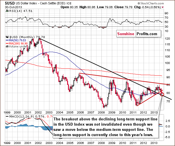
Just as we wrote in the previous Premium Update, the situation in the long-term chart hasn’t changed much recently. The long-term breakout above the declining long-term support line was not invalidated. Therefore, even if we see further deterioration in the USD Index, it will still remain in an uptrend in the long term. From this perspective, it seems that the downward move – if it’s not already over – will be quite limited because the long-term support line will likely stop any further declines.
Now, let’s examine the weekly chart.
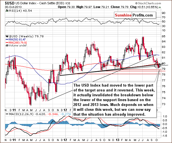
On the above chart, we see that the USD Index broke below the medium-term support lines based on the February 2012, September 2012 and January 2013 lows (a bold black line and a thin black line) and reached the lower part of the target area.
The USD Index moved higher this week and the move below the lower support line was already invalidated. The invalidation by itself is a bullish signal. If we see a bold move back above the 80 level, the breakdown will be fully invalidated and the implications will be clearly bullish for the coming weeks.
Naturally, what’s small on a long- or medium-term chart can be quite a visible move on the short-term chart. So, let’s check the short-term outlook.
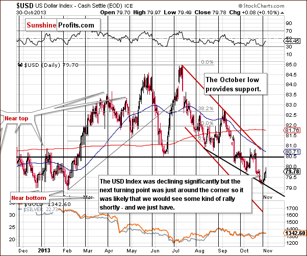
On the daily chart, we see that the USD Index had broken below the previous October’s low, and had reached the short-term support line based on the August 8 and the October 3 lows. But soon after that, it rallied invalidating the breakdown below previous October lows.
In fact, the price bounced off the 2013 low which we saw in early February. Those who have been following our analyses for longer are probably not surprised to see that the turnaround happened at the cyclical turning point.
Let’s keep in mind that the cyclical turning points work on a “near to” basis, so we could still see another re-test of the 2013 lows or even a small move below them. If this happened shortly, it would not invalidate the turning points’ indications. The reason we emphasize the above is that it looks like we could (which doesn’t mean that it’s likely) see the Euro Index move slightly higher before it tops out.
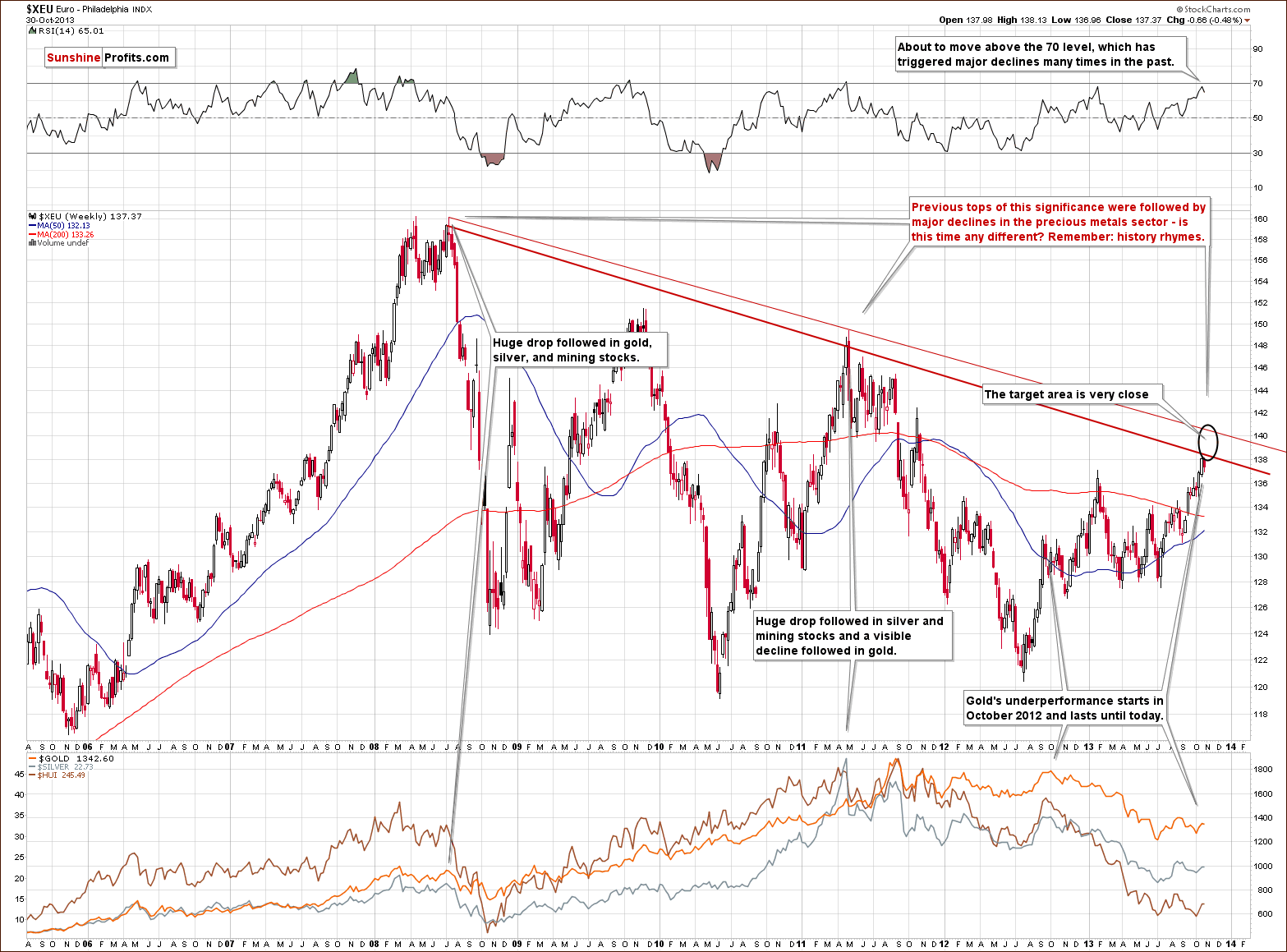
Last week we wrote that the Euro Index remains in a short-term uptrend, but in a long-term downtrend.
While the long-term downtrend remains in place, the short-term uptrend might already be over. The Euro Index moved very close to the strong resistance created by the declining resistance line and if it was the case that many traders were planning to bet on the turnaround in the index, it could be the case that the price will not reach the resistance line at all.
Please recall that we usually suggest getting out of the speculative positions at prices that are lower than our price target “just in case”. If everyone does that, then the top / bottom will form before the predicted price simply because all orders will be placed slightly below/above it. While this won’t have to be the case this time, but it is certainly possible. This means that the local top in the Euro Index is probably in, but if it’s not, then the currency index will not rally much higher (likely not above the upper of the declining long-term resistance lines).
Moreover, when we take a closer look at the above chart we see that the RSI almost reached the 70 level. If the indicator moves slightly higher it will likely trigger declines as it has many times in the past. Please note that there were cases when the index topped when the RSI indicator was only close to the 70 level.
Most importantly, however, we would like to re-emphasize one important fact: the previous tops (in 2008 and then in 2011) were followed by major declines in the precious metals sector. If history repeats itself we may see similar price action in this situation.
Summing up, we could see some strength in the Euro index and weakness in the USD Index on a short-term basis, but it seems that it will be quite limited based on the long-term support and resistance lines. The implications for the precious metal market are no longer bullish in the short term as currencies have already reversed and the USD Index has done so at the cyclical turning point. The impact on the precious metals sector is likely to be bearish in the medium term.
General Stock Market
This week we will start the general stock market with a quote from last week’s report:
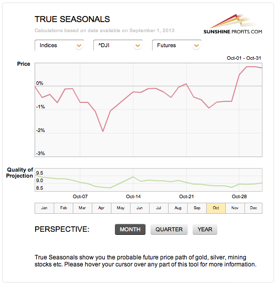
Taking a look at the True Seasonal patterns for the stock market reveals that the situation has been developing quite in tune with them this year. We saw a correction at the beginning of October which was followed by a sharp move back up. The rally now continues. What’s next? Please note that there are no clear short-term indications from the seasonality and derivatives’ expiration effect (two things that are combined on the above chart), but the overall trend is higher. The quality of projection starts to increase in the final part of the month along with the projected price, which means that the price at the end of the month is likely to be higher than where it was at the beginning of the month (and where it is now), but it’s rather unclear how it gets there.
We saw another rally and stocks are indeed trading higher than they were at the beginning of the month and higher than last week. What’s next?
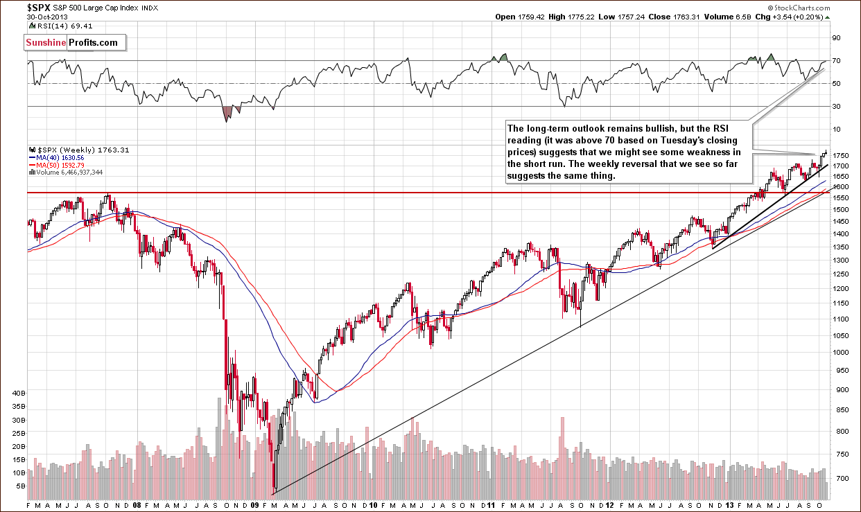
The RSI indicator suggests that we might see some weakness in the short term as it moved above the 70 level. It’s not a crystal-clear signal, though. There were times when stocks managed to rally despite overbought RSI readings. It seems to us that it’s likely a short-term sell signal after all. The reason is that the currency markets (USD and Euro Indices) are likely close to their major turning points (not only the short-term ones) and this can change things temporarily on the US stock market as well. There is a fundamental justification – US exports are more competitive when USD is relatively cheap (making US products cheaper for non-USD buyers). Lower USD can turn into higher sales for the companies, which could turn into higher profits and thus higher stock prices. Markets discount this relationship quickly and it could result in US stocks being negatively correlated with the USD Index in the short and medium term.
In other news, there was an interesting poll on finance.yahoo.com recently. The question was: "As markets continue to hit new highs, several big-name investors are beginning to sound the warning bell. Are you getting worried?"
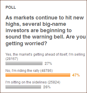
The results tell us one important thing – we are likely not near a major top. We could be near a local one, of course, however, major tops are formed when everyone and their brother are bullish – and this is definitely not the case today. Only about half of respondents are bullish on the market – the rest is either bearish or waiting on the sidelines – there's definitely capital out there that can fuel further rallies.
Overall, the medium-term outlook for the US stock market is bullish and – as you will see in the section about gold & silver correlations – the implications for gold are bearish – but we might see some weakness in the short run.
Gold & Silver Correlations
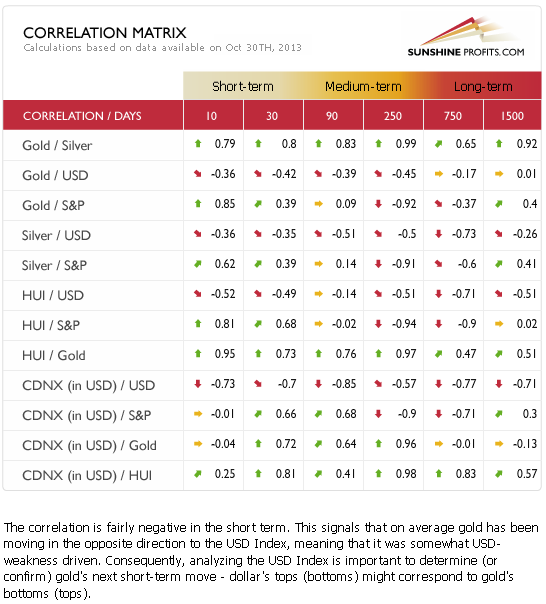
This week we are seeing a return to normalcy in case of the short-term coefficients. The precious metals sector is responding negatively to changes in the USD Index and positively to changes on the general stock market. The 30-day coefficients have not changed enough to be significant on their own, but it seems that just a few more days of the opposite movement in metals and USD Index (and similar moves in metals and stocks) will be enough to indicate that we can counting on the negative correlation in the coming days and weeks as well.
As we wrote last week: taking into account the situation in the Euro Index, it seems that the long-term resistance will likely trigger a medium-term downward move. Therefore, we will focus on the medium-term correlations. In the medium term (taking the 250-day column into account) we could see a negative impact on the precious metal market in the coming weeks but not necessarily days.
Consequently the implications of non-precious metal markets on the precious metals seem to be more important on the medium term basis and this time the influence seems to be bearish.
At this time, however, it seems that the short-term impact is mildly bearish and it might become clearly bearish in just a few days.
Gold
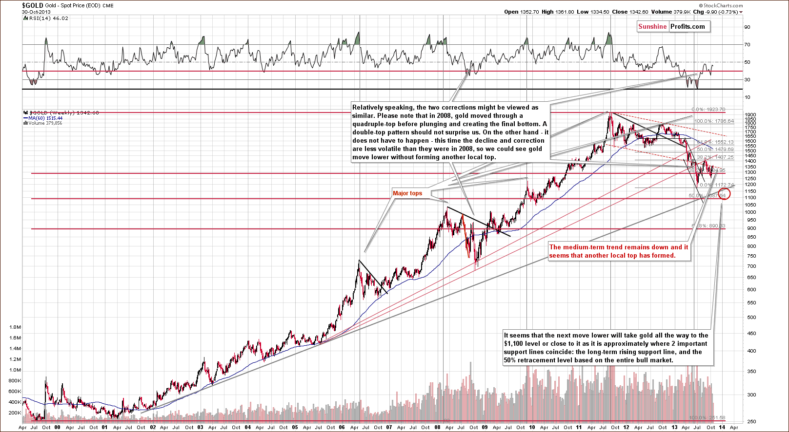
Once again we see that the situation hasn’t changed much from this long-term perspective. It was bearish as gold had already broken below the long-term rising support line and this breakdown wasn’t even close to being invalidated this week.
Please note that in 2008, when gold moved higher before plunging for the final time, there were several intra-week attempts to move higher after which gold finally declined. Therefore, a double top pattern should not surprise us here.
Actually, we saw a similar pattern on a smaller scale in recent days. It’s more visible on the short-term chart. Let’s take a look.
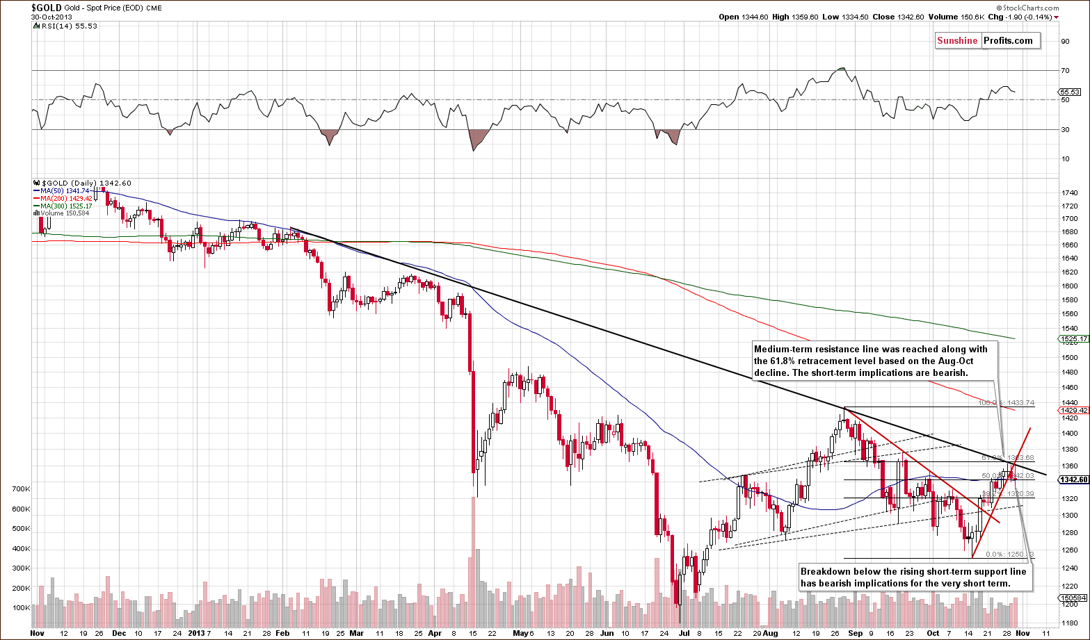
On the above chart we can see two things:
Gold reached the declining resistance line and the 61.8% Fibonacci retracement level 3 times (intraday highs) in the last 3 days but failed to break it.
Gold has broken below the short-term rising support line (marked with red on the above chart).
The first point has bearish short- and medium-term implications. The second point has bearish short-term implications.
Either way, the outlook remains bearish.
Now, let’s move on to the chart of gold priced in Australian dollars.
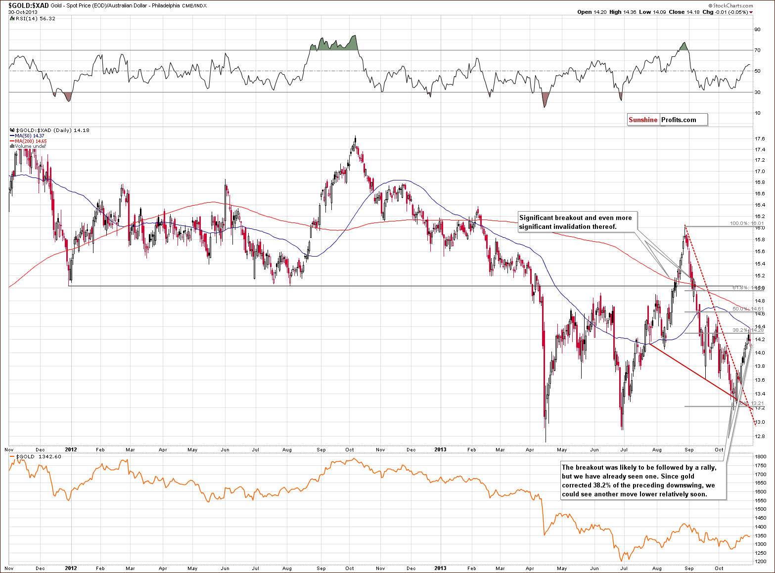
On the above chart we see that gold rallied sharply in the recent weeks but it reached its first - 38.2% Fibonacci retracement level and declined thereafter. It seems that at this time, what was likely to happen based on the breakout above the declining resistance line – has already happened.
The medium-term outlook remains bearish as the breakdown below late 2011 and 2012 lows was not invalidated. It might also be the case that the short-term correction is also over.
Let’s take a look at the chart featuring gold’s price from the non-USD perspective.
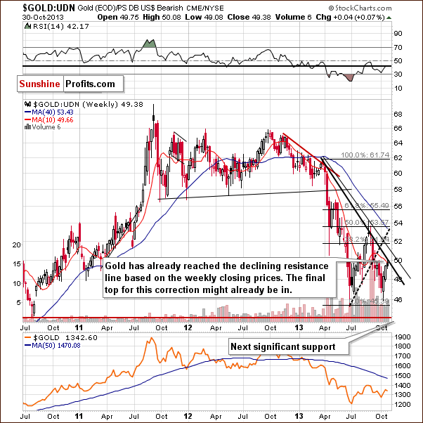
Looking at the above chart, we see that from this perspective, the situation is quite unclear. On the one hand we might see a post-double-bottom rally. However, on the other hand a pullback might be nothing more than a confirmation of a breakdown that we saw in mid-September.
The non-USD gold price moved to its declining resistance line (similar to the USD gold price) and declined. In this case we are taking the weekly closing prices into account. Naturally, we could see a move up to 51 on the above chart and the medium-term outlook would remain bearish, but it’s not that likely that we will see an additional rally.
Still, keeping the double-bottom possibility in mind, it’s a good idea to take a look at gold priced in other currencies (other than the US Dollar that is) and check whether the current upside move is bullish or not. After all, the non-USD gold price that you can see above is the weighted average of gold priced in several major currencies (with weights as in the USD Index). The UDN ETF that we use as a proxy above was not trading long enough to allow us to analyze the above chart from a very long-term perspective.
First, let’s take a closer look at the chart of gold priced in British pounds.
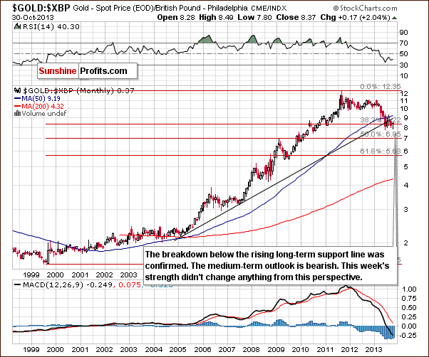
On the above chart we see that gold pulled back to the levels that we saw at the beginning of the month (it’s actually a bit above them). In spite of this, the recent rally seems too small to invalidate the previous breakdown below the long-term support line. Therefore, the implications remain bearish.
The situation is quite similar when we take a look at gold priced in euros.
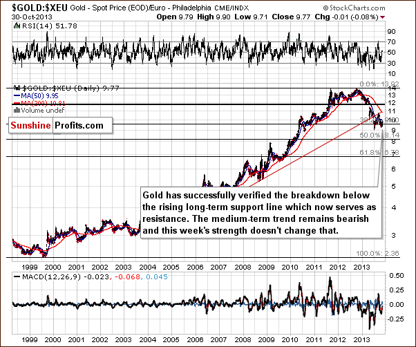
On the above chart we see that gold verified the breakdown below the rising long-term resistance line and now it serves as resistance.
From this point of view we see that this week’s show of strength hasn’t changed anything and the medium-term trend remains bearish. Actually, it doesn’t look like it’s about to change anytime soon.
Summing up, the medium-term outlook for gold remains bearish, and at this time the short-term outlook is bearish as well.
Silver
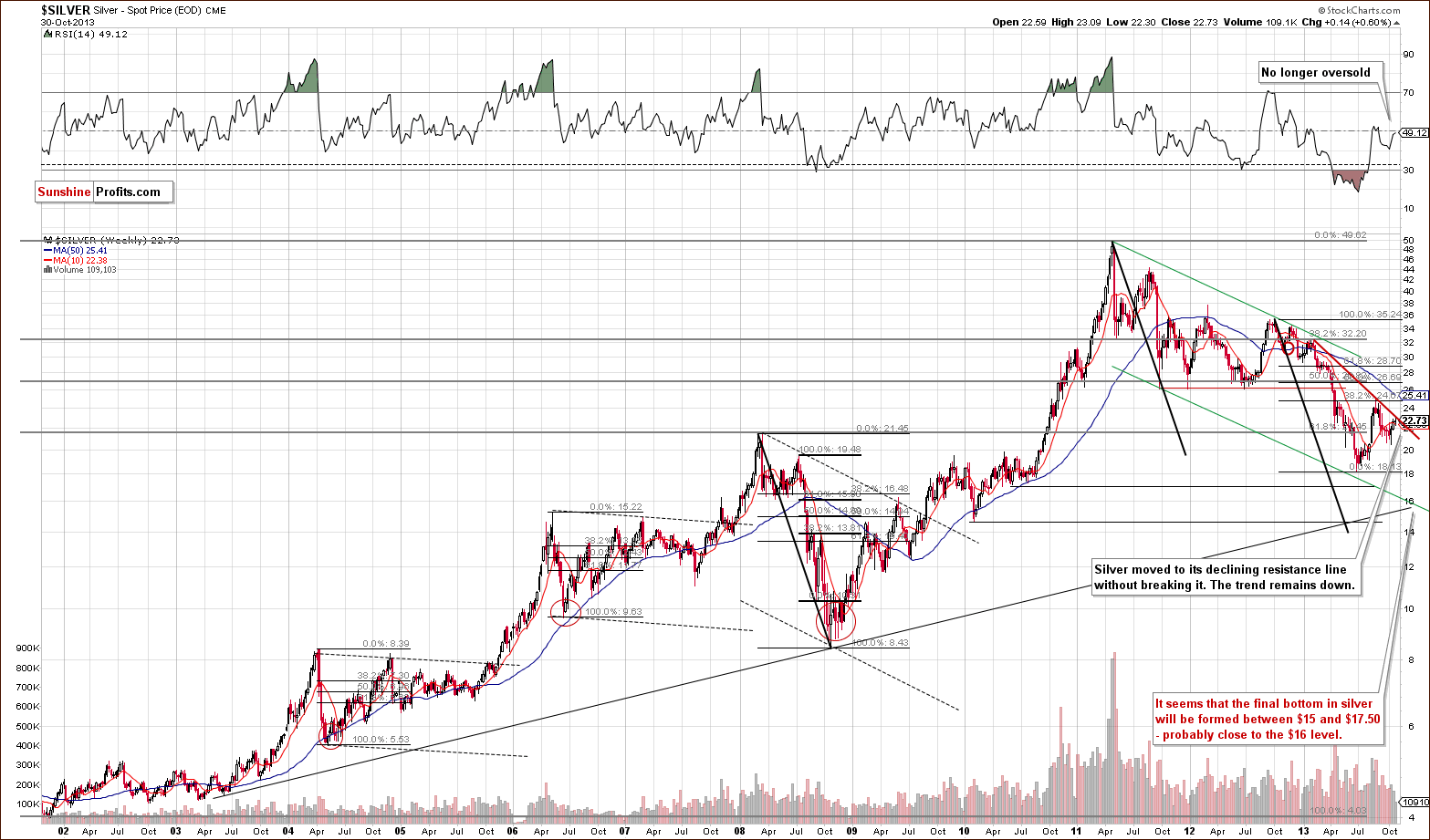
In recent days, we saw another upward move in silver, which took the white metal to the medium-term declining resistance line based on the February and August highs. In spite of this growth, silver didn’t manage to break above it.
At this point it’s worth mentioning the position of the RSI. Although the indicator was heavily oversold in April, silver accelerated declines and reached the 2013 low in June. Therefore, it seems that bigger declines can be seen in the white metal in the near future, even though the RSI remains in the middle of the trading range – especially when we take into account the proximity of the above-mentioned medium-term declining resistance line.
Please keep in mind that the white metal still remains in a medium-term downtrend.
Now, let’s move to the short-term chart to see the recent price moves more clearly.
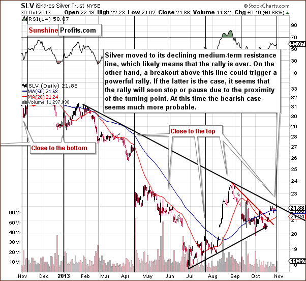
Looking at the above chart we see that the SLV ETF moved slightly above the medium-term declining resistance line on Wednesday on an intra-day basis, but didn’t manage to hold these gains. Consequently, we think it’s safe to also say that there was no breakout from this perspective.
Please note that the white metal moved higher right before the cyclical turning point. If anyone has doubts about the direction in which silver should move based on that, now they should disappear, because silver’s most recent move is definitely up. Taking this face into account, the white metal is quite likely to decline shortly.
Summing up, in the past two weeks silver moved higher after the breakout above the short-term declining resistance line, but now it reached a medium-term declining resistance line and its cyclical turning point. Therefore, the outlook for the white metal is bearish.
Palladium
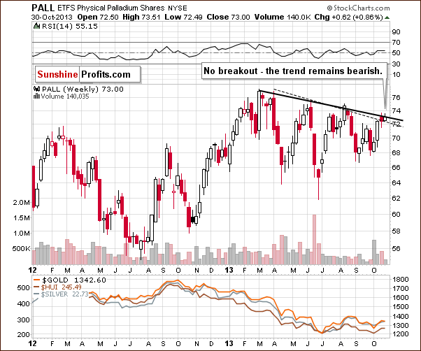
On the above chart, we see that palladium reached the declining resistance line based on the 2013 top and the June peak in the previous week. However, this strong resistance stopped further growth and the metal declined below it. Earlier this week we saw another attempt to move above this line, but it failed. Therefore, the breakdown that we saw at the end of August was not invalidated.
From this point of view, the implications are still bearish.
Gold & Silver Mining Stocks
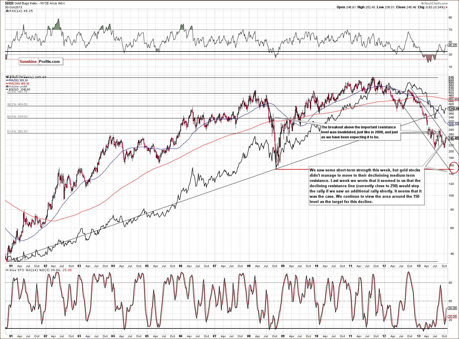
On the above long-term chart we see that earlier this week, the HUI Index reached its medium-term declining resistance line.
Quoting our Monday’s Market Alert:
(…) Gold moved to its declining resistance line based on Feb and Aug highs which corresponds to the 61.8% retracement based on the Aug-Oct decline. The analogous declining resistance line was reached today in the case of the HUI Index.
Please note that we also saw similar price action in the case of silver. Therefore, implications are bearish and the trend remains down. Please note that we still expect that the HUI Index will move to the 150 level or very close to it.
Having said that, let’s move on to the gold stocks to gold ratio.
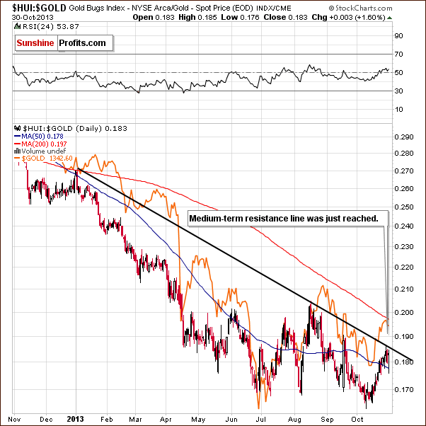
Looking at the above chart featuring gold stocks performance relative to the underlying metal – gold, we clearly see that the ratio reached its medium-term resistance line (similar to what we saw in case of gold, silver and the HUI index), which is a medium- and short-term bearish factor.
Although we saw an invalidation of the breakdown below the previous 2013 low, the long-term trend remains unchanged – we have the ratio below the 2008 low and the breakdown below this low was already confirmed.
Let’s take a look at the long-term chart featuring the junior mining stocks.
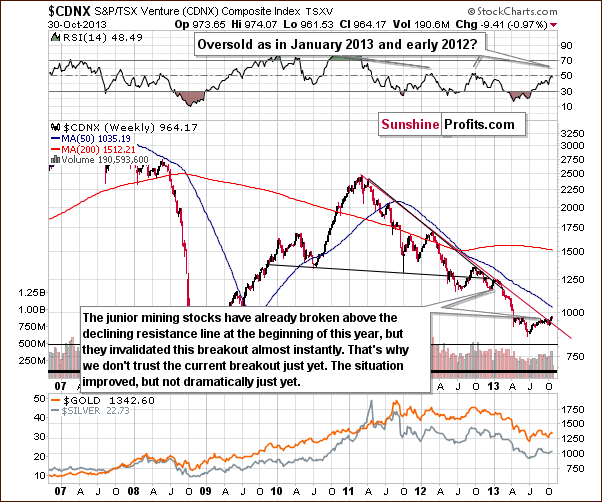
Although the juniors sector moved above the declining resistance line, we think that it’s still too early to say that the breakout has been truly confirmed – especially when we take into account the position of the RSI.
Please note that the last two times when the indicator reached these levels, major medium-term tops were formed. Therefore, we would need to see a verification of the breakout first to view it as an important medium-term signal. This would be the case in any other breakout as well, but in case of the above chart, waiting for a verification seems particularly justified because we have already seen a false breakout at the beginning of this year – one which was followed by a significant decline in the entire precious metals sector.
Before we summarize, let’s examine the short-term GDX ETF chart.
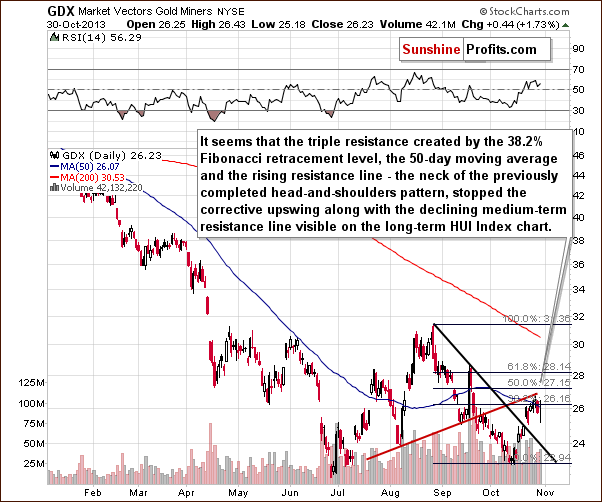
On the above chart we see that the neck level of the previously completed head and shoulders formation was reached and mining stocks reversed. Although the GDX ETF moved above the 50-day moving average and the 38.2% Fibonacci retracement level, the breakout was quickly invalidated.
Please note that Wednesday’s rally didn’t change anything, because it didn’t even erase Tuesday’s decline. And speaking of that one-day upward move… there is one more particularly interesting thing – mining stocks’ underperformance. Their move higher was very small compared to the one we saw in underlying metals. The implications are bearish.
Summing up, the outlook for the mining stocks remains bearish in the medium term, and we also have short-term bearish implications right now.
Other news
We’ve seen two interesting pieces on finance.yahoo.com this week - in the first one, Charles Schwab's chief investment strategist, Liz Ann Sonders said that she thinks that the bull market in the general stock market is not over. We agree, but we would also like to add that it's artificially driven - the growth is not fueled by savings of the private sector, but by massive money creation.
The second link features Robert Shiller, the real estate market authority and this year’s Nobel Prize laureate in economics, who says that it's not likely that we will see another bubble in the real estate market, perhaps not in our lifetime. While we have great respect for prof. Shiller, it seems to us that we could see bubbles in many markets in the years to come when the markets really start using the money that has been created. We expect to see many more bubbles in the distant future and we wouldn't rule out another housing bubble.
Summary
The breakout in the Euro Index and the proximity of its long-term resistance line seem to be the key two factors that are already contributing to precious metals price movement and are likely to impact them in the near future. As the Euro Index rallies, we could see some strength in the precious metals market but this strength is likely to be temporary at best. Just as the Euro Index is likely to resume its decline, the precious metals market is likely to move lower.
More importantly, the short-term outlook for the currency sector changed recently as the USD Index already started to rally after its cyclical turning point.
The stock market seems to have begun a correction within a medium-term uptrend.
Since correlations with the precious metals market are beginning to return to their normal values (negative with the USD Index and positive with the US stock indices), we have weak bearish indications for the short term. The situation has deteriorated for the PM sector based on the last several days.
The precious metals sector seems to have reversed direction this week right after moving to the declining resistance lines. We can see this important phenomenon in gold, silver, HUI Index, and HUI:gold ratio. It might be the case that the next major downleg has already begun and it seems likely that we will see at least a short-term downswing shortly. We still can’t rule out another small rally in case the Euro Index rallies, but overall it seems that betting on lower gold, silver, and mining stock values is a good idea right now.
Trading – PR: Half position: short position in gold, silver and mining stocks.
Trading – SP Indicators: No positions: SP Indicators suggest long positions, but the new self-similarity-based tool suggests short ones for the precious metals sector. We think that overall they cancel each other out.
Long-term investments: A half position in gold, silver, platinum and mining stocks. As far as long-term mining stock selection is concerned, we suggest using our tools before making purchases: the Golden StockPicker and the Silver StockPicker
| Portfolio's Part | Position | Stop-loss / Expiry Date |
|---|---|---|
| Trading: Mining stocks | Short - half | HUI: 268, GDX: $28.60 |
| Trading: Gold | Short - half | $1,392 |
| Trading: Silver | Short - half | $23.90 |
| Long-term investments: Gold | Long - half | - |
| Long-term investments: Silver | Long - half | - |
| Long-term investments: Platinum | Long - half | - |
| Long-term investments: Mining Stocks | Long - half | - |
This completes this week’s Premium Update. Our next Premium Update is scheduled for Friday, Nov 8, 2013. We will continue to send out Market Alerts on a daily basis (except for when Premium Updates are posted) and we will send additional Market Alerts whenever appropriate.
Thank you for using the Premium Service
Sincerely,
Przemyslaw Radomski, CFA

