
- Euro & USD Indices
- True Seasonals for US Dollar
- General Stock Market
- Correlation Matrix
- Gold
- Silver
- Palladium
- Mining Stocks
- Letters from Subscribers
- Leveraged ETFs/ETNs
- Gold below $1,000?
- Summary
We write a lot about China whose appetite for gold is matched only by the size of its currency reserves. This time we would like to turn our attention away from China to Africa. However, we discovered that we cannot explore the Africa without referring back to China.
Africa is currently the fastest growing region in the world, its growth driven by a commodity exports boom. China, hungry for natural resources, is emerging as the major player on the continent. China is now Africa’s largest trading partner and the Chinese are striking deals, investing in oil, gas, and mineral projects, buying assets and building roads and infrastructure all over the continent. Trade between China and Africa increased 20 fold in the past ten years, reaching more than $200 billion in 2012. Last year a Chinese group tried to buy a majority stake in African Barrick Gold a leading gold producer in Tanzania. Talks collapsed, but this leaves no doubt about China’s interest in African gold.
You don’t hear much about Africa in the precious metals press even though the continent produces up to 30% of global gold production. You only hear about Africa when there is labor unrest, as was the case last summer in the Lonmin platinum mine strike that took the lives of 34 people.
South Africa is one of the global leaders in gold production, but it also has the highest average production costs in the world, lowering grades as well as the exhaustion of several mines. Tanzania and Mali are rapidly becoming Africa's newest gold producers with several mines being commissioned or in final feasibility stages. Ghana is still a major gold producer and is attracting thousands of Chinese workers and heavy equipment to work Ghana’s small-scale mines.
China’s inroads into Africa are sparking debates on China’s motives. Many say China’s ambitions are mostly colonialist; to buy up Africa’s commodities and sell back manufactured products. The West, after exploiting Africa for centuries, has undertaken various well-meaning projects to alleviate Africa’s poverty where over 50 per cent of Africans still live below $2 per day. These efforts have had mixed success at best. In any case, the former colonial powers are in a morally weak position to lecture China on Africa. China’s focus is straight forward—to secure access to Africa’s natural resources. In the Fifth Forum on China Africa Cooperation in Beijing last summer former Chinese president boasted of the burgeoning trade between China and Africa in 2011, triple the amount since 2006.
Chinese mining operations in Africa have a less than glowing track record. A 2011 report by Human Rights Watch said that safety and labor conditions at Chinese mines in Zambia were worse than at other foreign-owned mines (To be fair, one must point out that conditions in China itself are not much better and an estimated 5,000 miners die on the job each year, a number four times higher than in the U.S.)
China's is willing to do business with African governments without taking into account their human rights record. With its huge currency reserves, China is able to provide African governments with below market debt for massive projects, which, needless to say, are built by Chinese firms.
“It is time for Africans to wake up to the realities of their romance with China,” writes Lamido Sanusi, governor of the Central Bank of Nigeria in an article for The Financial Times. “Nigeria, a country with a large domestic market of more than 160m people, spends huge resources importing consumer goods from China that should be produced locally. We buy textiles, fabric, leather goods, tomato paste, starch, furniture, electronics, building materials and plastic goods. The Chinese, on the other hand, buy Nigeria’s crude oil. In much of Africa, they have set up huge mining operations. They have also built infrastructure. But, with exceptions, they have done so using equipment and labor imported from home, without transferring skills to local communities. So China takes our primary goods and sells us manufactured ones. Africa is now willingly opening itself up to a new form of imperialism.”
There have been speculations that China is bolstering its gold reserves quietly by buying gold mined in Africa on the sly. The last time the People’s Bank of China revealed its gold holdings was in 2009 at a total of 1,054 metric tons, which is about 1.8 per cent of its total reserves. Just recently a high ranking officials in China’s central bank said that China cannot buy too much gold without causing a surge in the price that would ultimately hurt Chinese consumers.
China imports about 500 to 600 tons of gold a year and mines about the same amount on Chinese soil. How much of that gold goes to the Central Bank and how much is coming in from Africa under the radar? We’ll find out when China next reveals its reserve holdings.Meanwhile, let’s examine the charts (courtesy of http://stockcharts.com.)
USD and Euro Indices
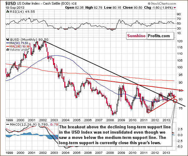
The situation in the long-term chart has changed, but the most important thing didn’t change. The long-term breakout above the declining long-term support line was not invalidated, even though the USD dropped heavily on Wednesday.
However, since the medium-term breakdown (below the support line marked with red) is visible also from this perspective, we could see some short-term weakness anyway. It seems that the long-term support line will stop the decline. Therefore, from the long-term perspective, it seems that the downside is still quite limited.
Now, let’s examine the weekly chart.
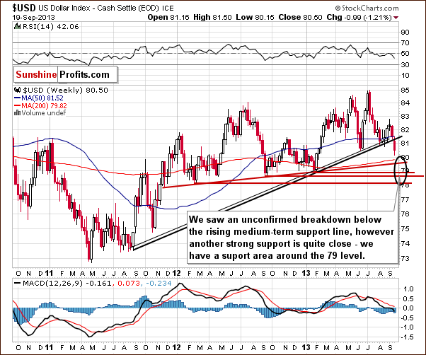
On the above chart, we see the breakdown more clearly. The breakdown is unconfirmed at this point, and we could still see a reversal back above the previously-broken support/resistance line. It would be a powerful bullish signal, but it seems more likely that we will see another move lower first. This is due to the size of Wednesday’s move without a visible intra-day pullback.
The target area is quite unclear because of the multiple support lines, including the long-term support line seen on the previous chart. It seems that we could see the US Dollar Index in the 78-79 range before the bottom is in.
Again the exact price target is unclear.
Let’s check the short-term outlook.
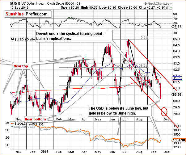
On the short-term chart, we see that the target area is close to the 79 level. The present cyclical turning point makes the situation extreme and difficult to trade as we could see a powerful pullback immediately even if the target area isn’t reached.
Additionally, please note that even though the USD Index has declined heavily in September, we also have gold visibly lower than it was at the beginning of the month.
Is another move lower on a very short-term basis likely? It is - based on the True Seasonals pattern that has been working very well in the past few months.
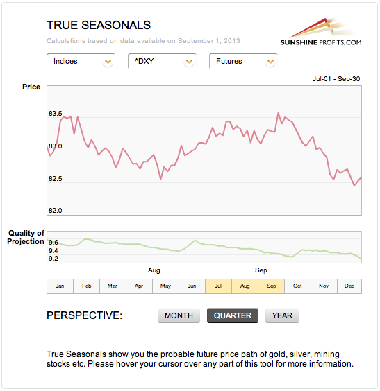
Please note that we saw a visible decline prior to the first part of August after which we saw an upswing which lasted until early September. This has been followed by a significant decline, which is precisely what the True Seasonal patterns were suggesting.
Right now, they are suggesting another small move lower in the final part of this month.
Taking the previously mentioned support levels into account, it seems that the move lower could be more significant, but it will be approximately in tune with the True Seasonals pattern.
Please note that the quality of the prediction (green line in the lower part of the above chart) declines in the final part of the month, which means that a deviation (in the form of a bigger decline) is not unlikely.
Let’s see if analysis of the euro index confirms the above as well.
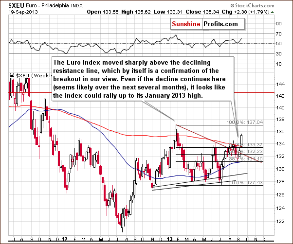
It does. Just as we saw a breakdown on the medium-term USD Index chart, we also saw a breakout above the medium-term declining resistance line in case of the Euro Index.
Similarly, the next significant resistance is at the previous 2013 high.
Summing up, it looks as though we could see further weakness in the USD Index in the very short-term (within a week or so), but we expect the decline to be stopped by the declining long-term support line, and the next big move will likely be to the upside.
Please note that multiple smaller support levels and the existence of the cyclical turning point make the situation rather unclear – we could see a move up even without reaching the long-term support line.
General Stock Market
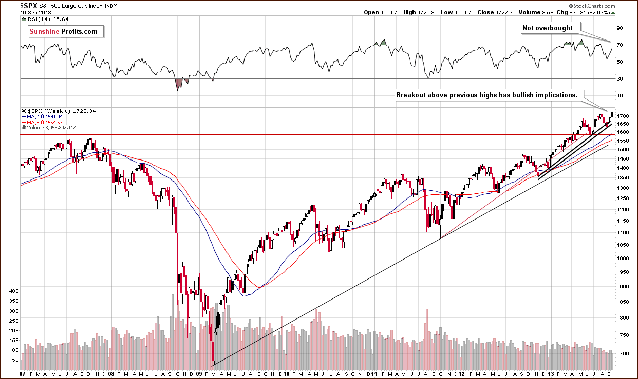
On the above chart, we see that the situation has improved in recent weeks.
At the end of August, the S&P 500 Index reached the rising support line based on the November 2012 - January 2013 lows (on an intraday basis). As you see on the above weekly chart, this support line stopped further declines, which resulted in a rally in the following weeks.
On Wednesday, the S&P 500 Index broke above previous highs and climbed to a new record high at 1,729.44. Technically, the outlook for the S&P 500 Index remains bullish.
Before we examine the Broker-Dealer Index chart to see what the financial sector is doing, let’s take a look at the DIA ETF chart, which is another proxy for the general stock market.
Quoting from our previous Premium Update:
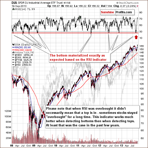
(…) the DIA ETF moved lower, and the RSI based on it moved below 30 - almost to the 26 level. Since the beginning of 2008, there have been exactly 7 cases when we saw something similar. In 4 of them, this meant that an important bottom had just been formed. In the remaining 3 cases, a major bottom was formed in a short time anyway.
(…) it is still in play and can lead to a bigger pullback or – more probable – a new up-leg. It seems that the bottom might already be in.
As you can see on the above chart, we had such a price action earlier this month. After the DIA ETF pulled back from its September 6 low, we saw a rally, which pushed it higher. This upward move resulted in a breakout above the August top which formed a week or two earlier.
Please note that the RSI indicator climbed to the 74 level, which means it is overbought. In this case, it doesn’t necessarily mean that the top is in, because sometimes stocks have remained “overbought” for a long time without correcting. In other words, the RSI Indicator is better for timing bottoms than for predicting tops, at least in the case of the general stock market.
We turn now to the financial sector, which in the past used to lead the rest of the general stock market.
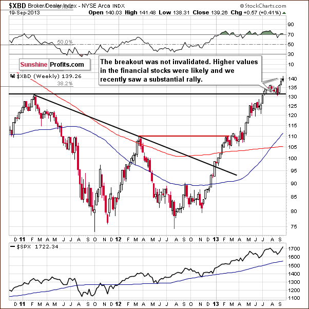
On the above chart, we see that although there was a downward move, which took the financials to the previously broken resistance level of 130 at the end of August, the breakout above this level has not been invalidated.
At the beginning of September, the financials pulled back sharply and broke above the July top. Earlier this week, we saw another upswing, a move which resulted in an increase above the 140 level.
This confirms that the situation is bullish, and we can still expect further growth in the financial sector and the general stock market.
Summing up, the outlook for general stock market is very bullish in the medium term and is also bullish in the short term.
Gold & Silver Correlations
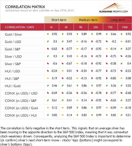
This week when analyzing the Correlation Matrix, we would like you to focus on two things.
The first one is the correlation between the US Dollar Index and the precious metal sector. It is a bit unclear at this time. The situation was more negative prior to Wednesday as gold moved lower even though the dollar wasn’t rallying (in fact, it was declining). We saw the two markets move in opposite directions once again on Wednesday, but a one-day event is not enough to change the tendency, of course. Again, the link between gold and the USD Index are a bit unclear at this time, and the short-term implications are unclear.
However, taking into account what we see in the medium-term columns, especially in the yearly one (250 trading days), we might expect a medium-term upswing in the dollar to translate into a medium-term downswing in the precious metals sector.
The second thing is the negative link between the general stock market and precious metals. Please note that stocks rallied sharply on Wednesday and broke above the previous highs which improved the technical situation for the stock market much more than for gold (there was no breakout in case of the latter).
Consequently, we can see some negative impact on gold through the positive impact on the stock market. As stocks rally, we can see negative pressure on gold even though they rallied together on Wednesday. The overall correlation is still negative.
Gold
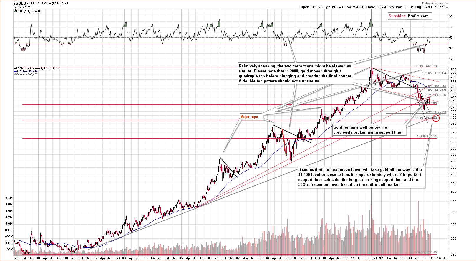
On the long-term gold chart, we see that Wednesday’s rally was not as bullish as it seemed at first sight. In spite of the strong daily upward move, which pushed gold above $1,360, the situation hasn’t changed much from this perspective.
As you see on the above chart, gold verified the breakdown below the long-term resistance line created by the July 2005 and the October 2008 bottoms (taking intraday bottoms into account). At this point, it’s worth noting that there was an invalidation of the breakout above the 38.2% Fibonacci retracement level based on the September 2012 - June 2013 decline earlier this month. This was a bearish sign.
From this point of view, it seems that even if gold increases once again in the coming days and reaches the above-mentioned levels once again, the medium-term outlook will continue to be bearish.
Please note that in 2008, when gold moved higher before plunging for the final time, there were several intra-week attempts to move higher after which gold finally declined. Therefore, a double top pattern should not surprise us here. The same goes for a triple top.
Let’s now take a look at the medium-term picture to see more details.
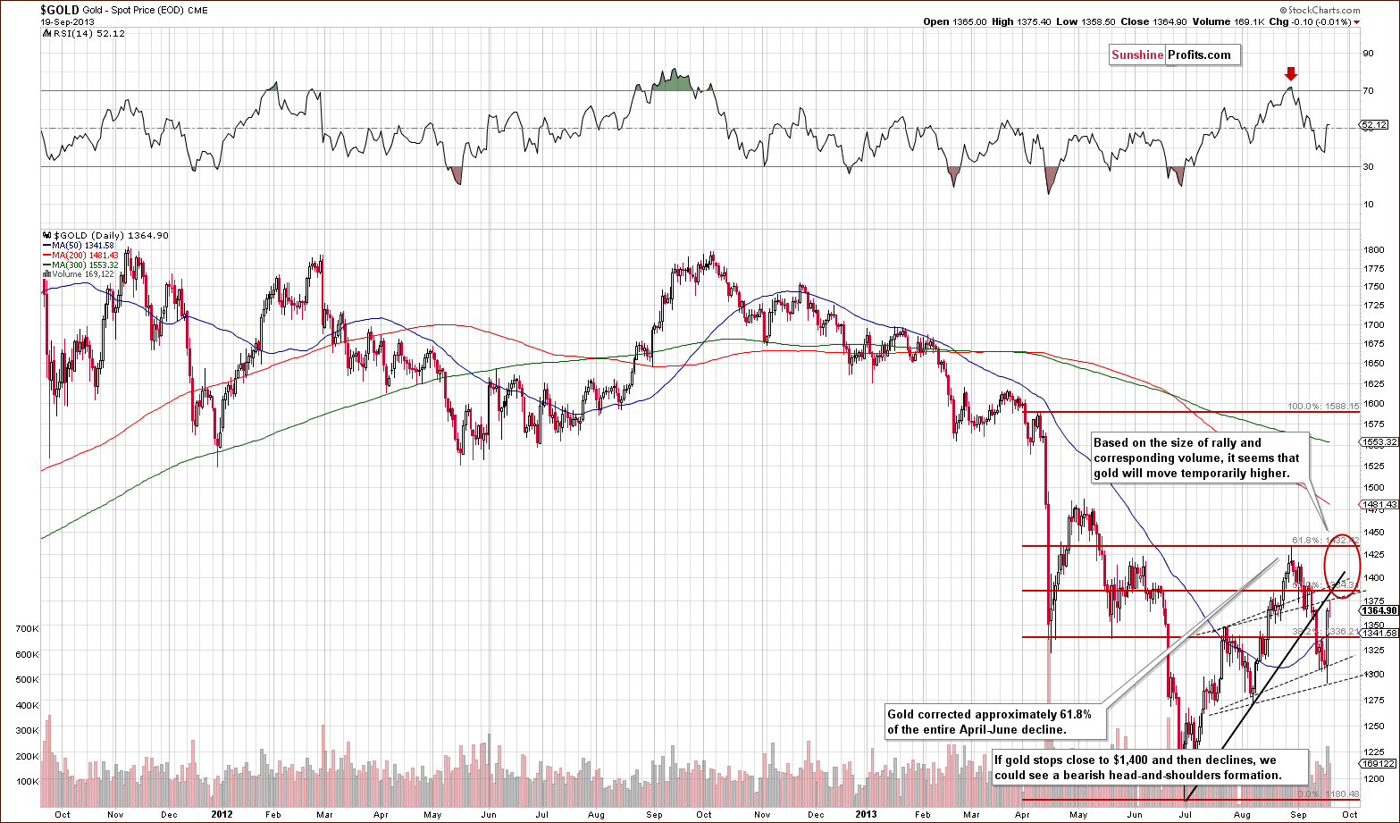
On the above chart, we see that gold rallied sharply on Wednesday. However, it still remains below the previously-broken rising resistance line based on the July and August lows.
Taking into account the size of rally and corresponding volume, it seems that gold will move temporary higher. In this case, if the yellow metal stops its upward move close to $1,400 and then declines, we could see a bearish head-and-shoulders pattern develop.
Again, it’s worth repeating that even if gold continues its rally and moves close to the August top, the medium-term outlook will remain bearish. We would need to see a strong, confirmed move above the August high to discuss the possibility that the medium-term outlook is changing.
Let’s take a look at the chart featuring the gold price from the non-USD perspective.
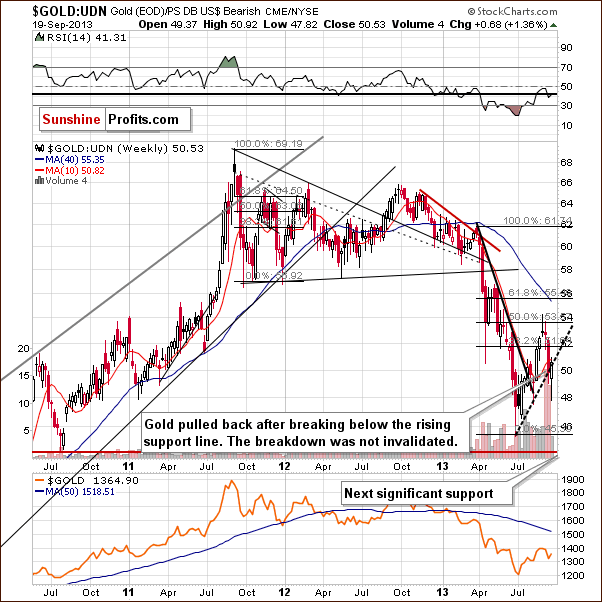
On the above chart, we clearly see that in the past week, gold broke below the rising support line based on the June and August bottoms. This week’s upswing was not enough to invalidate the breakdown, however.
Therefore, from this perspective, the implications are bearish.
Let’s examine gold from another perspective – gold priced in the British pound.
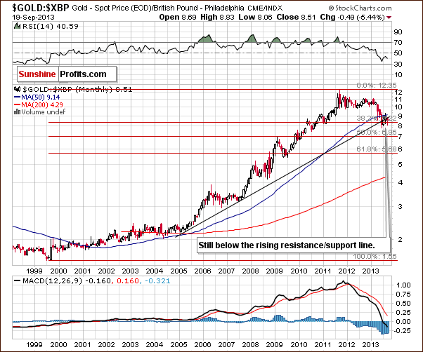
Looking at gold’s price from the British pound perspective, we see that there was a breakout above the rising resistance line in recent months. However, the improvement didn’t last long. Earlier this month, gold gave up the gains and dropped below this line once again. Additionally, the breakout above the 50-month moving average was invalidated. These invalidations are bearish signals.
Let’s now take a look at gold priced in the euro.
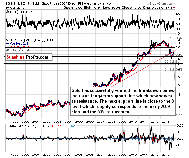
On the above chart, we see that the situation hasn’t changed much. Although gold priced in euros pulled back in recent days, it still remains below the previously-broken rising support/resistance line (marked with red). Therefore, the implications are bearish.
Summing up, the medium-term outlook for gold remains bearish. Despite Wednesday’s strength, the downward trend is not threatened at the moment. We will keep monitoring the situation and report to you accordingly, but at this time, it seems that we will not see a very strong rally just yet. It doesn’t seem that the next move up will take gold above the previous highs, but the details are quite unclear at this time.
Silver
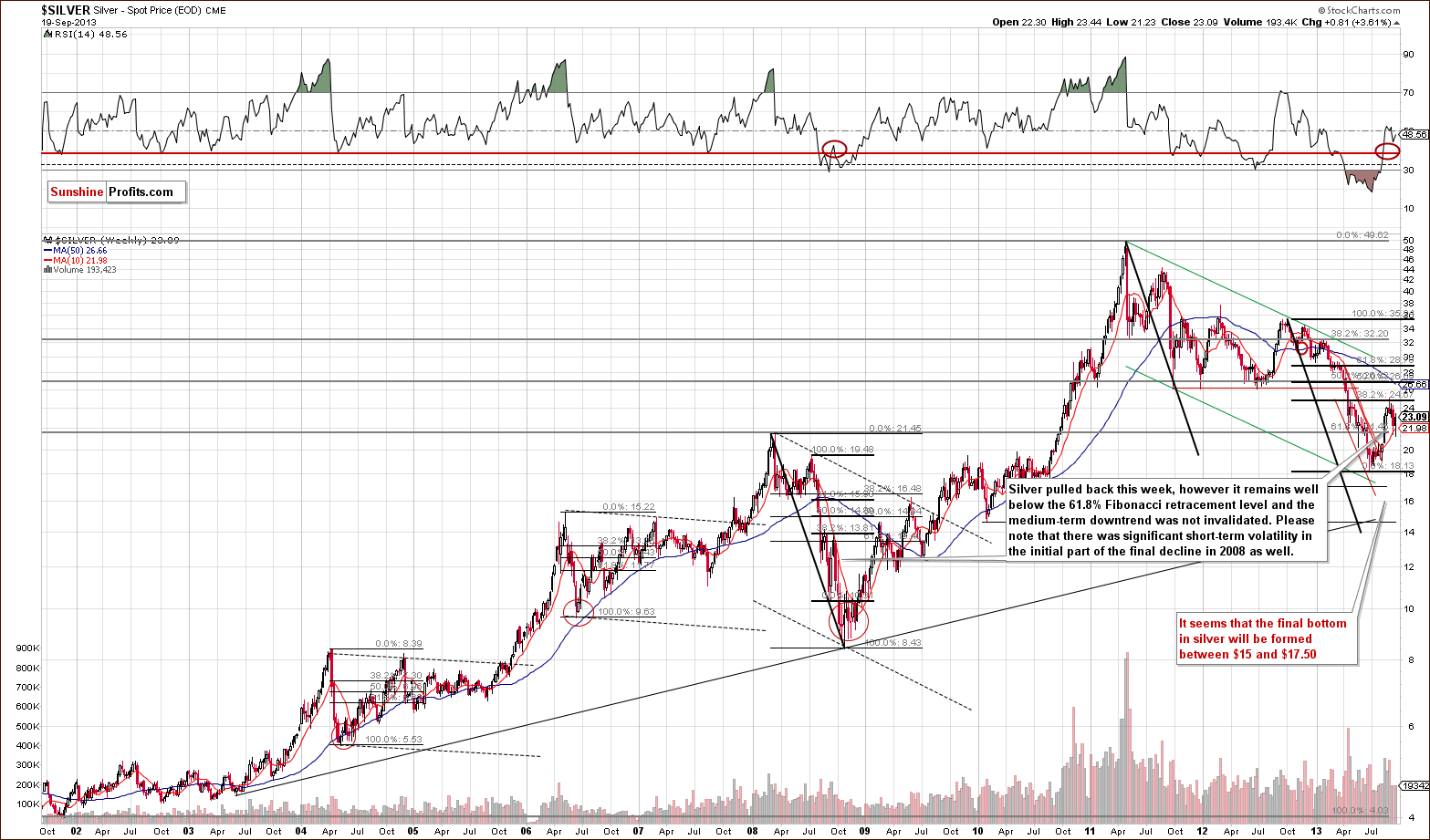
When we take a look at the above chart, we see that silver pulled back this week. In spite of this upward move it still remains visibly below the 32.8% Fibonacci retracement level based on the entire September 2012-June 2013 decline.
Taking this into account, the medium-term downtrend was not invalidated. In fact, from the long-term perspective, the pullback is barely visible – the most recent move that we can see on the above chart is this month’s decline.
We previously wrote that silver might be very volatile during its downswing – just as was the case in 2008 – and it seems that this is the case once again right now.
It is visible even more clearly on the short-term chart, so let’s move to it right now.
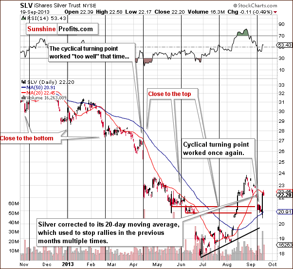
On the above chart, we see that silver pulled back after the cyclical turning point and reached the 20-day moving average on Wednesday. Please note that this moving average was seen to stop rallies multiple times in previous months. If history repeats itself, we will likely see a downward move. On the other hand, if gold moves higher, it may trigger a continuation of the upward move in silver.
Summing up, while the situation in silver is less bullish than it is for gold (based on the 20-day moving average which serves as resistance), we also view it as unclear.
Palladium
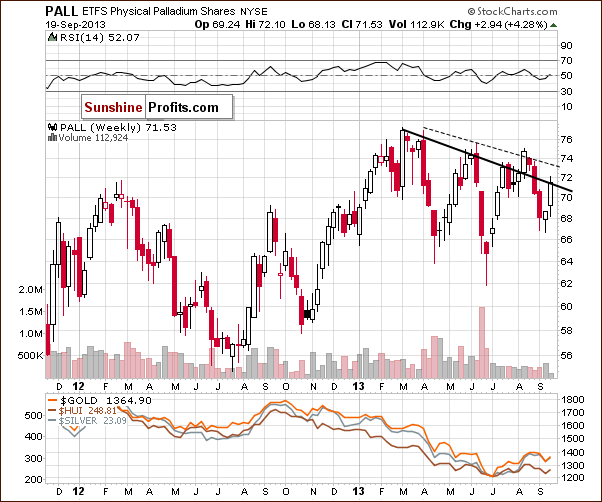
On the above chart, we see that palladium declined slightly below the 68 level; however, the metal has pulled back and we’ve seen a rally over the past several weeks, which took it to the previously-broken declining resistance line based on the 2013 top and the May peak (in terms of weekly closing prices).
As you can see on the above chart, there was no upward move above this line; therefore the breakdown that we saw at the end of August was not invalidated.
From this point of view, the implications are bearish.
Gold and Silver Mining Stocks
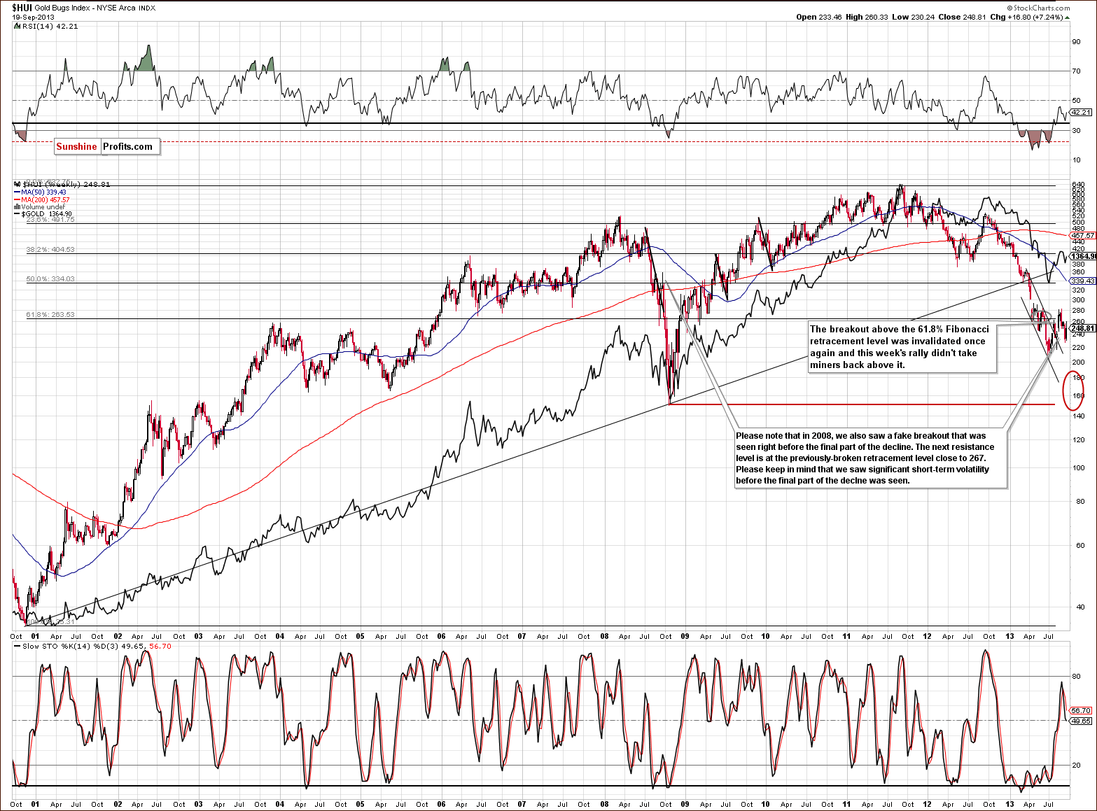
In this week’s very long-term HUI index chart (a proxy for the gold stocks) the situation hasn’t changed much. Although, there was another attempt to move above the 61.8% retracement level, it also failed, just like the previous ones. In this way, the mining stocks returned to below the above-mentioned retracement level (at approximately 267), and still remain below it.
From the long-term perspective, the implications are therefore bearish once again, and the trend remains down, even though we saw a strong move higher on Wednesday.
Now, let’s move on to the gold stocks to gold ratio to see if there was any major change on a relative basis.
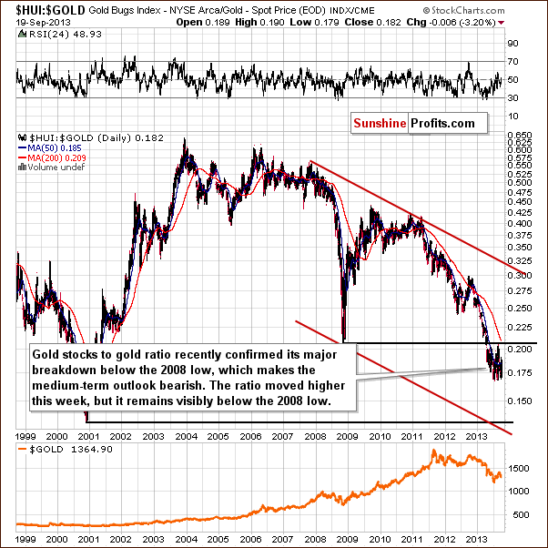
On the above chart, we see that the ratio declined in recent days and approached its previous 2012 lows. Despite this drop, we saw a sharp pullback on Wednesday, which took the ratio above the 0.187 level. With this move, the gold stocks: gold ratio climbed above the 50-day moving average, which now serves as support.
Did this increase change the outlook? Not really. The breakdown below the ratio’s 2008 low was verified in last month, and the trend remains down. The ratio’s position relative to the 50-day moving average is less important.
Consequently, from this point of view, the medium-term outlook remains bearish.
Before we summarize, let’s examine the GDX ETF chart.
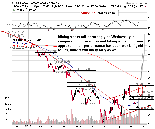
On the above short-term chart, we once again see that there was a strong one-day rally on Wednesday which pushed mining stocks to the 50% Fibonacci retracement level based on the August-September decline. However, when we compare this rally to other stocks and take into account a medium-term approach, miners’ performance has been weak. If gold rallies a little and then declines once again, miners will likely do the same and we could see a bearish head and shoulders pattern here as well.
Summing up, the outlook for the mining stocks remains bearish, and the trend is still down despite Wednesday’s show of strength. The long-term tendencies seem to be most important at this time, even for short-term price moves. The move above the 61.8% Fibonacci retracement level failed once again, which is a bearish sign. The long-term trend in the gold stocks to gold ratio remains down, and a major breakdown has been verified. All in all, even though Wednesday’s rally looked very encouraging, it is not enough to invalidate multiple bearish signals. It seems that the present rally will not take miners much higher nor that this move will stay in place for a long time. Consequently, it seems it’s not worth betting on.
Letters from Subscribers
Q. In last week's premium update, you suggested in Q&A session that leveraged ETFs/ETN are the best way to short/long the market. I found that futures are more flexible and cheaper without the burden of commissions. Pls kindly elaborate more on your preference of leveraged ETFs over future contracts. Thank you.
A. We didn't write that leveraged ETFs/ETNs are the best way to short/long the market. We wrote that it's the easiest way. The question was asked by someone who, quoting, "has not gone shorting before" and in this case the sophistication of a given vehicle seemed quite important. Naturally, you are correct that futures (and options) provide much greater flexibility for more advanced traders. Please note that they rank very high in our ranking (taking usefulness for trading purposes into account).
Q. Goldman Sachs sees gold below $1,000. Do you agree?
A. The interesting thing about the video featuring the head of commodities research at Goldman Sachs is that while we don't usually agree with this company, this time I think they made several correct points. The thing that is most interesting to us, precious metals investors, is the bearish outlook for gold - gold is at risk of falling below $1,000, and it could actually happen in our view. Temporarily, but we could see it. The reason for gold's decline is supposed to be the improvement in economic indicators - and since stock prices are the leading indicator for economic indicators - we might as well see that. The recovery is artificial, based on fiat money creation, but it will likely take some time before people realize that and get back into the gold market. The long-term outlook is bullish, but the medium-term one is not.
Summary
We saw a substantial price move on Wednesday when markets were surprised by the Fed’s announcement about tapering, or more precisely the lack thereof. The USD plunged, and stocks rallied along with precious metals and miners. However, these moves were significant only on a very short-term basis. Examination of the long-term charts reveals that they didn’t change the medium-term tendencies present in these markets.
The long-term outlook for the USD Index remains bullish based on the long-term breakout. The general stock market was likely to rally and the odds increased further based on the breakout above the previous high, and the medium-term outlook remains down in the cases of gold, silver, and mining stocks.
Please recall that one of the most important indicators as far as the medium-term trend is concerned on the precious metals market is currently the HUI to gold ratio and this ratio is not even close to invalidating its breakdown below the 2008 low.
Trading – PR: No positions.
Trading – SP Indicators: No positions: SP Indicators suggest long positions, but the new self-similarity-based tool suggests short ones for the precious metals sector. We think that overall they cancel each other out.
Long-term investments: A half position in gold, silver, platinum and mining stocks. As far as long-term mining stock selection is concerned, we suggest using our tools before making purchases: the Golden StockPicker and the Silver StockPicker
| Portfolio's Part | Position | Stop-loss / Expiry Date |
|---|---|---|
| Trading: Mining stocks | No positions | - |
| Trading: Gold | No positions | - |
| Trading: Silver | No positions | - |
| Long-term investments: Gold | Long - half | - |
| Long-term investments: Silver | Long - half | - |
| Long-term investments: Platinum | Long - half | - |
| Long-term investments: Mining Stocks | Long - half | - |
This completes this week’s Premium Update. Our next Premium Update is scheduled for Friday, Sep 27, 2013. We will continue to send out Market Alerts on a daily basis (except for when Premium Updates are posted) at least until the end of September, 2013 and we will send additional Market Alerts whenever appropriate.
Thank you for using the Premium Service.
Sincerely,
Przemyslaw Radomski, CFA

