

Briefly: in our opinion, full (300% of the regular position size) speculative short positions in mining stocks are justified from the risk/reward point of view at the moment of publishing this Alert.
In the previous analyses, I wrote about the reversals in gold and the USD Index, and I emphasized that the weakness in mining stocks (which refused to follow gold to new highs) was a strong confirmation of the bearish scenario for the near term. And that’s what seems to be taking place right now.
Let’s take a look at the charts, starting with the USD Index.
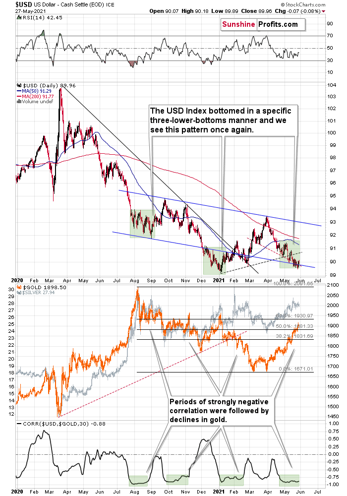
USDX – Is Bottom Finally In?
In terms of daily closing prices, the USD Index moved lower yesterday – by 0.07. However, it’s up by more than that, so overall we can say that the move higher in the USDX continues.
From the very short-term point of view, this move higher is encouraging because it took the USDX above both: the declining resistance line based on May’s highs, and the declining resistance line that started with the late-March high.
This is important not only (and not primarily) because of the double-breakout. It’s important and particularly bullish, as it emphasizes that the third – and quite likely the final – short-term bottom in a row is already in. Consequently, my previous comments on the above chart remain more than up-to-date (as they are being validated by current market action):
This week’s move lower is a continuation, and most likely the final part, of a specific multi-bottom pattern that the USD Index exhibited recently.
I marked those situations with green. The thing is that the U.S. currency first declined practically without any corrections, but at some point it started to move back and forth while making new lows. The third distinctive bottom was the final one. Interestingly, the continuous decline took place for about a month, and the back-and-forth declines took another month (approximately). In July 2020, the USDX fell like a rock, and in August it moved back and forth while still declining. In November 2020, the USDX fell like a rock (there was one exception), and in December it moved back and forth while still declining.
Ever since the final days of March, we’ve seen the same thing all over again. The USD Index fell like a rock in April, and in May we’ve seen back-and-forth movement with lower lows and lower highs.
What we see right now is the third of the distinctive lows that previously marked the end of the declines.
And what did gold do when the USD Index rallied then?
In August, gold topped without waiting for USD’s final bottom – which is natural, given how extremely overbought it was in the short term.
In early January, gold topped (which was much more similar to the current situation given the preceding price action) when the USDX formed its third, final distinctive bottom.
The USD Index is after a two-month decline, half of which was the back-and-forth kind of decline. It’s forming the third – and likely the final – bottom, and gold just refused to react positively to this situation in today’s pre-market trading.
This might be “it” – the markets might be forming their final reversals here, starting to follow the most bearish (in the case of gold) part of the analogy to the price action in 2008 and 2012.
I received a few questions recently asking what would need to happen for me to change my mind on the precious metals sector’s outlook. There are multiple reasons, and it’s impossible to list all of them. However, one of the reasons that would make me strongly consider that the outlook has indeed changed (at least for the short term) would be a confirmed breakdown in the USD Index below the 2021 lows to which gold would actually react.
History Rhymes
At the moment of writing these words, gold is already back below the $1,900 mark – at about $1,890, which means that the breakout above this psychologically important level was invalidated. Moreover, it happened very close to the gold triangle-vertex-based reversal point, with RSI well above 70 (extremely overbought) and – most importantly – in near-perfect tune with how the final pre-slide tops formed in 2008 and 2012. Needless to say, the implications are very bearish.
My previous comments on gold charts remain up-to-date:
Gold seems to be insisting on repeating – to some extent – its 2012 performance, and – to some extent – its 2008 performance. Either way, it seems that gold is about to slide.
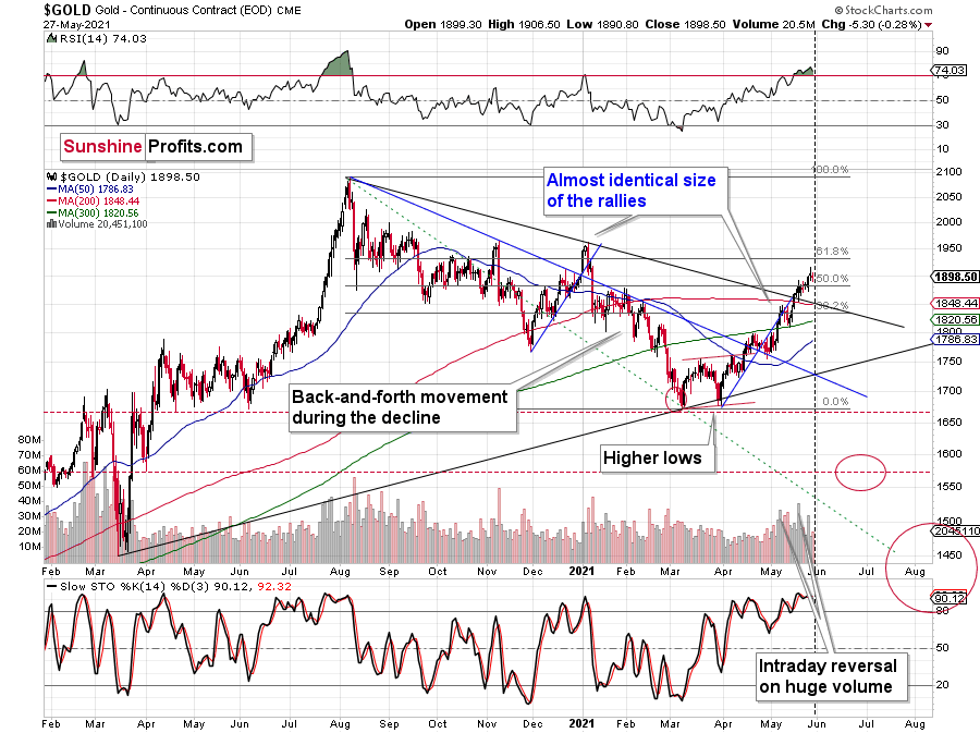
The initial reversal in gold took place after gold moved very close to its mid-January highs and the 50% Fibonacci retracement based on the August 2020 – March 2021 decline. Yesterday’s close was the first close above this important resistance, so the breakout was not confirmed.
The sizes of the current rally (taking the second March bottom as the starting point) and the rally that ended at the beginning of this year are practically identical at the moment. The current move is only a little bigger.
Just as the rallies from early 2012 and late 2012 (marked with blue) were almost identical, the same could happen now.
The March 2021 low formed well below the previous low, but as far as other things are concerned, the current situation is similar to what happened in 2012.
The relatively broad bottom with higher lows is what preceded both final short-term rallies – the current one, and the 2012 one. Their shape as well as the shape of the decline that preceded these broad bottoms is very similar. In both cases, the preceding decline had some back-and-forth trading in its middle, and the final rally picked up pace after breaking above the initial short-term high.
Interestingly, the 2012 rally ended on huge volume, which is exactly what we saw also on May 19 this year. Consequently, forecasting much higher gold prices here doesn’t seem to be justified based on the historical analogies.
The thing I would like to emphasize here is that gold didn’t form the final top at the huge-volume reversal on Sep. 13, 2012. It moved back and forth for a while and moved a bit above that high-volume top, and only then the final top took place (in early October 2012).
The same happened in September and in October 2008. Gold reversed on huge volume in mid-September, and it was approximately the end of the rally. The final top, however, formed after some back-and-forth trading and a move slightly above the previous high.
Consequently, the fact that gold moved a bit above its own high-volume reversal (May 19, 2021) is not an invalidation of the analogy, but rather its continuation.
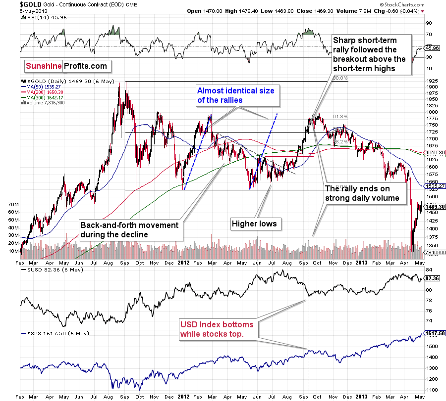
There’s one more thing I would like to add, and it’s that back in 2012, gold corrected to approximately the 61.8% Fibonacci retracement level – furthermore, the same happened in 2008 as you can see in the below chart. Consequently, the fact that gold moved above its 50% Fibonacci retracement doesn’t break the analogy either. And even if gold moves to $1,940 or so, it will not break it. It’s not likely that it is going to move that high, as in both cases –in 2008 and 2012 – gold moved only somewhat above its high-volume reversal before forming the final top. So, as this year’s huge-volume reversal took place close to the 50% retracement and not the 61.8% retracement, it seems that we’ll likely see a temporary move above it, which will create the final top. And that’s exactly what we see happening so far this week.
The lower part of the above chart shows how the USD Index and the general stock market performed when gold ended its late-2012 rally and was starting its epic decline. In short, that was when the USD Index bottomed, and when the general stock market topped.
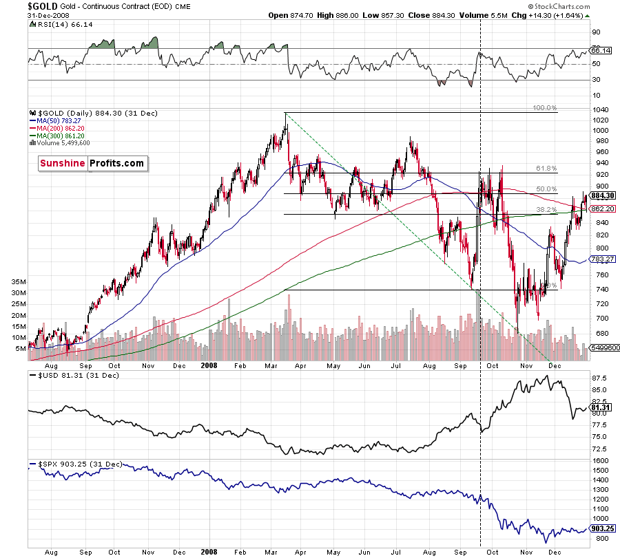
Back in 2008, gold corrected to 61.8% Fibonacci retracement, but it stopped rallying approximately when the USD Index started to rally, and the general stock market accelerated its decline. This time the rally was not as volatile, so the lower – 50% Fibonacci retracement level will hold the rally in check.
Taking into consideration that the general stock market has probably just topped, and the USD Index is about to rally, then gold is likely to slide for the final time in the following weeks/months. Both above-mentioned markets support this bearish scenario and so do the self-similar patterns in terms of gold price itself.
What would change my mind with regard to gold itself? Perhaps if it broke above its January 2021 highs and confirmed this breakout. This would be an important technical indication on its own, but it would also be something very different from what happened in 2008 and 2012. If that happened along with strength in mining stocks, it would be very bullish. Still, if the above happened, and miners didn’t react at all or they declined, it would not be bullish despite the gains in the gold price itself.
Gold Stocks Refuse to Follow Gold
Gold stocks moved slightly lower yesterday, but the important thing is what happened in the previous days. And more precisely, what didn’t happen.
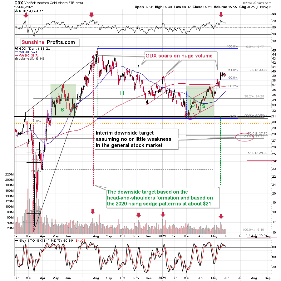
And what didn’t happen was that gold stocks didn’t move to new highs, while gold did. In other words, gold stocks refused to follow gold higher, which is a very strong bearish indication.
Another thing that would most likely make me bullish on the precious metals sector would be seeing strength in gold stocks despite declines in gold or back-and-forth action in it. In other words, exactly the opposite of what we’re seeing right now.
Having said that, let’s take a look at the markets from a more fundamental angle.
Records Are Made to Be Broken
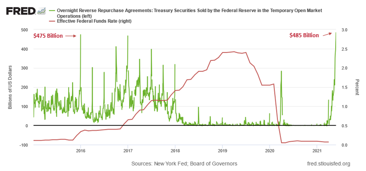
With investors preoccupied with the release of U.S. GDP (official) and weekly jobless claims, the U.S. Federal Reserve reverse-repo nightmare is moving at a torrential pace. Over the last few days, I’ve highlighted the surge in cash-for-Treasuries transactions, as excess liquidity becomes a game of hot potato across the U.S. banking sector. And with the FED’s daily reverse repos hitting an all-time high on May 27, the rubber band is looking like it’s about to snap.
Please see below:
To explain the significance, I wrote previously:
A reverse repurchase agreement (repo) occurs when an institution offloads cash to the FED in exchange for a Treasury security (on an overnight or short-term basis). And with U.S. financial institutions currently flooded with excess liquidity, they’re shipping cash to the FED at an alarming rate.
The green line above tracks the daily reverse repo transactions executed by the FED, while the red line above tracks the federal funds rate. Moreover, notice what happened the last time reverse repos moved above 400 billion? If you focus your attention on the red line, you can see that after the $400 billion level was breached in December 2015, the FED’s rate-hike cycle began. Thus, with current inflation dwarfing 2015 levels and U.S. banks practically throwing cash at the FED, is this time really different?
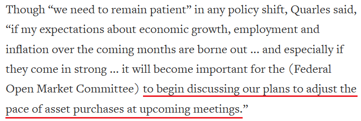
To that point, while I’ve been warning for weeks that the FED is likely to taper its asset purchases much sooner than investors expect, FED Vice Chairman Randal Quarles said on May 26 that “upside” risks of surging inflation may be mounting.
Please see below:
 Source: Reuters
However, while Quarles’s ‘ifs’ and ‘ands’ are much less hawkish than what FED Vice Chairman Richard Clarida told Yahoo! Finance on May 25 (covered in the May 26 Gold & Silver Trading Alert), he should take a look at the FED’s latest data. Case in point: with the Kansas City FED releasing its Manufacturing Survey on May 27, an excerpt read:
“The index of prices paid for raw materials compared to a month ago posted a new survey record high for the second straight month, and prices received for finished goods also surpassed historical levels. Price indexes vs. a year ago also posted record highs, with 98% of firms reporting higher materials prices compared to a year ago. Moving forward, district firms expected materials prices and finished goods prices to continue to increase over the next six months.”
If that wasn’t enough, notice what survey respondents had to say about the current state of affairs?
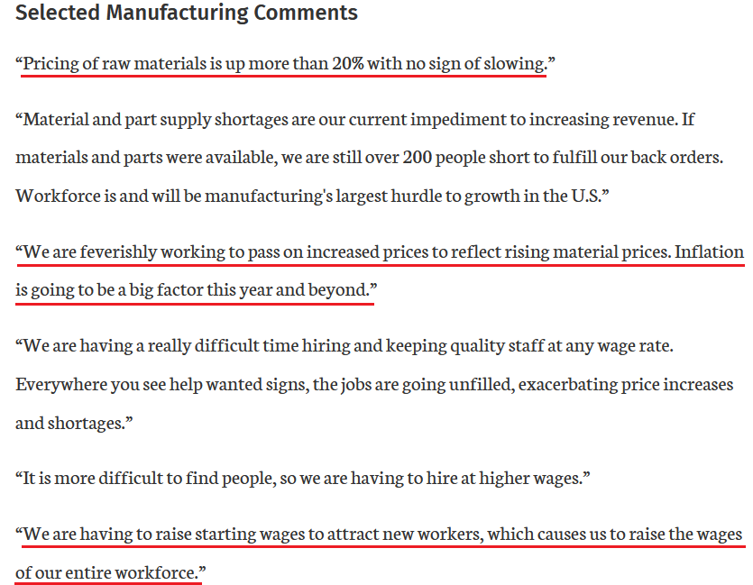 Source: KC FED
And no, they weren’t finished:
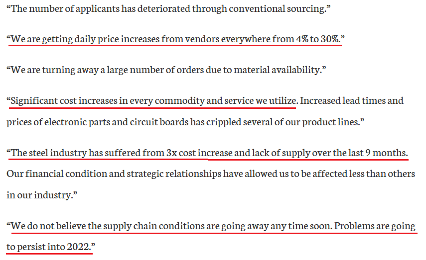 Source: KC FED
Furthermore, with the Personal Consumption Expenditures (PCE) Index scheduled for release today, history implies that inflationary pressures have only just begun.
Please see below:
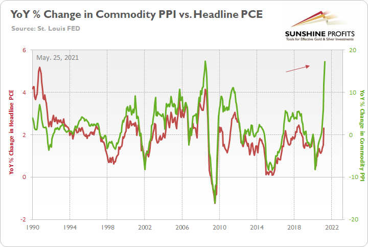
To explain, I wrote on May 25:
The green line above tracks the year-over-year (YoY) percentage change in the Commodity Producer Price Index (PPI), while the red line above tracks the YoY percentage change in the headline PCE Index (which includes the inflationary effects of food and energy). If you analyze the right side of the chart, you can see that a material gap is clearly visible. And while the headline PCE Index tends to undershoot the commodity PPI, reconnecting with the green line implies a headline PCE Index of roughly 5.50%. For context, the last time the PCE Index jumped above 5% was November 1990.
10-Year Treasury Yield – a Sleeping Giant?
What’s more, with the U.S. 10-Year Treasury yield rising above 1.60% on May 27, when the headline PCE Index says “jump”, the Treasury benchmark often says “how high?”
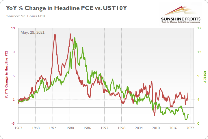
To explain, the green line above tracks the U.S. 10-Year Treasury yield, while the red line above tracks the YoY percentage change in the headline PCE Index. If you analyze the relationship, you can see that bounces in the latter are often followed by bounces in the former. Moreover, when the headline PCE Index increased by 2.50% YoY in July 2018, the U.S. 10-Year Treasury yield ended the month at 2.89%. Thus, with a wide gap already present on the right side of the chart, the Treasury benchmark’s sedation may not last much longer.
To that point, with more than 50% of global economies’ (38 in total) leading economic indicators hitting above-trend growth, the U.S. 10-Year Treasury yield is looking more and more like a sleeping giant.
Please see below:
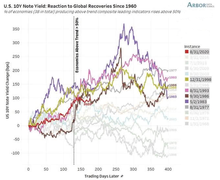
To explain, the colored lines above track the performance of the U.S. 10-Year Treasury yield before and after 50% of global economies’ leading economic indicators reached above-trend growth. If you analyze the red line in the middle of the chart (2020), you can see that the U.S. 10-Year Treasury yield remains stuck in consolidation mode. However, if you analyze the behavior of other colored lines, history implies that it’s a matter of when, not if, we witness another surge.
In addition, while the S&P 500 elicited strength on May 27, it’s becoming increasingly apparent that the U.S. equity benchmark has peaked. Case in point: I mentioned previously that U.S. housing starts and building permits have already rolled over. And with the pair often peaking in advance or alongside the S&P 500, the data is quite ominous. Moreover, with U.S. durable goods orders (released on May 27) declining by 1.30% month-over-month (MoM) – versus an expected increase of 1.30% – the print is yet another nail in the S&P 500’s coffin.
Please see below:
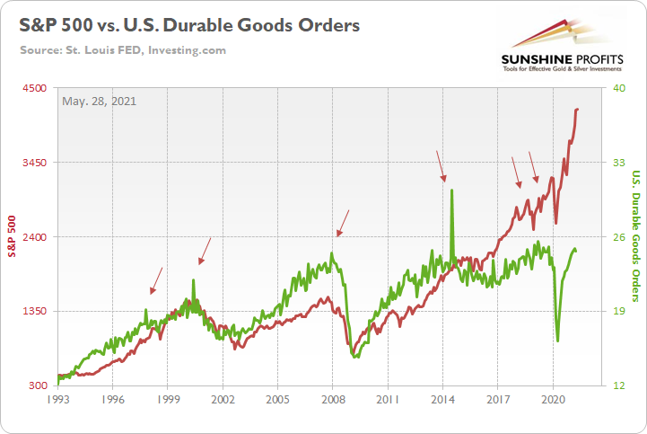
To explain, the red line above tracks the S&P 500, while the green line above tracks U.S. durable goods orders. If you analyze the relationship, you can see that peaks in U.S. durable goods orders often coincide with peaks in the S&P 500. And while the data is much more volatile than U.S. housing starts or building permits, it’s nonetheless another sign of waning momentum – especially coupled with the fact that U.S. building permits peaked in January, while this is only the first decline in U.S. durable goods orders.
The FED’s Balance Sheet
What’s more, not only is surging inflation, U.S. housing deceleration and taper talk all coinciding with the FED’s reverse-repo debacle but also the YoY percentage change in the FED’s balance sheet has peaked, rolled over and is likely to fall even further over the next several months.
Please see below:
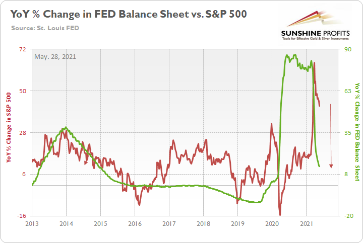
To explain, the red line above tracks the YoY percentage change in the S&P 500, while the green line above tracks the YoY percentage change in the FED’s balance sheet. If you analyze the relationship, you can see that investors’ optimism often rises and falls with the pace of the FED’s asset purchases. To that point, the FED’s YoY rate of expansion of its balance sheet peaked (for good) during the third week of February and has been in freefall ever since. Similarly, the S&P 500’s YoY rate of expansion peaked during the third week of March and has declined substantially. And with a reduction of the FED’s bond-buying program poised to push the former into negative territory in the coming months, it’s another sign that the S&P 500’s best days are likely in the rearview.
On top of that, not only has liquidity peaked but investors’ appetite for margin debt has rolled over as well.
Please see below:
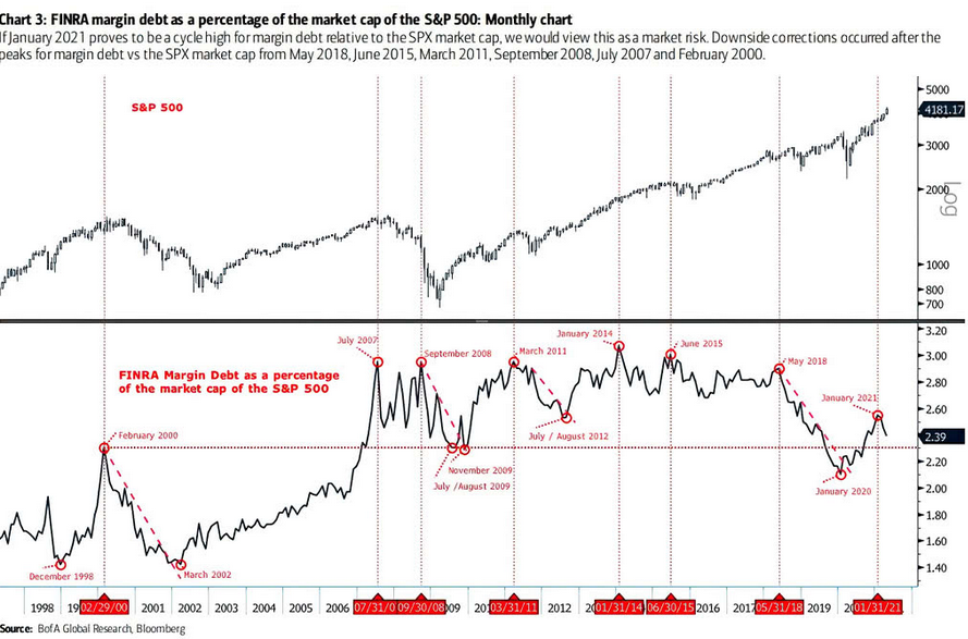
To explain, the black line at the top half of the chart tracks the S&P 500, while the black line at the bottom half of the chart tracks margin debt as a percentage of the S&P 500’s market cap. If you focus your attention on the intersecting vertical lines, you can see that peaks in margin debt often coincide with (or are followed by) peaks in the S&P 500. Moreover, if you analyze the right side of the chart, you can see that margin debt has already rolled over. As a result, with peak liquidity, peak margin debt and peak speculation (appetite for SPACs/IPOs) likely in the rearview, the S&P 500 is running out of upside catalysts.
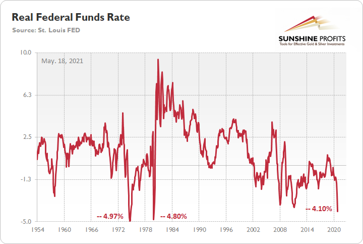
Real Federal Funds Rate
As further evidence, I mentioned on May 18 that the real federal funds rate is approaching an all-time low. For context, the federal funds rate is the overnight lending rate set by the FOMC, while the real federal funds rate is adjusted for inflation by using the YoY percentage change in the headline Consumer Price Index (CPI).
Please see below:
And with inflation surging and corporate earnings failing to keep pace, the S&P 500’s real earnings yield has fallen below zero for only the fourth time since 1980. More importantly, though, notice what happened during the other three historical analogues?
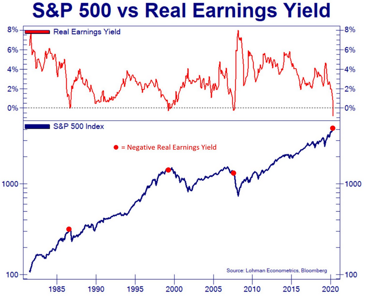
To explain, the blue line above tracks the S&P 500, while the red line above tracks the S&P 500’s real earnings yield. If you analyze the first three red dots, you can see that a negative real earnings yield preceded Black Monday (the 1987 flash crash), the dot-com bubble and the bulk of the declines during the Global Financial Crisis (GFC). Moreover, if you analyze the right side of the chart, you can see that the S&P 500’s real earnings yield is even lower now than it was during these three monumental times in history. As a result, is this time really different?
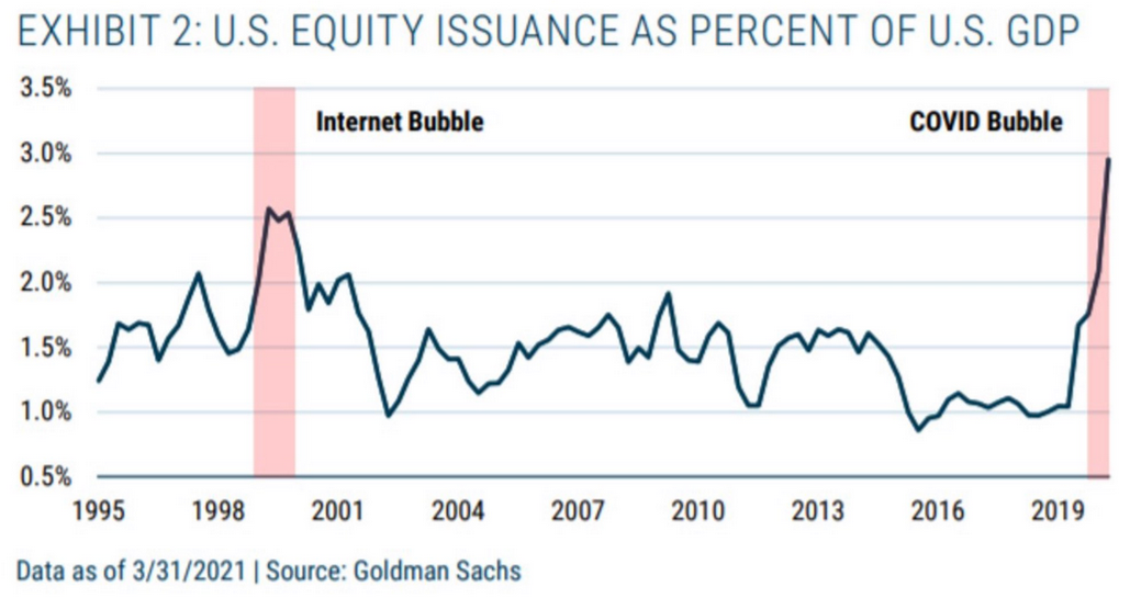
Finally, with public investors’ appetite for risk allowing private investors to cash in their chips, U.S. equity issuance as a percentage of GDP (as of March 31) has run away from the dot-com bubble. And because history shows that surging IPOs don’t occur at the bottom, again, is this time really different?
In conclusion, the PMs wobbled on May 27, as the rising U.S. 10-Year Treasury yield brought back some painful memories. And with the latter likely to provoke even more tears over the medium term, the PMs are increasingly operating on borrowed time. With inflation surging and the FED reluctantly inching toward reducing its bond-buying program, the U.S. 10-Year Treasury yield should move materially higher. Moreover, with widening interest rate differentials likely to support the USD Index as well, the PMs’ environment could look vastly different in the coming months. The bottom line? With the FED trying to thread the needle of controlling inflation without spooking the financial markets, their poor track record doesn’t instill much confidence. And with the PMs’ performance likely tied to the FED’s omniscience, investors may regret pledging their allegiance.
Overview of the Upcoming Part of the Decline
- It seems likely to me that the current corrective upswing is very close to being over, given gold’s similarity to what happened in 2012, USD’s similarity to 2016 and the situation in the general stock market.
- After miners slide once again in a meaningful and volatile way, but silver doesn’t (and it just declines moderately), I plan to switch from short positions in miners to short positions in silver (this could take another 1-2 weeks to materialize). I plan to exit those short positions when gold shows substantial strength relative to the USD Index, while the latter is still rallying. This might take place with gold close to $1,450 - $1,500 and the entire decline (from above $1,700 to about $1,475) would be likely to take place within 1-12 weeks, and I would expect silver to fall hardest in the final part of the move. This moment (when gold performs very strongly against the rallying USD and miners are strong relative to gold – after gold has already declined substantially) is likely to be the best entry point for long-term investments, in my view. This might happen with gold close to $1,475, but it’s too early to say with certainty at this time. In other words, the entire decline could take between 1 and 12 weeks, with silver declines occurring particularly fast in the final 1-2 weeks.
- If gold declines even below $1,500 (say, to ~$1350 or so), then it could take another 10 weeks or so for it to bottom, but this is not what I view as a very likely outcome.
- As a confirmation for the above, I will use the (upcoming or perhaps we have already seen it?) top in the general stock market as the starting point for the three-month countdown. The reason is that after the 1929 top, gold miners declined for about three months after the general stock market started to slide. We also saw some confirmations of this theory based on the analogy to 2008. All in all, the precious metals sector would be likely to bottom about three months after the general stock market tops. If the general stock market puts the final top in the first half of May (which seems quite likely given NASDAQ’s top in late April), then we might expect the precious metals sector to bottom sometime in August.
- The above is based on the information available today, and it might change in the following days/weeks.
Please note that the above timing details are relatively broad and “for general overview only” – so that you know more or less what I think and how volatile I think the moves are likely to be – on an approximate basis. These time targets are not binding or clear enough for me to think that they should be used for purchasing options, warrants or similar instruments.
Letters to the Editor
Q: Dear PR,
The analysis is so comprehensive. All we now need is...the world to wake up and agree with you, so we can ride off into the sunset.
With respect to your in-depth analysis, if I wanted to pave the way for a huge equity bull run, I would:
1. Hold the dollar’s head underwater by shorting it until it drowns.
2. Short the VIX.
And this is what seems to have been happening since March 2020. Oh... these guys are also short 25% of the TLT long bond. And they have lent everyone tons of money to go to Vegas.
Every time the dollar moves UP, the automated trading computers slam it back down again. Approx. 70% of the market is automated programs that simply have “buy” or “sell” levels programmed in and execute at very high speed. They probably buy gold AND short the dollar and make tons of money both ways. And we only have a prayer when the swarm of locusts moves on. Maybe that's why miners lag/lead? Maybe these programs are not buying the miners? Kinda makes you wonder how the little guy makes money.
All the best.
A: Yes, I think that the move in the USDX is to a sizable extent triggered by the traders or algorithms that bet on a given move being continued – perhaps with some help from the Powers That Be. But the situation has become too excessive, and it seems bound to reverse its course.
The groups that buy miners and gold – and junior miners – and silver – are not exactly the same people, just as you wrote. Yet another reason is the depth of the market and the regulations that the funds have; or instance, they are only investing in stocks that are well-capitalized, so that they don’t move the market when they enter it, and so that they can exit the market without causing the price to plunge (before they finish exiting it that is). That’s why we can see these specific relative moves in them that we can use as clues as to the market’s next direction.
Well, the statistics show that the little guys usually don’t make money or quite little thereof. Not enough capital for playing the algo game, and not enough patience/insights to wait out temporary adverse moves and profit on bigger (not immediate-term, but at least short- or medium-term) trends where the algo’s power is much smaller. And most people neither educate themselves nor do they secure access to professional analyses that could assist them in their investment decisions.
Summary
To summarize, even though it doesn’t seem to be the case based on this month’s price change in gold, it seems that the yellow metal’s days are numbered. This is based not only on the excessively oversold USD Index and its 2016 self-similar pattern but also on what’s happening in the stock market, silver’s recent outperformance and price levels reached throughout the precious metals sector. From the long-term point of view, the current situation seems similar to what we saw in the second half of 2012, while from the short-term point of view it seems similar to what we saw at the beginning of 2021. While the very near term remains unclear, the outlook for the next several months remains very bearish.
After the sell-off (that takes gold to about $1,350 - $1,500), we expect the precious metals to rally significantly. The final part of the decline might take as little as 1-5 weeks, so it's important to stay alert to any changes.
Most importantly, please stay healthy and safe. We made a lot of money last March and this March, and it seems that we’re about to make much more on the upcoming decline, but you have to be healthy to enjoy the results.
As always, we'll keep you - our subscribers - informed.
To summarize:
Trading capital (supplementary part of the portfolio; our opinion): Full speculative short positions (300% of the full position) in mining stocks are justified from the risk to reward point of view with the following binding exit profit-take price levels:
Mining stocks (price levels for the GDXJ ETF): binding profit-take exit price: $24.12; stop-loss: none (the volatility is too big to justify a stop-loss order in case of this particular trade)
Alternatively, if one seeks leverage, we’re providing the binding profit-take levels for the JDST (2x leveraged) and GDXD (3x leveraged – which is not suggested for most traders/investors due to the significant leverage). The binding profit-take level for the JDST: $39.87; stop-loss for the JDST: none (the volatility is too big to justify a SL order in case of this particular trade); binding profit-take level for the GDXD: $94.87; stop-loss for the GDXD: none (the volatility is too big to justify a SL order in case of this particular trade).
For-your-information targets (our opinion; we continue to think that mining stocks are the preferred way of taking advantage of the upcoming price move, but if for whatever reason one wants / has to use silver or gold for this trade, we are providing the details anyway.):
Silver futures upside profit-take exit price: unclear at this time - initially, it might be a good idea to exit, when gold moves to $1,512.
Gold futures upside profit-take exit price: $1,512.
Long-term capital (core part of the portfolio; our opinion): No positions (in other words: cash
Insurance capital (core part of the portfolio; our opinion): Full position
Whether you already subscribed or not, we encourage you to find out how to make the most of our alerts and read our replies to the most common alert-and-gold-trading-related-questions.
Please note that we describe the situation for the day that the alert is posted in the trading section. In other words, if we are writing about a speculative position, it means that it is up-to-date on the day it was posted. We are also featuring the initial target prices to decide whether keeping a position on a given day is in tune with your approach (some moves are too small for medium-term traders, and some might appear too big for day-traders).
Additionally, you might want to read why our stop-loss orders are usually relatively far from the current price.
Please note that a full position doesn't mean using all of the capital for a given trade. You will find details on our thoughts on gold portfolio structuring in the Key Insights section on our website.
As a reminder - "initial target price" means exactly that - an "initial" one. It's not a price level at which we suggest closing positions. If this becomes the case (like it did in the previous trade), we will refer to these levels as levels of exit orders (exactly as we've done previously). Stop-loss levels, however, are naturally not "initial", but something that, in our opinion, might be entered as an order.
Since it is impossible to synchronize target prices and stop-loss levels for all the ETFs and ETNs with the main markets that we provide these levels for (gold, silver and mining stocks - the GDX ETF), the stop-loss levels and target prices for other ETNs and ETF (among other: UGL, GLL, AGQ, ZSL, NUGT, DUST, JNUG, JDST) are provided as supplementary, and not as "final". This means that if a stop-loss or a target level is reached for any of the "additional instruments" (GLL for instance), but not for the "main instrument" (gold in this case), we will view positions in both gold and GLL as still open and the stop-loss for GLL would have to be moved lower. On the other hand, if gold moves to a stop-loss level but GLL doesn't, then we will view both positions (in gold and GLL) as closed. In other words, since it's not possible to be 100% certain that each related instrument moves to a given level when the underlying instrument does, we can't provide levels that would be binding. The levels that we do provide are our best estimate of the levels that will correspond to the levels in the underlying assets, but it will be the underlying assets that one will need to focus on regarding the signs pointing to closing a given position or keeping it open. We might adjust the levels in the "additional instruments" without adjusting the levels in the "main instruments", which will simply mean that we have improved our estimation of these levels, not that we changed our outlook on the markets. We are already working on a tool that would update these levels daily for the most popular ETFs, ETNs and individual mining stocks.
Our preferred ways to invest in and to trade gold along with the reasoning can be found in the how to buy gold section. Furthermore, our preferred ETFs and ETNs can be found in our Gold & Silver ETF Ranking.
As a reminder, Gold & Silver Trading Alerts are posted before or on each trading day (we usually post them before the opening bell, but we don't promise doing that each day). If there's anything urgent, we will send you an additional small alert before posting the main one.
Thank you.
Przemyslaw Radomski, CFA
Founder, Editor-in-chief

