

Briefly: in our opinion, full (300% of the regular position size) speculative short positions in mining stocks are justified from the risk/reward point of view at the moment of publishing this Alert.
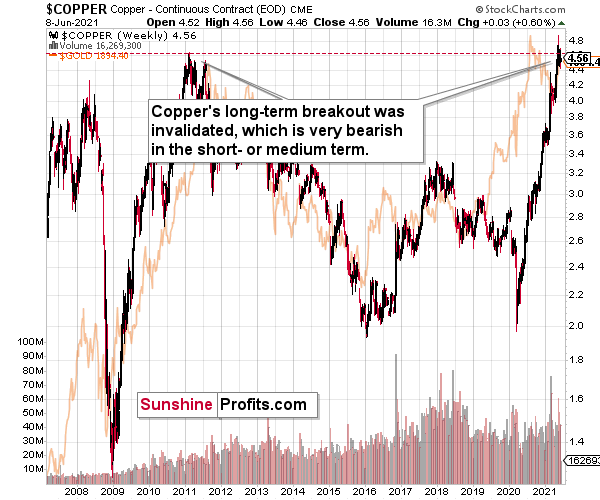
Do you know what the key commodity in today’s world is? Crude oil. It’s the most commonly used good on the planet. In terms of versatility and number of applications, silver is not far behind, but there is also one more market that definitely comes to one’s mind when one hears “world commodity” –copper. And for a good reason – while it doesn’t have as unique properties as silver or gold, copper is much cheaper and thus more widely available.
Consequently, what’s happening in copper prices might have quite profound effects on the rest of the world, including the precious metals market. And the thing is: something very important happened to the price of copper recently.
The Importance of the Brown Metal
Namely, copper has just invalidated its breakout to new highs, which means that – just like in the case of gold in August 2020 – it wasn’t strong enough to soar higher. Well, it’s not to say that copper is weak, as it has more than doubled its price since the 2020 lows. However, it does mean that it’s likely time for a bigger corrective downswing, especially given that we haven’t seen one in many months. For instance, when gold invalidated its breakout above the 2011 high despite very bullish fundamentals, it meant that forecasting gold at lower levels was very much justified.
Likewise, when copper failed to hold its breakout above the 2008 high back in 2011, it was followed by a multi-year decline. Will the same happen this time? I wouldn’t bet on that given the amount of money being pumped into the system, but even if this is not the case, copper is likely to suffer a significant drawdown on a temporary basis. No market can move up or down in a straight line, and neither copper nor gold nor silver are exceptions to this rule.
Ok, but why is it important for the precious metals investors?
Because of two things:
- Both markets tend to move in a big way at similar times. The more local moves can vary, but the really big price moves are usually aligned. For example, the 2008 – 2011 rally and the fact that they both bottomed in late-2015 / early-2016.
- The copper price is quite closely related to the general stock market and the former’s inability to hold above its previous highs seems to be an indication of a change in the trend in the general stock market as well.
As I wrote before, the general stock market’s decline is not required for the precious metals sector to decline, but it would likely exacerbate the decline, just like it did in 2008 – especially in the case of silver and mining stocks.
And speaking of stocks, let’s check what the S&P 500 is doing.
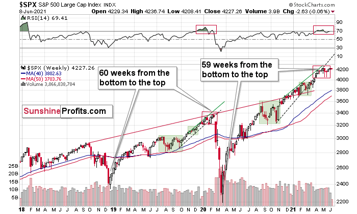
The markets are self-similar (which is another way of saying that they have a fractal nature), which generally means that while the history tends to rhyme, it also tends to rhyme in similar shapes of alike or various sizes.
For example, the rally from 2018–2020 seems very similar to the rally from 2020 to the present. Both rallies started after a sharp decline, and the first notable correction took the form of back-and-forth trading around the previous high. I marked those situations with big rectangles.
Then the rally continued with relatively small week-to-week volatility. I created rising support lines based on the final low of the broad short-term consolidation and the first notable short-term bottom.
This line was broken, and some back-and-forth trading followed, but it was only about half of the previous correction in terms of price and time.
Then, we saw a sharp rally that then leveled off. And that was the top. The thing that confirmed the top was the visible breakdown below the rising support line right after stocks invalidated a tiny breakout to new highs. That’s what happened in February 2020, and that’s what seems to be taking place right now.
Back in 2020, the rally ended when the weekly RSI moved above 70 once again and when the S&P moved slightly to its new highs. While the history doesn’t have to repeat itself to the letter, if we see another small move higher – to new highs – that also takes the RSI above 70, please keep in mind that it’s not really a bullish development, but actually history forming its final rhyme. And the implications appear bearish for the precious metals sector, as it’s likely to be hit by the first wave of stock market declines – just like it was the case in 2008, 2020, and… 1929.
Moreover, mining stocks’ performance relative to hold has been heralding the declines across the precious metals market for some time now.
While gold is not doing much today, it’s important to note that yesterday it moved quite close to its previous highs (and visibly above $1,900) before declining. And how did gold miners react?
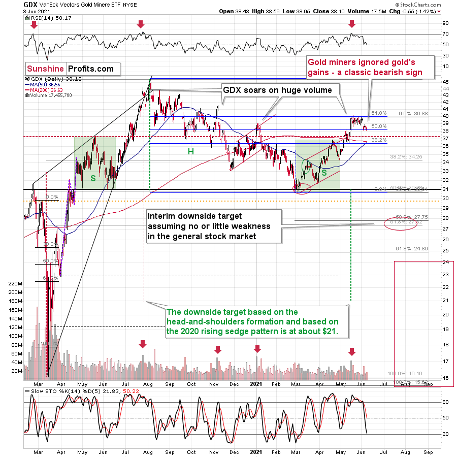
In short, they didn’t. And the GDX ETF has just closed at a new monthly low.
Even without considering the invalidation of the breakout to new highs, the sell signal from the RSI and stochastic indicators, and even without noticing that the GDX corrected to its 61.8% Fibonacci retracement without invalidating it, one can clearly see that gold stocks refused to follow gold higher during the most recent rebound. This is bearish – and quite profoundly so.
And silver? Has it maybe indicated something that gold hasn’t?
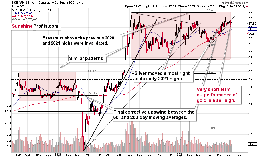
Of course it has. Silver is after a confirmed breakdown below its rising short-term support line, and this breakdown took place right after silver failed – for the fourth time – to break above its early-January high. And, more importantly, it happened shortly after silver outperformed gold on an intraday basis, just like it tends to do right at the tops.
The analogies to 2008 and 2012 in the case of gold are also quite clear:
For more context, I wrote on Jun. 4:
The analogies to how the situation in gold developed in 2008 and 2012, provides us with an extremely bearish price prediction for gold. Many other factors are pointing to these similarities, and two of them are the size of the correction relative to the preceding decline and to the previous rally. In 2012 and 2008, gold corrected to approximately the 61.8% Fibonacci retracement level. Gold was very close to this level this year, and since the history tends to rhyme more than it tends to repeat itself to the letter, it seems that the top might already be in.
In both years, 2008 and 2012, there were three tops. Furthermore, the rallies that took gold to the second and third top were similar. In 2008, the rally preceding the third top was bigger than the rally preceding the second top. In 2012, they were more or less equal. I marked those rallies with blue lines in the above chart – the current situation is very much in between the above-mentioned situations. Also, the current rally is bigger than the one that ended in early January 2021 but not significantly so.
Remember what happened when gold previously attempted to break above major long-term highs? It was in 2008 and gold was breaking above its 1980 high. Gold wasn’t ready to truly continue its bull market without plunging first. This downswing was truly epic, especially in the case of silver and mining stocks; and now even gold’s price patterns are like what we saw in 2008.
My previous comments on the analogies to 2008 and 2012 remain up-to-date:
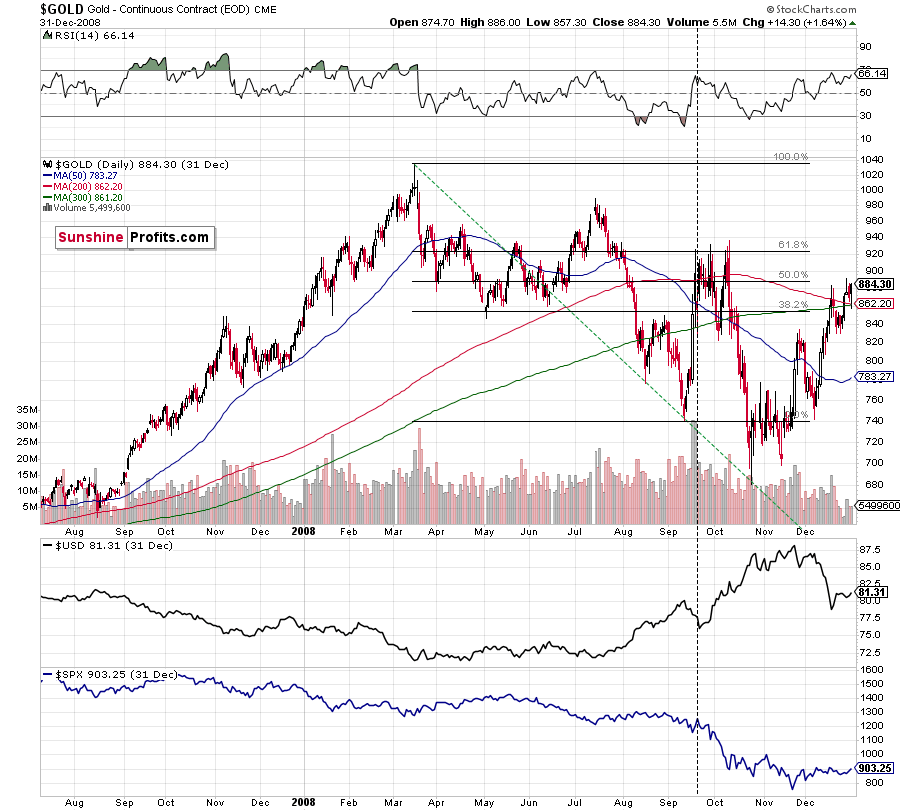
Back in 2008, gold corrected to 61.8% Fibonacci retracement, but it stopped rallying approximately when the USD Index started to rally, and the general stock market accelerated its decline.
Taking into consideration that the general stock market has probably just topped, and the USD Index is about to rally, then gold is likely to slide for the final time in the following weeks/months. Both above-mentioned markets support this bearish scenario and so do the self-similar patterns in terms of gold price itself.
What would change my mind with regard to gold itself? Perhaps if it broke above its January 2021 highs and confirmed this breakout. This would be an important technical indication on its own, but it would also be something very different from what happened in 2008 and 2012. If that happened along with strength in mining stocks, it would be very bullish. Still, if the above happened, and miners didn’t react at all or they declined, it would not be bullish despite the gains in the gold price itself.
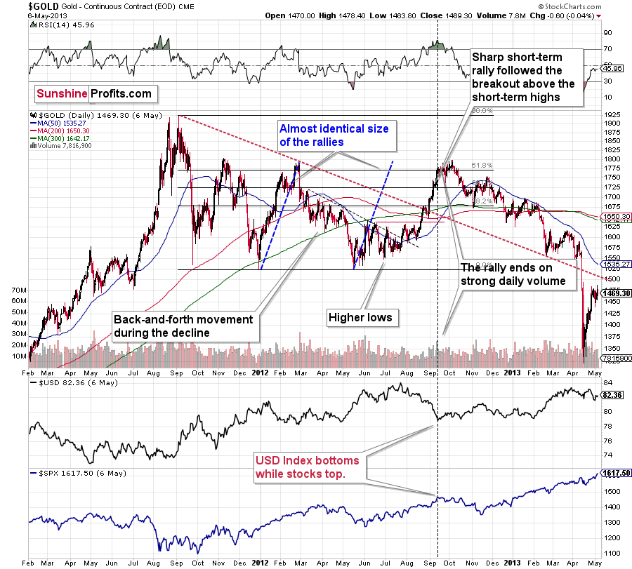
The March 2021 low formed well below the previous low, but as far as other things are concerned, the current situation is similar to what happened in 2012.
The relatively broad bottom with higher lows is what preceded both final short-term rallies – the current one, and the 2012 one. Their shape as well as the shape of the decline that preceded these broad bottoms is very similar. In both cases, the preceding decline had some back-and-forth trading in its middle, and the final rally picked up pace after breaking above the initial short-term high.
Interestingly, the 2012 rally ended on huge volume, which is exactly what we saw also on May 19 this year. Consequently, forecasting much higher silver or gold prices here doesn’t seem to be justified based on the historical analogies.
The thing I would like to emphasize here is that gold didn’t form the final top at the huge-volume reversal on Sep. 13, 2012. It moved back and forth for a while and moved a bit above that high-volume top, and only then the final top took place (in early October 2012).
The same happened in September and in October 2008. Gold reversed on huge volume in mid-September, and it was approximately the end of the rally. The final top, however, formed after some back-and-forth trading and a move slightly above the previous high.
Consequently, the fact that gold moved a bit above its own high-volume reversal (May 19, 2021) is not an invalidation of the analogy, but rather its continuation.
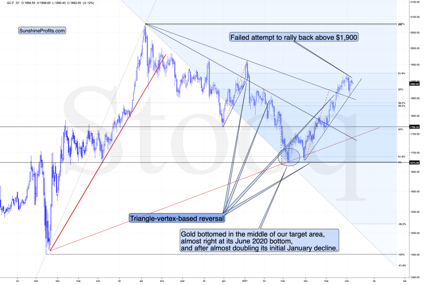
Moreover, back in 2008 and 2012, gold corrected to its 61.8% Fibonacci retracement before sliding profoundly for the last time. That’s almost exactly what we saw on June 1. Gold was just about $4 away from the 61.8% retracement, which means that it was practically right at it given the long-term point of view.
On top of that, with the Fed’s confidence game won or lost by whether or not inflation proves “transitory,” wouldn’t the central bank appreciate lower gold prices? If you think about it, it would be awfully convenient for the price of gold to decline in order to prove the point of the transitory nature of inflation.
Now, as you know, I’m not a fan of all the conspiracy theories that are out there, and I’m not the first to shout gold manipulation or silver manipulation every time the yellow or while metal goes down, but I also know that being realistic is one of my strengths. With the situation being what it is, and since the communities of top investment bankers and the community of officials interlace, I think that we have yet another reason to expect that the gold price is going to slide in the following weeks/months.
In addition, while gold has reached its dashed rising support line, the implications of its triangle-vertex-based reversal points remain much more significant. To that point, even if the yellow metal rises to the 61.8% Fibonacci level, it doesn’t change the medium-term outlook. For context, gold rallied to the 61.8% Fibonacci level in 2012 before suffering a profound drawdown. The bottom line? While short-term strength is not my base case, if gold happens to bounce, it’s likely the last “hurrah!” before the yellow metal succumbs to the bearish reality.
Moreover, do you know what else happened in 2008 and 2012 when gold topped? Gold stocks had been underperforming gold, and they had actually started their decline sooner. That’s exactly what we are seeing right now, and that’s what the most recent lack of strength in gold stocks confirms.
The history is rhyming, and the next huge move in gold is not likely to be to the upside; we should rather prepare for a slide.
Having said that, let’s take a look at the markets from a more fundamental angle.
You Can Have It
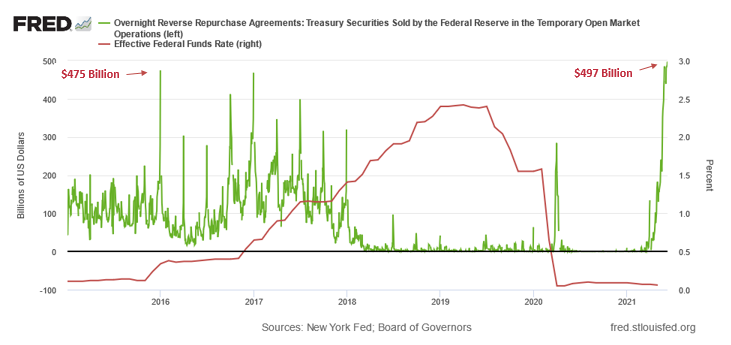
With financial institutions playing hot potato with the U.S. Federal Reserve’s (FED) ‘market functioning’ allotment of excess liquidity, daily reverse repurchase agreements hit another all-time high on Jun. 8 and are poised to eclipse $500 billion.
Please see below:
To explain the significance, I wrote previously:
A reverse repurchase agreement (repo) occurs when an institution offloads cash to the FED in exchange for a Treasury security (on an overnight or short-term basis). And with U.S. financial institutions currently flooded with excess liquidity, they’re shipping cash to the FED at an alarming rate.
The green line above tracks the daily reverse repo transactions executed by the FED, while the red line above tracks the U.S. federal funds rate. Moreover, notice what happened the last time reverse repos moved above 400 billion? If you focus your attention on the red line, you can see that after the $400 billion level was breached in December 2015, the FED’s rate-hike cycle began. Thus, with current inflation dwarfing 2015 levels and U.S. banks practically throwing cash at the FED, is this time really different?
To that point, while the central bank hasn’t made its intentions public, it’s increasingly clear that FED officials know that the gambit is up. Yet, with the group’s confidence game built on elevating investors’ spirits, the FED doesn’t want to alarm market participants and scare them out of risk assets. However, with reality making its presence felt on a daily basis, the clock is ticking on the upcoming reveal.
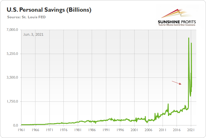
Case in point: while the FED insists that liquidity is necessary to support the ‘wounded’ economy, institutions aren’t the only ones rejecting the cash. If you analyze the chart below, you can see that individuals’ appetite for credit card debt remains nonexistent.
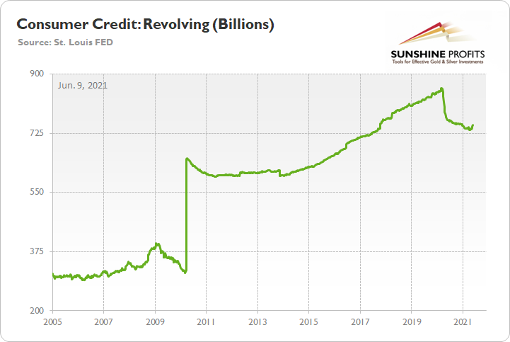
To explain, the green line above tracks the total credit card and revolving debt balance in the U.S. (released on Jun. 4). If you analyze the right side of the chart, you can see that citizens aren’t swiping their credit cards with much fervor. And why not? Well, with personal savings still in excess of $2.8 trillion (well above the historical norm), benevolent fiscal policy means that individuals are already flush with cash.
The bottom line?
With prospects hitting ‘return to sender’ on the FED’s liquidity offerings, QE has become much more semblance than substance. And with an official announcement inching closer by the day, it’s only a matter of time before the financial markets catch on.
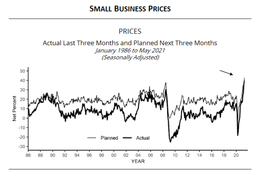
Case in point: pricing pressures and labor shortages are spiraling out of control. With the NFIB Small Business Optimism Index (released on Jun. 8) declining from 99.8 in April to 99.6 in May, the report revealed that “inflation is rampant on Main Street.”
“The net percent of owners raising average selling prices increased 4 points to a net 40%, seasonally adjusted, the highest reading since April 1981. This is inflation on Main Street, which means it is inflation for the whole economy. The inflation spike is likely temporary according to the Fed but is being closely watched… seasonally adjusted, a net 43%plan price hikes (up 7 points).”
Please see below:
 Source: NFIB
Let Me Have My Employees Back!
If that wasn’t enough, with small businesses short of qualified workers (due to enhanced unemployment benefits), another excerpt from the report read:
“A net 34% reported raising compensation (up 3 points), the highest level in the past 12 months. Raising compensation is about the only way owners have to remedy the labor shortage problem. A net 22% plan to raise compensation in the next three months.”
For even more context, please have a look at the commentary below:
 Source: NFIB
Continuing the theme, I wrote on May 11 that Chipotle Mexican Grill announced on May 10 that the company would increase employees’ average hourly wage to $15 by the end of June. However, front-running its own hike, CEO Brian R. Niccol said on Jun. 8 that the company increased menu prices by roughly 4% and cited labor costs as the main reason.
Please see below:
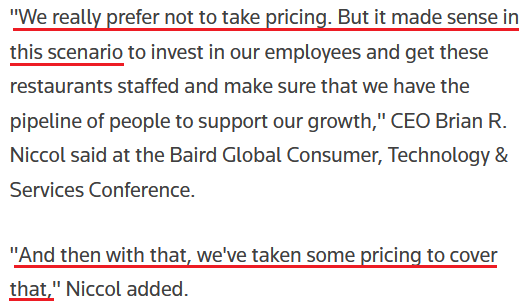 Source: Reuters
The FED Needs to Taper, but When?
In addition, with rising inflation often a self-fulfilling prophecy, investors’ fear of the FED’s inability to control the situation actually exacerbates the predicament. For example, inflows into broad-based commodity ETFs have gone completely parabolic. And because speculative commodity buying (as inflation hedges) increases the cost of raw materials, threatens businesses’ profit margins and results in even bigger cost-push inflation, the sinister merry-go-round will only subside if the FED tapers its asset purchases and/or raises interest rates.
Please see below:
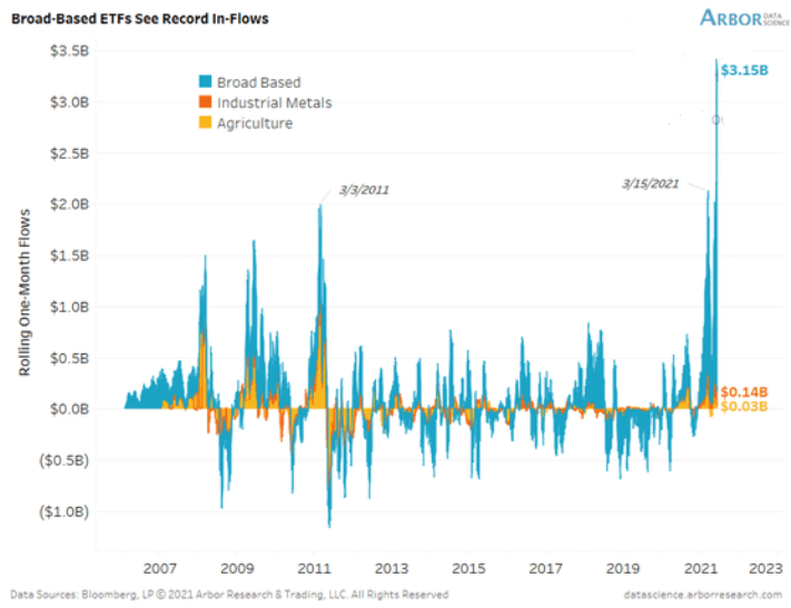
To explain, the blue bars above track the rolling one-month flows in and out of broad-based commodity ETFs. If you analyze the right side of the chart, you can see that the current reading ($3.15 billion) is unprecedented. And with record ETF inflows leading portfolio managers to either purchase the underlying commodities in the spot market and/or increase the funds’ exposure via futures contracts, the bid is showing no signs of slowing down.
Moreover, with the FED’s critics becoming more vocal, former FED Vice Chairman Donald Kohn said on Jun. 8 that “there are risks to the upside for inflation” and that the FED’s agenda is “a framework that’s not designed to deal with the upside risks.” Likewise, while he didn’t call for a specific change in the FED’s current stance, he did say that FED officials should openly acknowledge that inflationary risks are rising.
Please see below: 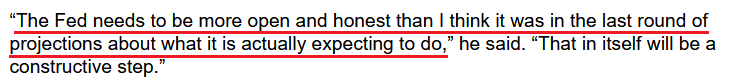 Source: Bloomberg
However, not holding our breath, I mentioned above that the FED already knows that it has to taper. The problem is that telling the public will result in heightened volatility. Thus, FED officials will likely remain tight-lipped for as long as they possibly can.
The U.S. Labor Market
In the meantime, though, with the U.S. labor market poised to sizzle in the coming months, the U.S. 10-Year Treasury yield and the USD Index should catch fire over the medium term. To explain, with U.S. nonfarm payrolls well below their pre-pandemic highs, the FED can ignore rampant inflation and use high unemployment as an excuse for further easing. However, with the U.S. Bureau of Labor Statistics (BLS) revealing on Jun. 8 that U.S. job openings surged to an all-time high of 9.286 million – and came in well above the consensus estimate of 8.300 million – the only things depressing the U.S. labor market now are ill-advised enhanced unemployment benefits.
Please see below:
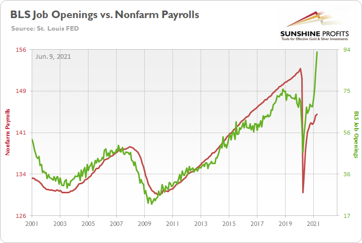
To explain, the red line above tracks U.S. nonfarm payrolls, while the green line above tracks U.S. job openings. If you analyze the relationship, you can see that the latter is often a strong predictor of the former. However, with enhanced unemployment benefits still in effect until mid-to-late June or early July (across ~25 states) – and nationwide until Sep. 6 (expected) – the shift likely won’t occur overnight. But once the benefits expire, U.S. nonfarm payrolls will likely spike in August (reflecting July’s data) and September (reflecting August’s data) and lift the U.S. 10-Year Treasury yield and the USD Index in the process.
As further evidence, not only do the BLS job openings signal rapid employment growth, but U.S. job postings on Indeed (released on Jun. 3) also depict a strong labor market that’s suffocated only by misguided enhanced unemployment benefits.
Please see below:
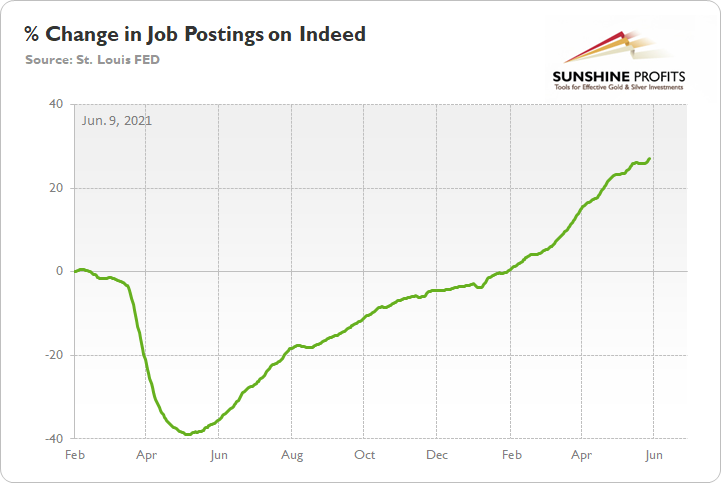
To explain, the green line above tracks the percentage change in job postings on Indeed, with Feb. 1 2020 used as the base value. If you analyze the right side of the chart, you can see that employment prospects in the U.S. remain robust. Moreover, with Feb. 1 2020 acting as the comparable, there are no base effects, and the data shows that job postings are more abundant now than they were pre-COVID-19 (as disruptions didn’t occur until March 2020). The bottom line? With the U.S. 10-Year Treasury yield and the USD Index already undervalued despite the artificial weakness in the U.S. labor market, once the sea change officially occurs, it could cause plenty of problems for the PMs.
The USD Index
Speaking of the USD Index, net-short positioning is approaching the 2017 highs once again. However, with prior periods of extreme pessimism preceding significant rallies in the greenback, a medium-term shift could result in a significant short-covering rally.
Please see below:
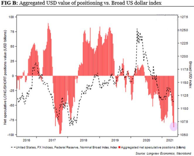
To explain, the dashed black line above tracks the broad USD Index, while the red bars above track net-speculative futures positioning. If you analyze the right side of the chart, you can see that speculators have all but abandoned the greenback. However, with morale extremely lopsided, the USD Index rallied from roughly 91 to 95 when a similar reading was present in 2017. Thus, with bullish technicals and fundamentals signaling a forthcoming shift in USD sentiment, the dollar could be nearing its time to shine.
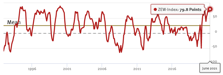
Last of all, because the EUR/USD accounts for nearly 58% of the movement of the USD Index, the currency pair is of critical importance. And while investors continue to buy hope and sell reality, rather than rising to 86.0 (the consensus estimate), the German ZEW Economic Sentiment Index (released on Jun. 8) fell from 84.4 in May to 79.8 in June. For context, Germany is Europe’s largest economy.
Please see below:
 Source: ZEW
To explain, the red line above tracks the German ZEW Economic Sentiment Index. If you analyze the behavior, you can see that 79.8 is still well above its historical average. More importantly, though, notice how abnormally high readings are often followed by swift reversions? And with the prior high (84.4) only superseded by 2000, there is an awful lot of optimism already priced into the EUR/USD.
In conclusion, the PMs look increasingly vulnerable as liquidity exits the financial system. With reverse repos siphoning nearly $500 billion and U.S. government officials prepping investors for the inevitable taper, the stock market’s inability to find a bullish catalyst highlights the heightened anxiety. And while investors are perfectly happy to trade sideways until another catalyst presents itself – under the belief that the FED will protect any and all losses on the downside – the main driver of higher asset prices is effectively nearing its end. The bottom line? While the dam won’t break overnight, the daily leaks signal that the wall of optimism is unlikely to hold over the medium term.
Overview of the Upcoming Part of the Decline
- It seems likely to me that the current corrective upswing is very close to being over, given gold’s similarity to what happened in 2012, USD’s similarity to 2016 and the situation in the general stock market.
- After miners slide once again in a meaningful and volatile way, but silver doesn’t (and it just declines moderately), I plan to switch from short positions in miners to short positions in silver (this could take another 1-2 weeks to materialize). I plan to exit those short positions when gold shows substantial strength relative to the USD Index, while the latter is still rallying. This might take place with gold close to $1,450 - $1,500 and the entire decline (from above $1,700 to about $1,475) would be likely to take place within 1-12 weeks, and I would expect silver to fall hardest in the final part of the move. This moment (when gold performs very strongly against the rallying USD and miners are strong relative to gold – after gold has already declined substantially) is likely to be the best entry point for long-term investments, in my view. This might happen with gold close to $1,475, but it’s too early to say with certainty at this time. In other words, the entire decline could take between 1 and 12 weeks, with silver declines occurring particularly fast in the final 1-2 weeks.
- If gold declines even below $1,500 (say, to ~$1350 or so), then it could take another 10 weeks or so for it to bottom, but this is not what I view as a very likely outcome.
- As a confirmation for the above, I will use the (upcoming or perhaps we have already seen it?) top in the general stock market as the starting point for the three-month countdown. The reason is that after the 1929 top, gold miners declined for about three months after the general stock market started to slide. We also saw some confirmations of this theory based on the analogy to 2008. All in all, the precious metals sector would be likely to bottom about three months after the general stock market tops. If the general stock market puts the final top in the first half of May (which seems quite likely given NASDAQ’s top in late April), then we might expect the precious metals sector to bottom sometime in August.
- The above is based on the information available today, and it might change in the following days/weeks.
Please note that the above timing details are relatively broad and “for general overview only” – so that you know more or less what I think and how volatile I think the moves are likely to be – on an approximate basis. These time targets are not binding or clear enough for me to think that they should be used for purchasing options, warrants or similar instruments.
Q: Thank you for the in-depth analyses and stimulating rhetoric, I look forward so much to each daily report.
Given that I completely understand your logic and the bearish medium-term outlook for gold and silver, please tell me – what is the best medium to use to open a short position against silver?
I am using junior miners ETF for my short against gold, and I am long USDX.
A: Thank you for your kind words, I really appreciate them! As far as a shorting proxy for silver is concerned, the ZSL ETF seems to be a relatively simple and straightforward option. I don’t want to say that it’s perfect for you, as I don’t know anything about your individual situation, and I can’t provide investment advice. This ETF is inverse and 2x leveraged. I don’t know of any non-leveraged inverse ETF for silver, though. If anyone does, I’ll be happy to share this information with others.
Q: First of all, thank you for your steady guidance. Without it, I would have changed the course many times.
I follow the FVX, TNX and TYX and the 3-months chart is showing me trendlines that are declining a bit instead of increasing. Is this manipulation or a free market at work? I'm not a fan of conspiracy theories, but this one is giving me ideas. Please explain.
A: Thanks, I’m very happy that you enjoy our services. Well, I won’t be able to tell whether it’s free-market action or manipulation by looking at the chart, and I don’t have enough “insider information” to say whether or not a given bond yield is being manipulated. What I can say based on the charts is that I don’t see an indication of the recent pause to be anything more than a normal counter-trend correction, similar to what we also saw close to the end of 2020. But since even Janet Yellen recently said that higher rates would be beneficial for the society and the Fed, it seems that these pauses are close to being over. And the same goes for the corrective upswing in the precious metals sector.
Q: It's an interesting article, and your research is different from other analysts. Sir, what is your medium-term target in silver? Thanks.
A: Thanks, it’s difficult to say what silver will do, as it could get very volatile close to the end of the decline. If by “medium-term target” you mean the ultimate downside target that silver could reach when gold declines profoundly to $1,500 or even lower, then silver might decline back to its 2020 low (~$12) or even lower, especially if the general stock market declines at the same time.
Summary
To summarize, it seems likely to me that the corrective upswing is over, given gold’s similarity to what happened in 2012 and 2018 and its turnaround at the double triangle-vertex-based reversal point, USD’s similarity to 2016, action in the silver, and gold miners, and the situation in the general stock market.
After the sell-off (that takes gold to about $1,350 - $1,500), we expect the precious metals to rally significantly. The final part of the decline might take as little as 1-5 weeks, so it's important to stay alert to any changes.
Most importantly, please stay healthy and safe. We made a lot of money last March and this March, and it seems that we’re about to make much more on the upcoming decline, but you have to be healthy to enjoy the results.
On a different note, over a month ago, I wrote that as a bonus gift, we’ll provide you with a month of free access to Rafael Zorabedian’s (our new Stock Trading Strategist) Stock Trading Alerts. And we actually overdelivered as you had access to those premium comments a little bit longer. I trust that you enjoyed them because they generated quite sizable returns for just one month of service.
During this time, Rafael’s call on the GRID resulted in about 5% of unleveraged profits, Rafael’s call on the ERTH resulted in about 11% of unleveraged profits and Rafael’s call on the QTUM resulted in about 6% of unleveraged profits. You will find more details in this article from Rafael. The quick promotion for Rafael’s Stock Trading Alerts that allows you to subscribe for $9 for the first 2 weeks of service, is still active. If you enjoyed the results of Rafael’s work, this seems like a great option – if you continue to enjoy it, then great, profit from it. If not, you can simply cancel before the renewal. It seems to me that the former is much more likely, though. Please use the following link to continue using Rafael’s premium Stock Trading Alerts at these preferred terms ($9 for the first 2 weeks):
https://www.sunshineprofits.com/subscriptions/available-to-buy-products/
As always, we'll keep you - our subscribers - informed.
To summarize:
Trading capital (supplementary part of the portfolio; our opinion): Full speculative short positions (300% of the full position) in mining stocks are justified from the risk to reward point of view with the following binding exit profit-take price levels:
Mining stocks (price levels for the GDXJ ETF): binding profit-take exit price: $24.12; stop-loss: none (the volatility is too big to justify a stop-loss order in case of this particular trade)
Alternatively, if one seeks leverage, we’re providing the binding profit-take levels for the JDST (2x leveraged) and GDXD (3x leveraged – which is not suggested for most traders/investors due to the significant leverage). The binding profit-take level for the JDST: $39.87; stop-loss for the JDST: none (the volatility is too big to justify a SL order in case of this particular trade); binding profit-take level for the GDXD: $94.87; stop-loss for the GDXD: none (the volatility is too big to justify a SL order in case of this particular trade).
For-your-information targets (our opinion; we continue to think that mining stocks are the preferred way of taking advantage of the upcoming price move, but if for whatever reason one wants / has to use silver or gold for this trade, we are providing the details anyway.):
Silver futures upside profit-take exit price: unclear at this time - initially, it might be a good idea to exit, when gold moves to $1,512.
Gold futures upside profit-take exit price: $1,512.
Long-term capital (core part of the portfolio; our opinion): No positions (in other words: cash
Insurance capital (core part of the portfolio; our opinion): Full position
Whether you already subscribed or not, we encourage you to find out how to make the most of our alerts and read our replies to the most common alert-and-gold-trading-related-questions.
Please note that we describe the situation for the day that the alert is posted in the trading section. In other words, if we are writing about a speculative position, it means that it is up-to-date on the day it was posted. We are also featuring the initial target prices to decide whether keeping a position on a given day is in tune with your approach (some moves are too small for medium-term traders, and some might appear too big for day-traders).
Additionally, you might want to read why our stop-loss orders are usually relatively far from the current price.
Please note that a full position doesn't mean using all of the capital for a given trade. You will find details on our thoughts on gold portfolio structuring in the Key Insights section on our website.
As a reminder - "initial target price" means exactly that - an "initial" one. It's not a price level at which we suggest closing positions. If this becomes the case (like it did in the previous trade), we will refer to these levels as levels of exit orders (exactly as we've done previously). Stop-loss levels, however, are naturally not "initial", but something that, in our opinion, might be entered as an order.
Since it is impossible to synchronize target prices and stop-loss levels for all the ETFs and ETNs with the main markets that we provide these levels for (gold, silver and mining stocks - the GDX ETF), the stop-loss levels and target prices for other ETNs and ETF (among other: UGL, GLL, AGQ, ZSL, NUGT, DUST, JNUG, JDST) are provided as supplementary, and not as "final". This means that if a stop-loss or a target level is reached for any of the "additional instruments" (GLL for instance), but not for the "main instrument" (gold in this case), we will view positions in both gold and GLL as still open and the stop-loss for GLL would have to be moved lower. On the other hand, if gold moves to a stop-loss level but GLL doesn't, then we will view both positions (in gold and GLL) as closed. In other words, since it's not possible to be 100% certain that each related instrument moves to a given level when the underlying instrument does, we can't provide levels that would be binding. The levels that we do provide are our best estimate of the levels that will correspond to the levels in the underlying assets, but it will be the underlying assets that one will need to focus on regarding the signs pointing to closing a given position or keeping it open. We might adjust the levels in the "additional instruments" without adjusting the levels in the "main instruments", which will simply mean that we have improved our estimation of these levels, not that we changed our outlook on the markets. We are already working on a tool that would update these levels daily for the most popular ETFs, ETNs and individual mining stocks.
Our preferred ways to invest in and to trade gold along with the reasoning can be found in the how to buy gold section. Furthermore, our preferred ETFs and ETNs can be found in our Gold & Silver ETF Ranking.
As a reminder, Gold & Silver Trading Alerts are posted before or on each trading day (we usually post them before the opening bell, but we don't promise doing that each day). If there's anything urgent, we will send you an additional small alert before posting the main one.
Thank you.
Przemyslaw Radomski, CFA
Founder, Editor-in-chief

