

Briefly: in our opinion, full (300% of the regular position size) speculative short positions in mining stocks are justified from the risk/reward point of view at the moment of publishing this Alert.
Gold finally made its critical move. It broke below its short-term support line and closed the day below it. And that’s clearly bearish.
Let’s jump right into gold’s chart.
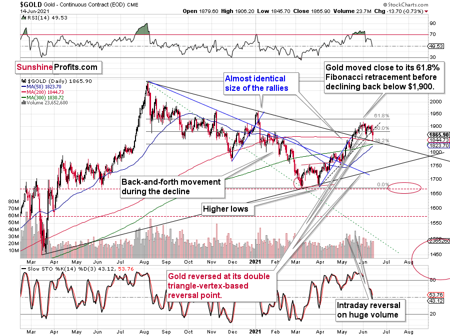
The above chart is likely either perplexing, confusing or appearing random for those who haven’t stumbled upon the technical analysis toolkit. But to those who have learned about its principles and have used it themselves, the above chart is very exciting. And to those who took the expertise to the next level and see an even bigger picture, the chart is relatively calm, and normal.
Gold: How Exciting Are Recent Moves?
Why would the above chart be so exciting? Because gold just broke below its rising dashed support line and closed the day below it. This is the first time that it managed to do that, despite coming close to it a few times before. The excitement is even bigger because of what happened on an intraday basis – gold moved back to its declining support line based on the 2020 and 2021 highs and then it moved back up. Consequently, based on the same session, both bulls and bears have an indication that “they were right all along”. Was yesterday’s session a major breakdown, or a confirmation of the May breakout?
But how excited can you get if it’s clear that gold is simply repeating its price patterns from the past that were preceded by relatively similar events (invalidation of breakout to new all-time highs – just like in 2008; similarity with regard to price moves, volume, and key indicators – just like in 2011-2012).
Watching a football match is not as exciting when you already know the outcome, is it?
What’s likely to happen now? Gold is likely to move back and forth, but will ultimately break below the declining support line, which will be a major “uh-oh” moment for those who think that gold will move higher from here based on the very positive fundamental situation. Yes, it is very positive, but it doesn’t mean that gold would rally right away. It could decline despite the fundamentals, just like it did in 2008 and in 2013. And it seems that it’s about to slide.
My previous comments on the analogies to 2008 and 2012 remain up-to-date:
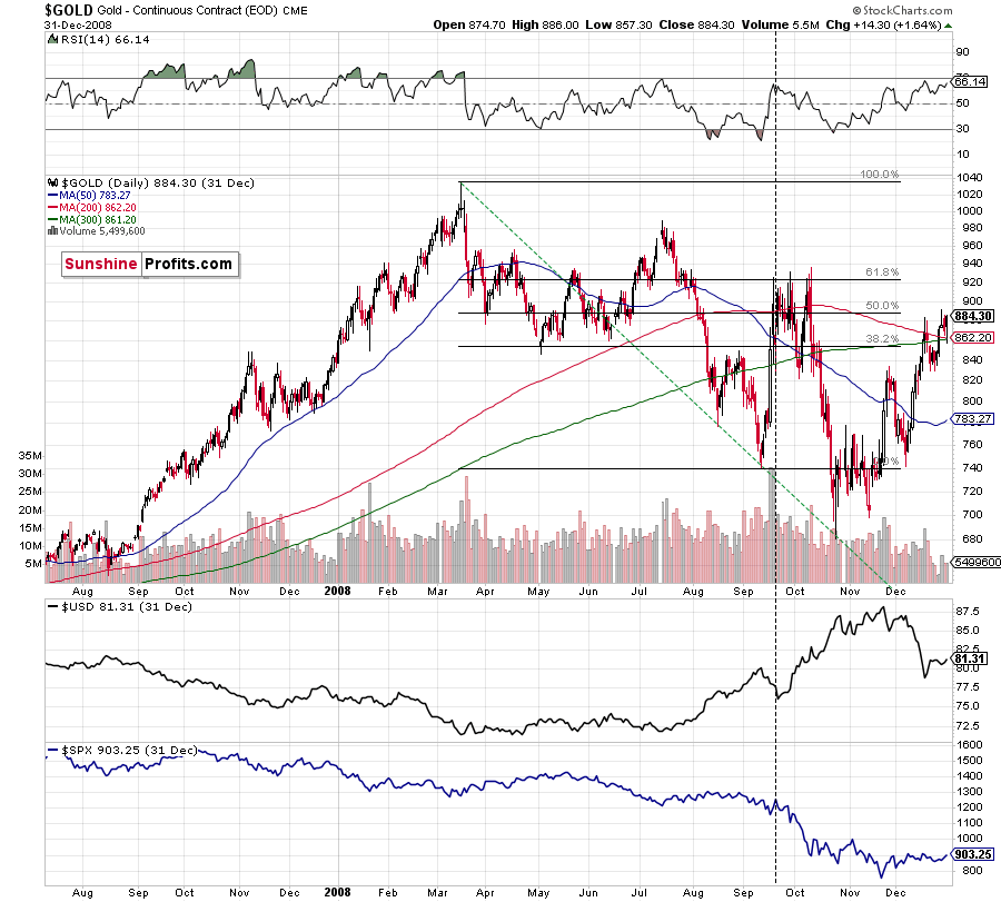
Back in 2008, gold corrected to 61.8% Fibonacci retracement, but it stopped rallying approximately when the USD Index started to rally, and the general stock market accelerated its decline.
Taking into consideration that the general stock market has probably just topped, and the USD Index is about to rally, then gold is likely to slide for the final time in the following weeks/months. Both above-mentioned markets support this bearish scenario and so do the self-similar patterns in terms of gold price itself.
Moreover, while the pace of gold’s decline in 2012 started off slow, the momentum picked up later on as the drawdown became even more vicious. As a result, the tepid pace of gold’s current slide remains deceptive and isn’t a cause for concern.
Please see below:
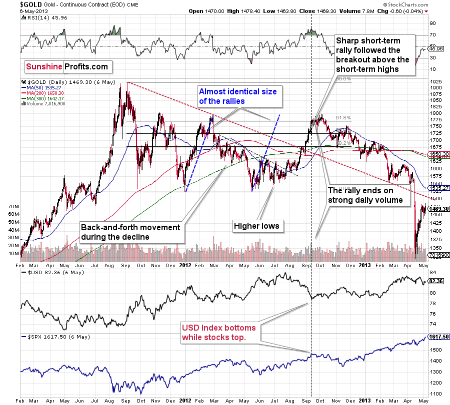
The relatively broad bottom with higher lows is what preceded both final short-term rallies – the current one, and the 2012 one. Their shape as well as the shape of the decline that preceded these broad bottoms is very similar. In both cases, the preceding decline had some back-and-forth trading in its middle, and the final rally picked up pace after breaking above the initial short-term high.
Interestingly, the 2012 rally ended on huge volume, which is exactly what we saw also on May 19 this year. Consequently, forecasting much higher silver or gold prices here doesn’t seem to be justified based on the historical analogies.
The thing I would like to emphasize here is that gold didn’t form the final top at the huge-volume reversal on Sep. 13, 2012. It moved back and forth for a while and moved a bit above that high-volume top, and only then the final top took place (in early October 2012).
The same happened in September and in October 2008. Gold reversed on huge volume in mid-September, and it was approximately the end of the rally. The final top, however, formed after some back-and-forth trading and a move slightly above the previous high.
Consequently, the fact that gold moved a bit above its own high-volume reversal (May 19, 2021) is not an invalidation of the analogy, but rather its continuation.
There’s one more thing I would like to add, and it’s that back in 2012, gold corrected to approximately the 61.8% Fibonacci retracement level – furthermore, the same happened in 2008 as you can see in the below chart. Consequently, the fact that gold moved above its 50% Fibonacci retracement doesn’t break the analogy either. And even if gold moves to $1,940 or so, it will not break it. It’s not likely that it is going to move that high, as in both cases –in 2008 and 2012 – gold moved only somewhat above its high-volume reversal before forming the final top. So, as this year’s huge-volume reversal took place close to the 50% retracement and not the 61.8% retracement, it seems that we’ll likely see a temporary move above it, which will create the final top. And that’s exactly what we see happening so far this week.
The lower part of the above chart shows how the USD Index and the general stock market performed when gold ended its late-2012 rally and was starting its epic decline. In short, that was when the USD Index bottomed, and when the general stock market topped.
Also, please note that while it might seem bullish that gold managed to rally above its declining black resistance line recently (the one based on the 2020 top and the 2021 top), please note that the same happened in 2012 – I marked the analogous line with red. The breakout didn’t prevent gold from sliding. When the price reached the line, we saw a short-term bounce, but nothing more than that – the gold price fell through it in the following weeks.
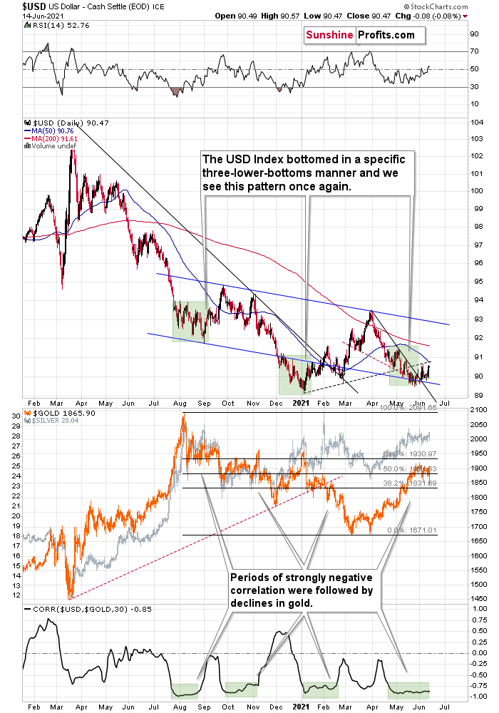
The same with silver.
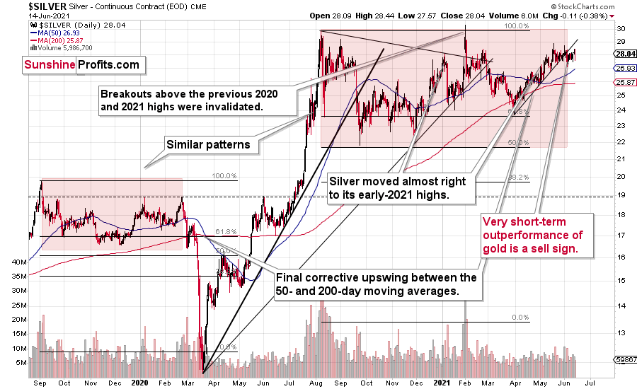
Silver’s Failed Attempts to Break Out
Silver confirmed its breakdown and is finished invalidating its fourth attempt to break above the early January highs. We currently see a fifth attempt, which is unlikely to succeed given the above-mentioned breakdown. This is a clearly bearish combination, even without taking into account the similarity between now, 2020, and 2008.
Let’s keep in mind that silver might hesitate to decline substantially at first, but then play a huge catch-up close to the end of the decline – just as it did in 2020.
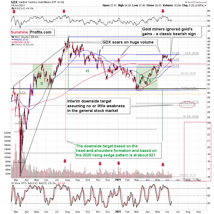
Miners: Breaking Below Support Lines Without USDX Help
The breakdown in the GDX ETF is also crystal clear. We saw a buy signal from the stochastic indicator, but the breakdown in terms of closing prices is more important, as the buy signals from the stochastic (below 20) were not that reliable so far this year. Please note that the mid-January buy signal was followed by much lower prices in the following weeks. The same was the case with the first buy signal that we saw in late February.
What’s particularly interesting is that gold and gold miners broke decisively below their rising support lines without the USD Index’s help. This is a sign of weakness in the PM market.
Having said that, let’s take a look at the markets from a more fundamental angle.
To Be, or Not to Be
With the U.S. Federal Reserve (FED) beginning its two-day policy meeting today, investors have retreated to their respective corners: on one side of the room, you have the inflation is “transitory” camp (the FED’s patience is prudent). On the other side of the room, you have the inflation is structural camp (the FED needs to taper). For context, all inflation is transitory. However, there is a big difference between one month of transitory inflation and 10 years of transitory inflation.
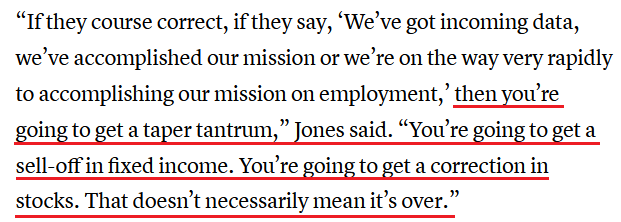
Voicing his opinion, billionaire hedge fund manager Paul Tudor Jones told CNBC on Jun. 14 that this is “the most important meeting in [Chairman] Jay Powell’s career, certainly the most important Fed meeting of the past four or five years.”
He added:
“You’ve got the craziest mix of fiscal and monetary policy since the Federal Reserve Board was created…Things are actually ‘bat-s’ crazy. At some point, we have to say, ‘OK, let’s slow down. We’re going to get back in the lane and we’re going to drive like we used to.”
And while Jones cautioned that if the FED doesn’t signal a reduction of its bond-buying program “then I would just go all in on the inflation trades [and] I’d probably buy commodities, buy crypto, buy gold,” if a more hawkish narrative emerges, then all bets are off.
 Source: CNBC
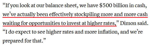
In addition, JPMorgan CEO Jamie Dimon also told an audience on Jun. 14 that the largest bank in the U.S. is positioned for higher interest rates and that “we’re going to be very patient, because I think you have a very good chance inflation will be more than transitory.”
He added:
 Source: CNBC
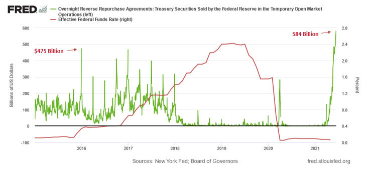
If that wasn’t enough, the FED’s daily reverse repurchase agreements hit another all-time high on Jun. 14 and the daily deluge signals that there is too much liquidity in the financial system. For context, the FED sold $209 billion worth of daily reverse repos on May 17. On Jun. 14, that figure ballooned to $584 billion.
Please see below:
To explain the significance, I wrote previously:
A reverse repurchase agreement (repo) occurs when an institution offloads cash to the FED in exchange for a Treasury security (on an overnight or short-term basis). And with U.S. financial institutions currently flooded with excess liquidity, they’re shipping cash to the FED at an alarming rate.
The green line above tracks the daily reverse repo transactions executed by the FED, while the red line above tracks the U.S. federal funds rate. Moreover, notice what happened the last time reverse repos moved above 400 billion? If you focus your attention on the red line, you can see that after the $400 billion level was breached in December 2015, the FED’s rate-hike cycle began. Thus, with current inflation dwarfing 2015 levels and U.S. banks practically throwing cash at the FED, is this time really different?
However, while investors fret over whether or not the FED will (or should) come to its senses, a more important development will occur on Jun. 15. With the Commodity Producer Price Index (PPI) scheduled for release today, it will provide important clues on where the inflation story is headed. For context, the commodity PPI often leads the headline Consumer Price Index (CPI) and that’s why tracking its movement is so important.
To that point, whether inflation is to be, or not to be, when the commodity PPI implied a roughly 4.50% increase in the headline CPI, the latter rose by 4.15% (exceeding expectations). Likewise, when the commodity PPI implied a roughly 5.50% increase in the headline CPI, the latter rose by 4.93% (also exceeding expectations). As a result, a hot-or-cold print will go a long way in solving the inflationary riddle.
In the meantime, though, if we analyze the performance of the pair during the inflationary surges of the 1970s and the early 1980s, it’s clear that the relationship has stood the test of time.
Please see below:
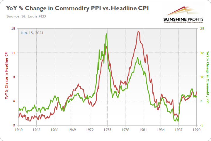
To explain, the green line above tracks the year-over-year (YoY) percentage change in the commodity PPI, while the red line above tracks the YoY percentage change in the headline CPI. If you analyze the relationship, you can see that the pair have a close connection.
More importantly, though, during the historical inflationary downpour, the month-over-month (MoM) percentage change in the commodity PPI never declined by more than 1.68%.
Please see below:
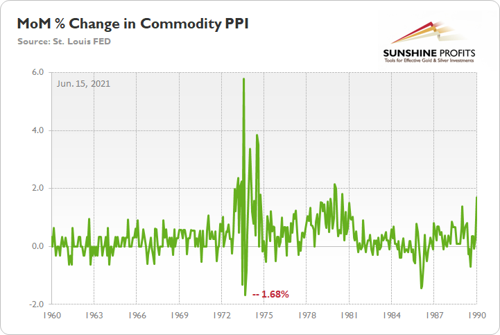
To explain, the green line above tracks the MoM percentage change in the commodity PPI. And if you compare the two MoM spikes in the commodity PPI to the two YoY spikes in the first chart above (focus your attention on the highs between 1972-1975 and 1978-1981), you can see that MoM resiliency helped sustain the YoY surges. Even more revealing, during the roughly nine-year bout of inflation, the commodity PPI dipped in-and-out of negative territory but never fell off of a cliff.
In stark contrast, investors’ theory of “base effects” is built on the volatile high-low action that we witnessed in 2008. And while I’ve highlighted on several occasions that the MoM percentage increases in the core CPI and the core Personal Consumption Expenditures (PCE) Index (excluding the one-time outlier in 2000) were only rivaled by the 1980s, doubters cite 2008 as their main source of skepticism.
Please see below:
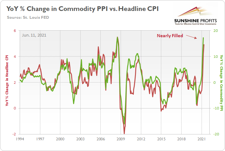
To explain, if you analyze the YoY surge in the commodity PPI on the right side of the chart (the green line), you can see that a similar spike occurred in 2008 (prior to the Global Financial Crisis). And with both the commodity PPI and the headline CPI completely rolling over into 2009, what’s stopping another precipitous drop from occurring once again?
Well, if we circle back to our MoM analysis, notice how from 2000 onward, prophecies of rampant inflation were often derailed by significant MoM declines?
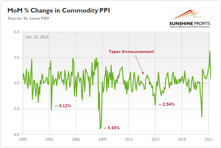
To explain, it’s no coincidence that a 5.33% MoM plunge in 2008 helped push the YoY percentage change in the commodity PPI and the headline CPI over a cliff. On top of that, large MoM drops occurred in 2003 and 2015 (January), which also derailed the inflationary momentum. For context, I excluded the fall in 2020 because COVID-19 shut down the global economy and the MoM decline was largely expected. More importantly, though, note that the commodity PPI began its 2014 MoM decent AFTER the FED’s taper announcement in December 2013.
What’s more, while proponents of the 2008 analogue argue that we’re headed for a deflationary bust, a contrasting indicator is already hiding in plain sight.
Please see below:
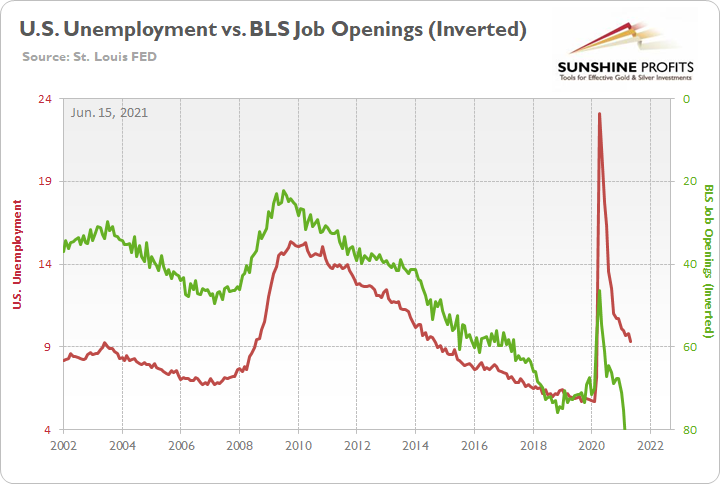
To explain, the red line above tracks the number of unemployed U.S. citizens, while the green line above tracks the inverted number of job openings tallied by the U.S. Bureau of Labor Statistics (BLS). For context, inverted means that the latter’s scale is flipped upside down and that a rising green line represents falling job openings, while a falling green line represents rising job openings.
If you analyze the relationship, you can see that when job openings sunk like a stone in 2008, unemployment skyrocketed. Conversely, with the BLS revealing on Jun. 8 that U.S. job openings hit an all-time high of 9.286 million – and came in well above the consensus estimate of 8.300 million – the current environment is nothing like the GFC. To that point, if you analyze the right side of the chart, you can see that job openings and U.S. unemployment are following the 2013-2015 analogue and not 2008 (signaled by both lines moving lower).
The bottom line?
While all eyes are focused on the FED, the commodity PPI is inflation’s canary in the coal mine. For example, when rising unemployment and falling U.S. job openings coincided with steep MoM declines in the commodity PPI in 2003 and 2008, inflation fizzled. Conversely, with falling unemployment and record U.S. job openings coinciding with a resilient commodity PPI (that as of this writing looks a lot like the 1970s and early 1980s), tapering is likely the only way to put out the inflationary fire ((like in December 2013).
As a result, the playbook looks like this: if MoM readings in the commodity PPI remain resilient – which is likely due to increased vaccinations, record job openings, parabolic shipping costs and a forthcoming infrastructure package – get ready for the taper in September. Conversely, if MoM readings fall off of a cliff, then inflation’s best days may be in the rearview.
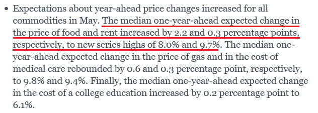
Supporting the former, the New York FED released its Survey of Consumer Expectations on Jun. 14. And with the Shelter CPI (which lags Apartment List data by roughly three months) poised to surge in September, U.S. citizens have already sounded the alarm on rent inflation.
Please see below:
 Source: NY FED
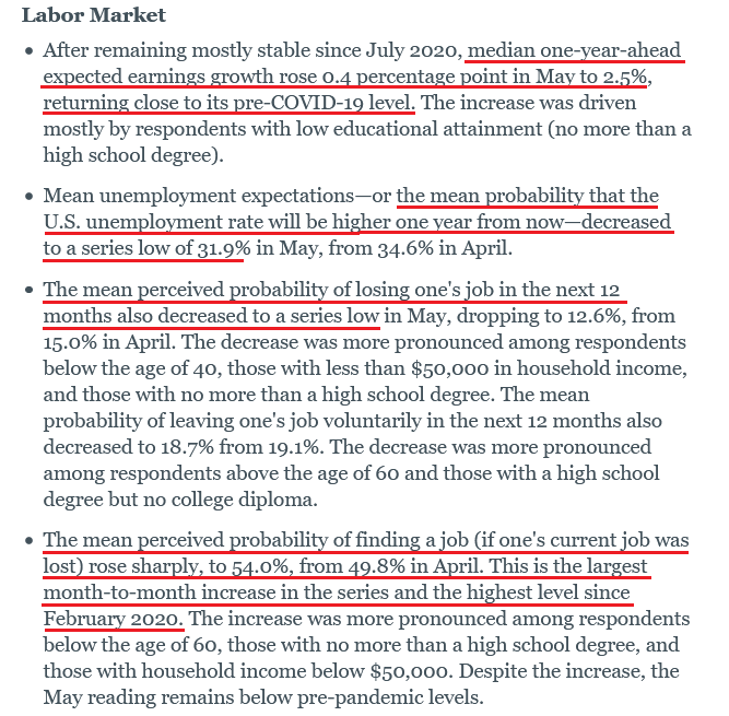
And supporting our thesis that the expiration of enhanced unemployment benefits will lead to a surge in U.S. nonfarm payrolls, the report also revealed:
 Source: NY FED
If that wasn’t enough, if we exclude Los Angeles to Shanghai, New York to Rotterdam and Rotterdam to Shanghai, shipping costs are surging at an unprecedented rate.
Please see below:
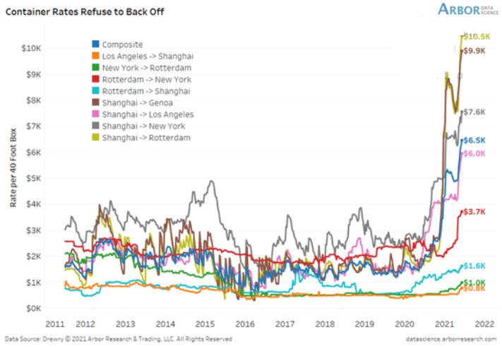
To explain, the lines above track the shipping costs to-and-from various regions. If you analyze the dark blue line sandwiched in the middle ($6.5K), average shipping costs continue to skyrocket. Moreover, if you’re shipping from Shanghai to Rotterdam, New York or Genca, global businesses are nowhere near solving these “transitory” issues.
Finally, with the central bank’s critics becoming increasingly vocal in recent days, Oxford Economics is now officially ‘fighting the FED.’ Case in point: while “base effects” will likely be cited during Jerome Powell’s (Chairman of the FED) press conference on Jun. 16, Oxford Economics believes that the headline CPI will remain extremely elevated in 2021.
Please see below:
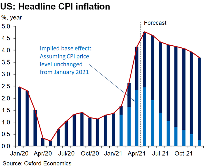
To explain, the light and dark blue bars above track Oxford Economics’ projections for the headline CPI. The light blue sections represent portions that are attributed to “base effects,” while the dark blue sections represent portions that are not a function of “base effects.” More importantly, though, if you analyze the forecasted trajectory, you can see that the group expects 4%+ headline CPI prints to continue through October and a roughly 3.75% print to materialize in December. As a result, with the chorus growing louder by the day, all signs point to the FED’s confidence game unraveling in September.
In conclusion, the PMs elicited more weakness on Jun. 14 and their recent bout of optimism is slowly becoming undone. And while Powell may channel his inner dove and ignite another rally on Jun. 16, taper talk is likely to heat up in the coming months. Moreover, with forward-looking investors likely to position for the shift in advance of the revelation, the PMs are looking increasingly vulnerable. The bottom line? Because letting the genie out of the bottle is a lot easier than putting him back in, the FED’s next magic trick will likely make the PMs’ tranquility disappear.
Overview of the Upcoming Part of the Decline
- It seems likely to me that the current corrective upswing is very close to being over, given gold’s similarity to what happened in 2012, USD’s similarity to 2016 and the situation in the general stock market.
- After miners slide once again in a meaningful and volatile way, but silver doesn’t (and it just declines moderately), I plan to switch from short positions in miners to short positions in silver (this could take another 1-2 weeks to materialize). I plan to exit those short positions when gold shows substantial strength relative to the USD Index, while the latter is still rallying. This might take place with gold close to $1,450 - $1,500 and the entire decline (from above $1,700 to about $1,475) would be likely to take place within 1-12 weeks, and I would expect silver to fall hardest in the final part of the move. This moment (when gold performs very strongly against the rallying USD and miners are strong relative to gold – after gold has already declined substantially) is likely to be the best entry point for long-term investments, in my view. This might happen with gold close to $1,475, but it’s too early to say with certainty at this time. In other words, the entire decline could take between 1 and 12 weeks, with silver declines occurring particularly fast in the final 1-2 weeks.
- If gold declines even below $1,500 (say, to ~$1350 or so), then it could take another 10 weeks or so for it to bottom, but this is not what I view as a very likely outcome.
- As a confirmation for the above, I will use the (upcoming or perhaps we have already seen it?) top in the general stock market as the starting point for the three-month countdown. The reason is that after the 1929 top, gold miners declined for about three months after the general stock market started to slide. We also saw some confirmations of this theory based on the analogy to 2008. All in all, the precious metals sector would be likely to bottom about three months after the general stock market tops. If the general stock market puts the final top in the first half of May (which seems quite likely given NASDAQ’s top in late April), then we might expect the precious metals sector to bottom sometime in August.
- The above is based on the information available today, and it might change in the following days/weeks.
Please note that the above timing details are relatively broad and “for general overview only” – so that you know more or less what I think and how volatile I think the moves are likely to be – on an approximate basis. These time targets are not binding or clear enough for me to think that they should be used for purchasing options, warrants or similar instruments.
Letters to the Editor
Q: What is your opinion on cryptocurrencies which are significantly down from their previous highs?
A: In my opinion they were in a speculative bubble that just burst, and they have further to fall, especially when the USD Index strengthens, stocks fall, and overall panic becomes the name of the game. However, it seems to me that some of the cryptocurrencies (like Ethereum) might actually have good long-term potential - E.g., Ethereum might be used not only as a currency but for execution of smart contracts.
Q: Approximately six months ago PR mentioned some investment ideas for the future. That being Psilocybin and AI. Australia’s only listed company on the ASX, Creso Pharma, is doing its due diligence on Halucinex and could be a great investment.
Cheers
A: Thanks, this could indeed be a good investment idea, but I haven’t dedicated enough time to these non-precious-metals areas in order to really give an opinion of quality that I would be happy with. Psylocybin-related and AI-related investments continue to be my non-precious-metals long-term investment ideas (perhaps along with Ethereum, given the improvements they are making in the 2.0 version). However, given where the markets (in particular, the general stock market) are right now, it seems to me that all the above would be likely to slide in value in the following months when stocks finally plunge, so I’m not buying any of them at the moment. Of course, that’s not investment advice for anyone; I’m simply sharing what I’m NOT doing. And yes, I continue to think that shorting the junior mining stocks right now is providing one of the best risk to reward opportunities.
Summary
To summarize, it seems likely to me that the corrective upswing is over, given gold’s similarity to what happened in 2012 and 2018 and its turnaround at the double triangle-vertex-based reversal point, USD’s similarity to 2016, action in the silver, and gold miners, and the situation in the general stock market.
After the sell-off (that takes gold to about $1,350 - $1,500), we expect the precious metals to rally significantly. The final part of the decline might take as little as 1-5 weeks, so it's important to stay alert to any changes.
Most importantly, please stay healthy and safe. We made a lot of money last March and this March, and it seems that we’re about to make much more on the upcoming decline, but you have to be healthy to enjoy the results.
As always, we'll keep you - our subscribers - informed.
To summarize:
Trading capital (supplementary part of the portfolio; our opinion): Full speculative short positions (300% of the full position) in mining stocks are justified from the risk to reward point of view with the following binding exit profit-take price levels:
Mining stocks (price levels for the GDXJ ETF): binding profit-take exit price: $24.12; stop-loss: none (the volatility is too big to justify a stop-loss order in case of this particular trade)
Alternatively, if one seeks leverage, we’re providing the binding profit-take levels for the JDST (2x leveraged) and GDXD (3x leveraged – which is not suggested for most traders/investors due to the significant leverage). The binding profit-take level for the JDST: $39.87; stop-loss for the JDST: none (the volatility is too big to justify a SL order in case of this particular trade); binding profit-take level for the GDXD: $94.87; stop-loss for the GDXD: none (the volatility is too big to justify a SL order in case of this particular trade).
For-your-information targets (our opinion; we continue to think that mining stocks are the preferred way of taking advantage of the upcoming price move, but if for whatever reason one wants / has to use silver or gold for this trade, we are providing the details anyway.):
Silver futures upside profit-take exit price: unclear at this time - initially, it might be a good idea to exit, when gold moves to $1,512.
Gold futures upside profit-take exit price: $1,512.
Long-term capital (core part of the portfolio; our opinion): No positions (in other words: cash
Insurance capital (core part of the portfolio; our opinion): Full position
Whether you already subscribed or not, we encourage you to find out how to make the most of our alerts and read our replies to the most common alert-and-gold-trading-related-questions.
Please note that we describe the situation for the day that the alert is posted in the trading section. In other words, if we are writing about a speculative position, it means that it is up-to-date on the day it was posted. We are also featuring the initial target prices to decide whether keeping a position on a given day is in tune with your approach (some moves are too small for medium-term traders, and some might appear too big for day-traders).
Additionally, you might want to read why our stop-loss orders are usually relatively far from the current price.
Please note that a full position doesn't mean using all of the capital for a given trade. You will find details on our thoughts on gold portfolio structuring in the Key Insights section on our website.
As a reminder - "initial target price" means exactly that - an "initial" one. It's not a price level at which we suggest closing positions. If this becomes the case (like it did in the previous trade), we will refer to these levels as levels of exit orders (exactly as we've done previously). Stop-loss levels, however, are naturally not "initial", but something that, in our opinion, might be entered as an order.
Since it is impossible to synchronize target prices and stop-loss levels for all the ETFs and ETNs with the main markets that we provide these levels for (gold, silver and mining stocks - the GDX ETF), the stop-loss levels and target prices for other ETNs and ETF (among other: UGL, GLL, AGQ, ZSL, NUGT, DUST, JNUG, JDST) are provided as supplementary, and not as "final". This means that if a stop-loss or a target level is reached for any of the "additional instruments" (GLL for instance), but not for the "main instrument" (gold in this case), we will view positions in both gold and GLL as still open and the stop-loss for GLL would have to be moved lower. On the other hand, if gold moves to a stop-loss level but GLL doesn't, then we will view both positions (in gold and GLL) as closed. In other words, since it's not possible to be 100% certain that each related instrument moves to a given level when the underlying instrument does, we can't provide levels that would be binding. The levels that we do provide are our best estimate of the levels that will correspond to the levels in the underlying assets, but it will be the underlying assets that one will need to focus on regarding the signs pointing to closing a given position or keeping it open. We might adjust the levels in the "additional instruments" without adjusting the levels in the "main instruments", which will simply mean that we have improved our estimation of these levels, not that we changed our outlook on the markets. We are already working on a tool that would update these levels daily for the most popular ETFs, ETNs and individual mining stocks.
Our preferred ways to invest in and to trade gold along with the reasoning can be found in the how to buy gold section. Furthermore, our preferred ETFs and ETNs can be found in our Gold & Silver ETF Ranking.
As a reminder, Gold & Silver Trading Alerts are posted before or on each trading day (we usually post them before the opening bell, but we don't promise doing that each day). If there's anything urgent, we will send you an additional small alert before posting the main one.
Thank you.
Przemyslaw Radomski, CFA
Founder, Editor-in-chief

