

Briefly: gold and the rest of the precious metals market are likely to decline in the next several weeks/months and then start another powerful rally. Gold’s strong bullish reversal/rally despite the USD Index’s continuous strength will likely be the signal confirming that the bottom is in.
Welcome to this week's flagship Gold & Silver Trading Alert. Predicated on last week’s price moves, our most recently featured outlook remains the same as the price moves align with our expectations. On that account, there are parts of the previous analysis that didn’t change at all in the earlier days, which will be written in italics.
Our short position in junior miners is already profitable.
Let’s start today’s analysis with a recap of what recently happened on the fundamental front.
The Weekly Fundamental Roundup
This week was all about the day traders, as a small slate of economic data kept fundamental investors in check. However, with market participants eagerly awaiting the release of the Consumer Price Index (CPI) today, stocks sold off as investors attempted to front-run the bad news.
However, while the print may or may not show a new 2022 high on a year-over-year (YoY) basis, the month-over-month (MoM) readings are more important. While most investors assume that ‘peak’ inflation signals the all-clear, I’ve been warning for months that it’s a long way down from 8%+ annualized inflation to the Fed’s 2% target. As a result, the consensus has overlooked the economic damage required to normalize the metric.
For context, I wrote on May 25:
While the permabears and permabulls argue about when consumer spending will fall off a cliff and when the Fed will turn dovish, the reality is that the central bank’s war with inflation will be one of attrition.
Yet, with CNBC hedging its perpetually bullish bets on Jun. 9, the media outlet had a similar message.
Please see below:
 Source: CNBC
Thus, whether we see new YoY highs or not, the fundamental thesis remains intact: when the stock market rallies, commodities often follow suit, which enhances inflation and makes the Fed’s job more difficult. To explain, I wrote on Apr. 6:
Please remember that the Fed needs to slow the U.S. economy to calm inflation, and rising asset prices are mutually exclusive to this goal. Therefore, officials should keep hammering the financial markets until investors finally get the message.
Moreover, with the Fed in inflation-fighting mode and reformed doves warning that the U.S. economy “could teeter” as the drama unfolds, the reality is that there is no easy solution to the Fed’s problem. To calm inflation, it has to kill demand. If that occurs, investors should suffer a severe crisis of confidence.
The Canada Connection
I’ve long warned that the Bank of Canada (BoC) is the hawkish canary in the coal mine. With the central bank raising interest rates by 50 basis points and the Fed following suit, their geographical proximity often aligns their monetary policies.
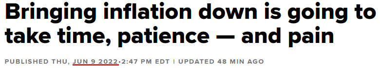
To that point, BoC Governor Tiff Macklem (Canada’s Jerome Powell) said previously that increasing the overnight lending rate above 3% may be needed to deal with “an overheating economy.”
“We think the economy can handle higher interest rates, we think the economy needs higher interest rates and in our last decision we indicated that we were prepared to move more forcefully if needed,” he said.
In addition, when asked on Jun. 9 about potential rate hikes above 50 basis points, Macklem didn’t dismiss the idea.
Please see below:
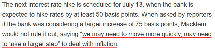 Source: CTV News
Furthermore, there has been a lot of chatter about struggling consumers amid high inflation. However, while some demand destruction has unfolded (which is expected), we’re far from the levels necessary to calm MoM inflation. To explain, I added on May 25:
The reality is that the U.S. is materially overstimulated, and the consequences of too much spending have come back with an inflationary vengeance. As a result, most U.S. consumers are stoking the pricing pressures, not suffering from them. Therefore, consumer spending is bearish, not bullish, because it intensifies inflation. As such, the further we drift from 2%, the more pain that needs to unfold to normalize the situation.
To that point, Air Canada announced on Jun. 9 that it’s canceled about 360 flights at the Toronto Pearson airport in the first seven days of June (~10% of its schedule) due to staffing shortages and a surge in passenger demand.
For context, Toronto is the fourth-largest city in North America, Pearson is Canada’s busiest airport, and Air Canada moves about 100,000 customers per day there. Thus, despite higher fuel charges uplifting ticket prices, Canadian travelers continue to spend money.
Please see below:
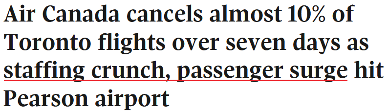 Source: The Globe and Mail
The U.S. Labor Market
One-half of the Fed’s dual mandate is maximum employment. Therefore, a resilient U.S. labor market enhances the Fed’s hawkish fervor. In a nutshell: spirited employment opportunities and inflation well above target are bullish for Fed policy.
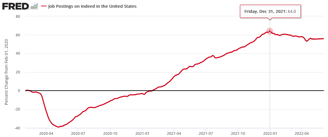
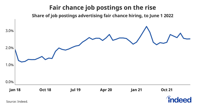
Moreover, with Indeed releasing its weekly job openings update on Jun. 7, the metric has flat-lined in recent weeks. However, while worker demand has moderated from its all-time highs (which is expected when the Fed hikes interest rates), it’s nowhere near falling off a cliff. As a result, the Fed needs to fire more hawkish bullets to normalize wage inflation.
Please see below:
Second, Indeed released a U.S. labor market report on Jun. 9. An excerpt read:
“In a tight labor market, employers must widen search criteria to find the workers they need (…). Now that employers find it hard to fill positions, some are starting to widen their search to include people with criminal records, sometimes advertising fair chance hiring policies. This is the practice of not discriminating against a job seeker because of past arrests or involvement with the criminal justice system.”
“In May 2022, the percentage of job postings on Indeed advertising fair chance hiring was up 31% from May 2019.”
Please see below:
In addition:
“Employer demand for workers continues to be strong. To find the staff they need, many are turning to often-overlooked groups, including people with criminal records. Advertising fair chance hiring in job postings may continue to accelerate if the labor market remains tight.”
Thus, if Indeed notices more job postings using phrases like “fair chance hiring” and “applicants with conviction records will not be excluded,” does it seem like demand destruction has unfolded? Think about it: some employers are wary about hiring applicants with criminal records. As such, with postings “up 31% from May 2019,” it highlights how supply/demand imbalances continue to favor employees. Moreover, this is profoundly inflationary and bullish for Fed policy.
Inflation Dynamics
With the labor market covered, the second half of the Fed’s dual mandate is inflation. Moreover, with policymakers and investors underestimating the demand side of the equation, they overlooked a key component stoking inflation. To explain, I wrote on Dec. 23:
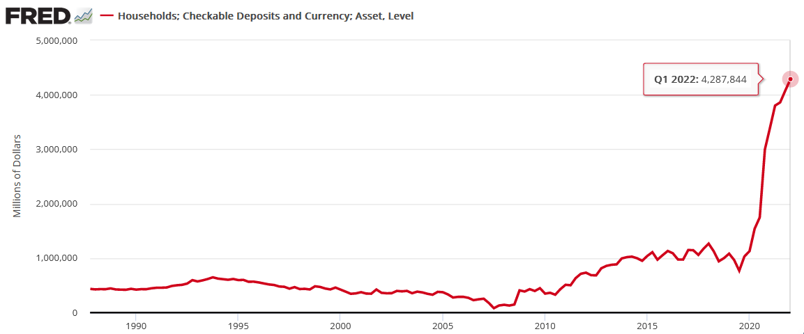
While the fiscal spending spree may end, U.S. households are flush with cash. U.S. households have nearly $3.54 trillion in their checking accounts. For context, this is 253% more than Q4 2019 (pre-COVID-19) (…).
While some investors expect a dovish 180 from the Fed, they shouldn’t hold their breath. With U.S. economic growth still resilient and the U.S. consumer in much better shape than some portray, the Fed can raise interest rates without crashing the U.S. economy. As a result, Powell will likely stick to his hawkish script and forge ahead with rate hikes in 2022.
Therefore, while the prediction proved prescient, U.S. households, on aggregate, are still flush with cash. For example, the Fed released its Financial Accounts of the United States report on Jun. 9. It revealed that U.S. households had nearly $4.288 trillion in their checking accounts as of the end of Q1. Moreover, the figure is 5.1% higher than in Q4:2021.
For the sake of objectivity, the data lags by roughly two months. However, with the metric at an unprecedented all-time high, U.S. consumers still have plenty of spending power. As a result, more hawkish policy is needed to create the demand destruction necessary to tame inflation.
Please see below:
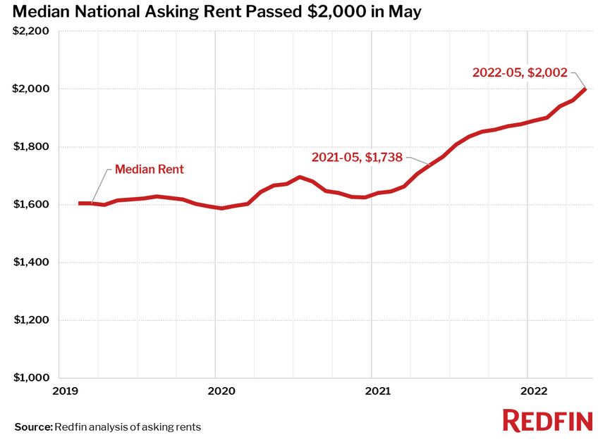
Also critical, I’ve noted on numerous occasions that rent inflation is a material component. For context, the Shelter CPI accounts for more than 30% of the headline CPI’s movement. Furthermore, Redfin – a full-service real estate brokerage – released its latest rental market report on Jun. 9. An excerpt read:
“The median monthly asking rent in the U.S. surpassed $2,000 for the first time in May, rising 15% year over year to a record high of $2,002. That’s on par with April’s annual increase of 15%, but a slowdown from March’s 17% gain.”
Please see below:
Redfin Deputy Chief Economist Taylor Marr said:
“More people are opting to live alone, and rising mortgage-interest rates are forcing would-be homebuyers to keep renting. These are among the demand-side pressures keeping rents sky-high. While renting has become more expensive, it is now more attractive than buying for many Americans this year as mortgage payments have surpassed rents on many homes. Although we expect rent-price growth to continue to slow in the coming months, it will likely remain high, causing ongoing affordability issues for renters.”
For context, I warned on Sep. 16, 2021 that inflation would prove much longer-lasting than many expected. I wrote:
While proponents of the “transitory” narrative cite used cars & trucks, lodging away from home and airfares as items that will mean revert (we agree), reopening components actually fell in August while the overall CPI remained elevated.
Please see below:
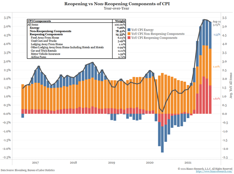
To explain, the blue (energy), orange (non-reopening) and red (reopening) bars above segregate the various contributors to the headline CPI. If you analyze the right side of the chart, you can see that reopening components peaked in June and have come down. Conversely, if you focus your attention on the blue bars, notice how energy accounts for roughly one-third of the headline CPI and its share actually increased in August?
Furthermore, the blue bars don’t account for the inflationary contributions of industrial metals, agricultural commodities, plastics, or shipping costs (which are at all-time highs). As a result, even if the reopening metrics begin to fade, higher commodity prices and prospective rent inflation should add upward pressure to the headline CPI over the medium term.
The Bottom Line
With inflation extremely elevated and the U.S. labor market still resilient, higher interest rates are needed to cool the pricing pressures. Moreover, a higher U.S. federal funds rate is bullish for U.S. real yields and the USD Index. In contrast, the prospect is bearish for the PMs and the S&P 500. As a result, lower lows should confront the pair over the medium term.
In conclusion, the PMs declined on Jun. 9, as a sea of red flooded Wall Street. Moreover, with inflation running away from the Fed, three rate hikes (25 basis point increments) have done little to calm the situation. Therefore, the Fed’s catch-22 is on full display, and it will likely culminate in a recession over the next six to 12 months.
What to Watch for Next Week
With more U.S. economic data releases next week, the most important are as follows:
- Jun. 14: NFIB Small Business Optimism Index, Producer Price Index (PPI)
The NFIB report will detail whether U.S. small businesses are raising their prices and wages in response to input pressures and worker shortages. In addition, while the PPI is lagged data, it’s important because it often leads the CPI.
- Jun. 15: Retail sales, New York Fed Empire Manufacturing Survey, FOMC statement
Retail sales will show whether consumers are still shopping amid the inflationary pressures, and the New York Fed’s manufacturing survey will highlight the growth, employment, and inflation developments in New York State.
More importantly, decision day for the FOMC will likely culminate with a 50-basis-point rate hike. Or a bigger one, in order to “send a message” to the markets that he’s serious about taming inflation. Moreover, Chairman Jerome Powell’s press conference is a must-watch.
- Jun. 16: Philadelphia Fed manufacturing index
Like the New York Fed’s data, this survey will highlight the growth, employment and inflation developments in Pennsylvania.
All in all, economic data releases impact the PMs because they impact monetary policy. Moreover, if we continue to see higher employment and inflation, the Fed should keep its foot on the hawkish accelerator. If that occurs, the outcome is profoundly bearish for the PMs.
Technically Speaking
Let’s start today’s technical discussion with a quick check on copper prices.
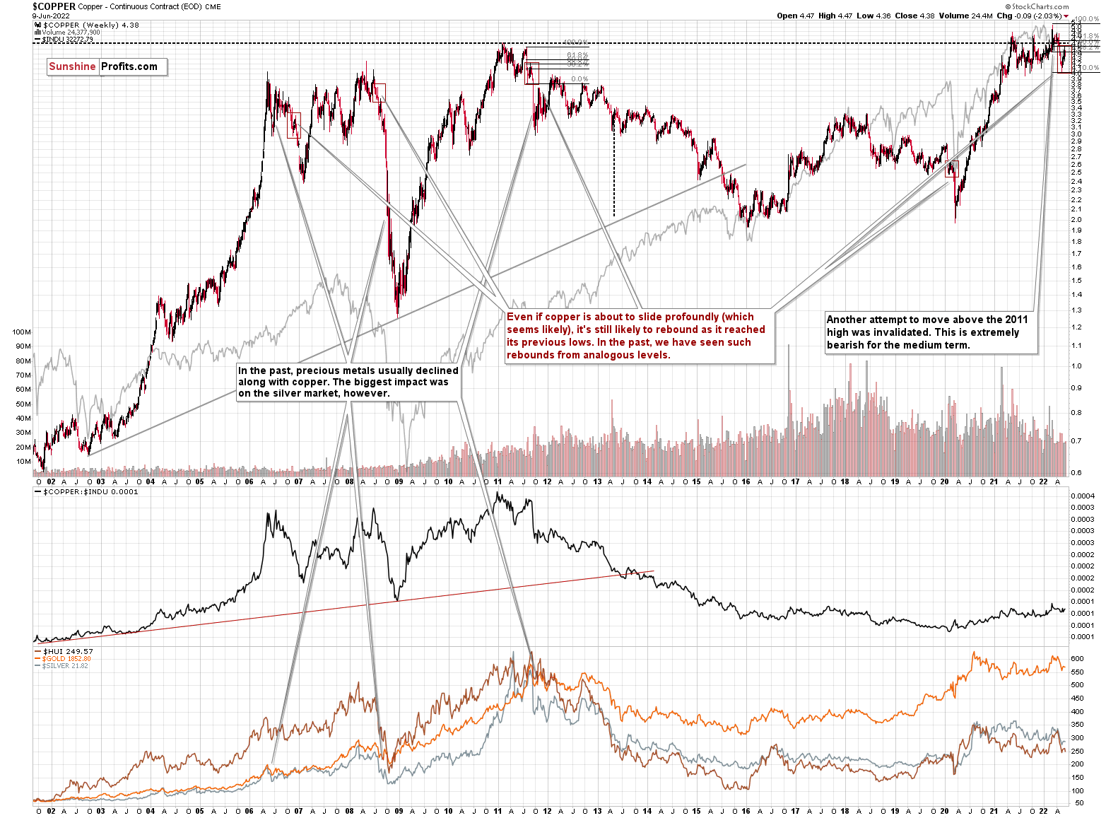
Practically, everything that I wrote about it last week remains up-to-date:
Copper recently CLEARLY invalidated another attempt to move above its 2011 high. This is a very strong technical sign that copper (one of the most popular commodities) is heading lower in the medium term.
The interest rates are going up, just like they did before the 2008 slide. What did copper do before the 2008 slide? It failed to break above the previous (2006) high, and it was the failure of the second attempt to break higher that triggered the powerful decline. What happened then? Gold declined, but silver and mining stocks truly plunged. The GDXJ was not trading at the time, so we’ll have to use a different proxy to see what this part of the mining stock sector did.
However, the situation looks different from the short-term point of view.
Even if copper is about to slide profoundly (which seems likely), it’s still likely to rebound as it reached its previous lows. In the past, we have seen such rebounds from analogous levels. I marked those situations with red rectangles.
Since PMs quite often align their short-term price moves with copper, a short-term correction here would be quite likely.
The only thing I would like to add is that it could be the case that the corrective upswing is about to end or it could have already ended. The size of the recent quick run-up is similar to what we previously saw in analogous situations (as marked with rectangles).
In particular, in the most similar situation (when copper corrected from similar levels in 2011), copper corrected a bit more than 50% of the preceding decline before sliding, and the same happened recently. Consequently, what we saw recently is just a confirmation of the bearish analogy.
Now, let’s move back to the big picture.
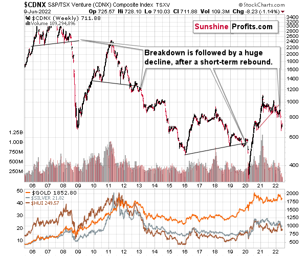
I previously commented on the above chart in the following way:
The Toronto Stock Exchange Venture Index includes multiple junior mining stocks. It also includes other companies, but juniors are a large part of it, and they truly plunged in 2008.
In fact, they plunged in a major way after breaking below their medium-term support lines and after an initial corrective upswing. Guess what – this index is after a major medium-term breakdown and a short-term corrective upswing. It’s likely ready to fall – and to fall hard.
So, what’s likely to happen? We’re about to see a huge slide, even if we don’t see it within the next few days.
Indeed, we did see a slide in the index. It’s down over 13%, even though the week is not yet over. The medium-term outlook remains extremely bearish, even though the above chart doesn’t have any specific short-term indications.
The index corrected just like the PMs, but it didn’t change anything with regard to the medium term.
What has happened recently?
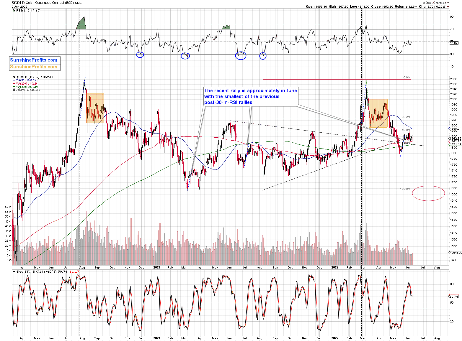
On May 20, I wrote the following:
Gold erased almost the entire war-tension-based rally, and it’s now correcting this decline.
The RSI based on gold’s daily price changes was close to 30, which is a classic short-term buy signal. Based on how much gold usually rallies after this signal, it seems that it hasn’t rallied enough so far.
I marked the smallest rallies that followed an analogous signal with blue, dashed lines, and I copied them to the current situation. They point to gold rising above $1,880 in the near future.
The recent intraday high was $1,878.60 – that’s definitely close enough to the above-mentioned target to mark a top, or at least to say that the analogy to the previous cases has already materialized. Consequently, it’s no longer likely that gold will continue to rally just for the sake of correcting the preceding decline, as it fell too far too fast.
The RSI just moved above 50, and this likely marked the end of the correction, just like it did a few times in early 2021. Moreover, please note that we saw a clear sell signal from the Stochastic indicator.
Before continuing with the analysis of the recent events – since the war-tension-based rally is over - I would like to quote what I wrote about war and gold’s “imminent” price rise at the end of February, when titles like “gold to $3000!” were common on various media sites.
Here's what I wrote on February 28, 2022, in the Gold & Silver Trading Alert entitled “Since There is a War, Gold Will Rise, Right? Wrong.”:
Let’s keep in mind that for gold to decline, the war doesn’t have to end, and it doesn’t have to be won by either side. The only thing that matters with regard to it, is how big the uncertainty and concern are, and the peak uncertainty/concern might be today, as everything is new, and the situation is dramatically changing the geopolitical environment in Europe.
For comparison, remember COVID-19 cases and deaths in early 2020? That was just a tiny fraction of what we saw later. However, it was new and unknown. People were particularly scared then, and the markets moved particularly significantly then – not based on additional millions of cases and thousands of deaths next year.
Investing and trading are difficult. If it was easy, most people would be making money – and they’re not. Right now, it’s most difficult to ignore the urge to “run for cover” if you physically don’t have to. The markets move on rumor and sell the fact. This repeats over and over again in many (all?) markets, and we have direct analogies to similar situations in gold itself. And junior miners are likely to decline the most, also based on the massive declines that are likely to take place (in fact, they have already started) in the stock markets.
That wasn’t the peak uncertainty - it peaked about a week later, but that’s not crucial. What is crucial is that the war is still taking place (months later), so it seems that one could say that the above proved correct.
Since junior miners just moved to new 2022 lows, it was also profitable not to chase the “emotional stampede”, but rather focus on the analogies to the previous situations from the past. Based on how the situation has developed in the markets so far, it seems that the clearest analogy is to how the gold market performed in 2001, based on the U.S.-Afghanistan war. I provided the chart in my Feb. 28, 2022, analysis, but here it is again:
The decline had been big and sharp, but please note when it ended. Gold formed an initial, and then final, short-term bottom, very close to the price levels at which the rally started before the outbreak of the war.
So, gold corrected, and then it did what it was likely to do based on the previous trends.
That’s exactly what we’re seeing right now. Gold has either completed its correction, or it’s still correcting. However, given the strength of the medium-term downtrend, I wouldn’t expect gold to rally much further or for this rally to take particularly long.
When gold is done correcting, it’s likely to return to its previous trend. This time, the medium-term trend is down.
The major takeaway from this situation is that when things get hot, it’s absolutely necessary to check what happened previously in similar situations before acting based on emotions.
Before looking at mining stocks, let’s take a look at gold from a broader point of view.
Let’s keep in mind that between 2020 and now, quite a lot happened, quite a lot of money was printed, and we saw a war breaking out in Europe. Yet, gold failed to rally to new highs.
In fact, it’s trading very close to its 2011 high, which tells you something about the strength of this market. It’s almost absent.
Truth be told, what we see in gold is quite in tune with what we saw after the 2011 top, and in particular, shortly after the 2012 top. The long-term gold price chart below provides details.
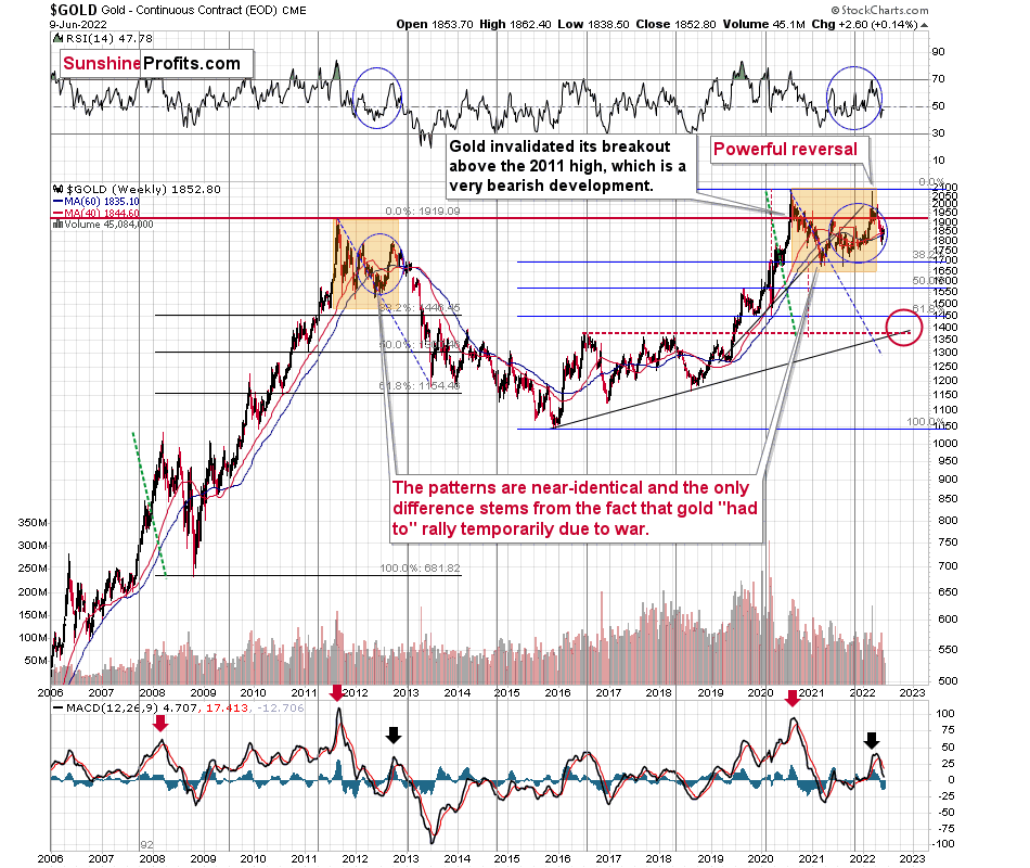
It seems that if it weren’t for the war in Europe, gold wouldn’t have been able to move above $2,000 and instead it would have topped close to its previous highs, which provided strong resistance.
The extraordinary thing about that is that that’s exactly what happened in 2012. Gold moved higher but only until it reached its previous highs, which happened in the second half of 2012.
This time the RSI was a bit higher, but it was close to 70, just like what we saw in 2012.
Yes, this time gold moved back to the previous high, but:
- This happened as a result of a geopolitical event (war in Europe) and geopolitically-driven rallies are generally unsustainable;
- When gold reached its previous highs, it also formed a profound weekly reversal, which formed on huge volume, and that’s very bearish.
So, the current medium-term outlook for gold is very bearish.
There are also very interesting short-term takeaways from the above chart.
If the 2012-2013 is currently being replayed (at least to a significant extent), then let’s not forget that this decline initially took the shape of a back-and-forth decline with lower lows and lower highs (but there were notable short-term rallies within the decline).
One of those counter-trend rallies took place when gold touched its 40- and 60-week moving averages (marked with blue and red) in late 2012. The RSI was trading at about 50 at that time, and that’s more or less when we saw the clear sell signal from the MACD indicator (lower part of the above chart).
Let’s see how this applies to the current situation.
Basically, we saw the same thing. Gold has corrected – just like it did in 2012. However, the correction didn’t last very long (it’s just a correction, after all).
Back then, it had ended a bit above the 40- and 60-week moving averages after the RSI moved back close to the 50 level (I mean the second rebound, not the first one). We’re seeing the same thing.
The difference now is that gold declined more in the short term before correcting, whereas back in 2012, it corrected twice. However, let’s not forget that this time the preceding rally was bigger (war tensions), so it’s no wonder that gold had more to correct in a shorter time. Consequently, it seems that the current correction is taking place “instead of” two 2012 corrections.
Anyway, after the correction was over, gold plunged, and the next rebound started once gold moved close to its previous medium-term lows. The analogous lows right now are the 2021 bottoms, which are below $1,700. That’s where I think gold is headed next.
Let’s take a look at the silver market.
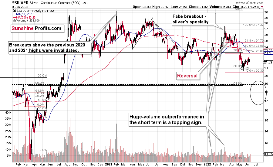
Just like gold, silver hit my target area and then moved slightly below it. Then it rallied, but it could be the case that the rally is already over. In fact, it seems quite likely.
Silver didn’t correct significantly, somewhat in line with what we saw in early 2020. No wonder – the silver market is more correlated with the general stock market, and the latter hasn’t been the top performer recently (except for the very recent run-up).
Why would silver be more aligned with stocks than gold is? Because it has more industrial applications than gold. Therefore, the demand for the white metal is more aligned with how the economy is performing.
How low will silver slide now? Ultimately, I wouldn’t rule out a move to or below the 2020 low, but as far as the next short-term downswing is concerned, the $17 - $19 area becomes the likely target. Yes, it’s quite wide, but it really is unclear how silver will perform now.
The support provided by the 2020 highs and the 61.8% Fibonacci retracement based on the entire 2020-2021 rally is very strong. However, this support is not that much below the current price levels. And if gold and miners are about to more or less repeat their recent declines (and stocks decline too), then silver could also repeat its previous decline. In this case, it would be likely to fall below the above-mentioned support.
The next support is provided by the mid-June 2020 low (~$17).
Please note that silver recently outperformed gold on a very short-term basis, which was an indication that the rally is over or about to be over. Lower silver prices are likely to follow.
Let’s not forget that gold is not the only precious metal that is repeating its 2012 performance right now, and you can see more details on silver’s long-term chart.
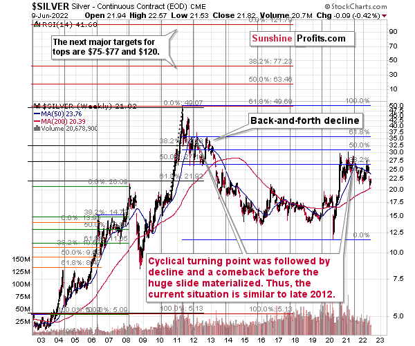
As you can see on the above chart, silver corrected about 50% of the previous downswing, and this correction ended at about $30, a long time ago. Ever since, silver has been declining, and even the outbreak of war in Europe didn’t make silver rally above that level.
On the above chart, you can see how silver first topped in 2011, then declined and formed another top at the cyclical turning point. Next, it declined once again – to the previous lows. After that, silver rallied (in 2012 and 2022), and it topped between its 50-week moving average (marked in blue) and the previous top. Now silver is declining in a back-and-forth manner (you can see it more clearly on the previous short-term silver chart).
Back in 2012, these were just the early days of a gargantuan decline, and the same appears likely to be the case this time. Interest rates are going up after all, and the Fed is determined to quench inflation.
Let’s not forget that rising interest rates are likely to negatively impact not just commodities, but practically all industries. This will likely cause silver’s price to decline profoundly, as silver’s industrial demand could be negatively impacted by lower economic growth (or a decline in economic activity).
Besides, please note that silver didn’t even manage to rally as much as copper (which tried to move to new highs recently) or most other commodities, thus being rather weak.
Consequently, it seems that silver will need to decline profoundly before it rallies (to new all-time highs) once again.
Having said that, let’s take a look at what happened in junior mining stocks.
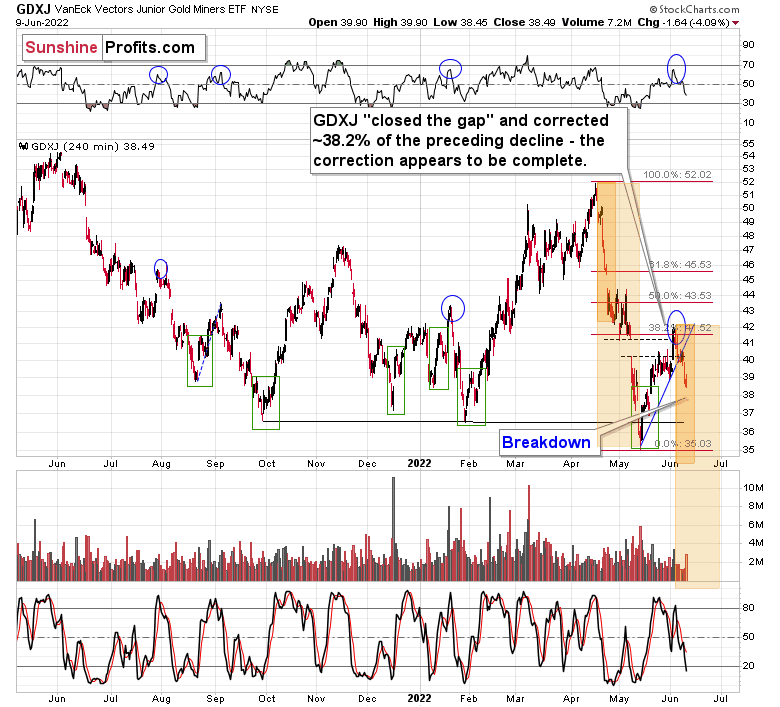
In last Friday’s (June 3) Gold & Silver Trading Alert, I commented on Thursday’s rally in the following way:
The price of the GDXJ ETF – a proxy for junior miners – moved sharply higher yesterday, and this got many people excited. High volume confirms that. It’s natural for most investors and traders to view rallies as bullish, but let’s keep in mind that most traders tend to lose money… It’s not that simple. After all, the best shorting opportunities are at the tops, which – by definition – can only be formed after a rally.
The particularly interesting thing about high volume readings in the GDXJ ETF is that they quite often mark local tops. Remember the late-April – early-May consolidation? It ended when GDXJ finally rallied on high volume. That was the perfect shorting opportunity, not a moment to panic and exit the short position.
The GDXJ-based RSI indicator is also quite informative right now. It moved well above 50, but it’s not at 70 yet. Why would that be important? Because that’s when many of the previous corrections ended.
When one digs deeper, things get even more interesting. You see, when we consider corrections that started after the RSI was very oversold (after forming a double bottom below 30), it turns out that in all those cases, the tops formed with the RSI between 50 and 70. I marked those situations with blue ellipses on the above chart.
So, while it’s easy to “follow the action,” it’s usually the case that remaining calm and analytical leads to bigger profits in the end.
Also, let’s use yesterday’s move as something useful. If this single-day move higher made you really uncomfortable and almost made you run for the hills, it might be a sign that the size of the position that you have is too big. It’s your capital and you can do with it what you wish, but if the above were the case, it might serve as food for thought.
The big trend (as well as the reasons for it) remains down, which means that the enormous profit potential remains intact.
Last Friday’s and this week’s declines confirm the above. The high-volume rally marked the top – those who got excited at that time likely bought exactly or very close to the top, instead of shorting at that time. Fortunately, you were prepared.
After taking profits off the table and closing short positions on May 12, we immediately entered long positions (it turned out that it happened right at the bottom), and we then took profits from that long position on May 26. Next, we returned to short positions. These positions are already profitable, but it seems that they will be much more profitable soon.
Why?
Most importantly, because history rhymes, we’re likely to see a repeat of 2012-2013 or the 2008 decline. So far, the current slide is in tune with the 2008 performance.
However, let’s not dig into the long-term details yet. While we’re close to the short-term chart, let’s focus on what it features. For your convenience, here it is once again.
The recent April-May decline doesn’t have to be repeated to the letter, but we could see something similar nonetheless. After all, that decline is the most recent analogy to what we’re about to see in the GDXJ (a massive decline).
Based on the above, I marked two cases from the precious decline (the initial decline and the entire decline) and I copied them to the current situation, assuming that the recent top is indeed the starting point of the next bid decline (which seems likely in my view).
It turns out that junior miners might need to decline to or slightly below the May lows before we see even a moderate corrective upswing.
Will I want to trade this correction? Probably not. If we see a correction from below $35, it might be small – only a bit over $36, so it might be way too risky to trade this quick rebound. The downside (the bigger orange rectangle) is much bigger than the above, and it would be a much bigger waste to miss this move in order to try to catch a relatively small move.
Besides, there’s also a chance that we won’t see any meaningful correction, just like what happened in 2020.
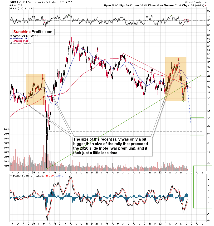
Back in March 2020, after the corrective upswing, mining stocks fell like a stone in water. While the current price moves are less volatile, they are still somewhat similar (note the marked areas on the above chart).
Moreover, please note that the GDXJ failed to break back above the red and green resistance lines, which by itself is also a bearish indication.
The next short-term upswing is quite likely here, and (while I can’t make any promises with regard to performance), in my opinion, the profits on our short positions are likely to increase tremendously before we exit them.
Also, let’s not forget about the forest while looking at individual trees. By that, I mean looking at how gold stocks perform relative to gold. That’s one of the major indications that the current situation is just like what we saw at the 2012 top.
I previously wrote the following:
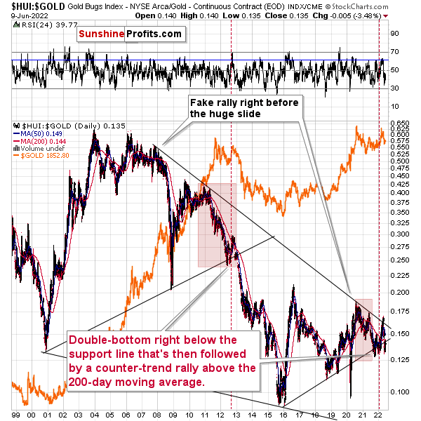
Gold stocks (GDX, GDXJ, and HUI Index) have recently been quite strong relative to gold. OK, but is this necessarily bullish? It might be, until one considers the fact that we saw the same thing at the 2012 top! This changes everything, and it does so because the links between now and that top are almost everywhere: in gold, in silver, in gold stocks, and even in their ratios.
As it turns out, the gold stocks to gold ratio is behaving almost identically as it was behaving at the 2012 top in the precious metals sector.
In both cases, the ratio moved below the rising medium-term support line, then formed a double-bottom below the line, and invalidated the breakdown, which resulted in a counter-trend rally. The rally ended shortly after the ratio moved above its 200-day moving average (marked in red). That’s what happened recently. What happened next in 2012? The decline not only continued – it accelerated!
Consequently, the recent action in the ratio is not really bullish. In other words, the fact that gold stocks were recently (in the short run only) strong relative to gold doesn’t make the medium-term outlook for the precious metals sector bullish. However, it remains bearish.
Interestingly, the ratio itself moved to its declining resistance line (and it even moved slightly above it, but the move was too small to be viewed as reliable), indicating that the corrective upswing might already be over or almost over. We get the same indication from the RSI indicator. It’s not above 70, but in the case of most local tops, the RSI didn’t have to move above 70. It just moved to more or less the same levels – I marked it with a horizontal blue line.
The above is actually a confirmation of the analogy that is visible directly in all three key components of the precious metals sector: gold, silver, and mining stocks.
Indeed, the HUI to gold ratio moved lower recently, clearly invalidating the breakout above its declining resistance line – in line with my previous expectations.
The decline didn’t stop there. The ratio actually managed to decline below its rising support line, likely surprising those who didn’t see the analogy to 2012-2013 (but if you’ve been reading my analyses for some time – you did).
The implications are extremely bearish, as it appears that the 2012-2013 decline will now be repeated to a considerable extent. Still, given this similarity, it seems that we might see a short-term correction just like the one that we saw in the early part of the 2012 decline.
I already discussed the analogies to 2012-2013 in gold and silver, so let’s take a look at the analogy in the HUI Index – a proxy for gold stocks.
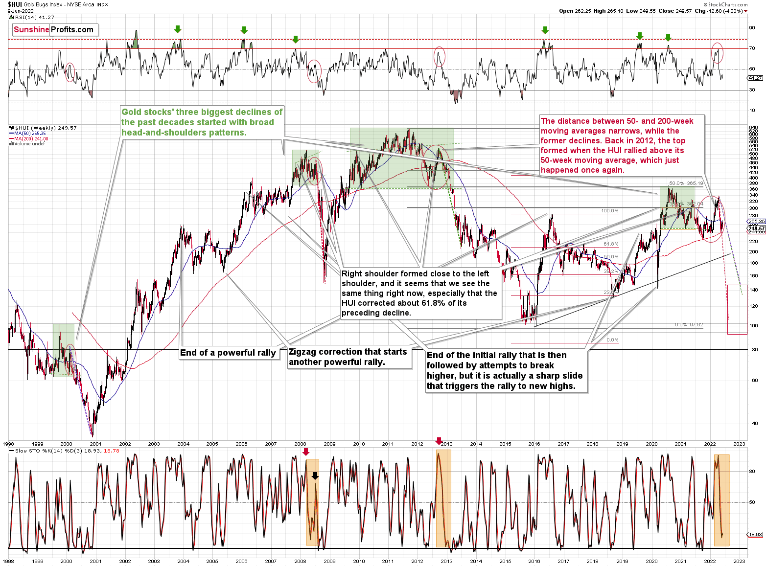
If you look at the areas marked with red circles (especially now, 2012/2013, and 2008), you’ll notice that they are very similar. These are the sizable short-term rallies that we saw after/in the final parts of the broad head-and-shoulders patterns.
The moves were quite sizable – the 2012 rally was even bigger than the current one, even though there was no war in Europe at that time.
Based on how broad the pattern is and the self-similarity present in gold, it seems that the analogy to what happened in 2012 is most important right now.
Looking at the moving averages, we see that the 50-week moving average (blue) and 200-week moving average (red) performed quite specifically in late 2012, and we see the same thing this year.
The distance between 50- and 200-week moving averages is currently narrowing, while the former is declining. Back in 2012, the top formed when the HUI rallied above its 50-week moving average, which just happened once again.
The RSI indicator (above the price chart), based on the HUI Index’s weekly chart, provides us with another confirmation of the analogy, and the same goes for the stochastic indicator (below the price chart). The former was just close to the 70 level – exactly what we saw at the 2012 top, and the latter was above 90 – again, something that we saw at the 2012 top.
As history tends to rhyme, gold stocks are likely to slide, similarly to how they declined in 2012 and 2013.
Still, if the general stock market slides, and that appears likely for the following weeks and months, then we might have a decline that’s actually similar to what happened in 2008. Back then, gold stocks declined profoundly, and they have done so very quickly.
Please note that the sharpness of the recent decline in miners was even bigger than the one that we saw in 2008!
The dashed lines that start from the recent prices are copy-paste versions of the previous declines that started from the final medium-term tops. If the decline is as sharp and as big as what we saw in 2008, gold stocks would be likely to decline sharply, approximately to their 2016 low. If the decline is more moderate, then they could decline “only” to 120-150 or so. Either way, the implications are very, very, very bearish for the following weeks.
Please note that while we saw a tiny buy signal from the stochastic indicator, given the analogy to 2008, this is not necessarily bullish. When we saw it back then, it only emphasized the existence of the correction that was already ending.
Let’s take a brief look at the stock market indices.
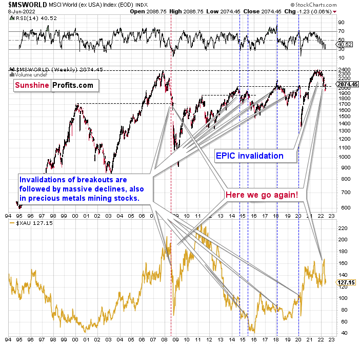
The technical picture in the case of world stocks remains extremely bearish, and my previous comments on it were just confirmed. Here’s what I’ve been writing about the above chart for quite a few weeks now:
World stocks have already begun their decline, and based on the analogy to the previous invalidations, the decline is not likely to be small. In fact, it’s likely to be huge.
For context, I explained the ominous implications on Nov. 30. I wrote:
Something truly epic is happening in this chart. Namely, world stocks tried to soar above their 2007 high, they managed to do so, and… they failed to hold the ground. Despite a few attempts, the breakout was invalidated. Given that there were a few attempts and that the previous high was the all-time high (so it doesn’t get more important than that), the invalidation is a truly critical development.
It's a strong sell signal for the medium - and quite possibly for the long term.
From our – precious metals investors’ and traders’ – point of view, this is also of critical importance. All previous important invalidations of breakouts in world stocks were followed by massive declines in mining stocks (represented by the XAU Index).
Two of the four similar cases are the 2008 and 2020 declines. In all cases, the declines were huge, and the only reason why they appear “moderate” in the lower part of the above chart is that it has a “linear” and not a “logarithmic” scale. You probably still remember how significant and painful (if you were long, that is) the decline at the beginning of 2020 was.
Now, all those invalidations triggered big declines in the mining stocks, and we have “the mother of all stock market invalidations” at the moment, so the implications are not only bearish, but extremely bearish.
World stocks have declined below their recent highs, and when something similar happened in 2008, it meant that both stocks and gold and silver mining stocks (lower part of the chart) were about to slide much further.
The medium-term implications for mining stocks are extremely bearish.
Let’s take a look at the U.S. stock market.
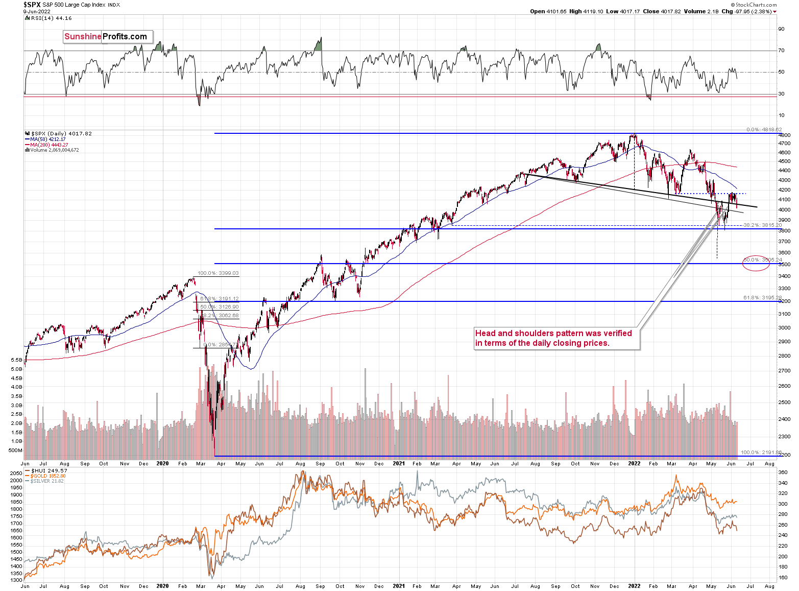
Stocks moved above the previously broken neck level of the head and shoulders pattern, but they stopped below the previous 2022 low. As they were unable to break above it, they verified the breakdown below it.
Additionally, please note that we recently saw a session where the S&P 500 declined on enormous volume. We saw something similar in mid-December 2021, which was before stocks started their major slide.
This means that the rally could be over at this very moment or about to end. Yesterday’s 2%+ decline appears to confirm that.
The implications for the precious metals market, especially for silver and mining stocks, are bearish.
From a broader point of view, let’s keep in mind what happened in the previous cases when stocks declined profoundly – in early 2020 and in 2008. Miners and silver declined in a truly epic manner, and yes, the same is likely to take place in the following months, as markets wake up to the reality, which is that the USD Index and real interest rates are going up.
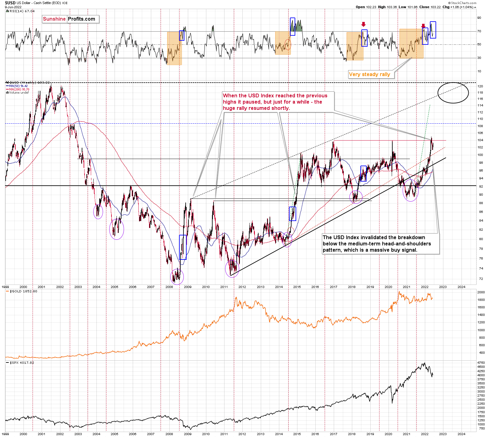
Speaking of the USD Index, after invalidating the breakout below the multi-year head-and-shoulders pattern, the USDX was poised to soar, just like I’ve been expecting it to do for more than a year, and that’s exactly what it did.
The RSI is currently slightly below 70, but since the USDX is in a medium-term rally and is already after a visible correction, it can rally further. Please note that we saw the same thing in 2008 and 2014. I marked the corrections with blue rectangles.
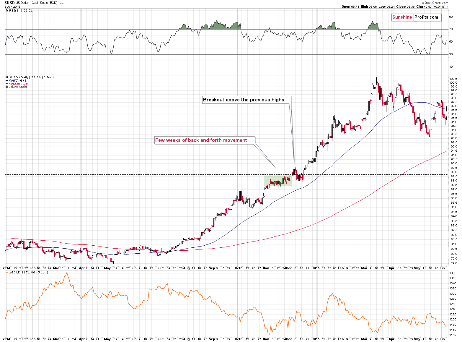
Back in 2014, the USD Index invalidated the breakout above the previous major highs, but then it soared once again, ignoring the invalidation. Consequently, I’m not taking the recent invalidation at its face value.
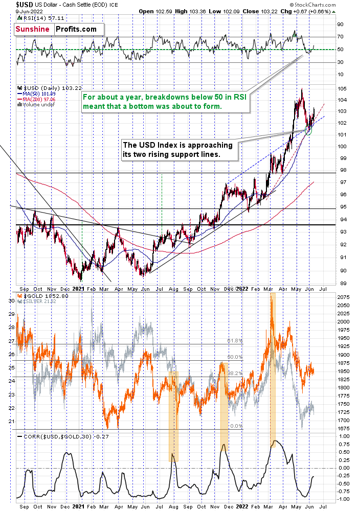
On the short-term basis, you can see that the USD Index bottomed exactly at my target area, at the combination of two support lines and the 50-day moving average.
Additionally, please note that the USDX once again bottomed close to the turn of the month. There is a specific cyclicality in the USD Index – it quite often turns around close to the end of a given month, and I marked those reversals with dashed vertical lines. It just happened once again. Since the bottom appears to be in, the USD Index appears to be ready to rally once more.
However, even if the USD Index moves slightly lower here, it’s likely to rally significantly in the following weeks and months.
The opposite is likely to take place in the precious metals sector. Gold, silver, and mining stocks are likely to decline profoundly in the following months, even if they move slightly higher here.
Consequently, in my view, the risk-to-reward ratio strongly favors short positions in junior mining stocks at this time.
Naturally, as always, I’ll keep you – my subscribers – informed.
Overview of the Upcoming Part of the Decline
- It seems to me that the short-term rally in the precious metals market is either over or very close to being over. It’s so close to being over that I think it’s already a good idea to be shorting junior mining stocks.
- We’re likely to (if not immediately, then soon) see another big slide, perhaps close to the 2021 lows ($1,650 - $1,700).
- If we see a situation where miners slide in a meaningful and volatile way while silver doesn’t (it just declines moderately), I plan to – once again – switch from short positions in miners to short positions in silver. At this time, it’s too early to say at what price levels this could take place, and if we get this kind of opportunity at all – perhaps with gold close to $1,600.
- I plan to exit all remaining short positions once gold shows substantial strength relative to the USD Index while the latter is still rallying. This may be the case with gold close to $1,400. I expect silver to fall the hardest in the final part of the move. This moment (when gold performs very strongly against the rallying USD and miners are strong relative to gold after its substantial decline) is likely to be the best entry point for long-term investments, in my view. This can also happen with gold close to $1,400, but at the moment it’s too early to say with certainty.
- The above is based on the information available today, and it might change in the following days/weeks.
You will find my general overview of the outlook for gold on the chart below:
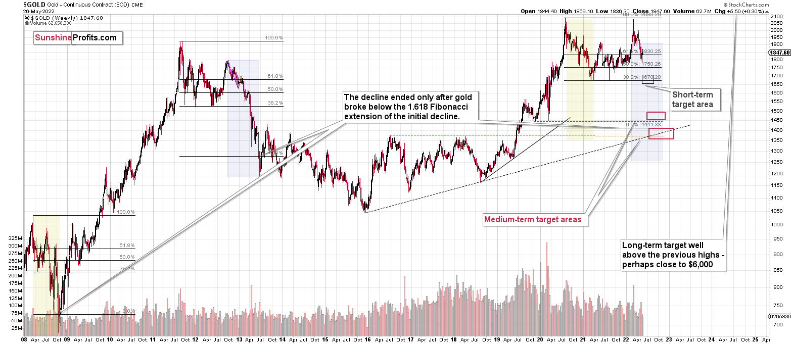
Please note that the above timing details are relatively broad and “for general overview only” – so that you know more or less what I think and how volatile I think the moves are likely to be – on an approximate basis. These time targets are not binding or clear enough for me to think that they should be used for purchasing options, warrants or similar instruments.
Summary
Summing up, it seems to me that the short-term rally in the precious metals market is either over or close to being over. In fact, it’s so close to being over that I think it’s already a good idea to be shorting junior mining stocks.
I previously wrote that the profits from the previous long position (congratulations once again) were likely to further enhance the profits on this huge decline, and that’s exactly what happened. The profit potential with regard to the upcoming gargantuan decline remains huge.
As investors are starting to wake up to reality, the precious metals sector (particularly junior mining stocks) is declining sharply. Here are the key aspects of the reality that market participants have ignored:
- rising real interest rates,
- rising USD Index values.
Both of the aforementioned are the two most important fundamental drivers of the gold price. Since neither the USD Index nor real interest rates are likely to stop rising anytime soon (especially now that inflation has become highly political), the gold price is likely to fall sooner or later. Given the analogy to 2012 in gold, silver, and mining stocks, “sooner” is the more likely outcome.
After the final sell-off (that takes gold to about $1,350-$1,500), I expect the precious metals to rally significantly. The final part of the decline might take as little as 1-5 weeks, so it's important to stay alert to any changes.
As always, we'll keep you – our subscribers – informed.
To summarize:
Short-term outlook for the precious metals sector (our opinion on the next 1-6 weeks): Bearish
Medium-term outlook for the precious metals sector (our opinion for the period between 1.5 and 6 months): Bearish initially, then possibly Bullish
Long-term outlook for the precious metals sector (our opinion for the period between 6 and 24 months from now): Bullish
Very long-term outlook for the precious metals sector (our opinion for the period starting 2 years from now): Bullish
As a reminder, Gold Investment Updates are posted approximately once per week. We are usually posting them on Friday, but we can’t promise that it will be the case each week.
Our preferred ways to invest in and to trade gold along with the reasoning can be found in the how to buy gold section. Additionally, our preferred ETFs and ETNs can be found in our Gold & Silver ETF Ranking.
Moreover, Gold & Silver Trading Alerts are posted before or on each trading day (we usually post them before the opening bell, but we don’t promise doing that each day). If there’s anything urgent, we will send you an additional small alert before posting the main one.
Thank you.
Przemyslaw Radomski, CFA
Founder, Editor-in-chief

