

Briefly: Outlook for the precious metals market remains bearish for the following few weeks, and bullish for the following months and years.
Welcome to this week's flagship Gold & Silver Trading Alert. As we promised you previously, in our flagship Alerts, we will be providing you with bigger, more complex analyses (approximately once per week) and it will usually take place on Monday.
Some of the most important analogies and long-term trends might have changed, but it's too early to say so, and most of our previous extensive comments still remain up-to-date in general.
As it is the case usually, we will quote last week's comments while updating everything that needs to be updated or changed. In the end, the entire below analysis is up-to-date at the moment of publishing. The parts that we didn't change (or changed only insignificantly) since last week, will be put in italics.
The most important fundamental factor right now remains the Covid-19 pandemic and what might be referred to as the Great Lockdown, but the thing that the markets really focused on was the supposedly extreme improvement in the labor market. We'll discuss the latter first and we'll move to an interesting new observation regarding the current pandemic - before moving to charts.
Jobs Report - Not as Good as It Seems
The recent job report is not reliable, but it shows recovery in the US labor market. The situation is still bad, but optimism could triumph for now, which is bad for gold.
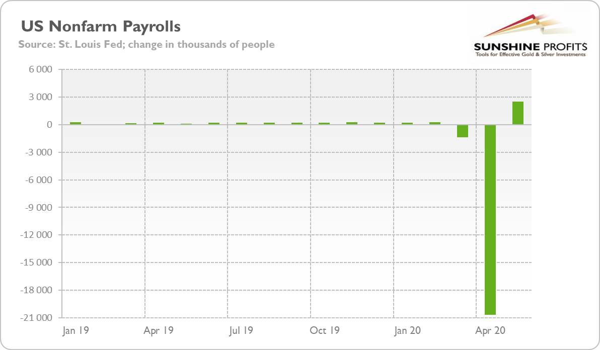
On Friday, the Bureau of Labor Services released the newest edition of the Employment Situation Report. The publication shows that the US economy regained 2.5 million jobs in May, constituting the biggest nonfarm payroll surprise in history. Indeed, the economists polled by MarketWatch had forecast a loss of 7.25 million jobs. The rebound is presented in the chart below.
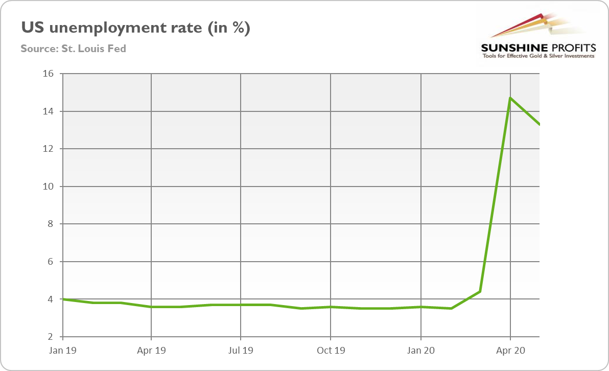
Meanwhile, the analysts expected that the unemployment rate would rise to 19 percent from 14.7 percent in April, but it declined to 13.3 percent, as one can see in the next chart. The report, if reliable, signals that the postpandemic recovery has begun, as the charts below show.
Not surprisingly, the stock market reacted euphorically, with the S&P 500 Index jumping more than 2.5 percent on Friday, while the price of gold dropped below $1,700.
But is the situation in the US labor market indeed so rosy? Not quite. After all, even if the data reported by the BLS is reliable, the number of working Americans is about 20 million lower than before the pandemic, and the unemployment rate is still at the highest level since the Great Depression. So, there is still a long way to go until the labor market returns to normalcy.
But it's not even the case that the recovery has really begun. You see, the report is not reliable. And the BLS admitted itself, writing that
If the workers who were recorded as employed but absent from work due to "other reasons" (over and above the number absent for other reasons in a typical May) had been classified as unemployed on temporary layoff, the overall unemployment rate would have been about 3 percentage points higher than reported.
In plain English, it means that the BLS incorrectly described the job status of millions of people and without such an error, the unemployment rate would be not 13.3 percent, but 16.3 percent. So instead of decreasing - suggesting the start of the recovery - it would rise further since April.
The ADP report released earlier in the week, based on data directly from the employers themselves, showed almost 3 million more lost jobs, not a gain in jobs. The number was also better than forecasts, but significantly worse than the BLS data.
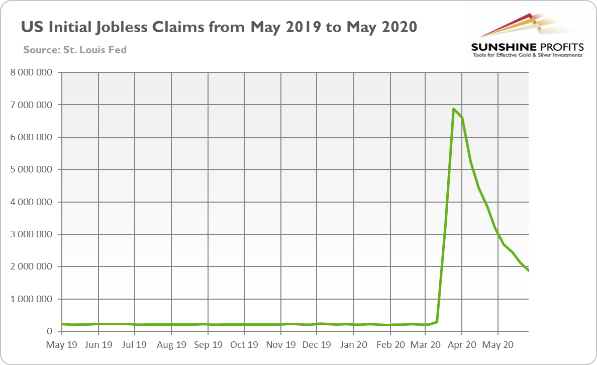
Initial claims also do not indicate the rebound in the US labor market. As the chart below shows, each week since the outbreak of the pandemic, a few millions of Americans applied for the unemployment benefits - and more than 42 million in total wanted to become unemployed, implying a bleaker situation in the US labor market.
Implications for Gold
What does the recent Employment Situation Report imply for the gold market? The headlines are very positive, implying that the recovery started earlier than expected. It should spur more optimism among investors, which could further fuel the rally in the stock market, while weakening the safe-haven demand for gold.
However, the BLS data is not completely reliable and the real unemployment rate likely exceeds 16 percent. The government wrongly classified millions of people as "employed but not at work" instead of "unemployed on temporary layoff". Hence, the labor market is still in a terrible spot, so investors should remain cautious.
In the short run, the optimistic narrative could triumph in the marketplace. After all, the reopening of state economies in May should start the economic recovery. But we will see what the more distant future will bring. The second wave of infections is still possible and after all these riots in the US make it even more probable. Nevertheless, the risk appetite should strengthen now with the positive (although partially fake) job report, which is bad news for the gold market.
Covid-19 Situation
The official total US death count is about 111k, greatly exceeding the regular flu season deaths, and the official global death toll is about 403k. New cases and the death toll are quickly climbing in the emerging / BRIC economies, which makes the grand total of new daily cases move to new highs on an almost daily basis.
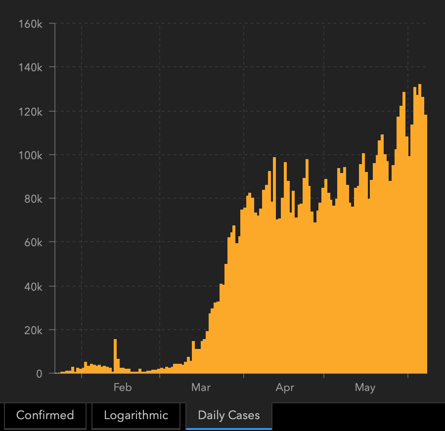
The above chart features global daily cases and it's clear that after several weeks of stabilization, we're seeing a new uptrend. In other words, the pandemic is escalating in global terms.
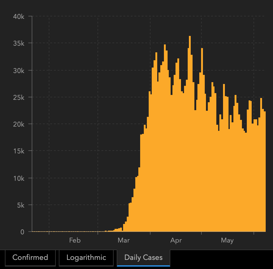
As far as the US is concerned, it's not as obvious, but the situation is once again deteriorating. The downtrend in new daily cases seems to have ended in late May and is now on the rise. There are both: higher lows and higher highs. And, let's keep in mind that we haven't seen the full implications of the riots and protests, as the incubation period is up to 2 weeks.
The daily new cases are likely to go up, and then the daily death toll is likely to go up shortly thereafter.
Will we see the Great Lockdown 2.0 soon? That's certainly possible.
Our Tuesday's comments remain up-to-date:
The relationship works both ways: does anyone really care about social distancing anymore in the middle of a protest? Maybe so, but what about during a riot? There are exceptions, but if you look at the many pictures and videos of protests-turned-riots right now, you'll see that people have practically forgotten that... We still have a pandemic!
When it was pretty obvious that the virus will hit the US significantly in February and early March, the USD Index was still declining. The US stock market reacted relatively late as well. When did it all change? When the number of new Covid-19 cases spiked, especially in the US.
Look at what's going on - the virus is still out there, and people are acting not only as if nothing happened, but as if they wanted to actually spread the virus by gathering in large groups. Of course, (hopefully) nobody means that, but that's the end effect anyway.
Once again, we are in a situation where it's quite obvious that the number of Covid-19 cases will rise, that more people will die, and that the final economic implications will be even worse. But the numbers are not yet showing it, and the media are focused on the riots and their social and political implications, so people are kind of ignoring the repeat of the very recent history. For now.
And again - what did the USD Index do in March when the Covid-19 cases started to soar? It soared as well, as a safe-haven currency. The riots don't undermine US dollar's credibility compared to other currencies, even though it might seem to be the case at first sight.
It seems that we're going to get a repeat of what we saw about 3 months ago and the initial reaction of the precious metals market is likely to be analogous as well - they are likely to fall.
Summing up, based on the incorrect optimism the somewhat fake jobs report caused on Friday, the general stock market might be reaching extreme optimism. The contrast between extreme optimism and fear (even more moderate than the one that we saw in Mach) is huge, so when the new Covid-19 cases start to spike once again, stocks' fall could be quite significant.
What does it imply for the precious metals market? It implies that the initial decline that we saw in gold might be reversed more or less at the same time as the fear factor (like in March) kicks in, so we don't have to see any meaningful rebound in gold's price. In case of silver and miners, the above suggests that they are likely to catch up with gold this month, likely rather earlier than later.
The particularly important factor for gold will likely be the economic implications of the second Covid-19 wave. How do we know that? Because we compared what people were searching for (online) with how gold prices shaped. There's a lot more data available on https://searchingcovid19.com/ but we'll focus on the chart that shows when people were getting interested in what aspects of the pandemic and we'll compare them to gold.
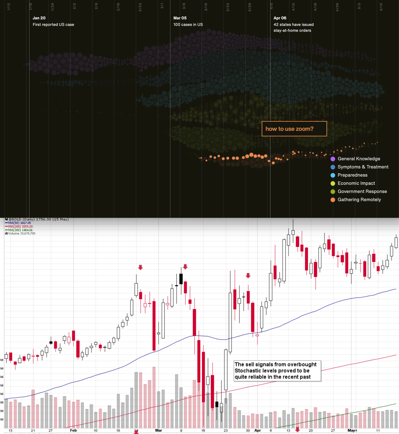
We aligned both charts with regard to time. The chart on the bottom is from Stockcharts.com and it features gold's continuous futures contract. The gold price (and the USD Index value) really started to move once people got particularly interested in the economic impact of the pandemic and in the government's response.
In the recent days (and weeks) the news is dominated by other issues. Once people start considering the economic implications of the second wave of this coronavirus, the prices would be likely to move.
As you saw on the previous chart featuring the US cases, the downtrend has already reversed, but it's only been relatively mild and not something that caught the mass media's attention. However, once it catches it, the markets could react violently, just like they did in March.
Seasonally Speaking
Two weeks ago, we wrote that gold (seasonally) and gold miners (seasonally) tend to top in early June, and it seems that it's exactly what we saw this year. Last week - on June 1st -, we wrote that we could expect the precious metals sector to top shortly due to the above-mentioned seasonal tendencies. Indeed, gold closed at the top on the very same day, and we saw the overnight high on the following day.
The implications of the continuation of the seasonal patterns is bearish. They suggest a bottom close to the middle of the month.
Interestingly, there were usually two triggers for these moves: one from the USD Index, and the other from the stock market.
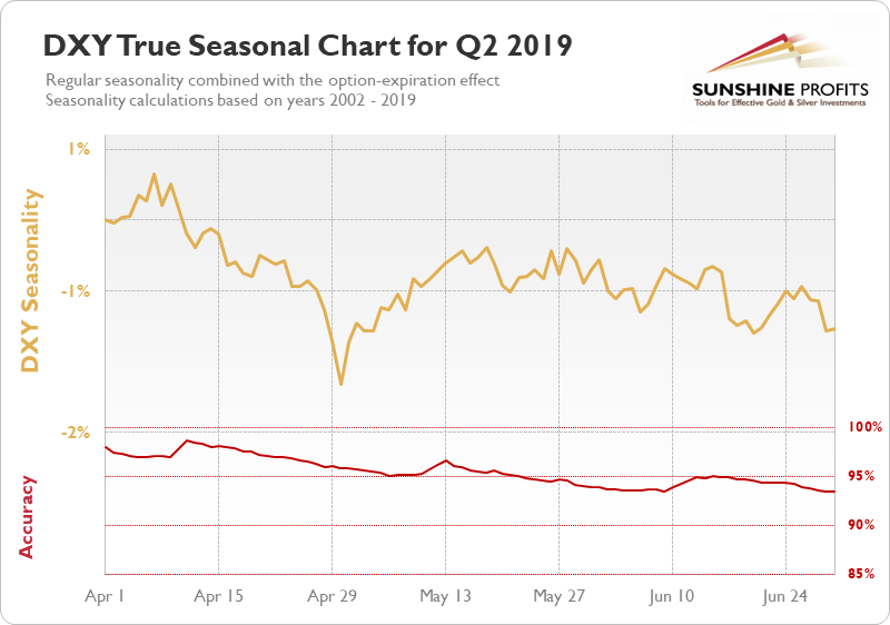
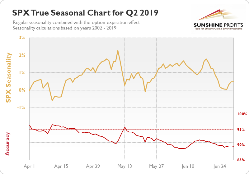
The USDX (seasonally) tends to bottom in early June, while stocks (seasonally) tend to form a local top. These moves are not huge, though, and the accuracy for the seasonality-based forecasts is lowest in the entire quarter.
Given USD's reversal and biggest daily gain in 2 weeks, as well as stocks' likely excessive optimism it seems that the former has already bottomed, and the latter might top shortly. This further supports what we wrote earlier today.
Let's keep in mind that the USD Index is after a major, long-term breakout so a move higher from here would not be against the key trend. Moreover, let's keep in mind that big moves up in the USDX practically always correspond to big moves down in gold - sooner or later.
The Big Picture View of the USD Index
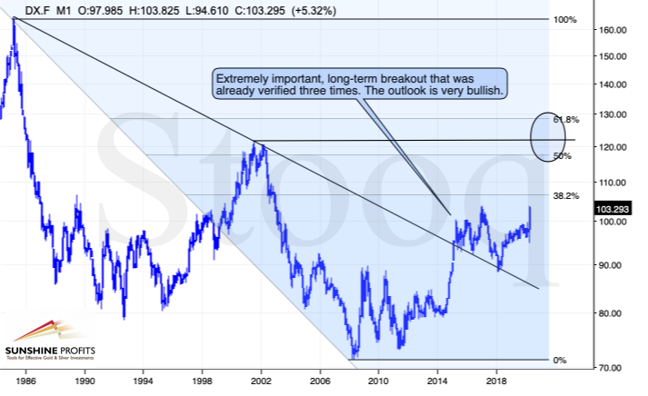
The 2014-2015 rally caused the USD Index to break above the declining very-long-term resistance line, which was verified as support three times. This is a textbook example of a breakout and we can't stress enough how important it is.
The most notable verification was the final one that we saw in 2018. Since the 2018 bottom, the USD Index is moving higher and the consolidation that it's been in for about a year now is just a pause after the very initial part of the likely massive rally that's coming.
If even the Fed and the U.S. President can't make the USD Index decline for long, just imagine how powerful the bulls really are here. The rally is likely to be huge and the short-term (here: several-month long) consolidation may already be over.
There are two cases on the above chart when the USD Index was just starting its massive rallies: in the early 1980s and in mid-90s. What happened in gold at that time?
Gold Performance When the USD Index Soars
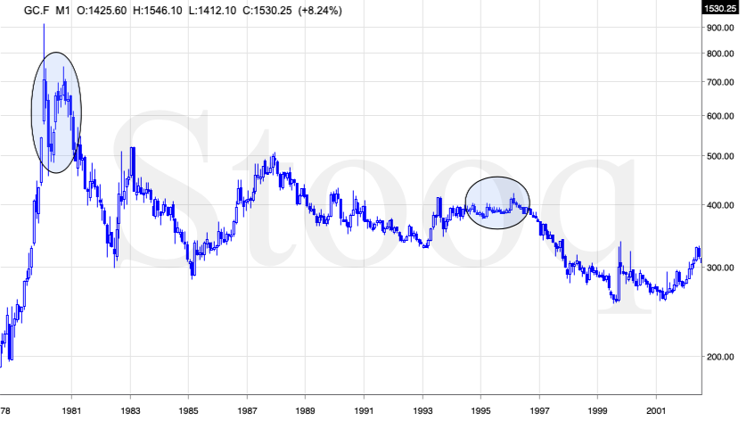
These were the starting points of gold's most important declines of the past decades. The second example is much more in tune with the current situation as that's when gold was after years of prolonged consolidation. The early 1980s better compare to what happened after the 2011 top.
Please note that just as what we saw earlier this year, gold initially showed some strength - in February 1996 - by rallying a bit above the previous highs. The USD Index bottomed in April 1995, so there was almost a yearly delay in gold's reaction. But in the end, the USD - gold relationship worked as expected anyway.
The USD's most recent long-term bottom formed in February 2018 and gold seems to have topped right now. This time, it's a bit more than a year of delay, but it's unreasonable to expect just one situation to be repeated to the letter given different economic and geopolitical environments. The situations are not likely to be identical, but they are likely to be similar - and they indeed are.
What happened after the February 1995 top? Gold declined and kept on declining until reaching the final bottom. Only after this bottom was reached, a new powerful bull market started.
Please note that the pace at which gold declined initially after the top - in the first few months - was nothing to call home about. However, after the initial few months, gold's decline visibly accelerated.
Let's compare the sizes of the rallies in the USDX and declines in gold. In the early 80s, the USDX has almost doubled in value, while gold's value was divided by the factor of 3. In the mid-90s, the USDX rallied by about 50% from its lows, while gold's value was divided by almost 1.7. Gold magnified what happened in the USD Index in both cases, if we take into account the starting and ending points of the price moves.
However, one can't forget that the price moves in USD and in gold started at different times - especially in the mid-90s! The USDX bottomed sooner, which means that when gold was topping, the USDX was already after a part of its rally. Consequently, when gold actually declined, it declined based on only part of the slide in the USDX.
So, in order to estimate the real leverage, it would be more appropriate to calculate it in the following way:
- Gold's weekly close at the first week of February 1996: $417.70
- USDX's weekly close at the first week of February 1996: 86.97
- Gold's weekly close at the third week of July 1999: $254.50
- USDX's weekly close at the third week of July 1999: 103.88
The USD Index gained 19.44%
Gold lost 39.07% (which means that it would need to gain 64.13% to get back to the $417.70).
Depending on how one looks at it, gold actually multiplied USD's moves 2-3 times during the mid-90 decline.
And in the early 1980s?
- Gold's weekly close at the third week of January 1980: $845
- USDX's weekly close at the third week of January 1980: 85.45
- Gold's weekly close at the third week of June 1982: $308.50
- USDX's weekly close at the third week of June 1982: 119.01
The USD Index gained 39.27%
Gold lost 63.49% (which means that it would need to gain 173.91% to get back to $845).
Depending on how one looks at it, gold actually multiplied USD's moves by 1.6 - 4.4 times during the early-80 decline.
This means that just because one is not using U.S. dollars as their primary currency, it doesn't result in being safe from gold's declines that are accompanied by USD's big upswings.
In other words, the USD Index is likely to soar, but - during its decline - gold is likely to drop even more than the USD is going to rally, thus falling in terms of many currencies, not just the U.S. dollar.
Please note that there were wars, conflicts and tensions between 1980 and 2000. And the key rule still applied. Huge rallies in the USD Index mean huge declines in gold. If not immediately, then eventually.
Having covered the most important factor for the USD Index and gold, let's take a look at the other - also important - factors influencing both of these markets.
More on the USD Index and Gold
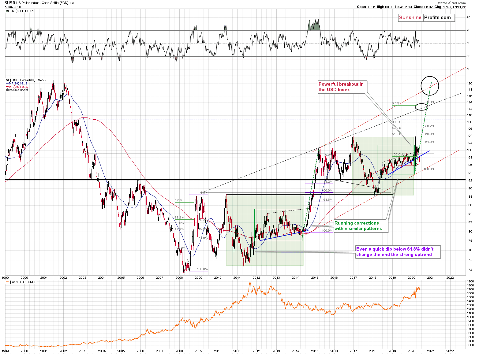
The USD Index was previously (for the entire 2019 as well as parts of 2018 and 2020) moving up in a rising trend channel (all medium-term highs were higher than the preceding ones) that formed after the index ended a very sharp rally. This means that the price movement within the rising trend channel was actually a running correction, which was the most bullish type of correction out there.
If a market declines a lot after rallying, it means that the bears are strong. If it declines a little, it means that bears are only moderately strong. If the price moves sideways instead of declining, it means that the bears are weak. And the USD Index didn't even manage to move sideways. The bears are so weak, and the bulls are so strong that the only thing that the USD Index managed to do despite Fed's very dovish turn and Trump's calls for lower USD, is to still rally, but at a slower pace.
We previously wrote that the recent temporary breakdown below the rising blue support line was invalidated, and that it was a technical sign that a medium-term bottom was already in.
The USD Index soared, proving that invalidation of a breakdown was indeed an extremely strong bullish sign.
Interestingly, that's not the only medium-term running correction that we saw. What's particularly interesting is that this pattern took place between 2012 and 2014 and it was preceded by the same kind of decline and initial rebound as the current running correction.
The 2010 - 2011 slide was very big and sharp, and it included one big corrective upswing - the same was the case with the 2017 - 2018 decline. They also both took about a year. The initial rebound (late 2011 and mid-2018) was sharp in both cases and then the USD Index started to move back and forth with higher short-term highs and higher short-term lows. In other words, it entered a running correction.
The blue support lines are based on short-term lows and since these lows were formed at higher levels, the lines are ascending. We recently saw a small breakdown below this line that was just invalidated. And the same thing happened in early 2014. The small breakdown below the rising support line was invalidated.
Since there were so many similarities between these two cases, the odds are that the follow-up action will also be similar. And back in 2014, we saw the biggest short-term rally of the past 20+ years. Yes, it was bigger even than the 2008 rally. The USD Index soared by about 21 index points from the fakedown low.
The USDX formed the recent fakedown low at about 96. If it repeated its 2014 performance, it would rally to about 117 in less than a year. Before shrugging it off as impossible, please note that this is based on a real analogy - it already happened in the past.
In fact, given this month's powerful run-up, it seems that nobody will doubt the possibility of the USD Index soaring much higher. Based on how things are developing right now, it seems that the USD Index might even exceed the 117 level, and go to 120, or even higher levels. The 120 level would be an extremely strong resistance, though.
Based on what we wrote previously in today's analysis, you already know that big rallies in the USD Index are likely to correspond to big declines in gold. The implications are, therefore, extremely bearish for the precious metals market in the following months.
On the short-term note, it seems that the USD Index has finished or almost finished its breather after the powerful run-up. While the base for the move may be similar to what happened between 2010 and 2014, the trigger for this year's sharp upswing was similar to the one from 2008. In both cases, we saw dramatic, and relatively sudden rallies based on investors seeking safe haven. The recent upswing was even sharper than the initial one that we had seen in the second half of 2008. In 2008, the USDX corrected sharply before moving up once again, and it's absolutely no wonder that we saw the same thing also recently.
But a correction after a sharp move absolutely does not imply that the move is over. In fact, since it's so in tune with what happened after initial (!) sharp rallies, it makes the follow-up likely as well. And the follow-up would be another powerful upswing. Just as a powerful upswing in the USD Index triggered gold's slide in 2008 and in March 2020, it would be likely to do the same also in the upcoming days / weeks.
Please note that the 2008 correction could have been used - along with the initial starting point of the rally - to predict where the following rally would be likely to end. The green lines show that the USDX slightly exceeded the level based on the 2.618 Fibonacci extension based on the size of the correction, and the purple lines show that the USDX has approximately doubled the size of its initial upswing.
Applying both techniques to the current situation, provides us with the 113 - 114 as the next target area for the USD Index. A sharp rally to that level (about 13-14 index points) would be very likely to trigger the final sell-off in gold, silver, and mining stocks.
For now, however, we see that gold declined last week, even despite the profound move lower in the USD Index. The latter declined by over 1.40 and during the same time, gold declined by almost $70. This is a very bearish combination. If the USD Index does soar from here, then gold is likely to fall really hard.
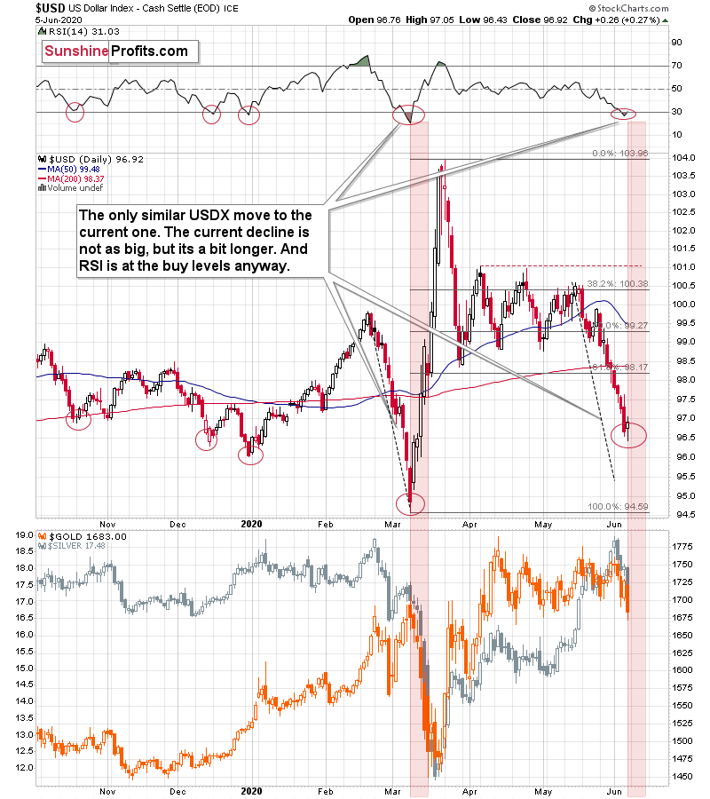
From the short-term point of view, the situation in the USD Index is similar to what we saw in early March. The US currency is after a sizable decline also this time. Right now, it's not as big, but it's a bit longer.
Back in March, gold declined once the USDX soared after the bottom. This time it seems that gold is reacting... In a much more - yes - bearish way. It's true that gold is a bit higher than it was in early March (not significantly, though). However, it's very important to note that this time, gold is reacting to much weaker signals with much bigger strength. The USD Index moved higher by mere 0.26 on Friday. It was the biggest daily gain in 2 weeks, but it was still relatively small. Back in March, the post-bottom rally took the USDX over a full index point higher.
It looks like gold really wanted to decline sooner (there were many indications for it in the previous weeks), but it just didn't get any reasonable trigger. Instead, the USDX kept declining.
And what happens when the price really wants to move in a given direction, but it keeps getting triggers for an adverse move? At first, it reacts to them to only a limited extent, then it ignores them, and then it declines slowly regardless of the adverse factors. Finally, when even there is a slight sign that should make the market move in the direction in which it really wants to go, it reacts with extra strength. That's what's been taking place in gold in the previous weeks.
In each case in the past several months, when the RSI index moved below 30 and then rallied back above it, it meant that a bottom was in. So, as the USD Index seems to have bottomed, gold could get multiple additional reasons (daily rallies in the USDX) to plunge.
The most important detail that connects the March bottom and the 2008 bottom in gold was that both were confirmed by gold's strength despite continuous strength in the USD Index. That's the key sign that is absent right now. In fact, the USD's rally has only begun. It seems that gold will flash this major buy signal only after another sizable decline.
Having said that, let's take a more detailed look at gold.
Gold's Long-term View
In short, the long-term analogy in terms of prices to what happened in 2008 still seems intact in terms of the monthly price changes. In fact, the situation is developing as we had indicated previously:
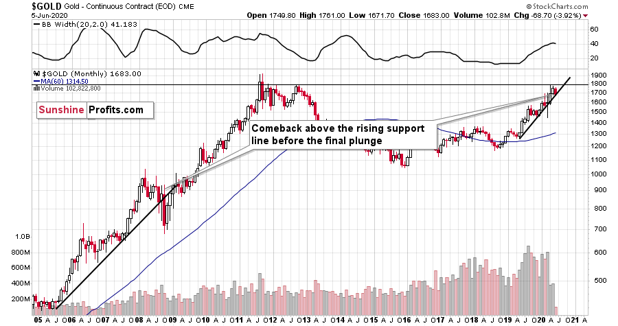
In 2008, after the initial plunge, and a - failed - intramonth attempt to move below the rising support line, gold came back above it and it closed the month there. The same happened in March 2020.
During the next month in 2008, gold rallied and closed visibly above the rising support line. The same was the case in April, 2020.
In the following month - the one analogous to May 2020 - gold initially moved higher, but then it plunged to new lows and finally closed the month below the rising support line.
We haven't seen the plunge last month, but we did see a move very close to the previous highs, just like what we saw in March. As the volatility is now somewhat smaller, it suggests that instead of seeing the slide in May, we might see it in June. This would also be in tune with the seasonal tendencies that we discussed earlier today.
For now, gold has indeed declined, and it paused above the rising support line. Once it breaks below it, the slide is likely to be significant.
Let's check how low gold could decline during this slide. In short, the above is based on the long-term gold chart and it hasn't changed this week.
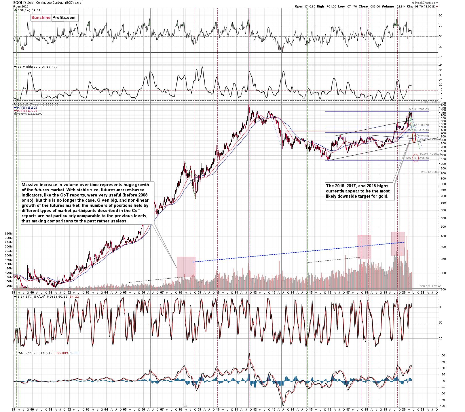
Our current (and it might change in the following days) estimate is that gold would decline to the 2016, 2017, and 2018 lows - slightly below $1,400. Why? Because this level is confirmed by several major highs, which makes it the strongest support that's below the previous 2020 lows.
Moreover, back in 2008, gold bottomed about 8% below its initial September bottom. The recent bottom in gold was about $1,451. If history repeats itself, gold could decline to 92% x $1,451 = about $1,335.
In 2008, gold also declined by about 27% from its previous high. If the history repeats itself here, and gold topped yesterday (which seems quite likely), we can see gold's bottom at 73% x $1,789 = about $1,306.
The 2016, 2017, and 2018 highs are the strongest gold support that we have close to the above-mentioned price levels. Gold's fundamental situation is even better now than it was in 2008, so we think that looking for the support above the above-mentioned 2008-based price levels is more appropriate than basing it the above-mentioned gold trading tips. The 2016, 2017, and 2018 highs fulfill this requirement.
This means that gold would be likely to bottom between about $1,350 and $1,380.
Of course, the above estimates assume that gold would decline significantly and not modestly, when the USD Index does indeed break higher.
The way gold responds to USD's rally from the current levels to the previous 2020 highs should tell us a lot about what's really in store for gold in the following weeks.
Please note that the very long-term cyclical turning point in gold (marked with vertical, gray lines) is due in July. Until the 2011 top, these turning points were tops, and after the 2011 top - in each case - these turning points corresponded to major bottoms. Last week, we wrote that if gold was to bottom in July, it was about time for it to start declining. And it did start to decline.
Having said that, let's take a look at silver. In case of the white metal, its ratio to gold might be more important at this time than price itself.
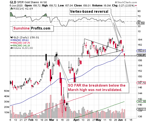
Last week, we wrote that we had a good indication from the GLD ETF that the rally is about to end today. This was the case due to the triangle-vertex-based reversal that we then. This trading technique has proven to be useful many times in the previous months, so it was worth worth to pay attention to its indications also that time.
Right now, we can say the same thing about the RSI indicator and the buy signal in the USD Index - it's definitely worth to pay attention to it.
As far as the GLD ETF is concerned, we haven't seen invalidation of the breakout above the March high just yet, which might be a partial explanation as to why gold is up a bit in today's pre-market trading and as to why mining stocks didn't decline more on Friday (the other reason being the rally in the stock market). This doesn't imply that the decline is over, but rather indicates that when GLD closes below this all-important level, the huge slide will follow. Given how likely an upswing in the USD Index is, GLD is likely to break lower soon; likely this week.
Silver's Strength and Indications
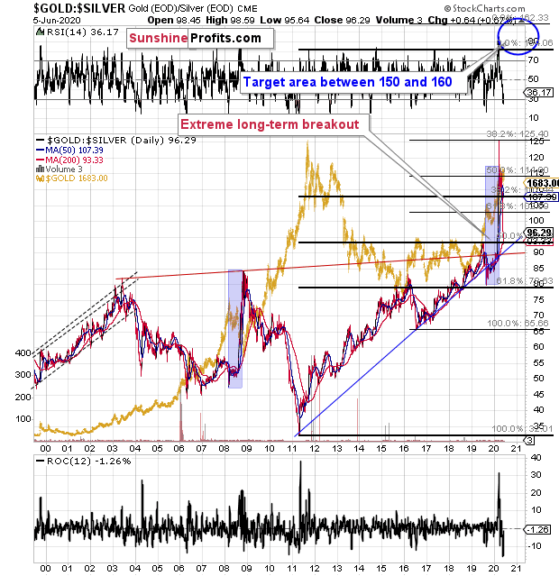
The gold to silver ratio moved 2 points higher last week, which didn't take it back below the key resistance at the 100 level, but it's a small indication that the ratio is moving higher.
The ratio moved below the 100 level, but the move is so far quite small from the long-term point of view. You can barely see it on the second, long-term chart, and if it wasn't for the dashed lines, it would be hard to tell if the ratio really moved below 100 or not.
If the ratio stays below 100 for longer, we'll confirm that the breakout was indeed invalidated. However, for now, it seems that silver's tendency to outperform in the short term at the top is distorting the technical picture.
We saw something similar in late 2019. The gold to silver ratio broke below its rising support line and the RSI based on it moved below the 30 level. This move was very temporary, and the ratio moved much higher shortly. And silver price tumbled.
On a long-term basis, silver reached its declining resistance line and it's still below the levels from which the previous 2020 slide started, at least in terms of the daily closing prices.
Last week, silver invalidated the small breakout above its previous highs, just as we had expected it to. It also invalidated the breakout above the very long-term, green resistance line, which is bearish.
The HUI Index had already invalidated its breakout above the 2016 high.
Silver just invalidated the above-mentioned breakouts.
Gold is the only part of the gold-silver-miners trio that didn't invalidate the recent major breakout... Yet. It seems that the latter will simply be the final confirmation that the short-term decline has begun.
Even though silver rallied considerably beforehand, it doesn't have to be the case that the link between now and 2008 is broken.
This is the link that we mean:
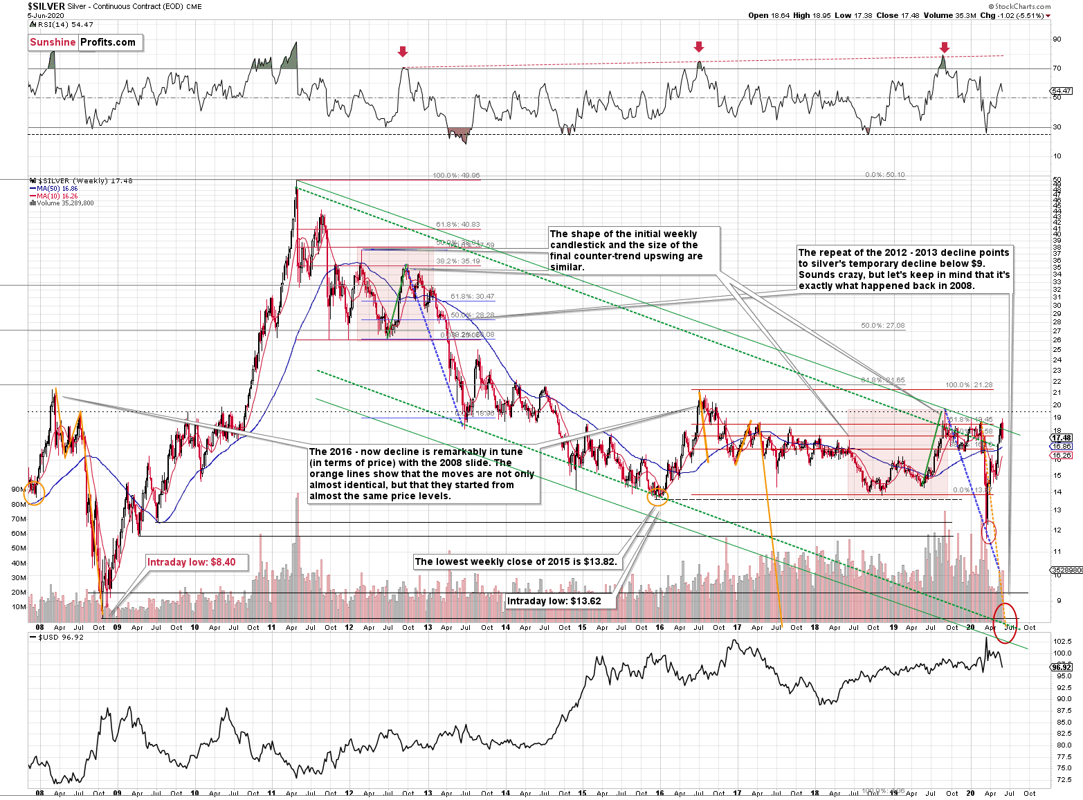
Silver just plunged to our initial target level and reversed shortly after doing so. It was for many months that we've been featuring the above silver chart along with the analogy to the 2008 slide. People were laughing at us when we told them that silver was likely to slide below $10.
Well, the recent low of $11.64 proves that we were not out of our minds after all. Our initial target was reached, and as we had explained earlier today, the entire panic-driven plunge has only begun.
Those who were laughing the loudest will prefer not to notice that silver reversed its course at a very similar price level at which it had reversed initially in 2008. It was $12.40 back then, but silver started the decline from about 50 cent higher level, so these moves are very similar.
This means that the key analogy in silver (in addition to the situation being similar to mid-90s) remains intact.
It also means that silver is very likely to decline AT LEAST to $9. At this point we can't rule out a scenario in which silver drops even to its all-time lows around $4-$5.
Note: Silver at or slightly below $8 seems most probable at this time.
Crazy, right? Well, silver was trading at about $19 less than a month ago. These are crazy times, and crazy prices might be quite realistic after all. The worst is yet to come.
Let's quote what the 2008-now analogy is all about in case of silver.
There is no meaningful link in case of time, or shape of the price moves, but if we consider the starting and ending points of the price moves that we saw in both cases, the link becomes obvious and very important. And as we explained in the opening part of today's analysis, price patterns tend to repeat themselves to a considerable extent. Sometimes directly, and sometimes proportionately.
The rallies that led to the 2008 and 2016 tops started at about $14 and we marked them both with orange ellipses. Then both rallies ended at about $21. Then they both declined to about $16. Then they both rallied by about $3. The 2008 top was a bit higher as it started from a bit higher level. And it was from these tops (the mid-2008 top and the early 2017 top) that silver started its final decline.
In 2008, silver kept on declining until it moved below $9. Right now, silver's medium-term downtrend is still underway. If it's not clear that silver remains in a downtrend, please note that the bottoms that are analogous to bottoms that gold recently reached, are the ones from late 2011 - at about $27. Silver topped close to $20.
The white metal hasn't completed the decline below $9 yet, and at the same time it didn't move above $19 - $21, which would invalidate the analogy. This means that the decline below $10, perhaps even below $9 is still underway.
Now, some may say that back in 2008, silver rallied only to about $14 and since now it rallied to about $16, so the situation is now completely different and that the link between both years is broken. But that's simply not true.
The nominal price levels are just one of the ways that one should look at the analogy - far from being the perfect or most important one.
Please note that back in 2008, there were two smaller bottoms in silver, and this time we saw just one. The decline before the bottom was sharper, so is it really that surprising that the rebound was sharper as well? Silver ended the 2008 corrective upswing once it moved visibly above the declining orange line and that's exactly what happened recently. It also topped once it reached its 10-week moving average (red line). That's exactly what just happened. This MA is at $15.81 and at the moment of writing these words, silver is back below it, trading at $15.65.
The situations are not perfectly identical in terms of nominal prices, but they remain remarkably similar given how different fundamental reasons are behind these price moves (in reality, what's behind both declines is fear that - itself - doesn't change).
The technique used for predicting silver price is clearer than the one that we applied for gold, so it seems useful to look not only at the USD Index for signs, but also at the white metal itself. Once silver moves to $8 or below it, it will likely serve as a strong buy sign for gold, regardless of the price at which gold will be trading at that time.
The 2020 slide was sharper, so it's not that surprising that the rebound was also more notable. Besides, the breakout above the 100 level in the gold to silver ratio and is a small feat either. The comeback to the previously broken 100 level in the ratio is normal, so given gold's recent rally, silver's rally in the last few weeks is not that ground-breaking either.
Consequently, while the 2008-now analogy in terms of price is no longer as clear as it used to be, the breakout in the gold to silver ratio above 100 level is what makes up for the above in terms of overall bearishness of the medium-term silver price developments. And weakness in mining stocks confirms it.
And speaking of the mining stocks, let's take a closer look at their performance.
Gold Miners' and Their 2016 High
We previously described the above HUI Index - flagship proxy for the gold miners - in the following way:
The HUI Index declined significantly, and then it rebounded significantly.
Both are likely linked. Miners first declined more sharply than they did in 2008, so the rebound was also sharper. Based on the stimulus and gold reaching new yearly highs, miners also rallied, and tried to move to new yearly highs. It's not surprising.
However, if the general stock market is going to decline significantly one more time, and so will gold - and as you have read above, it is very likely - then miners are likely to slide once again as well. This would be in tune with what happened in 2008.
At this time, it may seem impossible or ridiculous that miners could slide below their 2015 lows, but that's exactly what could take place in the following weeks. With gold below their recent lows and the general stock market at new lows, we would be surprised not to see miners even below their 2020 lows. And once they break below those, their next strong resistance is at the 2016 low. However, please note that miners didn't bottom at their previous lows in 2008 - they moved slightly lower before soaring back up.
Please note that the HUI Index just moved to its 2016 high which serves as a very strong resistance. Given the likelihood of a very short-term (1-2 days?) upswing in stocks and perhaps also in gold (to a rather small extent, but still), it could be the case that gold miners attempt to rally above their 2016 high and... Spectacularly fail, invalidating the move. This would be a great way to start the next huge move lower.
And what happened next?
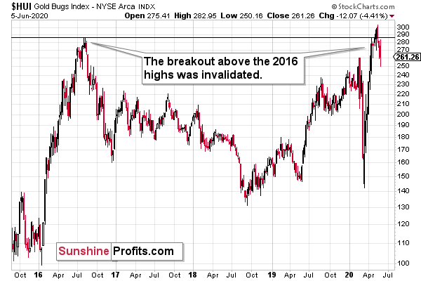
The HUI Index invalidated the breakout above its 2016 high in terms of the weekly closing prices and also in terms of the monthly closing prices.
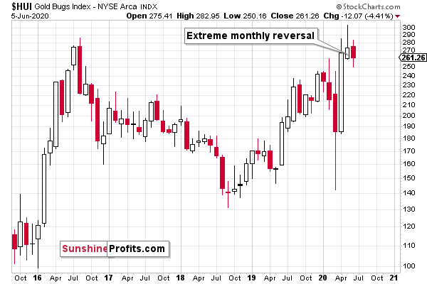
This is a perfectly bearish sign, especially since the HUI Index has been forming an extremely clear monthly shooting star candlestick. This is a clear formation with clear implications - gold miners are likely to decline in June.
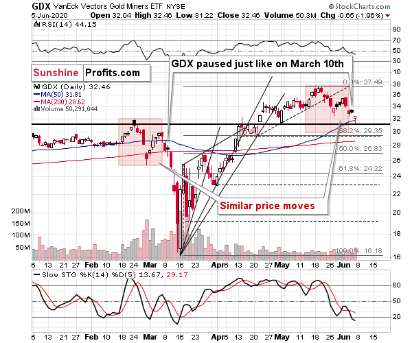
Miners were relatively strong on Friday, as we already wrote earlier today. The thing that we would like to add, is that ultimately gold price drives gold miners' revenue and thus profits, not the prices of other stocks. The impact that the general stock market has on the mining stocks is usually temporary and if gold continues to decline from here, miners are likely to catch up sooner or later.
The decline in the stock market would be a great catalyst for the bearish catch-up, though.
Before summarizing, let's take a look at the lesser-known parts of the precious metals sector: platinum and palladium.
PGM Group Indications
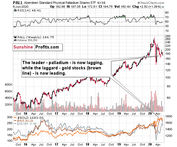
The interesting detail is palladium's weakness. This precious metal was the one that soared most profoundly in the past few years and while it recovered some of its 2020 declines recently, it appears to be back in bearish mode as its unable to keep gained ground, even despite the move higher in the general stock market.
The previous leader is now definitely lagging. And you know what is leading now? Silver - as it usually does in the final part of the upswing. When leaders are lagging, and laggards are leading, one should recognize that the market is topping - and that's the key take-away from the palladium and platinum analysis right now.
Palladium was the leader and platinum was actually one of the laggards. And what did platinum do?
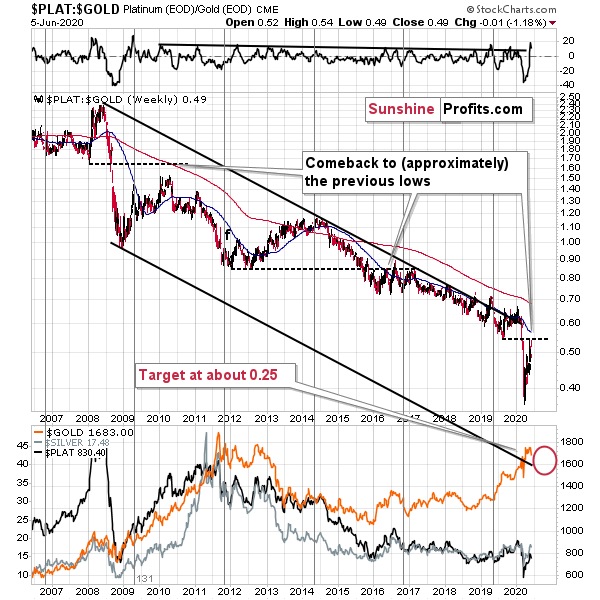
Platinum recently moved higher relative to gold, showing exceptional "strength". The laggard is leading the way - very toppy action.
The long-term downtrend in the platinum to gold ratio has fundamental legs - the little silver (as that's what platina means) is suffering from declining demand from the automotive industry. The diesel engines, where platinum is used as a catalyst, give way to gasoline engines and electric cars. But that's just the long-term trend. There are local trends around the main trend and the interesting pattern in them was that once the platinum to gold ratio broke below the previous lows, it then moved back closer to them, to kind of "wave goodbye".
It seems that we saw this phenomenon right now as the ratio moved to the 2019 low and then moved a bit lower. As the breakdown was verified, the ratio could now turn lower once again. The big slide that we saw earlier this year took place at the same time when stocks, silver, miners, and gold declined, as the USDX soared. Platinum seems to be telling us to be prepared for another wave lower, also in gold - and we are.
Summary
Summing up, the tops in gold, silver, and mining stocks appear to be already in, and the decline is likely to accelerate shortly. The outlook for the precious metals market is bearish for the next few weeks, and it's very bullish for the following months. Even if gold, silver, and mining stocks are not going to move to new 2020 lows, they are still likely to decline visibly when the USD Index soars.
After the sell-off (that takes gold below $1,400), we expect the precious metals to rally significantly. The final decline might take as little as 1-3 weeks, so it's important to stay alert to any changes.
Most importantly - stay healthy and safe. We made a lot of money on the March decline and the subsequent rebound (its initial part) price moves (and we'll likely make much more in the following weeks and months), but you have to be healthy to really enjoy the results.
To summarize:
Very short-term outlook for the precious metals sector (our opinion on the next 2-3 weeks): Bearish
Short-term outlook for the precious metals sector (our opinion on the next 2 months): Bearish for about 2-3 weeks, and then bullish once again
Medium-term outlook for the precious metals sector (our opinion on the period between 2 and 6 months from now): Bullish
Long-term outlook for the precious metals sector (our opinion on the period between 6 and 24 months from now): Bullish
Very long-term outlook for the precious metals sector (our opinion on the period starting 2 years from now): Bullish
Our preferred ways to invest in and to trade gold along with the reasoning can be found in the how to buy gold section. Additionally, our preferred ETFs and ETNs can be found in our Gold & Silver ETF Ranking.
As a reminder, Gold Investment Updates are posted approximately once per week. We are usually posting them on Monday, but we can't promise that it will be the case each week.
Please note that this service does not include daily or intraday follow-ups. If you'd like to receive them, we encourage you to subscribe to our Gold & Silver Trading Alerts today.
Thank you.
Sincerely,
Przemyslaw Radomski, CFA
Editor-in-chief, Gold & Silver Fund Manager

