

Briefly: gold and the rest of the precious metals market are likely to decline in the next several weeks/months and then start another powerful rally. Gold’s strong bullish reversal/rally despite the USD Index’s continuous strength will likely be the signal confirming that the bottom is in.
Introduction
Welcome to the Gold Investment Update. Predicated on last week’s price moves, our most recently featured outlook remains the same as the price moves align with our expectations. On that account, there are parts of the previous analysis that didn’t change at all in the earlier days, which will be written in italics.
This week’s ending was not as wild as the previous one, when gold formed its epic, huge-volume reversal, but it was still quite interesting. Let’s examine what happened and discuss what may be waiting just around the corner, starting with the fundamentals.
The Weekly Fundamental Roundup
While the week was full of drama, the Fed and the implications of its future monetary policy was the most important fundamental development to hit the newswire.
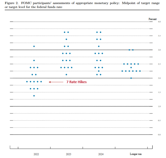
For example, the FOMC announced a 25 basis point rate hike on Mar. 16, and the median projection (the five dots below) is for six more rate hikes in 2022 (seven in total). Moreover, with six meetings left on the FOMC’s 2022 schedule, it implies consecutive rate hikes for the next several months.
Please see below:
 Source: U.S. Fed
Moreover, with FOMC officials’ median estimate increasing from three rate hikes in December to seven rate hikes in March, the hawkish ante has been upped with every new release of their Summary of Economic Projections (SEP).
However, while the developments are fundamentally bullish for the USD Index and U.S. Treasury yields, the PMs are behaving as if none of that matters. Moreover, with the Russia-Ukraine conflict distracting gold, silver, and mining stocks from domestic fundamental realities, their recent strength is a function of momentum, not medium-term technicals or fundamentals.
To explain, I spent a lot of time covering the S&P Goldman Sachs Commodity Index (S&P GSCI) this week and noted that it could act as the fundamental canary in the coal mine.
For context, the S&P GSCI contains 24 commodities from all sectors: six energy products, five industrial metals, eight agricultural products, three livestock products, and two precious metals. However, energy accounts for roughly 54% of the index’s movement.
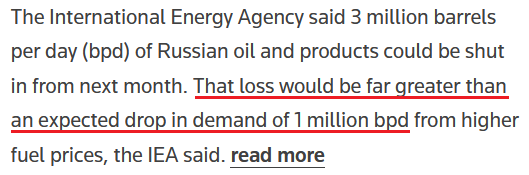
Furthermore, with the index rising and falling sharply in a matter of days, the PMs have been along for the ride. However, with the International Energy Agency (IEA) lighting a fire under crude on Mar. 17, it released a report outlining the potential shortfall of Russian oil in April. It stated:
“The prospect of large-scale disruptions to Russian oil production is threatening to create a global oil supply shock. We estimate that from April, 3 mb/d of Russian oil output could be shut in as sanctions take hold and buyers shun exports. OPEC+ is, for now, sticking to its agreement to increase supply by modest monthly amounts. Only Saudi Arabia and the UAE hold substantial spare capacity that could immediately help to offset a Russian shortfall.”
With financial markets all about expectations, the potential for a shortfall sent WTI 6.95% higher on Mar. 17.
Please see below:
 Source: Reuters
Moreover, since energy accounts for roughly 54% of the S&P GSCI’s movement and momentum begets momentum, the PMs are borrowing optimism and ignoring fundamentals. However, the short-term phenomena will likely result in sharp drawdowns over the medium term.
Please see below:
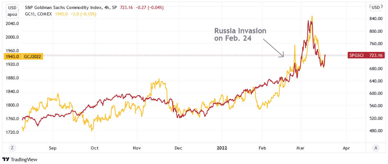
To explain, the red line above tracks the four-hour movement of the S&P GSCI, while the gold line above tracks the gold futures price. If you analyze their behavior before Russia invaded Ukraine, you can see little to no connection.
However, if you focus your attention on the price action since the Feb. 24 invasion, you can see that it’s become all one trade. Moreover, the weak fundamental outlook that caused gold to underperform the S&P GSCI in early 2022 has only intensified since the Fed meeting. But despite that, momentum investors are following the trend and rallies in crude are sparking rallies in the metals.
As a result, the PMs’ rallies on Mar. 17 were more about momentum. However, with their medium-term fundamentals heading in the opposite directions, sharp drawdowns should materialize once the ‘all-for-one’ trade unwinds.
To that point, while the PMs may assume that the Fed won’t follow through on its hawkish forecast, the reality is that the U.S. economic outlook is bullish for hawkish Fed policy.
To explain, I wrote on Mar. 9:
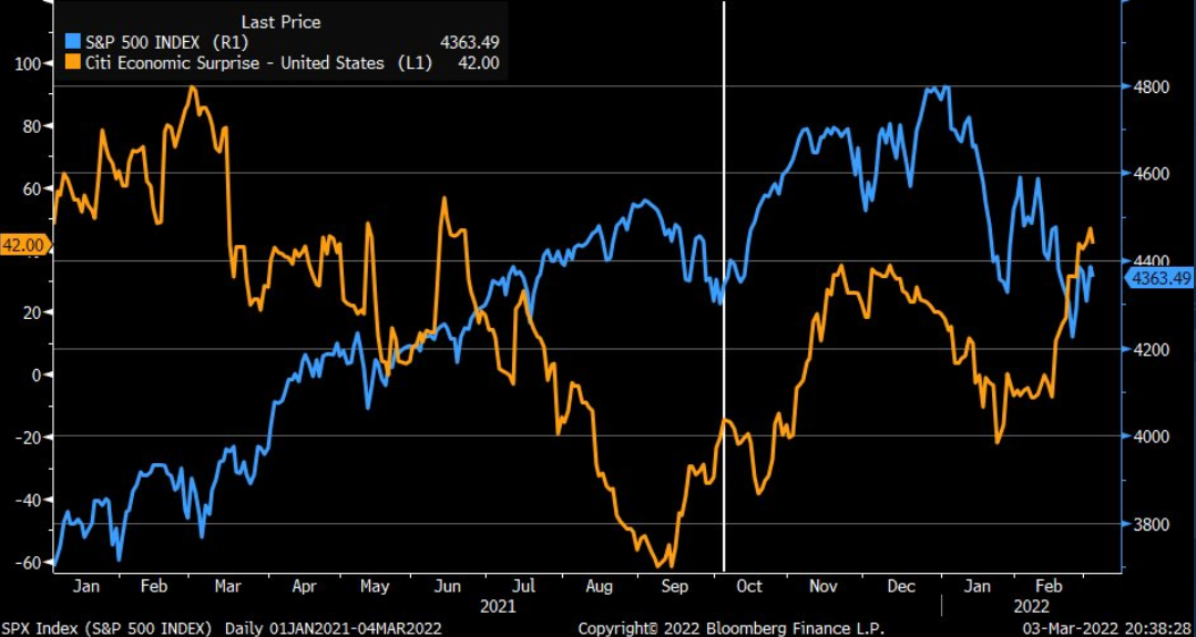
The blue line above tracks the S&P 500, while the orange line above tracks Citigroup’s Economic Surprise Index. For context, a surprise occurs when an economic data point outperforms economists’ consensus estimate.
If you analyze the right side of the chart, you can see that the orange line bottomed in January and has been moving higher ever since. As a result, the U.S. economy remains in a healthy position, and as long as this is the case, it keeps the pressure on the Fed to raise interest rates at its next several monetary policy meetings.
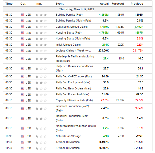
To that point, with more data released on Mar. 17, the outperformances continued.
Please see below:
 Source: Investing.com
To explain, building permits, housing starts, manufacturing production, initial and continuing jobless claims, and the Philadelphia Fed’s manufacturing index all outperformed expectations on Mar. 17. As a result, they add upward momentum to Citigroup’s Economic Surprise Index. Moreover, with the Fed’s hawkish disposition dependent on the health of the U.S. economy, Thursday’s data only enhances the prospects of more rate increases.
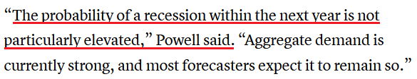
For example, I wrote on Mar. 17: Powell noted during his press conference that there are ~1.7 job openings for every unemployed U.S. citizen. He added that “all signs are that this is a strong economy, one that will be able to flourish in the face of less accommodative monetary policy.”
Moreover, with continuing jobless claims hitting a new post-pandemic low on Mar. 17, the Fed’s maximum employment mandate remains on the hawkish side of the spectrum.
Please see below:
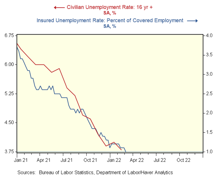
To explain, the red line above tracks the civilian unemployment rate, while the blue line above tracks the insured unemployment rate. For context, the latter calculates the number of U.S. citizens collecting unemployment as a percentage of the U.S. labor force. Moreover, the metric dropping to 1% on Mar. 17 highlights how U.S. labor market strength should keep the Fed’s foot on the hawkish accelerator.
Second, I also noted on Mar. 17 that the critical development is Powell’s view of the U.S. economy. In a nutshell: if Powell believes the U.S. economy is in a healthy position, then he’ll raise interest rates until he no longer thinks that’s the case. With his remarks on Mar. 17 signaling more hawkish policy to come, the PMs should suffer the consequences over the medium term.
Please see below:
 Source: CNBC
In addition, I noted above that U.S. housing starts outperformed expectations on Mar. 17. With the metric hitting a new 2022 high of 1.769 million, the data supports Powell’s assertion that the U.S. economy is nowhere near a recession.
Please see below:
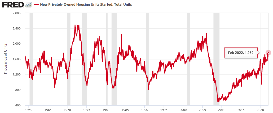
To explain, the red line above tracks U.S. housing starts, while the gray bars above track U.S. recessions. If you analyze the connection, notice how U.S. housing starts always peak and decline in advance of U.S. recessions. Moreover, the relationship has been present since before 1960. As a result, with U.S. housing starts hitting a new post-pandemic high on Mar. 17, it adds more fuel to the Fed’s hawkish fire.
On top of that, while inflation remains extremely problematic, the latest survey data shows that pricing pressures are still headed in the wrong direction. For example, I noted above how the Philadelphia Fed’s manufacturing index outperformed expectations on Mar. 17. Well, the report also stated that “price increases become more widespread:”
“The prices paid index climbed 12 points to 81.0, its highest reading since June 1979. More than 87 percent of the firms reported increases in input prices, while 6 percent reported decreases; 7 percent of the firms reported no change. The current prices received index increased 5 points to 54.4. Nearly 57 percent of the firms reported increases in prices received for their own goods this month, 2 percent reported decreases, and 38 percent reported no change.”
Please see below:
 Source: Philadelphia Fed
Similarly, the New York Fed’s Empire State Manufacturing Index was released on Mar. 15. The report revealed:
“The prices paid index edged down three points to 73.8, while the prices received index rose two points to a record high of 56.1, signaling ongoing substantial increases in both input prices and selling prices.”
Please see below:
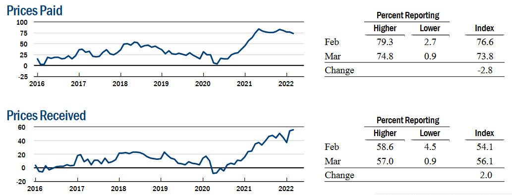 Source: New York Fed
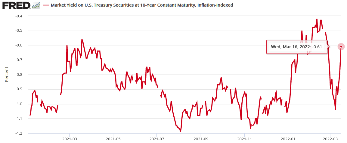
Finally, while the Russia-Ukraine conflict resulted in a safe-haven bid for U.S. Treasuries, that gambit has already unraveled. In the process, the sharp decline in the U.S. 10-Year real yield has also reversed, and with even higher real yields required to calm inflation, the PMs will likely regret dismissing all of these fundamental warning signs.
The bottom line? While it was an eventful week on the fundamental front, the realized data only strengthened the PMs' bearish thesis. For months I've been warning that surging inflation and a resilient U.S. economy would elicit a hawkish shift from the Fed. Moreover, with each monetary policy meeting and each SEP release, the Fed continues to increase its hawkish directives. As a result, while the PMs seem inclined to ignore these developments right now, history implies that the tranquility won't last.
What to Watch for Next Week
With another full slate of U.S. economic data releases next week, the most important ones are as follows:
- Mar. 22: Richmond Fed manufacturing and services indexes
With output and inflation metrics providing insight into the state of play in March, it will be interesting to see if the data mirrors the results from the New York and Philadelphia Fed’s manufacturing surveys.
- Mar. 23: New home sales
With housing starts and building permits outperforming expectations on Mar. 17, new home sales will tell us how consumers are reacting to U.S. mortgage rates that have increased sharply amid the rise in U.S. Treasury yields.
- Mar. 24: Durable goods orders, ISM and IHS Markit PMIs, the KC Fed manufacturing index
More comprehensive than the regional surveys (like New York, Richmond, Philadelphia, KC, etc.), the ISM and IHS Markit PMIs cover the entire U.S. As a result, the readings on output, employment, and inflation are the most important data points of the week.
- Mar. 25: Michigan consumer sentiment, pending home sales
Like in prior months, it will be interesting to see how consumers respond to higher oil prices, higher mortgage rates and the overall inflationary environment. In addition, pending home sales will piggyback on the implications of the other housing data.
All in all, economic data releases impact the PMs because they impact monetary policy. Moreover, if we continue to see outperformance alongside higher employment and inflation, the Fed will need to push up real yields to reduce demand and calm the pricing pressures. If that occurs, the outcome is profoundly bearish for the PMs.
Before moving to technicals, it seems that it might be a good idea to once again comment on Wednesday’s price action. In yesterday’s analysis, I wrote the following:
Having said that, let’s segue to a question that I just received from one of my subscribers.
The question was about the rise in mining stocks and gold and how it was connected to what was happening in bond yields. Precisely, while short-term and medium-term yields moved higher, very long-term yields (the 30-year yields) dropped, implying that the Fed will need to lower the rates again, indicating a stagflationary environment in the future.
First of all, I agree that stagflation is likely in the cards, and I think that gold will perform similarly to how it did during the previous prolonged stagflation – in the 1970s. In other words, I think that gold will move much higher in the long run.
However, the market might have moved ahead of itself by rallying yesterday. After all, the Fed will still want to keep inflation under control (reminder: it has become very political!), and it will want commodity prices to slide in response to the foregoing. This means that the Fed will still likely make gold, silver, and mining stocks move lower in the near term.
In particular, silver and mining stocks are likely to decline along with commodities and stocks, just like what happened in 2008.
Speaking of commodities, let’s take a look at what’s happening in copper.
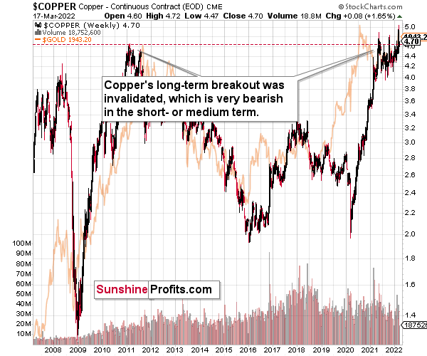
Copper invalidated another attempt to move above its 2011 high. This is a very strong technical sign that copper (one of the most popular commodities) is heading lower in the medium term.
Yes, it might be difficult to visualize this kind of move given the recent powerful upswing, but please note that it’s in perfect tune with the previous patterns.
The interest rates are going up, just like they did before the 2008 slide. What did copper do before the 2008 slide? It failed to break above the previous (2006) high, and it was the failure of the second attempt to break higher that triggered the powerful decline. What happened then? Gold declined, but silver and mining stocks truly plunged. The GDXJ was not trading at the time, so we’ll have to use a different proxy to see what this part of the mining stock sector did.
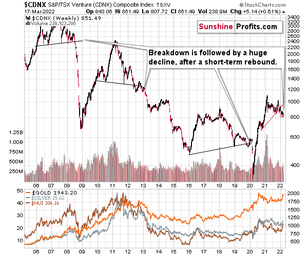
The Toronto Stock Exchange Venture Index includes multiple junior mining stocks. It also includes other companies, but juniors are a large part of it, and they truly plunged in 2008.
In fact, they plunged in a major way after breaking below their medium-term support lines and after an initial corrective upswing. Guess what – this index is after a major medium-term breakdown and a short-term corrective upswing. It’s likely ready to fall – and to fall hard.
So, what’s likely to happen? We’re about to see a huge slide, even if we don’t see it within the next few days.
In fact, the outlook for the next few days is rather unclear, as different groups of investors can interpret yesterday’s developments differently. However, once the dust settles, the precious metals sector is likely to go down significantly.
What happened during yesterday’s session?
(The above chart includes today’s pre-market trading, while the one below doesn’t.)
Gold moved higher, but it gave away some of its gains in the final hours of the session, and it’s been declining in today’s overnight trading as well.
Please note that yesterday’s daily rally in gold was accompanied by relatively low volume (one of the lowest readings that we’ve seen this year), which is exactly what one would expect from a counter-trend rebound a.k.a. a breather.
Overall, it seems that gold corrected in tune with my previous comments, and that this corrective upswing could already be over. I commented on the gold chart:
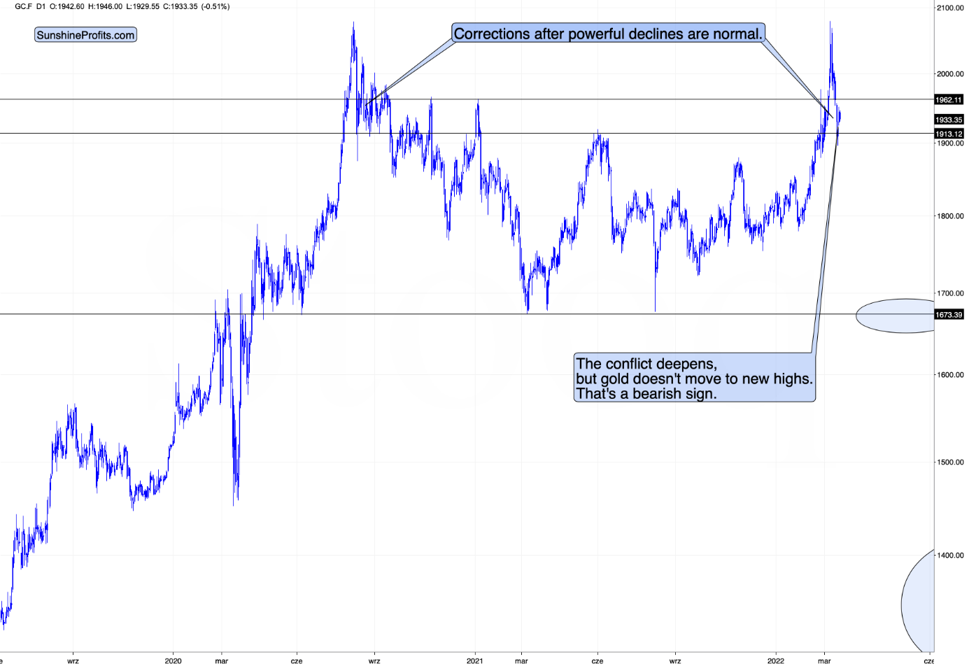
Gold is up in today’s pre-market trading, but please note that back in 2020, after the initial post-top slide, gold corrected even more significantly, and it wasn’t really bullish.
This time gold doesn’t have to rally to about $2,000 before declining once again, as this time the rally was based on war, and when we consider previous war-based rallies (U.S. invasion of Afghanistan, U.S. invasion of Iraq, Russia’s invasion of Crimea), we know that when the fear-and-uncertainty-based top was in, then the decline proceeded without bigger corrections.
Silver corrected visibly yesterday, but it doesn’t change anything either.
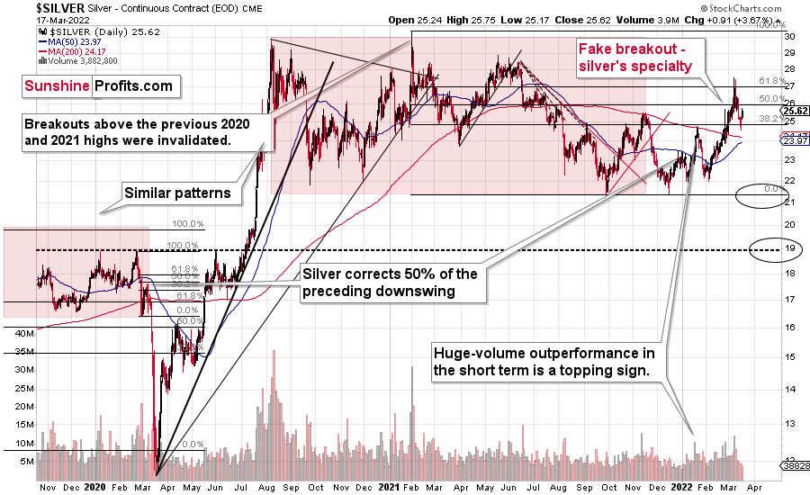
No market moves up or down in a straight line, and silver is no exception. A rally by ~$1 from intraday low to overnight high after a ~$3 decline is a relatively normal correction during a bigger decline.
As a result, nothing really changed in the above chart. At the moment of writing these words, silver is trading below its late-2021 highs in intraday terms. Consequently, it’s too early to say that we saw a new breakout above those levels. In fact, it appears that we witnessed yet another attempt to break above them, which – once again – failed. Therefore, it seems likely that this week’s counter-trend rally was just a brief pause, before the invalidation-based decline fully ensues.
Junior miners’ performance remains in tune with my previous comments too.
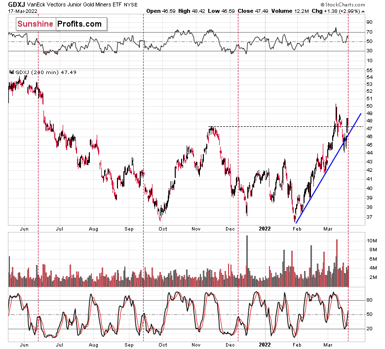
In my previous analyses, I wrote the following:
Now, if we zoom in even further, we’ll see that miners moved to their very short-term rising support line.
This means that it won’t be that odd if we see some kind of breather right now, before the decline continues.
Given that the Fed’s interest rate decision and the following press conference are scheduled for Wednesday, it would be rather normal to see the markets’ hesitation on Tuesday. There might be some immediate-term volatility, but the big moves might wait for the interest rate decision.
Whatever that decision is, when the dust settles, junior miners are likely to decline further.
Indeed, we saw the market’s hesitation – the junior miners bounced back. The dust is still in the air, and juniors are tracking back-and-forth around their rising short-term support line. Again, after a short while, juniors’ decline is likely to continue.
At this point, one might wonder if the recent buy signal from the stochastic indicator should be treated at its face value. Well, let’s take a look at what happened after similar buy signals in the past.
I marked three cases that are very similar to the current situation in GDXJ and in the stochastic indicator. It turns out that the current performance is typical for the corrective upswings that we see within bigger declines, mostly (2 out of 3 similar cases) after the initial small decline. With this kind of performance, it seems that one shouldn’t be concerned with possible bullish implications of the indicator at this time.
Besides, when looking at the GDXJ from a daily point of view, we see that it failed to rally back above its declining resistance line.
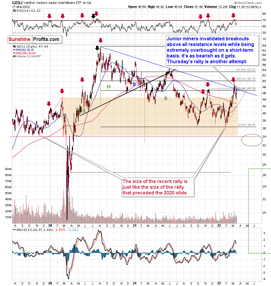
Consequently, yesterday’s session was a reversal that showed that junior miners lack strength. That’s not bullish, but bearish.
Also, let’s not forget about the forest while looking at individual trees.
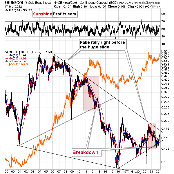
The gold stocks to gold ratio shows just how similar the current situation is to what we saw at the 2012 top.
The ratio formed a double-bottom slightly below its rising medium-term support line, then it rallied above its 200-day moving average (red line) by (approximately) as much as it did in 2012. What followed next? A massive decline: in gold, in silver, in the ratio, and in the mining stocks themselves.
The above is actually just a confirmation of the analogy that is visible directly in all three key components of the precious metals sector: gold, silver, and mining stocks.
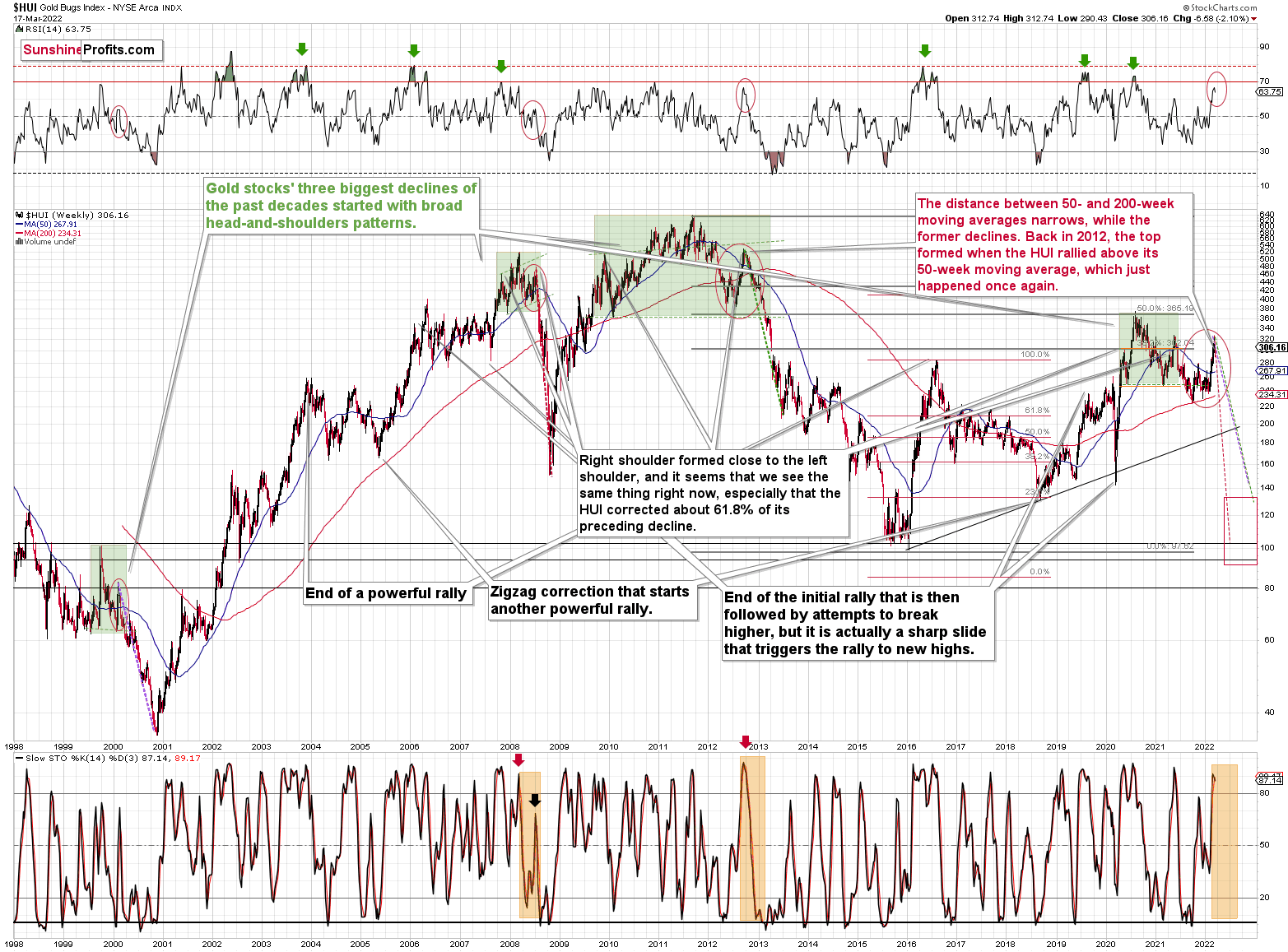
Starting with the latter, the situation remains in tune with how I described it last week:
If you look at the areas marked with red circles (especially: now, 2012/2013, and 2008), you’ll notice that they are very similar. These are the sizable short-term rallies that we saw after / in the final parts of the broad head-and-shoulders patterns.
The moves were quite sizable – the 2012 rally was even bigger than the current one, even though there was no war in Europe at that time.
Based on how broad the pattern is and self-similarity present in gold, it seems that the analogy to what happened in 2012 is most important right now.
Looking at the moving averages, we see that the 50-week moving average (blue) and 200-week moving average (red) performed quite specifically in late 2012, and we see the same thing this year.
The distance between 50- and 200-week moving averages currently narrows, while the former declines. Back in 2012, the top formed when the HUI rallied above its 50-week moving average, which just happened once again.
The RSI indicator (above the price chart), based on the HUI Index’s weekly chart, provides us with another confirmation of the analogy, and the same goes for the stochastic indicator (below the price chart). The former is just below the 70 level – exactly what we saw at the 2012 top, and the latter is above 90 – again, something that we saw at the 2012 top.
As history tends to rhyme, gold stocks are likely to slide, similarly to how they declined in 2012 and 2013.
Still, if the general stock market slides, and that appears likely for the following weeks and months, then we might have a decline that’s actually similar to what happened in 2008. Back then, gold stocks declined profoundly, and they have done so very quickly.
The dashed lines that start from the recent prices are copy-paste versions of the previous declines that started from the final medium-term tops. If the decline is as sharp and as big as what we saw in 2008, gold stocks would be likely to decline sharply, approximately to their 2016 low. If the decline is more moderate, then they could decline “only” to 120 - 150 or so. Either way, the implications are very, very, very bearish for the following weeks.
Also, unless the HUI rallies today (which seems doubtful given gold’s pre-market decline), we’ll see a fresh sell signal from the weekly stochastic indicator, which (unlike its 4-hour version) is quite efficient.
Having said that, let’s take a look at the analogy present in gold.
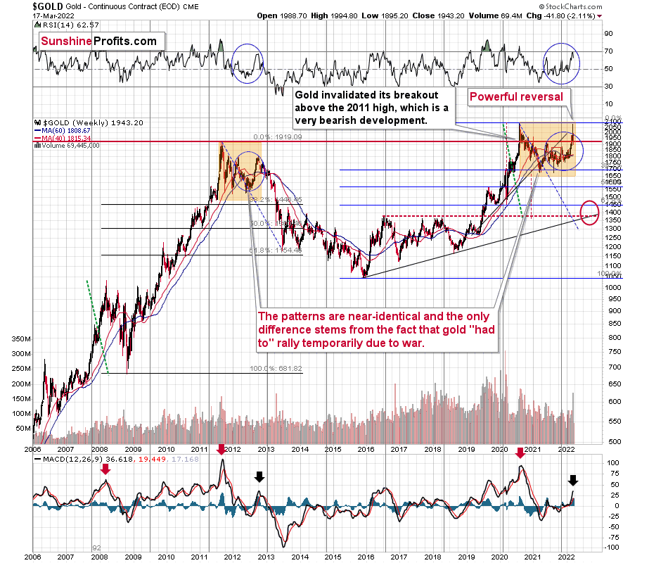
In short, the analogy between 2012 and 2022 remains up-to-date, with one important difference. This time, gold was practically forced to rally due to the safe-haven demand that war triggered. However, as it’s often the case with geopolitical events, their impact is likely to be temporary.
The RSI based on gold’s weekly chart is now above its 2021 high and very close to the 70 level, which is in tune with what we saw in 2012 (at the top) and it’s a major sell signal on its own.
The move higher in the MACD indicator (bottom of the above chart) is also noticeable, which is in tune with what we saw at the 2012 top.
This week is not over yet, but the nature of this week’s trading already seems clear. Namely, we’re likely to see a powerful weekly shooting star reversal candlestick. This is a very bearish indication for the following weeks and months.
Even the moving averages (40- and 60-week ones) are trading close to each other, just like what we saw in late 2012. Back then, they marked the target for the very initial decline from the top.
If this part of history were to be repeated, we could see some sort of short-term rebound (nothing major, though) after gold declines to about $1,800. This would be in tune with the analogy to 2003, when gold gave back all the war-based premium.
This would likely have a devastating impact on the prices of mining stocks. The latter would also likely suffer when the general stock market slides, and it seems that we won’t have to wait too long for that either.
Before moving to silver, please note that after last week’s epic, huge-volume (thus confirmed) reversal, I wrote about the profound bearish implications in the medium term. Gold is down by about $50 so far this week. Based on the analogies to 2012-2013 and 2008, it’s likely still just the beginning.
Silver’s 2012-2022 analogy looks like this:
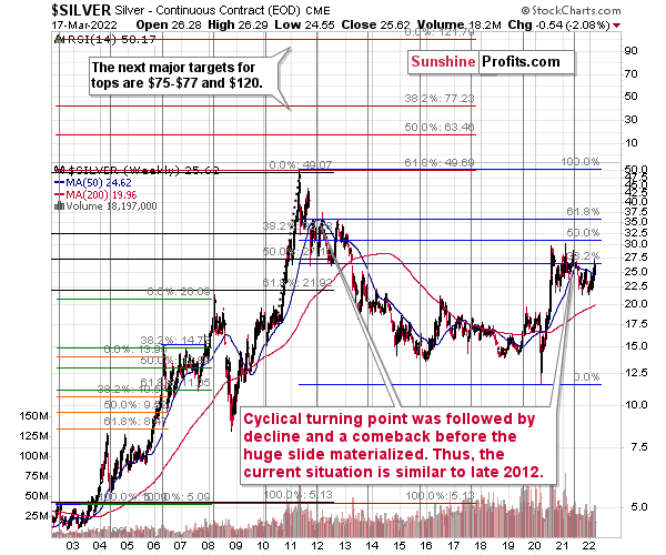
At the turn of the year in 2011/2012, there was a cyclical turning point in silver, and we saw a sizable decline in silver shortly thereafter. The same happened in 2021, after silver’s cyclical turning point.
Back in 2012, silver declined more or less to its previous lows and then rallied back up, but it didn’t reach its previous top. It more or less rallied to its 50-week moving average and then by about the same amount before topping.
Recently, we saw exactly the same thing. After the initial decline, silver bottomed close to its previous lows, and most recently it rallied to its 50-week moving average and then by about the same amount before topping – below the previous high.
Thus, the situation is just like what it was during the 2012 top in all three key components of the precious metals sector: gold, silver, and mining stocks.
We have a situation in the general stock market that points to an even quicker slide than what we saw in 2012-2013. If stocks slide sharply and significantly just like in 2008, then the same fate may await the precious metals sector – just like in 2008. In this case, silver and mining stocks (in particular, junior mining stocks) would be likely to fall in a spectacular manner.
All the above was confirmed by silver’s invalidation of its breakout above the late-2021 high. Not only has the medium-term outlook been bearish, but now the short-term outlook for silver is bearish too.
So, the link between the current situation and the two most bearish periods in precious metals’ recent history remains up-to-date (with 2012-2013 and 2008). The link with the latter is primarily based on the likelihood of interest rate hikes, how overvalued the general stock market has become from the medium-term point of view, and the technical signs from the latter.
Let’s take a brief look at the stock market indices.
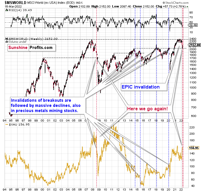
The technical picture in the case of world stocks remains extremely bearish, and my previous comments on it remain up-to-date:
World stocks have already begun their decline, and based on the analogy to the previous invalidations, the decline is not likely to be small. In fact, it’s likely to be huge.
For context, I explained the ominous implications on Nov. 30. I wrote:
Something truly epic is happening in this chart. Namely, world stocks tried to soar above their 2007 high, they managed to do so and… they failed to hold the ground. Despite a few attempts, the breakout was invalidated. Given that there were a few attempts and that the previous high was the all-time high (so it doesn’t get more important than that), the invalidation is a truly critical development.
It's a strong sell signal for the medium- and quite possibly for the long term.
From our – precious metals investors’ and traders’ – point of view, this is also of critical importance. All previous important invalidations of breakouts in world stocks were followed by massive declines in the mining stocks (represented by the XAU Index).
Two of the four similar cases are the 2008 and 2020 declines. In all cases, the declines were huge, and the only reason why they appear “moderate” in the lower part of the above chart is that it has a “linear” and not “logarithmic” scale. You probably still remember how significant and painful (if you were long that is) the decline at the beginning of 2020 was.
Now, all those invalidations triggered big declines in the mining stocks, and we have “the mother of all stock market invalidations” at the moment, so the implications are not only bearish, but extremely bearish.
What does it mean? It means that it is time when being out of the short position in mining stocks to get a few extra dollars from immediate-term trades might be risky. The possibility that the omicron variant of Covid makes vaccination ineffective is too big to be ignored as well. If that happens, we might see 2020 all over again – to some extent. In this environment, it looks like the situation is “pennies to the upside and dollars to the downside” for mining stocks. Perhaps tens of dollars to the downside… You have been warned.
World stocks have declined to their previous highs, and when something similar happened in 2008, it meant that both stocks and gold and silver mining stocks (lower part of the chart) were about to slide much further. In particular, that’s when the corrective upswing in the miners ended and the huge slide started. The implications for mining stocks are extremely bearish.
Here's how the situation currently looks from the U.S. point of view. The chart below features the S&P 500 futures.
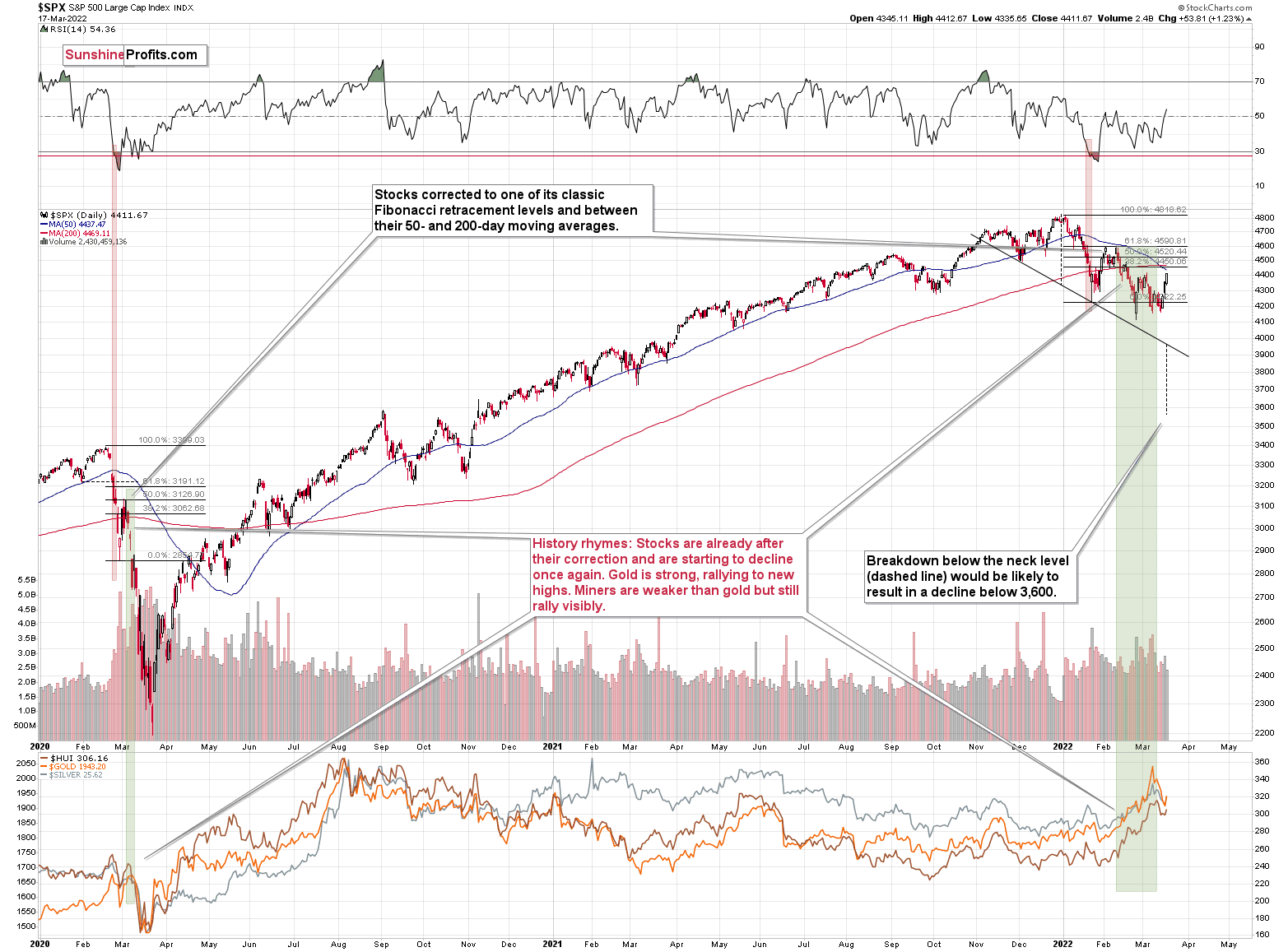
The key thing about the above chart is that what we’ve seen this year is the biggest decline since 2020 (I’m not counting the last few days), and the size of the recent slide is comparable to what we saw as the initial wave down in 2020. If these moves are analogous, the recent rebound and sideways trend are normal – there was one in early 2020 too (the correction that is). This also means that a much bigger decline is likely in the cards in the coming weeks.
Stocks have not yet declined significantly below the previous lows, but it seems that they are on the verge of doing so (the rates are rising and they are about to rise much more based on the fact that inflation has gotten very political). If 2020 could teach us anything, it would be that the following slide could be huge and sharp.
The volatility won’t necessarily match the 2020 one, but the decline is likely to be significant, anyway.
Let’s keep in mind that the interest rates are likely to go higher, and that sanctions on Russia could impact global trade in multiple ways, thus negatively affecting the stock market.
This would be likely to have a very negative impact on the precious metals market, in particular on junior mining stocks (initially) and silver (a bit later).
All in all, technicals favor a decline in the precious metals sector sooner rather than later.
Overview of the Upcoming Part of the Decline
- It seems to me that the corrective upswing is now over or very close to being over , and that gold, silver, and mining stocks are now likely to continue their medium-term decline.
- It seems that the first (bigger) stop for gold will be close to its previous 2021 lows, slightly below $1,700. Then it will likely correct a bit, but it’s unclear if I want to exit or reverse the current short position based on that – it depends on the number and the nature of the bullish indications that we get at that time.
- After the above-mentioned correction, we’re likely to see a powerful slide, perhaps close to the 2020 low ($1,450 - $1,500).
- If we see a situation where miners slide in a meaningful and volatile way while silver doesn’t (it just declines moderately), I plan to – once again – switch from short positions in miners to short positions in silver. At this time, it’s too early to say at what price levels this could take place, and if we get this kind of opportunity at all – perhaps with gold close to $1,600.
- I plan to exit all remaining short positions once gold shows substantial strength relative to the USD Index while the latter is still rallying. This may be the case with gold close to $1,350 - $1,400. I expect silver to fall the hardest in the final part of the move. This moment (when gold performs very strongly against the rallying USD and miners are strong relative to gold after its substantial decline) is likely to be the best entry point for long-term investments, in my view. This can also happen with gold close to $1,375, but at the moment it’s too early to say with certainty.
- As a confirmation for the above, I will use the (upcoming or perhaps we have already seen it?) top in the general stock market as the starting point for the three-month countdown. The reason is that after the 1929 top, gold miners declined for about three months after the general stock market started to slide. We also saw some confirmations of this theory based on the analogy to 2008. All in all, the precious metals sector is likely to bottom about three months after the general stock market tops.
- The above is based on the information available today, and it might change in the following days/weeks.
You will find my general overview of the outlook for gold on the chart below:
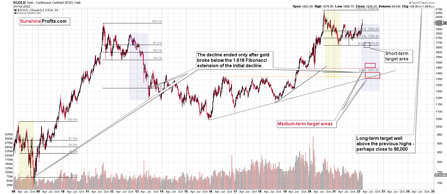
Please note that the above timing details are relatively broad and “for general overview only” – so that you know more or less what I think and how volatile I think the moves are likely to be – on an approximate basis. These time targets are not binding or clear enough for me to think that they should be used for purchasing options, warrants or similar instruments.
Summary
Summing up, despite the recent rally in gold, the outlook for junior mining stocks remains exactly as I described previously.
Crude oil’s extreme outperformance, the stock market’s weakness, and critical medium-term resistance levels reached by gold (all-time high!) and junior mining stocks, all indicate that the tops are at hand or have just formed. The huge-volume reversals in gold and (especially) mining stocks, along with silver’s short-term outperformance, all point to lower precious metals prices in the following days/weeks. It seems that the top is in.
Investing and trading are difficult. If it was easy, most people would be making money – and they’re not. Right now, it’s most difficult to ignore the urge to “run for cover” if you physically don’t have to. The markets move on “buy the rumor and sell the fact.” This repeats over and over again in many (all?) markets, and we have direct analogies to similar situations in gold itself. Junior miners are likely to decline the most, also based on the massive declines that are likely to take place (in fact, they have already started) in the stock markets.
From the medium-term point of view, the two key long-term factors remain the analogy to 2013 in gold and the broad head and shoulders pattern in the HUI Index. They both suggest much lower prices ahead.
It seems that our profits from short positions are going to become truly epic in the coming months.
After the sell-off (that takes gold to about $1,350-$1,500), I expect the precious metals to rally significantly. The final part of the decline might take as little as 1-5 weeks, so it's important to stay alert to any changes.
Most importantly, please stay healthy and safe. We made a lot of money last March and this March, and it seems that we’re about to make much more in the upcoming decline, but you have to be healthy to enjoy the results.
As always, we'll keep you - our subscribers - informed.
To summarize:
Short-term outlook for the precious metals sector (our opinion on the next 1-6 weeks): Bearish
Medium-term outlook for the precious metals sector (our opinion for the period between 1.5 and 6 months): Bearish initially, then possibly Bullish
Long-term outlook for the precious metals sector (our opinion for the period between 6 and 24 months from now): Bullish
Very long-term outlook for the precious metals sector (our opinion for the period starting 2 years from now): Bullish
As a reminder, Gold Investment Updates are posted approximately once per week. We are usually posting them on Monday, but we can’t promise that it will be the case each week.
Our preferred ways to invest in and to trade gold along with the reasoning can be found in the how to buy gold section. Additionally, our preferred ETFs and ETNs can be found in our Gold & Silver ETF Ranking.
Moreover, Gold & Silver Trading Alerts are posted before or on each trading day (we usually post them before the opening bell, but we don’t promise doing that each day). If there’s anything urgent, we will send you an additional small alert before posting the main one.
Thank you.
Przemyslaw Radomski, CFA
Founder, Editor-in-chief

