

Briefly: in our opinion, full (300% of the regular position size) speculative short positions in mining stocks are justified from the risk/reward point of view at the moment of publishing this Alert.
Welcome to this week's Gold Investment Update. Predicated on last week’s price moves, our most recently featured outlook remains the same as the price moves align with our expectations. On that account, there are parts of the previous analysis that didn’t change at all in the earlier days, which will be written in italics.
In the previous weeks, we started the analysis with the analysis of the fundamental factors that happened during the previous week, but in today’s Alert, we’ll take a slightly different approach – adding more fundamental details within the regular – more technical – analysis. Still, I’d like to emphasize the following:
All in all, there are multiple fundamental reasons why gold is likely to soar in the upcoming years. However, even the most profound bull markets can’t move up in a straight line, and some corrections will likely take place. After the big rallies, we will probably witness significant corrections, and in the case of the precious metals market, one is long overdue.
To clarify, the significant correction in the precious metals market is already underway, but it seems that it’s not over yet, and it’s probably before its biggest and most important part.
Triggers for the decline in the precious metals market are not necessary – the market might collapse on its own or as a result of some lone random trigger that normally wouldn’t cause any major action. However, a trigger would speed things up. The less likely trigger might come from the general stock market – after all, it fell sharply together in the first half of this year.
S&P 500 (SPX) Signals
Despite inching 0.17% lower for the week, the SPX is still trading well above its fair value. And like a fuse that’s ready to ignite, the ‘momentum begets momentum’ trade has manifested itself into a ticking time bomb.
Algorithms continue to push prices to the limit, but beneath the surface, the rally remains tired and overdone. In the coming weeks, the SPX is primed for a triangle-vertex-based reversal, with ~3,600 and ~3,400 as the initial breakpoints (with a larger plunge likely to unfold thereafter). Please note that the rally has practically ended after the vertex of the triangle based on the blue and red lines.
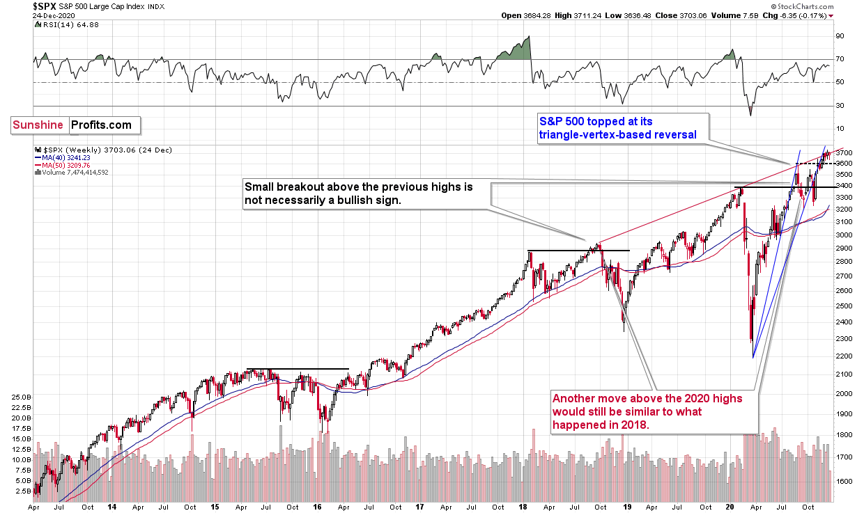
As historical precedent, a similar pattern emerged earlier this year. The SPX declined shortly after its triangle-vertex-based reversal (marked by the rising red line and the blue line based on the 2020 bottom and the June bottom).
The price action is also analogous to SPX’s behavior during the 2018 top:
Back in 2018, stocks moved above their previous high before sliding. The fact that they moved above their previous highs is therefore not as bullish as it first appears.
Fundamentally, the situation is even more alarming. Pick a valuation multiple out of a hat and the SPX’s current metric likely exceeds the Dotcom bubble.
Please see the chart below:
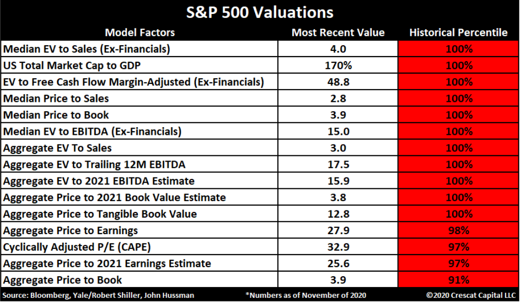
If you analyze the area shaded in red, you can see that 11 of the first 15 metrics (as of late November) are in the 100th percentile (meaning that comparable historical multiples were equal or lower 100% of the time). And while Jerome Powell, Chairman of the U.S. Federal Reserve, believes that P/E multiples are “not as relevant” in a world of low interest rates, history isn’t exactly on his side.
Remember though: A decline in stocks is not required for the PMs to decline. However, a break in the former could easily trigger a sell-off in the latter. And as history has shown, silver and the miners will be the hardest hit.
Gold and Seasonality
On Dec. 14, I discussed the variables that affected gold pre-and-post Thanksgiving:
This year, gold declined immediately before and right after Thanksgiving, after which it corrected. However, if we compare what gold did relative to the USD Index, we see that there is very little strength to be celebrated here. How does it impact the above seasonality? I think that it doesn’t mean that gold is bottoming right now, but rather that its decline is longer than the previous ones were on average. Based on many years of experience in this market, I think that what’s happening in the USD Index and how gold is reacting to it, is currently the key thing to pay attention to (along with monitoring the relative strength of silver and miners compared to gold). The seasonality is helpful, but it plays a supporting role, not the main one. All in all, perhaps we’ll see the final bottom closer to the end of the year or even later.
The key takeaway?
While seasonality is a helpful indicator, its historical precedent shouldn’t be taken as gospel. Instead, seasonality is an ancillary indicator – a co-pilot that supports other analysis. Specifically, the performance of the USD Index, and gold’s performance relative to the miners and silver provides more insight into the metal’s near-term direction. Thus, we’ll focus our attention on these variables going forward.
The USD Index (USDX)
After awakening from its slumber last week, the USD Index may be in the early innings of a short-term breakout. Bursting with energy, the dollar basket closed (on Dec. 22) above its declining resistance line (although more data is needed to confirm a larger move).
And to quote Francis Bacon, because “we rise to great heights by a winding staircase of small steps,” Tuesday’s ‘small step’ may be the beginning of an epic comeback.
Please see below:
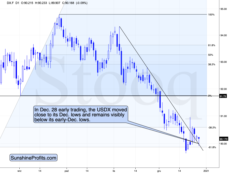
In this week’s early trading, the USDX moved lower and then rallied back up, after touching its previous resistance line, which now appears to have turned into support. Despite the initial decline, the USDX is now more or less where it had started this week’s trading. Its ability to reverse the initial decline appears bullish.
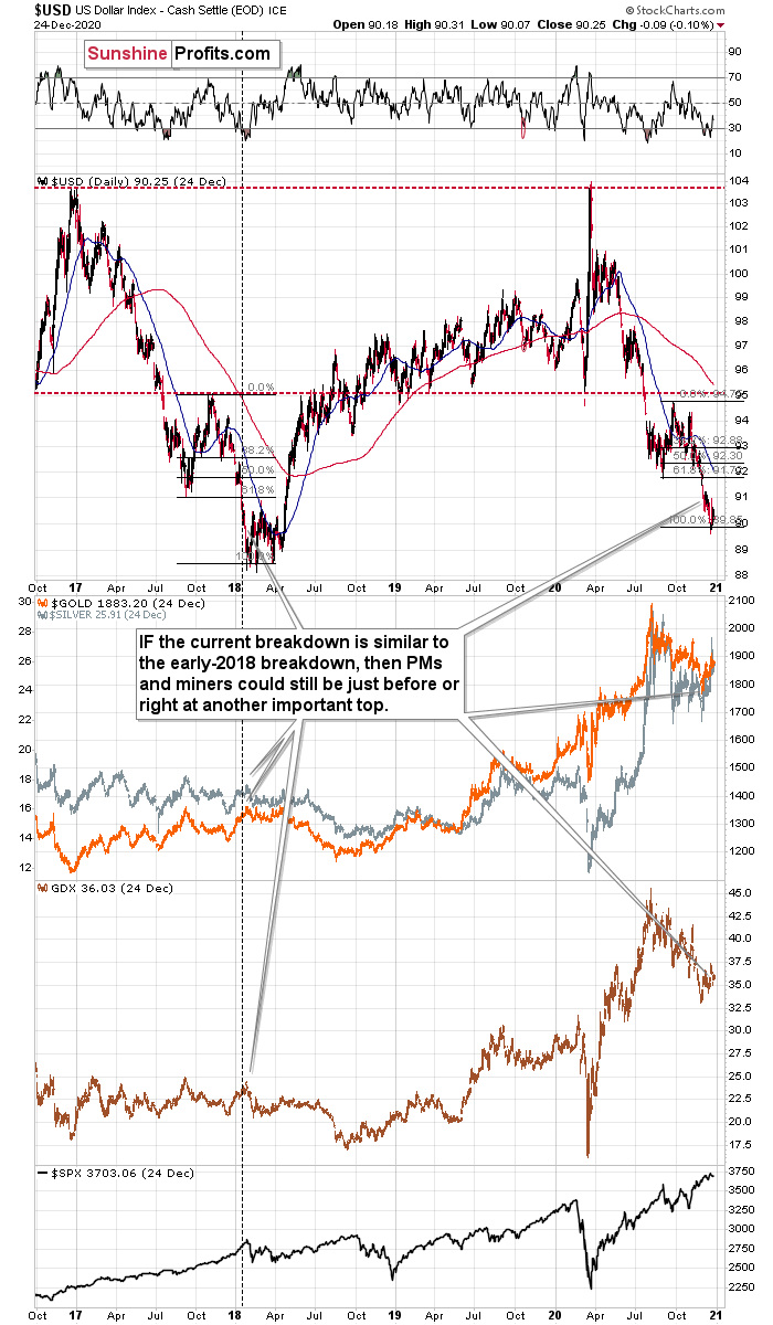
While the USDX traded lower-to-flat from Dec. 23 – 25, the price action still follows a familiar playbook: In 2018, the USDX dipped below the 1.618 Fibonacci extension level before circling back with a vengeance (The initial bottom occurred in early 2018, with the final bottom not far behind.) Moreover, the 2018 USDX bottom also marked the 2018 top in gold, silver and the gold miners (depicted in charts 2 and 3 below).
On Dec. 14, I elaborated on the potential move:
It appears that the USD Index is repeating its 2017 – 2018 decline to some extent. The starting points of the declines (horizontal red line) as well as the final high of the biggest correction are quite similar. The difference is that the recent correction was smaller than it was in 2017.
Since back in 2018, the USDX’s bottom was at about 1.618 Fibonacci extension of the size of the correction, we could expect something similar to happen this time. Applying the above to the current situation would give us the proximity of the 90 level as the downside target.
“So, shouldn’t gold soar in this case?” – would be a valid question to ask.
Well, if the early 2018 pattern was being repeated, then let’s check what happened to precious metals and gold stocks at that time.
In short, they moved just a little higher after the USDX’s breakdown. I marked the moment when the U.S. currency broke below its previous (2017) bottom with a vertical line, so that you can easily see what gold, silver, and GDX (proxy for mining stocks) were doing at that time. They were just before a major top. The bearish action that followed in the short term was particularly visible in the case of the miners.
Consequently, even if the USD Index is to decline further from here, then the implications are not particularly bullish for the precious metals market.
And as we approach the New Year and beyond, I expect a similar pattern to emerge.
Why so?
First, the USD Index is after a long-term, more-than-confirmed breakout. This means that the long-term trend for the U.S. currency is up.
Second, the amount of capital that was shorting the USD Index was excessive even before the most recent decline. This means that the USD Index is not likely to keep declining for much longer.
In addition, after last week’s drawdown in gold and the gold miners, the sun appears to be setting on the yellow metal. As ‘buy the dip’ morphs into ‘sell the rally,’ gold’s downtrend is likely to resume. Furthermore, the 2018 analogue signals that SPX’s days are also numbered (If you analyze the chart above, you can see that the USDX bottom coincided with the SPX top.)
Fundamentally, the USDX is also poised to pop.
On Tuesday (Dec. 22), I highlighted the misguided narrative plaguing the U.S. dollar. In short:
With liquidity spigots on full blast around the world, the U.S. isn’t the only region expanding its money supply (And remember, currencies trade on a relative basis.) In fact, the European Central Bank (ECB) has more assets on its balance sheet than the U.S. Federal Reserve (FED).
And after another update, the ECB’s spending spree has now reached a record €7 trillion (As a point of reference, the Dec. 22 ECB chart was relative to the FED, so both balance sheets were presented in U.S. dollars. The chart below depicts the ECB’s balance sheet in euros).
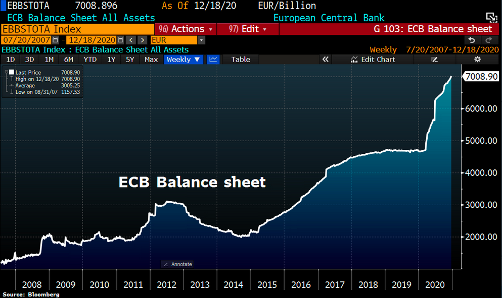
Week-over-week, the ECB’s balance sheet increased by €59 billion. But the real story? The ECB’s total assets now equal 69% of Eurozone GDP – nearly double the FED’s 35%. So while EUR/USD clawed back some of its early-week losses (after the EU and the U.K. reached a Brexit agreement), its prior three-day downtrend (Dec. 18 – 22) is likely to continue (Remember, movement in the euro accounts for nearly 58% of the movement in the USDX.)
Consequently, the implications for the precious metals market are not as bearish as everyone and their brother seems to tell you. Conversely, the forex market could provide the PMs and mining stocks with a substantial bearish push in the coming weeks – or even days.
As further evidence of a potential uprising, please see the USDX’s long-term breakout in 2015:
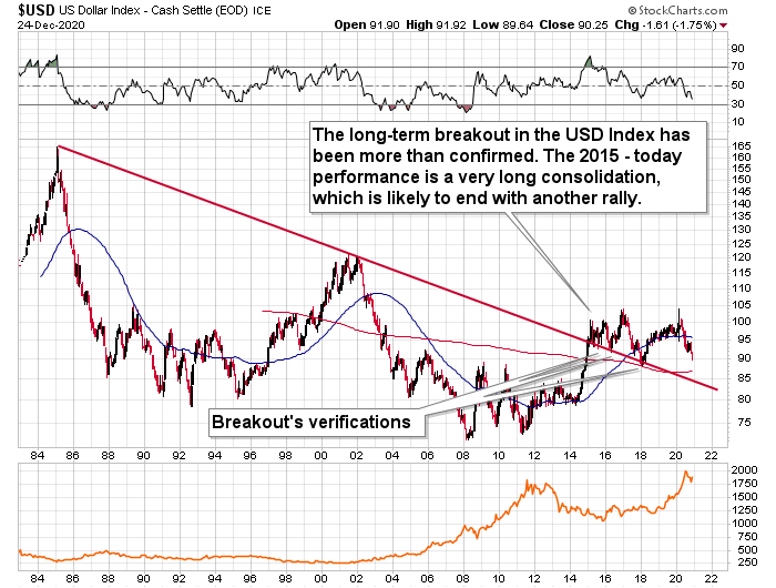
The duration of the move, the multiple breakouts, and the five-year consolidation signals a move higher for the USDX. This remains the path of least resistance (perhaps to the ~120 level).
Please note that the consolidation that preceded the previous rally to 120 that took place between 1997 and 2000 happened when the USD index was trading at relatively similar price levels – approximately between 90 and 105.
A second major factor is extreme USDX bearishness within the futures market. A contrarian indicator, net-short USDX futures positions remain excessively high.
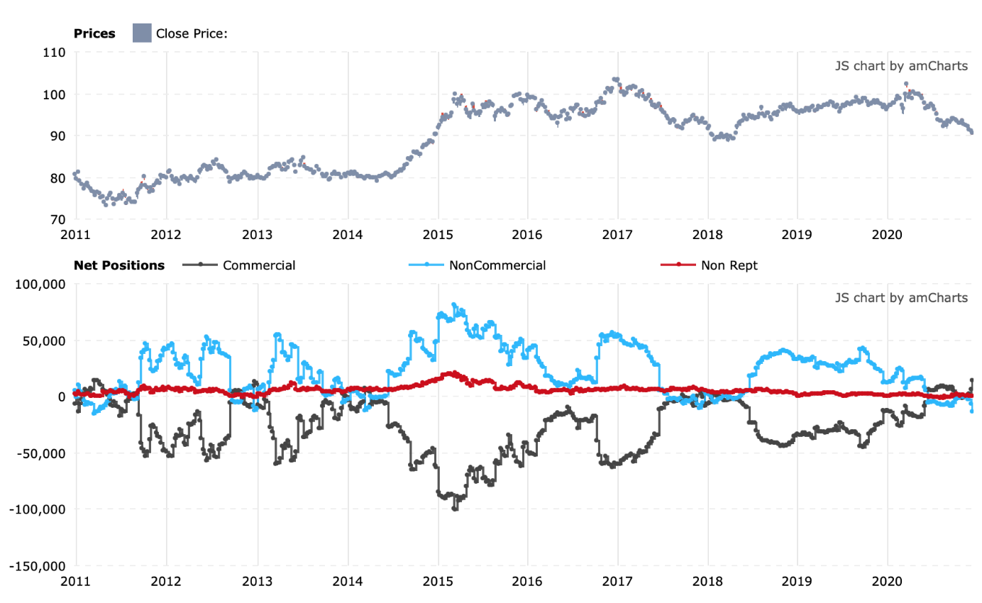
The above chart shows the netted version of the positions included in the Commitment of Traders report. Please note how the lows in the blue line correspond to major medium-term bottoms in the USD Index. We once again find ourselves in this situation.
On the fundamental front, please keep in mind that for the currency markets it’s not important how “things are going in the U.S.”, but how they are doing relative to the rest of the world, and most importantly, relative to the Eurozone and Japan (currency exchange rates against the euro and the yen have the biggest weights in the USD Index, which is ultimately a weighted average of currency exchange rates). Are things about to get much worse in the U.S. compared to them? No. In risking oversimplification, let’s say that while things are bad pretty much all around the world, they might actually get calmer in the U.S. as the post-presidential election turmoil subsides.
Please note that the current – broad – lows in the values of the net positions of the non-commercial traders (broad bottom in the blue line) is similar to only one case from the past – the 2017-2018 bottom. This further confirms the validity of the analogy to 2018 that I made earlier, based on the similarity in price patterns.
In summary, there are a variety of bullish catalysts supporting a higher USDX:
- Technicals show a bottom is forming (or may have already formed).
- Fundamentals show the ‘lower USDX story’ is much more semblance than substance.
- One-sided futures positing signals that a short-covering rally could be imminent (which results in traders buying the U.S. dollar, thus propelling the USDX higher).
Sentiment Indicators
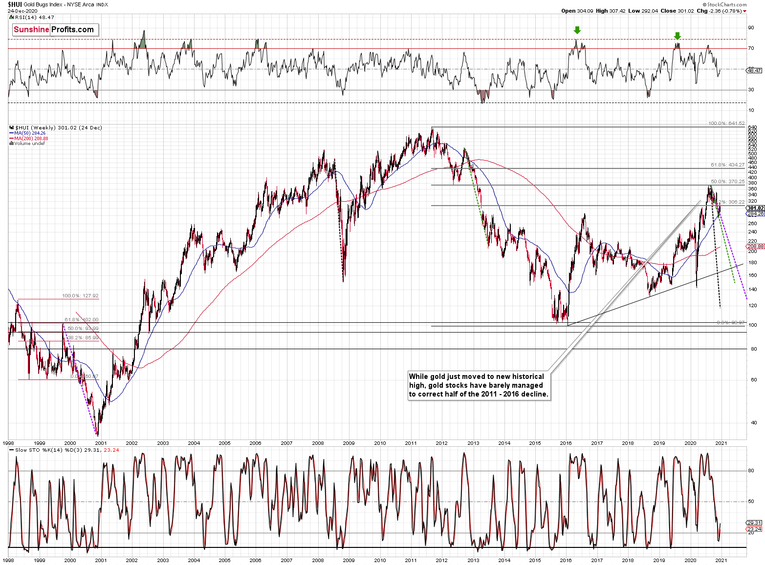
After last week’s trade, the Gold Miners Bullish Percent Index ($BPGDM) moved slightly lower. However, it still remains above 40 and sits more than 30 points above the 2016 and 2020 lows.
On Dec. 14, I wrote:
Back in 2016 (after the top), and in March 2020, the buying opportunity didn’t present itself until the $BPGDM was below 10.
Despite the green arrows, it’s important to remember that gold is simply treading water, and it will take a lot more negativity before it finds a bottom.
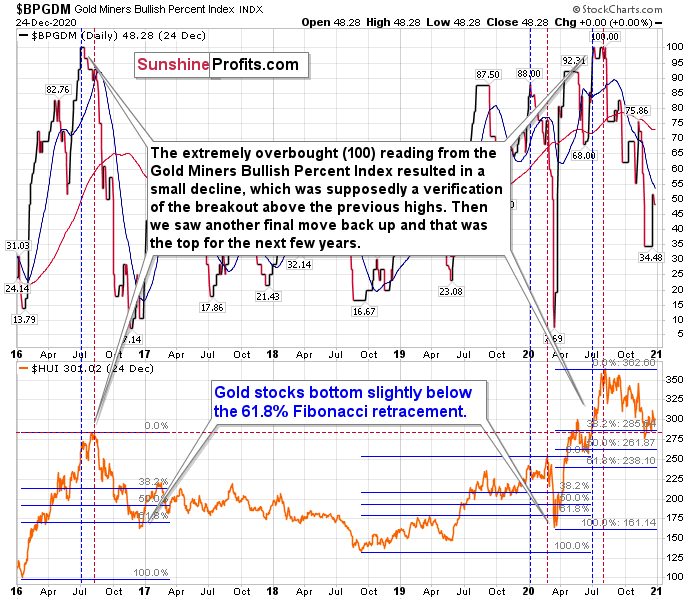
The excessive bullishness was present at the 2016 top as well and it didn’t cause the situation to be any less bearish in reality. All markets periodically get ahead of themselves regardless of how bullish the long-term outlook really is. Then, they correct. If the upswing was significant, the correction is also quite often significant.
Please note that back in 2016, there was an additional quick upswing before the slide and this additional upswing had caused the $BPGDM to move up once again for a few days. It then declined once again. We saw something similar also in the middle of this year. In this case, the move up took the index once again to the 100 level, while in 2016 this wasn’t the case. But still, the similarity remains present.
Back in 2016, when we saw this phenomenon, it was already after the top, and right before the big decline.
Based on the decline from above 350 to below 280, we know that a significant decline is definitely taking place. But has it already run its course?
Let’s consider two similar cases when gold miners declined significantly after the $BPGDM was very high: the 2016 decline and early-2020 decline.
In both cases, the HUI Index continued to decline until it moved slightly below its 61.8% Fibonacci retracement level. This means that if the history is to repeat itself, we shouldn’t expect any major turnaround until the gold miners decline to 220 - 230 or so. Depending on how things are developing in gold, the above might or might not be the final bottom, though.
Please note that the HUI already declined below its 2016 high. This breakdown is yet another bearish sign.
Gold Miners (GDX)
Declining by 1.50% for the week, I warned on Dec. 18 that options activity across the GDX signaled trouble beneath the surface.
And in an unsurprising twist, the GDX failed to recapture its December highs. For context, on Dec. 17, the GDX traded above its 50-day moving average, however, it failed to hold the key level and closed below it again this week (invalidating the initial breakout).
But since the 50-day MA acts as a fulcrum between the bulls and the bears, how will the tug-of-war end?
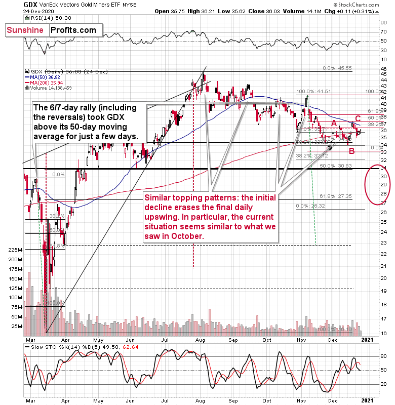
Well, like a glass ceiling that just won’t break, the GDX is staring up at a potential top (with the next move lower likely to unfold in the coming weeks – perhaps days).
Why so?
Last week’s price action was analogous to the GDX’s behavior in October. From a short-term perspective, Decembers’ rallies continue to fizzle, which follows the topping pattern seen in October.
Furthermore, on Tuesday (Dec 22.), the Stochastic indicator began flashing red. The last time this occurred, the GDX declined by approximately $8. From the most recent top, it implies a bottom of roughly $31 (the upper bound of a target range that I’ve reiterated for some time).
Last but not least (in fact, it’s the most important indication that keeps on flashing the very bearish signals), the GDX’s underperformance relative to gold hasn’t dissipated. I wrote previously:
While gold corrected about 61.8% of its November decline, gold miners declined only half thereof. In other words, they underperformed gold, which is bearish.
The GDX ETF moved to its 50-day moving average – the level that kept its rallies in check since early October. Can miners move above it? Sure, they did that in early November, but is it likely that such a move would be confirmed or followed by more significant strength? Absolutely not. Let’s keep in mind two things:
- Back in early November, the GDX moved above the 50-day MA, when gold did the same thing, so if the GDX wanted to rally above this MA, it “should have” done so yesterday. It was too weak to do it.
- The early-November move above the 50-day MA was invalidated in just 2 days.
Moreover, please note that the performance of the GDX ETF from late-November to now looks like an ABC correction. This is not a bearish sign on its own, but it fits other indications described today and this week in general. It increases the chance that the top is already in or very, very close.
Another important development was the spike in volume during Thursday’s (Dec. 17) upswing. It resulted in the largest number of GDX shares traded since the November 6 top (on days when GDX is positive), and we all know what happened to GDX after November 6 (As a point of reference, the four other highest volume days since the November 6 top coincided with declines of 6.13%, 2.74%, 3.40% and 4.29%).
How about today’s pre-market trading?
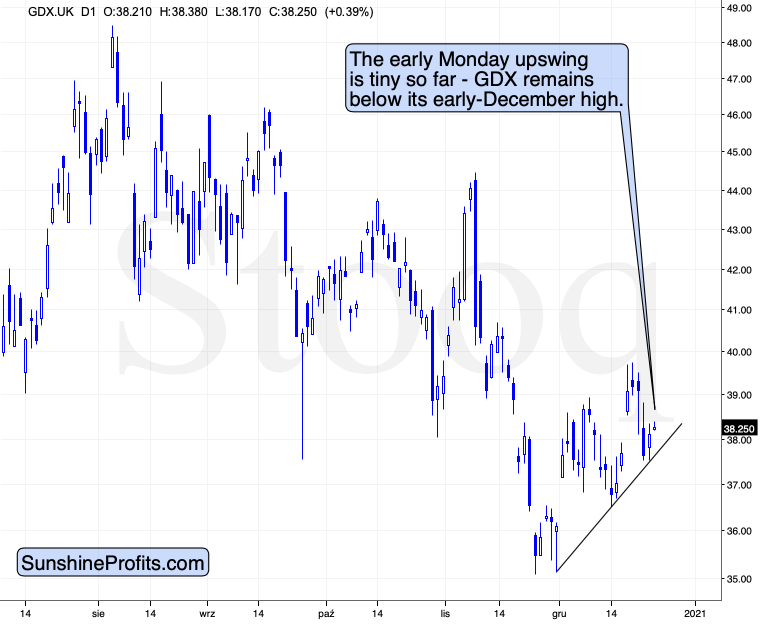
GDX’s early trading on the London Stock Exchange shows that the ETF moved higher by very little in response to a more visible move higher in gold and, in particular, silver. Today’s intraday high (so far) is well below the early-Dec. high, while gold’s and silver’s intraday high and the current prices are both above their respective early-Dec highs. Miners are clearly underperforming and the implications are clearly bearish.
Regarding price targets, my December 1 comments remain up to date:
How high could miners go? Perhaps only to the previous lows and by moving to them, they could verify them as resistance. The previous – October – low is at $36.01 in intraday terms and at $36.52 in terms of the daily closing prices. No matter which level we take, it’s not significantly above the pre-market price of $35.76, thus it seems that adjusting the trading position in order to limit the exposure for the relatively small part of the correction is not a good idea from the risk to reward perspective – one might miss the sharp drop that follows. Please note how sharp the mid-November decline was initially.
That’s almost exactly what happened – the GDX ETF rallied to $36.92 in intraday terms, and to $36.50 in terms of the daily closing prices. The breakdown was verified in terms of the daily closing prices, which is more important than what happened in intraday terms.
Consequently, the outlook is bearish as it seems that miners are ready for another move lower. There’s still a chance that the precious metals sector would move higher based on a possible short-term decline in the USD Index, but this chance is slim, especially given today’s pre-market decline in both the USD Index and gold.
The next downside target for the GDX ETF is the February top in terms of the closing prices – $31.05.
Also, let’s not forget that the GDX ETF has recently invalidated the breakout above the 61.8% Fibonacci retracement based on the 2011 – 2016 decline.
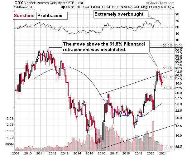
When GDX approached its 38.2% Fibonacci retracement, it declined sharply – it was right after the 2016 top. Are we seeing the 2020 top right now? This is quite possible – PMs are likely to decline after the sharp upswing, and since there is just more than one month left before the year ends, it might be the case that they move north of the recent highs only in 2021.
Either way, miners’ inability to move above the 61.8% Fibonacci retracement level and their invalidation of the tiny breakout is a bearish sign.
The same goes for miners’ inability to stay above the rising support line – the line that’s parallel to the line based on the 2016 and 2020 lows.
Gold
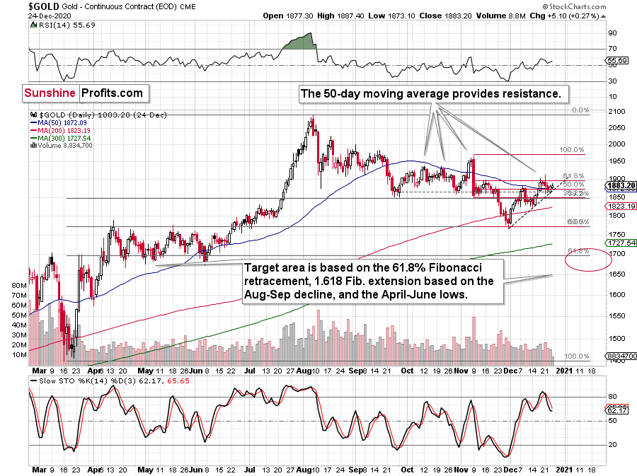
Despite bouncing off its rising support line (the dotted line on the right side of the chart), gold still ended the week in the red. Lifted by an indecisive USDX (which consolidated during the back-half of the week), gold’s 50-day moving average (which it held last week) remains the last line of defense for the bulls.
But just like the sun – which appears brightest before it sets – gold is unlikely to hold its 50-day MA for much longer. In addition, gold’s RSI (at ~56) is currently declining from a similar level that preceded the yellow metal’s plunge in November (the line shown at the very top of the chart).
Last week, I warned that rising real yields could also derail the golden rally. When real yields are negative (meaning the expected inflation rate is greater than the nominal interest rate), it’s bullish for gold, because the yellow metal offers a higher potential return than owning government bonds. Conversely, when real yields are positive (or become less negative), the opposite occurs.
Putting in a double bottom at – 1.08% on August 6 and August 31, the U.S. 10-Year real yield currently sits at – 1.01% (1 basis point below last week).
However, despite real interest rates inching lower, nominal interest rates (the yields listed on various government bonds) could be a sleeping giant.
Please see the chart below:
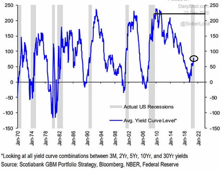
Notice the shaded gray bars from top to bottom? They represent historical U.S. recessions. And to make a relative assessment, the blue line is the average interest rate on U.S. Treasuries (various maturities) during the same time periods.
If you analyze the last U.S. recession (the 2008 housing crisis, represented by the shaded gray bar near Jan-10), you’ll notice that the average U.S. Treasury yield peaked at more than 200 basis points (2.00%). In contrast, during the current economic malaise, the average U.S. Treasury yield hasn’t eclipsed (roughly) 75 basis points (0.75%).
The key takeaway?
If the average U.S. Treasury yield repeats its historical pattern, then nominal interest rates have plenty of room to move higher. And following right along, they will lift real yields in the process (unless the expected inflation rate swells, which is unlikely). The potential development is extremely bearish for gold, because it decreases gold’s attractiveness relative to government bonds. So, while pundits keep reiterating that “this time is different,” history suggests otherwise.
As another piece of the interest rate puzzle, copper/gold could be the missing link.
Tilting the scale between risk-on and risk-off, the copper/gold ratio increases when investors are bullish on economic growth and decreases when investors are bearish on economic growth.
Please see below:
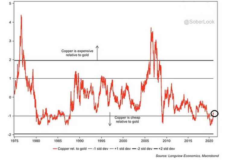 Right now, copper/gold is trading nearly 1 standard deviation below its historical average, implying a ~18% chance of moving lower and an ~82% chance of moving higher when using standard normal probabilities (Z-Score of – 0.90). In other words, based on the reversion to its mean.
More importantly though, copper/gold is highly correlated with U.S. Treasury yields: When the ratio increases (copper is outperforming), higher interest rates tend to follow. Conversely, when the ratio decreases (gold is outperforming), lower interest rates tend to follow.
Notice the blue and gold lines moving in similar directions – especially since 2010?
The bottom line is that copper/gold might have the same effect as the steepening yield curve (one might be indicating the other and result in turn be followed by lower gold prices). If it reverts back to its historical average (by moving higher), gold will likely face significant selling pressure.
*Still, based on what we explained in the opening part of last Monday’s analysis, the situation with real interest rates is a big “if”.
Let’s zoom in.
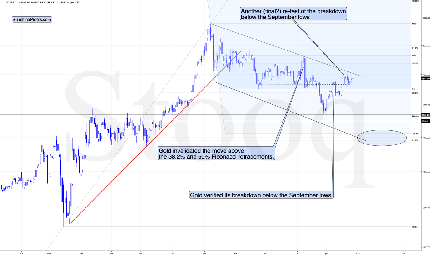
As you can see on the above chart, gold invalidated the move above the mid-November highs – again. Just as the USDX declined and reversed its decline, gold reversed its early rally.
Still, please note that today’s intraday high (at the moment of writing these words) is clearly above the early December high. In fact, the current gold price is above the early December high. Please compare that to where gold miners (GDX) are trading on the LSE – well below their December high. Miners are clearly weak, and the implications are clearly bearish.
Before moving further, I would like to quote my previous comments that explain why I expect gold to bottom at least at the $1,700 level.
One of the reasons is the 61.8% Fibonacci retracement based on the recent 2020 rally, and the other is the 1.618 extension of the initial decline. However, there are also more long-term-oriented indications that gold is about to move to $1,700 or lower.
(…) gold recently failed to move above its previous long-term (2011) high. Since history tends to repeat itself, it’s only natural to expect gold to behave as it did during its previous attempt to break above its major long-term high.
And the only similar case is from late 1978 when gold rallied above the previous 1974 high. Let’s take a look at the chart below for details (courtesy of chartsrus.com)
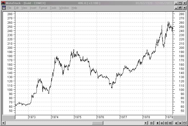
As you can see above, in late 1978, gold declined severely right after it moved above the late-1974 high. This time, gold invalidated the breakout, which makes the subsequent decline more likely. And how far did gold decline back in 1978? It declined by about $50, which is about 20% of the starting price. If gold was to drop 20% from its 2020 high, it would slide from $2,089 to about $1,671.
This is in perfect tune with what we described previously as the downside target while describing gold’s long-term charts:
The chart above shows exactly why the $1,700 level is even more likely to trigger a rebound in gold, at the very minimum.
The $1,700 level is additionally confirmed by the 38.2% Fibonacci retracement based on the entire 2015 – 2020 rally.
There’s also a good possibility that gold could decline to the $1,500 - $1,600 area or so (50% - 61.8% Fibonacci retracements and the price level to which gold declined initially in 2011), but based on the size of the recent upswing, we no longer think that this scenario is the most likely one.
The odd thing about the above chart is that I copied the most recent movement in gold and pasted it above gold’s 2011 – 2013 performance. But – admit it – at first glance, it was clear to you that both price moves were very similar.
And that’s exactly my point. The history tends to rhyme and that’s one of the foundations of the technical analysis in general. Retracements, indicators, cycles, and other techniques are used based on this very foundation – they are just different ways to approach the recurring nature of events.
However, every now and then, the history repeats itself to a much greater degree than is normally the case. In extremely rare cases, we get a direct 1:1 similarity, but in some (still rare, but not as extremely rare) cases we get a similarity where the price is moving proportionately to how it moved previously. That’s called a market’s self-similarity or the fractal nature of the markets. But after taking a brief look at the chart, you probably instinctively knew that since the price moves are so similar this time, then the follow-up action is also likely to be quite similar.
In other words, if something looks like a duck, and quacks like a duck, it’s probably a duck. And it’s likely to do what ducks do.
What did gold do back in 2013 at the end of the self-similar pattern? Saying that it declined is true, but it doesn’t give the full picture - just like saying that the U.S. public debt is not small. Back then, gold truly plunged. And before it plunged, it moved lower in a rather steady manner, with periodic corrections. That’s exactly what we see right now.
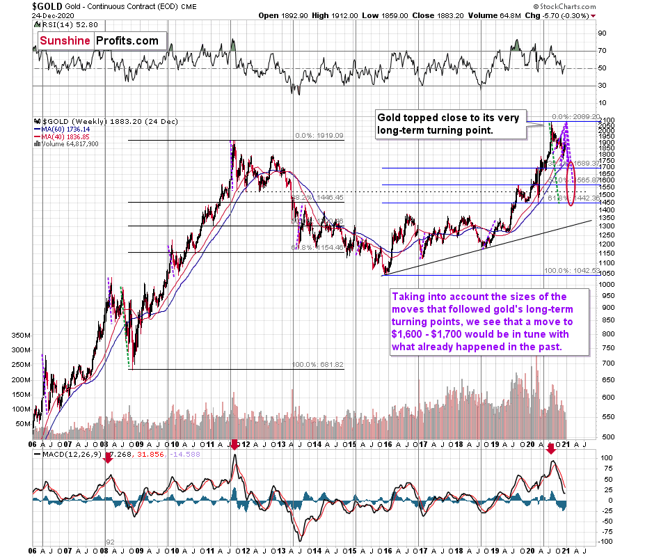
Please note that the above chart shows gold’s very long-term turning points (vertical lines) and we see that gold topped a bit after it (not much off given their long-term nature). Based on how gold performed after previous long-term turning points (marked with purple, dashed lines), it seems that a decline to even $1,600 would not be out of ordinary.
Finally, please note the strong sell signal from the MACD indicator in the bottom part of the chart. The only other time when this indicator flashed a sell signal while being so overbought was at the 2011 top. The second most-similar case is the 2008 top.
The above-mentioned self-similarity covers the analogy to the 2011 top, but what about the 2008 performance?
If we take a look at how big the final 2008 decline was, we notice that if gold repeated it (percentage-wise), it would decline to about $1,450. Interestingly, this would mean that gold would move to the 61.8% Fibonacci retracement level based on the entire 2015 – 2020 rally. This is so interesting, because that’s the Fibonacci retracement level that (approximately) ended the 2013 decline.
History tends to rhyme, so perhaps gold is going to decline even more than the simple analogy to the previous turning points indicates. For now, this is relatively unclear, and my target area for gold’s final bottom is quite broad.
Silver
Barely able to outrun gold and the GDX, silver was also in the red last week. But given its almost continuous outperformance in recent days, silver’s price action remains medium-term bearish.
In early December, investors rejected silver’s breakout above the November highs (as it fell below the dotted line at the top right-hand corner of the chart below). Since then, $26 has become the breakpoint and bulls have been unable to push the white metal sustainably higher.
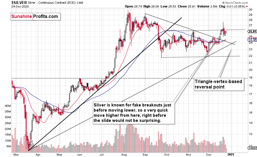
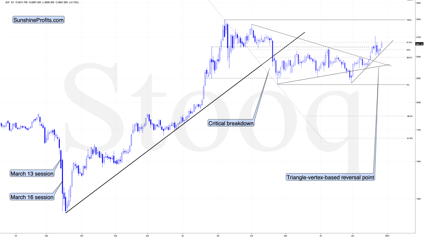
Additionally, silver is fast-approaching its triangle-vertex-based reversal point, which is likely to climax by the end of the week.
So ... should we brace for fireworks?
Well, not necessarily. Over the next few days, the price action remains a coin flip. With a lack of conviction among market participants, silver could plunge over the near-term or it could continue its consolidation.
Either way, silver’s car is running out of gas and it could approach a dead end in the next few weeks. Or days. Or hours.
If you analyze the chart above, you can see that silver remains range-bound – stuck within a roughly four-month channel (despite the violent swings in both directions).
And what does this mean?
Not much, actually – it means that the white metal is continuing to trade sideways after breaking below the rising, medium-term support line in mid-September.
What is most important here is that silver is holding up much better than gold and – in particular – mining stocks. If this was the early stage of a rally, miners would have been strong, and silver would have been weak or average. What we see confirms the validity of the bearish case for the next few weeks or months.
In today’s pre-market trading, we see that silver once again showed strength relative to gold and – in particular – relative to gold stocks. This relative performance serves as yet another bearish confirmation.
For greater insight, it’s valuable to analyze the relative performance of the precious metals and compare how they’re impacted by the USDXand the SPX.
And dancing to the same beat, gold, silver and the GDX all broke down in September after the USDX broke above resistance.
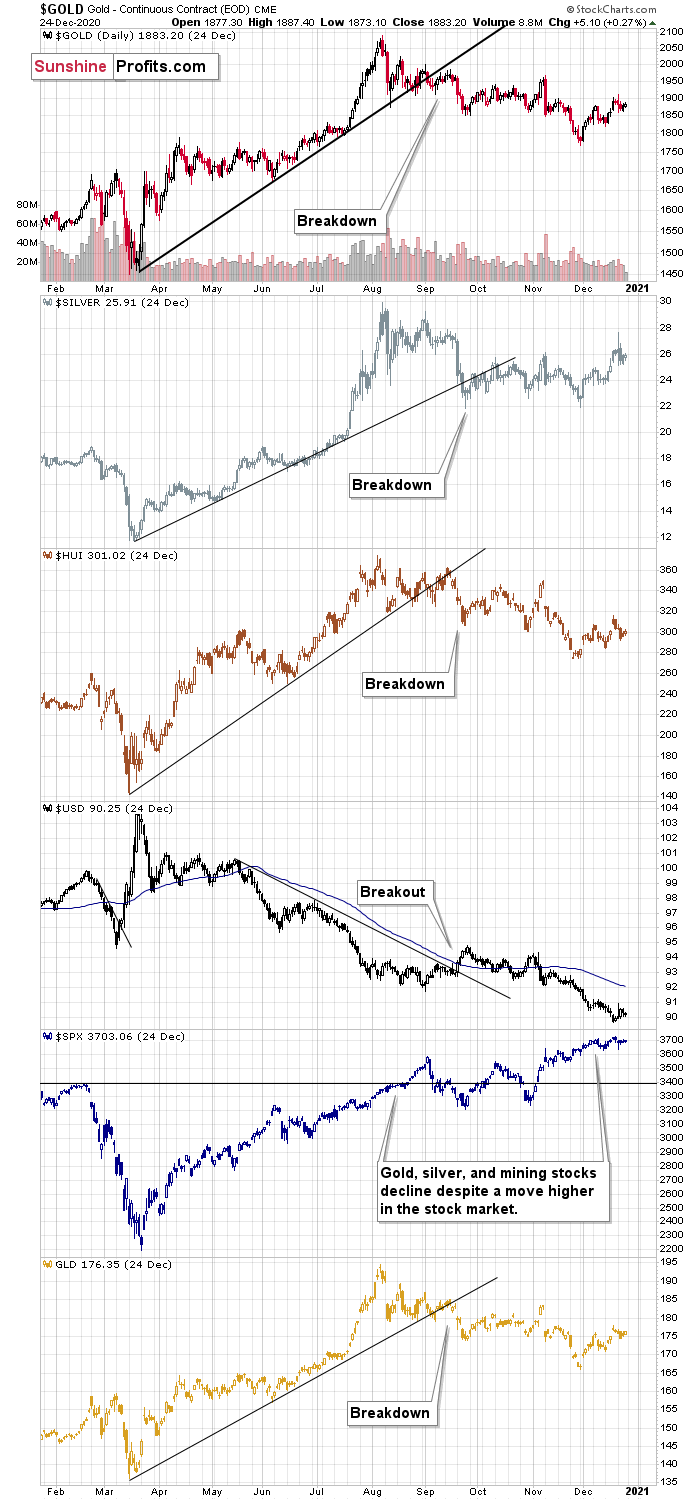
What happened since that time? The USD Index moved somewhat higher, but then ultimately moved to and stayed at new yearly lows. Gold, silver, and mining stocks should have rallied given the above. They have not.
Silver is more or less at the level just before it broke, gold is below it, and mining stocks are also below it – the most out of the entire trio.
So, it is not only the case that silver was strong and miners were weak in the last several days – it’s been the case over the past few months as well. The implications are bearish.
Also troubling is that the soaring stock market hasn’t shined its light upon silver. Contrasting the mantra that ‘a rising tide lifts all boats,’ equity market strength hasn’t triggered a sustainable rally in silver or the gold miners. And this “should have” been the case – both are more connected to stocks than gold is. Gold stocks because they are, well, stocks. Silver, due to multiple industrial uses.
Additionally, the implications coming from silver’s long-term chart are also bearish for the next several weeks (perhaps even months) due to the size of the volume that accompanied the recent monthly rally.
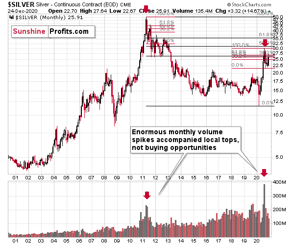
If you look at the monthly silver volume levels, it seems likely that the next sizable downswing has already begun. The previous substantial monthly volume in silver accompanied the 2011 top. The analogy doesn’t get more bearish than this. Ok, it would, if there were multiple key tops confirmed by huge monthly volume. But the 2011 top was so significant that other tops are not comparable, except for the most recent one. Thus, the implications are bearish.
Moreover, please keep in mind that while gold moved to new highs, silver – despite its powerful short-term upswing – didn’t manage to correct more than half of its 2011 – 2020 decline.
In fact, silver has already invalidated its move above the lowest of the classic Fibonacci retracement levels (38.2%), which is not something that characterizes extraordinarily strong markets.
Just as in 2011, silver initially spiked on high volume, before rolling over and making a vertical move lower. Then it corrected slightly more than 61.8% of the preceding decline and then it truly plunged – much more than it had declined initially. We already saw the initial slide and the corrective upswing slightly above the 61.8% retracement. If the history is to rhyme (and this appears likely) then we can expect to see a sizable slide in the white metal in the next several weeks to months.
Based on the above chart, it seems that silver is likely to move well above its 2011 highs, but it’s unlikely to do it without another sizable downswing first.
We are witnessing something similar in the HUI Index as well. The latter corrected half of its 2011 – 2016 decline and nothing more, while gold moved well above its 2011 high.
All in all, it was mostly gold that was making the major gains earlier this year – not the entire precious metals sector.
Please note that the HUI Index is declining at a pace that’s very much in tune with how it declined in 1999-2000 and 2012-2013, which is a particularly bearish similarity.
To explain, focus on the green and purple dotted lines on the right side of the chart: In recent months, the HUI Index has been declining at a similar pace to the drawdown in 1999-2000. And despite what the bulls tell you, interim upswings were also apparent before the 1999-2000 drop.
Thus, the recent price action – even the short-term rallies - remains very bearish. And the HUI Index is likely to succumb to a similar fate over the next few weeks and months.
So, how do we determine whether we see the buying opportunity or not?
We will view the price target levels as guidelines, and the same goes for the Gold Miners Bullish Percent Index (below 10), but the final confirmation will likely be something else. Something that we already saw in March when gold bottomed.
We will be on a special lookout for gold’s strength against the ongoing USDX rally. At many vital bottoms in gold, that’s exactly what happened, including the March bottom.
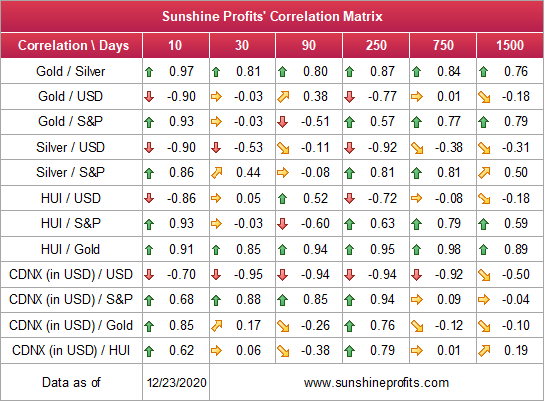
As one would expect, the correlation between gold and the USDX is strongly negative over the medium-term (past year). However, after trading in similar directions over the previous 30 days, gold, silver and the HUI Index (relative to the USD) are now back to their usual divergences (10-day correlations of – 0.90, – 0.90 and – 0.86). Naturally, 10 trading days of data is not enough to say if the correlations are fully back to normal, but it seems that return to normalcy is indeed taking place. This means that a rally in the USDX would be likely to trigger a slide in the PMs and miners.
Since gold, silver, and mining stocks have been strongly negatively correlated with the USD Index in the medium term, it seems likely that they will be negatively affected by the upcoming sizable USDX upswing.
…Until we see the day where gold reverses or soars despite the U.S. currency’s rally.
If that happens with gold at about $1,700, we’ll have a very good chance that this was the final bottom. If it doesn’t happen at that time, or gold continues to slide despite USD’s pause or decline, we’ll know that gold has further to fall.
Naturally we’ll keep you – our subscribers – informed.
To move forward, how does the GDX downside target compare to gold’s downside target? If, at the same time, gold moves to about $1,700 and miners are already after a ridiculously big drop (to $31-$32 in the GDX ETF, or lower), the binding profit-take exit price of your GDX ETF will become $32.02 (those with higher risk tolerance might lower it to $31.15 or so, but moving it lower seems just too risky).
At this time, the final GDX target (the one that would correspond to gold at $1,500 or so) is still unclear. The $17 - $23 area seems probable, especially if the general stock market slides once again. It’s too early to say with any significant level of certainty. Gold is providing us with a clearer final target, so that’s what we’ll focus on. And most importantly – we’ll focus on gold’s performance relative to the USD Index.
Overview of the Upcoming Decline
- As far as the current overview of the upcoming decline is concerned, I think it has already begun.
- During the final part of the slide (which could end within the next 1-5 weeks or so), I expect silver to decline more than miners. That would align with how the markets initially reacted to the Covid-19 threat.
- The impact of all the new rounds of money printing in the U.S. and Europe on the precious metals prices is incredibly positive in the long run, which does not make the short-term decline improbable. Markets can and will get ahead of themselves and decline afterward – sometimes very profoundly – before continuing with their upward climb.
- The plan is to exit the current short positions in miners after they decline far and fast, but at the same time, silver drops just “significantly” (we expect this to happen in 0 – 3 weeks ). In other words, the decline in silver should be severe, but the decline in the miners should look “ridiculous”. That’s what we did in March when we bought practically right at the bottom . It is a soft, but simultaneously broad instruction, so additional confirmations are necessary.
- I expect this confirmation to come from gold, reaching about $1,700 - $1,750 . If – at the same time – gold moves to about $1,700 - $1,750 and miners are already after a ridiculously big drop (say, to $31 - $32 in the GDX ETF – or lower), we will probably exit the short positions in the miners and at the same time enter short positions in silver. However, it could also be the case that we’ll wait for a rebound before re-entering short position in silver – it’s too early to say at this time. It’s also possible that we’ll enter very quick long positions between those short positions.
- The precious metals market's final bottom is likely to take shape when gold shows significant strength relative to the USD Index . It could take the form of a gold’s rally or a bullish reversal, despite the ongoing USD Index rally.
Summary
While Christmas came early for the precious metals last week, the holiday cheer isn’t likely to last very long. Despite doing its best Santa Clause impersonation, silver’s gift-giving isn’t rubbing off on gold or the gold miners. And given its relative outperformance, it’s most likely only a matter of time before silver’s sleigh crashes.
The divergent price action signals that the next move lower in the precious metals market is already underway. It will likely take another 1-5 weeks to play out (or perhaps even longer), with gold falling to or below $1,700 and with a substantial decline in silver (downside target is unclear) and miners ($1,700 in gold is likely to correspond to about $31 in GDX).
Remember, the recent upswing is a relatively normal bounce within a bigger decline. And after last week’s drawdown, this corrective upswing might have already ended.
Despite a recent decline, it seems that the USD Index is going to move higher in the following months and weeks, in turn causing gold to decline. At some point gold is likely to stop responding to dollar’s bearish indications, and based on the above analysis, it seems that this is already taking place.
Naturally, everyone's trading is their responsibility. But in our opinion, if there ever was a time to either enter a short position in the miners or increase its size if it was not already sizable, it's now. We made money on the March decline, and on the March rebound, with another massive slide already underway.
After the sell-off (that takes gold to about $1,700 or lower), we expect the precious metals to rally significantly. The final decline might take as little as 1-5 weeks, so it's important to stay alert to any changes.
Most importantly, please stay healthy and safe. We made a lot of money on the March decline and the subsequent rebound (its initial part) price moves (and we'll likely earn much more in the following weeks and months), but you have to be healthy to enjoy the results.
As always, we'll keep you - our subscribers - informed.
To summarize:
Short-term outlook for the precious metals sector (our opinion on the next 1-6 weeks): Bearish
Medium-term outlook for the precious metals sector (our opinion for the period between 1.5 and 6 months): Bearish initially, then possibly Bullish
Long-term outlook for the precious metals sector (our opinion for the period between 6 and 24 months from now): Bullish
Very long-term outlook for the precious metals sector (our opinion for the period starting 2 years from now): Bullish
Our preferred ways to invest in and to trade gold along with the reasoning can be found in the how to buy gold section. Furthermore, our preferred ETFs and ETNs can be found in our Gold & Silver ETF Ranking.
As a reminder, Gold & Silver Trading Alerts are posted before or on each trading day (we usually post them before the opening bell, but we don't promise doing that each day). If there's anything urgent, we will send you an additional small alert before posting the main one.
Thank you.
Sincerely,
Przemyslaw Radomski, CFA
Editor-in-chief, Gold & Silver Fund Manager

