

And so it happened. Gold stocks closed the week below the neck of their inverse head-and-shoulders pattern, while the USD Index closed it above its own inverse H&S. The implications thereof are strongly bearish for gold, silver, and mining stocks and we can say the same about gold’s shooting star candlestick that formed on Friday... And that’s not even close to being everything that happened and changed in the last few trading days. There are myriads of factors that are in place right now and if one wants to trade and invest in the precious metals market successfully, they should definitely not be ignored.
We have quite a lot to show you today, so let’s jump right into the charts, starting with the gold stocks.
The Inverse Head-and-Shoulder Patterns
The HUI Index moved higher initially on Friday, but almost the entire daily rally was erased as the gold miners reversed and closed a bit below the opening price. This is a profound bearish sign, because of three things:
- We saw a weekly closing price below the neck level of the formation, which makes it crystal clear that the pattern was invalidated.
- The invalidation was clearly confirmed even though bulls had the early gains on their side. All miners had to do was to hold on to their early gains. And they failed to do so nonetheless.
- It all happened during the session on which the USD Index moved lower – it should have caused the PMs and miners to rally and the strength of reaction was very weak.
In Friday’s analysis, we showed that this invalidation was seen also in case of the gold stocks to gold ratio. Today, we’ll show you that it is also present in case of silver mining stocks.
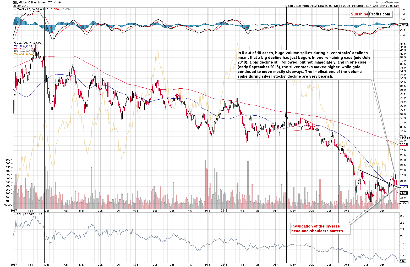
As you can see on the above chart, silver miners closed the week well below the neck level of the inverse H&S formation. The implications are clearly bearish.
Naturally, it’s nothing unexpected – last Monday, we wrote the following regarding the huge volume spikes in the SIL ETF (proxy for the silver stocks):
We just saw a spike in the volume of silver stocks during their daily decline. Why is this important? Because in the recent past it almost always meant lower PM prices.
In 8 out of 10 cases, huge volume spikes during silver stocks' declines meant that a big decline has just begun. In one remaining case (mid-July 2018), a big decline still followed, but not immediately, and in one case (early September 2018), the silver stocks moved higher, while gold continued to move mostly sideways. The implications of the volume spike during silver stocks' decline are very bearish.
We saw yet another decline after the previous spike, so the up-to-date statistic is 9 out of 11.
Let’s stay with the inverse head-and-shoulders pattern for a while, while changing the sector.

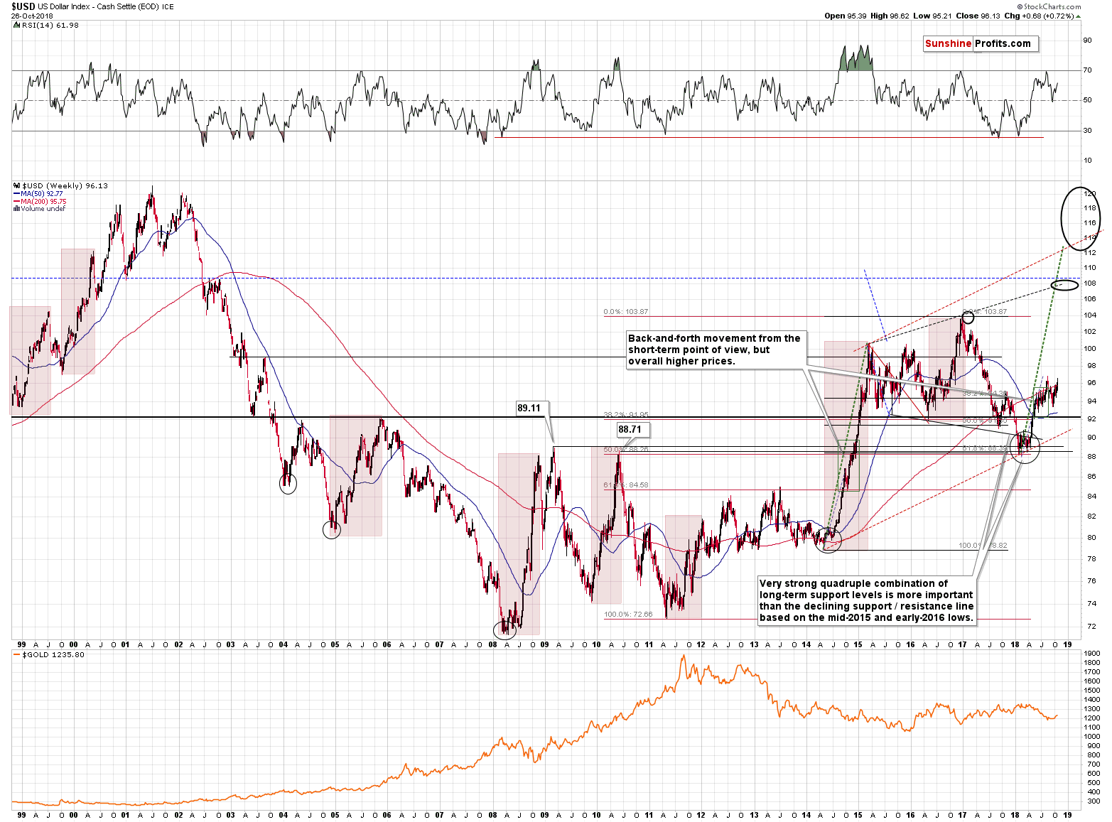
For three consecutive days, the USD Index closed the day visibly above the neck level of its inverse head-and-shoulders pattern. We got additional confirmation from the weekly closing price. The breakout above the local (marked with green) neck level of the inverse head-and-shoulders pattern is now complete and confirmed.
The fully-confirmed breakout in the USD Index is particularly bullish given the fact that it took place on very bearish news (Trump’s criticism of the Fed’s interest rate decisions). The USDX should have declined on it, and instead it moved to new short-term highs. This is a very bullish combination for the US currency, and since the precious metals market generally moves in the opposite direction to the USD Index, the implications are very bearish for the PMs and mining stocks.
To be clear, the USDX reversed on Friday and closed the day lower, thus forming a bearish shooting star candlestick, so it could move lower today, but it’s not likely to move much lower. The neck level of the inverse H&S is now support and it’s likely to keep the declines in check.
The target based on the inverse H&S formation is about 98.3, which means that the USD Index is now likely to complete the breakout above the much bigger (August 2017 – now) inverse H&S formation, which would (when completed) have target at about 105.
But the inverse H&S in miners was invalidated – can’t it be invalidated also in case of the USDX, thus making precious metals rally?
Of course it can be. But it’s not likely to be. The rally in the mining stocks was not in tune with the long-term signals, so it was likely to be reversed. The rally in the USD Index is in tune with the long-term signals, so it’s likely to continue.
The Long-term Context for the Inverse H&S Patterns
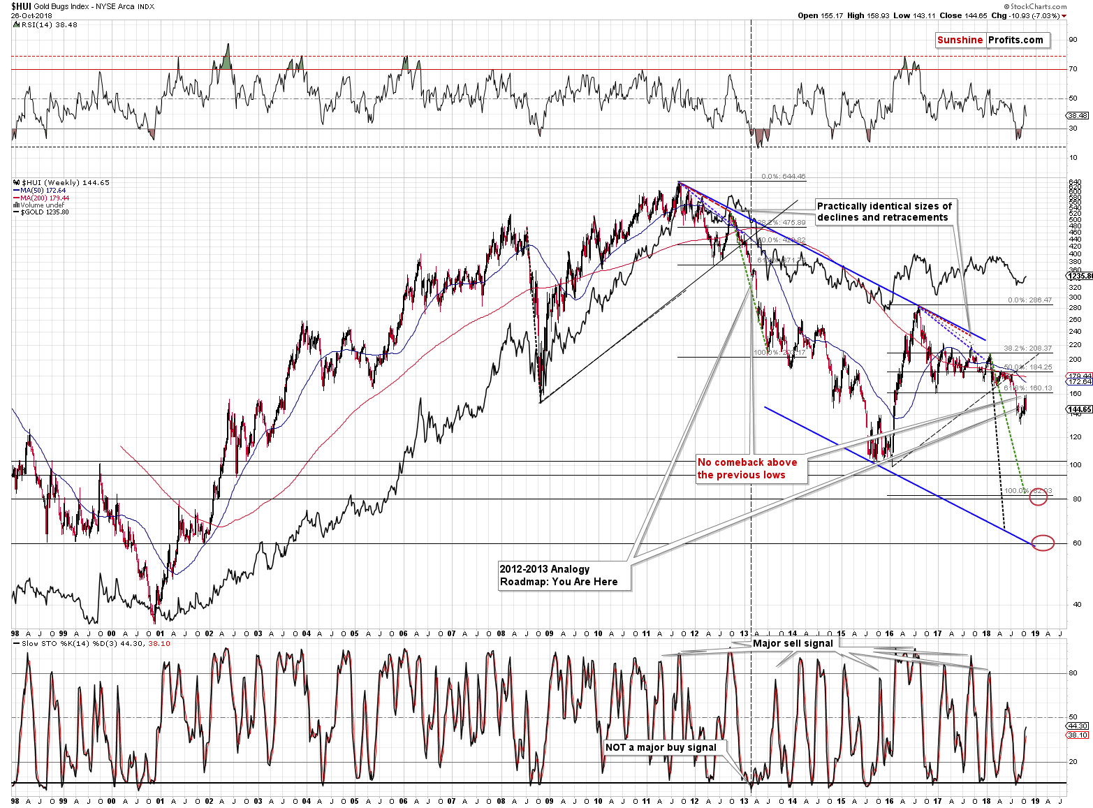
In our previous analyses, we emphasized that the current situation (including the short-term upswing) remained similar to what happened in 2013 before the biggest part of the decline. In both cases, miners corrected, but failed to rally above the previously broken lows. In 2013, it was the 2012 low that was not broken, and this year, it was the December 2016 low. The strength of last week’s decline makes is likely that the corrective upswing is over and that the corrective upswing is over without invalidation of the breakdown below the December 2016 low. In other words, both cases remain very similar and the outlook remains very bearish for the following weeks.
On the other hand, in case of the USD Index, this year’s rally is still similar to what we saw in 2008, 2010 and to the 2014-2015 upswing. The current consolidation is bigger, but still similar to the one that we saw in 2010. Please note that based on the above chart, the USD Index is likely to move above the 2017 high, perhaps significantly so – to the 108 level, or even higher.
Since the bigger pictures and their implications are completely different for the mining stocks and for the USD Index, it’s likely that the inverse H&S pattern in case of the latter will result in higher USD values, while the one in the miners was invalidated.
The final mining-stock-related chart is its ratio with the general stock market.
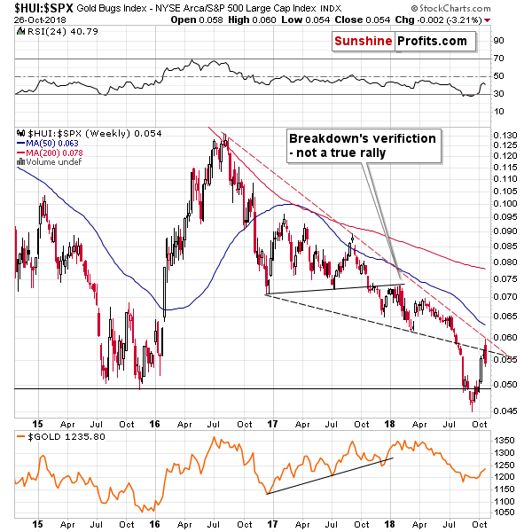
Last week, the HUI to S&P 500 Index moved to declining red resistance and declined practically immediately. In this way, the small breakout above the declining black resistance line was quickly invalidated. The implications and outlook remain bearish.
Having said that, let’s move to a different part of the precious metals sector. To the one that didn’t provide us with any exciting signals recently, which is what makes the situation particularly exciting. Yes, you read that right.
Enter silver.
Silver’s Exciting Pause
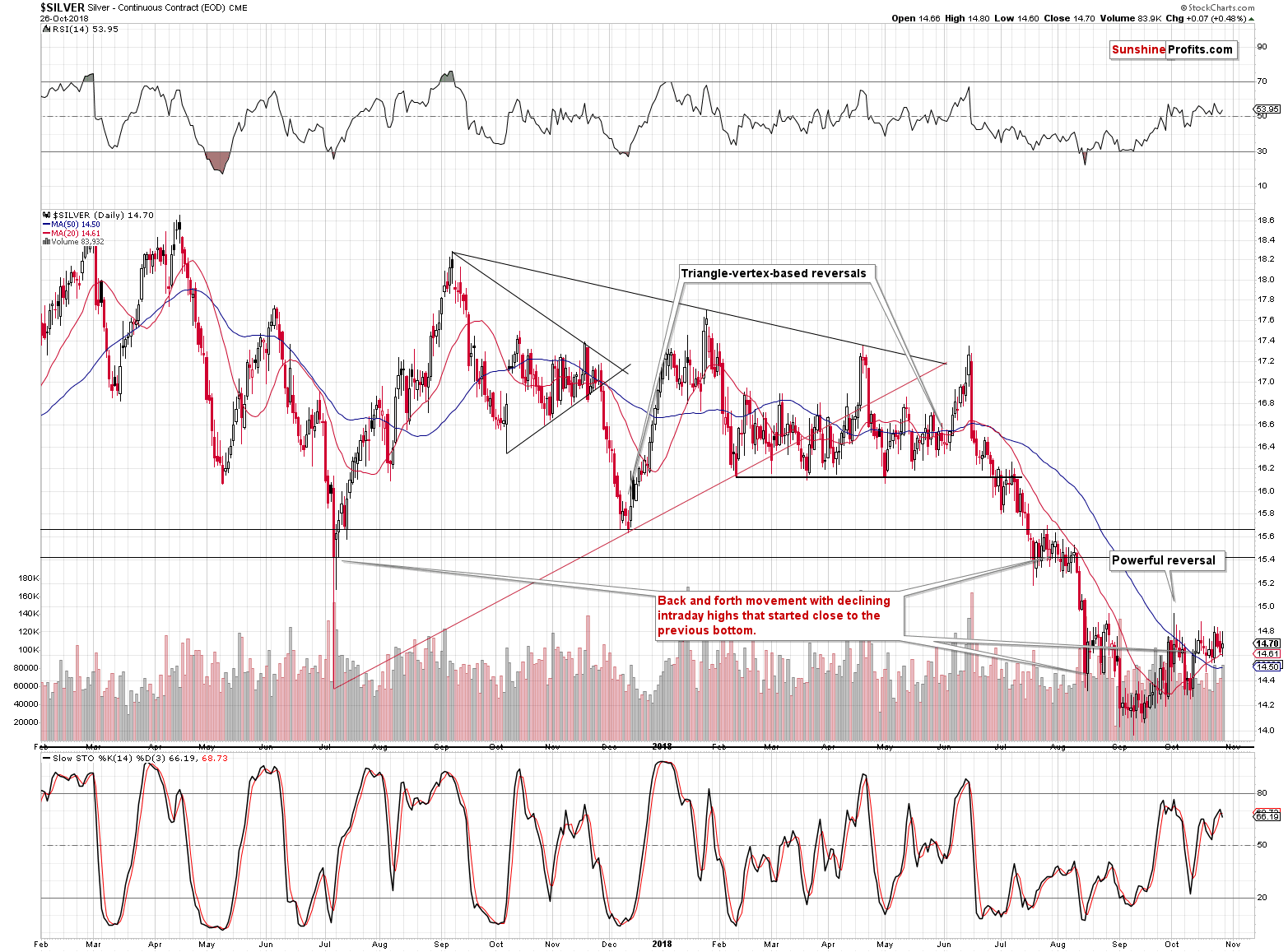
Silver has been moving back and forth recently with lower intraday highs. This seems like nothing special, until you notice that almost exactly the same thing happened in late July and early August. Right before the sharp $1+ decline.
And it’s not only the shape that’s alike. We can see similarity also in terms of the price level around which both consolidations took place. It was a major bottom in terms of the daily closing prices. In July and August silver moved back and forth around the July 2017 bottom. In this case, silver is moving around the mid-August bottom.
Moreover, this time, silver is consolidating after breaking below a very important long-term support line.
There are two major implications of the above:
- Once silver moves lower, it’s likely to move sharply and significantly.
- Silver is likely to move lower soon, perhaps very soon (most likely it's a matter of days rather than weeks).
To summarize what we wrote so far, the outlook is bullish for the USD Index, bearish for the mining stocks, and bearish for silver. What about gold?
Gold’s Short-term Sell Signals
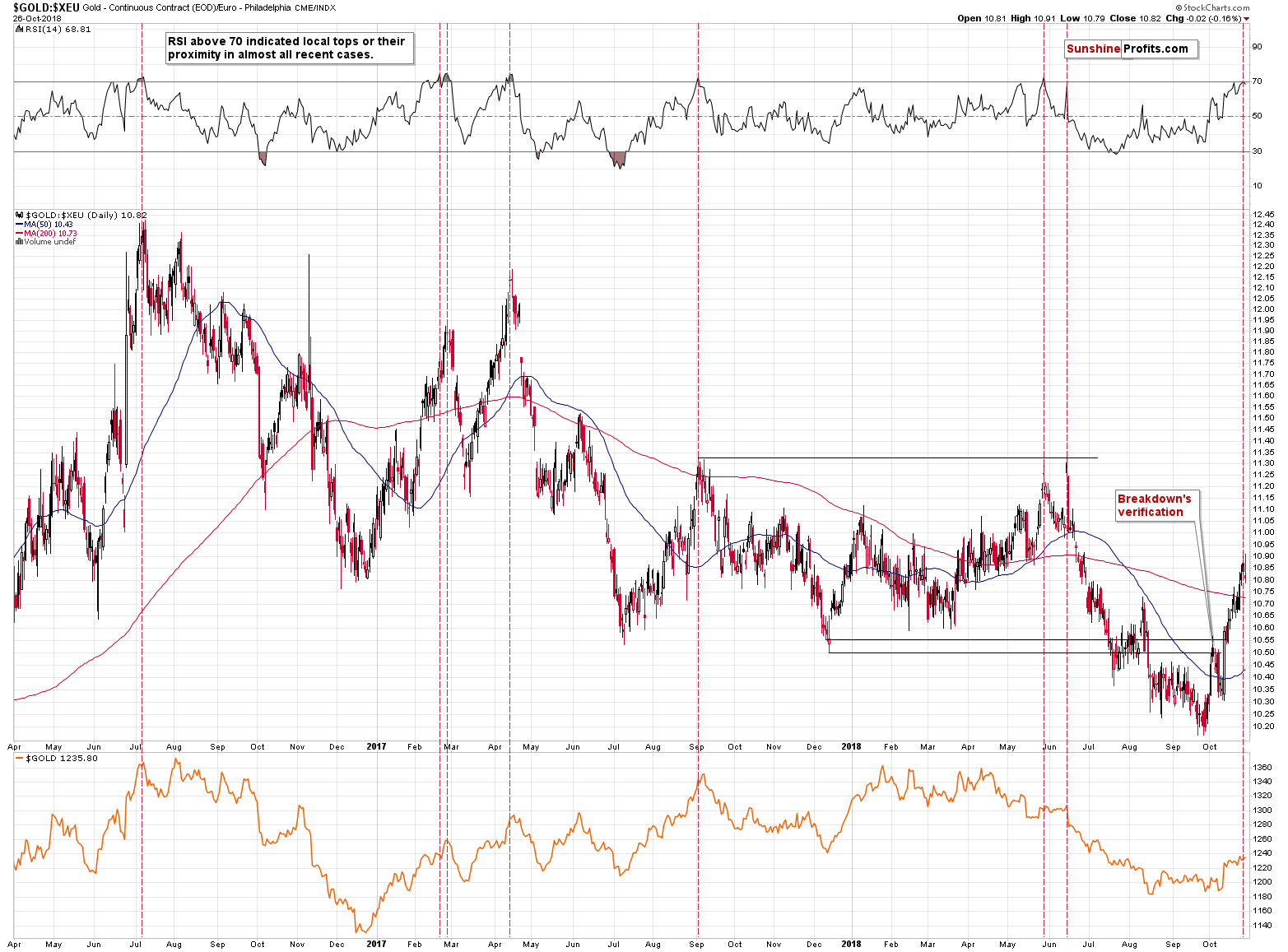
Looking at the gold price in terms of the euro provides us with a very effective sell signal. In practically all cases when the RSI moved above 70, it meant that the local top is in or about to be in (marked with vertical red lines on the above chart). That’s exactly what we just saw and the implications are bearish.
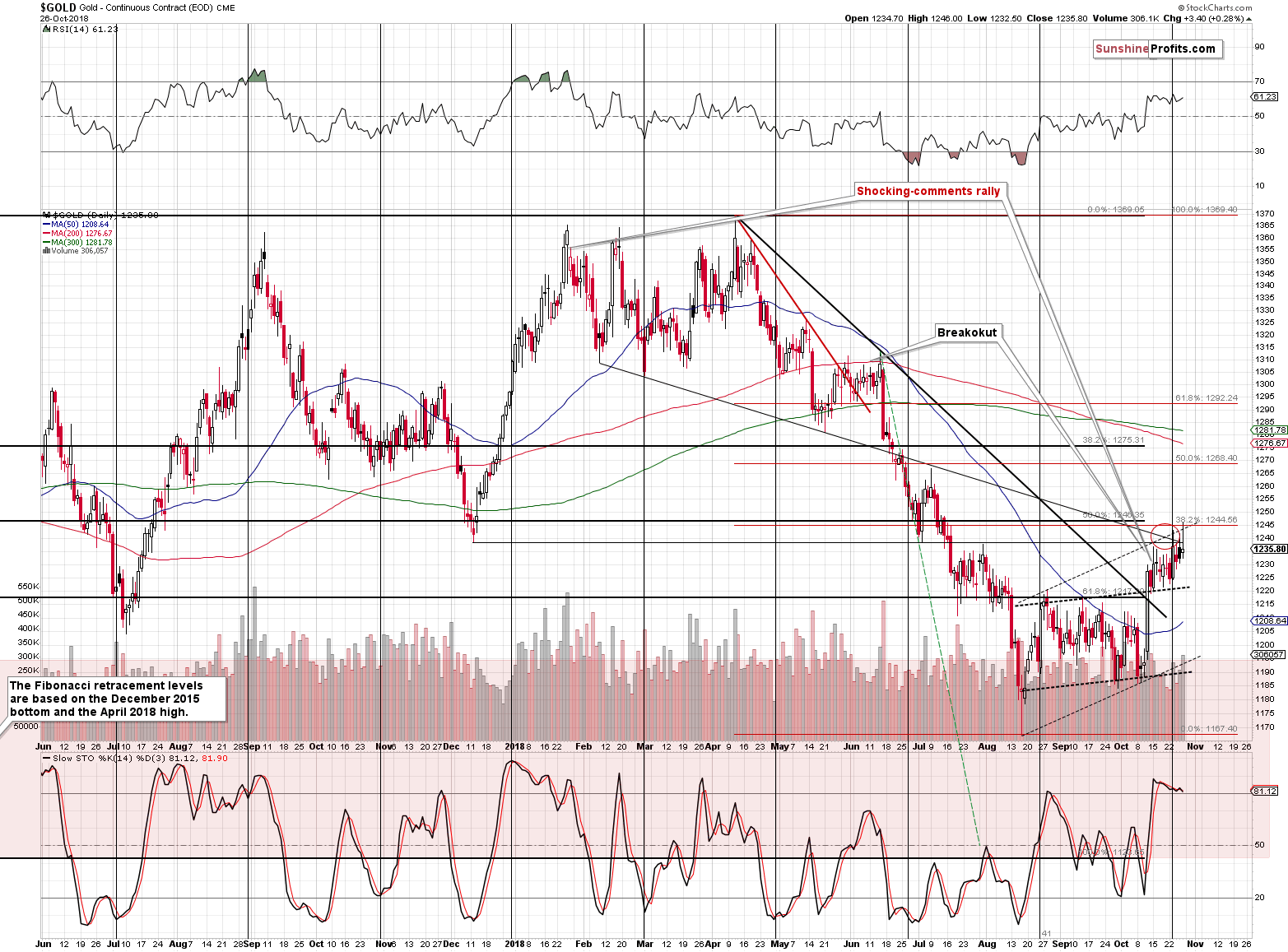
In terms of the US dollar, we also saw a sell sign even though gold closed Friday’s session $3.40 higher. The reason was the shape of the session along with the corresponding volume. The daily candlestick was a shooting star, which is a classic reversal pattern. It’s quite reliable if it’s confirmed by strong volume and this is the kind of volume that accompanied the reversal. The implications are bearish and our previous comments on the above chart remain up-to-date. Last Monday, we wrote the following:
What is important, is that despite all the bearish factors, gold could still move a little higher before the reversal. It moved very close to our target area, so the top could be in, but we should not be surprised by a move to about $1,240 once again. The target area is based on the declining medium-term resistance line, the upper border of the rising flag pattern, the early July low and the December 2017 low. There are also two Fibonacci retracement levels, including the 38.2% retracement (about $1,245) based on the most recent decline. Reaching this level would also not change the outlook and it’s also something that could happen before the reversal and before the big decline resumes.
Friday’s intraday high of $1,246 definitely fits the above-mentioned target of approximately $1,245. But, since gold reversed despite a move lower in the USD Index (thus invalidating the small breakouts above the declining resistance line and the 38.2% Fibonacci retracement), it seems that we will not see higher gold values anytime soon. Naturally, a move a bit higher, would not invalidate the bearish case automatically, but it seems that we won’t see higher gold prices for a few months. Today’s pre-market decline to about $1,230 fits the above gold forecast.
The short- and medium-term signals point to much lower gold values. However, as you may remember, we quite often emphasized the link between the current situation in gold and what we saw in 2013. Because of the recent upswing in the yellow metal, one might have thought that this link is no longer up-to-date. The reality, however, is entirely different as the 2013-now analogy is even more valid than it was before.
Gold’s Big Picture and the 2013 – Now Analogy
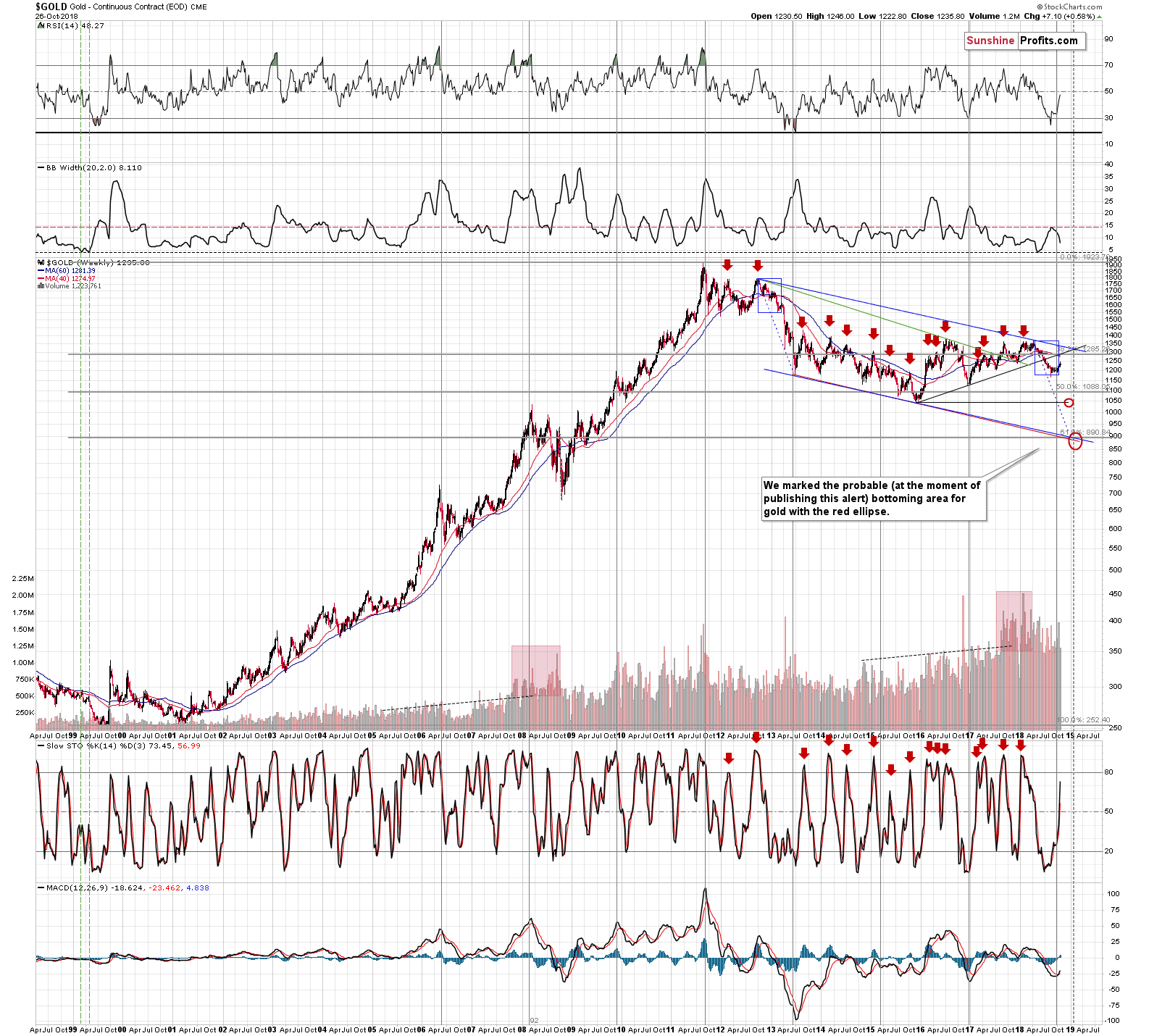
Without going into details, please focus on the blue rectangle that we drew on the above chart for 2012 and 2013. It starts at the final pre-decline top (in terms of both: price and time) and it ends at the final pre-slide bottom (in terms of price) and the end of the final corrective upswing (in terms of time). Nothing special about it so far.
We copied it (100% copy without any adjustments) to the current situation based on just one thing: the starting point of the current medium-term decline – the April 2018 top.
The special thing about it is that it almost perfectly fits what we just saw. Both initial declines took different shapes (the 2012 – 2013 decline was interrupted by two bigger corrective upswings, while the current one wasn’t), but both moves are extremely similar in terms of the price levels that were reached and in terms of the amount of time that it took for gold to move to them. The size of the corrective upswings is also quite similar. The current one is a bit bigger, but not significantly so.
Consequently, both declines remain very similar and if the similarity is to continue (and it’s very likely) then we can expect a huge and volatile price drop any day now.
By the way, do you recall how everyone and their brother were cheering for gold based on the increase in the volume during 2017 and in early 2018? We wrote multiple times that it was not a bullish factor (for instance in the November 14, 2017 analysis) and that we saw something similar in 2007 and 2008 (as marked with red rectangles) – which preceded an important decline. Several months later gold is indeed lower, not higher
Summary
Summing up, there are multiple factors in place that point to much lower precious metals and mining stock prices in the coming days and weeks and the enormously bearish analogy to 2013 remains in place. All in all, it seems that the profits on our short positions will increase significantly very soon.
We hope you enjoyed today’s analysis. The full version thereof includes an additional gold chart with reversal dates for the upcoming months along with price targets for the initial bottom, rebound, and THE final bottom. If you’d like to read it, we encourage you to subscribe to our Gold & Silver Trading Alerts today.
Thank you.
Sincerely,
Przemyslaw Radomski, CFA
Founder, Editor-in-chief, Gold & Silver Fund Manager
Gold & Silver Trading Alerts
Forex Trading Alerts
Oil Investment Updates
Oil Trading Alerts
