
- Euro & USD Indices
- General Stock Market
- Crude Oil
- Correlation Matrix
- Gold
- Silver
- Mining Stocks
- Letters from Subscribers
- Impact of imminent known events on gold
- Sources of information
- We're not seeing a short squeeze, yet
- Bernanke's contradictory statements
- Similarity between two pullbacks
- Summary
Can uber-contrarian Peter Schiff be on target again? Schiff is best known as the analyst who warned about the big housing and credit bubbles several years before they happened. Now, at a time when mining companies are universally loathed, the CEO of Euro Pacific Capital thinks that this is the best time to launch a mutual fund with exposure to the mining sector.
“I’m timing that to coincide with what I believe to be the greatest buying opportunity that I’ve seen during the entire bull market in gold stocks,” Schiff said in an interview. According to Schiff, even though gold prices are substantially off their highs, they are still three times higher than they were a decade ago, unlike many gold stocks that are actually priced lower than they were a decade ago.
“So you got the opportunity to roll back the clock to the time where gold was under $300 and buy the gold stocks. I think they’re giving these stocks away. In fact…the sentiment has probably never been this bad. We’ve had a big collapse in price. Nobody wants to buy these stocks and so this is when I’m launching my fund.”
Schiff believes, as we at Sunshine Profits have written before, that the increase in the cost of digging an ounce of gold out of the ground will cause some mining companies to cut down on exploration, cut back on unprofitable mines or even go out of business.
Gold miners are feeling the pain. AngloGold Ashanti, the world’s third biggest gold producer, last week predicted a writedown in the range of $2.2 to $2.6 billion on its mining assets. The company also said it would produce 4 to 4.1million ounces of gold this year, rather than the 4.1 to 4.4 million ounces previously planned. This is in response to the fall in gold prices. Last month, Barrick Gold, the world’s biggest producer, said it expects to write as much as $5.5 billion off the value of a delayed mining project in Latin America. Newcrest Mining, Australia’s biggest producer, meanwhile reported it might take a writedown of as much as Australian $6 billion. Harmony Gold, the South African miner, has also announced that it would write down the value of its Hidden Valley mine in Papua New Guinea. Miners operating in South Africa, such as AngloGold Ashanti, look particularly vulnerable as gold mining companies offered their workers a small increase in wages after prolonged worker protests.
These hits on the mining sector will eventually cut down on the supply and when the demand will kick in, well… some miners will become gold mines. But one must pick the right companies and buy at the right time. This requires proper due diligence. As always, we suggest using our tools, the Golden StockPicker and the Silver StockPicker before making purchases.
Speaking of gold supply, somewhere in the universe a lot of gold has just been created equal to the masses of several of our moons. But we don’t need to worry about the gold reaching the market and flooding it anytime soon. The gold is about 3.9 billion light-years from Earth.
New research from Harvard astronomers published this week suggests that all of the gold on Earth might have come from cosmic crashes between super dense, dead stars. Unlike elements including carbon or iron, gold cannot be created within a star but instead must be born in a cataclysmic event known as a short gamma-ray burst, a flash of high-energy light from an extremely energetic explosion. One such burst was recorded last month by NASA's Earth-orbiting Swift spacecraft.
Observations of this gamma-ray bursts provided evidence that it resulted from the collision of two neutron stars - the dead cores of stars that previously exploded as supernovae. Moreover, a unique glow that persisted for days at the gamma-ray burst location potentially signifies the creation of substantial amounts of heavy elements, including gold.
Associate Professor Edo Berger of the Harvard-Smithsonian Center for Astrophysics, who headed the research team, said: 'We estimate that the amount of gold produced and ejected during the merger of the two neutron stars may be as large as 10 moon masses. 'That's quite a lot of bling! To paraphrase Carl Sagan, we are all star stuff, and our jewelry is colliding-star stuff.”
Gold is rare on earth because it's rare in the universe. The occurrence of gold in the Earth's crust is estimated to be about 0.005 parts per million. That makes it one of the ten rarest elements. So far humans have retrieved a relatively small amount of gold from the Earth at around 172,000 ton. Most of it is unreachable in the Earth's core or in the oceans.
"By combining the estimated gold produced by a single short GRB with the number of such explosions that have occurred over the age of the universe, all the gold in the cosmos might have come from gamma-ray bursts," researchers said.
Now, besides wearing gold on our fingers, necks and wrists, we can also wear it in our hearts. Researchers at Tel Aviv University have discovered a novel use for gold that can help those that have suffered heart attacks.
Israeli scientists have found that gold nanofibres in engineered heart tissue can enhance electrical signaling and restore heart function in the wake of heart attacks. They have integrated cardiac cells with nanofibres made of gold particles with the goal of optimizing electrical signaling between cells to mimic the heart's coordinated electrical system, which controls heartbeat and rhythm.
In another story from the Middle East, Dubai's government will pay residents in gold for losing those extra pounds as part of a government campaign to fight obesity in the Gulf Arab emirate. A 30-day weight-loss challenge was launched last Friday to coincide with the Muslim holy month of Ramadan. This is when the faithful refrain from eating and drinking during daylight hours but may go on an eating binge after dark. For every kilogram dropped by Aug. 16, contestants can walk away with a gram of gold, currently worth about $42, Dubai's civic authority announced as part of its 'Your Weight in Gold' initiative. The top three dieters can win gold coins worth up to $5,400. Dubai is home to one the largest gold markets in the region and even has gold vending machines in shopping malls. We sure wish someone would offer us a gold coin to lose a couple of kilos.
To see how the price of gold will do in the upcoming weeks let's begin this week's technical part with the analysis of the US Dollar Index. We will start with the very long-term chart (charts courtesy by http://stockcharts.com.)
USD and Euro Indices
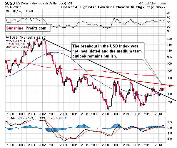
The situation in the long-term chart hasn’t changed recently. The breakout above the declining support/resistance line (currently close to 79) was still not invalidated. From this perspective the situation remains bullish.
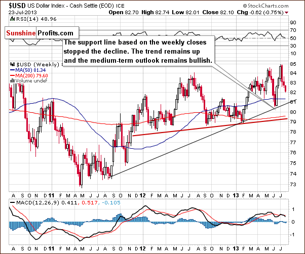
When we take a look at the above chart we can see that the USD Index has declined once again. Despite this fact, the recent declines didn’t take the index below 81, so the medium-term uptrend is not threatened. The reason for this is that the medium-term support line was not broken, in fact, it was not even reached. From this perspective, the situation remains bullish, and we can expect the dollar to strengthen further in the coming weeks.
Now, let’s check to see if the short-time outlook is also bullish.
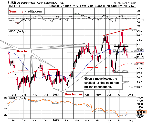
It is. From the short-term perspective, we see that earlier this week, the U. S. dollar dropped slightly below the 61.8% Fibonacci retracement level based on the June - July rally. It also declined slightly above 82 on an intra-day basis on Tuesday. The move below this level is not confirmed, however.
Moreover, we see that the USD Index moved to the 50% Fibonacci retracement level created on the entire February – July rally, which is at the 82 level. In fact, the existence of this level might explain why dollar moved slightly below the short-term 61.8% retracement.
All in all, from the price perspective, it still seems that a rally will follow.
The most important factor on the above chart supporting the bullish case is the cyclical turning point which is in play right now. It’s quite possible that we will see its impact on the dollar this week, and this can lead to a bigger pullback. This provides us with strong bullish implications from this perspective.
Combining both perspectives - a move to the upside is still likely to be seen. If the buyers manage to push the USD Index higher, we might see an increase to the level of the June top or even to the rising resistance line based on the May high and June peak before another pause is seen. Taking a look at the long-term charts, however, we see that the next significant resistance is currently close to 86 (86.4) – the declining red line in the chart.
Now let’s move on to the analysis of the Euro Index.
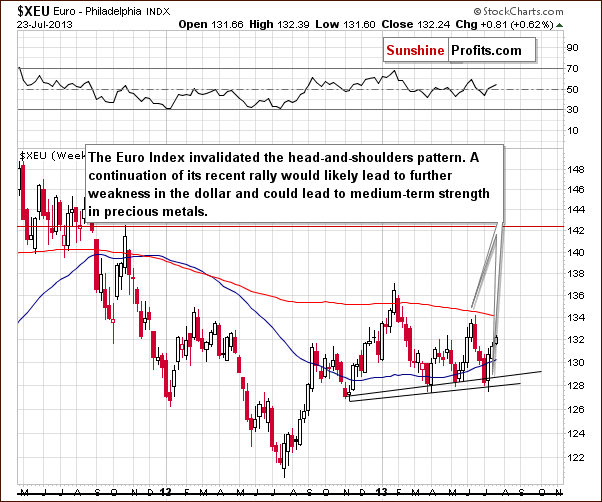
After an invalidation of the bearish head-and-shoulders pattern, the European currency continued its rally. The euro climbed up once again and broke above last week’s top in the past few days. This led to further weakness in the dollar and also to short-term strength in precious metals. If, however, the head-and-shoulders formation is completed, the implications for precious metals will be very bearish.
Summing up, from the short-term perspective, we see that the USD Index plunged, but the recent decline still seems to be a counter-trend bounce. When we factor in the cyclical turning point we could see another rally soon. Taking a look at medium- and long-term charts, both outlooks for the dollar remain bullish. This is a bearish piece of information for metals and miners.
General Stock Market
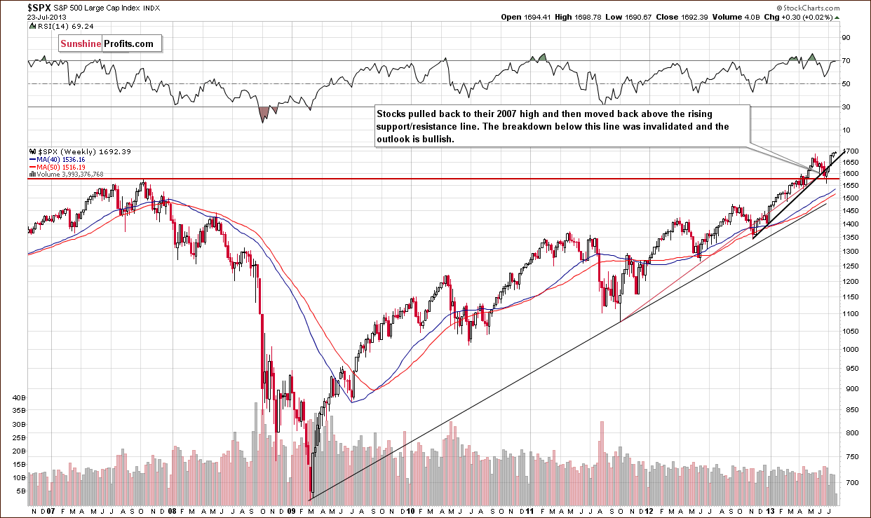
On this week‘s long-term S&P 500 chart, we see that the situation has improved with stocks moving up once again this week. At this moment, the breakout is still not invalidated; we are close to it being confirmed. Please note that we would need to see just one more weekly close before saying that the breakout is truly confirmed and that another upswing is quite probable. While this appears somewhat likely right now, it’s not really to any great extent. Still, from this perspective, we already see that the recent decline was nothing more than one more correction and the outlook continues to be bullish.
On the above chart we see that prices climbed up above the May 22 local top last week. These new historical highs encouraged traders and investors to continue to buy resulting in a third consecutive record closing high on Monday. On Tuesday, stocks increased once again and almost reached the critical psychological level of 1700.
From this point of view, the breakout above the May’s top is confirmed (we saw three daily closes above this level) and the outlook is bullish.
We turn now to the financial sector, which in the past used to lead the rest of the general stock market.
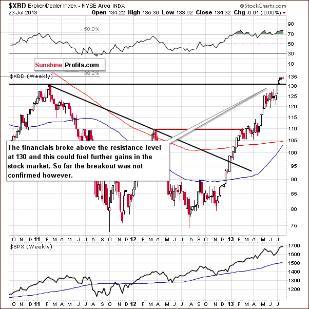
On the Broker-Dealer Index chart this week, we see that the financials broke above the resistance level at 130 early in the month. Similar to what we see on the long-term S&P 500 chart, the breakout has not been invalidated in this case either. The situation improved this week (we saw a move above the 135 level on an intra-day basis on Tuesday) because there has been no decline so far – the price only needs to stay where it is (above the 130 level) until the end of the week to clearly verify the breakout.
Summing up, we saw a short-term (confirmed) breakout in stocks which will likely lead to the confirmation of the long-term breakout. This factor along with a bullish outlook for the financials makes the outlook bullish overall for the general stock market.
Crude Oil
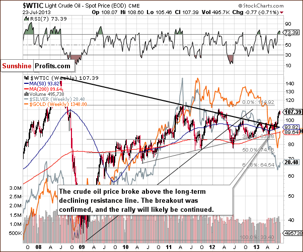
On the above chart we see that the price of crude oil remains above the broken long-term declining resistance line. However, the situation is still overbought on a short term basis (the RSI indicator is above 70), and it may result in a consolidation or even a correction to the previously-broken resistance line.
Gold and Silver Correlations
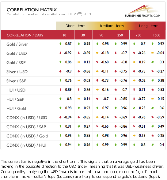
The Correlation Matrix is a tool, which we have developed to analyze the impact of the currency markets and the general stock market upon the precious metals sector, (namely: gold and silver correlations). We have seen negative correlation between the metals and the USD Index, while the general stock market coefficients with the metals are pretty much neutral. Taking the short-term, bullish outlook for the USD Index into account, the implications for gold, silver, and the mining stocks are clearly bearish at this time.
Gold
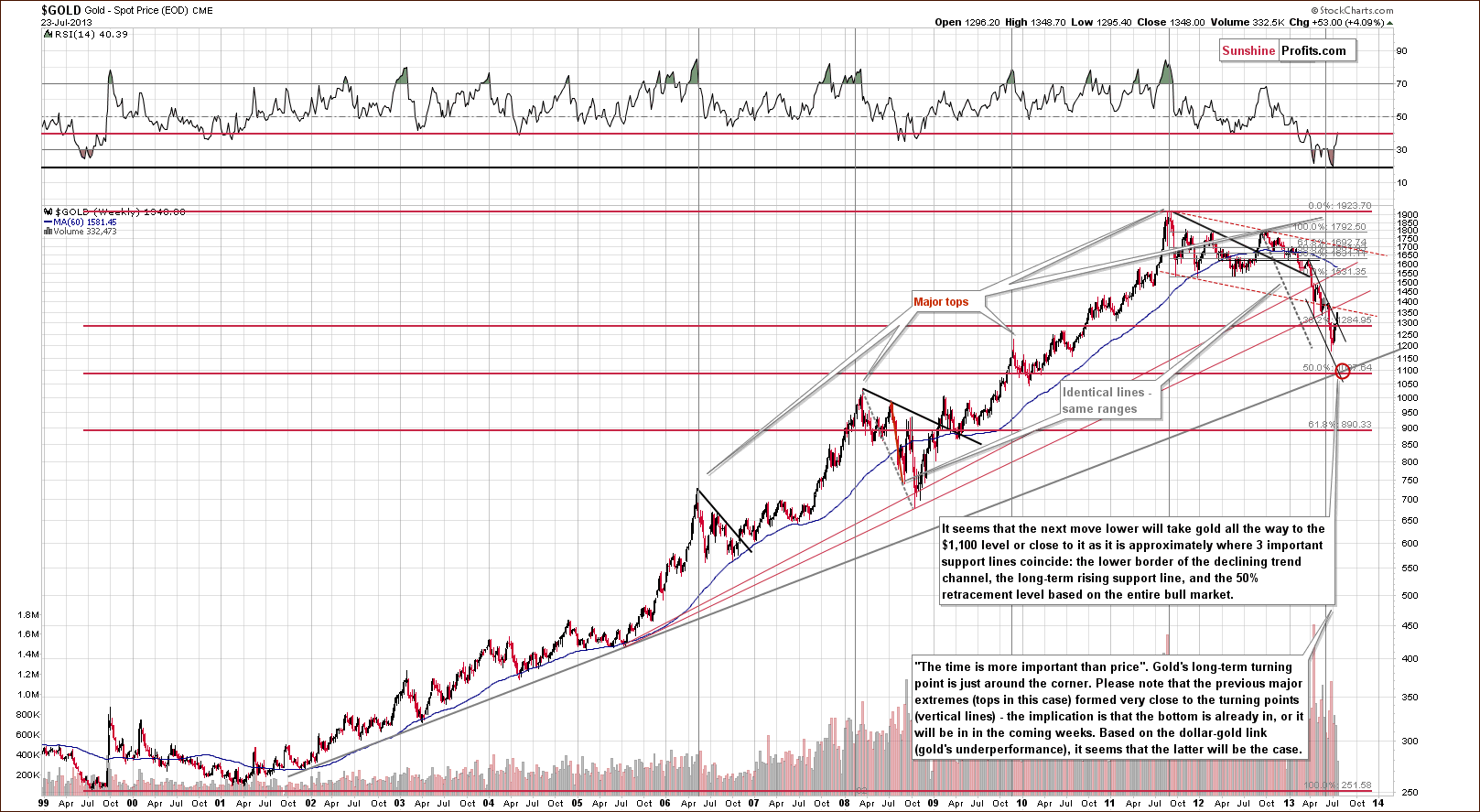
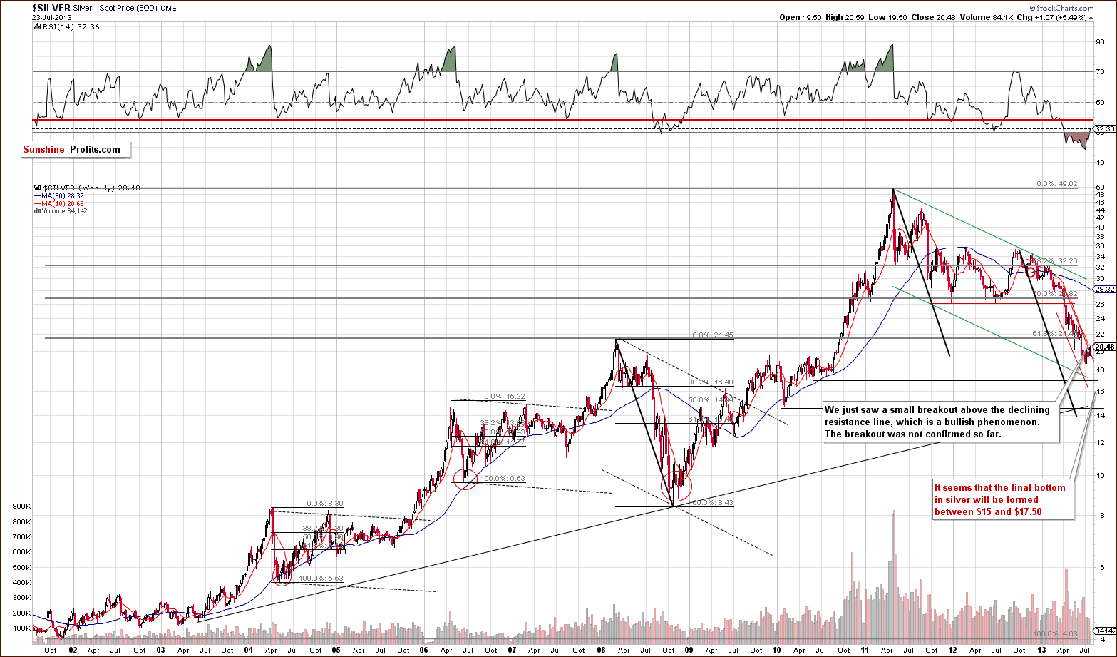
On the long-term gold chart we have two significant changes to discuss. First, we see a breakout above the declining resistance line, but we’ll cover this fact when describing the following chart, and the second – the simple fact that gold hasn’t for another week. Given where gold is currently, if we see an April- or June-style drop, the yellow metal will move right into our target area marked with red ellipse. This is where several important support lines intersect and where we think the final bottom will materialize.
Still, on a short-term basis, we saw a breakout…
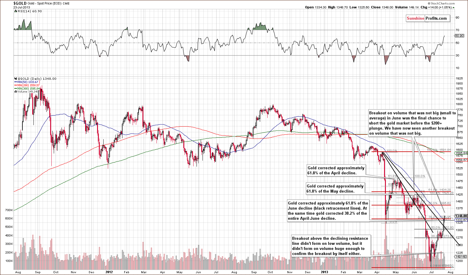
We have an unconfirmed breakout so far. At the same time, a breakout that is quite similar to the early-June breakout that was followed by a $200+ decline. The question is how much can we trust a breakout if the previous breakout – one very similar to the current one – resulted in such a dramatic decline? It seems to be best to look for other clues.
While the situation in the USD Index is a major bullish factor, let’s focus on things related to the above chart. Actually, we have already described them earlier this week when we discussed the similarity of the retracements, that is, today‘s vs. the one seen after the April decline:
(…) the current move up is very similar to what we saw after the April decline. In fact, it seems that the April decline-and-pullback pattern is repeating here. Please note that after April's huge decline gold corrected 61.8% and then declined once again. This week gold rallied to the 61.8% retracement based on the June decline, so we can say that things are in tune with the previous pattern. Unless we see more strength in the coming days, it seems that we will see another decline.
Additionally, we saw a pullback to the 38.2% Fibonacci retracement level based on the April-June decline, which is also an important resistance level.
All in all, the above chart has more bearish implications than bullish ones. Now let’s take a look at the chart featuring gold‘s price from the non-USD perspective.
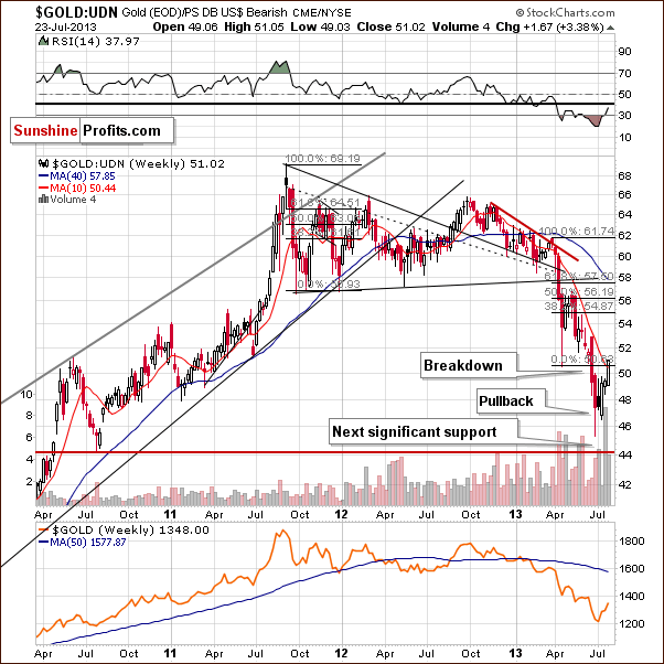
Gold viewed from the non-USD perspective showed strength this week and the rally took it to the level of April’s bottom and actually a bit above it. At the same time we saw a small move above the 10-week moving average. Despite this move to the upside, the outlook still remains bearish in our view because of two factors – the breakout was not yet confirmed, and equally importantly, the week is not over just yet, which means that there will be no breakout if gold ends the week below the above-mentioned resistance levels.
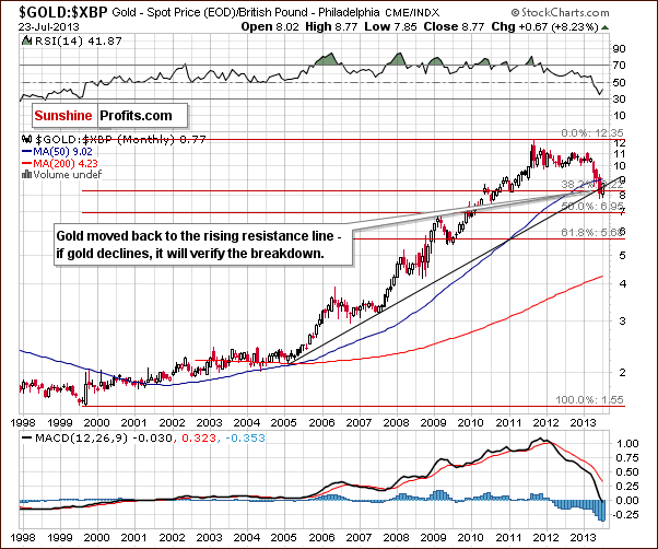
After the recent rally, gold priced in British pounds moved above the rising resistance line and is currently verifying the breakout. If the monthly candlestick closes above this resistance line, the breakout will be confirmed. There’s still quite a bit of time for gold to reverse and move back below not only the rising resistance line, but also below the 38.2% Fibonacci retracement level. Consequently, we don’t really view this chart as bullish.
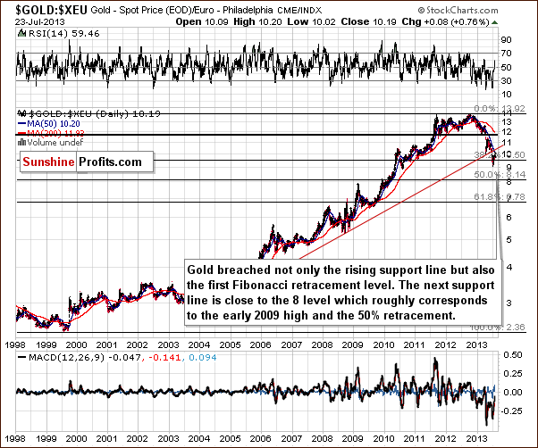
Gold priced in euro climbed up and reached to the 50-day moving average, which still serves as resistance. Despite this growth, gold did not break out above the previously broken, important long-term support line, which has now turned into resistance. Implications here are still bearish.
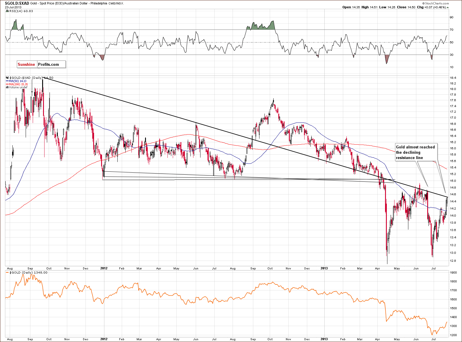
On the above chart, we see that the price of gold in Australian dollars has moved up and almost reached the declining resistance line. At this point, it’s worth mentioning the previous local top. We saw a pullback to this resistance line in June, but the buyers didn’t manage to push gold above it. This resulted in strong declines which took the price all the way down to the April bottom area. If we see similar price action here, gold priced in Australian dollars will likely decline once again. Such a triple-bottom, in this case, would likely mean a breakdown below the previous lows in the price of gold seen from our regular USD perspective, similar to what was seen in June.
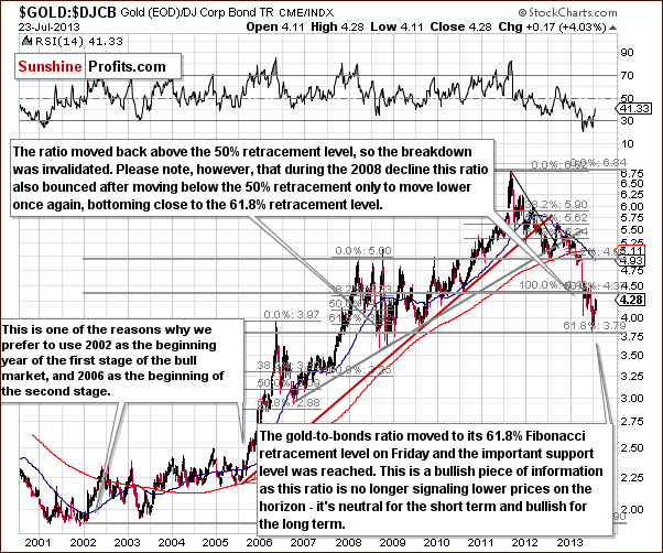
The picture above illustrates the gold to bonds ratio. In this chart, we see that the ratio has declined to the 61.8% Fibonacci retracement level and then pulled back.
We saw a similar price action in 2008. The ratio declined to the 61.8% Fibonacci retracement level which marked a local bottom, and then after a pullback, moved temporarily below this support level (that is below the 61.8% retracement) before reaching the final 2008 bottom.
A similar pullback (likely underway or already over) and the subsequent decline in this case would likely see gold moving below its June lows.
Summing up, we saw a breakout in gold, but this breakout was not yet confirmed, and more importantly, it’s unclear whether this breakout can be trusted. The previous and very similar breakout was quickly invalidated during a very comparable time (the USD was at its cyclical turning point after a significant decline and gold had moved to its 61.8% Fibonacci retracement level). Taking into account other factors leaves us with an overall bearish outlook for the yellow metal.
Silver
In this week’s very long-term silver chart, we see a small breakout above the declining resistance line, but this breakout is quite small and at this point still not confirmed. It therefore does not change the picture very much from this perspective; let’s turn to the medium-term picture to analyze the breakout more thoroughly.
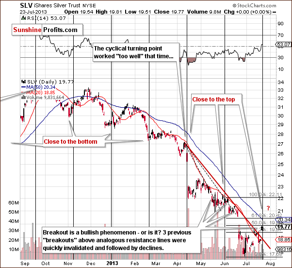
In this week’s medium-term silver chart, we have numerous factors to discuss this week. Let’s begin with the breakout and also some discussion of previous breakouts. The current resistance line is different from the one which was previously broken, yet similar. While it is true that the first top which formed the resistance line is the same, the final top used was different.
What happened after the breakout in late May took place close to silver’s cyclical turning point at the time. Prices then declined, and this was followed by another move to the upside and then another breakout above the resistance line. Prices then declined and invalidated the breakout. We saw a breakout also in early June, which was also invalidated shortly. That was the third breakout in a row that was invalidated. We now have a situation where another resistance line is in place and a small breakout seen.
The question now is whether this is a true breakout or another “fakeout” similar to the last three. At first site, a breakout is a bullish phenomenon but the second look at it could even be bearish unless another bullish confirmation is seen. At this time, with no other bullish signals yet, we’re not sure if we are ready to trust this breakout. It’s simply not a bullish factor at this time because of it’s more recent performance.
We now wish to comment on the retracement levels now in play. Silver’s recent rally was stopped at the 50% Fibonacci retracement level based on the June decline. Technically, therefore, silver is still in a downtrend, taking into account all the latest declines from this perspective. What’s happened most recently does not seem to be the beginning of a new rally but rather just a pullback.
Finally, we have a cyclical turning point close at hand and in the past two cases, the white metal formed a local top and then declined significantly in the weeks following the cyclical turning point. Right now, we definitely have a previous move to the upside ahead of the cyclical turning point so declines are likely to follow. All-in-all, even though we have a breakout here, we think that this chart is more bearish than bullish.
Summing up, the outlook remains bearish for the white metal even despite a breakout that we saw recently because of the reliability of past breakouts and because of the current turning point.
Gold and Silver Mining Stocks
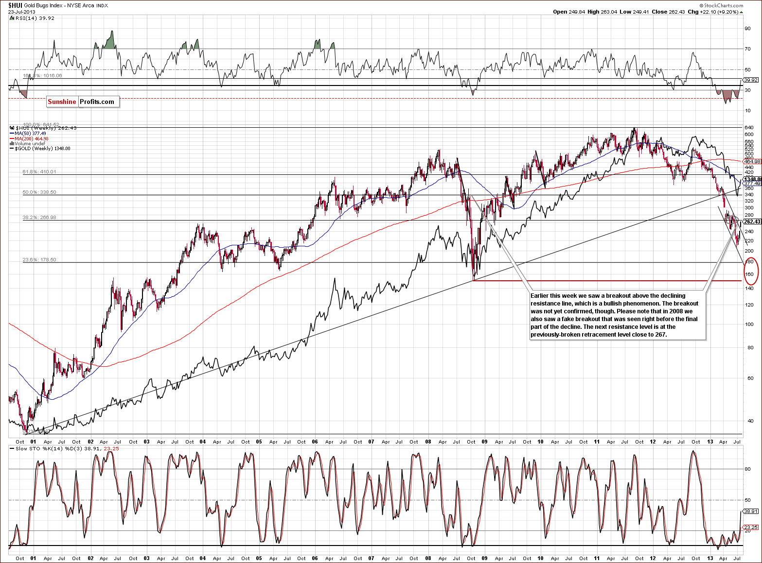
In this week’s very long-term HUI index chart (a proxy for the gold stocks), we see a trading pattern this week similar to the ones we’ve discussed previously for gold and silver. Here, we see a breakout above the declining resistance line but no breakout above the key 61.8% Fibonacci retracement level, which was previously broken from above. Prices are still below this level. This means that the breakout already seen might not be enough. A fake breakout similar to what might be seen in the silver market (but on a larger scale) may be seen for the mining stocks and also on the gold market, as discussed previously.
In 2008, after a number of different significant declines, we saw prices move higher and surpass the previous declining resistance line. However, this turned out to be a “fakeout” and was followed by a final powerful downswing in prices (that took miners to their final bottom). Something similar could be seen here once again with prices declining to the red ellipse area in our chart. In fact, this appears likely in our view.
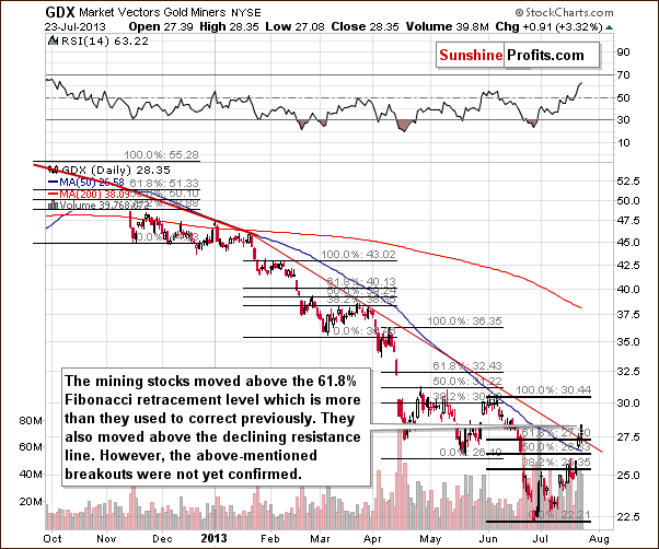
In this week’s medium-term GDX ETF chart, we saw some strength this week with the breakout above the medium-term declining resistance line and also a breakout above the 61.8% Fibonacci retracement level. This happened on Tuesday, so we’ve only seen one daily close, and the breakout is not yet confirmed. Consequently, we don’t feel there are strong bullish implications yet. As is often the case, it seems profitable (there were numerous times when waiting for a confirmation helped to stay on the correct side of the precious metals market in the past and 3 days seem to be the optimal value for the precious metals market in our view) to wait for confirmation of breakouts before reacting to them and calling it a truly bullish signal.
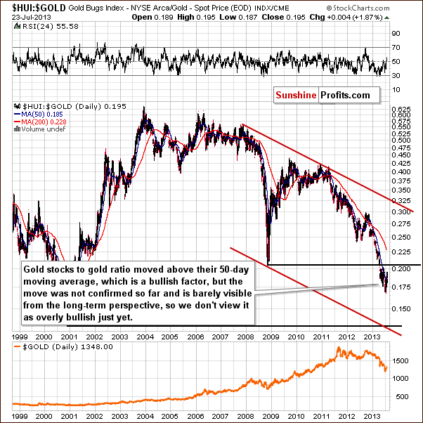
In the gold stocks to gold ratio chart, we will try to determine if miners have been outperforming gold. On this long-term ratio chart, we see a bullish move in the ratio above the 50-day moving average (which is at 0.185), but it is small and unconfirmed at this point. It’s a tough call right now to say if the decline in the ratio was really stopped since it is well below the 2008 bottom. The breakdown was not invalidated and the downtrend still appears to be in play here. A downtrend in this ratio indicates that the gold stocks are underperforming gold, not outperforming it.
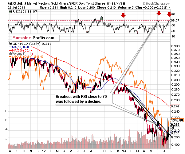
In the miners to gold ratio chart, we see the same thing here the short term. We also see a breakout. However, just like it was the case in several previous charts that we discussed earlier, the previous, similar breakout was shortly invalidated and this lowers the current breakout’s reliability. Please note that and the RSI level in this chart is now close to 70. This level marked local tops this year in the ratio, and the same was seen throughout the precious metals sector. In fact, the last time that we saw this phenomenon was at the beginning of June when silver was at its cyclical turning point – just like it is right now – which makes these two situations even more similar.
Simply put, the breakout is not as bullish as it first appears. Concerning a possible fake breakout (like the previous breakout above the declining resistance line), a quick invalidation was seen with the RSI level close to 70. With this being the case again, it appears very possible that we could see an invalidation of the move one more time.
Summing up, the outlook for the mining stocks remains bearish. Recent breakouts are unconfirmed, prices and ratios are below the long-term resistance levels and the RSI indicator based on the GDX:GLD ratio suggests that we are at a local top in the precious metals sector.
Letters from Subscribers
Q: As a general rule, when you write your analyses/alerts, to what extent do you take into account imminent known events (e.g., Bernanke speech tomorrow, employment numbers on Friday, etc.) You never say, 'if this, then that' or the like - so, do you the feel the probableoutcome is 'already in the charts' to some degree? Or that the potential reactions of the various markets should be obvious to us? Or what?
There have been occasions where I have read an alert and have thought to myself, 'ok, but what about (whatever) tomorrow? - did he consider that?'.
The point is, I'm sure you do - but it would be helpful to tell us exactly what your approach is.
A: Imminent known events will have no impact on the price if their impact is widely understood. In this case they are unlikely to make any impact on the price - it already includes this impact and whatever information we can draw from it by analyzing the charts and measuring how investors reacted to these events. Did the market rally insignificantly when it was supposed to truly soar? Or did the decline not materialize and instead we saw a nice rally? This is the way that we can use the known events. They won't have an impact on the price because investors have already bought or sold based on them. When people know that something is going to happen, they will act on it now before others get their chance to react in order to get better prices.
There are lots of different reports, working papers, financial reports etc. released each day. By analyzing the charts: price, volume and some other measures (like popularity of gold-related searches on the Internet) we can analyze all of them (indirectly, of course) by looking at the weighted average of their importance - after all, the price moves should be based on all of them.
In general, our approach is that the fundamental situation determines where the markets are going to go over the long run. That's when the fundamental information matters the most. The more we zoom in, the less important fundamentals become. Once the main trend is established (here: precious metals are likely to move higher), the technical analysis and related techniques like cyclical and fractal analysis become more important. That's why we pay greater attention to the latter in our daily Market Alerts.
There are times when we comment on the current events / facts - it's when we think that markets are not interpreting the outcome correctly. For example, Bernanke says something that we think is just smoke and mirrors and the more important message is written between the verses of what he's saying.
We'll also tell you what we think about a given issue if you ask us to.
Q: I fully understand your analysis but can you advise me if you are only using the stockcharts.com website to analyse and make your bearish and bullish calls. Surely you need to take into account volume, pricemovements etc outside of the USA trading hours? Does that play any rolein your analysis or not.
A: We take into account price movements from other exchanges as well. However, as far as volume is concerned, we look mainly at the US markets and at the biggest ETF (GLD) as these are the most representative ones in our view. We usually compare volume on a relative basis and since a small difference in volume levels could change the outcome of the analysis, focusing on volume from smaller markets / ETFs might be misleading.
On a side note, we are using also our own tools, also the soon-to-be-released self-similarity tool, which are not yet available on the website and that we do not feature on a regular basis in the updates.
Q: Late last week, did you consider the possibility that the dollar might edge a little lower? And that gold, already holding quitewell at 1295, might therefore tip above 1300? And thereby trip the buy stops at that level? In a situation already primed for a massive shortsqueeze?
We're not really seeing a short squeeze, yet.
A: We replied partially in Monday's Market Alert and the remaining part of the reply is that yes, we took into account the scenario in which the USD moves a bit lower - that's why we mentioned that the very short term is a bit unclear. Gold and miners moved above our stop-loss orders as we initially thought that they would be reached only if the USD moved substantially below its final Fibonacci retracement. This was not the case and thus we re-entered the short positions.
Short squeeze – this is one of the reasons for which we suggest keeping gold as insurance with part of one's capital and also why we were quick to get back in the market with half of the long-term investment capital. This is not what we take into account when making speculative trades. That's not the first time that we read about the "imminent short squeeze" in various places on the Internet. We have seen such claims for years (also when silver was well below $10) and we would have not entered multiple good trades if we had paid a lot of attention to such a possibility. It may happen one day, and precious metals prices may move sharply higher, and that's why we have the insurance capital in the first place. The issue is rather complex, so we won't go into details here, but we invite you to read more about our approach in our gold portfolio report.
Q: I just noticed that Ben B just said the following:
“If we were to tighten policy, the economy would tank," says Ben Bernanke wrapping up day one of his Humphrey Hawkins testimony(tomorrow, the Senate). John Hilsenrath notes the striking change fromthe June FOMC policy statement - which said downside risks had diminished - to today's testimony which clearly highlighted the downside. "A dovish tilt towards easier money." Hilsenrath and FTAlphaville also both note another dovish tilt, the re-emergence of the "D" word - deflation.
Will this change your bearish opinion in the short term?
A: No, it doesn't change our outlook for gold in the short term. It seems to us that Bernanke is making contradictory statements from time to time in order to better manage investors' expectations and perhaps not to create bubbles based on an extreme optimism or pessimism (in this case). With the doublespeak, multiple reports hitting the market each day, it's best to watch how markets react to various news - the price moves, the volume and the relationships between them. Huge pieces of information can trigger some moves, but the recent comments from Bernanke don't seem to be a game changer in our view.
Q: Hello- I just read your daily premium update- you mention that "Because we have not seen any real moves to the downside in gold’s price recently, it seems unlikely that the previously-expected pattern of decline, big pullback, and decline will be seen". Look at the chart in mid-April and compare it to now- we have exactly the same pattern, in April a steady, 11-day rise, then a plateau (7 days) and a second, 7-day sell-off. From the 5th of July onwards, we had a 4-day steady rise, then a 5-day plateau. The pattern is very similar and leads me to thinking that a sharp correction is actually quite likely. Do you agree?
A: Yes, actually, it seems that the April decline-and-pullback pattern is repeating here. As we wrote in Monday's second Market Alert, “please note that after April's huge decline gold corrected 61.8% and then declined once again. This week gold rallied to the 61.8% retracement based on the June decline, so we can say that things are in tune with the previous pattern. Unless we see more strength in the coming days, it seems that we will see another decline.”
The time analogy that you mentioned further confirms the similarity between the two pullbacks and at the same time confirms the bearish outlook.
Summary
The situation in the USD Index is of particular interest this week. Prices are close to the final Fibonacci retracement level and right at the cyclical turning point (and following a sharp decline). A rally seems quite likely in the cards for the short term, and this will probably have a very negative impact on the precious metals.
The situation in the general stock market remains bullish, but stocks do not appear to have much impact on the precious metals right now.
Gold prices pulled back this month but are still in tune with what we saw after the declines in April. This week’s upswing appears to be the final part of gold’s corrective move. If the entire April to July decline is taken into account, prices have pulled back to the 38.2% Fibonacci retracement level, which suggests that gold is ready to decline once again.
Overall, we saw several unconfirmed breakouts this week in the precious metals market. The previous, analogous breakouts were often followed by declines so it’s not that clear if we can trust a breakout at this point given other bearish signals. More important resistance levels have not been reached, and we have seen some new sell signals as well. Most notably, these are the cyclical turning point in the USD Index and on the silver market. These turning points worked well in previous cases, and the implications are therefore bearish for the precious metals market once again. The result is a general bearish short-term outlook throughout the precious metals sector.
At the same time please note that our stop-loss levels are relatively close to where the precious metals sector is right now (we adjusted them slightly for gold and mining stocks), so if the rally continues we will close the short positions and prepare for the next trade. Overall, even if we close the current trade in this way, the last several trades created significant gains for your portfolio’s speculative part, especially the profitable trade for which we suggested doubling the size of the position (half of the regular position is suggested right now).
Also, please note that we already suggested getting back on the long side of the market with a large part of one’s holdings (half of the investment capital), and we did so practically at the very bottom in case of the mining stocks. Even if the precious metals sector rallies higher, we will get back with the remaining part of the long-term investment capital and we will have an average entry price that is much below where we suggested selling them.
Trading – PR: Short positions (half) in gold, silver and mining stocks.
Trading – SP Indicators: No positions: SP Indicators suggest long positions but the new self-similarity-based tool suggests short ones for the precious metals sector and we think that overall they cancel each other out.
Long-term investments: Half position in gold, silver, platinum and mining stocks. As far as long-term mining stock selection is concerned, we suggest using our tools before making purchases: the Golden StockPicker and the Silver StockPicker
| Portfolio's Part | Position | Stop-loss / Expiry Date |
|---|---|---|
| Trading: Mining stocks | Short - half | 273 (HUI), $29.4 (GDX) / - |
| Trading: Gold | Short - half | $1,356 / - |
| Trading: Silver | Short - half | $20.90 / - |
| Long-term investments: Gold | Long - half | - |
| Long-term investments: Silver | Long - half | - |
| Long-term investments: Platinum | Long - half | - |
| Long-term investments: Mining Stocks | Long - half | - |
This completes this week’s Premium Update. Our next Premium Update is scheduled for Wednesday July 31, 2013 (two days ahead of our regular schedule).
Thank you for using the Premium Service. Have a profitable week and a great weekend.
Sincerely,
Przemyslaw Radomski, CFA

