
Big-time investors, people like John Paulson and George Soros, have ploughed their money into gold. Well, those holdings are scheduled to be reported by the U.S. Securities and Exchange Commission on Feb. 14. Investors last revealed their stakes as of Sept. 30 in filings in November. If it is disclosed that they have liquidated major positions in gold, the news could possibly have some negative impact on the market. But somehow we suspect the big guns have held on to their gold positions.
Soros Fund Management LLC, which manages about $27 billion, listed the SPDR Gold Trust, the biggest ETF backed by gold, as its biggest holding in the Nov. 15 filing. If you recall, Soros grabbed some headlines last year when he described gold as "the ultimate asset bubble." at the World Economic Forum's meeting in Davos, Switzerland. In a Nov. 15 speech in Toronto, Soros said conditions for the metal to keep rising were "pretty ideal" and at this year's Davos forum, he said the boom in commodities may last "a couple of years" longer.
With the euro in trouble and the dollar threatened by Ben Bernanke’s well-oiled printing press, gold has become a hot “currency”.
Hedge fund tycoon John Paulson is the man who made his name, and a fortune, betting against subprime mortgages when no one else even knew what they were. Paulson & Co. is the largest investor in the SPDR Gold Trust, according to data compiled by Bloomberg. The 7.8 percent stake was worth $4.03 billion on Sept. 30-- that represent the rough equivalent of 96 metric tons of the metal. Mr. Paulson’s firm does not actually own all that gold in the physical sense. But if it did, it would have more gold than the Australian government. Mr. Paulson himself would be holding more gold than Bulgaria.
Just recently Paulson said that gold could go to $2,400 an ounce based on the fundamentals–and that momentum could carry it to $4,000 an ounce. He also said one should get out of bonds since you're much better off investing in blue chip stocks with good dividend yields. He also recommended buying a home.
Why a home?
Paulson sees inflation coming by 2012 or so. It’s inevitable. America is the most indebted nation in the history of the world. If 30 years ago the total sum of U.S. debts were less than 150% of GDP, today it is 243% of gross domestic product, and growing. Skyrocketing is more like it. Household debts are still twice what they were just a decade ago.
There is only one possible way out. The U.S. government needs inflation to shrink these debts in relation to the economy, asset prices and incomes.
Deflation would make debts even bigger in real terms, which would be nothing short of a disaster. That's why Fed chairman Ben Bernanke offered more quantitative easing–which is likely to bring inflation.
Inflation is good for gold, which has a long history of acting as a hedge against it.
Measuring inflation is a time-consuming endeavor. Each month, government researchers across the country amass piles of data on prices for everything from cucumbers to cheese to phones. Two weeks after the end of the month, the government releases statistics on inflation like the Consumer Price Index.
But those interested in inflation data can now get an advance glimpse ahead of the government stats thanks to a real-time inflation calculator (we encourage you to click on the link and play around with the chart in the lower part of the screen – we’re going to have similar level of interactivity in the charts on the new website that we’re currently preparing for you) devised by two bright economists at M.I.T., Alberto Cavallo and Roberto Rigobon. The two devised software that scans Web sites for prices, using a method similar to the one that Google uses to index Web pages. Whenever a new page containing a product and a price appears, the software begins tracking it. The initial results are promising: the price index has anticipated the government’s inflation data with remarkable precision.
It’s called The Billion Prices Project. It collects prices from hundreds of online retailers around the world on a daily basis to conduct economic research. It currently monitors daily price fluctuations of about 5 million items sold by more than 300 online retailers in more than 70 countries.
That’s impressive.
With rising inflation it is likely that there will be a corresponding rise in the price of precious metals. Which brings us to the next question, how do you value gold?
There is no scientific method for valuing gold since it’s a non-earning asset. Perhaps we should value gold by “1/n, where ‘n’ is investor confidence in paper currencies. But how do you measure ‘n’?
In Babylonian times it was said that an ounce of gold bought some 350 loaves of bread. According to our source known as The Bread Lady in Miami, the average price of a loaf of bread in the U.S. is about $1.70, which suggests a fair price for gold of about $595. But hold on! We are not sure this comparison is valid. The Babylonians had organic whole wheat bread, which would cost a lot more today than $1.70, more like $5.00 per loaf, which would make the price of gold $1,750.(That is $50 less than the guesstimate we made for the gold high for 2011 in December 17th, 2010 Premium Update .)
Another rule-of-thumb says an ounce of gold could purchase a decent men’s toga in Roman times and a gentleman’s suit today. The quality of tailoring is not spelled out but you can certainly get a good quality suit for over $1,300.
Since 1900, an ounce of gold on average (which means that during declines in precious metals silver declined more, and during upswings silver rallied more – and the ratio was more favorable to silver investors than 50 to 1) could purchase 50 times its weight in silver. After last year’s run-up of silver, this ratio has fallen to 47 times. The price of gold in terms of oil has also been fairly constant. Since 1900, an ounce of gold has purchased on average 13.4 barrels of oil. Today, the same ounce buys 15.5 barrels.
To take a look at both gold and silver let’s begin this week's technical part with the analysis of the Euro Index. We will start with the short-term (charts courtesy by http://stockcharts.com).
Euro - USD Indices
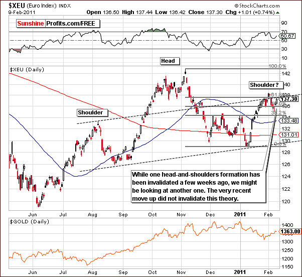
In the short-term Euro Index chart this week we see sideways movement and there remains a bearish outlook. A small increase in index levels that we’ve seen this week should not be viewed as bullish, in fact, it resulted in the right shoulder of the bearish head-and- shoulders pattern being formed. These implications will naturally result in a bullish sentiment for the USD Index as seen on the next chart.
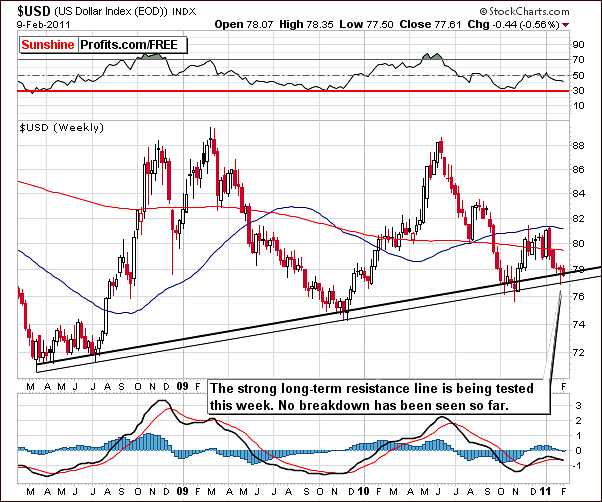
In the long-term USD Index chart this week we can see that index levels have barely moved since last week’s Premium Update. We have, however, seen a small decline which appears to be verifying the upper support line and is therefore not a bearish indicator. No breakdown has been seen. At this point the bottom appears to be in and the trend appears bullish.
Summing up, once again the outlook is bullish for the USD Index and slightly bearish for the Euro Index. Since precious metal have been trending with the dollar in recent weeks, the implications for gold, silver and mining stocks are also short-term bullish.
General Stock Market
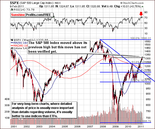
In this week’s S&P 500 Index chart, we can see that index levels have surpassed the August 2008 highs although this move has not yet been verified. It is, however, an important development.
Concerning the very long-term nature of this chart, a proper confirmation of this move is critical. In our Tuesday message, we stated that “There was a significant development on the general market yesterday - stocks (S&P 500 Index) moved above their August 2008 high of 1313.15. So far, this break out has not been confirmed, as the price has yet to close above this level for 3 consecutive trading days. Additionally, volume was not particularly huge (it was not extremely low either), so at this point we would not consider the breakout as a true one - at least not yet.”
As you may recall, we normally need to see three days of higher closing prices for a breakout to be verified. This time, due to the importance of this move and its implications, we have decided that the breakout will be acknowledged if this Friday’s closing index level remains above the 2008 high. If this is the case, stocks will likely move higher from there and have a positive impact upon the precious metals sector. More details on this topic can be found in our Correlation Matrix section of this update.
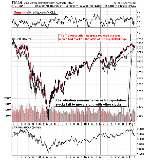
The Dow Jones Transportation Average Index this week continues to decline – relative to the Industrial Average. This is a bearish signal and the situation remains tense as to the future direction for the general stock market. Quoting from last week’s Premium Update, declines of this type are normally followed by significant declines in the industrials and in the general stock market overall. Consequently, the situation is still bearish from the medium-term point of view.
The implications seen in this ratio support our position of needing further evidence for verification of the breakout in the S&P Index discussed in our previous chart.
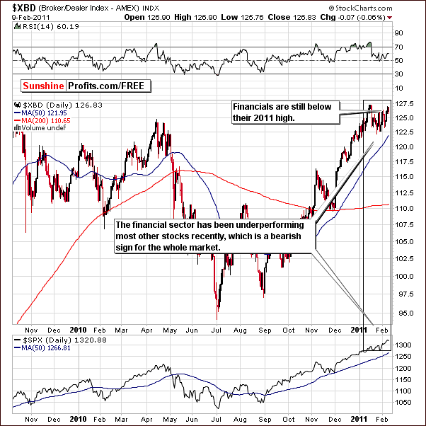
The Broker Dealer Index (proxy for the financial sector) level has not moved above the previous 2011 high. This level must be surpassed for any bullish sentiment to appear here and at present, the index chart yields yet another bearish indicator for the general stock market outlook in the weeks ahead.
Summing up, the situation remains tense in the general stock market. S&P Index levels are verifying an important breakout and this will be confirmed or invalidated, most likely by the end of the week.
The implications here are great with particular respect silver. Should the recent rally in stocks pause or end, the implications would be negative upon the precious metals sector on the whole. A continuation of the current general stock market rally would be very positive news for the white metal and all who are investing in it.
Correlation Matrix
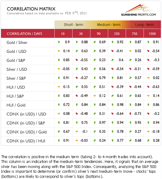
The commentary in last week’s Premium Update is mostly up-to-date we will quote it and comment where necessary.
In this week’s Correlation Matrix see a relatively strong positive relationship between the precious metals sector and the dollar in the short term [this week we also see positive correlation coefficients in the medium term, which further confirms the point made last week]. In other words, we have a numerical representation of what we mentioned earlier – the USD Index currently moves along with metals.
There is a quite interesting phenomenon in the 90-day column, as [almost] all assets appear to be positively correlated with each other. Still, there are only a few cases where the strength of the correlation is significant, and that is silver vs. stocks, gold stocks vs. gold, and juniors vs. stocks. While the gold stocks and gold virtually have to be highly correlated (gold mining companies’ profits depend on the price of gold), the other two pairs provide us with important insight.
The correlation between gold and stocks has been somewhat negative in the short run. A major development in the general stock market such as a large decline will impact the precious metals for the medium-term and these columns should therefore be your focal point at this time. In other words, a large decline in stocks would still be bearish news for gold investors.
Silver is still highly correlated with the general stock market and therefore what happens there is very important to silver’s trends. This is due to silver’s heavy industrial use as compared to other precious metals.
Gold
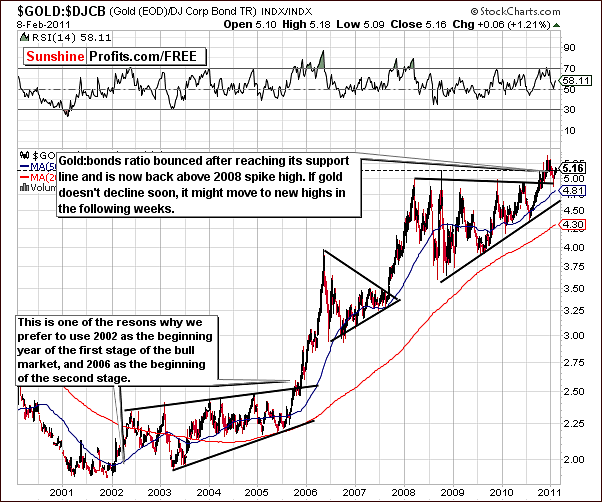
The ratio between the price of gold and corporate bonds once again provides us with some valuable insight into the latest developments. The ratio has recently touched a support line and has now moved higher, actually exceeding the 2008 spike high. This is an important development and from this point the odds slightly favor a continuation of the rally and the target level of $1,600 remains valid.
From a non-USD perspective, gold has bottomed close to the rising long-term support line and also close to the 50-week moving average. This is a trend, which has been seen fairly often in the past and usually points to a subsequent rally. Most importantly, no evidence of a breakdown has been seen and the outlook for gold from a non-USD perspective is therefore bullish for the short term.
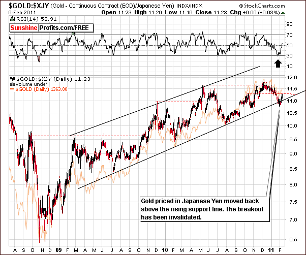
This week, the price action of gold in terms of the Japanese yen shows that the recent small breakdown, which was fairly insignificant has been followed by a rise in prices above the lower border of the rising trend channel. This is a perfect example to stress the importance of waiting for confirmations before making major decisions with one’s capital. Had the decision been made two weeks ago to move out of gold and into yen due to the small decline seen in price it obviously would have been the wrong move.
A continuation of this new upward move could lead to a local top, similar to what was seen in October 2010. However if some sideways price movement is seen followed by a decline, the bearish head and shoulders pattern could begin forming. It is too early at this time to state that as any more than a possibility but it is something we will keep our eye on.
Over all, the information in this chart is generally bullish at this time. This is based for the most part on the non-confirmation of the recent breakdown and the quick rise in price, which followed.
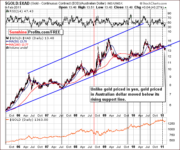
We now turn to the Australian dollar perspective, which was featured in January 12th, 2011 Premium Update. A breakdown was seen at that time and is still in place. This is of concern to us because a true bullish run for gold would show bullish trends in all major currencies. Therefore, based on the price action in terms of the Australian dollar, a move above the 14 level is needed before we can confidently state that gold’s $1,600 rally is quite probable.
Since the signs are bullish in all other currencies, our outlook for gold remains generally bullish. From the Australian dollar perspective, a sideways movement in price for prolonged periods of time is fairly commonly seen. A strong move higher with vengeance frequently follows such price action trends. Should we see something similar also this time, the $1,600 target from the USD perspective will become very likely.
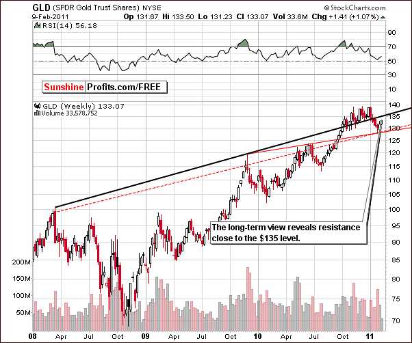
This week in the GLD SPDR long term chart we see that the bottom is definitely in from the regular USD perspective. Support lines have been reached with strong volume and now a slight rally from a long term perspective has begun.
The long-term resistance line lies ahead however. This is slightly higher that we recently stated in our latest message as it is close to the $135 level for the GLD ETF. In short, gold has room to rise and if no confirmation of a local top is seen soon, its rally is likely to continue.
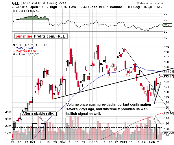
In the short-term GLD ETF chart this week we see a target level of about a $134, which is a dollar or so less than the target level based on the long-term chart seen earlier. The price here is presently at the 50-day moving average and the rising black support line. The long-term support line, however, is more important and stronger than those developed over the short term. If no top is confirmed, then exiting one’s speculative positions would not be advised.
Recent price volume action indicates the rally will likely continue. Rising prices have been accompanied by high volume levels and moves lower (pause) have been seen on small volume. No change in this pattern was seen through mid-week although a slight consolidation has appeared on Wednesday.
Summing up, the short term outlook for gold is bullish with target levels of $134 and $135 for GLD ETF ($1,370 and $1,380 in spot gold) with the latter being more probable. Confirmation of a local top will be sent out whenever it appears to have formed. At this point, based on our analysis of volume, it seems that a further upswing in price is likely.
With respect to long term capital, the outlook appears more bullish now than it has been for the past few weeks. Upswings in price above previous support lines have been seen in both the gold:bonds ratio and gold priced in Japanese yen.
Silver

A look at the very long-term chart for silver shows that the white metal has topped the target level based on the Phi factor of 1.618 – obtained through extrapolation of previous tops. Silver recently bounced off a support line based on ’05 and ’07 bottoms and the 2009 high.
If the current rally is similar to the three big rallies seen over the past five years (note the red dashed lines on the chart above) then perhaps this rally could continue. A bullish case could be made for several weeks depending on what happens in the general stock market. If stock prices plunge, it is unlikely that silver will see new highs soon. Still the outlook remains bullish but it does appear risky to bet on any big movement for silver at this point in time.
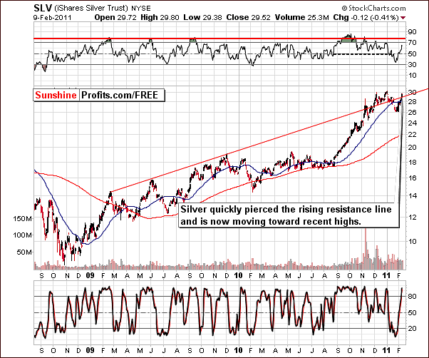
In the long-term chart this week we see that silver pierced through the rising resistance line shown in red in our chart. It is now close to reaching the level of its previous high and for this reason at least a pause in the rally is likely soon.
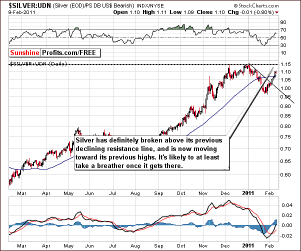
In this week’s silver’s non-USD chart, we can see a trend similar to the one presented on the previous chart. A clearly visible rally began in late January and index levels are now approaching previous highs. If silver’s price and the USD Index both rise at the same time, the silver:UDN ratio will likely move towards 1.15 matching its previous high. If this does take place then the rally would likely stop or at least pause temporarily at current levels.
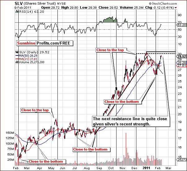
In this week’s short-term SLV chart, we see two target levels based on early and late December highs. Wednesday’s close was below both targets and it seems best to wait for additional confirmation here before exiting long speculative positions. Price volume action in the next few days may yield more information and we will let you know if and when this does take place.
Summing up, the short-term outlook for silver is bullish. It seems likely that the current rally could last at bit longer. The medium-term sentiment however is for the most part dependent upon the general stock market. A medium-term (several months) rally could be seen if stocks do not decline soon.
Silver to Gold Ratio
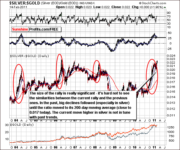
A look at the very long-term ratio chart for silver:gold shows that current action is not in tune with previous rallies. We have not seen a major drop in gold and silver prices. The rally in this ratio has likely been aided by the rally seen in the general stock market. Since the immediate trend for stocks is unclear at this time, the same holds true for the silver:gold ratio.
The current uptrend will likely pause (and the rally will continue), or end (forming a double top). It is unclear at this time as to what will follow next. We will continue to monitor this and report to you accordingly.
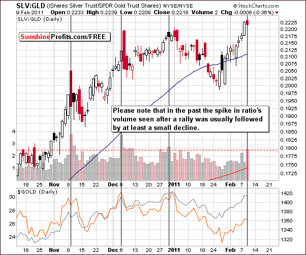
The short-term chart for the silver:gold ratio has bearish implication though not necessarily to be seen immediately (perhaps in the next several days). A local top may be seen in the near future. Volume levels have been very large (in relative terms - as compared to the previous volume) especially on Wednesday this week and this has been seen but very few times previously.
Generally, after a significant rally, a local top is formed on significant volume. Since silver is near a local top and gold and mining stocks are at resistance levels, it appears that it may be time to get ready to close speculative long positions. Additional confirmation is needed at this time however, so closing positions is not suggested yet.
Mining Stocks
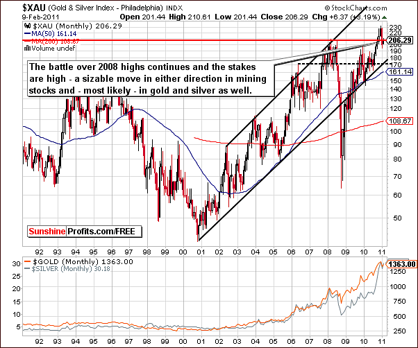
In the very long-term XAU Index chart (proxy for Gold and Silver Mining Stocks), the battle for the 2008 highs continues. That is to say, it is still not clear whether this resistance level will hold the current rally. Whichever way it eventually goes will likely determine the next big move for all the mining stocks.
A decline back to the 180 level or a move to new highs seem to be the two likely possibilities. Once again the general stock market will have a great influence on the direction of the index level here. The short-term trend however remains bullish.
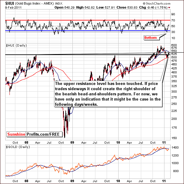
This week’s HUI Index chart shows some evidence that a consolidation period may be underway. If this continues and is followed by a downward move, it could very well be the beginning of a bearish head-and-shoulders pattern. This would also negatively impact all mining stocks and the precious metals sector as a whole.
It is truly too early to draw any conclusions at this time. We are merely commenting on indications and possibilities at this time and will keep you up to date as the situation further develops.
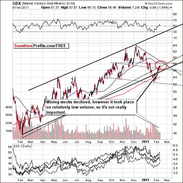
The short-term GDX ETF chart continues to show an upward trend this week. A decline was seen on Wednesday but volume levels were low. In general, high volume levels have been accompanying higher prices on a daily basis.
Index levels are currently in the lower part of the red target ellipse (and moved slightly lower on Thursday). If gold and silver prices rise, mining stocks are likely to rally as well and this seems probable for the short-term.
Summing up, the short-term outlook for mining stocks is bullish even though price moved lower on Thursday morning. The medium- and long-term outlook however will likely be greatly influenced by what happens in the general stock market.
Other Charts
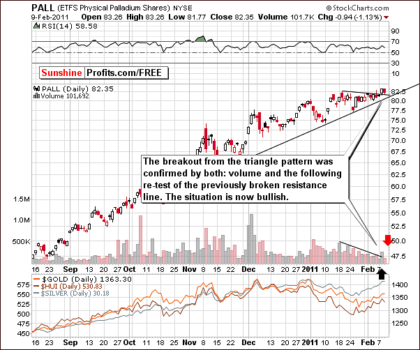
This week we have included the short-term chart for Palladium ETF which has just had a small breakout to new highs. The move was not significant in size but was on relatively high volume. The price action saw a move above a triangle pattern (usually the triangle formation signals continuation of the previous trend – which was up) on relatively high volume and a verification of the breakout on low volume.
This is short-term bullish and since palladium is part of the precious metals sector, we felt it was worth a mention in this week’s Premium Update. The implications from this chart are bullish for the precious metals sector on the whole.
One of our Subscribers recently asked if the current breakout in the yield spread between short-term and long-term bonds is meaningful to precious metals investors. He further asked if it changes anything from the fundamental perspective, for instance that inflation was no longer a threat to the economy.
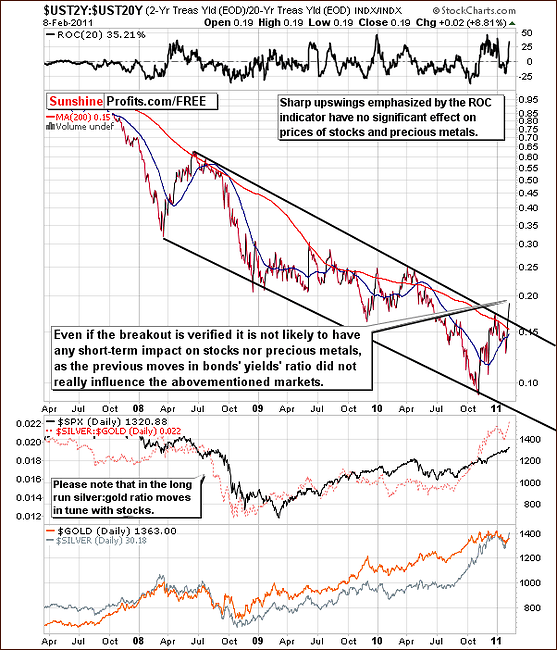
Our comment here is that long-term fundamentals are driven by the fundamental situations of the markets themselves not the short-term technical signs. These are used to time the market not analyze the economy. The economy is analyzed by economic indicators, major trends, demographics, industry analysis and other analyses which is more of a top-down approach. Prices reflect not only fundamental but also emotional factors, and that’s why technical analysis is so useful while timing the market. However, it cannot by itself change the fundamental outlook. Once we see a breakout, we cannot automatically infer that it was because of a change in fundamentals – it could have been caused by emotional factors, or it could have been just an accident. Printing presses around the world are hot from printing money and the inflation remains a long-term threat.
On the technical side, we took a lot of time to review the chart above and even analyzed from the perspective of the rate-of-change indicator for the bond yield spreads. No important implications were uncovered for stock, nor precious metals investors.
There were times when such a quick rally meant a local bottom for metals; there were times when it meant a local top, and times when it meant absolutely nothing. Consequently, seeing such event doesn’t provide us with much information.
Summing up, the analysis of the yield spreads does not appear to be a useful analytical tool for the Precious Metals Investors as far as timing is concerned.
Seasonal Pattern for Gold
Before summarizing, we would like to provide you with findings of our new tool – True Seasonals, a tool that not only provides you with the seasonal patterns of a stock/metal (gold in this case) but also adjusts this seasonal pattern for the influence of the expiration of derivatives. Please recall any of the big discussions about investment banks and their alleged practice to sell massive amounts of gold near the expiration of gold options and futures? Our tool takes that influence into account.
Please take a look at the chart below (note that on the new website the chart is going to be interactive, updated daily and available at all times).
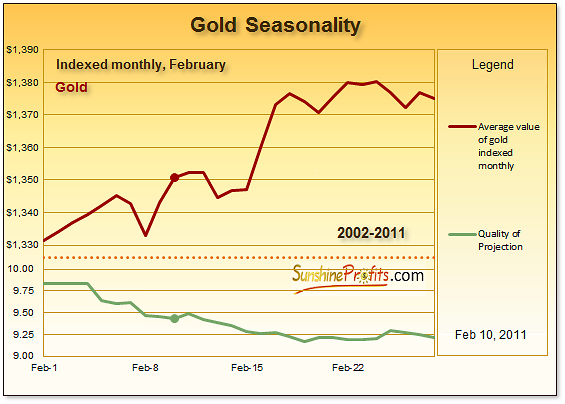
The chart above presents the seasonal pattern of the prices of gold in February. As we’ve stated earlier, this pattern is adjusted for the expiration of derivatives. The horizontal axis is the time axis for February. The vertical axis has been broken down into two parts: the first (the one in the upper part of the chart) presents the average price changes of gold in February; the second (the one in the lower part of the chart) presents Quality of Projection – our unique measure of the precision of the tool. Quality of Projection ranges from 10 to 0 (typically), where 10 indicates an extremely precise prediction and 0 indicates that the seasonal prediction is not particularly accurate
The chart shows that the price of gold, on average, rises throughout February. It also implies that there are usually two periods of that rise: the price of gold rises slowly during the first part of the month with several short-lived declines along the way and then it enters the second phase – a phase of quicker growth in the middle of the month with a slowdown towards its end. All of this suggests that, on average, gold tends to appreciate in February but the way up may be bumpy. This appreciation used to be moderate in the past (the average growth in February amounts to 3.3%).
Moreover, the performance of gold since February 1st 2011 to February 9th 2011 was better than the performance indicated by the seasonal pattern. This might suggest a higher price of gold at the end of the month than is indicated above. It also means that gold might have moved too high too fast and a few days of pause would not be necessarily bearish - such movement would be in tune with the seasonal tendency and it would not invalidate the move to $1,380 in the following days.
Summing up, the performance of gold in the previous Februarys suggests that the current rally is not over yet, and the quality of the signal is quite high. However, it is strongly recommended to keep track of the situation - as this point might be crucial for the rest of the month and for the following ones.
Letters from Subscribers
Recently our Subscriber asked us if we could comment on article he found based on the Elliot Wave Theory, a topic which we have already covered in the January 21st Premium Update. We were asked to comment on an essay featuring this technique, and before we managed to do so, this theory proved to fail once again. There might be markets where it works really well for FUTURE PRICES (it's very easy to draw these 12345abc patterns on past prices and make it appear as if it works), but we still don't consider it being really useful for precious metals market. Here is what we wrote then (and also almost 2 years ago):
The Elliott Wave Theory is a part of the technical analysis, and as such it is more of an art than of a science. Therefore, it is impossible to prove that it is either good or bad for any market. I have personally not found it particularly useful. When gold broke through the $400 level I remember many Elliott Wave analysts writing about imminent correction to the $200 area, which never happened. I understand that these wave patterns often do occur, but I found them easy to spot and reliable only in hindsight. Of course EW analysts have more experience in reading these waves and I don't claim to be an expert on that field.
Summary
The USD Index is currently rallying and the outlook is bullish for the dollar. The outlook for the euro is slightly bearish at this time. The general stock market situation continues to be tense though with a slightly bullish bias.
The influence of stocks upon the precious metals sector is positive for the short term and therefore it seems a bit premature to exit speculative positions and take our profits off the table at this time. We are awaiting additional confirmation of a top being reached.
If, however, the breakout for stocks is verified (stocks close the week above the previous highs) or even if the rally pauses above the previous highs, a move back to silver with your long-term capital may be the right move once again. At this time, however, it seems best to be insured against a quick decline in stocks and hold current positions.
Earlier this week, we sent out a message, in which we stated that “we believe that at this point no adjustments are necessary in both: speculative and long-term capital. As always, we will keep you updated, should anything change.” So far, the situation did not change; it seems that your gains on the current speculative position could still become bigger.
Our next Premium Update is scheduled for Friday, February 18, 2011.
This completes this week's Premium Update.
Thank you for using the Premium Service.
Sincerely,
Przemyslaw Radomski

