
The decade just ended was one in which the U.S. endured two market crashes, one at each end of the decade, the terrorist attacks of 9/11, a war in Afghanistan and a fiasco in Iraq that still drag on, Wall Street scandals highlighted by Enron, Hurricane Katrina, and the recent near economic meltdown. Is it any wonder then that Time Magazine couldn’t quite decide how to call this decade? The magazine came up with a few names: Decade from Hell, or the Reckoning, or the Decade of Broken Dreams, or the Lost Decade.
Book ended by 9/11 at the start, and a financial wipeout at the end, the first 10 years of this century will very likely go down as the most dispiriting and disillusioning decade Americans have lived through in the post–World War II era…Call it whatever you want — just give thanks that it is …over.
Noble Prize winning economist Paul Krugman had no problem at all coming up with a name for the decade. He called it The Big Zero.
In his New York Times column Krugman wrote: It was a decade in which nothing good happened, and none of the optimistic things we were supposed to believe turned out to be true.
He has his reasons for calling the past decade The Big Zero. He says it was a decade of:
- Zero job creation.
- Zero economic gains for the typical family.
- Zero gains for homeowners, even if they bought early. (Almost a quarter of all mortgages in America, and 45 percent of mortgages in Florida, are underwater, with owners owing more than their houses are worth.)
- Zero gains for stocks.
Krugman reminds readers of the excitement in 1999 when the Dow first topped 10,000. Summing up Krugman says:
So there was a whole lot of nothing going on in measures of economic progress or success… So let’s bid a not at all fond farewell to the Big Zero — the decade in which we achieved nothing and learned nothing.
We are now poised at the beginning of a new year and a new decade. We can hope that the bad things that happened in the first decade were a coda to the previous century, and not an overture of what’s to come. Today the US is cleaning up the mess from the largest financial collapse in history. There is no doubt, as we have written before, that the US will remain vulnerable to misgivings about its sovereign creditworthiness. This is especially so when you consider the high proportion of US debt held overseas.
In previous Premium Update essays we talked about the huge dollar reserves held by China, which alone accounts for 13 per cent of US Treasury bonds. Looking forward to the next decade, US publicly held debt is forecast to more than double to 85 per cent of gross domestic product.
Time will show whether the US government’s decision to spend its way out of this crisis was the right move. I heard Jay Leno joke that the government spending its way out of the crisis is like an alcoholic drinking his way out of alcoholism.
Some argue that the first decade of the 21st century was the last decade of the American Century. We are beginning to see of the rise of other powers, China, India, Russia, and Brazil. Some call it the beginning of a multi-polar century. Not all of the powers are democracies.
I guess if you lived in China or Brazil this past decade, you might have given this past decade a different name than those chosen by Time Magazine or Paul Krugman. Maybe you might have called it The Decade That Prosperity Began.
Perhaps some you recall a bestselling book that was published in 1999, right before the dot-com bubble burst. The title was “Dow 36,000: The New Strategy for Profiting From the Coming Rise in the Stock Market.” The book’s two authors were so confident that they responded to a critic by saying that if in ten years the Dow is closer to 10,000 than to 36,000, they will each give $1,000 to charity. The Dow zigzagged its way through the last 10 years to finish near where it started. As of Wednesday of last week, the S&P index closed 23 percent below and the Dow closed 8.25 percent below where they ended 10 years ago, in 1999. The NASDAQ, the average that was hit hardest by the bursting of the dot-com bubble, is down 44 percent over that period.
I wonder if someone will remember to call the two authors and get them to pay up on their bet.
What would we call this decade at Sunshine Profits? From our point of view it’s nothing short of the
This decade was gold’s turn to shine. Take a look at this chart, courtesy of Bloomberg. It compares how a $100 invested at the beginning of 2000 would have performed during the decade.
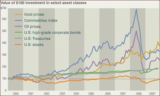
You will find more information here.
A $100 investment in gold when the market opened on January 3, 2000, was worth about $380 as of the end of the decade, for a total return of 280 percent and an annualized return of 14.3 percent. Gold stocks (as measured by the XAU Index) have also had a good decade, climbing 9.4 percent annually.
For this coming year and perhaps even for this coming decade, we're betting on silver and gold, also in the form of mining stocks.
As far as the technical part of the commentary is concerned, we would like to start by elaborating on one of the points made in the Market Alert that we've sent on Wednesday. In sum, the Alert included the information that there are several reasons to believe that the bottom MIGHT be in, but on the other hand there are many other factors that don't make this an extraordinary speculative buying opportunity. One of the factors that we mentioned was the USD Index, which was (and still is) very close to the cyclical turning point, as suggested by the previous analysis. Consequently, we believe it would be useful to begin this week's issue with the analysis of the U.S. Dollar (charts courtesy of http://stockcharts.com).
USD Index
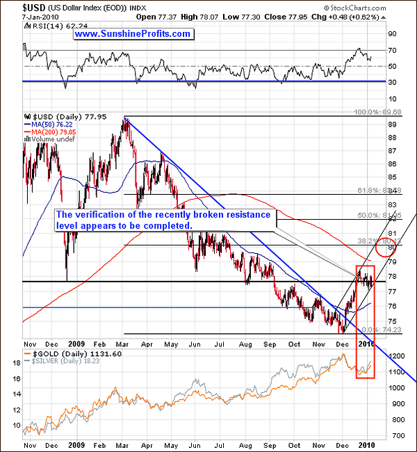
Reviewing the big picture before digging into details is particularly useful when signals are mixed - which appears to be the situation today. Signals coming from the longer time-frames are generally stronger than those from daily charts, so beginning with these types of charts allows us to see what are the main, long-term tendencies and then look for confirmation (or lack thereof).
This time, this approach let's us put the current move down in the USD Index into proper context. The U.S. Dollar moved from below 75 to over 78 in just a few weeks, so a correction was likely (as we mentioned back then). Still, please keep in mind that the current upswing (since early December 2009) is itself a correction of much bigger (March 2009 - December 2009) decline that took USD Index from almost 90 to almost 74. This is a huge move that took most of the year to form, and 2-weeks of a rising prices are not very likely to fulfill the role of a correction.
In other words, it is doubtful that two weeks and a correction of 27% or so of the size of the preceding move have already caused people to turn bullish / close out their short positions in the USD Index. The upswing was sharp, which makes me assume that many speculators perceive this phenomenon as very temporary (quick upswing followed by even quicker downswing). Consequently they have not closed their short positions yet, and once they do, USD Index is likely to move higher. As a digression - it is these types of psychological phenomena that make the whole chart analysis work.
Moreover, the current small (last few weeks) decline has been very calm compared to the previous upswing - which is exactly what consolidations look like. Additionally, the USD Index is correcting in the form of a flag, which is a typical formation of continuation (price is likely to move in the same direction as it did before it entered the formation).
The current correction caused the whole preceding rally to become less steep, which leads to the change in the time/price combination that is likely to contain the next local top. As usual, we've marked this area with red ellipse, and it is still around the 80 level, with the only difference being that it is now more likely to take place near the end of the month.
We've additionally marked the last few weeks with the red rectangle to emphasize the fact that recently PMs have been moving exactly in the opposite direction on the USD Index. Therefore, if the USD Index moves higher from here - possibly to the 80 area, gold and silver are likely to move lower at the same time.
Before moving to the short-term chart, let's take a look at one of the ETF designed to track the performance of the U.S. Dollar - the PowerShares DB US Dollar Index Bullish Fund (UUP) - this will allow us to analyze volume.
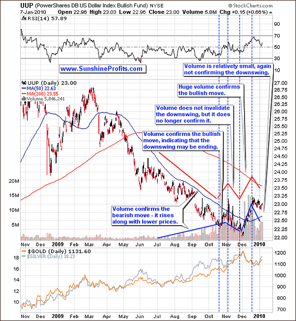
The red and blue lines on the chart above represent the direction in which the price and volume moved. Based on the changes in the direction we may recognize five time frames. The dashed vertical time lines mark the turning points in terms of price/volume behavior.
Before mid-October value of the USD Index declined along with rising volume, which means that people were more and more scared that the plunge would never end and sold more and more quantities of the currency. In mid-October situation changed as some investors jumped back on the long side of the market and many others followed. The move up took place on a very large volume indicating that this is not just a coincidence, and it signaled that a bigger move up may appear in the future. At the beginning of November, USD declined once again, but this time it moved lower on declining volume - which is normally neutral signal, but given the fact that the volume was rising during the previous part of the decline, it should make one at least suspicious.
Finally, early December was the time when the bottom was put and prices began to increase. The noteworthy fact is that it moved higher on an enormous volume, which means that this is not likely to be just a small blip on the radar screen. Since mid-December the value of the USD Index has been sliding lower, but this has been taking place on a small volume, which once again indicates that this is just a correction, and the next move in the USD Index will be up.
Let's turn to the short-term chart for more details.
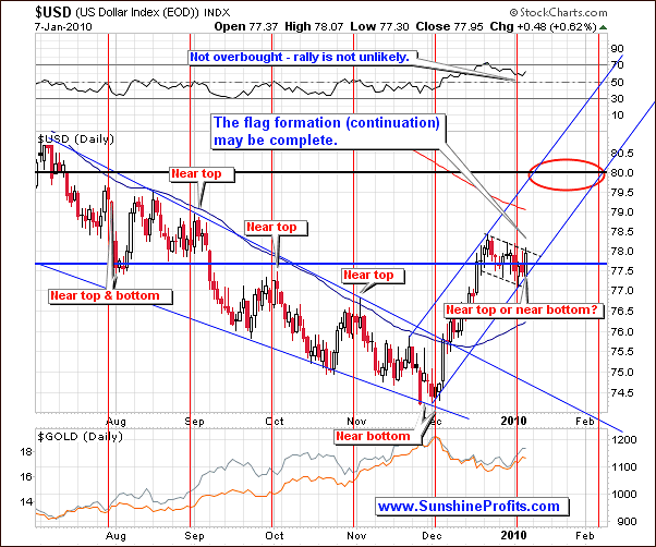
The short-term chart confirms that the USD Index is indeed in the flag formation, which is a sign of a trend continuation. If we have seen the bottom of this formation at the beginning of 2010, we can create a rising trend channel, which - along with other tools - created the area marked with red ellipse.
Summing up, based on the above analysis it seems that the next move in the USD Index will be up and the next resistance level likely to stop that move is around the 80 level. The above study of the U.S. Dollar is crucial this week, because lately PMs seem to be reflecting the moves of the USD Index to a great extent. One way to check this strength is to compare moves of USD and PMs on one of the above charts. The advantage of this method is that it is very easy to apply. The drawback is that it is difficult to "measure" the strength of the "reflection of the move" by just looking on the chart. This is where our correlation matrix comes in, because the "strength of reflection of the move" is just another word for "correlation".
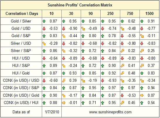
The correlation between the precious metals sector (gold, silver, and HUI Index) and the USD Index has been very strong during the past 30 trading days, which suggests that the situation on the dollar market should not be ignored by anyone interested in any of the precious metals.
On the other hand, PMs' correlation with the general stock market has been weak during the previous 30 trading days. Moreover, it has been negative, which leads us to the same conclusion as the one from the previous Premium Update. Back then we wrote the following:
(...) the fact that in the past 30 trading days PMs moved on average in the opposite direction to the general stock market (which is NOT in tune with the historical norms for PM stocks and silver) is very important. These numbers suggest that right now (!) we should not rely on the signals from the general stock market as far as timing PMs is concerned.
Yes, the precious metals stocks (and underlying metals) plunged along with main stock indices in 2008, but there were also many times when PM stocks moved higher along with lower values of the main stock indices, for instance February and September 2001. So, the question arises - how do we know what is the influence this time and how can we be sure that the main stock indices are going to influence PMs in this or the other way?
Naturally, there are no sure bets in the markets, but if the objective/unemotional analysis is the key to estimating what is probable and what is not, then it seems that using mathematical/statistical calculations is one of the best approaches - after all, very few things are less emotional than a math equation.
I've mentioned above that the analysis of the general stock market is not very important given the current market juncture, but we would like to provide you with the analysis of this market in case you do decide to own some of the popular stocks. Additionally, it will allow me to maintain the continuity of the analysis
General Stock Market
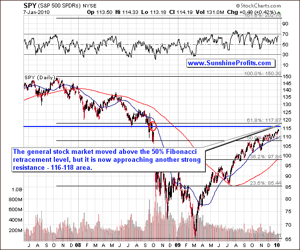
The long-term chart of the SPY ETF (proxy for the general stock market) informs us that the 50% Fibonacci retracement level has been taken out, although the testing took about 2 months. The volume did not increase lately, so points made in the previous Premium Updates are still up-to-date, namely, that the buying power is drying up, which means that the top is likely to emerge sooner or later. The key question remains - when, and exactly how high.
Since the 50% Fibonacci retracement level has been broken, the next serious resistance is just above where we are today - in the $116 - $118 area. The upper border of this range is created by the most classic Fibonacci retracement level - 61.8% - the $117.87 level. The lower border is created by the July 2008 bottom - the last visible bottom before the major plunge. Additionally, this area is the place where the price used to trade just before the dramatic fall.
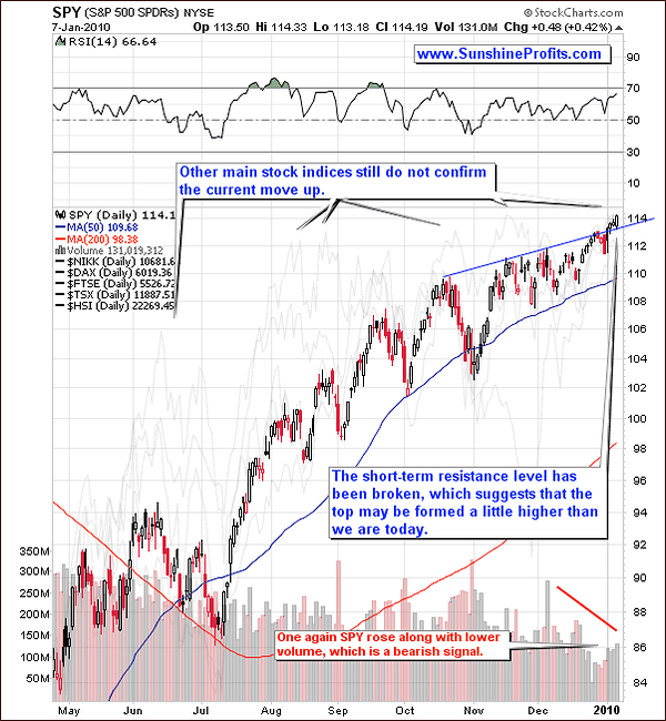
The short-term chart confirms that the general stock market may need to move higher before the top will be reached. This is not what was likely - based on the previous analysis, but it happened (from time to time "unlikely" virtually has to happen, because otherwise it would just be called "impossible"), and nobody can argue with the facts. The breakout above the upper border of the trading range has been verified, so we may now expect the main stock indices to move higher - probably to the $116 - $118 area.
Having covered the situation on the markets that drive (or used to drive) the value of gold, silver, and corresponding equities, let's move to the analysis of these markets themselves. Let's begin with the long-term chart featuring gold.
Gold
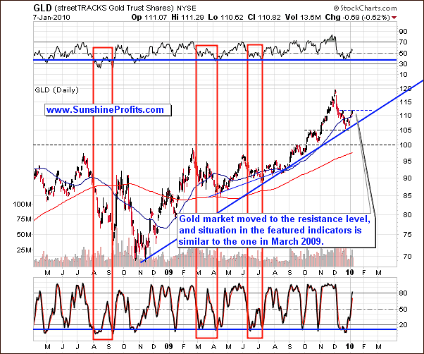
The price of gold moved higher this week, but it was stopped by the resistance level created by the small December top. The history suggests that the gold market often corrects in the form of a zigzag, and the one that we have seen so far is in my opinion too small to say that "that was it".
Please compare the December 2009 downswing to the similar moves in the past that I've marked with red rectangles. Each time correction had two stages, and even the smallest one (June-July 2009) had the biggest upswing within it, than what we've seen in the mid-December 2009. This alone suggests that the current move up is in fact an upswing within a move lower.
The current situation in the featured indicators: RSI and Stochastic, is also similar to the ones from the time frames marked with red rectangles, which serves as a confirmation of the above analysis. Let's zoom in to compare the today's price action with one of the previous declines.
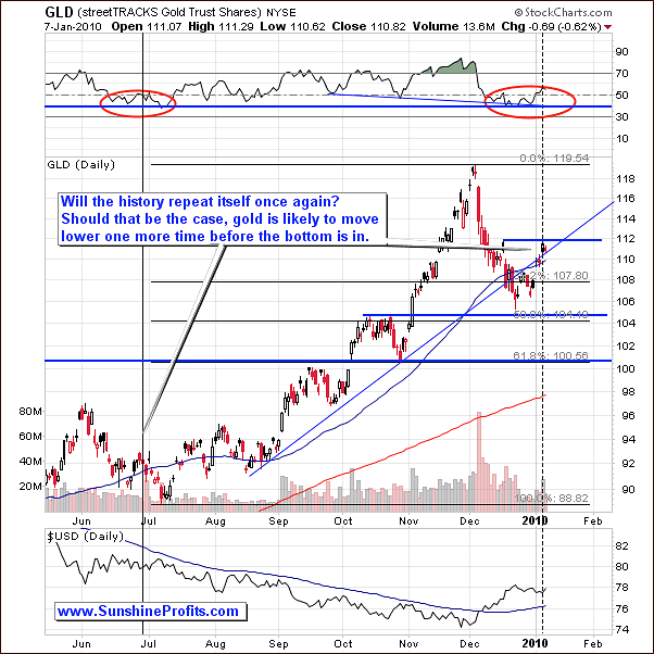
The history repeats itself or at least it rhymes - is one of the old sayings that the technical analysis is based on. The reason is that the human psychology is one of the most stable phenomena involved in the markets. Economies, currencies, even countries' borders changed throughout the history, but the fact that people want to act on reason when their money is at stake, and usually end up acting emotionally is present at all times. Of course, the above is just a general rule, but it can be partially applied today.
One of the time-frames to which the current situation on the gold market is similar is the June-July 2009 downswing, and the similarity is not limited to the price itself. Another thing that serves as a connection between these two situations is the way the RSI Indicator is behaving. In the middle of the previous year, RSI however at/around the 50 level after having declined from over 70, and this is also the case today.
Moreover, the situation on the USD Index is also similar. Back then USD moved temporarily higher after rising for about two weeks, and this is also the case today. Based on the previous behavior of the USD Index, RSI indicator, and the price of gold itself, and the analogous patterns today, I've marked the point in the past (at the end of June), which seems to be the analogy to where we are today. The implications are bearish in the very-short-term, and bullish in the long-term, which is in tune with what we wrote previously.
Silver
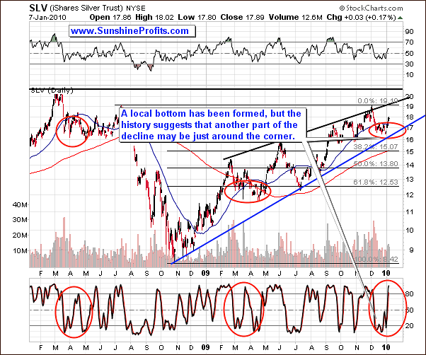
The situation on the silver market is also similar to the ones that already took place, also with similar implications to the ones mentioned earlier in this update.
The tendency for the silver to correct in more than one stage is even stronger for the white metal than it is for the yellow one, especially after big upswings. This has a lot to do with the fact that silver is generally more volatile than gold, but I don't want to get into details of this mechanism in this particular essay. The point here is that what we've seen up to date is most likely just a first part of the decline. We doubt that the second part would take us much below the recent low, but it appears likely that it will take some time (a week or a few of them) before the final bottom for this decline is put.
Please take a look at the situation in the Stochastic indicator. During past corrections it formed some kind of double-bottom, after which it rallied to/above the 80 level only to correct soon after that. This is where we are today - at the moment Stochastic indicator has just moved above the 80 level. Should the history repeat itself once again, silver may move lower soon.
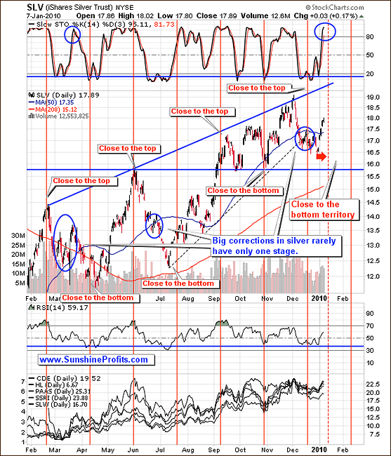
The second silver chart allows us to analyze the cyclical tendencies on the silver market. Silver is still closer to the "top" line than it is to the "bottom" one, which means that it is not yet in the "close to the bottom" territory. While such tendencies will stop working eventually, we don't have any proof that this is what is taking place right now.
Therefore, it currently seems that the next move down could begin soon and end near the end of the month or early in February. Having analyzed the situation on the metals market, let's take a look at the precious metals stocks.
Precious Metals Stocks
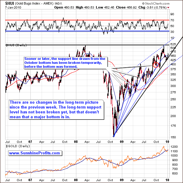
Once again, there are virtually no changes in the long-term picture of the HUI Index, so we will just include the previous comments, as they are up-to-date also today:
Please take a look at the thin blue lines coming from the same price/time combination. Each of them was pierced, before the final bottom was put in, and this is what I expect to take place this time.
(...) taking the historical performance of the gold stock sector, it seems that PMs will need to move a little lower before putting in a bottom. The short-term chart confirms this.
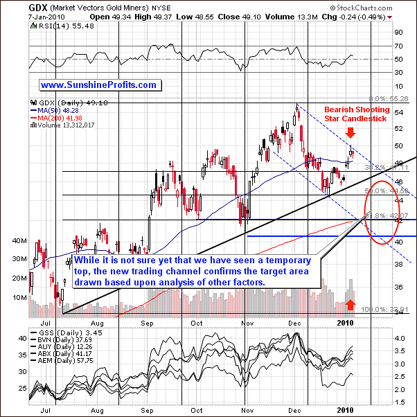
An additional factor pointing to lower prices is the bearish candlestick on high volume - so called "shooting star". This type of session often signals a reversal in the most recent move - which was up.
Additionally, the cyclical tendencies suggest that the next turning point is still ahead of us, so we may expect the PM stock sector to move lower in the near future. Naturally, there are no certainties on the market; I'll keep you updated, should the situation change.
The last confirmation that the next move is likely to be down comes from the GDX: SPY ratio.
Precious Metals Stocks' Performance Relative to Other Stocks
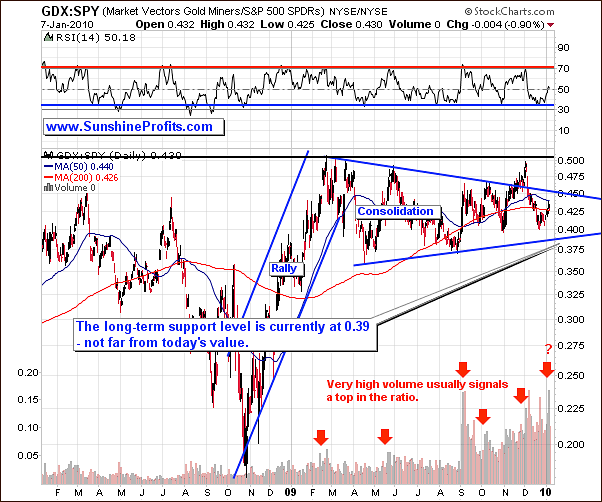
The GDX:SPY ratio describes how did the gold stocks perform versus stocks from other sectors and the major tops / bottoms in the ratio usually correspond to the same extremes in the PMs.
Please note that the volume for this particular ratio has been very high on Wednesday. Similar action in the past almost always signaled that the ratio is likely to move lower - I've marked these situations with red arrows.
Consequently, it currently seems that this ratio will need to move a little lower - to 0.39 level before a bottom is reached. This means that PM stocks and also the rest of the PM market may move lower in the short term.
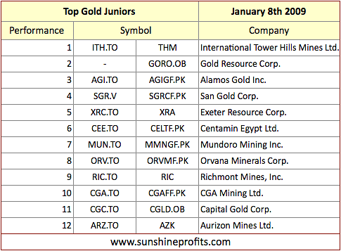
Juniors
As stated in the Key Principles section, the list of top juniors will be updated approximately every 4 weeks, so this is the Update that should contain the revised version of the list.
The tables below feature our favorite junior stocks at the moment of writing these words. For more information on how you can use these lists please refer to the Key Principles section, especially to the part dedicated to juniors.
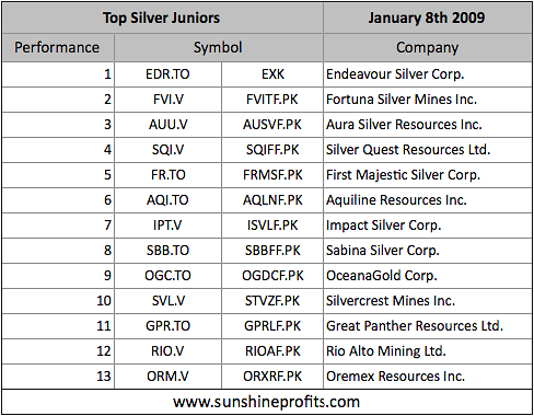
There are not many changes this month as far as silver is concerned, and almost all companies featured last month are still in our top silver junior list, meaning that if you purchased these companies a month ago, you still own stocks with the best (in our opinion, of course) profit potential.
As far as gold juniors are concerned, there are two new companies in our ranking: International Tower Hill Minerals Ltd., and Alamos Gold, Inc. Both of these companies have been very strong performers, and this month we have decided to put them on our list, even though their market capitalization is not extremely small.
Please keep in mind that the key to making money in the junior sector in the long run is proper diversification. You can make a killing with a single stock that soars, and perhaps do so with another one, but if you use too much of your capital for each of these volatile companies you might end up with nothing if the next of the "hot picks" files for bankruptcy while all of your capital was invested in it. On the other hand, diversification allows you to grow your long-term assets over time, while being safe from a bankruptcy of a single company. In other words - why put your money at risk, when there's no need to.
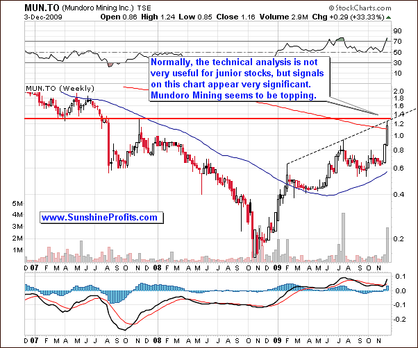
Speaking of junior stocks that have soared - over a month ago we mentioned Mundoro Mining Inc. We wrote the following:
MUN.TO is currently reaching a critical resistance level at 1.3 CAD, which has been created by combining two very important resistance levels - the rising medium-term line, and the horizontal line that has already stopped a rally in MUN.TO in 2007. Consequently, it seems that rebalancing your long-term junior portfolio now would be a good idea. By that I mean selling a part of your MUN.TO holdings and use the proceeds to purchase other stocks from the list.
We supplemented the above analysis with the following chart:
If you didn't follow the story since that time, here's what happened:
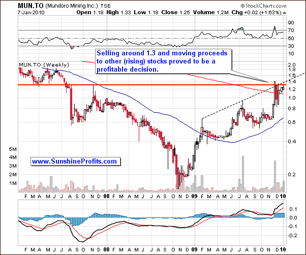
Stock closed the week at 1.4 CAD, which means that those of you, who decided to close/limit their position in MUN.TO were able to sell into strength and took the money off the table just before the price fell below 0.9 CAD. It seems that people saying that the technical analysis simply does not work will have a hard time denying its usefulness on the above charts.
Summary
The points made in the latest Market Alert are still up-to-date. Namely, it MAY be the case that the bottom is behind us and the risk being left behind is too big to be out of the market with one's long-term holdings - at least in our view.
On the other hand, there are still several points that make us wait for better opportunities to initiate a speculative long position, or to say that it is unprofitable to wait for one.
If the USD Index moves higher for a few days, and PMs refuse to move much lower, it will serve us as a clear signal that we might expect higher prices in PMs in the near future. However, this was not the case just yet.
This completes this week's Premium Update.
Thank you for using the Premium Service. Have a great weekend and a profitable week!
Sincerely,
Przemyslaw Radomski

