
It was a blockbuster summer for the bulls on Wall Street but September is historically the market's worst-performing month and already we've begun to see some sharp pullbacks.
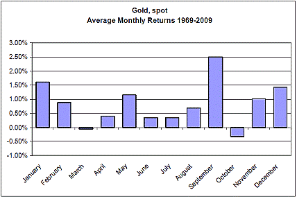
Interestingly enough, on the flip side of the coin, September is historically the best month for gold. The price of gold has risen in 16 of the 20 Septembers since 1989. And as this September began we have already seen some tangible proof as the yellow metal makes new forays towards quadruple digits.
In the Market Alert I sent you on Thursday I pointed out that we have just seen a significant breakout from the triangle pattern in gold to which I had previously referred in several Premium Updates. Not only did the gold price close much above the upper border of the triangle, but the move also took place on a very strong volume. This is exactly the type of confirmation I like to see in a breakout.
Source: U.S. Global research
At the moment gold is on course for its biggest weekly gain since late April, which is quite encouraging after its prolonged consolidation within the triangle pattern.
While September is a good month for gold, it is historically a great month for gold stocks as measured by the NYSE Arca Gold Miners Index.
After the typically weak summer months the gold miners start to perk. Since 1993, when it was created, the GDM has been up 11 times in September and down just five times.
I hope you took full advantage of the "heads up" I gave two weeks ago and bought precious metals mining stocks. If you did, you would have made about 14% profit so far if you diversified in many stocks (HUI Index), and about 19% if you put your money in the top 3 stocks (GSS, IAG, AEM) that the leverage calculator suggests as a speculative proxy for gold.
It is my job to sift through the massive amounts of data, analyze the charts, demystify the markets and help you make serious money, so nothing makes me happier than when you make money.
September is also historically a miserable month for the U.S. Dollar, a bullish sign for gold since gold trades at an inverse relationship to the dollar (More on that later.) Looking back 39 Septembers going back to 1970, the dollar has seen negative performance 26 times, more than any other month.
So what's behind this predictable September pattern, as far as gold goes?
Several gold-demand drivers converge all at the same time this month.
- The post-monsoon wedding season begins in India as farmers begin to channel some of their hard-earned rupees into gold.
- The Indian festival season begins.
- American jewelers begin restocking in advance of the Christmas shopping season.
- Ramadan ends in late September in the Muslim world with a period of celebration and gift-giving.
- And, in China, the week-long National Day celebration starts October 1. Already in China gold jewelry demand increased 6% in the second quarter as we reported in a recent Premium Update.
While just about everyone in the world is getting ready to celebrate, the price of gold is getting ready to perform its own celebration dance.
Gold
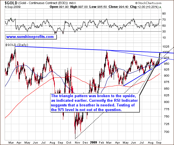
Looking at this chart (charts courtesy of stockcharts.com) you can see that gold prices broke out of the triangle pattern, but were stopped by another resistance line. The RSI Indicator, a very valuable tool in timing the gold market local tops, suggests that gold may need to take a breather before moving higher. Should that be the case, the most probable scenario is a test of the upper border of the triangle pattern.
Still, in the short term prices may rise a little higher before correcting.
Analysis of the short term chart suggests that although prices have risen high and fast this may not be the end of this rally. First of all, the volume is not low. It was lower on Friday than during the previous two days, but it is still considerably higher than the average during the past few months. Low volume would indicate that the buying power has dried up and price is ready to plunge. We do not see this yet.
Also, please take a closer look at what happened at the end of May. The RSI was very close to the 70 level in the 4th week of the month, but the price pulled back only for two days, and then rallied further. While I can't say for sure that this will happen here, I can say that there are no clear signs of a top yet.
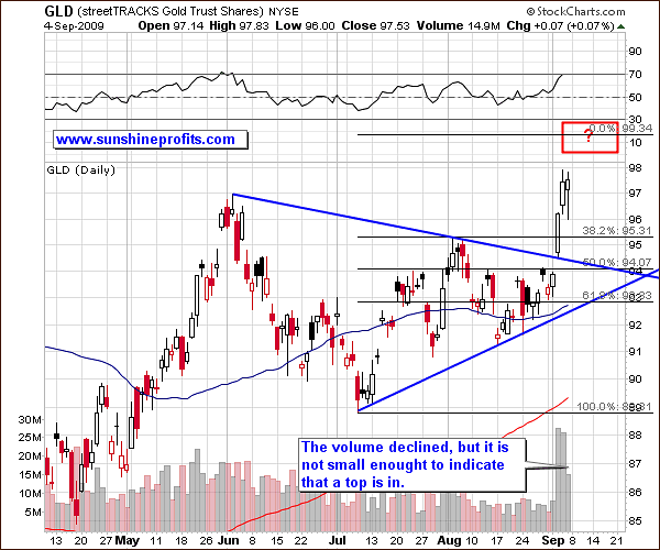
Moreover, taking into account the 1.618 ratio that is also very useful in predicting the range of future price moves, we might expect the GLD ETF to reach levels marked with a red rectangle. This would correspond to gold breaking above $1000. Should this move materialize, I would expect it to be volatile.
Silver
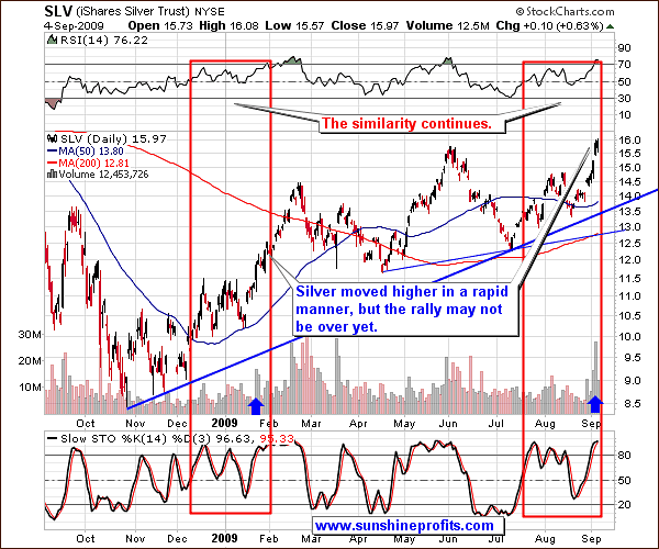
In doing technical analysis we look for patterns since history tends to repeat itself. Analysis of silver market has been particularly interesting in the recent weeks, as the similarity between two time frames marked with red rectangles has been really remarkable since I first mentioned it on August 22nd. Back then we had RSI of 50 and silver at about $14. The "history repeats itself" principle has worked perfectly. Please note that even the action in the volume has been similar - along with the spike marked with blue arrows.
Generally, the more similarities you find between two situations, the greater the probability that similar actions will follow. In this case we had similar patterns in the price itself, indicators and even volume. If this similarity is to continue in the near future, we may see the RSI stay for several days in the overbought territory and even higher silver prices. A direct extrapolation of the previous upswing would give us $18+ silver, but since silver is so highly correlated with gold, it seems that silver will "wait and see" how gold deals with the $1000 barrier and then move in the similar manner. Should gold break through it, there is very little doubt in my mind that silver would react by moving visibly higher.
Precious Metals Stocks
The precious metals stocks have made substantial gains this week, mostly during the last few days. Are they overbought, prone to plunge or heading to the moon? Let's take a look at the GDX ETF chart to find the most probable answer.
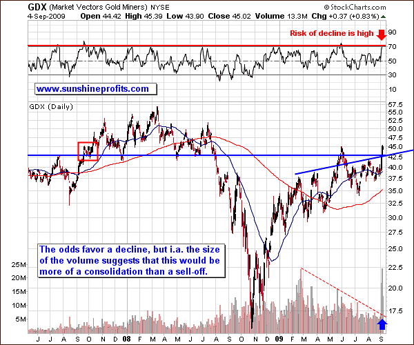
This week's price action has indeed been important - it is clearly visible also in the long-term chart. As I mentioned in the latest Market Alert, the breakout took place on very high volume, which means that the move is likely to mark the beginning of a bigger upswing.
On the other hand, PM stocks seem to be overbought. The RSI indicator, whose past reliability in timing tops should not be underestimated, is now telling us that PM stocks are likely to endure at least a small consolidation.
Consolidation does not need to take the form of a sell-off. It may simply mean trading in a rather tight trading range, just as was the case two years ago in the September - October time frame (marked with a red rectangle on the chart above).
Based on the long term chart, one could expect the GDX to move higher from here, but later decline to the $42.5 level, where we now see two support levels (as marked on the chart with thick blue lines).
The analysis of the medium-term chart reveals that this rally may take PM stocks a little higher before it runs out of steam.
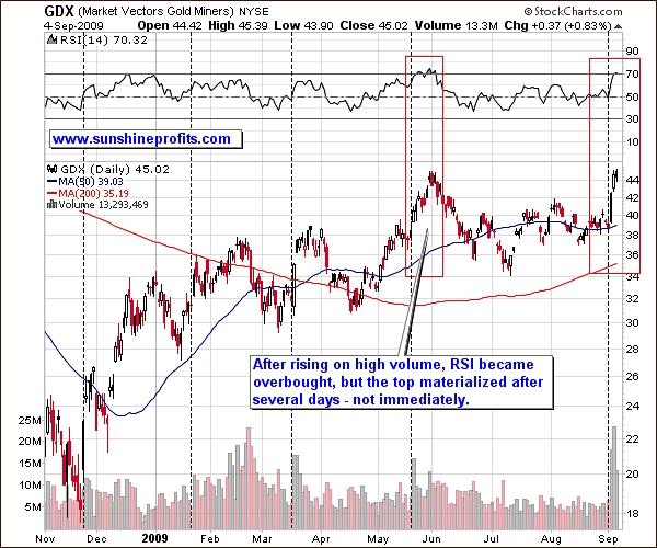
Just as I predicted in this week's Market Alert analysis, the price moved higher but now the probability of further gains has decreased. However, the last time that the GDX ETF rose on a substantial volume (in May - the vertical dashed line), it rose for several more days, even though it had earlier reached overbought level on the RSI (above 70). Currently the RSI is also above the 70 barrier, which suggested caution, but is not a screaming sell-short signal.
Based on the short-term chart, it seems that PM stocks could rise a little more, and then get back to the previous local top (around $45, which corresponds to the HUI Index at about the 400 level).
In a recent essay posted on Bloomberg, the author mentions the HUI Index breadth indicators:
The Philadelphia Stock Exchange Gold and Silver Index [XAU] is signaling that some bullion producers will extend gains after all 16 companies in the index rose yesterday, according to WJB Capital Group Inc.
The article suggests that these stocks are likely to move higher BECAUSE so many of them have already moved higher - thus indicating strong momentum. Before those of you who are contrarians run for the door, please take a look at the chart itself for analysis of the data in its raw form. I will use the Gold Miners Bullish Percent Index (GMBPI).
I have mentioned this tool in the June 20th Premium Update, but here's a brief reminder:
The Gold Miners Bullish Percent Index is a market breadth/momentum indicator and is calculated by dividing two numbers: the amount of gold stocks on the buy signal (according to the point and figure chart which emphasizes strong moves while ignoring small ones) and the amount of all the gold stocks in the sector. If every gold stock is rising, then the value of the index will be at 100%, which raises a red flag, as everyone interested in the market is already in, and the top will soon emerge. If we're looking at sentiment, substantial momentum usually corresponds to investors eager to jump in at quickly rising prices because they believe prices will continue much higher and are afraid of being left behind.
Now let's take a closer look at the following chart:
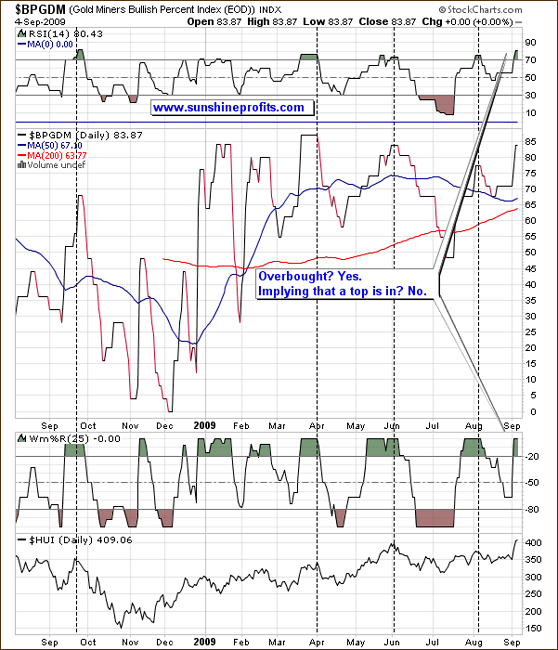
The GMBPI itself is currently trading at the overbought levels that in the past sometimes meant that a top is in. However, that is only part of the story.
Please remember that if during the second half of May 2009 an investor hastily acted solely on the popular use of the RSI that says to sell once it gets above the 70 level, he would have missed a $50 move in the HUI Index.
It's usually a good idea to put every indicator/tool into the proper perspective before acting on it. Keep in mind that the people who design an indicator want it to work in many markets and usually don't fine-tune it for a particular market. Investors need to make the appropriate adjustments themselves.
Here, when you consider the local tops that materialized when both the RSI and William's %R indicators were in the overbought territory, it becomes clear that these tops did not form immediately after the overbought levels were reached. Conversely, the HUI's value usually moved higher for several days/weeks before topping. I have marked with vertical, dashed lines each time gold stocks took their time before reacting to the "overbought-sell-now signal".
So even though the probability of a correction increases it does not mean that it will take place soon.
Correlations
It is not without a reason that I have begun this week's update with PMs themselves without first referring to their key drivers - the general stock market and the U.S. Dollar. This week the "normal", historical correlations have turned upside down. It is very difficult to say how a move in either of these markets would influence prices of precious metals and corresponding equities. Please take a look at the following table for details.
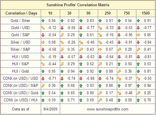
Only juniors have recently acted more or less in a way that one would expect them to; the most important changes are visible between the correlations of the PMs, USD Index, and the S&P 500.
Historically, PMs and PM stocks move in the opposite direction to the USD Index, and either independently from the general stock market (gold) or along with it (silver, PM stocks). The big news is that none of these tendencies held during the past two weeks. More or less PMs were trading independently from the USD Index, and in opposite direction to the general stock market (even silver).
A two-week period is not statistically significant, but it does provide us with a valuable indication to the tendencies that may emerge in the near future. The 30-day column has been somewhat affected by this anomaly - the only coefficients that are still significant are the negative ones between USD Index and gold / gold stocks.
In other words, all of this suggests that if the general stock market were to plunge, it is now less likely that it would drag the PM sector (even PM stocks) along with it. I realize that they did sell off together last year, but the data now suggests that risk of that taking place is considerably lower.
Speaking of the general stock market, please take a look at the following chart:
General Stock Market
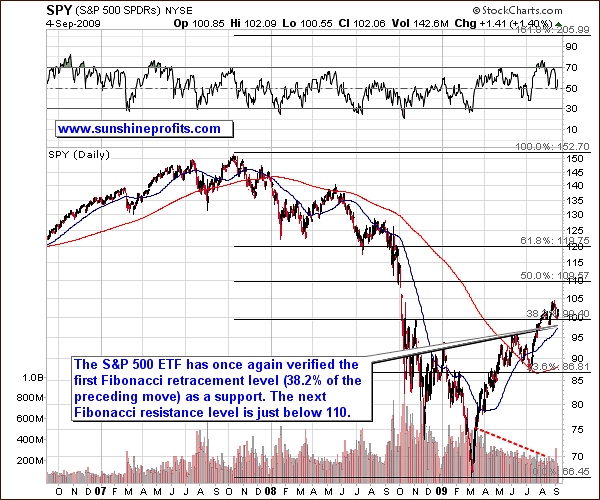
Although S&P 500 has recently moved lower, it did not change much from the long-term perspective. The value of the SPY ETF is still above the 38.2% Fibonacci retracement level, and the trend remains up. The RSI Indicator is not overbought here, but it is not that useful in timing main stock indices, as it is the case with precious metals. Still, the short-term chart uncovers a bearish signal.
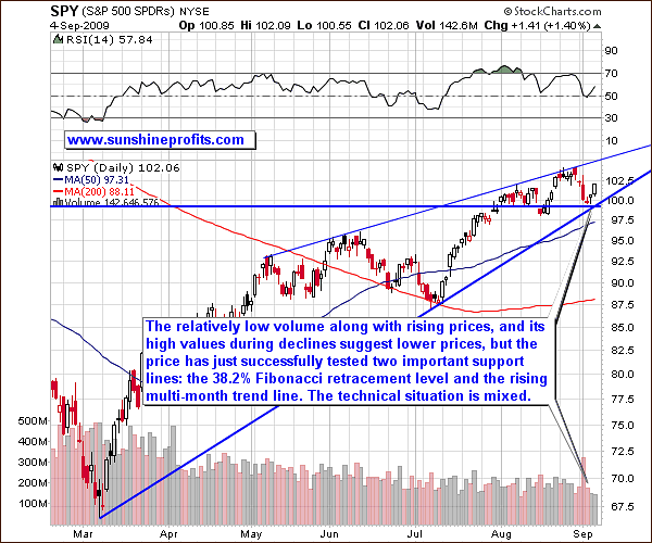
The volume has been visibly lower during the last two days, when SPY ETF rose, than it was the case a few days earlier - during the decline. Such a price/volume action is generally a bearish signal, as it means that the buying power is drying up. The price has bounced, but this is nothing extraordinary here, given the heavy support from the rising monthly trend line, and the Fibonacci retracement level.
Taking all of the above-mentioned factors into account does not provide us with one crystal clear conclusion. The trend remains up, but it is not out of the question that we are now forming the right shoulder of the bearish head-and-shoulders formation (with the latest top being the head).
USD Index
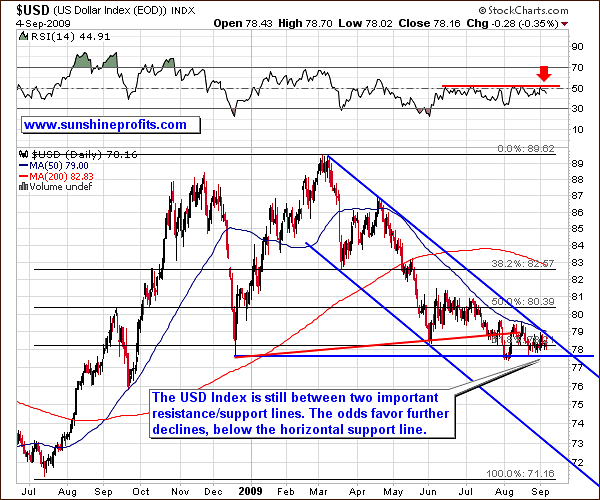
There is not much to report this week as far as the USD Index is concerned, as its value is still between two important support/resistance lines, and it has not broken out so far. As I mentioned in the previous Premium Updates, the trend remains down, so the odds favor a breakdown below December 2008 low.
Junior Mining Stocks
As stated in the Key Principles section, the list of top juniors will be updated approximately every 4 weeks, so this is the Update that should contain the revised version of the list.
The tables below feature our favorite junior stocks at the moment of writing these words. For more information on how you can use these lists please refer to the Key Principles section, especially to the part dedicated to juniors.
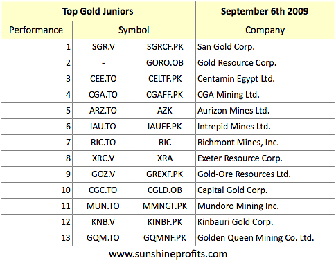
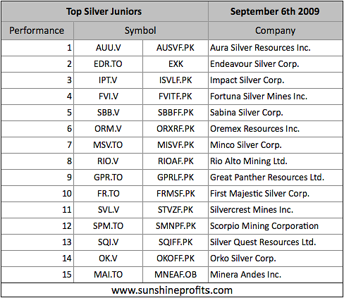
There are not many changes this month, and almost all companies featured last month are still in our top list. This means that they have performed well relative to the whole sector and that they are still a great buy today. The most important thing when estimating whether or not a stock is still worth holding is the comparative analysis - is there a stock (or a few of them) that gives you greater potential for further gains? Therefore, if you hold companies that have been underperforming the market, I believe it would be best to restructure your portfolio so that it contains stocks that have the biggest upside potential.
Summary
Your approach toward the situation on the precious metals market should depend on your investment perspective and risk preferences. The trend is up for the PMs, but there are a few signs that some kind of breather is likely. This does not need to take place instantly, so the question is whether or not to hold your positions in this market.
The fundamentals have not changed, so I don't think that selling one's long-term PM investments is a good idea right now. However, the short-term speculative capital is another matter. If you are risk-averse, I would suggest exiting at least a part of your speculative positions right now, and re-entering during a consolidation. Those of you, who accept high risk in order to reap the biggest gains, may want to wait for PMs to move a little higher (to levels mentioned above) before closing your speculative positions.
This completes this week's Premium Update.
Thank you for using the Premium Service. Have a great weekend and a profitable week!
Sincerely,
Przemyslaw Radomski

