With less than three months left until the end of the year, let’s do a quick recap. Silver may not be as shiny as gold, but it has been no pushover to the yellow metal. So far in 2012, silver has been the top performing precious metal with a gain of nearly 24 percent. The gold/silver ratio, the number of ounces of silver needed to buy one ounce of gold, fell below 52.0, from closer to 52.5 earlier this week, reflecting silver's outperformance relative to gold.
The silver market is often volatile catapulting higher or fainting in a swoon with little volume. This scares a lot of investors away. But here are a few things to consider. The makers of solar panels consume about 11 percent of the world’s supply of silver, the material in solar cells that conducts electricity. It seems easy to make the argument that global demand for solar panels will rise along with concern for the environment and demand for green energy. This need alone could sustain much higher prices. The output capacity of the metal is hardly keeping pace with the industrial demands for silver that also includes batteries, cameras and medical equipment. Many investors scared away by the volatility of the silver market may miss the boat.
The second runner up in the precious metals hit parade is platinum. The price of platinum rose by 20 percent in the space of two months after a series of violent strikes in South Africa shut down much of the country's production and left about 50 people dead. Almost 80 percent of the world's platinum comes from South African mines. Even with the fragile supply line, analysts are less optimistic about the price prospects for platinum this year and next, according to a Reuter’s poll this week. Platinum is used in the automotive industry, which has been hard hit by the economic downturn. This poses enough of a threat that analysts expect a median platinum price of $1,559.50 in 2012, compared with forecasts three months ago for an average price of $1,572, according to the survey.
Much has been written about platinum’s decreased potential due to the 2011 tsunami and earthquake in Japan, but we believe that this metal will be able to move up strongly in the following years, once again exceeding the price of gold.
Despite a lukewarm, lackluster first half of the year, Gold has so far risen by 13 percent in 2012, nothing to sneeze at. The price of gold rose by about $215 in 2012, with most of the gains, $165 worth, having materialized in the last two months. This was after the U.S. Federal Reserve announced its plan to resume buying bonds to prop up the economy. The underlying bullish case for gold remains intact, given the prospect of indefinite loose monetary policy. Central banks have been supporting gold this year and it’s no wonder. They are well aware of the soon-to-be-enforced reserve requirements that call for greater holdings in gold. There is also demand from key consumers such as China and India.
Gold mining is also experiencing strikes. Members of South Africa's biggest union this week rejected a proposal by the nation's largest gold companies to raise wages and end strikes that have crippled the industry. This is affecting about 41 percent of South Africa's gold output.
Meanwhile, for both gold and silver, the reversal in U.S. bonds is freeing up capital that looked for a safe haven. It only takes a tiny fraction of money shifting out of bonds to drive up the price of silver and gold.
The euro-zone crisis remains the dominant theme this week. Standard & Poor cut Spain’s debt rating to one level above junk. The country’s rating was lowered two levels to BBB- and so far, Spain refuses to seek help. It’s sad to think that only two years ago Spain was top rated at AAA. Spain’s financing needs are increasing along with its costs. It plans to borrow 207.2 billion euros next year, pushing its debt load to almost 91 percent of economic output. TheInternational Monetary Fund said in a report Wednesday that if European governments fail to solve the crisis, the region’s banks could be forced to sell as much as $4.5 trillion of assets. The figure is up from the $3.8 trillion estimate the IMF made in April. “Against this backdrop, the gold price remains well supported,” said analysts at Commerzbank, in a note. The Commerzbank analysts said they don’t foresee any prolonged downswing in gold, “as this should be precluded in particular by continued inflows into the gold exchange-traded funds.” We agree, however, a temporary correction is still in the cards, as we will explain in the following part of the update.
In other news, fans of “The Lord of the Rings”, epic high fantasy novel by J.R.R. Tolkien, might be happy to learn that New Zealand is issuing a series of gold “Hobbit” coins. “The Hobbit,” a film based on the first Tolkien book, was filmed in New Zealand and will premiere on Nov. 28. The 99.99 percent gold coins retail for about $3,027 U.S. The rim is inscribed, inboth English and Dwarvish, (a made up language) with the words ‘Middle-earth – New Zealand.’
Gollum, a character in the book, referred to his ring as “my preciousssss.” To see how preciousssss metals will fare in the coming weeks let’s turn to the technical part starting with analysis of the USD Index (charts courtesy by http://stockcharts.com.)
Before we begin – please note that this week’s update will include fewer charts than it was the case in the previous updates. The reason is that there are very few (if any) changes on the charts that we didn’t feature and at the same time we will have a detailed reply to the question that we received recently and we didn’t want the update to become extremely long. We believe that the charts that are featured clearly explain our views on the market and reasoning behind them. If not, please tell us and we will explain in the following Market Alert or create another smaller update with more details.
USD Index
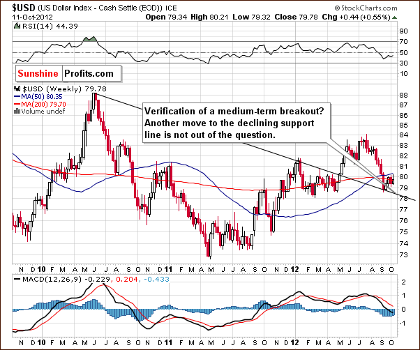
We begin this week with a look at the medium-term USD Index chart, because the long-term chart had virtually no change at all in the past 7 days. The medium term still looks favorable today though another move to the downside is not completely out of the question. This may sound worthless as the market has to do something – but we mean that it is likely to move higher in the medium term (several weeks), but this chart doesn’t tell us if a move lower in the short-term will happen or not.
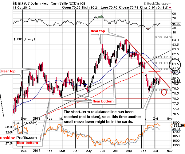
Turning now to the short-term USD Index chart, we see additional clarification that a period of decline will likely come first with a rally to follow. In this week’s short-term chart, we see that the index touched the declining resistance line and then moved slightly lower – the resistance held. It’s quite possible that the previous bottom or price levels even a bit lower could be seen. The index does not seem likely to move below the level of the 2012 bottom however.
Summing up, the USD Index appears likely to move lower in the very short term and then turn to the upside in the weeks to follow. Target levels for the decline appear to be between 78.7 and 78.9.
General Stock Market
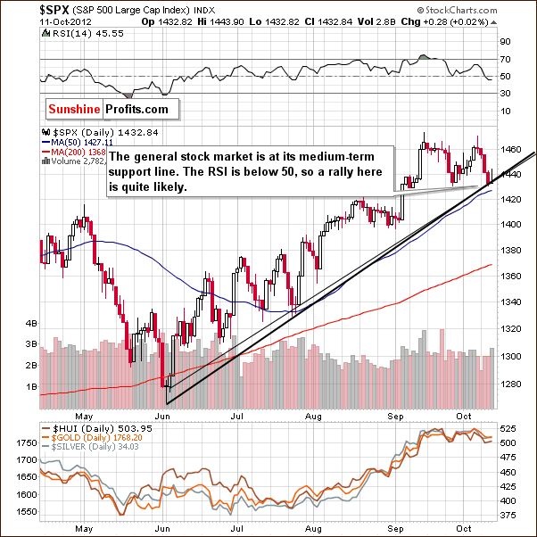
In the short-term S&P 500 Index chart, we see a rather good summary of the current situation in the general stock market. One important support line is in play right now – it’s been created in two ways: one based on intra-day lows and the other based on daily closing prices. Since these levels have just been reached, it seems that stocks are ready to move higher once again and the RSI level slightly below 50 supports this. During the June-today rally, local bottoms formed when the RSI moved below 50 and a similar situation appears to be happening once again. So it seems probable that the next move for stocks will be to the upside.
Correlation Matrix
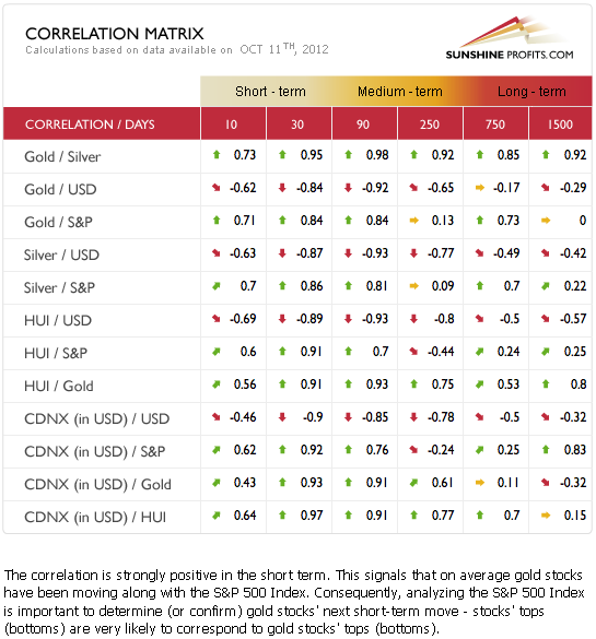
The Correlation Matrix is a tool which we have developed to analyze the impact of the currency markets and the general stock market upon the precious metals sector. Once again we see the classic correlations this week as the USD Index is negatively correlated with the precious metals and the metals are positively correlated with the general stock market. The highest correlation in the past 30 days has been between the miners and stocks.
The miners did not decline as much as stocks this week. Note that while the correlation coefficient for the 30 trading days is very big, the one based on the past 10 trading days is only 0.6. Since stocks decline recently, this is a bullish sign for the miners. They are simply not responding to the negative signals from the general stock market, which is unusual since they are normally highly correlated with stocks. With stocks now bottoming, the picture is clearly quite positive for the miners in the short term. If miners held well despite declines in stocks, they could rally when there is no negative influence coming from the stock market, and they could rally strongly if the influence is positive. This is one of the reasons that made us suggest keeping small speculative long positions intact earlier this week.
Gold
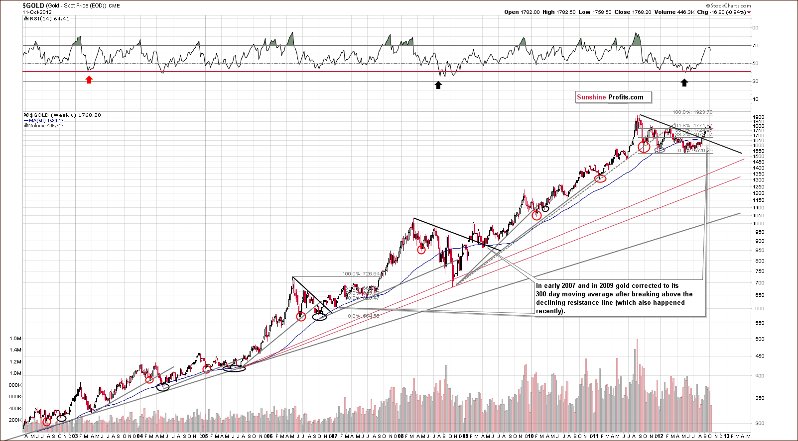
In gold’s very long-term chart, we still haven’t seen a significant correction. Based on the following post-breakout cases, we are expecting to see a move toward the 300-day moving average, slightly below the $1,700. Obviously, this move was not seen, but it probably will in the following weeks.
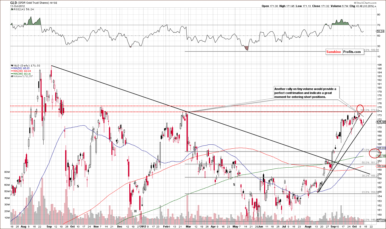
In the short term GLD ETF chart, we have an interesting situation this week. We see that prices moved to the short-term support line based on intra-day lows. The RSI is no longer close to overbought levels. Based on this chart alone – and the 2 above-mentioned factors – another move to the upside here is more probable than not. If the move to the upside is accompanied by low volume, it’s probable that a local top will be confirmed.
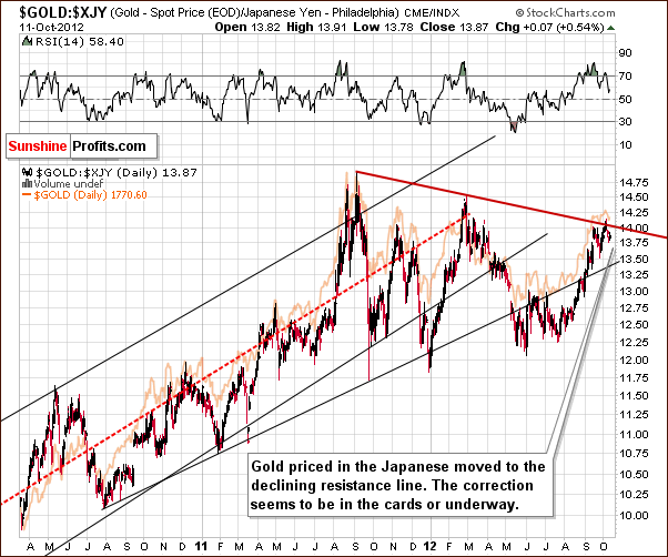
In this week’s chart of gold from the perspective of the Japanese yen, we have a bearish medium-term signal as the declining resistance line has just been reached. This line was touched in September 2011 and once again early in 2012. Both times, the decline which followed was in the 15% to 17% range, interrupted only by a couple of periods of consolidation on the way down. A correction appears to be very much in the cards here, but please keep in mind that the above chart has medium-term implications, not short-term ones – we could easily see another small move higher and the above picture doesn’t really lower the probability for it taking place.
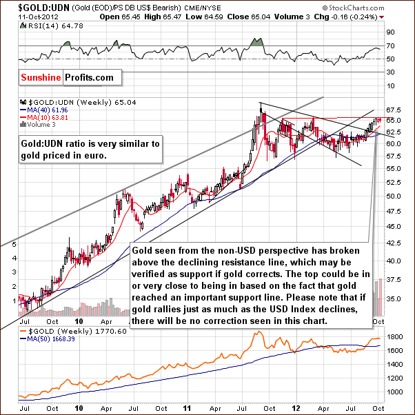
In this week’s chart of gold from the non-USD perspective, we have generally the same implications although the picture is a bit different. We could see a decline here verifying the previous breakout or simply a consolidation below the 2012 highs which would create the handle of a bullish cup-and-handle pattern.
Please note that if gold moves higher but the move is accompanied by analogous move lower in the USD Index, or if gold declines but the decline is accompanied by analogous move higher in the USD Index, there might be no reaction on the above chart as these moves could not be visible from the non-USD perspective. Consequently, we could see a continuation of the „handle“ of the cup-and-handle pattern above and a decline in or rally in gold seen from our regular, USD perspective.
The implications coming from the above chart are rather bearish for the medium term because, after all, the breakout above the declining support line has not been verified by a pullback to this level.
Summing up, gold seems likely to move higher in the days ahead but it seems that this rally will not be long lived. This is consistent with suggestions coming from the USD Index and the general stock market. If the low volume levels are indeed seen, the next significant move in the yellow metal’s price will probably be to the downside.
Silver
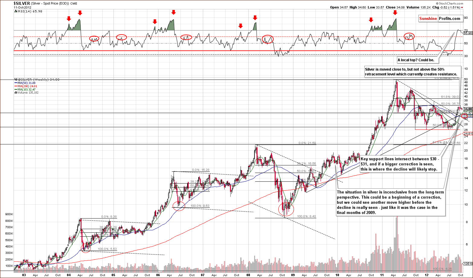
In the long-term chart for silver this week, no conclusive outcomes are provided. Silver has corrected somewhat, but this could simply be part of a sideways trading pattern similar to what was seen at the end of 2009. Short-term declines do not say anything about whether additional moves to the downside are coming or not (like in the final months of 2009). From this chart, we infer downside medium-term target levels between $30 and $31.
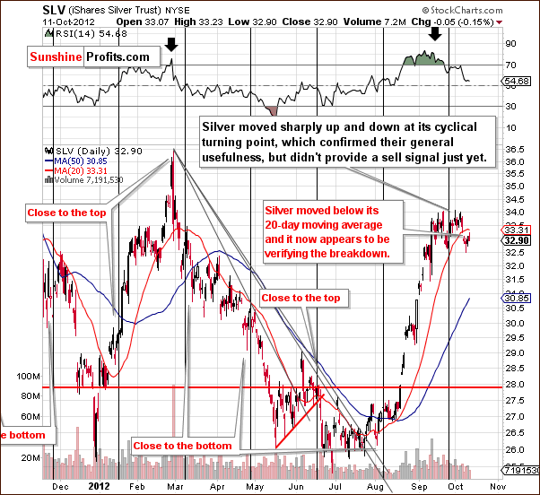
In the short-term SLV ETF chart, we have a rather negative picture this week. Prices have moved below the 20-day moving average and since this has provided support and resistance several times in the past, such a breakdown is a clear negative factor.
The white metal is tricky from a technical perspective. If the rest of the metals rally, then silver could move higher as well, similar to what we saw in February 2012. We cannot rule out this type of performance once again in the weeks ahead.
Summing up, the picture is generally bearish for silver in the medium- and short term (long-term case being bullish, of course) but the signals do not appear reliable enough to suggest opening short positions. It’s also noteworthy that analyses of the USD Index, gold and the general stock market suggest otherwise as well.
Precious Metals Mining Stocks
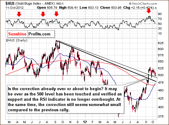
In this week’s medium-term HUI Index chart (proxy for gold stocks), we see that the RSI levels, which were heavily overbought in recent weeks are no longer at these levels. The consolidation seen in the miners for the past few weeks has coincided with RSI levels declining to about the 50-level. At this time, further consolidation or a continuation of the rally are both possible. This chart is not conclusive as to which is more likely.
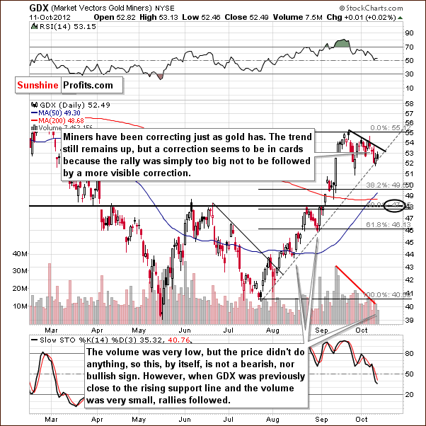
In the GDX ETF short-term chart, we have not seen a breakdown below the rising support line. On Thursday, the miners did nothing on relatively small volume so this is not viewed as bullish or bearish by itself. This becomes a bullish indication when you look at the previous cases when prices were close to the rising support line and volume was relatively low. Such a situation has coincided with local bottoms in the past and sharp rallies generally followed. This could be the case now, especially considering that stocks are at a short-term support line. The mining stocks and the rest of the general stock market could very well rally from current price levels.
Summing up, the short term appears quite bullish for the mining stocks, but the rally seems likely not be huge in any respect. It seems that the decline to follow will be bigger, and there are no signs that this period of decline has yet begun.
We – as analysts – don’t really think that it’s a good idea to bet on the coming rally as it will likely be quite small. However, one of the SP Indicators flashed a buy signal, so being speculatively long with a small part of the capital is still suggested.
Letters from Subscribers
This week there’s only one letter that we broke into several parts and replied to them separately.
Q: First, congratulations on getting it up and running seamlessly. Excellent content, user friendly, well thought out, and you are obviously always looking to go beyond.
A: Thank you, we hope to provide you with even more pleasant surprises in the coming months. (On a side note, the author of this question was one of the first subscribers who updated their account and moved to the new payment processor. Most of our support requests are from subscribers who didn't update their account – if you haven’t updated your account yet, we strongly suggestdoing so right away, to ensure that the website and Premium Service run seamlessly for you as well.)
I have finished digesting your article on Portfolio Structure, which is quite interesting. I am eager to see yourPortfolio Assistantin operation.
I have the following questions:
1. As far as holding physical metals, it appears that you recommend 30-60% of total physical assets held be in silver. Is that correct?
Yes, we are speaking of the ratio of physical silver to all physical metals (gold, silver, platinum). Depending on individual circumstances, our suggested silver share is mostly between 30% and 60%. Generally, the higher one's risk tolerance, the higher the share of silver.
I realize all of the arguments one could make in favor of silver. Still, I can't see gold going to $800; I can see silver going to $15 though; so does it really belong in the 'insurance' category?
Yes. You can imagine silver going to $15 and so can I. Silver is more volatile, so if both metals correct more than half of their prices then silver will probably correct more. This is highly improbable in my view, but yes, it is something that could happen. What's even more unlikely is that silver would move to $15 and stayed there for months. The chance of that is very low and can be viewed as a kind of cost of owning silver in the first place.However, the whole idea of insurance per se is to pay a little now (the cost of insurance) in order to make sure that some serious event will not hurt you in the future. Insurance is meant to be a cost. If it wasn't, it would generate no revenue for the insurance companies and in this case, they would not exist in the first place.
In the case of standard insurance, you pay a fixed amount in cash. In the case of silver, you don't really pay anything for insurance. You take a small risk (small based on the fundamental situation) that you will lose on your silver investment and that is your cost. However, unlike standard insurance, you are not simply paying the insurance fee without any profit. Silver has huge upside potential and is very likely to provide substantial gains in the coming years.
What does silver insure you from? From the monetary crisis in which the value of fiat currencies will likely collapse. This is an event that we, unfortunately, view as quite probable in the coming decade. In this case, silver and gold will, in all likelihood, soar as people recall that these two metals have effectively been money throughout history.
Maybe I am still too focused on the Hunt brothers, but assuming you can convince me, where do you see a good entry point? (I know that's a tough one)
When it comes to the insurance category there is only one good answer in our view: now. When it comes to the long-term investment category, the answer is also now, however if making a big purchase is difficult psychologically, you might wait until the correction in the precious metals market before getting into silver.
Regarding the Hunt brothers and their attempt to corner the silver market - yes, that was a major issue in the 70s-80s bull market, but who says there will not be any attempts to corner the market this time? The only difference is that this time technology is much more advanced which could make such endeavors more difficult to track and mitigate. Silver is a relatively small market so any big entity can move it, and when things get really hot there will very likely be a lot of entities that will try to take advantage of the situation, just like the Hunt brothers over 30 years ago. Instead of trying to guess the exact outcome, we suggest owning physical silver that is nobody's obligation and that will be in high demand at that time.
2. What are your thoughts on holding physical platinum in the 'insurance' category? Or holding it at all, long term? Is it a good form of diversification?
Long-term investment category: yes, it is good for diversification and additionally, while you remain invested in the precious metal sector you can benefit from the changes in relative valuations. Right now platinum seems oversold relative to gold and that's why we included it in the investment category - in order to profit on the coming rebound in the platinum-to-gold ratio.
We didn't include platinum in the insurance category because it has had minimal monetary usage in the past and consequently may not soar as significantly as gold and silver in the event of a collapse or serious turmoil in the monetary system, which is what this part of your portfolio is aimed at insuring and protecting you from. You can find out more about platinum in our interview with Nick Barisheff and our report on Japan and the precious metals market.
3. I was rather surprised to see that, across the range of sample portfolios, mining stocks held in the 'investment' category averaged about 10% ofone's total portfolio, whereas physical metals held in the 'investment' categoryaveraged about 25% or so. First, am I reading this correctly?
Yes, this is correct. Please note that what you see in the sample portfolios does not take into account what we will likely see in a few weeks - a final test of the previously-broken resistance line in the GDX:GLD ratio (miners-to-gold ratio). Once we have that, we will most likely suggest moving from metals to miners in the investment category.
If so, I have some thoughts for your comments: First, I think many of us are holding much of our 'investment' capital in various retirement vehicles. As you point out, getting in or out of long term investments is an infrequent occurrence, but still, selling or acquiring physical metal in these vehicles is pretty involved and also takes some time. Additionally, I have always looked at mining stocks as a sort of 'leveraged gold', the place where the real money can be made, precisely because these stocks either under- or over-perform.
That is certainly the case in the short term. However as far as medium-term moves are concerned, previous years provide no proof of the leverage still being in place. The situation seems to be reversing, but we're still waiting for a confirmation (as mentioned above).
Therefore, the idea is to be aware of what they are doing presently and adjust investment moves accordingly. In short, try to use a lot of money and a few very well supported moves to make a profit, rather than accomplish the same results through many, many trades with much smaller amounts of capital each time.
If capital's default mode in this case is "in the market" then the above can be described as our "investment" category given that there are indeed only a few very well-supported moves. Because there will only be a few of these moves, the main thing that will push the portfolio's value higher will be the continuation of the secular bull market in precious metals. If one wants to make profits on trades, then there has to be more of them. If one doesn't want to get too emotional about their positions (this is a very important factor often neglected by beginner investors) the size of a single position cannot be significant.
We believe (based on our research on trading and investing in gold) that the best results are achieved if investment (as mentioned above) is combined with speculation in small doses, and the sample portfolios reflect that.There are also psychological benefits from dividing capital into these two categories. If you know that you have separate capital for trading, you are much less likely to "mess" with the investment part too often (thus taking on positions that are too big and that increase the risk of getting emotional about the position, which consequently increases the odds of selling before a move up and buying before a move down).
My point is that I think your sample portfolios are much over weighted in physical rather than miners, and so, the ultimate question is: did you have some idea in mind as to a rate of return these portfolios were designed to achieve? Or was your idea to try to balance risk/reward and let the return find its own level? I am not at all criticizing your approach here, but I would like to better understand the reasoning behind it.
Generally, when constructing a portfolio for individual or institutional investors, an investment advisor needs to know a lot about the individual (or entity) before providing any suggestions or creating a portfolio. First of all, the advisor needs to know what goals need to be met by the portfolio (like retirement) in order to calculate the required rate of return from the portfolio. Then further details can be discussed such as the desired rate of return (for goals that are nice but not indispensable, like a trip around the world). Then there's a big discussion about risk (willingness and ability to accept it) and investment constraints (liquidity requirement, time horizon, taxes, legal issues, and other unique circumstances). Sample portfolios can't deal with these issues because they are not designed specifically for one person or entity. So the answer is no, there is no target rate of return for these 3 sample portfolios. Since there are 3 of them, they are much better in our view than just one big universal "recommended portfolio" and as you will soon see, the interactive Portfolio Assistant will be even better as it will help you with some of the above-mentioned individual, investor-specific issues.
We decided to approach the portfolio construction starting with risk. We thought of how risky each part of the portfolio was in the past and how much risk each investor can accept (and how much can be diversified away). Not losing money (and not taking on too much risk) is more important than making it (and taking on too little risk). So the common denominator of risk (not just return) allows us to do many simulations even though we don't know the exact details of each portfolio. It is also in-tune with Warren Buffet's rule of investing - not losing money. Please note that the risk increases along with profitability anyway (up to some point), so the more risky portfolios are also the more profitable ones. So it's not that we don't take profitability into account at all. We simply focus on keeping the risk at reasonable levels and providing bigger returns for those who accept more of the risk.
4. Finally, I can appreciate your thoughts about creating trades based on various signals. However I, for one, have no interest in trying to integrate signals from a single source, i.e. Sunshine Profits. When I read a summary update or a market alert, which of course contains your analysis and conclusions, I don't then want to have to review other Sunshine indicators to see what they say. I expect you will do that as part of your analysis, because, after all, who is better qualified? Just like with the various charts and graphs, we don't just want to read you say 'buy' or 'sell' without reviewing the data, but, in the end, we do want the 'buy or sell' opinion. There is no shortage of free data (and opinion, for that matter) all over the internet. It is the skillful integration and analysis of this data that is valuable.
Thank you for asking this question. Before we reply, it is very important going forward that each of our subscribers is convinced that we have answered this question exhaustively and that everyone agrees with our reply. We ask you in advance to let us know what is unclear or what part of our views you disagree with. We will strive to discuss this issue until our take on this is perfectly clear for everyone.
The first point that we would like to make is that Sunshine Profits should no longer be viewed as a single source of signals.
We didn't put emphasis on it previously because until recently we used signals from our charts as supplementary information and always summarized all the signals in each update/alert. We mentioned that one can use our indicators on their own as they wish, but we didn't specifically suggest opening particular positions. We preferred to verify our indicators multiple times over the years before becoming really convinced that they are able to do a great job for you on their own.
There are literally loads of examples that confirm that they get the job done. It could have gone under your radar if you didn't monitor these charts, but it's all there. Just take a look at the long-term charts - the first two from the top. The second one is particularly interesting. You don't see signals close to major tops - but you have just seen one on July 20th, 2012. On the following day (when you could react to the signal) the HUI Index traded between 387.24 and 392.23 – practically at the previous major bottom.
SP Indicators were released in March 2009 along with the start of our Premium Service that included access to them. Signals that you see before March 2009 are simulated - so from the methodological point of view they are less important. However, the really big thing here is that since that time, the efficiency of the indicators has been just as good as during backtesting. This is very good information because it means that the results we got during backtesting are stable and the indicators really represent psychological phenomena that are present in the precious metals market. We were not simply "lucky" to have picked good parameters that nicely fitted past data. What we got is a real and tradable representation of psychological phenomena present in the precious metals market.
The values of the indicators since March 2009 are based on real prices, updated daily and you - our Subscribers - were able to monitor these charts each day. Therefore, whatever you see since 2009 is verified. As you can see, the performance is quite good to say the least, and we feel confident to introduce these indicators as a stand-alone source of signals.
Why can't we just include it in our weekly analysis from time to time like we have so far? We can and we will!
However, the "skillful integration and analysis of data" is only one of two sides of this approach. The point is that while a calculator, computer program, or an indicator by itself can be perfectly logical and emotionless, I, PR, cannot. I can make thousands of dollars without a single smile and I can lose them without a single frown (because I realize that it's all part of a bigger process), but as hard as I might try, I will never be completely free of emotional biases, nor will any other (human) analyst.
So while I (or other analysts) strive to use all my knowledge and data (including indicators) in order to create value for you, I can sometimes simply "mess up" in my analysis of the emotionless indicators. For instance, if I get 10 trades in a row correct and get 50 "Thank you! Keep up the good work!" emails, I might get overconfident in my abilities and take on too much risk in subsequent trades, which will lead to losses when I finally do make an incorrect call. If I get 5 trades in a row wrong (even after these 10 successful trades) I will get 50 emails saying how bad I am and that could make me hesitate before taking the next position in the market. I am aware of this (by the way, the ability to spot these phenomena was one of the things that were tested in the final CFA exam) and I strive not to be affected by them. But I will never be as unemotional as a computer program or indicator.
Simply put, sometimes less is more (simple signals from indicators and nothing else) and sometimes more is more (complex analysis taking into account multiple factors).
What is best to do? Diversify! And that's what our approach is all about. The factors determining the correctness/ incorrectness of your Editor are different from those determining the correctness/ incorrectness of the indicators. So a large part of successful and unsuccessful trades should average out. In other words, thanks to diversification between subjective signals (Premium Updates and Market Alerts) and objective ones (signals from indicators) you will make smaller trades that will lead to more stable capital growth and decreased risk. In the future, when more sources of signals are introduced, we might suggest increasing the leverage on each position. The lower risk gained from diversification should allow us to do so.
The bottom line is that thanks to the SP Indicators and the signals provided in Premium Updates/ Market Alerts independently, you lower your risk and make capital growth more stable. That's why we advocate it. Sunshine Profits is no longer just a source of signals but a brand that provides multiple sources of signals. For now, there are two in particular: PR's analysis and the SP Indicators.
Additional Information
Continuing our step-by-step introduction to the new website and its features, this week we would like to put your attention to the reports section. The headline on the top of the list says „Big Discussions of Big Topics“ and the section is just that. In this section you will find pdf reports with details regarding some major issues that we have researched. We’ve recently seen an article on increasing margin requirements on precious metals market – that’s one of the things that we researched extensively in the previous months and you can read more about in the reports section. Generally, each new tool that you will see on the website will be released along with avideo about it and with a big report discussing details and mechanics behind it (of course we have to keep the most critical details secret because otherwise tools/indicators might stop working). The reports section is where you will find them.
Summary
The outlook for the USD Index is bearish for the short term and bullish for the weeks to follow (the medium term). The short-term outlook for the general stock market is bullish as stock prices are at important support lines right now. Both of these market situations are likely to have a bullish impact on precious metals for the short term and probable bearish implications for the medium term.
It seems that a situation for a shorting opportunity in the precious metals market will be seen very soon. A quick rally will likely be seen first however but, based on our analysis, this rally does not seem big enough to justify opening speculative positions. However, one of the SP Indicators flashed a buy signal, so being speculatively long with a small part of the capital is still suggested.
Long-term investments: remain in the market with your precious metals holdings
Trading – PR: No position; looking for a confirmation to open a short position.
Trading – SP Indicators: Long position; based on the signal from the SP Short-term Gold Stock Bottom Indicator; our interpretation is that the rally will be small and quick.
This completes this week’s Premium Update. Our next Premium Update is scheduled for Friday, October 19, 2012. Of course, we will continue to send out Market Alerts whenever appropriate.
Thank you for using the Premium Service. Have a profitable week and a great weekend!
If you haven’t updated your account yet, please do so now to ensure that your subscription runs without any interruptions and to help us quicker move completely to the new, better payment system, that will allow us to focus on providing new analysis for your and sending you updates more often. You can use the same plan that you used or you can take this opportunity to move to a bigger plan and save some money. Also, please note that after you update your account you may get an e-mail message from PayPal or ccbill saying that your subscription was canceled – don’t worry, that will be just us making sure that you won’t be billed twice for the same thing.


