
Congratulations. Let’s all take a collective deep sigh of relief. Instead of a new crisis, we're just going to keep having the same old one.
Greeks voted to stay in the European Union with a narrow victory for the center-right New Democracy party. A global crisis has been averted—for now. But as we take a deep sigh of relief let’s keep in mind that the euro is already on a slippery slope to oblivion.
Let’s face it. A Greek exit is already a forgone conclusion for many. Now it’s Spain’s turn to headline with its bond yields soaring to new euro-era highs. Spain’s economy is almost twice the combined size of Greece, Ireland and Portugal, countries that have already received some form of eurozone bailouts. Spain looks poised to become a domino.
Meanwhile, Gold prices fell on Tuesday for the first time in eight days and Wednesday gold fell below $1,600 an ounce as buyers stayed on the sidelines ahead of the meeting of the U.S. Federal Reserve which announced Wednesday a modest increase in its efforts to reduce borrowing costs for businesses and consumers. The Fed voted to extend its existing “Operation Twist” asset-purchase program through the end of the year. In plain English, the Fed will keep selling short-term bonds, and using that money to buy long-term bonds.It gets its name not from the Chubby Checker song but from the Fed trying to twist the yield curve.
The Fed has decided to play a game of wait-and-see.
Recent U.S. economic data has been as soft as the belly of the Pillsbury Doughboy and the Fed’s decision reflects that. There is growing concern that the economy is once again faltering into the summer months after the false start of a relatively strong winter. The Fed’s policy-making committee said in a statement that it expected the economy would continue to grow at a “moderate pace,” but it noted that “growth in employment has slowed in recent months,” even as inflation has declined.
The market had already priced in most of the expectations around the Fed’s decision and many traders figure that the Fed is laying the groundwork for a more aggressive easing of monetary policy in the near future.
With all the turmoil in the markets in the past half a year, many people wonder why gold hasn’t taken off in response. Some contend that the yellow metal has lost its safe haven status because it has not responded to the Euro crises as in the past when the price climbed to just shy of $2,000 last August. We saw an interesting analysis by Marcus Grubb, managing director of investment for the World Gold Council that explains how gold has a history of delayed reactions to global crisis.
The first point he makes is that gold is one of the few assets which holds its value during turbulent economic times; therefore, investors often sell gold at first in order to raise liquidity to meet margin calls in other sectors.
He cites Black Monday of October 1987 as an example. Markets around the world crashed and billions were wiped off stock prices over the course of the month. Instead of increasing in response to demand for safe haven assets, the price of gold initially fell as investors sold it to generate cash.
Another example of gold’s delayed reaction to a crisis and its vital role as liquidity took place during the Asian currency crisis of 1997-1998. It was when the Korean won became unacceptable in international currency markets. In response, the Korean government offered to buy gold from the Korean population in return for interest-bearing won-denominated bonds. Koreans responded and the Korean government refined the 250 ton of gold it received in the first three months of 1998, sold it in the international market to raise dollars and was thus able to service its debt.
Isn’t this one of the reasons that central banks like to hold gold in the first place?
In the period after the collapse of both Bear Stearns in March 2008 and Lehman Brothers in September 2008, gold declined at first as investors sold for liquidity. But it wasn’t long before the yellow metal emerged as the strongest asset class as the credit crunch unfolded.
It is very possible that we are seeing the same pattern. Perhaps we are now at the early stage in a new phase of the eurozone crisis with gold is being sold to meet margin calls. The bottom line is that the fundamentals which underpin gold demand remain firmly in place. One can count the rapidly expanding middle class in China purchasing more gold, to central bank purchases and the Indian love affair with gold. Demand remains supported by a varied set of drivers including jewelry demand that comprises the largest component of overall demand and, especially in India and China, is less affected by events in Europe.
Grubb writes: No two periods are ever the same and we are currently experiencing extraordinary economic events for which there is no precedent. There is however a precedent for gold’s current behavior. A bumpy period for gold may be ahead until clarity on the future of the euro zone is established.
Once a sense of direction does materialize and margin calls have been met, history suggests that investors will return to an asset which is proven to hold its value and can be relied upon as liquidity and a protector of wealth during extreme uncertainty.
These being times of great uncertainty, wewill now turn to this week’s technical portion with the analysis of the US Dollar Index chart (charts courtesy by http://stockcharts.com.)
USD and Euro Indices
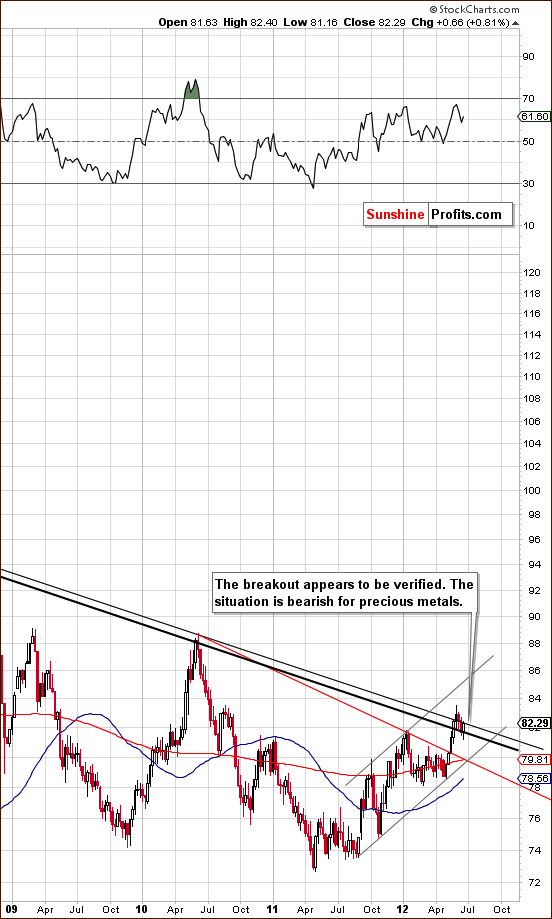
We begin this week with a look at the long-term USD Index chart (please click the above chart to enlarge). The index appears now to have completed the verification of its breakout. About one half of the previous upswing has been corrected and the index has declined more or less to the lower of the major support lines. It is now moving higher once again.
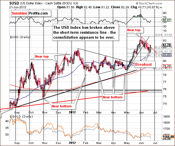
In the short-term USD Index chart, we can see the recent correction and subsequent reversal. The index closed above the short-term declining resistance line, which is the higher one - based on intra-day highs (relative to the line based on daily closing prices). The situation here is therefore bullish from a technical point of view. We don’t describe it as clearly bullish because the breakout has not yet been confirmed. The index has not moved considerably above the declining support line and has only closed above it one time. Two more closes are needed to confirm the move and then the situation would be better described as very bullish.
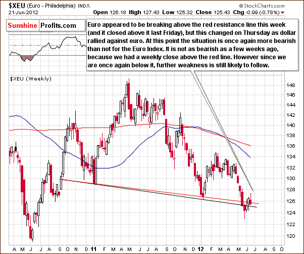
In the long-term Euro Index chart, we see that as the USD Index has reversed and moved higher, the Euro Index has reversed and moved lower. The previous move above the declining red support-resistance line has been invalidated and the situation is now more bearish than not for the euro. This is consistent with a more bullish than not outlook for the dollar.
The recent rally in the Euro Index could have been based upon the improved outlook in Greece. With the New Democracy winning the election as expected, investors may now be focusing on Spain and the problems of other countries causing the implications here to be bearish. Favorable outcome of the Greek elections appears to have been in the price and we saw a “buy the rumor, sell the fact” type of action.
Summing up, the situation in the USD Index is bullish and this has bearish implications for the precious metals, the details of which will be discussed later in this week’s Premium Update.
General Stock Market
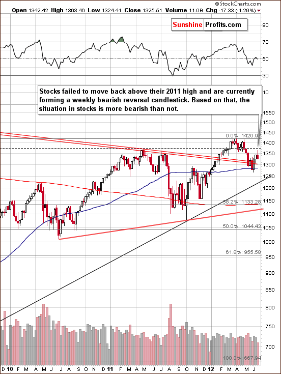
In the long-term S&P 500 Index chart, we see that stock prices are still above the declining red support line but not above their 2011 highs. Stocks moved sharply lower after the latter level was reached and Ben Bernanke’s speech did not give markets what they were expecting. Actually, Fed’s chief speech could be interpreted in the following way: the economy is not yet weak enough for QE III and we want to see lower stock and commodity prices before we make another move. Lower stock prices appear more probable from here.
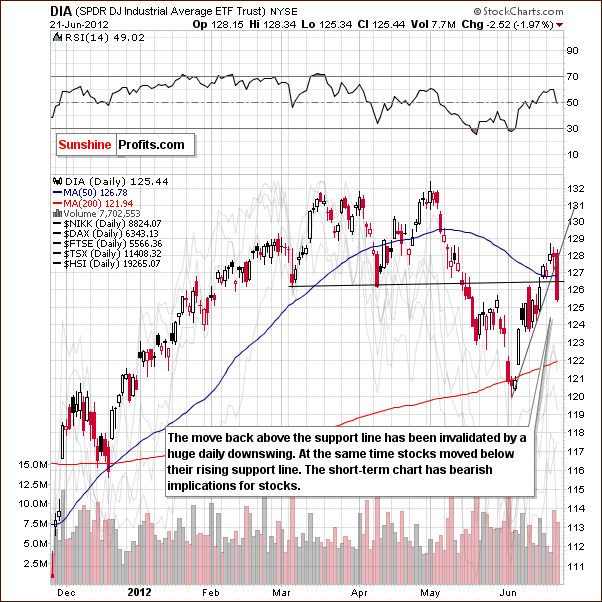
In the short-term DIA (a proxy for the Dow Jones Industrial Average), we see a breakdown below both the previous lows and the rising short-term support line. The decline was sizable and had significant volume. It could very well be the beginning of a bigger move to the downside here. The short-term picture is bearish.
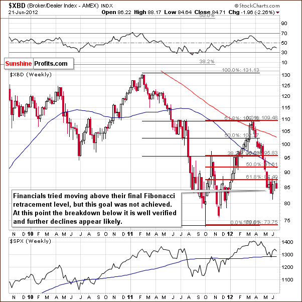
In the Broker Dealer Index chart (a proxy for the financial sector), recall that in the past few weeks we have seen several attempts for the index to move above the final Fibonacci retracement level. In last week’s Premium Update, we commented on the bearish factor in place here. Verification of the move below the lower 61.8% Fibonacci retracement level continues. This is a bearish development for the financials as well as for the whole stock market. The financials now appear ready for additional moves to the downside in the weeks ahead.
Summing up, the situation for the general stock market appears bearish from both a short-term and medium-term point of view. The next downside target level for the S&P 500 is around $1,230 followed by $1,130 as a possible subsequent target level.
Crude Oil
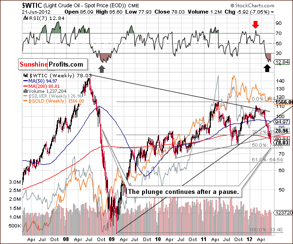
We now look at the crude oil price chart. In the Premium Update last week, we stated that the short-term trend for oil prices is likely to remain to the downside, and this is also bearish news for precious metals as the actions seen in two markets resemble the 2008 pre-plunge consolidation.
The recent pause in declining prices for crude oil was quite understandable, as multiple support lines were in play. The consolidation now appears to be over and considerably lower prices could be seen in a trend similar to 2008. The implication here for gold is that the recent correction in gold prices could very well be over and major price declines just ahead. The situation is quite bearish for precious metals investors.
Correlation Matrix
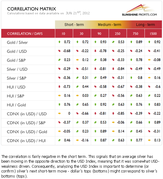
The Correlation Matrix is a tool which we have developed to analyze the impact of the currency markets and the general stock market upon the precious metals sector. We see a bit of a weaker link between gold and the USD Index this week. This link appears to be getting stronger however, based on the 10-day column.
The impacts of the currency market and the general stock market appear strongest upon silver. They likely contributed to its heavy price decline on Thursday as the USD Index rallied while stocks declined significantly. Overall, the implications going forward are bearish for the precious metals sector taking into account the USD and Euro Indices, and the general stock market.
Gold
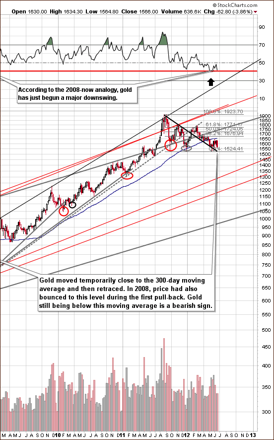
In the very long-term gold chart (please click the above chart to enlarge), there is little to infer from the price action alone this week other than the move to the level of the 300-day moving average marking an important local top. In last week’s Premium Update, we stated that the situation appears quite mixed with a bullish breakout above the declining support-resistance line being followed by a quick bearish turnaround once the 300-day moving average line was reached. The 300-day moving average turned out to be stronger than the short-term breakout.
This week, the RSI levels are noteworthy as they approached the 50 level and have now declined back close to the horizontal red line corresponding to 40. In 2008, a similar move meant that a major decline was underway in gold prices so the implications here are bearish. We choose not to use the words overly bearish yet since gold’s price is still above the declining thick black support line.
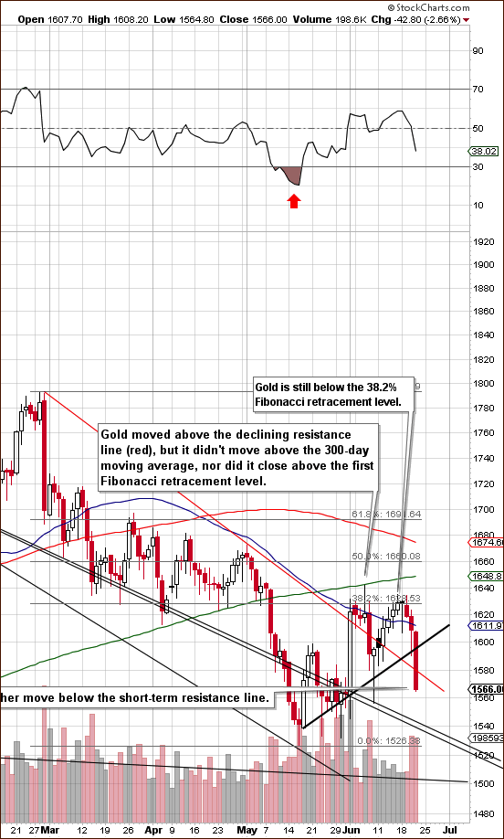
In gold’s short-term chart (please click the above chart to enlarge), we have seen two breakdowns on Thursday. The first is below the declining support line based on previous local tops and the second below the short-term rising support line based on opening and closing prices. If we drew another line based on intra-day lows, we would see a breakdown there as well.
Gold prices declined on significant volume and this chart appears quite bearish with a possible head-and-shoulders pattern being formed over the past few weeks (second half of May being the left shoulder). The only bullish thing here is that gold is still above $1,540, which is where the long-term declining support line currently is. Another important point is that gold prices are still above $1,500. If prices decline below $1,500, hedging or selling most of one’s long-term holdings will likely be a good move even without additional confirmation from us as additional very sharp price declines would likely follow in this case.
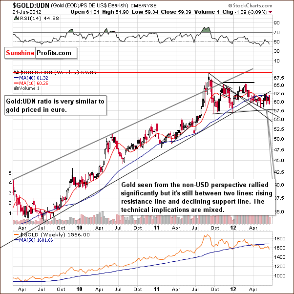
In this week’s chart of gold from a non-USD perspective, there is very little new to report. Prices remain between the long-term, rising resistance line and the medium-term declining support line. Trading patterns have been sideways and the implications here are mixed.
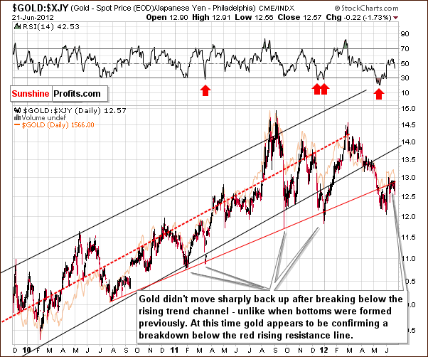
Looking at gold from the Japanese yen perspective, the situation is unchanged. Quoting from last week’s Premium Update, recent price patterns have not been in tune with previous bottoms seen over the past couple of years. Unless a quick move is seen back into the trading channel, the signals suggest that a period of declining prices will likely be seen from here.
The breakdown below the rising red resistance line appears to be in the process of being confirmed at this time.
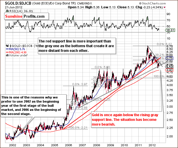
In the gold to bonds ratio chart, the situation has become a bit more bearish as the ratio is once again below the rising gray line created by local bottoms seen over the past six years. This could be viewed as another breakdown which would likely indicate that another major decline is in the cards.
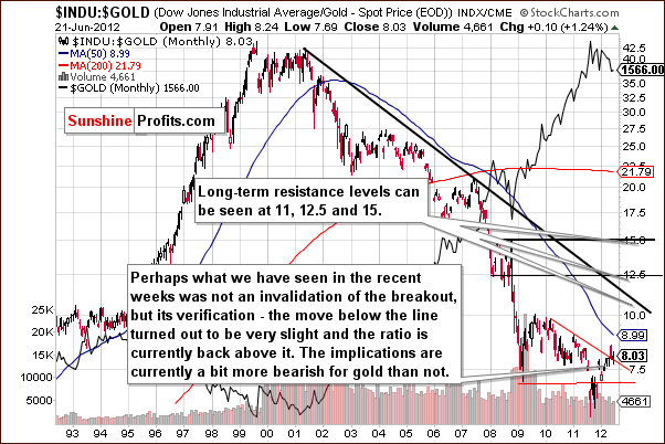
In the Dow to gold ratio chart, we see that the ratio is once again slightly above the declining red resistance line. In previous weeks, we have commented on the breakout and the invalidation of a breakout here. This week, it seems that the recent breakout has not been invalidated as gold prices moved lower, thus pushing the ratio higher. If gold continues to underperform stocks for some time (a few weeks), we could see a confirmation of the breakout and a powerful downswing in gold prices.
Summing up, the situation for gold is bearish for the short term and medium term and a bit more bearish than last week. At this point, it’s a bit unclear what action is best with respect to holding or hedging long-term gold positions. It seems best to make this decision based on what percentage of one’s portfolio is in gold.
We have previously commented on being out of mining stocks, silver and platinum and gold was the only market that we suggested remaining in. Whether to keep that holdings intact or to hedge (or sell) a large part of them depends on how much of your total precious metals portfolio remain invested in gold. If the share is already small, then sudden weakness will not harm you too much and there will be time to get out when/if gold moves below $1,500 (possibly at much worse prices, though), and if the share is still considerable, then it seems that making it small is a good idea right now but hedging or selling half of your gold holdings.
If gold is 30% or more of one’s portfolio, it seems that hedging or exiting one-half of the position might be a good idea. A lower percentage, say 30% or less may warrant holding the position and awaiting further confirmation.
In our view, the gold situation is at a tipping point as to hedging or exiting positions. This is due mainly to the fact that it is not clear yet if the USD Index breakout will be confirmed. Furthermore, the gold support line has also not yet been broken. Both the confirmation of the breakout and the breaking of the support line appear likely to be seen in the coming weeks however. Other factors herald lower gold prices.
Silver
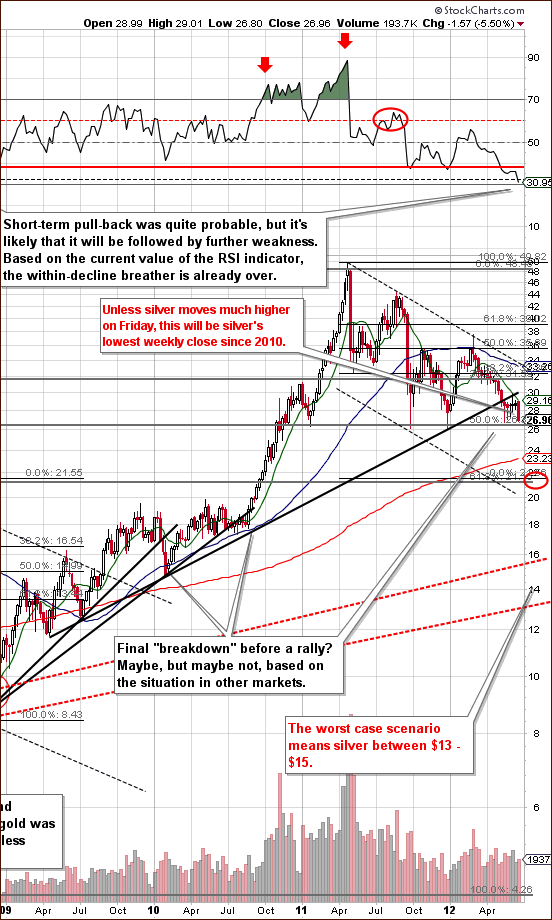
In the very long-term chart for silver (please click the above chart to enlarge), we see two important developments this week. The RSI link with 2008 is more visible and the implications are more bearish since a significant decline in silver’s price was seen back then. The price of silver is now significantly below $28 and a weekly close in this price range would be the lowest for an end of week since 2010. Some investors may view this as a breakdown - a reason to close their positions that would further contribute to lower silver prices. In short, the situation looks quite unfavorable.
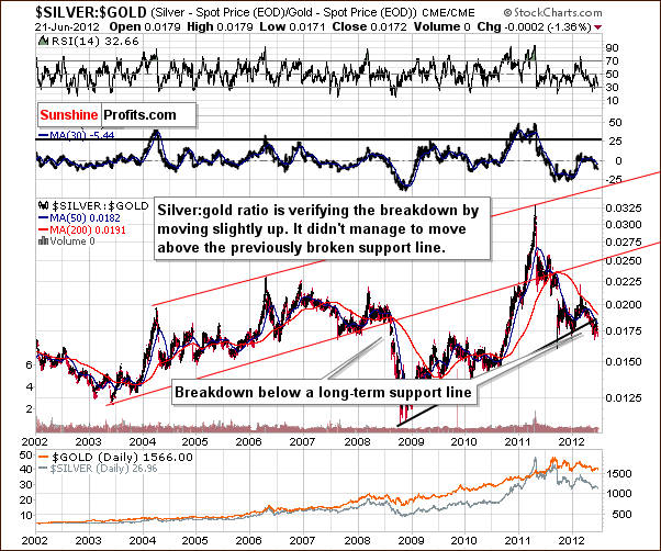
In the silver to gold ratio chart, the bearish outlook is further confirmed. Silver has been underperforming gold for some time now causing this ratio to decline. The post breakdown consolidation here has bearish implications not only for silver but for the whole precious metal sector. In fact, the consolidation may be already over and the next decline could be underway.
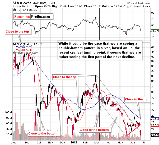
In the short-term SLV ETF chart, prices declined very much in line with what we have warned in previous weekly Premium Updates. The cyclical turning point, as expected, resulted in silver’s price moving lower. Prices are now not only below the rising short-term support line but back into the declining trend channel, which prices had broken above in early June. The breakdown has also been confirmed. The short-term outlook for silver is bearish with prices close to final support levels. Once these are taken out, which appears likely, a much bigger decline is likely to follow.
Summing up, the situation is quite bearish for silver at this time with an initial downside target level of $21.
Precious Metals Mining Stocks
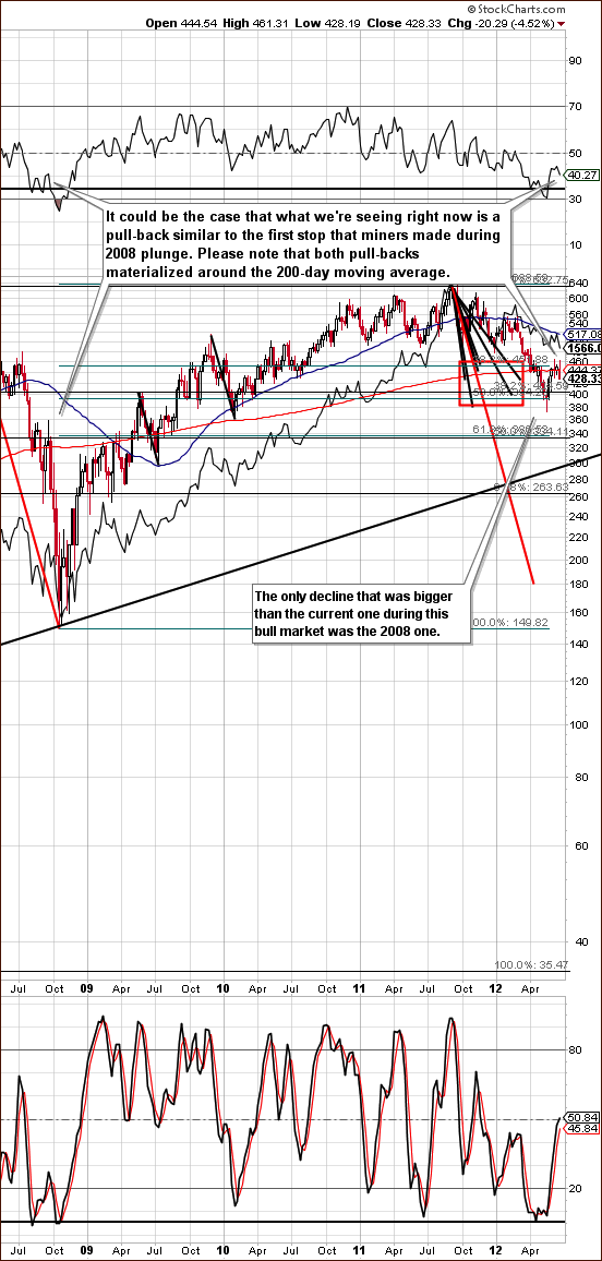
In this week’s long-term HUI Index chart (please click the above chart to enlarge), not much new is visible. With respect to price, we have seen a rally here to the 200-day moving average followed by declines in price. The RSI turned south once again and this could be viewed as the beginning of another decline (similarly to what we saw in RSI in gold and silver). The situation is quite similar to what was seen in 2008 and quite dangerous for mining stock investors.
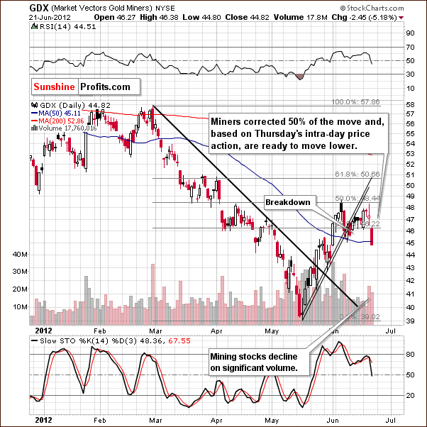
In the GDX ETF chart, which represents precious metals mining stocks, a huge decline of more than 5% was seen on Thursday. This compares to gold prices declining 2.66%. So the miners are clearly moving lower and not really outperforming gold anymore.
It [outperforming gold] seems to have been the case since the significant rally in late May but the miners were heavily oversold before that. Now it seems the bounce needed has been seen in mining stock prices and they are now moving along with gold. A bearish outlook for gold is a bearish outlook for mining stocks and the bearish situation in the general stock market contributes to the bearish outlook for both as well.
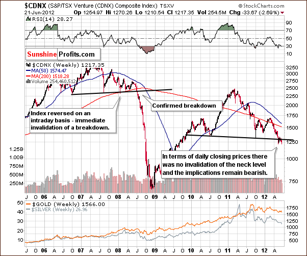
In the Toronto Stock Exchange Venture Index (which is a proxy for the junior miners as so many of them are included in it), we have another bearish contributor. A bearish head-and-shoulders pattern has been completed and verified here and this is a very bearish development for mining stocks and precious metals overall.
Summing up, it seems that betting on lower mining stock prices with speculative capital is still a good idea today. Likewise, being out of most long-term investment capital positions.
Letters from Subscribers
Q: When is a breakout signaled on a weekly chart? On a daily chart, it is signaled by 3 consecutive days above the resistance line, or one sharp move above. But is it 3 weeks on a weekly chart? I’m thinking of the breakout in the euro/dollar, a weekly close above 1.26 EUR.
A: Yes, that would be 3 weeks for a weekly chart. However, the breakout of the euro/dollar above this level has just been invalidated.
Note to readers: This week we are addressing other questions in the main part of the update.
Summary
The situation in the USD Index is bullish once again and the outlook for the Euro Index is bearish. A small correction was seen in the former but the index is now rising once again. The general stock market has a bearish outlook now as prices moved sharply lower this week.
The Fed wants to see lower prices of stocks and commodities and we believe that they will.
The general outlook for precious metals is bearish. Although, the breakout in the USD Index has not yet been confirmed, the situation will be even more bearish for precious metals if the expected confirmation is seen.
Gold prices moved below two support lines Thursday and the situation for silver is even more bearish. The white metal’s price is likely to close the week at the lowest week-ending level since 2010. This may lead to additional sell-off by investors who view this as a breakdown to be followed by additional moves to the downside.
The mining stocks outlook is also bearish and this is magnified by signals from the Toronto Stock Exchange Venture Index. The implications based on this week’s developments seem to point to limiting long-term investment exposure in gold, a step which has been previously discussed for silver and mining stock Investors. It seems the long-term investors who own gold should reduce their exposure by hedging (preferred) or selling if gold exceeds 30% of their portfolio. Speculators with open short positions in the precious metals sector (mining stocks) seem to be in the right place and may also consider adding to these positions in the coming weeks (we will let you know when we believe this is a good idea).
Yes, precious metals are still in a secular bull market and are likely to move much higher eventually, but there’s a huge difference between “eventually” and “now” and it seems that a decline will be seen first.
This completes this week’s Premium Update. Our next Premium Update is scheduled for Friday, June 29, 2012.
Thank you for using the Premium Service. Have a profitable week and a great weekend!
Sincerely,
Przemyslaw Radomski

