
Today's talk on economic matters reminds me of good, old-fashioned Campbell's alphabet soup, except that the reality is nothing like the TV commercial-"M'm! M'm! Good!"
It seems clear to many economists that we are in a recession and the question that arises is what shape the recession will take: "V", "U", "L", or "W". Several weeks ago in the Premium Update we discussed the "W" possibility, a recession followed by a short-lived recovery, followed by another recession. Those are rare. Only one has occurred in the last 80 years; the first half of this rare double-dip recession was the one that ended in July 1980, and the second was the one that began one year later, in July 1981.
But there are other alphabetic possibilities brought up by economists. Whatever shape the upcoming recession will ultimately take (and this we will know in hindsight) it will add to the hardships of millions of people around the globe.
This week Federal Reserve Chairman Ben Bernanke told Congress he is prepared to take further action to support the economy if the outlook deteriorates, but indicated the Fed's reluctance to do so, given limited options and questions about the effectiveness of any new measures. Presenting the Fed's semiannual report Bernanke said the Fed still expects the economy to show moderate growth this year despite a "somewhat weaker outlook" that he blamed on financial market turmoil, largely stemming from Europe. He emphasized that the labor market remains a key worry. The U.S. has lost 8.5 million jobs since the downturn started.
Households are Hunkering Down
We believe that it is very likely that the global slowdown will accelerate in the second half of this year. Promised austerity programs will be put into effect and fiscal stimulus will disappear. Incentives for car and home buyers will weaken as programs expire. Millions of people are out of work and there is little job creation.
There is a risk of further rise in unemployment, larger cyclical budget deficits, a further fall in home prices, larger losses by banks on mortgages, consumer credit, and other loans. There is a spreading sense of dread among consumers. Households are hunkering down. Even the wealthy are cutting down on spending according to a New York Times article this week. The recovery has been helped in large part by the spending of the most affluent, but now, even the rich appear to be tightening their belts.
Especially at this stage of a recovery, businesses and economists want to see people of all incomes spending more, because the demand for goods and services would in turn encourage companies to hire workers. The American consumer accounts for an estimated 60 percent of the country's economic activity. The circular worry, of course, is that consumers will stop spending because of concerns about a slowdown, and that economic growth will slow because consumers have stopped spending (as if ones wealth was being built by spending not by saving.)
Let's keep in mind that this week Moody's cut Ireland's sovereign debt rating by one notch citing the government's "gradual but significant loss of financial strength." And also this week Hungary's currency and stocks came under heavy selling pressure Monday after talks between the government in Budapest and international lenders broke down because of unresolved issues.
Some economists, like Kenneth Rogoff, professor of economics at Harvard University, say that sovereign debt problems are a typical aftershock of any wave of international financial crises. The picture is not as bleak as it seems, he says, and "the normality of the crisis trajectory to date hardly suggests the need for a panicked fiscal response."
Back to Our Alphabet Soup
Economist Nouriel Roubini, of "Black Swan" fame, considered an L-Shaped recession but is leaning more towards a "U-shaped recession." In an article Double-Dip Days, he says that the most likely scenario for advanced economies is a mediocre U-shaped recovery, even if we avoid a W-shaped double dip. He cautions to fasten our seatbelts because we're in for a bumpy ride.
Whatever letter of the alphabet US economic performance ultimately resembles, what is coming will feel like a recession. Mediocre job creation and a further rise in unemployment, larger cyclical budget deficits, a fresh fall in home prices, larger losses by banks on mortgages, consumer credit, and other loans, and the risk that Congress will adopt protectionist measures against China will see to that...
Finally, policymakers are running out of tools. Additional monetary quantitative easing will make little difference, there is little room for further fiscal stimulus in most advanced economies, and the ability to bail out financial institutions that are too big to fail - but also too big to be saved - will be sharply constrained.
So, as the optimists' delusional hopes for a rapid V-shaped recovery evaporate, the advanced world will be at best in a long U-shaped recovery, which in some cases - the eurozone and Japan - may be long enough to stretch into an L-shaped near-depression. Avoiding double dip recession will be difficult.
In such a world, recovery in the stronger emerging markets - the great hope for the global economy - will suffer, because no country is an island economically. Indeed, growth in many emerging-market economies - starting with China - is highly dependent on retrenching advanced economies.
Of course, at some point, the growth of China's huge internal demand will make up for the declining exports, but we are still far from that point. If it wasn't the case, the yuan would not be subject to so many arguments, as its exchange rate against the USD would be allowed to float.
Last week we talked about the Keynesians versus the Austrians. This week the Financial Times of London took up the debate where we left off with an article by Niall Ferguson, author of The Ascent of Money, who said that the argument goes round and around, to the great delight of the financial media as the dog days of summer set in. He writes:
It was said of the Bourbons that they forgot nothing and learned nothing. The same could easily be said of some of today's latter-day Keynesians. They cannot and never will forget the policy errors made in the US in the 1930s. But they appear to have learned nothing from all that has happened in economic theory since the publication of their bible, John Maynard Keynes's The General Theory of Employment, Interest and Money, in 1936.
In its caricature form, the debate goes like this: The Keynesians, haunted by the spectre of Herbert Hoover, warn that the US in still teetering on the brink of another Depression. Nothing is more likely to bring this about, they argue, than a premature tightening of fiscal policy. This was the mistake Franklin Roosevelt made after the 1936 election. Instead, we need further fiscal stimulus.
The anti-Keynesians retort that US fiscal policy is already on an unsustainable path...
The Keynesians retort by pointing at 10-year bond yields of around 3 per cent: not much sign of inflation fears there! The anti-Keynesians point out that bond market sell-offs are seldom gradual. All it takes is one piece of bad news - a credit rating downgrade, for example - to trigger a sell-off. And it is not just inflation that bond investors fear. Foreign holders of US debt - and they account for 47 per cent of the federal debt in public hands - worry about some kind of future default.
Like Ferguson says, the argument goes round and round as the dog days of summer set in. To see what the dog days of summer have in store for precious metals let's begin this week's technical part with the analysis of the Euro Index. We will start with the long-term chart (charts courtesy by http://stockcharts.com.)
Euro and USD Indices
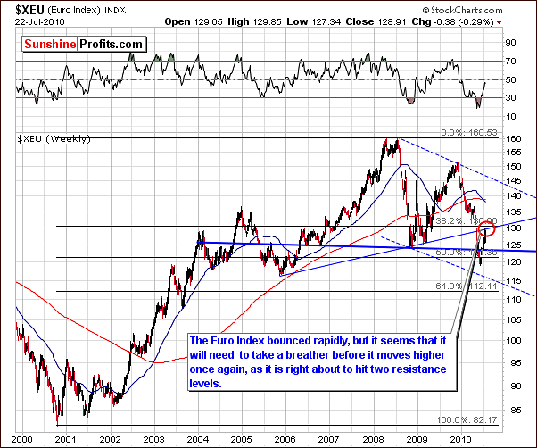
This week's long-term Euro Index chart shows that there has been little change from last week. It appears the euro is taking a breather from its recent rally. There are two resistance levels which have likely contributed to this situation. Both the rising resistance line (thin blue line drawn from 2005 and 2008 bottom) and the 38.2% Fibonacci retracement level have come into play and the rally likely does not have the strength to breakout above these strong resistance levels in the short-term.
In addition, the RSI is presently between 40 and 50. The long, sustained multi-year rallies (2002-05 and 2006-08) saw the RSI levels consistently between 50 and 80. It is probable that higher values will be seen in the Euro Index, if the RSI indicator manages to move and stay for a few months above the 50 level.
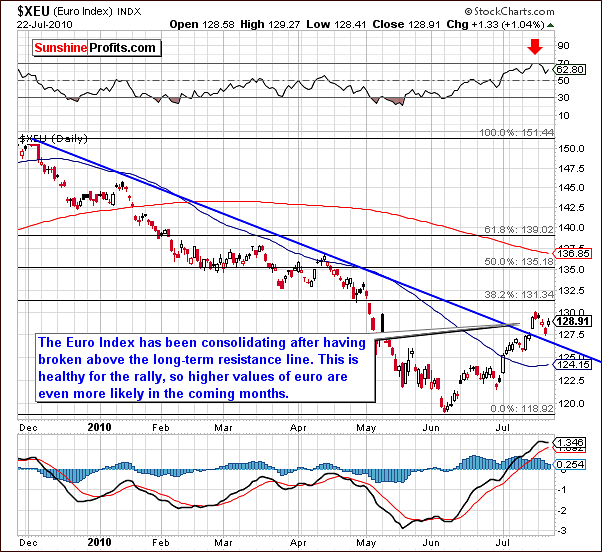
In the short-term Euro Index chart, we see there has been some consolidation after the breakout above the declining resistance line. This makes the move more meaningful and increases the likelihood that the rally will continue in the coming months. It is quite normal to see ups and downs for several days and when this is followed by further increases to even higher levels, it is a true sign of strength, as it shows that the growth is steady and "reasonable" instead of it being a single quick spike (that is likely to end even faster than it had begun in the first place.)
Investor actions of late have likely depended upon their individual situations. Those who are called the weak hands are likely to have left the market while the strong hands have remained invested in the euro and are keeping the buying pressure on. This may be the critical factor in keeping the Euro Index level above the declining support line. Once the rally resumes, more upward momentum is likely (the weak hands, including momentum traders will be back). Weaker investors may re-enter the market and stronger investors would likely continue to pour in more capital thus strengthening and prolonging the rally.
Normally during upswings, multiple short rally periods are seen with many small consolidation periods interspersed. This is truly healthy for a rally and contributes in a positive manner to make further strength more likely (especially if corrections are accompanied by low volume.)
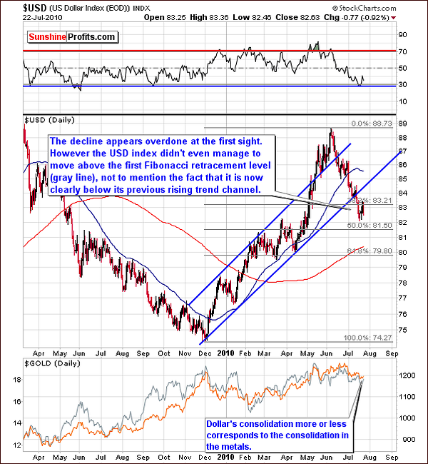
The long-term USD Index chart at first glance indicates what may seem to be an end to the recent decline. Although it is possible that a short period of sideways movement will be seen, it is important to note that the declines that we've seen in 2009 took dollar much lower and they were separated by only small corrective upswings. Therefore, the significant downside remains.
Whereas we are presently still above the psychologically important 80 level, last year's decline dipped below 75. As many as six or eight bounces were followed by further declines before the eventual bottom was reached. Also, the current downtrend has only three sharp downward plunges. This is far less than the last sustained declining market period.
Presently the USD Index level is below the first Fibonacci retracement level and also clearly below the previous rising trend channel. The interesting fact here is that the USD Index managed to move below the retracement level without a moment pause, and is now testing it as resistance - not as support.
This, along with the likely rally coming for the euro in the following weeks will preclude any bullish sentiment at this time. Although a slight bounce and or some sideways movement may be seen in the near-term, further declines appear probable for the USD Index.
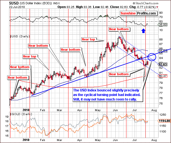
In this week's short-term USD Index chart, it appears that a local bottom has been reached very close to the vertical red line in the chart. As we have frequently mentioned in prior updates, at times these red lines are quite accurate in predicting local tops and bottoms. The recent bounce corresponded precisely with this cyclical turning point indicator.
It is important to note however, that what appears to be a new rally will likely result in only slightly higher levels. A likely target level is indicated by the blue circle and further points to what appears to be very little room for this rally. The upper border of the declining trend channel will likely provide resistance and keep any rally from gathering serious momentum. Thus, the upside potential taking these factors into consideration is only in the 2½ -3% range.
With respect to gold, silver and mining stocks, it is possible that a small rally in the USD Index will coincide with a local top for gold, silver and mining stocks. After their (referring to both USD, and the precious metals sector) recent severe decline, they have been consolidating somewhat and if a local top is indeed to be formed, it should be seen very soon. Overall, however, the trend appears to be down in the short to medium-term. This will be discussed in detail later in this update.
Summing up, it seems that the consolidation period for both the Euro Index and USD Index will likely continue. The eventual trend for euro appears to be upwards while declines are expected to be seen for the dollar. Both indices appear at this time to be forming small, contra-trend moves
General Stock Market
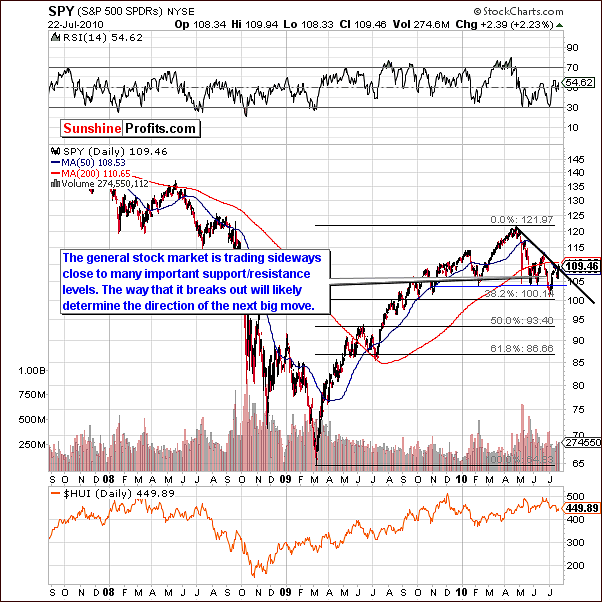
The general stock market this week has moved upwards and is now very close to several important resistance levels. Although a move higher was seen in the past few days, it is important to note that this upward trend has not been confirmed.
The direction in which the market moves next could very well determine the short to medium-term trend. A move in either direction is likely to dictate the general direction for at least the short-term, and this move may very well be significant.
Presently, however, the trend still remains down. The black line in the chart formed by connecting recent local tops is a declining resistance line. Also in play are the 200-day and 50-day moving averages. Once again, this trio will provide strong support if a breakout can be sustained and verified. Conversely, strong resistance will be felt should upward movement be thwarted in the short-term.
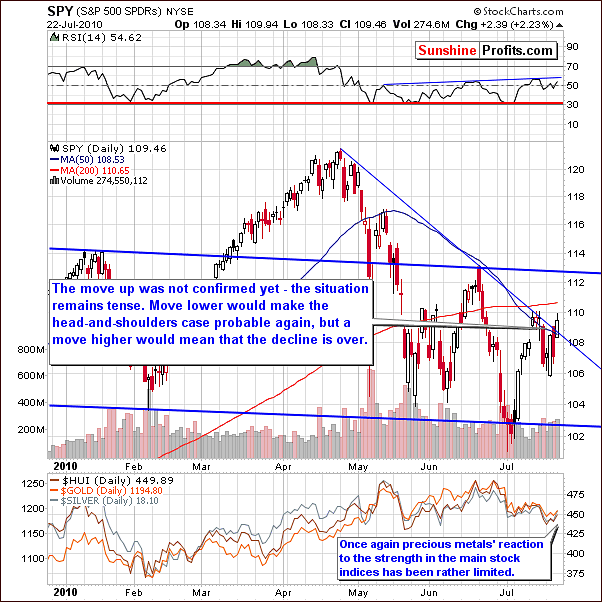
Prices are clearly seen hovering around the support levels in this week's short-term chart. Furthermore, the RSI is close to a local resistance level. Whichever way the next decisive move is will determine the market's next big move. Once again, the trend remains down until upward movement is confirmed.
In the precious metals sector, reaction has been quite weak. Whereas the general stock market has moved nearly all the way back to its pre-decline levels (second week of July), gold silver and mining stocks have not followed suit. This is indeed a bearish indicator for precious metals Investors and Traders alike. Further details will be discussed in upcoming sections of this update.
Summing up, the trend remains down for stocks. Although we have seen some information, which may appear bullish this week, we must have confirmation of the breakout before abandoning our bearish sentiment. We will continue to monitor the general stock market closely, as its direction may eventually have profound effects on precious metals. As always, we will keep our Subscribers informed as the situation develops. At this time, however, there appears little to be excited about.
Correlations
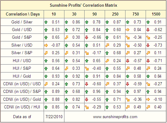
The correlation matrix is a tool that we use to quantify observations made throughout the update - at times it provides insight not visible directly on the charts or by analyzing the fundamental situation of the precious metals market. When two markets or indices move in a similar fashion, the correlation coefficient in the matrix table above will be high, that is above 0.50.
Gold, silver, mining stocks and the USD Index once again are showing some positive correlation. Weakness in the euro would therefore tend to drive precious metals higher. Conversely, a strong euro could result in lower precious metals prices.
Precious metals and the general stock market have some positive correlation but the levels are quite low. It appears that in recent weeks, the general stock market has been leading the precious metals sector to some extent, and the correlation values would not reflect that (they don't take into account the fact that one market may lead or lag another one - come to think of it, this is something that we might want to develop in the future).
Summing up, there are bearish indications for gold, silver and mining stocks due to the recent recovery and rally seen in the Euro Index, and the fact that it has been rallying rather poorly given recent upswing on the general stock market.
Gold
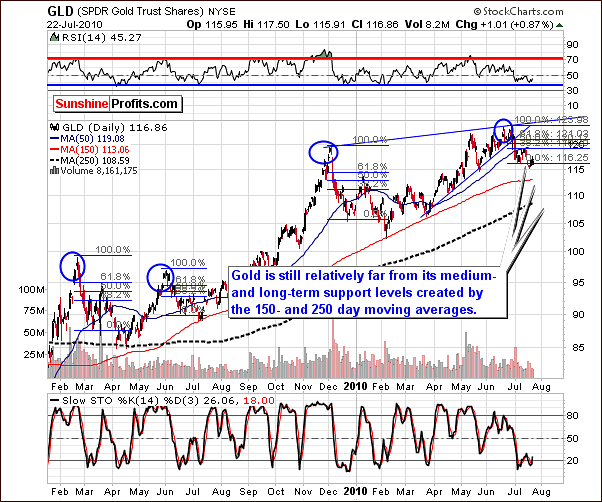
Points made last week in very-long-term chart for gold are still up to date. It is likely that the price of gold will decline further before any new rally begins. Since last week's update, gold's decline as measured by the GLD SPDR has been approximately 1.2%.
This week's long-term GLD ETF confirms that the critical resistance levels which stopped previous declines are still not a factor. The 250-day and 150-day moving averages are still three to nine points lower on the above chart. It is therefore likely that further declines will be seen in the following weeks until these support levels are realized.
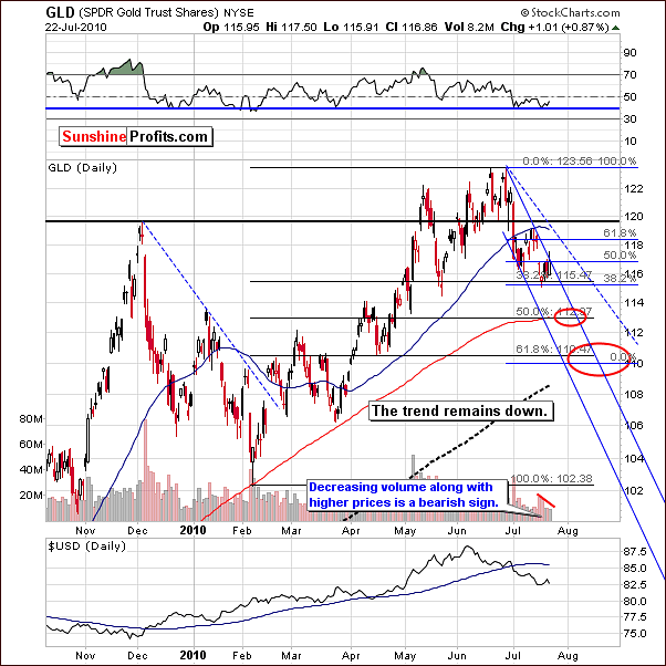
In the short-term chart, volume levels are clearly seen. Note that upward moves are accompanied by volume levels which are much lower than those seen during the preceding periods of decline. This is a bearish indicator.
The targets noted by the red ellipses in the above chart remain up to date. They correspond to further declines in the 2-5% range as being possible based on today's signs. Additionally, the 150-day and 250-day moving averages are also aligned with these targets levels.
Additionally, based on the above chart, we cannot rule out a quick move slightly above the $118 level (to the resistance level created by the declining dashed line and the Fibonacci retracement level), but it is neither probable nor huge enough to justify exiting short positions at this time. The trend remains down.
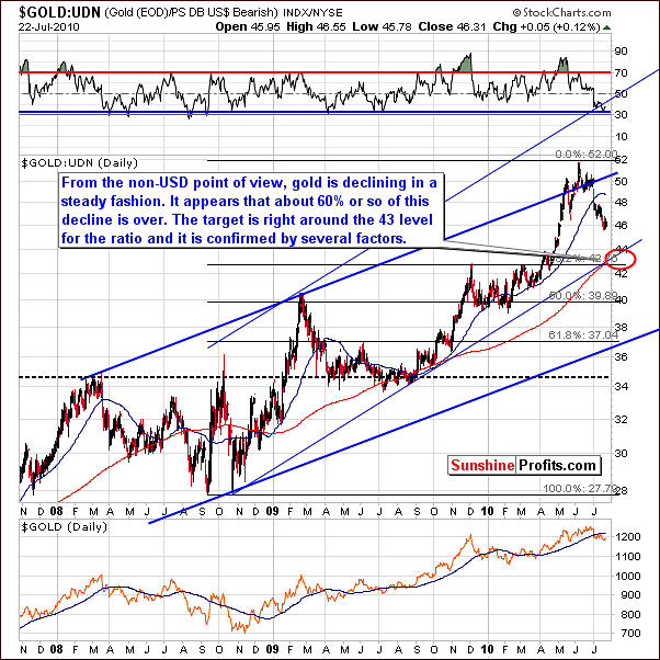
The non-USD chart which applies to gold's price in other currencies such as the euro, sterling, etc. shows that gold appears to be more than half way through its present decline. The ratio should reach a bottom somewhere in the 42-44 range. As mentioned last week "this target is determined by a rising support line and the previous important top".
Summing up, although gold moved up slightly in the past few days, the trend remains down. We continue to look for favorable opportunities to bet on lower prices. Until a rally is validated, extreme caution must be exercised, especially with negative M3 money supply growth (as reported by shadowstats.com and as featured in the July 1st 2010 Premium Update).
Sunshine Profits will continue to watch for risk-reward profitable opportunities to increase our Subscribers' profits. We will advise accordingly with a Market Alert or in a subsequent update.
Silver
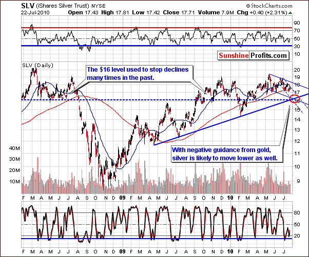
Very little change was seen in this week's long-term chart for silver. The downtrend continues and price levels remain within the declining trend channel. As we have indicated in previous updates, silver often follows gold's lead in general movement. It is therefore not surprising that the outlook for silver is quite similar to that for gold. Since our last update, silver's price has declined slightly less than 1.5%.
It is likely that the $16 level will hold, that is, stop silver's decline. Note that this was true last summer on at least three occasions, and the $16 level has held three times this year as well.
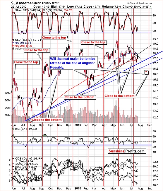
This week's short-term chart shows that the next cyclical turning point is due at the end of August, which could be our first timing sign relating to the next major bottom. As you have seen on the gold chart (and will see on the GDX chart in the following section), the lower target for the decline is in tune with the abovementioned turning point.
Recently, silver's price has just touched the short and medium term resistance levels. Although, not very strong, they may still stop silver's recent rise, or it may move slightly higher to the $18 level. Still, the current trend for silver continues to be down.
Focusing on the vertical red lines, which are critically important in the above chart, indications are that silver will possibly reach its bottom around the end of August. The same can be said for gold and mining stocks as well.
Summing up, the situation for silver is quite similar to that of gold. Although slight increases may be seen in silver's price, it is likely to downtrend in the short to medium- term. Moves upward at this time are likely no more than market corrections. Analysis of numerous signs and historical data indicate that the beginning of any new rally is very unlikely over the next several weeks. Should this be invalidated, we will let you know.
Precious Metals Stocks
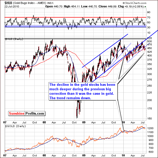
The HUI Gold Bugs Index does not provide excessive information this week. The index rose slightly after declining early in the week and was actually down a bit more than 2% when comparing Thursday closes this week and last. Its level is presently below the critical lower border of the rising trend channel. Thus, the breakdown has been confirmed and the trend remains down at this point in time.
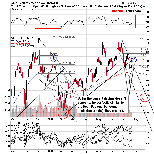
This week's short-term GDX chart shows that the local tops seen recently have come earlier than in the previous December-February decline. We therefore have adjusted the downward slope in the trend channel and a much sharper downward angle is seen. We have additional information now to project upcoming targets. The decline is likely to take mining stocks lower than previously stated.
Many similarities are seen when comparing today's decline with that of December-February. The Fibonacci retracement tool can also be used to predict targets thanks to the use of the 1.618 (Phi) number - by extrapolating previous price moves.
Taking the initial decline, that is from local top to first local bottom times two corresponds to a 50% Fibonacci retracement level target (early Dec). At the same time, the 38.2% retracement level is seen at a level consistent with the second local bottom (mid-Dec). This is also the point we are at in our current decline. Taking both levels into account, along with a prior top, yields a next local bottom in the 42 to 43 range. Note that in the past, a slight upswing was seen before the decline continued. This time, however, it seems that instead of one bigger correction we might see two smaller one's and the first of them is already behind us.
The volume was much lower during the final part of the upswing (in the first week of January) than it is today, suggesting that another shorting opportunity is ahead of us.
At this point, note that in December 2009 - January 2010 time frame GDX corrected about half of the previous decline before plunging again. If this tendency is to repeat also this time, we can expect it to move about 2% above where we are today, to the 50-51 range. The move is not certain and not huge, so we don't recommend betting on it. Instead this could be a good entry point to add to one's short positions.
We will be looking for a confirmation from the GDX:SPY ratio, and its volume. Please take a look at the chart below for details.
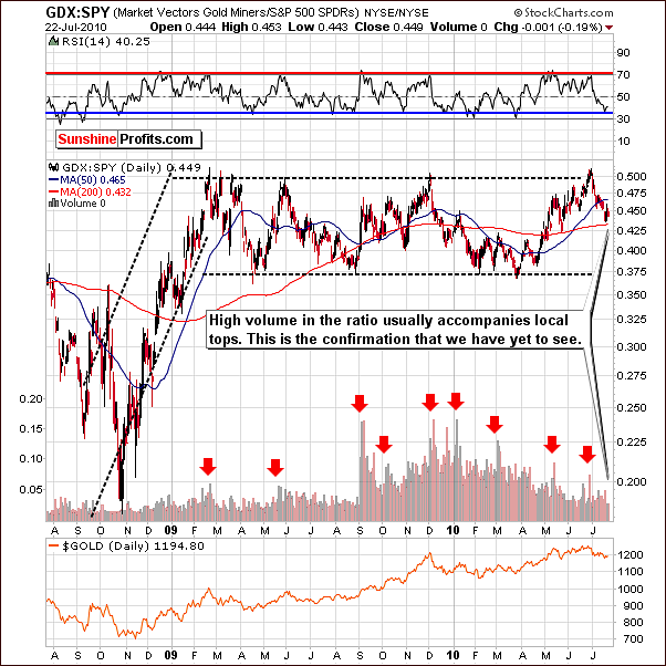
Before we suggest adding to short positions or buying additional put options, we would need to see further confirmation of this coming downtrend. High volume in the GDX:SPY ratio, which measures mining stocks' performance relative to other stocks, would provide the needed confirmation.
Summing up, mining stocks appear to be in a contra-trend rally. This situation in gold is analogous to the December decline and silver is suggesting a turning point as well. Mining stocks will likely reach a bottom near the end of August and it is expected to be much lower than today's levels. Additional confirmation is needed however to bet on lower prices. High volume in the GDX:SPY ratio would provide such confirmation.
Other Information
This week we have received several questions, so we would like to take this opportunity to let our thoughts available also to other Subscribers.
The first question is about copper - would copper, as a purely industrial metal, be a relevant proxy measure for the industrial forces acting on silver? These would obviously be visible through a suitable spot price or ETF etc.
Generally yes, but what we would be looking for in copper is the "general stock market influence" in order to apply that to the analysis of silver market. It would be imperative to do so if we didn't have any other measures available. However, since we can analyze the main stock indices or even check volume trends through ETFs, we are not missing much information by analyzing them directly. We agree that the analysis of the copper market might be more useful if we determined that it is the general stock market that is the main force behind silver's moves - which is not the case at this point.
At times we can see copper leading the main stock indices, which would be bullish here as copper (and copper mining stocks) appear to have broken out of the downtrend. However, on the other hand, we have seen the death cross meaning that the 50-day moving average moved below the 200-day moving average, which is commonly referred to as a bearish signal. The previous time that we've seen it take place was at the very end of 2007, just before the massive plunge materialized. So, the situation is just a we've stated in the General Stock Market section in this update - whichever way the situation plays out soon is likely to mark the direction of the next big move.
Another question is about the flag formation (price trading sideways but generally moves slightly in the counter-trend direction) - is it bearish or bullish for a given market. The answer is that the flag formation is often a sign of continuation of a previous move. In other words, if the price was moving lower before entering the flag formation, the formation is bearish, and if the price was moving higher before entering the flag formation, the formation is bullish.
The final question is about "the best indicator" - which of them is the most effective, reliable and thus profitable one. The answer is that there is no single best indicator or even technique. There can be more or less useful indicators for particular stocks/indices/situations but their reliability can change over time.
Please note that even if you had the best indicator - say RSI - you will still need to optimize the number of days that it's based on (with MACD we would have 3 parameters). Please note that if you go for instance to http://stockcharts.com to create your own charts, you have a text box next to each indicator's name so that you can customize it. So, the consecutive question is - if the RSI is the best indicator - which parameters should be used? Maybe the RSI(14) is best than other indicators, but RSI(47) is much worse than any of them? And even if you have that information - how do you use that particular indicator? Do you use the overbought and oversold levels or do you buy when it crosses the 0 level, or when it changes direction, etc.?
Once you have your best indicator, it may turn out that it will be the best one for only a few weeks and after that time another indicator will outperform it. Another problem - how do you measure its performance? In other words, how do you estimate which indicator is better? One will be better for long-term Investors while other will do miracles for Day-Traders.
Therefore, the situation is complicated and selecting the single best indicator is impossible. The only thing that one can do here is to try to isolate particular ways to estimate indicators' performance (for example - biggest gain after 2 weeks - short term, 2 months - medium term, and 6 months - long term) and then check all important indicators with virtually all combinations of parameters for each term. Out of all combinations we can then select the ones that provide us with biggest profits. Of course these calculations would need to be repeated periodically in order to make sure that the best indicators are still living up to their respective titles. There are also several other important details that need to be considered, but we believe at this point we have already more than answered the initial question.
In case you were wondering if we are planning to implement a feature that would let you know which indicators/parameters are best for the precious metals sector (and individual mining stocks) with regard to particular time targets in mind and if we're planning to update these calculation periodically, then the answer is yes - we have been working on this since March, 2010. Yes, we are also working on estimating option's and future's expiration on the value of gold, silver and mining stocks. There is also an additional feature that we're working on, but we don't want to provide more details at this time. All of this and much more (yes, including a whole new website) will be available this fall.
Summary
Gold, silver and mining stocks do not appear to be responding positively to bullish influences from other markets such as the USD Index, the Euro Index and the general stock market. Moves higher this week were smaller in the precious metals sectors as compared to the general stock market. Furthermore, negative correlation with the euro must be taken into account and the eventual Euro Index rally will likely result in lower precious metals prices.
Silver's cyclical turning points along with other techniques allow us to create targets for the coming weeks. All precious metals appear headed for a bottom in the next 4 to 6 weeks, likely around the end of August. We are awaiting further confirmation of these expected downturns before suggesting any profit oriented moves with speculative capital. Our practice of always keeping Subscribers informed and current will continue throughout these complicated and ever-changing market scenarios.
Market Alerts and subsequent weekly updates will be used to quickly and accurately disseminate information and advice as warranted in the coming days and weeks.
This completes this week's Premium Update.
Thank you for using the Premium Service. Have a great weekend and profitable week!
Sincerely,
Przemyslaw Radomski

