

Briefly: In our opinion, short (full) speculative positions in gold, silver and mining stocks are justified from the risk/reward point of view.
Quite a lot happened in the precious metals market and in the related markets and ratios last week, but did as much change? In today’s alert we’ll go through some of the most important markets and ratios and examine what the current outlook really is.
In short, even though a lot happened, not much changed. The medium-term outlook for the precious metals market was bearish and it still is bearish. The short-term outlook somewhat clarified and it is bearish as well. Let’s move right to the charts (charts courtesy of http://stockcharts.com).
First things first, let’s take a look at gold’s long-term chart.
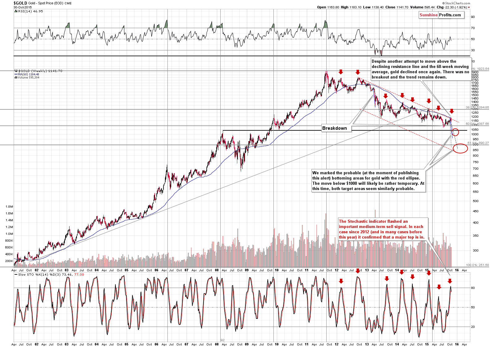
There are a few things that we would like to say regarding the above chart that are very important:
- The trend remains down.
- There was an attempt to move above the declining resistance line and the 60-week moving average and it was quickly invalidated, which by itself was a major sell signal.
- We saw a major sell signal in the Stochastic indicator (lower part of the above chart). In each case since 2012 (and in many cases before 2012) this meant that an important top was in and that much lower values were to be expected. Since late-2012 a sell signal from the Stochastic indicator has meant that there will be no new high anytime soon.
Therefore, the medium-term outlook remains bearish and there are significant bearish indications as well.
The red ellipses that you can see on the above chart mark our up-to-date targets for the gold market. These targets cover both the price and time. At this time, the most likely outcome in our opinion is that we will see a decline to $1,000 - $1,050 in the next few weeks / months, then we might (but it’s unclear at this moment – it’s only a little more likely than not) see a corrective upswing to $1,080 - $1,100 or so, and then we are likely to see a decline to the final bottoming area at about $830 - $900). You will find more details regarding the way in which we estimated those targets in the Apr. 24, 2015 Gold & Silver Trading Alert (note: due to the most recent corrective upswing, they moved out into the future, but they didn’t change price-wise).
Regarding the medium-term decline and the final bottom targets, we would like to emphasize that we don’t think that gold is not rallying due to a negative fundamental situation. No – we think that the fundamental situation has been positive for many months (and we are excited about the coming decline because it will provide us with a great buying opportunity). Gold is declining, because that’s simply how markets work – they move from extreme pessimism (what we had 15 years ago) to extreme optimism (mid-2011), then to extreme pessimism, then to extreme optimism and so on and so forth. Gold has not yet moved to the “extreme pessimism” territory and the market is not yet ready to really respond to the positive fundamental situation. It will likely not be able to do so until the situation gets really extreme.
Why do we think that the situation was not extreme enough at the previous 2015 low? Because we didn’t see enough confirmations of such a situation. Besides, gold is not responding to bullish signs as it should be if the bull market was really back. If it was really in the “bull market mode,” it would have soared based on the Eurozone QE2 announcement. Not only didn’t gold really rally, but it’s now lower than it was at the announcement. Plus, mining stocks are still relatively close to their 2015 lows despite a corrective upswing in the recent weeks.
Keeping the above in mind, let’s take a look at gold’s short-term picture.
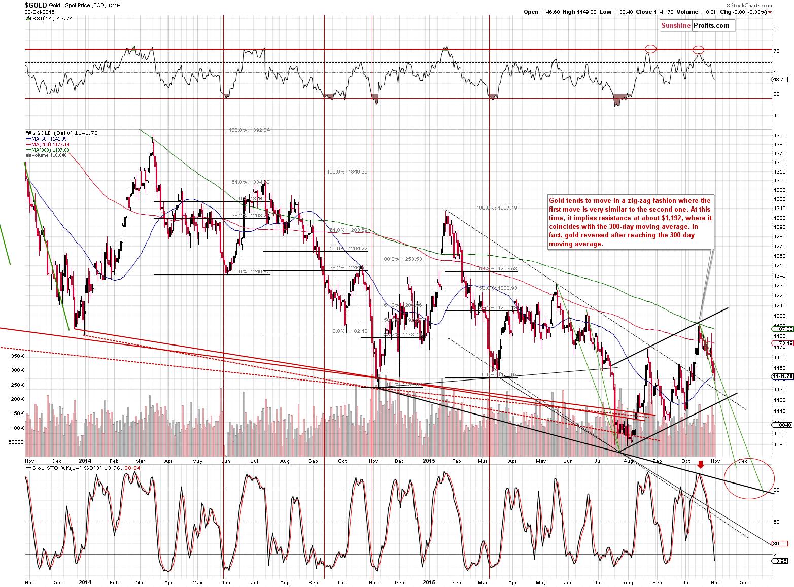
Gold declined substantially last week and the important thing is that the volume on which it declined was significant. The decline is likely underway and it’s likely that the corrective upswing is already over. The trend remains down.
The green line on the above chart represents the pace at which gold declined in the past. As you can see, gold’s decline is well in tune with these patterns.
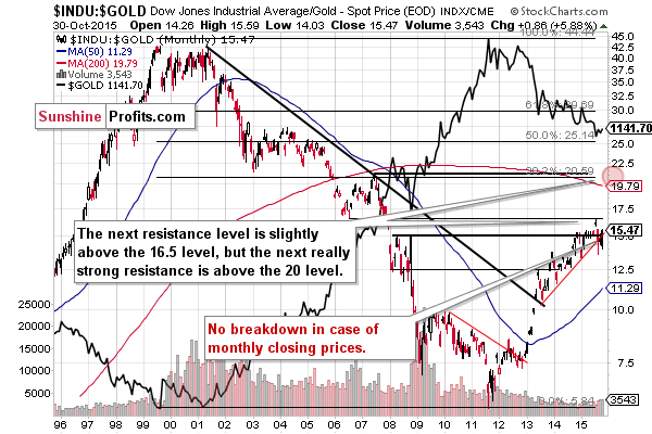
The Dow to gold ratio is one of the most important long-term charts for the precious metals sector -when it moves higher, gold is likely to decline. The important thing that we can see on the above chart is that despite an intra-month move below the rising support line, the ratio moved back above it and the trend remains up. This bodes well for the ratio, but the opposite is the case for the precious metals sector.
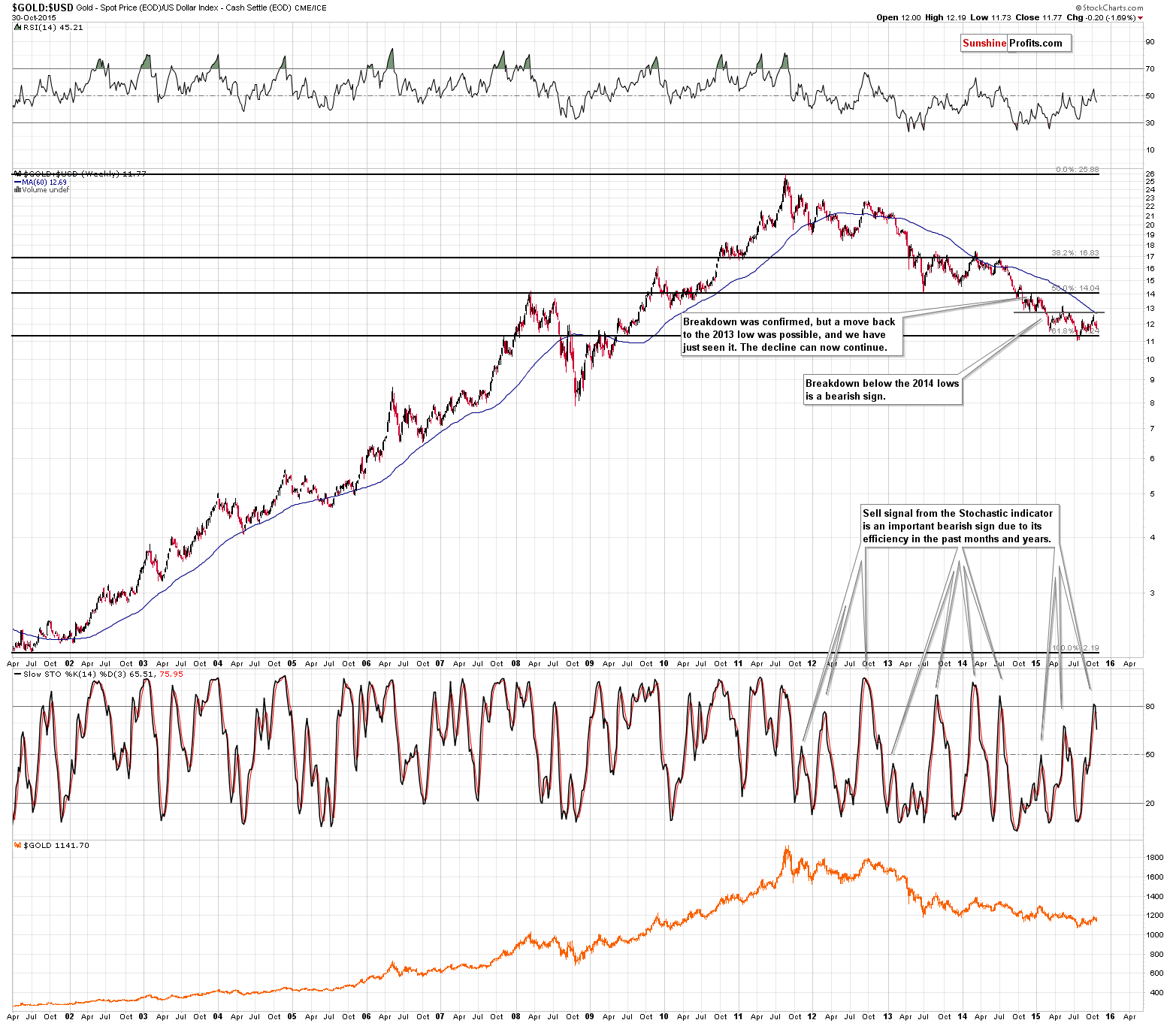
The gold to USD Index ratio has no clear economic interpretation, but it’s useful in technical terms – for confirming or invalidating other signals. At this time we clearly see the sell signal from the Stochastic indicator. It’s been very reliable in the past years, so the implications are strongly bearish.
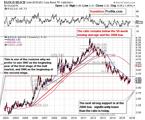
Finally, let’s take a look at the gold to bonds ratio. This ratio did a very good job at smoothing out the temporary, short-term price swings and helping one to focus on the main, long-term moves. The 50-week moving average has been particularly useful. During its recent rally gold moved to this resistance line once again, but – as it was the case numerous times in the past – it declined. It seems that the next wave down has just begun.
Overall, the outlook for gold is bearish for short- and medium term. Having said that, let’s take a look at silver.
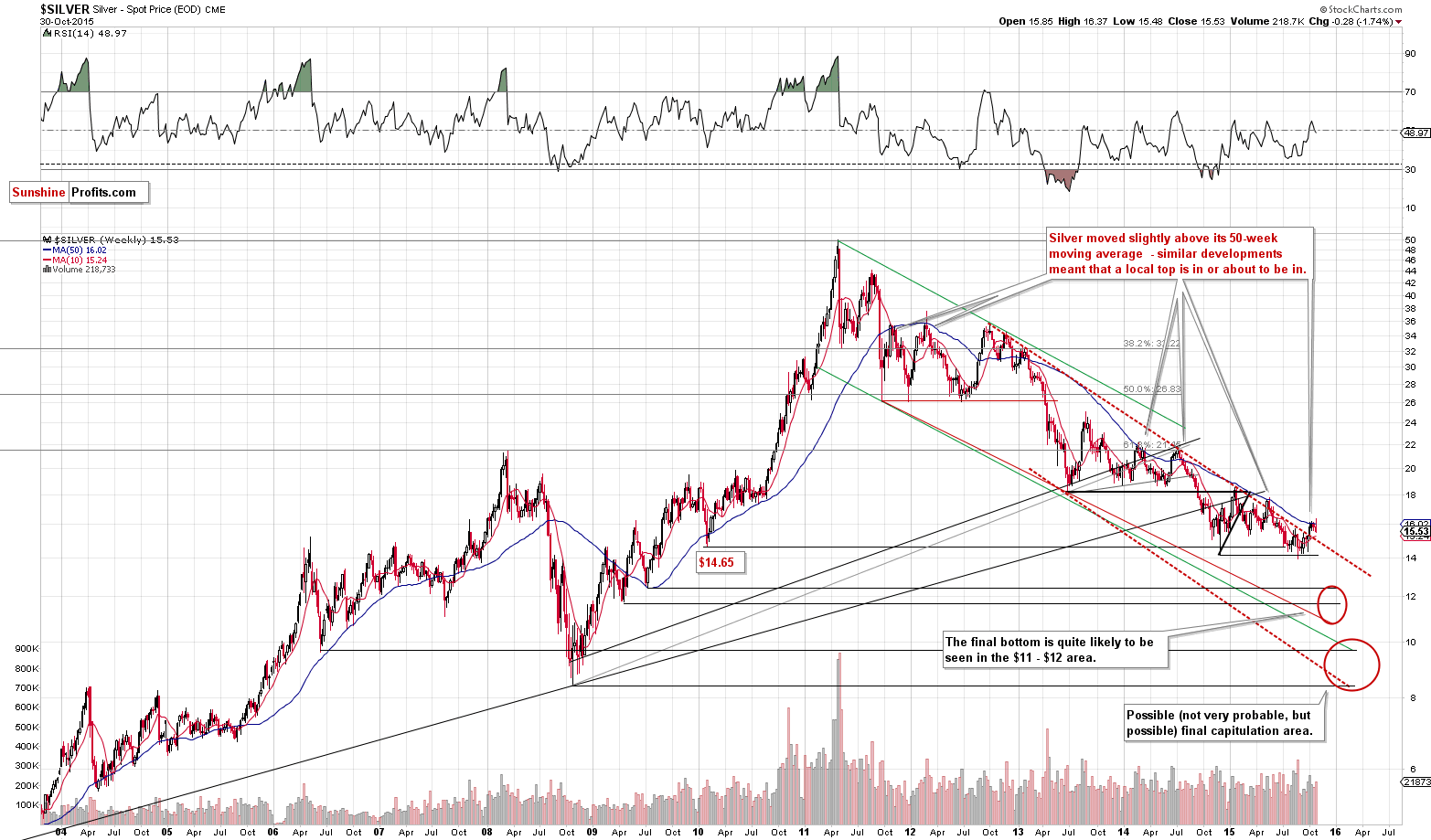
Silver remains in the medium-term downtrend as well. The white metal is a bit above the declining red, dashed resistance line, but it just invalidated a small breakout above the 50-week moving average and that’s the same thing that we saw at the last previous top.
The above chart features our price / time targets for silver – you will find a bigger discussion of this topic in the May 6th 2015 Gold & Silver Trading Alert.
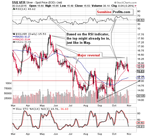
Looking at the short-term silver chart we see that the daily reversal was indeed followed by much lower prices, as we expected. In Thursday’s alert, we commented on the above silver chart in the following way:
The interesting thing is that silver formed a daily reversal on huge volume. That’s a clear bearish sign for the short term – a one that we saw at previous local tops. Moreover, please note that on an intra-day basis, silver greatly outperformed gold, which is another bearish sign (such short-term outperformance periods very often preceded declines).
Silver declined on big volume on Thursday, so the above was confirmed. Friday’s move lower on lower volume didn’t add anything new to the above. The outlook is clearly bearish as silver closed the day and week at the lowest levels since early October.
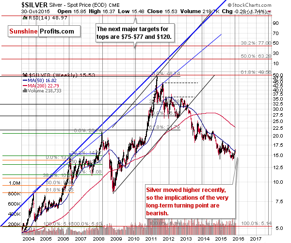
Another thing that’s very important is the very long-term turning point in silver. Our comments on the above chart from the Oct. 26 Alert remain up-to-date:
The very long-term chart of silver shows 2 things:
- The long-term price targets are a lot higher than the current price.
- Silver’s short-term rally is likely over.
The first point is based on the Fibonacci extensions and previous highs, and the second point is based on the very long-term turning points. Please note how precise these important points were in the past – the last move was definitely to the upside, so the implications are bearish.
Overall, the outlook for silver is bearish not only because of the bearish outlook for gold, but also due to silver’s own technical reasons.
Having said that, let’s take a look at the mining stocks.
We previously commented on the above chart in the following way:
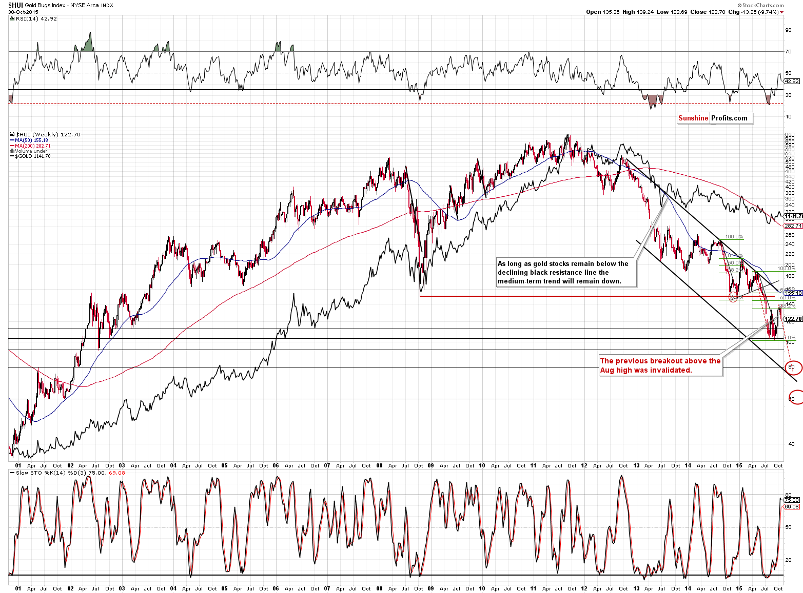
Gold stocks have moved lower this week and the breakout above the August high was once again invalidated. More importantly, please note that the Stochastic indicator moved above the 80 line. Each time (!) after 2011 (and many times before 2011) this (the sell signal served as a confirmation) meant that the local top was in or very close to being in and that short positions, not long ones, should’ve been strongly considered.
The Stochastic indicator moved lower (as its based on weekly closing prices and gold stocks declined even more after we wrote the above), but the bearish implications remain in place. The most recent move higher – although it seemed to be a bullish development, was actually a correction to (slightly above) the 38.2% Fibonacci retracement level – technically, there is no sign that a major rally started a few weeks ago.
It’s likely that the next big move lower is already underway. The self-similar pattern confirms this outlook as well.
We recently wrote that the situation in the HUI Index was similar to what we had seen at and after the previous corrective upswing. As you can see on the above chart, this continues to be the case also today. This time we see gold stocks decisively moving below the August high and the recent lows. Gold stocks even closed the week below the early August high. The implications are bearish.
We realize that the self-similar pattern and the point of using it might be perplexing, so we would like to once again explain it.
In short, the way people react to certain events (economic news, elections’ outcome, price and volume patterns etc.) tend to repeat themselves, if not to the letter, then considerably. This is has profound implications as it allows one to look for similar actions in the past and then extrapolate the previous outcome to the current situation. The more similar patterns from the past we find and the more similar to what we have now they are, the more reliable the prediction made on such an analogy.
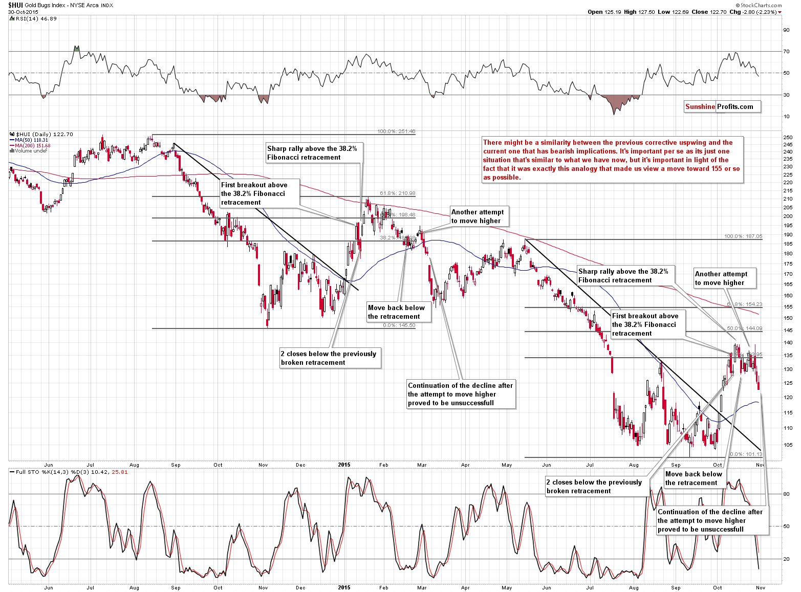
We have just one point in time that is similar to what we have seen recently in the HUI Index, but the similarity is quite significant, so the implications are meaningful. On Oct. 22, we described the situation on the above chart in the following way:
The thing that creates the analogy is a number of similarities – in terms of price, time and shape of the move. The more similarities we have, the more useful and reliable an analogy gets. Both of the mentioned declines were quite similar in terms of time, price and – to a considerable extent – shape. The individual events that trigger certain moves differ, so the moves are not identical, but the overall sentiment makes the moves similar anyway. This can create a roadmap for the following days. The similarities are generally reliable in the short term, but not really in longer terms. The more distant the price projection, the more blurry it gets and the less reliable it is.
In this case, the after-breakout (early October) rally and a move to/above the 38.2% Fibonacci retracement was the more clear part of the analogy, but the detailed shape of the top and the price level that was / is about to be reached is less precise.
Is the top already in, in light of the above?
Based on the price analogy alone – no. But what about the analogy in terms of time and shape?
Regarding time: back in January it took 10 sessions (from the day of the breakout) for gold stocks to top and now the daily highs close to the 140 level were seen after 7, 8 and 9 sessions. In our opinion that’s similar to what we saw previously. Gold stocks are now 12 sessions after the breakout and it would take them at least several additional sessions to move above the October highs. Consequently, the top would be formed after 16-20 sessions after the breakout, which is much less similar to the previous pattern when gold stocks topped after 10 sessions. Consequently, the analogy in terms of time suggests that the top is likely already in.
Regarding shape: a picture can tell a thousand words and at this time it certainly does. Please take a look at the above chart (as a reminder, clicking on the chart will expand it and if it’s still not expanded sufficiently, then clicking another icon on the top of the chart should help; in most cases pressing “ctrl” and “+” or “cmd” and “+” on keyboard should make everything even bigger).
Back in January, gold stocks first moved above the 38.2% Fibonacci retracement, then declined and closed below it for 2 days (the same happened earlier this month), then they rallied to new highs (again, the same happened this month) and formed the top (perhaps that’s what happened this month as well). After that gold stocks declined back below the 38.2% retracement and attempted to move above it once again but the move was relatively small and was soon followed by another wave down. This is exactly what’s happening right now. The important thing is that after that time, gold stocks did not move higher again but rather continued to slide. Consequently, this time, we can expect lower prices without an additional short-term rally – the analogy in terms of shape suggests that the top is likely already in.
To sum up, the analogy in terms of price suggests that miners could rally further (but this is not a strong suggestion – gold stocks have already rallied substantially and what happened recently is already a rally that’s similar to what we had seen previously), the analogy in terms of time suggests that the rally is over (and it’s a quite strong suggestion – stronger than the one based on price, in our opinion) and the analogy in terms of shape provides a moderately strong suggestion that the rally is over. The overall implications of the analogy to the previous decline are therefore not bullish, but rather bearish.
What has changed since Oct. 22, when we first wrote the above? The outlook has deteriorated further, as it has become clear that we have not seen a new high and the similarity in terms of time has clearly bearish implications at this time. The same goes for the shape – both patterns are now even more similar than they were in the past. All in all, based on the self-similarity phenomenon, lower mining stocks values are to be expected in the following days and weeks.
Of course, we are not looking for similarities in the price and volume only, but also in important ratios.
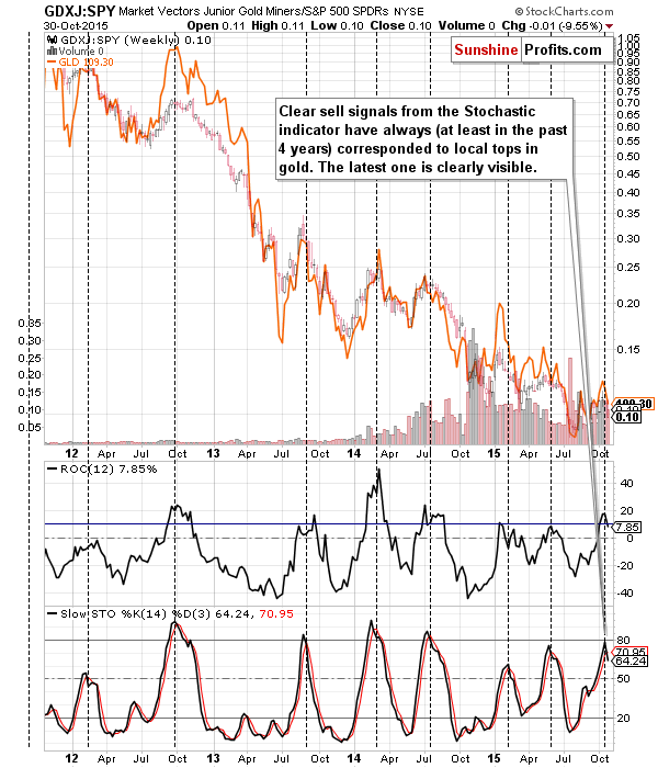
At this time, we can say that we just saw a major sell signal from the GDXJ to SPY ratio (performance of junior mining stocks relative to other stocks). Precisely, we see the sell signal based on what’s going on with the Stochastic and ROC indicators. Similar situations in the past meant that we were already after a major top. This fits well with other signals that we’ve been discussing recently.
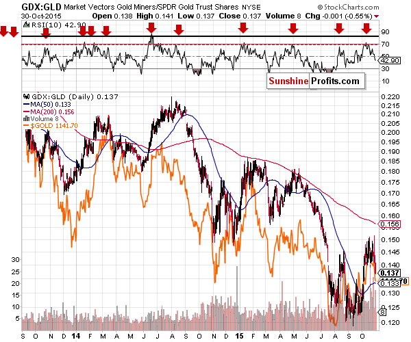
Comparing the performance of mining stocks with the one of gold, we see a confirmation that a major top is likely already behind us. The above chart doesn’t say much about the next several days, but it shows (thanks to the performance of the RSI indicator in the upper part of the above chart) that the rally was in tune with the previous counter-trend rallies – it doesn’t seem it was anything more than just that.
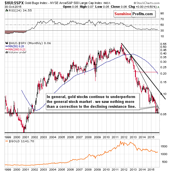
Comparing the performance of gold stocks with that of the general stock market provides us with similar implications – the trend remains down and the recent rally was nothing more than a correction to the declining resistance line. The above chart doesn’t say anything about the next several days, but the implications for the medium term remain bearish.
Summing up, the decline in the precious metals sector continues and there are multiple signs that point to the continuation of the decline – if not immediately, then shortly. Moreover, it seems likely that the corrective upswing is already over. It seems that the next big move will be to the downside and being positioned to take advantage of it remains justified from the risk/reward point of view. It seems likely that the current short position will further increase our profitability.
As always, we will keep you – our subscribers – updated.
To summarize:
Trading capital (our opinion): Short position (full) position in gold, silver and mining stocks is justified from the risk/reward perspective with the following stop-loss orders and initial (! – this means that reaching them doesn’t automatically close the position) target prices:
- Gold: initial target price: $1,050; stop-loss: $1,223, initial target price for the DGLD ETN: $98.37; stop loss for the DGLD ETN $62.34
- Silver: initial target price: $12.60; stop-loss: $16.73, initial target price for the DSLV ETN: $96.67; stop loss for DSLV ETN $40.28
- Mining stocks (price levels for the GDX ETF): initial target price: $11.57; stop-loss: $18.13, initial target price for the DUST ETF: $26.61; stop loss for the DUST ETF $9.22
In case one wants to bet on junior mining stocks' prices (we do not suggest doing so – we think senior mining stocks are more predictable in the case of short-term trades – if one wants to do it anyway, we provide the details), here are the stop-loss details and initial target prices:
- GDXJ ETF: initial target price: $16.27; stop-loss: $25.23
- JDST ETF: initial target price: $46.47; stop-loss: $15.58
Long-term capital (our opinion): No positions
Insurance capital (our opinion): Full position
Plus, you might want to read why our stop-loss orders are usually relatively far from the current price.
Please note that a full position doesn’t mean using all of the capital for a given trade. You will find details on our thoughts on gold portfolio structuring in the Key Insights section on our website.
As a reminder – “initial target price” means exactly that – an “initial” one, it’s not a price level at which we suggest closing positions. If this becomes the case (like it did in the previous trade) we will refer to these levels as levels of exit orders (exactly as we’ve done previously). Stop-loss levels, however, are naturally not “initial”, but something that, in our opinion, might be entered as an order.
Since it is impossible to synchronize target prices and stop-loss levels for all the ETFs and ETNs with the main markets that we provide these levels for (gold, silver and mining stocks – the GDX ETF), the stop-loss levels and target prices for other ETNs and ETF (among other: UGLD, DGLD, USLV, DSLV, NUGT, DUST, JNUG, JDST) are provided as supplementary, and not as “final”. This means that if a stop-loss or a target level is reached for any of the “additional instruments” (DGLD for instance), but not for the “main instrument” (gold in this case), we will view positions in both gold and DGLD as still open and the stop-loss for DGLD would have to be moved lower. On the other hand, if gold moves to a stop-loss level but DGLD doesn’t, then we will view both positions (in gold and DGLD) as closed. In other words, since it’s not possible to be 100% certain that each related instrument moves to a given level when the underlying instrument does, we can’t provide levels that would be binding. The levels that we do provide are our best estimate of the levels that will correspond to the levels in the underlying assets, but it will be the underlying assets that one will need to focus on regarding the sings pointing to closing a given position or keeping it open. We might adjust the levels in the “additional instruments” without adjusting the levels in the “main instruments”, which will simply mean that we have improved our estimation of these levels, not that we changed our outlook on the markets. We are already working on a tool that would update these levels on a daily basis for the most popular ETFs, ETNs and individual mining stocks.
Our preferred ways to invest in and to trade gold along with the reasoning can be found in the how to buy gold section. Additionally, our preferred ETFs and ETNs can be found in our Gold & Silver ETF Ranking.
As always, we'll keep you - our subscribers - updated should our views on the market change. We will continue to send out Gold & Silver Trading Alerts on each trading day and we will send additional Alerts whenever appropriate.
The trading position presented above is the netted version of positions based on subjective signals (opinion) from your Editor, and the Tools and Indicators.
As a reminder, Gold & Silver Trading Alerts are posted before or on each trading day (we usually post them before the opening bell, but we don't promise doing that each day). If there's anything urgent, we will send you an additional small alert before posting the main one.
=====
Latest Free Trading Alerts:
The Personal Consumption Expenditures Price Index decreased 0.1 percent in September. What does it mean for the U.S. economy and the gold market?
U.S. PCE Index Falls in September
=====
Hand-picked precious-metals-related links:
Deutsche Bank expects Gold to average around $1,100 an ounce in 2016
Gold likely to trade below $1,100 in Q4: report
ScotiaMocatta: Commitments of Traders (CFTC)
=====
In other news:
Dollar dips as worries over China weigh on appetite for risk
Fed proposal aims to stop 'too big to fail'
China Caixin October PMI rises to 48.3 vs 47.2 in September
Saudi Arabia downgraded after budget surplus turns negative
China's premier: Growth of 6.5 percent expected through 2020
Oil prices could take until 2018 to recover: Statoil CFO
=====
Thank you.
Sincerely,
Przemyslaw Radomski, CFA
Founder, Editor-in-chief
Gold & Silver Trading Alerts
Forex Trading Alerts
Oil Investment Updates
Oil Trading Alerts

