

Briefly: gold and the rest of the precious metals market are likely to decline in the next several weeks/months and then start another powerful rally. Gold’s strong bullish reversal/rally despite the USD Index’s continuous strength will likely be the signal confirming that the bottom is in.
Welcome to this week's Gold Investment Update. Predicated on last week’s price moves, our most recently featured outlook remains the same as the price moves align with our expectations. On that account, there are parts of the previous analysis that didn’t change at all in the earlier days, which will be written in italics.
Gold is correcting today while being ahead of its triangle-vertex-based turning point. What does it mean? It most likely means that either this is not the final short-term (!) bottom, or that the near-term vertex-based turning point is going to be a local top, not a bottom.
In the case of the former scenario, we are prepared by already having exit targets for GDXJ slightly above $37, which means that if junior miners get excessively oversold in the near term, we’re ready to profit from it on top of profiting from the medium-term decline.
Regarding the latter scenario, we are also prepared, because in this case, we’ll simply not participate in the current counter-trend rebound (which would most likely be smaller than the one starting from $37 in the GDXJ), but we will be ready to participate in another powerful decline.
The best part is that none of the above scenarios changes anything with regard to the ultimate downside target for the current medium-term decline. The precious metals markets are still very likely to fall substantially in the following months, and even if one doesn’t participate in the counter-trend trades, they would still be likely to reap enormous profits thanks to the medium-term move. After all, mining stocks are likely to decline all the way down to their 2020 or even 2016 lows.
Therefore, the recent adjustment in short-term target prices doesn’t lower the ultimate profitability of participation in the medium-term trend. It’s just an attempt to take advantage of a very short-term market imbalance – nothing more. To clarify, right now, the $37 level in the GDXJ represents an extremely oversold situation, but if the GDXJ declines steadily to this level over the next month, I would probably not want to exit a short position based on this level being reached, as given the steady nature of the move lower, there would be no excessive oversold status – no imbalance that I would like to take advantage of.
Having said that, let’s continue today’s analysis with a recap of what recently happened on the fundamental front.
The Weekly Fundamental Roundup
This week was all about earnings, as some of Wall Street’s heavyweights released their quarterly reports. Moreover, while mixed results caused sentiment to swing from one extreme to the other, inflation remains front and center, and the outlook for Fed policy is bullish.
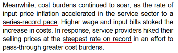
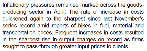
For example, whether it’s PepsiCo, Mondelez, or Whirlpool, companies have warned that inflation remains extremely problematic. Moreover, with American Express and Visa highlighting consumers’ eagerness to spend, the pricing pressures show no signs of slowing down. Likewise, S&P Global released its U.S. Composite PMI on Apr. 22, and I wrote on Apr. 25 that it was another all-time high for inflation.
Isolating services:
 Source: S&P Global
Isolating manufacturing:
 Source: S&P Global
With growth, employment and inflation supporting several rate hikes over the next several months, there is little in the release that implies a dovish U-turn. To that point, please remember that the survey was conducted from Apr. 11 to Apr. 21. Therefore, while investors hope that decelerating growth and inflation will allow the Fed to back off, the PMI data suggests otherwise. As such, the Fed’s conundrum continues to intensify.
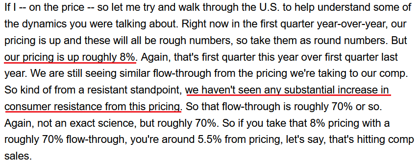
Furthermore, with more appetizing earnings reports released on Apr. 28, the results were even more bullish for Fed policy. Likewise, with the PMs’ force fields wearing off, they should suffer profoundly as rate hike volatility increases. For example, McDonald’s released its first-quarter earnings on Apr. 28. CFO Kevin Ozan said during the Q1 earnings call:
“In the U.S., I think last quarter, I mentioned that we thought commodities were going to be up roughly 8% or so for the U.S. That number is now more like 12% to 14% for the year. So U.S. commodities clearly have risen (…).”
“On the labor side, in the U.S., it's probably over 10% right now. Part of that is because you'll recall that we made adjustments to our wages in our company-owned restaurants mid-year last year, so we haven't lapped that. So part of it is due to that and part of it is due to just continued wage inflation.”
As a result, the Fed is losing control of the inflation situation, and the largest restaurant chain in the world is still sounding the alarm. Therefore, with the pricing pressures unwilling to abate on their own (which I’ve warned about for some time), killing demand is the only way to reduce the wage-price spiral.
Please see below:
 Source: McDonald’s/Seeking Alpha
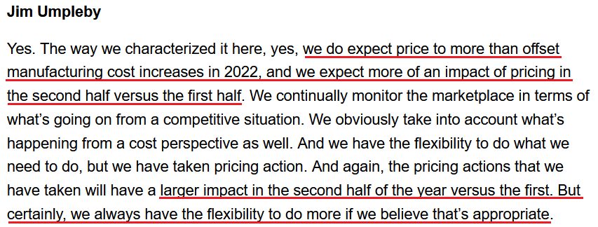
On top of that, Caterpillar released its first-quarter earnings on Apr. 28. For context, the company is the world's largest construction equipment manufacturer. CFO Andrew Bonfield said during the Q1 earnings call:
“We remain encouraged by the strong demand for our products and services. The first quarter of 2022 marked the fifth consecutive quarter of higher end user demand compared to the prior year. Services remained strong in the quarter. We continue to make progress on our service initiatives, including customer value agreements, e-commerce, connected assets and prioritized service events.”
CEO Jim Umpleby added:
“Absent the supply chain constraints, our top line would have been even stronger. When the supply chain conditions ease, we expect to be well positioned to fully meet demand and gain operating leverage from higher volumes.”
Thus, with each new earnings season, companies note that demand remains resilient. As a result, why not raise prices and capitalize on too much stimulus?
 Source: Caterpillar/Seeking Alpha
As expected, the “transitory” camp waved the white flag in 2022. However, the merry-go-round of input/output inflation was visible from a mile away. For example, remember what I wrote on Mar. 30, 2021?
Didn’t Powell insist that near-term inflation was only “one-time” and “transient”? Well, despite government-issued CPI data failing to capture the effect of the Fed’s liquidity circus, pricing pressures are popping up everywhere. And with corporations’ decision tree left to raising prices or accepting lower margins, which one do you think they’ll choose?
Continuing the theme, Domino's Pizza reported its first-quarter earnings on Apr. 28. For context, the company is the largest pizza chain in the U.S. Moreover, when contrasting the quarterly results of Microsoft and Alphabet on Apr. 28, I wrote that investors fail to realize that some companies have succumbed to the medium-term realities sooner than others. Therefore, Domino's Pizza is another example. CEO Ritch Allison said during the Q1 earnings call:
“Consistent with our communications during our prior earnings call, we faced significant inflationary cost increases across the business in Q1. Those cost pressures combined with the deleveraging from the decline in U.S. same-store sales resulted in earnings falling short of our high expectations for the business (…).”
“We believe that we will continue to face pressure both on the top line for our U.S. business and on our bottom line earnings over the next few quarters. While we remain very optimistic about our ability to drive long-term profitable growth in the near-term 2022 is shaping up to be a challenging year.”
CFO Sandeep Reddy added:
“In addition, we would like to update the guidance we provided in March for 2022. Based on the continuously evolving inflationary environment, we now expect the increase in the store food basket within our U.S. system to range from 10% to 12% as compared to 2021 levels.”
If that wasn’t enough, with unprecedented handouts reducing U.S. citizens’ incentive to work, staffing shortages materially impacted Domino’s Q1 results. Moreover, the development is extremely inflationary and only increases the chances of future interest rate hikes.
Please see below:
 Source: Domino’s Pizza/Seeking Alpha
Therefore, while I've warned on numerous occasions that the Fed is in a lose-lose situation, investors still hold out hope for a dovish pivot. However, they fail to understand the consequences. For example, a dovish 180 is extremely unlikely in this environment; but even if officials completely reversed course, the long-term economic damage would be even more paramount.
When companies are saddled with input pressures, even value-oriented chains like Domino's Pizza can only endure margin erosion for so long. Thus, with management searching for new ways to appease investors, Fed officials' patience will only cause an even bigger long-term collapse once inflationary demand destruction unfolds.
Please see below:
 Source: Domino’s Pizza/Seeking Alpha
Turning to the macroeconomic front, some interesting data also hit the wire on Apr. 28. For example, the Kansas City Fed released its Tenth District Manufacturing Survey. The headline index declined from 37 in March to 25 in April. Chad Wilkerson, Vice President and Economist at the KC Fed, said:
“The pace of regional factory growth eased somewhat but remained strong. Firms continued to report issues with higher input prices, increased supply chain disruptions, and labor shortages. However, firms were optimistic about future activity and reported little impact from higher interest rates.”
To that point, both the prices paid and received indexes increased month-over-month (MoM).
Please see below:
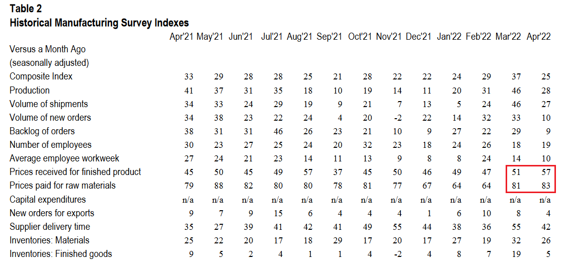 Source: KC Fed
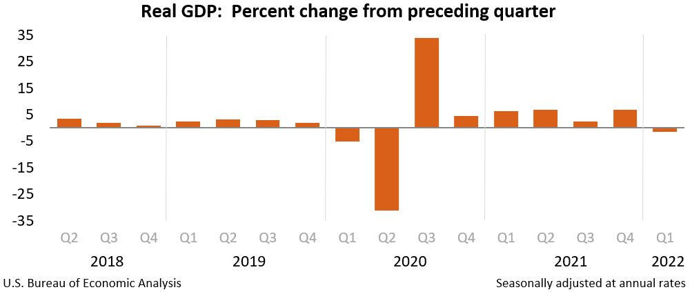
Finally, the major surprise on Apr. 28 was that U.S. real GDP contracted by 1.4% (advance estimate) in Q1. The report stated: “The decrease in real GDP reflected decreases in private inventory investment, exports, federal government spending, and state and local government spending, while imports, which are a subtraction in the calculation of GDP, increased.”
However: “Personal consumption expenditures (PCE), nonresidential fixed investment, and residential fixed investment increased.”
Therefore, with supply chain disruptions leading to import stockpiling (which hurts GDP), net trade was the weak link. However, the dynamic should reverse in Q2 and Q3, and if so, shouldn’t impact the Fed’s rate hike cycle.
The bottom line? The Fed is stuck between a rock and a hard place: deal with inflation now and (likely) push the U.S. into a recession later or ignore inflation and watch an even bigger crisis unfold down the road. As such, the first option is the most likely outcome. Remember, while Fed officials may seem out of touch, they’re not stupid, and history shows the devastating consequences of letting unabated inflation fester. Therefore, interest rate hikes should dominate the headlines over the next several months, and the PMs and the S&P 500 should suffer mightily along the way.
In conclusion, the PMs were mixed on Apr. 28, as silver was the daily underperformer. Moreover, while mining stocks were boosted by the S&P 500, the ‘buy the dip’ crowd is fighting a losing battle. With Amazon and Apple down after the bell on Apr. 28, weak earnings guidance should also dominate the headlines in the months to come. As a result, with the USD Index on fire and real yields poised to continue their ascent, the PMs’ medium-term outlooks are extremely treacherous.
What to Watch for Next Week
With more U.S. economic data releases next week, the most important are as follows:
- May 2: ISM Manufacturing PMI
Like this week’s S&P Global Report, ISM’s report is one of the most important data points because it covers growth, inflation, and employment across the entire U.S. Therefore, the results are more relevant than regional surveys.
- May 3: JOLTS job openings
Since the lagged data covers March’s figures, it’s less relevant than leading data like the PMIs. However, it’s still important to monitor how government-tallied results are shaping up.
- May 4: ADP private payrolls, ISM Services PMI, FOMC statement and press conference
With the FOMC poised to hike interest rates by 50 basis points on May 4, the results and Powell’s comments are the most important fundamental developments of the week. However, ADP’s private payrolls will also provide insight into the health of the U.S. labor market, while the ISM’s Services PMI will have similar implications as the manufacturing PMI. Moreover, both will provide clues about future Fed policy.
- May 5: Challenger jobs cuts
With the data showcasing how many employees were fired in April, it’s another indicator of the health of the U.S. labor market.
- May 6: Nonfarm payrolls, unemployment rate, average hourly earnings
Half of the Fed’s dual mandate is maximum employment, so continued strength in nonfarm payrolls is bullish for Fed policy. In addition, a low unemployment rate is also helpful, while average hourly earnings will showcase the current state of wage inflation.
All in all, economic data releases impact the PMs because they impact monetary policy. Moreover, if we continue to see higher employment and inflation, the Fed should keep its foot on the hawkish accelerator. If that occurs, the outcome is profoundly bearish for the PMs.
Let’s start today’s technical discussion with a quick check on copper prices.
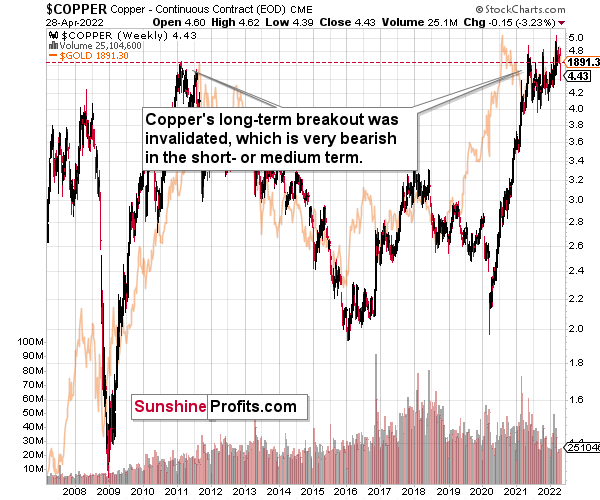
Copper just invalidated another attempt to move above its 2011 high. This is a very strong technical sign that copper (one of the most popular commodities) is heading lower in the medium term.
The interest rates are going up, just like they did before the 2008 slide. What did copper do before the 2008 slide? It failed to break above the previous (2006) high, and it was the failure of the second attempt to break higher that triggered the powerful decline. What happened then? Gold declined, but silver and mining stocks truly plunged. The GDXJ was not trading at the time, so we’ll have to use a different proxy to see what this part of the mining stock sector did.
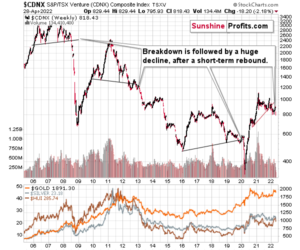
The Toronto Stock Exchange Venture Index includes multiple junior mining stocks. It also includes other companies, but juniors are a large part of it, and they truly plunged in 2008.
In fact, they plunged in a major way after breaking below their medium-term support lines and after an initial corrective upswing. Guess what – this index is after a major medium-term breakdown and a short-term corrective upswing. It’s likely ready to fall – and to fall hard.
So, what’s likely to happen? We’re about to see a huge slide, even if we don’t see it within the next few days.
What has happened recently?
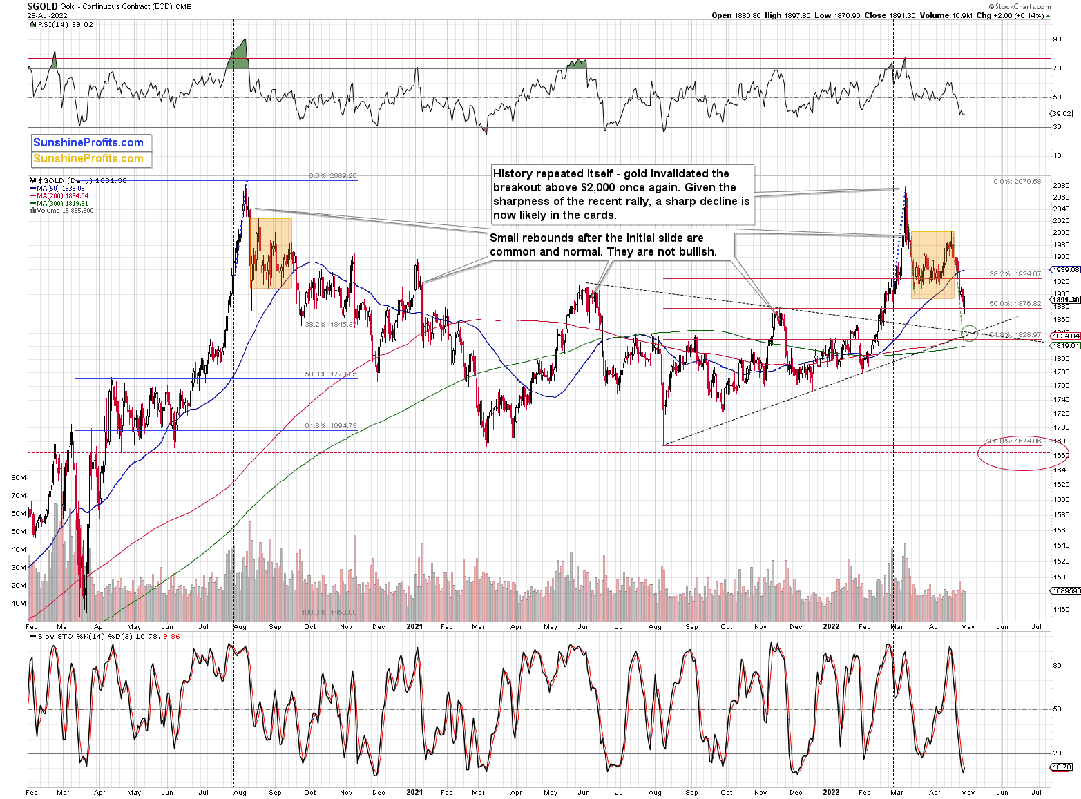
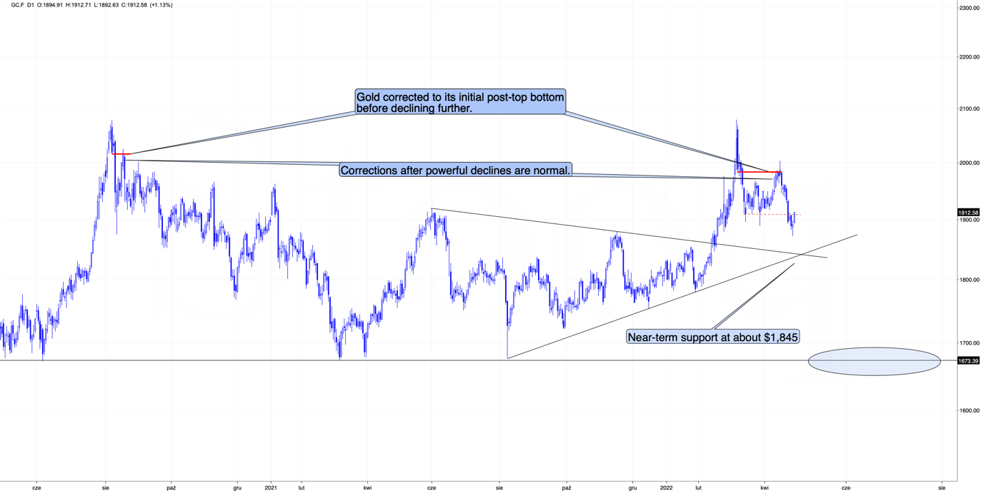
Gold reversed and ended yesterday’s session in the green, and it’s moving higher in today’s pre-market trading.
It found some support at its Nov. 2021 high, and it could be the case that it corrects in a regular manner, or it could be the case that what we see is actually a small breather, and a big correction starts once gold moves to its double support at the vertex of its triangle pattern.
On the above chart, you can also see some of the overnight price changes. Today’s move higher is so far in tune with the previous counter-trend rallies that we saw during bigger declines, for example in early March 2021, on September 22, 2020, and in the second half of September 2021.
Consequently, yesterday’s reversal and today’s pre-market rally were not necessarily bullish – they are still natural parts of a bigger bearish pattern.
Moreover, let’s keep in mind that between 2020 and now, quite a lot happened, quite a lot of money was printed, and we saw a war breaking out in Europe. Yet, gold failed to rally to new highs.
In fact, it’s trading very close to its 2011 high, which tells you something about the strength of this market. It’s almost absent.
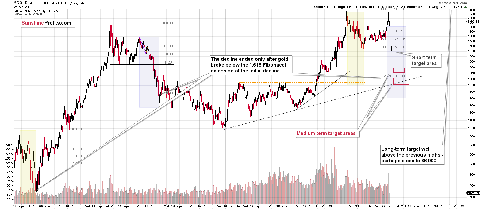
Truth be told, what we see in gold is quite in tune with what we saw after the 2011 top, and in particular, shortly after the 2012 top. The long-term gold price chart below provides details.
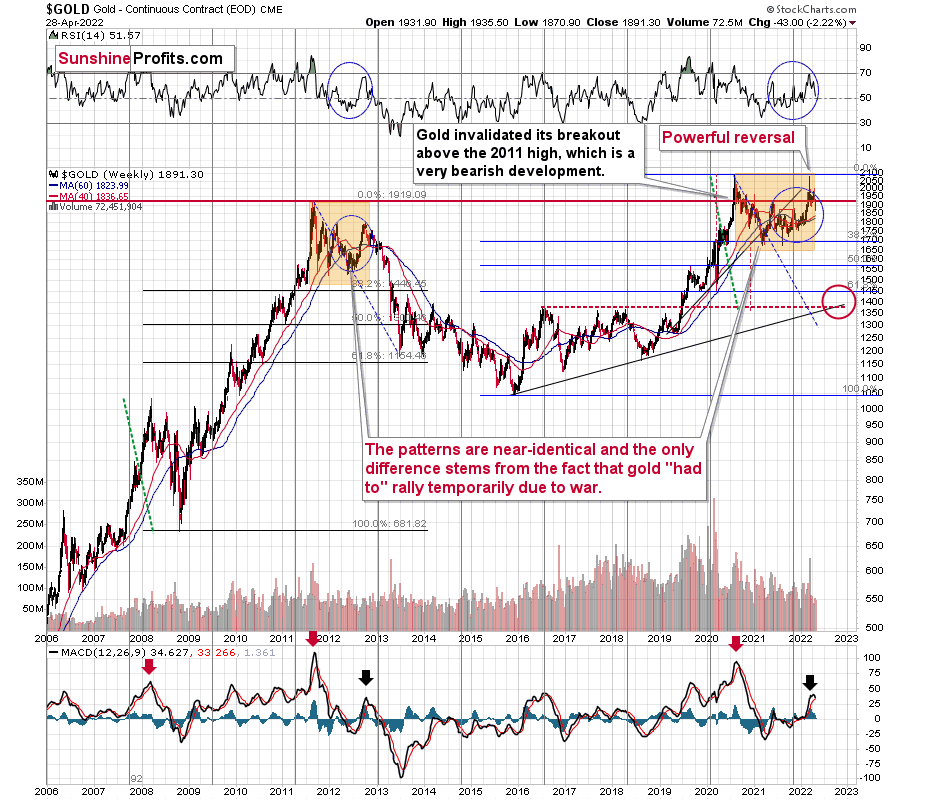
It seems that if it weren’t for the war in Europe, gold wouldn’t have been able to move above $2,000 and instead it would have topped close to its previous highs, which provided strong resistance.
The extraordinary thing about that is that that’s exactly what happened in 2012. Gold moved higher but only until it reached its previous highs, which happened in the second half of 2012.
This time the RSI was a bit higher, but it was close to 70, just like what we saw in 2012.
The moves that we see in the long-term MACD indicator (lower part of the above chart) also confirm the analogy between now and 2012. The indicator is between 25 and 50, and it’s above its previous local top (early 2012 and mid-2021), and this local top formed after a profound decline from the ultimate top.
Yes, this time gold moved back to the previous high, but:
- This happened based on a geopolitical event (war in Europe) and geopolitically-driven rallies are generally unsustainable;
- When gold reached its previous highs, it also formed a profound weekly reversal, which formed on huge volume, and that’s very bearish.
So, the current outlook for gold is very bearish – the recent back and forth movement (the consolidation) appears analogous to the back-and-forth part of the decline that we saw right after the 2012 top. That was the beginning of a huge medium-term downswing.
Meanwhile, silver is declining too. Immediately after the Easter holiday, the white metal moved to approximately its previous high, which provided resistance, and then it declined. In other words, silver once again failed to rally above the 50% retracement based on the 2021 decline. Now it’s sliding.
The next strong support for silver is provided by its 2021 lows, a bit below the $22 level.
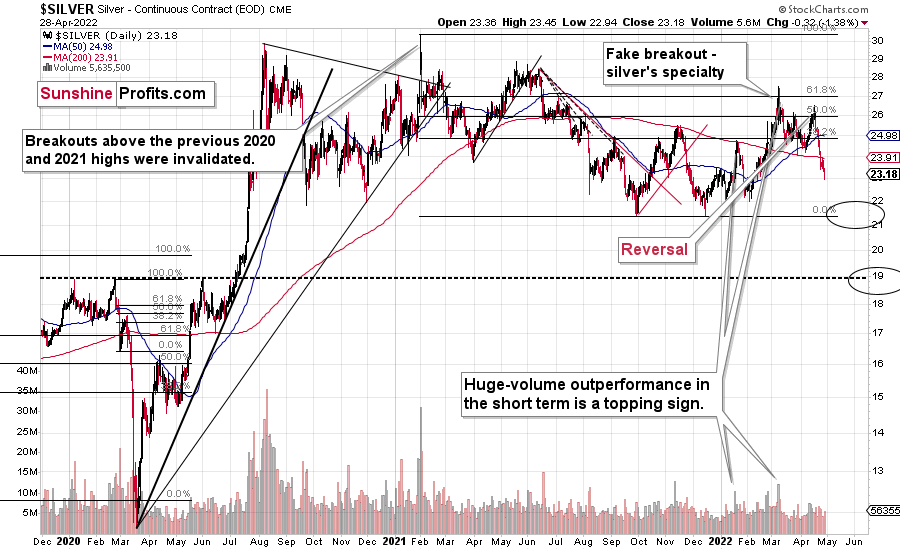
Let’s keep in mind that silver outperformed gold right at the end of the recent rally, which further validates the theory that the rally is already over – silver’s outperformance is what we tend to see in the final parts of a given rally.
Also, silver is known for its fake breakouts, so the fact that we just saw one isn’t really bullish (especially that it was already invalidated!). In fact, I wrote about that several days ago – it was possible that it would happen, and it did. It didn’t change the outlook – what we see is in near-perfect tune with what we saw in 2012 – that’s the back-and-forth decline in gold and silver and the consolidation in the mining stocks.
This is bearish, and it’s in tune with other indications that we have gotten previously from the price of the white metal.
First of all, when silver got really popular in early 2021, it still failed to hold the breakout above the previous highs. Back then, very few people wanted to listen to this, but I warned that this was the exact wrong moment to buy silver and that better buying opportunities were likely ahead. Well, it turns out that those buying at close to $30 have bought at close to a year+ top. As practically everyone interested had already gotten in, the price declined as there was nobody (of course, that’s just an oversimplification) else who wanted to buy, and the market needs to attract fresh buying power if the price is to rally.
Anyway, after that invalidation, silver never managed to get very close to the $30 level.
Sure, it will likely surpass it, and then the previous all-time high, and then move to three digits, but it doesn’t mean that it has to happen very soon, as well as that silver can’t slide profoundly before that happens.
In fact, gold is not the only precious metal that is repeating its 2012 performance right now, and you can see more details on silver’s long-term chart.
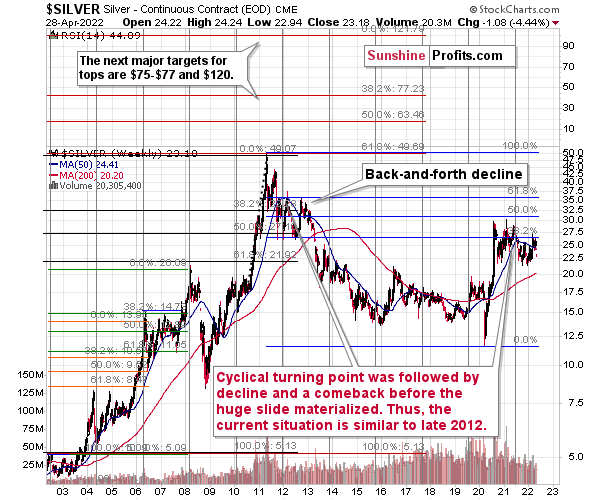
As you can see on the above chart, silver corrected about 50% of the previous downswing, and this correction ended at about $30, a long time ago. Ever since, silver has been declining, and even the outbreak of war in Europe didn’t make silver rally above that level.
On the above chart, you can see how silver first topped in 2011, then declined and formed another top at the cyclical turning point. Next, it declined once again – to the previous lows. After that, silver rallied (in 2012 and 2022), and it topped between its 50-week moving average (marked in blue) and the previous top. Now silver is declining in a back-and-forth manner (you can see it more clearly on the previous short-term silver chart).
Back in 2012, these were just the early days of a gargantuan decline, and the same appears likely to be the case this time. Interest rates are going up after all, and the Fed is determined to quench inflation.
Let’s not forget that rising interest rates are likely to negatively impact not just commodities, but practically all industries. This will likely cause silver’s price to decline profoundly, as silver’s industrial demand could be negatively impacted by lower economic growth (or a decline in economic activity).
Besides, please note that silver didn’t even manage to rally as much as copper (which tried to move to new highs recently) or most other commodities, thus being rather weak.
Consequently, it seems that silver will need to decline profoundly before it rallies (to new all-time highs) once again.
Having said that, let’s take a look at what happened in junior mining stocks.
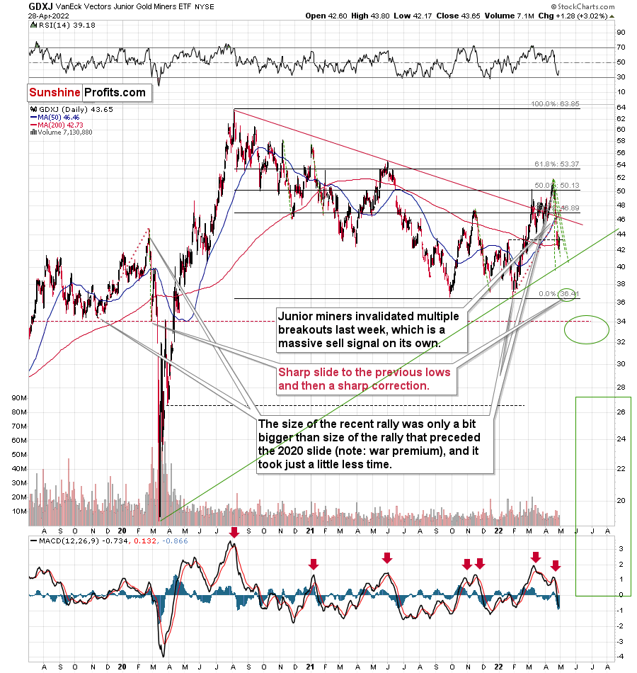
In short, they are now lower than they were 7 days ago, but they did move higher yesterday, just like gold did.
Based on the invalidation of the breakout above the declining red resistance line, it’s clear that the medium-term trend remains down.
However, based on the size of the previous very short-term declines, it seems that a brief rebound might be just around the corner.
The green, dashed lines represent the sharpest short-term declines that we saw in the GDXJ in the recent past. Only the final March 2020 slide was bigger. As you can see, the GDXJ is now quite close to the levels that imply this kind of excessiveness. You can also notice that the ~$37 target is visibly below those levels. This has two important implications:
- If the GDXJ drops to ~$37 without correcting first, it will be extremely oversold on a very short-term basis, making a very short-term rally very likely.
- There is a possibility that the GDXJ will correct before moving to ~$37, perhaps closer to the $40 level, where the rising, green support line is located.
When we zoom in, we see that the triangle-vertex-based reversal is just around the corner.
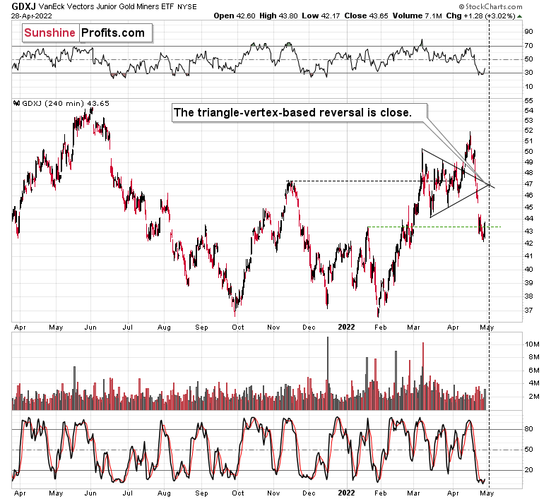
The vertex is at the beginning of May, on Tuesday (May 3) or Wednesday (May 4). Let’s not forget that Wednesday is the Fed’s interest rate decision day.
Consequently, it seems that we have about 3 sessions until the end of this short-term decline. When will the GDXJ go off during this time? Will it really be able to drop more than it did in the previous cases (green lines on the previous chart) and follow its 2020 analogy to the letter?
Alternatively, we could have 3 sessions until the decline resumes, and what we see right now is the breather. However, I already discussed that in the opening paragraphs of today’s analysis.
Also, let’s not forget about the forest while looking at individual trees. By that, I mean looking at how gold stocks perform relative to gold. That’s one of the major indications that the current situation is just like what we saw at the 2012 top.
I previously wrote the following:
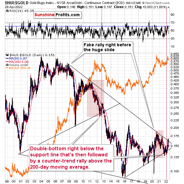
Gold stocks (GDX, GDXJ, and HUI Index) have recently been quite strong relative to gold. OK, but is this necessarily bullish? It might be, until one considers the fact that we saw the same thing at the 2012 top! This changes everything, and it does so, because the links between now and that top are almost everywhere: in gold, in silver, in gold stocks, and even in their ratios.
As it turns out, the gold stocks to gold ratio is behaving almost identically as it was behaving at the 2012 top in the precious metals sector.
In both cases, the ratio moved below the rising medium-term support line, then formed a double-bottom below the line, and invalidated the breakdown, which resulted in a counter-trend rally. The rally ended shortly after the ratio moved above its 200-day moving average (marked in red). That’s what happened recently. What happened next in 2012? The decline not only continued – it accelerated!
Consequently, the recent action in the ratio is not really bullish. In other words, the fact that gold stocks were recently (in the short run only) strong relative to gold doesn’t make the medium-term outlook for the precious metals sector bullish. However, it remains bearish.
Interestingly, the ratio itself moved to its declining resistance line (and it even moved slightly above it, but the move is too small to be viewed as reliable yet), indicating that the corrective upswing might already be over or almost over. We get the same indication from the RSI indicator. It’s not above 70, but in the case of most local tops, the RSI didn’t have to move above 70. It just moved to more or less the same levels – I marked it with a horizontal blue line.
The above is actually a confirmation of the analogy that is visible directly in all three key components of the precious metals sector: gold, silver, and mining stocks.
Indeed – the HUI to gold ratio moved lower recently, clearly invalidating the breakout above its declining resistance line – in line with my previous expectations. The implications are extremely bearish, as it appears that the 2012-2013 decline will now be repeated to a considerable extent.
I already discussed the ones in gold and silver, so let’s take a look at the analogy in the HUI Index – a proxy for gold stocks.
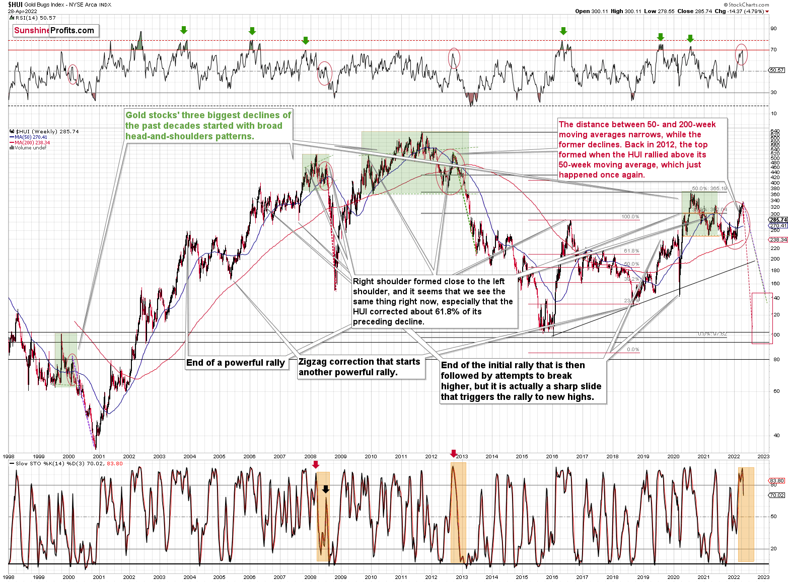
If you look at the areas marked with red circles (especially now, 2012/2013, and 2008), you’ll notice that they are very similar. These are the sizable short-term rallies that we saw after / in the final parts of the broad head-and-shoulders patterns.
The moves were quite sizable – the 2012 rally was even bigger than the current one, even though there was no war in Europe at that time.
Based on how broad the pattern is and the self-similarity present in gold, it seems that the analogy to what happened in 2012 is most important right now.
Looking at the moving averages, we see that the 50-week moving average (blue) and 200-week moving average (red) performed quite specifically in late 2012, and we see the same thing this year.
The distance between 50- and 200-week moving averages is currently narrowing, while the former is declining. Back in 2012, the top formed when the HUI rallied above its 50-week moving average, which just happened once again.
The RSI indicator (above the price chart), based on the HUI Index’s weekly chart, provides us with another confirmation of the analogy, and the same goes for the stochastic indicator (below the price chart). The former is just below the 70 level – exactly what we saw at the 2012 top, and the latter is above 90 – again, something that we saw at the 2012 top.
As history tends to rhyme, gold stocks are likely to slide, similarly to how they declined in 2012 and 2013.
Still, if the general stock market slides, and that appears likely for the following weeks and months, then we might have a decline that’s actually similar to what happened in 2008. Back then, gold stocks declined profoundly, and they have done so very quickly.
The dashed lines that start from the recent prices are copy-paste versions of the previous declines that started from the final medium-term tops. If the decline is as sharp and as big as what we saw in 2008, gold stocks would be likely to decline sharply, approximately to their 2016 low. If the decline is more moderate, then they could decline “only” to 120-150 or so. Either way, the implications are very, very, very bearish for the following weeks.
Also, we saw a fresh sell signal from the weekly stochastic indicator, which (unlike its 4-hour version) is quite efficient. This is a very bearish development for the medium term. After all, the last two times we saw this signal, were at the 2021 and 2020 tops.
Let’s take a brief look at the stock market indices.
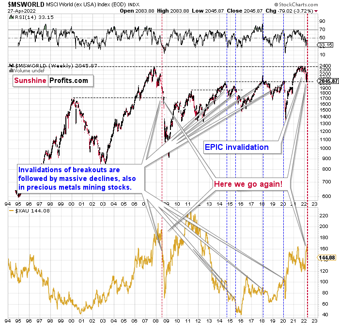
The technical picture in the case of world stocks remains extremely bearish, and my previous comments on it remain up-to-date:
World stocks have already begun their decline, and based on the analogy to the previous invalidations, the decline is not likely to be small. In fact, it’s likely to be huge.
For context, I explained the ominous implications on Nov. 30. I wrote:
Something truly epic is happening in this chart. Namely, world stocks tried to soar above their 2007 high, they managed to do so, and… they failed to hold the ground. Despite a few attempts, the breakout was invalidated. Given that there were a few attempts and that the previous high was the all-time high (so it doesn’t get more important than that), the invalidation is a truly critical development.
It's a strong sell signal for the medium- and quite possibly for the long term.
From our – precious metals investors’ and traders’ – point of view, this is also of critical importance. All previous important invalidations of breakouts in world stocks were followed by massive declines in mining stocks (represented by the XAU Index).
Two of the four similar cases are the 2008 and 2020 declines. In all cases, the declines were huge, and the only reason why they appear “moderate” in the lower part of the above chart is that it has a “linear” and not a “logarithmic” scale. You probably still remember how significant and painful (if you were long, that is) the decline at the beginning of 2020 was.
Now, all those invalidations triggered big declines in the mining stocks, and we have “the mother of all stock market invalidations” at the moment, so the implications are not only bearish, but extremely bearish.
What does it mean? It means that it is time to get out of the short position in mining stocks to get a few extra dollars from immediate-term trades that might be risky. The possibility that the omicron variant of COVID makes vaccination ineffective is too great to be ignored as well. If that happens, we might see 2020 all over again – to some extent. In this environment, it looks like the situation is “pennies to the upside and dollars to the downside” for mining stocks. Perhaps tens of dollars to the downside… You have been warned.
World stocks have declined to their previous highs, and when something similar happened in 2008, it meant that both stocks and gold and silver mining stocks (lower part of the chart) were about to slide much further. In particular, that’s when the corrective upswing in the miners ended and the huge slide started. The implications for mining stocks are extremely bearish.
Let’s take a look at the U.S. stock market.
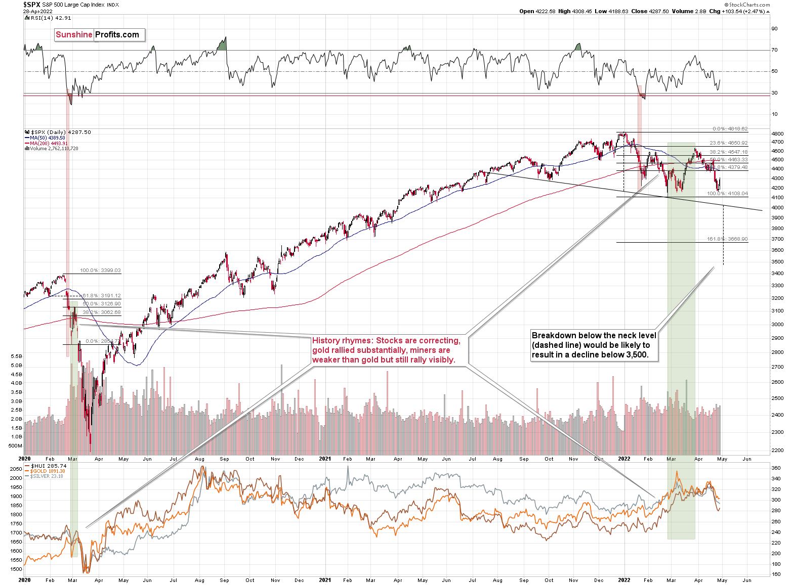
After declining visibly this month, the general stock market moved back up yesterday. In other words, stocks are either taking a breather or they are bottoming close to their previous lows. Which is more likely? Based on the financial tightness and how it’s growing all over the world, the “breather scenario” is more likely. The analogy to 2020 provides another confirmation.
If what we’re seeing right now is similar to what we saw then – and it is, but only to some extent – then we could see a move below the initial lows followed by a corrective upswing – a verification of the breakdown. That’s what we saw on March 9 and 10, 2020.
Since the current decline is taking much more time, what took just one day then (the March 9, 2020 decline), could take several days now. For instance… 3-4 days. This would be in perfect tune with what I wrote above about the triangle-vertex-based reversals and about the Fed’s decision.
So, will stocks and PMs (including miners) decline for the next 3 days or so and then launch a corrective upswing? That’s quite possible, but it’s not imminent. It would work differently, and I’ll keep my eyes open for clues and indications, and I’ll report to you if another scenario becomes more probable.
Provided that stocks continue to decline, silver and miners are likely to fall even more than gold.
Let’s keep in mind what happened in the previous cases when stocks declined profoundly – in early 2020 and in 2008. Miners and silver declined in a truly epic manner, and yes, the same is likely to take place in the following months, as markets wake up to the reality, which is that the USD Index and real interest rates are going up.
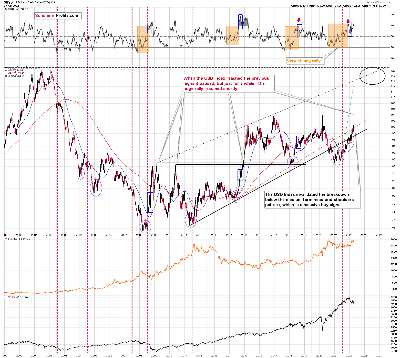
Speaking of the USD Index, after invalidating the breakout below the multi-year head-and-shoulders pattern, the USDX was poised to soar, just like I’ve been expecting it to do for more than a year, and that’s exactly what it did.
The RSI is currently above 70, but since the USDX is in a medium-term rally and is already after a visible correction, it can rally further. Please note that we saw the same thing in 2008 and 2014. I marked the corrections with blue rectangles.
The next strong resistance is at the previous highs – close to the 104 level.
I previously wrote the following about this target:
It doesn’t mean that the USD Index’s rally is likely to end there. It’s not – but the USDX could take a breather when it reaches 104. Then, after many investors think that the top has been reached as the USDX corrects, the big rally is likely to continue.
The important detail here is that the consolidation close to the 104 level doesn’t have to be really significant (perhaps 1-2 index points of back-and-forth movement?) and it definitely doesn’t have to take long. The interest rates are going higher, and investors appear to have just woken up to this reality – it will take some time before everyone digests what’s going on. Before the late-reality-adopters join in, the USD Index could be trading much, much higher.
Back in 2014, when the USD Index approached its previous highs (close to 89), it consolidated so quickly that it’s almost not visible on the above chart – it took just a bit more than a week (from Dec. 8, 2014 – 89.56 to Dec. 16, 2014 – 87.83).
We could see something similar this time – and as the USD Index corrects for about a week, the same thing could take place in other markets as well: stocks and PMs. If junior miners were after a very sharp slide at that time, they would be likely to correct sharply as well.
I would like to add one important detail. Back in 2014, the USD Index didn’t correct after reaching its previous high. It corrected after moving above it. The higher of the highs was the March 2009 high, at 89.11.
The higher of the recent highs is at 103.96 right now, so if the analogy to 2014 is to remain intact, the USD Index could now top at close to 104.5 or even 105.
Consequently, there’s still room for an additional sizable short-term rally, even though the USD Index is trading at 103.12 at the moment of writing these words. Perhaps the USD Index will try to move above 104 within the next 3-4 sessions, triggering final short-term (!) declines in the stock market and in the precious metals market.
In today’s pre-market trading, the USD Index is at about 103, which doesn’t add any clarity to what I already wrote today. We could see another upswing shortly with a top on Tuesday or Wednesday, but we might also see some back and forth movement (or another 0.5-1 index point correction) that is then followed by another huge wave up.
All in all, the technical picture for mining stocks is extremely bearish for the following months, even though we might see a short-term correction close to the beginning of May.
Do I plan to trade this correction? It depends on how likely it is and where the prices of gold, silver, and mining stocks are. If they are close to relatively strong support levels while gold and miners are at their reversal points, I might indeed temporarily get out of the short positions. Of course, I’ll keep you informed.
Overview of the Upcoming Part of the Decline
- It seems to me that the corrective upswing is now over or very close to being over , and that gold, silver, and mining stocks are now likely to continue their medium-term decline.
- It seems that the first (bigger) stop for gold will be close to its previous 2021 lows, slightly below $1,800 . Then it will likely correct a bit, but it’s unclear if I want to exit or reverse the current short position based on that – it depends on the number and the nature of the bullish indications that we get at that time.
- After the above-mentioned correction, we’re likely to see a powerful slide, perhaps close to the 2020 low ($1,450 - $1,500).
- If we see a situation where miners slide in a meaningful and volatile way while silver doesn’t (it just declines moderately), I plan to – once again – switch from short positions in miners to short positions in silver. At this time, it’s too early to say at what price levels this could take place, and if we get this kind of opportunity at all – perhaps with gold close to $1,600.
- I plan to exit all remaining short positions once gold shows substantial strength relative to the USD Index while the latter is still rallying. This may be the case with gold close to $1,350 - $1,400. I expect silver to fall the hardest in the final part of the move. This moment (when gold performs very strongly against the rallying USD and miners are strong relative to gold after its substantial decline) is likely to be the best entry point for long-term investments, in my view. This can also happen with gold close to $1,375, but at the moment it’s too early to say with certainty.
- As a confirmation for the above, I will use the (upcoming or perhaps we have already seen it?) top in the general stock market as the starting point for the three-month countdown. The reason is that after the 1929 top, gold miners declined for about three months after the general stock market started to slide. We also saw some confirmations of this theory based on the analogy to 2008. All in all, the precious metals sector is likely to bottom about three months after the general stock market tops.
- The above is based on the information available today, and it might change in the following days/weeks.
You will find my general overview of the outlook for gold on the chart below:
Please note that the above timing details are relatively broad and “for general overview only” – so that you know more or less what I think and how volatile I think the moves are likely to be – on an approximate basis. These time targets are not binding or clear enough for me to think that they should be used for purchasing options, warrants or similar instruments.
Summary
Summing up, despite the recent rally in gold, the outlook for junior mining stocks remains exactly as I described previously.
Investing and trading are difficult. If it was easy, most people would be making money – and they’re not. Right now, it’s most difficult to ignore the urge to trade along with the crowd that’s ignoring two critical factors:
- rising real interest rates,
- rising USD Index values.
Both of the aforementioned are the two most important fundamental drivers of the gold price. Since neither the USD Index nor real interest rates are likely to stop rising anytime soon (especially now that inflation has become highly political), the gold price is likely to fall sooner or later. Given the analogy to 2012 in gold, silver, and mining stocks, “sooner” is the more likely outcome.
It seems that our profits from short positions are going to become truly epic in the coming months.
Moreover, let’s keep in mind that we are not patient with this trade to just get out of it close to being even or with a reasonable (10%-30%) profit. Of course, I can’t promise anything, but this entire short trade is likely to end with gold below $1,500 and junior miners close to or below their 2020 lows. The upside potential for the inversely trading instruments is likely enormous. Yes, we might adjust the trade or exit it temporarily, only to get back to it shortly thereafter, but the overall potential remains gargantuan. It’s quite likely that none of those gains will be reaped by precious metals perma-bulls.
After the sell-off (that takes gold to about $1,350-$1,500), I expect the precious metals to rally significantly. The final part of the decline might take as little as 1-5 weeks, so it's important to stay alert to any changes.
As always, we'll keep you – our subscribers – informed.
To summarize:
Short-term outlook for the precious metals sector (our opinion on the next 1-6 weeks): Bearish
Medium-term outlook for the precious metals sector (our opinion for the period between 1.5 and 6 months): Bearish initially, then possibly Bullish
Long-term outlook for the precious metals sector (our opinion for the period between 6 and 24 months from now): Bullish
Very long-term outlook for the precious metals sector (our opinion for the period starting 2 years from now): Bullish
As a reminder, Gold Investment Updates are posted approximately once per week. We are usually posting them on Monday, but we can’t promise that it will be the case each week.
Our preferred ways to invest in and to trade gold along with the reasoning can be found in the how to buy gold section. Additionally, our preferred ETFs and ETNs can be found in our Gold & Silver ETF Ranking.
Moreover, Gold & Silver Trading Alerts are posted before or on each trading day (we usually post them before the opening bell, but we don’t promise doing that each day). If there’s anything urgent, we will send you an additional small alert before posting the main one.
Thank you.
Przemyslaw Radomski, CFA
Founder, Editor-in-chief

