

Ladies and Gentlemen, we have a tie! The current expansion already goes on 120 months, the same as the economic boom lasting from March 1991 to March 2001. However, in the previous edition of the Market Overview, we suggested that the current expansion still has room to run. After all, the ongoing boom is very long, but this is because it is very weak. If the US economy is to replay the robust recovery of the 1990s in terms of GDP growth and not merely in terms of number of months, it could grow for additional couple of years.
Now, let's compare our growth leaders in a more detailed way and draw valuable conclusions for the economic outlook and the gold market.
Chart 1: Current vs. economic expansion in the 1990s compared in terms of real GDP (green bars), industrial production (blue bars) and real incomes (red bars)
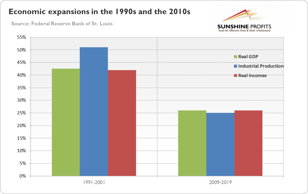
As one can see in the chart above, although both expansions lasted the same time - 120 months - the boom of the 1990s was much stronger. Indeed, the real GDP and real income soared more than 40 percent, while industrial production surged more than 50 percent over the decade. In contrast, all three measures increased just about 25 percent in the 2010s. It means that the current expansion is much weaker. In part this is completely understandable, because as time goes by and economy advances it is harder for maintaining a fast growth rate. But still the sluggish growth is disturbing, with the exception of the gold bulls who should welcome it.
Let's move on now to discuss the US labor market. As one can see in the chart below, the unemployment rate at 3.6 percent is currently below the bottom of the 1990s (3.8 percent), although the current expansion started which higher unemployment rate than the former expansion.
Chart 2: US unemployment rate (red line, left axis, U3, in %) and the labor force participation rate (blue line, right axis, in %) from March 1991 to April 2019.
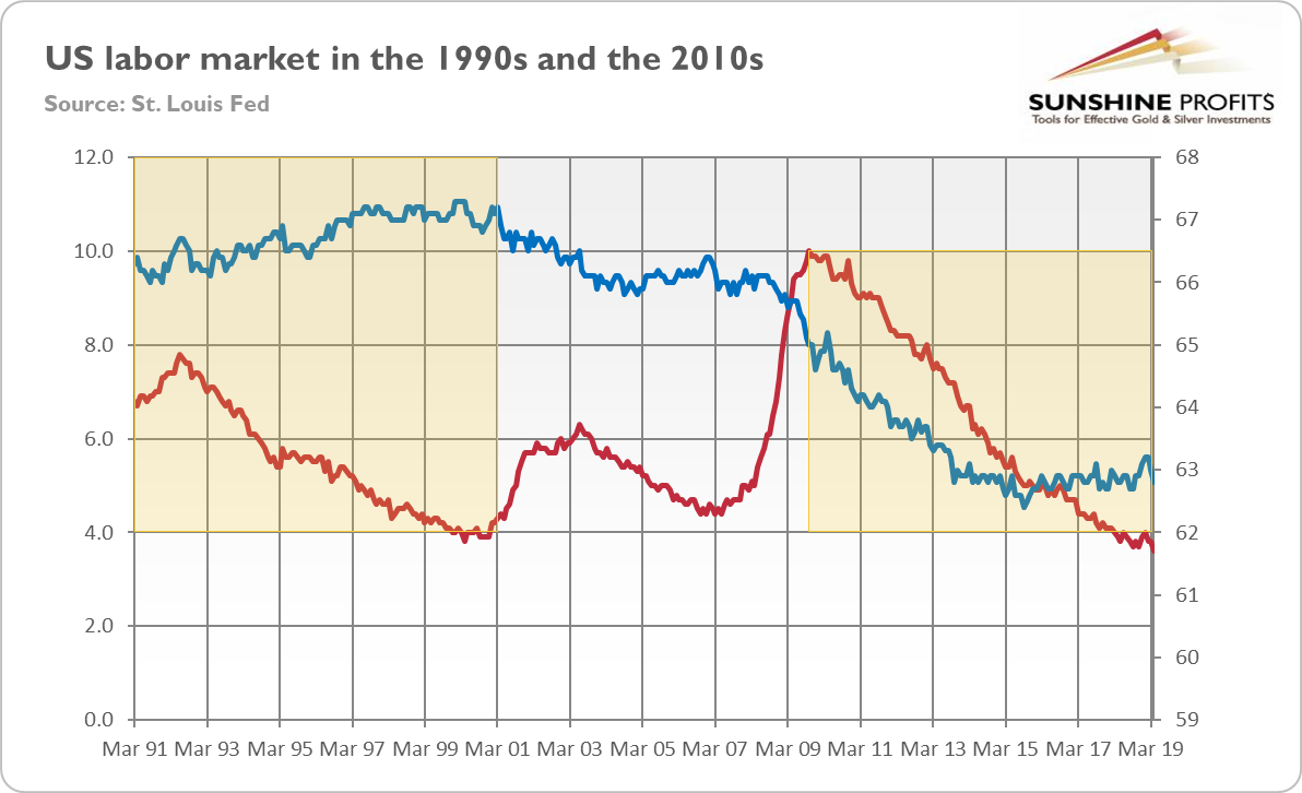
However, the labor participation rate is significantly lower than in the 1990s, as it declined from about 67 to 63 percent. It indicates that the labor market slack is greater than the unemployment rate suggests. Indeed, the U-6 unemployment rate, which includes also all marginally attached workers plus total employed part time for economic reasons, is at 7.3 percent, a 0.5 percentage point above the through of 6.8 percent in October 2000. If indeed the labor market slack is greater than commonly believed (which would explain the sluggish wage growth), than economic expansion can last longer without overheating.
Let's compare now inflation in the 1990s and currently. As the chart below shows, inflation rate has been recently significantly lower - more than 1 percentage point, on average - than in the 1990s. Then, there was a disinflation, so gold struggled. Since the Great Recession, inflation rate stabilized, but at stubbornly low level.
Chart 3: US CPI rate (as % from a year ago) from March 1991 to April 2019.
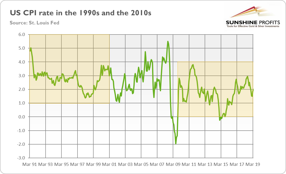
Gold, which is considered to be inflation hedge, does not like low inflation. Although low inflation also means more dovish Fed and lower nominal interest rates, it allows the Goldilocks economy to last.
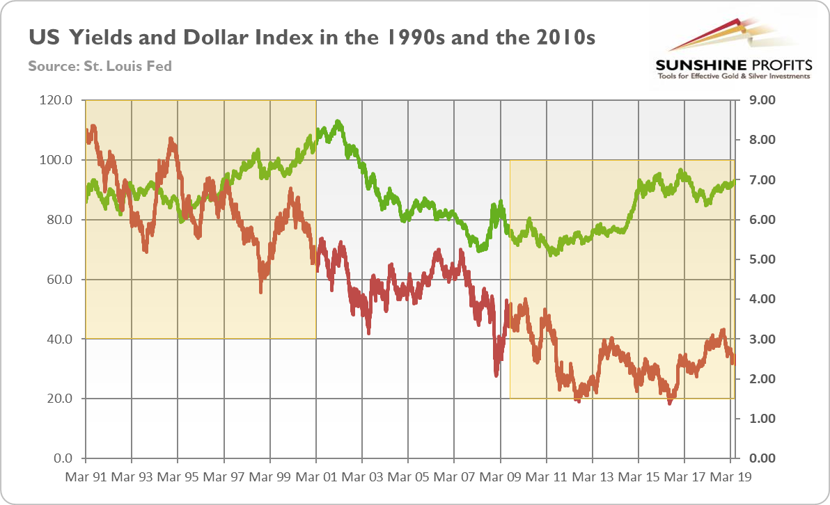
Indeed, the chart below shows that the nominal long-term yields are significantly lower than in the 1990s. Similarly, the greenback's strength is weaker than 20-30 years ago. It suggests that the current expansion has still more room to run.
Chart 4: US Long-Term Nominal Interest Rates (red line, right axis, 10-year Treasury yields, in %) and the Trade Weighted US Dollar Index (green line, left axis, against major currencies) from March 1991 to April 2019.
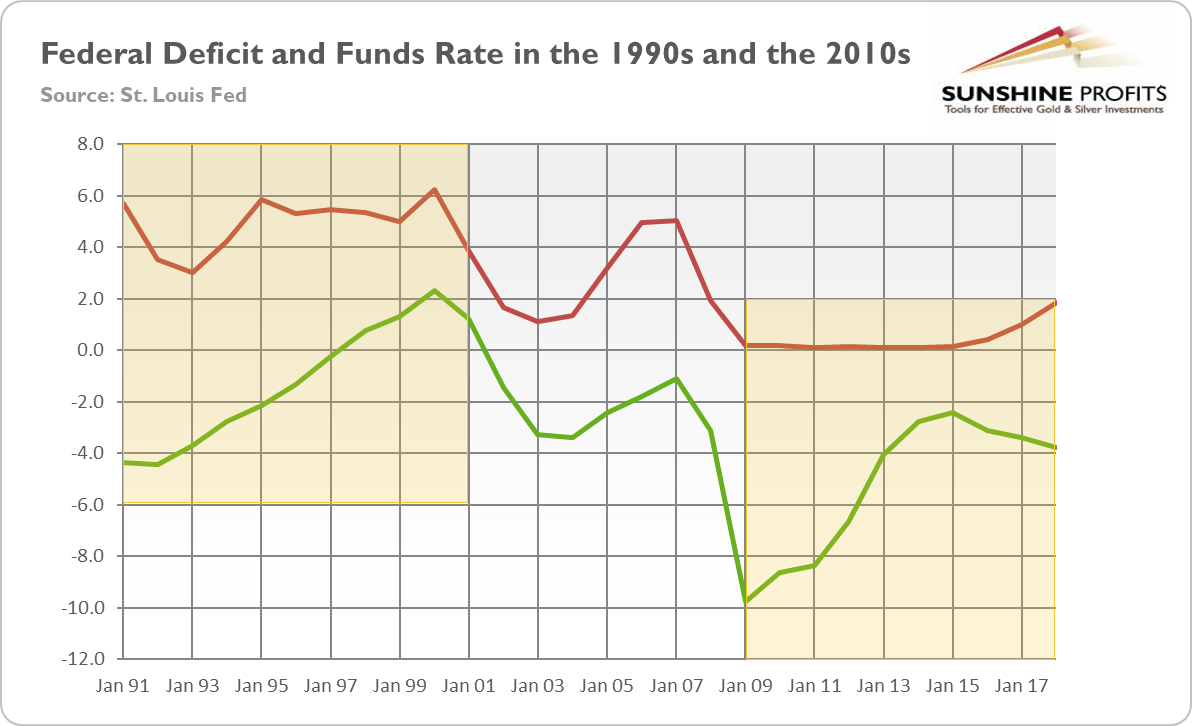
What does it all mean for the gold market? Well, the macroeconomic environment in the 1990s was much worse for the yellow metal. The GDP was rising quickly, while the labor market was strengthening. Inflation was decreasing, while the US dollar was strong and appreciating in the second half of the 1990s. The US fiscal policy was tightening, while the Fed was lifting the federal funds rate in 1993-95, as one can see in the chart below.
Chart 5: Federal deficit (green line, as % of GDP) and the effective federal funds rate (red line, annual average, %) from 1991 to 2018.
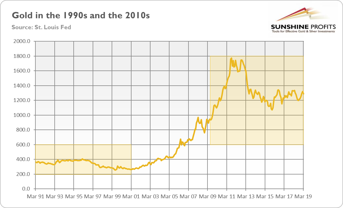
Not surprisingly, gold struggled in the 1990s. The current expansion - despite the fact that gold has been recently in a sideways trend - has been much better for the price of the yellow metal, as the chart below clearly shows.
Chart 6: Gold prices (London P.M. Fix, in $) from March 1991 to April 2019.
But what does it imply for the future? First of all, our analysis confirm the view that - given the level of slack in the labor market and low inflation - the current expansion could continue for a while. This is bad news for gold. But we have also good news. In the 1990s, the economy grew strongly despite Clinton's fiscal surpluses and Fed's tightening in 1993-95. Now, the economy expands slowly even when supported by the Trump's fiscal deficits and the Fed's ZIRP that lasted until December 2015. It doesn't bode well for the future for the economy in the long term, but it fills the gold bulls with optimism. After all, gold remains in the sideways trend not without a reason: the Goldilocks economy feels good right now, but it might jump out the window later.
If you enjoyed the above analysis and would you like to know more about the economics and gold, we invite you to read the June Market Overview report. If you’re interested in the detailed price analysis and price projections with targets, we invite you to sign up for our Gold & Silver Trading Alerts. If you’re not ready to subscribe yet and are not on our gold mailing list yet, we urge you to sign up. It’s free and if you don’t like it, you can easily unsubscribe. Sign up today!
Thank you.
Arkadiusz Sieron
Sunshine Profits' Gold News Monitor and Market Overview Editor
