
This essay is based on the Premium Update posted on August 27th, 2010. Visit our archives for more gold articles.
With gold rising almost each day now, those of you, who are holding the yellow metal as a long-term investment are most likely happy with this situation. However, Speculators, and particularly Contrarians are probably waiting for the slightest sign of weakness in order to profit in the following correction. As we all know, no market - virtually regardless of the fundamental situation - moves in a given direction in a straight line.
Periodical corrections need to happen from time to time, as Investors and Speculators are ultimately human beings driven not only by cold logic, but also by emotions, out of which greed and fear as the most important ones when speaking about investments. When greed takes over everyone buys like there's no tomorrow and the price spikes high. The problem is that there comes a point when everyone that were interested in a given asset are already in the market, and since that is the case, there is nobody left on the sidelines, who can enter the market. In other words, there is no fresh capital flowing into the market that would ensure further rallies.
When there's nobody left to buy, the rally runs out of steam, stops, and then starts to decline. Speculators rush to secure their profits and they sell their positions, thus making the price move even lover. This is exactly how local tops are formed, and these need to take place from time to time. Consequently, one needs to deal with this situation, and the best way of doing that is to take advantage of it by using a part of one's capital to bet on these short-term price moves.
This brings us to the main point of this essay - how do we know that a local top or bottom is likely to be formed? There are myriads of ways to do so, but not every one of them can be successfully applied. While it is not the point of this essay to explain each and every detail of selecting the best tools, we would still like to suggest using tools and techniques that specialize in a particular market (or sector, or even particular stock) first, and only if you don't have this "tailored" guidance, resort to popular analysis. Also, please remember to check if a particular tool had indeed worked in the past.
Speaking of dedicated tools, please take a look at the chart (courtesy of http://stockcharts.com) below - this is something that we've featured in last week's Premium Update.
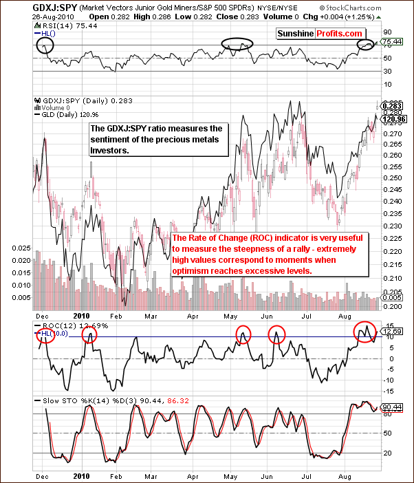
As we have thoroughly explained last week, the GDXJ:SPY ratio aims to isolate the emotionality regarding gold. The GDXJ represents juniors (it is an ETF that serves as a proxy for the sector). Normally the smaller companies outperform larger mining companies (seniors) when stocks are rallying and underperform when stocks are declining. The emotions of individual investors greatly influence this market.
When the ratio is excessive, emotionality is in great supply and - if preceded by a strong rally - a local top is likely to be seen. In last week's update we stated the following:
(...) we've been striving to find a way to measure this phenomenon and we believe we found two ways to do it.
First is taking a look at the values of size of a rally in the ratio and comparing it to the size of the rally in gold. If it's bigger it means that the public is very excited about this rally, which suggests that a correction will be seen quite soon. We've seen that in early January, May, and June 2010.
If the rally is smaller than that of gold, it means that people are still waiting on the sidelines and are ready to jump back into the market once they get more convinced about the rally. When would that take place? When price rises. Consequently, when the prices rise, people will buy more and the prices will rise even further. Yes - it is against the buy low, sell high rule, but this is how things play out most of the time. We've seen that since February to early April 2010 - and the rally continued afterwards.
The second way to analyze the ratio is to apply indicators, and two of them appear particularly useful. The less useful of these two is the well-known RSI indicator - please take a look at the areas marked with black ellipses. The signal is visible only for most important tops (it is visible today though...).
The most useful indicator here appears to be the Rate of Change indicator. As it name suggests, it measures the rate of change, which is another way of calling the "steepness of the rally" or its "rapidness". High values here indicate optimism. As visible on the chart above, excessive emotions result in an ROC greater than 10, which likely results in a top forming soon thereafter. The ROC indicator was just at the 15 level - actually an all-time high for this indicator when applied to this particular ratio, which serves as a strong indication that the local top is in or is very close to being in.
As you may see on the chart above, we see further indications of the excessive optimism among precious metals Investors, which is bearish in the short term. One of the questions that we've received this week was about the fact that most of the time this ratio appears undervalued. Generally, that is true, and the long-term implications are bullish for the metals. Most of the time we don't have the excessive optimism like we have today and the trend remains up, as new Investors "discover" precious metals and enter the market.
Before summarizing this week's essay, there is one more thing that we would like to comment on - namely, the Hindenburg Omen (it name comes from the Hindenburg catastrophe of May 6, 1937, when the German Zeppelin Hindenburg was destroyed). We have received several questions about this phenomenon from our Subscribers, which asked about our view on the fact that it had flashed two signals in the past two weeks.
Without going into details - the Hindenburg Omen is a rather sophisticated technical indicator that is based on the number of stocks that formed a new 52-week high, and that reached a 52-week low. Other exchanges can be used, but typically NYSE is. The idea is that when there is a large number of both new lows and new highs on the market, then there is a high probability of a big downswing in the market in the following several weeks/months.
Therefore, the Hindeburg Omen is a long-term indicator, not necessarily a short-term one, which doesn't say much about the short term (a quick rally could be seen in stocks soon). What it does say is that a bigger decline could follow in the next several weeks.
Generally, we see the logic behind this indicator as credible. We have not tested/verified the accuracy of this indicator ourselves, but the reason is that... We've come to the similar conclusion on our own regarding the precious metals market about 1.5 years ago. In fact, the sample version of our Premium Charts section includes its description - it's about our SP Gold Stock Extreme Indicator (note that it flashed a signal when the HUI Index topped in May 2010). Once you go to the page above, you will notice that while our road toward similar calculations was different, but the main point is very similar. Quoting from that page: "if the abovementioned assumptions are mostly true, then the ratio between 'top' PM stocks and the rest should behave specifically around bottoms and tops". While we don't provide the exact formula, the idea is that we also (like it is the case in the Hindeburg Omen calculations) take a look at the divergence between leading and lagging stocks - when it's huge, the indicator flashes an "extreme" signal.
This is just a speculation at this point - but, if the Hindenburg Omen is correct, and the general stock market moves significantly lower and the recent correlation between stocks and gold remains negative, it could translate into the next massive upswing in the whole precious metals market. Again, we don't see that happening immediately, and we will certainly get back to this once we have more information in the following weeks. It might be a good idea to join us for this ride, and enjoy the full version of our precious-metals-focused analysis right away.
To make sure that you are notified once the new features are implemented, and get immediate access to my free thoughts on the market, including information not available publicly, I urge you to sign up for my free e-mail list. Sign up today and you'll also get free, 7-day access to the Premium Sections on my website, including valuable tools and charts dedicated to serious PM Investors and Speculators. It's free and you may unsubscribe at any time.
Thank you for reading. Have a great weekend and profitable week!
P. Radomski
--
Do you remember that hilarious scene from Shrek sequel where one of the main movie characters with Eddie Murphy's voice kept asking Are we there... yet?. We are all asking the same question today - have PMs reached their local tops? Are they ready to move back to their July lows? Or perhaps - are they ready to skyrocket? This week's Premium Update contains 18 detailed charts to help us reveal the answer and make sure we are not sitting right below jet nozzles on Cape Canaveral's launchpad.
Last week we've decided not to include our Correlation Matrix in the update, however, this is not the case today, as it provides us with two important values. This week, we are not only using our recently developed technique which benefits from ratio analysis, but in fact we've went one step further and we feature additional new type of chart - providing additional insight, but allowing to analyze the current situation from a slightly different angle.
Additionally, in today's report we also discuss the uneven link between Gold and Bonds.
We encourage you to Subscribe to the Premium Service today and read the full version of this week's analysis right away.
