
This essay is based on the Premium Update posted November 13th, 2009. Visit our archives for more gold & silver articles.
In the last several days I received many letters in which Readers commentend on my analysis of the seasonality on the silver market (thank you), so I decided to provide you with more detailed analysis of silver in the following essay.
I will begin with a reply to the letter from a Subscriber, who mentions that the 30 year seasonal charts for silver show Nov to be a higher drop, but the 15 year seasonal chart shows the trend to have changed. The question is which seasonal tendencies one should rely on. As always, it is useful to put things into proper context before making any calls.
In my opinion, the 15-year cycles are long enough to eliminate the "noise", so I think this signal is more important than the 30-year one. Why did this tendency change? Because fundamentals for silver have changed. There is much less silver now than it was 15 years ago, and the demand side of the market is changing - the use in photography declines but the increase in demand for industrial applications increases. Consequently, the amount of silver scrap entering the market is smaller (very large part of it comes from the use in photography), and so on. Therefore, very long-term cycles for silver could be misleading.
When speaking of silver and gold in the same essay, it is very useful to provide a chart with the ratio that sayh how much silver is worth in terms of gold or vice-versa. (charts courtesy of http://stockcharts.com).
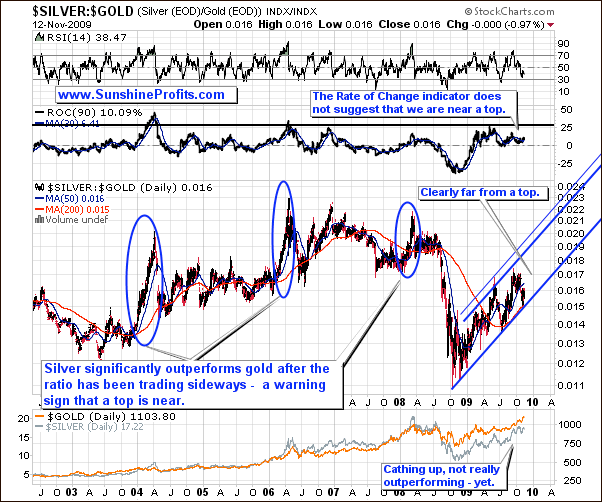
The silver-to-gold ratio has been declining in the past few weeks, which confirms that this is not a final stage of this rally, and that it has much more to go. Naturally, this does not mean that there will not be any corrections along the way, but from the long-term point of view, this rally is still in its early stage. Let's take a look at the short-term silver chart for more details.

Silver appeared to be forming a bearish head-and-shoulders formation, but the action in volume did not confirm this, and the formation was finally invalidated yesterday, when silver moved higher on strong volume. I've discussed this matter last week when I commented on the situation in the PM stocks:
In the "head" part of the pattern the price fails to go much above the previous top, and in the final, third attempt to move to new highs, it doesn't even go above the previous (head) one. Since there is not enough buying power, the volume is lower with each upswing preceding a top (shoulder/head/shoulder). Without the confirmation in form of declining volume the whole logic behind this formation is flawed. That is precisely the case with the precious metals stocks, as this week's rally took place on a huge volume - definitely higher than the one on which the "head" was formed. Therefore, I don't think that the head-and-shoulders pattern should concern you at this point.
The same can be said about silver this week. Moreover, the indicators (RSI, Stochastic) that mostly corresponded to the topping areas in the silver market are now relatively far from their overbought levels. Therefore, taking into account the fact that silver rose on a high volume yesterday, and that it is still several cents below its resistance level, it seems that it may move a little higher before topping temporarily.
There is one more chart that I would like to feature this week, before summarizing the USD Index.
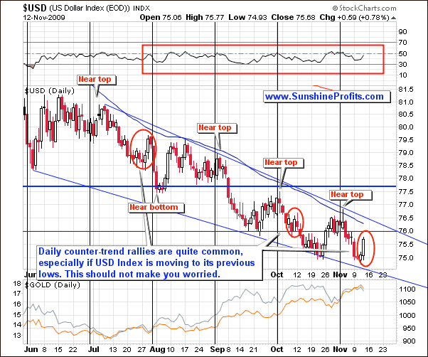
The USD Index moved higher recently causing a mini-pullback in the precious metals, but should this make you concerned? Not really. The trend remains down, and a single-day or two-day rallies are quite common even during particular downswings, so yesterdays action doesn't really change anything as far as the bearish/bullish implications are concerned. Again the trend remains down, which is positive for PMs.
Moreover, please compare yesterday's performance of the USD Index to the performance of gold and silver although the daily rally was rather big, the reaction in metals was limited, which is another sign of the strength in this market.
Summing up, despite its recent weakness relative to gold, silver by itself doesn't seem to be topped yet. We may get a day or two of lower prices, but it may need to reach the resicance level marked on the above chart before correcting significantly. Still, since it is highly correlated with gold, the yellow metal might ignite a decline in silver if it corrects itself. On the other hand, if we get a confirmation that the rally in gold is becoming a parabolic one, silver may also rally very high in a relatively short time-frame. I've sent a Market Alert to my Subscribers on that matter yesterday - you might want to check it out and also read the latest Premium Update with the indepth analysis of the long-term silver chart (analysis of this chart alone is 2 times bigger than this whole essay) it has implications reaching much beyond the silver market.
To make sure that you are notified once the new features (like the newly introduced Free Charts section) are implemented, and get immediate access to my free thoughts on the market, including information not available publicly, I urge you to sign up for my free e-mail list. Sign up today and you'll also get free, 7-day access to the Premium Sections on my website, including valuable tools and charts dedicated to serious PM Investors and Speculators. It's free and you may unsubscribe at any time.
Thank you for reading. Have a great and profitable week!
P. Radomski
--
This is the biggest Premium Update that I've created so far. I received a substantial amount of positive feedback (thank you) after covering the long-term price/time targets for this rally in gold last week, and I was asked to conduct a similar analysis for the silver market. Consequently, this update includes the long-term silver chart and its detailed analysis, with the implications reaching much beyond the silver market itself. The analysis of this chart alone is about 2x bigger than the analysis included in the whole free essay.
Other things covered in this update include the analysis of gold (both short, and long-term perspective), USD, the general stock market, precious metals stocks, and their relative performance to other equities, silver-to-gold ratio, gold miners bullish percent index, and the recent signals from two of our exclusive indicators. Additionally, I comment on the Nov 23rd options expiration, and the likelihood/timing of a disconnection between PM stocks and the general stock market.
