
This essay is based on the Premium Update posted November 27th, 2009. Visit our archives for more gold & silver articles.
Gold has been moving parabolically in the past few months, but is this the final run up? I seriously doubt it, because the levels that I expect gold and silver to achieve (mentioned in the previous Premium Update) at the end of this bull market are still very far from where we are today.
Please keep in mind that the road to the top will not be a straight line, and since that is the case it makes sense to take advantage of the inevitable corrections. Let's examine the chart (charts courtesy of http://stockcharts.com) of gold to check if we are close to another buying or selling opportunity.
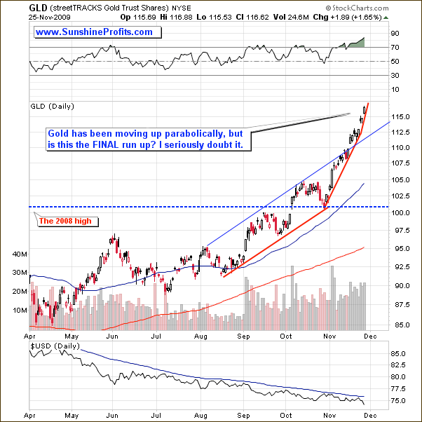
Once gold broke out of its resistance line, gold moved much higher (as suggested several days ago) and it has been moving in a parabolic fashion. This type of upswing is usually very profitable for those holding the metal, but confusing for those trying to time the top. This time is no different, as the short-term chart doesn't provide us with any reliable targets for this rally. On the other hand, gold appears to be the only part of the precious metals market that is really thriving. Such divergences are not really encouraging for anyone long gold, or any other precious metal, especially given their poor performance today.
Let's turn to silver and check what is the white metal likely to do next.
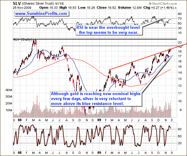
Silver has more than doubled in the past year, and it is finally very close to its 2008 highs. However, before these resistance levels are reached, silver much first breach through the rising red line that has proven a strong resistance many times in the past. The Stochastic Indicator is currently above the 80 level, which means that a top might be put here (it is a necessary condition, but not a sufficient one). The RSI is not in the "extreme overbought" territory yet, but it is now very close to it.
While it may make sense for super-aggressive speculators to wait for the final signal, from my point of view it seems that most Investors would be better off closing their positions a little earlier. The sell-offs in silver are usually very volatile and take the metal much lower in a short time frame, so unless you can monitor market almost constantly and sell during the early part of the plunge (its hard to get your orders filled during that time). Let's take a look at silver from the short-term perspective to see if we it confirms the above analysis.
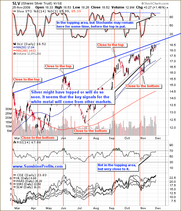
The short-term silver chart confirms the points raised above. Apart from the fact that silver is now near the short-term resistance level (thin blue line), the additional signal comes from the volume. Please note that the volume was much higher on Tuesday, when silver declined than it was the case on Wednesday, when it moved higher.
The seasonal tendencies provide us with additional details. This time silver is already closer to the "top" area than it is to the "bottom" one. While the next vertical red line (topping area) is "scheduled" on second week of December, it is certainly possible for silver to top sooner. Please keep in mind that these tendencies have been very reliable, but often on a "top/bottom in near" instead of exact dates. So, if the top is to be reached soon (or it has just been reached), it would not invalidate the whole pattern.
Since this week's Premium Update includes the analysis of gold in currencies other than the U.S. Dollar, I believe it is a good idea to feature also similar analysis of the silver market.
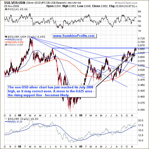
The chart of silver is not that bullish, as it is the case with gold, because there is no visible rising trend channel. The late-February - today consolidation may be seen as flag pattern, which means that the rally following the breakout is likely to take the ratio much higher - taking into account the size of the October-2008 - February-2009 move preceding the consolidation. In this case the target would be above 0.75 - above the 2008 high. Naturally, I expect this to mean higher silver prices in USD as well.
However, this is not likely to take place immediately, as the ratio has just reached one of the important resistance levels - the July 2008 high. This means that we may need to see silver trade sideways before a more significant move. Today's price action seems to confirm this.
Moving on to the situation on the Dollar market, let's begin with the long-term chart.
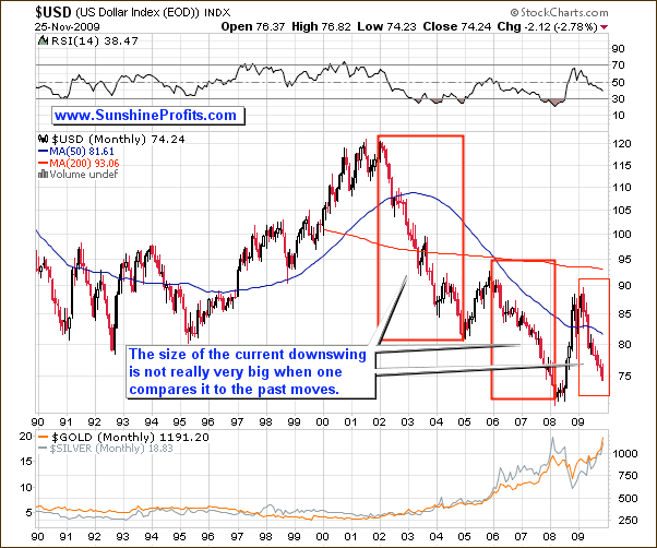
There are no big changes on the above chart since I featured it in the November 3rd Free Commentary, but I decided to provide you with this chart anyway, as it helps to put things into proper perspective. The size of the current downswing is still not very big when one analyzes it from the very-long-term perspective, so I don't think that a rally from here is imminent. Consequently, gold and silver may rally in the long run despite their short- or even medium-term weakness.
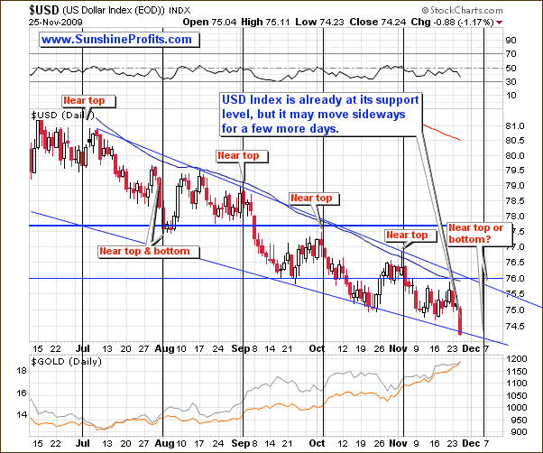
The situation on the USD Index evolves in a predictable fashion. So far, the USD Index has been trading lower between two blue borders of the trading channel. The seasonal tendencies suggest that the U.S. Dollar is likely to put a top (more likely) or a bottom in the first half of December. This could mark the end of the correction in the precious metals, or at least the end of the first part of the correction. I will let you know, once we get more information.
Summing up, the bull market in the precious metals - including the silver market -is healthy, but it seems that the most probable scenario is the short term is a consolidation. The analysis of the cyclical tendencies in silver and the USD Index suggests that the first half of the December will include an important extreme for these markets. I will leave additional details for my Subscribers. I encourage you to join us today - this week's Premium Update includes detailed analysis of 19 charts, and as a Subscriber you will have access to all previously posted updates (including today's Market Alert!) with long-term price projections - not to mention Premium Charts, and Tools.
To make sure that you are notified once the new features (like the newly introduced Free Charts section) are implemented, and get immediate access to my free thoughts on the market, including information not available publicly, I urge you to sign up for my free e-mail list. Sign up today and you'll also get free, 7-day access to the Premium Sections on my website, including valuable tools and charts dedicated to serious PM Investors and Speculators. It's free and you may unsubscribe at any time.
Thank you for reading. Have a happy Thanksgiving holiday weekend and a profitable week!
P. Radomski
--
This week's Premium Update is the biggest one that I've ever created in terms of charts - 19. Apart from covering the current situation on the precious metals market, I analyze the performance of gold in various currencies: Euro, Yen, British Pound, Canadian Dollar, and Australian Dollar. Other things that I've analyzed this week include: gold from long- and short-term perspective, platinum, long- and short-term view on the USD Index, our unique correlation matrix, precious metals stocks and the general stock market. The latter is supplemented by the analysis of the financial sector (Broker/Dealer Index), which provides additional insight.
