
This essay is based on the Premium Update posted on April 19th 2009.Visit our archives for more gold & silver articles.
In my previous essays, I have often mentioned the silver market indirectly - through gold, as both metals are highly correlated. This week, however, I will focus directly on the white metal; and present my views on its technical situation.
The abovementioned correlation may become weaker once we advance to the third stage of the bull market. The third stage is characterized by the wide-spread participation of the (emotional) public and by the massive parabolic upswing in virtually every asset in the sector. Silver is much smaller market and when more investors wake up to the fact that there's more to the precious metals sector than just gold and that diversification is a "a good thing to do", silver price will soar.
There is also a specific psychological phenomenon that I believe will make silver outperform gold. If you ask someone which stock (the same sector, fundamental situation, etc.) has a better chance to go up 10x in value: A priced at $0.1 or B priced at $100, they will almost always reply: A. Naturally this is an illusion from a fundamental point of view, as the nominal price shouldn't have anything to do with stock's appreciation. But - thanks to this psychological phenomenon - the nominal price does matter. Since silver's nominal price is much lower than the price of gold, silver will appear more appealing to the average investor.
This has happened in the past - please note that silver's catch-up materialized mostly in the last phase of the bull market (1970-1980).
Naturally, there is much more to the silver market than just the two aforementioned features, but I have mentioned some of them in the past (read here and here), so there is no need to go through the fundamentals of this market once again here. Instead, I would like to focus on where we are in the silver market today, and what may be waiting just around the corner.
I will begin with the very-long-term silver chart (charts courtesy of stockcharts.com).
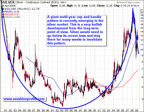
On a multi-year level, silver looks very bullish. Decent symmetry and the enormous size of the "cup" are really impressive. This pattern does not tell us whether or not silver has reached the ultimate low yet. It does not tell us, whether or not we will trade sideways for months. However, it does tell us that when this formation is complete, the following move should really be substantial.
Of course, this pattern could be invalidated, but silver would need to truly plunge (below $7 or so) and stay there for many weeks, to make this chart look bearish. I view this as very unlikely. Besides - for the secular bull market to turn into a secular bear market there must be a change in the fundamental situation on a particular market; even a powerful technical pattern is not enough to do it. The main implication that this chart has for long-term investors is that no matter how low we will go temporarily, silver will most likely bounce with a vengeance. This means that if you don't have to sell your silver in the next several months/years, then it does not matter much for you, how low silver will go temporarily. You can therefore just sit back and relax, or (even better) use a part of your capital for speculation (diversifying strategies) to make money along the way.
For more timing details we will need to zoom in.
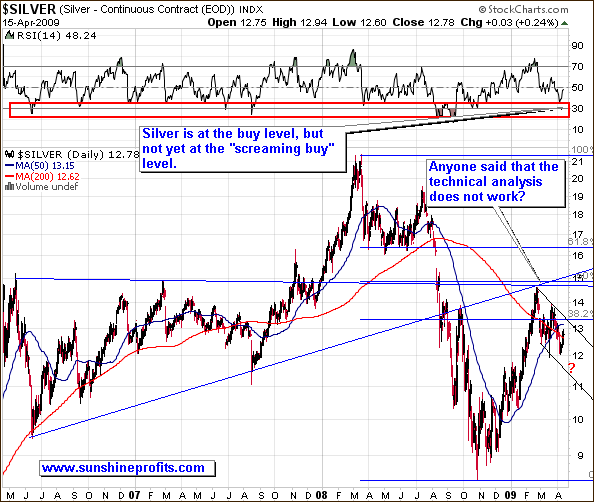
The above chart features the previous 3 years of silver prices. We had a dramatic plunge from above $19 level to below $9, after silver corrected 50% of the preceding downswing. Since this bounce has been rapid, a breather is needed before silver can climb higher. It's nothing to worry about - after a quick 60%+ move a pullback is to be expected. This is where we are today. It seems that this correction's end is near, but this chart alone is not detailed enough to make any specific calls.
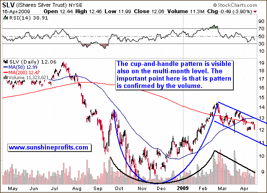
This chart gives us more detailed information. By using the SLV ETF fund as a proxy for silver, we are able to analyze the volume and see that the multi-month cup-and-handle pattern (yes, once again) is emerging. In fact, it is not only clearly visible, but it is also confirmed by the volume. On the first (multi-year) chart I was unable to analyze volume, since the SLV ETF has been introduced in 2006.
The important point is that the volume is decreasing in the "handle" part of the pattern i.e. in recent weeks. This signals that silver is not beginning a new downleg here, but is rather taking a pause, as price falls rather due to the lack of interest, than because of the fact that investors are desperate to close their positions. The declining volume can be interpreted in the following way - investors are on average waiting for a better moment to add to their positions, but are rather not exiting their positions in a rapid manner. This is exactly what I would expect to happen during a "breather". Again, the cup-and-handle pattern does not tell us exactly how low we will get on a temporary basis, but it does tell us that after the handle is completed and we will see a breakout, the following move should be substantial.
Moving on to the gold market, please take a look at the chart below
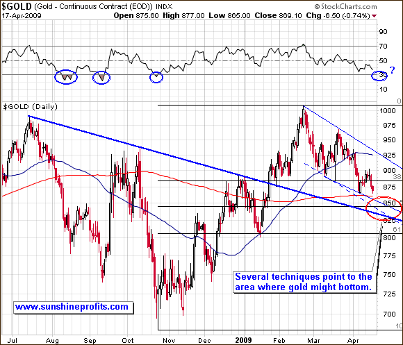
Like I mentioned in my previous Premium Update, we don't have one, single support level that is very likely to stop this decline. Instead we have many smaller signals that point to similar (not precisely, though) price/time points. Since we cannot get from market anything more that it gives us, we must proceed with making the most from what we do get.
Since support and resistance lines are often parallel to each other (thus building a trend channel), we can also draw an additional (dashed) line based on the above resistance line. Another thing is that we have the 50% Fibonacci retracement level just below $850 - as I mentioned previously, prices often correct half of the preceding move before resuming their main direction. Last, but definitely not the least, support level is the thick trend line which has been verified only very briefly (on an intraday basis) in January. This support level is created by drawing it through 3 important tops, and these tops are at least 2 months away from each other. This is what makes this line an important support level. Taking all of the above into account, we conclude that there is no single super-strong support level that would surely stop this decline. Instead, we have an area, which is likely to contain the bottom. More specific remarks are reserved for Premium Service Subscribers.
Summing up, we currently have very bullish chart patterns in silver and it seems that we are close to the bottom in gold as well. Long-term investors may consider adding to their positions, while speculators might want to wait for additional signals before entering new long positions.
Of course the market might prove me wrong, as nobody can be right 100% of the time. To make sure that you know my thoughts (including information not mentioned here) on the market as soon as I post them, I suggest signing up for my free mailing list. Sign up today and you'll also get 24 hours of access to the Premium Sections on my website (including tools and charts dedicated to PM investors and speculators). It's free and you may easily unregister anytime.
P. Radomski
--
This week's Premium Update main focus is on the current market situation and on timing the coming bottom. Additionally, I took a more detailed look on the silver market.
