
tools spotlight

-
If the S&P 500 Plunges, the Gold Market May Follow
August 22, 2022, 7:40 AMIt was a sea of red across the financial markets on Aug. 19, as gold declined by 0.47%, silver by 2.03%, the GDX ETF by 2.17% and the GDXJ ETF by 3.06%. Moreover, the S&P 500 sank by 1.29% and the NASDAQ Composite by 2.01%. In contrast, the USD Index rallied by 0.64% and U.S. Treasury yields also rose sharply. As a result, the price action continues to unfold as expected (profits on our short position have just increased once again), and the trends should continue in the weeks ahead.
Stocks in the Spotlight
While last week proved that gold, silver, and mining stocks don't need the S&P 500's help to move lower, a sharp drawdown of the latter could intensify the drawdowns of the former. Thus, with bonds and commodities suffering recently, the S&P 500 should be next in line.
To explain, dovish comments by Fed Chairman Jerome Powell on Jul. 27 helped loosen financial conditions and uplift risk assets. In the process, the USD Index, real yields, and high yield credit spreads all retreated. However, with the damage reversing in recent days, financial conditions have re-tightened, and the developments spell trouble for the S&P 500.
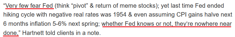
To that point, Michael Hartnett, Chief Market Strategist at Bank of America, told clients on Aug. 19 that we're in the midst of a "cyclical bear" market, and the "ultimate lows" are on the horizon. He wrote:
“[With] inflation on course to be 5%-6% next spring, quantitative tightening is likely to be stepped up significantly in coming months, which would be negative for credit spreads & equity multiples.”
Furthermore, with the crowd confusing Fed officials' poor communication skills for a dovish pivot, Hartnett shares our view that investors are ignoring the Fed at their own peril.
Please see below:
 Source: Investing.com
For context, I warned about this phenomenon on May 20. With investors following the post-GFC script, they’re more worried about missing a dovish pivot than suffering the consequences of ignoring fundamental reality. However, with their misguided faith in the central bank likely to be their undoing, market participants’ belief that the Fed can control the economic cycle should result in plenty of pain over the medium term. I wrote:
While some claim that sentiment is extremely bearish on Wall Street, the reality is that no one fears the Fed (…).
With the consensus still fighting the hawkish realities that I warned about since 2021, the VIX is behaving as you might expect. I mean, why panic when the Fed is all bark and no bite? Therefore, everyone can relax because the Fed will turn dovish, inflation will rage, and in some alternative reality, this outcome is bullish for risk assets.
However, I’ve warned on numerous occasions that a dovish pivot would have dire long-term consequences for the U.S. economy. As such, Fed officials (should) know this, and a small short-term recession is much more attractive than a long-term hyperinflationary collapse. Yet, investors still assume that the latter option is more likely because the Fed can’t withstand falling stock prices.
However, with recency bias clouding investors’ judgment, they don’t realize that 1970s/1980s-like inflation is a completely different animal.
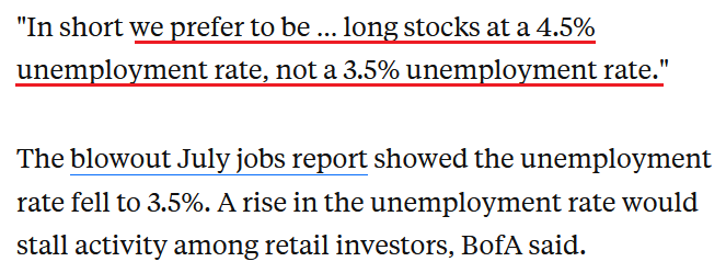
Furthermore, Hartnett noted the importance of the U.S. unemployment rate. Remember, bear markets don’t end with the U.S. unemployment rate at a ~50-year low; they begin with the metric at a ~50-year low. Thus, Hartnett realizes that the bottom in stocks likely awaits us.
Please see below:
 Source: Markets Insider
 For context, I explained the relationship on Aug. 17. I wrote:
The U.S. unemployment rate hit a new 2022 low of 3.5% in July. However, the metric always bottoms before a recession.
Please see below:
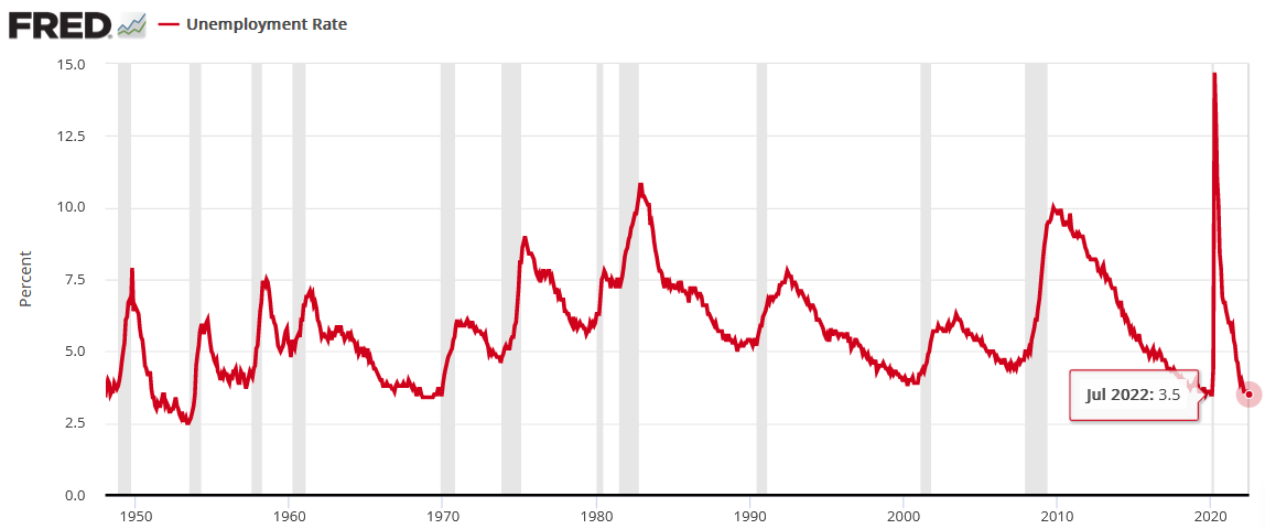
To explain, notice how the U.S. unemployment rate always troughs and then steadily rises before a recession hits? Thus, with the metric heading south in July, the bearish turn still awaits us (…).
All 11 instances of abnormally low U.S. unemployment rates since 1950 were bearish, not bullish. Furthermore, six readings occurred before/alongside profound S&P 500 bear markets, while five readings resulted in the S&P 500 giving back all of its prior gains. As a result, even if the latter occurs, the S&P 500 ended June at ~3.785, which implies more than 12% downside from the Aug. 16 close if the optimistic scenario unfolds.
However, with asset prices still in bubble territory and unanchored inflation forcing the Fed to tighten monetary policy at a torrent pace (rate hikes + QT), a soft landing is highly unlikely. Moreover, with the 1970s and 1980s highlighting the destruction that unfolds when inflation reaches unanchored levels, the bulls have a laundry list of excuses that only hold if ‘this time is different.’
Thus, while investors still have complete faith in the Fed, fundamental realities should shake their confidence over the medium term. Moreover, with their current expectations in la-la land, a realization leaves plenty of room for re-ratings of the PMs and the S&P 500.
Please see below:
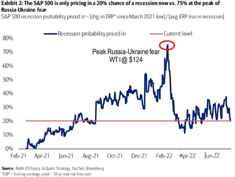
To explain, the blue line above tracks the recession odds priced into the S&P 500. For context, Bank of America forecasts the metric by dividing the change in the equity risk premium (ERP) since March 2021 by the average change in the ERP during historical recessions. If you analyze the high in early 2022, peak fear had investors pricing in a 75% chance of recession. Yet now, the metric stands at 20%.
However, uninformed investors don't realize that the Fed hasn't curbed unanchored inflation without triggering a recession since 1954. Therefore, history implies that the recession odds are 100%. As such, with sentiment likely to shift when investors lose faith in the Fed, asset prices should suffer mightily as they re-price to reflect their fundamental values.
Continuing the theme, I've warned repeatedly that the Fed needs higher real interest rates to curb inflation. Moreover, Powell understands this, and he made the point for me during his June FOMC press conference.
Please see below:
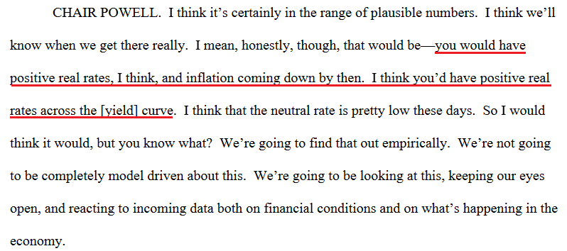 Source: U.S. Fed
Thus, with a higher U.S. 10-Year real yield extremely harmful to the PMs and the S&P 500’s fundamental values, further upside should weigh heavily on their medium-term prices.
Please see below:
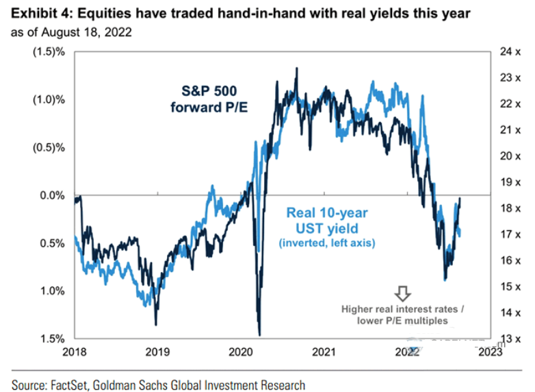
To explain, the dark blue line above tracks the S&P 500’s forward price-to-earnings (P/E) ratio, while the light blue line above tracks the inverted (down means up) U.S. 10-Year real yield. If you analyze the relationship, you can see that a higher U.S. 10-Year real yield compresses the S&P 500’s forward P/E.
Likewise, while it’s hard to see on the right side of the chart, the light blue line has moved lower once again as the U.S. 10-Year real yield recouped roughly 40% of its recent decline. In contrast, the S&P 500’s forward P/E has barely budged and is at 17.9x as of the Aug. 19 close. Therefore, a decline to the 17x implied by the U.S. 10-Year real yield would result in an immediate S&P 500 downside of 5%.
However, this would only erase the short-term imbalance. Please remember that the U.S. 10-Year real yield surpassed 1.1% in 2018, which is much higher than the current reading of 0.43%. Moreover, the U.S. had much lower inflation in 2018, so one could argue that the metric should exceed its 2018 highs given today’s fundamental environment.
Either way, a rally above 1% would put immense pressure on the S&P 500’s forward P/E. In addition, the projection only accounts for the ‘P’ (price) side of the equation. With the ‘E’ (earnings expectations) likely to decelerate sharply as the Fed hammers demand to cool inflation, the S&P 500’s forward P/E should have plenty of medium-term downside.
To that point, modern history reminds us that the S&P 500’s forward P/E falls well below 17.9x when recessions occur.
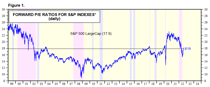 Source: Yardeni.com
 Rents and the CPI
While I’ve been warning for months that higher rents would put upward pressure on the Consumer Price Index (CPI), the Shelter CPI hit a new 2022 high in July. Moreover, with the ascent likely in the early innings, a realization should make the Fed’s job increasingly difficult in the months ahead. For context, the Shelter CPI accounts for more than 30% of the headline CPI’s movement.
Please see below:
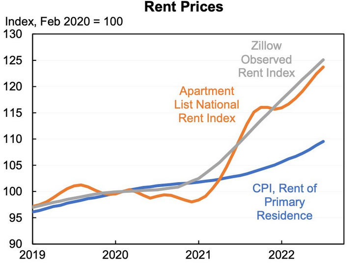 Source: Jason Furman
To explain, the gray and orange lines above track the index values of Zillow and Apartment List’s rental indices, while the blue line above tracks the rent component of the CPI. As you can see, the latter has materially underperformed the former.
However, please remember that the CPI component tracks the average of all rental prices, which includes new and renewed leases. In contrast, Zillow and Apartment List’s data only tracks new leases, where prices are rising much faster. Therefore, as new leases become a greater percentage of the rent CPI, they will put upward pressure on the Shelter CPI and the headline CPI.
As evidence, Apartment List researchers explained the discrepancy. They wrote:
“Our repeat-rent index tracks the change in rent prices for new leases, while the CPI measures the price change in market rents for all housing units. New leases always see the most significant price increases (or declines) in any given market, whereas renewal leases tend to see more modest rent adjustments.”
“And more importantly, only a small fraction of households sign a new or renewal lease in any given month, while the large majority of households see no change in their housing costs. As a result, housing price changes will always appear more muted when considering all households rather than only those who signed new leases.”
Thus, while the consensus assumes that inflation will subside and the Fed can cut rates in 2023, the realities on the ground suggest otherwise.
 Source: Apartment List
The Bottom Line
While gold, silver and mining stocks have materially underperformed the S&P 500 recently, they are still far from reflecting their fundamental values. Moreover, with the Fed still behind the inflation curve and quantitative tightening (QT) set to double to $95 billion per month next week, several assets should suffer sharp re-ratings as reality sets in over the medium term. As a result, the PMs' fundamental outlooks remain profoundly bearish for the next weeks or months. Consequently, it’s likely (no guarantees, of course) that the profits on our short position will increase much further in the not-too-distant future.
In conclusion, the PMs declined on Aug. 19, as the S&P 500 suffered a mild sell-off. Moreover, with real yields rising and the USD Index gunning for its 2022 highs, the S&P 500's bear market is likely far from over.
Thank you for reading our free analysis today. Please note that the above is just a small fraction of the full analyses that our subscribers enjoy on a regular basis. They include multiple premium details such as the interim targets for gold and mining stocks that could be reached in the next few weeks. We invite you to subscribe now and read today’s issue right away.
Sincerely,
Przemyslaw Radomski, CFA
Founder, Editor-in-chief -
The USDX Situation Suggests the Peak in Gold Is Already In
August 19, 2022, 9:38 AMIn today’s globalized economy and interconnected financial markets, no market can truly move on its own. The context matters a lot, and two of the most important “external” markets from the point of view of precious metals investors and traders are the stock market and the currency market. In the case of the latter, it’s the USD Index that provides the greatest insights. Consequently, in today’s analysis, I’ll cover those two areas. Let’s start with stocks.
Declining stock prices would only add fuel to the bearish fire (after all, gold stocks are… just stocks) and that’s exactly what’s likely to happen.
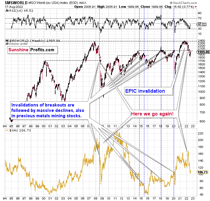
The technical picture in the case of world stocks remains extremely bearish, and my previous comments on it were just confirmed. Here’s what I’ve been writing about the above chart for quite a few weeks now:
World stocks have already begun their decline, and based on the analogy to the previous invalidations, the decline is not likely to be small. In fact, it’s likely to be huge.
For context, I explained the ominous implications on Nov. 30. I wrote:
Something truly epic is happening in this chart. Namely, world stocks tried to soar above their 2007 high, they managed to do so, and… failed to hold the ground. Despite a few attempts, the breakout was invalidated. Given that there were a few attempts and that the previous high was the all-time high (so it doesn’t get more important than that), the invalidation is a truly critical development.
It's a strong sell signal for the medium - and quite possibly for the long term.
From our – precious metals investors’ and traders’ – point of view, this is also of critical importance. All previous important invalidations of breakouts in world stocks were followed by massive declines in mining stocks (represented by the XAU Index).
Two of the four similar cases are the 2008 and 2020 declines. In all cases, the declines were huge, and the only reason why they appear “moderate” in the lower part of the above chart is that it has a “linear” and not a “logarithmic” scale. You probably still remember how significant and painful (if you were long, that is) the decline at the beginning of 2020 was.
All those invalidations triggered big declines in the mining stocks, and we have “the mother of all stock market invalidations” at the moment, so the implications are not only bearish, but extremely bearish.
World stocks have declined below their recent highs, and when something similar happened in 2008, it meant that both stocks and gold and silver mining stocks (lower part of the chart) were about to slide much further.
The medium-term implications for mining stocks are extremely bearish.
However, let’s get back to the short- and medium-term points of view.
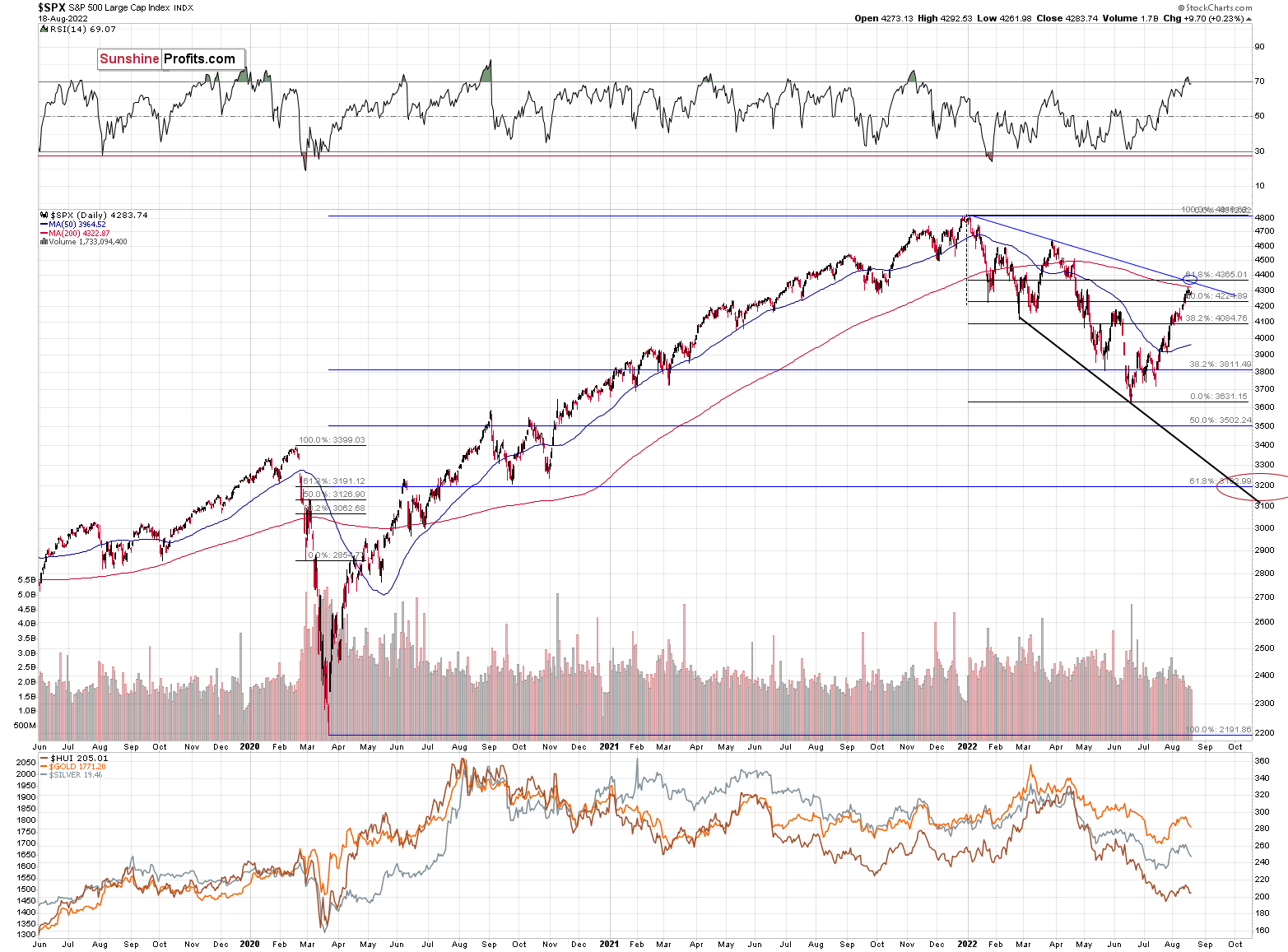
Stocks rallied recently, but since they corrected approximately to their previous June highs and March lows, the rally might be over, or very close to being over.
Especially since the RSI had just moved above 70, and then it declined back below this level. This indicated local tops many times in the past.
As I had indicated previously, interest rates are likely going up, which is a bearish factor for the stock market, and the recent rally was likely due to the market’s misinterpretation of the importance of Powell’s speech. The S&P 500 wanted to correct (based on emotional = technical reasons) and it used Powell’s seemingly dovish comments as an excuse to do so. However, what materially changed? Nothing. Interest rates are likely to be raised, as inflation remains the key political issue right now, and the markets are likely to respond by declining.
Most interestingly, though, such a decline would likely have a devastating effect on the prices of mining stocks (especially junior mining stocks) and silver. There might be some impact on gold, too.
The above would also be in tune with an extra rally in the USD Index. After all, less competitive exports are not that favorable for the U.S. economy.
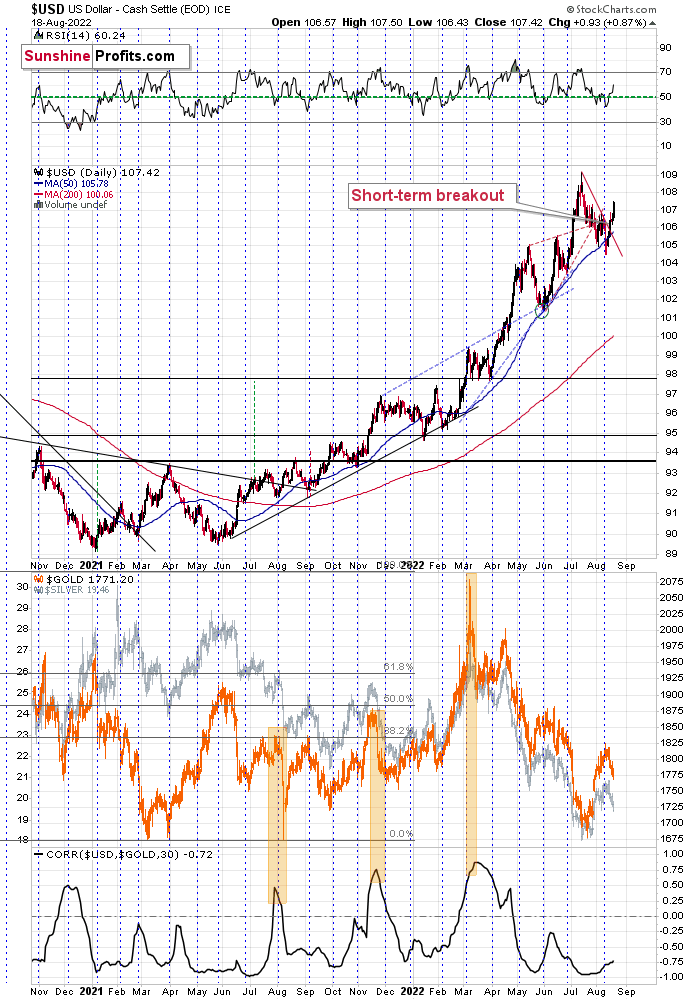
The USD Index had recently moved slightly below its 50-day moving average, and then it moved back above it.
After that, it started to rally, and it has continued to rally until this moment.
This move is in tune with what we saw at previous local bottoms. The RSI moved slightly below 50, which used to accompany bottoms in the previous months.
So, the scenario in which the USD Index has already bottomed seems quite likely.
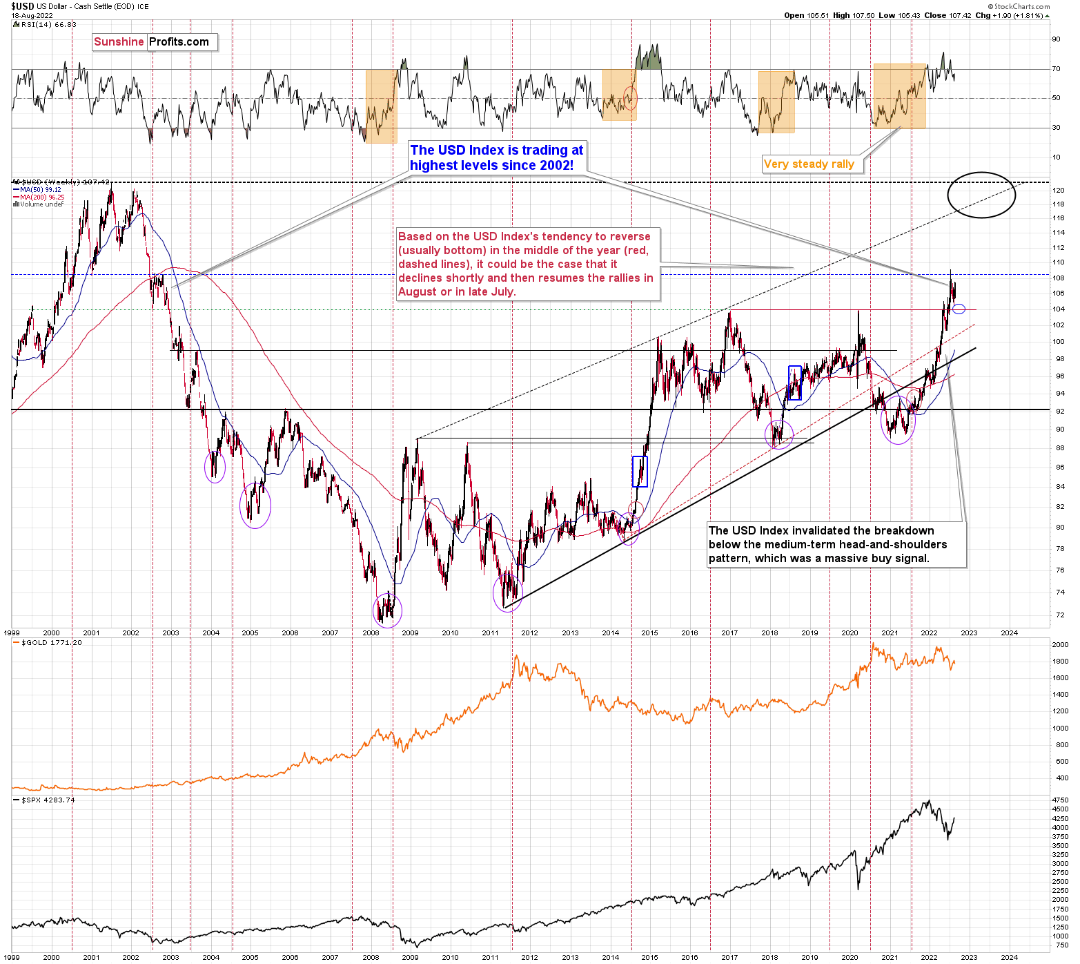
I previously wrote the following about the USD Index’s long-term chart:
There’s also the possibility that the USD Index keeps declining until it reaches the very strong support at about the 104 level – the previous long-term highs (…).
Last week, the USD Index bottomed at about 104.5, which was very close to the above-mentioned 104 level. If traders had expected the USD Index to bottom at this level, then some of them might have bought at higher levels in order to maximize their odds of catching the bottom, thus actually creating the bottom at higher levels.
Since the USD Index is already (at the moment of writing these words) back above the 107.5 level, it could be the case that the short-term bottom is already in. Actually, there were only five sessions this year when the USD Index closed at levels that were higher than the current USDX value.
This, in turn, likely means that the peak for precious metals is already in.
Thank you for reading our free analysis today. Please note that the above is just a small fraction of the full analyses that our subscribers enjoy on a regular basis. They include multiple premium details such as the interim targets for gold and mining stocks that could be reached in the next few weeks. We invite you to subscribe now and read today’s issue right away.
Sincerely,
Przemyslaw Radomski, CFA
Founder, Editor-in-chief -
Gold’s Foremost Lesson from 2013
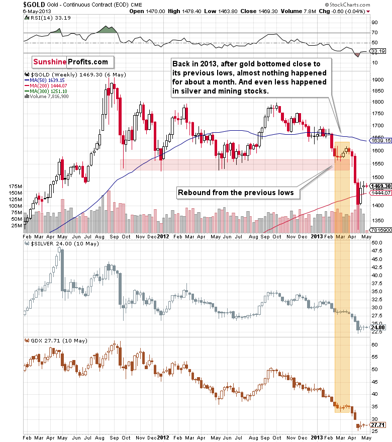
August 18, 2022, 9:34 AMHistory rhymes as people tend to react similarly to similar price changes. What we see in gold right now is a repeat of almost a decade ago.
Gold is performing just as in 2013, and it has extremely important implications for the following weeks.
Since I keep reading about how supposedly bullish the current corrective upswing is, I decided to dedicate today’s analysis to showing you just how perfectly normal it is for this correction to be taking place – in tune with what happened in 2013, not against it.
In other words, what we see now is not a bullish game-changer, but rather a very normal repeat of what we already saw almost a decade ago.
History rhymes as people tend to react similarly to similar price developments. The underlying reasons for price moves change, but the forces that really drive the buy and sell decisions remain the same. These forces are fear and greed. Thanks to this, even though the economic, financial, and geopolitical situations are different now than in 2013, the price moves continue to be very, very similar.
The exception is that back in 2013, there was no major military invasion in Europe, and we have one right now. This means that gold – being a safe-haven asset – was practically forced to rally. As gold rallied higher than it did in late 2012, it then declined in a more volatile manner. Since the decline was sharper this year than it was in 2012 and 2013, the correction that we see now is also more volatile. That’s perfectly normal. If you drop a ball from a higher level, it will also bounce higher before falling again, right? However, it will fall, nonetheless.
Let’s see what happened in 2013.
Now, let’s see what happened recently.
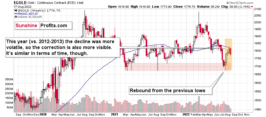
No, it’s not the same chart :). The first one shows gold’s performance between 2011 and mid-2013, and the second shows gold’s performance between late-2019 and today.
The price pattern in gold is so similar, because… history rhymes! Gold got too high too fast in 2011 and the same thing happened in 2020. In fact, if it weren’t for the huge amounts of money that were created due to the pandemic-related stimulus programs, gold would have likely declined instead of rallying. The proof here lies in the fact that, well, it invalidated the breakout above the 2011 high despite the above and despite the Russian invasion.
Think about it: if someone told you a few years ago that there would be a pandemic, global lockdowns, huge amounts of money being printed, double-digit inflation in many parts of the world, and a Russian invasion of Ukraine, would you believe that gold would fail to rally and stay above its 2011 highs?
Very few people would have likely believed that – and yet, that’s exactly what happened, and what’s still happening.
Yes, gold “wants” to decline before soaring (and yes, I do think that it will soar, but it’s simply unlikely before sliding first, similarly to what we saw in 2008), and since that’s the case, it has to decline in some sort of price pattern. What’s the most likely way for gold to decline? Since history tends to rhyme, the previous big declines provide guidance. In particular, the 2013 decline has been repeated to a very considerable (quite extreme, actually) extent.
What does this specific self-similarity tell us right now?
It’s telling us… Hmm, no.
It’s screaming right into our ears: watch out!
If the pattern simply keeps repeating itself (which has been taking place for months!), then the huge slide is just ahead. The current correction and back-and-forth trading is likely just the calm before the storm.
Of course, the above is just my opinion, and I can’t promise any kind of performance of any market, including gold, but please note that the previous months’ weakness in gold and silver mining stocks vs. gold are also just like what we saw in 2013 before the huge slide…
I don’t even want to get into the “tiny” fact that while gold moved briefly above its 2011 highs in 2020, neither silver nor gold mining stocks were even close to something similar. Instead, they corrected about a half of their huge decline, and then they started another move lower – a move that continues to this day.
The markets are screaming an important message. However, it’s your choice if you decide to listen to them.
Thank you for reading our free analysis today. Please note that the above is just a small fraction of the full analyses that our subscribers enjoy on a regular basis. They include multiple premium details such as the interim targets for gold and mining stocks that could be reached in the next few weeks. We invite you to subscribe now and read today’s issue right away.
Sincerely,
Przemyslaw Radomski, CFA
Founder, Editor-in-chief -
Want to Take Advantage of Declines? Keep an Eye on Gold Stocks
August 17, 2022, 8:15 AMVery little happened in the precious metals sector yesterday, and practically everything that I wrote yesterday and in Monday’s flagship analysis remains up-to-date.
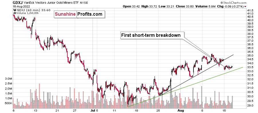
Let’s start with a quick update on the GDXJ’s very short-term chart.
Yesterday, I wrote the following:
Gold declined yesterday, and it did so in tune with what we saw in 2013. The back-and-forth trading continues, but we have some signs that it’s getting close to being over. In other words, it’s likely the case that we won’t have to wait for the decline to re-start much longer.
One of those signs comes from the very short-term GDXJ ETF chart.
Junior miners are after a breakdown below their rising black support line, and the move above the early-August high was clearly invalidated. This means that we saw two small sell signals.
Once the GDXJ declines below the rising, green support line, it will be a good indication that the next big move lower is already underway. Right now, it’s quite possible, but not very likely. In other words, if we see more back-and-forth movement this week, it would still be normal in light of the analogy to 2013 and it would not be something bullish.
Indeed, the junior miners’ ETF moved slightly lower, but overall it stayed between the two support lines. Once we see a breakdown below the green line, we’ll likely “know” (there are no certainties in any market) that the next big move lower has just started.
Gold and silver haven’t done much, and the USD Index declined a little.
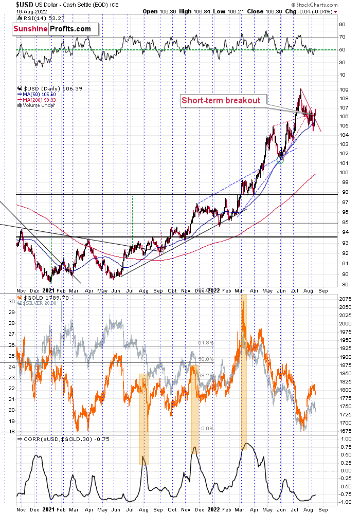
This tiny decline is perfectly normal given the recent short-term breakout. It’s most likely just its verification. Consequently, my previous comments on the above chart remain up-to-date:
Another indication comes from the USD Index, which just moved above its declining red resistance line. It’s up by about 0.3 in today’s pre-market trading, which indicates that the move is likely to continue.
This fits the subtle clues coming from gold and junior miners – the top might already be in.
Even if it’s not, I think it remains a good idea to be well positioned to take advantage of lower prices in the precious metals sector, especially in the junior mining stocks.
One thing that I would like to add today is that the general stock market is approaching a combination of strong resistance levels.

One of them is provided by the all-important 61.8% Fibonacci retracement level based on the entire 2022 decline. The other is the declining resistance line based on the previous 2022 highs. These levels coincide just slightly above the current values of the S&P 500 index – at around 4,365 – implying that the S&P 500 index’s short-term upside is very limited.
The best (here: most bearish) thing about the above chart is not only the above. It’s also a fact that the precious metals sector has already stopped reacting to higher stock market values. Consequently, when stocks finally decline, it’s likely that they will contribute to lower PM values, but at the same time, if they keep rallying, it’s not necessarily likely to make PMs move higher.
This is just one of the factors that creates a great risk-to-reward situation for a short position in the precious metals sector, especially in junior mining stocks. As a quick reminder, the prices of junior miners are more correlated with other stocks than the rest of the precious metals sector.
Thank you for reading our free analysis today. Please note that the above is just a small fraction of the full analyses that our subscribers enjoy on a regular basis. They include multiple premium details such as the interim targets for gold and mining stocks that could be reached in the next few weeks. We invite you to subscribe now and read today’s issue right away.
Sincerely,
Przemyslaw Radomski, CFA
Founder, Editor-in-chief -
Ignoring Bearish Fundamentals May Push Gold to New 2022 Lows
August 16, 2022, 9:19 AMWith commodities getting whacked on Aug. 15, gold, silver, and mining stocks materially underperformed the S&P 500. Moreover, with bond and commodities markets more attentive to Fed officials’ hawkish threats, the general stock market is the lone member pricing in a dovish pivot.
However, since hope often leads to disappointment when it’s built on a sloppy foundation, the bulls don’t realize that the Fed’s inflation fight will be one of the most challenging fundamental contests in decades. Therefore, while investors believe that the hard work is done once the Consumer Price Index (CPI) slows, the reality is that the difficult times have only just begun.
For example, the New York Fed released its Empire State Manufacturing Survey on Aug. 15. An excerpt read:
“Business activity declined sharply in New York State, according to firms responding to the August 2022 Empire State Manufacturing Survey. The headline general business conditions index plummeted forty-two points to -31.3. New orders and shipments plunged, and unfilled orders declined. Delivery times held steady for the first time in nearly two years, and inventories edged higher.”
Please see below:
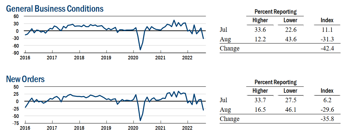 Source: New York Fed
However, while output fell off a cliff, there was “a small increase in employment” and the prices received index moved higher.
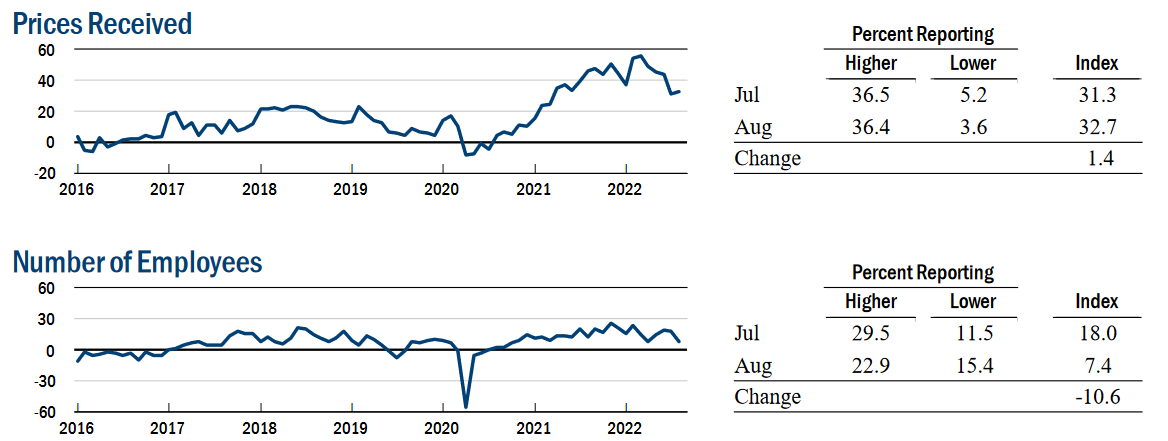 Source: New York Fed
Thus, while the sharp decline in output should have culminated in lower prices, the data highlights just how sticky inflation has become. Furthermore, if prices don’t decline when output craters in New York State, how can investors expect them to fall when S&P 500 companies still have resilient demand?
Furthermore, the report revealed:
“The delivery times index declined to around zero, indicating that delivery times held steady, the first month they have not lengthened in nearly two years.”
Please see below:
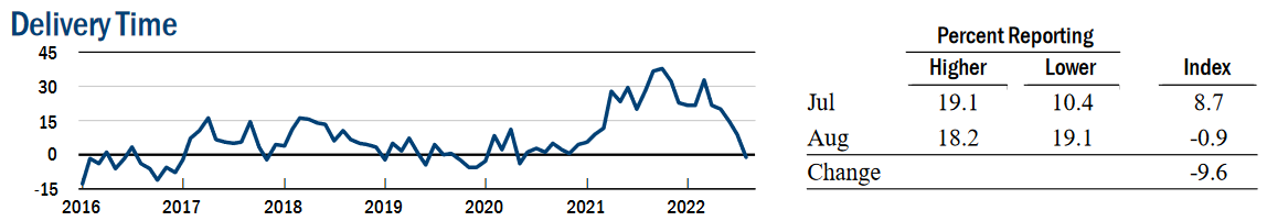 Source: New York Fed
To explain, the Fed and the consensus blamed supply-chain disruptions for the recent bout of inflation. In a nutshell: COVID-19 restrictions suffocated shipping activity, and suppliers didn’t have the inventory to meet demand. Therefore, order backlogs surged, and prices increased as manufacturers bid against one another to obtain the scarce inputs.
However, while the New York Fed’s delivery times index is back near pre-COVID-19 levels, its prices received index is not. As a result, the normalization of supply chains has done little to curb inflation, and investors materially underestimate the challenges that lie ahead.
1970s Here Were Come
While the GDXJ ETF diverged from the S&P 500 on Aug. 15, a sharp decline in the latter would spell immense trouble for the former. Therefore, the general stock market is an important component of our investment thesis. Moreover, while the S&P 500 continued its ascent and the bulls have their sights set on new all-time highs, I warned on Aug. 15 that the fundamental outlook signals the exact opposite. I wrote:
After the FFR peaked in July 1973, the Fed cut interest rates to help support a weakening U.S. economy. However, with inflation still unanchored, the policy mistake led to an even higher FFR during the depths of the recession (the gray area).
Please see below:
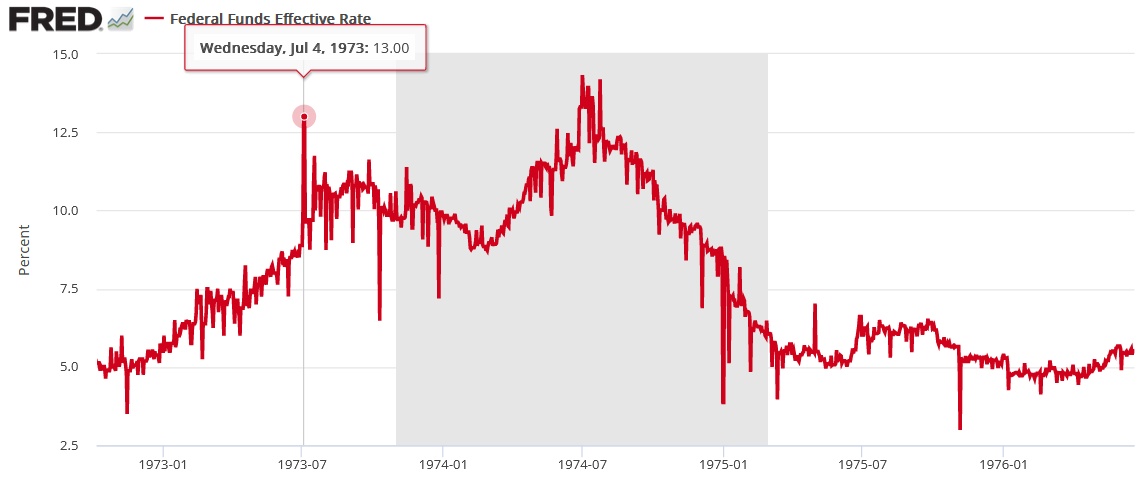
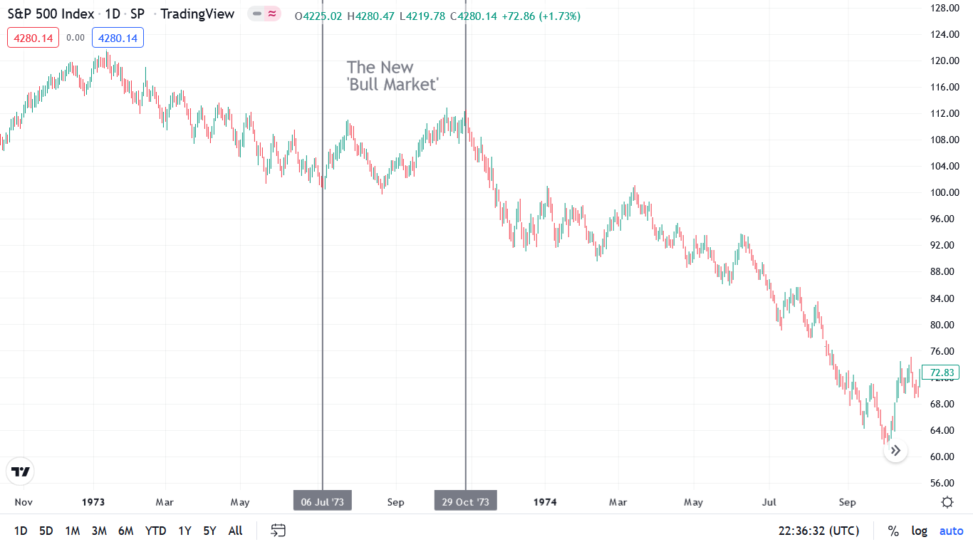
Likewise, the S&P 500 initially celebrated the dovish pivot. With uninformed investors assuming that cutting interest rates was the appropriate response, a sharp rally occurred in July 1973, followed by a sharp pullback and then another rally to a higher high. As a result, don’t you think the crowd was calling for a new bull market from July through October 1973? However, unanchored inflation forced the Fed to reverse course and the S&P 500 fell off a cliff.
Thus, we find ourselves in the same situation. With the consensus underestimating the destructive nature of inflation and overestimating the Fed's ability, the bulls should suffer a crisis of confidence over the medium term.
Please see below:
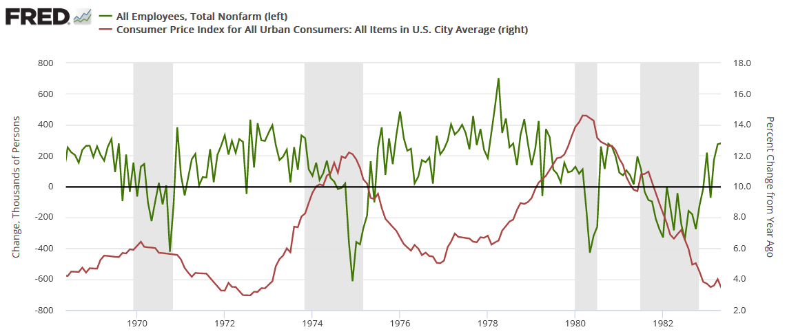
To explain, the red line above tracks the year-over-year (YoY) percentage change in the headline CPI, while the green line above tracks the monthly change in U.S. nonfarm payrolls. For context, the consensus cites near-record job openings and robust payroll growth as evidence for why only a mild recession can occur (if one occurs at all).
However, the chart above highlights how unanchored inflation torpedoed that narrative in the 1970s. If you analyze the shaded gray areas (recessions), notice how the green line remained positive during the early stages of the recessions in 1970, 1974, and 1980. In a nutshell: monthly payroll growth stayed positive during the outset of all three recessions.
However, if you focus your attention on the sharp drops in the green line near the end of the 1970, 1974, and 1980 recessions (negative monthly payrolls prints), you can see that reality re-emerged and the U.S. labor market suffered mightily. Moreover, negative payroll growth was also present during the 1982 recession, but inflation was declining at that time.
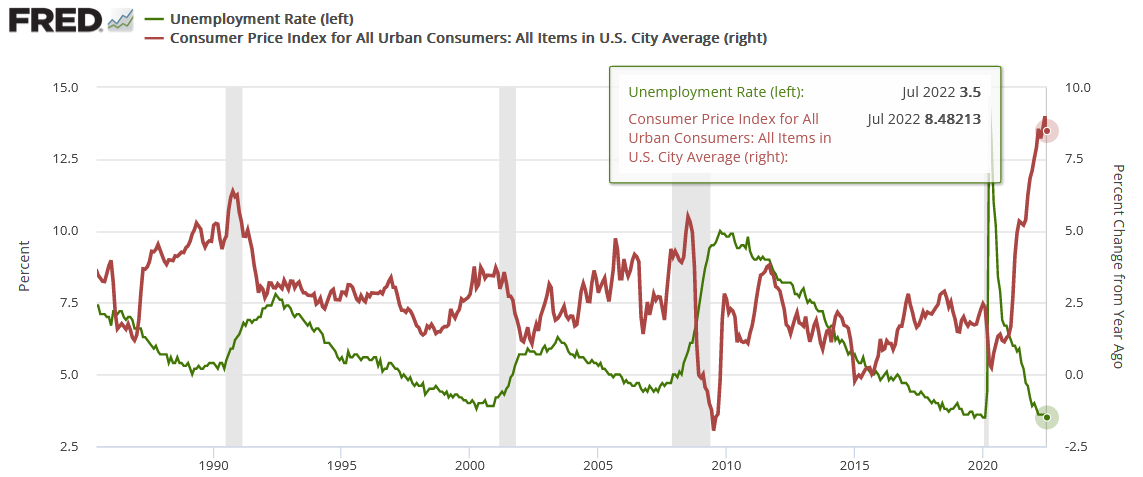
As such, it’s important to remember that U.S. nonfarm payrolls growth has been positive in every month except one since May 2020. Furthermore, the U.S. unemployment rate declined to 3.5% in July – its lowest level in ~50 years – and its relationship with the CPI has similar implications.
Please see below:
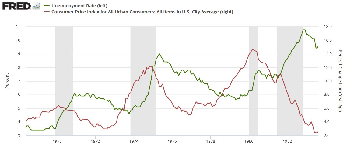
To explain, the red line above tracks the YoY percentage change in the headline CPI, while the green line above tracks the U.S. unemployment rate. As you can see, the 1970, 1974, and 1980 recessions culminated with high inflation and delayed spikes in unemployment. Moreover, while the 1982 recession had a diverging relationship, Paul Volcker made it his mission to eradicate inflation at all costs. Therefore, he understood the severity of the problem and didn’t want a repeat of the outcomes from 1970, 1974, and 1980.
Furthermore, notice how the U.S. unemployment rate always bottoms before a recession? Remember, bear markets don’t end with the U.S. unemployment rate at a ~50-year low; they begin with the metric at a ~50-year low.
To that point, even modern history highlights the uninformed nature of the bulls’ thesis.
Please see below:
To explain, the recessions near 1990, 2000 and 2008 all began with cycle-low U.S. unemployment rates (the green line) and rising inflation (the red line). In addition, if you analyze the right side of the chart, you can see that the gap between the two is one for the ages. As such, can you guess where this story is headed next?
Finally, while I warned repeatedly that market participants underestimated the demand side of the inflation equation, the consensus still believes that supply-chain issues are the primary driver. However, with unanchored wage inflation poised to keep the pricing pressures uplifted for much longer than investors realize, the Fed will need to push the U.S. federal funds rate (FFR) much higher than 3%.
Please see below:
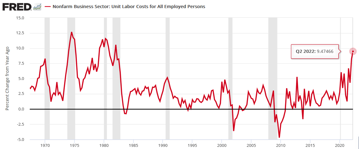
To explain, the red line above tracks the YoY percentage change in U.S. nonfarm unit labor costs from the late 1960s until today. For context, the metric combines wages and productivity to determine the labor costs incurred by U.S. businesses. In a nutshell: when the red line rises, labor is more expensive.
If you analyze the peaks, notice how unanchored labor costs were present during the 1970s and 1980s recessions. Furthermore, even modern history shows that spikes in labor costs occurred before/during the recessions near 1990, 2000 and 2008.
More importantly, the current reading is higher than 1970 and is only surpassed by 1974, 1980, and 1982. Thus, it may seem counterintuitive, but low unemployment, high wages, and high job openings (end-of-cycle metrics) are bearish, not bullish. As a result, the bulls are in la-la land, and the ‘this time is different’ crowd should suffer mightily when reality re-emerges.
The Bottom Line
While the PMs have rallied recently, they're still underperforming the S&P 500 and the NASDAQ Composite. Moreover, with the latter ignoring the bearish fundamentals at their own peril, a sharp re-rating of the general stock market should help push gold, silver and mining stocks to new 2022 lows. Likewise, while the bulls want you to believe that all is well on Wall Street, their success hinges on outcomes materializing that haven't occurred in 50+ years.
In conclusion, the PMs declined on Aug. 15, as most of the commodity complex was crushed. However, with little fear present in today's financial markets, asset prices are far from their fundamental values. As such, the medium-term outlook is profoundly bearish, and it's likely only a matter of time before sentiment reflects these realities.
Thank you for reading our free analysis today. Please note that the above is just a small fraction of the full analyses that our subscribers enjoy on a regular basis. They include multiple premium details such as the interim targets for gold and mining stocks that could be reached in the next few weeks. We invite you to subscribe now and read today’s issue right away.
Sincerely,
Przemyslaw Radomski, CFA
Founder, Editor-in-chief


Gold Investment News
Delivered To Your Inbox
Free Of Charge
Bonus: A week of free access to Gold & Silver StockPickers.
Gold Alerts
More-
Status
New 2024 Lows in Miners, New Highs in The USD Index
January 17, 2024, 12:19 PM -
Status
Soaring USD is SO Unsurprising – And SO Full of Implications
January 16, 2024, 8:40 AM -
Status
Rare Opportunity in Rare Earth Minerals?
January 15, 2024, 2:06 PM

