

Briefly: in our opinion, full (300% of the regular position size) speculative short positions in junior mining stocks are justified from the risk/reward point of view at the moment of publishing this Alert.
Welcome to this week's flagship Gold & Silver Trading Alert. Predicated on last week’s price moves, our most recently featured outlook remains the same as the price moves align with our expectations. On that account, there are parts of the previous analysis that didn’t change at all in the earlier days, which will be written in italics.
PLEASE NOTE:
Dear Subscribers,
On an administrative note, I will be traveling next week, and therefore, Gold & Silver Trading Alerts posted during next week will not include the regular technical analysis – they will focus on the fundamental aspects instead. The next regular technical analysis will be posted on Monday, Aug. 22. I will keep you informed if anything major changes (which is unlikely).
Sincerely,
PR
The key thing is that while the medium-term outlook remains profoundly bearish, so far we’ve seen back-and-forth movement. This is in perfect tune with what happened in 2013 before the biggest part of the slide, so the lack of declines so far doesn’t invalidate the bearish outlook.
Let’s start today’s analysis with a recap of what recently happened on the fundamental front.
The Weekly Fundamental Roundup
With Fed officials green-lighting a rise in risk assets and then attempting to undo the damage due to the inflationary impact, this week was all about repeating past mistakes. Moreover, with real yields, high yield credit spreads, and the USD Index down from their highs, financial conditions have eased materially in recent days.
Please see below:
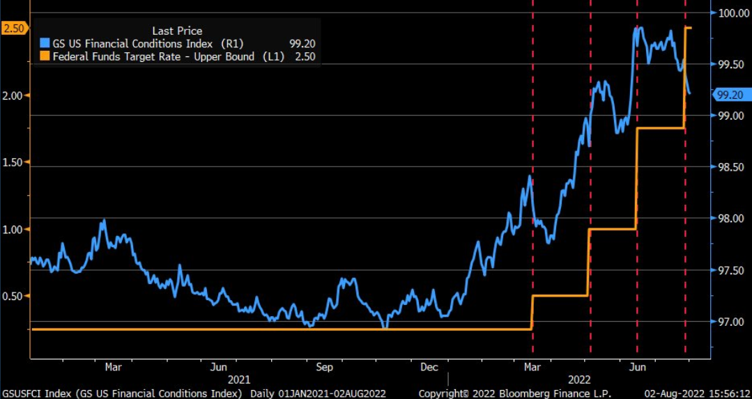
To explain, the blue line above tracks the Goldman Sachs Financial Conditions Index (FCI), while the orange line above tracks the U.S. federal funds rate (FFR). As you can see, each subsequent rate hike culminated with higher highs in the FCI.
However, if you analyze the right side of the chart, you can see that the blue line has declined substantially despite another 75 basis point rate hike by the Fed. As a result, the financial markets are making the central bank's inflation fight even more difficult.
Speaking of which, Citigroup's Inflation Surprise Index (ISI) has moved higher once again.
Please see below:
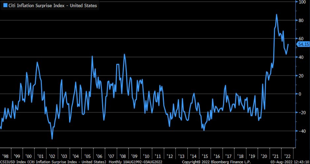
To explain, the blue line above tracks Citigroup’s ISI. For context, a ‘surprise’ occurs when a realized data point outperforms economists’ consensus estimate. Moreover, if you analyze the vertical ascent in 2020-2021, you can see that the consensus materially underestimated inflation’s prowess.
Furthermore, the slight uptick on the right side of the chart shows that inflation outperformance has materialized once again. Thus, with inflation still prevalent and financial conditions loosening, the meme stock/YOLO frenzy has returned to Wall Street.
Please see below:
 Source: Bloomberg/Hedgeye
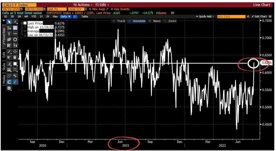
To explain, the white line above tracks the call option activity of speculative traders. If you analyze the right side of the chart, you can see that the white line has surged recently. Therefore, the decline in real yields and the belief that the Fed will turn dovish has investors thinking it’s the summer of 2020 all over again.
For context, call option buying helps fuel higher stock prices because it forces option sellers (dealers, hedge funds, etc.) to hedge the positions by purchasing the underlying stock. Thus, a feedback loop of continued call option buying and continued hedging can push stock prices higher even as the fundamental environment deteriorates.
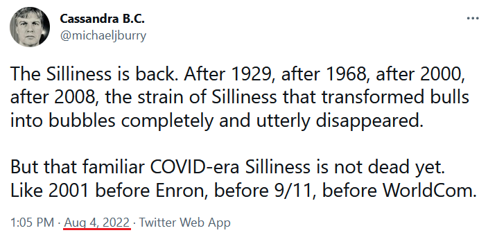
Moreover, Michael Burry – who is famous for shorting the housing market in 2008 – highlighted retail investors’ renewed “silliness” on Aug. 4.
Please see below:
Thus, while I warned that Fed Chairman Jerome Powell made a material mistake during his press conference on Jul. 27, the speculative frenzy that erupted this week is far from the environment needed to curb inflation. Furthermore, with the GDXJ ETF rallying by nearly 5% on Aug. 4, gold, silver, and mining stocks were along for the speculative ride. To explain, I wrote on Jan. 12:
[Like] hyper-growth NASDAQ stocks and speculative assets like cryptocurrencies, the PMs, suffer from a similar fundamental affliction. For context, PMs are less volatile than speculative assets. However, it's important to remember that gold, silver, and mining stocks peaked amid the liquidity-fueled surge in the summer of 2020.
Likewise, their uprisings coincided with real interest rates that were at all-time lows at the time. Conversely, with the Fed's liquidity drain already unfolding and real interest rates poised to rise in the coming months, PMs should suffer from the likely re-pricings.
To that point, while real yields are materially higher and the GDXJ ETF is materially lower, the price action on Aug. 4 highlights the psychological stimulation that Powell provided.
Please see below:
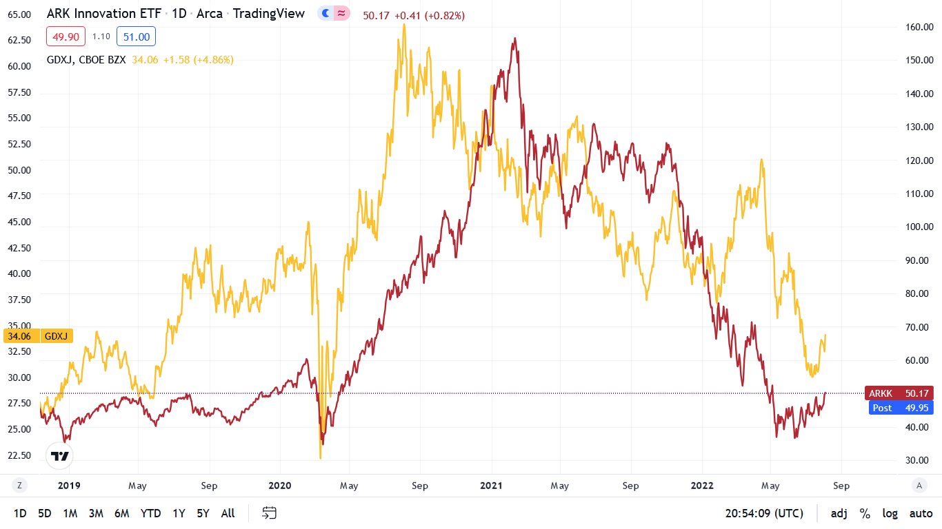
To explain, the gold line above tracks the GDXJ ETF, while the red line above tracks the ARK Innovation ETF. As you can see, the two behave relatively similarly during changes in the fundamental environment. In a nutshell: it’s risk-on when financial conditions loosen and real yields decline.
Therefore, while the PMs’ upswings on Aug. 4 may seem material, the reality is that we’ve seen this move before. Moreover, with the Fed needing higher real yields and a stronger USD Index to curb inflation, the recent price action is antithetical to the central bank’s goals.
In addition, while Fed officials’ mixed messaging has emboldened the speculators, Cleveland Fed President Loretta Mester’s comments on Aug. 4 sparked confusion.
On the one hand, she said:
"Interest rates continue to rise this year and into next year through the first half, and maybe by then we can pause and we can start bringing them back down."
On the other hand:
"I would pencil in going a bit above four [percent] as appropriate. It's not unreasonable, I think, to maintain that as where we're getting to and then we'll see."
Thus, in one breath, she states that the FFR should rise “a bit above four [percent],” while in another, she says that 2023 could elicit a “pause and we can start bringing them back down.” As a result, with investors ignoring the former and celebrating the latter, the gap between sentiment and reality is widening.
However, with the consensus likely to realize that even a 4% FFR won’t be enough to eliminate inflation, the reality check should lead to higher highs in the FCI, real yields, and the USD Index. In contrast, it should also culminate with lower lows for gold, silver, and mining stocks.
Employ Rationality
With the JOLTS report showing a decline in U.S. job openings on Aug. 2, any sign of economic weakness has the bulls salivating over a potential dovish pivot. However, while the consensus follows the post-GFC script, they don’t realize that unanchored inflation materially changes the game.
Please see below:
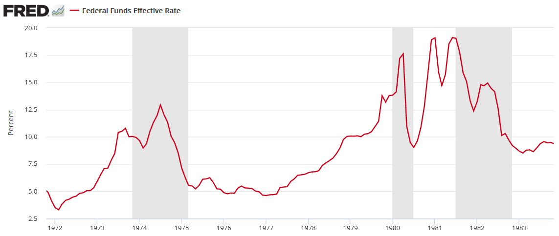
To explain, the red line above tracks the FFR during the 1970s/1980s, and the vertical gray bars represent recessions. For one, unanchored inflation forced the Fed to raise interest rates during (not just before) all three recessions. In addition, the ~1974 and ~1982 recessions show how after the Fed cut rates to support economic growth, the central bank had to reverse course and raise the FFR once again. As such, the consensus underestimates how difficult it is to slay inflation once it gets going.
Second, the JOLTS spread – which subtracts the number of unemployed U.S. citizens from the number of U.S. job openings – is still nearly 4.8 million.
Please see below:
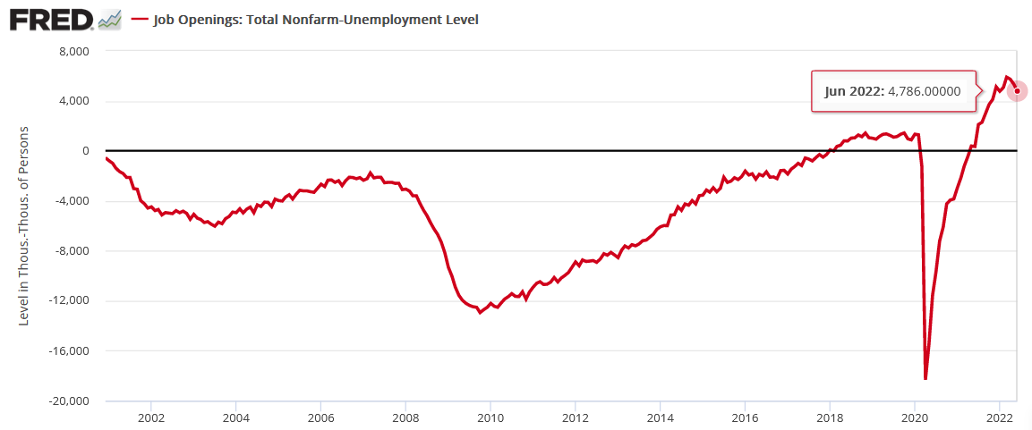
To explain, the red line above tracks the JOLTS spread. If you analyze the right side of the chart, you can see that the metric is well above zero and miles above its historical average. As a result, the U.S. labor market has slowed, but it’s nowhere near a crisis.
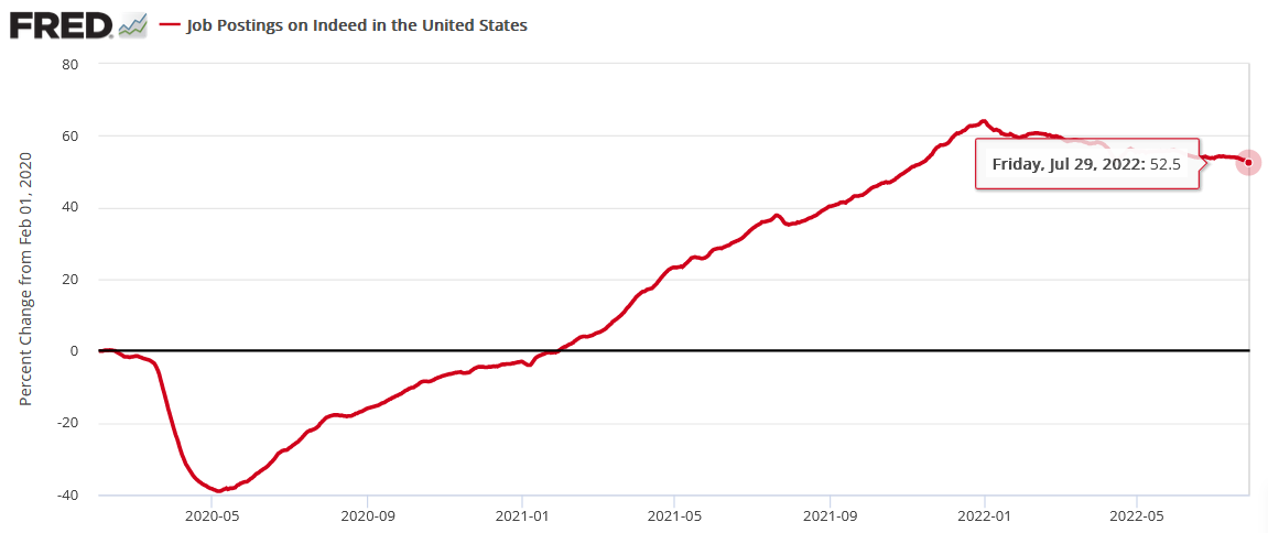
To that point, Indeed updated its U.S. job posting data on Aug. 4. For the week ended Jul. 29, there are still 52.5% more job openings than in February 2020 (pre-COVID 19). Moreover, the metric has held relatively steady since April.
Please see below:
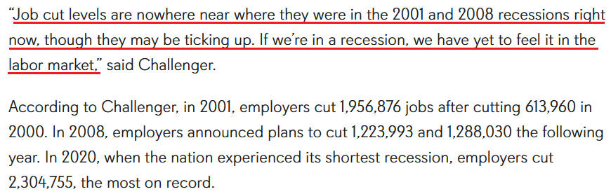
Finally, Challenger, Gray & Christmas Inc. released its job cuts report on Aug. 4. An excerpt read:
“U.S.-based employers announced 25,810 cuts in July, a 20.6% decrease from the 32,517 cuts announced in June (…). July marks the second-highest monthly total this year. It is the third time this year that cuts were higher in 2022 than in the corresponding month a year earlier. So far this year, employers announced plans to cut 159,021 jobs, down 31.3% from the 231,603 cuts announced through July in 2021. It is the lowest recorded January-July total since Challenger began tracking monthly job cut announcements in 1993.”
Thus, while the U.S. labor market is slowing – which is expected when the Fed hikes interest rates nine times (25 basis point increments) – we’re far from conditions that justify a dovish pivot.
 Source: Challenger, Gray & Christmas Inc.
The Bottom Line
While the financial markets have turned back the clock to the summer of 2020, the fundamental environment couldn’t be more different. Moreover, with gold, silver, and mining stocks benefiting from the speculative fervor, fighting inflation should prove more challenging than investors realize. As a result, optimism should turn to pessimism in the months ahead.
In conclusion, the PMs rallied on Aug. 4, as retail investors returned with a vengeance. However, with prior bubbles underscoring how the retail crowds’ overconfidence is their undoing, the FOMO in today’s financial markets highlights why we’re likely far from a medium-term bottom. Therefore, it’s important not to overthink the PMs’ daily moves.
What to Watch for Next Week
With more U.S. economic data releases next week, the most important are as follows:
- Aug. 8: The Confidence Board’s Employment Trends Index (ETI)
With employment one-half of the Fed’s dual mandate, continuous monitoring of the U.S. labor market is essential to handicap future central bank policy.
- Aug. 9: NFIB Small Business Optimism Index
Since small businesses are the lifeblood of the U.S. economy, their wage and pricing behavior have a profound impact on inflation. As such, the report should provide important insights.
- Aug. 10: Consumer Price Index (CPI)
While the CPI is a lagged indicator, and the ISM and S&P Global’s PMI reports are more predictive, the former moves markets. Moreover, while the data may come in light due to last month’s decline in commodity prices, we’re still a long way from 2%.
- Aug. 11: Producer Price Index (PPI)
With the PPI often leading the CPI, the former should provide important clues about whether lower commodity prices have eased corporations’ input burdens.
All in all, economic data releases impact the PMs because they impact monetary policy. Moreover, if we continue to see higher employment and inflation, the Fed should keep its foot on the hawkish accelerator. If that occurs, the outcome is profoundly bearish for the PMs.
Technically Speaking
Let’s start today’s technical discussion with a quick check on copper prices.
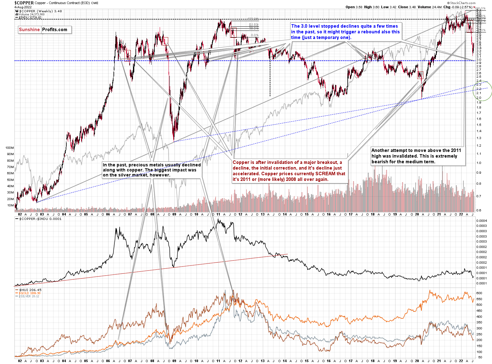
Practically, everything that I wrote about it last week (and in the previous weeks/months) remains up-to-date:
Copper recently CLEARLY invalidated another attempt to move above its 2011 high. This is a very strong technical sign that copper (one of the most popular commodities) is heading lower in the medium term.
It seems to me that there might be some kind of smaller corrective upswing or a pause when copper moves to about $3.0, but that it would then decline profoundly once again, only to bottom in the $2.0-2.4 area. That’s where we have rising, long-term support lines and also the previous – 2016 and 2020 – lows.
Interest rates are going up, just like they did before the 2008 slide. What did copper do before the 2008 slide? It failed to break above the previous (2006) high, and it was the failure of the second attempt to break higher that triggered the powerful decline. What happened then? Gold declined, but silver and mining stocks truly plunged.
Again, copper is after invalidation of a major breakout, a decline, the initial correction, and its decline just accelerated. Copper prices currently SCREAM that it’s 2011 or (more likely) 2008 all over again. This is extremely bearish for mining stocks (especially juniors) and silver.
No market moves in a straight line, up or down, but since we just saw a corrective upswing, the downtrend might now resume (or it might resume after additional very short-term upswing).
Having said that, let’s check junior miners’ really big picture.
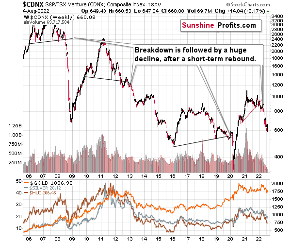
I previously commented on the above chart in the following way:
The Toronto Stock Exchange Venture Index includes multiple junior mining stocks. It also includes other companies, but juniors are a large part of it, and they truly plunged in 2008.
In fact, they plunged in a major way after breaking below their medium-term support lines and after an initial corrective upswing. Guess what – this index is after a major medium-term breakdown and a short-term corrective upswing. It’s likely ready to fall – and to fall hard.
So, what’s likely to happen? We’re about to see a huge slide, even if we don’t see it within the next few days.
Having said that, let’s turn to gold.
Let’s start with context:
Between 2020 and now, quite a lot happened, quite a lot of money was printed, and we saw a war breaking out in Europe. Yet, gold failed to rally to new highs.
In fact, it’s trading very close to its 2011 high, which tells you something about the strength of this market. It’s almost absent.
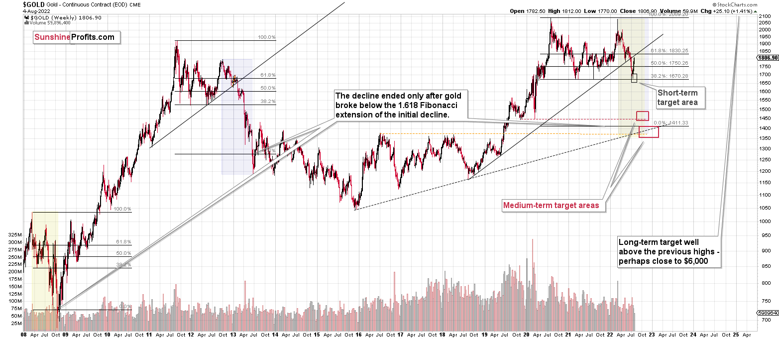
Truth be told, what we see in gold is quite in tune with what we saw after the 2011 top, and in particular, shortly after the 2012 top. The long-term gold price chart below provides details.
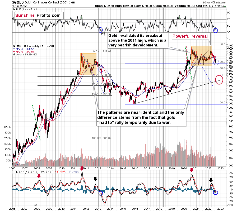
Please note that the 38.2% Fibonacci retracement based on the entire 2015-2020 rally is very close to $1,700, which made the above-mentioned support area even stronger. Indeed, that’s when gold bottomed recently.
It seems that if it weren’t for the war in Europe, gold wouldn’t have been able to move above $2,000 and instead it would have topped close to its previous highs, which provided strong resistance.
The extraordinary thing about that is that that’s exactly what happened in 2012. Gold moved higher but only until it reached its previous highs, which happened in the second half of 2012.
This time the RSI was a bit higher, but it was close to 70, just like in 2012.
Yes, this time gold moved back to the previous high, but:
- This happened as a result of a geopolitical event (the war in Europe), and geopolitically-driven rallies are generally unsustainable;
- When gold reached its previous highs, it also formed a profound weekly reversal, which formed on huge volume, and that’s very bearish.
So, the current medium-term outlook for gold is very bearish.
There are also very interesting short-term takeaways from the above chart.
If the 2012-2013 is currently being replayed (at least to a significant extent), then let’s not forget that this decline initially took the shape of a back-and-forth decline with lower lows and lower highs (but there were notable short-term rallies within the decline).
The final of the corrections that still took place within the back-and-forth decline started in early 2013 - when gold moved close to its previous medium-term lows, when RSI was a bit above 30, and when the MACD was close to -20, which was also slightly below its previous medium-term low.
We can see all three above-mentioned similarities on the above chart. I marked them with blue ellipses. They are not “somewhat similar” – they are remarkably similar in both cases!
Indeed – gold rallied recently just like it had rallied in 2013, right before the most volatile part of the slide.
What does it imply going forward?
Please note that, based on the above-mentioned similarity, the corrective upswing in gold has probably already been completed or is about to be completed. Even at first sight, the rallies within blue ellipses appear practically identical. The RSI moved similarly higher as well.
The rally is bigger this time, but the geopolitical factors also contributed (China/Taiwan), but as we know, geopolitical factors tend to have only a temporary effect on prices.
How low is gold likely to go during this upcoming decline? Perhaps as low as its 2020 low – to the $1,450-1,500 area.
I realize this is far from the current price, but nonetheless, this target area appears justified in my opinion. There are two important Fibonacci retracements based on the 2015-2020 rally that gold can bounce from (it recently bounced from the 38.2% retracement). These are: 50% and 61.8% retracements.
The support provided by the 61.8% retracement is strengthened by the 2020 low and the support provided by the 50% retracement is strengthened by the 2019 high.
However, based on gold’s self-similarity to 2013, it seems that we’re about to see a slide that’s bigger than what we’ve been seeing so far this year. This time – based on the similarity – gold is likely to decline profoundly, but no longer in the back-and-forth mode. If gold formed its next local low at the 50% retracement (so at about $1,560), then it might do so still within the declining, short-term trend channel (sometime in September).
However, if gold is to stick to the link to 2013, then it should decline more rapidly. In this case, the technique that can help us estimate the short-term target is the one that says that after a breakdown from a trend channel, price is likely to move approximately by as much as the height of the previous trend channel. In this case, gold could break below the trend channel soon and then decline even more. Based on the height of the trend channel, the above means that a move to the 61.8% retracement as the next downside target is more likely than a move to the 50% retracement.
Besides, the decline in gold would likely be linked to a breakdown in the EUR/USD below 1, which – if confirmed – would likely trigger significant selling.
On the fundamental news front, this fits the current situation as well. The likelihood of real interest rates moving higher in the future didn’t decrease at all, but at the same time, the market focused on something insignificant – Powell’s speech. Yes, it was insignificant because of all the times Powell’s suggestions didn’t result in actual action. Also, wasn’t it Powell who spoke many times about the benefits of higher interest rates, but then cut them (probably as he was pressured to do so by Trump)?
This time, the pressure is different – people are most concerned with inflation, and the latter has become political. So, while it remains clear that real interest rates are going up, the market’s perception triggered this artificial short-term rally, which means that now the gold price has more room to fall.
However – just because something is likely to happen, doesn’t mean that it’s likely to happen right away. So, let’s zoom in on what happened in 2013 after the analogous rebound.
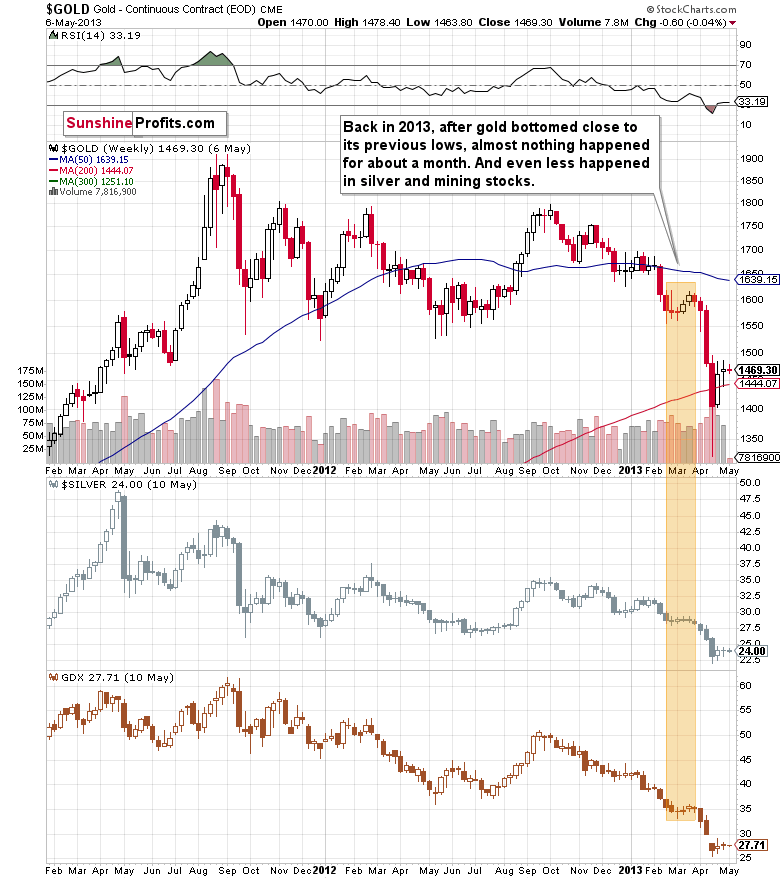
Well, gold consolidated for a few weeks and plunged only after that consolidation.
While it doesn’t guarantee that we’ll see a pause that’s as long as the one that we saw before the April 2013 slide, it’s a good indication that the huge decline might not start immediately, but rather we might see some “preparatory” action.
For now, investors and traders might view the current prices as temporary, and they might expect gold to soar back up. In fact, I saw multiple analyses indicating exactly that. This means that a week or a few weeks of back and forth trading close to the current price levels or between the current price levels and the recent lows would help to convince them that this move lower was not accidental.
This would make them much more likely to sell (and panic) once gold breaks below its recent lows.
Also, while the above chart doesn’t show it, because it’s based on weekly and not daily prices, gold topped in March 2013 when its daily RSI was trading just a little above 50 and close to its previous highs – just like what we see right now.
Getting back to the possible back-and-forth movement that we might see now, please note that the price “action” was even more boring in the case of silver and mining stocks (middle and lower parts of the above chart). They did very little during the consolidation, but when they finally moved lower, they truly plunged.
Oh, and don’t let the sizes of the moves fool you – the scale is linear in the case of silver and GDX, while it’s logarithmic in the case of gold. In reality, the mining stocks still declined the most, and silver’s decline was still bigger than the one seen in gold.
So, like I wrote in the opening paragraphs of today’s analysis, the fact that the precious metals sector is doing pretty much nothing right now is perfectly normal, and the bearish outlook for the following weeks/months remains fully intact.
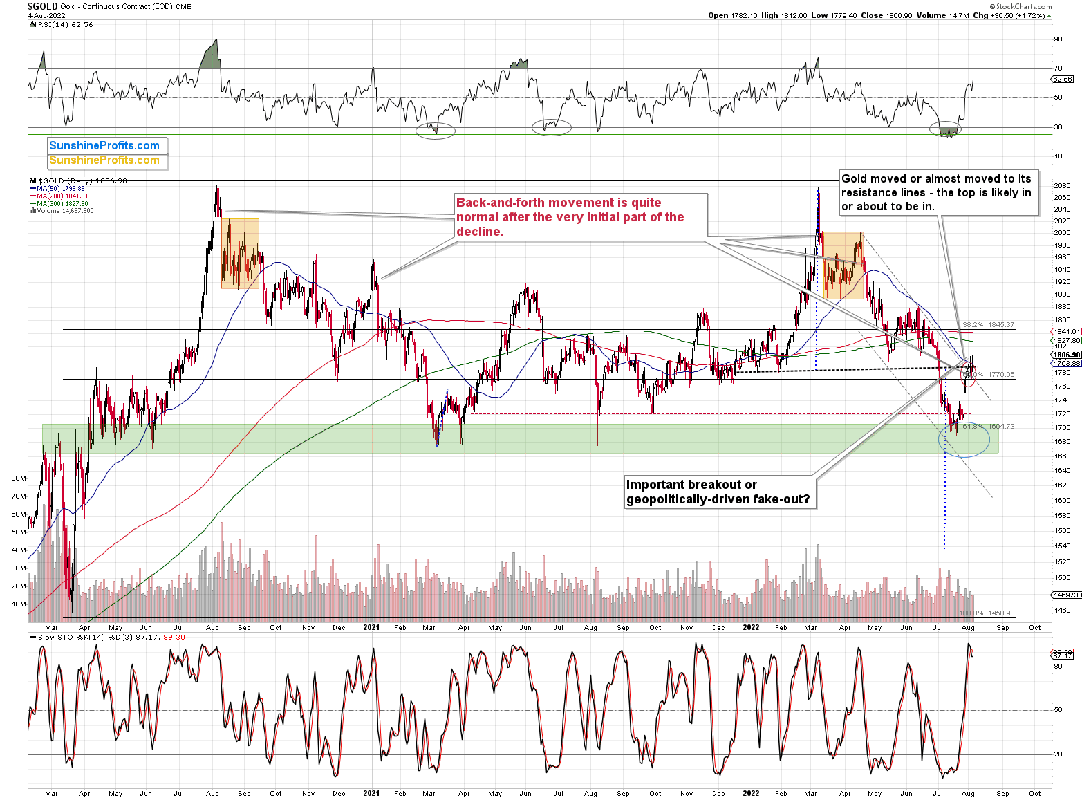
The $1,800 level – approximately – served as support in May and June, so it’s a natural candidate for resistance right now. At the moment of writing these words, gold futures are trading at about $1,803, so the breakout above this level might be invalidated soon. This invalidation would serve as a sell signal and a good starting point for another decline.
Silver and mining stocks are likely to be affected even more than gold, though.
Let’s take a look at the silver market.
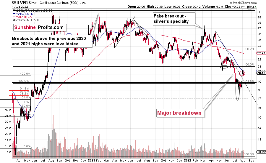
Like gold, silver just hit my previous target area. It touched its 50-day moving average and its May bottom. This resistance held. At the same time, silver verified its breakout above the declining resistance line.
If silver wasn’t known for fake breakouts, this might be concerning, but it is known for them. Consequently, I’m not taking this indication at its face value.
Furthermore, during its recent upswing, silver outperformed gold on high volume, which we frequently see as confirmation of a short-term top being in or near. How low will silver now move? This is rather unclear, because things can now get very volatile (like in 2008, 2013 or 2020), and it seems to be a better idea to be looking at gold than at silver when determining the exit moment for the white metal.
However, to provide you with some numbers, I’d say that silver is likely to decline at least to $15 before the next important correction. I wouldn’t be surprised to see it fall all the way down to its 2020 low of $12 before moving up in a more visible way.
As you see, the silver outlook is not as precise as it is for gold, as the support levels and targets based on multiple techniques don’t necessarily align. In the case of gold, they do.
Let’s not forget that gold is not the only precious metal that is repeating its 2012 performance right now, and you can see more details on silver’s long-term chart.
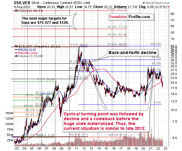
As you can see on the above chart, silver corrected about 50% of the previous downswing, and this correction ended at about $30, a long time ago. Ever since, silver has been declining, and even the outbreak of war in Europe didn’t make silver rally above that level.
On the above chart, you can see how silver first topped in 2011, then declined and formed another top at the cyclical turning point. Next, it declined once again – to the previous lows. After that, silver rallied (in 2012 and 2022), and it topped between its 50-week moving average (marked in blue) and the previous top. Now silver is declining in a back-and-forth manner (you can see it more clearly on the previous short-term silver chart).
Back in 2012, these were just the early days of a gargantuan decline, and the same appears likely to be the case this time. Interest rates are going up after all, and the Fed is determined to quench inflation.
Let’s not forget that rising interest rates are likely to negatively impact not just commodities, but practically all industries. This will likely cause silver’s price to decline profoundly, as silver’s industrial demand could be negatively impacted by lower economic growth (or a decline in economic activity).
Besides, please note that silver didn’t even manage to rally as much as copper (which tried to move to new highs recently) or most other commodities, thus being rather weak.
Consequently, it seems that silver will need to decline profoundly before it rallies (to new all-time highs) once again.
Having said that, let’s take a look at what happened in mining stocks.
History tends to repeat itself. Not to the letter, but in general. The reason is that while economic circumstances change and technology advances, the decisions to buy and sell are still mostly based on two key emotions: fear and greed. They don’t change, and once similar things happen, people’s emotions emerge in similar ways, thus making specific historical events repeat themselves to a certain extent.
For example, right now, gold stocks are declining similarly to how they did in 2008 and in 2012-2013.
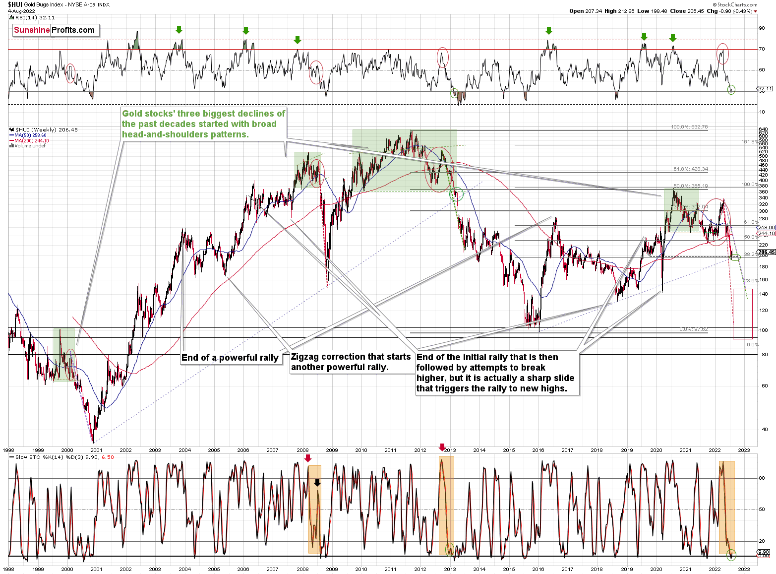
The Russian invasion triggered a rally, which was already more than erased, and if it wasn’t for it, the self-similarity would be very clear (note the head-and-shoulders patterns marked with green). Since the latter happened, it’s not as clear, but it seems that it’s still present. At least that’s what the pace of the current decline suggests.
I used a red dashed line to represent the 2008 decline, and I copied it to the current situation. They are very similar. We even saw a corrective upswing from more or less the 200-week moving average (red line), just like what happened in 2008.
We saw a breakdown to new short-term lows, which means that the volatile part of the slide is likely already underway.
Moreover, three weeks ago, I commented on the above chart in the following way:
On a short-term basis, we see a short-term (only) downside target of around 200. That’s about 10% below yesterday’s (Thursday’s) closing price. There are several reasons for it:
- It’s a round number, and those tend to be more important psychologically than other numbers.
- That’s where we have the rising medium-term support line based on the 2016 and 2018 lows. The temporary move below this line triggered a massive rally in 2020.
- That’s where we have the 61.8% Fibonacci retracement level based on the entire 2016-2020 rally.
The 200 target was then reached, briefly breached, and it was followed by a rally.
Analogy-wise, it’s what we previously saw in 2013. It might not be obvious which part of the chart to look at, as the upswings are not that visible from the long-term point of view, so I marked them with green ellipses (also in RSI and Stochastic).
How low can the HUI Index fall during the next big downswing?
As it’s the case with gold and silver, a move back to the 2020 lows is definitely in the cards. Please note that this level is also strengthened (as support) by other major lows: the 2019, 2014, and 2008 ones.
However, I wouldn’t rule out a move even lower on a temporary basis. If gold were to decline to about $1,450-1,500, it would mean that it would double its current 2022 decline. If the HUI Index does that, it will move below 150.
So, all in all, 120-150 is my current target area for the upcoming slide in the HUI Index.
All right, let’s zoom in and see how mining stocks declined in 2008.
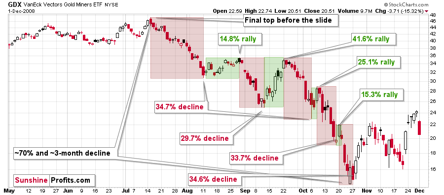
Back then, the GDXJ ETF was not yet trading, so I’m using the GDX ETF as a short-term proxy here.
The decline took about 3 months, and it erased about 70% of the miners’ value. The biggest part of the decline happened in the final month, though.
However, the really interesting thing about that decline – that might also be very useful this time – is that there were five very short-term declines that took the GDX about 30% lower.
I marked those declines with red rectangles. After that, a corrective upswing started. During those corrective upswings, the GDX rallied by 14.8-41.6%. The biggest corrective upswing (where GDX rallied by 41.6%) was triggered by a huge rally in gold, and since I don’t expect to see anything similar this year, it could be the case that this correction size is an outlier. Not paying attention to the outlier, we get corrections of between 14.8% and 25.1%.
The interesting thing was that each corrective upswing was shorter (faster) than the preceding one.
The first one took 12 trading days. The second one took seven trading days. The third one took 2 trading days, and the fourth and final one took just 1 trading day.
Fast forward to the current situation. Let’s take a look at the GDXJ ETF.
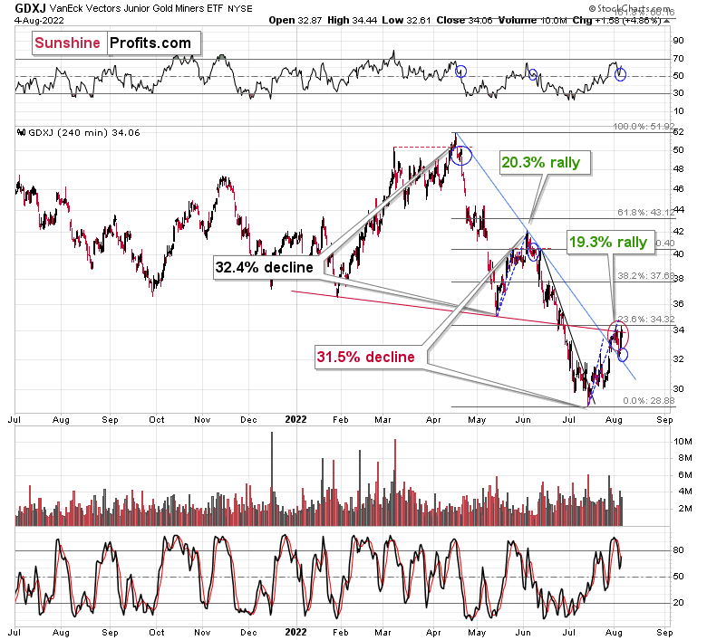
The GDXJ ETF declined by 32.4% and then corrected – it rallied by about 20.3%. The corrective upswing took 14 trading days.
Now, it had declined by about 31.5% and then rallied by about 19.3%. This time – if yesterday was the top – the upswing took 15 trading days. Still, if it wasn’t for the geopolitical situation, it would have probably not rallied, and the rally would have been 13 trading days long.
The deviation from the above tendency for the corrections to be quicker is not big enough to say that it’s no longer present.
The above is in near-perfect tune with the previous patterns seen in the GDX during the 2008 slide.
I previously wrote the following:
What does it tell us? It indicates that history can be rhymed, and while it will not be identical, we should pay attention to the indicators that worked in 2008. The next corrective upswing (a notable one, that is) might start when the GDXJ ETF declines by about 29-35% from its recent top. To clarify, I don’t claim that the above technique would be able to detect all corrective upswings, or that I aim to trade all of them. For instance, in my view, it was a good idea to enter a long position on May 12 and switch to a short position on May 26, but I wasn’t aiming to catch the intraday moves.
Based on how long the corrective upswings took in 2008 and how long the recent one took, the upcoming corrective upswing is likely to take between 5 and 10 trading days. If the bottom formed yesterday, which seems likely as the GDXJ ETF is already up by over 1% in today’s London trading, then we can expect the next local top to form within 1-2 weeks. In other words, it seems that the corrective upswing is likely to end in the next part of July – probably in its final week.
Back in 2008, the counter-trend rallies varied greatly in their magnitude, but please keep in mind that back then, the decline was very much news-based – Lehman Brothers’ collapse, etc. This time, the decline is more measured, so declines and corrections are more measured as well.
While back in 2008, during the first correction, the GDX gained only 14.8% and during the second one it gained a sizable 41.6%, this time the first rally provided a measured 20.3% increase. If the upcoming correction is also measured, then the GDXJ might also rally by about 20%.
It appears that it’s exactly what we saw. The medium-term downtrend can now continue (or if it hasn’t started yet, it might start soon).
How low can the GDXJ ETF move during the (this?) next big move lower? A move to its 2020 lows (~$20) seems quite likely.
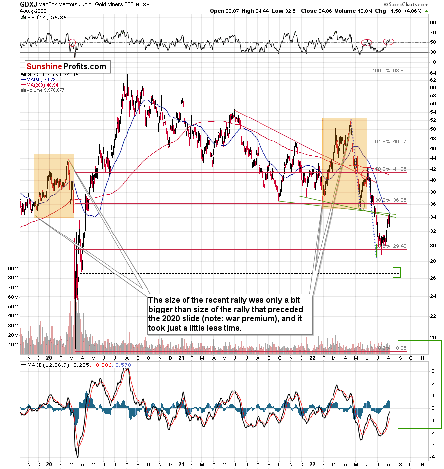
Yes, it is possible that the GDXJ ETF will fall below its 2020 lows, but it might need to correct first.
Please note that a move to the 2020 lows (~$20) is something that fits what I wrote about gold and the HUI Index - that they could repeat their so-far 2022 decline (approximately).
I added an extra short-term downside target of about $26.5. If GDXJ gets there while gold re-tests its previous lows once again, then we might get one tiny rebound just before the slide. But it seems too small to be worth trading, as the risk associated with missing the much bigger move lower might not justify the potential quick gain.
Moreover, please note that due to their recent outperformance, juniors can now reverse their trend and decline more than senior miners – this would fit a situation in which the general stock market declines.
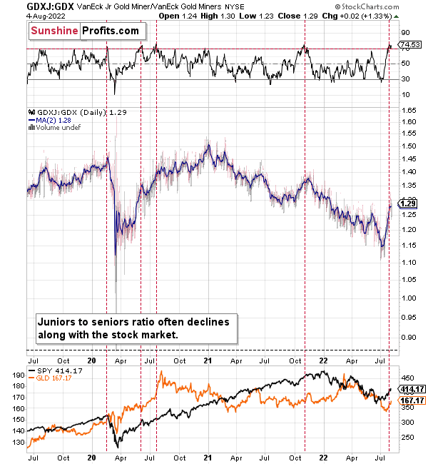
During their previous upswing, juniors rallied relative to seniors, and the situation is now excessive from the short-term point of view. At least the RSI indicator suggests that juniors are now likely to decline relative to seniors.
Also, let’s not forget about the forest while looking at individual trees. By that, I mean looking at how gold stocks perform relative to gold. That’s one of the major indications that the current situation is just like what we saw at the 2012 top.
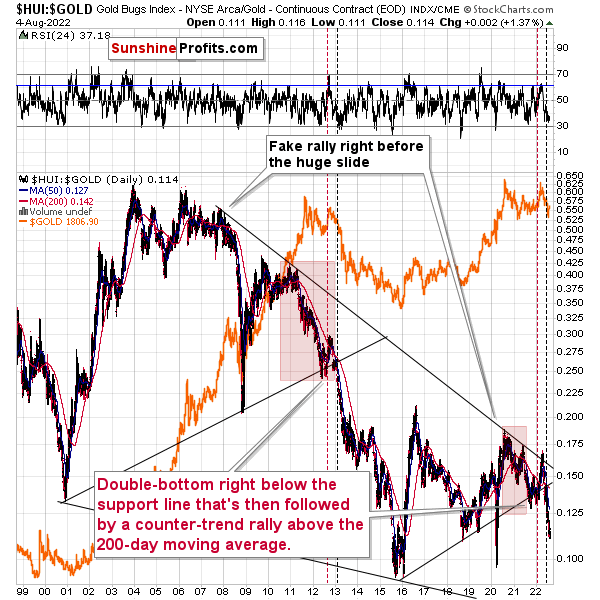
The situation in the gold stock to gold ratio is similar to what we saw in late 2012 and early 2013. The HUI to gold ratio invalidated its first attempt to break lower (marked with red, dashed lines), but after a corrective upswing, it then broke lower more decisively. That’s what I marked using black, dashed lines.
If history is to rhyme, we’re about to see a profound decline. In fact, we’re likely already past its beginning.
Also, please note that the pattern that we currently see, which started in early 2016, is somewhat similar to what happened between 2003 and 2008.
Back in 2008, the breakdown from the consolidation resulted in sharply lower ratio values and much lower prices of gold stocks.
So, if the situation is analogous to 2012-2013, we’re likely to see a big decline in the following weeks/months, and if it’s analogous to 2008, we’re likely to see an enormous decline in the following weeks/months.
Declining stock prices would only add fuel to the bearish fire (after all, gold stocks are… just stocks) and that’s exactly what’s likely to happen.
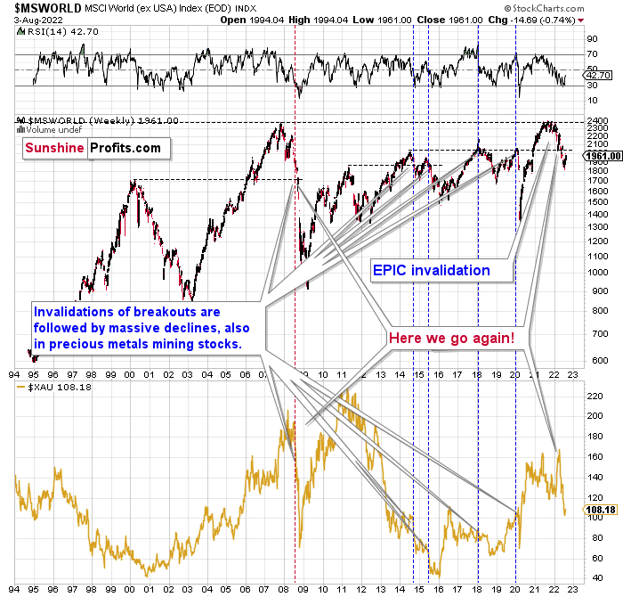
The technical picture in the case of world stocks remains extremely bearish, and my previous comments on it were just confirmed. Here’s what I’ve been writing about the above chart for quite a few weeks now:
World stocks have already begun their decline, and based on the analogy to the previous invalidations, the decline is not likely to be small. In fact, it’s likely to be huge.
For context, I explained the ominous implications on Nov. 30. I wrote:
Something truly epic is happening in this chart. Namely, world stocks tried to soar above their 2007 high, they managed to do so, and… failed to hold the ground. Despite a few attempts, the breakout was invalidated. Given that there were a few attempts and that the previous high was the all-time high (so it doesn’t get more important than that), the invalidation is a truly critical development.
It's a strong sell signal for the medium - and quite possibly for the long term.
From our – precious metals investors’ and traders’ – point of view, this is also of critical importance. All previous important invalidations of breakouts in world stocks were followed by massive declines in mining stocks (represented by the XAU Index).
Two of the four similar cases are the 2008 and 2020 declines. In all cases, the declines were huge, and the only reason why they appear “moderate” in the lower part of the above chart is that it has a “linear” and not a “logarithmic” scale. You probably still remember how significant and painful (if you were long, that is) the decline at the beginning of 2020 was.
All those invalidations triggered big declines in the mining stocks, and we have “the mother of all stock market invalidations” at the moment, so the implications are not only bearish, but extremely bearish.
World stocks have declined below their recent highs, and when something similar happened in 2008, it meant that both stocks and gold and silver mining stocks (lower part of the chart) were about to slide much further.
The medium-term implications for mining stocks are extremely bearish.
However, let’s get back to the short- and medium-term point of view.
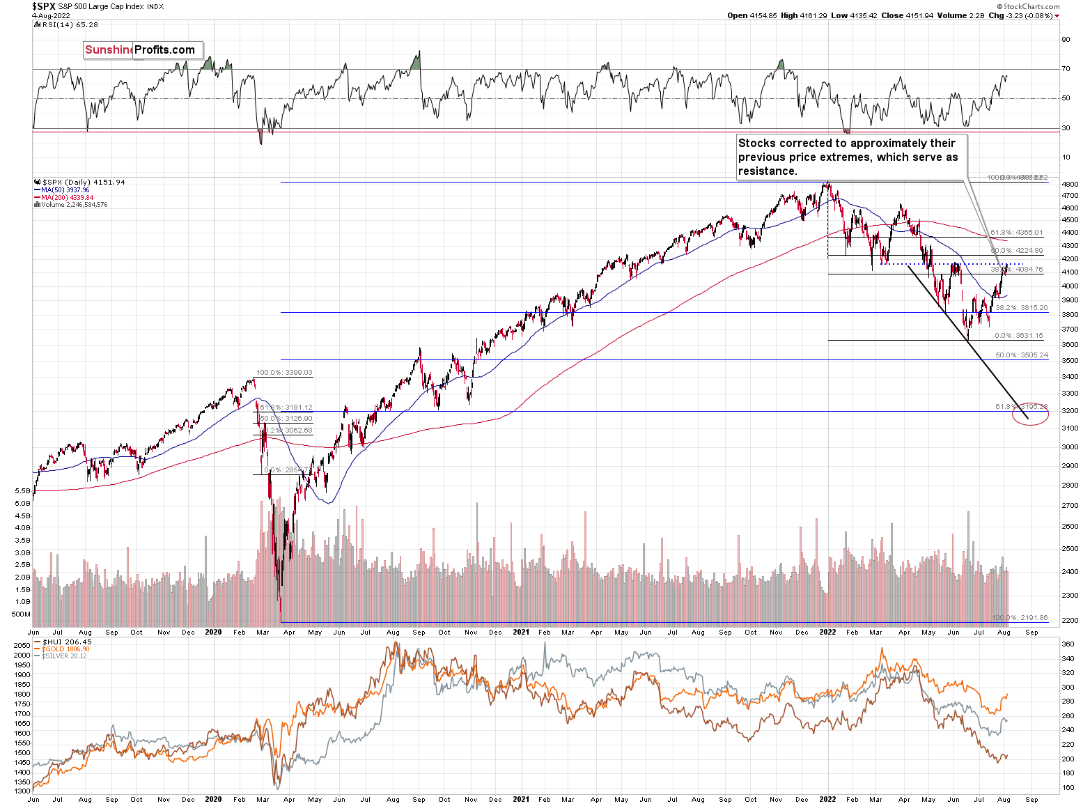
Stocks rallied recently, but since they corrected approximately to their previous June highs and March lows, the rally might be over, or very close to being over.
As I had indicated previously, interest rates are likely going up, which is a bearish factor for the stock market, and the recent rally was likely due to the market’s misinterpretation of the importance of Powell’s speech. The S&P 500 wanted to correct (based on emotional = technical reasons) and it used Powell’s seemingly dovish comments as an excuse to do so. However, what materially changed? Nothing. Interest rates are likely to be raised, as inflation remains the key political issue right now, and the markets are likely to respond by declining.
Most interestingly, though, such a decline would likely have a devastating effect on the prices of mining stocks (especially junior mining stocks) and silver. There might be some impact on gold, too.
The above would also be in tune with an extra rally in the USD Index. After all, less competitive exports are not that favorable for the U.S. economy.
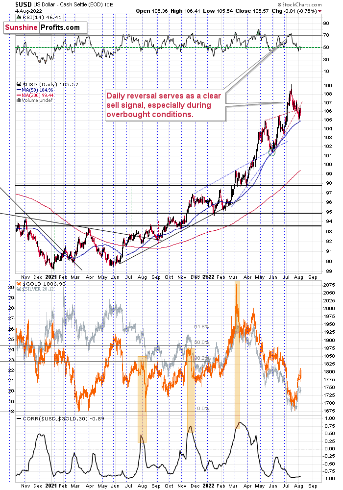
The USD Index recently (almost) moved to its 50-day moving average.
This move is in tune with what we saw at previous local bottoms. The RSI moved slightly below 50, and it’s the turn of the month – this combination was enough to trigger rallies in the U.S. dollar index.
Let’s keep in mind that the latter tends to form important bottoms close to the middle of the year.
So, the scenario in which the USD Index has already bottomed seems quite likely.
There’s also the possibility that the USD Index keeps declining until it reaches the very strong support at about the 104 level – the previous long-term highs. Right now, it’s at about 105.5, which means that it could decline by another 1.5 index points or so. It doesn’t necessarily mean that gold, silver, and mining stocks would need to rally substantially if the above materialized. Conversely, since gold might now be reluctant to react to the USD’s lead and miners might be reluctant to react to gold’s lead, it seems that the possible upside for junior miners is very limited.
In other words, even if the big decline really picks up in a few weeks, I think that the risk-to-reward ratio already favors being on the short side of the precious metals sector. In particular, on the short side of junior mining stocks.
Overview of the Upcoming Part of the Decline
- It seems to me that the corrective upswing is either over or about to be over, and that the next big move lower is about to start.
- If we see a situation where miners slide in a meaningful and volatile way while silver doesn’t (it just declines moderately), I plan to – once again – switch from short positions in miners to short positions in silver. At this time, it’s too early to say at what price levels this could take place and if we get this kind of opportunity at all – perhaps with gold prices close to $1,600.
- I plan to exit all remaining short positions once gold shows substantial strength relative to the USD Index while the latter is still rallying. This may be the case with gold prices close to $1,400. I expect silver to fall the hardest in the final part of the move. This moment (when gold performs very strongly against the rallying USD and miners are strong relative to gold after its substantial decline) is likely to be the best entry point for long-term investments, in my view. This can also happen with gold close to $1,400, but at the moment it’s too early to say with certainty.
- The above is based on the information available today, and it might change in the following days/weeks.
You will find my general overview of the outlook for gold on the chart below:
Please note that the above timing details are relatively broad and “for general overview only” – so that you know more or less what I think and how volatile I think the moves are likely to be – on an approximate basis. These time targets are not binding nor clear enough for me to think that they should be used for purchasing options, warrants, or similar instruments.
Letters to the Editor
Q: I appreciate your work and the time you put into your technical analysis. Some say it is a bear market rally? Others say it’s the beginning of a new bull market rally? What's going on with gold at $34? Treasuries and oil are slumping, gold is climbing?
A: Well, like I wrote in today’s analysis, in my opinion, it’s a bear market rally – a corrective upswing. Nothing that changes the medium-term downtrend. The recent news coverage that the conflict between China and Taiwan got made people concerned, and they bought gold as a safe-haven asset. The rest of the precious metals sector (and some other markets) reacted too. But geopolitically-driven news is unlikely to trigger anything more than a temporary price move.
What’s most likely now, based on the analogy to what we saw in 2013, is some kind of back-and-forth movement in gold. If the above-mentioned conflict escalates, we might see more intraday rallies. If it de-escalates, we might see more intraday declines. I don’t want to predict the political twists and turns – I prefer to focus on what’s more predictable and what helped us secure profits for multiple trades in a row – technical analysis and focus on analogies to similar periods from the past.
Please note that silver and mining stocks are unlikely to be as affected as gold is in the case of conflict escalation, so I’m choosing not to adjust the current trade.
I’m accepting the back-and-forth movement for the next 1-4 weeks, and I prefer to wait them out while already having a short position in junior mining stocks. Why? Because it’s a medium-term downtrend, after all, and the really big surprises are likely to be to the downside. There could be some deviations from the analogy and gold could decline sooner than it did in 2013 – for example, as the current geopolitical conflicts de-escalate. Moreover, junior miners might decline more than gold does in the initial part of the decline (that’s what they tend to do), and I don’t want to miss this part of the move.
Q: Today makes me want to sell. Couldn't we have missed this pain?
A: Well, there are a few ways I could respond. I’ll strive to reply in a way that most people might find useful.
Of course, one could have entered the short position at the exact top. Beforehand, they could have entered the long position at the exact bottom, and the previous short position could have been entered exactly at the top, and so on. It is possible that every price extreme could have been chosen with 100% accuracy.
In theory.
In practice, I have never seen that happen, and I’ve never even read about anyone being able to do that – ever.
Whether one describes something as satisfactory or not satisfactory (or even painful) will depend on what they expect. If what happens is better compared to the expectations, happiness (etc.) is the usual result. If what happens is worse compared to the expectations, sadness (or fear, etc.) is the usual result.
Now, what expectations one sets, it’s up to them. If one expects to achieve something that was never achieved by anyone, then it’s their choice. However, the odds are that in this case, it will be difficult for them to find happiness with the outcome. If one expects little, they will usually get a result that’s satisfying.
In the case of trading/investments, it’s called creating the benchmark. What’s the correct benchmark for a long-term gold portfolio? The price of gold. What’s the correct benchmark for a trading strategy with long and short positions without any directional bias? It’s the risk-free interest rate. I haven’t counted it recently, but I guess this year we outperformed the latter at least 100 times.
However, still, having this sort of benchmark is a bet with oneself that one won’t be happy until they get what they expect.
Why not turn this way of thinking into something that could bring happiness and growth at the same time, regardless of what happens in the market?
Is it even possible? Unlike picking every top and bottom, it’s not impossible, but it requires a shift in the way of thinking about many things.
What if one didn’t base happiness or lack thereof from the results of the trades (which are ultimately impossible to control as too much depends on external factors), but rather on how well one approached a certain trade? How carefully was the research conducted and/or how well the sources of research chosen? How did you pay attention to aligning the size of the position to your specific situation and investment goals? How do you balance the attention that you give to trading with the attention that you give to other aspects of your life?
Once you do everything that depends completely on you, you could already be satisfied. The result of the trade doesn’t depend on you, right? If it’s a winning trade – good, but the important thing was that you did what you could. If it’s a losing trade – also good, as long as you did the important things that you (on your own) could.
A big stone is heavy only if you’re trying to lift it.
A result of the trade is only impacting your happiness if you link your happiness to it. If you link your happiness to what really depends on you, you can be happy 100% of the time, regardless of what the market does.
The results of this approach not only help one achieve peace of mind and joy, but they also help in the results of the trade by not placing them in the spotlight. How so? Because this allows you to sort of automatically avoid some of the psychological pitfalls associated with trading. Confirmation bias, for example. You can’t control the market anyway, and by not trying you gain an extra advantage – the ability to look at it in a clearer manner.
That, my friends, is Stoicism in practice. If you’re interested in learning more, I encourage you to visit Ryan Holiday’s page – DailyStoic.com. Oh, and if you previously read somewhere that Stoicism is just about not showing emotions (not true, it’s about mastery of emotions, not their absence) or something like that, I also invite you to read this article by Donald Robertson on the difference between stoicism and Stoicism.
Summary
Summing up, it seems that the corrective upswing is over (or close to being over), which means that the powerful medium-term downtrend can now resume.
Last week, we closed yet another profitable trade in a row. This year’s profits are already enormous, but it seems likely to me that they will grow even more in the following weeks and months. Making money on corrections during powerful trends is a difficult feat, but you managed to do just that – congratulations!
On an administrative note, I will be traveling next week, and therefore, Gold & Silver Trading Alerts posted during next week will not include the regular technical analysis – they will focus on the fundamental aspects instead. The next regular technical analysis will be posted on Monday, Aug. 22. I will keep you informed if anything major changes (which is unlikely).
Moreover, please note that it’s not only the profits on the long positions that are so great about this success – it’s also the ability to get back on the short side of the market at more favorable (higher) prices, thus increasing the likely profits from the current trade. Congratulations, once again!
Also, please note that I will be updating the targets for the leveraged ETFs as we move closer to them, as their prices will depend on the path prices take to reach their targets.
After the final sell-off (that takes gold to about $1,350-$1,500), I expect the precious metals to rally significantly. The final part of the decline might take as little as 1-5 weeks, so it's important to stay alert to any changes.
As always, we'll keep you – our subscribers – informed.
To summarize:
Trading capital (supplementary part of the portfolio; our opinion): Full speculative short positions (300% of the full position) in junior mining stocks are justified from the risk to reward point of view with the following binding exit profit-take price levels:
Mining stocks (price levels for the GDXJ ETF): binding profit-take exit price: $20.32; stop-loss: none (the volatility is too big to justify a stop-loss order in case of this particular trade)
Alternatively, if one seeks leverage, we’re providing the binding profit-take levels for the JDST (2x leveraged). The binding profit-take level for the JDST: $29.87; stop-loss for the JDST: none (the volatility is too big to justify a SL order in case of this particular trade).
For-your-information targets (our opinion; we continue to think that mining stocks are the preferred way of taking advantage of the upcoming price move, but if for whatever reason one wants / has to use silver or gold for this trade, we are providing the details anyway.):
Silver futures downside profit-take exit price: $12.32
SLV profit-take exit price: $11.32
ZSL profit-take exit price: $79.87
Gold futures downside profit-take exit price: $1,504
HGD.TO – alternative (Canadian) 2x inverse leveraged gold stocks ETF – the upside profit-take exit price: $19.87
HZD.TO – alternative (Canadian) 2x inverse leveraged silver ETF – the upside profit-take exit price: $49.87
Long-term capital (core part of the portfolio; our opinion): No positions (in other words: cash)
Insurance capital (core part of the portfolio; our opinion): Full position
Whether you’ve already subscribed or not, we encourage you to find out how to make the most of our alerts and read our replies to the most common alert-and-gold-trading-related-questions.
Please note that we describe the situation for the day that the alert is posted in the trading section. In other words, if we are writing about a speculative position, it means that it is up-to-date on the day it was posted. We are also featuring the initial target prices to decide whether keeping a position on a given day is in tune with your approach (some moves are too small for medium-term traders, and some might appear too big for day-traders).
Additionally, you might want to read why our stop-loss orders are usually relatively far from the current price.
Please note that a full position doesn't mean using all of the capital for a given trade. You will find details on our thoughts on gold portfolio structuring in the Key Insights section on our website.
As a reminder - "initial target price" means exactly that - an "initial" one. It's not a price level at which we suggest closing positions. If this becomes the case (as it did in the previous trade), we will refer to these levels as levels of exit orders (exactly as we've done previously). Stop-loss levels, however, are naturally not "initial", but something that, in our opinion, might be entered as an order.
Since it is impossible to synchronize target prices and stop-loss levels for all the ETFs and ETNs with the main markets that we provide these levels for (gold, silver and mining stocks - the GDX ETF), the stop-loss levels and target prices for other ETNs and ETF (among other: UGL, GLL, AGQ, ZSL, NUGT, DUST, JNUG, JDST) are provided as supplementary, and not as "final". This means that if a stop-loss or a target level is reached for any of the "additional instruments" (GLL for instance), but not for the "main instrument" (gold in this case), we will view positions in both gold and GLL as still open and the stop-loss for GLL would have to be moved lower. On the other hand, if gold moves to a stop-loss level but GLL doesn't, then we will view both positions (in gold and GLL) as closed. In other words, since it's not possible to be 100% certain that each related instrument moves to a given level when the underlying instrument does, we can't provide levels that would be binding. The levels that we do provide are our best estimate of the levels that will correspond to the levels in the underlying assets, but it will be the underlying assets that one will need to focus on regarding the signs pointing to closing a given position or keeping it open. We might adjust the levels in the "additional instruments" without adjusting the levels in the "main instruments", which will simply mean that we have improved our estimation of these levels, not that we changed our outlook on the markets. We are already working on a tool that would update these levels daily for the most popular ETFs, ETNs and individual mining stocks.
Our preferred ways to invest in and to trade gold along with the reasoning can be found in the how to buy gold section. Furthermore, our preferred ETFs and ETNs can be found in our Gold & Silver ETF Ranking.
As a reminder, Gold & Silver Trading Alerts are posted before or on each trading day (we usually post them before the opening bell, but we don't promise doing that each day). If there's anything urgent, we will send you an additional small alert before posting the main one.
Thank you.
Przemyslaw Radomski, CFA
Founder, Editor-in-chief

