
This has been quite a week. Hurricane Sandy showed us how vulnerable we are to the large and indifferent forces of nature. The stock market was closed for two days. You know what that means? Although people’s lives were in danger, at least for two days their money was safe.
Kidding aside, we pray that Sunshine Profits subscribers living in the Northeast have weathered the storm well.
Not since the attack on the World Trade Center in September 2001 has the stock market been closed for more than two days. The last time it happened due to inclement weather, the price of an ounce of gold was $18.94. We’re talking about a blizzard in 1888.
Statistics show that 4 out of 5 times that the markets closed for some unscheduled event, the market ended lower on the day it re-opened yet 10 trading days later, it was net higher, with a marked tendency for a quick recovery.
Following the two days of suspended floor trading, on the last day of the month, gold closed up $7.00, or 0.4%, to$1,719.10 an ounce. Losses for October amounted to 3.1% for gold, 6.5% for silver prices and 5.5% for platinum. Gold’s monthly decline was the first since May while silver’s was the first since June. For the year, gold has gained $152.30 or 9.7%.
You may hear in the news that the catastrophe may actually be good for the economy because it stimulates consumer spending in the aftermath, as people rebuild and replace damaged goods. This brings us to the “parable of the broken window” as expostulated by Frédéric Bastiat in 1850. He showed why destruction, and the money spent to recover, is actually not a net-benefit to society. Society loses the value of things that are uselessly destroyed and the money spent on replacing or rebuilding is taking away resources that could have been put to better use. The baker whose shop window was broken may give business to a local glazier to replace the window, but he might forgo a new suit he was planning to buy, thus taking away business from the tailor. Theorists of the Austrian School of Economics frequently cite the broken window fallacy. The stimulus felt in one sector of the economy, for example, the “Cash for Clunkers” program, comes at a direct—but hidden—cost to other sectors. If there was no hurricane, the resources that must now be expended on rebuilding would have been available for other uses, creating new wealth. The rebuilding activity is merely playing catch up.
The Keynesians seem to like "broken windows." One of Keynes' great fallacies is that all economic activity - even unproductive activity - is 'good'. Keynes advised that governments could battle recessions by paying people to dig ditches and then fill them up again.
Golden Age in Turkey
Turkish banks are trying to lure citizens to deposit an estimated $302 billion of hidden gold in “golden age” accounts to help ease the nation’s current-account deficit, reduce gold imports and external borrowing. The gold accounts give customers an amount in Turkish lira equivalent to the weight of the precious metal they turn over to the bank. Customers can bring jewelry or coins to the bank and take out loans against their value. The banks can sell or hold onto the gold.
The campaign by Turkey’s banks targets Turks who traditionally give gold coins or jewelry as presents at weddings, births and circumcision ceremonies. The custom gained popularity about a decade ago when Turkey’s inflation rate was more than 70 percent, making gold an attractive preserver of wealth.
The World Gold Council estimates that there are 5,000 metric tons of gold held by individual Turks-- an amount greater in value than Ireland’s gross domestic product. Turkey has been exporting gold to Iran, whose citizens are looking for a life preserver from their fast sinking currency. Turkey’s central bank this summer raised the proportion of reserves lenders can keep in gold to 30 percent from 25 percent, giving banks an incentive to attract more bullion.
Is Germany Worried About Its Gold?
Recently, Germany's federal auditor has told the Bundesbank to do spot checks to ensure the world's second-largest gold reserves really are safe in vaults in New York, London and Paris. Germany holds much of its 3,400 tons of pure gold - worth an estimated 143 billion euros (US$187 billion) - with partner central banks abroad. There have been conspiracy theories and rumors claiming that Germany’s gold bars may have been stolen or replaced.
Initially, the Bundesbank rejected the demand, arguing, "The scope of the checks that [the federal court of auditors] wants does not correspond to the usual practices among central banks. ...There are no doubts about the integrity and the reputation of these foreign depositories.”
The Bundesbank has now agreed to fly 50 tons of the deposited gold from New York back to Germany every year where it will be melted down to test the overall purity before being re-cast into standard gold bars.
That sounds like a very reasonable thing to do, until you realize that it could be the best way to access otherwise virtually inaccessible gold bars. During the transport, melting and re-casting processes the overall purity could drop due to "technical reasons". Of course there is no proof that this would be used by the Powers That Be…
Some two-thirds of Germany's gold reserves, worth $190 billion, are being kept in the vaults of the U.S. Federal Reserve, the Bank of France and the Bank of England since post-World War II, when Germany was concerned about a possible land war with the former Soviet Bloc.
One wonders if Germany’s move to repatriate its gold reserves might make the financial markets even more nervous about the fate of the Euro. Is the Bundesbank telling us what we already know - that gold and silver are real money?
You do have some physical gold and silver as suggested in our portfolio structure report, right?
To take a look at gold’s performance for the upcoming short term just before the U.S. elections, let’s start this week’s technical portion with the US Dollar Index (charts courtesy by http://stockcharts.com.)
USD Index
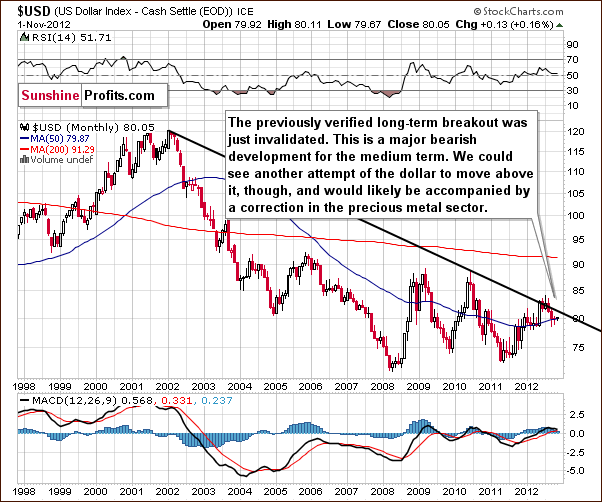
There has basically been no change this week and our comments from last week’s Premium Update are still up to date:
The picture remains bearish here. This chart provides no implications for the short term whatsoever as declines could continue or a new rally could begin based on what we see here. The upcoming rally would be likely small because the declining resistance line would probably stop it. However, what's small on the long-term chart can be average on the medium-term one and significant from the short-term perspective, and this is the case right now.
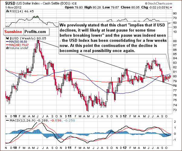
In the medium-term USD Index chart, we expected to see some consolidation after the declining support line was reached, and this is exactly what happened. We have seen a several week long consolidation and right now could see either a small move to the upside or some small declines. This chart does not give clear indications, but it does seem that a rally is no longer implied.
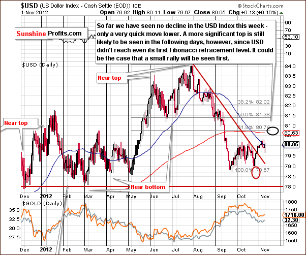
Turning now to the short-term USD Index chart, we see more details this week from this perspective then from the others. A small local top formed right after the cyclical turning point, but our target level was not reached. The current index level is still visibly below our target level and, at this time, it seems that some additional rally is likely. This rally will probably bring the index through the first Fibonacci retracement level. A small rally has been seen so far, but the breakout above the declining resistance line makes more of a rally (at least more than we’ve seen in the past two weeks) quite probable.
Summing up, the situation in the USD Index is still bullish but a bit less so than last week. The medium-term outlook is bearish based on the long-term chart. Our target level is 80.74, in line with the first Fibonacci retracement level.
General Stock Market
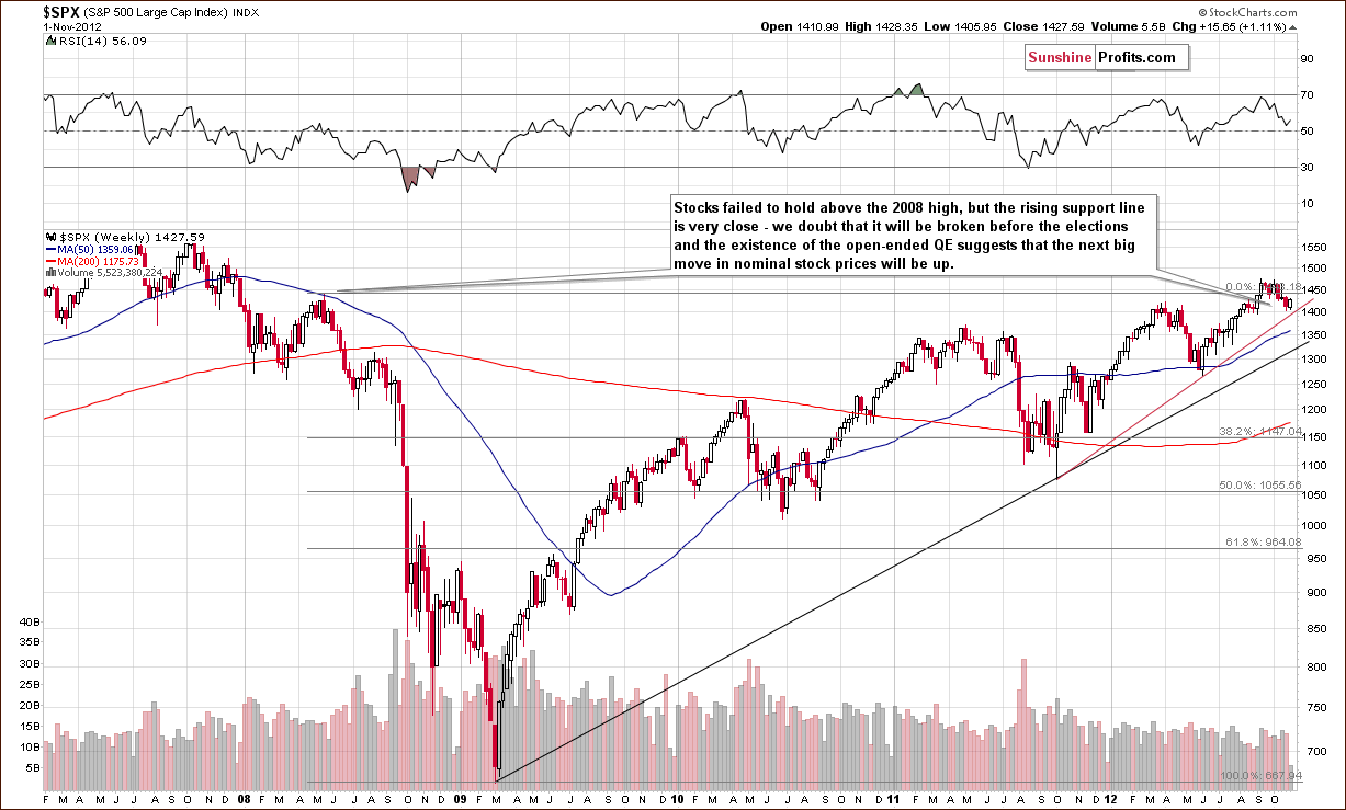
The long-term S&P 500 Index chart is once again our only stock chart this week because it truly explains it all. We did see a pullback in stock prices this week, but the rising red support line has not yet been reached. It seems therefore that further weakness could be seen before stocks form their bottom. A day or a few of them of declines followed by a strong rally just before the Election Day seems to be a likely scenario.
Crude Oil
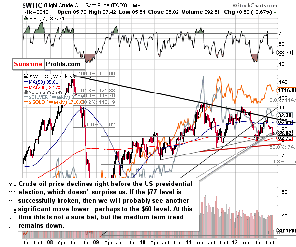
In the Crude Oil Price chart this week, we have seen a further deterioration in prices. Two weeks ago we mentioned this as being likely since it’s a positive reflection on politicians running for office.
At this time it seems that the medium-term trend for crude oil prices is down, and if the neck level in the head-and-shoulders pattern is broken, then the downside target level would be close to $60. This is considerably lower (about 30%) than today’s crude oil price and would not necessary bring gold and silver down as significantly. Such a case was seen in mid-2011. All-in-all, however, the short-term implications here are bearish for the precious metals.
Correlation Matrix
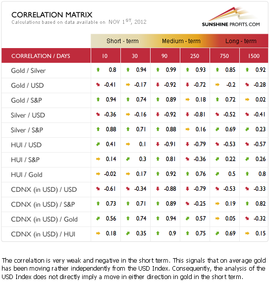
The Correlation Matrix is a tool which we have developed to analyze the impact of the currency markets and the general stock market upon the precious metals sector. We continue to see little correlation between the USD Index and gold and the rest of the precious metals. This can be attributed to what has happened within the past month where metal prices declined despite the lack of a rally in the USD Index. This is a bearish factor for gold, silver and the mining stocks.
The general stock market is positively correlated with the precious metals. This has bullish implications in these days just before the US elections. However, since gold price increases are not really what the Powers That Be prefer to see right now (implications of inflation), we could see some deviation from the normal correlations. The point is that significant coefficients should not be considered as useful as they normally are. In short, the overall implications of this table are bearish to neutral for the precious metals sector.
Gold
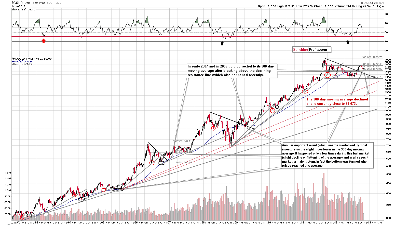
In gold’s very long-term chart, last week’s Premium Update comments about the 300-day moving average are still timely.
The 300-day moving average has declined slightly and this has only been seen a few times in this bull market.On each occasion, lower prices never followed on a medium-term basis meaning a major bottom formed.Any declines to or slightly below this average (when it declined) were short-lived.
Since the 300-day moving average declined this week, we have lowered our target level by $10 to $1,673. This is a bit more than 2% below Thursday’s closing price level.
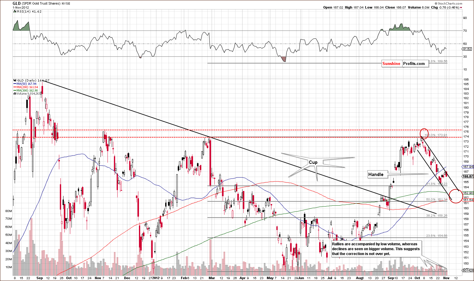
Analysis of the short term GLD ETF chart once again gives us bearish implications based on price trends and price/volume action. Declines have been accompanied by relatively high volume and no breakout has been seen. In Wednesday’s Market Alert, we commented on the resistance lines of gold and silver in the following way (the above chart provides illustration):
Gold and silver moved higher, but they didn't move above their short-term declining resistance lines. In case of the GLD ETF and SLV ETF such lines are created based on intra-day highs of Oct 4 and Oct 11.
For the yellow metal, the line was touched but not broken and gold prices declined on Thursday. The question is “when will the downside target levels be reached”? It seems that this is likely about a week or so away and gold will likely bottom in the range shown by the red circle in our chart, somewhere in the $161 to $163.5 range. Our best guess is still the 300-day moving average, which is currently at $162.90
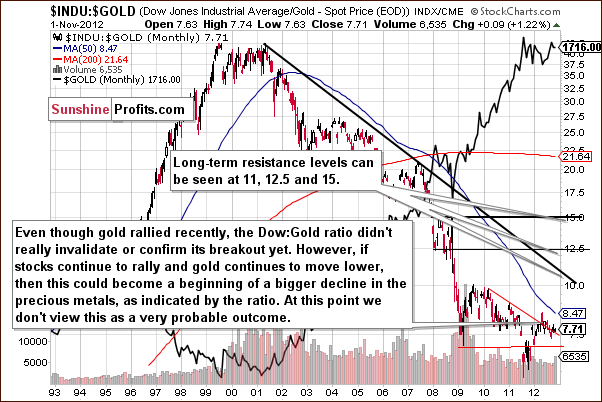
In this week’s Dow to gold ratio chart, the jury is still out as to where the ratio is headed next. The ratio is almost exactly where it was last week and there has been no confirmation or invalidation of the breakout. We will continue to monitor this situation.
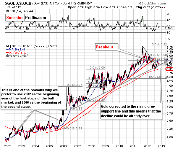
In this week’s gold to bonds ratio chart, there is no change from what we wrote in last week’s Premium Update.
In this week's gold to bonds ratio chart, we see a move to the rising (grey) support line but this development is not that significant. The reason is that the gold charts seen earlier are more important. Consequently, another move here to the rising 200-week moving average might be needed, a retest of this support line. The fact that the ratio moved to the rising support line is bullish but only slightly. This very support line failed to hold just a few months ago.
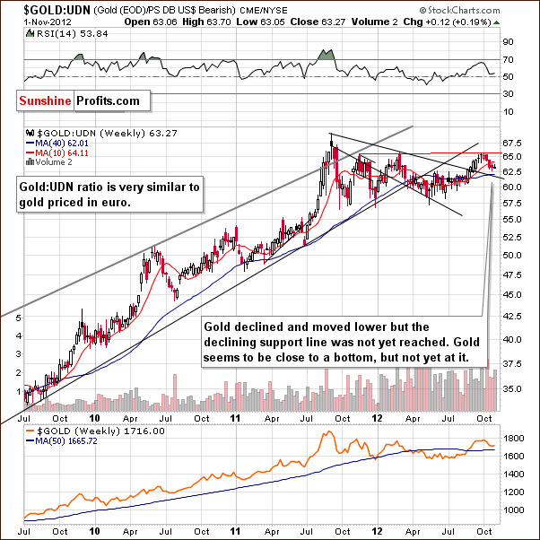
In this week’s chart of gold from the non-USD perspective, there has been no significant change and very little movement in the index level which is almost exactly where it was a week ago. Last week’s Premium Update comments are still up to date:
In this week's chart of gold from the non-USD perspective, we see some declines but not enough to reach the key support level. The index is less than 1% higher than it was a week ago and it seems that the declines are almost over but not just yet.
Summing up, the situation in gold continues to look bearish for the short term and bullish for the medium and long term. The target level based on the 300-day moving average has been lowered to $1,673.
Silver
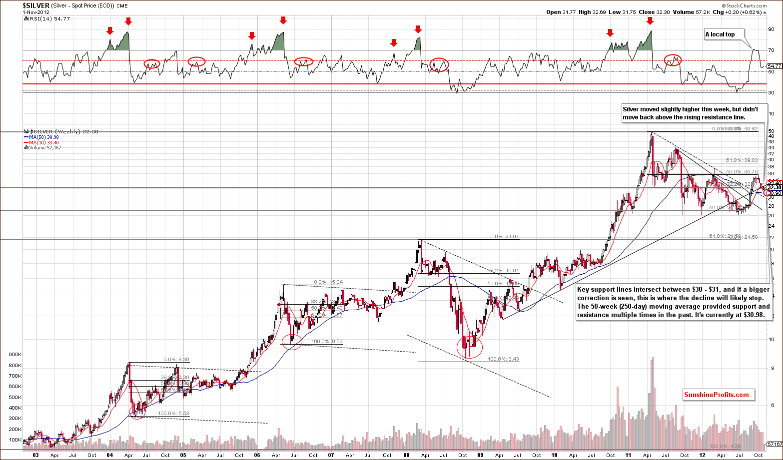
In the very long-term chart for silver this week, we have seen a small rally, which is probably nothing more than a confirmation of the recent breakdown and Thursday’s closing price is only 0.10 higher than it was a week ago. Price levels remain close to two previous support lines, one of which now provides resistance (the rising support-resistance line based on 2009 and 2010 weekly lows). Our target level is not much below silver’s current price, but it has not yet been reached.
What we stated in last week’s Premium Update about the 50-week moving average is worth repeating here:
The 50-week moving average is now at $30.98, so it is very much in our target range for the current decline. Volume levels in the past few weeks have been lower as compared to the preceding rally, so the technical picture looks positive for the medium term. An additional $1 (or bigger) decline will likely be seen before the next bottom forms though.
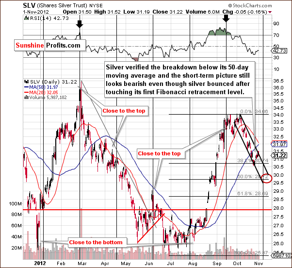
In the short-term SLV ETF chart, we have illustrated a declining trend channel as we did for the GLD ETF. The declining resistance line has not been broken this week, and the target area remains unchanged. There is one significant difference, however.
We have fine-tuned the cyclical turning points to better correspond to recent tops and bottoms. It seems likely that this will improve the accuracy of future market calls and we should begin to see the fruits of our labor in a week or so, as this is where the next cyclical turning point is located.
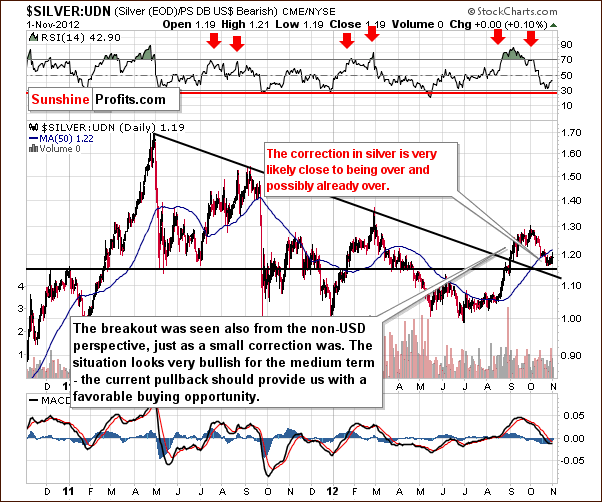
In the chart of silver’s price from a non-USD perspective, the final bottom seems not to have yet been reached. This is pretty much in tune with last week’s comments, and although the bottom may be in place, it probably has not yet formed.
Summing up, the situation is unchanged from last week. The correction is likely not over yet, and silver’s price will probably move $1 or more to the downside before the final bottom is reached. Our target area remains at $30 -$31.
Palladium
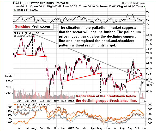
In this week’s long-term chart for palladium, we will follow up on what we wrote last week. Palladium rallied in recent days, but did not surpass the previous support line which is now providing resistance. The recent rally did not invalidate the bearish implications here as it has not been significant thus far. A sign of strength for this metal would have bullish implications for the precious metals overall. Lacking a breakout here, the next move for palladium will likely be to the downside, and this holds true for the precious metals sector overall as well.
Mining Stocks
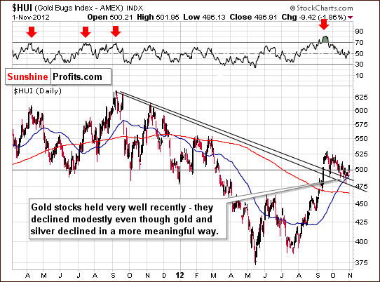
In this week’s medium-term HUI Index chart, this week’s performance was overall good. Although some volatility was seen following the hurricane-forced market closure, Thursday’s decline followed Wednesday’s rally, and the index is actually a bit higher than a week ago. The gold stocks continue to outperform gold.
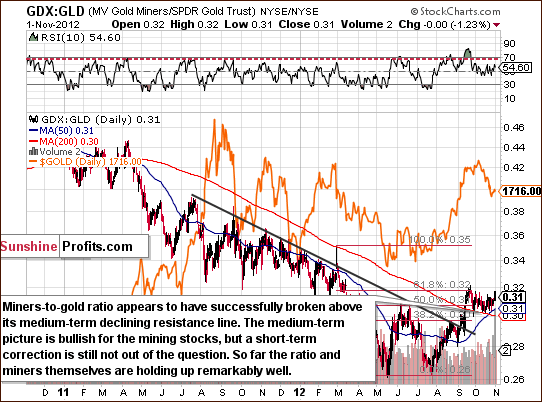
In the long-term miners to gold ratio chart, we see a rally (in the recent days) supported by strong volume. With the ratio of volumes high, the suggestion is that moves to the upside are true in nature, and this is yet another bullish confirmation in favor of the mining stocks.
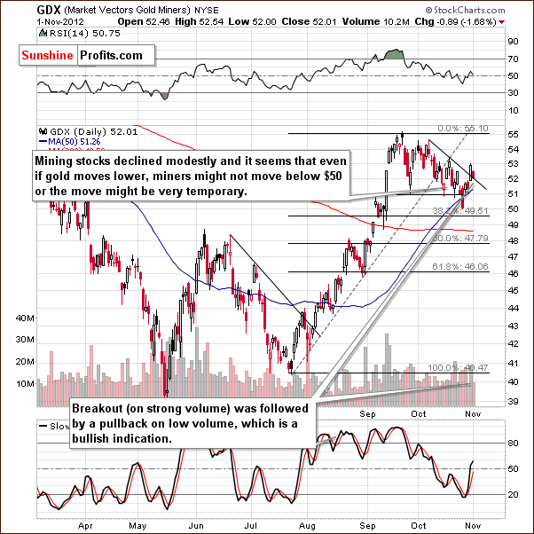
In the GDX ETF short-term chart, we see a breakout above the short-term support line. Analysis of volume here provides just the opposite of what was seen for gold. Moves to the upside are accompanied by high volume levels and price declines are seen on low volume. This is a bullish implication, and we believe that being long on mining stocks is still a very good idea.
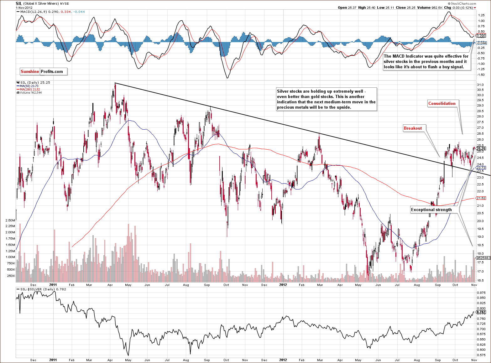
This week we again include the long-term Global X Silver Miners chart. The rally seen on Wednesday was truly spectacular and so was the lack of decline on Thursday! The last time volume levels were seen like this was in the first half of 2011 during a major rally. This is an important achievement. The silver miners held their gains, being pretty much flat on Thursday when gold miners declined. There is exceptional strength in the silver stocks right now.
Perhaps we are close to the last call for purchasing gold and silver stocks before the huge rally truly begins. While their price levels could move down a bit if gold and silver decline, it will probably be to a minimal degree. The rally seems that it will be significant and it appears too risky to wait for slightly lower prices.
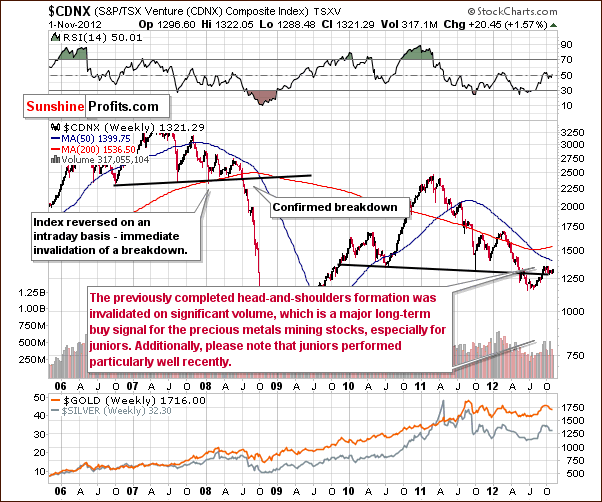
In the Toronto Stock Exchange Venture Index (which is a proxy for the junior miners as so many of them are included in it), price levels continue to hold and do well despite declines in the general stock market and in gold and silver prices. The situation in precious metals mining stocks is definitely bullish based on this chart.
Summing up, the mining stocks continue to show exceptional strength and the outlook remains bullish. Speculative long positions in the miners continue to be a good idea at this time.
Letters from Subscribers
Q: How important is seasonality in your analysis of gold and gold stocks? I understand that gold and gold stocks typically start to advance into the 4th quarter of the year starting now.
A: Actually we replied to a similar question last November. Back then we were asked about the effect of options expirations on the prices of precious metals. Since we analyze them along with seasonal patterns, we believe those comments are also applicable in this case - we're quoting it below:
We believe the effect of the derivatives expiration should be examined along with the seasonal tendencies in metals. In other words, we believe the best approach is to determine the average influence that options have on gold when they expire and combine this influence with the seasonal factor.
Let's take a look at the seasonal tendencies to see the likely path for gold based on how it has performed each November during this bull market, and then apply the "derivatives' expiration factor". In this case we'll apply the options' expiration effect. Please take a look at the chart below for details.
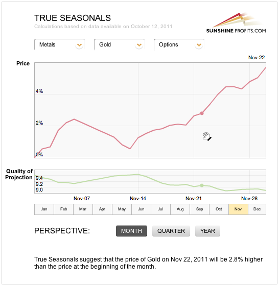
(The chart that you're seeing is not yet available as a tool, but it will be available soon.)
In short, gold's consolidation in the early part of November is in tune with the true seasonal pattern (seasonals + expirations of derivatives' effect) and based on this pattern we can expect the end of the month to provide us with higher prices, not lower ones.
Q: Do you also look at the Commitment of Traders (COT) indicator in the futures market when figuring out the entry point for silver/gold? Currently the silver COT shows that large commercial speculators are still mostly short.If so, I am wondering what the picture was like back in late 2010, and also in 2008 right before metals took off?
A: We have previously answered quite a few questions about the Commitment of Traders report and we believe that quoting two of them (along with corresponding charts) will answer your question as well. In short, CoT reports act somewhat like a momentum indicator and yes, bottoms in prices often correspond to extreme readings in these reports. We don’t feature CoT in our weekly reports because of our policy of not releasing anything before we’re 100% sure that what we offer is really useful and really works (and the results are stable). Preparing an indicator based on the CoT reports is one of the things that are on our 2-do list (on a side note this list is quite long).
Q1: I've tracked down the website which publishes/discusses the latest COT reports. These are compiled by the Scarborough Bullion Desk (they have impeccable credentials) and accessed by this website: http://politicalmetals.com/2011/06/21/will-it-be-up-or-down/ who analyze and discuss in depth the significance of the information they contain. I assume Clive gets the reports and analysis directly from www.politicalmetals.com which is a no subscription site. The first link above will take you directly to the article which is causing such excitement, both to Clive and the author.
I have read it, and though I don't fully understand the basis of their conclusion (silver will bottom shortly in the mid 30s and then rocket upward to at least $50 by year end) - I can well understand that their reasoning could be regarded as unquestionable from past experience.
In the event you do not wish to go to Clive's website, I'm pasting his relevant articles in, though I have doubts as to whether the graphs will reproduce. Having said that, you will probably get a better overview from www.politicalmetals.com and http://politicalmetals.com/2011/06/21/will-it-be-up-or-down/
A1: Generally, the whole bullish analysis stems from the chart including a Commercial Net Short)/ (Total Long) Ratio. This ratio is close to its previous lows and when it was previously similarly low, silver bottomed, so the argument is that silver is bottoming right now as well.
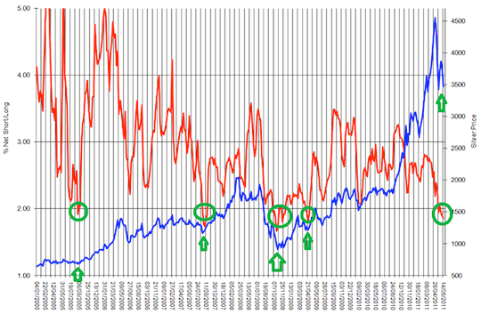
At first it looks quite convincing. However, upon second look, we see something not emphasized in the chart - that the ratio is in fact in a downtrend. It's quite obvious in terms of lower tops on average, but it is not that obvious when one takes a look at the lows
There are 4 lows that are featured on the chart and actually only 3 of them mark major bottoms that are at the same time start of a bigger rally. The most recent one is just a local bottom seen after the correction from a true 2008 bottom.
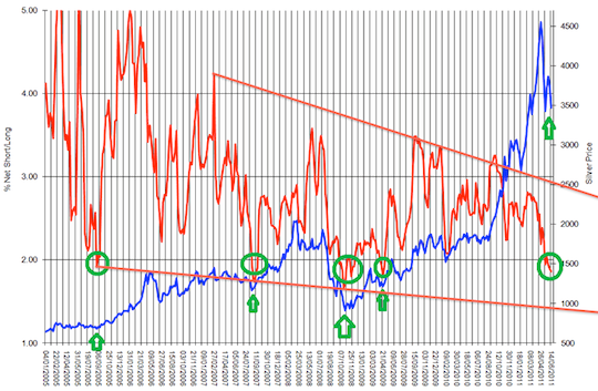
Now, if we take these 3 important bottoms into account a new pattern will emerge. Namely, that the major bottoms in silver are accompanied by the ratio moving below previous lows and possibly to the lower border of the trading channel. Either way, this suggests that what we have seen so far is not yet the final bottom and that a move toward the declining support line will likely confirm that the bottom is in fact in.
Another point worth noting is that none of the major rallies (indicated by green ellipses and arrows) started soon after a previous major top and this is what the "horizontal buy level" theory would imply. However, taking a relative (here: trend) approach would allow for further declines that would take more time. This would make the next super buying opportunity in tune with the previous ones and since history rhymes it seems to be the more likely outcome.
There's one more interesting phenomenon that is connected with silver and taking a relative approach - the silver:gold ratio. Please note that we've written about this ratio in mid-April) and soon after that ratio topped at the upper border of the rising trend channel - along with silver itself. Please note that it did not top at the previous highs, but at the resistance based on the trend channel.
Summing up, there is more than one way to analyze the Commercial Net Short)/ (Total Long) Ratio and it seems that the relative approach is more appropriate. Consequently, we don't view the current levels of the ratio as a strong short-term buy signal
Q2: Could you please comment on the article from Zeal about the COT report? I would find your views on this most interesting, thanks.
A2: We agree that the COT report indicates that the gold market is oversold from the long-term perspective. However, we currently view this as no different than an indication from a really long-term RSI indicator or another momentum indicator based on a long-term chart. This type of analysis works very well as a confirmation of an ongoing trend. The "problem" right now with this type of analysis is that gold has actually broken below its long-term support line at the end of 2011 and is now in a medium-term downtrend. It has also broken below its 300-day moving average. This implies that while the situation is oversold, it may become much more oversold in the following weeks. The positions visible in the COT report may become more prominent and the situation more extreme - which would accompany gold below $1,500.
Stop-loss Details for Sunshine Profits Indicators
Last week we wrote the following about stop-loss levels for orders based on signals from the SP Indicators:
The next step (which is almost ready today) will be to create a section dedicated to stop-loss orders which will feature the long-term profitability of each of the indicators associated with various stop-loss levels. This is what convinced us that the optimal values of stop-loss levels are really something optimal and not found by a coincidence.
…And this week we deliver. We created a new section in the SP Indicators category entitled Stop-loss Details. Please click the link to see and read our discussion on our choices regarding stop-loss levels. As a reminder – we will continue to notify you about signals from charts via e-mail (manually) until we set up the system that will do it automatically (again, via e-mail). In other words, you are and will continue to be notified about these important signals.
Summary
The USD Index declined modestly after reaching a cyclical turning point, but since the decline was quite small it seems that the dollar will rally before any further declines are seen. The implications are bearish for gold, silver and mining stocks, even though the correlations this week are not really significant (they are not significant because metals declined even without dollar’s significant rally).
The general stock market is mixed for the short term and the final support line for stocks has not yet been reached. With Election Day looming, however, some strength is possible for stocks in the coming days. This will probably have a positive impact on the precious metals. Keep in mind, however, that the classic correlation matrix implications may not be as dependable right now due to the influence of the US elections.
Gold is still in a short-term downtrend and silver is as well. The downside target level for gold has been lowered to $1,673 based on this week’s decline in the 300-day moving average, and silver still appears to be heading to the $30 - $31 range. The mining stocks, however, have broken above their declining short-term support line, and analysis of volume for the miners is positive as well. They appear poised to continue to outperform the underlying metals and perhaps rally even despite weak performance in the underlying metals. We do not have any downside target levels for the miners at this time as it seems they may move no lower than price levels seen last week.
Long-term investments: remain in the market with your precious metals holdings
Trading – PR: Short position in gold and silver (not in mining stocks).
Trading – SP Indicators: Long position in mining stocks.
| Portfolio's Part | Position |
|---|---|
| Trading: Mining stocks | Long |
| Trading: Gold | Short |
| Trading: Silver | Short |
| Long-term investments | Long |
Thank you for using the Premium Service. Have a profitable week and a great weekend!
This completes this week’s Premium Update. Our next Premium Update is scheduled for Friday, November 9, 2012. Of course, we will continue to send out Market Alerts whenever appropriate.

