

Briefly: in our opinion, full (300% of the regular position size) speculative short positions in junior mining stocks (GDXJ) are justified from the risk/reward point of view at the moment of publishing this Alert.
Some might consider an additional (short) position in the FCX.
Welcome to this week's flagship Gold Trading Alert.
Predicated on last week’s price moves, our most recently featured medium-term outlook remains the same as the price moves align with our expectations (and we remain on a streak of 11 realized – unleveraged – trades). On that account, there are parts of the previous analysis that didn’t change at all in the earlier days and are written in italics.
The key event of the recent past is still gold’s profound weekly reversal that we saw three weeks ago, which was then supplemented by yet another weekly reversal last week, and nothing that happened in the meantime invalidated the enormously bearish implications thereof. While I realize that it’s most difficult to focus on what really happened instead of following the prevailing feeling (it “feels” most bullish close to the tops), I trust that my analysis will help to keep things in the proper perspective.
The notable short-term events of smaller importance are the sharp decline in the junior mining stocks, silver’s breakdown below its head-and-shoulders top pattern, and USD Index’s decisive comeback. And yes, it’s all bearish for the future of the precious metals sector.
The key fundamental development that happened recently is Fed’s dovish turn, which is I’ll once again start with a quote from the previous analysis about that topic, and I’ll move to the technical details next.
Debunking Rate-Cut Optimism
The recent narrative uplifting stocks and the PMs is the belief that a pivot is bullish. Conversely, pivots are not bullish, and risk assets often crash when they realize why rate cuts are occurring.
Please see below:
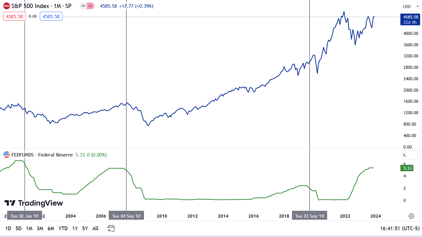
To explain, the blue line above tracks the S&P 500, while the green line tracks the federal funds rate (FFR). If you analyze the horizontal gray lines, you can see that the last three times the Fed cut the FFR, the S&P 500 was already sinking or was approaching a cliff.
Therefore, while it may seem like new highs are inevitable for all assets, the recent optimism is more of a ‘buy the rumor, sell the news’ type trade. In other words, investors will likely bail on the S&P 500 and the GDXJ ETF when the Fed actually cuts rates. To that point, with oil prices resuming their crash, it’s a bad look for global growth when crude oil falls below $70.
Overall, the fundamentals continue to unfold as expected, with higher rates weighing heavily on the U.S. economy. And while the ‘bad news is good news’ trade remains intact, history shows it should end with sharp drawdowns of the S&P 500 and the GDXJ ETF, and a meaningful rise in the USD Index.
Later, I added:
Again, the immediate-term reaction is one thing, as people reacted emotionally to more dovish approach. We also saw an immediate-term rally in 2019, but then a decline materialized, anyway.
So, no, the current move higher doesn’t change the outlook. The big move is still likely to be to the downside. I know that it might be difficult to think so while gold jumped over $30, but this really is the case. Remember how difficult it was to doubt gold’s breakout to new highs? On Dec 4, 2023, I wrote that the breakout is likely to be invalidated and followed by a massive slide. I started that day’s analysis with the following sentence:
“During sharp rallies, it’s nearly impossible to convince investors that this move is about to end. And yet, that’s exactly what is likely.”
That was the top.
And this sentence applies also today. The breakdown below the rising support line in gold was not invalidated and the next big move is likely to be to the downside.
Before I move to gold’s breakdown below its rising support line, it’s consider the key event – the weekly reversal.
I previously wrote about some details coming from the broader perspective and some from the immediate-term analysis, and all that remains true. The recent weekly reversal was so huge that its impact on the next weeks really needs to be kept in mind at all times. It’s not likely that a daily price move in any direction (…) would invalidate the implications of the powerful weekly (!) reversal.
In case that massive reversal seems like a distant memory, here’s a reminder of what happened.
Gold soared above $2,100 only to then plunge to almost $2,000, and in happened on huge volume. This was the most profound weekly reversal in years. It was similar to the reversal that we saw in May 2023 and the one from March 2022, and they both started big declines.
The same is likely this time.
This means that this and last week’s moves higher were just a small rebound before the decline’s continuation.
This is particularly likely given the fact that both previous weekly reversals were followed by some kind of bounce before the decline really picked up pace. In 2022, it took several weeks before the second (lower) top formed and in May 2023 the corrective upswing was over within a week. Right now, we’re 1.5 weeks after the reversal, which means that the decline could start any day now.
Also, please note that in 2022, gold corrected over 50% of the initial decline before finishing the rebound, and in May 2023, gold corrected slightly over 61.8% of the initial decline before moving south. This means that the size of the rally that we just saw is nothing extraordinary. In particular, it doesn’t mean that gold rallied so much that it invalidates the immensely bearish implications of the recent weekly reversal.
Gold recently moved a bit above the 61.8% Fibonacci retracement level, just like it did earlier this year, and – again, just like it did earlier this year – it then moved back below it. Moving back below this retracement meant that the top was in. The same happened this time.
This is in perfect tune with the previous post-massive-reversal-top price patterns, which means that it doesn’t invalidate them. This is a normal behavior after a gargantuan reversal.
This is in perfect tune with the previous post-massive-reversal-top price patterns, which means that it doesn’t invalidate them. This is a normal behavior after a gargantuan reversal.
Yes, I put the same paragraph twice, and I did it in purpose. If there’s one thing that I want you to remember about the current market situation is this. I’m going to continue to describe what’s happening in other markets, but – given the profoundness and importance of the weekly reversal – the above is enough to make the current outlook for gold (and in consequence for silver and mining stocks) bearish for the following weeks (and likely months).
On top of the above we saw another weekly reversal last week. Just when it seemed that the medium-term outlook for gold couldn’t get any more bearish – it did.
Having said that, let’s take a look at the currency markets as what’s happening there is one of the key building blocks for the situation in the precious metal and mining stocks.
Starting with the most recent events, we see that the U.S. currency has been moving relentlessly higher in the last several days.
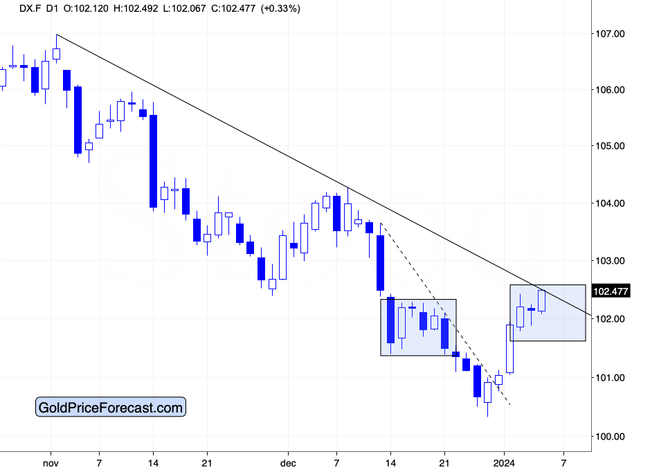
Given the sharpness of the initial part of the rally, a breather was likely to take place, and indeed it materialized. The thing is that yesterday’s pause – because that’s when that breather took place – was tiny. The USD Index declined in the late trading on Wednesday and then early on Thursday, but ultimately the size of the entire decline was negligible. These kind of corrections characterize the strongest of rallies, and it seems that’s exactly what we have here – a very strong rally.
Now, since the USD Index just approached its declining resistance line, we might (or might not) see a several-day long pause. If we see it, it would be something natural, and the end result could actually be bullish.
The reason is that USDX’s pause here could mirror the pause that we saw in the second half of December (marked with rectangles), which would both serve as shoulders of an inverse head-and-shoulders pattern – that’s a bottoming formation.
This is in perfect tune with what I wrote previously, and those comments still remain up-to-date – they continue to support even higher USDX values.
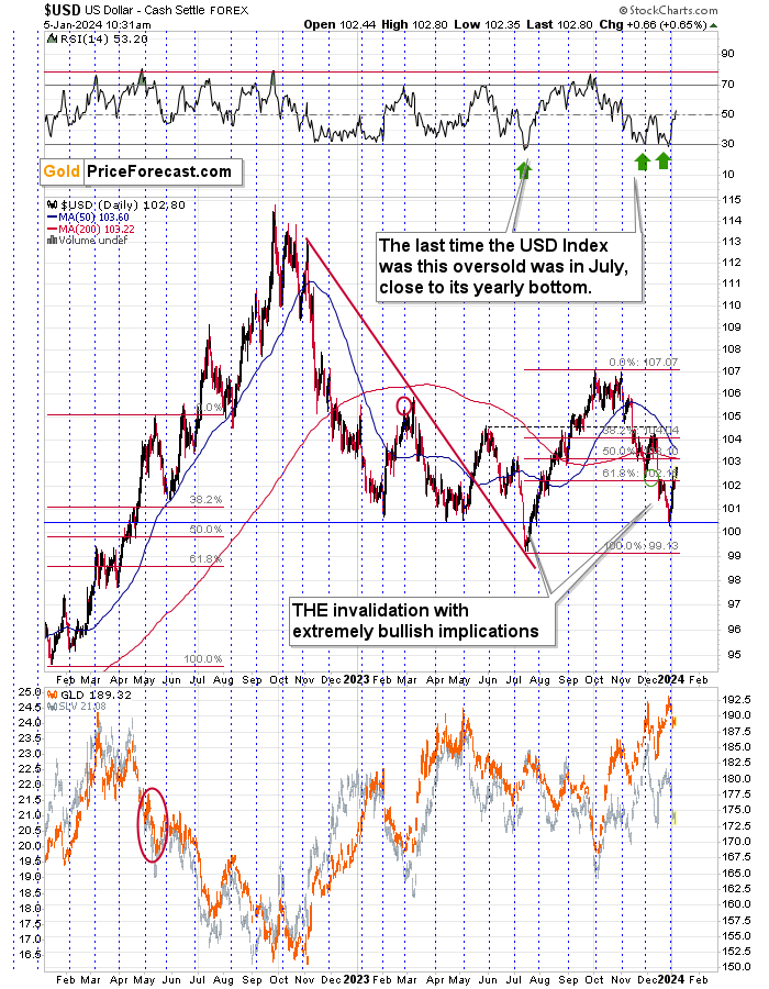
Let’s check the facts:
- The USD Index is after a sizable, short-term decline, which caused it to be very oversold in RSI terms.
- The last two times, when the RSI was similarly oversold, immediately preceded bottoms and rallies (including the yearly bottom).
- The USD Index is slightly above the all-important 100 level, which serves as a strong support due to psychological reasons (everyone notices it as it’s a perfectly round number).
- The USD Index is at its previous bottoms – each time the USD Index got close to the current levels in 2023, it then bottomed and rallied.
- It’s very close to the turn of the month, and the USD Index has a strong tendency to reverse its course close to those moments (as marked with blue, dashed lines). Since the last move was to the downside, the reversal has bullish implications.
There is one additional clue on the long-term chart.
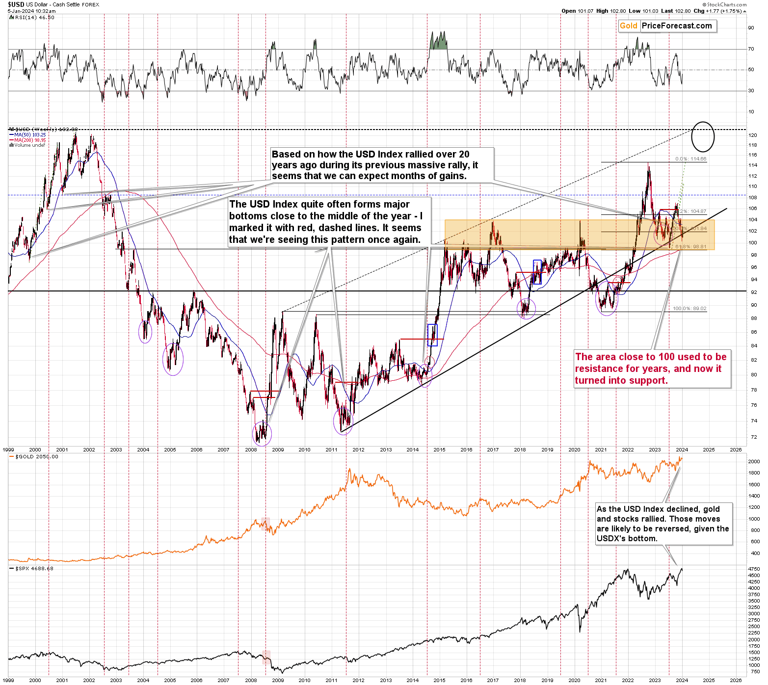
It’s the rising, long-term support line that started in 2011. It was reaching this line that triggered the reversal and caused the yearly bottom to form. Precisely, the USD Index broke slightly below this line, and it was the invalidation of the breakdown that created the bottom.
The USD Index is EXACTLY in the same position right now!
We just saw the invalidation of the breakdown below the rising, long-term support line – we once again saw the key buy signal!
Since gold was recently willing to decline even while the USDX was moving lower… Gold is likely to truly plunge (and the same goes for other commodities, like natural gas, the key industrial metal - copper, even uranium) when the USD Index finally rallies. And it looks like those price moves have already started.
Also, to make the outlook for the USD Index even more obvious, please keep in mind that USD Index’s biggest component, the EUR/USD formed a bearish pattern, suggesting a quick reversal – and that’s exactly what we saw.
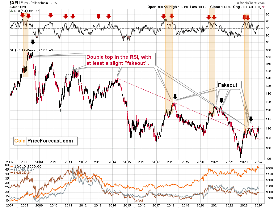
The European currency moved once again to its early-2023 top, thus likely creating a multi-top pattern. This has been a common way for the EUR/USD to top and I marked the previous cases on the above chart.
In 2008 and in 2011 there were sharp, final comebacks to this level before the decline continued. The one in 2014 was small, but it was still there, and the same goes for the one seen in 2021.
What might see chaotic or a game-changer from the short-term point of view, often becomes normal and orderly when looked at from a bigger perspective.
In fact, the above sentence might be one of the key benefits that professional analyses offer. Thanks to being able to view the bigger picture, and to having a broader perspective (thanks to knowing what to focus on), experienced analysts are able to see the situation as it is, instead of “feeling” what the market is currently “feeling”, which is what most (especially beginning) investors do.
Remember the Gamestop craze?
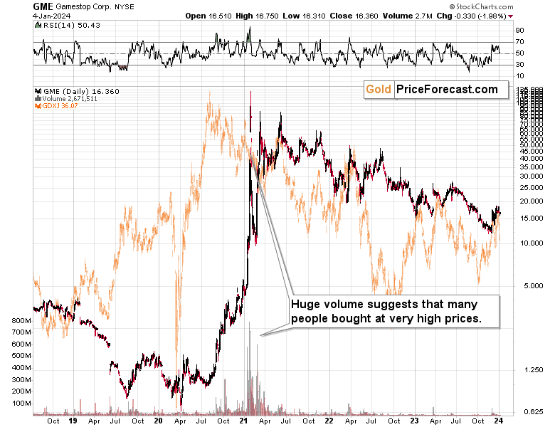
Many people bought into the rally hoping for a “todamoon” scenario. Indeed, the share value moved higher initially, but when the vast majority of people jumped on the bandwagon (as we see in volume readings), it was already too late – that was the top.
Back then, I wrote that this rally was unsustainable, and I wrote the same thing about silver’s short-term rally that we saw at that time… And people were laughing at me when I wrote that while the reasoning behind silver’s WHY – as to why it should rally – was correct, the timing was completely wrong. They didn’t laugh for long, as that was indeed a top, and higher silver prices were not seen since that time.
In early 2021, I wrote that if people wanted to push silver higher, they would need to do it when it was already strong on its own (after a huge decline), and not during a medium-term move lower.
What happened then?
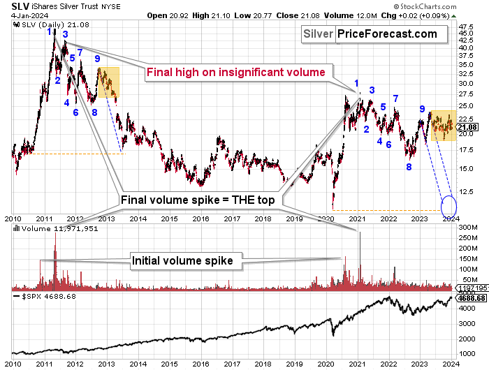
What pretty much always happens after the investment public gets particularly excited about something. We saw a top while silver futures moved slightly above 30 and SLV topped on huge volume – just like it did in 2011.
Looking at historical analogies (note the markings on the above SLV chart) made it obvious that this was a top in the making, and yet, it was nearly impossible to convince people that this huge-volume rally was actually not bullish.
And the historical analogies tell us something very important also this time.
The recent back-and-forth movement in silver is similar to what silver did in late 2012 and early 2013, but that’s just the final part of a long-term analogy.
The final tops (2011, 2021) formed on huge volume, and that was preceded by an initial volume spike. Then the SLV ETF declined in a back-and-forth manner, where we saw 9 bigger highs and lows. Then, after the final (9) top, silver declined in a back-and-forth manner in a smaller range.
We see the same thing right now. The current price movement is what preceded one of the biggest declines in silver’s recent history, so it’s difficult to view the recent performance as something bullish.
The analogy to 2011-2013 had very bearish implications for the following weeks and months, so the implications here are bearish, not bullish.
Yet, just as it was difficult to view silver’s 2021 rally as a top, it’s difficult to view the recent back-and-forth movement in silver as an indication of the upcoming decline – a really big decline.
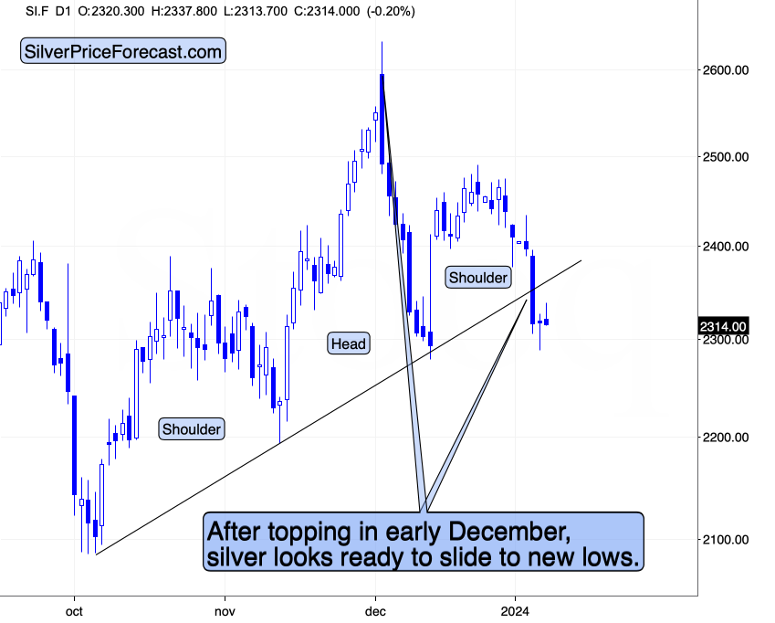
The fact that silver just broke below its head-and-shoulders top pattern makes the short-term outlook bearish, and given the above-mentioned context, we can say that the medium-term picture is profoundly bearish as well.
I previously wrote that silver could pause after breaking below the pattern, and it that’s what happened. The corrective upswing was not huge, suggesting that the silver market is weak, and that it’s about to slide quite profoundly.
Today’s close will most likely be the third consecutive close after the breakdown and seeing it will imply that the breakdown was complete. This will have very bearish consequences for silver (as well as gold and mining stocks) for the following week.
Moreover, the short-term performance of junior mining stocks confirms that we might not need to wait for long before the slide continues.
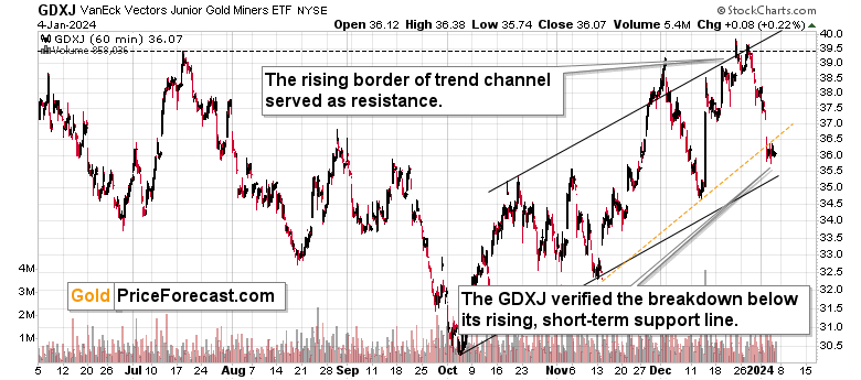
The reason is not only mining stocks invalidation after trying to break above the December and July highs, and it’s not only miners’ general weakness relative to gold.
It’s also because junior miners just moved below their rising support line, and then they verified the breakdown by moving back to this line without invalidating the move.
In yesterday’s analysis I wrote the following:
I told you that this was the likely outcome, when very few wanted to believe that and… That’s what juniors did.
The GDXJ closed the day below $36, and it’s after the breakdown below it’s very short-term (marked with orange) support line. During yesterday’s session, juniors moved below this line, then they moved quickly back to it, and then they declined once again. That’s a tiny – but still – verification – of the quick breakdown. The decline can now continue, but another move to this level is not out of the question, either.
I previously wrote that our winning streak of 11 closed profitable (unleveraged) trades is likely to get longer, and yesterday’s slide in the GDXJ definitely confirms it.
Congratulations on staying strong and patient when juniors were moving higher, and it “felt” like they were breaking to new highs. It was a trap, and you didn’t fall for it.
Indeed, we saw another small move back to the rising resistance line, and it didn’t change anything. Actually, the fact that junior miners moved back to this line without moving above it makes the short-term picture more bearish.
Exciting times are ahead – that is unless one “follows the herd” that often gets on the wrong side of the trade at the exact reversal point… You know when people will be most reluctant to buy? At the bottom. And that’s where we plan to buy aggressively.
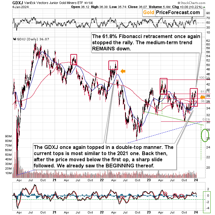
GDXJ’s medium-term chart shows that it formed a double top, just like it did many times in the past.
The current tops is most similar to the 2021 one. Back then, after the price moved below the first op, a sharp slide followed. We already saw the BEGINNING thereof.
This means that my previous comments on the above chart remain up-to-date:
(…) Moreover, please take a look at the areas that I marked with red rectangles. They mark important tops in the GDXJ ETF. In call those cases, junior miners topped by first declining somewhat, then correcting, and then sliding without looking back. In two out of three cases the second (final) top was below the initial one, and in the remaining case (in early 2022), the second (final) top, was slightly higher than the initial one.
So, is seeing the GDXJ close to the previous top (but still below it) a bullish game-changer? Absolutely not.
All in all, the outlook for the precious metals market remains strongly bearish and the potential for our current trading positions in junior mining stocks remains enormous.
What’s next? While the next 1-3 days are a bit unclear, the entire roadmap that I featured for the GDXJ ETF in my previous Gold Trading Alert remains very much up-to-date.
The markets usually don’t move up or down in a straight line, so some kind of correction is likely to take place in the future, anyway. The question is from what price levels.
My best candidate for the first correction (based on the data that I have available right now) is The $30.5 - $32 range, which is based on the previous lows. I don’t expect a huge rally from those levels, though. Perhaps a move from $30.5 to $32, and then the decline would continue.
The next target is more important. After breaking to new 2023 lows, the move to the 2022 low (close to $26) becomes a good possibility – I marked this area with a green ellipse.
Once this level is reached, I then expect the GDXJ to correct in a more visible manner. After all, at that point, it will be after important breakdowns:
- Below the rising blue support line
- Below the previous 2023 low
- Below the green support line
Consequently, a verification of those breakdowns by a move back to them, would be quite normal. This means a move back to $29 - $30. Then, after a successful verification of those breakdowns, I’d expect the GDXJ to slide lower – to the 2020 low or close to them – at about $20.
There’s also a good possibility of seeing a bottom at about $22, as that’s where we have a downside target based on the head-and-shoulders pattern that is most likely being formed right now. It could also be the case that the GDXJ slides to about $20 on an intraday basis only to recover and close the day at about $22. In a way, both targets would be reached in this case.
There are many IFs around the above-mentioned scenario, and the situation might (and it probably will) change as we go. Remaining open-minded and flexible regarding the new information is key, but having a roadmap is very useful, too, as it shows how things could develop on a more-or-less basis. This can help you prepare for those – or similar – price moves.
Meanwhile, the implications coming from many long-term charts continue to favor lower precious metals and mining stock prices in the following months.
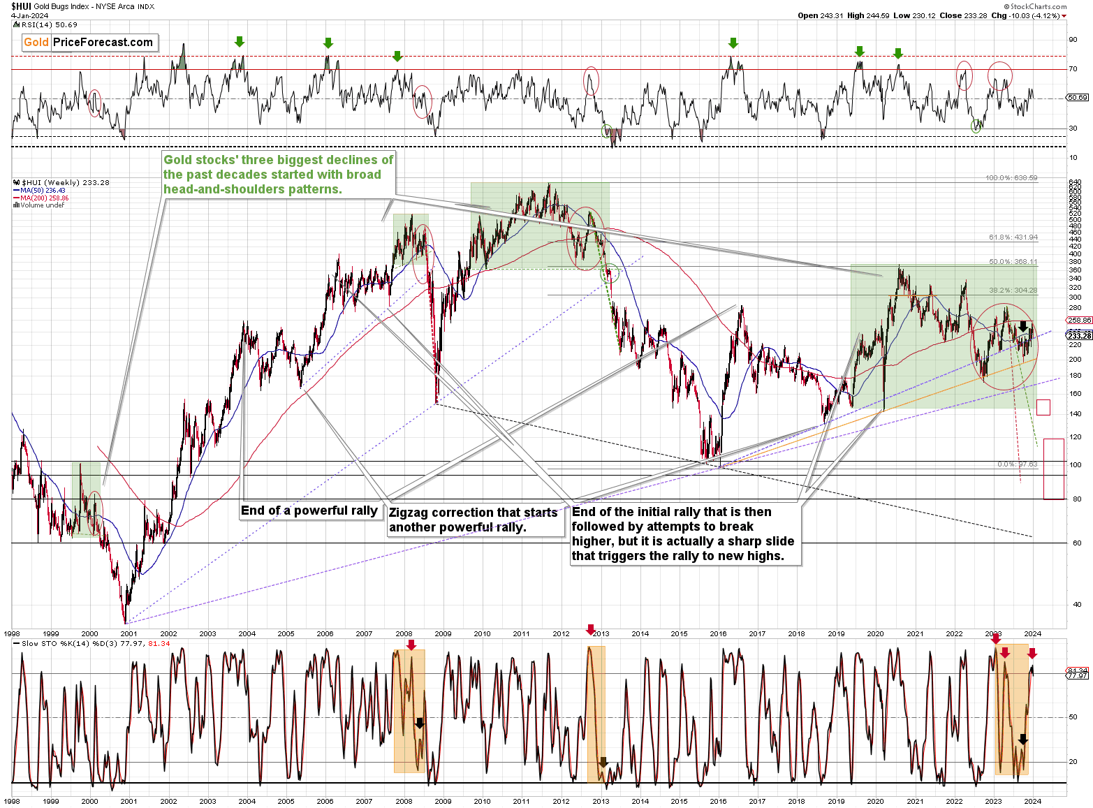
The big news coming from the long-term HUI Index (proxy for gold stocks) chart is the sell signal from the Stochastic indicator. This is not something that we see frequently (we saw it twice last year), but when we do, it’s really time to be paying attention.
This sell signal often follows major tops, and it confirmed the final 2008 and 2012 tops. It doesn’t get much more bearish than this.
In other news, the situation in world stocks hasn’t really improved recently.
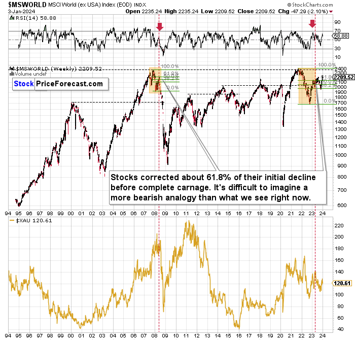
The situation continues to be very similar to what we saw in 2008, with the main difference being that now the initial decline was bigger. Because of that it’s no wonder that the corrective upswing is also bigger and it takes longer.
In both cases, world stocks corrected to approximately the 61.8% Fibonacci retracement, and they declined thereafter. This time, there were two corrections to that level, which is not that odd given that the initial decline was bigger this time.
The implications remain very bearish not just for stocks, but also for mining stocks.
As you can see miners (the XAU Index) suffered enormously in 2008 in the aftermath of the situation that’s so similar to the current one. Let’s take a closer look.
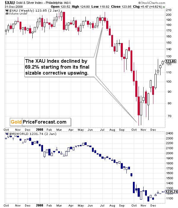
This analogy has very bearish implications for the following months.
And while we’re discussing stock market indices and their long-term charts, let’s not forget about the critical situation in the Toronto Stock Exchange Venture Index – one of the proxies for junior mining stocks.
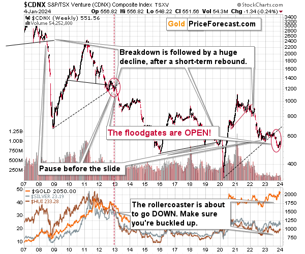
The TSXV is after a massive breakdown below the rising support line, that’s analogous to the one that we saw in early 2013 – and, to a smaller extent, to the one seen in 2008.
Now we see a pause in the decline, but given that the breakdown was already confirmed, the decline is likely to resume after the pause, and it’s likely to put a very bearish pressure on the precious metals and mining stock prices.
Gold stocks to other stocks also clearly show just how important and big the recent “strength” in the mining stocks were.
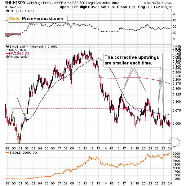
In short, both are nonexistent. The ratio between the HUI Index (proxy for gold stocks) and the S&P 500 Index (general stock market) is testing its recent lows.
It takes just a little push for the ratio to break below its 2-15, 2018, 2021, and 2022 lows. This is very bearish, because after that breakdown, there’s no significant support all the way down to the 2000 low close to 0.025. This means cutting gold stocks’ prices in half IF the general stock market stays at its current levels, and it means even bigger declines in gold stocks, if other stocks do decline.
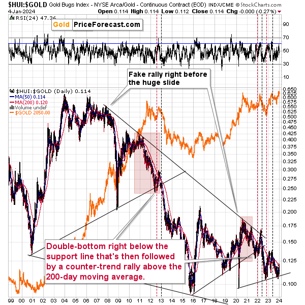
Comparing gold stocks to gold reveals that we saw another small correction within a long-term downtrend. Ever since mid-2021, all attempts to break above the 200-day moving average (marked with red) were followed by invalidations and declines in the precious metals sector.
This is bearish, and the same goes for the fact that corrective upswings were smaller in each time when the ratio moved from about 0.1. The 2016 bottom was followed by a sizable correction, the one from 2020 was smaller, then one that we saw in 2022 was even smaller, and this year’s correction is tiny in comparison.
The implications for the following months are very bearish, as when the ratio finally breaks below the rising support line, it’s likely to decline much lower – as low as the 2016 low or even lower.
The stock market recently flashed MAJOR sell signals (I’d view Paul’s decision to take profits from his previous long positions as another bearish confirmation) in the form of invalidations of breakouts to new all-time highs.
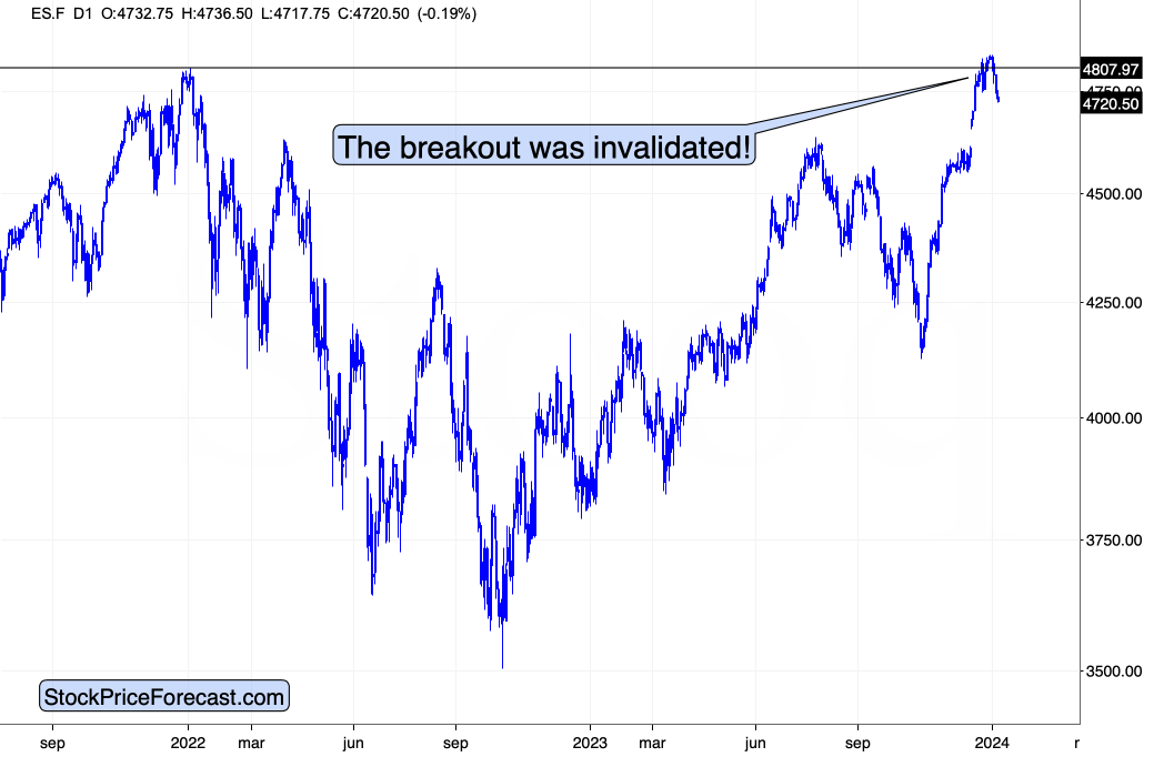
The invalidation is clear in case of the S&P 500 Index futures.
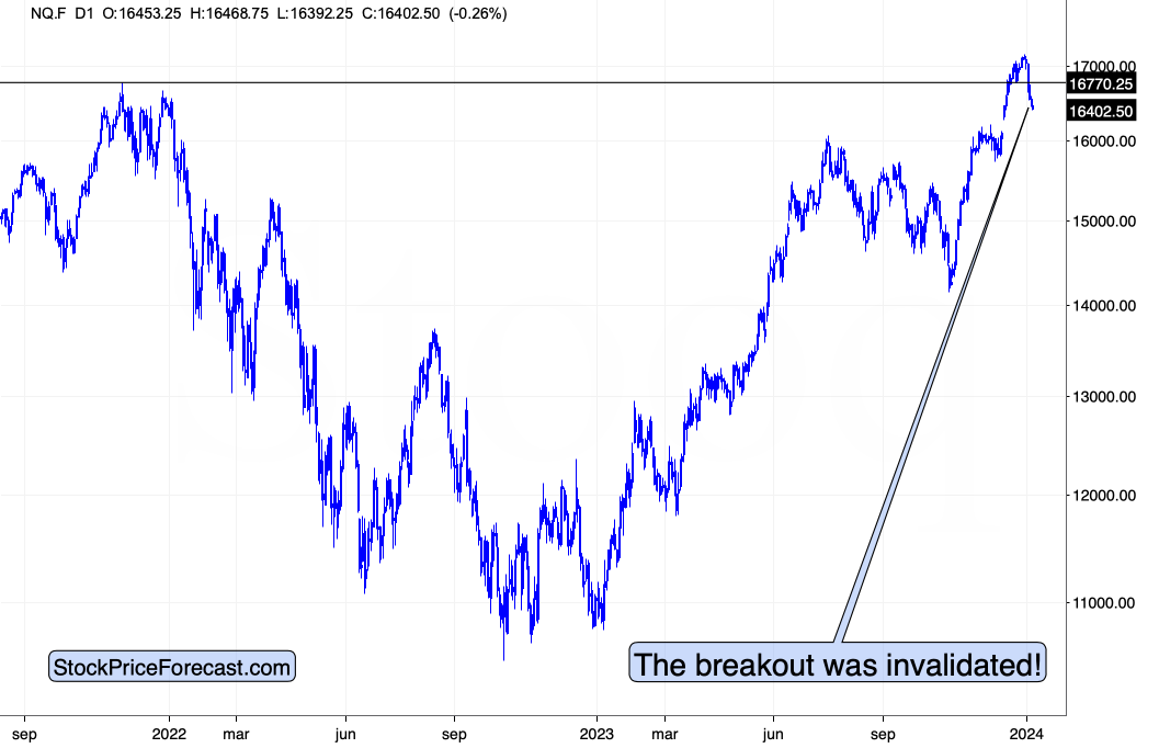
It’s even clearer in case of the NASDAQ Index, because in this case, this is the first invalidation, not the second one, as what we saw in the S&P 500 (in late December).
Both index futures are down in today’s pre-market trading, suggesting even lower prices ahead.
As far as tech stocks are concerned, there’s actually more important things going on than the short-term chart shows.
I wrote about it in Monday’s Gold Trading Alert, but it’s worth quoting it also today, as the implications remain up-to-date:
Several decades ago, “tech” stocks were a novelty, and now they are the biggest components of stock market indices. Even the most popular company from the automotive industry – Tesla – is essentially a tech company.
The initial blockchain and AI emotional upswings are over, but it doesn’t make them any less important. Remember the dot-com bubble that followed the all-things-internet bull market? It’s the same thing right now, but with different tech advancements. Even though internet was a game-changer for pretty much all aspects of economy and everyday life, it was also true that the changes did not follow immediately, and that the markets got way ahead of themselves. The same with blockchain and with AI. There were some changes in everyday life, but not tremendous ones – at least not yet.
People’s emotionality remains unchanged despite different geopolitical and technological circumstances, and this also applies to the way in which people react to similar prices moves that were triggered by analogous events. (And markets are created by people, right? Plus algorithms, but those were essentially programmed by humans, anyway.)
Given the above, one would expect that the stock market – at least its tech indices – would behave similarly now to how it behaved around the dot-com peak.
And… That’s exactly what’s happening.
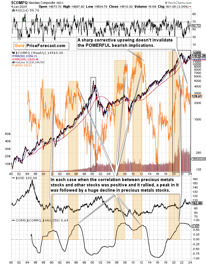
The above chart features the NASDAQ (main line) as well as gold and silver stocks (the XAU Index serves as a proxy; orange line).
There is only one period comparable to the recent over-decade-long rally and that’s the huge rally that preceded the 2000 top. It’s not like we have to look for the analogy – clear crystal-clear when looking at the chart for just a second.
I already described the underlying technical changes that triggered both upswings, so I want to focus on something else now. Namely, on the fact that since the long-term momentum was already broken, it’s obvious that the moment that is analogous to what we see right now is what we saw in 2000 after the top.
That was when the momentum in the previous long-term upswing was broken, and the NASDAQ moved below its 50-week moving average (marked with blue). It then moved back up again, but that was not the continuation of the uptrend, even though it looked like it. In reality, it was the first correction after the start of a massive decline.
This is most likely where we see tech stocks right now as well. We saw the distinct slide below the 50-week moving average, and now we experienced a short-term rally. Some will say that this is just the continuation of the previous long-term uptrend, but the historical analogy suggests otherwise. It seems much more like the first correction after the start of a massive decline.
Now, if tech stocks are about to turn south and then decline in really substantial manner, what does it imply for the precious metals market?
There are times when tech stocks and the precious metals stocks move in the same direction, and there are times when they move in the opposite directions. For example, they plunged together in 2008 and in 2020. This is one of those times, and you can see details in the bottom part of the above chart.
The correlation coefficient that’s visible there takes values from -1 to 1, and the closer it is to -1, the more markets tend to move in the opposite directions, the closer to 1 it is, the more markets move in the same direction, and the closer to 0 it is, the more markets move regardless of each other.
At 0.69, the coefficient indicates a situation, in which both markets move in the same direction.
This means that a big move lower in the NASDAQ is likely to translate into a big move lower in other stocks and also in mining stocks. Quite likely also in copper.
And by bigger, I don’t mean “just big”. Based on the past patterns in the tech stocks, it seems that a 2008-style decline – or worse – is to be expected. This means a huge decline in mining stocks is likely around the corner.
Truth be told, such a bearish storm for mining stocks has been brewing for some time. It’s clear once you look at the correlation coefficient itself and focus on the times when it’s been rising for a long time, and then it started to decline.
I marked the rallies (usually from the 0 level) in the correlation with orange rectangles. In each of the previous cases, when the correlation peaked, it meant that the XAU Index was about to move significantly lower. As you can see on the above chart, the correlation peaked in 2021 and while the XAU declined since that time, the size of the decline is not yet comparable to what used to happen after similar signals.
This means that gold and silver mining stocks have likely not declined enough just yet. Therefore, they are likely to slide much more in the following months. This move lower started in 2022, and given the recent short-term events, it seems that it’s about to continue. There will be short-term trading opportunities in both directions, but the underlying big trend in the mining stocks is currently down. And if that’s not clear, please consider the fact that while gold is well above its 2008 highs, gold and silver stocks, are well below that high. In fact, they are even below their 2006 high.
Speaking of copper, the situation in it also confirms that a turnaround is most likely upon us.
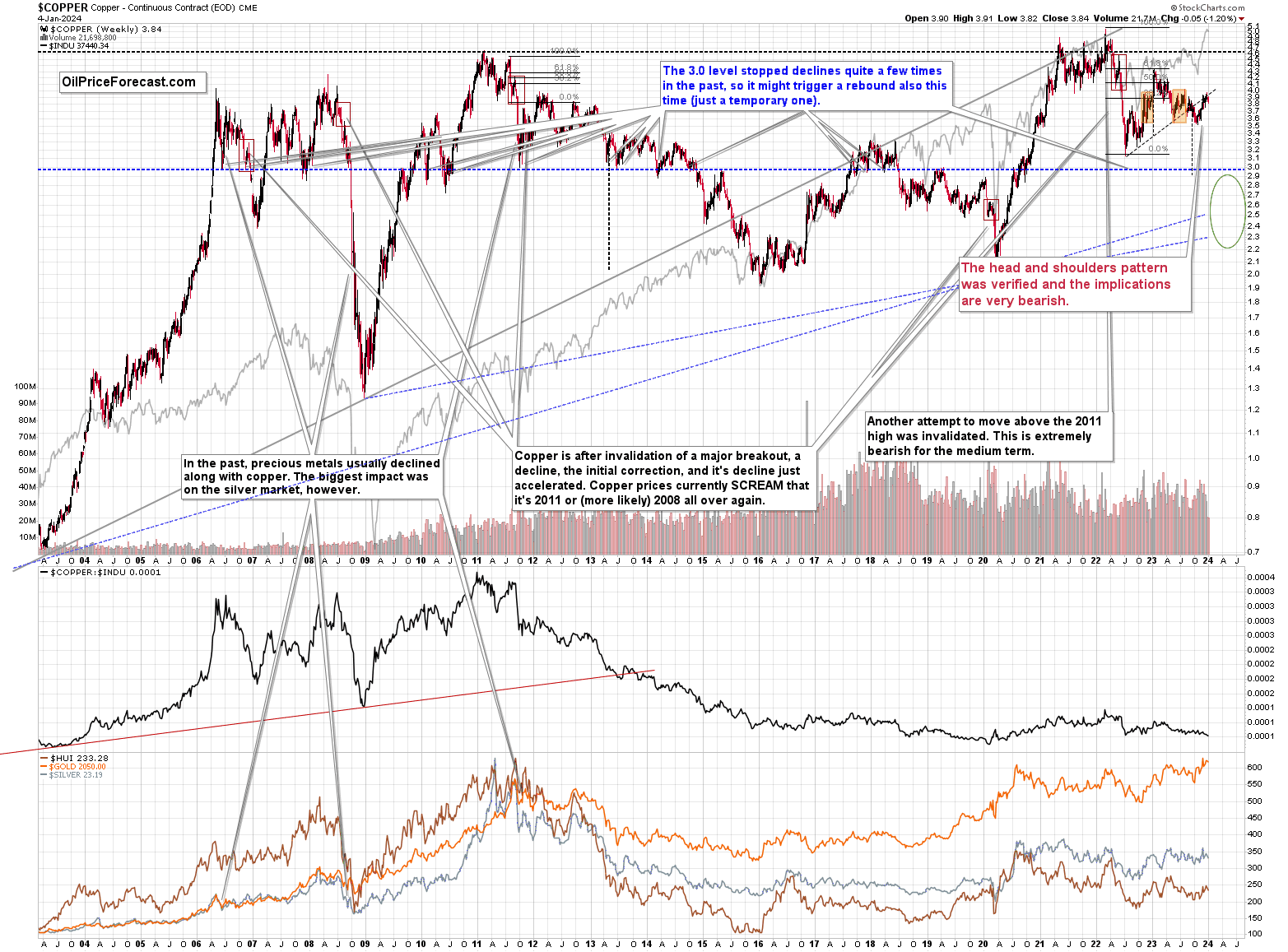
The recent rally was quite sharp, but it took copper back to its rising resistance line, which is also the neck level of the head-and-shoulders formation. A decline from here would be a natural consequence of the verification of the breakdown. The target based on the head-and-shoulders formation is below 3.0, and that’s where copper is likely heading, at least initially.
The short-term picture for copper is also bearish (although rather unclear), and you’ll find details below in the quote from yesterday’s Oil Trading Alert (while there’s just “Oil” in the name of the service, it covers many commodities like natural gas and copper as well as individual oil stocks):
===
Copper - The Current Overview

Let’s start todays analyze with the medium-term chart and the quote from Oil Trading Alert posted on Dec. 29, 2023:
(…) the price extended earlier upward move and climbed to a fresh multi-month high of 3.974 earlier this week, but will we see further improvement?
If we take a closer look at this chart, we can see a couple of worrying factors that could interfere with the bulls' pro-growth plans. (…)
Firstly, copper moved to the resistance area created by the June and July peaks (3.967-4.024).
Secondly, the volume that accompanied recent increases was falling week by week, which definitely doesn't confirm the strength of the bulls.
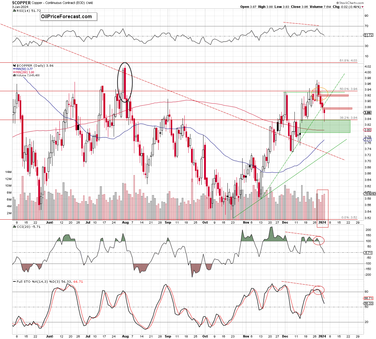
Thirdly, the CCI and the Stochastic Oscillator moved to their overbought areas, increasing the probability of sell signals in the coming week(s). Although this is not yet a very negative sign, we must remember that such high readings of indicators we could observe at the beginning of this year. What happened then? In the same month, a multi-month correction of previous increases began, which raises the risk that we may see a similar situation at the beginning of next year (as history likes to repeat itself).
Looking at the chart, we see that the situation developed in tune with the pro-bearish scenario and copper moved lower as expected. The combination of all the above-mentioned factors encouraged the sellers to act, which triggered a decline that took the commodity to the 50-week moving average and the green gap (3.789-3.829) created at the end of November.
What’s next?
Before we find the answer to this question, let's recall the short-term situation from a week ago and then examine the daily chart in search of valuable clues about the next move of market participants.
Last Friday, you could read the following:
(…) an invalidation of the earlier breakout above the Dec. 1st peak of 3.933 and the 50% Fibonacci retracement (…) during yesterday’s session, (…) doesn’t bode well for further improvement.
Additionally, copper moved to the area of a huge bearish engulfing candlestick pattern formed on Aug. 1st (marked with the black eclipse), which serves as very important resistance (and reinforces the strength of the 61.8% Fibonacci retracement).
What does it mean?
In my opinion, (…) the combination of these two factors will likely encourage the bears to attack. This scenario is additionally supported by the current situation in the indicators.
(…) there are negative divergences between the price and all marked indicators, which increases the probability that reversal may be just around the corner. Additionally, the CCI and the Stochastic Oscillator moved to their overbought areas and the latter indicator already generated a sell signal.
How low could copper go?
In my opinion, the first downside target for the sellers would be the green dashed rising support line (currently at around 3.875), but if it is broken, the bears will likely test Dec. 19 low of 3.841 or even the green gap (3.788-3.835) formed on Dec. 14, which is also reinforced by the major support seen on the weekly chart – the gap (3.789-3.829) formed at the end of the previous month, which was strong enough to stop declines at the beginning of the month.
From today’s point of view, we see that the green dashed rising support line didn’t manage to stop the sellers and Tuesday’s daily closure took place under this support. This show of the bulls’ weakness encouraged their opponents to act and resulted in a red gap (3.872-3.881) at the beginning of the next session.
Although the buyers tried to close it, they failed quickly, which translated into another downswing that pushed the price to our next downside target – the Dec. 14 low and the green gap (3.788-3.835) formed that day.
The volume, which accompanied recent declines was increasing from session to session confirming the sellers' involvement in shaping the next red bearish candles. Additionally, the CCI and the Stochastic Oscillator generated sell signal, giving the bears even more reasons to act in the following days.
If this is the case and the commodity extends losses from here, the first downside target for the sellers would be around 3,80, where the 38.2% Fibonacci retracement (based on the entire October-December upward move) and the 200-day moving average currently are.
Slightly below these supports is also the lower border of the green gap formed on Dec.14 (3.788-3.835) and the gap (3.789-3.829) formed at the end of November (marked on the weekly chart), which together serve as the major short-term support, which was strong enough to stop declines in December.
Therefore, in my opinion, as long as this key area holds the way to the downside is not as wide open as it may seem at the first glance and reversal can’t be ruled out (even if the sellers may want to try the bulls’ strength and involvement in this zone first). If this is the case and copper moves higher – the first upside target would be the red gap formed yesterday. If it is closed, we’ll likely see a test of the previously broken green dashed line.
However, before we move on to the summary, let's consider the pro-declining scenario. What could happen if the bears manage to close both green price gaps?
It would be a strong bearish signal, which will likely open the way to the 50% Fibonacci retracement (around 3.75) and the early December lows (at around 3.731).
Summing up, copper reversed and decline during the last week, which resulted in two red price gaps and a breakdown under the short-term green dashed support line. Thanks to this price action, the commodity slipped to the key support area, which will most likely determine the future fate of the price. If the bulls show strength and manage to hold it, we’ll likely see an attempt to erase pro bearish technical signals. However, if they fail, the way to lower values of the commodity would be open and we’ll see a realization of the pro-bearish scenario in the coming week.
===
Naturally, the above would be likely to have a very negative impact on the prices of copper stocks, like FCX.
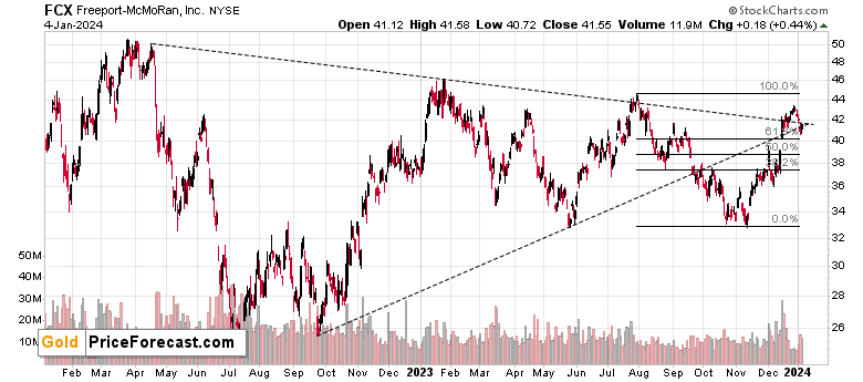
The FCX just invalidated its move above the declining dashed resistance line, and when that happened in August 2023, it meant that the top was in. The implications here are – of course – bearish.
Since the price target for copper is well below its current price, FCX is likely to fall far from the current levels as well.
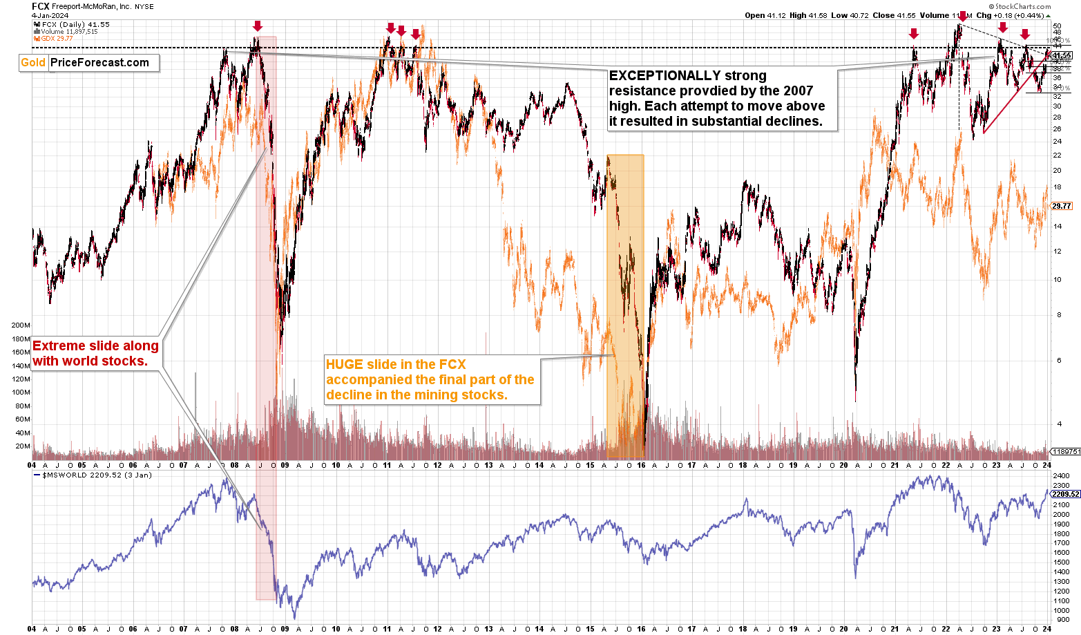
The declines from the current levels after failed breakouts above the 2007 high were big, and in some cases (in 2008) they were enormous. The downside potential is waaaay bigger than what you can see on FCX’s short-term chart.
Last, but definitely not the least, let’s take a look at gold’s short-term chart.
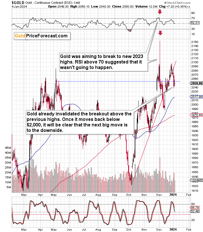
This year started with a slide, and this kind of bearish performance is likely to continue. The reason that’s visible on the above chart (on top of multiple other indications mentioned earlier today) is the confirmed breakdown below the rising red support line, which is now serving as resistance.
The additional – obvious – bearish sign comes from the invalidation of the attempt to move above the early 2023 highs.
Also, please note that when gold declined, the move was accompanied by huge volume, and when it moved back up, it was accompanied by low volume. This confirms that the true direction, in which gold wants to move, is down.
Finally, the analysis of sentiment continues to support lower gold prices in the following weeks and months. My previous sentiment analysis remains up-to-date:
Have you considered buying gold recently? Like to the point of searching for it online?
Because many people have.
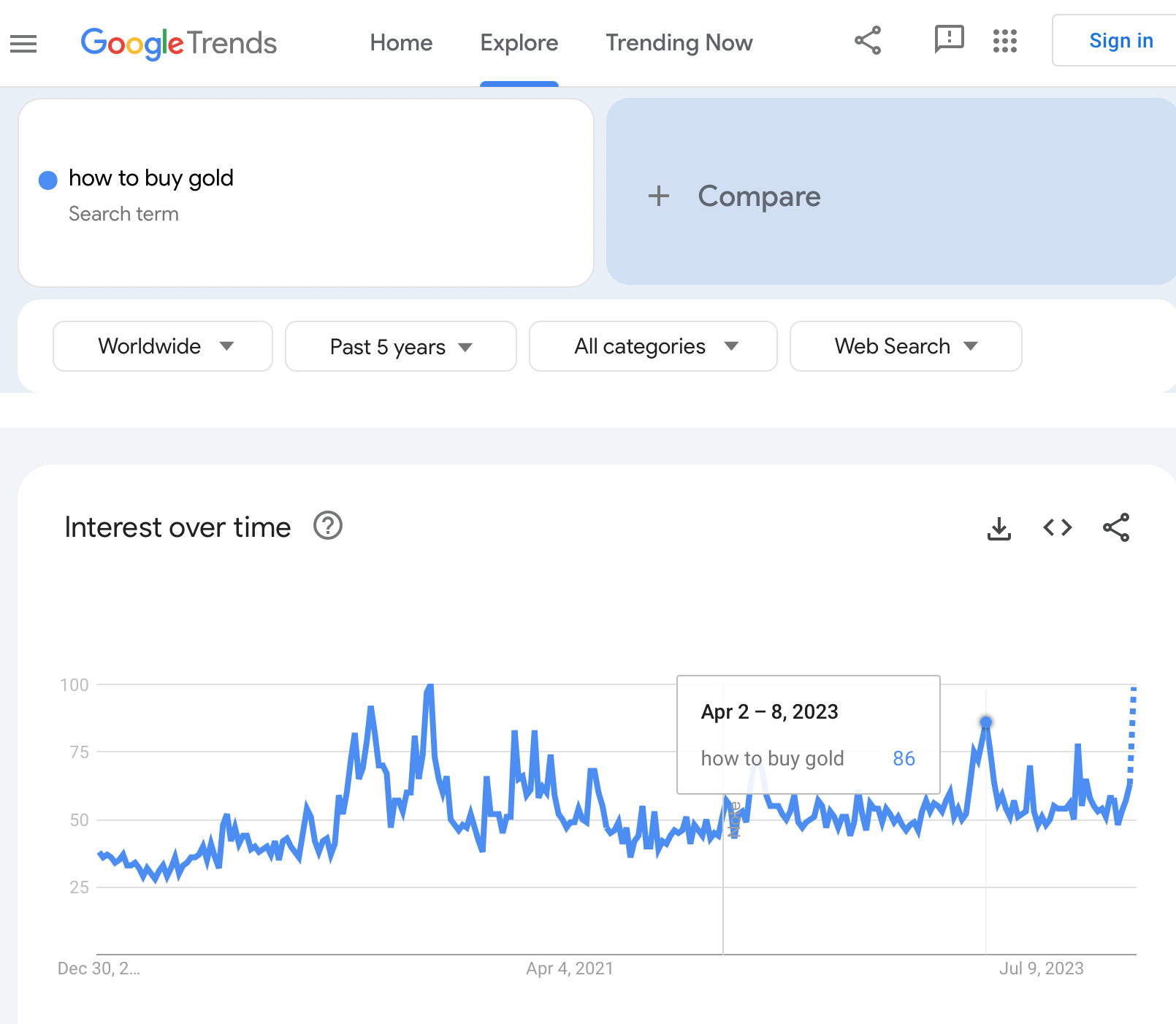
As you can see on the above Google Trends screenshot, the searches for “how to buy gold” just soared, and it’s not the first time that it happened.
Makes one wonder… What happened to gold price in those other cases?
After all, whatever circumstances triggered this jump in the interest in the topic, they are taking place all over again. I don’t mean the state the world is in – I mean the sentiment among gold investors. By estimating the latter, we can also estimate what’s likely to happen to the price, because… The history tends to rhyme, and people’s emotional reactions to what the market is doing remain more or less the same, regardless of the details of the fundamental situation.
I marked one of the moments on the above chart and here are the other notable peaks:
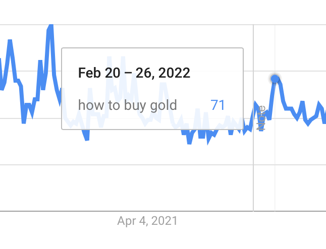
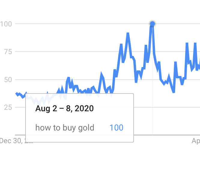
So, what happened to gold price on those occasions?
I marked all-above-mentioned cases with blue, dashed lines and in three out of four cases those were the MAJOR tops. Ones that were followed by hundreds-of-dollar declines in the price of gold.
The only remaining case was when it was still the end of a short-term rally and the start of a pause (that took gold about $100 lower, anyway). This time was truly exceptional, though, because it was right after the covid-scare bottom – it was not a regular course of action.
So, I’d say that in all “regular” cases, the huge increase in interest in buying gold translated into huge declines in the following months. After all, people tend to buy at the tops – that’s exactly what this sentiment analysis proves.
We are at this stage one more time (in many other stocks, too, including some oil stocks). Once again, it’s difficult NOT to buy into the euphoria, even though looking at the situation from a broad perspective practically “screams” WATCH OUT.
Now, you are informed, you are prepared.
And I will continue to keep you – my subscribers – up-to-date, so that what surprises most investors, will not surprise you, but that it will benefit you. We’re on a streak of 11 profitable (unleveraged) trades, after all, and it’s VERY likely that the current trades will increase this streak soon.
Again, as always, I’ll keep you – my subscribers – updated.
= = =
If you’d like to become a partner/investor in Golden Meadow, you’ll find more details in the above link.
Overview of the Upcoming Part of the Decline
- It seems that the recent – and probably final – corrective upswing in the precious metals sector is over.
- If we see a situation where miners slide in a meaningful and volatile way while silver doesn’t (it just declines moderately), I plan to – once again – switch from short positions in miners to short positions in silver. At this time, it’s too early to say at what price levels this could take place and if we get this kind of opportunity at all.
- I plan to switch from the short positions in junior mining stocks or silver (whichever I’ll have at that moment) to long positions in junior mining stocks when gold / mining stocks move to their 2020 lows (approximately). While I’m probably not going to write about it at this stage yet, this is when some investors might consider getting back in with their long-term investing capital (or perhaps 1/3 or 1/2 thereof).
- I plan to return to short positions in junior mining stocks after a rebound – and the rebound could take gold from about $1,450 to about $1,550, and it could take the GDXJ from about $20 to about $24. In other words, I’m currently planning to go long when GDXJ is close to $20 (which might take place when gold is close to $1,450), and I’m planning to exit this long position and re-enter the short position once we see a corrective rally to $24 in the GDXJ (which might take place when gold is close to $1,550).
- I plan to exit all remaining short positions once gold shows substantial strength relative to the USD Index while the latter is still rallying. This may be the case with gold prices close to $1,400 and GDXJ close to $15 . This moment (when gold performs very strongly against the rallying USD and miners are strong relative to gold after its substantial decline) is likely to be the best entry point for long-term investments, in my view. This can also happen with gold close to $1,400, but at the moment it’s too early to say with certainty.
- The above is based on the information available today, and it might change in the following days/weeks.
You will find my general overview of the outlook for gold on the chart below:
Please note that the above timing details are relatively broad and “for general overview only” – so that you know more or less what I think and how volatile I think the moves are likely to be – on an approximate basis. These time targets are not binding nor clear enough for me to think that they should be used for purchasing options, warrants, or similar instruments.
Letters to the Editor
Depending on the nature and target group of your question, feedback or comment, please use the following means of communication:
- For questions or comments that you’d like to get the Community’s response, please use the Ask the Community space so others can contribute to the reply and also enjoy the answers.
- For questions, comments or feedback that you’d like me to comment on / reply to, please send them to Golden Meadow’s support – some clarifications can be provided directly by our experienced support team, and those that are strictly for me, will be forwarded to me and I’ll then provide replies either individually, or in the “Letters to the Editor” section in the Alerts, depending on the nature of the question/comment.
Summary
To summarize, the declines across the precious metals sector that we saw this week are most likely just a small beginning of a much bigger move lower.
The key thing about the precious metals market is still gold’s extremely important weekly reversal that we saw over three weeks ago, which puts the following rallies in the proper context. Last week’s weekly reversal confirms the bearish nature of those price moves.
The invalidation of breakouts above previous highs as well as the clear relative weakness of mining stocks compared to gold as well as silver’s breakdown below its head-and-shoulders pattern confirm the bearish outlook.
Additionally, the peak in interest in “how to buy gold” searches makes the current situation even more bearish, as this has been a very accurate detector of massive, medium-term tops.
===
As we’re on a streak of 11 profitable (closed, unleveraged) trades, and – just like I wrote today and in the previous days – it looks like we’re going to see much more of them in the near future, I want to provide you with even more great news!
There are even more savings connected with our Diamond Package that includes Gold Trading Alerts, as well as Oil Trading Alerts and Stock Trading Alerts. The prestigious Diamond Package includes a bundle-offer discount, there’s a 10% discount available for purchasing it for more than one year, and on top of that when using the “DIAMOND10” code when going Diamond there’s an additional 10% discount on top of it all.
Additionally, if you’re interested in trying out Oil Trading Alerts and/or Stock Trading Alerts, please note that there’s a 7-day free trial available for both services. You can sign up for the free trials (or go Diamond) using this page.
Please contact our support to upgrade your subscription to ensure that your paid-for days will be properly transferred over to your new subscription.
To summarize:
Trading capital (supplementary part of the portfolio; our opinion): Full speculative short positions (300% of the full position) in junior mining stocks are justified from the risk to reward point of view with the following binding exit profit-take price levels:
Mining stocks (price levels for the GDXJ ETF): binding profit-take exit price: $28.12; stop-loss: none.
Alternatively, if one seeks leverage, we’re providing the binding profit-take levels for the JDST (2x leveraged). The binding exit level for the JDST: $10.54; stop-loss for the JDST: none.
For-your-information targets (our opinion; we continue to think that mining stocks are the preferred way of taking advantage of the upcoming price move, but if for whatever reason one wants / has to use silver or gold for this trade, we are providing the details anyway.):
Silver futures downside exit price: $20.22 (stop-loss: none)
SLV exit price: $18.62 (stop-loss: none)
ZSL exit price: $24.98 (stop-loss: none)
Gold futures downside exit price: $1,812 (stop-loss: none)
Spot gold downside exit price: $1,792 (stop-loss: none)
HGD.TO – alternative (Canadian) 2x inverse leveraged gold stocks ETF – the exit price: $8.43 (stop-loss: none)
HZD.TO – alternative (Canadian) 2x inverse leveraged silver ETF – the exit price: $19.49 (stop-loss: none)
///
Optional / additional trade idea that I think is justified from the risk to reward point of view:
Short position in the FCX with $27.13 as the short-term profit-take level.
Long-term capital (core part of the portfolio; our opinion): No positions (in other words: cash)
Insurance capital (core part of the portfolio; our opinion): Full position
Whether you’ve already subscribed or not, we encourage you to find out how to make the most of our alerts and read our replies to the most common alert-and-gold-trading-related-questions.
Please note that we describe the situation for the day that the alert is posted in the trading section. In other words, if we are writing about a speculative position, it means that it is up-to-date on the day it was posted. We are also featuring the initial target prices to decide whether keeping a position on a given day is in tune with your approach (some moves are too small for medium-term traders, and some might appear too big for day-traders).
Additionally, you might want to read why our stop-loss orders are usually relatively far from the current price.
Please note that a full position doesn't mean using all of the capital for a given trade. You will find details on our thoughts on gold portfolio structuring in the Key Insights section on our website.
As a reminder - "initial target price" means exactly that - an "initial" one. It's not a price level at which we suggest closing positions. If this becomes the case (as it did in the previous trade), we will refer to these levels as levels of exit orders (exactly as we've done previously). Stop-loss levels, however, are naturally not "initial", but something that, in our opinion, might be entered as an order.
Since it is impossible to synchronize target prices and stop-loss levels for all the ETFs and ETNs with the main markets that we provide these levels for (gold, silver and mining stocks - the GDX ETF), the stop-loss levels and target prices for other ETNs and ETF (among other: UGL, GLL, AGQ, ZSL, NUGT, DUST, JNUG, JDST) are provided as supplementary, and not as "final". This means that if a stop-loss or a target level is reached for any of the "additional instruments" (GLL for instance), but not for the "main instrument" (gold in this case), we will view positions in both gold and GLL as still open and the stop-loss for GLL would have to be moved lower. On the other hand, if gold moves to a stop-loss level but GLL doesn't, then we will view both positions (in gold and GLL) as closed. In other words, since it's not possible to be 100% certain that each related instrument moves to a given level when the underlying instrument does, we can't provide levels that would be binding. The levels that we do provide are our best estimate of the levels that will correspond to the levels in the underlying assets, but it will be the underlying assets that one will need to focus on regarding the signs pointing to closing a given position or keeping it open. We might adjust the levels in the "additional instruments" without adjusting the levels in the "main instruments", which will simply mean that we have improved our estimation of these levels, not that we changed our outlook on the markets. We are already working on a tool that would update these levels daily for the most popular ETFs, ETNs and individual mining stocks.
Our preferred ways to invest in and to trade gold along with the reasoning can be found in the how to buy gold section. Furthermore, our preferred ETFs and ETNs can be found in our Gold & Silver ETF Ranking.
As a reminder, Gold & Silver Trading Alerts are posted before or on each trading day (we usually post them before the opening bell, but we don't promise doing that each day). If there's anything urgent, we will send you an additional small alert before posting the main one.
===
On a side note, while commenting on analyses, please keep the Pillars of the Community in mind. It’s great to provide points that help others be more objective. However, it’s important to focus on the facts and discuss them in a dignified manner. There is not much of the latter in personal attacks. As more and more people join our community, it is important to keep it friendly. Being yourself, even to the point of swearing, is great, but the point is not to belittle other people or put them in a position of “shame” (whether it works or not). Everyone can make mistakes, and everyone does, in fact, make mistakes. We all here have the same goal: to have a greater understanding of the markets and pick better risk-to-reward situations for our trades. We are on the same side.
On another – and final – side note, the number of messages, comments etc. that I’m receiving is enormous, and while I’m grateful for such engagement and feedback, I’m also starting to realize that there’s no way in which I’m going to be able to provide replies to everyone that I would like to, while keeping any sort of work-life balance and sanity ;) Not to mention peace of mind and calmness required to approach the markets with maximum objectivity and to provide you with the service of the highest quality – and best of my abilities.
Consequently, please keep in mind that I will not be able to react / reply to all messages. It will be my priority to reply to messages/comments that adhere to the Pillars of the Community (I wrote them, by the way) and are based on kindness, compassion and on helping others grow themselves and their capital in the most objective manner possible (and to messages that are supportive in general). I noticed that whatever one puts their attention to – grows, and that’s what I think all communities need more of.
Sometimes, Golden Meadow’s support team forwards me a message from someone, who assumed that I might not be able to see a message on Golden Meadow, but that I would notice it in my e-mail account. However, since it’s the point here to create a supportive community, I will specifically not be providing any replies over email, and I will be providing them over here (to the extent time permits). Everyone’s best option is to communicate here, on Golden Meadow, ideally not in private messages (there are exceptions, of course!) but in specific spaces or below articles, because even if I’m not able to reply, the odds are that there will be someone else with insights on a given matter that might provide helpful details. And since we are all on the same side (aiming to grow ourselves and our capital), a ton of value can be created through this kind of collaboration :).
Thank you.
Przemyslaw K. Radomski, CFA
Founder, Editor-in-chief

