
- Yellen as a predictor of bubbles?
- USD and Euro Indices
- General Stock Market
- Correlation Matrix
- Gold
- Silver
- Platinum
- Mining Stocks
- Summary
Yellen as a predictor of bubbles?
Economics is an ironic science (if it is science at all by physicists’ standards). One can be perfectly correct about various phenomena in general, but offer completely wrong predictions in detail. Nevertheless offering correct predictions is still a significant skill, even if your theories are wrong. Living aside Janet Yellen’s theories for the moment, we should praise her for the prediction abilities. As the study of Wall Street Journal confirms, she was the best predictor from the group of the Federal Reserve Policy makers.
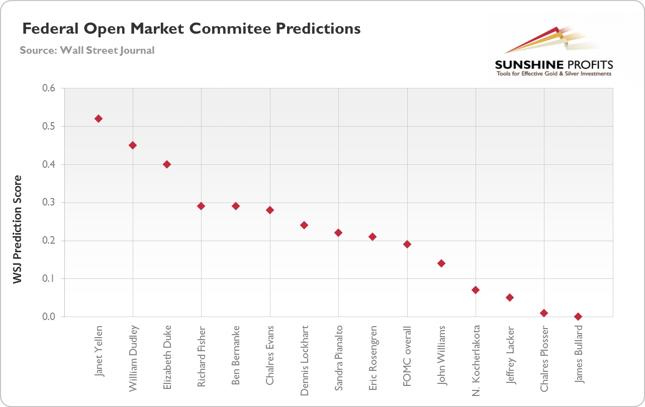
In predicting the inflation rate, labor markets and GDP growth Yellen overshadowed the others. But what has been heard most recently was her statement in 2005, when the real estate bubble was at its highest. Her reasonable observation was: there is a bubble because of the high relation between real estate prices and rent. Yet the more thought-provoking were the statements on the relation between the bubble and monetary policy. She asked three questions. How devastating the bubble would be for the economy? Can the Fed successfully mitigate negative effects of popping the bubble? Should monetary policy be used to deflate the possible real estate bubble?
In answering the first question Yellen did not see that a bust would have severe consequences for the banking and financial system, ergo for all other industries not directly related real estate. Despite noticing the existence of a bubble, she believed the economy should “absorb the shock”, since the reversion of the price ratio of price-to-rent would represent only a half of the adjustment from 2000/2001.
Moreover in answering the second question, Yellen suggested that a change would kick in gradually, because household spending can be smoothened (so the Fed could react to those changes, because the central bank can mostly influence the economy in the longer run).
The answer to the third question was negative, because apparent positives of the Fed’s action are overweight by its disadvantages. Any tighter monetary policy in order to stop the bubble can impose “substantial costs” on all other sectors, and result in various “imbalances”. Notice that this statement was given few years ago, in 2005. A year, when the economy appeared to be in good condition, with the possible future recession envisioned as yet another slowdown (just as many after Second World War). The vision was not a major Recession with capital “R” that was about to be the biggest bust since the Great Depression.
If we may use the horrible central banking jargon, in 2005 Yellen was closer to “dovish” interpretation of reality, and not “hawkish” (that is she was rather not concerned by possible inflationary scenarios).
What does this history tell us for possible future actions? The general rule is: if you’re “dovish” in bad times, then you are very likely to be even more “dovish” during worse times. Not just very likely, but we should say very, very, very likely. Since the times are rather “worse” than “bad”, do not expect backing out from “stimulation” policies. Soft monetary policy in favor of the banking system is all well and good, despite the change in the chairman position.
Apparently Janet Yellen is not going to predict the bubbles that should result from those policies. Naturally, the long-term implications for the gold market are bullish.
The above is based on the November Market Overview report. Let’s move to the charts to see what’s likely to happen in the medium- and short term (charts courtesy of http://stockcharts.com.)
USD and Euro Indices
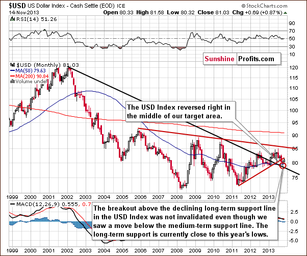
The situation in the long-term chart hasn’t changed much recently and what we wrote in our last Premium Update is still up-to-date today.
(...) the long-term breakout above the declining long-term support line was not invalidated. Additionally, the USD Index reversed right in the middle of our target area. Therefore, from this perspective, it seems that the downward move – if it’s not already over – will be quite limited because the long-term support line will likely stop any further declines.
Now, let’s examine the weekly chart.
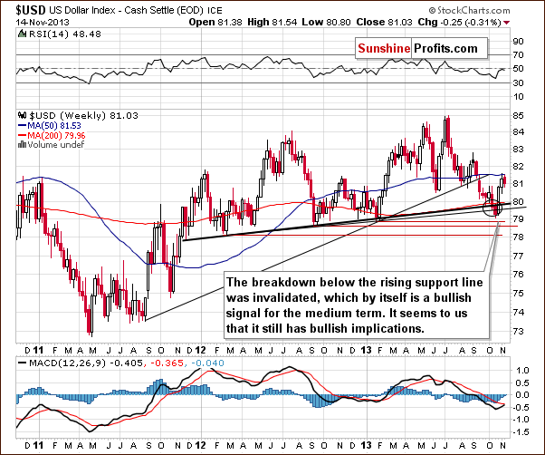
Looking at the above chart we see that after a sharp rally, which invalidated the move below the lower support line and the breakdown below the medium-term support line (a bold black line), the USD Index almost reached the previously-broken rising medium-term support line created by the August 2011 and January 2013 lows.
The invalidation of the breakdown is itself a bullish signal and it seems that we will still see more of its impact in the coming weeks.
Although we saw a correction in recent days, it is still shallow, which is a bullish signal for the short term – every now and then markets need to take a break from rallying – none of them can move in one direction all the time.
Let’s check the short-term outlook.
Quoting our previous Premium Update:
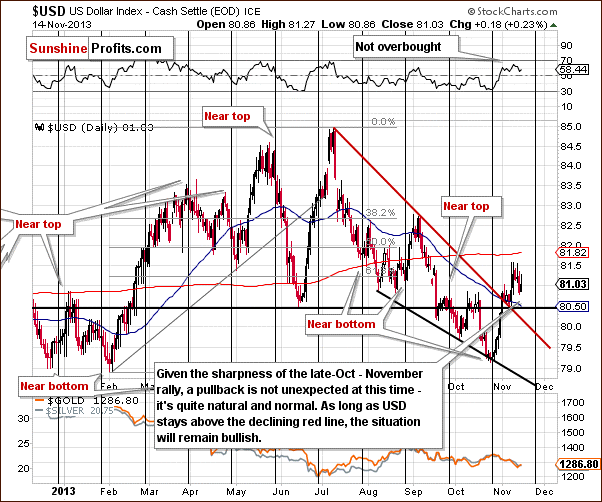
(…) the USD Index rallied in the previous week and moved above the previously-broken resistance line based on the June low. Additionally, (…) the U.S. dollar broke above the short-term resistance line based on the July and September highs. Looking at the above chart we see that both breakouts were confirmed.
On the above chart we clearly see that after the sharp late-October-November rally, the USD Index gave up some of the gains and corrected earlier growth in recent days. Despite this drop, the U.S. dollar still remains above the previously-broken resistance lines. Please note that as long as it stays above the short-term resistance line (marked with red), the situation will remain bullish.
Let’s now take a look at the Euro Index.
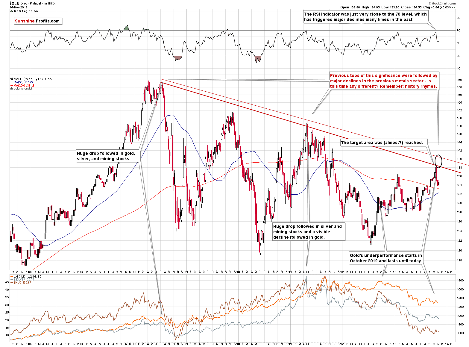
Looking at the above chart we see that the October - November decline pushed the European currency to its lowest level since mid-September. At the beginning of the week the Euro Index bounced off the last week’s low and continued its upward move in the following days. In this way, the European currency almost reached the previously-broken 135 level. In spite of this fact, this week’s upswing didn’t change anything, because it didn’t even erase half of the recent decline. Taking this fact into account, it seems that further deterioration is quite likely in the coming week.
To see the current situation more clearly, let’s zoom in on our picture and move on to the medium-term chart.
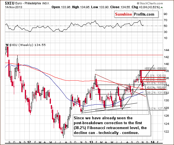
From the medium-term point of view, the situation is a mirror image of what we saw on the short-term USD Index chart. After the Euro Index dropped below its rising support line and erased 50% of its entire July – October rally, we saw a relatively small move back up, which took the European currency to the 38.2% Fibonacci retracement level based on the October - November decline.
As mentioned earlier, although we’ve seen some improvement in the recent days, the Euro Index still remains below the level of 135. Additionally, the breakdown below the rising support line hasn’t been invalidated.
Please note that the current correction is still shallow, which means that the decline can continue. Even, if we see a move higher, to the 61.8% retracement level, the euro will still remain in a downtrend. From this point of view, the situation is bearish. But if we see a move below 131.56 the bearish implications will be even stronger. On a very short-term basis, though, we can’t rule out more strength in the European currency.
Summing up, we could see further improvement in the Euro Index and weakness in the USD Index on a short-term basis. However, it seems that the bearish trend will remain in place as long as the euro remains below its short-term resistance line and the dollar stays above its short-term support line. Therefore, currently, the implications for the precious metal market are bullish but are likely to become bearish shortly. We will discuss this once again in the Correlations section.
General Stock Market
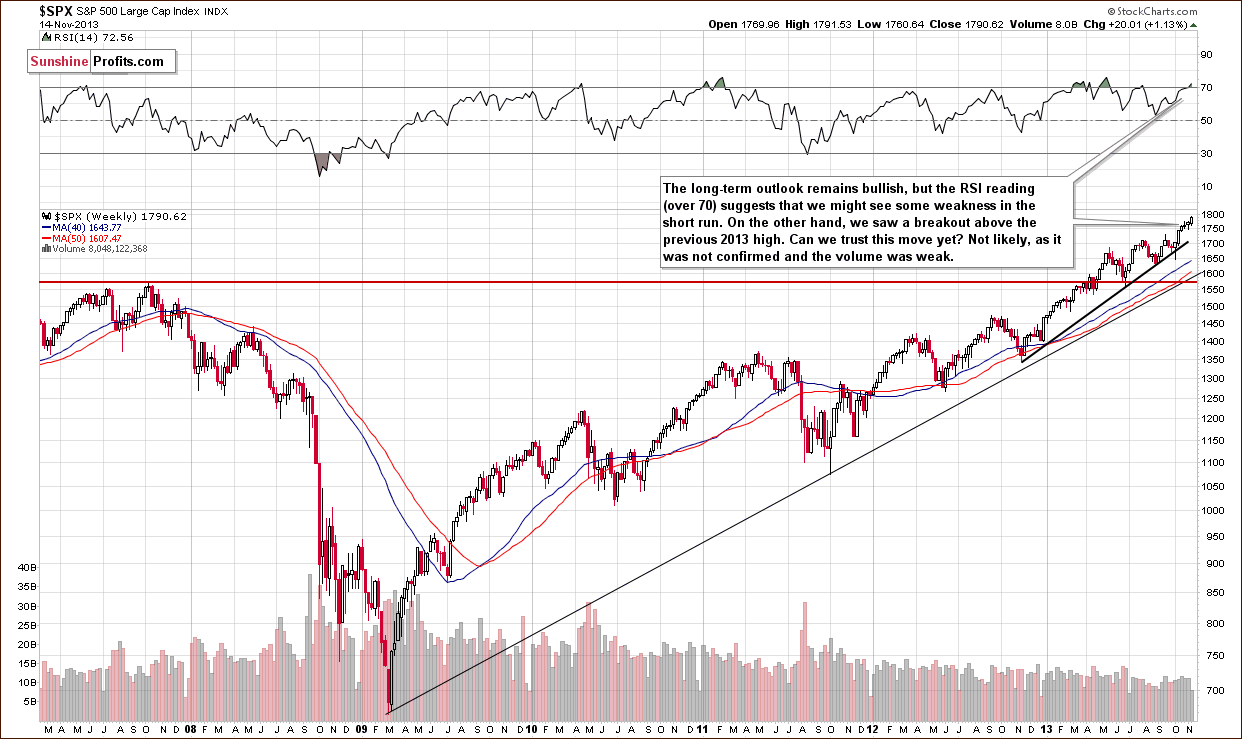
On the above chart we see that the S&P500 Index moved higher in recent days and almost touched the October top on Wednesday. From this point of view, the long-term outlook remains bullish. However, the RSI reading (over 70) suggests that we might see some weakness in the short term.
However, Wednesday’s breakout formed on low volume in both key stock market ETFs: DIA and SPY. Consequently, we remain skeptical about the strength of the stock market, especially since the True Seasonal patterns suggest a short-term decline any day now.
As you will see in the Correlation Matrix below the short-term implications for gold and silver are rather nonexistent whatever stocks do in the following days.
Gold & Silver Correlations
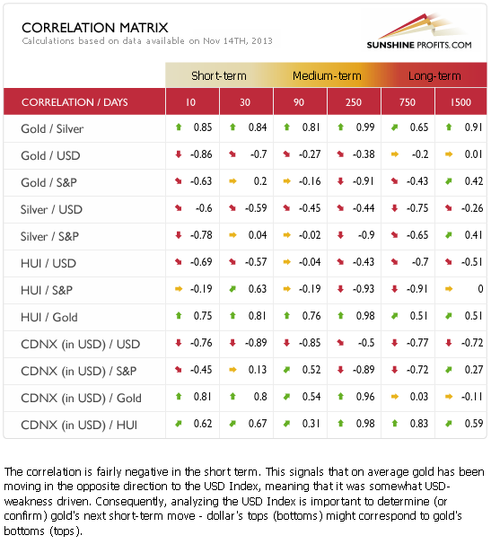
Correlations seem to have moved back to their default values in the case of the USD Index and the precious metals sector. This means that it's no wonder that metals and miners are correcting – the reason could simply be the correction in the USD Index. The latter had quite a volatile run up in the recent weeks and – as mentioned earlier in today's update – was something that one could have expected. Just as the trend remains up in case of the USD Index, the trend remains down in case of the precious metals sector.
Meanwhile, the correlation coefficients between PMs and the general stock market are rather insignificant on a short-term basis (with the exception of the mining stocks sector, which seems to be waiting for a decline in stocks in order to decline itself), so we can't tell much about the possible impact of the current outlook for stocks for the prices of gold and silver.
Overall, with bullish implications from the currency sector (despite a very short-term correction that was likely triggered by the correction in currencies) and the unclear impact of the stock market, the precious metals sector seems to be set to decline once again after a quick move up.
Gold
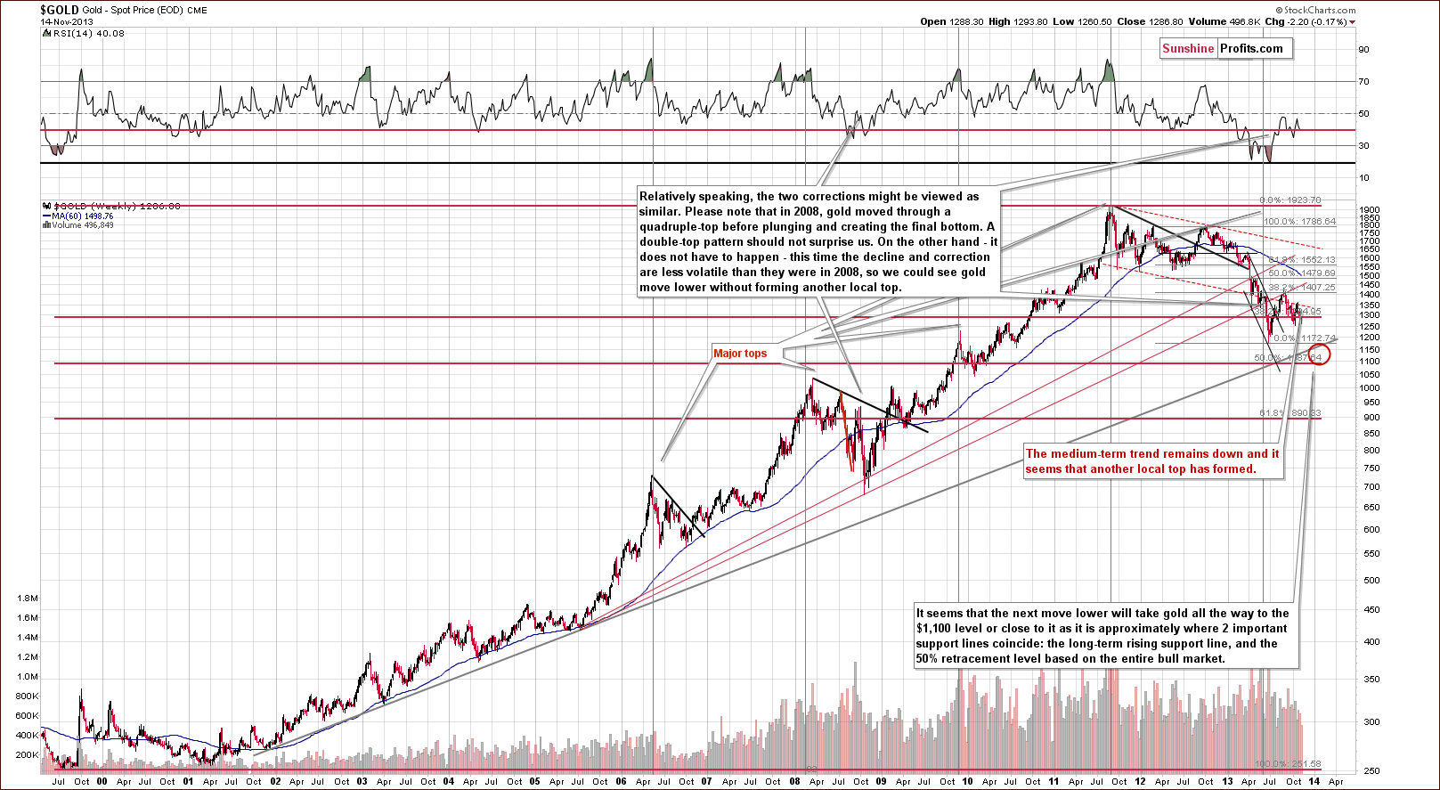
Quoting our previous Premium Update:
Looking at the above chart we see that the situation hasn’t changed much from the long-term perspective. The medium-term outlook was bearish as gold had already broken below the long-term rising support line and the recent decline naturally hasn’t made the situation look bullish.
The medium-term trend remains down and from this perspective it seems that another local top has formed. Therefore, further deterioration is quite likely, if not immediately, then at least soon.
Gold is trading very close to the 38.2% Fibonacci retracement level ($1,285) based on the entire bull market, and just a bit more weakness might trigger a significant sell-off if the breakdown is confirmed.
Let’s move on to the short-term chart to see the recent price moves more clearly and estimate the short-term outlook.
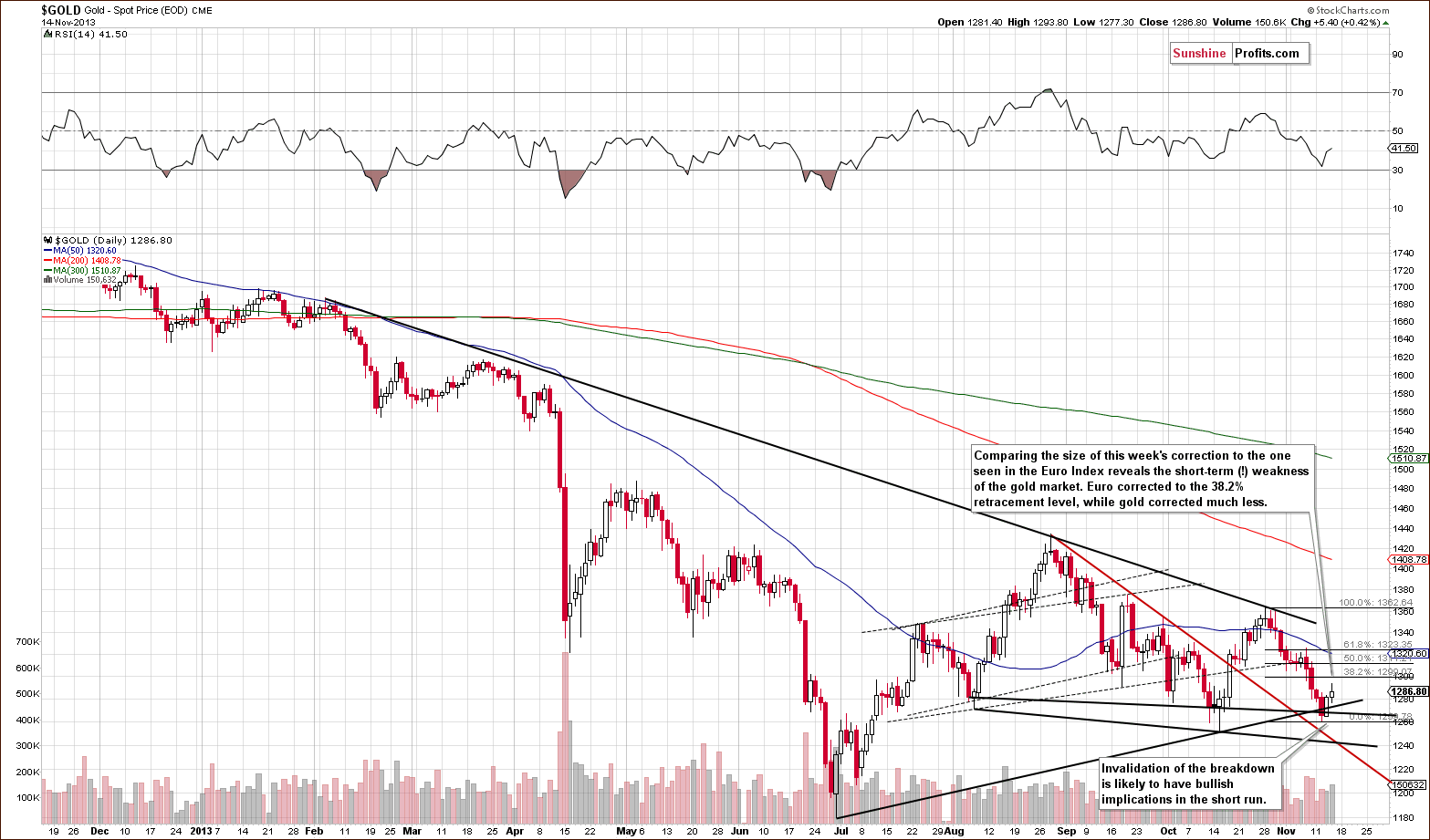
Gold declined since we posted our previous Premium Update and it even moved below the rising support line based on the June and October lows. The breakdown was invalidated on the next day and the implications were – and still are – bullish for the short term.
In yesterday’s Market Alert we wrote the following:
At this time the 38.2% Fibonacci retracement based on the October - November decline is at $1,300 and it seems that gold will correct (at least) to this level before moving down once again. It could move higher, to $1,323, where the 61.8% retracement is located.
Since gold remains below the declining resistance line (based on February, August and October highs), the trend remains down and we can expect big moves to be to the downside, even if short-term upswings are seen (and we will quite likely see one based on the recent invalidation of the breakdown).
Let’s take a look at the chart featuring gold’s price from the non-USD perspective.
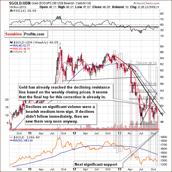
Basically, the most important thing that we can observe on the above chart was already described earlier this week, in Monday’s Market Alert:
Last week gold: UDN ratio declined on quite big volume, which used to precede significant declines in the past. Of course, a ratio does not have a volume by itself - the above is just a thought short-cut, and what we mean is actually the ratio of volumes - volume for gold divided by volume for the UDN ETF. Anyway, the resulting declines were not seen immediately in all cases, but they were seen shortly in almost all cases. Please take a look [above] - we marked these cases with grey rectangles.
The above still has implications for the following weeks and they are bearish. As it was the case in the previous weeks, the medium-term trend remains down.
Summing up, the medium-term outlook for gold remains bearish, but based on the recent invalidation of the breakdown, we might see higher gold prices in the next several days. We don’t think that this rally will take gold much higher (likely not above $1,323 and even if it does, very not likely above $1,340).
Silver
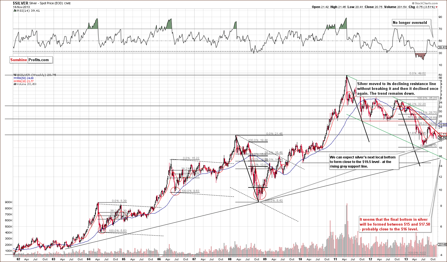
Paraphrasing what we wrote in yesterday’s Market Alert:
Earlier this week, silver was below the previous October lows (even when taking the intra-day lows into account). Moreover, the white metal not only confirmed the breakdown below the rising support line, it also moved below the 61.8% Fibonacci retracement level based on the June-August rally ($20.80). This means that the upward correction might already be over. Then again, the breakdown below the 61.8% retracement has not been confirmed just yet (we will need 3 consecutive closes below this level and we have seen 2 for now), and if gold rallies and silver follows, then the breakdown will likely be invalidated and another short-term rally will follow.
The RSI indicator is not oversold at this time, so we might see significant declines in the coming weeks (it’s not that RSI is suggesting that at this time, but it doesn’t “say” that it’s unlikely).
Finally, the support line based on the 2008 and 2013 lows creates an initial downside target – something that silver is likely to reach (and pause / bounce) before moving to our final target level around the $16 level. At this time, this initial target is very close to $19.50.
Let’s move to the short-term chart to see the very recent price moves more clearly.
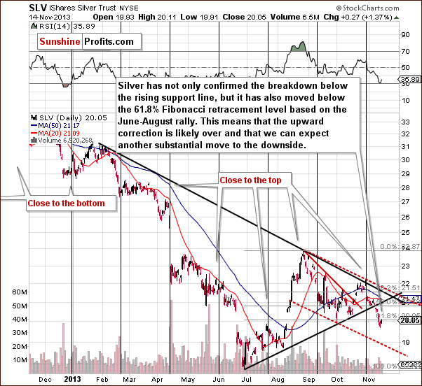
On the above chart you can see the above-mentioned breakdown below the 61.8% retracement more clearly.
There are also other interesting things visible on it. We can see that the recent decline in SLV materialized on significant volume, which suggests that it was no accident. Interestingly, we saw something similar (a visible but not huge plunge) in early June, which preceded the real downswing and investors had several days to prepare.
The second interesting thing that we can see above is the downside target for the SLV ETF very close to the $19 level. The target is created by the red dashed line, which is a parallel line to the declining resistance line based on the most recent local tops. It is more or less in tune with the initial target for spot silver at $19.50.
Summing up, the outlook for silver remains bearish, however, given the bullish outlook for gold in the short term, we might expect to see a quick rally in silver as well.
Platinum
Several months ago we featured the platinum market and for an even longer time we have been suggesting moving a significant part of one’s long-term investments from gold to platinum. We emphasized over and over again that platinum cheaper than gold was an anomaly and something that will very likely not remain in place for long. Let’s see how it went.
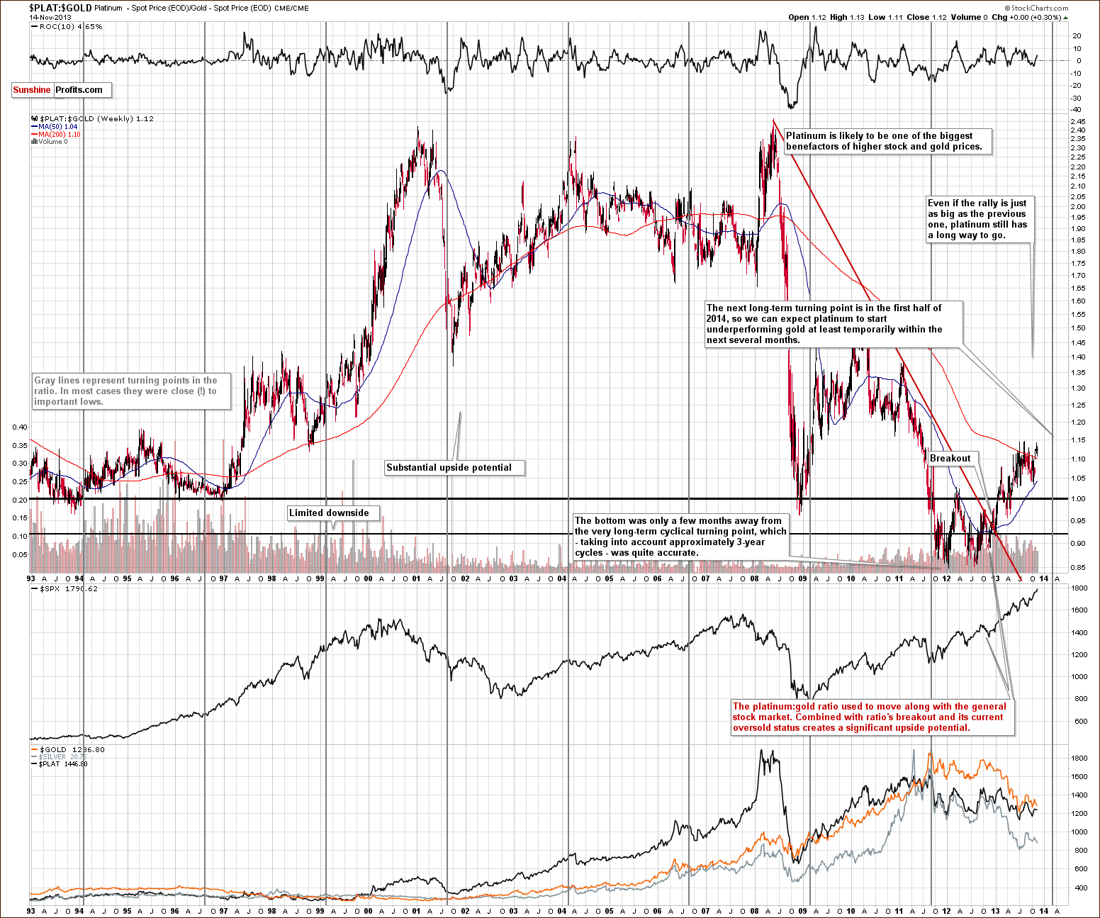
The anomaly disappeared as platinum started to outperform gold along with the strength on the general stock market and moving from gold to platinum turned out to be a good decision.
As always, the key question is – what’s next? Many months ago when we had suggested moving from gold to platinum, we focused on the long-term cyclical turning points and it turns out that this technique worked out very well. The next turning point, however, is quite close at this time. It’s still months away, but taking the long-term approach, a few months is not that long.
The turning points work on a near-to basis, and from the long-term perspective this could easily mean several months in either direction. Consequently, we are quite likely to see a decline in the platinum to gold ratio somewhere in the next 12 months or so. At this time, however, it’s not that obvious that a major move in the opposite (down) direction will follow. The ratio is still well below the historical average, not to mention an overbought status.
This means that we might see a turnaround in the ratio in the coming months, but it’s neither very likely to happen soon, nor does it have to have a major impact on the ratio. We could simply see a relatively small decline, just like the one we saw in 2006, which would be followed by a significant rally.
Consequently, it still seems that taking long-term investments into account, platinum is preferred over gold (however, due to the diversification principle, we suggest owning both).
Gold & Silver Mining Stocks
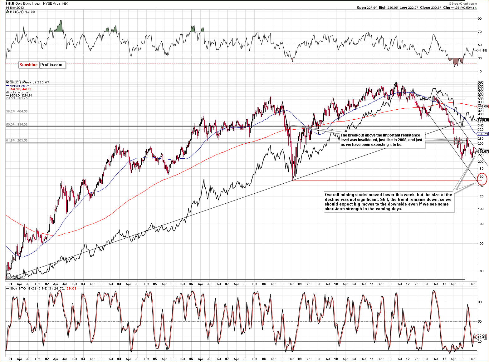
From the long-term point of view, nothing changed. The trend was down last week and the same is the case right now. We haven’t seen any breakout above the declining resistance line and we can expect big moves to the downside in the days or weeks ahead.
2 weeks ago we mentioned that there were some bullish indications on the chart featuring junior mining stocks.
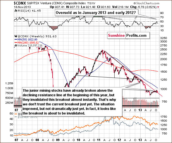
Although the juniors sector moved above the declining resistance line, we think that it’s still too early to say that the breakout has been truly confirmed – especially when we take into account the position of the RSI.
Please note that the last two times when the indicator reached these levels, major medium-term tops were formed. Therefore, we would need to see a verification of the breakout first to view it as an important medium-term signal. This would be the case in any other breakout as well, but in case of the above chart, waiting for a verification seems particularly justified because we have already seen a false breakout at the beginning of this year – one which was followed by a significant decline in the entire precious metals sector.
Since that time, juniors have declined (both last and this week) and they look like they are about to invalidate the previous breakout, which would – naturally – have bearish medium-term consequences.
If the decline that we are likely to see in the precious metals sector after the current correction is over takes juniors back below their declining red support/resistance line, we will have one more indication that the next major move will be to the downside.
Please note that in case of the junior mining stocks the next significant support is much below the current value of the TSX Venture Index, so the coming decline will likely be very significant.
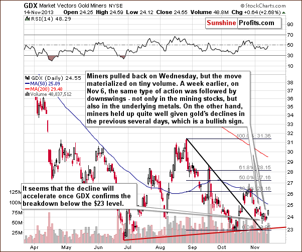
From the short-term point of view, it seems that we just saw or are still seeing a pause within a short-term decline (which could become a medium-term decline). On Wednesday the volume accompanying a small upswing was very small, but it was more significant on Thursday, so there are no bearish implications of this correction.
What’s more interesting is the size of the decline that accompanied gold’s decline in recent weeks. While gold declined significantly, miners moved only slightly lower (after the big drop in the first days of the month). This is a bullish factor for the short term, but not a very strong one, as we had a good reason for miners to rise – the rally on the general stock market. Consequently, miners’ strength is not necessarily a sign of strength on the precious metals sector, but perhaps simply a reaction to what was seen in the main stock indices.
Finally, we would like to discuss the current situation on the gold stocks to gold ratio.
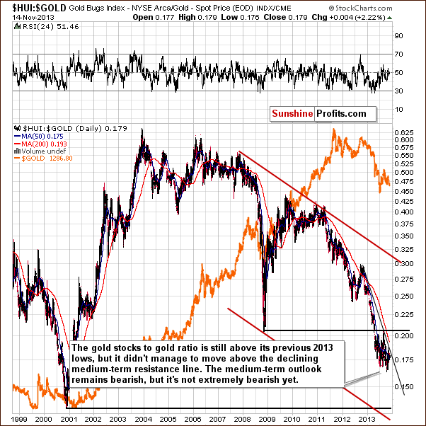
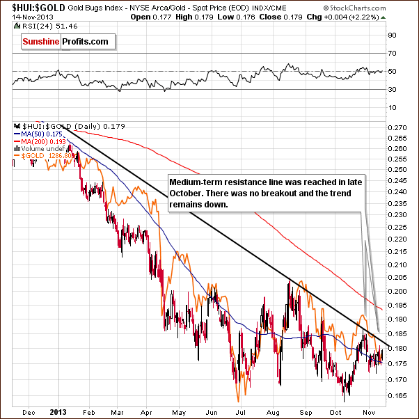
Generally, the downtrend remains in place, and it will remain in place as long as the HUI to gold ratio stays below the declining resistance line. Since the ratio is not that close to it, it doesn’t seem that we will see a breakout soon. In fact, we don’t expect to see one before another major plunge in the precious metals sector.
Summing up, the outlook for the mining stocks is similar to the outlook for gold. It seems that we might see short-term strength, but we expect it to be only temporary. The medium-term trend remains down.
Summary
The key market that is influencing the precious metals sector at the moment is the currency market. Both: Euro and USD indices have been correcting this week and their respective corrections might or might not be over at this time. These corrections have contributed – which was in tune with the most recent readings from the Correlation Matrix – to corrections also across the precious metals sector.
Gold has recently invalidated a breakdown below the rising support line, which has already triggered a rally (on Thursday) and that could still contribute to higher prices in the next few days. The upside seems rather limited – we don’t think that gold will move above the $1,340 level, which corresponds to the medium-term declining resistance line.
Silver’s technical picture is bearish at this time, but given the bullish short-term outlook for gold makes us doubt that silver will really rally without an additional move up.
Miners have shown strength recently – likely thanks to the positive influence coming from the stock market. But regardless of the reason, it’s still rather positive information for the short term. Naturally, it would be much more bullish if stocks weren’t responsible for the miners’ rally as in this case miners’ strength would likely truly indicate the PM sectors’ strength, but still, what we have is more bullish than not.
Given all of the above, it seems that staying out of the precious metals market with one’s speculative capital is justified. As we wrote in yesterday’s Market Alert, we will monitor the situation to – most likely – re-enter the short positions at more favorable prices and to further increase your profits from the previous transaction.
Trading – PR: No positions.
Trading – SP Indicators: No positions: SP Indicators suggest long positions, but the new self-similarity-based tool suggests short ones for the precious metals sector. We think that overall they cancel each other out.
Long-term investments: A half position in gold, silver, platinum and mining stocks. As far as long-term mining stock selection is concerned, we suggest using our tools before making purchases: the Golden StockPicker and the Silver StockPicker
| Portfolio's Part | Position | Stop-loss / Expiry Date |
|---|---|---|
| Trading: Mining stocks | None | - |
| Trading: Gold | None | - |
| Trading: Silver | None | - |
| Long-term investments: Gold | Long - half | - |
| Long-term investments: Silver | Long - half | - |
| Long-term investments: Platinum | Long - half | - |
| Long-term investments: Mining Stocks | Long - half | - |
This completes this week’s Premium Update. Our next Premium Update is scheduled for Friday, Nov 22, 2013. We will continue to send out Market Alerts on a daily basis (except for when Premium Updates are posted) and we will send additional Market Alerts whenever appropriate.
Thank you for using the Premium Service.
Sincerely,
Przemyslaw Radomski, CFA

