
- USD and Euro Indices
- General Stock Market
- Correlation Matrix
- Gold
- Silver
- Palladium
- Mining Stocks
- Summary
In the previous update we have seen how Federal Reserve’s balance sheet grew in the last few years. Now let us look how this growth coincided with increases on the stock market:
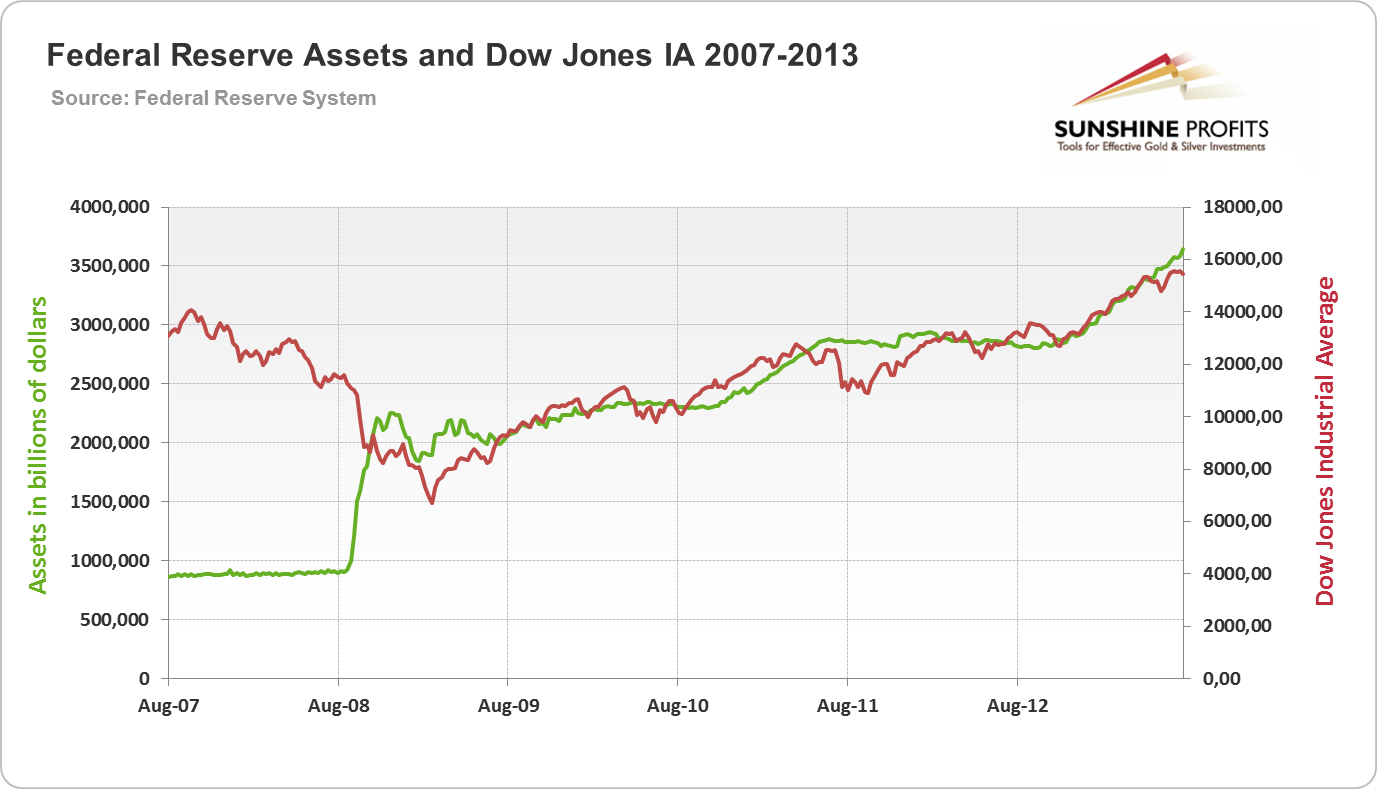
When you look at the above graph it would seem almost gratuitous to ask if there is a relationship between the Dow Jones Industrial Average and the Fed’s balance sheet. You don’t need to be a technical analyst to see that there is indeed a relationship. Both grew at the same time, but this does not necessarily imply that the Fed is solely or even mostly responsible for the growth in the stock market. Nevertheless, its influence on the index can hardly be exaggerated. Part of the stock market’s growth may be due to natural market recovery, part caused by the interventionist policies (notice that the growth in the value of balance sheet is not associated with the growth with market value of assets, since they are not marked to market; that is the value of assets held is not adjusted to current market value like in the case of market institutions).
Why is this relevant? It tells us the strength of the dollar system, or actually the strength of the foundation upon which it stands. To put it technically – the economy needs investment demand to grow, or even more simply, it needs money to grow. The sources of that money can be various and the sustainability of growth depends on what those sources are. The best possible source of money to grow is to get money by saving it – that’s the natural capital accumulation, which allows the diversion of funds from pure consumption to financing investment activities. Another possible, but unsustainable way, is to have a bank credit expansion to finance growth through debt). This is what has happened after 2001, the economy grew because banks created massive amounts of credit. The end result of this bubble was predictable from the start to many. There was such huge amount of mal-investments that even the banks themselves got into trouble.
After such a downturn (let’s say that Lehman’s collapse in 2008 was the beginning of the downturn) we could move into phase two which consists of the government funding “growth” through both fiscal stimulus and monetary policy. We put quotation marks on the word “growth” because it is a very slow and often fictitious growth (usually the case with government-funded growth). This is why we can say that the dollar system is in trouble even if the dollar as currency is not doing badly at all in the currency markets. The economy grew, but not as a result of solid fundamentals, but due to the Fed’s interventionist policies. That is why gold kept on shining through that period.
Since the economy did not go into full-blown recovery, it is not surprising that the Fed did not back out from these interventionist practices. And the change at the helm should not change this trend either. We do not believe in a permanent (or at least truly sustainable) market recovery without market forces freely influencing the prices. As long as the Fed stays on its interventionist course, we have every reason to believe that gold remains a firm choice.
However, the above (based on the October Market Overview report) relates to the long run only and if we’d like to get insight into
USD and Euro Indices
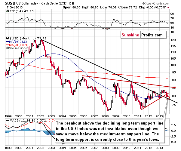
The situation in the long-term chart hasn’t changed much recently, and what we wrote in our previous Premium Update is still up-to-date today.
The long-term breakout above the declining long-term support line was not invalidated. (…) However, since the medium-term breakdown (below the support line marked with red) is visible also from this perspective, we could see some short-term weakness anyway. It seems that the long-term support line will stop the decline – that is, if the USD Index gets that low. Therefore, from the long-term perspective, it seems that the downside is still quite limited.
Now, let’s examine the weekly chart.
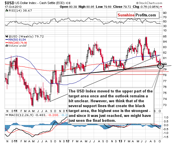
On the above chart, we see that the USD Index reached the upper part of the target area (marked with a black ellipse) once again. Additionally, the dollar dropped to the medium-term support line based on the February, September 2012 and January 2013 lows (a bold black line), which means that the final bottom of the recent corrective move might be already in or we we’ll see it soon, without an additional significant decline.
Even if the USD Index moves lower - to the next support line based on the September 2012 and the January lows (currently around 79.5), it still will be in the target area. Therefore, from this perspective, the situation will not change much. As long as the dollar remains above this level, further declines will likely be very limited. We would need to see a confirmed breakdown below this level to change the outlook to bearish.
Let’s check the short-term outlook.
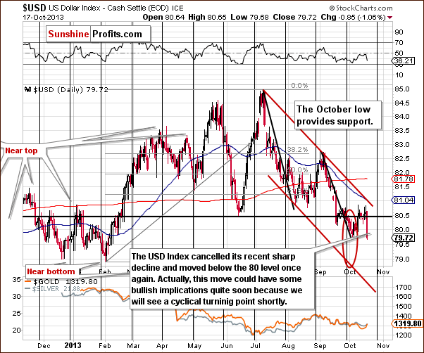
On the daily chart, we see that the USD Index climbed to last week’s high in recent days. However, the combination of this resistance and the proximity of the short-term declining resistance line triggered a corrective move, which pushed the dollar slightly above the 80 level.
As you can see on the above chart, there is a cyclical turning point just around the corner. Therefore, the recent declines are not as bearish as they seem at first sight. It’s quite possible that we will see its impact on the dollar in the coming week. This can lead to a bigger rally, especially when we take into account fact that the USD Index remains in a short-term downtrend.
Let’s now take a look at the Euro Index.
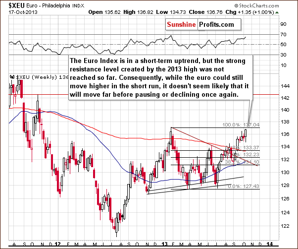
Looking at the above chart, we see that the situation (precisely, implications thereof) hasn’t changed much in the past week. Although the Euro Index remains in a short-term uptrend, the strong resistance level created by the 2013 intraday high has not been reached so far. This means that another move to the upside would not surprise us. However, even if the European currency breaks above the previous high, any upward move will likely be limited by the above-mentioned resistance level (the Euro Index closed at 136.76 and the high is at 137.11). Therefore, as long as the euro remains below the 2013 top, it’s hard to talk about a real bullish development here.
Summing up, on Thursday, the USD Index dropped below the 80 level and reached the medium-term support line. Even if the dollar drops lower, it will reach another support line. Therefore, it seems that further declines are very limited.
General Stock Market
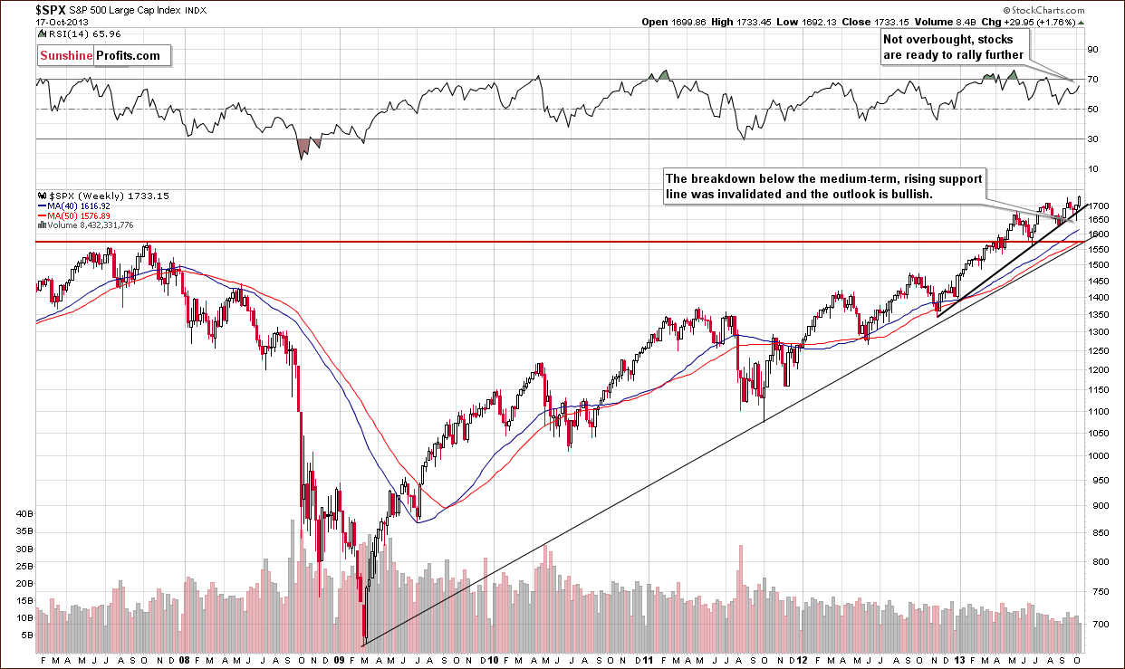
Looking at the above chart, we see that the invalidation of the breakdown below the rising medium-term support line has indeed triggered the expected rally in the past few days. The S&P 500 rose and actually moved above its September 18 top. There was no analogous breakout in case of the Dow Jones Industrial Average, though.
The outlook is bullish and – as you will see in the section about gold & silver correlations - the implications for gold are bearish.
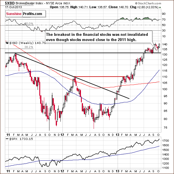
Let’s turn now to the financial sector, which in the past used to lead the rest of the general stock market.
Quoting our previous Premium Update:
(…) since the support created by the 2011 high is relatively close, we will likely not see another major decline.
On the above chart, we clearly see that, in spite of the last week’s downward move, the financial stocks didn’t invalidate the breakout above the level of 130. These positive circumstances triggered an upward move this week, which took the financials to slightly below the September high.
Consequently, the medium-term outlook remains bullish. Please note that the financial stocks proved once again to be a reliable indicator in estimating whether the trend is about to change or not.
Summing up, the long-term, medium-term and short-term outlooks for the stock market remain bullish, and the implications for the precious metals sector are bearish.
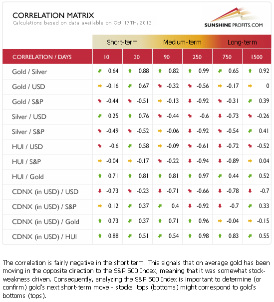
Gold & Silver Correlations
In our previous Premium Update we wrote the following:
(…) The most interesting thing about these coefficients is what actually caused them to be upside down. In the case of the USD Index – it was the fact that metals managed to decline even when the dollar declined (bearish implications). In the case of the general stock market – it was the fact that the metals managed to decline along with a decline in the case of stocks.
Stocks’ bullish invalidation of the breakdown is so important because of the significant and negative correlation with gold and silver. Naturally, the bullish action on the stock market is bearish for the precious metals sector.
Recently (mainly on Thursday), we have seen some strength in the cases of precious metals and mining stocks, but these were not enough to change the most important correlations. In the case of gold, silver and the general stock market, they remain strongly negative. Although the correlation between miners and the S&P500 is weaker, mining stocks are not likely to move anywhere without metals moving in the same direction, so the negative impact of the stock market’s rally should also be seen in case of the mining stocks – if not directly, then likely indirectly, and if not immediately, then eventually.
Let’s take a look at the metals themselves, starting with gold.
Gold
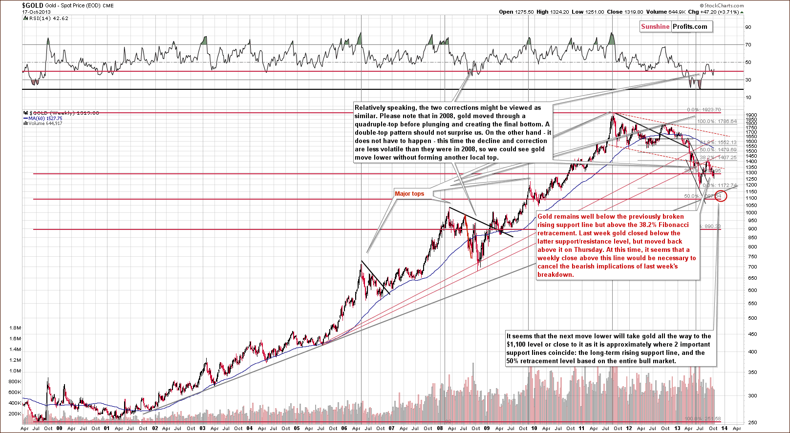
This week – mainly on Thursday – gold moved higher and you can see it (though barely visible from this perspective) on the above chart as a move back above the $1,285 level. As you know from previous updates, this level is quite important as it corresponds to the 38.2% Fibonacci retracement level based on the entire bull market. That’s a major, long-term support/resistance level, and thus, we can expect breakouts and breakdowns below this level to be followed by significant moves to the upside or downside – depending on what type of move preceded the breakout/breakdown.
One of the beautiful things about the markets is their fractal nature – big, long-term moves are similar to short-term ones in their shape. You can spot the same patterns on the weekly chart and on the daily one – for example the zigzag patterns. This also means that long-term patterns will require some kind of long-term verification. For instance, instead of seeing a “3 daily closes below a certain price level”, we would prefer to see “3 weekly closes below it”.
Given the importance and implications of breaking the long-term 38.2% retracement level, can we draw meaningful conclusions based on just an intraday move? Definitely not. Are daily closing prices significant enough on their own? Still not likely.
Last week’s close below the above-mentioned support was a bearish sign but not very bearish as we didn’t see a long-term form of confirmation. This week’s “invalidation” of the breakdown seems even more short-term and temporary. It’s simply as much of a factor as it might appear at the first sight. The thing that we should be focusing on in the above chart is the more-than-confirmed breakdown below the long-term rising support line.
From the long-term perspective, the outlook remains bearish. The biggest question that we have concerning gold is not if it will decline, because that seems quite likely, but when will it happen.
Let’s look for some answers on the short-term chart.
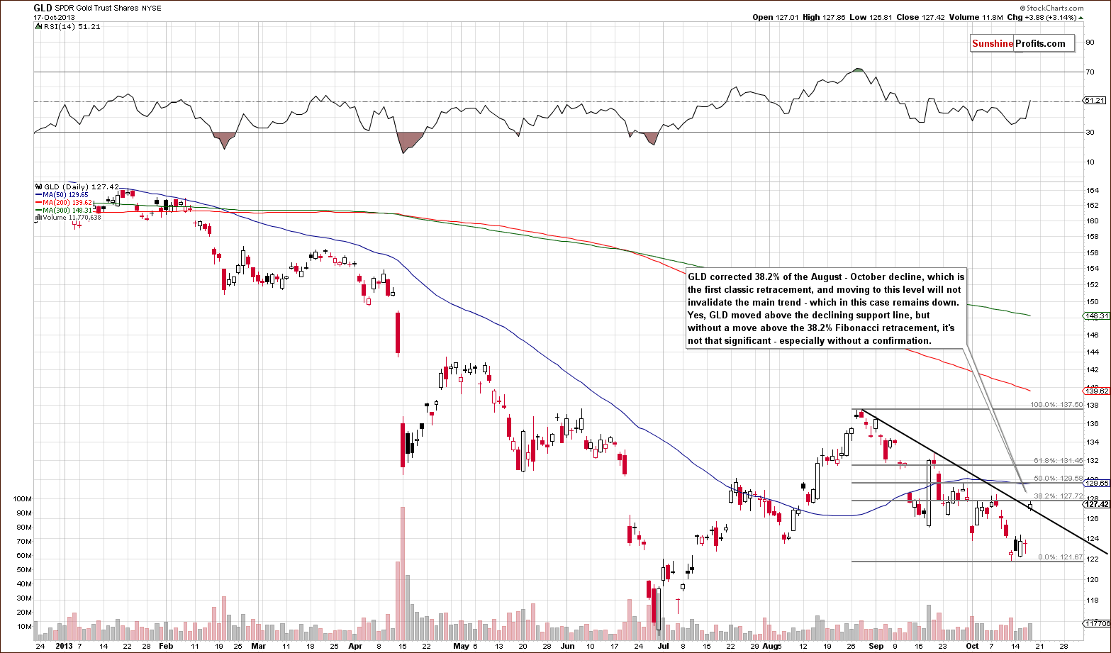
On the above gold chart, we can see that the head and shoulders pattern was invalidated “once again”. Right after it took place, a move higher was likely; however, it materialized within minutes after the invalidation in pre-market trading. At this time, it could be the case that the move higher that was likely to happen has already happened, minutes after it became likely.
What’s next? Gold is still likely to decline. Why is this the case even though gold rallied substantially on Thursday? It's because the breakout above the declining resistance line was not confirmed by 3 consecutive trading days and because the 38.2% Fibonacci retracement stopped the decline. Technically, that’s just a correction within a decline.
Before moving on to analyzing gold priced in other currencies, let’s focus on one more thing – the reason behind gold’s rally – or more precisely, the category of the reason. We saw a sizable rally that was triggered by a declining USD that was triggered by the agreement regarding the debt ceiling and the discussion on abolishing the debt ceiling altogether. Both moves could have been triggered by this event. The point is that it was new fundamental information that triggered the move. The same was the case in mid-September when markets were surprised by the no-tapering piece of information. What happened next back then? Gold did nothing on the following day and then simply continued the decline – and the latter was even more visible in case of the mining stocks.
Now, let’s move on to the chart of gold priced in Australian dollars.
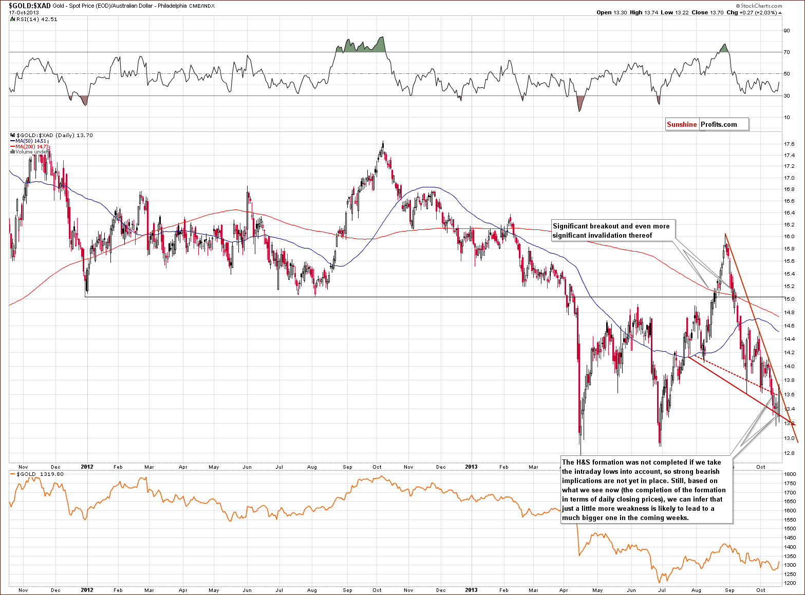
Looking at the above chart, we see that the situation hasn’t changed much. More precisely, the situation changed a bit, but the implications didn’t.
Quoting our previous Premium Update:
(…) there is a bearish head and shoulders formation underway, which may result in further declines in the near future. In this case, we could see a strong corrective move, one which would likely push gold’s price all the way back down to the April bottom area. Actually, we could even see a move below the April lows, because gold seen from this perspective is actually no longer strong versus gold priced in the US dollar.
Consequently, until the above pattern is completed, there will be no significant bearish implications. Please note that gold priced in Australian dollars remains below the long-term declining support/resistance line (marked with black on the above chart), and the breakdown is confirmed.
From this perspective, the situation is somewhat more bearish than not, but not significantly. Please note that if the head-and-shoulders formation is completed, we will likely see a move all the way down to the previous 2013 lows.
This week we saw a move above the neck level based on the daily closing prices but not above the declining resistance line, so basically, the situation remains bearish, but not very bearish – the formation is underway, but it has not completed yet.
Let’s examine gold from another perspective – gold priced in British pounds.
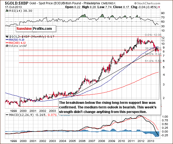
On the above chart we see that the breakdown is now confirmed, and the outlook is clearly bearish for the medium-term. Thursday’s upswing didn’t invalidate the breakdown below the 38.2% Fibonacci retracement level.
The situation is a bit different when looking at gold priced in euro.
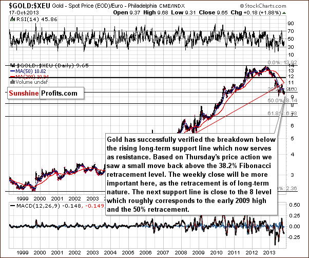
On the above chart we see that the correction that we saw in the past month was nothing more than a verification of the breakdown. From this point of view, the outlook remains bearish. We saw a move back above the 38.2% Fibonacci retracement level, but, as we explained when describing the USD gold chart, a single daily close is not significant enough to invalidate a breakdown below such an important level.
Let’s take a look at the chart featuring gold’s price from the non-USD perspective.
Looking at the above chart, we see that from this perspective, nothing of importance changed this week. Yes, we saw a move higher, but no move can continually move only in one direction, and some corrections are to be expected – at this time there is no evidence that this week’s move is anything more than just a bounce. We have non-USD gold after a major breakdown and it’s not surprising that it’s taking two steps forward (2 weeks with lower closes) and one step back (a higher weekly close this week is quite probable).
Summing up, the medium-term outlook for gold remains bearish, even though we saw some strength this week. From the long-term perspective, a single daily close is too insignificant to change something, and from the short-term point of view, we only have an unconfirmed (!) and small breakout above the declining support line without a move above the 38.2% Fibonacci retracement level.
Silver
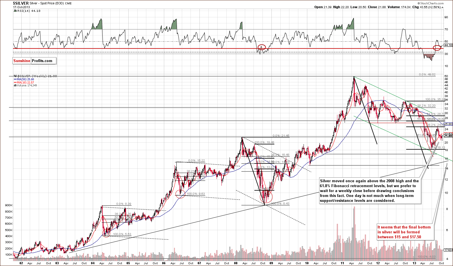
In recent days, we saw an upward move in silver, which took the white metal slightly above the 2008 high. However, as we discussed in the gold section, we should wait until the end of the week to check whether this increase is important or not – especially when we take into account the importance of this level for the long-term outlook.
Please note that silver closed the previous week below the 2008 high and the 61.8% Fibonacci retracement level based on the entire bull market, which was a bearish sign. However, we will need to wait for a weekly close before drawing any conclusions based on this week’s strength.
Now, let’s move to the short-term chart to see the recent price moves more clearly.
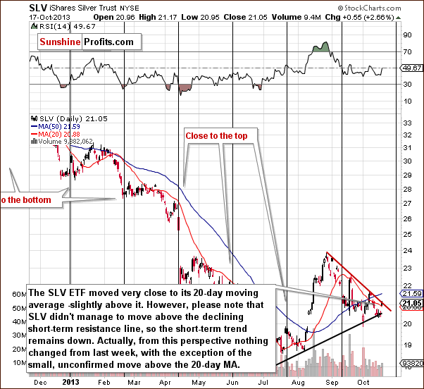
Looking at the above chart we see that the SLV ETF moved to the short-term declining resistance line, but it didn’t break above it. Therefore, the short-term downtrend remains in place. When we take a closer look at the daily chart, we see that SLV also moved slightly above the 20-day moving average. However, we saw similar price actions in mid-September and early October and in both cases the breakout was quickly invalidated. The major obstacle, which stopped further growth, was the above-mentioned short-term declining resistance line.
Taking this fact into account, we don’t think that anything will change this time, and we might see a similar price action once again. namely, another decline.
Summing up, although a lot happened on Thursday, not much changed. Moreover, the upward move in silver was much smaller than the move for gold. As we see on the short-term chart, it didn’t change much, and the trend remains down. At first sight, it seems that it changed a lot on the long-term chart, but we should wait for a weekly close before we can draw initial conclusions.
Palladium
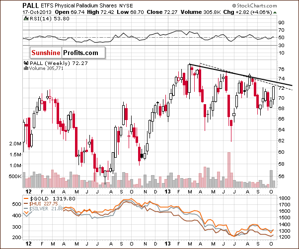
On the above chart, we see that in previous weeks, palladium declined slightly below the 68 level; however, the metal has corrected and we’ve seen a rally over the past two few weeks, which took it (almost) to the declining resistance line based on the 2013 top and the June peak (marked with black dashed line).
As you can see on the above chart, there was no upward move above this line; therefore the medium-term trend remains down. The implications for palladium and the rest of the precious metals sector are still bearish.
Gold and Silver Mining Stocks
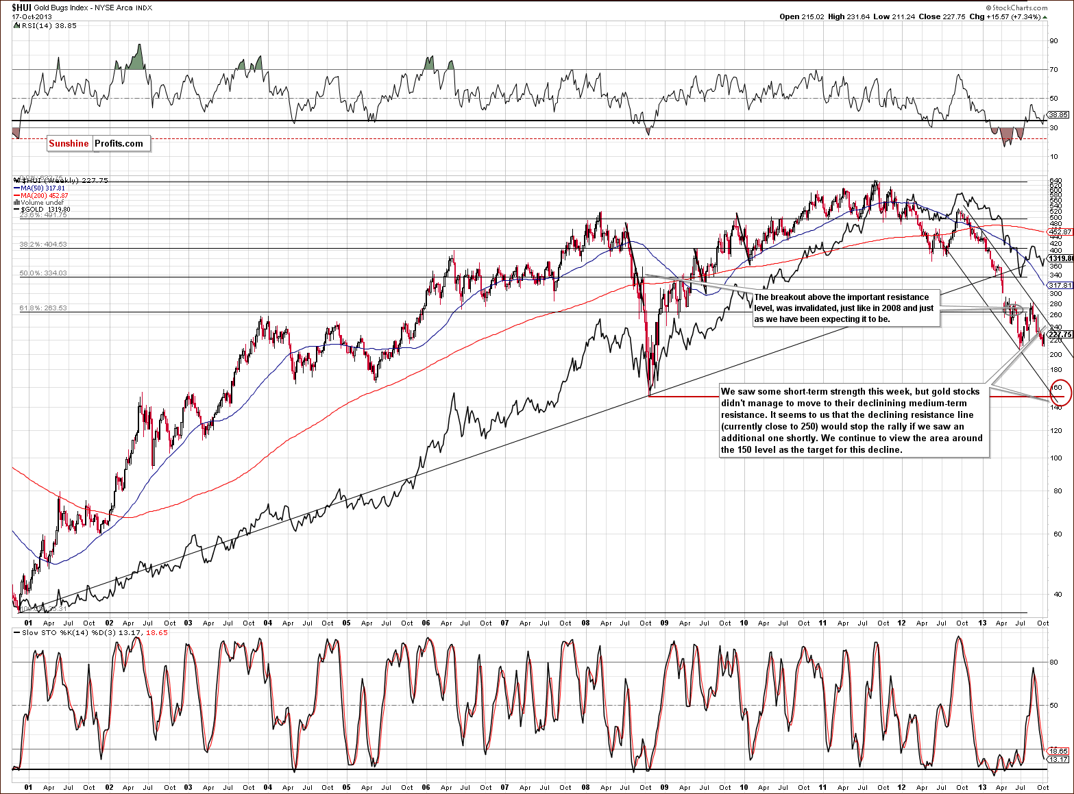
From the medium-term perspective, the HUI Index chart is still clearly bearish. Thursday’s strength didn’t change anything because the index didn’t even move to the major declining resistance line (the upper border of the declining channel). Therefore, the implications are bearish and the trend remains down. Please note that we still expect that the HUI Index will move to the 150 level or very close to it.
Let’s take a look at another long-term chart – this time it will be the one featuring the junior mining stocks.
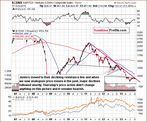
On the above chart, we see that Thursday’s strength didn’t change anything, and juniors remain close to their long-term declining resistance line based on the March 2011, March 2012 and January 2013 highs. Therefore, the bearish implications remain in place.
Please note that in the past, declines didn’t happen immediately after this resistance line was reached, but they appeared in a few weeks. From this point of view, it seems that we could see another downswing quite soon, as juniors have been trading below the resistance line for a few weeks now.
Having said that, let’s move on to the gold stocks to gold ratio – another important long-term chart.
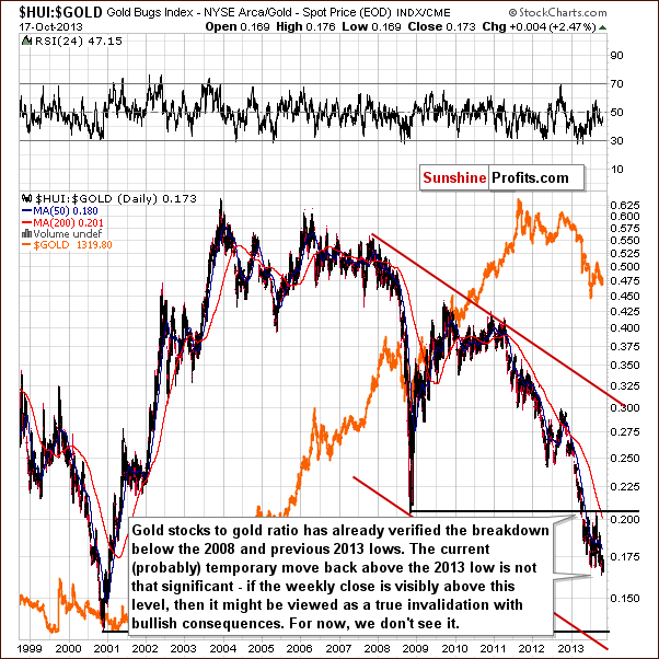
Thanks to Thursday’s rally, the gold stocks to gold ratio moved slightly above the previous 2013 lows. However, the ratio has already verified the breakdown below this level (last week), and we think that one daily close above the previous 2013 lows doesn’t change much.
Please note that just as in the case of silver (from the long-term perspective) we would prefer to wait for at least a weekly close above the major support/resistance level before drawing conclusions.
Before we summarize, let’s examine the short-term GDX ETF chart.
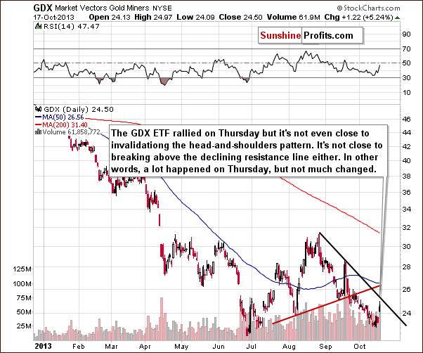
Looking at the above chart, we see that the GDX ETF rallied on Thursday, but just like in case of the HUI Index it didn’t even move to its declining resistance line. Naturally, the bearish head and shoulders formation was not invalidated as its neck level is still above the declining resistance line.
Consequently, the trend also remains down from the short-term perspective.
Summing up, although mining stocks rallied significantly on Thursday, they didn’t reach their resistance lines. Therefore, the medium- and the short-term downtrends remain in place.
Summary
The USD Index declined significantly yesterday but it’s not at / very close to significant support levels, and it seems that further declines will be very limited or nonexistent. The outlook for the general stock market remains bullish. The above is a bearish combination for the precious metals sector.
Gold moved sharply higher on Thursday, similar to what we saw when investors learned that there would be no tapering in September. Back then, a decline followed the single-day sharp rally, and we could see also something similar in the coming days and weeks. From the long-term point of view, important resistance levels were “broken” in the cases of gold and silver, but a single day is really not enough to invalidate the previously confirmed moves. On a short-term basis, gold’s breakout above the declining resistance line is not confirmed, especially since there was no breakout above the short-term 38.2% Fibonacci retracement level. In the case of silver, there was no short-term breakout, and the same is the case in HUI Index, GDX ETF and the junior mining stocks sector.
Overall, the medium-term trend remains bearish.
Trading – PR: Short position (half of the regular size of the position) in gold, silver and mining stocks.
Trading – SP Indicators: No positions: SP Indicators suggest long positions, but the new self-similarity-based tool suggests short ones for the precious metals sector. We think that overall they cancel each other out.
Long-term investments: A half position in gold, silver, platinum and mining stocks. As far as long-term mining stock selection is concerned, we suggest using our tools before making purchases: the Golden StockPicker and the Silver StockPicker
| Portfolio's Part | Position | Stop-loss / Expiry Date |
|---|---|---|
| Trading: Mining stocks | Short position (half) | HUI: 240, GDX: $26 |
| Trading: Gold | Short position (half) | $1,330 |
| Trading: Silver | Short position (half) | $22.60 |
| Long-term investments: Gold | Long - half | - |
| Long-term investments: Silver | Long - half | - |
| Long-term investments: Platinum | Long - half | - |
| Long-term investments: Mining Stocks | Long - half | - |
This completes this week’s Premium Update. Our next Premium Update is scheduled for Friday, Oct 25, 2013. We will continue to send out Market Alerts on a daily basis (except for when Premium Updates are posted) at least until the end of October, 2013 and we will send additional Market Alerts whenever appropriate.
Thank you for using the Premium Service.
Sincerely,
Przemyslaw Radomski, CFA

