
- Euro & USD Indices
- General Stock Market
- Correlation Matrix
- Gold
- Silver
- Platinum
- Mining Stocks
- Sunshine Profits Indicators
- Junior Mining Stocks
- Letters from Subscribers
- SP Indicators positions and stop-loss
- Gold cycle
- When dollar goes lower so does gold
- Gigantic Head and Shoulders in the HUI since 2009
- Bearish flag pattern in miners
- Platinum ETFs
- Summary
A trend is a trend until it stops. Could this be the case for bonds? Is the bond bubble about to burst? And if so, what are the implications for precious metals?
Anyone following the financial press can see that analysts are rumbling that bond prices will fall when interest rates rise and that it will happen sooner than later. And we generally agree – you can’t lower interest rates below zero (who knows, maybe the Fed will surprise us calling that an unconventional but necessary move?) and since they are practically there, the ceiling is very close to the current bond valuations. The reason that bonds beat stocks over the past two decades is that interest rates have plunged making attractive the fixed income that bonds promise to pay.
There are not that many whippersnappers on Wall Street today that remember the bottom in the bond market which took place on Oct. 26, 1981. The yield on 30-year Treasury bonds rose to 15.21 percent and on that date, a Treasury bond issued in 1970 and scheduled to mature in 2000 was quoted at less than a dismal 56 percent of face value. It had a coupon of 7.875 percent, but that was not considered enough to compensate investors for the risk. The great bear market in bonds, both corporate and government, lasted 35 years, from 1946 to 1981. The current bond bull market has lasted some 30 years so far. Is it about to change as some analysts are saying?
Bonds are a form of IOU issued by countries and companies. They provide investors with a promise to pay interest income and repay their capital at a fixed date in the future. Bonds have delivered higher total returns than stocks for more than 20 years now. The value of bonds decline when interest rates move higher.
In the four years since Lehman Brothers imploded, investors have poured $900 billion into bond funds and have withdrawn $410 billion from equities.
Bonds are up across the board. Vanguard's Total Bond Market Index Fund has returned 20% in three years and nearly 40% over five. The rates have been driven down by the Federal Reserve as it seeks to stimulate the economy and prevent deflation. Investors have been flocking to bond for safety and China has been buying and investing in dollars to keep the renminbi from appreciating too much.
Bonds and their yield are like the playground seesaw. When the bond price goes up, the yield goes down and vice versa. Could it be that bond investors are making the same errors today that were made with stocks in the late 1990s, mistaking rising prices as a sign of safety, instead of a sign of rising risk? Can the same be said for gold?
After three decades of declines, interest rates are as close to rock bottom as they can get. Analysts are (correctly, in our view) most worried about bonds with longer maturities, and advise investors to shift into shorter-term notes, or into debt that offers floating rates -- those that would rise along with the market.
For some time, Bill Gross has voiced his concern that the Fed's monetary stimulus program could generate higher inflation in coming years and has shunned 10- and 30-year Treasuries, whose value will be eroded. Instead he holds shorter-dated Treasuries such as five-year notes as the Fed remains a buyer of Treasury debt in 2013. Higher interest rates could be detrimental to gold initially, but let’s not forget that in the bull market of the 70’s, higher rates simply followed gold higher. Plus the accompanying higher inflation would be beneficial for precious metals, because investors would likely purchase something that has a few-thousand-years long history of holding its value if all else fails.
"Investors should be alert to the long-term inflationary thrust of such check writing" by the Fed, said Gross in his January investment outlook. "While they are not likely to breathe fire in 2013, the inflationary dragons lurk in the 'out' years towards which long-term bond yields are measured."
Nearly 40% of the 32 investment strategists and money managers surveyed recently by CNNMoney think that interest rates will begin to rise in 2013, and another 30% say the shift will begin in 2014.
That would be even sooner than the Federal Reserve's projections. The central bank doesn't expect to raise the federal funds rate, the key interest rate that influences overall interest rates, until some time in 2015. The Fed said that it will keep its stimulus policies in place until the unemployment rate falls to 6.5%, which it doesn't think will happen before then. But whether that takes place this year or next, or in 2015, one doesn’t want to be stuck with major investments in bonds when it happens.
Gross, who runs the world's largest bond fund, questioned how any central bank can print trillions and trillions of electronic dollars without any consequence. "They just make it up," he wrote. "Supposedly they own a few billion dollars of 'gold certificate' that represent a fairytale claim on Fort Knox's secret stash, but there's nothing there but trust."
"The future price tag of printing six trillion dollars' worth of checks comes in the form of inflation," he said, adding that "to date, central banks have been willing to accept that cost -- nay -- have even encouraged it."
For all the investors who've rushed into bond funds in recent years, Gross has the following advice for 2013: "Be leery and recognize [that] yields in the investment grade market -- mortgages, Treasuries and corporates -- only yield 1.7%. It's difficult to squeeze much juice from an orange that yields 1.7%."
Investors today are wiser about stocks. They know that the buy and hold strategy is no longer a guarantee of high returns. Stock investors made their money in the 1920s, in the 1950s and 1960s, and in the 1980s and 1990s. In other periods, they made very little. The period since 2000 has been one of those times.
The same waves are also true for bonds. According to London Business School research, most of the real, inflation-adjusted returns from U.S. bonds over the past 100 years came in just two eras: the 1920s and 1930s, and since 1981. In other periods, bondholders fared far worse. In the 1970s, long-term bonds were such a poor investment that they became known as "certificates of confiscation." Inflation was rising and if one took the coupon payment, adjusted for inflation and taxes, one had a negative real return.
Waves come and go. The current bull market in bonds must end at some time in the future, sooner or later, not until inflation or interest rates rise. So far, the economy remains sluggish, real unemployment is high and inflation is minimal. But, sooner or later, investors will experience either a loss of money, or at best meager returns.
If inflation eats away the value of bonds, those who hold gold in their portfolios may be able to compensate.
Let’s see how gold is performing this week. Let's begin this week's technical part with the analysis of the US Dollar Index. We will start with the long-term chart (charts courtesy by http://stockcharts.com.)
USD Index
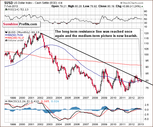
We begin our currency section with a look at the long-term USD Index chart. No significant changes are seen this week and the long-term trend for the USD Index remains down. Thursday’s rally did not take the index level above the long-term resistance line, so the outlook here from the long-term perspective remains bearish.
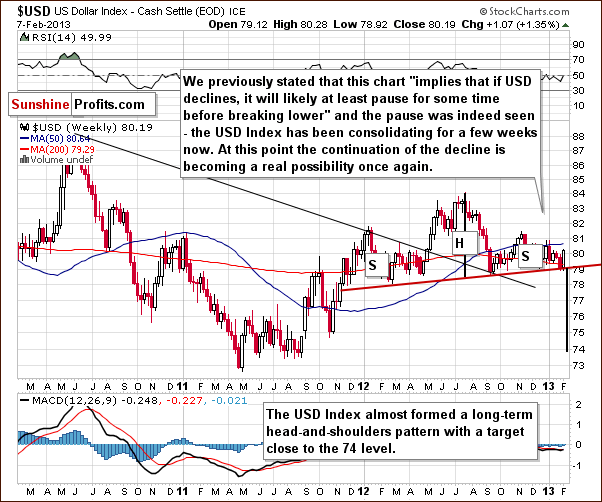
In the medium-tern USD Index chart, virtually nothing changed this week, although a move to the upside was seen on Wednesday-Thursday’s. The head-and-shoulders pattern is still not completed. A breakdown here below the 79 level, which is the neck level of the above-mentioned pattern - is quite probable and will likely lead to much bigger moves to the downside. These subsequent declines could stretch out for a period of weeks or even months.
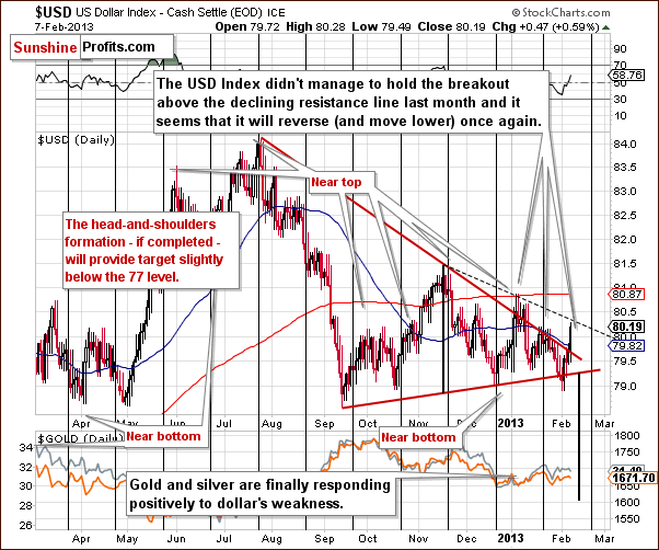
In the short-term USD Index chart, a rally above the medium-term declining resistance line based on the July-August and late-November highs last year was seen this week. As the beginning of the dashed line is at the Nov 2012 top (the one that created the medium-term support line) and the Jan 2013 high (the one that formed after prices tried breaking above the declining resistance line), it might be the case that this line represents the “how far too far can the index move and still go back down”. It’s simply our guesstimate based on two facts: each of the previous breakouts failed and the rally stopped right at the dashed line, thus confirming at least some significance thereof.
We still believe the next move seen here will be to the downside. With a cyclical turning point a bit more than a week away, sideways trading in the coming days will likely be quickly followed by a period of declines which could then trigger a rally in the precious metals sector.
Summing up, the medium-term outlook appears bearish and we continue to view the short term as bearish in spite of the rally seen on Wednesday and Thursday this week.
General Stock Market
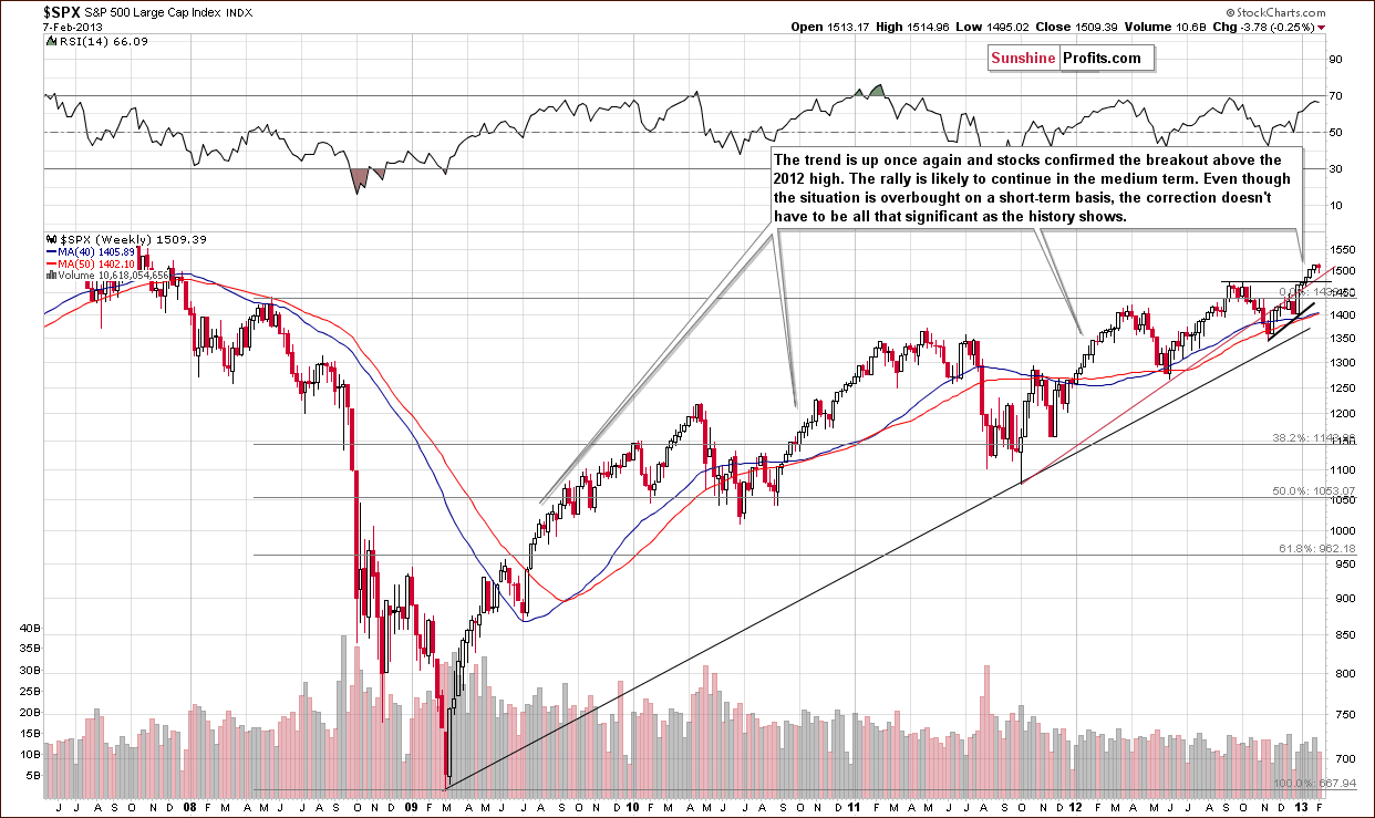
In the long-term S&P 500 Index chart, stock prices were relatively unchanged this week from a long-term perspective. Back and forth moves were seen, and the S&P 500 closed on Thursday at a price level just $4 below where they ended last week. Sideways trading this week cooled the situation a bit, and, as we mentioned in last week’s Premium Update, big price declines were not seen and were not expected here:
A small decline or some consolidation or a continuance of the rally could be seen in the coming days. It is unlikely that any big declines in stock prices will be seen anytime soon.
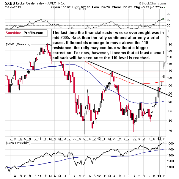
In the financial sector (Broker/Dealer Index serves as a proxy here) chart, higher prices for stocks appear to be a real possibility based on the strength seen here in the financials. No resistance line has been reached recently, but there is one ahead at the 110 level. A bit more of a rally here would lead to a possible consolidation, which in turn would perhaps create the handle of a bullish cup-and-handle pattern.
All-in-all, the situation is bullish for the medium term although a short-term consolidation is possible after a bit more of a rally. The RSI levels are extremely overbought right now, and the last time this was seen was not at the 2007 top but rather in the middle of 2005. Back then, the financials had a small consolidation and then rallied strongly for many weeks before any correction was seen.
Summing up, the situation in stocks remains bullish but some additional consolidation could be seen before prices move to the upside.
Gold and Silver Correlations
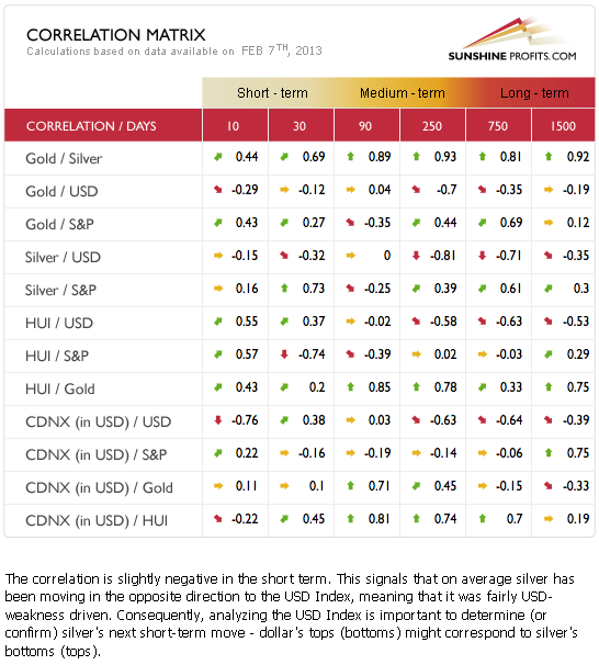
The Correlation Matrix is a tool which we have developed to analyze the impact of the currency markets and the general stock market upon the precious metals sector (namely: gold & silver correlations). Only silver is more or less in tune with the norm as it is negatively correlated with the dollar and positively correlated with the general stock market. The past few days however have not seen silver’s price decline significantly in spite of higher USD Index values. This is a good short-term sign for the white metal.
Generally, the long and medium-term coefficients are still negative between the precious metals and the USD Index. If the index breaks down below the 79 level and declines further, this will likely have a bullish impact on the precious metals. No direct short-term implications can be inferred at this time in our view however (with the bullish exception for silver).
Gold
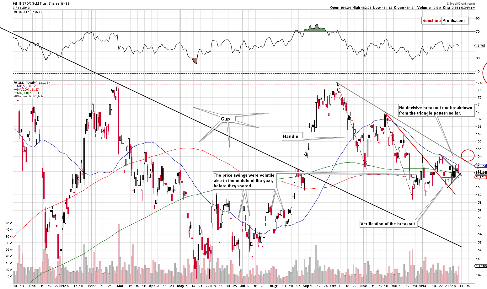
In the medium-term GLD ETF chart, price action was very volatile on Thursday and the back and forth movement finally closed at the upper border of the triangle pattern. This means that for one more day, the situation has been “indecisive”. We expect a breakout to materialize shortly and higher prices will very likely be seen. Gold’s price revolved around the 300-day moving average, and the GLD ETF closed right at this average on Thursday. Once the rally is seen, we expect to see some consolidation in the GLD ETF around the $164 level followed by a continuation of the rally.
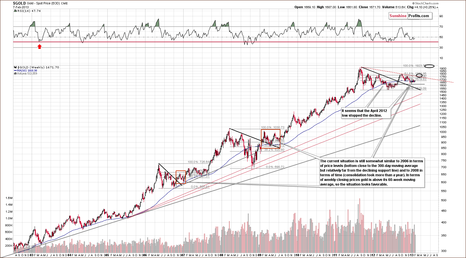
In this week’s long-term gold chart, very little changed and the situation remains bullish here. Gold prices consolidated after breaking out and the yellow metal is technically ready for a big rally. Comments made in last week’s Premium Update remain up-to-date:
The bottom was very likely formed here a few weeks ago when gold prices dipped below the 300-day moving average, which is a very important long-term technical development. Prices now appear to be simply consolidating a bit, which is also in tune with the historical patterns – the rally didn’t always start in a volatile way after the final bottom was reached below the 300-day MA – but it happened eventually many times and on each occasion the rally was worth waiting for.
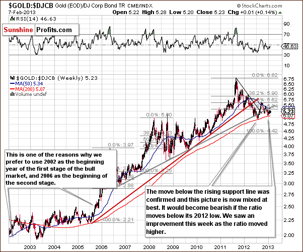
In this week’s gold to bonds ratio chart, we see that the ratio moved higher this week but is still below the rising resistance line. Higher ratio values are a somewhat bullish piece of information, but the overall picture here is still mixed at best.
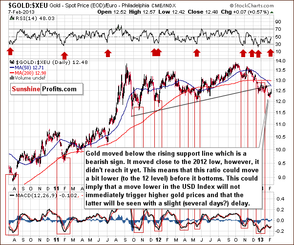
In this week’s chart of gold from the euro perspective, the same holds true here as prices are higher but have not moved back above the rising support line, which is now providing resistance. The technical picture here is not that good, but the small decline that could (doesn’t have to) be seen here is could simply represent a time when gold lags the USD Index – the latter moves lower but gold doesn’t rally immediately.
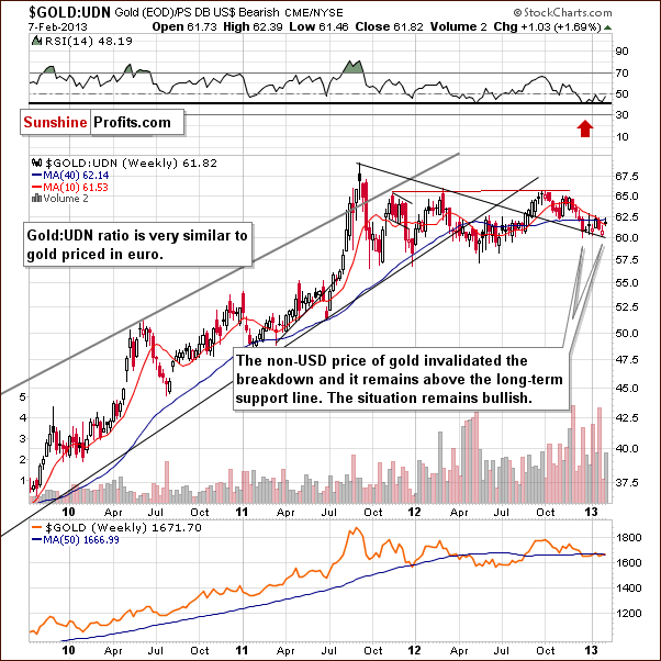
In this week’s chart of gold from the non-USD perspective, we continue to see a several-month-long consolidation period, which could very well be discouraging to some. After a breakout and another bottom in the RSI last week, the RSI moved higher this week and this may be a sign that the consolidation period is ending. We believe that the implications here are bullish simply because prices are above the declining support line, because the consolidation took many months and that gold is in a long-term uptrend.
Summing up, the situation in gold did not change much this week in terms of price, but the technical situation and the triangle pattern present on a short-term basis suggest that the end of this consolidation period may be close. It is encouraging that gold did not decline much even though the dollar rallied quite sharply on Thursday. We expect gold prices to move higher, and it seems that the rally could very well be seen quite soon.
Silver
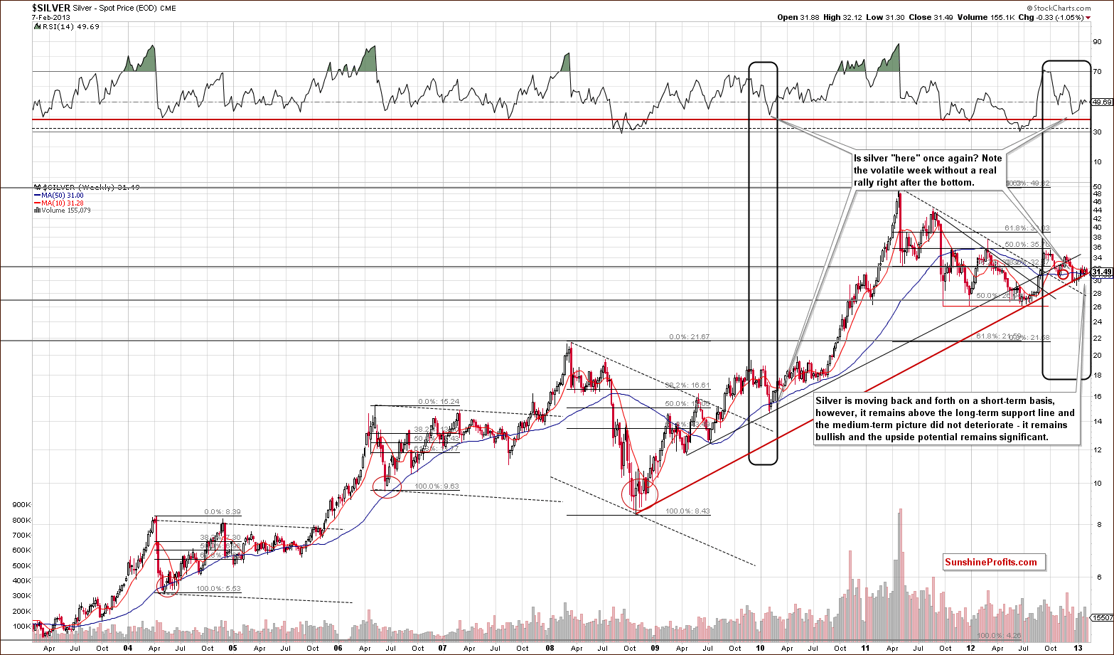
In this week’s long-term silver chart, silver’s price is very close to the rising support line, generally in the $31 range. This is about $0.50 below silver’s closing price on Thursday. All-in-all, the situation remains bullish here. Comments which were made in last week's Premium Update remain up-to-date:
In this week’s long-term silver chart, we again must emphasize the importance of looking at the big picture which should always take precedence over short-term charts. In silver’s long-term chart, we see that prices tried to break down below the long-term support line but failed. They are now back above this line, and, after rallying, touched the resistance-support line once again. So, we have a bullish situation with bullish implications for the long, medium and short term. Short-term implications come from this long-term chart as well because silver’s current price is close to the long-term support line, and it seems unlikely to move much lower right now.
The same can be said about what we wrote yesterday:
Yesterday, we emphasized the existence of a triangle pattern in the silver market because it was much clearer there than in the gold market. We also wrote that "of course there is a long-term support line just a little below today's prices, so the situation would be bullish even without the triangle pattern". This important support line is currently at the $31 level, so there was no meaningful breakdown here, only a short-term one.
Do we suggest getting out of the market with any of the long positions right now? No, we suggest keeping them. Even if silver moves lower to the $31 level, it will not drop much (…)
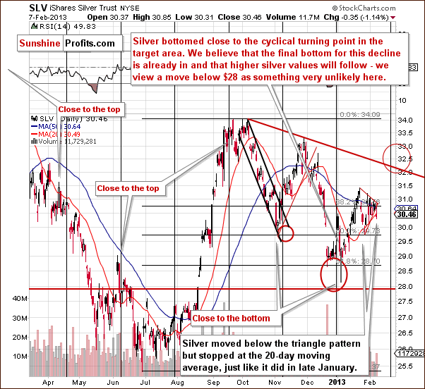
In the short-term SLV ETF chart, we saw a breakdown below the lower border of the triangle trading pattern. Silver’s price however did not move below the 20-day moving average, similar to what was seen in late January. For this reason (and the fact that the long-term support line is so close), we don’t think that the price decline will be upheld. We expect an invalidation of the breakdown, a rally perhaps to our target area within a few weeks, and then a local top forming close to the cyclical turning point which would come about in late February.
Another possibility is for a small decline and then a rally until the cyclical turning point is reached. It seems that the odds favor a rally first, however, as the short-term trend remains up at this time. The fundamentals favor higher prices as the consolidation took a long time and the long-term support line is close to current price levels. Much lower prices simply do not seem to be in the cards.
Summing up, the situation continues to look bullish for the white metal, and we suggest remaining long on silver.
Platinum
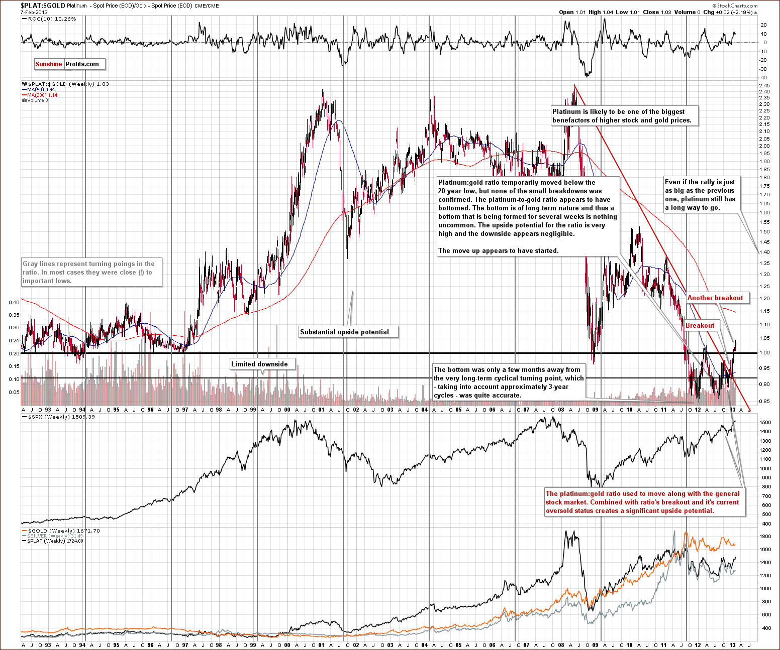
In this week’s platinum to gold ratio chart, there are no big changes. The ratio has simply moved a bit higher, up to 1.03 from last week’s 1.01. Platinum is now almost $50 higher than gold in price, but this price difference is tiny compared to the norm of the past 20 years. It still does not appear to be too late to open a position is platinum or switch part of your gold holdings over and secure a position which appears to have tremendous upside potential. We continue to believe that platinum will outperform gold in the coming months.
Gold and Silver Mining Stocks
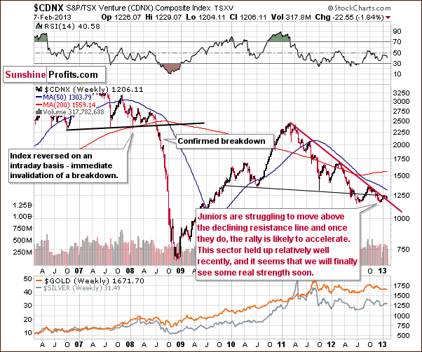
In the Toronto Stock Exchange Venture Index (which is a proxy for the junior miners as so many of them are included in it), the Junior’s sector did not do much this week as sideways trading was seen and price levels are now close to the declining resistance line. No significant breakout has been seen yet, but one is likely once additional strength is seen in the precious metals. This will probably lead to a continuation of the rally, and little else needs to be said. We expect prices to move to the upside here as well.
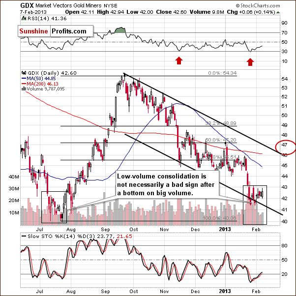
In this week’s GDX ETF chart, not much has changed on a medium-term basis. A short-term rally was seen on Thursday but with accompanying low volume levels, it is unclear if this is a bullish sign or not. In the previous similar case when mining stocks were heavily oversold on a short-term basis after a big decline and after a bottom following a huge decline, low volume seen during the rallies which followed was not necessarily bearish. Higher prices continued and a big rally was seen to follow as well. This could be the case here, taking this chart, the gold, silver, USD and general stock markets (even though the short-term correlation of the USD and stocks is not significant at this time) into account.
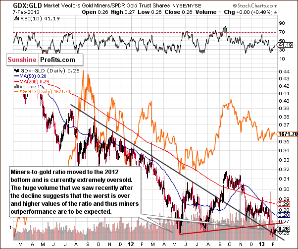
In this week’s miners to gold ratio chart, little change was seen, and the ratio is still close to the 2012 low, which is a major support line. It will probably not move below this level as it seems the damage has already been done here, and recent high volume levels confirm it.
Summing up, we remain bullish on mining stocks, mostly based on the other parts of the precious metals sector, which had been discussed previously and on the signals from the SP Indicators.
Sunshine Profits Indicators
Even though it seems that not much happened on the precious metals market this week, our indicators suggest that a lot happened behind the surface. This week was very rich in signals – almost all of the Sunshine Profits’ Gold & Silver Indicators flashed signals.
Let’s begin with the one that is most meaningful in our view.
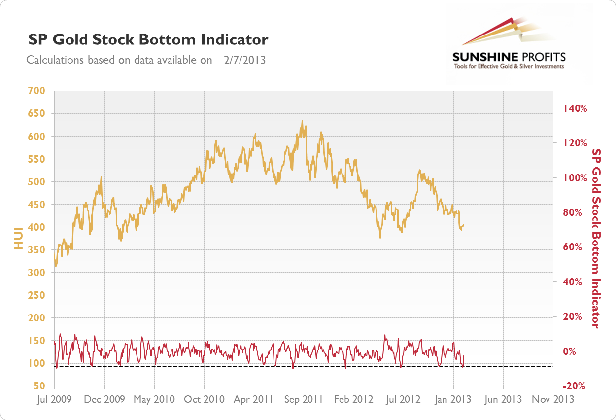
In this week’s SP Gold Stock Bottom Indicator, we have medium-term buy signal which does not flash too often. Take a look at the previous bottom which it detected and the prior one also. These are both major bottoms, not just local ones. The ensuing rallies are visible on a long-term basis not just for a few weeks. So the buy signal mentioned earlier this week in Tuesday’s Market Alert is of a medium-term nature, and the stop losses we suggested were therefore relatively far.
In other news, our SP Gold Stock Bottom Indicator has flashed a buy signal for gold, silver andmining stocks. This is a signal that we don't see very often - the last time we saw it was when mining stocks bottomed in mid-2012...
The implications of this signal are as follows:
Go long gold for 4 weeks with a 6.6% stop-loss order
Go long silver for 4 weeks with a 12% stop-loss order
Go long gold for 4 weeks with a 17.5% stop-loss order
Actually, another signal was seen when the indicator moved back above the dashed line, and we will adjust the timing/stop-loss details accordingly (in the table in the summary section).
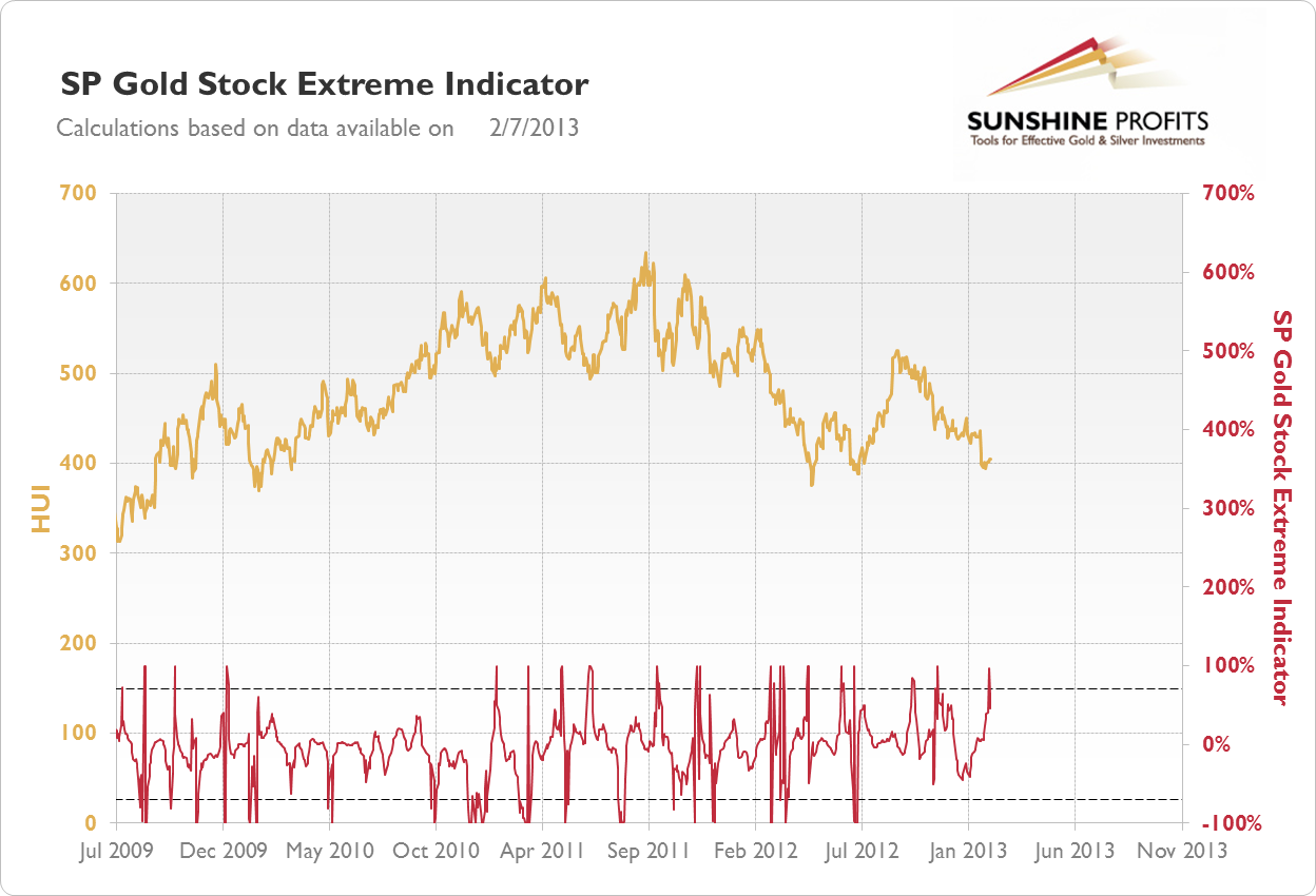
In this week’s SP Gold Stock Extreme Indicator, the buy signal confirms the formation of a bottom on its own. This was also the case in the middle of 2012, when a similar confirmation was seen.
The same can be said about the SP Gold Stock Extreme #2 Indicator and the SP Short-term Gold Stock Bottom Indicator:
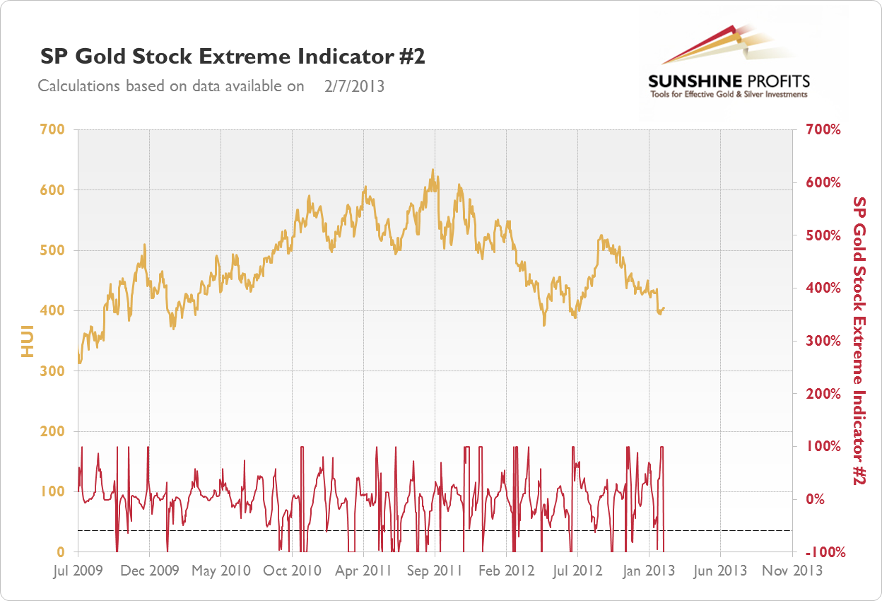
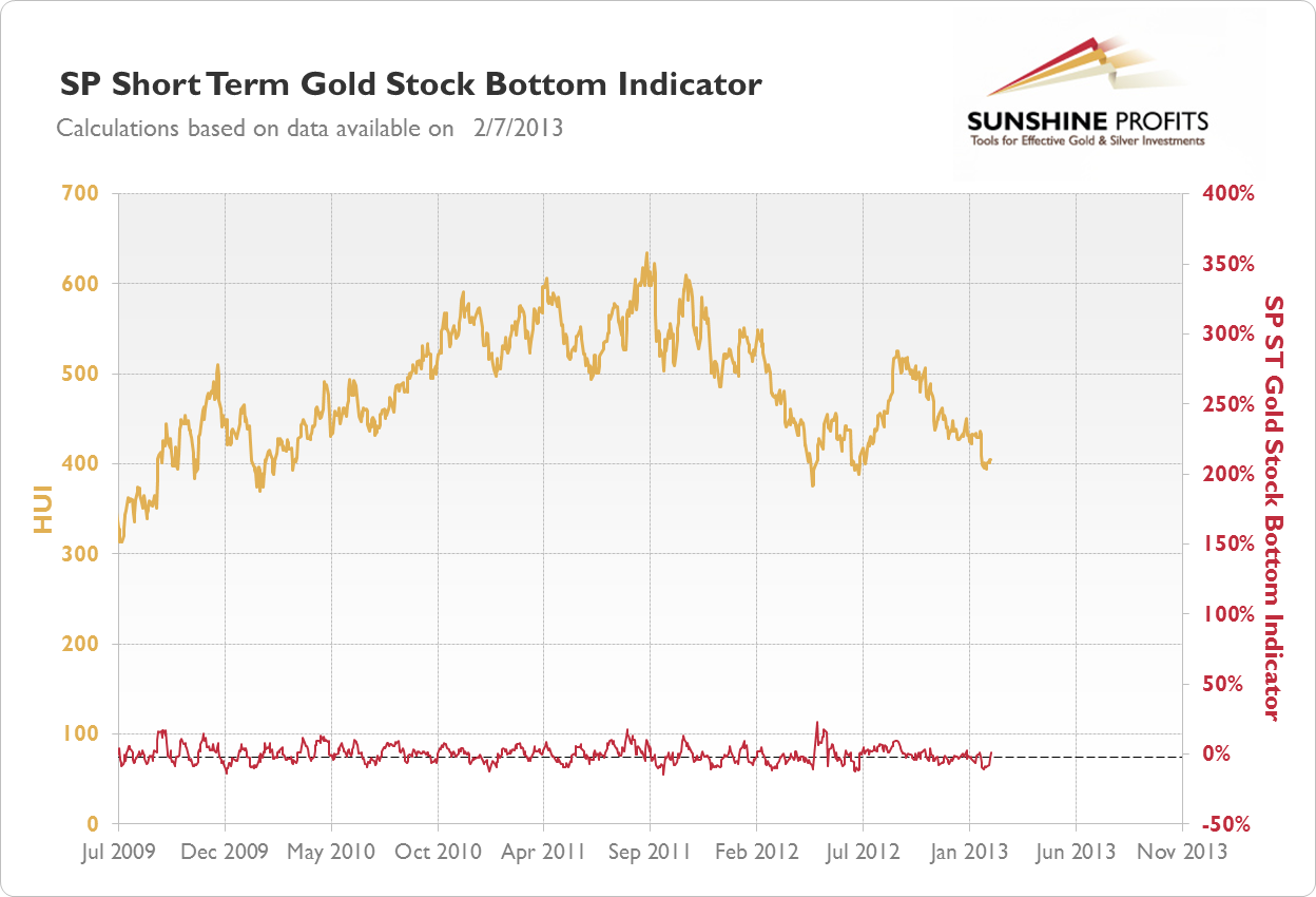
When several signals suggest higher prices, the situation becomes much more bullish. We were already long based on the previous signals, so it doesn’t change much – it simply serves as a confirmation.
Junior Mining Stocks
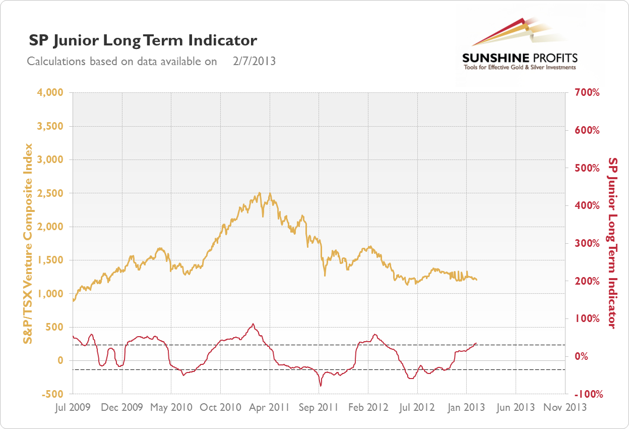
We begin this week’s junior section with a look at our indicator dedicated to timing turning points in the junior sector or – more precisely – to determining when it’s a good idea to move from juniors to seniors and vice-versa. The “move from juniors to seniors” signal is given when the indicator is above the upper dashed line and starts to decline. Although it’s not clearly visible on the above chart, the indicator just declined insignificantly yesterday and thus such a signal emerged.
Should you sell all your juniors and buy seniors based on that? At this time we think it’s a better idea to keep them in a 50/50 proportion, because of the technical situation in gold, silver and the general stock market. Please note that the junior mining stocks sector is particularly strongly positively correlated with the general stock market.
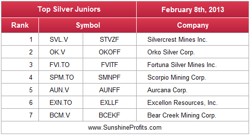
As stated in the Gold & Silver Portfolio report, the list of top juniors will be updated approximately every 4 weeks, usually at the beginning of the month. As mentioned above, holding juniors is still suggested. Let’s see which juniors are particularly likely to provide you with high profits in the coming months.
As a reminder, in our view, one of the most important considerations when choosing junior mining stocks is their performance relative to the rest of the sector and also their strength during a decline and the subsequent bounce. For juniors, we can’t apply sophisticated algorithms that we use on our rankings of senior gold stocks and silver stocks because the market is too small in each junior’s case and the small price moves may not properly reflect the stocks’ true value. It is for this same reason that junior mining stock prices can be manipulated more easily (diversify to lower the risk of being affected!). And it is also why we don’t analyze individual juniors from the technical perspective on a regular basis.
See the results of our latest research on juniors in the tables below:
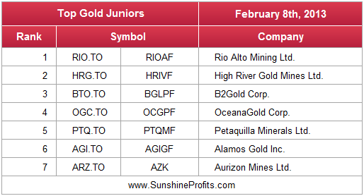
The biggest change this month is that we have B2Gold Corp. instead of CGA Mining in the gold ranking – the reason is the merger of these companies. B2Gold’s performance has been strong recently and it is actually one of the best types of performance that you can see. The company has been moving in tune with the whole sector (thus confirming that the exposure to gold) but the highs were higher and lows were higher than in the broad indices and this outperformance was steady, seen regularly.
Please keep in mind that we updated the dataset for calculations 4 months ago and companies that we had featured in the previous months are mostly still in the ranking. This implies that the fundamentals behind companies are most likely solid as they consistently perform well. This does not refer to each company individually because they all have their ups and downs, but to all of them at the same time – they seem to average out each other’s downs and ups and at the same time provide good profit potential – which is exactly what we strive for when constructing a juniors portfolio.
Letters from Subscribers
Q: I have a query regarding your SP indicators signals and the implications. Three suggestions are mentioned with variable stop-loss order percentages. I am interpreting this to mean that the suggestion is to take three separate positions with the appropriate stop-loss. If this is correct, is it effectively allowing for the short and medium term benefits?
A: Yes, you are correct, it's about three separate positions, each with the appropriate stop-loss. It does provide some diversification; however, different stop-loss levels (percentage-wise) are not designed to diversify between different time-frames. Instead they are a reflection of each market's volatility. For instance, mining stocks are more volatile than gold on a medium-term basis and thus a more distant stop-loss order was chosen. This is just a general rule. All stop-loss levels were chosen individually for each market based on the projected performance.
Q: I note in 2006-07 it took 76 weeks to make a new high for gold and in 2008 it took 78 weeks to make a new high in gold. We are now at week 74 in the gold cycle. Do you feel this is significant? I feel when it does move it will be to almost 1900 before a short- or medium-term correction. “When time is up, price will reverse. Time is more important than price.”--W. D. Gann (famous technical analyst.)
A: Yes, we feel this is significant and we expect to see a more volatile upswing in the coming weeks. We would like to add that the time factor may make this consolidation significant. Less than 40 years ago the correction took gold much lower - about half of the previous high - before the final rally in gold materialized. At this time we think that the prolonged consolidation might have been enough and gold doesn't have to move even lower - the lack of a rally might have been enough to make people throw in the towel.
Q: It seems that every time the dollar goes lower so does gold. Why then are we going long gold when it appears the dollar will continue lower? I realize that usually that is a good signal for higher gold prices, but not right now. Am I wrong?
A: Actually the 30- and 90-day correlation coefficients for gold and the USD Index are close to 0 at this time, which is a numerical representation of the fact that gold has moved rather independently from the USD Index recently. However, we expect a relatively large move lower in the USD Index, and this means that correlations based on longer periods should be considered. If you take the past year into account, gold moved inversely to the USD index most of the time. Therefore, what we see in the USD Index will likely result in higher gold prices in the coming weeks and months.
Q: I have ONE major concern. The gigantic Head and Shoulders in the HUI since 2009 with the Right Shoulder now formed and a neckline at about 375-80. If that breaks don’t we see a fast 100-150 on the HUI? Isn’t that a scary chart? I would greatly appreciate an answer on this because I am seriously considering selling a lot of my stocks in gold and silver based on that alone. The CDNX chart looks very scary also.
A: The head of this pattern would be very large compared to the shoulders, meaning that this formation is not very reliable. Also, if we use the 2012 low as the neck level (approximately), then the HUI Index is still considerably above it, so this formation is not in place, at least not yet. Therefore, it doesn't have bearish implications. The breakdown below the 2012 low (close to the 370 level in the HUI Index) would be a very bearish technical factor, if confirmed. However, we don't think that such a breakdown is in the cards in the coming weeks.
As far as CDNX (Toronto Stock Exchange Venture Index) is concerned, we don't view this chart as bearish, as a small rally here will mean a major breakout that will likely result in much bigger rallies.
Q: Hello P.R. Doesn’t this seem like a bearish flag: Slow grind higher in miners on low volume after big declines. What should we be looking for if this is actually the bottom?
Should the move up be bigger and on higher volume? I don’t know anything, just wondering. Every time there seems to be a break after a big decline, the decline returns with a vengeance. How is this different?
A: Generally yes, we would like to see a strong rally on strong volume to be more confident that the final bottom is behind us. The price pattern in mining stocks does look like a bearish flag pattern that would result in the continuation of the decline. However, we will not know until the miners break out either above the flag or below it. The key point here is that other markets - gold, silver, platinum - suggest higher prices in our view, and the SP Indicators suggest higher prices as well. The situation in the USD Index is also favorable. As no market moves totally on its own, we take more of them into account, and in this case the results are bullish.
We would like to say that the rally has to happen immediately, but that doesn't have to be the case. It's likely to be the case and that's why we suggest long positions. However there are no sure bets here, we might need to wait longer (a few more weeks?) for the rally to materialize. All in all, taking the possible scenarios into account, we think that the risk/reward ratio favors the long position.
Q: Do you suggest platinum ETF such as PPLT or others? Also thoughts on the Euro taking such a hit lately and Euro possibly seeing recession and impact on US markets...thanks
A: Regarding platinum - we received a very similar question before and this is what we replied (in May 4, 2012 Premium Update):
The answer depends on whether you own silver and platinum for the short- or long-term. We suggested owning platinum for the long term, so the following takes that into account.
We answered a similar question about platinum ETFs on March 16, 2008, so we will quote our previous reply, as it is still relevant as far as selecting an easy-to-use way to own platinum is concerned. We generally prefer physical holdings, but we realize that is not convenient for most investors.
PHPT (ETFS Physical Platinum ETF), in our view, is the best option for those looking for Platinum ETFs – both long-term and short-term. For long term investors, the fact that PHPT is physically backed is reason enough to consider it not only in the platinum space, but as a good instrument in the overall precious metals segment. PHPT has high liquidity and years of market presence.
Reasonable costs and tracking error also make PHPT a competitive ETF tool for the precious metals investor. However, for long-term investors, PPLT is a good alternative. PPLT measures the same as PHPT in terms of key attributes such as liquidity and physical backing, but lags behind marginally because it is relatively new and does not boast of the same history and trust as PHPT. For short-term traders tracking error and costs are a drag.
Finally, for any questions related to any precious metals ETF / ETN we recommend checking our Precious Metals ETF Ranking - it provides very detailed analysis and comparison between over 100 funds. To check only the platinum funds, select full screen mode (button is at the bottom of the ranking), choose "investor ratings" and then click the "benchmark" column. Then compare those with the PGM benchmark.
As far as Euro is concerned, we view Thursday's decline as a rather technical event and it seems that the uptrend will resume. The economic problems in the eurozone will have a negative impact on the situation in the US, but with so much money being printed right now and with very low interest rates, we expect to see higher stock values nonetheless, at least in the medium term.
Summary
The situation in the USD Index remains bearish even though the index moved higher on Thursday. Once a breakdown is seen below 79 and it’s verified, big declines are likely and will probably trigger a short and medium-term rally in the precious metal sector.
Long-term indications for gold and silver are that a rally is likely, with gold close to its 300-day moving average and silver’s long-term support line just about $0.50 below its current price. The short-term chart for the white metal suggests that the consolidation may be over soon based on the recent triangle trading pattern.
The situation for platinum is that it remains undervalued to gold based on 20-year norms. Its ratio with gold rose 2% this week from 1.01 to 1.03 and it does not seem to be too late to profit from the higher ratio values which result from platinum’s price rising faster than gold’s. There still seems to be potential in investing in platinum at this time.
Based on the recent indications of the SP Long-term Junior Indicator and our own views on the sector, we suggest dividing your long-term mining stock investments equally between gold & silver producers and junior mining stocks.
The situation in the gold and silver mining stock is not encouraging for the short term, but taking the long-term valuation into account, as well as the other precious metals markets and related signals, being long in the mining stocks with speculative capital still seems to be a good idea.
Trading – PR: Long position in gold, silver, and mining stocks
Trading – SP Indicators: Long position in gold, silver and mining stocks
Long-term investments: Remain in the market with your precious metals holdings
| Portfolio's Part | Position | Stop-loss / Expiry Date |
|---|---|---|
| Trading: Mining stocks | Long | $41 GDX (half) / 34.86, Mar 6, 2013 (half) |
| Trading: Gold | Long | $1,629 (half) / $1,564, Mar 6, 2013 (half) |
| Trading: Silver | Long | $30.15 (half) / $27.95, Mar 6, 2013 (half) |
| Long-term investments | Long | - |
This completes this week’s Premium Update. Our next Premium Update is scheduled for February 15, 2013.
As always, we'll keep you updated should our views on the market change. We will continue to send out Market Alerts on a daily basis (except when Premium Updates are posted) at least until the end of February, 2013 and we will send additional Market Alerts whenever appropriate.
Thank you for using the Premium Service. Have a profitable week, a great weekend!
Sincerely,
Przemyslaw Radomski, CFA

