
- USD and Euro Indices
- General Stock Market
- True Seasonals
- Correlation Matrix
- Gold
- Silver
- Mining Stocks
- "How anyone can have confidence in the USD?"
- Summary
What tapering?
Even though the so-called “tapering” of the Fed did not take place in September it is that probable that it would happen in the near future? As the case of European Central Bank demonstrates, the shrinking of the balance sheet may happen smoothly (the ECB also expanded its balance sheet in the last few years, but recently it shrunk). The case of US is different in important aspects (in case of US it was mostly about real estate commercial paper and asset-backed securities, whereas in Europe it was about sovereign debts), but the question remains: how will the tapering look like and when will it take place?
We believe that if tapering happens, it might be done slowly in a very gradual and “don’t rock the boat” manner by small adjustments of the balance sheet (at least at first). But apart from backing away from asset purchases, there is also the challenge of increasing interest rates which have been in a trough for a long time. When should this happen?
The Fed is consistently clear about when it plans to start the possible tapering. It all comes down to “improving labor markets” and keeping the inflation rate down at the longer run. This was the case with previous Fed’s announcements and it is the same with the one from September 18th. As we heard, asset purchase program is not set on any particular course, therefore will be adjusted according to changing conditions.
The changing conditions would have to mean much higher employment, much higher inflation and most importantly much better conditions on the credit market. Only then should we expect to see some tapering, either in the form of decreased purchases, or in the form of increased interest rates (or both). So far we have not seen changes in the labor markets, prices and credit activities which would justify a change in the Fed’s behavior. Apart from that, we have not heard the words from the Fed itself suggesting this could happen. There is even more, because at the same time the Fed issued new forecasts with lower projections of GDP growth. This is hardly a sign the Fed should consider as promising for future tapering actions. Additionally, as the Fed’s minutes tell us within a couple of weeks we could hear members of the Federal Open Market Committee come out against tapering, and then suddenly the FOMC starts to contemplate it. This entire mess indicates that the Fed is playing with expectations and testing the market rather than considering serious changes in its policies.
In the light of those factors, big twists in the market pricing behavior because of the meeting on the 18th seem like an exaggeration, even ludicrous. We do not see huge fundamental changes in the economy to justify those mood swings. Nevertheless, the reaction after the meeting confirms that the market was expecting something else. Perhaps it was supposed to be no tapering with the statement that some mild tapering is already happening.
Even though the position of the Fed’s chief is about to change, we do not see any changes in Fed’s policy whatsoever on the horizon. The long-term outlook for gold remains firm
Let’s move to charts to see what can happen in the medium and short term (charts courtesy of http://stockcharts.com.)
USD and Euro Indices
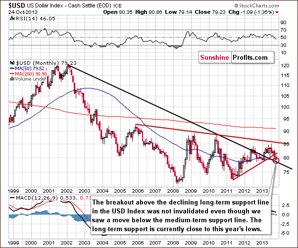
The situation in the long-term chart hasn’t changed much recently. The long-term breakout above the declining long-term support line was not invalidated. Therefore, even if we see further deterioration in the USD Index it will still remain in an uptrend in the long-term. From this perspective, it seems that the downward move will be quite limited because the long-term support line will likely stop the decline.
Now, let’s examine the weekly chart.
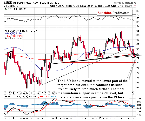
On the above chart, we see that the USD Index broke below the medium-term support line based on the February 2012, September 2012 and January 2013 lows (a bold black line) and reached the lower part of the target area. Additionally, the dollar slipped below the medium-term line based on the September 2012 and the January lows. In spite of this drop, the next support zone is quite close - slightly below the 79 level. From this perspective, it seems that the USD Index will not drop much further. Even if we see another downward move, the dollar will remain above the final medium-term support at the 78 level.
Naturally, what’s small on a long- or medium-term chart can be quite a visible move on the short-term chart. Let’s check the short-term outlook.
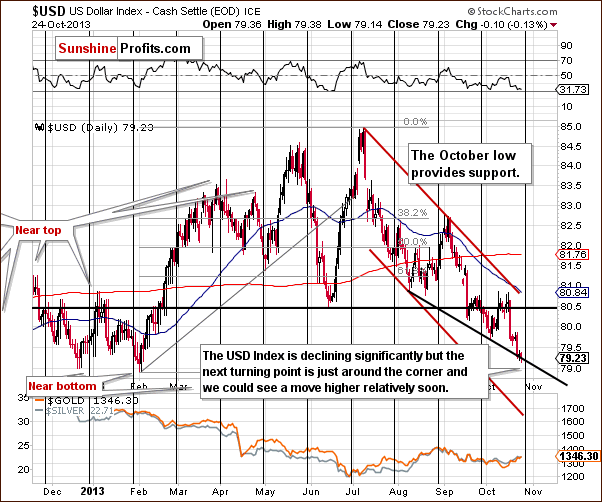
On the daily chart, we see that the USD Index broke below the previous October’s low and reached the short-term support line based on the August 8 and the October 3 lows.
As can be seen on the above chart, there is a cyclical turning point just around the corner. Therefore, we could see a reversal of the current bearish tendency in coming weeks. This can lead to a bigger pullback, especially when we take into account the fact that the USD Index remains in a short-term downtrend. On the other hand, let’s also keep in mind that the cyclical turning points work on a “near to” basis, so the bottom could be a week away and it would still be in tune with those indications. Given the current momentum, one week of declines could mean visibly lower USD values. Especially, if you factor in the medium-term breakout in case of the Euro Index.
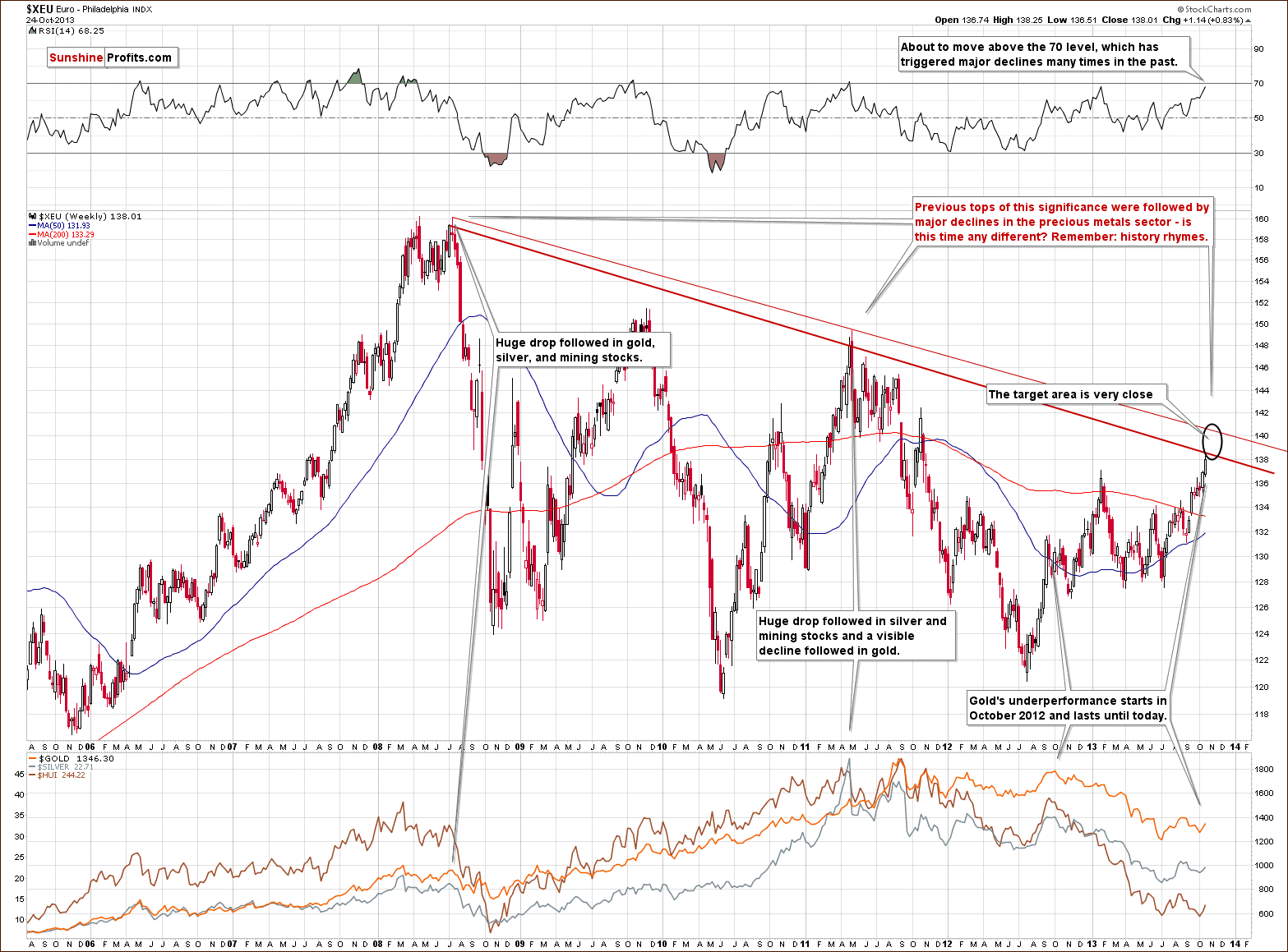
Looking at the above chart, we see that the Euro Index remains in a short-term uptrend, but in a long-term downtrend. Earlier this week, the euro broke above the strong resistance level created by the 2013 intraday high. However, it seems that further growths are limited, because of the long-term declining line based on the 2008 and the 2011 highs (in terms of weekly closing prices). From this perspective, if the Euro Index continues its rally this resistance line will be reached quite soon. However, if we take into account intraday highs we see a resistance line that is a bit higher, which means that we could see a move slightly above the 140 level. Either way, it seems that current rally, which has been in place since July will be stopped rather sooner than later.
Moreover, when we take a closer look at the above chart we see that the RSI almost reached the 70 level. If the indicator moves slightly higher it will likely trigger declines as it used to do many times in the past. Again, it seems that the upside is present, but quite limited.
Please note that previous tops (in 2008 and then in 2011) were followed by major declines in the precious metals sector. If history repeats itself we may see similar price action in this situation.
Summing up, we could see some strength in the Euro index and weakness in the USD Index on a short-term basis, but it seems that it will be quite limited base on the long-term support and resistance lines. The implications for the precious metal market are mildly bullish in the short term, but bearish in the medium term.
General Stock Market
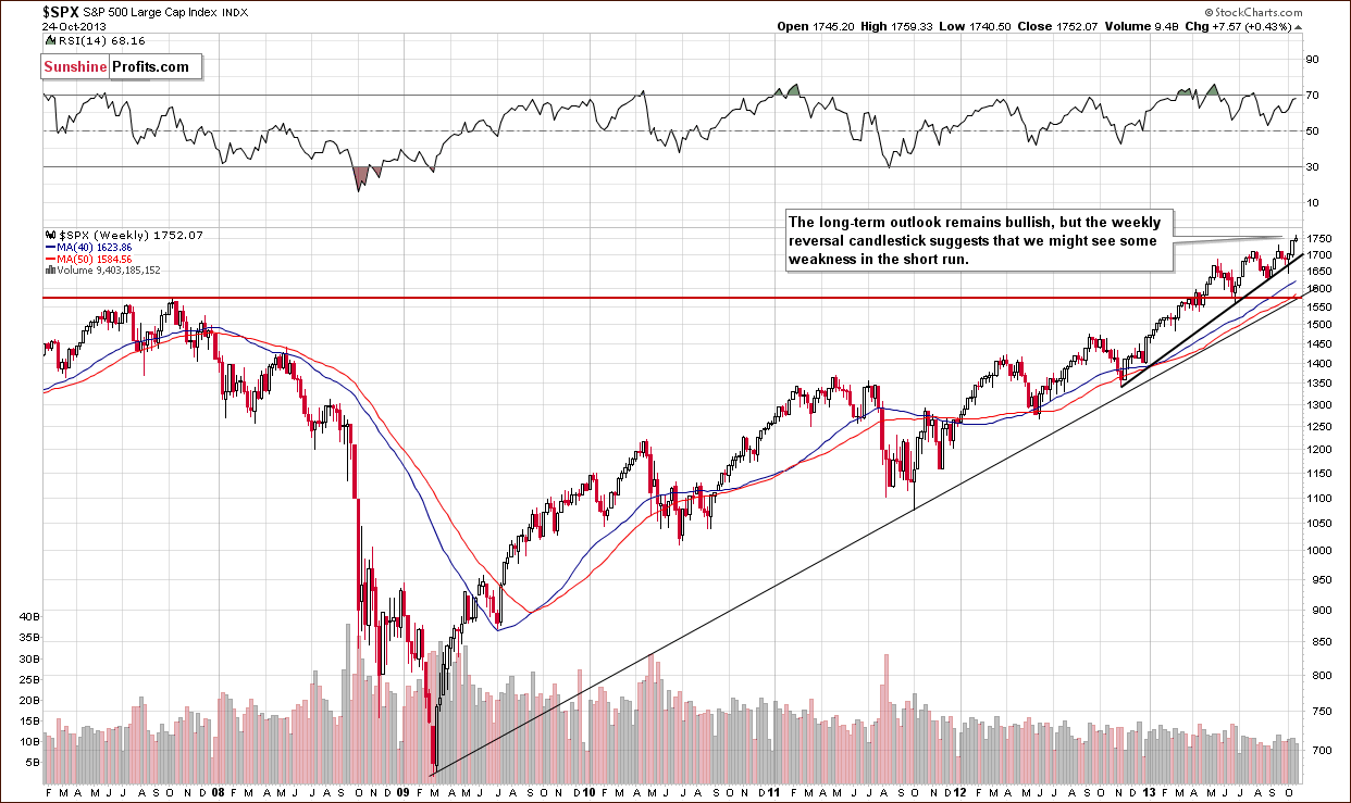
Looking at the above chart, we see that the situation hasn’t changed much recently as far as medium-term trends are concerned. Earlier this week, stocks moved higher, but they erased gains in the following days and reached levels that we saw at the beginning of the week. In this way stocks formed a bearish gravestone candlestick pattern. Therefore we might see some weakness in the short term.
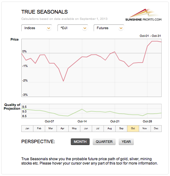
Taking a look at the True Seasonal patterns for the stock market reveals that the situation has been developing quite in tune with them this year. We saw a correction at the beginning of October which was followed by a sharp move back up. The rally now continues. What’s next? Please note that there are no clear short-term indications from the seasonality and derivatives’ expiration effect (two things that are combined on the above chart), but the overall trend is higher. The quality of projection starts to increase in the final part of the month along with the projected price, which means that the price at the end of the month is likely to be higher where it was at the beginning of the month (and where it is now), but it’s rather unclear how it gets there. It seems that one would need to use other techniques to detect the very short-term price moves.
Overall, the medium-term outlook is bullish and – as you will see in the section about gold & silver correlations - the implications for gold are bearish.
Gold & Silver Correlations
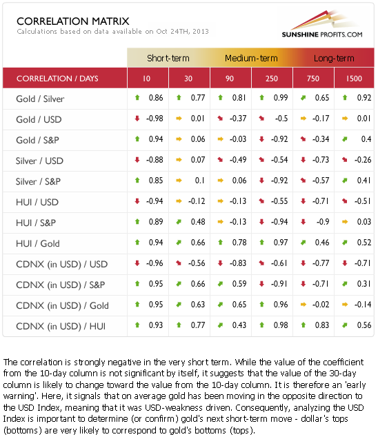
On a short-term basis (the 30-day column) the coefficients are quite insignificant and declining. Looking at the 10-day column, we see that they are moving back to their regular values, but it is too early to discuss these implications, as the 30-day coefficients haven’t changed so far. This means that the negative link between the U.S. dollar and the precious metals could be just a temporary phenomenon and not a change in the tendency. That’s why we described currencies’ impact on the precious metals as only mildly bullish for the short term.
Taking into account the situation in the Euro Index, it seems that the long-term resistance will likely trigger a medium-term downward move. Therefore, we will focus on the medium-term correlations. In the medium term (taking the 250-day column into account) we could see a negative impact on the precious metal market in the coming weeks but not necessarily days.
Consequently the implications of non-precious metal markets on the precious metals seem to be more important on the medium term basis and this time the influence seems to be bearish.
Gold
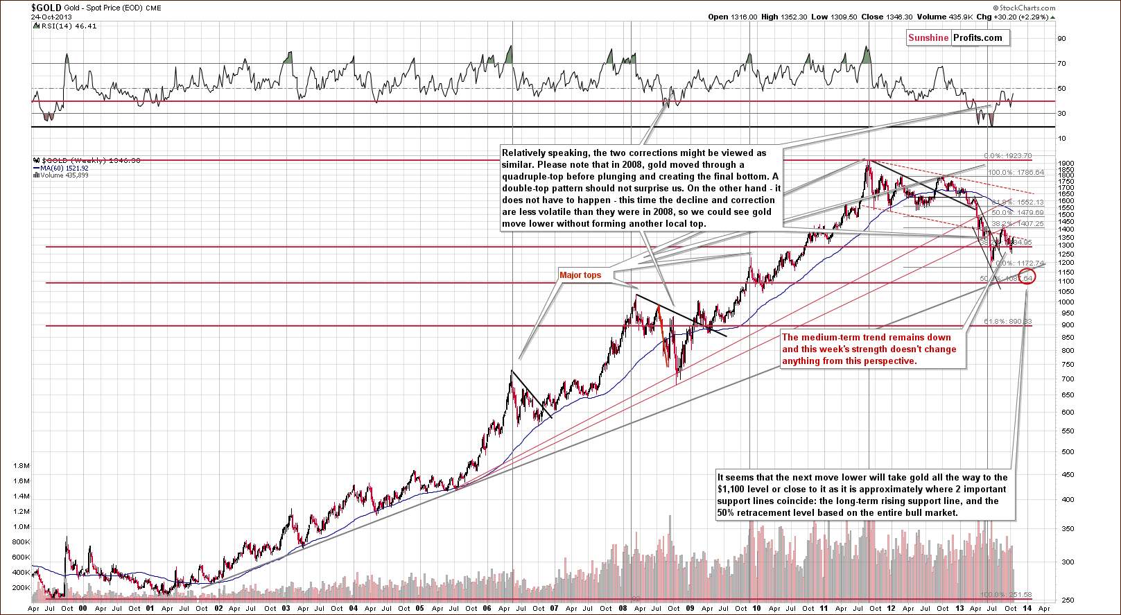
On the long-term chart we see that although gold pulled back this week the situation hasn’t changed much from this long-term perspective.
In mid-June the yellow metal broke below the long-term rising support line based on the July 2005 and the October 2008 bottoms (in terms of an intra-day high). Although there was a pullback in the following months, it turned out to be nothing more than a verification of the breakdown. In September gold verified the breakdown below the above-mentioned support line which served as resistance. After that we saw further declines, which took the yellow metal below $1,300. In the last two weeks gold pulled back once again. However, it still remains in the medium-term downtrend.
From this point of view, it seems that even if gold increases once again and climbs to the previous high (which would mean an approximately $90 rally), the medium-term outlook will continue to be bearish.
Please note that in 2008, when gold moved higher before plunging for the final time, there were several intra-week attempts to move higher after which gold finally declined. Therefore, a double top pattern should not surprise us here.
Let’s move on to the short-term chart.
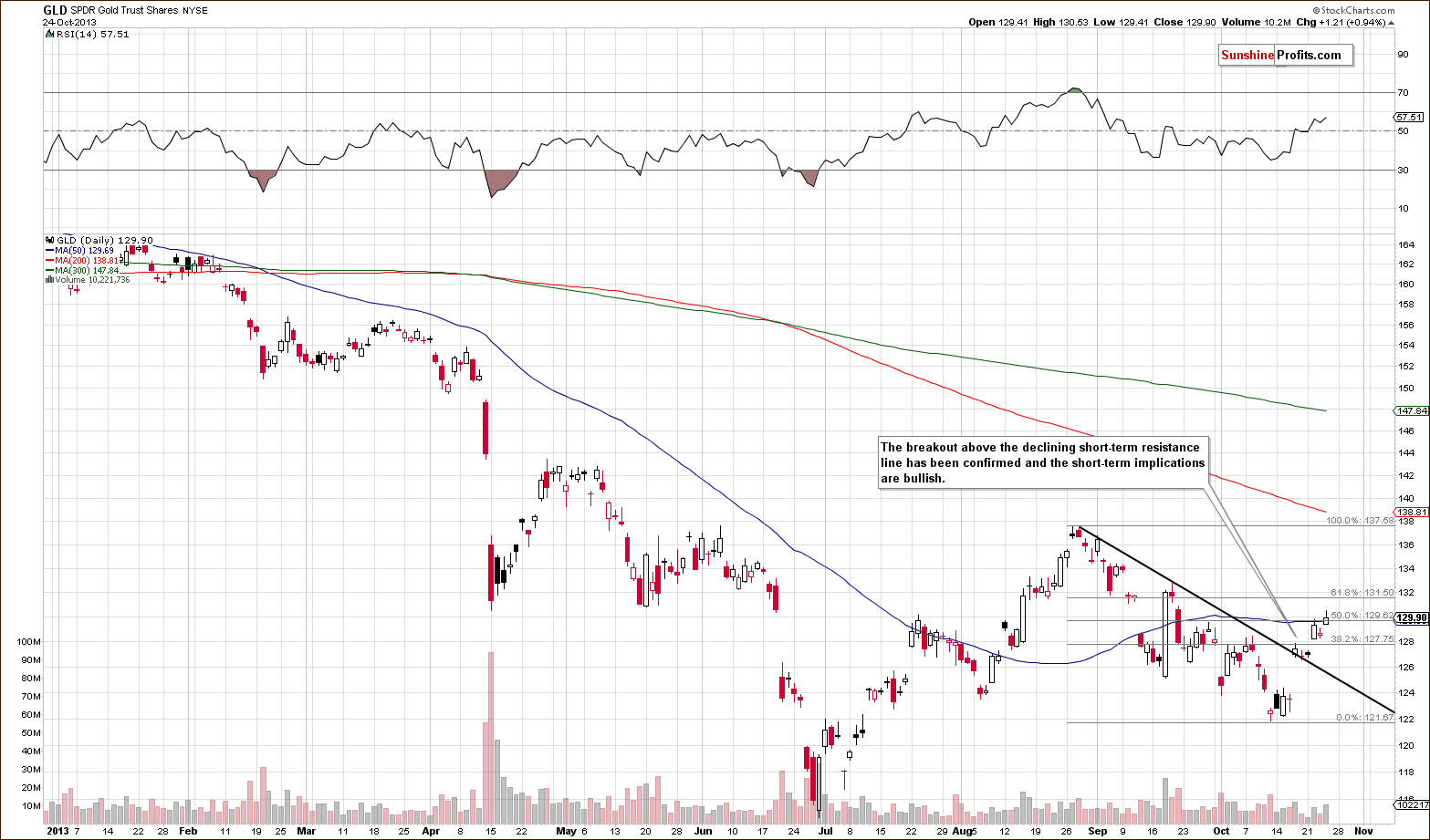
On the above gold chart, we can see that the breakout above the short-term declining resistance line is confirmed and the implications are bullish. Taking into account the fact that gold moved and managed to close above the 50% Fibonacci retracement level and the 50-day moving average on Thursday, we will likely see further improvement. In this case, the next price target is the 61.8% Fibonacci retracement level. If it is broken (which could be the case based on the rally in the Euro Index), the next important resistance level will be around the August high.
Please note that even if gold climbs so high the medium-term trend will not change based on the long-term perspective.
Now, let’s move on to the chart of gold priced in Australian dollars.
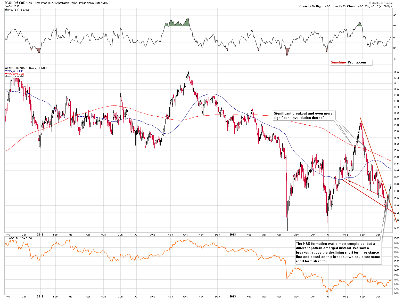
On the above chart we see that gold corrected sharply in the recent days. The bearish head and shoulders formation was not completed and a different pattern emerged instead. We saw a breakout above the declining short-term resistance line and the implications for the short-term picture are bullish.
Please note that earlier this year we saw a similar price action. In August gold priced in Australian dollars broke above the declining resistance line (and a horizontal support line created by 2012 lows), which resulted in a rally and a new monthly high. However, in the following weeks we saw an invalidation of the August breakout. If history repeats itself we might see an invalidation of the recent breakout, but just like it was in August we will likely see a further rally before this happens.
Let’s take a look at the chart featuring gold’s price from the non-USD perspective.
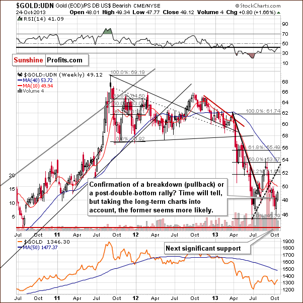
Looking at the above chart, we see that from this perspective, the situation is quite unclear. On the one hand we might see a post-double-bottom rally. However, on the other hand a pullback might be nothing more than a confirmation of a breakdown that we saw in mid-September.
Taking the above into account, we will take a closer look at gold priced in other currencies (other than the US Dollar that is) and check whether the current upside move is bullish or not. After all, the non-USD gold price that you can see above is the weighted average of gold priced in several major currencies (with weights as in the USD Index). The UDN ETF that we use as a proxy above was not trading long enough to allow us to analyze the above chart from a very long-term perspective.
First, let’s take a closer look at the chart of gold priced in British pounds.
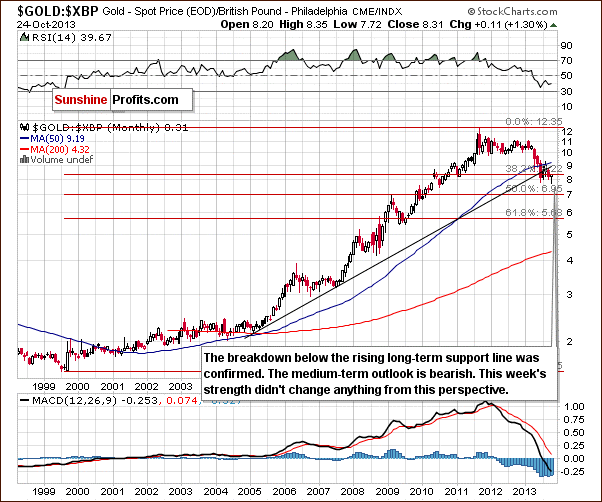
On the above chart we see that gold pulled back to the levels that we saw at the beginning of the month. In spite of this, the recent rally seems too small to invalidate the previous breakdown below the long-term support line. Therefore, the implications remain bearish.
The situation is quite similar when we take a look at gold priced in euro.
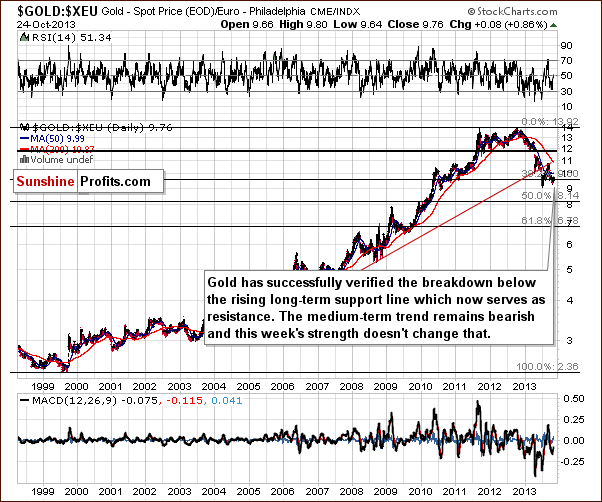
On the above chart we see that gold verified the breakdown below the rising long-term resistance line and now it serves as resistance.
From this point of view we see that this week’s show of strength hasn’t changed anything and the medium-term trend remains bearish.
Before we summarize, let’s take a look at the gold to bonds ratio.
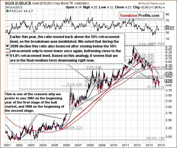
On the above chart we see that earlier this year the ratio declined to the 61.8% Fibonacci retracement level and then pulled back. With this upward move the ratio came back above the 50% Fibonacci retracement level and invalidated the breakdown. When we take a closer look at the chart we notice that we had a similar situation in 2008.
As we wrote in our Premium Update on July 24, 2013:
We saw a similar price action in 2008. The ratio declined to the 61.8% Fibonacci retracement level which marked a local bottom, and then after a pullback, moved temporarily below this support level (that is below the 61.8% retracement) before reaching the final 2008 bottom.
It seems that history repeated itself. Taking the above into account we may see further declines, which is another confirmation of the bearish outlook – for the medium term (the above chart has insignificant short-term implications if any).
Summing up, the medium-term outlook for gold remains bearish, even though we saw some strength this week and we are likely to see some more in to several days.
Silver
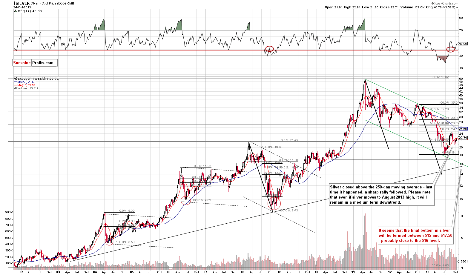
In recent days, we saw an upward move in silver, which took the white metal slightly above the 50-day moving average. At the beginning of August, we saw a similar situation. Back then it triggered a sharp rally in the following weeks and resulted in a new monthly high. Please keep in mind that even if we see further improvement in the coming week and silver reaches the August high the white metal will still remain in a medium-term downtrend.
Now, let’s move to the short-term chart to see the recent price moves more clearly.
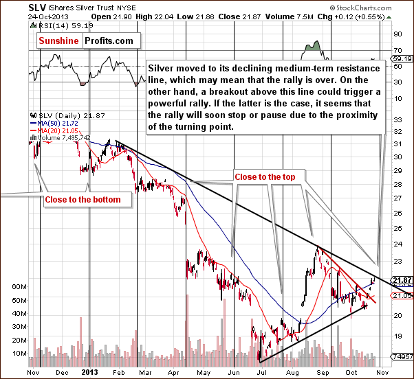
Looking at the above chart we see that the SLV ETF moved above the 50-day moving average and reached the medium-term declining resistance line, which may stop further growth. However, if we see a breakout above this line we might see a powerful rally (something that a move above the 50-day moving average suggests, as discussed above).
At this point it’s worth noting that silver’s cyclical turning point is just around the corner. Therefore, it’s quite possible that we will see its impact on silver in the coming week. This can lead to a pause or even stop further increases. This seems to be in tune with what we see on the Euro Index chart – a short-term upswing is to be followed by another slide.
Summing up, although we saw an upward move in silver in the recent days it didn’t change much from the long-term perspective. However, on a short-term basis, things are not bearish, and actually a quick move higher seems to be in the cards, even though we don’t think that the rally is sustainable.
Gold & Silver Mining Stocks
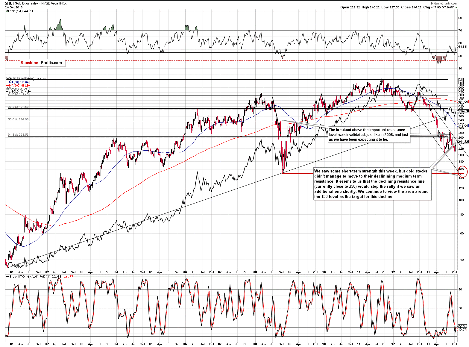
On the long-term HUI Index chart (proxy for gold stocks) we don’t see any meaningful changes based on this week’s price changes and what we wrote last week remains up-to-date:
From the medium-term perspective, the HUI Index chart is still clearly bearish. Thursday’s strength didn’t change anything because the index didn’t even move to the major declining resistance line (the upper border of the declining channel). Therefore, the implications are bearish and the trend remains down. Please note that we still expect that the HUI Index will move to the 150 level or very close to it.
On the following chart we can actually see long-term changes – for the first time in months.
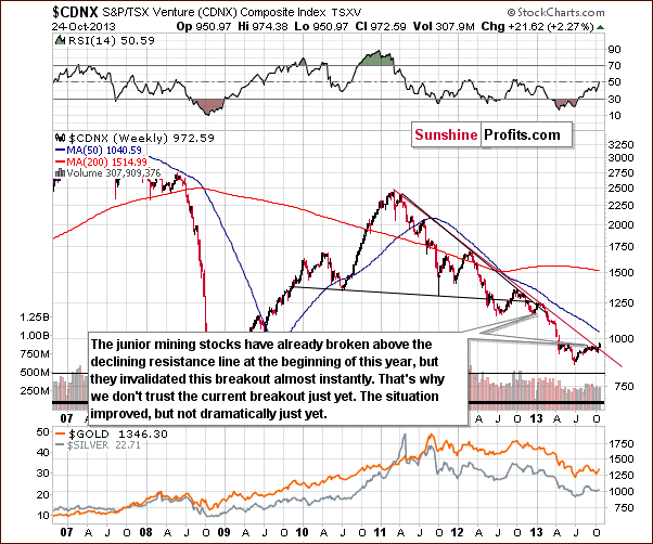
The juniors sector moved above the declining resistance line, which is a major bullish development... Or is it? It’s only a somewhat bullish development at this time. The reason is that we would need to see a verification of the breakout first to view it as an important medium-term signal. This would be the case in any other breakout as well, but in case of the above chart, waiting for a verification seems particularly justified because we have already seen a false breakout at the beginning of this year – one which was followed by a significant decline in the entire precious metals sector.
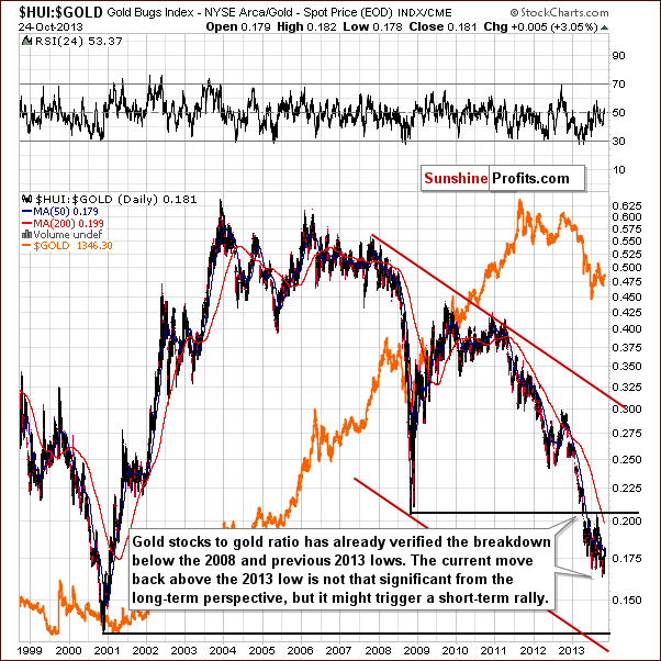
The above chart, featuring gold stocks performance relative to the underlying metal – gold, seems to confirm what we wrote earlier about gold. The long-term trend remains unchanged – we have the ratio below the 2008 low and the breakdown below this low was already confirmed. However, we saw an invalidation of the breakdown below the previous 2013 low and consequently, we can expect to see a short-term move higher.
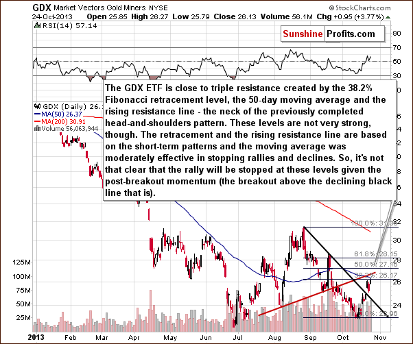
On a short-term basis, we have seen strong performance since mid-October and a short-term breakout this week. The breakout was already verified so we are likely to see further strength in the mining stocks – perhaps a repeat of the previous week which would take GDX above $28 - to the mid-September high. Such a scenario would be in tune with what’s going on in the Euro Index chart.
Summing up, while the outlook for the mining stocks remains bearish in the medium term, we could – and are likely to see – continuation of strength in the very short term.
Letters from Subscribers
Q. I wanted to understand in more tangible terms how much 17.5 trillion dollars US debt was equal to. To put this in perspective the universe is 13.78 billion years old. This would mean the US would have to pay $3.45 / per day for the entire time the universe has existed in order to pay off its debt. That is assuming the debt is on an interest free loan. Once they pay that off in effect they have zero.
When I look at things like this I can't understand how anyone can have confidence in the USD? My life's savings is in USD. Even if I move to another currency they are underpinned by USD. I don't feel confident right now. I really hope that that previous metal buy opportunity occurs in the medium term.
A. Most people don't analyze the situation as thoroughly as you have. Some that do end up thinking "well, if the system managed to work for years with so much debt, then it looks like the debt doesn't matter that much". The latter is even repeated by some economists and analysts. Most people, sadly, don't care about the way the world currently works and that it's on an unsustainable path. They have confidence in the USD as they don't see any reason not to have it - they can use their dollars to pay for goods and services regardless of the debt, quantitative easing programs, etc. If you kept building a house of cards (and you were extremely good at it) for 50 years, some people would believe that it would never collapse.
The best we can do, in our opinion, is to buy some gold & silver as insurance (yes, we are repeating ourselves here, but it will be so important one day that we think it's justified) and use other parts of our capital in a more active approach (investment and trading).
Summary
The breakout in the Euro Index and the proximity of its long-term resistance line seem to be the key two factors that are already contributing to precious metals price movement and are likely to impact them in the near future. As the Euro Index rallies, we could see some strength in the precious metals market but this strength is likely to be temporary. Just as the Euro Index is likely to resume its decline, the precious metals market is likely to move lower after an additional short-term upswing.
While the short-term correlations between currencies and the precious metals sector are rather weak on a short-term basis, the technical developments on gold, silver and mining stock charts support the above outlook anyway. We saw several short-term breakouts throughout the sector and almost no long-term breakouts. The exception here is the junior sector, which moved above the long-term declining resistance line. This is of little significance at this point. The breakout was not verified and given that the only similar breakout was invalidated, that breakout’s confirmation seems necessary to draw bullish conclusions and discuss possible changes in the medium-term trends.
Trading – PR: Half position: long position in gold, silver and mining stocks.
Trading – SP Indicators: No positions: SP Indicators suggest long positions, but the new self-similarity-based tool suggests short ones for the precious metals sector. We think that overall they cancel each other out.
Long-term investments: A half position in gold, silver, platinum and mining stocks. As far as long-term mining stock selection is concerned, we suggest using our tools before making purchases: the Golden StockPicker and the Silver StockPicker
| Portfolio's Part | Position | Stop-loss / Expiry Date |
|---|---|---|
| Trading: Mining stocks | Long - half | HUI: 220, GDX: $24 |
| Trading: Gold | Long - half | $1,280 |
| Trading: Silver | Long - half | $21.30 |
| Long-term investments: Gold | Long - half | - |
| Long-term investments: Silver | Long - half | - |
| Long-term investments: Platinum | Long - half | - |
| Long-term investments: Mining Stocks | Long - half | - |
This completes this week’s Premium Update. Our next Premium Update is scheduled for Thursday, Oct 31, 2013 (one day ahead of the regular schedule). We will continue to send out Market Alerts on a daily basis (except for when Premium Updates are posted) and we will send additional Market Alerts whenever appropriate.
Thank you for using the Premium Service
Sincerely,
Przemyslaw Radomski, CFA

