
- Euro & USD Indices
- General Stock Market
- Correlation Matrix
- Gold
- Silver
- Mining Stocks
- Letters from Subscribers
- Gold Stock Indicators
- Oil deposit in North Dakota
- Gold and US Dollar positive correlation
- Extra chart
- Summary
It is the penultimate trading week on the cusp of a new year as we watch U.S. lawmakers inch their way towards a deal to avert a fiscal disaster. According to the Mayan calendar today is supposed to be the end of the world which would at least take the edge off the fiscal cliff situation.
Assuming the world does not end today, a resolution to the fiscal cliff problem could take some safe-haven appeal off gold and on the other hand, failure to reach a deal could trigger a broad sell-off, which could initially drag gold down. As a reminder – we don't think that this will happen. We think that the compromise will be reached at the very last minute or the decision will be postponed or some kind of mix of the above, but the problem will be ultimately solved by printing more money.
It is known as a counter-intuitive flight to safety, when investors seek safety in the very asset that worries them. These are the investors who run for safety in the U.S. dollar as they try to protect themselves from government fiscal mismanagement and the debasing of the fiat dollar through quantitative easing. Two summers ago investors flocked to Treasuries when U.S. debt had just lost its AAA credit rating. Go figure.
This is that time of year when we take a look at those brave (or foolhardy) financial analysts who took out their crystal ball and predicted where precious metal prices would go in 2012. It turns out that most of them were overly optimistic, including yours truly.
With 11 consecutive years of positive performance from gold in what was one of the most lucrative trades of the decade, this will not be the first year that the research analysts' price forecasts turn out to be wrong. Usually they have consistently grossly underestimated the gold price. From 2006 through 2011, for example, Bloomberg's contributing analysts have forecasted that future gold prices would be lower, getting it wrong for seven years out of seven. Gold is undoubtedly volatile. Here are some interesting statistics. Based on 10 years of data, as of September of this year, over any 20 days, there is a 7 percent chance of a 10 percent change in the gold price.
The year 2012 was a roller-coaster ride. Gold surged to early highs in the first quarter, but broke down along with risk assets as the European sovereign debt crisis intensified and China slowed down. Gold then surged again coming into the third quarter, when the president of the European Bank, Mario Draghi, pledged to save the single currency by doing “whatever it takes,” only to further consolidate throughout the fourth quarter.
At the beginning of last year there were quite a few analysts who were overly optimistic. Let's begin with Goldman Sachs, which made a controversial downgrade in their gold price prediction a few weeks ago. Last year they predicted the price of gold would peak at $1,900 per ounce and average $1,810 per ounce during the year. Goldman attributed its bullish gold price outlook to further net buying by central banks and strong physical demand from investors, the ongoing negative real interest rate environment in the U.S., and continued European sovereign debt and global recessionary concerns. They were right about the fundamentals but they got their figures wrong. Gold peaked at $1,798 in early October 2012 and averaged $1,671 during this year (based on Jan 3, 2012 – Dec 18, 2012 prices).
Bank of America Merrill Lynch analysts said gold prices would rally again in 2012 to reach $2,000 to $2,500 per ounce. UBS had reiterated their bullish outlook for gold and believed gold would average $2,050/oz in 2012. Barclays Capital said gold would average $2,000/oz in 2012 – which was 25% above the spot price at the end of 2011.
John Embry, chief investment strategist of Sprott Asset Management, said the price of the yellow metal could possibly exceed $2,500.
"Everyone wonders where gold's going and where silver's going, I prefer to look at where are currencies going. Today we're in the later stages of yet another failed experiment in fiat papered currencies and they're losing value at an alarming rate and as a result gold is rising in value denominated in these failing currencies," Embry told Business Television at the time. "It isn't that gold is in a bubble because it's up in price, it's the fact that the currencies are falling in value almost every day." He was right in his analysis but wrong in his predictions.
Australia's Bureau of Resources and Energy Economics forecast in its December 2011 quarterly report that gold prices in 2012 would still go up 17 per cent to $1,850 an ounce. A survey of the Professional Numismatists Guild (www.PNGdealers.com), a non-profit organization composed of the country's top rare coin and bullion coin dealers, almost unanimously pointed toward price increases. Coin dealers' predictions of where gold will close at the end of the first quarter in 2012 ranged from a low of $1,475 per ounce to a high of $2,155, with a mean average of $1,759.57. Their estimates for gold at the end of 2012 varied from $1,450 up to $2,575 with the average $1,976.22.
We were also overly optimistic. Our guesstimate for 2012 was $2,200 for gold and $50 for silver. We fell short. But we have to keep in mind that over the long haul, gold is the ultimate safe haven and we believe that based on the underlying fundamentals, which have not changed, it will go up. Gold has risen 645% while the Dow Industrials has only gained 13% over the past decade. Gold has maintained its safe haven status for thousands of years and there is not another investment that can make that claim (well, maybe except silver). Despite its volatile year, gold is still up $85/oz. or 5.4% for the year.
The best part of gold's performance in 2012 is that the whole year is basically one big cup-and-handle pattern. This is a bullish formation and the fact that it took so long for it to develop makes it even more bullish. “The longer the base, the stronger the move” is very often the case and – given gold's bullish fundamentals – it seems that coming rally in the price of the yellow metal will also be quite spectacular.
To predict how precious metals will behave in the short run, let's begin this week's technical part with the analysis of currencies (charts courtesy by http://stockcharts.com.)
Euro & USD Indices
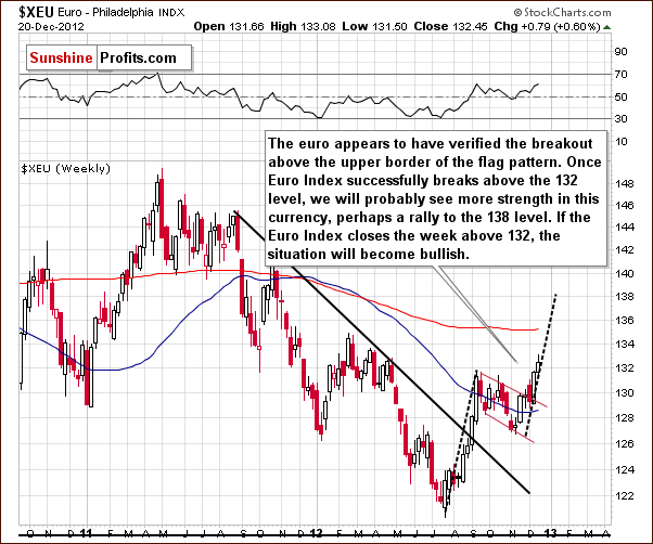
We begin this week with a look at the long-term Euro Index chart. We see a breakout above declining flag pattern, which is a continuation pattern. The recent rally shows us something similar to what we saw before the euro entered this trading pattern. The index level is now visible above 132 so it has moved above the flag pattern and above its previous high. Once the euro ends the week above this level on Friday, the recent breakout will be confirmed and higher values will be very likely in the coming weeks.
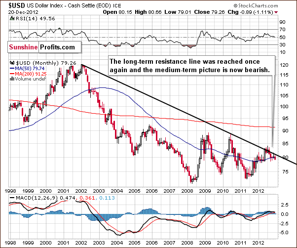
Turning now to the long-term USD Index chart, we see the influence of this week's bullish picture in the Euro Index. Comments made in last week's Premium Update are still up-to-date.
Based on the Euro Index analysis, we expect the USD Index outlook to be bearish and this chart confirms this. Little has changed this week. Lower values are a clear possibility here, and a recent attempt to move above the long-term rising resistance line failed. The trend will remain down even if the USD Index moves to the last Fibonacci retracement level (around 82).
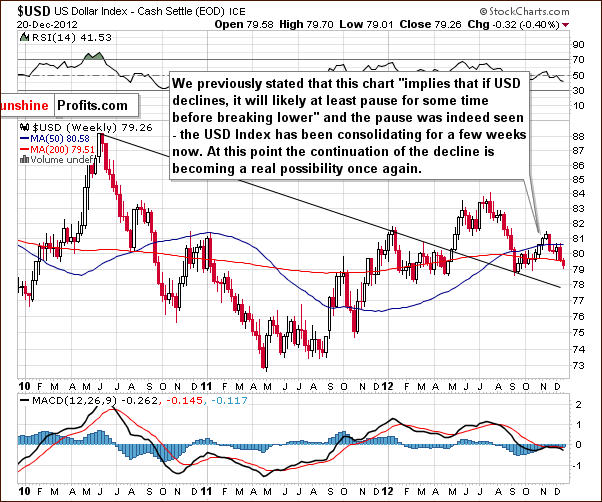
Turning now to the medium-term USD Index chart, the comments made in last week's Premium Update are still accurate and up-to-date here as well.
A consolidation has been ongoing for over a month, and the index now appears ready to move lower. The decline and consolidation here are a reflection of the upswing and consolidation seen recently in the Euro Index.
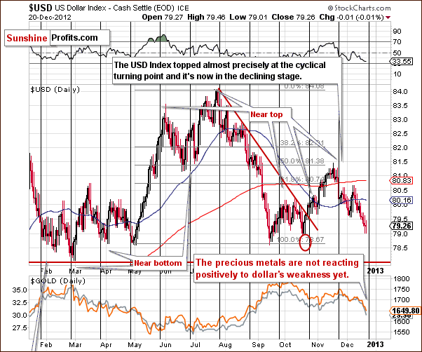
In this week's short-term USD Index chart, we see declines this week and the recent zig-zag trading pattern has resulted in overall declines for the past month. The index is approaching a cyclical turning point, which suggests that a local bottom will soon form. It is likely that a small rally will follow, perhaps to the 80 level or so before declines once again continue. This is in line with the medium-term and long-term trends here.
The most bearish implication here is that gold and silver are also declining in price along with the dollar. There have still been no positive reactions to the weakness to the USD Index.
Summing up, the situation in the Euro Index has become more bullish and will be even more so if it ends the week above the 132 level. The situation is bearish for the medium term in the USD Index though a short-term pullback is possible for the next week or so.
General Stock Market
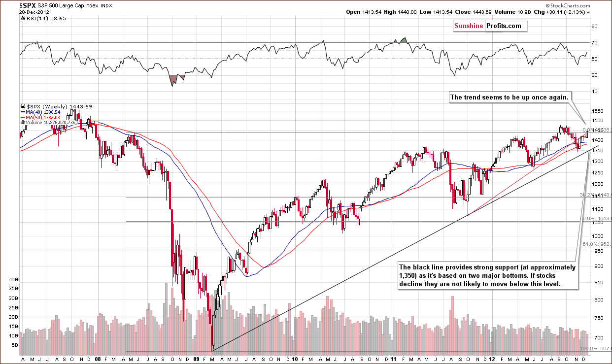
In the long-term S&P 500 Index chart, trading was to the upside this week as the gravestone doji pattern did not result in lower stock prices – the pattern was invalidated. The uptrend resumed and stocks are at a previously broken support line, which now provides resistance. An additional few days of strength will make this picture bullish going forward because of this breakout. The next stop is the 2012 high, and then the 2007 high.
Correlation Matrix
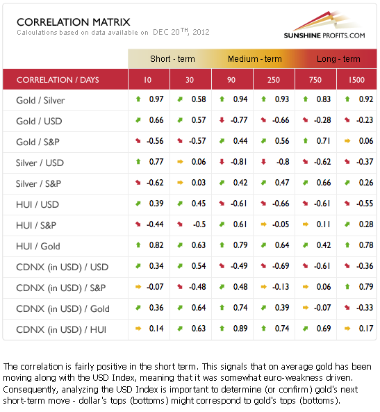
The Correlation Matrix is a tool which we have developed to analyze the impact of the currency markets and the general stock market upon the precious metals sector. The Correlation Matrix is quite confusing this week as it shows that the coefficients have truly turned upside down. They are pretty much neutral for silver but clearly upside down for gold and the precious metals mining stocks.
The strangest picture here is between gold, the USD. Gold generally moves opposite of the USD Index but has been pretty much in tune with it for the last 30 days and has moved in the opposite direction of stocks. In short, the situation is far from normal; more on this will be discussed in our gold priced in euro section.
Gold
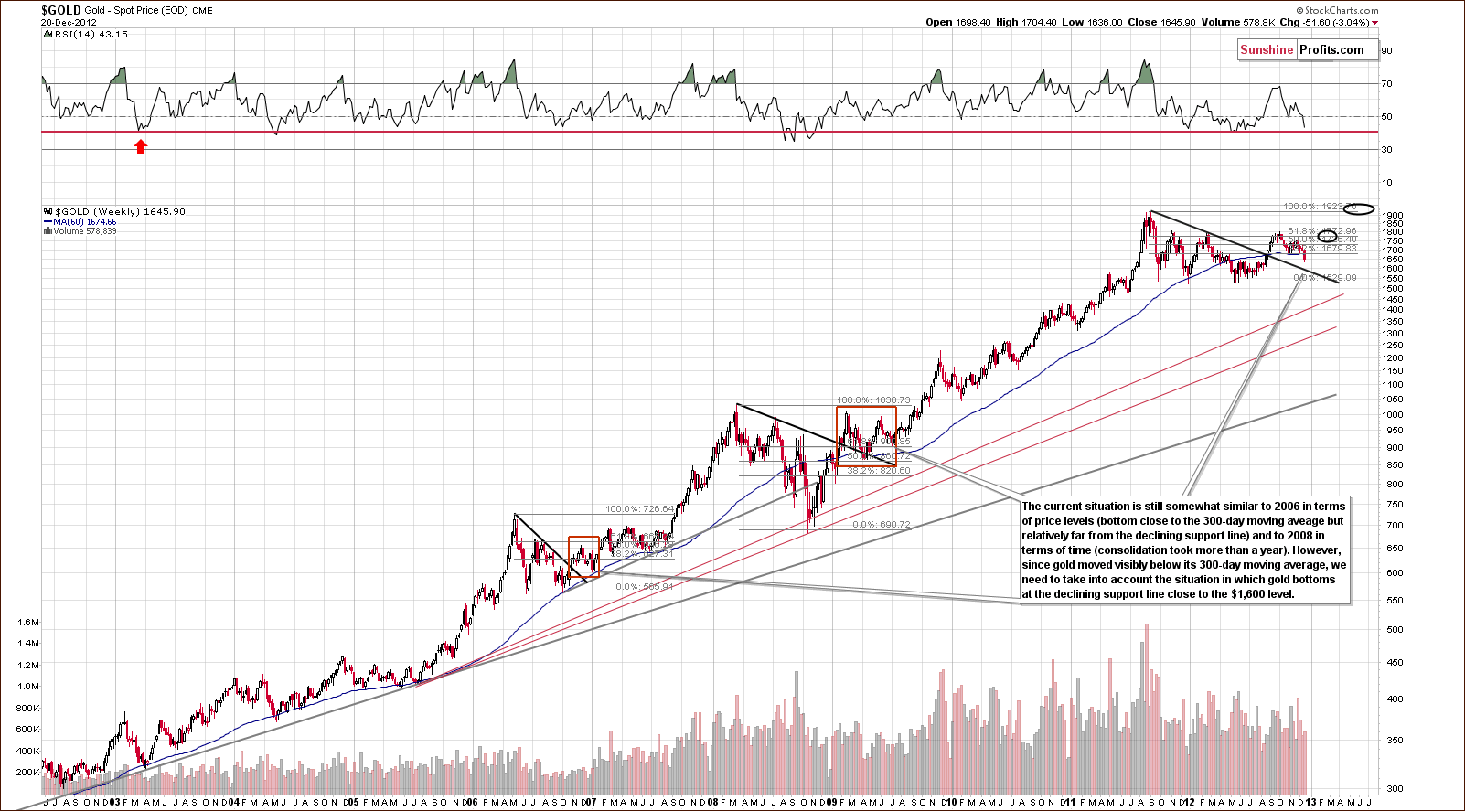
In gold's long-term chart (click on the above or any other chart to expand it), we see that prices have moved below the important 300-day moving average (the blue slope in our chart). If prices close the week below this level, which appears likely, then we will have an increased probability of significant declines, perhaps to the $1,600 level. If prices do move that low, it will be a huge buying opportunity and the RSI levels around 40 confirm this. Many times in the past, major bottoms have been seen with the RSI level near 40.
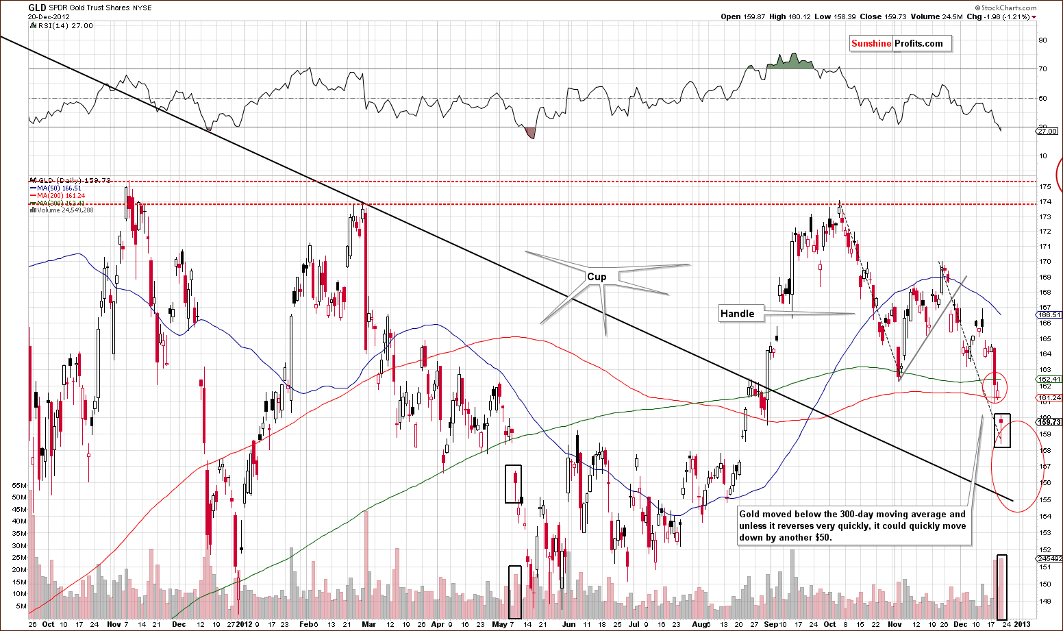
A look at this week's medium-term GLD ETF chart shows that on a short-term basis, the RSI is heavily oversold. Earlier this week, our initial target level for this ETF was reached and the upper part of the next target level was reached on Thursday. The last two declines (the one seen in October and the one that started in late November) are symmetrical for an ABC correction zig-zag pattern. We could see additional weakness here to the declining support line but it's also possible that the bottom is in. This came to mind because of huge volume levels in the GLD ETF and the intra-day reversal in gold's price.
We also have a bearish implication in this chart. Comparing today with the last time price moved below the 300-day moving average, we see a similar candlestick on similar volume (note black rectangles on the above chart). When this happened back in May, much lower prices followed for the next few weeks. Unless a sharp rally is seen on Friday, continued weakness will likely be seen here in the days ahead.
In the Market Alerts that we sent to you this week, we mentioned the extremely oversold situation indicated by the RSI indicator on charts featuring gold priced in currencies other than the USD – let's examine each of them.
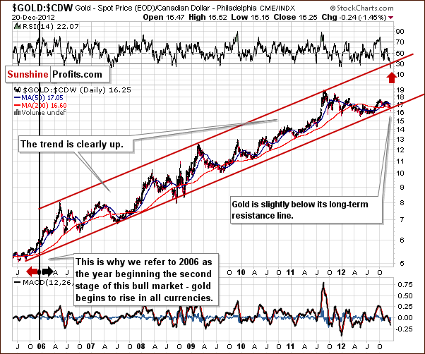
In this week's chart of gold from the Canadian dollar perspective, we see gold's price has just moved a bit below the long-term resistance line. The move has not yet been confirmed. This type of price move has not been seen since late 2008 but with RSI levels extremely oversold, the bottom seems either to be in already or at least very close.
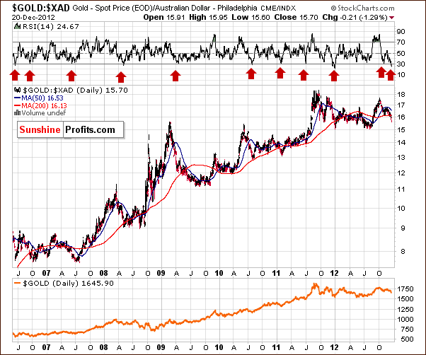
In this week's chart of gold from the Australian dollar perspective, the extremely low values for the RSI are a somewhat bullish sign. This value level has only been seen a few times in past years and each marked a major bottom in gold priced in the Australian dollar.
This is a very long-term chart so a few more days of declines will make little difference. It seems that a medium-term bottom is quite close or perhaps already in.
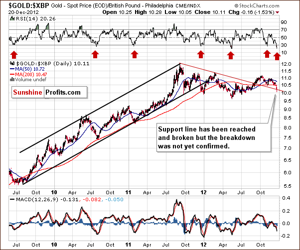
In this week's chart of gold from the perspective of the British pound, the same can be said. RSI levels are extremely oversold and a small breakdown below the declining support line has been seen here. This move has not yet been confirmed, however.
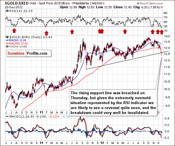
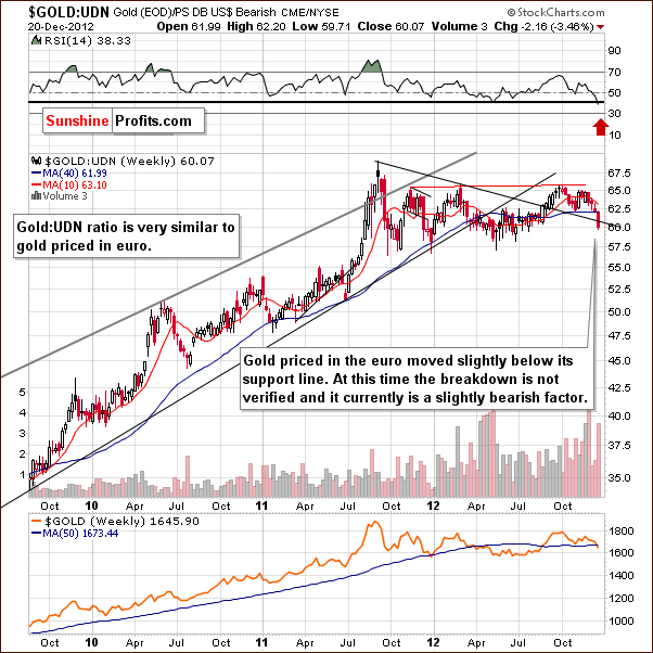
In the gold to euro ratio chart, once again extremely oversold RSI levels are present as they have moved below 30 and are approaching 20 for this ratio. This has not been seen for many years. Gold priced in euro also moved below its rising support line but this breakdown has not been confirmed so little weight is placed on this move. It is a bearish development, however.
The decline in the above chart does quite a good job in representing the simultaneous slide in the dollar and the price of gold (the thing that made the correlations turn upside down in the past 30 trading days). On the above chart we see that the decline is excessive and likely to end or at least pause very soon, so the correlation might return to its normal state in a week or two.
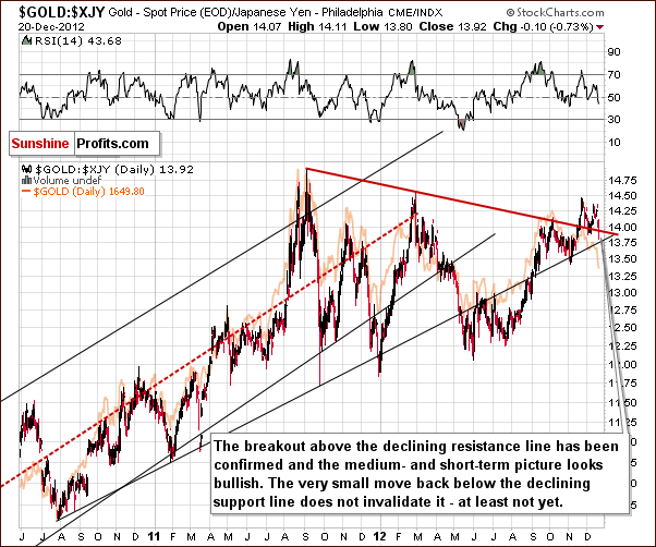
After examining the above chart of gold from the Japanese yen perspective, we can say that it's the only clearly bullish one that we have this week. Gold has verified a breakout above the declining resistance line and is now only slightly below it. The breakout has not been invalidated since prices were above the support line for several weeks and the outlook remains bullish here.
In this week's chart of gold from the non-USD perspective which is generally a weighted average of the above charts with special emphasis on gold priced in euro (the USD:EUR exchange rate is responsible for more than half of the USD Index movement). This perspective is therefore quite similar from a technical standpoint. The RSI level is extremely low on a short-term basis, and an important support line has also been insignificantly broken here.
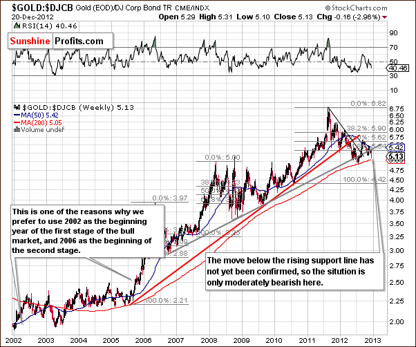
In the gold to bonds ratio chart, the breakdown will be confirmed if the ratio closes the week below the rising grey support on Friday and the next two weeks as well. At this time, the picture is mixed though a bit bearish.
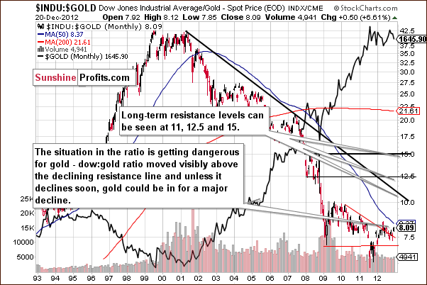
In this week's Dow to gold ratio chart, we have our most concerning situation. The ratio is now visibly above the very long-term declining resistance line, and if gold fails to rally in the coming weeks, the ratio could move much higher. This would be an indication that a significant correction in the price of gold, possibly a repeat of the decline from the 2011 high to the 2012 major low. It is still too early to forecast such a plunge right now, however.
Summing up, the situation for gold has deteriorated this week. Multiple signals on many charts show the situation to be extremely oversold short term especially from a non-USD perspective. A local bottom is probable within a week or so. Given this week's volatility and the fact that other oversold assets could become more oversold on a short-term basis before the price trend reverses, we could see additional weakness in the price of gold. Spot gold could move to $1,600, which is considerably below Thursday's closing price so you should be prepared emotionally for such a downswing.
Silver
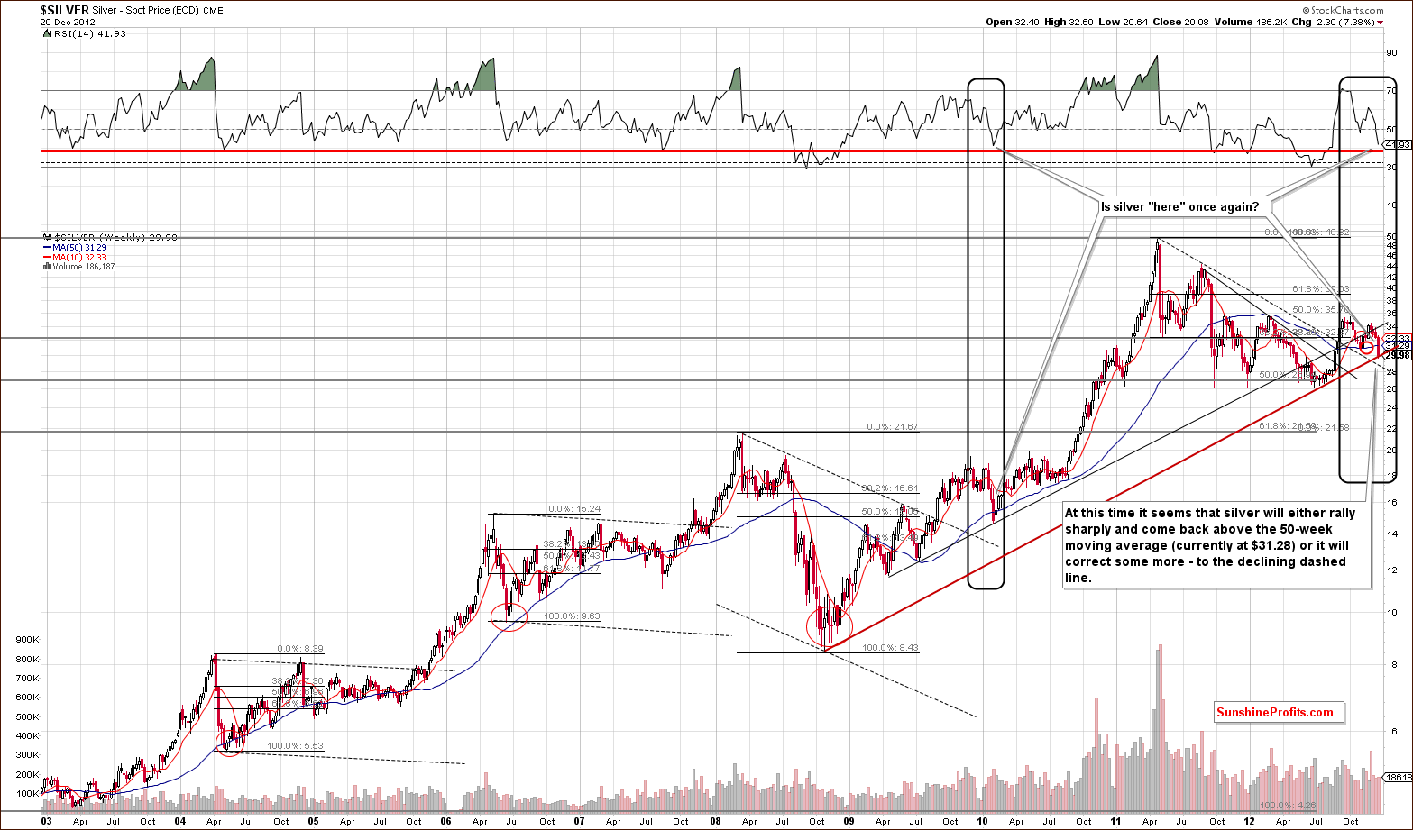
We begin our silver section with a look at the white metal's long-term chart which is very interesting this week. The situation here will turn bullish if silver rallies on Friday and closes the week close to or at the 50-week/250-day moving average (blue slope in our chart). This would require a move of about $1.50, however, so the odds are it probably will not happen.
Additional weakness could therefore be seen on a short-term basis. Also, if gold prices move lower as we discussed earlier, silver's price would likely do the same. The declining dashed support line, currently around $28 could be approached and RSI levels would likely move to the horizontal red line. This would make a situation similar to what was seen in several previous major bottoms.
Current moves in silver's price and the RSI based on it are similar to what was seen in early 2010, nearly three years ago. At that time, silver declined sharply and moved temporarily below the 50-week moving average and formed its final bottom. Lower prices were never seen again. The situation could be similar now or some additional short-term weakness could be seen in the coming days or weeks.
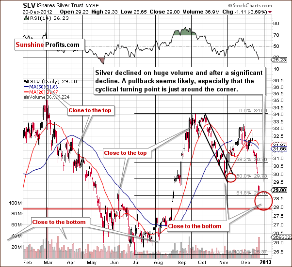
In the short-term SLV ETF chart this week, we see more insights into recent declines and a very volatile Thursday which saw price declines accompanied by significant volume levels. This is a bullish sign. High volume levels at or after major declines usually mark the end of the decline or imply that it is close.
An important fact is that this ETF has not moved below the 61.8% Fibonacci retracement level so the recent decline could be viewed as simply a correction of the June to September rally. The cyclical turning point is close and the preceding move is definitely to the downside, so a rally is probable in a week or so. At this time, further short-term weakness is still possible, especially if gold prices decline. The RSI level here is flashing a buy signal right now.
Looking now at silver's price from a non-USD perspective, we see a correction to the previously broken resistance line, which is now a support level. The line has not been broken and the RSI is extremely oversold, so it is suggested that the local bottom is or will be in soon.
Summing up, the situation is just as difficult here as it is in the gold market. Silver may need a bit more of a correction but a final bottom will probably be seen within a week.
Gold and Silver Mining Stocks
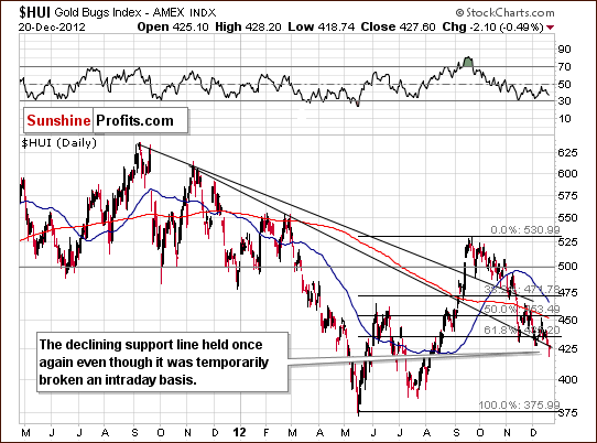
In this week's medium-term HUI Index chart, we see that mining stocks have held up remarkably well this week. This is in spite of heavy declines for gold and silver. The HUI Index has not closed below the declining support line as it reversed intra-day on Thursday and closed only a bit below than the previous close.
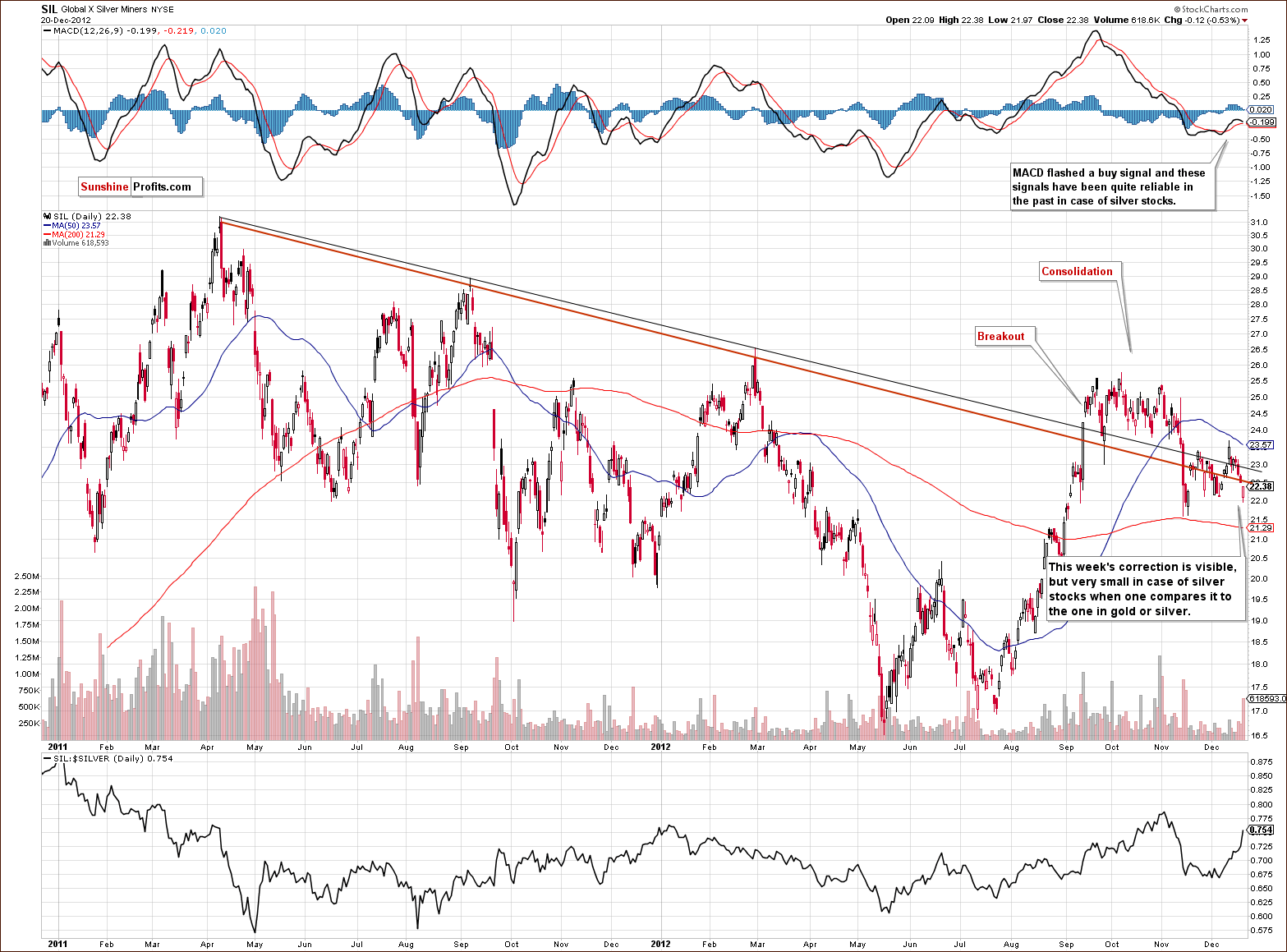
Turning now to the long-term Global X Silver Miners chart (proxy for silver stocks), we also see a very small decline when comparing to the decline in silver's price. This is favorable for silver stocks, and those who wanted to save their shirts have likely already exited. The remaining investors will likely not be shaken out of this market easily (except for the final day of the decline). We continue to prefer silver shares over gold shares.
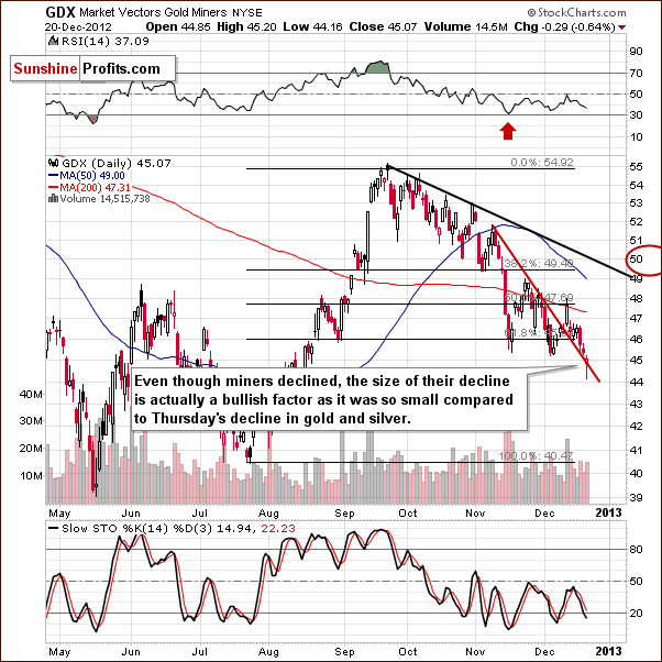
In the GDX ETF short-term chart, we see that the decline in mining stocks did not take the ETF below its short-term declining support line. This is similar to what we saw earlier on the HUI Index chart, however, this time it is a different support line that was not broken. Even though we have seen lower lows and lower highs, this chart has some bullish implications.
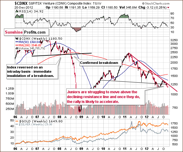
In the Toronto Stock Exchange Venture Index (which is a proxy for the junior miners as so many of them are included in it), there has been little change this week. Quoting from last week's Premium Update:
No breakout has been seen above the declining resistance line. The index is now closer to the previous bottom. It appears that once the breakout is confirmed, a huge rally is possible. This current (late 2012) consolidation and price swings will then seem to be quite irrelevant. The downside seems limited by 2012 low, and the upside is significant given an almost 2-year long consolidation.
Summing up, the situation in gold and silver mining stocks looks difficult but much more promising than the outlook for gold and silver. It seems that this sector was damaged so heavily in previous months that those still in the market will not exit at such low prices. They seem to believe that the low prices will not be in place much longer, and we agree with them. When we see a day when miners decline, this might be an indication that the final bottom is in.
Letters from Subscribers
Q&A:
Q1:The short-term gold stock indicator has no stop-loss level. How should I interpret it? What if the underlying instrument keeps going down for a number of days?When should I getout?
A1: It depends on an indicator - all indicators are accompanied not only by a stop-loss suggestion but also by the suggested holding period. If that was 2 weeks then you close the position 2 weeks after the signal is seen - even if the position is not profitable.
Q2:Can one also use the "gold stock" indicators for trading GDX and XAU, or is it exclusively for HUI? If not, would you be willing to develop indicators for those two as well?
A2: Yes, generally when we say that an indicator is for the mining stocks, it will be useful for HUI and XAU indices and also for mining stock ETFs such as GDX.
More indicators will certainly be provided in the coming weeks (I realize that we say that about many things, but... It is simply that there's so much in the works right now.)
Q3:Would it be possible to place a summary of the current signals together with the expiry date and stop-loss in one simple table? With the current situation of only 5 days of signal history, the trading period summary below, and the summary of open signals older than 5 days in another place(the Premium Update) it's difficult to monitor all the signals.
A3: Good idea, thanks. We'll implement that right away by adding an additional column in the table in the Summary section.
Q4:I would suggest including only open signals instead of displaying the status of all charts for each day on the "current signal page". Actually the table in the summary section of the Premium Update could be extended to also include the expiry date (where applicable) and stop-loss price. And it could be placed on the page with current signals.
A4: After some thought, we will put some kind of small table with signals and their details in the right-hand column of the website so that it is easily accessible, but we'll leave the current signals in the charts section to signals from our indicators.
We will implement the above shortly (to be honest, we apologize for not having implemented it earlier, because we have received similar requests a few times in previous months, but we have been focusing on other items on our to do list).
[Note - the author of the above valuable comments was granted a month of access to the Premium Service]
Q: I'm curious how the new apparently endless oil deposit in North Dakota influences global economies, gas prices, and of course if it will have any influence on the US economy. Could it help America to reduce its debt? What impact will it have on gold prices?
A: In 2008 an oil boom started in North Dakota. At this time technological advancements made it possible to extract oil from well-known fields at acceptable costs. Since then, the annual oil production figures have been ever-rising, from 62.8 million barrels in 2008 to 152.9 million barrels in 2011 (a 143.5% rise according to North Dakota State Government data). Oil is being extracted mainly in the area called the Bakken Formation and in 2008 the U.S. Geological Survey estimated Bakken's recoverable oil resources at 3.0 to 4.3 billion barrels. These would be the barrels that could actually be extracted from the rock and later sold.
If we take these estimates, and note that the state government collects taxes of approximately 11.5% on every extracted barrel of oil, assuming the price of a barrel of oil is $100, we arrive at an estimated $34.50 to $49.45 billion. Enormous as this amount may be, it pales in comparison to the current $16.37 trillion U.S. debt burden. A quick calculation shows that, even if oil tax revenues from the Bakken Formation were used in their entirety to pay for federal obligations, they wouldn't reduce the debt pile by more than 0.3% (!). And this amount could be paid off only under the assumption that all the oil was available today. You can probably see that tax revenues from North Dakota oil won't pay for the U.S. debt.
On the other hand, the oil boom can help the U.S. economy on a regional level. As of October 2012, North Dakota had the lowest unemployment rate in the U.S. at 3.1% (Bureau of Labor Statistics). According to a recent piece of news the state budget surplus is currently estimated at $1.6 billion. Of course, the oil boom brings other challenges, like environmental pollution. But on the whole it has so far helped North Dakota to be largely unaffected by the economic crisis.
Conventional wisdom has it that increases in the price of oil fuel price increases in all goods and, to some extent, the price of gold. So, if an oil boom drove oil supply higher and prices lower, it could have negative implications for the price of gold. Does this have to be the case? Absolutely not – there have been times when oil was in a downtrend and precious metals rallied nonetheless. You will find much more detailed analysis of the gold-oil link in our reports section.
During the 2008-2011 period, oil from the Bakken Formation accounted for about 39.0% of the growth in US oil production. The overall growth of oil production amounted to 12.6%. However, during the same period, the price of Brent oil rose by 11.4%. This shows that, even in times when the oil supply in the U.S. increases, the price of oil can go up. Because of that, we don’t see the significant oil supply expansion in North Dakota as a factor that can have decisive long-term implications for gold.
Q: Is this the last week of trading? Meaning, any US stock trades after this week do not count toward 2012 taxes? What about Canadian stocks? Thanks.
A: Most likely the trades that are executed before the end of the year will count toward 2012 taxes (including Canadian stocks) and trades closed in 2013 will count toward 2013 taxes. However, we can't say for sure because we're not tax specialists and rules for taxation can vary greatly among individuals depending on numerous factors.
Q: This positive correlation with the dollar is beyond strange and highly unnerving. Is this an indication of some fundamental change in gold? It almost seems impossible. Any light you could shed on why gold now tracks the dollar's every move would be greatly appreciated. This seems to negate the purpose we entered the PM market in the first place.
A: We doubt that it's some kind of fundamental change in gold. Why could this be the case fundamentally? Possibly Europeans could be thinking that the worst is over and that the European economy is going to improve in the coming months and are now selling their gold to get back euros. Technically speaking, gold priced in euro is correcting significantly.
The most important thing is to check if we have ever seen anything like this during this bull market or if this is something completely new. And this is precisely what we do when looking at the gold:XEU ratio or gold priced in the euro. There have been times when gold declined along with the dollar and this resulted in sharp declines in the ratio and moves lower in the momentum indicators that are based on it, such as the RSI Indicator. The situation is now extreme and history tells us that the relationship is likely to return to normal very soon.
Another thing that is somewhat related to gold from the non-USD perspective is the SP Gold Bottom Indicator - especially the long-term version. The moment when the indicator moves below its signal line generally corresponds to extremes in the gold-USD link. The indicator is about to flash a buy signal, but it was not yet the case. The suggestion here is that the simultaneous decline in gold and the dollar might to be over just yet.
Extra Chart
We don't want to provide details on our upcoming tool that is based on the self-similar pattern just yet, so that’s why we named this section just what it is – an extra chart. Earlier this week, on December 17, 2012, we wrote the following:
One of the tools that is ready and that we are (successfully) testing provided us with a bearish indication for the gold market. The suggestion is that gold would drop at least $30 in a week or so. The tool is based on detecting self-similar patterns and it seems that it based the above indication on the possible completion of the ABC (zigzag) pattern - the one that we showed in the GLD ETF chart in the latest Premium Update (gray, dashed lines).
Since this tool was right on spot (in a way, it did a better job than your Editor, who had also taken multiple other factors into account), you are probably wondering what it's suggesting right now.
In short, what it predicts (the gold line is the predicted price path for the GLD ETF), is not pretty. According to this tool, gold has not finished its decline yet and is likely to continue its slide. Please note that the prices are provided for the GLD ETF, not for gold – the reason is that this tool takes into account not only price, but also volume.
We would like to emphasize that this tool provides and updated price path each day and it can change the probable price path quickly once it detects a sign of strength. In a way, it's like a totally emotion-free analyst, who is able to take a fresh look at the market every day.
For now the implications are bearish. Again, please keep in mind that this tool is still in the testing phase, so we are not totally convinced that it can be implemented right now. We will perform more real-life conditions tests and – if everything goes well – we will make it available on our (or, actually, your) website.
Summary
The outlook for the precious metals market is particularly difficult right now. Whereas sometimes the situation in markets can be compared to a coiled spring, it now seems more like a gold bar, which is being cracked by 20 springs from different directions and all coiled to the maximum level. It's hard to tell which will break first and which way the gold bar will ultimately move.
It is difficult to project a most likely outcome here as the key link, gold:USD has not been working normally for the last 30 days. Our best guess is that we'll see some kind of consolidation in the euro and USD Indices. A slight rally for the dollar around its cyclical turning point could cause more weakness in gold, silver and mining stocks but this will likely be short-lived. Once a top is reached in the USD Index and a bottom in the precious metals, the negative correlations between the precious metals sector and the USD Index will probably return. The RSI levels today also show that it's about time for this link to return to normal and for gold to form a bottom.
We do not suggest opening long positions due to the risk of another sharp decline. Gold could move to $1,600 and silver and mining stocks could follow. It's quite difficult to provide target levels for the latter two so we will focus on gold. It seems that if gold declines, the mining stocks will not decline as much but the most significant decline will likely be seen right before the bottom is reached. We will watch for this and keep you informed - as always.
Trading – PR: No positions
Trading – SP Indicators: Long position mining stocks – unless a buy signal is seen based on today's (Friday's) closing prices (you will see them on Saturday), close this position on Monday.
Long-term investments: Remain in the market with your precious metals holdings
| Portfolio's Part | Position | Stop-loss / Expiry Date |
|---|---|---|
| Trading: Mining stocks | Long (half) | No stop loss / Dec 24, 2012 |
| Trading: Gold | No positions | - |
| Trading: Silver | No positions | - |
| Long-term investments | Long | - |
This completes this week's Premium Update. Our next Premium Update is scheduled for December 28, 2012. Of course, we will continue to send out Market Alerts on a daily basis at least until the end of January 2013 with the exception of Fridays, when Premium Updates are posted (we will issue an alert if what we wrote in the update becomes outdated on the same day it is posted, though).
We will strive to send Market Alerts also on Dec 24 and Dec 26, however, we would like to apologize in advance if we are not able to do so due to your Editor's holiday travel schedule.
Thank you for using the Premium Service. Happy Holidays!
Sincerely,
Przemyslaw Radomski, CFA

