
We are bullish on gold and don’t need outside confirmation. With that in mind, it’s still pleasant to hear that a Bank of America analyst sees gold prices hitting $7000/oz before ending the uptrend. He joins a list of other analysts who have predicted a massive surge in the price of gold. When America went off the gold standard, prices went up from $35/oz to approximately $800/oz. Measuring that kind of performance in the current gold price would bring the gold price over $5000/oz from its base of $250/oz. Predictions of $10,000/oz have also been making the rounds.
Lately, gold has been a disappointment to many investors while it has been mostly treading water. Gold has traded well beneath its all-time high of $1,924 an ounce on September 6th and well above its subsequent low near $1,520 which took place in late December. Many anticipated higher prices this year,but the year isn’t over yet, and neither is gold's long-term spectacular, secular bull market. We are now in one of those periods of consolidation that tries the souls of gold investors, tests their resolve and challenges their staying power. This is when the market takes a breather and adjusts to prepare for the next major move.
Central Banks Accumulate Gold
If you need some encouraging news, according to the latest IMF statistics, at least 12 countries are known to have increased their gold reserves in March continuing a trend that goes back more than two years. Overall Central Banks appear to have purchased about 58 tons in the month, which suggests acceleration in their gold accumulation. The significant purchases were by Mexico, which increased its holdings by 16.81 tons; Russia with purchases of 16.55 tons and Turkey with 11.48 tons. The statistics only show the figures for those nations which are transparent in their reporting.In the past there have been some sharp ‘upwards adjustments,' to gold reserves notably from China, which seems to like to accumulate its gold on the quiet. Last year Central Banks that do report their statistics bought 439.7 tons of gold and many gold analysts are predicting similar levels of purchases in 2012. And to think that years ago investors feared that the bull market will end a long time ago because of massive sales of gold by governments and monetary authorities over the world…
Trouble Across the Pond
There are troubles across the pond. It seems that the U.K. economy has contracted in the first quarter, meeting the technical definition of recession, the second time in three years, according to official figures. A recession is defined as two consecutive quarters of contraction. The economy shrank by 0.3% in the fourth quarter of 2011. While the British economy is languishing, inflation isn’t — running at least a full percentage point above the Bank of England’s 2% target. So how did the U.K. get in this situation? The choir against austerity says the trouble started when the new British government opted for pre-emptive austerity when it took power in May 2010.
Recessions are deep and recoveries are weak, as most of the western economies have been learning, much to their consternation. Which brings us to the good news (according to the official statistics) for the U.S. economy, particularly the improving employment, output, and consumption statistics, which has diminished expectations of further U.S. central bank quantitative easing. This is what seems to have been hurting gold recently among institutional traders and speculators. We don’t buy into the rosy picture. Sooner or later there will be more QE.
Meanwhile, the European Central Bank remains under pressure to provide liquidity and keep interest rates down.But investors want higher returns in exchange for greater risk, which pushes countries such as Spain, Europe’s fourth largest economy, into impossible deficits and debt burden. Recently the yield on the Spanish 10-year bond pushed above 6 percent, the highest level on the 10-year bond since the European Central Bank launched its first Long Term Refinancing Operation last year. Concerns also spilled over into Italy, where bond yields increased to 5.65 percent.
It is ironic that investors fleeing the euro are looking to the dollar as a safe haven. That is like getting off the Titanic and finding refuge on the “safely docked” USS Arizona. As soon as investors wise up and lose faith in the dollar, gold, which carries no counter-party risk, will win.
Space, the Final Frontier
History shows that it is the quest for natural resources that has driven much of human exploration, whether it was the search for spices or for gold. History is repeating itself. Planetary Resources, a U.S. start-up company that aims to slash the cost of space exploration, has unveiled plans to mine asteroids for gold, platinum and rare minerals.
On Tuesday, Planetary Resources, which was founded earlier this year and has just 20 employees, said it would combine space exploration with mining to develop a method to extract gold, platinum and other precious metals and minerals from asteroids in orbit around the Earth. It suggested that this could "add trillions of dollars to the global GDP."
The first step of the company’s long-term plan is a low-cost robotic spacecraft designed for surveying missions. Within 10 years, the business intends to diversify into space mining. A company spokesman estimates that an asteroid 30 meters long can contain as much as $50 billion worth of platinum. The company is seeking to mine near-Earth asteroids, large space rocks numbering in the thousands. Planetary Resources said about 1,500 of those asteroids are as easy to reach as the moon.
To see how gold and silver will do here on planet Earth let’s begin this week's technical part with the analysis of the US Dollar Index. We will start with the very long-term chart (charts courtesy by http://stockcharts.com.)
USD Index
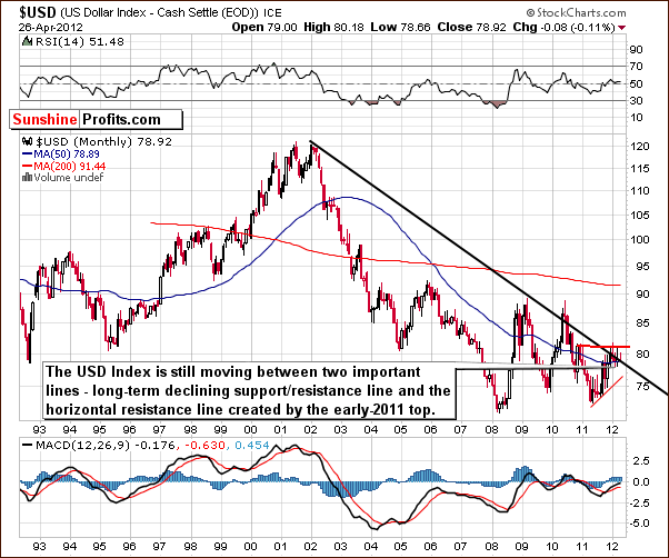
In the very long-term USD Index chart, very little has changed since last week. We have therefore decided to quote from last week’s Premium Update:
We see that the sideways trading patterns continue between the two levels which are quite important from a technical perspective. These are the declining long-term support line and the horizontal support line based on the early 2011 high. At this point, the very-long term chart remains mixed with a bearish bias.
To illustrate how small the trading range has been for the USD Index recently, the past six Premium Updates have found the change from the previous week to be as follows: down .41, down .61, up .95, down .79, up .25, and down .39. So nearly every week saw a change of less than 1% for the index value of a week earlier, and with the good mix of ups and downs, this is a prime example of true sideways trading.

In the short-term USD Index chart, we see that the index has moved below its short-term support line. This is a bearish development and we are a bit concerned with a cyclical turning point also about to come into play. There could simply be a small correction after the recent breakdown to be followed by more declines. The first support level is slightly above 78. Once the index moves below this level, it is likely to move lower, probably to around the mid-75 level.
The declines here could contribute to a significant rally in the precious metals sector – we’ll get back to this topic later in this update. The recent breakdown here, however, has not yet been confirmed, so the situation is not overly bearish at this time. It is best described as having slightly bearish indications today.
Summing up, the situation in the USD Index is a bit more bearish this week than last. It seems that a downturn is likely to begin soon and the narrow trading range of recent weeks could soon be behind us.
General Stock Market

From the long-term perspective, the bottom in the S&P 500 Index appears to be in. The support line based on previous highs has been reached and crossed but the breakdown failed. Prices bounced higher soon after reaching this line (based on 2011 high), and the long-term picture is bullish based on this development.

In the short-term S&P 500 chart, the situation is best described as a bit more bearish than not. Last week, the short-term outlook was bearish, but the long-term, bullish implications were of course, more important. This week, the long-term outlook is just as bullish and the short-term situation has improved a bit as stocks moved higher after consolidating. There is much less contradiction between the two perspectives as compared to a week ago and this makes the bullish view here a bit clearer.

In the Broker Dealer Index chart (proxy for the financial sector), we see that the index has corrected approximately to the first Fibonacci retracement level. This also coincides with the level of the late 2011 highs. The bottom for the financials has likely been confirmed with higher prices this week, and the signal here is bullish.
Summing up, the situation for stocks in general has improved and appears to be rather bullish right now.
Correlation Matrix

The Correlation Matrix is a tool, which we have developed to analyze the impact of the currency markets and the general stock market upon the precious metals sector. The signals from the chart this week are best described as mixed to bullish. We use the word mixed because many of the coefficients are rather weak, the relationships not strong, so the indications are therefore mixed. This generally describes the influence of the USD Index and general stock market upon the precious metals sector. At the moment, the latter appears to be more important so the rather bullish case for stocks is bullish for metals as well.
Gold

This week we begin our gold section with a look at the long-term chart (please click the above chart to enlarge). This week, we see that gold is clearly above the declining short-term trading channel. The current post-breakout trading pattern suggests that the consolidation period has ended, and the rising RSI level suggests that the final bottom has indeed been put.
The self-similarity with the trading patterns of 2006-2007 continues although not with great precision recently. Once again we have seen a correction after a breakout, but the shape of the 2012 pattern is a bit different from what we saw back in early 2007.
Finally, another example of a death cross trading pattern has developed in this chart recently. The green 50-day (or 10-week) moving average has moved below the red 200-day (40-week) moving average. Such a move is called the death cross. Theoretically this is a bearish development, but taking a closer look reveals that generally when it comes to analyzing gold’s reaction, in most cases this has been a bullish development with a rally seen soon thereafter. We will discuss this phenomenon in bigger details in the following part of the update.

Looking at the short-term GLD ETF chart (please click the above chart to enlarge), we see a breakout above the very short-term declining resistance line has been successful. It has been verified and higher prices seen thereafter. Gold appears to be trying to move above the declining red-dashed resistance line created by previous highs. Since gold has failed to break this level several times, we remain skeptical; however, it does seem that this attempt should succeed based upon the reverse head-and-shoulders formation and Wednesday’s intraday reversal on significant volume

In this week’s chart of gold from a non-USD perspective, we see a move below the rising support line, but the breakdown has not been confirmed. The index is still above the declining support line so the outlook remains bullish. Finally, this week we see a bullish reversal in the weekly candlesticks.

Once again, we have included a look at gold from the Japanese yen perspective. This week we once again see prices at the lower border of the rising trend channel. This normally indicates that a rally is likely based on many examples from the past when rallies followed periods of prices close to the lower border of the trading channel.

Finally, we look at the gold-to-bonds ratio chart. This is basically unchanged since last week and we include it to retain our proper long-term approach to analysis of the gold market. This is a major bottom, not only a short term one, and thus the fact that many analysts are still bearish is not all that unusual.
Summing up, the outlook is bullish for gold for both the long and short term and long positions in the yellow metal appear well justified at this time.
Silver

We begin this week’s silver section with a look at silver’s very long-term chart (please click the above chart to enlarge). This week we see quite a bit of volatility in the form of an intra-week reversal candlestick. Silver actually touched the rising support line based on multiple intra-week lows of previous years. It therefore appears that at least a short-term rally is likely.
Please keep in mind what we wrote last week:
In the past, strong moves to the upside followed the second failed attempt to break out and we are in such a post second attempt phase now.
Another factor that should be kept in mind is that silver bottomed right at its long-term cyclical turning point at the end of 2011 and is now poised for a substantial rally. Again, you will find details in last week’s Premium Update.

We now turn to silver’s short-term chart. We have bullish implications here as well, as a traditional intra-day reversal was seen on significant volume, typically coinciding with a local bottom. Also, we are approaching a cyclical turning point. As silver has been declining for two months now, it seems very probable that the cyclical turning point marks a beginning of a rally.

In the silver to gold ratio chart, as we mentioned in our Mid-Week Update a couple of days ago, we see that the ratio is at a major support line. On Tuesday, we wrote the following:
The key point here is that the ratio reached the long-term support line. In the latest Premium Update we wrote thatbased on this chart, silver is likely to outperform gold in the months ahead, though not necessarily immediately.Right now, thanks to silver’s recent move lower, we have a clearly bullish picture. The white metal is also approaching its short-term cyclical turning point, which given the nature of the current price move – is bullish.
Again, this has bullish implications for silver and the rest of the precious metals. It seems likely that silver will outperform gold in the weeks and months ahead.
Summing up, the outlook for silver is bullish for the short, medium and long term and long positions in the white metal appear justified at this time.
Gold and Silver Mining Stocks

Since we covered mining stocks two days ago, and nothing changed in our view on the sector, we will quote information from our Mid-Week Update. It might be a good idea to go through them again, as they are both: important and up-to-date.
Let’s start with the most straightforward parts – the indicators. At the top of the chart we have RSI and Stochastic is at the bottom. Both are extremely low and these are extreme levels even taking the whole bull market into account. That’s the biggest time frame that we can consider for a medium-term decline, so there will be no more zooming out. The implication is that the sentiment is really hitting rock bottom right now.
Let’s see how the current decline really compares to the previous ones. If there are characteristics in this decline that make it similar to the 2008 decline and there are no traits that make it look like other significant declines (but not as big as the 2008 one) then we haven’t seen the half of the decline yet. But, if the opposite is the case – if the current decline is similar to the previous declines that were not as big as the 2008 one, but doesn’t really resemble the 2008 one so far, then the odds are that we have a buying opportunity, not anything else.
Having described the methodology, let’s see which of the two outcomes is actually the case. On the above chart we have marked the 2008 decline with a red line and other major declines with black lines. Naturally, the red line is much bigger than the black ones. We duplicated all of these lines and attached their starting points to the 2011 top. Now we can see where gold stocks would move if the current decline was like other declines.
We divided outcomes into two groups – the 2008 and the rest. It appears that declines other than the 2008 one took gold stocks to the price range marked with a red rectangle.
Consequently, gold stocks’ decline is quite in tune with the previous declines – except of the 2008 one.
Price is only one dimension in which we can analyze similarities, so if other things make the current decline similar to the 2008 one then we could still be on a verge of a much bigger move lower.
So, let’s dig deeper and take a look at the sharpness of each of the moves. Actually, the current move is not in tune with the 2008 one at all in terms of sharpness. It is actually even a bit less sharp than other major declines, so the analysis of volatility doesn’t suggest a 2008-like plunge.
We also checked if gold (visible on the above chart – black line) and the general stock market are now acting in a way that’s similar to what was seen in the early part of the 2008 plunge. We used indicators (RSI, Stochastic) to estimate at which point we are now if these two declines are similar. In 2008 gold was after a considerable decline at that time (much below its previous bottom) and this is not the case right now. In 2008 gold corrected approximately 25% to “this” point (comparing the size of the decline to the price at the top) and right now gold is about 15% from the top. That’s a bit more than half of the previous, “analogous” decline. The similarity is even less visible in terms of the general stock market. Back in 2008, stocks were already after a significant decline and this is clearly not the case right now.
Consequently, taking into account: indicators (RSI, Stochastic), size of the decline, its volatility, and unique circumstances (situation in gold and main stock indices) into account leads us to believe that the current decline most likely isnota repeat of the 2008 one.
“But gold stocks are shockingly underperforming the metal and I know that this is not a good sign”.
True, gold stocks tend to lag gold prior to important tops and at times they show strength before the whole sector bottoms. However, the first part of this relationship (tops) is more reliable than the second one. The proper question that we need to ask though is if the ends of consolidation patterns were preceded by gold stocks’ outperformance or not. If that was the case before most big rallies, we would have an indication that more downside is yet to come as we have clearly not seen gold stocks’ outperform gold. Conversely, if we’ve seen gold stocks underperform gold before major rallies, then the current situation is not that concerning.
The most interesting part of the above analysis is the price action that followed each of the marked time frames. Allof them were followed by major rallies. This factor alone makes gold stocks underperformance a bullish phenomenon. Again, in some cases (tops) and very-short-term moves seeing gold stocks outperform gold is still a good sign, so all in all, we don’t really see miners’ underperformance as bullish, but we don’t currently see it as bearish neither.
Summing up, the situation in mining stocks is critical, but saying that a 2008-like decline is likely to follow is a huge exaggeration. The decline is in tune with previous major declines and it seems that a powerful rally will soon emerge. Does that have to take place immediately? No. Some major declines (we’re not talking about the 2008 one here) took gold stocks lower the current decline has taken them. Additionally, there are major support lines not too far below Tuesday's closing price. Combining two previous sentences makes us believe that prices of gold mining companies may move temporarily lower without invalidating the bullish picture. Naturally, this does not have to take place, nor is it overly likely. Please take one more look on the HUI chart above. The rallies that followed miners-underperform-gold periods were both significant and sharp especially at their first part.
Consequently, staying long despite a limited downside is still the best position in our view. The odds of being able to get back into miners when they take off will be quite small.
This is particularly up-to-date given the situation in gold. It’s bullish and once gold finally rallies, mining stocks are likely to soar as well. The point is that gold could start to rally any day now. We have a strange situation in gold where the rally could start very soon, but at the same time the consolidation can also continue for another week or two (or more) and it will not invalidate the bullish picture.
Additionally, this week gold stocks provided us with a significant intra-week reversal pattern as prices declined sharply and then turned quickly to the upside within the same week. This type of move has clearly bullish implications.

This chart shows the performance of junior mining stocks as compared with other stocks and we are going to do a more detailed analysis this week (we previously commented on it in the April 6th, 2012 Premium Update as an indication that the bottom for gold is in).
We see that a single huge spike in ratio of volumes used to mark major bottoms but not necessarily the final one. This spike was usually just before the final bottom in terms of time and this may be the case once again. One time that signal was followed by a higher bottom and one time by a lower low and it seems that we have once again seen the former.
The major bottom in early April was followed by higher prices and another bottom this week. This suggests that the implications from this chart are now clearly bullish and a new rally is likely to begin or is already underway.
Summing up, the situation in mining stocks is extreme at this time but also bullish. The comments from our mid-week update are still up-to-date. “…. the situation remains bullish for the whole precious metals sector although short-term performance might not indicate that and that we may not see much higher prices immediately. These are trying times, but we believe that being patient and long will provide a significant pay-off.”
Letters from Subscribers
Q: Is it safe to say that your 2006 fractal is not accurate at this point? This sideways movement is absolutely maddening. It leaves so much room for different interpretations when there is a trendless market such as gold in this last month.
A: Taking a short-term approach (predicting daily price moves), yes, at this point the short-term similarity is not present to a considerable degree. The market followed the fractal pattern for several weeks and contributed to our suggestion to stay out of the precious metals market with one's speculative capital at the end of February 2012 (please see the gold section of the Feb 23, 2012 Premium Update for details), but the daily price moves no longer reflect the moves seen in 2006/2007. So, what was seen in 2006/2007 is no longer very useful in determining precisely the next moves in gold.
However, the long-term picture remains similar in both cases: 2006-2007 and now (please see the long-term gold chart that we provided earlier today). The difference is in the shape of the post-breakout consolidation pattern. Over 6 years ago we had an ABC (zigzag) correction and this time it was more of a short-term downtrend with several smaller tops and bottoms. The long-term similarity and implications are still in place: the correction/consolidation appears to be over or very close to being over and higher prices are likely to be seen.
Q: An extremely reliable source has advised that it is very likely gold will spike up dramatically, possibly almost 100%, and possibly overnight in the very near future due to shorts being closed without access to enough physical. Will you alert us so we can profit on this? Do you think silver would spike with it? Hold its ratio?
A: If indeed we are to see such a price spike, then we are surely positioned correctly by being long. However, we doubt that this will happen in the near future. We have seen such indications (gold or silver were supposed to explode overnight due to supply issues) more than 50 times (an approximation of course). And yet, it hasn’t happened so far. This makes us skeptical about it happening soon. We’re not saying that it can't happen or that it won't happen - conversely, we expect to see a significant price spike at least in silver in the future, but it is not likely that it will be seen very soon. Since we don't have detailed reasoning as to why gold should actually spike this time (that was not applicable in previous cases where it didn't spike), we can't say if silver would spike along with it. Still, if precious metals really do move higher this sharply, we will surely keep you informed, for instance via Market Alerts or by other means (like this week's Mid-Week Update).
Q: Can you explain your position on the death cross since the 50 day MA for gold crossed the 200 day on April 17th? Thank you.
A: Yes, we do have something to say about the death cross in the precious metal market. Something quite to-the-point.
It doesn't work.
To be precise, in our opinion, it doesn't work as signaling a good moment to sell gold or silver. Actually, in most cases it was a very reliable buy (!) signal.
Here are the moments where the death cross was seen in gold during this bull market:
- End of Q2 2004 - right after a major bottom and before a big rally (lower prices were never seen after that bottom),
- Mid-2005 - right before a major bottom and before a huge rally (lower prices were never seen after that bottom),
- Beginning of Q4 2006 - right after a major bottom (lower prices were never seen after that bottom),
- Q3 2008 - in the middle of the 2008 plunge.
Which one of the above 4 is the odd one? The last one marked neither a good buying point nor a good exit point - it was right in the middle of the extraordinary decline. In all other cases the death cross was a bullish development.
Summing up, 3 out of 4 cases where the death cross was seen were great moments to buy and the 4th one was neither a good nor bad moment to buy. Therefore, the implications of a death cross are actually bullish.
Q: Death by a thousand cuts. Many have left our camp and more are leaving day by day. Some savvy investors are very bearish on the PM sector. Ackerman even believes the USD is going to 90. Gartman is calling for 1350 spot gold. I believe, like you, this is the calm before the storm, thus leading to higher prices in all the PM sectors. With that being said it would be prudent as an investor to be ready if the markets decide to pull the rug out from underneath us.
We always get upside targets from you. I’m curious, what are some "head for the hills" numbers on some of the instruments that we follow? I know it is tough because there is more to it than just a closing price (i.e. volume, etc.), but give it try. I have not given up yet but I know sometimes you have to lose a battle so you can come back and win the war. Thanks for all your help through the years.
A: As you have correctly indicated, there’s more to the “stop loss” than just the price, but here’s our best estimation for the “head for the hills” numbers. A confirmed breakdown below $1,600 in gold would likely make us close long positions and/or open short ones - speaking about speculative capital only. As far as long-term investments are concerned, a confirmed breakdown below $1,500 would likely make us consider temporarily getting out of the gold market. The analogous levels for silver are unclear and short-term breakdowns are known to be poor indicators of lower prices, so we would base our decisions regarding the white metal on the abovementioned gold targets. We have a similar situation in mining stocks, but in this case, we would also view a confirmed breakdown below 395 in HUI as a "head for the hills" signal. In all these cases, we'll keep you informed.
Summary
The situation in the USD Index is a bit more bearish this week than it was a week ago. On the other hand, the general stock market outlook is a bit more bullish than last week. Overall, the implications have improved a bit for the precious metals sector.
The influence of the currency and stock markets on the precious metals is no longer of upmost importance. The situation within each of the metals markets appears to be much more valuable in terms of determining what lies ahead. At this time, our analysis suggests that the situation is bullish in all parts of the precious metals sector even though we can’t rule out another small move lower in mining stocks – as indicated two days ago.
Gold appears to have broken out of its short-term consolidation pattern and confirmed this move. Silver moved to its long-term support line and then reversed. The decline in the HUI Index is very much in tune with previous declines except for the one in 2008 and it seems that is over or almost over.
Overall, the situation in the precious metals sector remains bullish for both the short and long term. Long investment and speculative positions remain justified (if you don’t have one, it’s not too late to bet on higher prices yet). We currently view the probability of an upswing in gold (instead of a move below $1,600) at 75%-80% - a very high number.
Target levels remain as follows: slightly above $1,900 for spot gold, $40 to $45 for spot silver, 550 for the HUI Index, and $55 for the GDX ETF.
This completes this week’s Premium Update. Our next Premium Update is scheduled for Friday, May 4, 2012.
Thank you for using the Premium Service. Have a profitable week and a great weekend!
Przemyslaw Radomski

