
This essay is based on the Premium Update posted on March 3rd, 2010. Visit our archives for more gold articles.
We've started our previous essay by describing several interesting facts about the U.S. Dollar. We wrote the following:
We've recently read something (http://www.lewrockwell.com/margolis/margolis179.html) that can elucidate the enormous, almost incomprehensible, size of the U.S. government debt. The numbers are so huge that it is difficult for most people to get a handle them.
If you had spend $1 million each day from the time of the establishment of the ancient city of Rome-about 2,700 years ago-until today, you would have accumulated about $1 trillion in debt. But hold on. You would have to double that figure to get to the $2 trillion in foreign debt that must be repaid or refinanced each year by the U.S. government, a feat accomplished in only a few short years.
It doesn't take a genius in economics to understand that when you print ever-increasing supply of fiat currency, it will inevitably lose its value.
Since fundamentals are one thing, and the short-term situation is quite a different thing (people, and thus markets that they create tend to act emotionally in the short-term), we decided to also provide you with the analysis of USD charts (courtesy of http://stockcharts.com.) Let's begin with the long-term chart.
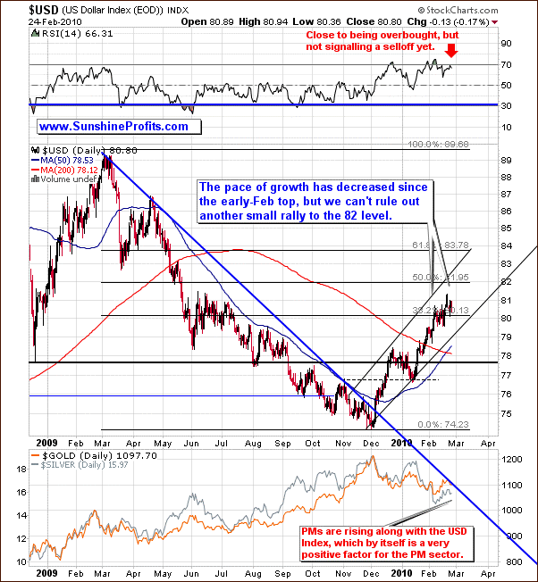
The long-term USD Index chart didn't change much since the previous week. Back then we wrote the following:
Silver and gold managed to rise without the positive influence from the dollar, which is generally a bullish sign. Moreover, it suggests that PMs may move higher even if the USD Index rallies as well. Just a few days of data are not enough to get overly excited about this phenomenon (that's why our Correlation Matrix doesn't reflect that), but it serves as a subtle clue that if we saw another upleg in the USD Index we would not need to be very afraid that PMs would tumble dramatically.
PMs continued to show strength despite the fact that USD Index did not tumble. This is positive for the precious metals, especially that this phenomenon has been visible for a few weeks now.
Since the correlation between USD Index and the precious metals market has been decreasing lately, further strength in the U.S. Dollar does not have to automatically translate into lower prices of gold and silver.
Generally, if PMs are able to rise even along with higher values of the USD Index, it usually means that the sentiment is very positive for metals, and once USD finally declines, PMs are to soar.
This time, however, we need to consider the fact that gold is trading very closely with the main stock indices, which were moving higher during the past several days.
The analysis of volume (of the UUP ETF which is a proxy for the USD Index) confirms the abovementioned point.
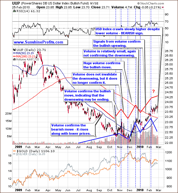
The USD Index crawls slowly higher despite lower volume, which is a bearish sign for the U.S. Dollar, and bullish for the precious metals (after all, PMs are priced in dollars.),
Let's take a look at the short-term chart for more details.
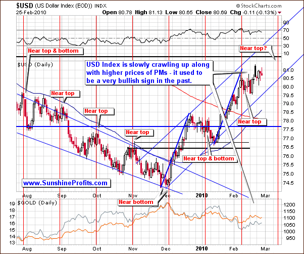
The graph above clearly shows the close relationship between the USD and precious metals. However, recent blows to the European economy (Greece) have created some uncertainties to their unusual coupling, because of the structure of the USD Index. After all, this index is a trade-weighted average of 6 currency exchange rates, and the weight for the Euro is 57.6%.
Should the cyclicality present on this market once again successfully provide us with a turning point, we might see it around the second week of March.
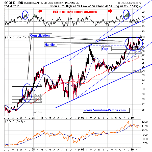
Moving on to the analysis of the gold market, this time I would like to provide you with the analysis of gold from the non-USD perspective. The following part of the update is in fact a follow-up of the December 18 Premium Update, in which we also covered the following chart.
In December we wrote the following:
UDN is the symbol for PowerShares DB US Dollar Index Bearish Fund, which moves in the exact opposite direction to the USD Index. Since the USD Index is a weighted average of dollar's currency exchange rates with world's most important currencies, the gold: UDN ratio means the value of gold priced in "other currencies".
From the average non-USD perspective, gold appears to be forming the "handle" of the cup-and-handle pattern. This is a bullish formation, meaning that the following move could take gold to new highs. The trend remains up, but the correction may not be over yet.
The corrective phase was not over in December, but according to the points made above, it may be over or be very close to its end.
Quoting from the December issue:
In 2007, gold had needed to correct 50% of the first stage of the substantial rally, before the move was resumed. It also moved below the 50-day moving average, which corresponded to the 38.2% Fibonacci retracement level. We have a very similar situation today - also confirmed by the Relative Strength Index. Consequently, gold may need to move lower - below the 38.2% Fibonacci retracement level, 50-day moving average, and stop at the blue rising trend line / 50% retracement level. I have marked the latter with the red ellipse.
This is exactly what we've seen in the past several weeks. Currently, the RSI indicator on above chart is not even close to being overbought. Summing up, it looks like the handle is close to being complete and the next big move up may begin soon - naturally, given that the general stock market doesn't drag it down.
Summing up, from the long-term point of view, the situation stays bullish, and gold chart in currencies other than the U.S. Dollar confirms it.
The situation in the USD Index market appears bearish, but it has not been the main driver of the PM prices lately. It's been the general stock market that used to drive gold and silver prices lately, which means that the situation is now less than perfectly bullish, especially in the short term. Our short-term analysis is available to our Subscribers in the March 3rd Market Alert.
To make sure that you are notified once the new features are implemented, and get immediate access to my free thoughts on the market, including information not available publicly, I urge you to sign up for my free e-mail list. Sign up today and you'll also get free, 7-day access to the Premium Sections on my website, including valuable tools and charts dedicated to serious PM Investors and Speculators. It's free and you may unsubscribe at any time.
Thank you for reading. Have a great and profitable week!
P. Radomski
--
Today our Subscribers have received a Market Alert with key short-term update on PM prices. It's also posted in the Premium Updates section, so you can read it as soon as you Subscribe to our Premium Service.
This week's Premium Update is the biggest one that we've ever created in terms of charts/tables - there is 20 of them, each with detailed description. Not only to we provide you with the analysis of cycles in silver and the U.S. Dollar along with fractal (self-similar) patterns on the gold market (long- and short-term perspective), but we also check which of the popular analytical tools might be misleading at the moment.
Additional things covered this week include: USD Index (also in the form that allows us to analyze volume), main stock indices, and our correlation matrix. We also analyze the performance of gold in various currencies: Euro, Yen, British Pound, Canadian Dollar, and Australian Dollar. We encourage you to Subscribe to the Premium Service today and read the full version of this week's analysis right away.
