
This essay is based on the Premium Update posted on May 7th, 2010.Visit our archi ves for more silver articles.
Thursday saw a huge reversal in the general stock market accompanied by huge volume. There seemed to be a selling mood, which accelerated for several hours though the mid-day period. Is this a beginning of a severe plunge or are we likely to see at least a small move higher - and what does this mean for silver? These are the questions that we will deal with in the following part of this essay.
Let's begin with the long-term SPY ETF chart (chart courtesy by http://stockcharts.com), which serves as a proxy for the general stock market.
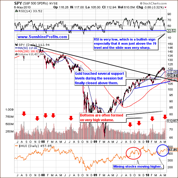
It seems that we have seen the end of the last rally in a big way. But all is not negative when we look a little deeper. Even though the market's close was significantly lower than the prior day, a look at the intra-day activity shows that there was actually a substantial recovery from today's low point and it is quite likely we will see this bounce continue at least in the short term.
Many factors point to this coming trend. Today's SPY chart yields three positive signs that support a bullish sentiment for the short term. The closing price around 113 is above the multi-year support/resistance level - the declining black line. It is also above the 200-day moving average and above the rising support line created by previous months' lows. The true confirmation comes from the volume levels which were profound. The RSI has not been this low in months and when we saw a similar level last year, it corresponded to the final low of a previous decline. An RSI level this low most likely signifies a buy zone. The negative momentum of the RSI index is also profound, especially given the fact that it was just above the 70 level.
Moreover, in 2009, the RSI rarely fell below 50 and this week's downturn indicates a strong possibility of this decline being over as well.
Please note that the RSI indicator on the above chart is based on daily closing prices and therefore it didn't take Thursday's huge intra-day reversal into account. Should that be the case, it would provide us with even more bullish reading.
The amount of capital which left and entered the market was huge. Support levels work or have merit because of people's beliefs, stop/loss orders, buy/orders and the like. The automatic buy/sell orders have already significantly come into play.
The strong reversal late in the session indicates many of these orders have been triggered already. Those wishing to exit the market, in all likelihood have already done so, or will do so very soon. That is to say, there are not many sellers left, and the buying power was strong enough to push prices up several hundred points in the DJIA. All of these factors suggest that at least a small rally is likely in the following days/weeks.
Let's take a look at the correlation matrix to find out what does the above analysis mean for gold, silver and mining stocks.
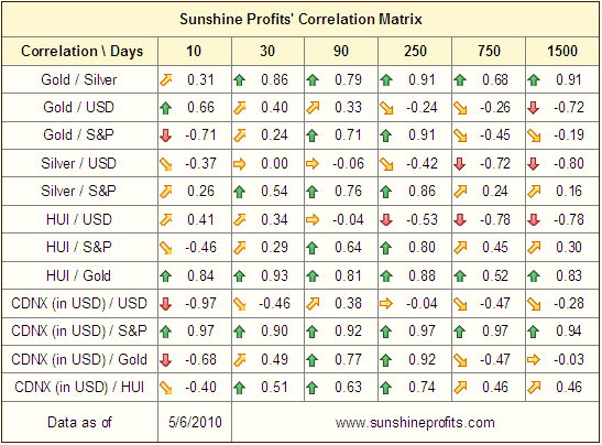
The correlation matrix this week is very interesting. The 30-trading-day column indicates that the correlation between gold, silver and HUI with the USD is quite weak, which is a quantitative representation of the fact that precious metals held or even rose slightly in spite of the USD strength this week. PMs are still rather correlated with the general stock market, but the strength of the correlation appears to have weakened significantly. This reflects the fact that gold and gold stocks have held up relatively well when the main stock indices plunged. Silver's performance on Thursday also suggests that it may not follow main stock indices much lower.
The 750-trading-day- and 1500-trading-day columns explain why silver and precious metals have been a bit weak during the past few days. Their long term correlation with the general stock market is higher than that of gold. For the very long term, which can be seen in the 750 day and 1500 day columns, gold has a negative correlation with the general stock market while silver and mining stocks do not. In the long run gold generally moves in the opposite direction of the general stock market, but silver and precious metal stocks generally often move in the same direction as other stocks. The soft bounce seen late this week in stocks may lead to silver and precious metals moving much higher.
Speaking of silver, let's take a look how it performed recently.
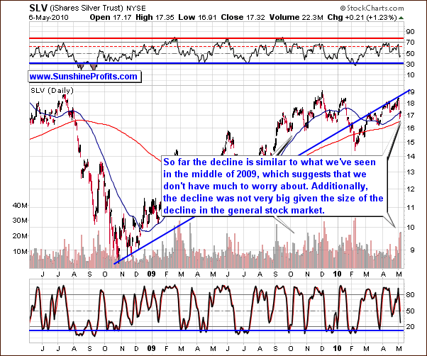
Silver appears to have bottomed out this week. This is in line with what we have stated earlier with regards to gold and the general stock market. The reason behind silver's weakness this week is it's correlation with the general stock market due to multiple industrial uses. Being a precious metal, silver sometimes follows the trends set by gold. However, silver has more industrial uses than gold and therefore may, at times, more closely follow the trends set by the general stock market.
Supply and demand situation for silver is still favorable. Emerging economies such as China and India are likely to continue to positively impact the direction of silver's price. Still, this week silver moved sharply lower. In our May 4th alert, we stated the downside appeared to be $17.30 ($17 for the SLV ETF). This level was breached intra-day but the closing price was higher. Silver is now at its 50-day moving average level which should provide support as was the case many times in the past. Higher volume has accompanied bottoms in the past and we have seen such levels this week.
Silver did not plunge at all on Thursday, actually rising about 1%. This is in spite of a day where the general stock market was severely down in the range of 5%. Indicators which normally are useful have little benefit this week due to the huge impact felt from the general stock market. The RSI level and stochastic indicator point towards a period of sideways price movement or a slight downturn, but these signals don't seem to be reliable at this point.
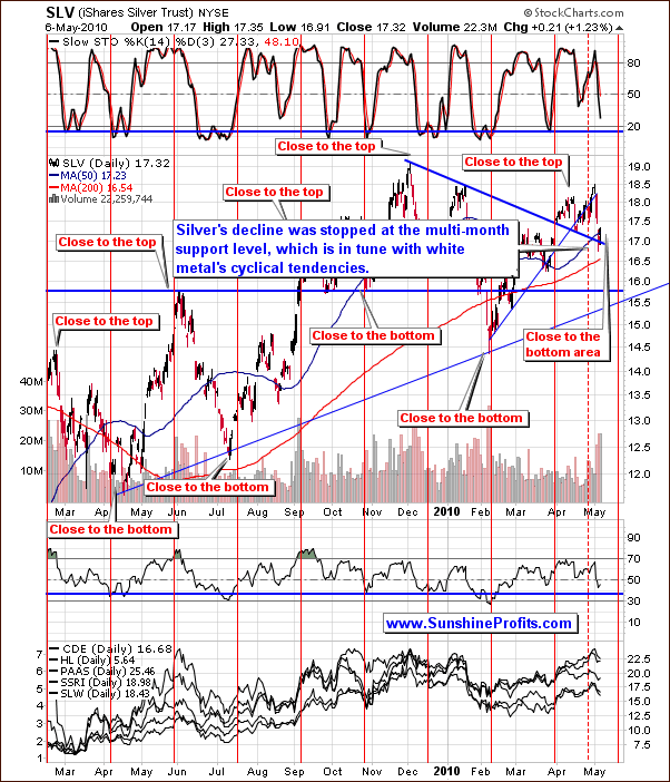
Moving to the short-term chart, cyclical tendencies appear to be in place. These are valid to use in projecting future price levels. The indications are we are close to if not at a bottom today. Although silver has moved lower this week, it stopped at the multi-month support level, which is in tune with normal cyclical tendencies. Silver's price may move higher, especially if the general stock market rallies even slightly. In short, this is what we expect sooner rather than later given all of the above factors.
Summing up, silver has continued to show weakness but has probably reached its bottom, and higher prices are coming. The general stock market did not cause a severe downturn this week and for both these reasons we expect silver to move upwards fairly soon. More detailed analysis - including short-term targets / probable scenarios is available to our Subscribers.
To make sure that you are notified once the new features are implemented, and get immediate access to my free thoughts on the market, including information not available publicly, I urge you to sign up for my free e-mail list. Sign up today and you'll also get free, 7-day access to the Premium Sections on my website, including valuable tools and charts dedicated to serious PM Investors and Speculators. It's free and you may unsubscribe at any time.
Thank you for reading. Have a great weekend and profitable week!
P. Radomski
--
This week we've seen a lot of sharp moves in many markets, not only in gold and silver, and this week's Premium Update reflects that, as it is literally loaded with signals from many techniques and important comments, which substantially increases the reliability of the whole analysis.
We have examined the general stock market (3 charts) from, long-, and short-term perspective (what does the recent plunge mean?). We've also examined the financial sector for more detailed view. Naturally, we cover the recent USD rally (3 charts), and explain what is likely to take place next and especially, what does it mean for PM Investors/Traders. We comment extensively on the current market situation in gold (2 charts), silver (2 charts) and precious metals stocks (2 charts), This week's issue also provides a critical update on the self-similar pattern that we've seen present on the gold market.
Each chart / technique that we present provides additional insight into the understanding of the situation on the metals market, and this week we have covered PM stocks' performance relative to other stocks, analysis of the platinum market, one of our unique indicators, recently featured daily seasonal patterns, performance of juniors relative to gold (is this a good time to buy/sell juniors?), correlation matrix, and more.
Additionally, this week's Premium Update includes the ranking of our top gold, and silver juniors. We encourage you to Subscribe to the Premium Service today and read the full version of this week's analysis right away.
