

Briefly: in our opinion, full (250% of the regular size of the position) speculative short positions in gold, silver and mining stocks are justified from the risk/reward perspective at the moment of publishing this alert.
We have some good news and some bad news for both: precious metals bulls and bears. Based on new developments it’s even more likely that we are just before the huge price decline in gold, silver, and mining stocks, but at the same time it also appears likely that the final bottom will take place later than we had expected, based on the previously available information.
Let’s start with additional bearish confirmations (charts courtesy of http://stockcharts.com). In our Monday’s analysis, we compared the price performance of gold that we saw in the recent months to what happened in 2013, right before the big $200+ plunge that took place in only 2 trading days. In today’s analysis, we will extend this analogy also to other markets. But first, let’s recall the Monday’s analysis.
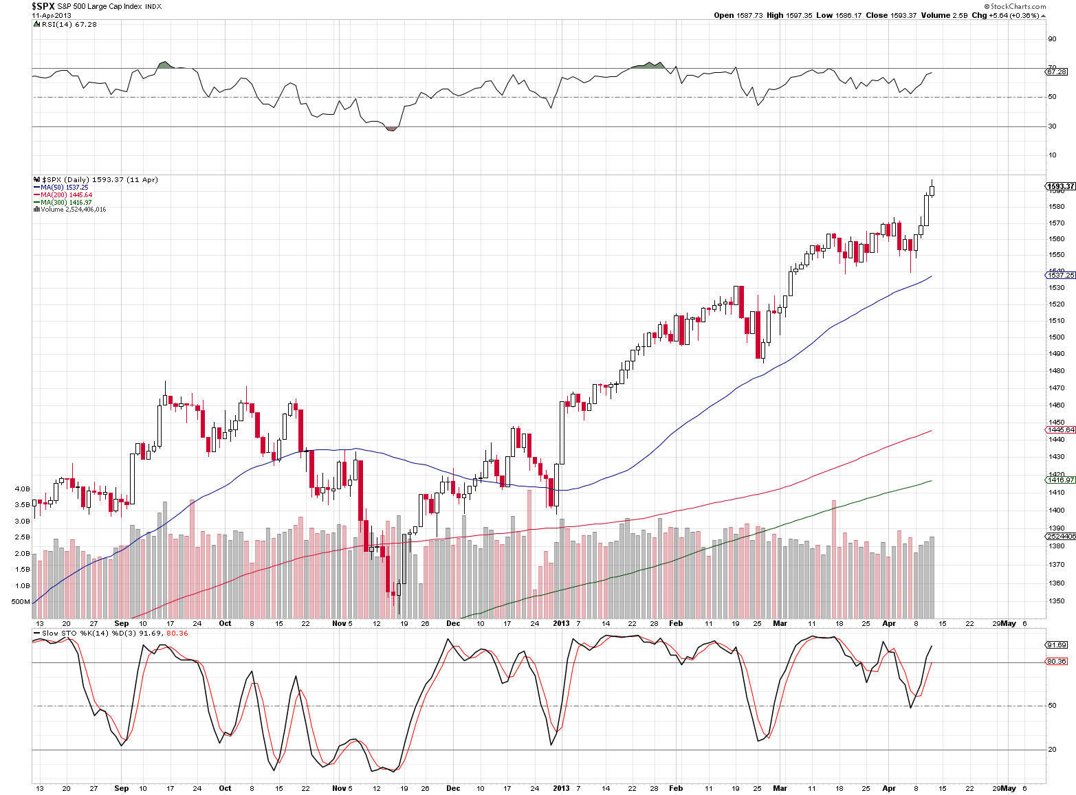
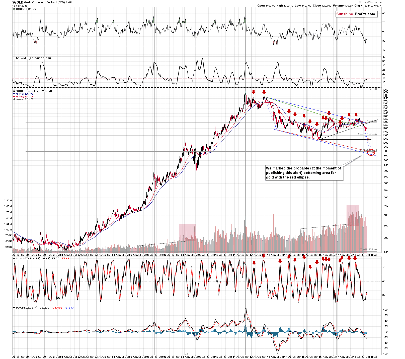
Gold: 2013 vs. 2018
On Monday, we featured the following two charts: one from 2013 and one from this year and we managed to describe them using exactly the same words:
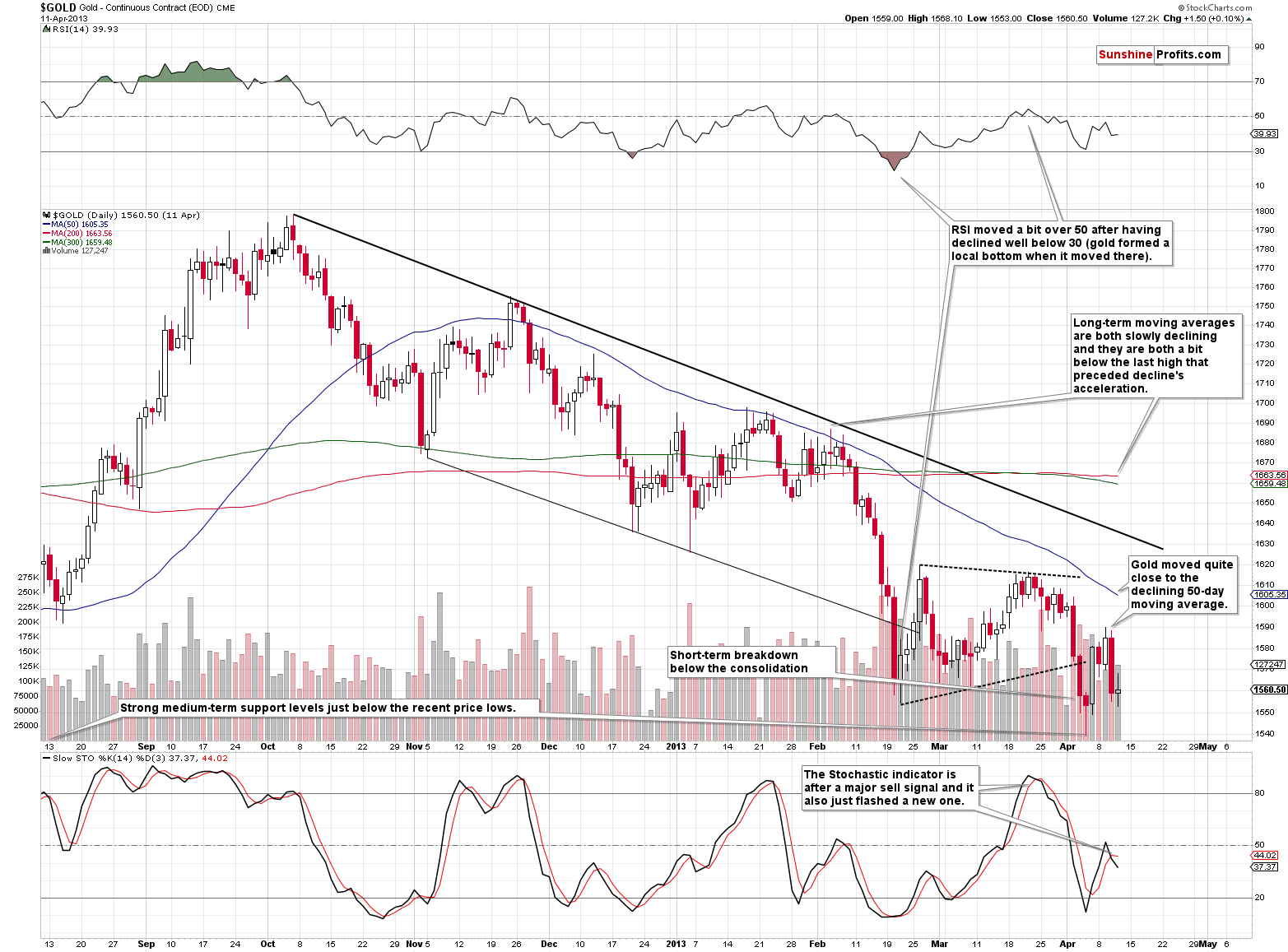
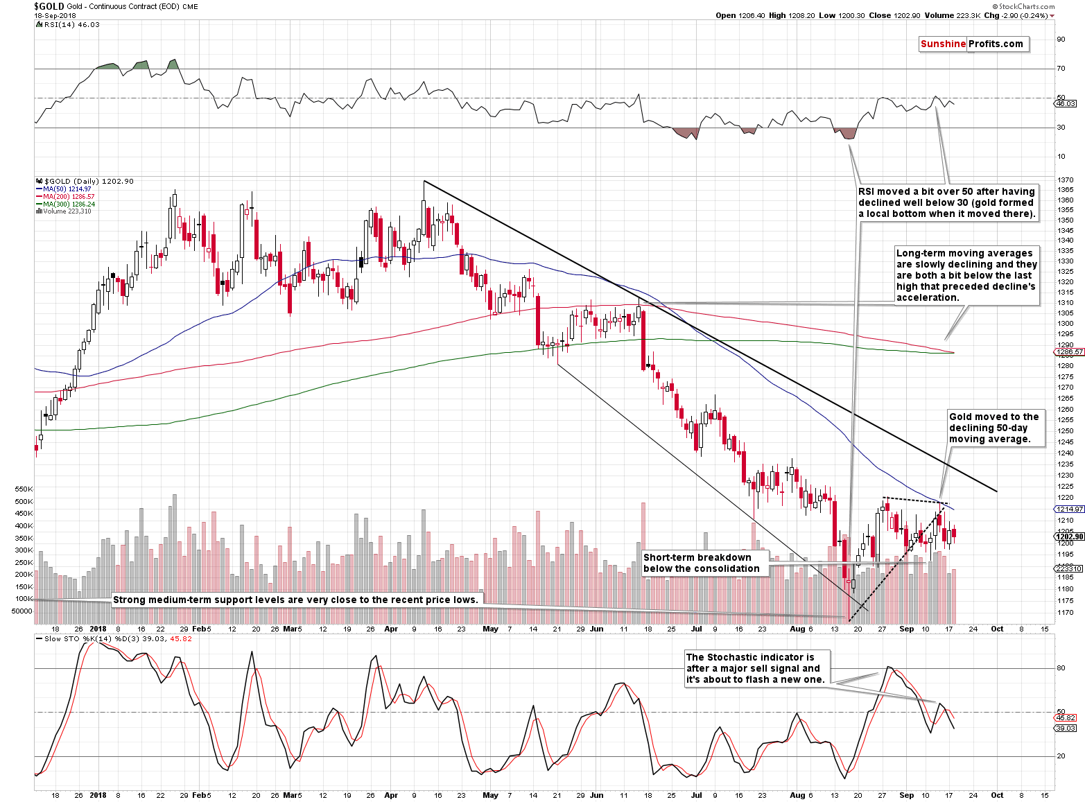
Gold moved back and forth lately as it’s been consolidating after the recent sharp decline that took gold to the medium-term support levels (even a bit below some of them) and the declining thin black support line (based on the previous lows).
The yellow metal moved close to its 50-day moving average (staying below it) and it’s still far from the declining black resistance line, which suggests that the trend remains down and that everything that we saw recently is just a pause within a bigger decline.
The RSI indicator was very oversold on a short-term basis during the recent volatile bottoming pattern, but it recovered since that time, and it recently even moved above 50, thus indicating that the situation is far from being very oversold on a short-term basis.
The Stochastic indicator already confirmed that the major short-term top is already in and we just saw another move lower in it, after it moved above the middle of its trading range.
Moreover, gold already broke below the consolidation pattern marked with dashed lines and even though it moved very briefly back into the pattern, it closed the last two sessions visibly below it.
Some will say that what we’re seeing is just a prolonged bottoming pattern and what we have now is the first post-bottom pause. But we disagree. Based on multiple other factors, including severe underperformance of gold stocks, the outlook remains strongly bearish and gold price appears ready to decline once again.
We emphasized that the shocking similarity can be seen not just in the position of indicators, proximity to the support and resistance lines, situation regarding the consolidation pattern, and the 50- a day moving average. Even the 200-, and 300- a day moving averages (marked with red and green) are slowly declining and are just below the local top after which the decline accelerated.
The more similar a given price pattern is, the stronger the implications are and while it’s usually best to have multiple patterns that are similar to the current one that are followed by the same outcome, this doesn’t seem necessary right now. The similarity is simply so big that even the single case can make a certain outcome very, very likely.
However, in today’s globalized economy, no market can move truly on its own – they are all connected in one way or another. Consequently, in order to check what’s in store for gold, it’s important to keep track of other markets also. What happened in these “other” markets in 2013 and how does it relate to the current picture? In the following paragraphs we’ll examine gold stocks, silver, the USD Index, and the general stock market.
Gold Stocks: 2013 vs. 2018
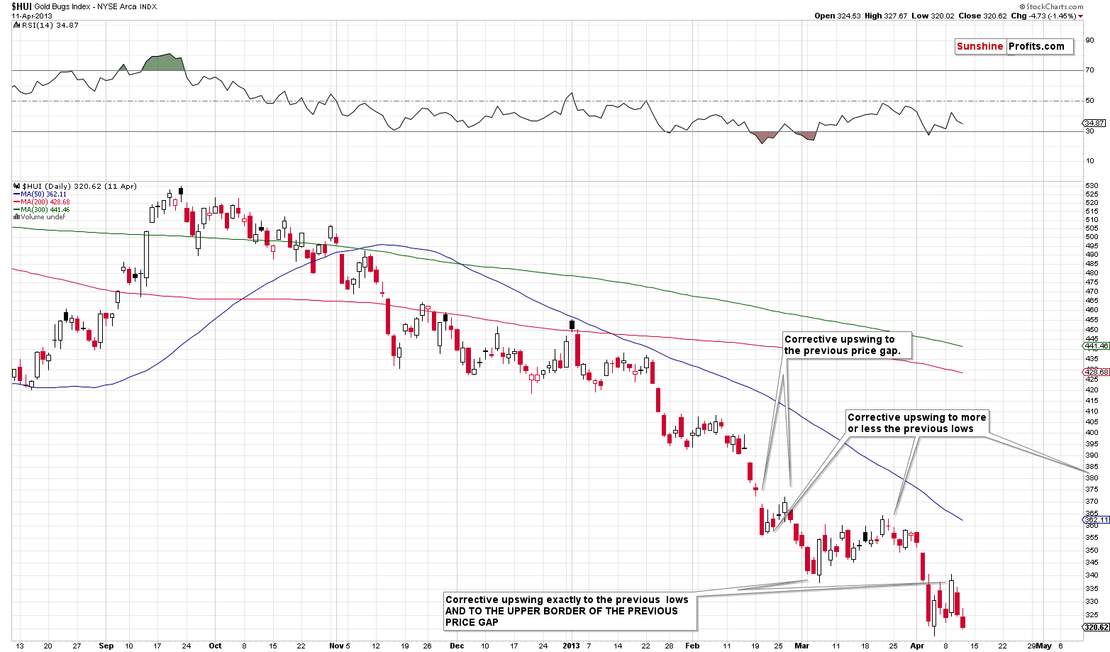
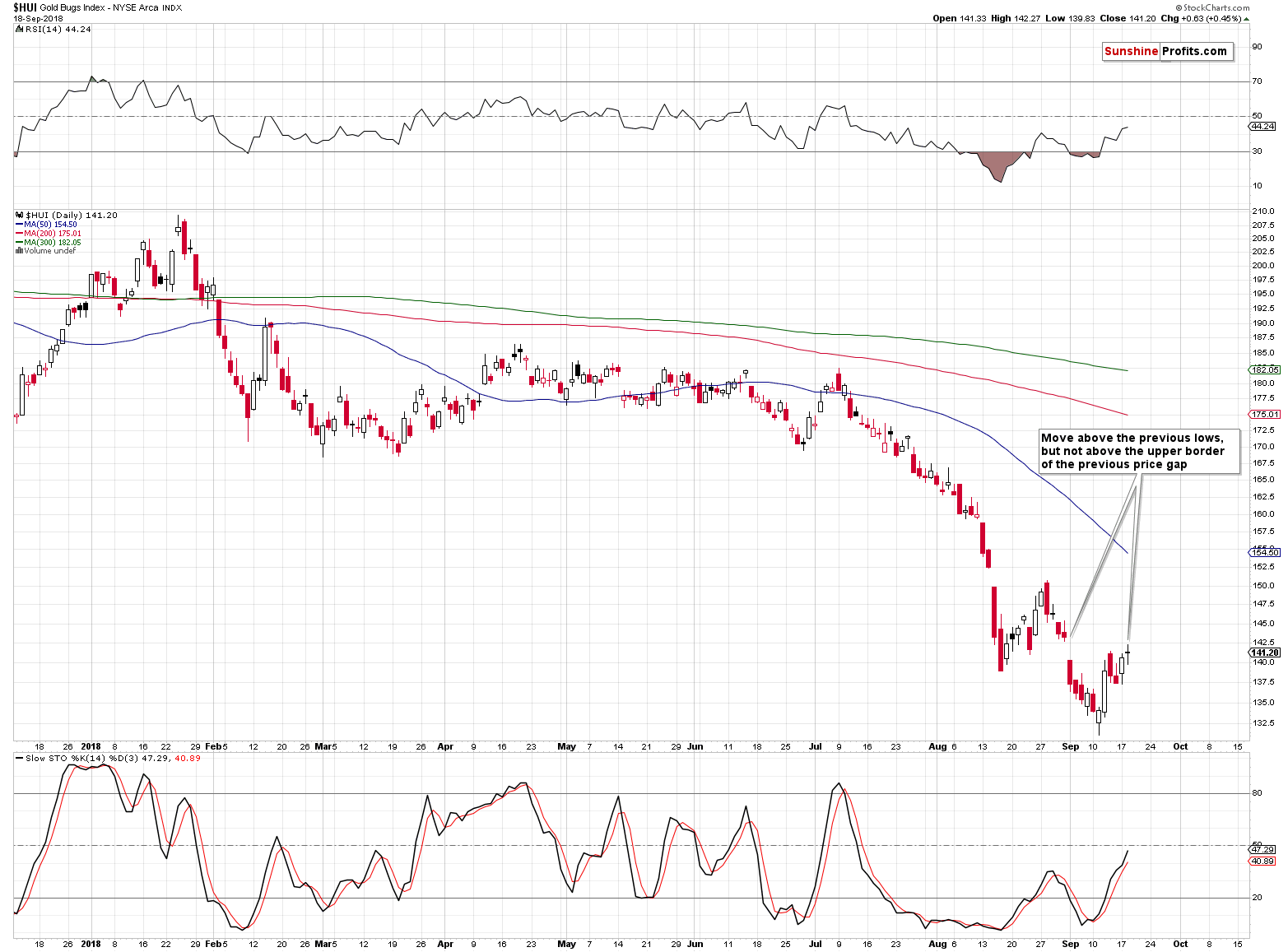
At the first sight, the overall shape of the price moves is similar, and there are several details that make it very similar.
The most interesting thing is the 2.5 factor.
If you divide the start and the end of the 2013 decline by 2.5, you’ll get a very good approximation of 2018 prices.
The 2012-2013 decline started at about 530. 530 / 2.5 = 212. The 2018 decline started a bit below 210.
The 2012-2013 decline accelerated after the top that formed at about 455. 455 / 2.5 = 182. The 2018 decline accelerated after the July top that was at about 182.
Shocked yet? There’s more. The pre-slide bottom in the HUI Index in 2013 was formed at about 320. 320 / 2.5 = 128. The intraday September 2018 bottom was 131.12 - extremely close to the above.
What happened next in 2013? The HUI Index rallied up to the previously broken support level and verified it as resistance. The support / resistance was provided by two levels: the previous local bottom, and the upper border of the most recent price gap. The HUI Index currently moved above the former, but not above the latter, so we might say that it’s in tune with the past pattern. The HUI Index rallied precisely from 317.42 to 340.69, which means that it moved higher by 7.33%. Applying the same to the most recent bottom gives us 131.12 * 1.0733 = 140.73 as the analogous upside target. That’s more or less where the HUI Index closed yesterday. To be precise, the intraday high was 142.27, but that’s very little deviation from the target. Please note that the previous downside target based on the analogy and the 2.5 number was 131.12 instead of 128, so it was off by about 3 index points. The current target is off by about 1.5 index points is the analogy and its remarkable accuracy seem to remain in place.
The implications are profound, because the above means that the upside is extremely limited and the follow-up slide is very, very close.
Before moving to silver, we would like to discuss one additional interesting phenomenon.
In case of gold, in 2013, we saw a decisive decline right after the initial top, then a decline at a slower pace and then decline’s acceleration, while in 2018 the initial decline was a prolonged top that was followed by the decline's acceleration without the slower decline in the middle.
The interesting thing about the above is that it was the other way around in case of gold stocks. In 2013, the HUI Index declined at a relatively slow pace initially and then the decline accelerated. In 2018, the HUI Index initially declined decisively, then consolidated for months and then the decline accelerated.
In a way, looking at performance of both parts of the PM sector in both years makes these periods more analogous than if we looked only at one of them alone.
The implications are extremely bearish.
Silver: 2013 vs. 2018
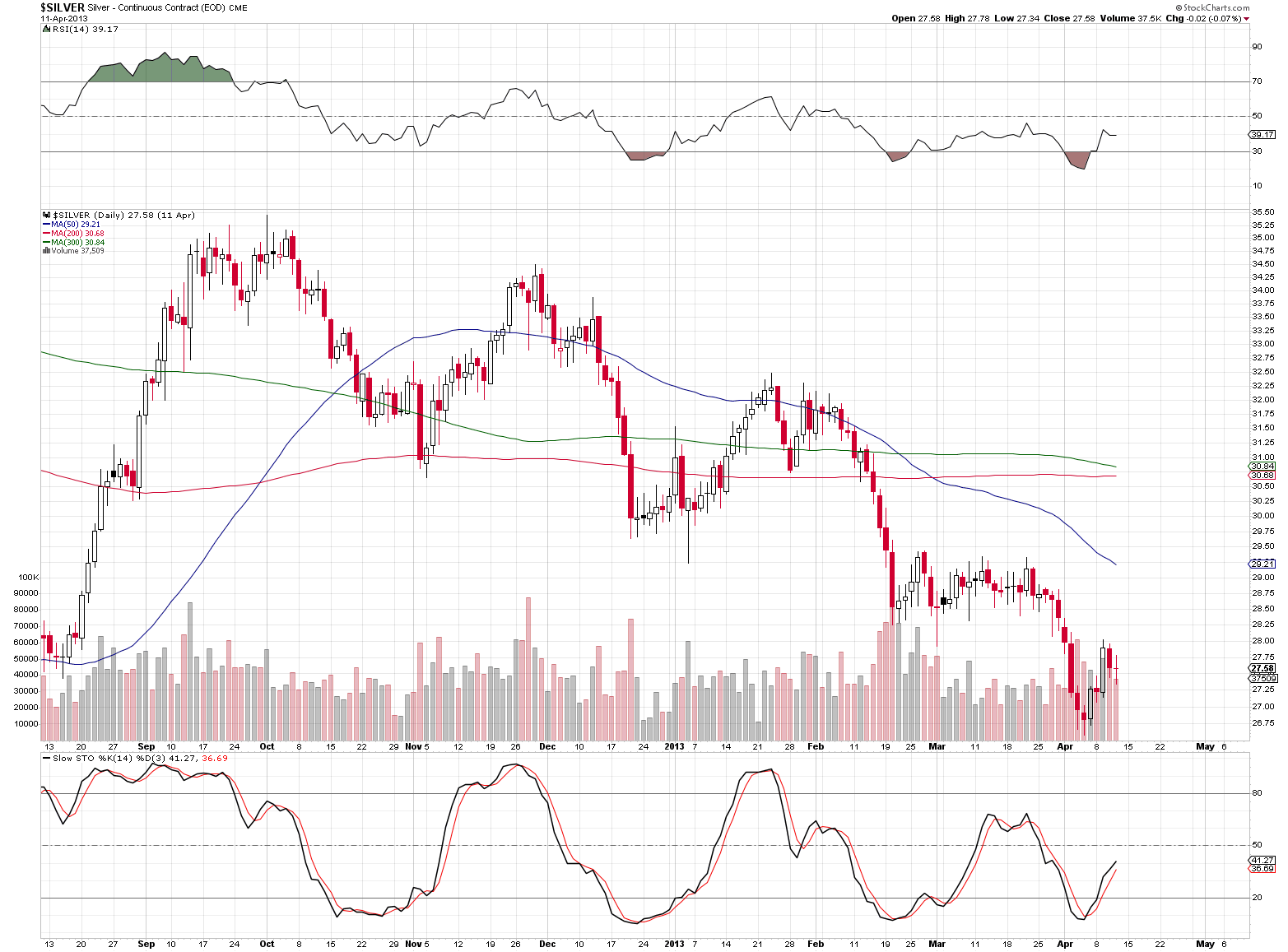
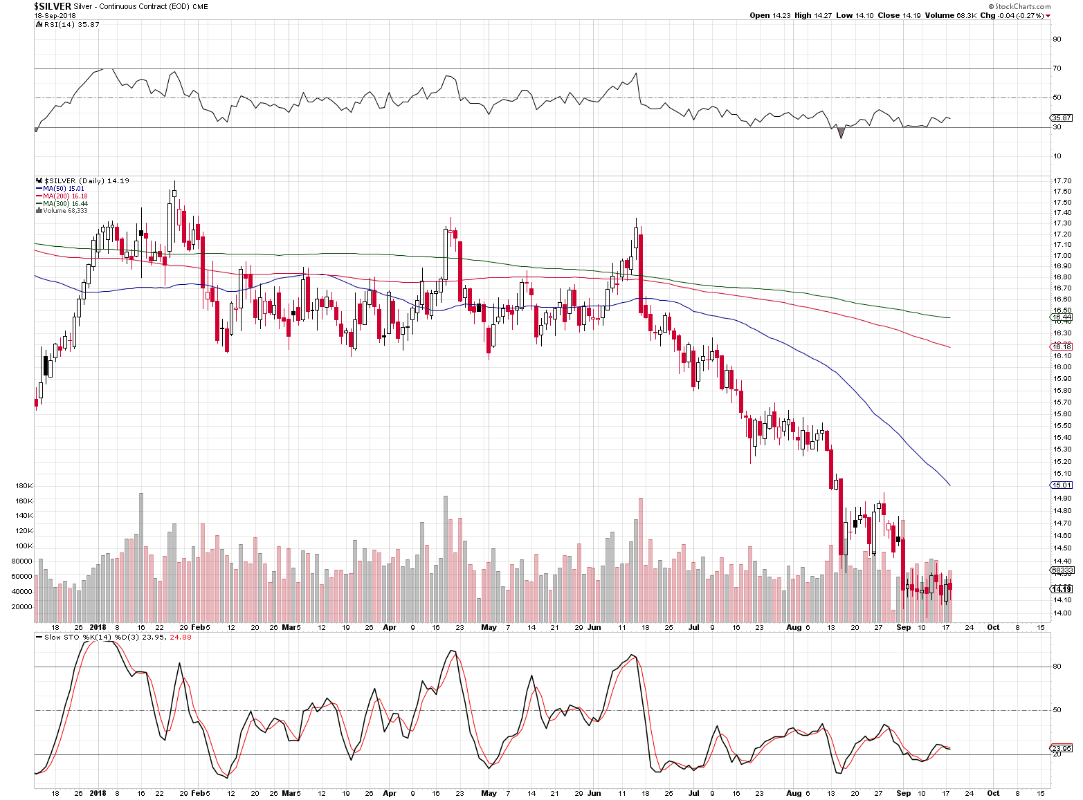
In case of silver, the similarity is not as striking, but it’s still present. In both: 2013 and 2018 we had 3 local tops before the decline really started. And, the final corrective upswing before the April 2013 slide took the white metal to the previously broken bottoms. That’s exactly what silver did on September the 13th, 2018.
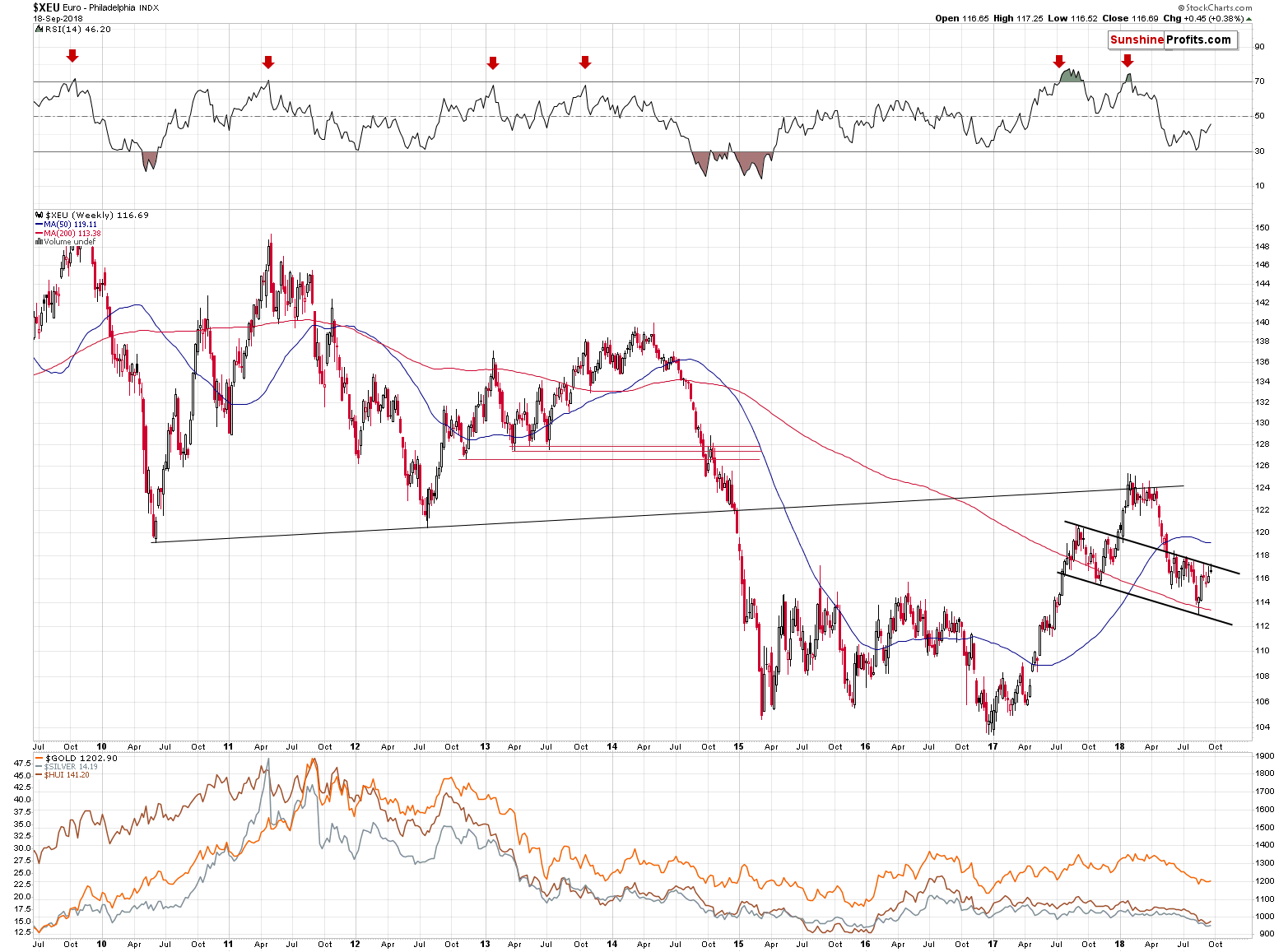
But the USD Index is declining! The precious metals will soar when USD slides!
We’ll get to the details later on, but first, please note that… This seemed to be the case in 2013 as well.
The USD Index: 2013 vs. 2018
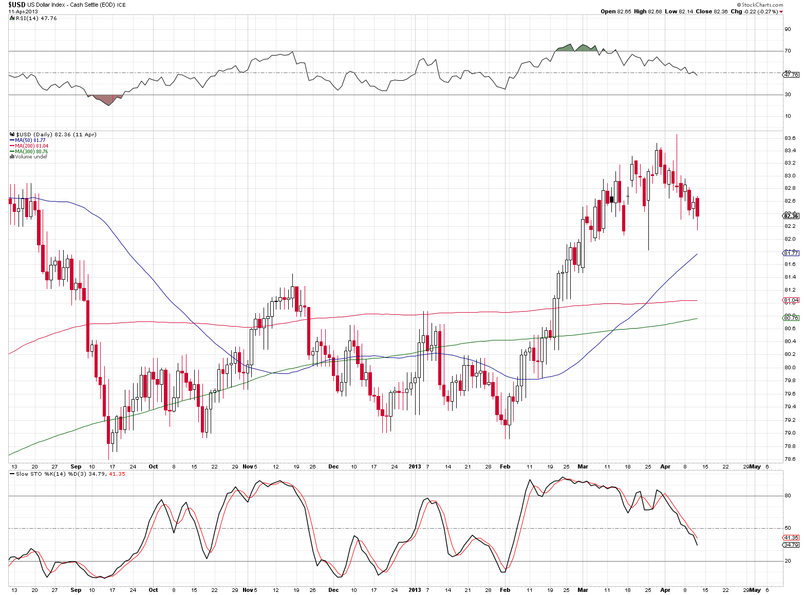
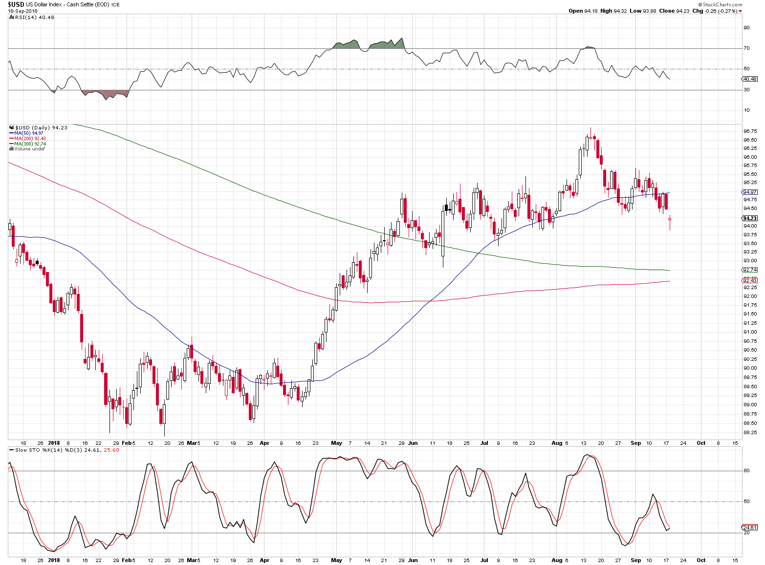
The USD Index looked like it was just about to decline after topping in 2013 as well. At least from the short-term point of view. If that was exactly what preceded the huge slide in the PMs in 2013, can it really be something that’s considered bullish today? It might have been, if it wasn’t for the similar performance that we saw in the past months.
Even the decline that preceded the early bottom was somewhat similar with a pause right before the final slide. After the initial bottom was formed, the USD Index formed a head-and-shoulders pattern, which was never completed (again, in both cases). Instead, a big rally followed the right shoulder of the pattern. The rally took the USDX visibly higher and before the local top, the rally slowed down. Again, this happened in both: 2013 and 2018.
And then, just before USD Index moved to its previous notable local bottoms (currently June and July bottoms are between 92.5 and 93.5)… Gold took a dive.
The General Stock Market: 2013 vs. 2018
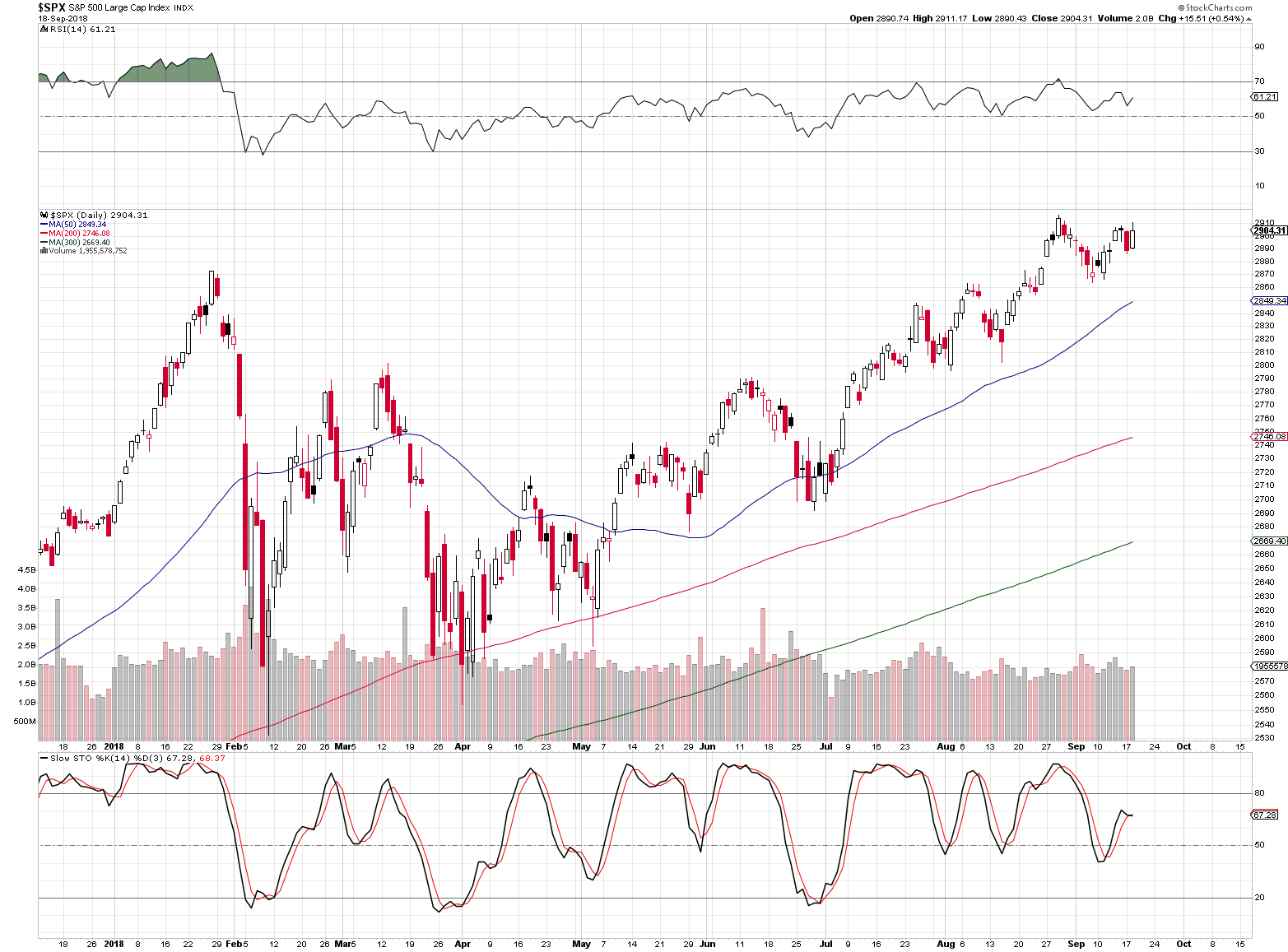
The shape of the price moves is only somewhat similar at the first sight, but the details are actually in tune. After the initial rally, there was a visible decline and correction that took a few months to complete. Then, the S&P 500 Index started a major rally and it’s technical position looked favorable. In 2013, the general stock market was simply soaring, and right now the rally has not been as visible, but still, the S&P is after a breakout above the previous highs and its verification, so the technical outlook does appear quite bullish.
Since the situation in both: USDX and the general stock market appear similar to what we saw in 2013, right before the big dive in the prices of precious metals, the implications are bearish.
Before summarizing, we would like to examine the situation in the currencies.
Forex Update
Even though the USD Index moved lower yesterday, the outlook for it didn’t change. Ultimately, the Index cannot move regardless of its components and the outlook for the key components of the USD Index didn’t change.
The line created as parallel to the line based on two important bottoms was not broken and it continues to serve as resistance. We expect to see a turnaround and sizable declines in the European currency shortly. Yesterday’s session didn’t change anything in the EUR/USD currency pair and the same goes for the situation in the Japanese yen.
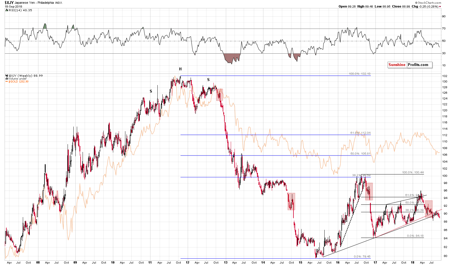
The yen even closed the session a bit lower. Consequently, the implications of last week’s breakdown remain up-to-date and are bearish for the yen (and bullish for the USD/JPY currency exchange rate). As a reminder, the Japanese yen ended the previous week visibly below the rising black support line that’s based on very important bottoms from 2015 and 2016. Since the support line is based on such important bottoms, it’s also very important itself. And, since the weekly closing prices are more important than the daily closing prices, what we saw last week was profoundly bearish for the following weeks.
The implications are bearish for the precious metals market due to the link between the yen and the price of gold (you can see the latter in the background of the above chart and it’s immediately clear that it moves in tune with the value of the Japanese currency).
Timing Update
It’s already second half of September 2018 and as you may recall, we previously wrote that gold is likely to form the key bottom in late September or in early October. While silver and mining stocks are relatively close to their 2015 and 2016 bottoms, gold is still visibly above it, so you might be wondering, if what we expected previously is still up-to-date.
The answer is that it is partially up-to-date and as it still seems likely that we will see a major bottom in later this month or in early October, but it’s becoming increasingly likely that this will not be THE bottom and that THE bottom will be formed a few weeks later.
The reason is what we already read today – the analogy to 2013.
The precious metals sector declined significantly in mid-April 2013, but it didn’t move to the final bottom right away. There was an initial powerful slide that was followed by a quick rebound and then a move to a more regular (still volatile, but not extremely so) bottom. Based on how similar things are to the 2013 decline, we expect something similar to take place also in the next several weeks.
The first big slide would be likely to start shortly, then we expect to see a temporary bottom with gold at or very close to its 2015 bottom. This would be likely to take place in late September or early October - close to gold’s very long-term cyclical turning point (vertical gray lines on the above chart), which is one of the reasons we had been expecting to see a major turnaround in early October.
At that time silver would likely be well below its 2015 bottom and mining stocks’ performance is less clear at this time – the could be either at their 2015 – 2016 bottoms or even lower. Either way, we might see a sizable correction from these levels (and many calls that the bottom is already in), before the final slide begins.
Naturally, it could be the case that gold would plunge to $890 shortly, but the above scenario appears more likely.
We will provide details regarding the most likely timing for THE bottom in the upcoming Alerts (we want to dedicate more time to it).
For now, we would like to emphasize that there is a short-term cyclical turning point for the mining stocks on Monday, September 24.
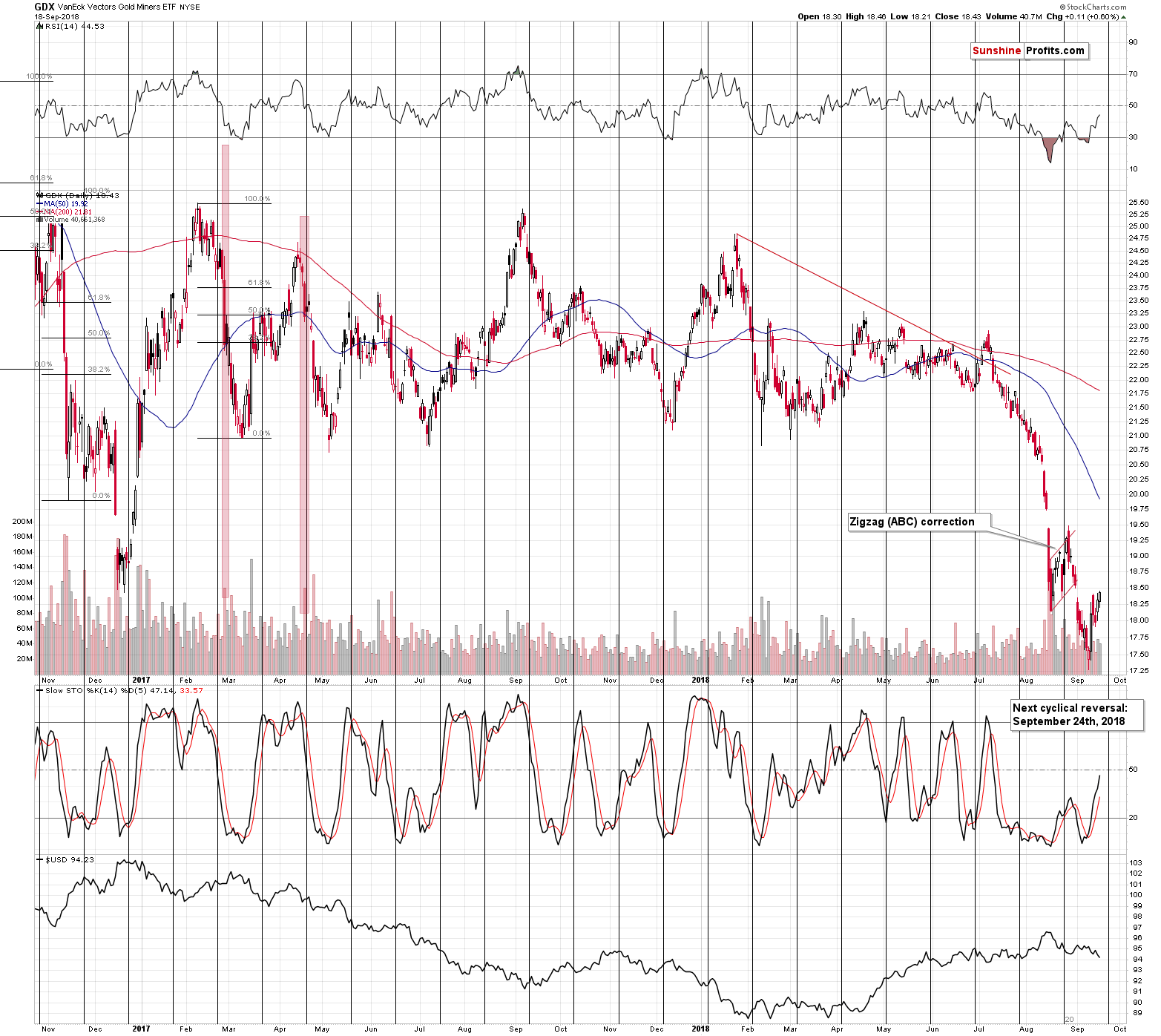
This means that even if we don’t see any meaningful bearish price action today, tomorrow, or even on Friday, it will still be rather normal as the big slide could start right at or right after the turning point.
Summing up, the situation on the precious metals market remains very bearish, as it’s likely that we are right before a major plunge, similar to the one that we saw in April, 2013. This is confirmed not only by what we’re seeing in the gold market, but also by what’s happening in silver, mining stocks, USD Index and the general stock market. It seems that the big profits on our short positions will become much bigger before this trade is completely over. Still, the upcoming late-September or early-October bottom in the PMs may not be, be THE final bottom for this decline. Instead, we may see an initial move to the 2015 bottom in gold that’s followed by a corrective upswing and then another wave down that takes gold to the final bottom, well below $1,000. As far as the near term is concerned, please note that even if nothing happens for the next few days, it will not invalidate anything as we are getting close to the cyclical turning point in the mining stocks – it could be the case that the decline is delayed due to its proximity and that we’ll see it either right on the turning point day (Monday), shortly before it, or shortly after it. We know that it’s frustrating to see the PMs do nothing even though so many signs point to lower prices, but the patience here should be very well rewarded.
As always, we’ll keep you – our subscribers – informed.
To summarize:
Trading capital (supplementary part of the portfolio; our opinion): Full short positions (250% of the full position) in gold, silver and mining stocks are justified from the risk/reward perspective with the following stop-loss orders and exit profit-take price levels:
- Gold: profit-take exit price: $1,062; stop-loss: $1,226; initial target price for the DGLD ETN: $82.96; stop-loss for the DGLD ETN $53.67
- Silver: profit-take exit price: $12.72; stop-loss: $15.16; initial target price for the DSLV ETN: $46.97; stop-loss for the DSLV ETN $31.37
- Mining stocks (price levels for the GDX ETF): profit-take exit price: $13.12; stop-loss: $19.61; initial target price for the DUST ETF: $80.97; stop-loss for the DUST ETF $33.37
Note: the above is a specific preparation for a possible sudden price drop, it does not reflect the most likely outcome. You will find a more detailed explanation in our August 1 Alert. In case one wants to bet on junior mining stocks’ prices (we do not suggest doing so – we think senior mining stocks are more predictable in the case of short-term trades – if one wants to do it anyway, we provide the details), here are the stop-loss details and target prices:
- GDXJ ETF: profit-take exit price: $17.52; stop-loss: $29.43
- JDST ETF: initial target price: $154.97 stop-loss: $64.88
Long-term capital (core part of the portfolio; our opinion): No positions (in other words: cash)
Insurance capital (core part of the portfolio; our opinion): Full position
Important Details for New Subscribers
Whether you already subscribed or not, we encourage you to find out how to make the most of our alerts and read our replies to the most common alert-and-gold-trading-related-questions.
Please note that the in the trading section we describe the situation for the day that the alert is posted. In other words, it we are writing about a speculative position, it means that it is up-to-date on the day it was posted. We are also featuring the initial target prices, so that you can decide whether keeping a position on a given day is something that is in tune with your approach (some moves are too small for medium-term traders and some might appear too big for day-traders).
Plus, you might want to read why our stop-loss orders are usually relatively far from the current price.
Please note that a full position doesn’t mean using all of the capital for a given trade. You will find details on our thoughts on gold portfolio structuring in the Key Insights section on our website.
As a reminder – “initial target price” means exactly that – an “initial” one, it’s not a price level at which we suggest closing positions. If this becomes the case (like it did in the previous trade) we will refer to these levels as levels of exit orders (exactly as we’ve done previously). Stop-loss levels, however, are naturally not “initial”, but something that, in our opinion, might be entered as an order.
Since it is impossible to synchronize target prices and stop-loss levels for all the ETFs and ETNs with the main markets that we provide these levels for (gold, silver and mining stocks – the GDX ETF), the stop-loss levels and target prices for other ETNs and ETF (among other: UGLD, DGLD, USLV, DSLV, NUGT, DUST, JNUG, JDST) are provided as supplementary, and not as “final”. This means that if a stop-loss or a target level is reached for any of the “additional instruments” (DGLD for instance), but not for the “main instrument” (gold in this case), we will view positions in both gold and DGLD as still open and the stop-loss for DGLD would have to be moved lower. On the other hand, if gold moves to a stop-loss level but DGLD doesn’t, then we will view both positions (in gold and DGLD) as closed. In other words, since it’s not possible to be 100% certain that each related instrument moves to a given level when the underlying instrument does, we can’t provide levels that would be binding. The levels that we do provide are our best estimate of the levels that will correspond to the levels in the underlying assets, but it will be the underlying assets that one will need to focus on regarding the signs pointing to closing a given position or keeping it open. We might adjust the levels in the “additional instruments” without adjusting the levels in the “main instruments”, which will simply mean that we have improved our estimation of these levels, not that we changed our outlook on the markets. We are already working on a tool that would update these levels on a daily basis for the most popular ETFs, ETNs and individual mining stocks.
Our preferred ways to invest in and to trade gold along with the reasoning can be found in the how to buy gold section. Additionally, our preferred ETFs and ETNs can be found in our Gold & Silver ETF Ranking.
As a reminder, Gold & Silver Trading Alerts are posted before or on each trading day (we usually post them before the opening bell, but we don't promise doing that each day). If there's anything urgent, we will send you an additional small alert before posting the main one.
=====
Thank you.
Sincerely,
Przemyslaw Radomski, CFA
Founder, Editor-in-chief, Gold & Silver Fund Manager
Gold & Silver Trading Alerts
Forex Trading Alerts
Oil Investment Updates
Oil Trading Alerts

