

Briefly: in our opinion, full (300% of the regular position size) speculative short positions in mining stocks are justified from the risk/reward point of view at the moment of publishing this Alert.
“Reversal” is the name of the game, at least when it comes to the precious metals market.
The USD Index declined profoundly once again yesterday (May 18), and gold, silver, and mining stocks ignored this move. They didn’t want to follow in its footsteps anymore.
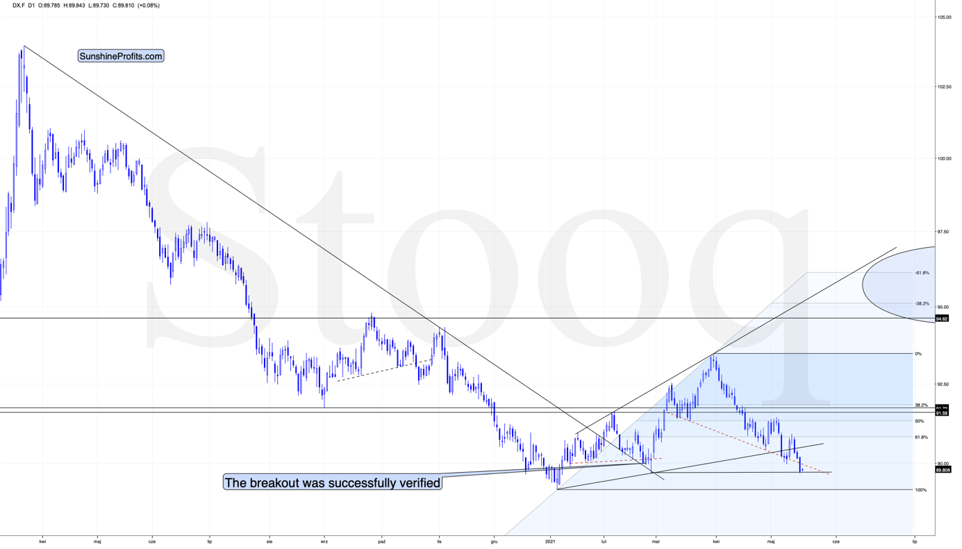
As you can see, the USD Index reached its horizontal support provided by the previous important low. Low that was formed after a fake breakdown below the neck level of a supposedly bearish head-and-shoulders pattern. The USDX is not only at similar price levels; it’s also right after a supposedly bearish breakdown below. The reversal could be just around the corner, or we might have already seen it, given today’s (small, but still) pre-market move higher.
As I mentioned above, yesterday’s sizable decline in the USDX should have triggered substantial rallies in the PMs. What happened instead?
What Happened to Gold?
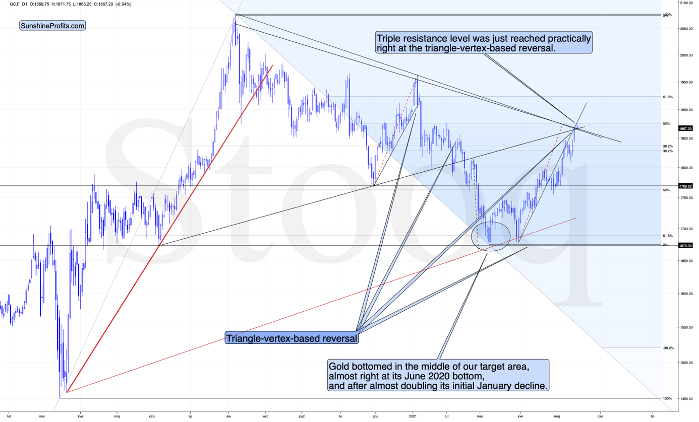
Gold reversed right at its triangle-vertex-based… well, reversal, and the combination of resistance lines.
The reversal in gold took place after gold moved very close to its mid-January highs and the 50% Fibonacci retracement based on the August 2020 – March 2021 decline.
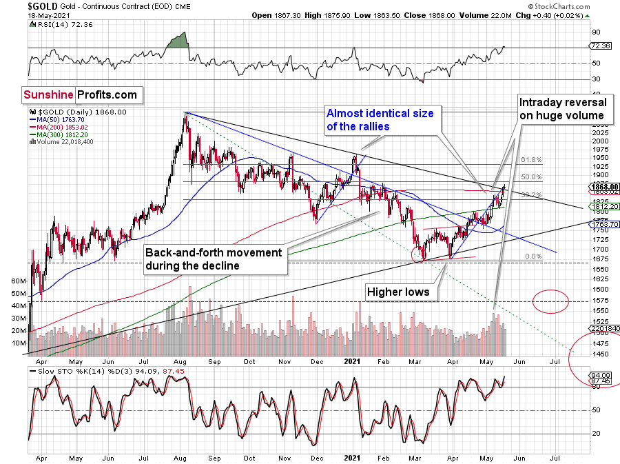
The sizes of the current rally (taking the second March bottom as the starting point) and the rally that ended at the beginning of this year are practically identical at the moment.
Just as the rallies from early 2012 and late 2012 (marked with blue) were almost identical, the same could happen now.
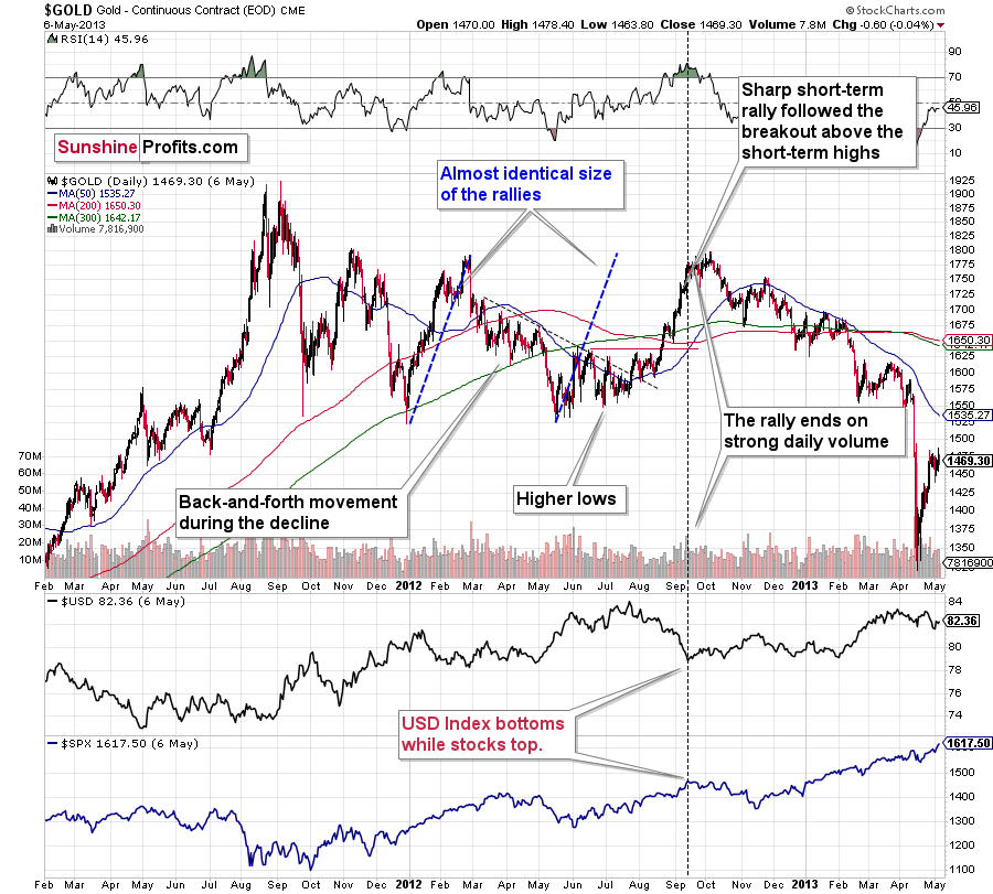
The March 2021 low formed well below the previous low, but as far as other things are concerned, the current situation is similar to what happened in 2012.
The relatively broad bottom with higher lows is what preceded both final short-term rallies – the current one, and the 2012 one. Their shape as well as the shape of the decline that preceded these broad bottoms is very similar. In both cases, the preceding decline had some back-and-forth trading in its middle, and the final rally picked up pace after breaking above the initial short-term high.
Interestingly, the 2012 rally had ended in huge volume, which is exactly what we saw on Friday. To be 100% precise, the 2012 rally didn’t end then, but it was when over 95% of the rally was over. Gold moved very insignificantly higher since that time. Most importantly, though, it was the “dollars to the upside, hundreds of dollars to the downside” situation. And it seems that we are in this kind of situation right now once again.
Interestingly, back in 2013 gold started its gargantuan (…) slide from about $1,800 and it is not far from this level also today.
Moreover, let’s keep in mind that the RSI indicator just topped slightly above 70, which is what tends to happen when gold tops. The upside seems very limited. In fact, it seems that the top in gold is already in.
The lower part of the above chart shows how the USD Index and the general stock market performed when gold ended its late-2012 rally and was starting its epic decline. In short, that was when the USD Index bottomed, and when the general stock market topped. I don’t want to get into too many USD-related short-term details, as I did that yesterday, but let’s take a closer look at the short-term developments on the stock market.
Stock Market
In short, the situation doesn’t look pretty. To explain, I wrote the following on May 11:
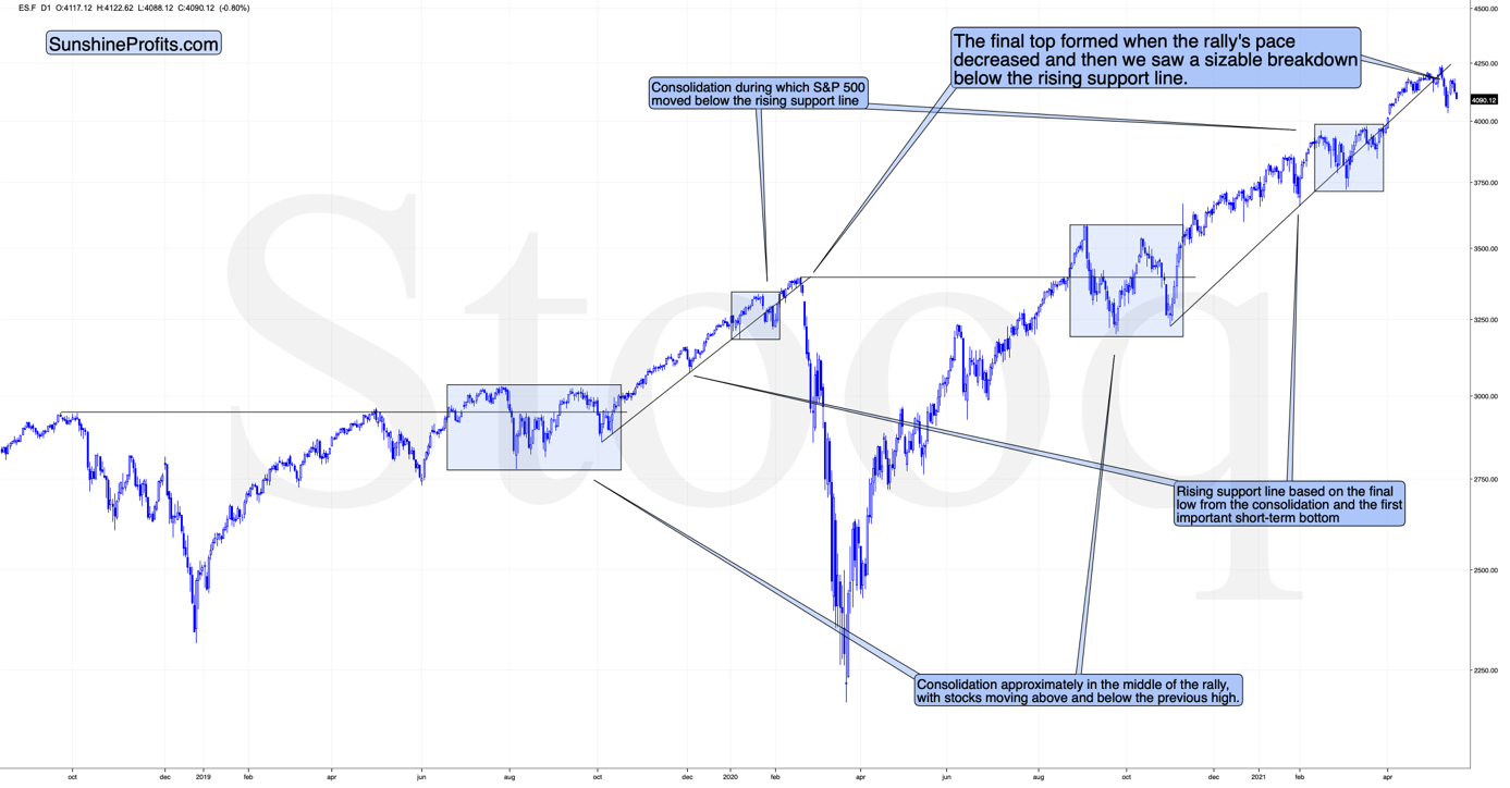
The markets are self-similar (which is another way of saying that they have a fractal nature), which generally means that while the history tends to rhyme, it also tends to rhyme in similar shapes of alike or various sizes.
For example, the rally from 2018–2020 seems very similar to the rally from 2020 to the present. Both rallies started after a sharp decline, and the first notable correction took the form of back-and-forth trading around the previous high. I marked those situations with big rectangles.
Then the rally continued with relatively small week-to-week volatility. I created rising support lines based on the final low of the broad short-term consolidation and the first notable short-term bottom.
This line was broken, and some back-and-forth trading followed, but it was only about half of the previous correction in terms of price and time.
Then, we saw a sharp rally that then leveled off. And that was the top. The thing that confirmed the top was the visible breakdown below the rising support line right after stocks invalidated a tiny breakout to new highs. That’s what happened in February 2020, and that’s what happened this month.
“Time is more important than price; when the time comes, the price will reverse”. Both rallies took an almost identical amount of time: 60 weeks vs. 59 weeks.
Stocks moved a bit higher recently, but yesterday’s and today’s pre-market decline seem to be telling investors that the initial slide was not just another correction in the bull market. This is the first time when the S&P 500 was unable to get back above its rising support line after temporarily breaking below it. Instead, we saw an attempt to rally, and now we see another slide lower.
This is bearish for gold’s forecast, but also very bearish for silver and mining stocks, which are more correlated with the stock market than gold is.
Speaking of silver, let’s take a look at its price chart.
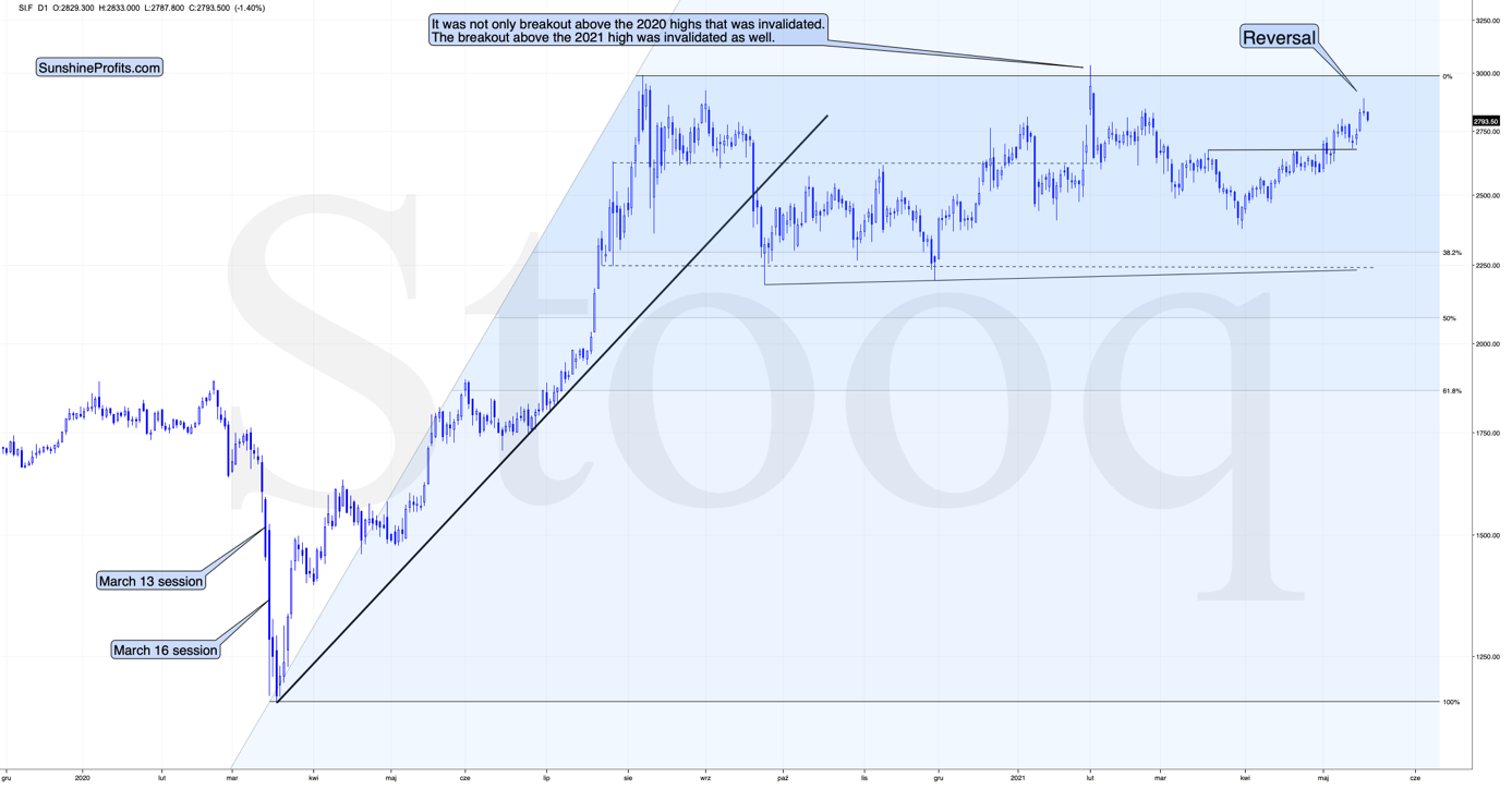
The white metal has clearly reversed yesterday (May 18), and at the moment of writing these words, it’s trading back below its May 10 high and the $28 level. Just like it is the case with gold, it seems to me that the outlook for silver is bearish.
Mining stocks seem to have reversed in a rather odd manner, but in one that’s ultimately in tune with how tops are formed based on technical analysis principles.
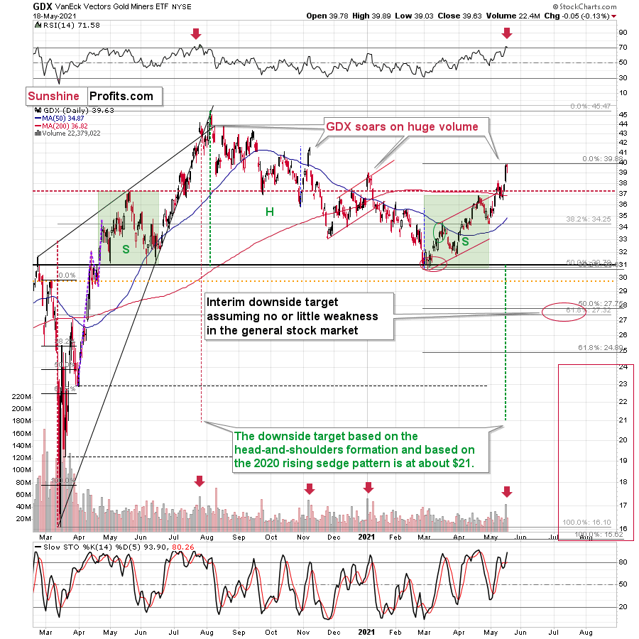
The same (or very similar) opening and closing price levels accompanied by an intraday reversal after an intraday decline – when seen after a short-term rally – are called a “hanging man” candlestick. In short, it’s one of the reversal candlestick patterns. It should have been confirmed by a huge volume – it wasn’t, so it’s not that important, though.
The most important details are still based on the preceding day’s huge volume, the RSI, and the way the GDX ETF topped in the past.
The GDX ETF soared to new highs on volume that was much greater than 40M shares. This happened only three times in the past 12 months. In each of those three cases, it was a major top, or it was very, very close to it.
The RSI just moved above 70, and it happened only twice recently. One time it heralded the 2020 top, and the other time we saw it in late February 2020 – right before a huge slide started.
Consequently, taking all the above into account, it seems to me that the situation in the precious metals market is very bearish right now, as it seems to be either topping or after the top. If I didn’t have a short position in the junior mining stocks right now, I would have opened it today.
Having said that, let’s take a look at the markets from a more fundamental point of view.
Looks Can Be Deceiving
While the Eurozone economy officially slipped back into recession on May 18, the EUR/USD – which accounts for nearly 58% of the movement of the USD Index – continued to ignore the fundamental frailty. And while consensus estimates have clearly turned bullish on the currency pair, the EUR/USD is attempting to sustain a trend that’s never been sustained before. Case in point: while investors celebrate the euro’s recent uprising, the University of Michigan’s Consumer Sentiment Index (CSI) is sending an ominous signal.
Please see below:
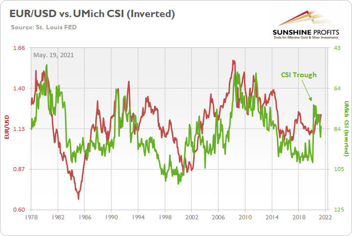
To explain, the red line above tracks the EUR/USD, while the green line above tracks the inverted University of Michigan’s CSI. For context, inverted means that the latter’s scale is flipped upside down and that a rising green line represents a falling CSI, while a falling green line represents a rising CSI. More importantly, though, if you analyze the relationship, you can see that troughs in the CSI nearly always coincide with peaks in the EUR/USD. And while the CSI dipped to 82.8 in May – from 88.3 in April – the index is still well above its April 2020 low of 71.8. Thus, is this time really different?
Moreover, if we zoom in a little closer, the last two times the EUR/USD materially diverged from the CSI, the former ended up suffering two severe drawdowns.
Please see below:
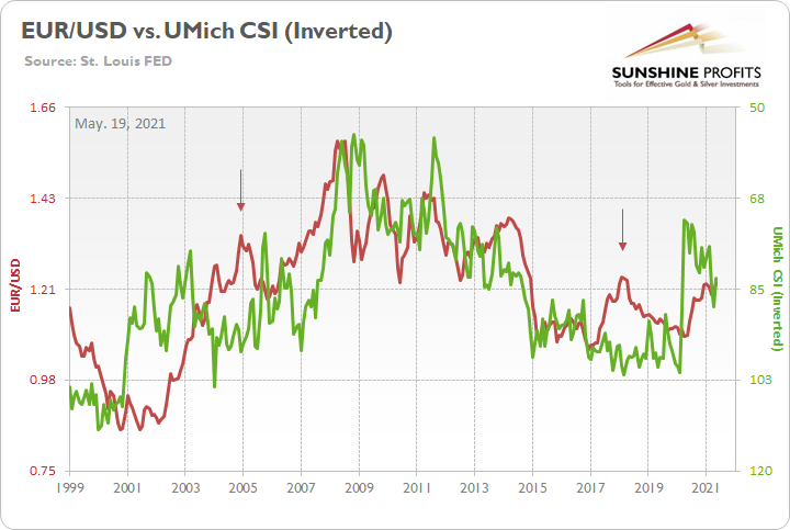
If you analyze the two arrows above, you can see that the EUR/USD and the CSI completely decoupled in 2004 and 2018. However, after the reality finally set in, the EUR/USD plunged. Moreover, if you analyze the price action in 2000, you can see that an identical development – though, with the opposite effect – also occurred. With the CSI moving sharply lower (depicted by the green line rising), the EUR/USD significantly underperformed. However, it was only a matter of time before the red line shot meaningfully higher. Thus, if you analyze the right side of the chart, you can see that both variables have risen simultaneously. And with the EUR/USD fighting a battle that it hasn’t won for 40+ years, should we really expect a different outcome this time around?
Likewise, while investors position themselves for an economic Renaissance across the Eurozone, real (inflation-adjusted) M1 money supply growth is already rolling over. For context, M1 represents the most liquid segments of the money supply, including physical currency, demand deposits, travelers’ checks and other checkable deposits.
Please see below:
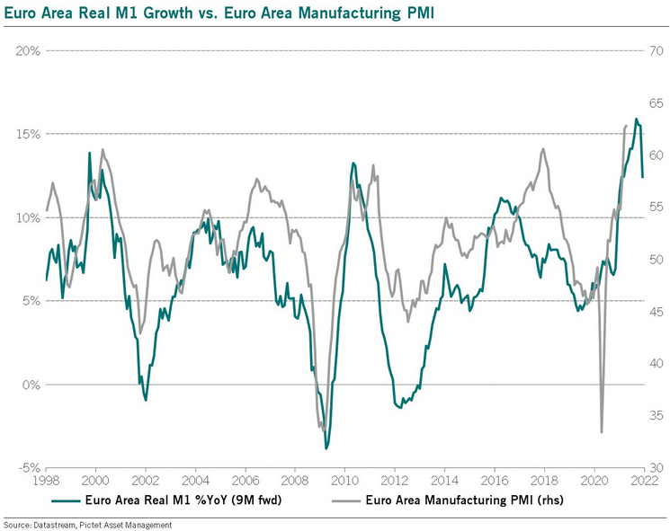
To explain, the blue line above tracks the year-over-year (YoY) percentage change in the Eurozone’s real M1 money supply, while the gray line above tracks the Eurozone’s manufacturing PMI. And while manufacturing optimism has boosted Eurozone growth expectations and the EUR/USD in the process, the liquidity-induced revival may have already run its course. If you analyze the right side of the chart, you can see that the blue line has already peaked and begun moving lower. And with the metric leading by roughly nine months, peak Eurozone economic momentum and a peak EUR/USD should be hallmarks of the second half of 2021.
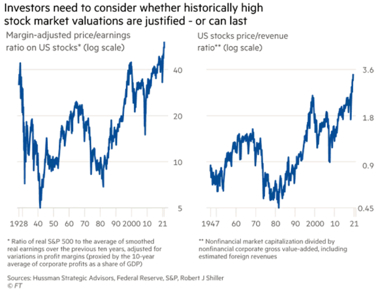
In addition, while the USD Index lies in wait, the basket should also benefit from the re-rating of the general stock market. While the greenback moved lower with the S&P 500 on May 18, a lack of fear among equity investors kept the dollar in the doghouse. However, with liquidity, GDP growth and corporate earnings likely to peak in the second quarter (by the end of June), near-record valuations aren’t as appealing as they once were.
Case in point: with U.S. equities’ margin-adjusted price to earnings (P/E) ratio and nonfinancial companies’ price to sales ratio (P/S) at all-time highs, investors’ margin for error has become quite slim.
Please see below:
The Importance of S&P 500
Likewise, while retail investors’ fury helped ignite a ferocious rally off of the March 2020 bottom, their affection for name-brand stocks pushed index concentration well above its all-time high.
Please see below:
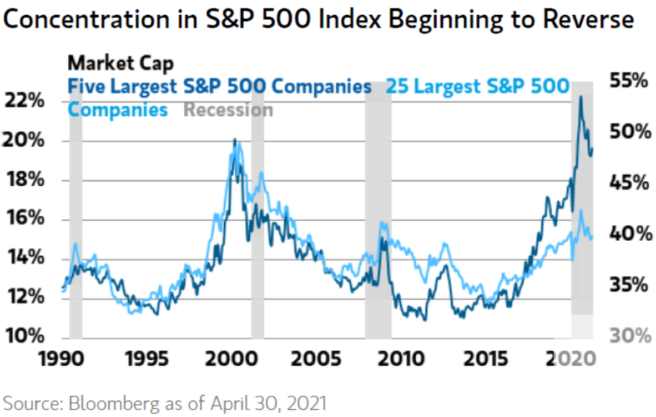
To explain, the dark blue and light blue lines above track the percentage weights of the five largest and the 25 largest companies in the S&P 500 (as of Apr. 30). If you analyze the right side of the chart, you can see that the 2020 high for the dark blue line exceeded the dot-com bubble. And while both lines have moved lower in 2021 – which implies less concentration and more broad-based participation (a positive development) – reversions often make plenty of noise. If you focus your attention near 2000 and 2010, you can see that similar excesses preceded the dot-com bubble and the Global Financial Crisis (GFC). And with today’s valuations on a par with both, history implies that a calm retreat back to the historical average is unlikely to occur.
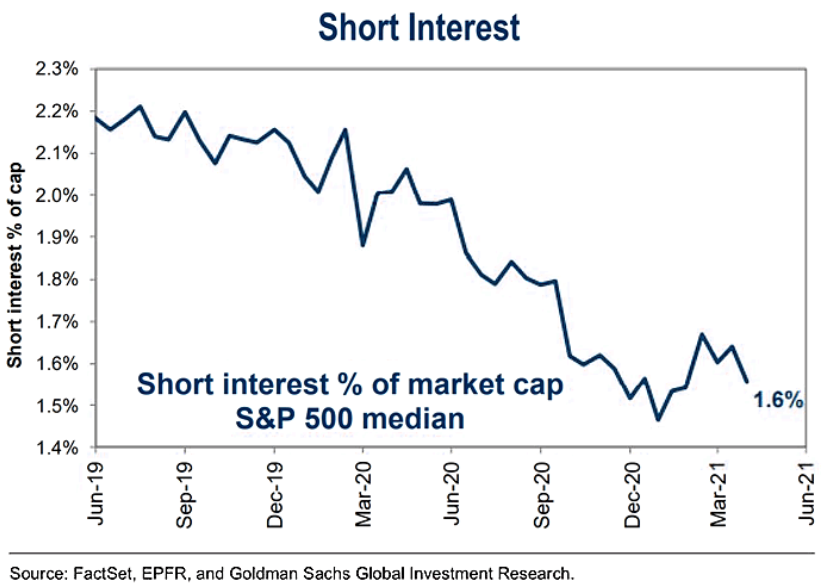
What’s more, with investors overwhelmingly long, there aren’t many buyers left to catch the falling knife. If you analyze the chart below, you can see that short interest as a percentage of the S&P 500’s market cap remains near an all-time low.
The Baffling 10-Year Treasury
If that wasn’t enough, the behavior of the U.S. 10-Year Treasury yield continues to rattle investors. Under normal circumstances, the stock market wouldn’t roll over at the first sign of interest-rate volatility. However, with valuations well above their historical norm, small problems have now become large problems.
Please see below:
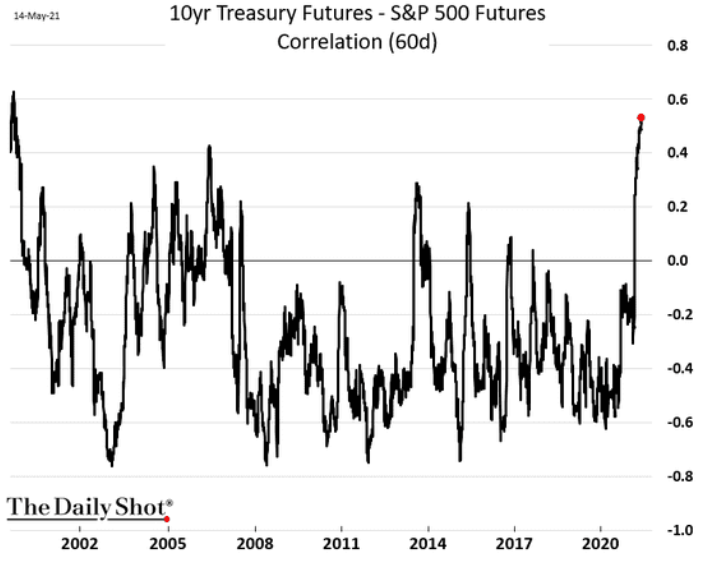
To explain, the black line above tracks the 60-day correlation between the U.S. 10-Year Treasury futures contract and the S&P 500. In a nutshell: when the former is rising (meaning that the U.S. 10-Year Treasury yield is falling), the latter follows suit. Conversely, when the former is falling (meaning that the U.S. 10-Year Treasury yield is rising), the latter follows suit. More importantly, though, if you analyze the right side of the chart, you can see that the tit-for-tat movement is only rivaled by the dot-com bubble (the reading on the far left of the chart). Thus, channeling 2000, investors’ fear of higher interest rates threatens to pop the bubble at any moment.
To that point, technology stocks’ former beauty has now turned into a beast. With inflation surging and investors fearful of rising rates, global fund managers have reduced their technology exposure to a new low.
Please see below:
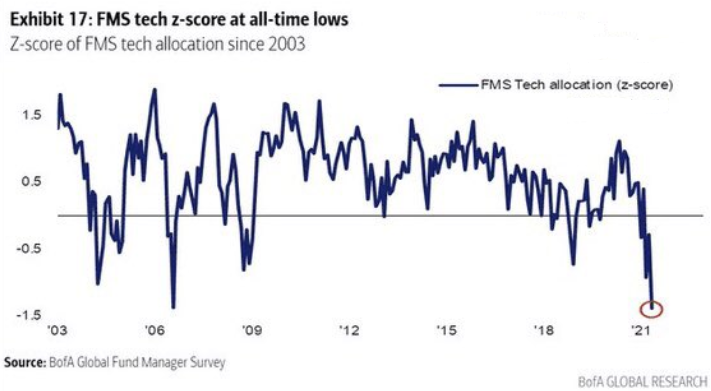
To explain, the blue line above tracks the Z-score of fund managers’ allocation to technology stocks. If you analyze the right side of the chart, you can see that the latest reading is roughly 1.5 standard deviations below the average. Moreover, with the five largest companies in the S&P 500 – Apple, Microsoft, Amazon, Facebook and Alphabet – all technology stocks, when you combine the concentration that I highlighted above with fund managers’ skittish behavior, it paints a rather ominous portrait.
Finally, with U.S. housing starts coming in at 1.569 million (vs. 1.710 million expected) on May 18, April’s print was 9.50% below March’s revised figure.
Please see below:
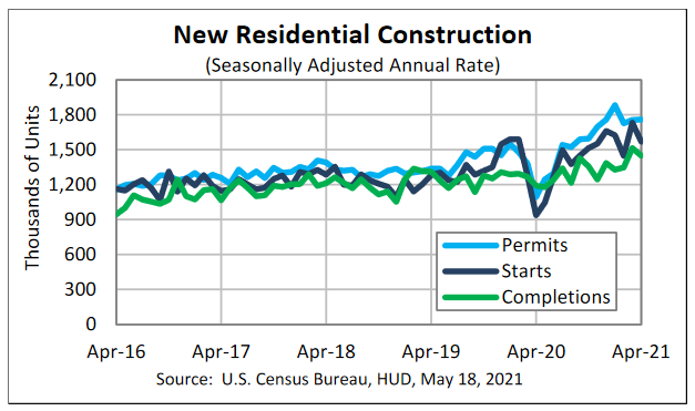
And while the U.S. Census Bureau cautions that it may take “six months … to establish an underlying trend,” U.S. housing starts have been roughly flat for six months. After 1.551 million new homes began construction in November 2020, U.S. housing starts hit a high of 1.733 million in March, before declining to 1.569 million in April.
And why is this so important?
Well, because U.S. housing starts often peak alongside or in advance of the S&P 500. In fact, U.S. housing starts rolled over before the dot-com bust, before the GFC, and before the coronavirus crisis was felt by the S&P 500.
Please see below:
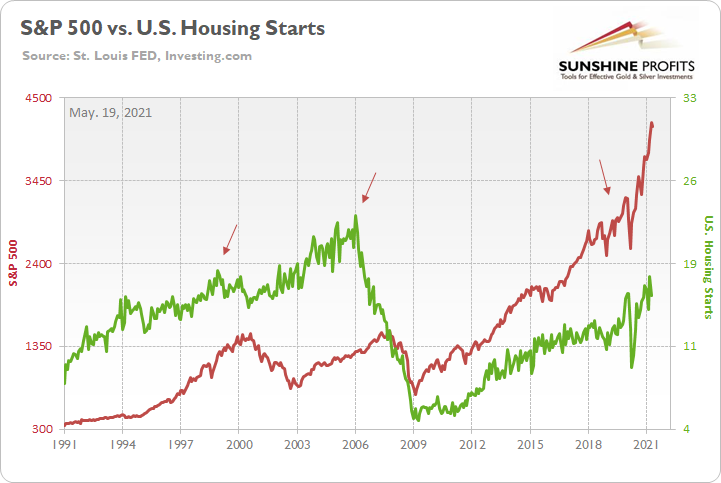
To explain, the red line above tracks the S&P 500, while the green line above tracks U.S. housing starts. If you analyze the arrows, you can see that the three material peaks in the latter occurred before the three material peaks in the former. Thus, if the U.S. housing market has already delivered its final act, the S&P 500 is likely next to follow.
In conclusion, while sentiment adds nails to the USD Index’s coffin, fundamentals signal a medium-term rise from the dead. With the USD Index extremely oversold and the basket only one liquidity event away from salvation, the PMs have enjoyed a near-perfect environment. However, with the macroeconomic data signaling a profound regime change in the coming months, investors that shy away from the U.S. dollar will likely end up its strongest supporters. The bottom line? While short-term strength in the PMs may seem groundbreaking, their gains could come crashing down without warning. And because Mr. Market is unlikely to sound the alarm once the cycle turns, the PMs are unlikely to emerge from the forthcoming wreckage unscathed.
Overview of the Upcoming Part of the Decline
- It seems likely to me that the current corrective upswing is very close to being over, given gold’s similarity to what happened in 2012, USD’s similarity to 2016 and the situation in the general stock market.
- After miners slide once again in a meaningful and volatile way, but silver doesn’t (and it just declines moderately), I plan to switch from short positions in miners to short positions in silver (this could take another 1-2 weeks to materialize). I plan to exit those short positions when gold shows substantial strength relative to the USD Index, while the latter is still rallying. This might take place with gold close to $1,450 - $1,500 and the entire decline (from above $1,700 to about $1,475) would be likely to take place within 1-12 weeks, and I would expect silver to fall hardest in the final part of the move. This moment (when gold performs very strongly against the rallying USD and miners are strong relative to gold – after gold has already declined substantially) is likely to be the best entry point for long-term investments, in my view. This might happen with gold close to $1,475, but it’s too early to say with certainty at this time. In other words, the entire decline could take between 1 and 12 weeks, with silver declines occurring particularly fast in the final 1-2 weeks.
- If gold declines even below $1,500 (say, to ~$1350 or so), then it could take another 10 weeks or so for it to bottom, but this is not what I view as a very likely outcome.
- As a confirmation for the above, I will use the (upcoming or perhaps we have already seen it?) top in the general stock market as the starting point for the three-month countdown. The reason is that after the 1929 top, gold miners declined for about three months after the general stock market started to slide. We also saw some confirmations of this theory based on the analogy to 2008. All in all, the precious metals sector would be likely to bottom about three months after the general stock market tops. If the general stock market puts the final top in the first half of May (which seems quite likely given NASDAQ’s top in late April), then we might expect the precious metals sector to bottom sometime in August.
- The above is based on the information available today, and it might change in the following days/weeks.
Please note that the above timing details are relatively broad and “for general overview only” – so that you know more or less what I think and how volatile I think the moves are likely to be – on an approximate basis. These time targets are not binding or clear enough for me to think that they should be used for purchasing options, warrants or similar instruments.
Summary
To summarize, even though it doesn’t seem to be the case based on this month’s price change in gold, it seems that the yellow metal’s days are numbered. This is based not only on the excessively oversold USD Index and its 2016 self-similar pattern but also on what’s happening in the stock market, silver’s recent outperformance and price levels reached throughout the precious metals sector. From the long-term point of view, the current situation seems similar to what we saw in the second half of 2012, while from the short-term point of view it seems similar to what we saw at the beginning of 2021. While the very near term remains unclear (today’s pre-market reversal might have been the final top, but there’s no certainty there), the outlook for the next several months remains very bearish.
After the sell-off (that takes gold to about $1,350 - $1,500), we expect the precious metals to rally significantly. The final part of the decline might take as little as 1-5 weeks, so it's important to stay alert to any changes.
Most importantly, please stay healthy and safe. We made a lot of money last March and this March, and it seems that we’re about to make much more on the upcoming decline, but you have to be healthy to enjoy the results.
As always, we'll keep you - our subscribers - informed.
To summarize:
Trading capital (supplementary part of the portfolio; our opinion): Full speculative short positions (300% of the full position) in mining stocks are justified from the risk to reward point of view with the following binding exit profit-take price levels:
Mining stocks (price levels for the GDXJ ETF): binding profit-take exit price: $24.12; stop-loss: none (the volatility is too big to justify a stop-loss order in case of this particular trade)
Alternatively, if one seeks leverage, we’re providing the binding profit-take levels for the JDST (2x leveraged) and GDXD (3x leveraged – which is not suggested for most traders/investors due to the significant leverage). The binding profit-take level for the JDST: $39.87; stop-loss for the JDST: none (the volatility is too big to justify a SL order in case of this particular trade); binding profit-take level for the GDXD: $94.87; stop-loss for the GDXD: none (the volatility is too big to justify a SL order in case of this particular trade).
For-your-information targets (our opinion; we continue to think that mining stocks are the preferred way of taking advantage of the upcoming price move, but if for whatever reason one wants / has to use silver or gold for this trade, we are providing the details anyway.):
Silver futures upside profit-take exit price: unclear at this time - initially, it might be a good idea to exit, when gold moves to $1,512.
Gold futures upside profit-take exit price: $1,512.
Long-term capital (core part of the portfolio; our opinion): No positions (in other words: cash
Insurance capital (core part of the portfolio; our opinion): Full position
Whether you already subscribed or not, we encourage you to find out how to make the most of our alerts and read our replies to the most common alert-and-gold-trading-related-questions.
Please note that we describe the situation for the day that the alert is posted in the trading section. In other words, if we are writing about a speculative position, it means that it is up-to-date on the day it was posted. We are also featuring the initial target prices to decide whether keeping a position on a given day is in tune with your approach (some moves are too small for medium-term traders, and some might appear too big for day-traders).
Additionally, you might want to read why our stop-loss orders are usually relatively far from the current price.
Please note that a full position doesn't mean using all of the capital for a given trade. You will find details on our thoughts on gold portfolio structuring in the Key Insights section on our website.
As a reminder - "initial target price" means exactly that - an "initial" one. It's not a price level at which we suggest closing positions. If this becomes the case (like it did in the previous trade), we will refer to these levels as levels of exit orders (exactly as we've done previously). Stop-loss levels, however, are naturally not "initial", but something that, in our opinion, might be entered as an order.
Since it is impossible to synchronize target prices and stop-loss levels for all the ETFs and ETNs with the main markets that we provide these levels for (gold, silver and mining stocks - the GDX ETF), the stop-loss levels and target prices for other ETNs and ETF (among other: UGL, GLL, AGQ, ZSL, NUGT, DUST, JNUG, JDST) are provided as supplementary, and not as "final". This means that if a stop-loss or a target level is reached for any of the "additional instruments" (GLL for instance), but not for the "main instrument" (gold in this case), we will view positions in both gold and GLL as still open and the stop-loss for GLL would have to be moved lower. On the other hand, if gold moves to a stop-loss level but GLL doesn't, then we will view both positions (in gold and GLL) as closed. In other words, since it's not possible to be 100% certain that each related instrument moves to a given level when the underlying instrument does, we can't provide levels that would be binding. The levels that we do provide are our best estimate of the levels that will correspond to the levels in the underlying assets, but it will be the underlying assets that one will need to focus on regarding the signs pointing to closing a given position or keeping it open. We might adjust the levels in the "additional instruments" without adjusting the levels in the "main instruments", which will simply mean that we have improved our estimation of these levels, not that we changed our outlook on the markets. We are already working on a tool that would update these levels daily for the most popular ETFs, ETNs and individual mining stocks.
Our preferred ways to invest in and to trade gold along with the reasoning can be found in the how to buy gold section. Furthermore, our preferred ETFs and ETNs can be found in our Gold & Silver ETF Ranking.
As a reminder, Gold & Silver Trading Alerts are posted before or on each trading day (we usually post them before the opening bell, but we don't promise doing that each day). If there's anything urgent, we will send you an additional small alert before posting the main one.
Thank you.
Przemyslaw Radomski, CFA
Founder, Editor-in-chief

