

Briefly: in our opinion, full (300% of the regular position size) speculative short positions in mining stocks are justified from the risk/reward point of view at the moment of publishing this Alert.
Yesterday (May 11), I wrote that the rally in gold and stocks might have just burnt itself out, and the markets didn’t wait long to agree with me.
Is it 100% certain that the top is in? Absolutely not, as there are no certainties in any market, and sound position management should be utilized at all times. But based on what happened yesterday, and what we saw in today’s pre-market trading, the odds that the corrective top is already in have greatly increased.
Let’s take a look at the charts for details, starting with the stock market.
The Influence of the Stock Market
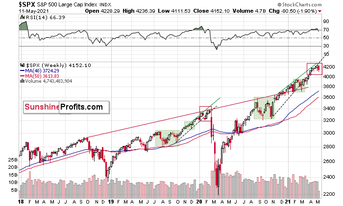
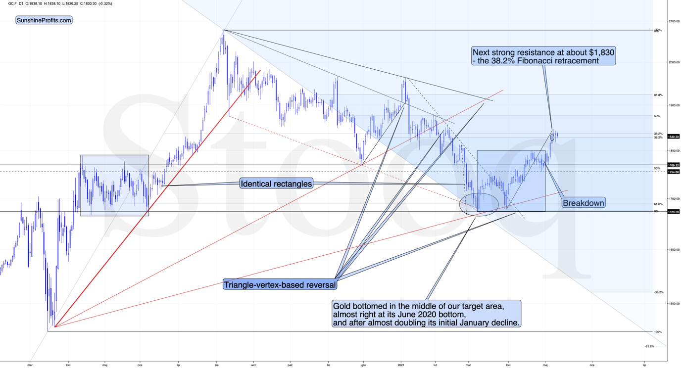
The markets are self-similar (which is another way of saying that they have a fractal nature), which generally means that while the history tends to rhyme, it also tends to rhyme in similar shapes of alike or various sizes.
For example, the rally from 2018–2020 seems very similar to the rally from 2020 to the present.
Both rallies started after a sharp decline, and the first notable correction took the form of back-and-forth trading around the previous high. I marked those situations with green rectangles.
Then the rally continued with relatively small week-to-week volatility. I created rising support lines based on the final low of the broad short-term consolidation and the first notable short-term bottom.
This line was broken, and some back-and-forth trading followed, but it was only about half of the previous correction in terms of price and time.
Then, we saw a sharp rally that then leveled off. And that was the top. The thing that confirmed the top was the visible breakdown below the rising support line right after stocks invalidated a tiny breakout to new highs. That’s what happened in February 2020, and that’s what happened this month.
Combining this with the recent underperformance of the NASDAQ (the previous leader which just moved to new monthly lows) suggests that this might have indeed been the top.
“But why didn’t the mining stocks or silver end yesterday’s session higher given the above, and the fact that stocks declined yesterday? Any tips on that?”
I see two likely reasons.
One is that the stock market reversed before the end of the day, so many investors and traders might have thought that the correction was already over, and they were eager to jump back into the market. This would explain why mining stocks (and GameStop) ended yesterday’s session higher.
The second reason is that miners don’t necessarily slide right after the top. Sometimes, they tend to move back and forth, testing the previous high (on lower volume).
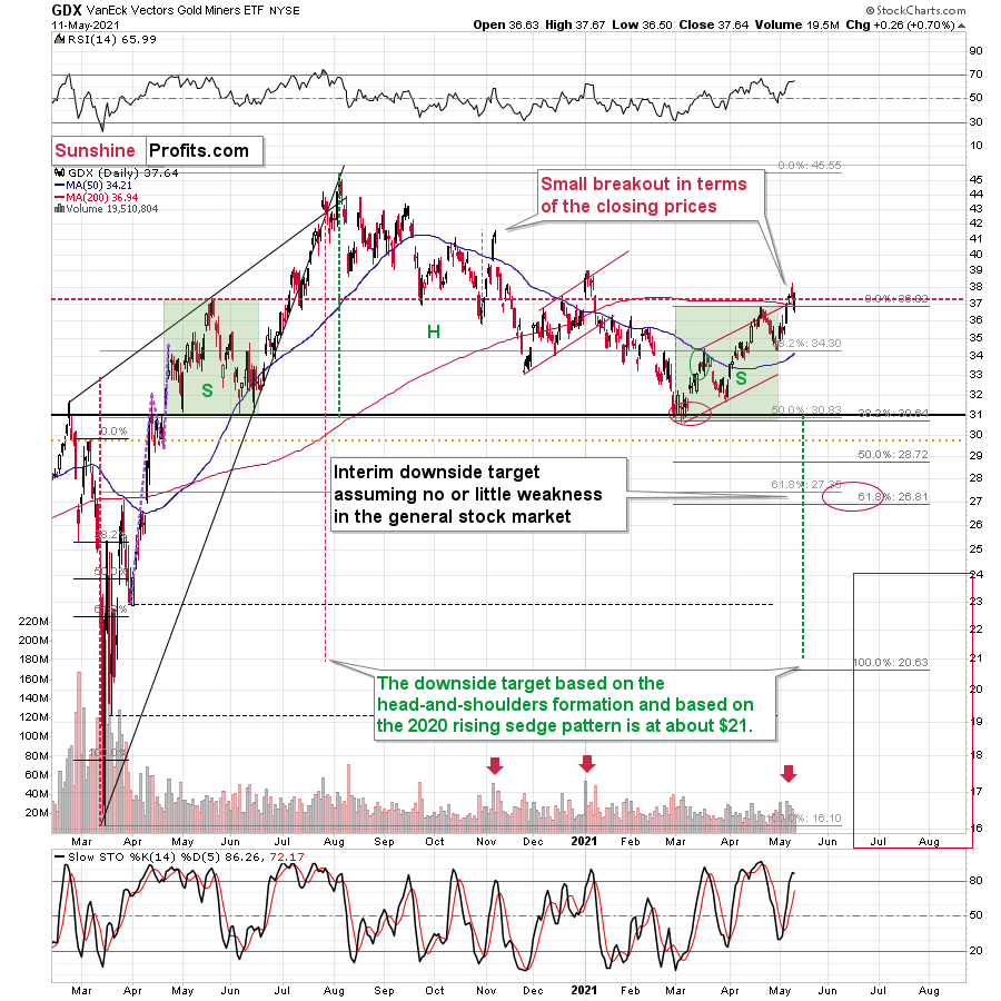
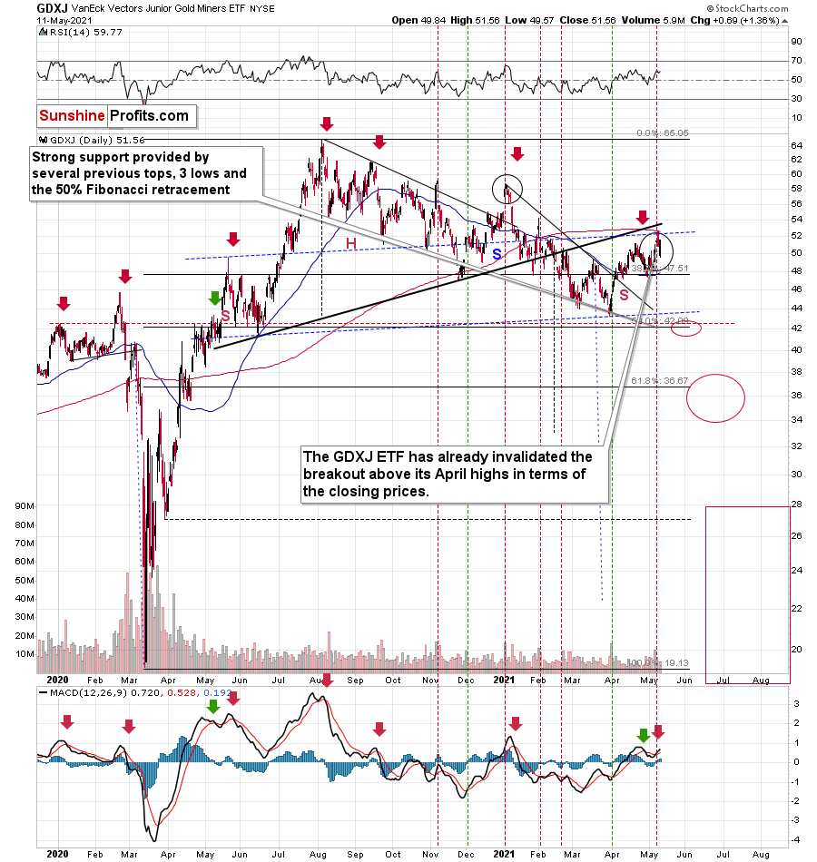
That’s what happened in early January 2021, and that’s what happened yesterday. Did it change anything with regard to the bearish implications of the current situation? Not at all. Besides, the most bearish thing about gold stocks is visible on the long-term HUI Index chart.
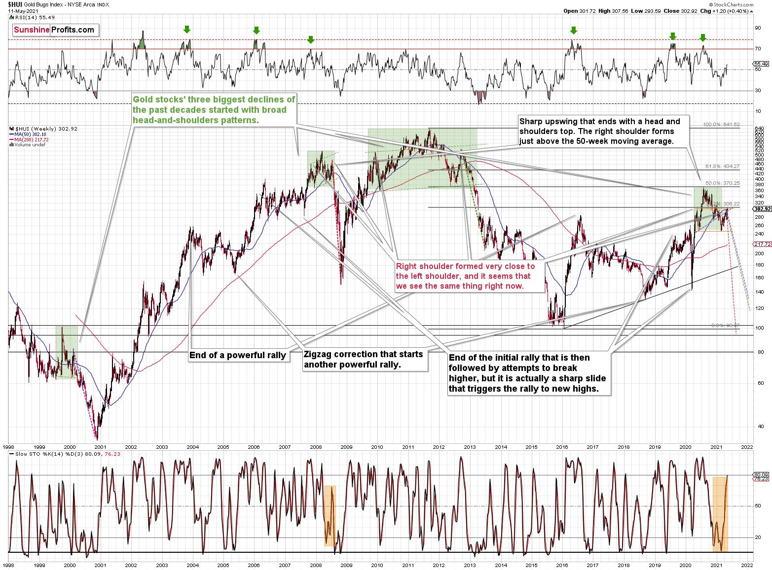
The HUI Index
While corrective short-term upswings within a medium-term downtrend can feel discouraging, it’s important to remember that similar instances occurred in 2008 and 2012. And to some extent also in early 2000.
The head and shoulders patterns from 2007 – 2008 and from 2009 – 2012 had the final tops – the right shoulders – very close to the price where the left shoulders topped. And in early 2020, the left shoulder topped at 303.02.
This week’s intraday high in the HUI Index was 307.56, and yesterday’s closing price (the highest closing price we saw recently) was 302.92. That’s one-tenth of an index point away from the left shoulder’s top; if the HUI slides from here – which seems likely – we’ll have a near-perfectly symmetrical H&S pattern with very bearish implications for the following weeks and months.
I previously wrote that “it wouldn’t be surprising to see a move to about 300 in the HUI Index”. And that’s exactly what we saw. To clarify, one head-and-shoulders pattern – with a rising neckline – was already completed, and one head-and-shoulders pattern – with a horizontal neckline – is being completed, but we’ll have the confirmation once miners break to new yearly lows.
Consequently, the recent rally is not a game-changer, but rather a part of a long-term pattern that’s not visible when one focuses on the short term only.
Let’s get back to the broader tops for a while.
Gold, Its Battles and the War
In August 2020 – at the top – gold’s peak was forming over approximately 4 trading days, and it plunged on the fifth day.
At the beginning of this year – at the yearly top – gold was peaking for 2-4 trading days (depending on how one treats the initial daily decline that was then followed by a small corrective upswing) and it plunged on the fifth day.
Today is the fourth day of what is likely to become a topping pattern (we will know for sure only after gold slides). Consequently, the fact that gold didn’t slide profoundly yesterday (except for the intraday decline) is not odd at all. Conversely, it’s in tune with the previous topping patterns.
Moreover, please note that since gold is repeating (to some extent) its 2011-2013 performance (actually, more of an average of gold’s trading performances from the above period and from 2008), it’s particularly normal for it to form a broader top here.
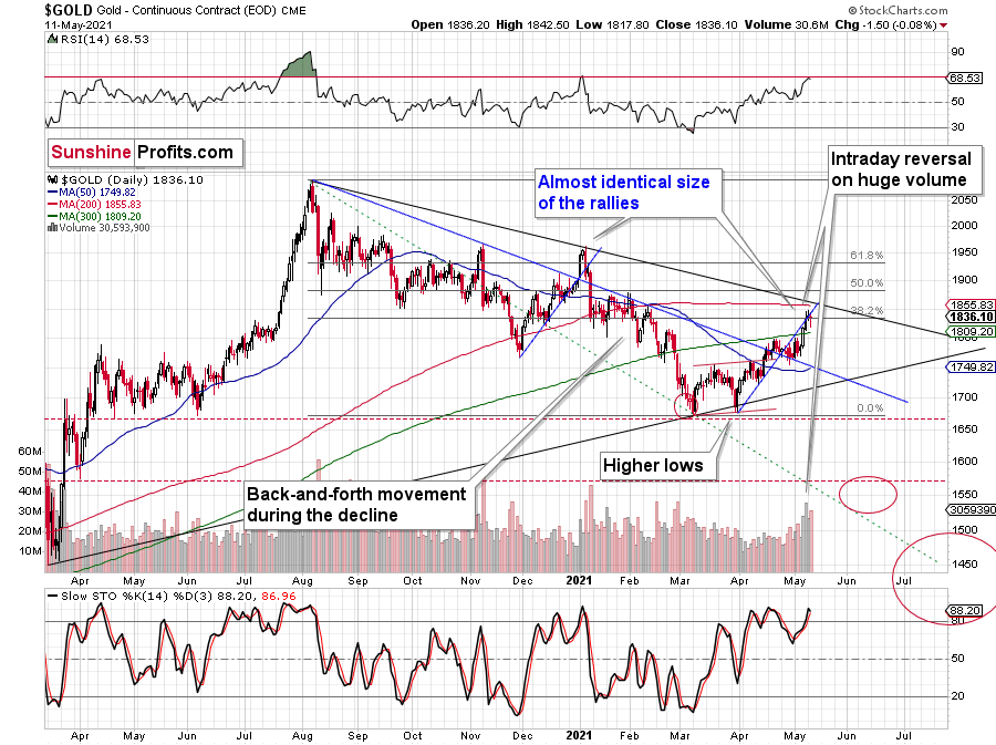
I previously wrote that the situation is similar to 2008 in a way and to 2012-2013 in a slightly different way. When I’m looking at it now, it’s quite normal that the gold market is mixing both previous performances. But it’s always easy to see things with the benefit of hindsight.
In 2008, before the final slide, we had clearly lower lows as well as lower highs. During the 2012-2013 consolidation we had a more or less horizontal pattern that was then followed by the final slide. Right now, we have something in between – we have lower highs and lower lows, but it’s not as clear as it was in 2008.
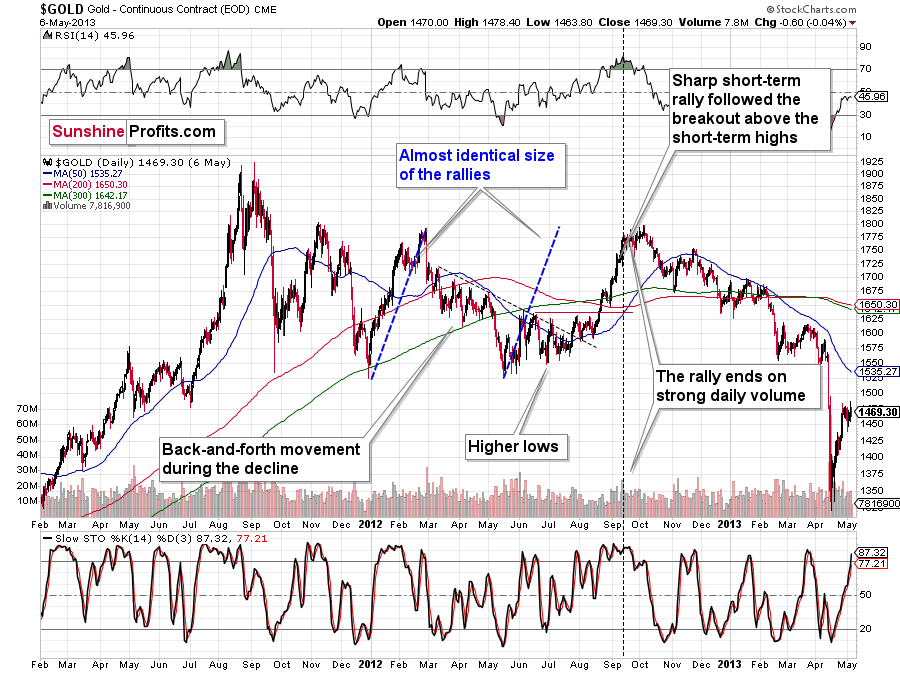
Back in 2008, it took gold 29 weeks to move from the initial (March 2008) top to the final (October 2008) top.
Back in 2011-2013, it took gold 55 weeks to move from the initial (September 2011) top to the final (October 2013) top.
The arithmetic average of the above is 42 weeks, and last week was the 39th week after the August 2020 top. If gold stops here or shortly, it will be almost right in the middle of the similarity between both periods.
Consequently, the way gold and mining stocks are performing now is perfectly normal for a medium-term decline – it’s not a game-changer. The medium-term forecast for gold remains bearish.
What’s Going on With the Euro?
Let’s get back to the issue of head and shoulders patterns – this time in the context of the currency markets.
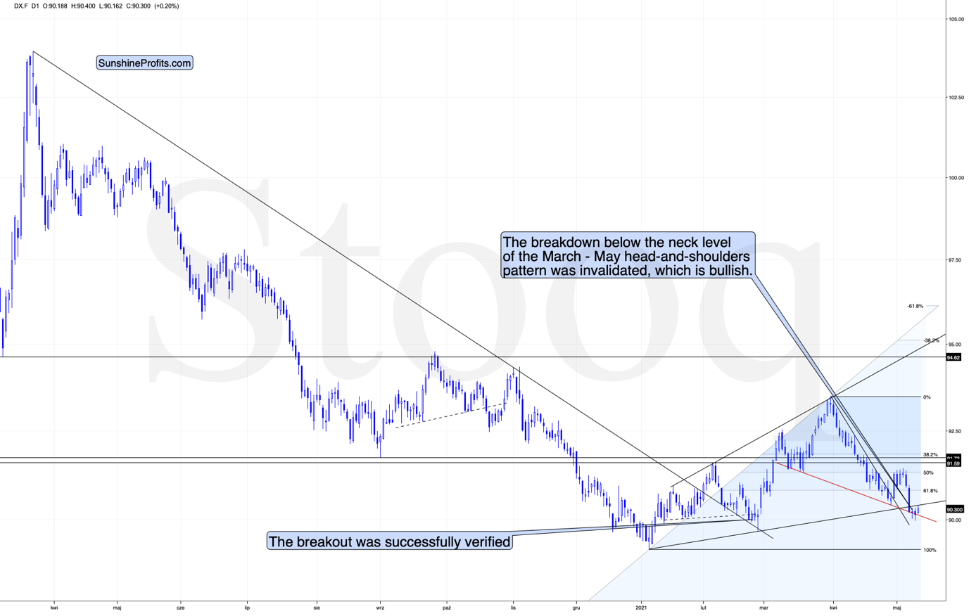
What one might not notice at first sight, but what is very important, the USD Index just invalidated a small breakdown below the head-and-shoulders pattern, and it rallied back above its neckline. This is a classic buy sign and a sign that the breakdown below the rising support line will be invalidated shortly.
There’s also a potential head and shoulders pattern present in the euro.
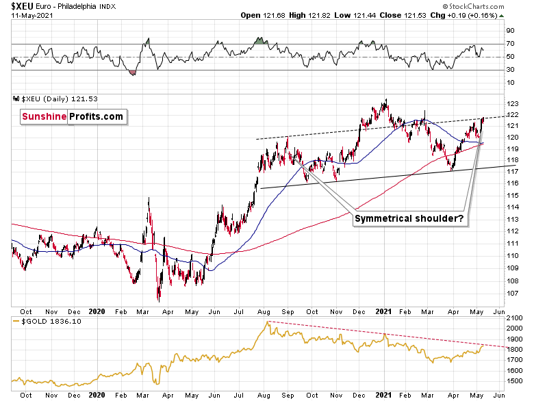
The European currency moved to the line that’s parallel to the rising neck level of the potential head and shoulders pattern. If it now declines and moves to new yearly lows, the situation will be extremely bearish – what is more, not only for the euro but also for the precious metals market, which tends to move in tune with the dollar competitor.
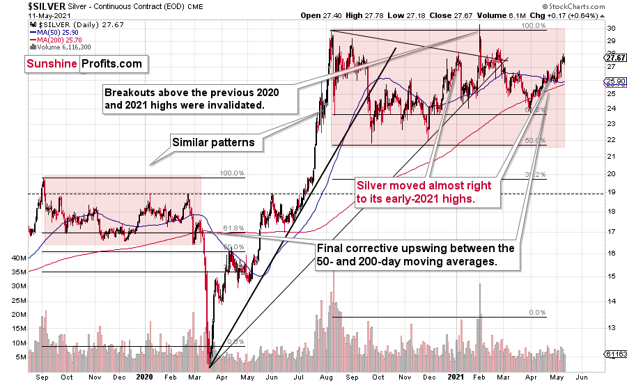
As far as silver is concerned, there’s not much new to report – my forecast for silver hasn’t become more bullish recently. The white metal continues to repeat its 2019-2020 performance, and it’s after a short-term period of outperformance relative to gold, which indicates major tops. Unlike gold or mining stocks, silver recently moved to its early-2021 high.
Interestingly, please note that silver is repeating more or less the same pattern from the past that the general stock market does. And we all know what happened to silver (and mining stocks) when the general stock market plunged in March 2020.
Having said that, let’s take a look at the markets from the fundamental point of view.
Tick-Tock
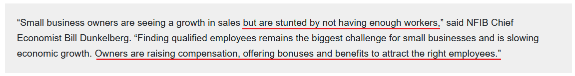
With the U.S. Bureau of Labor Statistics (BLS) releasing the Consumer Price Index (CPI) on May 12, all eyes will be glued to the April print. And with the NFIB Small Business Optimism Index (released on May 11) likely providing a taste of things to come, NFIB Chief Economist Bill Dunkelberg had this to say about the current state of affairs:
 Source: NFIB
On May 11, I wrote:
Average hourly earnings (released on May 7) for production and nonsupervisory employees within the leisure and hospitality industries have completely skyrocketed. For context, professionals within these industries include (but are not limited to) warehouse workers, drivers, beauticians, restaurant workers, nurses, social workers, lawyers and accountants.
Please see below:
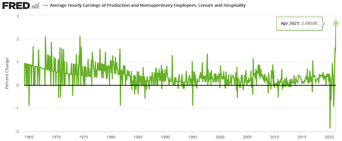
To explain, the green line above tracks the month-over-month (MoM) percentage change in the average hourly earnings for employees within the above-mentioned industries (remember, no base effect here). More importantly, though, if you analyze the right side of the chart, you can see that the current reading is unlike anything that we’ve ever witnessed before. As a result, with stagflation heating up, the U.S. government continues to test bond investors’ tolerance of negative real returns.
Likewise, while “a net 31% (seasonally adjusted) [of NFIB respondents] reported raising compensation” and “a net 20% plan to raise compensation in the next three months,” how do small businesses plan to overcome the rise in labor costs?
 Source: NFIB
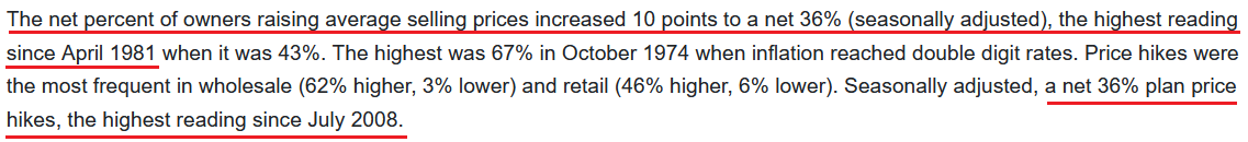
Even more revealing, with rampant speculation in the commodities market causing a spike in small businesses’ input costs, “a net 36%” of NFIB respondents raised their average selling prices, while “a net 36%” are planning to do so in the future. Moreover, both readings were the highest since April 1981 and July 2008 respectively.
Please see below:
 Source: NFIB
And while the inflationary impact of small businesses’ pricing behavior may not show up right away (the CPI is a lagging indicator), the U.S. Federal Reserve’s (FED) own 2021 Small Business Credit Survey revealed that companies with “fewer than 500 employees […] represent 99.7% of all employer establishments in the United States.” Thus, with 99.7% a rather material percentage, inflation could get spicy over the coming months. Case in point: notice a strong correlation between small businesses’ pricing behavior and the U.S. core CPI?
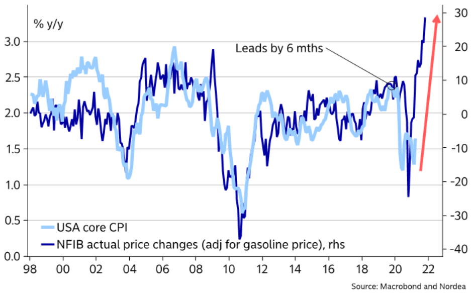
To explain, the dark blue line above tracks the year-over-year (YoY) percentage change in small businesses’ average selling prices, while the light blue line above tracks the (YoY) percentage change in the U.S. core CPI. If you analyze the right side of the chart, you can see the material divergence. And while the YoY percentage change in small businesses’ average selling prices often leads by six months – meaning that the U.S. core CPI often lags by six months – as mentioned above, things could get spicy over the medium term.
As for the stock market, investors’ suddenly shaken confidence has the bulls desperately searching for the next upside catalyst. But with two central banks already reducing liquidity, businesses being squeezed at the margins and surging inflation continuing to bait the bond market, equities’ outlook isn’t as sanguine as it used to be.
To explain, I wrote on May 11:
The markets are self-similar (which is another way of saying that they have a fractal nature), which generally means that while the history tends to rhyme, it also tends to rhyme in similar shapes of alike or various sizes. While it could be the case that we’ll see another short-term move higher (as we did previously after pullbacks), it seems to me that this might have been the final top for months to come.
And why could this be the final nail in equities’ coffin?
S&P 500 Is Likely Next in Line
Well, not only is the S&P 500’s 2018-2020 analogue unfolding in real time, but fundamental headwinds are also signaling severe trouble ahead. Case in point: while investors hope that massive monetary and fiscal stimulus will translate into sustained economic growth, the U.S. economy’s best days are almost in the rear-view.
Please see below:
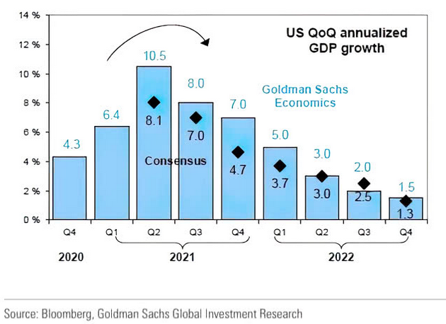
To explain, while Goldman Sachs’ economists expect U.S. economic growth to peak in the second quarter (which means by the end of June), economists’ consensus estimates have also moved in lockstep. And with peak liquidity and peak economic growth likely to coincide with peak corporate earnings, equity valuations remain a long way from fair value.
Moreover, with the IHS Markit iBoxx USD Liquid Investment Grade Index – which is a balanced representation of the investment-grade corporate bond market – already rolling over, the S&P 500 is likely next in line.
Please see below:
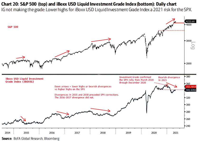
To explain, the black line at the top half of the chart above tracks the S&P 500, while the back line at the bottom half of the chart above tracks the IHS Markit iBoxx USD Liquid Investment Grade Index. If you analyze the arrows at the top and the bottom, they depict the bearish divergence between the former and the latter. For context, a bearish divergence means that when the S&P 500 makes a new high, the IHS Markit iBoxx USD Liquid Investment Grade Index doesn’t follow suit. More importantly, though, while the reading in 2016-2017 did not result in a drawdown of the S&P 500, similar readings in 2015 and 2018 did. And if you analyze the right side of the chart, you can see that the fourth alarm bell has already been rung.
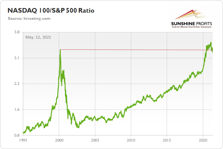
If that wasn’t enough, excessive concentration in Big Tech could eventually lead to a material unwind. While I’ve highlighted the NASDAQ Composite’s drastic underperformance of late, the NASDAQ 100/S&P 500 ratio still remains well above its historical norm. And while the ratio has already begun to roll over, once momentum manifests itself, history implies that it’s a long way down before support finally materializes.
To that point, with Big Tech commanding an even larger share of the S&P 500 than during the dot-com bubble, the five largest companies in the S&P 500 – Apple, Microsoft, Amazon, Facebook and Alphabet – are at risk of a significant rerating.
Please see below:
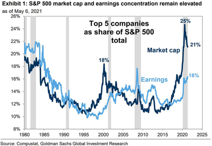
To explain, the dark blue line above tracks the five largest companies’ percentage share of the S&P 500, while the light blue line above tracks the companies’ percentage contribution to S&P 500 earnings. And while no one is debating the quality of Big Techs’ business models, valuation does matter. If you analyze the middle of the chart, you can see that a material gap between the two lines preceded the dot-com bubble. And if you analyze the right side of the chart, the gap between the two lines – though it has come down – still remains nearly as wide as it was during the peak in 2000. The bottom line? With inflation surging and the NASDAQ Composite extremely allergic to higher interest rates, it will only take one spark to start a fire.
The Importance of the KCFSI
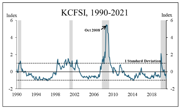
What’s more, there are plenty of other warning signs lurking in the background. Case in point: on May 11, the Kansas City FED released its monthly Kansas City Financial Stress Index (KCFSI). And with the index falling from – 0.33 in March to – 0.76 in April, “a negative value signifies that financial stress is below the long-run average.” Translation? All is well in the U.S. financial system.
Please see below:
 Source: Kansas City FED
To explain, the blue line above tracks the KCFSI, while the dotted horizontal back lines represent a plus-minus 1 standard deviation from the average. If you analyze the right side of the chart, you can see that financial stress is approaching historical lows. However, with abnormally low readings often serving as equities’ canary in the coal mine, prior milestones have been more ominous than prosperous.
Please see below:
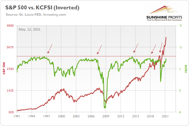
To explain, the red line above tracks the S&P 500, while the green line above tracks the inverted KCFSI. For context, inverted means that the latter’s scale is flipped upside down and that a rising green line represents a falling KCFSI, while a falling green line represents a rising KCFSI.
If you analyze the arrows above, you can see that the KCFSI always troughs before the S&P 500 peaks. And if you focus on the right side of the chart, the green line is fast approaching the – 1 standard deviation mark (the horizontal red line). The bottom line? With the KCFSI running out of real estate and a reversal likely to elicit a similar response from the S&P 500, the clock is already ticking.
Finally, I mentioned previously that enhanced unemployment benefits have eliminated the incentive for U.S. citizens to work. And with the BLS revealing on May 11 that the “number of job openings reached a series high of 8.1 million on the last business day of March” – coming in ahead of the 7.5 million expected – businesses are having a tough time finding labor (which matches what the NFIB survey revealed above). More importantly, though, with the S&P 500 moving in lockstep with the BLS job openings, a peak in the latter (deduced from the record print) may signal a peak in the former.
Please see below:
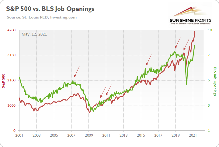
To explain, the red line above tracks the S&P 500, while the green line above tracks the BLS job openings. If you analyze the right side of the chart, you can see that the green line is at an all-time high. Moreover, peaks in the BLS job openings (the arrows above) occur either in advance or alongside peaks in the S&P 500. Thus, with some states already eliminating enhanced unemployment benefits (to encourage citizens to reenter the workforce), once these job openings begin to fill, the postings will come down and the green line will fall. And if history is any indication, the S&P 500 will likely follow suit.
In conclusion, the watch continues as we wait for the next meaningful market catalyst. But with technicals and fundamentals signaling a significant pullback of the S&P 500, the PMs are unlikely to sidestep the forthcoming volatility. Moreover, with the U.S. 10-Year Treasury yield barely flinching – in fact, it actually rose by 0.61% on May 11 – inflation jitters have the bond market completely on edge. And while the USD Index is the last piece of the bearish puzzle, a profound drawdown of U.S. equities will have investors signing a vastly different tune. As a result, with the PMs firmly in the line of fire, they’ll likely remain the walking wounded over the medium term.
Overview of the Upcoming Part of the Decline
- It seems likely to me that the current corrective upswing is close to being over if it isn’t already, given gold’s intraday reversal on Friday and gold’s lack of strength after it.
- After miners slide once again in a meaningful and volatile way, but silver doesn’t (and it just declines moderately), I plan to switch from short positions in miners to short positions in silver (this could take another 1-2 weeks to materialize). I plan to exit those short positions when gold shows substantial strength relative to the USD Index, while the latter is still rallying. This might take place with gold close to $1,450 - $1,500 and the entire decline (from above $1,700 to about $1,475) would be likely to take place within 1-12 weeks, and I would expect silver to fall hardest in the final part of the move. This moment (when gold performs very strongly against the rallying USD and miners are strong relative to gold – after gold has already declined substantially) is likely to be the best entry point for long-term investments, in my view. This might happen with gold close to $1,475, but it’s too early to say with certainty at this time. In other words, the entire decline could take between 1 and 12 weeks, with silver declines occurring particularly fast in the final 1-2 weeks.
- If gold declines even below $1,500 (say, to ~$1350 or so), then it could take another 10 weeks or so for it to bottom, but this is not what I view as a very likely outcome.
- As a confirmation for the above, I will use the (upcoming or perhaps we have already seen it?) top in the general stock market as the starting point for the three-month countdown. The reason is that after the 1929 top, gold miners declined for about three months after the general stock market started to slide. We also saw some confirmations of this theory based on the analogy to 2008. All in all, the precious metals sector would be likely to bottom about three months after the general stock market tops. If the general stock market puts the final top in the first half of May (which seems quite likely given NASDAQ’s top in late April), then we might expect the precious metals sector to bottom sometime in August.
- The above is based on the information available today, and it might change in the following days/weeks.
Please note that the above timing details are relatively broad and “for general overview only” – so that you know more or less what I think and how volatile I think the moves are likely to be – on an approximate basis. These time targets are not binding or clear enough for me to think that they should be used for purchasing options, warrants or similar instruments.
Letters to the Editor
Q: Dear Mr. Radomski,
I have been impressed with your economic and precious metals analysis for some time now. Your detailed charts and interpretation of complex relationships are often illuminating.
I'm hoping that Gold will correct significantly before the major upswing expected when the dollar rolls over. I've got money on the line.
But I'm starting to worry that it won't. Precious metals react to political issues as well as economic ones.
In my opinion, the USA is getting more and more polarized, not less, at this time. People are leaving many of our larger cities where police are vilified and crime rises… Government debt and the money supply are expanding dangerously.
Most people are not seriously worried yet. But it only takes a small percentage of people seeing the writing on the wall to keep the price of gold up.
I agree that you need to keep politics out of your advisories. But I think there is something real going on here. I would really appreciate a response from you.
Thanks,
A: I think there is indeed something real going on here, and there are many troubling issues that the world has to deal with right now (both: politically and economically), and many of them are likely to contribute to gold’s rally well above the $3,000 level but… It doesn’t mean that it’s going to happen soon. And it doesn’t mean that gold is going to rally without plunging first. All the above are the reasons that are likely to drive the gold price in the long run. The factors that are driving gold’s performance in the short run, and to a significant extent in the medium run, are of an emotional-technical nature. Consequently, the things that I’m discussing while analyzing charts are very likely to take precedence over the fundamental issues as far as the next several months are concerned, and then – once the decline materializes – gold can resume its very long-term bull market with full force.
Q: Hello Przemyslaw,
So, who has the big thumb on the scale holding the precious metals prices down? I'd like to know because this is NOT normal. Gold and silver should be popping upward.
I sincerely hope some of these short sellers get caught on the wrong side of the trade. I better hope it's not you.
A: Thanks, well, it’s quite a broad debate in many areas of life as to what is “normal” and what isn’t. And if it’s the same thing as “average”. Does “average” or “logical” equal “normal”? Or perhaps “truth”? But what definition of truth one should take into account – the more commonly used one presented by Aristotle or some other version?
The markets ultimately move because someone is buying while someone else is selling. People are buying and selling because of the logical/fundamental factors, as well as based on emotional/technical reasons. If one focuses on just the fundamental factors, then whatever is based on emotionality, as well as the necessary periods where markets cool down and take breathers, will seem not normal or even based on manipulation.
What I’m seeing here is something that’s indeed normal, but only when one looks at the market from a very long-term point of view. Did the world suddenly become a much better, calmer, peaceful place in 2008 or between 2011 and 2013? Or were the debts erased? And so on? Absolutely not. The fundamental situation remained favorable, and yet, gold plunged violently in both cases. And the same is likely in my view to happen soon.
Q: I have a question. I have 500 shares of GOLD on a cost basis of 21.35. The stock is at 23.92.
Is it smart, given your continued forecast for a near-term decline in gold and PM’s to sell covered calls on the position and get some money? If so, again, timing, June, July calls?
The goal is to take in some income while gold and pm stocks decline and keep the stock for the longer-term reversal that will eventually come based on inflation and money pruning.
Thoughts? Obviously, I understand you are not a financial advisor, but I already have these long-term positions, and I don’t want to sell them because I understand there is long-term value. I’m wondering, what are your thoughts on this strategy?
A: The below is not a reply directed to the person, who wrote this question, but my general thoughts on that matter.
In short, it’s one of the strategies to prepare for the upcoming slide in the PMs. I personally prefer directional trades, but I realized that I’m willing and able to take on more risk than most investors can or would like to. So, while I can’t say whether it’s “smart” or not because that would depend on each person and their own approach and risk tolerance levels, I can say that in general, in my view, this is “not unreasonable”.
Q: The dollar can’t get a break. I agree with your analysis, but it seems like every step forward by the dollar results in an equal step back. What tactical event/trigger is going to be required to get the dollar moving consistently north? Do you have any historical examples of such triggers?
A: The USD Index is extremely oversold on a medium-term basis, and the CoT reports show that as well. Consequently, what needs to happen right now is… Nothing. Just like a coiled spring doesn’t need anything to expand itself, or a pendulum that’s (almost?) all the way to one side of its swinging range. There are myriads of things that could speed this up, though, like some hawkish remarks from the Fed or Treasury. Or even more dovish action from the ECB. I don’t expect the latter to actually say anything dovish; in my view, they will most likely just proceed with dovish actions while keeping their rhetoric moderate or even hawkish – in order to prevent the euro’s demise. The markets have stopped buying these comments at face value and we can see that – in general – through rising long-term rates. The Fed-speak is all about low rates and the expectations of higher rates are becoming more common regardless.
Q: How low do you think silver will go and by when?
A: When: when the rest of the precious metals sector slides, meaning mostly gold and mining stocks. I expect silver to catch up big-time at the end of the slide, while it’s likely to lag during the decline initially. That’s what silver tends to do (historically). So, perhaps sometime in August.
How low: Very difficult to tell due to the volatility that silver exhibits near the bottom. I’m not even ruling out a slide below the 2020 lows. But silver doesn’t have to slide as well. We will have a clearer picture once we move closer to the final bottom, and we are already after miners’ big plunge and silver is starting to catch up.
With silver, it's like driving – you can only see a relatively small part of the entire road in front of you, but you know that if you stay alert, you will know when you run into an obstacle early enough to react, even if it’s many miles/kilometers ahead of you.
Q: In short, if you opt for an inflationary period... assets are revalued... and a weaker dollar may be the solution... although, you have to see how foreigners are, I guess they are nervous. I understand that the rises in stock exchanges will compensate... and gold will rise... I will appreciate your opinion… and thank you, as always.
A: Thank you for the question. While I’m not sure if I understand what the emphasis is on, and what I should elaborate on, I’ll do my best.
The inflationary pressures are not confined to the U.S. Many countries and monetary areas will try to lower their currency’s value in order to help their exports. Based on that, gold (and the rest of the precious metals market) is likely to soar. However, in the near term, the USD might still be viewed as the best-looking of all the ugly sisters (fiat currencies). It’s extremely oversold from the medium-term point of view, so it’s likely to increase its value. If the stock markets around the world plunge, the USD is likely to soar, just like it did in 2008 and 2020.
One more thing with regard to 2008.
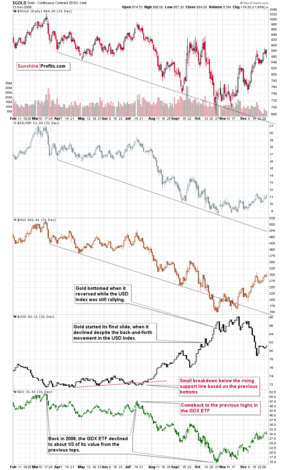
Please note (in the lower part of the above chart) that back then, the final huge slide in the mining stocks started when the GDX ETF moved back to its previous highs, while the USD Index moved a bit below its rising support line based on the previous tops. That’s exactly what happened recently as well. The final bottom in the GDX ETF formed about 3 months later at about 1/3 of its starting price. This week’s high was $38.22 and 1/3 thereof would be $12.74. While I don’t want to say that we will definitely see the GDX ETF as low as that, it’s not something that would be out of the ordinary, given the analogy to 2008. Now you see why the large bottoming target on the GDX ETF chart with the lower border in the $15s might actually be conservative… As always, I’ll keep you – my subscribers – updated.
Summary
To summarize, even though it doesn’t seem to be the case based on last week’s price change in gold, it seems that the yellow metal’s days are numbered. This is based not only on how miners responded to gold’s bullish lead (barely), but also based on silver’s outperformance and price levels reached throughout the precious metals sector. From the long-term point of view, the current situation seems similar to what we saw in the second half of 2012, while from the short-term point of view it seems similar to what we saw at the beginning of 2021. While the very near term remains unclear (Friday’s reversal might have been the final top, but there’s no certainty there), the outlook for the next several months remains very bearish.
After the sell-off (that takes gold to about $1,350 - $1,500), we expect the precious metals to rally significantly. The final part of the decline might take as little as 1-5 weeks, so it's important to stay alert to any changes.
Most importantly, please stay healthy and safe. We made a lot of money last March and this March, and it seems that we’re about to make much more on the upcoming decline, but you have to be healthy to enjoy the results.
As always, we'll keep you - our subscribers - informed.
By the way, we’re currently providing you with a possibility to extend your subscription by a year, two years or even three years with a special 20% discount. This discount can be applied right away, without the need to wait for your next renewal – if you choose to secure your premium access and complete the payment upfront. The boring time in the PMs is definitely over and the time to pay close attention to the market is here. Naturally, it’s your capital, and the choice is up to you, but it seems that it might be a good idea to secure more premium access now, while saving 20% at the same time. Our support team will be happy to assist you in the above-described upgrade at preferential terms – if you’d like to proceed, please contact us.
To summarize:
Trading capital (supplementary part of the portfolio; our opinion): Full speculative short positions (300% of the full position) in mining stocks are justified from the risk to reward point of view with the following binding exit profit-take price levels:
Mining stocks (price levels for the GDXJ ETF): binding profit-take exit price: $24.12; stop-loss: none (the volatility is too big to justify a stop-loss order in case of this particular trade)
Alternatively, if one seeks leverage, we’re providing the binding profit-take levels for the JDST (2x leveraged) and GDXD (3x leveraged – which is not suggested for most traders/investors due to the significant leverage). The binding profit-take level for the JDST: $39.87; stop-loss for the JDST: none (the volatility is too big to justify a SL order in case of this particular trade); binding profit-take level for the GDXD: $94.87; stop-loss for the GDXD: none (the volatility is too big to justify a SL order in case of this particular trade).
For-your-information targets (our opinion; we continue to think that mining stocks are the preferred way of taking advantage of the upcoming price move, but if for whatever reason one wants / has to use silver or gold for this trade, we are providing the details anyway.):
Silver futures upside profit-take exit price: unclear at this time - initially, it might be a good idea to exit, when gold moves to $1,512.
Gold futures upside profit-take exit price: $1,512.
Long-term capital (core part of the portfolio; our opinion): No positions (in other words: cash
Insurance capital (core part of the portfolio; our opinion): Full position
Whether you already subscribed or not, we encourage you to find out how to make the most of our alerts and read our replies to the most common alert-and-gold-trading-related-questions.
Please note that we describe the situation for the day that the alert is posted in the trading section. In other words, if we are writing about a speculative position, it means that it is up-to-date on the day it was posted. We are also featuring the initial target prices to decide whether keeping a position on a given day is in tune with your approach (some moves are too small for medium-term traders, and some might appear too big for day-traders).
Additionally, you might want to read why our stop-loss orders are usually relatively far from the current price.
Please note that a full position doesn't mean using all of the capital for a given trade. You will find details on our thoughts on gold portfolio structuring in the Key Insights section on our website.
As a reminder - "initial target price" means exactly that - an "initial" one. It's not a price level at which we suggest closing positions. If this becomes the case (like it did in the previous trade), we will refer to these levels as levels of exit orders (exactly as we've done previously). Stop-loss levels, however, are naturally not "initial", but something that, in our opinion, might be entered as an order.
Since it is impossible to synchronize target prices and stop-loss levels for all the ETFs and ETNs with the main markets that we provide these levels for (gold, silver and mining stocks - the GDX ETF), the stop-loss levels and target prices for other ETNs and ETF (among other: UGL, GLL, AGQ, ZSL, NUGT, DUST, JNUG, JDST) are provided as supplementary, and not as "final". This means that if a stop-loss or a target level is reached for any of the "additional instruments" (GLL for instance), but not for the "main instrument" (gold in this case), we will view positions in both gold and GLL as still open and the stop-loss for GLL would have to be moved lower. On the other hand, if gold moves to a stop-loss level but GLL doesn't, then we will view both positions (in gold and GLL) as closed. In other words, since it's not possible to be 100% certain that each related instrument moves to a given level when the underlying instrument does, we can't provide levels that would be binding. The levels that we do provide are our best estimate of the levels that will correspond to the levels in the underlying assets, but it will be the underlying assets that one will need to focus on regarding the signs pointing to closing a given position or keeping it open. We might adjust the levels in the "additional instruments" without adjusting the levels in the "main instruments", which will simply mean that we have improved our estimation of these levels, not that we changed our outlook on the markets. We are already working on a tool that would update these levels daily for the most popular ETFs, ETNs and individual mining stocks.
Our preferred ways to invest in and to trade gold along with the reasoning can be found in the how to buy gold section. Furthermore, our preferred ETFs and ETNs can be found in our Gold & Silver ETF Ranking.
As a reminder, Gold & Silver Trading Alerts are posted before or on each trading day (we usually post them before the opening bell, but we don't promise doing that each day). If there's anything urgent, we will send you an additional small alert before posting the main one.
Thank you.
Przemyslaw Radomski, CFA
Founder, Editor-in-chief

