
tools spotlight

-
Gold Outlook: The Inflation Chasm Between Europe and the US
October 7, 2021, 9:09 AMWith inflation more than two times lower in Europe than in the US, the divergence between the economic zones deepens day by day. How might it impact gold?
QE Infinity
While I’ve warned on several occasions that the Fed and the ECB are worlds apart, the latter now wants to provide more QE once it concludes QE. To explain, with the ECB’s PEPP program set to expire at the end of March 2022, the central bank is increasingly worried about a bond market sell-off. And with sluggish Eurozone growth, exorbitant sovereign debt and a lack of fiscal impulse increasing the ECB’s anxiety, officials are studying “alternatives” to suppress interest rates in the Eurozone’s most debt-ridden countries.
Please see below:
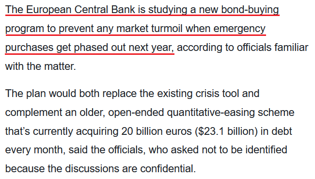 Source: Bloomberg
For context, I’ve been warning for months that the ECB would disappoint euro bulls.
I wrote on Apr. 27:
Recent whispers of the ECB tapering its bond-buying program are extremely premature. With the European economy still drastically underperforming the U.S., it’s actually more likely that the ECB increases the pace of its bond-buying program. Case in point: while the EUR/USD ignores the reality, last week’s PEPP purchases (€22.2 billion) by the ECB were the highest since June 2020. Moreover, since its March meeting, the ECB has increased its average daily PEPP purchases per week from €2.90 billion to €3.60 billion.
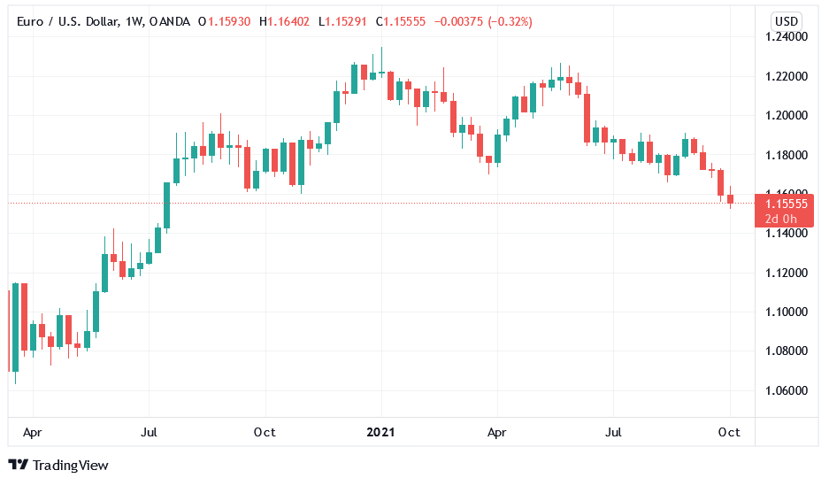
To that point, with reality in fashion once again, the EUR/USD closed at a new 2021 low on Oct. 6 and sunk to its lowest level since July 2020. For context, the EUR/USD accounts for nearly 58% of the movement of the USD Index, and the performance of the currency pair is material.
Please see below:
Furthermore, with the Fed closing in on a taper announcement and the ECB searching for new ways to extend QE, the divergence is profoundly bullish for the U.S. dollar. To explain, rising Eurozone inflation (which pales in comparison to the U.S.) underwrote misguided optimism for a hawkish shift. However, ECB President Christine Lagarde reiterated her dovish stance on Oct. 5, saying that “we should not overreact to supply shortages or rising energy prices, as our monetary policy cannot directly affect those phenomena.”
The Inflation Divergence Is Profound
Moreover, while the Eurozone headline Harmonized Index of Consumer Prices (HICP) increased by 3.4% year-over-year (YoY) in September (released on Oct. 1), the U.S. headline HICP surged by 6.77% in its latest print (released on Aug. 18). Even more revealing, if you exclude the inflationary impacts of food and energy prices, the Eurozone core HICP only increased by 1.9% YoY in September.
Please see below:
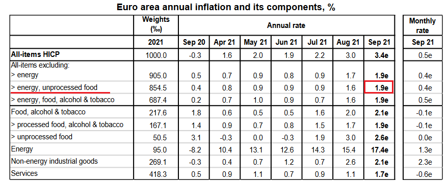 Source: Eurostat
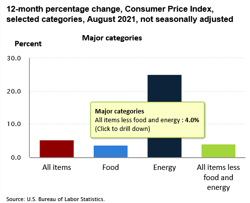
In stark contrast, the U.S. core Consumer Price Index (CPI) – which also excludes the inflationary impacts of food and energy prices and the latest release is more current than the U.S. HICP – increased by 4% YoY in August (released on Sep. 14).
Please see below:
In addition, while the Eurozone headline HICP at 3.4% YoY is still higher than the ECB’s 2% annual inflation target, it’s important to keep things in perspective. For example, since Lagarde has been leading the ECB, the Eurozone headline and core HICP have trended 0.8% and 1.7% below her annual targets. What’s more, when indexed from the beginning of 2012, Eurozone headline HICP is still 8% below the ECB’s 2% annual inflation trend.
Please see below:
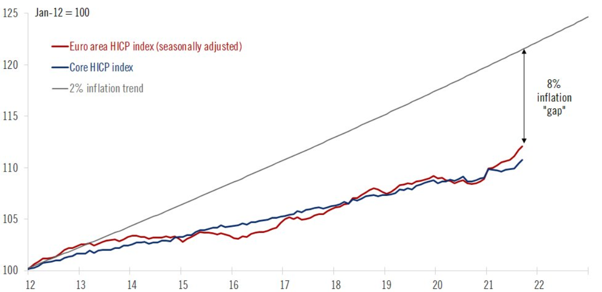 Source: Frederik Ducrozet
To explain, the red and blue lines above track the index levels of the Eurozone headline and core HICP, while the gray line above tracks the index level assuming the ECB has been meeting its 2% annual inflation target since the beginning of 2012. If you analyze the material gap on the right side of the chart, you can see that the ECB is far from achieving its objectives.
Likewise, if we zoom in on the roughly two-year chart, both the Eurozone headline and core HICP are still tracking materially below the ECB’s annual inflation targets.
Please see below:
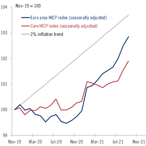 Source: Frederik Ducrozet
Cyclical Slowdown Ahead?
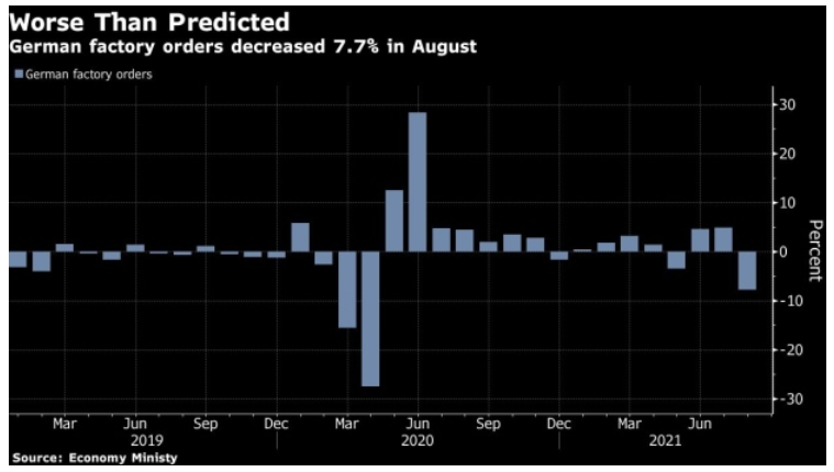
Furthermore, while the ECB studies “alternatives” to prevent interest rates from spiking in high-debt countries like Greece, Italy and Portugal, Germany – Europe’s largest economy – has suffered a significant economic setback. To explain, Germany is a manufacturing-heavy economy and exports are an important component of German GDP. However, with German factory orders plunging by 7.7% on Oct. 6 – with foreign demand down by 9.5% and domestic demand down by 5.2% – it was the sharpest month-over-month (MoM) decline since April 2020. For context, the consensus estimate was for a 2.1% decline.
Please see below:
Piecing it all together, with interest rate anxiety merging with a cyclical slowdown in Europe, Danske Bank expects lower-for-longer ECB policy to contribute to a lower-for-longer EUR/USD. The Danish bank’s strategists told clients:
“There has been no shortage of calls for EUR/USD to 1.30, of pieces written on a regime shift having happened in fiscal policy, oversubscription to social bonds and much more. However, narratives change…. Stagflation, rapid cyclical slowdown, rising interest rates and a correction in valuations may prove to be a very negative capital shock to the euro area and its asset prices. We target 1.13 in spot EUR/USD in the next year but if stagflation, cyclical slowdown and rising rates become dominant themes, then there seem to be clear downside to such estimate.”
Adding to the bearish euro thesis, with U.S. nonfarm payrolls scheduled for release on Oct. 8, a strong print could usher the EUR/USD even lower. For example, ADP’s private payrolls came in at 568,000 vs. 428,000 expected on Oct. 6. And though ADP’s data is an extremely poor predictor of U.S. nonfarm payrolls, Nela Richardson, chief economist at ADP, provided the following context:
“The labor market recovery continues to make progress despite a marked slowdown from the 748,000 job pace in the second quarter. Leisure and hospitality remains one of the biggest beneficiaries to the recovery, yet hiring is still heavily impacted by the trajectory of the pandemic, especially for small firms. Current bottlenecks in hiring should fade as the health conditions tied to the COVID-19 variant continue to improve, setting the stage for solid job gains in the coming months.”
And expecting those “solid job gains” to materialize sooner rather than later, J.P. Morgan strategists told clients that “we are looking for a 575,000 gain in jobs [on Oct. 8]. The driver for an above-consensus forecast is the expected rebound in the leisure and hospitality sectors.” For context, the consensus estimate is for 500,000 jobs added.
The bottom line? While the EUR/USD is finally starting to reflect fundamental reality, more downside should materialize in the coming months. With the Fed accelerating its hawkish rhetoric (and Chairman Jerome Powell’s shift the most noteworthy), the ECB is headed in the opposite direction. And while I’ve been warning for months that the Eurozone’s economic recovery is much more fragile than the U.S.’, the seeds are now sown for a profound divergence in central bank policy.
Moreover, while U.S. nonfarm payrolls may or may not accelerate the timeline on Oct. 8, it’s important to remember that the medium-term implications remain intact: the Fed should taper at a much faster pace than the ECB and the liquidity drain should pressure the FED/ECB ratio and the EUR/USD in the coming months. More importantly, though, with the EUR/USD’s pain the USD Index’s gain, the latter’s strong negative correlation with gold, silver and mining stocks should result in further downside for the PMs over the medium term.
In conclusion, the PMs were mixed once again on Oct. 6, though silver, was the worst performer of the bunch. Moreover, with the USD Index recapturing 94, and the front-end of the U.S. yield curve rallying as well, a recovering U.S. labor market should add more upward momentum to the PMs’ fundamental villains. As a result, the precious metals’ current consolidations will likely give way to sharp drawdowns in the coming months.
Thank you for reading our free analysis today. Please note that the above is just a small fraction of the full analyses that our subscribers enjoy on a regular basis. They include multiple premium details such as the interim targets for gold and silver that could be reached in the next few weeks. We invite you to subscribe now and read today’s issue right away.
Sincerely,
Przemyslaw Radomski, CFA
Founder, Editor-in-chief -
Fed: Singing the Inflation Blues
October 6, 2021, 10:04 AMWith inflation surging and Powell praying for a “transitory” miracle, the troubles confronting the Fed are accelerating, not decelerating.
“I got the blues, Got those inflation blues”
-- B.B. King
To explain, I wrote on Sep. 24:
I’ve warned on several occasions that the only way for the Fed to control inflation is to increase the value of the U.S. dollar and decrease the value of commodities. However, with commodities’ fervor accelerating on Sep. 23 – a day when the USD Index declined – the price action should concern Chairman Jerome Powell. As a result, FOMC participants’ 2022 inflation forecast is likely wishful thinking and they may find that a faster liquidity drain (which is bullish for the U.S. dollar) is their only option to control the pricing pressures.
To that point, with energy prices increasingly unhinged and WTI on pace for its seventh-straight week of weekly gains, the S&P Goldman Sachs Commodity Index (S&P GSCI) has been on fire recently. For context, the S&P GSCI contains 24 commodities from all sectors: six energy products, five industrial metals, eight agricultural products, three livestock products and two precious metals. However, energy accounts for roughly 54% of the index’s movement.
Please see below:
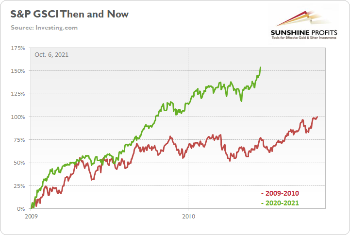
To explain, the green line above tracks the S&P GSCI’s current rally off of the bottom, while the red line above tracks the S&P GSCI’s rally off of the bottom in 2009-2010 (following the global financial crisis). If you analyze the middle of the chart, you can see that the S&P GSCI has completely run away from the 2009-2010 analogue. For context, at this point in 2009-2010, the S&P GSCI had rallied by 77% off of the bottom. However, as of the Oct. 5 close, the S&P GSCI has now rallied by 154% off of the April 2020 bottom.
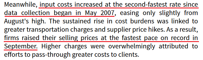
Furthermore, with higher energy and materials prices exacerbating the cost-push inflationary spiral, signs of stress remain abundant. For example, IHS Markit released its U.S. Manufacturing PMI on Oct. 1. And while the headline index declined from 61.1 in August to 60.7 in September, Chris Williamson, Chief Business Economist at IHS Markit, said that “prices charged for those goods leaving the factory gate also surged higher again in September, rising at a rate exceeding anything seen in nearly 15 years of survey history.”
Please see below:
 Source: IHS Markit
Singing a similar tune, the Institute for Supply Management (ISI) released its Services PMI on Oct. 5. For context, the U.S. service sector has suffered the brunt of the Delta variant’s wrath. And though pricing pressures aren’t as feverish as they are in the U.S. manufacturing sector, the report revealed that inflation increased at a “faster” pace and that “all 18 services industries reported an increase in prices paid during the month of September.”
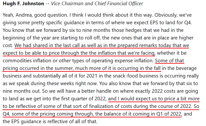
In addition, PepsiCo released its third-quarter earnings on Oct. 5. And after beating analysts’ estimates on both the top and bottom lines, the beverage giant raised its full-year guidance. However, while demand remains resilient, 11.6% year-over-year (YoY) consolidated net revenue growth coincided with a 3% decline in diluted earnings per share (EPS).
Despite that though, CEO Ramon Laguarta told analysts during the company’s Q3 earnings call that “what we're seeing across the world is much lower elasticity on the pricing that we've seen historically,” and as a result, price hikes are scheduled to commence in the coming months. For context, ‘elasticity’ attempts to quantify the change in demand that results from a change in price. And with CFO Hugh Johnston expecting charge inflation to outpace cost inflation going forward, “lower elasticity” is materially problematic for the Fed.
Please see below:
 Source: PepsiCo/The Motley Fool
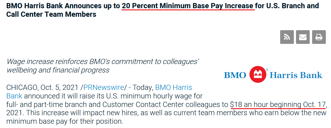
If that wasn’t enough, BMO Harris Bank announced on Oct. 5 that it will increase its minimum hourly wage for all branch and call-center employees by a “20 Percent Minimum” to $18 an hour. For context, BMO Harris Bank has more than 500 branches and more than 12,000 employees in the U.S.
Please see below:
 Source: BMO Harris Bank
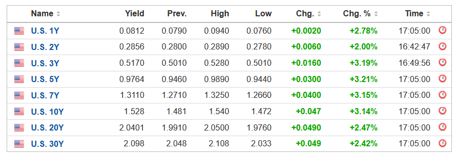
More importantly, though, with Powell’s inflationary conundrum helping swing the double-edged sword that’s been fundamentally slashing the PMs, the USD Index rallied by 0.20% on Oct. 5 and U.S. Treasury yields strengthened across the board.
Please see below:
 Source: Investing.com
As it relates to the dollar story, the USD Index’s fundamental strength is underwritten by the ‘dollar smile.’ To explain, when the U.S. economy is trudging along, the U.S. dollar tends to underperform. However, when the U.S. economy craters and a safe-haven bid emerges, the U.S. dollar often outperforms. Conversely (and similarly), when the U.S. economy is booming and higher interest rates materialize, the U.S. dollar also outperforms.
By the way, I’ve discussed the situation in the USD Index at length in today’s video.

For context, I indicated on Sep. 22:
The USD Index and U.S. Treasury yields can move in the same direction or forge different paths. However, while a stock market crash is likely the most bearish fundamental outcome that could confront the PMs, scenario #2 is next in line. When U.S. economic strength provides a fundamental thesis for both the USD Index and U.S. Treasury yields to rise (along with real interest rates), the double-edged sword often leaves the PMs with deep lacerations.
To that point, with a mix of both playing out in the present, Sebastien Galy, senior macro strategist at Nordea, signalled clients that the dollar smile remains alive and well:
“The dollar should continue to be supported by expectations of an eventual series of Fed rate hikes and the value of the dollar as a safe haven against a potential equity correction…. The downward trend in EUR/USD is likely to return in the coming weeks and months, suggesting EUR/USD around the 1.10 handle and potentially below that before moving higher.”
As for the yield story, Lindsey Piegza, chief economist at Stifel Financial, told clients that “markets appear increasingly jittery as the realization of a higher sustained level of inflation eventually resulting in a higher level of rates appears to be finally sinking in.... Against the backdrop of elevated inflation and rapidly rising energy costs, many market participants are skeptical the FOMC will be able to maintain these low rates for another year, let alone two.”
The bottom line? With inflation running away from the Fed, suppressing commodity prices (by strengthening the U.S. dollar and/or raising interest rates) is the only way to calm the inflationary pressures. If not, surging commodity prices will likely further suppress consumer confidence, upend corporate profit margins, culminate with demand destruction and the stock market should suffer mightily (which is also bullish for the U.S. dollar). As a result, with Powell creating an even larger inflationary wildfire the longer he waits, the PMs could confront immense volatility over the medium term.
In conclusion, the PMs were mixed on Oct. 5, though trouble looms large in the months ahead. With the USD Index and U.S. Treasury yields ripe for upward re-ratings, the Fed’s “transitory” narrative hasn’t aged well. And with the PMs’ main villains doing a lot of their fundamental damage since Powell turned hawkish, more upside catalysts should emerge over the medium term. As a result, the PMs’ outlook remains profoundly bearish over the next few months.
Thank you for reading our free analysis today. Please note that the above is just a small fraction of the full analyses that our subscribers enjoy on a regular basis. They include multiple premium details such as the interim targets for gold and silver that could be reached in the next few weeks. We invite you to subscribe now and read today’s issue right away.
Sincerely,
Przemyslaw Radomski, CFA
Founder, Editor-in-chief -
Gold Overview: A Whole Lot of Nothing
October 5, 2021, 9:25 AMIf there was a way to describe the last days on the precious metals market, it would be “a whole lot of nothing”. More or less, that’s what happened.
Let’s start with the nothing that happened in the USD Index.
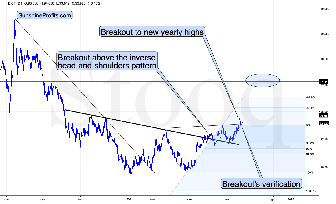
The USDX moved lower very recently, but it changed absolutely nothing. The USD Index moved back to:
- Its previous highs
- Its previous rising resistance line based on the previous highs, which it has verified as support
- The rising dashed support line based on the recent lows.
Moving to a rising support line and verifying a previous breakdown is not a bearish development. Conversely, it’s something quite common during an uptrend.
I previously mentioned that the USD Index is likely to consolidate either below or above its horizontal resistance at about 94.5, and what we’re seeing right now is a consolidation below this level. Once this level is taken out, the USDX could actually rally further without a bigger post-breakout consolidation. Consequently, I’m removing the short-term target area around this level as it no longer seems likely that the USDX will form a meaningful top there.
The next “nothing” comes from the gold market.
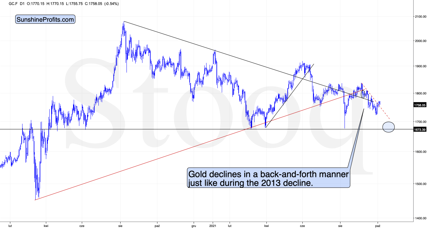
There’s a local breakout above the dashed resistance line, but it’s so much in tune with what happened in 2013 that it’s difficult to view it as bullish.
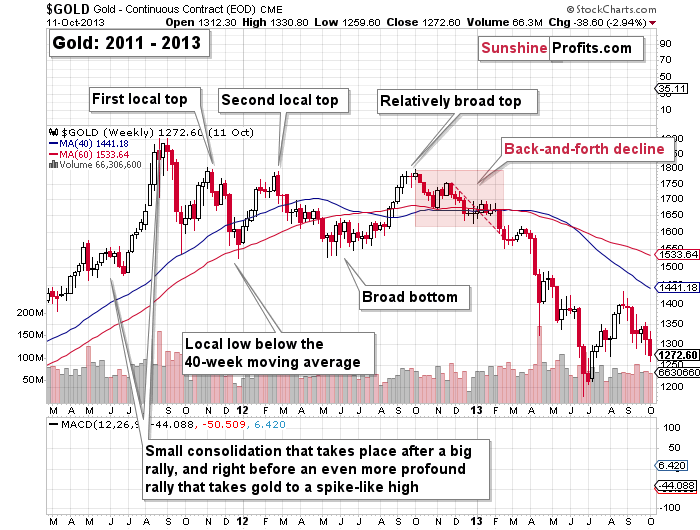
Likewise, the very short-term breakout that we just saw is similar to what we saw in… early 2013. Remember the similarity to early 2013 that I described on multiple markets? It’s not just gold, it’s the HUI Index, the HUI to gold ratio, and even the 10-year yield.
The small breakout above the red dashed line in early 2013 didn’t take the yellow metal much higher. Gold only finished moving back and forth before sliding to previous important lows, and that was just the beginning of a much bigger move lower.
The very bearish analogy remains intact, so what changed? Nothing.
Any Impact On Miners?
Additionally, please have a look at how weak the mining stocks’ reaction to gold’s upswing was.
Even without looking at exact percentage gains, it’s clear that the GDX has barely moved back up. It didn’t even manage to move back above $30 in yesterday’s intraday trading.
Juniors (GDXJ) confirm seniors’ (GDX) relative weakness, and they both suggest that the precious metals sector is likely to move lower in the following weeks.
Thank you for reading our free analysis today. Please note that the above is just a small fraction of the full analyses that our subscribers enjoy on a regular basis. They include multiple premium details such as the interim targets for gold and silver that could be reached in the next few weeks. We invite you to subscribe now and read today’s issue right away.
Sincerely,
Przemyslaw Radomski, CFA
Founder, Editor-in-chief -
Editorial Correction to Position Error on Oct. 4
October 4, 2021, 5:23 PMAvailable to premium subscribers only.
-
Miners: What the HUI Index Says About the Medium-Term
October 4, 2021, 9:57 AMIgnoring cycles, trends, and technical patterns is a potential recipe for disaster. The HUI index can tell us a lot about the near future.
After the HUI Index sunk to a new 2021 low last week, the index further validated the breakdown below the neckline of its bearish head & shoulders pattern. For context, H&S’ breakdowns have coincided with the largest declines in the HUI Index in recent decades. And while gold’s triangle-vertex-based reversal point may stop the bleeding in the very short-term, the HUI Index’s wounds are far from healed. To explain, I’ve been sounding the alarm on the HUI Index since the New Year (the index has declined by more than 29% YTD) and I wrote the following on Sep. 13:
The HUI Index plunged by nearly 6% last week, and the reversal of the previous corrective upswing mirrors its behavior from 2013. In addition, with its stochastic oscillator and its RSI (Relative Strength Index) also a spitting image, an ominous re-enactment of 2013 implies significantly lower prices over the medium term.
Please see below:
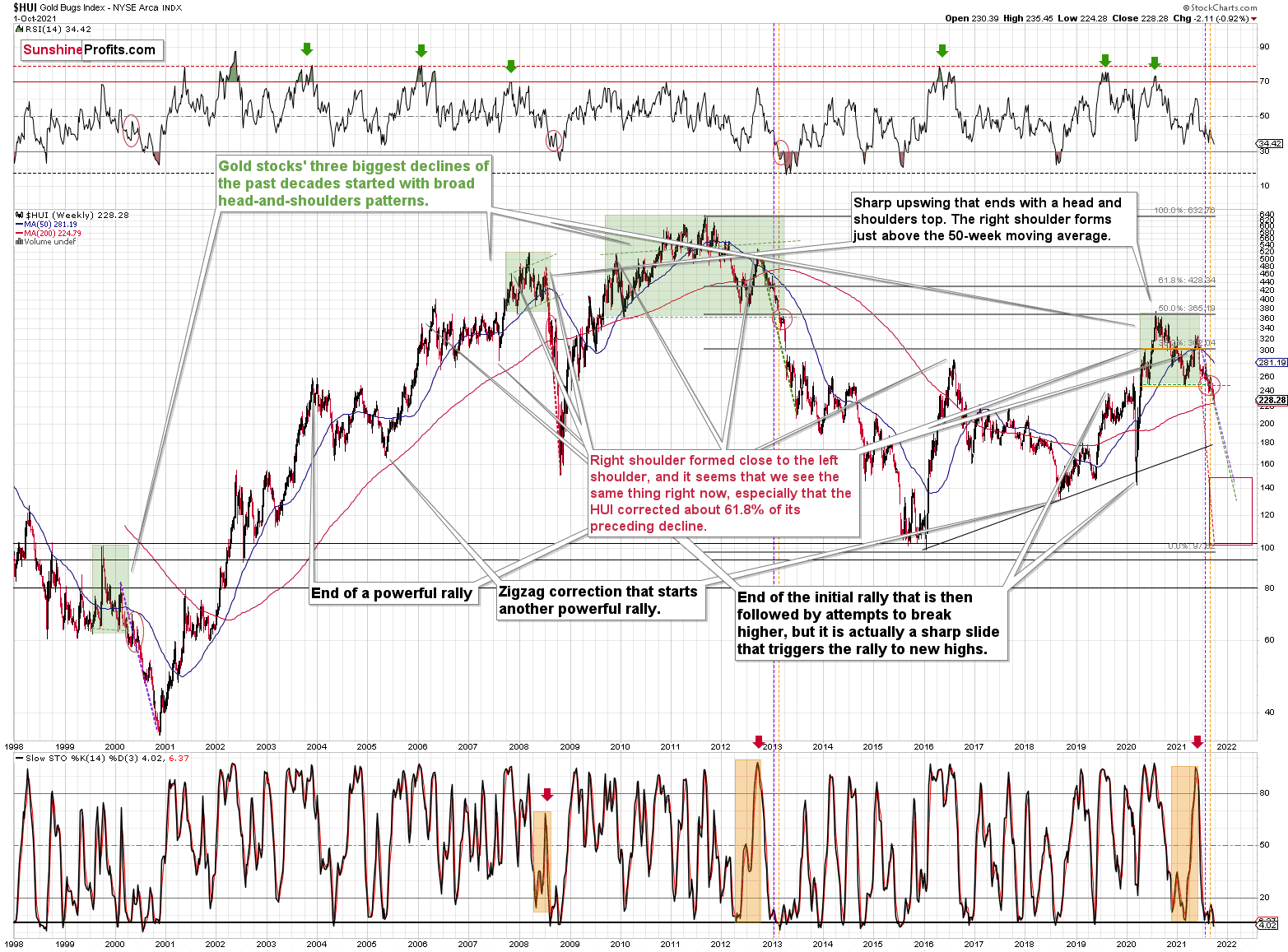
Furthermore, while I’ve also been warning about the ominous similarity to 2012-2013, the HUI Index continues to hop into the time machine. To explain, the vertical, dashed lines above demonstrate how the HUI Index is following its 2012-2013 playbook. For example, after a slight buy signal from the stochastic indicator in 2012, the short-term pause was followed by another sharp drawdown. For context, after the HUI Index recorded a short-term buy signal in late 2012 – when the index’s stochastic indicator was already below the 20 level (around 10) and the index was in the process of forming the right shoulder of a huge, medium-term head-and-shoulders pattern – the index moved slightly higher, consolidated, and then fell off a cliff. Thus, the HUI Index is quite likely to decline to its 200-week moving average (or so) before pausing and recording a corrective upswing. That’s close to the 220 level. Thereafter, the index will likely continue its bearish journey and record a final medium-term low some time in December.
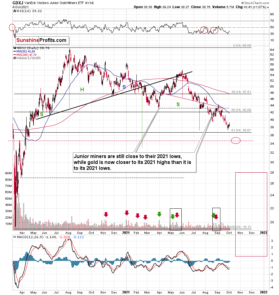
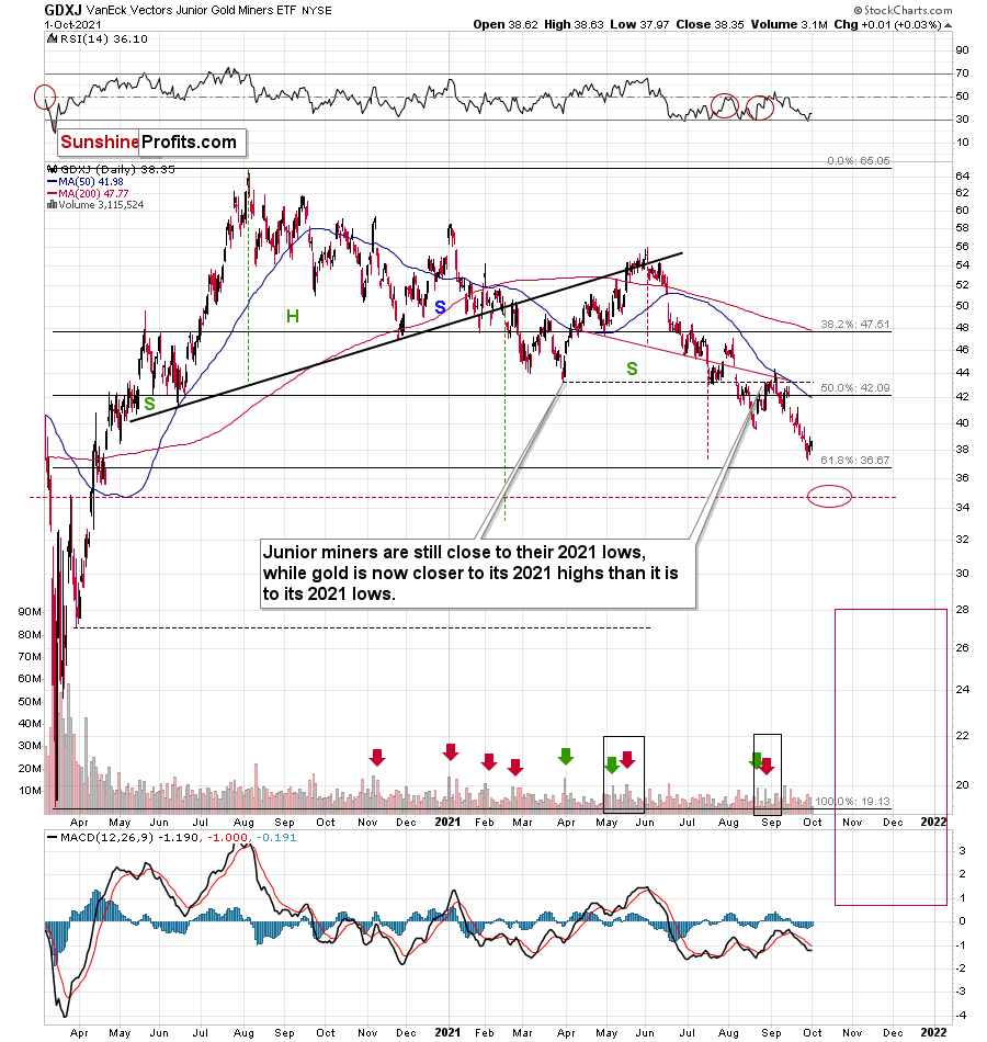
Furthermore, I warned previously that the miners’ drastic underperformance of gold was an extremely bearish sign. There were several weeks when gold rallied visibly, and the HUI Index actually declined modestly. And now, gold stocks are trading close to their previous 2021 lows, while gold is almost right in the middle between its yearly high and its yearly low.
And why is this so important? Well, because the bearish implications of gold stocks’ extreme underperformance still remain intact.
Let’s keep in mind that the drastic underperformance of the HUI Index also preceded the bloodbath in 2008 as well as in 2012 and 2013. To explain, right before the huge slide in late September and early October 2008, gold was still moving to new intraday highs; the HUI Index was ignoring that, and then it declined despite gold’s rally. However, it was also the case that the general stock market suffered materially. If stocks didn’t decline so profoundly back then, gold stocks’ underperformance relative to gold would have likely been present but more moderate.
Nonetheless, broad head & shoulders patterns have often been precursors to monumental collapses. For example, when the HUI Index retraced a bit more than 61.8% of its downswing in 2008 and in between 50% and 61.8% of its downswing in 2012 before eventually rolling over, in both (2008 and 2012) cases, the final top – the right shoulder – formed close to the price where the left shoulder topped. And in early 2020, the left shoulder topped at 303.02. Thus, three of the biggest declines in the gold mining stocks (I’m using the HUI Index as a proxy here) all started with broad, multi-month head-and-shoulders patterns. And in all three cases, the size of the declines exceeded the size of the head of the pattern. As a reminder, the HUI Index recently completed the same formation.
Yes, the HUI Index moved back below the previous lows and the neck level of the formation, which – at face value – means that the formation was invalidated, but we saw a similar “invalidation” in 2000 and in 2013. Afterwards, the decline followed anyway. Consequently, I don’t think that taking the recent move higher at its face value is appropriate. It seems to me that the analogies to the very similar situation from the past are more important.
As a result, we’re confronted with two bearish scenarios:
- If things develop as they did in 2000 and 2012-2013, gold stocks are likely to bottom close to their early-2020 low.
- If things develop like in 2008 (which might be the case, given the extremely high participation of the investment public in the stock market and other markets), gold stocks could re-test (or break slightly below) their 2016 low.
In both cases, the forecast for silver, gold, and mining stocks is extremely bearish for the next several months.
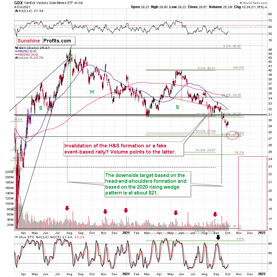
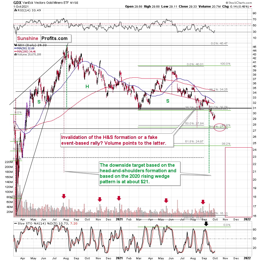
For even more confirmation, let’s compare the behavior of the GDX ETF and the GDXJ ETF. Regarding the former, the GDX ETF closed at a new 2021 low last week and sunk below $30 for the first time since April 2020. For context, I warned of a forthcoming calamity on Sep. 7:
I wrote:
Large spikes in daily volume are often bearish, not bullish. To explain, three of the last four volume outliers preceded an immediate top (or near) for the GDX ETF, while the one that preceded the late July rally was soon followed by the GDX ETF’s 2020 peak. Thus, when investors go ‘all in,’ material declines often follow. And with that, spike-high volume during the GDX ETF’s upswings often presents us with great shorting opportunities.
Moreover, even after the forecast became reality, the GDX ETF’s medium-term outlook remains quite bearish. For example, while gold bounced late last week and recouped its losses, the GDX ETF’s tepid rise further validated the senior miners’ underperformance.
As a result, the relative weakness implies lower lows over the next few months.
Please see below:
As for the GDXJ ETF, I wrote on Sep. 7 that overzealous investors would likely end the week disappointed:
With the current move quite similar to the corrective upswing recorded in mid-May, the springtime bounce was also followed by a sharp drawdown. As a result, the GDXJ ETF could be near its precipice, as its 50-day moving average is right ahead. And with the key level now acting as resistance, investors’ rejection on Sep. 3 could indicate that the top is already here.
And while the junior miners followed the roadmap to perfection, the GDXJ ETF still elicits material weakness. As a result, the GDXJ ETF remains poised to reach the ~$35 level over the medium term.
Please see below:
Finally, while I’ve been warning for months that the GDXJ/GDX ratio was destined for devaluation, the downtrend remains intact. And with the ratio reversing lower after reaching its declining resistance line, the medium-term implications remain unchanged. On top of that, if a stock-market swoon enters the equation, the ratio’s drawdown could be fast and furious (like what happened during the March 2020 crash).
To explain, when the ratio’s RSI jumped above 50 three times in 2021, it coincided with short-term peaks in gold. Second, the trend in the ratio this year has been clearly down, and there’s no sign of a reversal, especially when you consider that the ratio broke below its 2019 support (which served as resistance in mid-2020). When the same thing happened in 2020, the ratio then spiked even below 1.
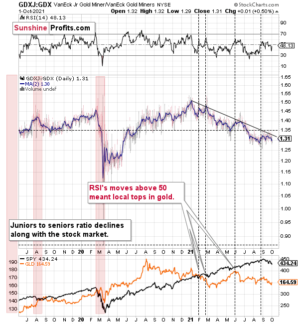
The bottom line?
If the ratio is likely to continue its decline, then on a short-term basis we can expect it to decline to 1.27 or so. If the general stock market plunges, the ratio could move even lower, but let’s assume that stocks decline moderately (just as they did in the last couple of days) or that they do nothing or rally slightly. They’ve done all the above recently, so it’s natural to expect that this will be the case. Consequently, the trend in the GDXJ to GDX ratio would also be likely to continue, and thus expecting a move to about 1.26 - 1.27 seems rational.
If the GDX is about to decline to approximately $28 before correcting, then we might expect the GDXJ to decline to about $28 x 1.27 = $35.56 or $28 x 1.26 = $35.28. In other words, ~$28 in the GDX is likely to correspond to about $35 in the GDXJ.
Is there any technical support around $35 that would be likely to stop the decline? Yes. It’s provided by the late-Feb. 2020 low ($34.70) and the late-March high ($34.84). There’s also the late-April low at $35.63. Conservatively, I’m going to place the profit-take level just above the latter.
Consequently, it seems that expecting the GDXJ to decline to about $35 is justified from the technical point of view as well.
Speaking of ratios, there was also a major breakdown in the gold to gold stocks ratio which most likely heralds severe declines in the following weeks/months, and if you’re interested in it, I recorded a video about it here (or search for “Sunshine Profits” on YouTube – it’s the Oct. 2 video).
In conclusion, gold, silver, and mining stocks have all broken down technically, and their fundamental outlooks also remain quite treacherous over the next few months. With the USD Index hitting a new 2021 high last week and U.S. Treasury yields also rallying, the pairs’ upward momentum should continue over the medium term. Moreover, with the general stock market also showing signs of stress, a profound decline could add to the precious metals’ ills. As a result, gold, silver, and mining stocks’ weakness should continue before lasting bottoms likely form near the end of the year.
Thank you for reading our free analysis today. Please note that the above is just a small fraction of the full analyses that our subscribers enjoy on a regular basis. They include multiple premium details such as the interim targets for gold and mining stocks that could be reached in the next few weeks. We invite you to subscribe now and read today’s issue right away.
Sincerely,
Przemyslaw Radomski, CFA
Founder, Editor-in-chief


Gold Investment News
Delivered To Your Inbox
Free Of Charge
Bonus: A week of free access to Gold & Silver StockPickers.
Gold Alerts
More-
Status
New 2024 Lows in Miners, New Highs in The USD Index
January 17, 2024, 12:19 PM -
Status
Soaring USD is SO Unsurprising – And SO Full of Implications
January 16, 2024, 8:40 AM -
Status
Rare Opportunity in Rare Earth Minerals?
January 15, 2024, 2:06 PM

